The similarities between the Gerrit Rietveld Academie and the Bauhaus school are immediately apparent. In theory and course structure, one could declare them almost the same, even looking from far away at the way classes are taught, there is a striking resemblance, but looking in a little deeper, a lot of the practice has changed. A great amount of freedom has ensued in the last 100 years and that is highly visible in the hallways, classrooms, staircases and pretty much every corner of our academy. 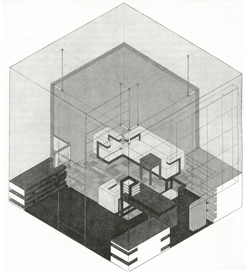
Looking strictly at the academy’s building, the Bauhaus influence, Gropius’ glass box designs’ influence on the Rietveld architecture is almost palpable. It is what Rietveld students have made of this glass box that demonstrates the progress. The beacon of modernist Bauhaus architecture is constantly littered and bombarded with student’s and teachers individual works and projects in the works; with posters promoting performances with roots in extremely diverse concepts, and the limitations of rationality imposed by the Bauhaus are thrown out the window.
Having spoken of posters, it would be ill advised not to look at the graphic design departments of the Bauhaus then and the Rietveld now. Having been put on paper by different designers, the ones coming from Bauhaus look like they might as well have been designed by the same person, and so do the ones coming from the second floor at the Rietveld today. Here is the difference: while the Bauhaus posters have a very neat, almost strict design based on straight lines and proportions, the results coming out of our graphic design department present relaxation and fluidity. The Bauhaus posters all promoted the same message through the same rhetoric: boring, modernist rationality. The Rietveld posters on the other hand merely promote each individual’s message through the same language.
But how have we arrived at this level of enabling relaxation?
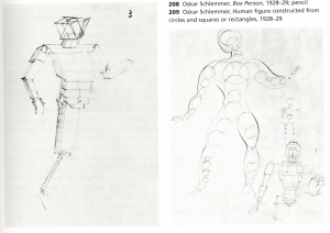
It could be the teachers. They kept the structure of the Bauhaus, even in teaching drawing, but the drawing subjects are now far more varied and exciting. In 1929 Oskar Schlemmer taught his students how to draw human proportions using spheres, tubes, cubes and other geometrical shapes. He did this in trying to question the nature of the human being, a lesson I cannot see disbarred from the socialist rhetoric of creating a new, logical type of human being, that the Bauhaus was so keen on.
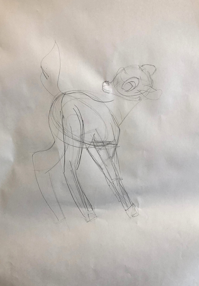
In 2019 Hewald Jongenelis (one of the drawing-painting teachers) taught his students, me included, how to draw fictional character Bambi through the same technique. He motivated this by saying: “If you can draw Bambi like this, you can literally draw anything”. Again adhering to teaching certain freedoms so necessary in the work of artists and designers these days.
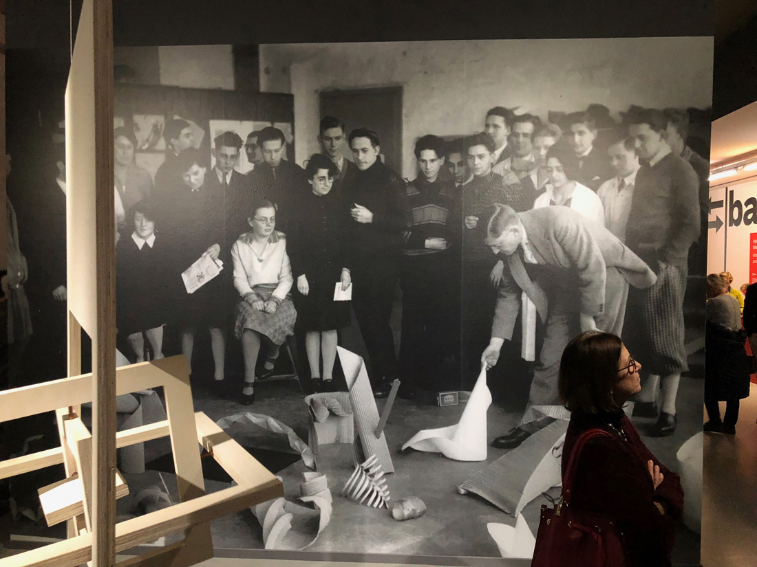
It could be a collaboration between teachers and students. Looking through a Bauhaus exhibition in Rotterdam, a certain picture that had been captured in a regular Bauhaus ‘Vorlehre’ (the Bauhaus equivalent of ‘Basicyear’) classroom decades ago caught my eye more than any designs exposed. A shared class structure in the Bauhaus school and Rietveld Academie is undoubtedly there. But something is off…
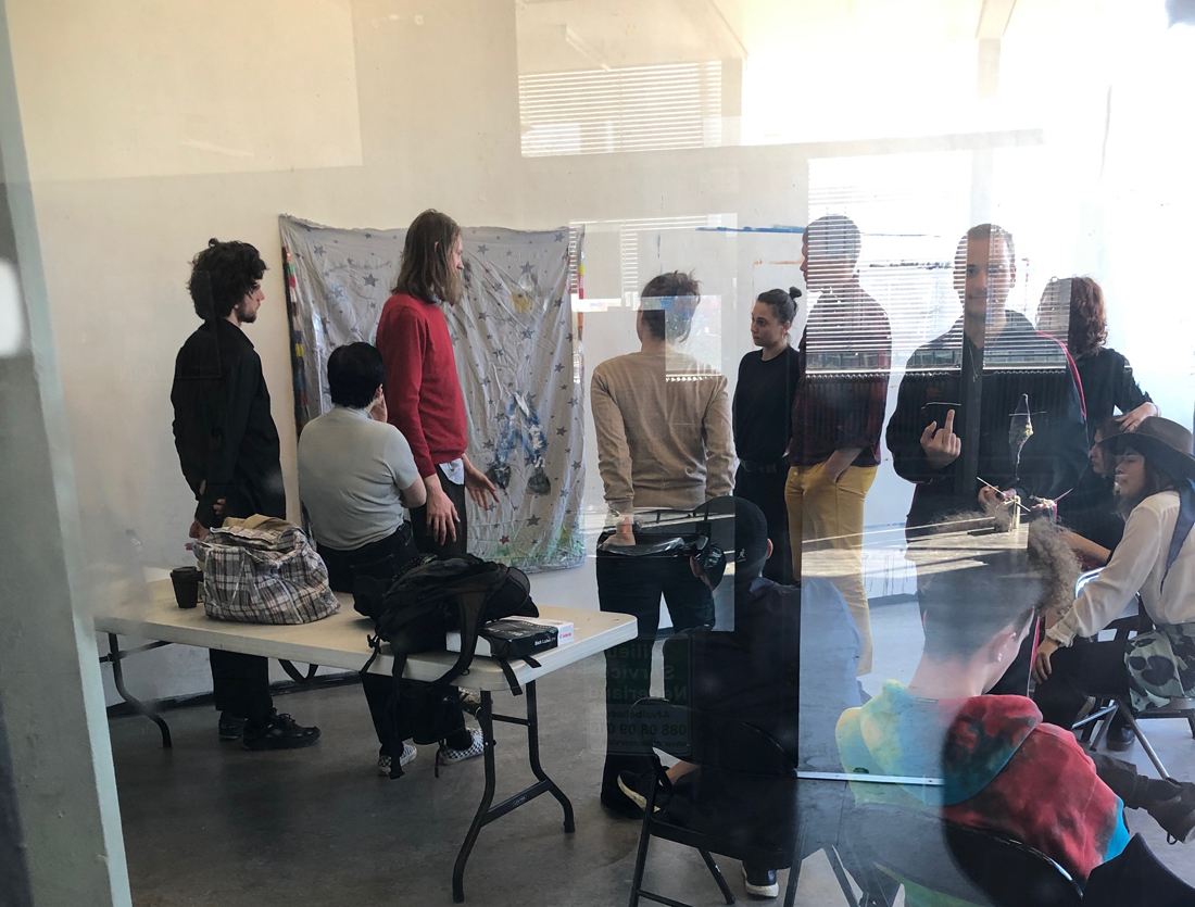
Where as in the Bauhaus school picture the entire class was immediately engaged in discussing one student’s work which was sitting in a pile of others like it, in a Rietveld basic year classroom some of the students’ attention is drifting away when things in class are becoming to repetitive, either towards their phone, towards the hallway or to anything slightly more stimulating than the class itself. Although this may seem like a bad habit, taking the bad with the good on might realise that this kind of habit allows for a constant flow of information with the outside of the classroom, broadening the field of subjects that students can study in their work or that they can ultimately bring into the classroom for their colleagues and teachers alike to digest.
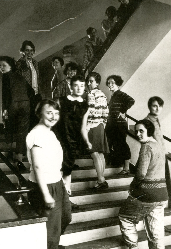
It could be only the students themselves. Its enough to look at their fashion, and how carelessly they wear it within the school to understand the freedom that Rietveld students are experiencing today as opposed to 100 years ago in the Bauhaus. Even though much of the fashion on the Rietveld staircase is alike between itself, which was also very much the case in the Bauhaus, put it on the streets and it will be the only one standing out in Amsterdam a city which has come to look almost as if its streets are painted through one stencil.
