Tuesday, November 17, 2009
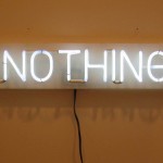
A hole, a crack, a black space – consisting of nothing!
I came to the bookshelf to choose my book and what i found was a book on its own and a large space which seperated it from the main body of the other books. The absence of something was so present for me in its tension that it drew my attention to that spot right away. Like the suspense of quiet in between movements of musical symphony the quietness was pointing and preparing me for this one very special book.
Rietveld Library code: *7399*
Tuesday, November 17, 2009
The second time in the Rietveld library to search for a book that I know nothing about yet.
The only thing I know is the mantra I keep repeating in my head. The mantra consisting of my last tag words. I pull a few books from the bottom shelves but none of them seems to be the right one.
Until I pull out a thin, square book of which the library code consists of the letters e a t (might be “cat” but i still read it as “eat”). The second thing I looked at was the back cover. It’s full of scratches. What happened with this book if you go beyond “it’s used as a cutting mat”?
I found it more then appropriate.
Eating; the everyday activity.
Square; meaning boring.
Thin book, bottom shelve; forgettable.
Scratches; popping up of questions.
My mantra of automaticlivesoblivionstorymaking was answered.
Rietveld Library code: 705.8 eat 12
Tuesday, November 17, 2009
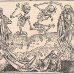
Where in the fist book the absurdity of life is discussed in a very airily funny and positive approach, this books deals with the same theme, but in a very confronting real way. This book is about the things and facts of life as well. Most photographs are shocking and horrifying, but they tell the story of history since 1955. It’s a book about photojournalism. Despite all the nasty images there are also beautiful pictures included, some of famous photographers. Though there’s definitely a shadow hanging over this book and it’s called reality.
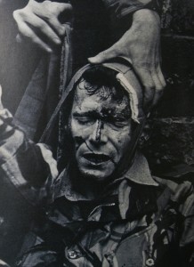
The search for a book with the same tag words was pretty hard. I was exactly looking for the other more confronting realistic side of the absurd things in life. In the end I think this is really a book that suits exactly that subscription and therefore the same tag words as my previous one. I think it‘s his serious brother.
Rietveld Library code: 761.6-pan-1
Monday, November 16, 2009
The Session is an Amsterdam based thematic fanzine run by a group of artists and designers. The Session takes place for one day every second month, during which works around a specific theme are being made.
The group uses different methods and media, from drawing to research to songwriting. There are as few rules as possible in order to keep things open and uncomplicated. The members of the group are taking turns in deciding the theme to work with, members can invite guests to join a session. The member deciding for the theme of an issue is the publisher and responsible for editing, design and (re-)production. This means that every issue will look different, that every issue will be compiled with a different approach and produced in a different way, testing out formats and techniques. The Session is a flexible container for any kind of content, trusting in the spontaneous quality of its Sunday-afternoon outburst. Issues released so far are:
(1) The Banana Session (September 2007)
(2) The Colo(u)r Session (December 2007)
(3) The Weapons & Armour Session (February 2008)
(4) The Secret Session (March 2008)
(5) The Holiday Session (June 2008)
(6) The Psychedelic Session (September 2008)
(7) The Obsession (January 2009)
(8) The Amsterdam Session (May 2009)
(9) The Last Session (September 2009)
The Session are: Monica Tormell, Tomas Adolfs, Staffan Björk, Tarja Szaraniec, Matthias Kreutzer, Kalle Mattsson, Orpheu De Jong and Jens Schildt.
http://www.thesession.nl
http://www.myspace.com/thesessions
http://www.thelastsessionradio.com
Monday, November 16, 2009


The library is a vault of knowledge and place of opportunities and inspiring meetings if only you know the combination to open it up.
In an attempt to expose that hidden treasure for ourselves we have to find out what we are searching for. Not aimed at 1 specific objective question but in an effort to make our personal focus manifest. Searching and naming (tagging) our find.
What if…, we were to browse through it, just like we so often browse the Internet, on association and intuition? Would we be able to unlock it and find hidden treasures. We probably would and we might also find out why the fast information that we find on the internet, the superficial re-shuffling of opinionated facts and loads of images, desperately requires editing. We might find an answer to the question, why more books are printed than ever and libraries thrive.
40 students set out to “browse” the library in that state of mind, showing what happens if you just release your preconceptions and start doing it. All their adventures can be read under the category >“subjective library” project<.
The tags they created in that process became part of the Designblog’s monumental tag list.
Monday, November 16, 2009
“subjective library” on Flickr
click on the images above to find some of the tags as we translated them into images for you. If you want to check them all out go to …… Flikcr.com /subjective library /click people link
selection made by Matthias Kreutzer and Henk Groenendijk
By Henk Groenendijk
/ Categories: image + language, Subjective library 3 Tags: airplane, Anita, archive, associations, attraction, Canada, compulsive, connection, embroidery, escape reality, eyes, first sight, hundred years, identical, imagination-tt, library, life, mass production, mystery, mysticism, normal, nothing, oblivion, part, pictures-tt, random, raven, reduced, secret, selection, seriouness, subjective, television, theft
No Comments
Monday, November 16, 2009
Amsterdam based Visual artist and archivist Tjebbe van Tijen (1944) works since 1988 under the name Imaginary Museum Projects consisting of regular lectures, performances and publications on subjects like social memory, psycho-geography, media history, mapping of human violence and visual language. Especially interesting in this project are the “Museums in our Minds Scrolls” that he is making. To view the strips of images, he build a special wooden viewing device with handles that one had to turn to scroll through the strips, a manual scroll-bar really.
link to the Imaginary Museum Homepage, or read the interview that Geert Lovink had with him in 2004
In his celebrated book “Le Musée Imaginaire”, Andre Malraux (1901) developped the idea that the world of reproductions forms a “museum without walls“ a museum in your head. A virtual museum read more:


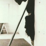
Continuous Drawing by Tjebbe van Tijen. Photographs with permission of Pieter Boersma. Coll. H. Groenendijk
One of Tjebbe van Tijen first “actions” was “the continuous drawing” organized by him and students of the London ‘Sigma Centre’ in 1967. The “continuous drawing” came out of a Londen sewer and travelled to The Netherlands. Two parallel lines, continuously branching and looping creating organic forms. True streets, onto cabs,in the airplane and thrue Schiphol Airport, over the streets, into the Stedelijkmuseum where it continuous on the stairs, to the terras, covering visitors and statues until it ends as a projection in a smoke filled dome, as if desolving in smoke. This project was initiated by the City of Amsterdam Municipality, Tourist Promotion and various Art Foundations in A’dam and R’dam. Other participants were a.o. Willem Breuker (musician), Theo Botschuijver (industrial designer), Graham Stevens (architect), Pieter Boersma (photographer). His took the initiative for a documentation center on art, technology and society at the Sigma Center and Stedelijk Museum (1967-1969) and was later founder and curator of the Documentation Center of Modern Social Movements at the University Library and International Institute for Social History in Amsterdam
sources: “Actie, werkelijkheid en fictie in de kunst van de jaren ’60 in Nederland” (Action, Reality and Fiction in the art of the sixties)©’79, Mediametic, Gandalf #19 ©’79. imaginary Museum
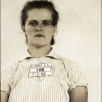
Sunday, November 15, 2009
A walk in to a wall. Different walls are facing me.
Hello I said to her.
She said hello to me.
I talked with her for a very little time.
The thing she said to me was red.
In points I agreed in some points I disagreed.
But in conversation with especially her cover I became curies.
Why is it that she said hello.
Why the others didn’t said hello.
She is not very beautiful at all, not very interesting either.
The word she chooses to say hallo was regular.
But it brought me to another level of being aware.

Rietveld Library code: ?
Saturday, November 14, 2009
Walking in the library. Looking for something who is nothing, at the same time. All the covers of the books are staring at me, they are all something. Then I find…
This book, black.
This book, German language.
Attracted, white lines on the cover.

The lines going to the nothingness of the black. I want to walk in the cover to see and feel the nothingness around me. Like standing somewhere on a field in the middle off the night.
This book, I can’t read because the language.
This book, with a very disturbing content.
Attracted, understand what I don’t understand.
Let me know, I whisper. Let me know…
Rietveld Library code: 774.4
Thursday, November 12, 2009
Image instead of font, relaxed instead of compulsive, everything except cats: these are the tags of the book I picked. No relation is a relation as well, and thus is this lack of relation the perfect link between the first and the second book. I found an objective way to link this post to my earlier post. This book pulled my attention in the same way it is linked to the other book: the big differences. Was the first book white, about fonts and having a sort of mysterious neurotic repeating cleanness, the second book is colorful, filled with images, hundreds of subjects and a bit of chaos. Browsing through the pages you see countless interesting illustrations, which make you want to take a closer look but also make you want to look further; are there more images like these, are there better images then these, could it become better then this? It makes you want to draw or make such images too: images from which you can see there was a lot of work in it or absolutely not much work. The amount of work is of no importance, the works are intriguing.
Rietveld Library code: ?
Thursday, November 12, 2009
Subjectively searching for a very unsubjective assignment, but still with the subjective thought in mind that it is not possible to be subjective in command, I saw a large white book. The title is not really that interesting, but the bigness of the book attracts me. It might be worth taking a look on the inside. So that is what I do. The whole book (798 pages) is filled with the same text in different sizes and fonts. If the book was on sale, I would buy it. But it is on lend, so that is what I do. It is fascinating to read the same text (‘In our house we had a cat with the grandiose name of Gonnosuke …’) over and over again. If not knowing the purpose of this book (a sort of shopping guide for fonts), you could think it was written by someone who was or high or compulsively neurotic or both.
Thursday, November 12, 2009
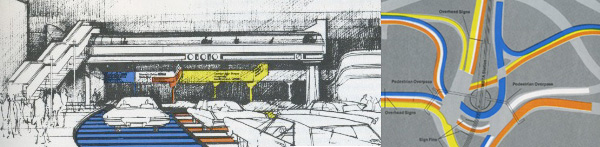
Walking through the library with a specific direction in mind (the tagword signs) my eyes crossed a book with the title ‘City Signs and Lights’. It is a book printed in the seventies and it has a silvershining cover with a lot of black ink printed over it. The book contains a study in city signs and lights. The interesting thing about this book for me is that it shows the paradox I discribed in my last post. And it contains a lot of examples where signs could get confusing.
One solution I really liked was where the writer (Stephen Carr) tried to untie a traffic knot. What he sugested was marking all the different directions by giving them their own color and repeat this in the direction signs, and give each section of the road the right colour wich lead you to the place where you wanted to be.
754.5 -carr-
Thursday, November 12, 2009
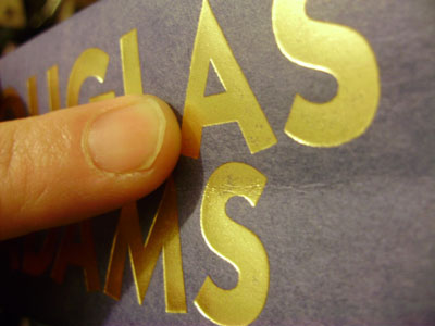
Browsing books is my favorite thing in the world. But I am not looking for an interesting read, not this time. I try to let my sub consciousness guide me. Walking past a row of books at the end I stop, touch the spine of a big tome, glaringly yellow, black border, interesting typography. My touch reveals a strange texture of the yellow paper. Or fabric maybe? The sticker on the back annoys me, how dare it break the yellow/black/angular balance of the back?
I slide the book out of it’s resting place and take a peek at the front. The same typography as the front, the same thin black letters on yellow. This time I can feel that the letters were pressed on the yellow. Hard. They appear to lie just below the surface. Intrigued I slide the book out altogether and wake up out of my book trance only to realize I am holding my choice in my hands.

725.9
Thursday, November 12, 2009
 When i was checking the books at the library, i saw a book about the topic that i’m really interested in, Soviet Architecture. I checked it and yes it was the book that i am looking for. Then i looked for other books to find some images to support my topic, i couldn’t find though. Suddenly i saw a boow, looking old and having old, dark red just jacket. Yes! It was about Russia Architecture. The best thing about it is the just jacket. It is just like Soviet public architeture or Soviet mentality. A book need to covered and there it is, nothing more ( i love “the Raven btw). One barely reads the name of the book, there is nothing on it to make you buy it (if you were in the book store). No colorful letters, no information about what it contains. One can find it, only if he/she needs it. Which is what i did. Which is why this dust jacket is a perfect match for this topic.
On the left side you see the book i choosed and on the right side there is a book from BRD – Germany (to compare)
718.8 lis 1
Wednesday, November 11, 2009
I want a big book. Not the biggest of them all.
But it should at least be heavy enough to keep reminding me it’s there when carrying it around in my bag.
I am (sort of) looking at books in the front, but have already decided to favor the ones in the back. Am I trying to look intellectually engaged or am I actually being polite to a bunch of books?
First I take out two books from each shelve as a test sample. One at about 25% of each shelve and one at 75%. This doesn’t feel like the way to go. I’d rather maintain control and make a more conscious decision.
There it is. Big and black. On the cover there’s a mouth sticking out it’s tongue and below that a picture of an iron, the kind you use on clothes. In the middle the title: SENSATION. I’m intrigued, even when I don’t make the connection right away. Maybe I did unconsciously. I allow myself only a few seconds to decide on the estimated level of enjoyment. A hard cover. Lots of big color pictures, lots of text. It passed the test.
707-8 cat 105, 12141, Thames and Hudson
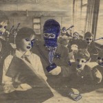
Wednesday, November 11, 2009
I noticed that all the books I took off the shelf, to look at, had strong expressive images on the spine of the covers. My eye caught a blue Pinocchio that was on a black and white background, also the white title was complementing the spine of this book. The black and white background had been drawn with a pencil and the Pinocchio was well painted with either paint or fabricated on the computer. It combined the “sketch” fase together with the “endproduct”. I though it gave me a good idea about the content of this book, just by looking at its spine. When I took the book off the shelve to look at it, the cover was fabulously bright with colors. I chose this book because it was screaming so loud that it practically jumped off the shelve into my hands, so I felt I HAD to take it.
Rietveld Academy Library No. 799.4
Tuesday, November 10, 2009

Walking through the library without a specific direction in mind my eyes crossed a book with a few signs on the back. No title, only the publisher (taschen) and the editor (colors magazine). I got attracted by these signs because they pulled my eyes immediately in its direction. Like signs have to do, they tell you how fast to go, where to stop, where to turn. Going through the book it was nice to see the different signs in different languages. Even if there is an Arabic text in the sign you still now what to do.
The nice thing about signs is the paradox in it. If we all follow the signs in a strict way, we will not get anywhere. Because at one point you will come across a dead end- or a stop sign. But if no one gives anything about the signs and ignore them it will become a complete mess.
754.9 -mus-