Thursday, March 19, 2009

Unique, Traditional Techniques for the Modern Weaver by Marjorie Cason and Adele Cahlander
I’m quite good at misreading. Today’s appeared to have been Waving out of Weaving. The thing immediately came with a very clear image : Someone had wrote a book on visual yodelling. Ancient—it had to be ancient—technique from Bolivia’s vast highlands.
By when I kneed to grab the book my mind was already wandering among bits of sign language notions I could recall, considering amplified variations after the needs of long distance communication. The surroundings of my prey presented unexpectedly high occurrences of the term jewellery and the blown-up pattern on the book cover soon identified itself as woven cloth. So much for highland waving.
While flipping pages, I still got stuck by the amount of weirdly positioned hands, drawn and pictured struggling with threads. I drew them and asked a sign language student to tell me which parts of the series could made sense. It turned out saying : ‘Independent animal west coast gives’.
cat. nr: 779.1-cas-1
keyword: animal
Wednesday, March 18, 2009
The book ‘The Art of Rock’ is about rock posters from 1955 until 1987, ‘From Presley to Punk’ stands on the cover.
I think. Only if you want a clear image of the atmosphere that these poster want to give you, you should not look at them closely. You should just brose through the book. Then you will find out that the atmosphere is mostly about drugs, endless summers and music. I like that. It takes me back to a few years ago when there were these cosy Friday and Saturday evenings with friends and no parents in the house when we just wanted to get as fucked as possible.
Another reason to not look to close at the posters is because most of them are not that good. When you do look good at them and look true all the tricks you will see there is a lot of graphic design creativity, which can work inspiring.
cat. nr: 754.1GRU
keyword: time
Wednesday, March 18, 2009

book
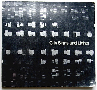
I picked the book City Signs and Lights (S. Carr (ed.), Boston, MIT Press 1973) from the Rietveld library. The title immediately brought up associations with Walter Benjamin´s concept of the flaneur, the prototype of the bourgeois consumerist as the socio-cultural product of the earliest department stores in Paris established around 1900. Parallel to this idea is, I believe, the Society of the Spectacle (Debord). The power to attract customers with light commercials like lamps attract bugs, by accepting the existence of Desire within the subject (Deleuze), creates a competition in the city landscape, that alters the landscape into a continuous feed of visual stimuli. This competition for attention in the urban environment leads in its turn to a new set of rules or aestethics for such commercials. This is probably the design part of the fascination: the competition within the city landscape for attention of potential customers that sets the parameters for an aesthetics of a denotation system that functions almost as a parasite on the urban environment.
(The author of City Signs and Lights doesn´t seem to mention a historical context)
The second association I had when I first saw the book, was Wong Kar-Wai´s Happy Together (1998) in which shots of city signs and lights are metaphorical for emptiness and alienation between the two main characters and their environment.
The book in itself does not provide extended written articles, but the title and images provoked associations and ideas about an exhaustive list of topics on the conditions of modern western society, semiotics in general, and the meaning of neon as a material or medium in particular.
cat. nr: 754.5-carr-1
keyword: neon
Tuesday, March 17, 2009
– First week: I grabbed the first book that caught my attention. Something on weaving, because I had misread it and thought it was about waving. I then drew all the hand positions displayed in the book and asked a sign language student to associate the ones he could recognise to words. The result became the starting point of the exploration: ‘independent – animal – west coast – give’.

– Second week: I used the search engine of the library. Typing in, one after the other, the four different words, I ended up with 10 book results. 2 for ‘independent’, 6 for ‘animal’, none for ‘west coast’ and 2 for ‘give’. 4 of the books were fitting within the design field, 2 of the ones found with ‘animal’, 2 with ‘give’.
Wondering about what to do with these four books, I took inspiration from a Wire album cover, On Returning, (a compilation of the three first album covers of the band) and compiled the four book covers.

– Third week: I asked someone for leads. Eveleen, who I asked if she would have ideas on compilation and art, told me to look into a book she heard quoted in a lecture, it was called something like ‘Postmodernist exhibition’. I couldn’t find a trace of the book in the library here, in CS nor on the internet but the idea was seducing.
In the meantime, I came across Martino Gamper’s work, approximately fitting with the subject I gave myself, but I wanted to keep using the system I had set, relate to the defined keywords.
I came back to the 10 books found earlier. 4 of them, as well, were fitting within the art field, 2 of the ones found with ‘independent’, 2 with ‘animal’. I then tried to install the 4 books as a ‘postmodernist exhibition’.
Funny thing is:The selection of the second week, on design, consists of books found through the keywords: “animal give(s)”.
The one on art then consisted of books found through the keywords: “independent animal”.
by Jules Estèves
keyword: sign language