Skip to Content Skip to Search Go to Top Navigation Go to Side Menu


Archive for May, 2011


Wednesday, May 11, 2011

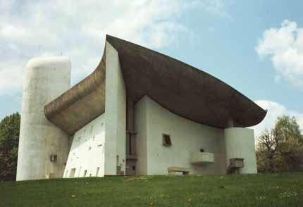
Due to sickness, I was not able to attend the excursion to “Beauty in Science” in Museum Boijmans Van Beuningen. The name of the exhibition though really triggered my interest but I had heard some rumors that ‘checking the web page of the museum would not be any different from paying the exhibition a visit’. I had a look at the Boijmans website and classmates’ contributions on our design blog and I came quickly to the conclusion that the rumors were likely to be true. I had hoped for stuffed animals, old education books, fascinating scientific tools from out of space and paintings as ‘The anatomy lesson of Dr. Nicoleas Tulp’ – things that I had seen on my favorite floor of the beautiful Naturalis (Leiden) very often and that inspired me every time I had visited this museum. And though I don’t need stuffed animals and fetuses in jars every time I visit something science related – I’m also very open for new experiences – the things I saw on the website were pretty dissapointing and above all, nothing new. Something on the web page of “Beauty in Science” says it all, actually:
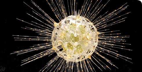
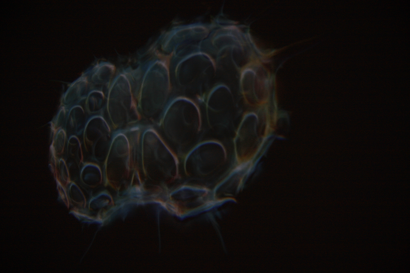
In his essay Hans Galjaard writes about how he was moved by a film of 4D ultrasound images of the development of the human foetus made by the gynaecologist Stuart Campbell. This was the beginning of his plan to collect aesthetically pleasing scientific images. In his quest for images he has asked many researchers if they have also experienced such a moment of overwhelming beauty – a so-called ‘Stendhal moment’ – but this was not the case.
So how should we experience this ‘overwhelming beauty’ if even the researchers who contributed footage for the exhibition did not feel anything of this themselves?

The hands of Nicoleas.

s-objectivity


Wednesday, May 11, 2011

“The YouTube slogan is “Broadcast Yourself”, an encouraging motto that calls up associations of a democratic Internet commons where all voices can speak and be heard. Here, it says, is a space for all individuals to create and control a channel of their own, transmitted to the world.”

Elizabeth Clark – What Good is the ‘You’ in YouTube? Cyberspectacle and Subjectivity

http://gnovisjournal.org

What is objectivity? Is it what we learn in school, the universal truths, that are right and won’t change no matter what context? Water will always frozen under 0 degree Celsius. Fair enough, objective truth. But what happens when objective facts are translated in subjective ways? Where is the neutral space there? What becomes of the neutrality of objectivity? We live in a world of exposure, of the self exploting, where the more you show the more you become. So where is the objectivity in all this? Where does it places itself within this world of subjective googles?

Laid Off – Natalie Bookchin from natalieb on Vimeo.

If we take the work of Natalie Bookchin – Laid Off, she shows an objective fact, to be fired, through the light of a lot of different experiences, all of those told by the person fired, in the first person, as if they were talking to a friend, but in fact made for youtube. Here she uses the personal diary of millions of people, put at disposal by them through a videoplateform, to talk about a fact, being fired. There is no maybe in that action, you don’t get “maybe” fired. You are either fired or you are not. But the way this fact it’s told by all these people, expresses more of the sensation of being fired, the feelings, the human side of the objective fact. Though I might question the means of communication that these people felt the urge to use, this self entertainment, I do nevertheless agree that objectivity is useful, but nothing without subjectivity. As one thing can’t exist without it’s opposite. So objectivity has it’s place in this neverending “me” world, it’s neutrality might be hidden under all these personal experiences, but it is the base of any reaction, it gives the impulse of reality that you need in order to jump (or not) into your own truth.

https://designblog.rietveldacademie.nl/wp-content/uploads/2011/05/Screen-shot-2011-05-11-at-6.24.31-PM-161×300.png


Wednesday, May 11, 2011

'Schotter' by Georg Nees

Computer art is any art related to computers – in the display or in the production of the work. It is such a broad term that I did not really know where or how to start. In the 1960s, computers were very exclusive things and the artists who started experimenting with these machines were really doing something that was never done before with tools and techniques that were never used before. But nowadays, digital technologies are integrated in traditional disciplines and therefore it is a bit harder to define where the term ‘computer art’ is applicable.

For what I have see until now in my short life, I don’t have too much affection with digital arts. But that might also have to do with ignorance, and the fact that even my mom can handle computers better than me – sometimes I even edit my photos in Word, something that people would like to kill me for. But when I found an article about algorithmic art, I could not ignore the fact that computers can actually do stuff that goes beyond human capability, and create things that would not be possible without automation, which is interesting, especially when you think of it as something that started about fifty years ago. They now seem a bit ‘flat’, but these works were the first steps into making art that involves science (and maybe also, science that involves art?), which makes me find them truly fascinating.  Because these artists really explored the borders of what was possible with new techniques, using them in favor of their creativity, I find the link between art and science in these works much more interesting than in the works in the Beauty in Science exposition.

mystery in beauty


Wednesday, May 11, 2011

First i’ll quote a little bit of wikipedia so that you know, if you didn’t already, what the golden ratio is, because that’s what the subject is and it might be nice to know:

“In mathematics and the arts, two quantities are in the golden ratio if the ratio of the sum of the quantities to the larger quantity is equal to the ratio of the larger quantity to the smaller one. The golden ratio is an irrational mathematical constant, approximately 1.6180339887.”

The golden ratio can be found in a lot of things that are considered beautiful, because it gives a certain balance that is liked by humans. It can be found in: nature, music, architecture, human body/face, art, etc.

The golden ratio was already ‘found’ by the ancient greeks, but it was only during the 19th century that they discovered that it carried a beauty that can be connected to art, architecture and nature.


Le Corbusier, a swiss-french architect, developed the Modular, an architectonic measuring system that uses the golden ratio. He used the modular for all his buildings, but he stated that he thought it was a bit sad that the golden ratio was discovered in relation to aestethics, because it took the mystery away from beauty.

The mystery of beauty appeared to be, in much scientific opinion, just the average.

I wonder what is this ‘mystery’ anyway. The beauty of ambiguity, something that keeps you wondering, and surprises you. Because at some point, caricaturing an attractive shape will result into abnormality that that con­cur­rent pref­er­ences for av­er­age­ness will out­weigh pref­er­ences for the at­trac­tive shape di­men­sion.” To put it more simp­ly, Plain Jane is not with­out her charm.

Moholy-Nagy’s Photograms


Wednesday, May 11, 2011

Lászlo


Portret

László Moholy-Nagy was born in 1895 in Hungary. Here he started painting around 1918. Around this period he also moved to Berlin to develop his talent.
Besides painting and photography Moholy-Nagy also made during his life a lot of other art in which he often involved light as a media. He made sculptures, collages, films, graphic design and even more different work.
Here below you see some of his early paintings.

In 1923 Moholy-Nagy became a teacher at the Bauhaus School in Weimar after he got to know Walter Gropius; the man behind the Bauhaus.
The school had a total new way of teaching. Students had the possibility to work with a lot of different materials and were stimulated in there independency and personal development. Information Bauhaus (dutch) or (english)

It was when Moholy-Nagy became a teacher at the Bauhaus that he started experimenting with typography and photography as well. When Moholy-Nagy later moved to the VS, he there started the New Bauhaus in Chicago and continued his experiments with film and photography.

philosophy

Moholy-Nagy believed in art as part of a lifestyle. A collective mentality in which art, together with other aspects of life come together as a ‘gesamtwerk’.

He was convinced of the forming function of art. He saw the ideal society as one in which everybody is practicing art. This would lead -so he thought- to an improved society. He joined the group MA, which believed in the revolutionary potential of art. more on his theory and himself

the photogram

A photogram is a print of something that lies on light sensitive material and then get’s lightened. In other words: A photogram is a form of photography without the use of a camera.

This is, I think, very interesting.
To me it’s fascinating to see the direct forms of a device on paper. It makes in a way the distance between you and the subject on the photo smaller. And the realism of a photo bigger.
So what you see is exactly what it is.

Moholy-Nagy tried a lot of different things. For example the experiments with the light from different angles. And also many try-outs with different types of material; in special the transparent materials.


The  photogram’s of Moholy-Nagy are often abstract but not always. Lazslo worked with figurative images in the photogram as well. He build figurative images out of form or/and made use of the negatives of other photo’s.
But just to give a little bit more information about the history of the photogram because you might find this interesting (as well as I do) I’ll give you some more facts;
– The first illustrated book containing photogram’s dates from 1843, from Anna Atkins. Not so long after the invention of photography itself.
– In the early twenties there was a lot of experimenting done with the photogram. Notably by Christian Schad and Man Ray.
– from the moment Moholy-Nagy discovers the Photogram (around the time he started teaching at the Bauhaus) he continuously produces them until his death.

concluding

After visiting the exhibition Moholy-Nagy “Art of Light” and seeing all his work paintings, films, objects, collages and a huge number of photograms, I became really interesting in them. By reading about Lazslo and looking at his work I found out that there is so much more to learn about him and this time, which I think will inspire me to design and create more photo’s for myself. Especially in relation to the philosophy of Moholy-Nagy about photography. This because I agree with him about how to make use of black and white and composition in photo’s. Over-thinking the work of Moholy-Nagy resulted into an eye opener into the possibilities of photograms or making use of light in art.

some other sources:
Moholy-Nagy: The Photograms, catalogue raisonné published by Hantje Cantz / The Art of Light exhibition cataloque(fotogrammen)
Biography Lazslo Moholy-Nagy [Rietveld Library].
general information on photograms
How to make a photogram

Minerals, dead pets, design?


Wednesday, May 11, 2011

When searching for ‘mineral art’, Google suggests I look for ‘minimal art’. When searching for ‘mineral design’, the first hit I find is a website from someone who collects minerals and sells them as design. The first question that arose in my mind was inevitably: is there such a thing as mineral design? Sabine Amory, the woman who ‘seeks the most beautiful minerals she can find for her own collection and for her customers’, simply calls her website “mineraldesignshop.com”, but can you call it design when someone merely finds something beautiful of which Mother Nature is the only maker, and labels it design? I say no. In the art world you can put a ready-made in a museum, and then call it art. But the whole idea of design, is that you design something. You use your brain and your hands to create something new. Or is it old-fashioned of me to think like that? Am I condemning Sabine without a good reason? I decided to ask her, along with two other companies that call themselves ‘Mineral Design’ (mineraldesign.com.br and mineral-design.com). My question was: could you please give me your opinion on minerals as a material in contemporary design? It’s been two weeks now, and I don’t count on a reply anymore. Maybe Sabine doesn’t see herself as a designer after all.

So-called ‘mineral design’

(more…)

Father and son Blaschka dealing with reality


Wednesday, May 11, 2011

Leopold Blaschkas (1822-1895) came from a long line of skilled glass makers. The family was originally from Venice, but lived in Bohemia, (what is now the Czech Republic). When young Leopold studied to become a goldsmith and gem cutter but then joined the family business and his main work was to produce glass eyes.

In 1857 his son Rudolph was born but shortly after two tragedies occurred in his life, his wife died in an cholera epidemic and two years later his father too. It was hard on him but he found a way to deal with his sorrow. He was artistically talented and started to look at the nature for inspiration, and sketched what he saw, plants and animals from outside his home and in exotic natural books he found. And then, on a boat trip to south America, he spend his time looking out in the sea around him. There he got struck by and fascinated by the sea animals he saw, those without

backbones especially, because of the transparency of their skin surface, which reminded him of the glass he was used working with as the glass master he was.

Although he was already one, he and became even more a passionate nature history lover and as a hobby he recreated both plants and animals in glass. After his encounter with sea animals he started making them in glass and then became one of the first who recreated animals from the sea in an accurate way, at that time you couldn’t take photographs under water.

In the late 1850s Leopold was commissioned by a Mr. Prince Camille de Rohan to create 100 glass models of a orchid collection Leopold already had started to work on. His models then got exhibited in Dresden Natural History Museum, This was the start of his career.

(more…)

Further understanding of ”Beauty in science”


Wednesday, May 11, 2011

In the ocean, small creatures are swimming around, a form of zooplankton they are, called radiolarians. The name zooplankton is derived from the Greek word ”zoon”, which means animal, and ”planktos”, which means ”wanderer” or ”drifter”, a drifting animal. Individual radiolarians are normally smaller than a hundredth of a millimeter, but some reach the size of a full millimeter or even more which makes it possible to see them with the naked eye. Some species are holding onto each other in a group and may reach a total size of a centimeter and even meter scale all together. The remains of the radiolarian skeleton cover large parts of the ocean bottom and works as radiolarian ooze. The shells of the radiolarians when they die, sinks to the bottom of the ocean, and over time, if enough shells sink together, their skeletal remains become sedimentary rock.

These drifting animals have been a great inspiration in creative fields. They look almost non earthly, both peculiar and beautiful and works as sorts of readymades from nature. An important person in the mapping of the radiolarians is a german biologist called Ernst Haeckel. He named around 150 species during his lifetime. More than a biologist he was also a philosopher, physician and an artist. I find this combination of working fields interesting and the story of Haeckel links to the beauty in science exhibition that is running at the museum Boymans van Beuningen this year. In year 1904 Heackel published a volume called Kunstformen der Natur, which consists of his 100 best prints of organisms from the sea, many of them first described by Heackel himself. Heackels work is a proof for that science and art can operate side by side and that they inevitable borrow from each others world.

It is not only Heackel that has been inspired by radiolarians. There are music pieces composed, architectural work and there is even a whole art genre named radiolarian art.

It is indeed something special about the planktons. Their structure is a living proof for that the more even a geometrical structure is, the more solid a construction will be. The shell which is made out of silica, also used when making glass, is inspiring for material oriented people. Radiolarians pattern have been casted and used over and over again and my conclusion is that reality and what reality offers is a fascinating subject and a good design and art recipe.

Radiolarians looks as if they were born out of pure imagination and they make me think of cells from a body, about the depth of the see and of universe in its whole. I get the same feeling as I got at the Boymans-exhibition when looking at a picture of the universe. It made me think how very surreal it is that we live inside that picture, now I think how very surreal it is that us living things, built out of small details, living in that big picture. The picture of the universe made me think about how we so badly want to understand why and about our need of decoding our reality and I suggested that religion, science and art works with the same questions but with different approaches, and now I think it is fascinating that when zooming out and when zooming in, the same magic occurs.

And then I wonder. Why did the picture of the universe got my attention in first place. And why do I react the same way on radiolarians? Not many other creatures inspire in the same way, i haven’t heard about rabbit art for example, or shark art. And why is that? My conclusion is because of the esthetics and because we are forced to leave our everyday proportions. It is actually purely the look of the radiolarian that was interesting to start with, I assume it was the beauty that made Haeckel treat radiolarians in artistic ways. The beauty, not the function they have, or history or further anecdote. It makes me think how important esthetic actually is? Is the magic I try to describe beauty? And is actually the good art and design recipe beauty? Would the radiolarians be interesting if looking like potatoes? I don’t think so. And what would happen if not needing to zoom in and switch from everyday proportions? Would radiolarians be as interesting if they were in human size laying around on every street?

It is somehow comforting that radiolarians swim in the sea and that stars shines from universe. And in whatever field we are working with, we are striving to find our place somewhere in between. And some make buildings and jewelry and other radiolarian art.

Didn’t I see this before?


Monday, May 9, 2011

Didn’t I see this before?

dejavu-gif

dejavu-gif

dejavu-gif


Didn’t I see this before?

In a web app I created for iPads you can move along stories told by various images and collages of hands. Sometimes you end up at a point you think you have experienced before. But is it really the same, or does it just familiar? You might just have a déjà vu.

Have you ever had this strange, but uncertain feeling that you have experienced something before? An overwhelming sense of familiarity? A moment you are not sure if something similar or the exact same thing already happened? Then you belong to the majority of people who have had a déjà vu. Scientists are still unsure how to explain this phenomenon. Some try to link it to memory functions, claiming that familiar events can trigger memories of forgotten information. Some say it’s a more like a “memory check” of our brain: a signal that there is a conflict between what we think we’ve experienced and what we actually did experience.

There are other interesting theories as well that try to explain a déjà vu:

Precognition: We have the power of foresight. A déjà vu is the evidence that we are actually able to predict the future.

Reincarnation: We have lived before. A déjà vu is the surfacing of a hidden memory, evidence of a previous existence.

Higher dimension: Our consciousness actually exists outside of our physical bodies in a higher dimension, and when a déjà vu occurs, it’s a brief moment when that separation becomes clear.

Parallel universes: There are other versions of ourselves, living in parallel universes. A déjà vu is a moment we share a memory with an alter ego of another universe.

Precognition: déjà vu is the evidence that we are actually able to predict the future.


In whichever explanation we believe in, the question remains:

Didn’t I see this all of this before?


Uta Eisenreich


Saturday, May 7, 2011


PAY ATTENTION AT YOUR BACK !


Uta Eisenreich is a Dutch photographer/artist, teaching at Gerrit Rietveld Academie. Looking at her works, especially at her last book “A not B”, I noticed the important role played by her background.

The book consisting of a series of still lives, inspired by non-verbal IQ tests for children. The images show changing combination’s of stereotypical domestic objects. The layout of these tableaux is determined by an underlying logic that the viewer is subconsciously triggered to discern..

She express herself through Photography, Performance, installations and Games. As I mentioned before I was captured by her ability in playing between subjects and backgrounds.  I found that book a clear example of balance and contrast between basic elements; all tricked out by “title-suggestion” that create a sort of curios  analogy.


Full colors and daily forms give me an idea of comfort.

Known.


While an esthetized light, an independent background create an idea of gravity absence, almost vacuum.

Unknown.


The almost absence of shadows and the extreme perspective, as in the Stenopeic Photography let disappear the deepness creating an optical ? illusion where is easy to get lost in focusing the main subject. Subject and background are on the same plan, they have the same value in the composition. From that originates my interest about the fact that ” a background is always present”. We can not have anything without any background.

Years ago I went to an exhibition of American Landscapes in the XIX century, damn it was boring. Nature, sky, horizon*….I couldn’t find a point to focus on.  What is the subject? The main interesting point?  It is a landscape, where is the background? Probably it is the landscape itself. Then Monet ‘s Waterlilies…subjects melted with other subjects in different plains ……

After I had the occasion to see a Rothko in person; the absence of conventional subjects led my sense to experience the paintings as a start point. Like a landscape, like a background. I still have to get the point.

Many times I heard discussion about landscape or background in architecture; how to integrate, to camouflage a structure in a determinate location/landscape/background.

In painting as in design as in architecture….. It can be monochrome, flat, floral, fizzy, silent….We can use it to amplify the main subject, or just to diminish it. Everything starts on something else. The Earth’s gravity has perhaps led us to a method of building based on addition;


X + Y


X + Y + K


X + Y + K + H + a canvas, a problem to solve, a rock, a dream, a need, a sheet of paper…


Again –just to remember–  isn’t how and where we present art the main important background?

Luckily it is an extremely versatile element. So versatile that we can even give it a determined value and meaning. However it can be an idea if we want.

*An expert mind pointed out to me that If we look at the horizon in Uta ‘s pictures, it is almost always not completely unbroken. As if she just did not crop it right and a little piece of the set-up shows. A corner or something else…… Like that the 2d effect is brocken as she shows a reference to the 3d set-up.

Don’t you wish you had microscopic goggles?


Thursday, May 5, 2011

Exhibition rooms were made bare for imagery with such vivid and strange colors and shapes that its hard to believe that these images are in fact real life forms, just microscopically zoomed in. At the beauty in science exhibition in Boijmans van Beuningen museum, this kind of scientific imagery is on display, only taken out of its scientific comfort zone.

You could discuss if this is in its favor or not. On one hand having a different audience looking at ‘scientific’ imagery might give light to those who don’t understand what their seeing, to make use of the visual aesthetic and inspire them. But on the other hand they are also taking a risk, in a way like art, by  showing a whole different audience things they understand themselves. A lot of people looking at it most probably won’t.

A majority might end up aimlessly walking around the museum wishing they had microscopic goggles. Just like some who go to art galleries and instead of thinking about the ‘message’ of a painting, instead think something more like: I wonder if her boobs looked like that in real life.

But no matter what they were trying to achieve, this exhibition could certainly change your way of thinking that there’s so much more visually to our world that we couldn’t get our head around it. But I don’t think this is something groundbreakingly new and for allot of people the beauty in science exhibition will do nothing more then the name says, show us the beautiful side of science, but if it will do more then that, I guess is just a matter of opinion.

Germaine Kruip: Modern Silence


Tuesday, May 3, 2011

I could talk about the obvious, that Germaine Kruip’s Counter Composition (2008) strongly relates to the Stijl and that she was clearly inspired by Theo van Doesburgs Contra-Compositie. The Amsterdam based artist got her idea when she found material she wrote when she was thirteen about van Doesburg.

I could also talk about how a work that is so strongly inspired by a movement that happened more then 80 years ago can still exist in this time.

But to me this is not the most interesting part about Kruip’s work. I can see how Kruip’s work is also very related to now and to her other work, in dynamics and use of light. And I think it is very much acceptable to take inspiration out of other one’s work, if you can make something new and your own out of it. The work is only an echo of the original work of van Doesburg. Van Doesburg emphasizes that the colors, shapes and lines are forming a dynamic contrast, Kruip takes that even further by actually using movement.

The thing that really catches me, which is maybe also obvious, but therefore not less interesting, is the use of simple, subtle images, the silence of it.
Her work continually changes as the light changes, using reflections, movement and daylight. In most of her works she is using daylight and by catching it with mirrors or shapes it leaves shadows, the work changes by the minute as the reflection or shadow of the light does. It is serene, sensible and calm, which is very much my taste. It’s not screaming for attention, using bold images, referring to mass culture or other problems in the world. It’s silent and well thought, showing beauty in ordinary things.

I think that noise and action are overrated, but people do not seem to take silence. We are used to the noise, as we are all living in this over civilised world. Even now I’m sitting in my living room writing I hear cars, people closing doors, sirens, once in a while bird, people locking there bikes and this all within a minute. The same counts for images. We are overwhelmed with images.
We live in a world where everything and everybody is screaming, for attention, for power. We are constantly moving, faster and faster. There’s no time to stand still and think. We need to be amused and entertained the whole time and it seems that we got so scared of being bored. The images we see, in movies, tv and also in art, need to be stronger every time, because otherwise it won’t have any effect on us. Everything needs to be more violent, more sexual, more shocking. We’ve already seen it all. But this constant overflow of images is also tiring. Always moving and going forward, isn’t the solution for being bored, maybe it is even the cause.
So in this sense I find Kruip’s work a sigh of relief. Things that aren’t fast, or loud are a very nice change, images that give you space and time for your own thoughts and ideas. The images that Kruip uses are sober and simple. But therefore not less beautiful, actually in their simplicity they are particularly aesthetic, catching beauty in everyday life.

Then on the other hand her work also fits very well within this modern world. By using mirrors she is generating fragments of images, a blended image-stream. The shimmers of light could also be associated with city life. The reflection makes you aware of yourself and the other people viewing. Even the speed is quit fast. In Counter Composition the sculpture turning in less then 10 seconds. An other example is Reading Room, (2006-2009), which was exhibited in ‘the Paviljoens’ in Almere, a piece where a light spot circulates through a room, the light and shadow changes as with daylight, but much faster. You are confronted with time, the going of time. But it is also very familiar in this ever-turning world.
So maybe Germaine Kruip’s work is a combination, a combination of this very aesthetic subtlety with references to our fast moving environment. Maybe it is a modern silence.

Agitating emotional language


Tuesday, May 3, 2011

After years of war Russia had to recover itself. An intense artistic activity emerged mainly influenced by works of Kandinsky, Malevich and Tatlin, the fresh generation explored new ways of dealing with art.
Artists searched for a way to deliberately change people’s beliefs through a well-planned strategy of persuasion.

I think the secret of propaganda is more related with the psychological mass event that was happening and it’s still happening in some countries. When people get hectic and they constantly search for the truth Agitprop becomes a serious weapon for manipulating the brain by agitating common political issues and presenting them in such a way that a reaction to it will be born. This reaction to what we see, makes us perceive things differently.

This political propaganda is influencing opinions and convincing people by using an emotional language of problems present day by day in society or politics.
One important artist that I would like to mention in my research about agitprop is Liubov Popova. I personally don’t see Popova as an artist upset by that time limits or by this propaganda that was influencing eyes everywhere. I see her as a free spirit that developed as much as possible. She had quite a broad approach to her art. Works of Popova and Rodchenko were recently presented together in an exhibition, gathering together 350 paintings, models, posters, films, designs and other objects. Before she died she even worked in the theater industry designing sets costumes and creating textile patterns for the first state textile factory in Moscow.

Political theater dynamically involves the audience and it became truly important in that historical context. Popova’s project for Earth in Turmoil 1922-3, a theatrical collaboration with Meirkhol’d is quite impressive, with a montage of political quotations, party slogans and film excerpts providing an ideological commentary on the action. The production was truly equal with a propaganda poster, but it explained itself in a more relaxed and artistic approach. She also had a great  approach for Meyerhold’s production “The Magnanimous Cuckold” with her stage design. The result was a machine moving structure, a very dynamic and pulsating spectacle that succeeded to unite in an organic way the actor and the set, and bring the public closer to the work. Nowadays we may refer to those kind of works as installations.

Tatlin’s influences Popova in a very obvious way, since they we’re working together. In almost all her work she uses geometrical shapes to create the deep space feeling. Popova’s knowledge not even responds to Malevich’s ideas but it pushes them further. A dynamic sense of instability and movement is matched by her use of strong color.

Popova’s personal approach to the Agitprop movement becomes a dangerous technique for manipulating peoples view. I think agitprop is still commonly used as an aggressive way of dealing with community problems and as a way to keep us focused on one of our “group” problems.
Propaganda, is something that nowadays rules our lives with every step we take. When we see a poster or look at the news we should be aware of that  the information is given to us through a filter. This way the entire population can be upset or worried about something.

In my country most of the time those propaganda posters have really no sense of the viewer reaction or pleasure to interact with them. And maybe that’s a strong reason to say that I really like Popova’s work, because her work catches you in a very powerful way.

When you force things by using a really emotional language, then the result is obviously. Popova’s works are considered to be entirely abstract and yet

without any doubt she produced propaganda and educational posters among others. I don’t think the propaganda was more

aggressive in the communist times than it is nowadays, or at least this was my experience in Romania. Today political propaganda and suppression works at its very best. And for this I will present the following postcard image from our president’s party. They attack today

exactly  that segment of the population where they know it their propaganda will work. The uneducated, especially religious people without a broad view about political issues. In the communist times artist like Popova, Rodchenko or Lissitzky and others found great inspiration in this subject, and developed it with all their ideological creativity. Today the propaganda is used in a more aggressive way and sometimes it doesn’t even have an artistic approach to it.

Victory Boogie Woogie


Sunday, May 1, 2011

“Victory Boogie Woogie” is the last painting by the Dutch painter Piet Mondrian. It was made but not completed in 1944, the year that Mondrian died. Even though it is unfinished, the disposition of the image is still quite clear. It is a continuation of his last finished painting “Broadway Boogie Woogie”, which it has a distinct resemblance to, even though the canvas of the latter is a simple square, while “Victory Boogie Woogie” is lozenge-shaped and by this deals with space very differently. Still, both paintings consist of multicolored, different sized paint-, plastic- and paper squares, arranged in an asymmetrical pattern in horizontal and vertical lines on the canvas. They seem to be partly interwoven, or layered, which suggests an almost textile-ish feel of the surface, probably partly due to its unfinished state. For both painting Mondrian used only the primary colors and shades of grey. The yellow is much more dominant in the Broadway painting while blue and red are more prominent in the other one.

While it is implied, that “Broadway Boogie Woogie” represents the sparkling lights on Broadway, as well as the streets of New York, filled with the yellow taxis, “Victory” stands for the (New York) city life in general. The lights, the traffic, one might even see the grid of the cities map with its crowded streets and huge buildings. It is strange, since the painting is obviously not trying to portray the scenery realistically; it is more a capturing of an ambiance, the kind of mood you experience when you’re in the middle of a big city. Very intense and maybe even a little overwhelming, a lot of sounds, smells, images, multicolored stuff and people, vehicles etc. surrounding you like a cloud of a heavy metropolis-esque odor, making you a little bit dizzy and leaving you in a state of inexplicable physical fatigue. Especially in comparison with the Broadway Boogie Woogie it feels very crowded, maybe also connected to the shift of the canvas, since this way the squares don’t run parallel to the borders of the canvas.

The fading out of the squares towards the border of the “Victory” painting might be an indication for the non-finishedness, or just a contrast to the filled and almost hectic center. And really, the painting evokes a state of slight confusion, reminds of speed, circulation, movement in general. That is why it fits it’s title (which was not given by Mondrian himself, since he was already dead) quite perfectly, the boogie woogie, a subcategory of blues that came up and was popular in the 30’s and 40’s of the last century, was a piano based dance music, which was very up-beat and fast. Also a characteristic attribute is the frequently repeated leitmotiv, which is perfectly illustrated by the recurrence of the same colors and same shape all over the canvas.

Get the Flash Player to see this content.

This seems to be a bit dreary, it actually is exactly that to me, but I imagine that you can get pretty excited about it when you have the tendency to a passion for Mondrian, I just can’t really call myself a groupie. Yet I do admire the careful arrangement of colors and sizes, this is the most interesting part for me, not the connection to the city or explicitly New York, though I find it curious how Mondrian tries to capture it’s spirit in a completely abstract way. This might be an attempt to find a symbol for the city, valid not for the individual but in the “Universal Reality”. I think this is very nice, you do not have to see a  cab in every yellow square to feel the vibe that enfolds throughout the image. Mondrian sure knew what he was doing, everything is arranged and composed so pefectly that it feels like Mondrian in controlling the motion of our eyes with his Boogie Woogie Paintings. Concluding I would say that, because of my personal taste, I don’t think it’s a painting in front of which I would choose to contemplate a long period of time. But I consider it very interesting and important, since it manages well to transport the artists position towards the city. What is left is the strong impression that Mondrian was immensely infatuated with being infatuated with the Big Apple.


Log in
subscribe