Monospaced Fonts.
The horizontal space that a letter occupies in a monospaced font is the same for every letter.
Meaning that wider letters are cramped into a smaller space, and thinner letters have more white space around them, so they will all fit in the same box.
Monospacing first occurred when the typewriter was invented, because the typewriter had to use the same space for every letter, a good example can be found in WordPad on Windows the standard font is still monospaced.
When looking at the shapes of letters it’s not hard to see that some letters need more horizontal space because they are more complicated in their shape, compare for instance the letter ‘m’ to the ‘i’ it seems obvious that the letter ‘m’ needs more space because it has 3 vertical lines opposed to one in the ‘i’, when these two letters need to be fitted into the same width then the ’m’ has to be cramped and the ‘I’ stretched, or the white space around it needs to be wider.
Is monospacing more easy and clear then variable-width fonts?
When seeing a monospaced font it immediately reminds me of old fashioned computers or typewriters, and it does not have any ‘flow’.
Most people will assume that the subject of the text corresponds with the typeface, making a text that is written monospaced unattractive for many people. Writing monospaced does give a certain structure to a text , although I doubt if it would become more clear, because it does more justice to the personality of a letter to give it the space that it needs and deserves, then to force it into a pre-defined space.
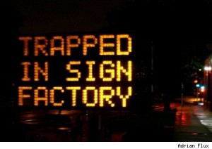
Using a monospaced font can serve some particular purposes, for instance when a text on a sign needs to be changed it is easier to work with when it’s possible to predict if a sentence fits when all letters have the same width, the same goes for some type of documents and other formal writings.
Concerning monospaced fonts it seems that technological reasons are more important than readability, although in bringing across a quick message they could work well.
Monospaced fonts can be strong when communicating short messages, but because it doesn’t ‘flow’ as nice as variable spaced fonts it can be more tiring to read long tekst written in monospace, because the words don’t become words but remain more separate letters.
What is important for readability of text is how letters form words when they are combined and here the white space in between is as crucial as the individual letter, monospaced fonts eliminate these characteristics and therefore it can take more effort to read a long text in a monospaced font.
In a monospaced font the letters have equal space, but why would an I or J or L need the same space as letters like W and M ?
If letters get the amount of space that they need instead of the amount that a technology allows them to have they can function more strong because they keep their own
characteristics, this way words can function as words instead of a combination of letters.
Why use monospaced fonts? I found out is mainly because of technological limitations, and in some cases to make it easier to know whether a text fits into a frame, although it seems there are more reasons to not use monospaced fonts but instead variable width fonts, because the main reason of text is communication and readability and they are stronger in variable width fonts.
Bob Vos
references:
list of monospaced fonts and a description.
http://www.fontsquirrel.com/fonts/list/style/Monospaced
this website contains many examples of monospaced fonts.
http://www.quora.com/Why-is-it-important-to-have-a-monospace-font-in-a-text-editor
text explanation about why monospaced fonts are used.

