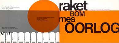
“De letter… n” by Remco Campert and Wim Crouwel, 1966
At “The printed book : a visual history”, I was most interested in the book “De letter… n” by Remco Campert and Wim Crouwel. What attracted me most was its’ hard, yet clean graphic style. The book was opened on a page that read ‘raket bom mes oorlog’, ‘rocket bomb knife war’, in thick black letters of various sizes on an orange and white background. ‘Raket bom mes oorlog’: every word gets its’ own separate line. The opposite page displays an orange ball that may remind us of the sun or, in this context, may just as well be a nuclear explosion.
As the books in the exhibition are set up in glass cases, I wasn’t able to flip through the book so, maybe because of the content of this particular page, the graphics in “Het gejuich was massaal”, a book about dutch punk the the late 70s, immediately came to mind.
Looking at the page again, something else comes to mind.

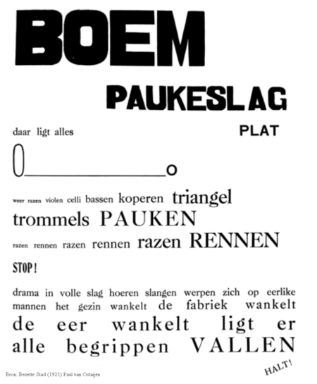
Paul van Ostaijen was a Belgian poet who started experimenting with typography in his poems in order to translate, among other things, rhythm and sound to the reader. He started in the 1910s with quite safe try-outs, mostly experimenting with different letter-spacing and word-spacing. In the 1920s, he went all out and experimented in a big way with font types and sizes. His best known example is “Boem paukeslag” from his 1921 book “Bezette stad” (“Occupied city”). In this poem, single words – keywords really – are connected and form some sort of narrative through the use of typography. In a similar way, raket bom mes oorlog are keywords but form an understandable whole due to the rhythm and context that is created through the graphics and typography.
post by Lieven Lahaye

