When we start talking about choosing a book on subjective grounds, we must first really understand what the term subjective actually means. So what exactly does it mean? Subjectivity is something existing in the mind. A subjective evaluation is different for every individual, everybody differs from each other, each of us have our very own personal taste and characteristics. Subjectivity places emphasis on one’s own moods, attitudes, opinions, perspectives, it relates to properties or specific conditions of the minds as distinguished from general or universal experience. One chooses an object mostly based on his or hers own subjective criteria. If you were to be presented with the opportunity of getting one free book out of a library without actually knowing the content inside the book, that would be the moment when you start choosing based on your own subjective criteria, you would start judging the book by the cover, its layout, the colors, letter type, fond, the texture and of course based on your own personal taste and what you find interesting or not, what grabs your attention or not. When I was placed in this situation I started looking at the bookshelves after which I realized that most of the books look basically the same from the sides. Most of them seemed boring and didn’t grab my attention, the few that I actually took out of the shelf were the once that stood out, the once that had a different aspect out of all the other, like uncommon letter types, or a visually nice combination of colors.

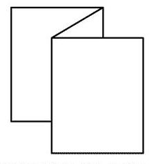
The book I ended up with is a book called Nest. and it’s about interior design. I choose this book because it is really different than the others. When I saw it on the shelf I thought that the book was placed on its wrong side, when took it out I noticed that this book actually didn’t have a side cover. I immediately liked the book, the front and the back cover are the same, dark grey (which is one of my favorite colors) hard cardboard , with big white letters for the title and a small white square with a few words about the content of the book. The cover itself is quite simple and plain, I’m a person that likes simplicity so this grabbed my attention. What I liked most about the book and the reason why I chose this one over all the other once is that this book doesn’t have pages it is actually a long flyer folded zigzagged into a book. So I guess what made me choose the book is the design of the book self and its layout.
Rietveld Library cat.nr: 774.5

