Skip to Content Skip to Search Go to Top Navigation Go to Side Menu


Here from ago


Friday, March 27, 2015

03/03/2015, 10:00 AM

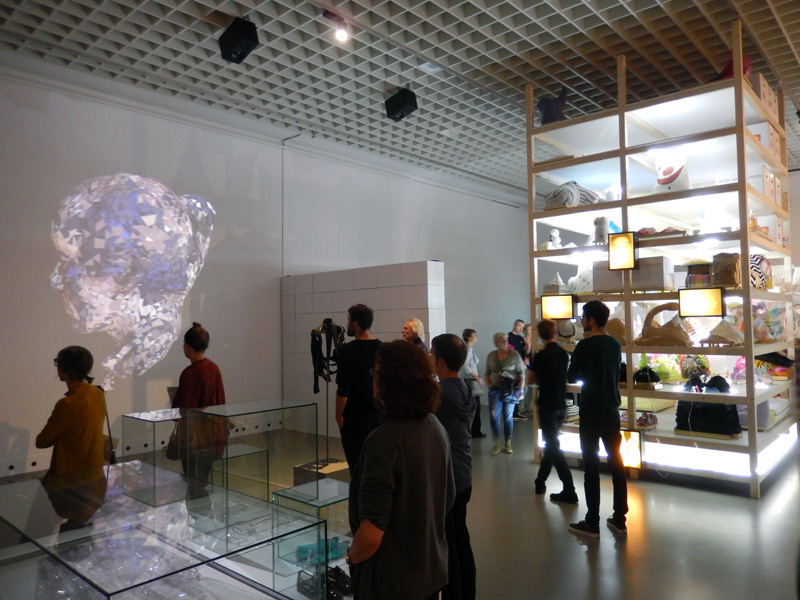
Fresh morning, makes me want to fill it with coffee and smoke and a nice story. And so we begin this day in a spacious room which is separated from the rest of the studio by this black wall which looks as if it fell from somewhere above and its destination happened to be this studio. It is interesting but Ok, nevermind. Let us sip our coffee from tiny soup bowls and burn it with some smoky inhales of rolled tobacco, as we further dicuss about this centrally positioned chair which put us together in this time and space.

10153205_10152017634480998_129506274_n
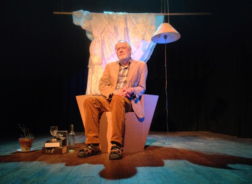
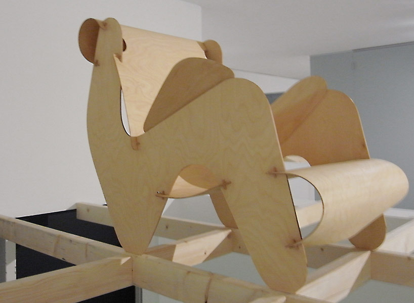
Chris Junge in the monodrama ‘ons ons’.

I have first encountered this chair on 3rd of July 2014, during an exhibition and a theater play by Melle Hammer, who at the same time is the designer of this chair. Its cheap and grandiose look caught my attention and kept my eyes staring at it, although I never really bothered to further investigate or question its existence. It seemed cheap in terms of the material it was made of (corrugated cardboard), and grandiose for its physical characteristics and attitude.

10885450_10152527566920998_4811577043378295905_n

As I sit a few steps across from it now, this switch from past to present keeps bouncing back and forth, making me want to finalize my opinion about this chair.  But then again, I know almost nothing about it. Although it is now standing upside down, it seems as if it hasn’t changed much, if at all. Cardboard still has the same brown color, its weight still looks cheap. Only this time, there’s more to see from what its interior structure offers, which is interior support consisting of two more cardboards connecting to form a plus-shaped structure.

And it’s Melle showtime, baby, feed me with words. It’s time for some real storytelling. He starts by describing the very first click he had for this chair, which was a theater play written by him. A monologue, or a dialogue should I say, between the writer and himself and so on which doesn’t really matter, but you get the idea. Anyway, the main point is that the he was trying to design a chair for this stage set which would give enough richness to the play, as if holding the whole scene on its legs.

We have a click. Good. And we have a direction/some kind of a plan. Good. What is the the hint, an inspiration, research, anything to grasp and begin with? A CHESTERFIELD CHAIR [x]. Just some background information. Ok, now we are complete: a click, a direction and a sort of inspiration.

Let us continue with some starting points, you know, that time when you get your hands dirty and make some mess. Before Melle starts telling me how the chair came to existence, he wants to make sure I understand the term „problem-solving“ before anything else about this chair, which has its occurence before design and which was his method of designing this chair. As an example, he puts a fork and a lemon squeezer on the table explaining that both of them can be used towards the same goal, which is getting the juice, despite the fact that their functions differ. Lemon squeezer speaks for itself, while the function of a fork, in this situation, would be „problem-solving“. I couldn’t make a direct connection to the chair, but I could sense my subtle excitement for what the following information is about. And so he introduces me to the problem he encountered in the beginning of the process, that being the money. He could not afford buying one of them chesties only for a one night show, so how one dealt with the problem and tried to find a solution resulted in the making of this chair. Corrugated, brown board costs only 6 euros per sheet (inc.taxes). It’s nice, yes, sharp, but its lasting is not long. Let’s say one year long, which is still enough as it was meant to be used for a few hours. Inside, the board consists of fluted sheets which will eventually deform or collapse through longer usage. During this play, the point of the chair where most power is used is armrest. At the same time, that’s where a lot of the chair’s strength comes from and it is double-layered. This armrest gives the chair a possibility to be used as a chair. However, real power comes from the interior of the chair which consists of two centrally crossing cardboards in order to support the weight. At this point of the story, I felt the pieces of the puzzle falling into their place, but Melle concludes it by saying that it is not a design, but a matter of problem-solving.


So far the obstacles encountered in the process were solved. Theater stage had its chair, it survived the show, and it met the budget conditions. Everyone is happy. The story goes on, however. It continues with Melle’s decision to take his problem-solving design further, from which breaking and overcoming more barriers followed. The goal is different now, that being to keep the model design of the chair which is strong enough to hold its ground without the interior support. And to last longer. Pure design. What is the key? Stronger material, which is Falcon board. It consists of standing up hextagons and doesn’t need to be double-layered in order to be stronger. It costs 9-11 euros per sheet(inc.taxes). Of course, it comes with disadvantages. Falcon board cannot be cut with machine pressing and immeddiately cutting down because of its high strength, but it would be possible with a plutter which travels slowly and precisely through the board. That said, it needs time and the production costs. However, this production would allow the possibility to print on the board, which further allows customized prints. This makes it into a more industrial product; it gives a furniture-feel and you can have it made with print preferences.

Melle_kill-your-darlings Melle_kill-your-darlings-1

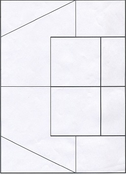
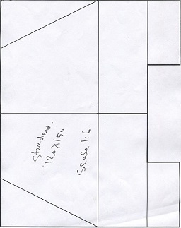
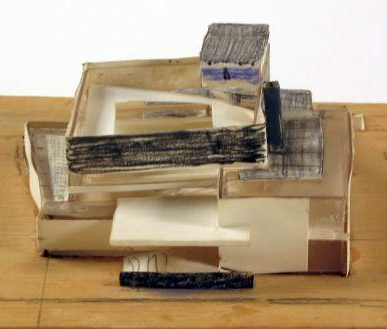
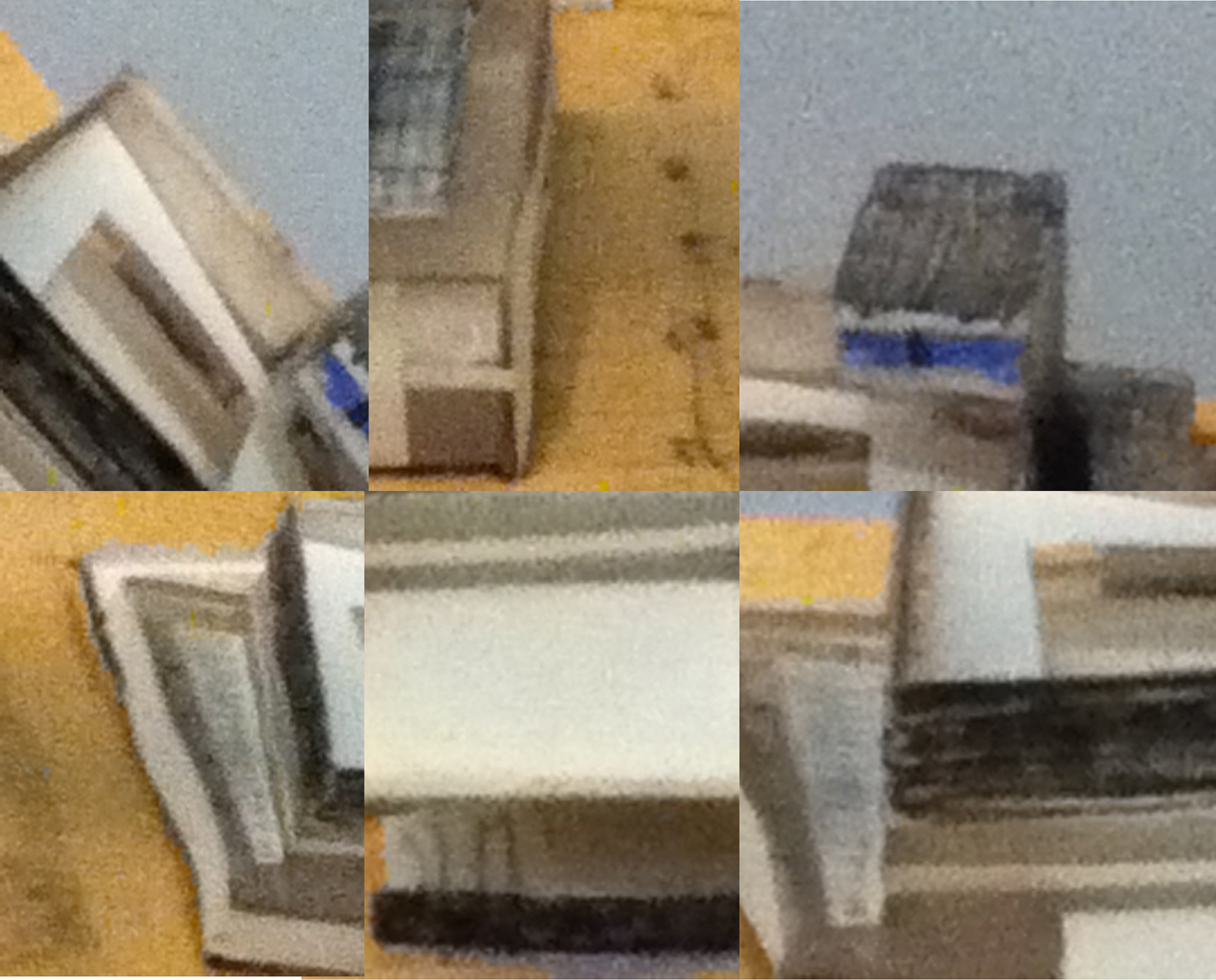
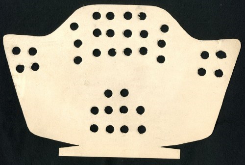
Scale model(corrugated board chair) • Scale model(falcon board chair)


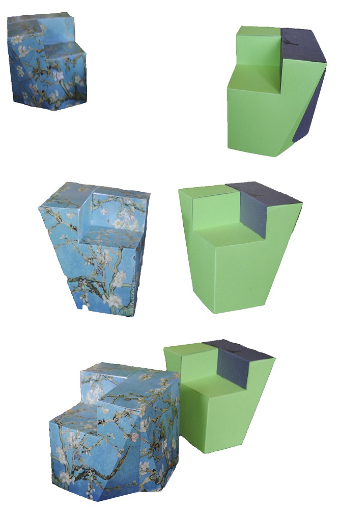
Example of customized print

I go back to that summer evening when I first saw the chair. I try to recall my thoughts, but it seems like I hadn’t put any effort to study the chair. All I can remember is that it did trigger my amazement for it for the reasons of its cheapness and steadiness. And I wonder, if I were to gain this knowledge about the chair before seeing it on stage, would the amazement still be there, or at all? Would it change my focus on the play? At the end of the play, who would my applaud be forwarded to? I was never exposed to much information about the chairs and their existence but the information keeps being present all the time, either verbally or visually. It took two events to broaden my perspective and make me question what lies beneath their designs.

Through Melle’s story; the whole process of deciding about the material, way of production, and constant problem-solving, I have come to realize that designing chairs is one of the hardest tasks for its creator.

11103936_10152743092000998_1510648936_n

Proving Prouvé


Friday, March 27, 2015

Starting our research trip through the endless material of chairs and endless amount of possibilities to wright a research about, we traveled to remote cities to attend group chair exhibitions. During this whole complicated ritual of coming up with a specific chair, I was always thinking of the simplest one. One that I could really describe because it would be just basic. And what is about basic that fascinates me is that anyone can imagine themselves on it. It might not be the most comfortable chair but for sure it will be one to spend some study hour on.
During these basic thoughts on basic chairs, my mind would travel to the chairs that I had been sitting on for 12 continuous years in my life, from the moment that I started primary school and finished high school.

13.thrania_metalika_gl

It is probably be the chair I have been sitting on the most. I have spend endless amounts of time getting bored on this chair, getting back pain on this chair and always trying to switch between positions as to find the right place for my feet. This would be in school, when I would bend my knees, place my legs under my butt so that I have a pillow on the basis of the chair with my feet coming out of the empty space, right under the piece of plywood supporting my back. Teachers would not allow non upright positions.
I remember I was then complaining to them on why they were using a comfortable chair with foam pillows for their desks in class, while us, a mass production of  students in a mass production education were sitting on mass production chairs.
This would be just four steel legs and two molded pieces of wood. Thin plywood.
On the group chair exhibition I found myself identifying with Jean Prouvé’s Standard Chair produced during the 1930’s-1950’s since it looked very similar to the school chair I was recalling at the moment.

jean prouve

Going through the background of Jean Prouvé and his architectural achievements I got informed about his fascination with mass production of machine-made furniture and his constant adaptation to the problems of his times through working in a collective union with fellow architects such as Le Corbusier, Eileen Gray and Sonia Delaunay. In 1930, Jean Prouvé  joined the French Union of Modern Artists(UAM), a groundbreaking movement who’s artists proclaimed ‘We must rise up against everything that looks rich, against whatever is well made, and against anything inherited from grandmother…”.  Apparently, through this collective way of working, simple and basic furniture for collective use were produced. Educational furniture was some of them.
This is when I realized that my visual connection of his chair to my school chair was not random.  The name of it gives it away: “Standard Chair”.
Unfortunately I never got to sit on one of the Standard Chairs but I am convinced that it feels more or less the same.

Both chairs I am comparing take the stress on the back legs where they bear the weight of the user’s upper body. Prouvé incorporated this simple insight in his design for the Standard Chair: while steel tubing suffices for the front legs, since they are subject to less stress, the back legs are made of voluminous hollow sections that transfer the primary weight to the floor.

Feels like it is a chair to keep you aware and well-postured. I remember sitting on ugly yellow cubular (rectangular) steel legs when new, clean and polished chairs arrived having tubular(round) steel legs. A small detail I remember since somehow I prefer the first ones. I can also recall the high pitch sound of these steel legs when you would boringly move the chair in the classroom by scrubbing it on the floor. It sounded like it is going to collapse, like all the rust-proof elements would finally get un-proofed. But they didn’t.
They survived through many years, through many students sitting awkwardly on them, vandalizing them, chipping off the layers of the plywood one by one on your front classmates’ chair, writing nonsense with blanco pen in the back of it or making graffiti on it.
There was also this plastic black cap used to block the empty space of the tubular steel at the edge of it. This cap that you could patiently remove during the boredom of the class, revealing the empty space, where you could dispose your chewing gum if the teacher would see you, where you could loose your pen or hide a cheating note.

I am mostly fascinated with Prouvé’s chair because it somehow summarizes all these memories in an official and prototype way. All these years of experiencing the school chair were brought to the foreground at my first encounter with this chair, proving to me that I was sitting on it without even realizing it. That it was Him behind it.
It seems like his industrialized Standard Chair was indeed used in schools at that time and that it did inspire even Chinese companies to copy it and send them to schools all over Europe by stacking them on each other just like a good mass production product would do.

A-001


La chaise vide – A research about a chair and design and art


Friday, March 27, 2015

lachaisechair

   It seems to be safe for me to say that if you don’t know Charles and Ray Eames you are not really a cultivated person. The super design couple have been a major influence in the design and the art world in general, making timeless designs as well as conceptual art works. In this research I wanted to analyze one of my favorite chairs which was designed by the Eames and try to get to a conclusion on why I like it as much as I say I do or if I have just chosen an object that I call my favorite to make me sound more cultivated. This is it.

   To begin with I want to make a little historical introduction to this chair with a name of double entendre. La Chaise was originally designed in the year 1948 by the couple Charles and Ray Eames for a competition held by The Museum of Modern Art in New York. The competition was entitled “Low-Cost Furniture Design” and was really connected with the atmosphere of the United States at post World War II times where a lot of immigrants were imigrating to the States and furniture had become a high priced luxury. So in a way to bring new horizons to inhabitants and introduce a new way of living the MoMA made that competition and invited world wide reknown designers to participate. The Eameses got second place but for a different chair called the “DAX” chair. Although the La Chaise chair didn’t win any of the awards at the competition it got some attention for elegant design in the free form. The Eameses were really interested in innovative designs and the plastic substance in general. They did a lot of experimenting with the shape of the new content in different but clever forms. Their rounded lines were easily transformed from the sketchbooks in to development and production. Ironically the chair was too expensive in production at the time so the chair was not manufactured again until the Swiss furniture company Vitra took over the production in the year 1998 with increasing interest from the public. The ‘La Chaise’ chair is “Two bonded fiberglass shells, chromed rod base  with natural oak cruciform foot”.

The 'La Chaise' chair by Charles and Ray Eames

The ‘La Chaise’ chair by Charles and Ray Eames


   The name of the chair has like I said before a double entendre (double meaning). In the French language the word la chaise means simply the chair, given that the La Chaise is a chair the first meaning speaks for itself but the other meaning connects with the artist Gaston Lachaise. In the year 1927 Gaston Lachaise made a sculpture by the name of Floating Figure which shows a figure which appears to be floating on water. It is a female figure with arms wide in a somehow formal but welcoming posture looking upwards, perhaps to the future while her feet are laying horizontal but crossed as if she would be sitting in a sofa.

'Floating Figure' by Gaston Lachaise

‘Floating Figure’ by Gaston Lachaise


   When looking closely at the chair by the Eames and the sculpture by Lachaise. You can well see that the sculpture was an inspiration to the chair which right now in the year 2015 is still a great object both as a designed object and as an eye pleasing artwork in itself.

   Two years ago I was studying at a technical school in Reykjavik where I took a course called Design history and I remember seeing a picture of the ‘La Chaise’ next to the ‘Floating Figure’. At that moment which, when I think of it now, was perhaps kind of stupid of me, not to have thought of before, being 21 years old, I saw for the first time how thin the line is between art and design. It really crossed me as a weird experience because for me the chair itself is as much of an artwork as the original sculpture by LaChaise only with more functions as it is supposed to be comfortable to sit in although I haven’t tried it myself.

Waterman


Tuesday, March 3, 2015

Waterman

Sportsfigures_240_WatermanBrooch

I have chosen the Waterman Brooch from the series, combining a postcard of a Bruce Weber image with the diamond ring of the commissioner. Bakker bought the image as a postcard from a secondhand store in New Orleans, then embellished it with white gold and diamonds that resemble water droplets flowing from the bucket down the model’s muscular back. The movement and elegance in the original image was heightened by the placement of the gemstones. Bakker eventually created two additional brooches using the same image; one is in the collection of the Stedelijk Museum ’s-Hertogenbosch, the other in a private collection.

Gijs Bakker (1942) is a Dutch jewerly and industrial-designer, educated at the Gerrit Rietveld Academie and the Konstfack Skolan in Stockholm. Over the years, he has taught at various European art academies and worked on numerous commercial collaborations, creating everything from furniture through jewelry to public spaces. In 1985, Bakker began to use easily available and recognizable images of popular figures for his Sports figure series.

Passing by these items in the museum has made me doubtful about if it’s serious or some sort of joke ending up in the kitschy result. I’ve found this contradictional impression interesting enough to deal with it a bit further.

But what is jewellery’s role in our modern and future lives?

In the late 1960s, Gijs Bakker and Emmy Van Leersum, created a furor with their avant-garde jewelry and clothing that fused fashion, design, and art. They were the first to make minimal jewelry out of unorthodox materials, such as aluminum and plexiglas. The pair set of a real revolution in jewelry design. Bakker and Van Leersum’s breakthrough came in 1967 when they presented their vision of a total concept of fashion and jewelry with a spectacular show at the Stedelijk Museum Amsterdam. It was a provocation after which jewelery totally changed,especially on the subject of the concept of beauty and functionality.


MS04foto_matthijs schrofer_lowres


The most famous item of jewelry featured in the show is undoubtedly Bakker’s Stovepipe Necklace (with matching bracelet), now an icon of Dutch design. Bakker was the first designer to create a piece of jewelry of such audacity and on such a scale. It was a provocation.


The-Gijs-and-Emmy-Spectacle-exhibition-at-the-Stedelijk-Museum_dezeen_3


3.1999-K80249(A-C)A


https://vimeo.com/89612291

Afterwards his role in dutch jewelry design became really important in Holland, it changed the view on jewelry.


In 1993 he founded Droog Design, a Dutch collective of designers, products and information, together with design critic and historian Renny Ramakers. Together with Ramakers, Bakker was the selector and art director of all products within Droog. Droog works with independent designers to design and realize products, projects, exhibitions and events. During the Milan Furniture Fair in 1993, the duo presented a selection of sober designs made of industrial materials and found objects. The presentation was titled ‘Droog Design’, because of the simplicity and dry humor of the objects. The Droog collection is curated by Renny Ramakers and consists of around 200 products by more than a hundred designers. New designs are often developed and presented in relation with exhibitions “Saved by Droog” is an element of Droog design that buys up stock and transforms it into something completely new with a distinct voice and purpose. It’s more than sustainable design; it’s a “reflection of the designer’s creativity.

image.php

droog design [x]

In current design projects Bakker investigates the relation between craft and design. Since 2009, he is exploring this theme in his role as creative director for HAN Gallery, formerly known as Yii in Taiwan.His new series ‘Go for Gold’ emphasizes the importance of gold in the competitive world of sports, business and politics. By laser-welding gold on titanium or by laser-cutting gold under titanium, the brooches literally go for gold.


 „I am watching football in the same way as I am watching ballet”


The Sport figures series used copies of images from various newspapers of athletes in track along with contrasting, valuable materials like gold for example – to emphasize and highlight a particular moment. The practice of this clash of substances ends up in a playful tension that comes from having precious gems combined with an everyday object, bringing focus (or questioning) the borderline between „cheap” and „expensive” materials.

Does the use of valuable material makes something a jewelry (as the commissioner ask for it) or does it become a design piece driven by the vision of the maker himself?

Since he was fluently shifting through content, character, and medium it makes it hard to categorize the Sports figure series. Visual references from sports, automotive, and history are imbued with a trademark postmodern stance: sarcastic, ironic, and unsubtly nonconforming.

All of the works demonstrate his unconventional relationship with his discipline, as Bakker once admitted, „I dislike jewelry. I dislike the behavior of jewelry buying ladies. I dislike ladies jewelry. jewelry shops depress me. if jewelry is only decorative, I lose interest. I like jewelry because it is absolutely superfluous. I like jewelry because it is never a prior functional. I like jewelry because like clothes, it is closest to our body and says something about the wearer. a painting is hung on the wall and can be ignored. a piece of jewelry is worn and creates an impression.”


timthumb.php


For the first look the Waterman seemed for me like objects what you find in shops selling useless stuff for tourist, ranging the weirdest combinations of taste and culture.  Yet Bakker’s main approach was driven by the concept over the final product. So instead of the craftmanship’s usual categories, he tried to focus on the driving thought behind the piece, which in this case was the clash of materials, a surprising marriage between the every dayness of the paper cut picture and the stones. For me, this piece is still about the beauty itself (like all jewellery), just inviting a rather unusual form of it, at least within this field. But picking athletes somehow still tells about the beauty, so this piece becomes a celebration of the natural born beauty, combined and emphasized by the diamonds, which becomes a secondary tool for this purpose rather then the main „attraction” or message of the work. Like if it would pass it’s shine to the photo itself.

Yet I think that next to all the importance of conceptual approach, the visual and applied design principle shouldn’t be left behind too much, especially in an originally and historically applied discipline like jewellery. I feel that it’s just not the right tool or way to mediate such a message. Let’s be honest, a jewel is made for wearing, but who would walk around in a piece like Waterman?


Complexity is Free


Monday, January 12, 2015

«Innovation can’t be found in the drawing of an object but in the use that is made of technology, materials, techniques. Technology has no interest for its image, but it is interesting for the service it offers. Its image must disappear, melt into the object. Technology is at the service of the result : price, lightness, comfort…» Patrick Jouin


OneShot.MGX_01

OneShot.MGX by Patrick Jouin

OneShot.MGX is a 3D-printed stool designed by the french designer Partick Jouin in 2004.This stool was manufactured using the 3D printing technique. Born in the mid 1980s, 3D printing, more formally known as additive manufacturing, was used at this time for visual prototyping. But some companies soon realized that the technology had the potential to do more than just producing prototypes. In 2003, .MGX by Materialise was founded and they invited world-class designers to experiment with this new technique and come up with novel products that were only possible with this new technology. Patrick Jouin was one of them and created on this occasion two chairs, a table and this stool.

I consider this item as one of the the most relevant among the Stedelijk’s design collection. Innovative, surprising, light, handy, delicate, subtile… it satisfies all the expectations that we have from a stool. You can take it anywhere easily, store it in a cupboard, in a car, in a bag. This object is in harmony with Patrick Jouin’s philosophy if we believe his words : «The objects we draw today are more discrete. They are more «affectuous». Discrete friends. They don’t tell less, they simply do it more slowly. It’s like homeopathy. They diffuse rather than they speak.»  I discovered Patrick at the same time as his product during the exhibition and I think he has a clear mind about what is going on in design nowadays. He created his own agency in 1998 after some years at Philippe Strack’s agency. His style is often qualified as discrete.

Patrick Jouin is really interested in experimenting new technologies. In an interview about rapid prototyping, P.J. said «The distance in between the creation, the drawing, and the final object was very short. It was like a sketch which is coming alive and taking shape in 3D. I know that every time in the history of design, when there is a new technology, there is always a new aesthetic.»

Patrick Jouin talking about 3D Printing

«Industrial production requires a radical conversion : we must start from the function of the object and possibilities of the machine. The limited performance of the craft production allowed sometimes the realization of original or richly decorated forms. Production by the machine, in series, needs a simplification of manufacturing’s forms and processes.» Willem Sandberg wrote these words around 1970 in a catalogue about the german designer Wilhelm Wagenfeld. Should we consider this way of thinking as still relevant nowadays ? New technologies such as 3D printing make these ideas a bit old-fashioned. I am not saying that this aesthetic is over, but 3D printing doesn’t undergo the same rules as the more industrial technique. Patrick Jouin said : «There are so many aspects, undiscovered yet, it is a new way to think how an object can be made.»

In his book Fabricated : The New World of 3D Printing, Cornell University researcher Hod Lipson describes ten of the underlying principles fundamental to 3D printing. The first principle he notes is that «manufacturing complexity is free». Unlike traditional manufacturing processes, where extra complexity requires a more expensive mold with more parts, there is no penalty with 3D printing when an object is made more complex. On the contrary, in some cases there may even be a benefit. With 3D printing, designers and artists can explore new kinds of highly complex and intricate forms that would have been impossible to realize with traditional techniques, and these come at no extra cost. It is a proverbial candy store of new formal possibilities, resulting in a new design language that is baroque and often eclectic.

Kram/Weisshaar, Multithread

Multithread #06 Console Shelf[x]

«Just because you can, doesn’t mean you have to». It is true that there is a risk of overuse, a risk that it becomes too much. What should designers do now that complexity is not a problem anymore. Designers are still in the early stages of the search for aesthetic in 3D printing. Many of the experiment we see today may appear outdated in ten years, but they are playing an important role in paving the way. With an increasing number of designers, artists, and makers gaining access to 3D printing, a mature formal language will develop over time, uniting and exploiting the full potential of the technology’s aesthetic powers.

«…people often proclaims grand ideas, things that are just after all, the qualities expected about an object. What an object owes us.» Patrick Jouin

Many studios and companies are working on developing this technique. In Amsterdam, we have the 3D Print Canal House, the first 3D-printed house. It also acts as an exhibition and interactive research center for 3D-printed architecture and related areas, such as material recycling, policy making, and smart electricity grids. The 3D Print Canal House has been printed on-site with the KamerMaker, a shipping container that has been converted into a giant 3D printer.

An aspect of 3D printing that I find particularly interesting is the way you share a product. The designer creates a file that could basically be printed anywhere by any 3D printer (if the printer is able to do so), but then a question appears, how is he going to sell it ? In a shop as a finished object or on internet/in a shop as a file still ?

What will make him choose a certain option ? If you decide to sell for example your 3D printed vases in a shop, you will propose to the public a definite object, with definite colors, materials and price. These choices will be of course part of your research and of course as a designer you know better than anyone the nice colors, but you don’t give to the buyer many possibilities. Eventually you could print ten times the same vase with each time different materials and/or colors, but then you take the risk that some of them might not be successful. You might have eventually planned everything with a marketing analyze or something else, but I am sure that 3D printing could be exploited in a much better way. In this way, the 3D print is not highlighted.

Imagine that you sell the product on your website. The vase that you created has a definite shape, but no colors for the moment, it is still a neutral file, just a shape. Then you put it online and decide the price of it. You could also suggests some colors or materials, without saying that one is better than another. The customer will be free now to  print the vase as he wants. There is no risk of overproduction in this case and there is also an attractive aspect for the customer. He might feel involved in the project and enjoy the fact of being part of the creative process. I talked about the price previously and I think this aspect is also interesting to discuss. How would you fix a price ? If the customer want to print it at home, you would sell a file only, so the customer will print and pay the material by himself. What is the value of it ? Is it in terms of technical innovation or complexity ? Or in terms of originality ? 3D printing could also lead to personal (home) creations and lead to the disappearance of designers. Of course, there will always be designers, but they could be at stake. For sure, this solution is possible only if a great number a person would have 3D printer at home, and it is still not the case, but it may happen soon. We can already see this kind of website where you have the possibility to create your own product.

I am also wondering about reproduction, re-appropriation and protection. How can you protect a product from reproduction or re-appropriation ? How could you recognize an original from the copie ? You could not.

The last possibility that I find personally the most interesting nowadays is to have your own 3D design/print shop. Imagine that you have your design studio that is at the same time a production place. You keep into the studio a selection of the products, accompanied by suggestions of colors and materials. Customers would come into the shop and ask for the vase 3D printed in red and blue plastic with maybe some adjustements. The nice thing is that you have then a real contact with the buyer, you can advice them, keep them informed and help them. You can imagine many things with 3D printing. It could provide a solution to over-production and consumption.

For example, companies could provide 3D files that allows you to print the piece of your machine that is broken instead of ordering it and get it from the other side of the world. You would just have to print it. For sure, the materials that you use to print will not come alone, but I think it could help. There are many other subjects to discuss, so if you are interested in 3D printing, you should have a look at this conference  about the environmental impact of 3D printing that was given on December 13th 2013.

A lot of people are active in 3D printing research. This is the case of Dr. Behrokh Khoshnevis of the University of Southern California which has been developing since 1998 a layered manufacturing process called Contour Crafting, in which cement or concrete is pumped through a nozzle connected to a computer-controlled crane or gantry. This draws the contours of the largescale structure to be built layer by layer.


Foster+Partners, Lunar Base

3D printing with Lunar soil by Foster + Partners[x]

Enrico Dini also, a passionate Italian inventor, has teamed up with the European Space Agency and the architects Foster+Partners to test the feasibility of a 3D-printed permanent moon bases built out of moondust. Contour Crafting is also aiming for the moon in a partnership the NASA. Give the significant challenges of scaling up 3D printing machinery to encompass an entire building, many concluded that, for the time being, the most pragmatic approach is to fabricate constructions in sections and then to stack these sections on-site.

Finally, if you are interested, I link you to some studios who realized some really nice project with 3D printing technique. I hope you enjoyed this article.

3D printing is definitely the technology of tomorrow.

MODEL SCULPTURE & DRAGONS


Sunday, January 11, 2015

A model is initially an object whose purpose is either to represent the real world or to be translated into the real world, in short the model can be a copy of reality or reality a copy of the model. The main difference is in terms of scale. Usually the model is a miniature of reality. But what more can it be? When we look at a toy car and a car, what do we see? Is the toy car just a replica of the car in a tiny scale? It is hard to analyze such a thing but I think that there is a huge difference triggered by (but not exclusively) the change of scale. When the toy car is made, it has no longer the same purpose as the car does. A child playing with it might as well imagine it just as real as the car and drive it around with his fingers, or see it in a whole new world, making it fly away, fist-fight and dance Rock n’ Roll. The new scale for things sometimes creates a new meaning for them above representation, a new reality even if they are seemingly the same object in different sizes.

model

sketch model of van Gogh Museum, Amsterdam by Gerrit Rietveld [object: SM]

In 1963-1964, the furniture designer and architect Gerrit Rietveld (1888-1964) designs the Amsterdam Van Gogh Museum. In 1964 the architect dies before the project is finished. The building is completed by his partners  J. Van Dillen and J. Van Tricht, and the construction was concluded in 1973. The model exposed in the design collection of the Stedelijk was produced by Gerrit Rietveld in those first two years. It is a sketchy model made of wood, paper, cardboard and glass. The final building is close but does not respect this concept, with a unified color of brick and very little white (from front).
I present this piece for multiple reasons. First, because in my personal taste, I prefer this version from the finished one. Rich in contrast between black and white rectangles overlapping each other, the building has the balanced complexity of the Rietveld style although the shapes which compose it stay simple and limited (only colors: white, black and blue) which gives sobriety to the building. When we look at the final museum’s front view, the unity in brick color makes the building lose its striking composition at first sight, for the overlapping rectangles melt into each other. The second reason why I chose this model is because of the way it was made, without any connection to the building itself. I see in between the other models of the museum [x], well built, detailed and clean; something of a stain. On a dirty piece of wood on which we can see quick pencil sketches for the display, an irregular, clumsy, and worn little building is erected. The colors are simply indicated by a rapid and un-precise use of color pencils ( blue and black). The materials used are cheap, and if we try we might not even find one horizontal or vertical line. And yet it is beautiful, marrying complexity and simplicity in form and color, with a rich diversity of cheap materials. Its cheapness gives it a poetic and rough authentic aspect, we see that it was handmade.

collage-model


James Castle

This may remind us of James Castle’s sown cardboard sculptures, which are made of scrap which gives them strength, or Bill Traylor’s choice (and no choice) of using cheap surfaces like cardboard for his paintings.

Bill Traylor blue man with suitcase                                                               James Castle


The model is in addition to this, very close to the final version. That sketchy but precise model shows the talent of Gerrit Rietveld as an architect, like the lines of a great draftsman. Its clumsiness along with the use of paper, lightly put together and slight curved, gives a feeling of fragility and tenderness which contrasts with the strongly built shapes of Rietveld’s buildings or the roughness of the materials.
I love this model because –to me– it is not a model anymore but a sculpture that contrasts with what we usually see, giving a new idea of his work and of what a model can be, even though it was not intended to become a piece of art. A model can be seen in ways that exceed its limits as a technical object.

A perfect embodiment of this idea is seen in the Tim Burton film Beetlejuice. The movie takes place in a small town and specifically in a house on top of a hill overlooking the town. In the opening scene (link here and here for the end with spider) a fake areal shot of the town is taken on a model of the town one of the main characters has built. We are tricked into believing that we are flying over a forest to finally overlook the whole town, then fly over and across it all the way to the house on top of the hill. Although it is possible to see that the scene is really shot on a model, the illusion is strong, and we are astonished to see a real spider (this time) which seems to be the size of a hippo, climb over the roof and be picked up by a real (gigantic) hand. What this illusion does is it gives life to the model, it gives it a new reality, and this is proved later on in the movie when we discover that the model has an “inhabitant”. When the protagonists are changed to the scale of the model, (in this scene) they come to its graveyard to dig up the main antagonist, Beetlejuice. In this case, the change of scale from real world to model is more than representation, the real world and the model are entangled, mingled into each other, whilst the two are different, the real world and the new world of the model. The model can open a whole new world for our imagination to create, a transcendental realm full of fire, wonder, and dragons.

Paul Schuitema: a pioneer of photomontage in the field of food industry


Sunday, January 11, 2015

                                                                                               Berkel Ham from Berkel LTD. Rotterdam (1928) By Paul Schuitema. 

In the Stedelijk’s permanent design collection, I chose one of Paul Schuitema’s posters. Paul Schuitema (1897-1973) is a Dutch graphic designer who also designed furniture, practiced photography and typography. He constructed his advertisements on the principles of De Stijl (more mathematical, abstract and simplified, when compared to previous styles) and Constructivism (as art had to contain social means). El Lissitzky’s ideas, as well as Rodchenko’s (his way of using new angles in photography – such as from high above or down below the subject) influenced him in the design of his industrial advertisements. Those same influences can be found in the works of his colleague, Piet Zwart. Repetition, geometrical forms and the use of primary colors are used in a similar way in both their posters. Paul Schuitema lived during the time of industrialization and of mass production after World War one. These periods can be felt in his poster and the subject chosen.

Schuitema

He started to use Photomontage in 1926 and was one of the pioneers of this technique in the field of industrial design. This poster is an advertising print for food processing industries. It was situated amongst others of his in the Stedelijk’s Design collection. It was explained how photography, not yet considered as an autonomous art, was used for another medium’s finality. Photography was newly used in the 1930’s in order to bring further other types of art.

This is what first appealed to me when I encountered this poster. It felt relevant to our times and to how projects are now executed. More and more of final projects aren’t only constructed of one medium. For example photography is rarely a finality in itself, but a way to get to an other specific result. This new technique of photomontage is relevant to our time in that way. In projects and art works, the medium used is now rarely thought as a finality in itself.

This new technique and his influences can be noticed in other posters of his:schuitema_lg

Primary colors, the use of photography, repetition and new angles as from high above or from down below are used in this second poster as well. Here is another example of his colleague’s, Piet Zwart’s, work, which is closely related to his:

pion6

After paying attention to Paul Schuitema’s poster (the first example used) – It’s design qualities and it’s historical position in the development of arts – I looked at it in it’s original function. This poster was designed in 1928 as an advertisement for the Berkel Ham industry. This subject, presented in the poster, actually takes over its technique and style. It appealed to me more when I tried to look at it in its original context.

Food nowadays is still advertised everywhere, however the energy coming out of them feels different. Therefore, I started to question the accuracy of this poster, for us today, on that matter. Food and its industry is a constant subject today – where it comes from, what is in it, how we eat it, how to eat in a balanced way, the products used for its production… The worry of how we feed ourselves could be considered as one of society’s current obsession. Seen from this point of view, this poster underlines the change of perception we have of food, from the 1930’s to nowadays.

The typography, the choice of photography, and the way the whole poster is disposed, gives me a feeling of playfulness and simplicity. A feeling of innocence almost emerges out of it. As I looked through other food advertisements, of different syles, the gap seemed even more clear:


Vintage-Meat-Ads-03-634x920       50cannedmeat

These posters were used as advertisements in the 1940’s and 50’s. Sentences as :  « This is not just a piece of meat … this is something a man wants to come home to … something that helps children to grow … something that makes women proud of their meals », were used. If these posters were contemporary, they could almost only be received in a satiric way.

Based on the same principles of photomontage, the Dutch group of graphic designers « Wild Plakken » (1977) created posters with a specific social and political goal. They chose clients according to their ideological means. Their belief that a designer had to use his graphic designs in order to mix life to art related to Paul Schuitema and his influences of De Stijl and Constructivism. They illegally pasted posters in Amsterdam, fulfilling this idea of spreading their ideals. Women rights and racism are some examples of subjects they would portray in their posters.

CRI_7259


Some of the same principles of Paul Schuitema can be refound in the esthetic of this poster. In the same way as in the Berkel’s ham industry poster, a different feeling appeals to me. This example of  the Wild Plakken’s poster doesn’t recall innocence, but still gives me a feelling that such an image on such subjects, today, is not as easily disposed for everyone in the city. It is interesting to see how, through time and the development of one technique – such as photomontage – these posters still give a feeling that a gap has been created. Paul Schuitema’s poster and this one example, still give me the impression that this type of expression is less accessible to everyone nowadays.

On the subject of the portrayal of food through images : Andreas Gursky’s photo « 99 cent » (1999) states a point of vue which completely contradicts with the posters above. Without giving us a direct position to take towards this subject, Andreas Gursky still pushes a feeling of being overwhelmed and crushed under the overtake of food industry. The feeling is completely contradictory to the one Paul Schuitema’s poster gives us. Both art pieces are thoughtfully structured but opposing themselves in their function.

Andreas-Gursky-4

They are however hard to compare as one is an advertisement and the other, a photography piece. I used Andreas Gursky’s photography as an example of what continuously changed our minds on the food industry. It is pieces of art as this one that put us aware and more distant from the advertisements we see. The opposition of those two examples, in the way they apply photomontage, can maybe explain the gap that I feel in the feeling those images give. As one (Paul Schuitema’s poster) shows a one sided image on how to perceive a subject, the other (« 99 cent »)  faces you to a situation, without giving a straight opinion but implying it through the image.

Art pieces (with « 99 cent » as an example), the overflow of news and a number of new scientific researches, give us a constant possibility to mistrust what is shown to us in advertisements. It is why Paul Schuitema’s poster struck me more than his others. His image underlines such a great gap of how society approached food industry at the time to now. His poster isn’t accurate for today’s society, which is what pushes its relevance in the Design Collection. It is relevant in its design – to how art works are proceeded today  – , and relevant in its subject – as it is one of today’s main concerns.


Who is Gherpe? About Superarchitecture and corruption by conventions


Saturday, January 10, 2015

Gherpe – a lamp designed by Superstudio
Gherpe
 (via:http://www.nova68.com/gherpelamp.html)

I think the Gherpe lamp is a relevant design because of several reasons. First of all, the lamp itself is made of materials that are still considered modern, even though it was designed more then forty years ago. That alone already shows how we still hang on to, or maybe are condemned to these materials nowadays. Next to that is the design, which references to the mathematics that appear in Nautilus shells. Then again the way this shape is interpreted is more like a cartoon of it, leaving the classical Nautilus image behind. This way of designing, letting interests and research – the designer was into marine biology – influence the work is something I think many designers work like, or would like to work like. Last reason why I think this is a relevant piece is because I think the whole of Superstudio, their designs and mainly their architecture is, because of their new views and extensive researches, relevant. They were part of a critical wave, commenting on Florence and it’s ancient heritage, on the years of full trust in technology and on architects before them. They wanted designers to be responsible for their creations when they design to make a better world. Their criticality on how design and architecture influences the life of other people and self-reflectiveness is what made them different from many before them. This idealism in theories, but with playfulness towards the designing process itself is to my opinion something important to keep relevant in art and design.

gherpe_01


(via:http://photografieundmehr.com/pics/2012-11/gherpe_01.jpg)

Nautilus-OS

Nautilus shell

(via: http://www.hungrywalrus.com/wp-content/uploads/2011/08/Nautilus-POS.jpg)

To test it’s relevance I’ m trying to get to know what Gherpe is, what it is not and what it could be, what it means to Superstudio and what it means to me.

At a time where popular culture is stealing all the science and logic that Modernism employed to make this world better, with youngsters starting to call themselves Mod.’s, Pop Art commenting on this Modernist reality and society by reproducing imagery from that popular culture, Gherpe is born. It’s designed by Cristiano Toraldo di Francia, and adopted by Superstudio, the Italian architecture group where Toraldo is the most important member of, together with Adolfo Natalini, who is a Pop Art painter when they found the group in 1966.


big_374062_2176_giulia_superstudio3

Alessandro Magris, Cristiano Toraldo di Francia, Piero Frassinelli, Roberto Magris, Adolfo Natalini
(via:http://www.domusweb.it/content/dam/domusweb/en/from-the-archive/2012/02/11/superstudio-projects-and-thoughts/big_374062_2176_giulia_superstudio3.jpg)


Where Modernism, in its affirmation of the human power to improve their environment the aid of practical experimentation and science, goes for logic, Gherpe pretty much mocks Modernism, by taking it’s science and it’s new materials to make something that is not in any way useful other than it’s aesthetical purpose. Gherpe is not practical, and it’s not helpful. But Gherpe’s cartoon like ambiguity looks fun, you want to have it, it looks smart even though it isn’t, and that’s exactly in line with popular culture of that day. Gherpes connection with nature is meaningless, but very important for it’s attractiveness. You could say it’s a beauty trick. The interest of Superstudio in nature combined with construction is to be traced back to one of their guides in the Academy of Architecture in Florence, which most members of Superstudio were attending. His name was Leonardo Savioli. As Adolfo Natalini says about Savioli: “Even when the drawings looked like traces of insects or explosions, galaxies, spiderwebs or wounds, they were always able to resemble parts of constructions or something constructable”.


Savioli_plateXVIII

Plate XVIII, a drawing by Savioli

(via:www.etsavega.net/dibex/Savioli_citta-e.htm)


The fact that Gherpe’s reference to nature doesn’t have any symbolism or engagement in it, already shows what things it really has to do with, things like freedom. Gherpe is free from the morals that come with modernism: Superstudio didn’t think architecture could change the world for the better. Gherpe is the joyous realization that the burden of creating something that will add to create paradise on earth is not possible.

Gherpe was in the Superarchitettura show. This was a show combining two groups. The Superstudio and Archizoom, both from Florence and mainly from the same architecture school. The show took place right after a flood had swallowed a chunk of Florence’s renaissance beauty, at a time where others mourned renaissance architectures birthplace the Superstudio show was a psychedelic experience work that purposely lacked engagement and put consumerism on a pedestal. Their ideal: morals were irrelevant to architecture, and so you should not aim to change the world with it either. So there is a different approach: “Superarchittettura accepts the logic of production and consumption, it utilizes it in an attempt at demystification” and  “Superarchitecture is the architecture of superproduction, of superconsumption, of superinduction of superconsumption, of the supermarket, of the superman, of the super gasoline”.

gherpe-archivio2

Toraldo and Gherpe, and Passiflora
(via:http://www.centrostudipoltronova.it/wp/wp-content/uploads/2014/07/gherpe-archivio2.jpg)

Seeing Gherpe from the eye of the Superarchitecture that it is, means not that Gherpe was meant for a world better than ours, but for the world as it was in 1967, where consumption and production were exploding. You could say, Gherpe is super itself. A lamp fitting for all these phenomena that felt relevant for the younger generation at this time. Instead of denying these phenomena, or wanting to change them, Superstudio designed something that fit in. It might even accelerate superconsumption, be meant for that purpose. In this perspective Gherpe is in a way a neo-futuristic piece, a monument for the speed and mass of its time. You could also see Gherpe as an, perhaps slightly melancholic, attempt at creating something, something touchable and real out of all the superlatives that together form the ungraspable frightening dystopia that was (and is) everyday life. And maybe that this is the reason we enjoy it, because Gherpe is then our comfort, a sign that from superproduction and superconsumption something appreciable can materialize.

superarchitettura-3

Image of Superarchittettura show
(via:http://www.stylepark.com/en/news/a-landscape-of-mountains-and-valleys-the-design-parade-03-in-hyeres/283330)

Gherpe shows Superstudio’s double nature: it’s serious, socially critical but can also be ironic.  When Superstudio presents an utopian, or dystopian design we can never accept it at face value. When they design a utopia, they explore every possibility into the extreme, and so exploration of the architecture itself is it’s aim. Instead of presenting the possible solutions it tells the stories of the decisions of mankind, the ones it made and might make. A very serious and melancholic subject, reflecting their serious opinions (Adolfo Natalini: “the race of consumerism is definitely wrong”) but enabling playful and smart experimentations.

As Gherpe is an early Superstudio piece, Gherpe is also an early exploration which, as we can see in the Stedelijk, ended in a lamp. As Superstudio kept exploring their ideas became more and more critical of architecture and design, which made their projects end up way less often in actual designs and realizable architecture. Instead they expressed their ideas in movies, models and collages.

According to Superstudio architecture was corrupted to such an extent that even the avant-garde architect was guilty of suppressing human development, since he made use of existing conventions in architecture. An interesting idea, which suggests human development can come from no other place than out of the blue. Where one can ask the question what human development actually is, but let’s get back to Superstudio. They saw reason as the only quality that’s uncorrupted by these conventions. This makes it’s easy to see why they step farther away from architecture and design, as they are easily seen as complete and valid evidence of manifestos or ideas, rather than generally questioning and alienating. That doesn’t mean Superstudio didn’t make anything at all anymore, as you might expect.

Instead they found ways to visualize what architecture could be, without designing from conventions. Something that wasn’t really architecture. For the exhibition “ Italy: The New Domestic Landscape”  in the MOMA Superstudio made an 8 x 8 black square on the floor, and made it repeat itself in an endless grid by placing mirrors at the walls. They put a box with wires on each corner, making the plugs recur regularly in this “landscape” [x]. It wasn’t the first time they worked with this black grid [x], but it was the first time architecture and design was so completely dismissed that it was actually left out at all. Even though this seems like the ultimate conclusion, there’s more to the ever expanding black grid. In the Continuous Monument, a glass grid-like structure that spans all over the world, visualized in absurd collages [x] where it embraces Manhattan or faces the Taj Mahal, the irony, social critic and dystopia remains: a homogenous unrealizable blank space, but also a space where we can project our own ideas on of what it really is. Our ideas, full of conventions and corruption.

521d003de8e44effd40000a8_environments-and-counter-environments-italy-the-new-domestic-landscape-moma-1972-exhibition_5-528x362

Grid in the Moma: View of Supersurface: An Alternate Model of Life on Earth, by Superstudio, in Italy: The New Domestic Landscape, MoMA, 1972. Photo: Copyright Cristiano Toraldo di Francia.

(via: http://www.archdaily.com/421040/environments-and-counter-environments-italy-the-new-domestic-landscape-moma-1972-exhibition/)

As you understand now, Gherpe too is a piece of corruption. A mash up of conventions and brainwashing, which will, as you look at it, only corrupt and brainwash you more. Which is very true in the sense that, the more you know, the more you are stuck in the things that already are. Whether that really suppresses the development of humanity is questionable. I personally am less negative about the influences of the past and the conventions we get taught. But the fact that Superstudio deals so productively with their frustrations over a system is something everyone, defenitely every art student, can be inspired by.

Over thinking and commenting on how design works is something I find fundamentally important, as I think this self reflection is what can bring us to new insights. Insights that can be reflected on again later, a continuous process I’d say would be human development rather than corruption. But, if you are reading this, and you do happen to find yourself having been corrupted by looking at Gherpe and reading about it, then at least we can be sure about it’s relevance for the (design) world today.


2701091233096716superstudio_monument_1_kl

The Continuous Monument, one of the many collages.

(via: http://www.spaceinvading.com/bookmarklet/Images/2701091233096716superstudio_monument_1_kl.jpg)

HEAD JEWELRY


Monday, December 1, 2014

Vaclav Cigler is a czech artist mostly known for his pioneering work in glass. Since the 1950s, Cigler has focused on glass sculpture and is still today considered as one of the preeminent artists working in glass. My interest in his work though did not develop from one of his glass sculptures but from an image of a mannequin head wearing a mysterious head jewelry exhibited in Stedelijk Museum.

Head Jewelry by Václav Cigler[x]

The jewelry consists of two galvanised brass circles put together, one that is fitting the circumference of the head and one attached to the other and placed in front of the face. The placing of the circle in front of the face affects the vision of the person wearing the jewelry. It becomes a frame through which the person watch the surroundings and in that way it changes and disturbs the perception. Furthermore the circled brass acts like mirrors: when angled, it gives the wearer a view of the room or of the people around which allows the possibility of intimate eye contact or covert observation. Imagining a lot of people walking around with this jewelry in the context of today it easily could be considered as some sort of electronic device attached to the head with a chip improving human possibilities. Or it could be a future, simplified version of virtual reality glasses having an invisible screen circled around the head. Especially the aspect of the mirror in the circle makes it relatable to virtual reality where the people around and the room then adapts into the screen of the virtual reality so it becomes this interaction between physical- and virtual reality.

When looking through some of Cigler’s work in glass it becomes clear that he is very interested in the human perception. That is also one of the reasons for his consistent interest in the work with glass because it is possible to create a new and different vision in that medium.

“…Glass is the most imaginative material that man has ever created. The presence of glass in a human space conditions not only the space itself but also an as the user. Glass is for me a pretext for expressing a different spatial and emotional perception of the world. A perception made unique by the optical means offered by this material, as well as by the new possibilities for using it in space… in glass, there’s the authenticity of the material, the discovery that it has uncommon optical and material properties, such as malleability. Glass by itself is a sufficient source of inspiration.”

Vane 2008 by Václav Cigler [x]

The sculpture “Vane” made in 2009 is an optical glass with an aperture in the center that gives an undistorted view of the landscape. A new visual perspective is given and what is seen is a collage space of reality.

In 1960 the phrase “Cyborg” was coined in a story called “Cyborgs and Space” and was used to describe a human being augmented with technological attachments which I find very interesting to put in relation with Cigler’s Head Jewelry. Manfred Clynes, being the inventor of the word cyborg, considered it as more human which is a contradiction to how it is generally perceived as something inhuman. But there is something interesting towards understanding or maybe even accepting a direct interaction between organisms and technology in order to enlarge the human experience.

You can question the definition of a cyborg and maybe this is also what Clynes is already pointing out; are all humans cyborgs? We do include both organic and inorganic subsystems. Inorganic systems being for instance prosthetic limbs or vaccinations that program the immune system in our bodies. At least it could be argued that we are living a cyborgian existence. A cyborg society has developed where the connection between organic and machine systems is extremely complex and inescapable.

A more direct example of a cyborg, or maybe as direct as most people would understand the definition of a cyborg, is Neil Harbisson. He is even considered to be the world’s first cyborg with an antenna attached to the back of his skull dangling over his forehead very similar to the shape of the head jewelry. Harbisson sees in grayscale but the antenna allows him to hear the color spectrum, even the colors that are beyond the range of human sight.

Neil_Harbisson_cyborgist

Neil Harbinsson[x]

He considers his decision of becoming a cyborg as an artistic statement: “I’m treating my own body and brain as a sculpture”. He is working with human perception using his own body as medium whereas Cigler uses glass to create different perceptions. Moreover, Cigler viewed jewelry as landscape for the human body as a means of connecting the body with its environment. Harbisson is literary connected with his surroundings by having the antenna which he considers just as much a part of him as any other organ or body part. Aesthetically the two objects, Head Jewelry and Eyeborg (what Harbisson calls his antenna), look very alike with their minimalistic characteristic but also their function has a lot in common if not considering the advanced technological aspect of the Eyeborg. What is interesting is how much an object can become a part of a human being and if it is really possible to not consider it as an object but as an organ. This also leads back to an acceptance of this cyborgian society that is already a reality. If a person got used to wearing the head-jewelry and seeing the surroundings through it, that is, having extra angles and the capability of observing secretly would this jewelry then also be thought of as a body part?

To sit like a swan


Monday, December 1, 2014

unfolded

The object in this picture is a model of ‘aluminiumstoel’ by Gerrit Rietveld. It is simply a piece of paper cut in a way that when you fold it, it turns into a miniature model of the aluminum chair. The simplicity of this design is admirable, even though the final result in steel does not really give the same feeling of organic harmony. However, this model could not represent the creator’s idea better.


folded<a

Aluminium stoel model[x]

href=”https://designblog.rietveldacademie.nl/wp-content/uploads/2014/11/aluminum.jpeg”>aluminum

Aluminium stoel[x]


Rietveld made this chair in his attempt to create a furniture using one piece of material, or more specifically, one sheet of it. In this case, he used a sheet of metal for the chair we see in the picture and it is easy to understand how he handled the material to display the result in this, since we have at our disposal inside information of the designer’s process of thought, namely; this beautifully cut and pierced piece of paper. Rietveld also experimented with plywood to achieve an immediate connection of an idea with the act of making. When only one piece of material is needed to make an idea come to life, and when that material is so flexible that handling it seems as easy as drawing on a paper with a pen, then there’s a new type of harmony introduced to the design process; that of an immediate, fast action resulting in a beautiful and easy product.


Screen Shot 2015-04-17 at 12.58.59 PM

Sketch of Aluminiumstoel; notice how the designer uses method of folding as a starting point for his research[x]


Rietveld and his contemporaries believed in a new world order, supported through their designs. In that world, one of the essential and necessary virtues would be the one of the minimum dwelling (das existenzminimum). For that to be achieved, all heavy labour would be replaced by machines, giving that way the man the freedom to use his leisure time in whatever way he thinks is best. In that world beauty and simplicity are the main gears of development. This is why in many Rietveld designs, in the model of the aluminiumstoel as well, we see a coexistance in harmony of these two and a lack of complexity which implies that the process of making of that object won’t result in valuing more than the object itself. For me, this is a reason why most of his chairs seem really uncomfortable; he wouldn’t want the owner of the chair to dwell in it for hours. There are examples of designs that embody perfectly Rietveld’s ideology, but were sadly never realised by him, like this chair of assembled plywood, designed in 1927.


plywood rietveld

Plywood prototype, 1958[x]


What I first thought when I saw the paper model – and what everyone probably thinks – is the old Japanese art of origami, the art of folding paper. The idea of folding a piece of paper in a certain way so that it creates a clear shape of something seemed really appealing when applied to interior design. More importantly, it seemed perfect for what Rietveld was aiming for; an oblect made of one sheet of material and whose existance would be a clear statement for an easy, free living of minimum dwelling.
Origami art has influenced many design-based branches, such as architecture, fashion and interior design. Its basic principles have even recently been proved to be beneficial for science when it comes to manufacturing. Assembled Additive Manufacturing is a new process of fabricating developed by researchers, which has origami principles as its base, as it treats 3D objects as multiple layers of 2D sheets.
I was surprised, however, to see that most origami-influenced designs were really static and superficial; meaning that none of them took the idea one step further, none handled the art of origami as a general principle that could be the base of something bigger, or even as a statement. Designer Stefan Schöning came up with a design for a ‘folder chair’, where all that’s needed for its creation is a sheet of polypropelene.


folded chair

Origami folding chairs[x]

This example is really similar to what Rietveld was aspiring to do. Many similar designs have been realised, however it seems to me that they mainly aim at impressing the viewer, at making them admit that “that’s a witty design”, without committing a vision in it, nor giving the viewer and the world a tool for a better living, which will, in its turn, become a reason for contemplation.


WHAT HAPPENS WHEN TABLES BECOME CHAIRS


Monday, December 1, 2014

tafel-stoel


Wandering around in the Stedelijk museum my sight was caught by this ‘Tafel-stoel’ (table chair) by Richard Hutten (1990). It is part of the furniture collection. This collection will always have significance because furniture is part of the basics we use in life.
I was initially looking for an interesting chair, but this design didn’t look like a real chair. But then, what is a ‘real’ chair? To answer that question we’ll have to make up a definition of the chair in general. I would say that a chair is a design made for sitting with a backrest (otherwise it would be a stool). In this case there is a backrest present, but it doesn’t really function as such. I could imagine that leaning against it would make it fall. Therefore I would say that this chair is a case on the border of being a chair or a stool. Meanwhile it is also a table. Or actually it was. It looks like the former tabletop was cut out to become the sitting of the chair. Pondering about the traits of the chair I figured that this design item still has relevance for us in life and work nowadays. The question about the definition of the chair will always remain present and this chair is an example of it. Sometimes we can’t categorize items and that’s what makes these objects interesting to look at. They make us wonder and evaluate our attitudes towards the things we use in our daily life. And as Wittgenstein noted in his ‘Tractatus’ ; “we have to know about the connections between the objects we use to understand the world“.

They are always placed in a certain context. A table is not just a bare object, there are chairs around it, it is situated in a room, etc. With this philosophy in mind we might understand a little better why this chair is not easily understood. The connections are not clear.


The relevance of this chair will become more clear when we look at the reason why the Stedelijk came up with this collection to exhibit. The collection is considered on the basis of five themes, addressing aspects such as furniture in the collection which enjoys the status of international design icon and evolutions in particular kinds of furniture design (The furniture collection Stedelijk Museum Amsterdam – Dosi Delfini, L. A. [x]). The ‘Table Chair’ is an example of a conceptual design. Conceptual designs can’t be missed in an overview of furniture from (roughly) the last century, since that become a big focus in the world of art. Art can’t get more abstract than a white canvas. But ideas can go as far as you can imagine and beyond. And that’s where the conceptual art comes in. It’s about ideas, not about beauty and functionality alone. In Hutten’s work we can see the extreme clarity of form, which still leaves an unexpected amount of freedom in interpretation. “The austerity of his designs is the rare kind that makes you feel cheerful” (Richard Hutten – Ed van Hinte). As with the Table chair: it can be used in various ways, even in a way the designer could never have foreseen.


You could place the back- and armrest in another way then you would regularly expect. For example the other way around, so it becomes more like a table to lean on.


It is exactly what would give joy to Hutten and to me. I also like conceptual art a lot. But it can be a trap in which objects become too direct. Hutten knew about this pitfall and made sure that there was always enough space left for imagination in his designs. He said: ‘Traditionally design is about solving a problem. I don’t solve problems; I create possibilities’ (Richard Hutten: works in use – Brigitte Fitoussi). I share this opinion with him, because problem solving is one thing. Creating new things is something different. It is like grabbing something out of the air (which is quite hard). And it is like making a chair out of a table, which becomes a creature, challenging your common sense.


Form follows fact


Monday, December 1, 2014

Cow chair was made in 1997 as a graduation project by the dutch designer Niels van Eijk. It is made from a single untreated cowhide which is stretched while soaking wet around a pre-consisting chair. It is left on the chair for a week until it has dried into a solid form. The idea was born when the designer looked down at his shoes and noticed how perfectly they were shaped around his feet. If this was possible, cowhide must have the quality to take on other forms, he thought, such as the shape of a chair. Van Eijk claims he is not a man of many words, he focuses on material and methods, which is clear in the case of the Cow chair. Despite that I think this chair is filled with relevant messages and comments on how we make and consume the objects surrounding us. It redefines the conventional use of familiar materials, It has strong relation to the discussion of using local recourses and it puts our attitude towards using animal products in context.

cow_chair_newmain

cow chair by Niels van Eijk 

The Cow chair does not try to conceal the single material used in its making. It almost looks like a newly skinned hide, having been laid on a chair at the tannery, waiting for further processing. Even the name of it has a very direct purpose, you are supposed to know that this chair was made of cowhide.
Normally, leather products have undergone such an intense working process that they do not remind us of they’re origin as much as the Cow chair does. As people of modern society, specially in the western world, have managed to distance ourselves from the source of the products we use that when we are exposed to the real thing a feeling of surprise or even repulsion arises. Sitting in a Chesterfield eating a fillet somehow feels more comfortable to most people than snacking on pigs ears and feeling the familiar texture of a cow behind your back.
Since 1997 several designers have experimented with the use of untreated leather or familiar animal body parts and taken the familiarity of they’re origin even further than Van Eijk. The artist Nandipha Mntambo uses the same method of stretching leather to form hides around her body as sculpture material. By leaving the hides unshaven she achieves feminine, yet animal like objects. She wants to address the things we demand of the female body, and how we want to change it, shape it, shave it bare.

1-Mirror-image cut-final-websize1
mirror image by Nandipha Mntambo • precious skin by Viktoria Ledig

Viktoria Ledig, a Swedish designer, used the tail, head and ears among other parts of the cow that otherwise would have been thrown away to make a line of products called precious skin. She tanned the body parts with a method that kept all the characteristics of the skin, so the final products had obvious wrinkles and blemishes along with a pale yellowish colour not so different from a humans skin. When describing the reason behind the project she asserts the following:
Leather is dead animal skin. This is perhaps the raw reason behind the human fascination with it. It is beautiful, precious and grotesque at the same time. We sometimes forget that touching leather is to handle a former living being’s hide.

The project and other similar ones for example Rachel Freire´s nipple dresses have caused a strong negative reaction, a louder outrage than is heard every time a designer puts out a more conventional product made from animal products.
When Jan van Eijk later formed a studio with his wife and co-designer Van der Lubbe, they designed a product with a more deliberate intention of discussing use of animal products. They used mole rats that had been killed on golf courses in order to make the experience of golf playing more comfortable. The product was a pair of loafers made from the whole body of the rat, hair, tail, nose and feet still attached. I think this work is a great example of putting our claim on nature into context. Although the making of these loafers used material that otherwise would have gone to waste, wearing them is an uncanny reminder of the animals fate. In the same way removal of an unwelcome animal only for increasing human leisure seems unnecessary or even cruel but it can easily be hushed or forgotten.


mole-4

moleshoesloka

leather football shoes by Adias • mole shoes by Van Eijk and van der Lubbe

The method Van Eijk used to mould the leather is very inspiring. The finished object is not soft and smooth but hard solid enough to stand on its own as well as supporting  a human being. I think it invites us to discover endless ways of using hide to construct objects. It isn´t too different from the way many nations made their first books, or the way old drums and other instruments are constructed.

By stretching the hide with water there is no need to use toxic chemicals to preserve the material and prevent it from rotting. This is on the other hand unavoidable when tanning leather, even if it is done in the most eco-friendly way. So in fact using the hide as done with the Cow chair and the other things mentioned above makes far much more sense than using it to make soft articles such as shoes and clothing.


Screen Shot 2015-04-17 at 13.42.11

Screen Shot 2015-04-17 at 13.42.36

Making of prototype 1 by Garðar Eyjólfsson

Garðar Eyjólfsson uses a similar method of shaping leather while making lamps by pouring hot water over it. Instead of selling the lamp around the world he shares the way of shaping the lamp shade with a video. By using such a simple method and sharing it on the web he makes it possible for people everywhere to make use of it. He transports an idea, not a material, and therefor makes it possible to produce the lamp in different places with local materials. I see that same quality in the Cow chair as well.

In the times where our consumption of material is unsustainable and our sources do not renew themselves fast enough it becomes a part of the designers job to go out of his way to source new solutions. Contemporary experiments with bioplastics, biomimicry and new ways of recycling are a important part of this process. But I think it is equally important to reinvestigate our old materials, our old methods, just as Jan van Eijk did while designing the Cow chair. How can we use them or parts of them to create things in a better way than we are doing now?

cyber and (un)aware


Monday, December 1, 2014


Jacob Jensen’s 1997 waterproof Beowatch (produced by bang & olufsen) was designed as a personal, unisex timepiece that makes telling time convenient and accessible. additionally, it also functioned as a remote control that controlled the volume of later bang & olufsen music centers. this design prompted me to question its present-day relevance in the design exhibition at the stedelijk museum, Amsterdam. over the last two decades the technology industry has undoubtedly grown and so has the way in which people engage with methods of measuring time. it is noticeable that less people wear wrist-watches everyday and the norm has adapted to using smartphones or other multifunctional devices to keep track of time.

this research will further discuss the design of the Beowatch in relation to the myriad of social questions it raises such as today’s security in wearable, intelligent technology and the aesthetics of unisex design.

b&o-image1

few wearable objects are designed to be unisex, particularly jewellery (if we classify a wristwatch as jewellery). i am drawn to the statement this wristwatch is indirectly raising about society’s perceived aesthetics of gender. the design is created as ‘neutral’, an object that is seen through its own entity- regardless of preconceived ideas of masculine and feminine beauty. throughout history, wearable objects or fashion, has had a very divisive characteristic – creating standards and room for assumptions. this design forgoes these notions and is created as its own autonomous form.

balancing aesthetic and (multi)functionality reiterates how the Beowatch was very modern for its time;.Jensen’s approach to design drew my attention as he states “…we expand our concept of…what a watch should look like. the sight of an object does not necessarily have to show its function…” (1994, Jacob Jensen design [paperback], Paul Schäfer). this relationship between functionality and aesthetic is a core issue that designers are faced with.

however, it is a challenge nowadays between technology and its external design. technology is becoming increasingly intelligent with wristbands/watches that gather data to measure heart rates, count steps, give directions, forecast weather, play music, interact with other devices, predict the position of the moon etc  and the visual appeal of wearing this technology. for example with the recent design release of Apple’s iwatch and Google’s glasses there is already considerable criticism on this ‘cyber-human’ image and artificial intelligence we are sometimes reluctantly and often unavoidably accepting.

b&o-image2

Jensen redesigned the concept of a remote control in the Beowatch by making it multifunctional (acting as a remote control and timepiece). similarly, designers today are changing conventional objects into ergonomic designs that fabricate, sync or react together with the human body. there is an evident focus from the technology industry to attach these gadgets and lumped plastic to people especially by getting them onto wrists. of course there are many benefits of having such tools; they are accessible, readily available and can make tasks faster. however, the fact that these devices become so quickly absorbed into the culture of everyday society is blurring the boundaries of our true basic needs.

they are also perhaps just purely adding insult to injury- for example do people need to know how little sleep they are getting? or if they have eaten too much on one day compared to the next? or if they have skipped a day of exercise? this data collection that these devices provide may give us information but it is still not enough, what is more important is the reasoning- why we slept/ate bad and missed exercise, for example. simply knowing these facts without reasoning is the added ‘insult’ to the injury/damage that has already been created. for instance if your watch tells you that you haven’t exercised enough, things that you probably know already, would you change your routine just because your watch is telling you? in most cases, not. there are versatile calculations everywhere, but the problem is what to do with this information and how to interpret it.

it is irrefutable that the pace of technological advancement is remarkable; but this also affords the risk that people will develop a better reading of their technology/ wristbands and lose their sensitivity and awareness in reading their own bodies.

b&o-image3

since the Beowatch, wrist technology has advanced further than the individual, as over the past decade debates have risen over personal security and privacy. it is unknown to the individual how much is known about them through their digital dossier. we are uncertain about where our information is stored or if it is being used for analysis; examples we have witnessed recently include the NSA files, cyber-hacks with phone applications and celebrities, Facebook scandals, Wiki-leaks and much more. these personal items have the potential act as a sensor or tracker, they constantly collect data which are ‘invisibly’ fed to different networks. though this subject may seem far fetched from the design of the Beowatch, the design is relevant as it marks part of the evolution of our technological reliance and dependence. it is uncertain where this line is between the personal object and a device that is actually just a form of data to a bigger establishment.

b&o-image4

the Beowatch nowadays represents a certain phase in design (1993-1996) as well as the literal time. it represents the start of multifunctional, human-fitted technology. though now the object is more about its face than its function, being presented in a showcase at the Stedelijk Museum, it is still highly relevant and raises many direct and indirect issues. As the son of Jacob Jensen said in an interview: “a product which survives the test of time, even when it has been out distanced by technology, contains a concise idea carried out at the right time, and with an aim of thorough reworking” (Timothy Jensen in Jacob Jensen design, 1994, Paul Schäfer). though technology has definitely distanced since 1997, the design of the Beowatch has survived by providing a mark for its time as well as offering insight into how we should speculate the future of cyber-human technology.


Stedelijk Design Show 2015 /Relevant Highlights


Monday, December 1, 2014


16 Rietveld Basic Year students visited the Amsterdam Stedelijk Museum to examine the items in the permanent survey of the design collection.

Does the Stedelijk exhibit all these design items simply because they are in their depot.

Do the collection criteria still have any significance today.

Do these design items have any relevance for us, our life or work,now? Is it possible to make a clear statement about that.

If you click on the image a caption will appear –just as a in a real museum– presenting information and a personal reflection on why that item is considered relevant. You can review the whole exhibition in pop-up mode.


click on images to visit the exhibit

Gijs_Bakker_Waterman_2_Cropped

modelWieke_stool_SM

PatrickJouinWelcome-To-The-StoreBeowatch_SM2

tafel-stoelunfolded

DSC_0321 Schuitema_300

superstudio_gherpe_flippedVaclavCigler_headband

cow-chair_flipped Paulina_glass


minding material


Monday, December 1, 2014

The exhibition The Future of Fashion Is Now [museum Boymans van Beuningen until January 2015] showed us an inspiring assortment of progressive designers with their newest techniques.

One of the many designers who participated in this exhibition was Iris van Herpen, who graduated at the Hogeschool voor de Kunsten Artez in Arnhem, the Netherlands. During her study she did an internship at Alexander McQueen in London and Claudy Jongstra in Amsterdam. Later, she began designing shoes for United Nude. An intriguing aspect is that she sees herself as a combination of a fashion designer and designer.
Iris van Herpen describes her own work as fashion where norms have no value and are being discarded. For her, fashion is a combination of craftsmanship and innovative techniques. It’s those techniques that really fascinate me in her work. Personally, I got really intrigued by the unique combination of materials and the technique with magnets she used to create the metal dress with, in collaboration with Jolan Van der Wiel.
On the other hand, the idea of using unusual materials such as wood and synthetics for 3D printing and laser cutting which eventually can be transformed into –wearable or non wearable– fashion, was a true eye opener for me.


Inspired by this project, I have pictured my own body in a plastic vacuum. Since this wasn’t possible with the vacuum machine that is available in school because of its size, I did thorough research on the internet in order to be able to build my own vacuum machine with the help of my father. Firstly, I made a mold out of plaster so that I could ‘pull’ vacuum from a see-through body. The heat got spread by a heater. In this way, only a small surface could be heated and I had no control of how the pvc plate would react to this. The consequence was that the pvc was about to burst or left air bubbles behind.

vacuum_1_900 vacuum_2_900

10912953_10203785246617845_1268682439_n

In the beginning I was quite disappointed because it didn’t go the way I expected it to. On the other hand, these little imperfections in the body actually do give some added value to the work. Having control over  your material can be handy, but as soon as you lose this, interesting and unique things can happen. This reminded me of the magnets that have a will of their own in the project of Iris van Herpen en Jolan van der Wiel.


Her growing metal dress from immediately had an impact on me when I saw it from a small distance. The dress presented in the museum was one of her latest experiments. The 3D printed dress lay in a bath and grows with the help of fluoride liquid and magnets. To develop this dress she asked Jolan van der Wiel, a product designer, for help. Because of her urge to constantly apply new techniques, she frequently works together with other artists who specialize in the handling of these certain techniques. Jolan tries to forget the mundane things in his studio and to trust and make use of his imagination. Just like Iris van Herpen, he is fascinated by the working of different instruments that offer him a platform to his fantasy.

Iris van Herpen_ferroJurk Iris van herpen_FerroJurk 2

One of the instruments he uses are magnets. He creates a mixture of synthetic and metal that transforms by the help of magnets in order to create his own, unique chairs. The magnet grabbed Iris van Herpen’s attention, what resulted in a collaboration. Together, they developed a way to transform metal by using magnets so shoes and garments could be made from this. They used the same technique as Johan van der Wiel (graduated from Rietveld Academy’s

Designlab in 2011) did to design his chairs [x]. JvW_black-gravity-stool They made a basis mold, the form of the dress or shoe, and ornamented this with the synthetic magnet mixture. Subsequently, when the mold is solid, the magnets continue to do their job. They determine how the form eventually will look like. The attracted force designs the shape and after that the plastic hardens whereby the form stays permanent. In this way, thousands of divergent forms can originate and every product has a truly unique aspect.

magnetenjurk_950

They practiced this technique in real life situation in the Boijmans museum. Underneath the 3D printed dress, different magnets are hidden. Above the dress, the fluoride liquid drops down, falling on the dress. Through the magnets, the liquid sticks which makes the dress grow layer by layer. Therefore the name ‘growing dress’.

SONY DSC images-5

Furthermore, without the fluoride liquid, the dress is made out of synthetic that is 3D printed. This is a technique that we continually see coming back in her designs. A 3D printer is a device that creates arbitrary three-dimensional objects based on digital drawings. The material that is used builds up layer per layer, such as the Ferro fluid process. With this technique, Iris van Herpen is able to accomplish sculptures that are impossible to make by hand.


Next to the 3D printer she also makes use of a lasercut machine. This machine makes it possible to cut or engrave different patterns out of different materials. These patterns are being outlined on a computer program like Illustrator and Autocat. I recently used this technique as well. The only thing is that you need to have good knowledge of material. Is the material elastic, is it going to melt because of the heat?

iris-van-herpen-ice-dress-2

The laser cut literally cuts the pattern or the figures with a cropped laser. On the basis of the material you coordinate the data for the machine. How deep does the radius have to go? How fast? Is it supposed to go slower somewhere, for example in turns? I personally experienced this when doing material research for the making of my bodysuits. Some materials work a lot better than expected, others are being destroyed completely by the heat. Now I know that table foil is a perfect material to cut and ribbed cardboard is completely useless, while I expected the opposite.


bodysuits2_1100


Iris van Herpen and Rem D. Koolhaas, the face behind United Nude, both agree that the border between fashion and design is tremendously vague. Together, they try to make the impossible possible as not everything has to be easy. One of the first shoes they developed together is the ‘Iris van Herpen x United Nude 2.0’, a limited edition made out of patent leather. The big secret of the weirdly formed shoe is the balance between the heel that is curved to the front and the gravity. This shoe was a big challenge for the both of them, but also for the wearer. United Nude was founded with the idea of breaking the conventional rules of designing shoes. The rules don’t have to be broken, they just tried to simply ignore the rules. The higher the heel, the bigger the challenge.
Speaking of challenges, Iris doesn’t only pushes boundaries in the shoe world but also in the fashion world. Here, we also see that she applies techniques that are being used in the design world. She wants to experiment with material and shapes.
This is something I also try to do myself, processing unusual materials while keeping the pure visible. In photography, I try to apply as few Photoshop techniques as possible. In my opinion, Photoshop is only there to corrugate, like for example the contrast, a disrupting line or adapting a color. Thus, I made a triptych in which material is central. In front of the camera, someone held table foil, which actually did all the work for the photo. I could have Photoshopped a nice little effect, but for me it’s all about experimenting with different materials.

table-foil_1100

Iris van Herpen doesn’t like following the rules blindly and decently too, that’s why she doesn’t think wearability is important for fashion. Because of this reason, she is able to use materials like synthetic, metal and wood, that can be transformed and cut through the help of her favorite techniques, namely 3D printing and laser cutting.

/


Just like Iris, I like working with unusual materials, and that’s why her work has a definite impact on me. She inspired me to dare to use different materials and techniques and made me step out of my comfort zone. So the main difference between all the other shown designer pieces is that the Ferrofluiddress is not at all a static object but it is a growing piece of art. Iris isn’t only a traditional designer who only works in fashion, but an artist who converts her experimentation into wearable sculptures.


“I find beauty in the continual shaping of chaos, which clearly embodies the primordial power of nature’s performance”
–Iris van Herpen–


There is no future, we create the past.


Monday, December 1, 2014

3 During the visit at the Boijmans Van Beuningen’s, between all the dresses who can melt and the one who construct themselves there where an UFO. Three little canvas on the wall of a red room , hidden by a giant costume referencing to the solar system. These three pictures were the work of Phyllis Galembo, the sample of an all life research about the ritual costumes and masks in Africa and the African Diaspora. This work was specially interesting not by the subject or the strong visual effect who drop out of these images but because it’s presented in the exhibition -The future of fashion is now- How can we related the future of fashion and a research about traditional costumes in Africa, who exist from centuries? We can relate this question with the work of Pablo Picasso who has been influenced with the first exhibition of african’s sculptures and masks in France and revolution the art history, but now is it still accurate? What is interesting about these traditional costumes is that they construct a bridge through the past and the future, pieces of art who travel between the ages, but the future of our own civilization is to look back in the past of other’s one or to build our own, now.

1 2

4

Phyllis Galembo is an American artist, fine art photographer. Her work is now related from more than twenty-five years at the African masquerade and ritual clothing. her first travel to africa was in Nigeria in 1985 since she travel through the west and central africa and regularly to Haiti. She document with simple and sober portraits these ritual clothing/art pieces without adding any meanings, keeping them in there own environment. This is a really important part of her work because these costumes are already meaningful in a lot of different themes (religious ceremonies, secret society, rituals, spiritual meanings…) An other big part of her work is to create a relation with the members of the different tribes and then be able to be in contact with these sacred objects. Here we find another interesting relation with the exhibition at the Boijmans Van Beuningen’s. The relation between the creation of a new area for the fashion designer’s and the work of Phyllis, who don’t create a new idea of fashion but put in the podium an ancestral art. The attention of the spectator is fixed on the clothing on the pictures relate to the meaning of the exhibition and not the pictures themselves who are the work of the artist. The projector should’t be pointed on the creator of these art pieces, or is it the collaboration with the photographer who make them important for this theme -The future of fashion is now-

7

These pictures were presented in the section “The (re)definition of the human figure”. It was the topic who interested me the most in the exhibition and also the one that disappointed me the most. The theme is so large and for me unxploited at all. Only the work of Pyuupiru (Tokio) “Mercurius” and the “Akata Masquerade” from the american photographer was relevant, even if my only wants was to see in real the costumes on the pictures.
The african traditional masquerade costumes are for me a door for a mystical world and also a question about the definition of the human being. These costumes are more than a redefinition of the human figure but a way to escape totally this human aspect, physically and spiritually. And maybe lead us to this question, why i was interested by this part of the exhibition, What is it to be human, Just a concept, are we just animals or is it something spiritual that we should be aware of, or search for?

6 5

Burial of his former carrier


Sunday, November 30, 2014

From my visit to the exhibition ‘The Future of Fashion is now’ at Boijmans the installation from the artist CC stays strongest in my mind. It was a large installation where the main part was a wooden structure that reached the ceiling. The structure formed few shelves that were full of multicolored sculptural mountains. For me it clearly stood out from the tailor dummies and hanging cloths that were around.  On one side of the structure were hanging four lighted-up squares that showed a man’s face, hands and feet.


De_Boijmans_seizoensaftrap_22


When I started to research CC as an artist I found out that he is formerly a hat designer. Known as Christophe Coppens or The Mad Hatter from the Country of Surreal Art and Comic Books, Belgium. CC is now living and working in Los Angeles.


f_pg06coppens


His career as a hat designer started when he was only 21 years old. In May 2012 he decided to make an end to that career, he closed his business and became a full time artist after 21 years of designing. He had been producing art work together with the designing but came to the conclusion that he could no longer combine the two. As he said:

“You can’t be a good artist with the mentality of a fashion designer. And I didn’t succeed at being a part-time artist.”[x]

It was surely a hard decision for him but an important one as he didn’t want to get lost in the design world where he had to distinguish between how things should be and how they have to be. Staying there he couldn’t be himself and use all the creativity he bears.

Coppens started making the mountain sculptures one week before closing his business. The first mountain developed during a lesson he took from the ceramic artist Mister Hugo Meert. Soon he made another one and then more and more. Perhaps the mountain shape was natural for him when working with the ceramic after all these years of hat designing. Considering the shape of hats may often be compered to mountains. As he moved to Los Angeles all the mountains around the city and the different shades of colours during different day light had an effect on him. He could surely relate that beauty to his work.

The first mountains were made out of ceramic. Later he started using his old clothes to make the mountains after noticing that all his clothes were linked to the person he was before becoming a full-time artist. The clothes were literally costumes for the outwards person he showed in interviews as a hat designer. It wasn’t Christophe Coppens himself. It didn’t fit him anymore he said, figuratively speaking. He also used some of his old furniture for the sculptural mountains. It became some kind of capsule of his past.


6a00e55290e7c48833017ee9241566970d-800wi


His first exhibition after becoming ‘fulltime artist’ showed his mountain sculptures and was called Everything Is Local, Landscape part 1. It was exhibited in Boijmans Museum in Rotterdam [x]. It was an emotional landscape that kept a hold on to the past at the same time as it looked at the future with joy.

The exhibition immediately attracted a lot of attention, especially in his home country’s press. The Belgian magazine Standaard gave him three stars of five and published an article with the title: Hoedje af voor Coppens (Hats off for Coppens).

Later he made and showed the work called The Hills Are Alive: Landscape part 2. It was exhibited in Tokyo and was livelier than his first one. Full of mountains each with it’s own personality he related Landscape part 2 to the shops he used to have full of hats [x].

His installation for the exhibition ‘The Future of Fashion is now’ at Boijmans Museum in Rotterdam is a collection from both Landscape part 1 and Landscape part 2. There he puts together mountains from the two exhibitions making up the current exhibition that he calls Landscape part 3.

It’s interesting how the mountains are mounted on wooden stands that may be references to theater stages. I get the feeling that the stands help the mountains to reach higher and then not only physically but also mentally. It becomes more of a showpiece then something that could be practical, just as his hats.


De_Boijmans_seizoensaftrap_21


All these years of hat designing might have been necessary for the work CC is making today. Now as he is using materials from his past and the memory of who he was before, recycling it to make new art. These are memories that he is ready to put aside but at the same time still wants to enjoy and keep in reach. Probably the lighted-up squares from Landscape Part 3 demonstrate this closure or some kind of a burial of his former carrier. The location of the squares indicates that the man is being crucified and the man is believably his own former identity. It therefore seems that CC is finally ready to say goodbye to his former identity as a hat designer, or what? Will we maybe see his resurrection in his next exhibition?

 ccloooooka

Tips from CC: Enjoy the present and wear sun screen [x],


Log in
subscribe