Skip to Content Skip to Search Go to Top Navigation Go to Side Menu


The World in the Computer


Thursday, November 27, 2014


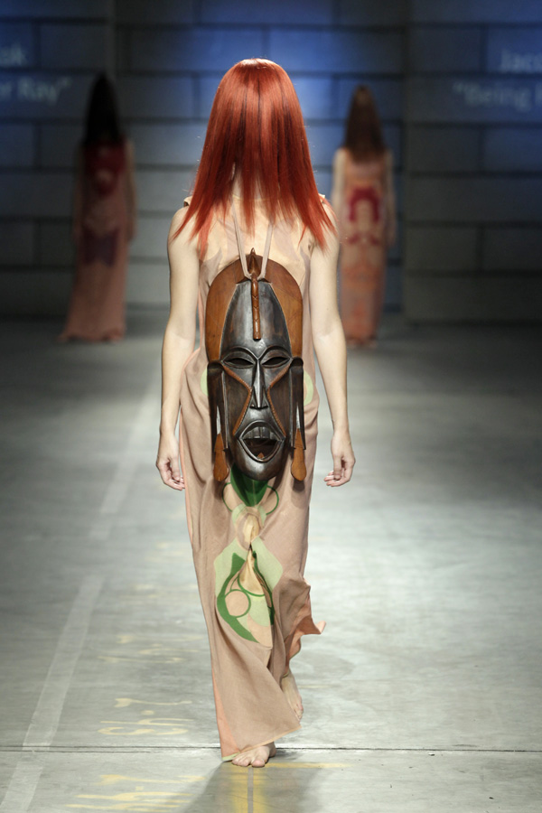
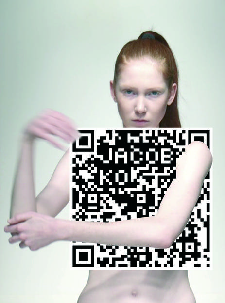
‘By presenting my designs not only physically but also digitally, new dimensions are created to strengthen the experience of fashion.’ (Jacob Kok)


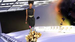
The reason I chose Jacob Koks 3D work – evolution, (animated movie by himself and the software developer Autodesk), was because of the way it was presented  as a video made in a computer program. The use of media and what it allows you to do with gravity and form in this animated short film is for me very interesting and relevant for the art and design as it develops today.

I think the title of the exhibition “ The Future for Fashion is now” indicates that; we should use all our technologies and experiences we made so far, in the work of art and design today.  For me the technology that is created is not so far mentally reachable, as it may be for my grandmother, but still it has gone to a level of complexity that can be hard to follow for everybody.  I grew up in a generation where computers still was a “new” thing. but at the same time still very much existing. I grew up with laptops mobile phones , as an everyday- kind of object. It is therefore extremely relevant, to also include these kinds of objects in our art today.

In Jacob Koks – Evolution, he is working in this “second world“ where space limits and rules of gravity does not exist. He can play with shapes and fabric, as he likes. In the video shapes of clothing and body parts have it’s own rhythm, in the sense that it does not follow the natural movement pattern of what that kind of object, is supposed to do. The pictures is overlapping each other, making one shape or one figurative person floating over to another shape or person, creating a new walking, and idea about what clothing is and can be.
He started out with catwalk videos, mainly because he did not have the money to create collections and also to get them in production; he used his budget on the catwalk sample and didn’t have money to make more. He “crowed founded” his first collection, but he brought up a subject, for him and the rest of the fashion industry to work at.

That’s where he “reinvented himself as a designer” put in his own words, but he also questioned the very materialized fashion world, which I find very interesting. Making the fashion virtual he was not only manipulating with body shapes and fabric, but also he dematerializing clothing in fashion, by doing so. He was able to, in a very experimenting way, to expand himself as a designer in a digitally media, but also making himself able to save some money to make his art/fashion real.

A lot of catwalk clothings is only made for inspiration, which gives the designer a lot of money to spend, without selling /earning anything. I think in the use of digitally media in the fashion industry like Jacob Kok does it, is a big inspiration for other upcoming artist in this field.

Later on he cooperated with the Sims 3 Game, which also gives a whole other perspective to his work.

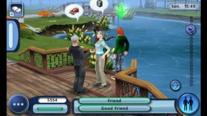
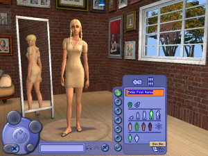
The Sims game is a virtual game where you create a world of your own. You simply make the figures by selecting their looks, from everything to eye colour, hairstyle, clothing, to personality interest and goals in life.

the-sims3-screens-05_656x369
Create_A_Sim-sims-2

When you made your characters, you can buy a property and then you start building. There are limits for your house building, as it is in real life, so you have to be patient.  Your characters have to go to work to earn money; they have to be stimulated mentally with having friends, hobbies love life and carrier.

You have to fulfill these desires to collect points. In this way the game can go on and on. It does not end. This game has sold over ten million copies worldwide since 2009 release, making it one of the best selling games of all time.

I believe the game is so popular because it works with the simplicity of life, it is like a recipe for how a “normal” life can look like, and you are the controller. In a world where young people are so confused about all the choices they have to make. The Sims game actually makes the player successful, almost no matter what, and if not, just start over.

It’s a game for both girls and boys maybe even some adults, because it is reflecting our own way of living. Maybe even questioning, our way of living.

When Jacob Kok is using these references in his work,[x] it could associate with a feeling, for those who knows the game, that their have control over their looks and behaving and in the end, control over their life. The game is creating a feeling of being more successful as a person, in a world that can be very confusing to live in.

Of course other artist/designers has explored this area of what the digitally media can give us.

Wade Guyton is a post conceptual American artist [x] who makes digital paintings on canvas using scanners and digital technology, but there is also artist who specialize in digitally artworks, that also plays with this virtual external world which computer games is presenting.

David O’Reilly is an artist working in the field of 3D animation movies, he is known for the distinctive absurdity of his work. In his work “External world” He kind of gives an example of how the absurd the world is. The theme of the whole film could be how people are scared of things that are new and maybe more specific about how things are rejected, if others do not understand it. The film is criticizing a lot of things, also the fact that animation movie is allowed to present violence  without being taken serious.

The relation between the two artist, is both the media but also how they reach their audience, by creating a space with no rules, a space that have no end and a place where we can create and do whatever we want.

O’Reilly is seen as one of the leading 3D animation artist, which has like Jacob Kok, is dealing with the human role in the world, by using 3D animation.

Jacob Kok works both inside and outside the media, by using The Sims, and catwalk animation movies as (Paradise) he is not only interested in fashion, but also have a background an interest in animation. His start point was not to only work in one media he once thought he would make music videos, because he felt that he in his work was embracing more visuals and music together, than separate (you can easily see this affection in his work; official trailer for his spring/summer collection) He is uniting several of his own interests in fashion/animation/ music, to make a new perspective to fashion and his artworks.

O’Reilly is working as an artist in digital form, Jacob Kok works with fashion and design and needs real time to exist, were O’Reilly only works in the virtual world. He doesn’t claim his works, but put them on the Internet for everybody to enjoy. Which I think also is an interesting point. Jacob Kok is also using this method to expand his works, but not as absolute and clear as O’reilly does it.

images

Something that I also find really interesting, is when artist use more than one skill, the combination of interest and competence is inspirational, personal and very true as an artist.  I think both of these artists are connecting very convincing and beautifully, a personal and new, perspective in the fields of art/fashion/animation.
FC11ToekomstVanFashion_MediaMatic

My Sofa Journey


Wednesday, November 26, 2014

Larssofa_0

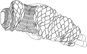
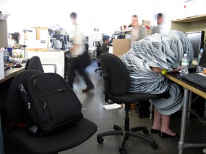
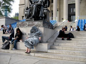
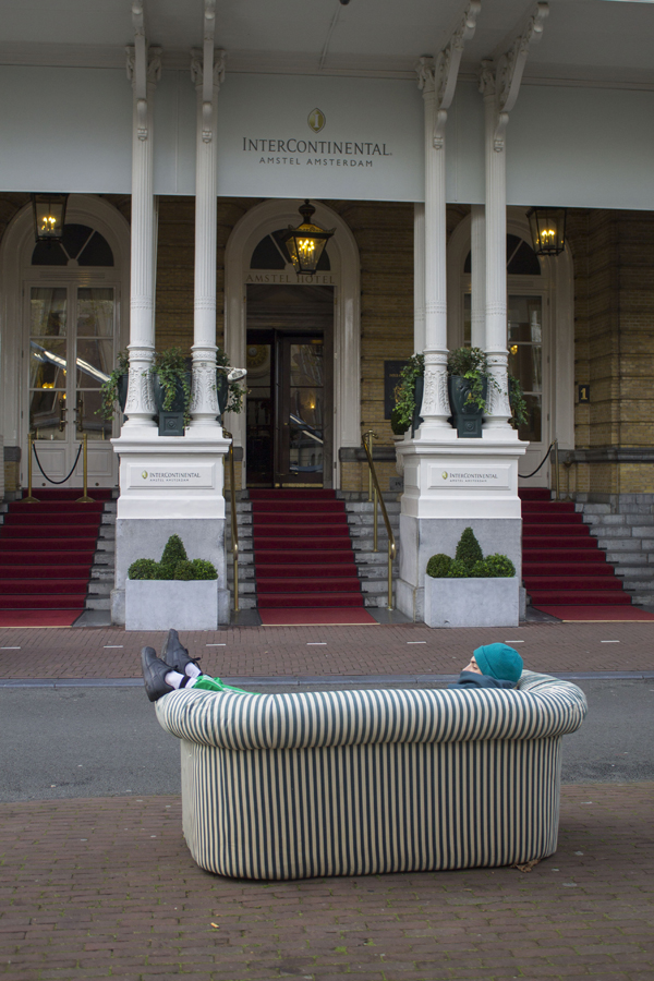
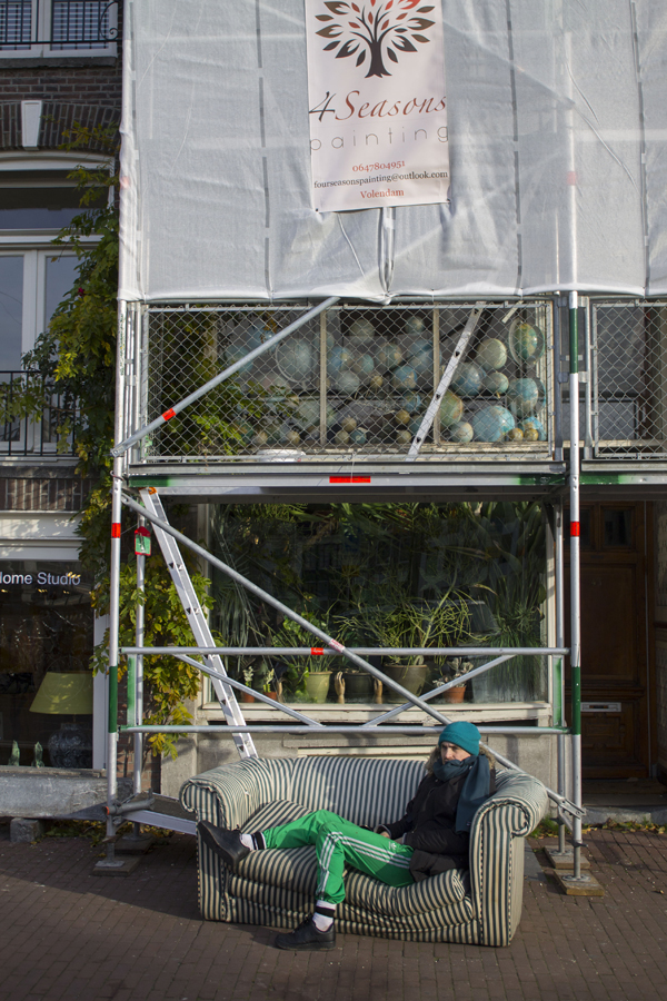
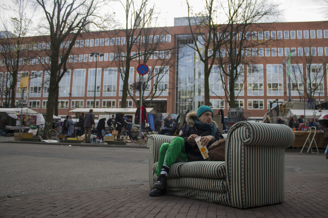
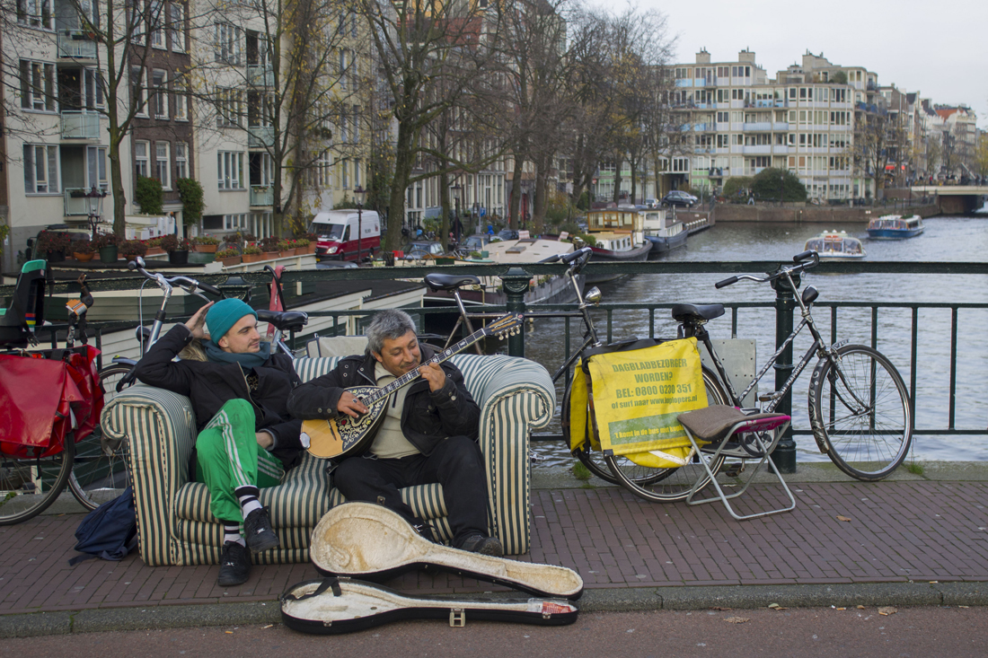
What happens if you could take a nap when and wherever you want? Forrest Jessee designed the sleep suit(1), that makes it possible to sleep in your own cocoon, at work, school or at the streets. I wanted to challenge the idea of Jessee. So I went to the streets to experience it, not with clothing… but with a simple sofa.


\BRIAN-LAPTOPUsersBrianDocuments! LUZCADLuzcad Drawings Ba
(1)


The sleep suit of Jessee immediately got my attention when I visited the exhibition “The future of fashion is now”. The shape in combination with the material its made of, creates an architectural form. It looks as a personal space, because of the thickness of the primary material, EVA foam, which is also used for padding and shock absorption in sports equipment. Usual fashion, in my opinion, is meant as a kind of jewelry for the body. Fashion, in common, plays with the form of the body, and is meant to be decoration. In this design the form of the body is almost not visual anymore. It adds something to the body, where it almost becomes a second body part. That in combination, with the daily environment, creates very interesting images (2,3).
 

Desk_675 (1)(2)

Steps_675 (1)(3)


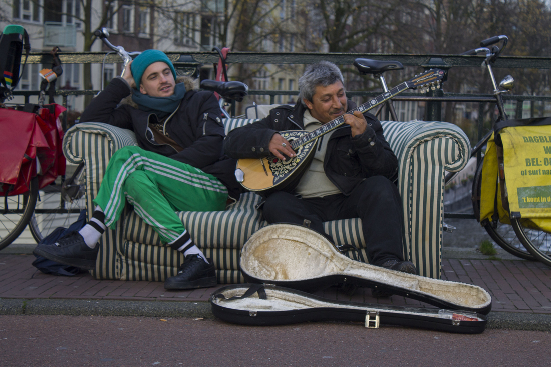
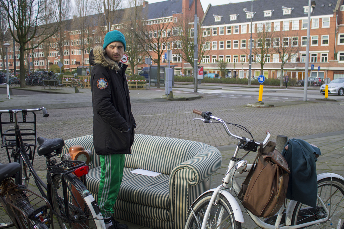
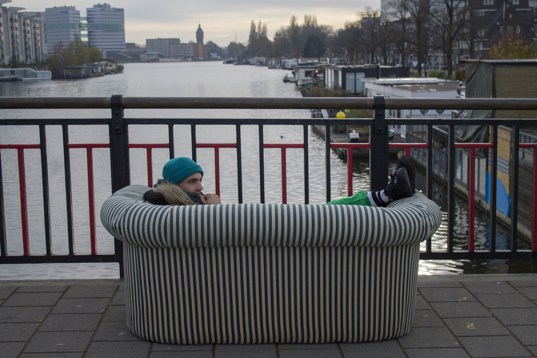
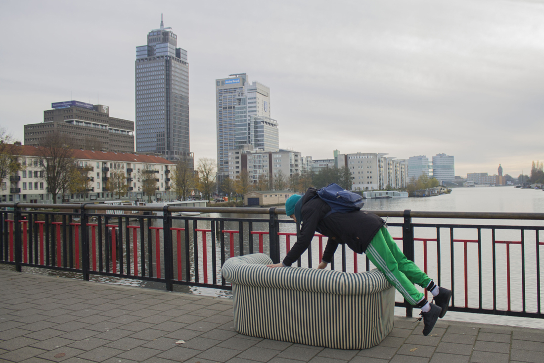
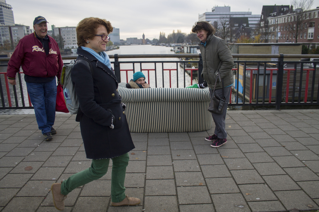
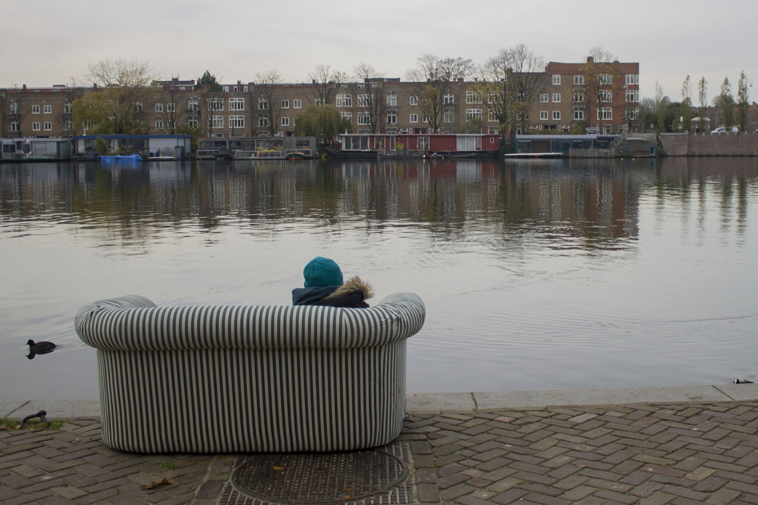
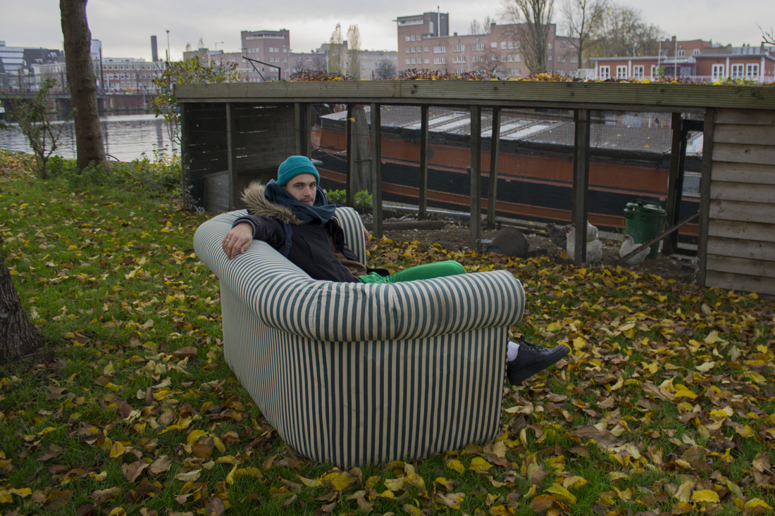
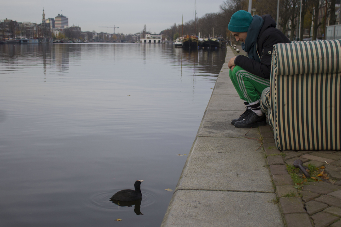
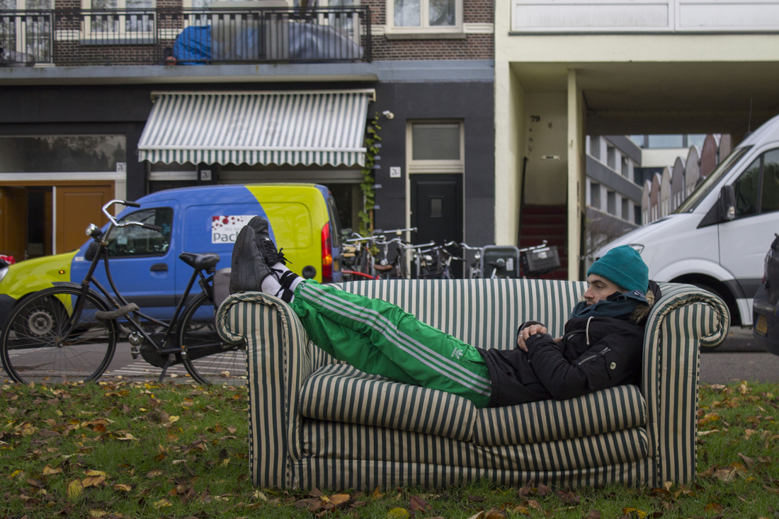
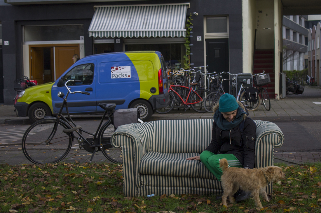
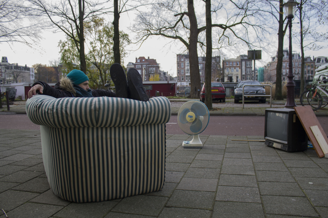
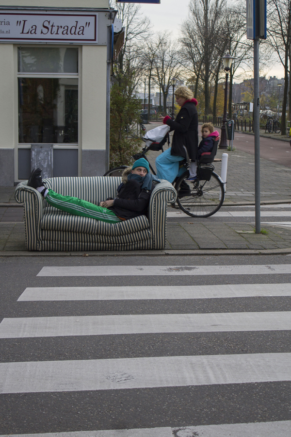
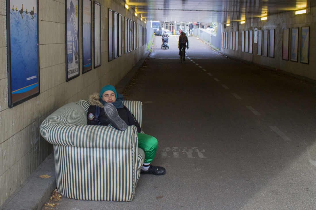
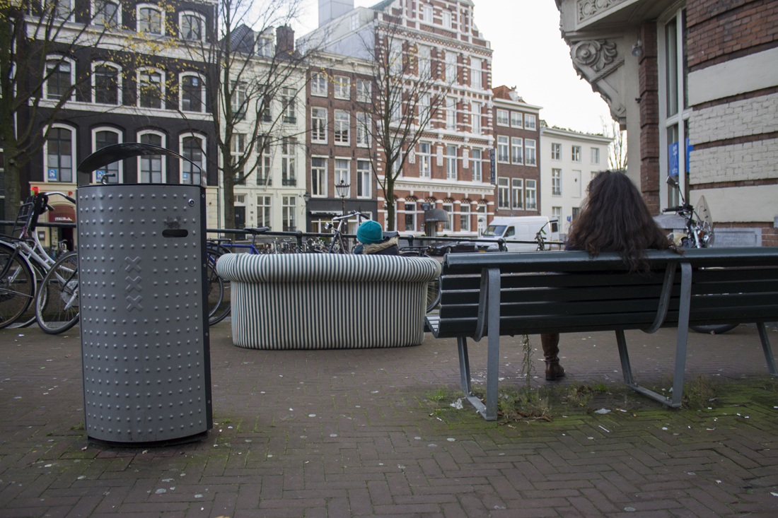
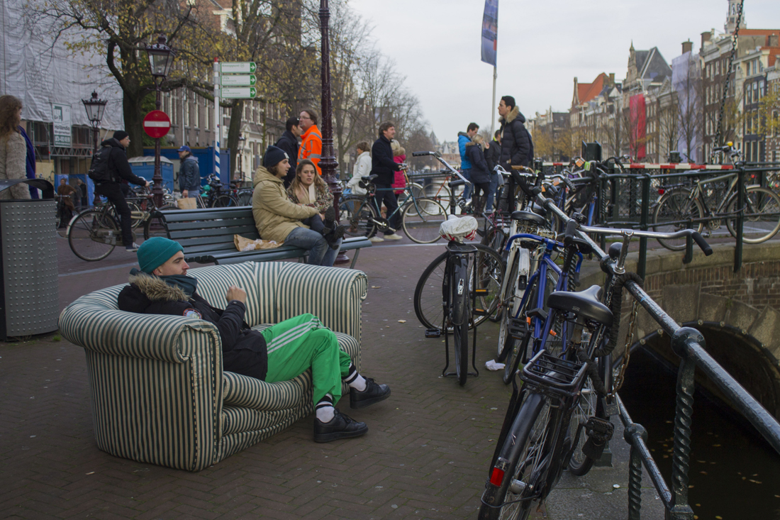
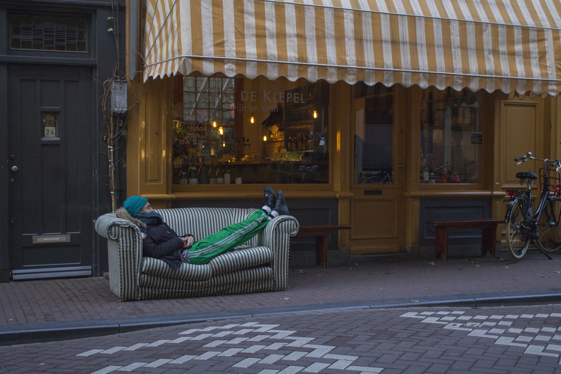
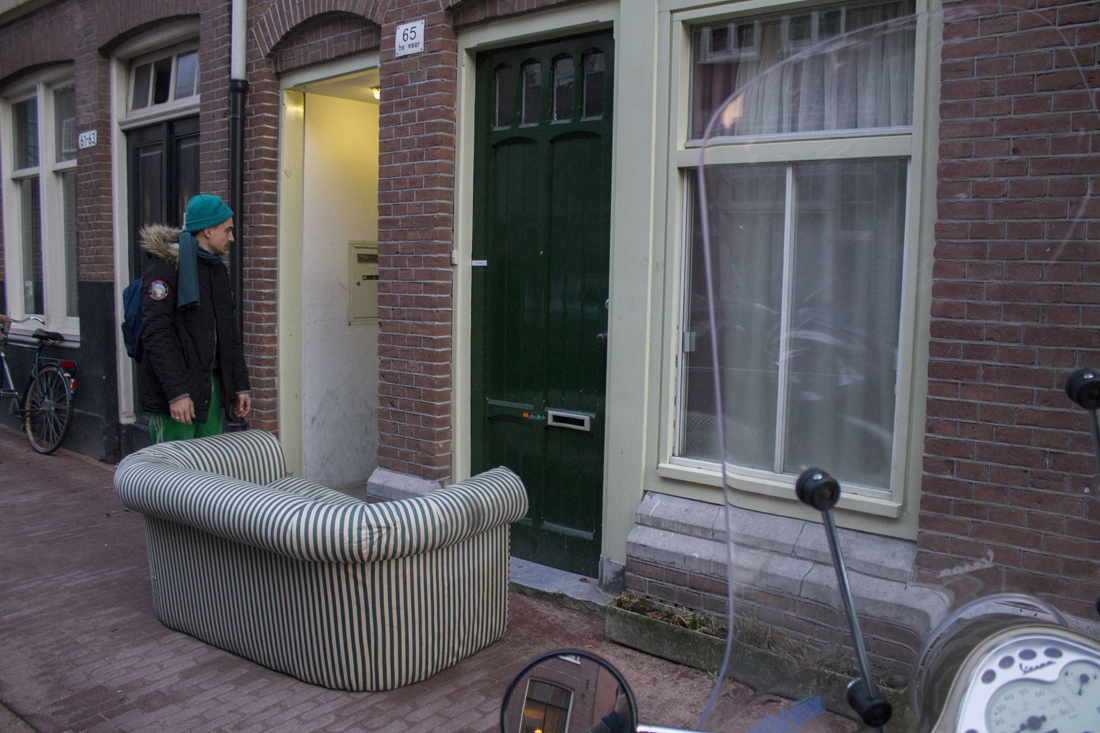
The part where this piece is playing with his environment is the part that I wanted to experience by myself. I just moved to my new home in the centre of Amsterdam, as I found my new sofa in the streets of Amsterdam South. So I walked 5,2 km to my home with it. I had to take a lot of breaks, and interesting things happened that for me related to the ‘Sleep Suite’ of Jessee.

What I wanted to experience, is the interaction with me laying/relaxing/sitting/jumping at my sofa and the busy city life. A lot things happened on my way so…

I want you to share my ‘Sofa Journey’.


Larssofa_4(4)

Larssofa_5(5)

Larssofa_6(6)

Larssofa_7(7)

Larssofa_8(8)

Larssofa_9(9)

Larssofa_10(10)

Larssofa_11(11)

Larssofa_12(12)

Larssofa_13(13)

Larssofa_14(14)

Larssofa_15(15)

Larssofa_16(16)

Larssofa_17(17)

Larssofa_18(18)

Larssofa_19(19)

Larssofa_20(20)

Larssofa_21(21)

Larssofa_22(22)

Larssofa_23(23)

Larssofa_24(24)

Larssofa_25(25)

Larssofa_26(26)

Larssofa_27(27)

Larssofa_28(28)


After 4,5 hours

Larssofa_29(29)


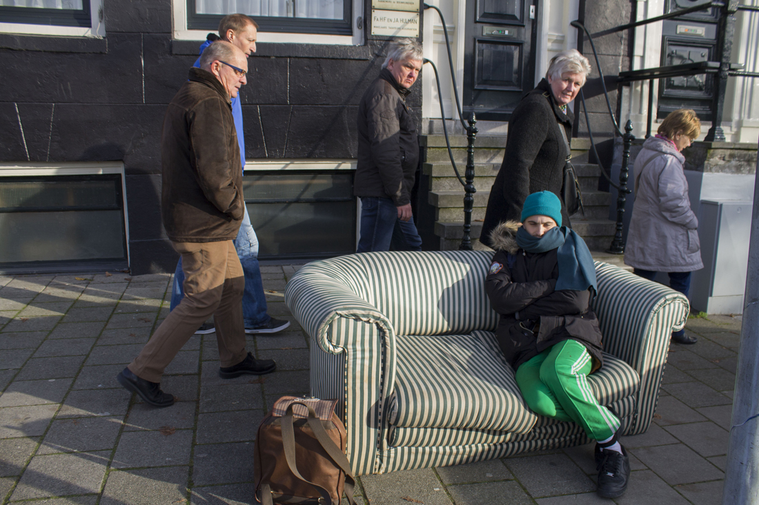
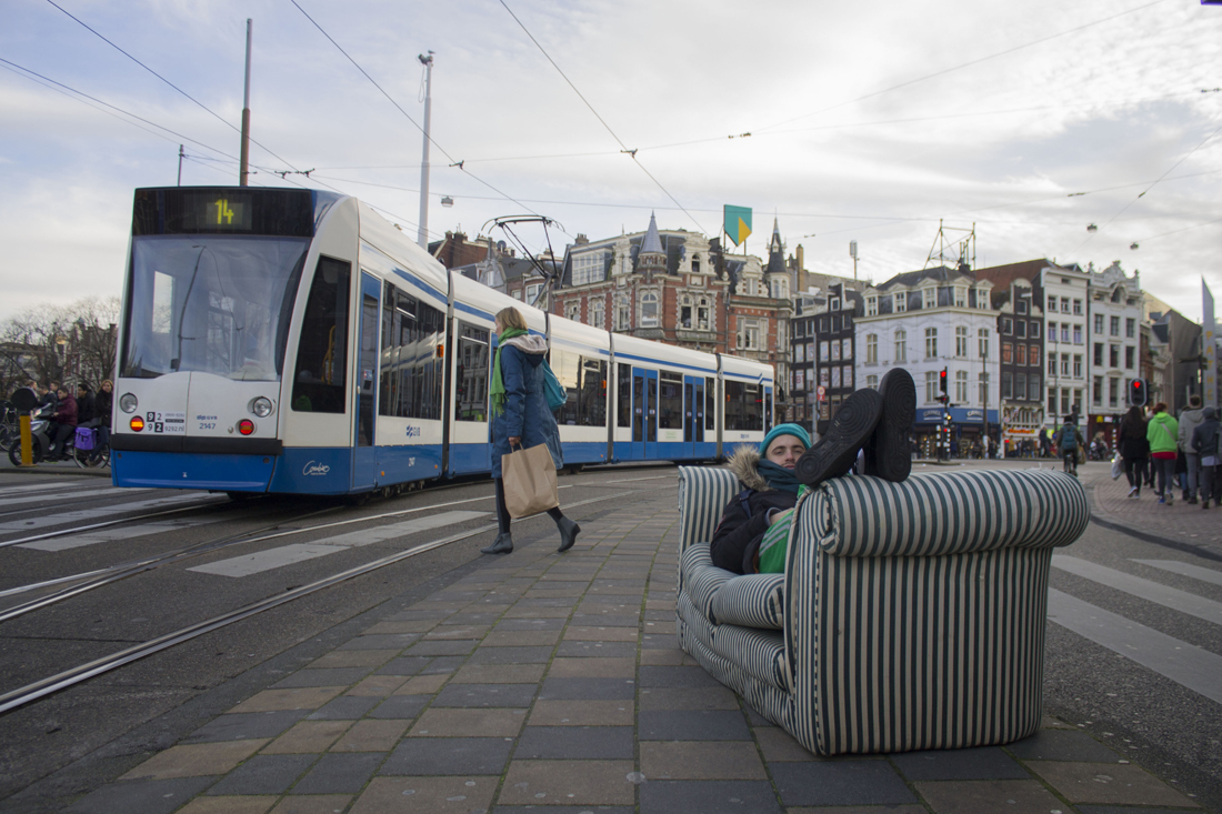
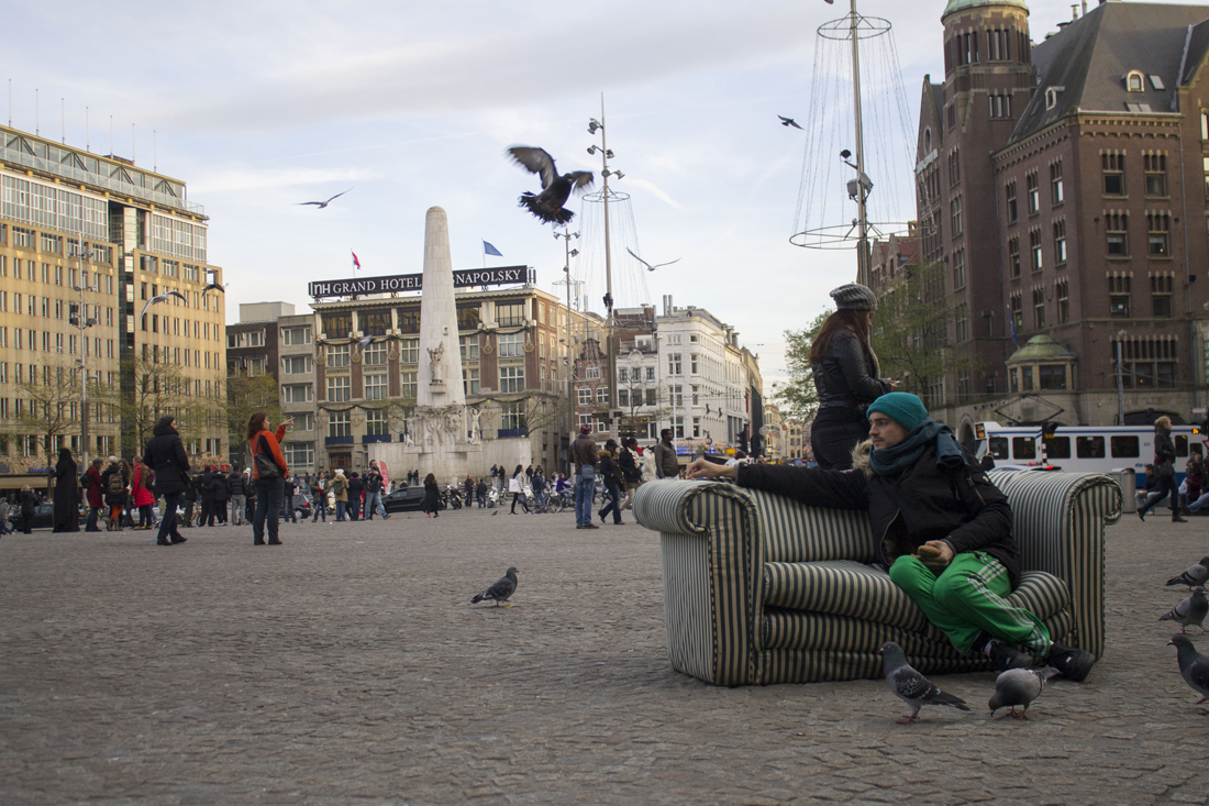
The experiences I’ve had this journey, I would never had without the sofa. The sofa became a medium to communicate with buildings, animals, trams and people. In the pictures I tried to play with the environment. For example, I saw a lot of buildings which had the same stripes above their windows as the stripes from the couch. I could involve in that way the couch with his surrounding(11,12). Also the stripes of the zebra path were interesting to combine with the sofa(14). The garbage that I found at the streets I also used to create a fake ‘living room atmosphere’, with the television, couch and ventilator(13).

Also the opposite situations were very interesting. Where the sofa was not palpitating the surrounding. A good example of it, is the picture where people looking strange at me sitting at my couch.(16) In the rest of the pictures there is also a lot of ‘miscommunication’ between me, relaxing at my sofa and the busy background. I enjoyed the journey a lot with me and my sofa, which is now settled in my appartement. It will always remember me of this day.

Are you the clothes you wear?


Wednesday, November 26, 2014

Every morning when I dress for school, I’m in doubt. I put something on and it’s again the same. I have a couple of outfits I wear a lot and that make me feel safe. Though, everytime I doubt whether it’s good enough. I’m in a school that calls itself an art school and it doesn’t feel like I’m a typical person that belongs in an art school, even though I don’t know if that kind of a person exists. Because of that I feel like I have to proof myself, as if I have to pretend that I’m someone else, wearing clothes that suit art school, but that suit don’t me. I feel too normal, too average, too ‘different’. Too boring. Even when the clothes I wear I really like and I feel comfortable in.

The strange thing is: there isn’t something like a dresscode for an art academy. Everyone wears what they like or what makes them feel good. So no one cares what you’re wearing. Although it feels like everyone has their own unique style, different from everyone, and maybe that could be the dresscode. Being as unique as possible. And if you see it like this, maybe I do fit in.

For me this proves that your identity is for a big part in the hands of the clothes you wear, prejudices exist and people pretend that they know who you are. You can deny that it is like this, and I’m sure that came across your mind, but I think everyone realizes that this is true. Even when you don’t really care about fashion or clothing, it says something about who you are, about your identity. It expresses your culture or subculture. The group you belong to. Fashion is the easiest way to express, to make a statement. And we do, all of us.


captura-de-tela-2012-10-22-c3a0s-09-02-0106-beyondthebody-publication

Beyond the Body, a perception of appearance and identity : video and publication 2012

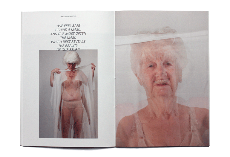
Imme van der Haak is an artist who takes identity as an starting point. She says that fashion is, for her, the way to form your identity, to show yourself. But also and mostly to try and be someone else and experience how that is, to step in someones skin and mind. In that way you can undergo an metamorphosis and your clothes can function as an cocoon where in you can undergo that metamorphosis. Also without clothes there is an identity, in scars, hair, birthmarks and surgical adjustments. Our body is an product of nature and a product of science. There are tons of possibilities to give our body a certain form. In the end she says that even without clothes, fashion influences our body. This can come out in tattoos, piercings, the way we cut our hair, but also in the edit on photographs in fashion.


imme-van-der-haak

Configurations : Jewelry 2010

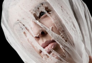
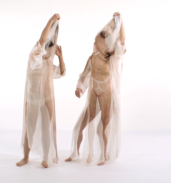
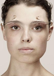
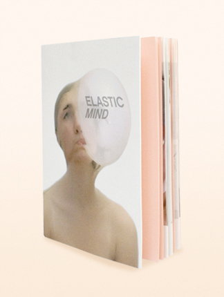
She makes works about changing the form of the body. This is shown the best in her work Elastic Mind, where she deforms her face and body with several tools, like elastics, balloons, tights, hairpins and treads. By this she does research to the form of the body, and tries to find new forms, that are not so normal but can be beautiful in a way. It was a research for a jewelry line she made, with really innovative and new jewelry. Also in her video work “Beyond the Body” shown in the exhibition The Future of Fashion is Now, a really beautiful and emotional video is shown, that makes us think about our own identity and how we express that. In the video two people are shown, covered by a transparent piece of fabric with the body of someone else printed on it, and by that they are given a second identity. The shape of the body changes because of the fabric and the picture, which is interesting and typical for Imme, like I said.

untitled-1_v7untitled-3_v2

Elastic Mind : publication 2010


Another artist that works with deformation of the body as a research for defining identity is Jeanne Dunning. She did kind of similar things, like putting balloons under clothing and creating extra bodyparts, which you can compare to Imme’s work in the video, because there you see two people at a time and by that sometimes there are more arms or legs. She creates surrealistic images as a result, not as a research like Imme does.

8fd0a8be

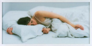
Jeanne Dunning : in bed 2004

I think it’s an interesting subject to think about how easily you can change the way you look and by that your identity. You will be the same person from the inside, but a lot changes by how other people see you or how your look makes you feel. It’s something we are busy with everyday.


Why do we wear clothes


Wednesday, November 26, 2014

The Exhibition “The Future of Fashion is Now” gave me a chance to consider about clothes, itself. Especially, the work called “Clear” by Mary Ping was quite impressive for me. Even though there were so many works that were using transparent materials on their works, Mary Ping’s piece was special for me. Because I think that the others focused on showing decay and disappearing phenomenon, but Mary Ping’s work literally shows clear, and perfectly- transparent clothes and accessories.

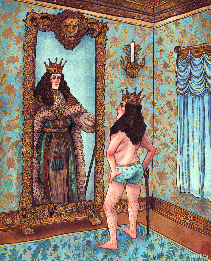
The visual image of her piece reminds me of the classic tale, “The Emperor’s New Clothes” written by Danish author Hans Christian Anderson. As you already know, the story is about an emperor who believes weaver’s lie that if clothes are made of some materials have a special effect, only those who are good at their job or are intelligent would be able see it. But at the end of story, children shouted the truth in front of emperor that he did not wear clothes. On the other hands, it also depicts the fact everyone was pretending like they could see the clothes and they even praised king’s naked body to king’s

wonderful clothes. the_emperors_new_clothes

From this tale, I found some fundamental features and reasons of clothes. For example, what is beautiful clothes( this question can be extended by, what is beauty), why do we have to wear clothes every single day, and why do we want to wear clothes. What is the function of clothes… and so on.

First of all, back to the original subject “clear”, Mary Ping says “Beauty reduced to the form, executed in transparent -and thus honest- material.”  I supposed there are so many kind of beauties in the worlds as much as there are so many people in existance. Also Beauty reflects so many components at the same time. Some of people thoughts beauty is one of the way to show their strong political and financial power to the others through colourful clothes, accessories, expensive decoration art works etc. Specifically the form of clothes were getting bigger, heavier and even really uncomfortable to show their power visually at that time and they thought that was most perfect clothes for them. In the same vein, the emperor in Anderson’s story wanted new clothes to exaggerate his power. Therefore sometimes i felt clothes seemed like a decoration paper to conceal and exaggerate myself. So Mary Ping’s piece makes me imagine that if everyone wear on this transparent clothes, they can be more honest than now. Because it can break the illusion by showing everything – natural body shape- without decoration.
Also It makes me feel like it has really natural, honest and variable form. Because this piece’s actual form is up to customer body. So it’s quite interesting process to observe changing of it’s form by different models.  I mean if someone who has really big belly wears it, the shape of  clothe looks like D-shaped clothes. Or if someone who is really thin wears that clothes, it looks like wearing space suit, because of empty space inside of the clothes. One more thing is , One of the other features of clothes reflects an identity. you can show your individual identity on your clothes. Clothes is really important way to show your identity and you can distinguish yourself from others by your unique clothes. And which components that i found interesting is we can see your own unique identity when you are wearing “Clear”piece.

slow and steady wins race image 1 20110915-SASWTR_SS2012-024

We usually tend to regard to show naked body as taboo and because of that reason, we need clothes to protect our body from other people’s attention. Ironically Mary Ping’s piece has totally opposite function compared to traditional clothes. However, I think its function is quite nice. Because as it looks like, it’s almost impossible to hide or exaggerate something in front of so many eyes. Because you always should be conscious of it.
Sensors and supervision


Wednesday, November 26, 2014


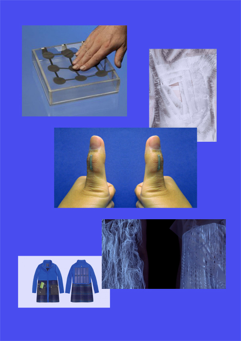
The exhibition The Future of Fashion Is Now at the museum Boijmans Van Beuningen in Rotterdam features established and upcoming designers questioning and challenging the premises of contemporary fashion. One of the contributing designers is the canadian designer Ying Gao, who in her work Incertitudes used speech- and motion-activated sensors hidden within two white dresses covered with thousands of small needles, reminiscent of porcupine coats. The gestures and noises of a viewer or passerby forces the attached pins to move, transforming the garment as well as the contours of its wearer. In her description of the piece, Gao refers to the constant stress and uncertainty of modern day individuals, always flexible and ready to adapt to new situations.
Gao was participating in the section of the exhibition called Materiality and Experience, which makes perfect sense in consideration of her other works, also making use of innovative technological solutions. Besides Incertitudes, she has also investigated light-reactive electronic components, by creating coats that move depending on the intensity of a light source, such as a flashlight. Involving interactive techniques in fashion could bring a sense of dynamism to the concept of clothing. When permitting participation/interaction with surroundings and spectators, the pieces rapidly distinguish themselves from any garment that is delivered already “done”. Bypassing flatness and immobility, they become equipped with a quality of sensibility and refinement.


researchweb2

 1.
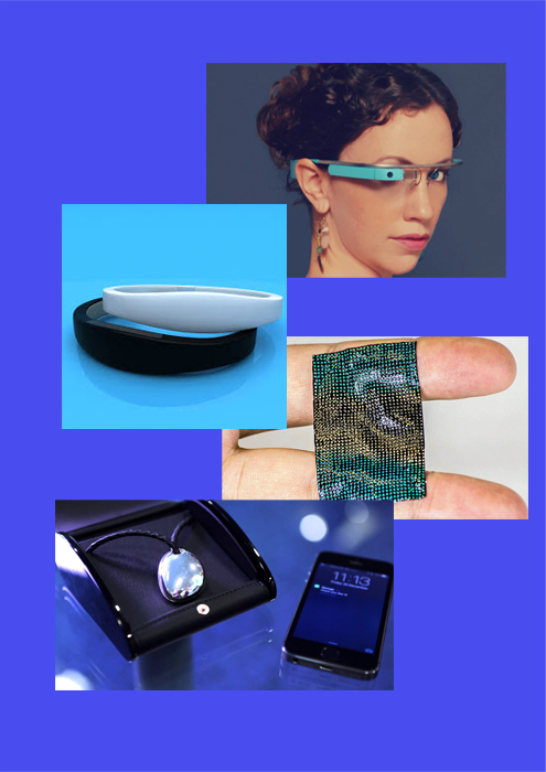
• Flexible Pressure Sensors • Incertitudes (close-up) by Ying Gao • Silver nano wire sensors • (Now)here (Now)here (close-up) by Ying Gao • Solar Powered Jacket by Tommy Hilfiger


Combining aesthetics with the latest technological developments is not always an uncomplicated process. Successful and sophisticated design of hi-tech clothing is still limited to a small number of fortunate tries. We slowly move away from the “ugliness” that usually haunt technical innovations in their early years. The industry could be seen as going through a process of normalization, where the feeling of the relatively unnecessary “tech gadget” is left behind.Designers experimenting with the new possibilities are however operating in an unexplored grey area somewhere between usefulness, beauty and supervision. When letting technology become autonomous and enabling it to take its own decisions, the designer releases control over the outcome. Reducing his or her position by introducing chance and fate will inevitably lead to new opportunities and new situations.
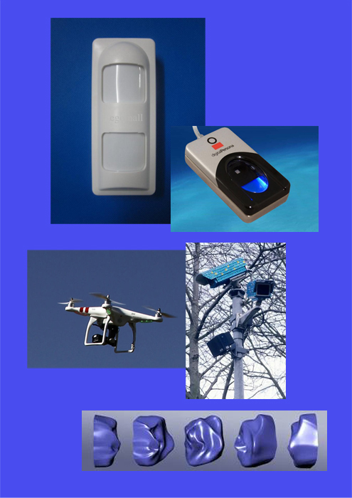
Although the integration of data-collecting sensors in fabric has a natural relevance for the innovative clothing designers, the use of such equipment will most likely not be restricted to the fashion industry only. This could mean infinite possibilities – the risk of abuse on civil liberties should be taken into consideration. What if the occurrence of intelligent fabrics was as widespread (but also overlooked) as surveillance cameras in public spaces? If biometric textile was put on the seats of public transport? Or misused, as if put on animals or plants? How would our experience of daily life change if speech- and motion reacting sensors were installed in supermarkets, shopping centers, cafés? If objects/garments changed with the impact of our mere presence?
 

research 2web2

 2.
• Infrared motion sensor burglar alarm • Digital persona Fingerprint reader • AR. 2.0 Parrot Model drone • System Azure Security Ornamentation by Jill Magid • Facial Weaponization Suit by Zach Blas


It is nowadays clear that smart wristbands (as well as watches, jewelry and other attachable items) tracking, measuring and analyzing the bearers every movement is a constantly growing industry. The technique of smart fabrics and integrated sensors in clothing is evolving equally rapid, thereby soon making the act of strapping on an external device unnecessary. By inserting sensors capable of tracking very precise information already in the fabrics, data on motion, size, location, force, weight or shape could easily be collected.
Technological monitoring of human movement is however nothing new. The first closed-circuit TV cameras (CCTV) came into use already in 1942 during the observation of a rocket launch in Peenemünde, Germany. Surveillance camera systems performing continuous video recording has been a common practice almost ever since. Among more recent developments are biometric recognition (face, fingerprints etc), aerial surveillance (helicopters, drones etc.) and naturally everything related to internet and social media. Could the integration of intelligent fabrics be a suitable addition to this process?


research 3web2

3.
• Google Glasses • Ritot smart wristband • Flexible Skin Temperature Sensor • Necklace Projector • Smartphone


New wearable technology are in some aspects already being used as a means of self-control and self-reflection, as a way of eliminating chance and the unforeseen at any cost. The behavior could be linked to the ongoing obsession with observing and measuring the own body. Health, sport and the perfecting of ones physical appearance has gotten a new trendy twist with smart apparel, fitting quite well into the all-encompassing life project certain enthusiastic users are living by. Are we moving from an attitude of authoritarian respect from earlier times and into a slavery of self discipline and personal surveillance? From the all-seeing, omnipresent monitor to the individual supervising itself?
The existence of hidden, interactive sensors and reactive fabrics is undeniably a relevant topic – the potential is striking. Anyone curious in new means of communication could possibly avoid the advancement of smart textile in modern daily life, reaching us all within a very near future.

On a personal level, I ask myself if there could be some sort of spirituality to be found in this technology of supervision? Is there an empty space to be filled in secular societies, leading up to this voluntary self-surveillance through different types of apparel and other devices? The subject is fascinating both from an artistic point of view as well as a philosophical/ethical one. 


research 4web2

4.

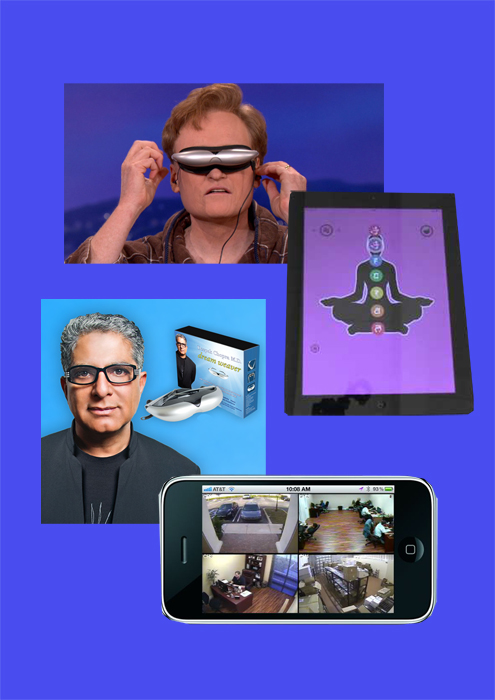
• Conan O'Brien tries Dream Weaver (video) • Chakra Balancing application • Deepak Chopras Dream Weaver • iPhone surveillance


How do we as individuals deal with the concept of spirituality, truth and privacy in the age of technology? The adaption to new conditions is unavoidable, but becomes more and more a matter of privileges.
The revelations on to what extent state supervision is currently practiced (Edward Snowden, NSA, Wikileaks) chocked a whole world and deepened the conflict with the established, monotheistic religions believing in the One and only God to monitor and judge all human action. Surveillance relates to different aspects of privacy, such as privacy of property, of space, of personality and of thought. Worthy of note is that not everyone has the economical means to question authoritarian demands on personal information, with the consequence of privacy possibly turning into a valuable property that only a select few can access.
New forms of spiritual practice and/or self-monitoring take shape with the aid of technological devices. Smartphone applications connected to health, higher power, meditation, zen etc. are immensely popular, offering a re-charging of the soul similar to the charging of batteries. When spiritual leaders such as Deepak Chopra releases biosensorical glasses promising relaxation and inner peace the merging of spirituality and technology is indisputably a fact. Are they all yet another expression of an egocentric, self-obsessed Western society or a useful tool to actually reconnect lost searchers of truth?
In any case, a space has opened up for an intimate, personal form of spirituality disconnected from the dogmas of organized religions whilst also distancing itself from sovereign state control. The idea of scientific knowledge as the superior way of accessing truth is once again questioned – and is it necessarily in opposition to all spiritual methods? To conclude: it is visible how technology/the visible and spirituality/the invisible intertwine and affect each other more and more in modern societies. This provides interesting opportunities for artists to question and investigate further, and I am certain that projects such as Ying Gaos is only a preview of what the future will hold.  


Red Carpet Culture


Tuesday, November 25, 2014

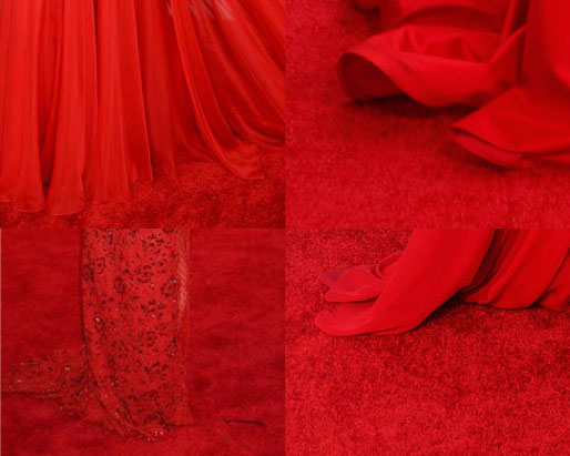
According to Oxford Dictionary, red carpet is ‘A long, narrow red carpet laid on the ground for a distinguished visitor to walk along when arriving.’ This dictionary also proposes one idiom related to the red carpet – red carpet treatment. This idiom is used ‘in reference to privileged treatment of a distinguished visitor.’ Viktor&Rolf’s Autumn/Winter 2014 collection meet that definition au pied de la lettre. This Amsterdam based duo literally made the dresses from the red carpet.


web_1


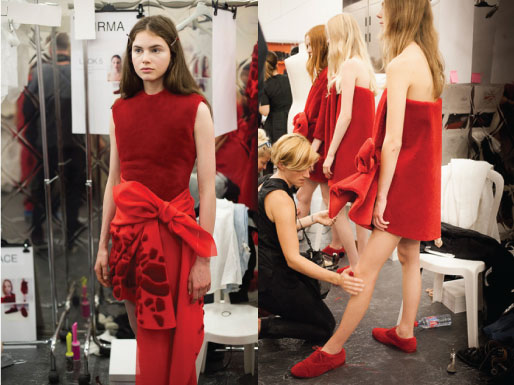
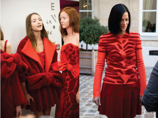
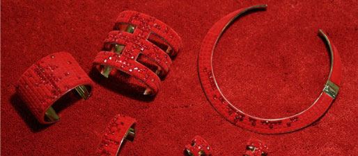
Viktor&Rolf took part in The Future of Fashion is Now exhibition at Museum Boijmans Van Beuningen in Rotterdam with two of their collections; Autumn/Winter 2013 aka Zen Garden collection [x] and Autumn/Winter 2014 aka collection executed entirely in red carpet. Although the Zen Garden one was broadly exhibited, the second collection made a bigger impression on me. Two white figurines with two dresses and two pair of shoes, all made from red carpet – that was it, quite decent display but perfectly contrasting to all glamorous world of red carpet. There was something magical about the material. Or maybe is it just something in human nature that we are subconsciously attracted by red carpet?


web_2


The designers found in a carpet manufacturer Desso a great partner for this collection. This Dutch company produced carpet without the usual rubber backing and also carpet with animal skin motifs, according to their words ‘shaved and laboriously hand-appliquéd carpet, which takes up to 300 hours per look to complete.’ The clothes were wrapped around body and a little bit resembled bath towels from afar. Dresses were accompanied by jewels and shoes made in the same style.
 

rc_9


Collection was initially presented in Paris, obviously on the red carpet, followed by a rhythmic clapping song [Video]. This presentation is worth watching. Viktor&Rolf themselves describe this collection as ‘a meditation on a current obsession.’ Are we actually a society obsessed by a red carpet? Are we a red carpet culture?

I have never realised that such thing as a red carpet can have a rich history. It was first mentioned in the play called Agamemnon, written by Aeschylus in 458 BC. In this play, the main character returns home from Troy and is greeted by his wife who offers him a red path to walk upon. However, Agamemnon, knowing that only gods walk on such luxury refuses and says: ‘I am a mortal, a man; I cannot trample upon these tinted splendors without fear thrown in my path.’
People are no more afraid of walking on the red carpet. First of all, there were popes and heads of states. Red carpet marked the route they were taking on ceremonials and special occasions. Red carpet is now mainly associated and broadly used by celebrities and all VIPs glamour world. For those who are interested, exhausting and detailed history of red carpet is here. Bearing in mind Agamemnon’s story and the fact that red carpet is only for gods, I realised that maybe the basis is still the same but we changed our faith.

We can also consider the red carpet as the first marketing tool in the history of fashion. In the early decades of the 20th century there were the celebrities (actors and actresses, singers, dancers as well as members of noble families) who carried fashion impulses. Nowadays designers like to dress celebrities for red carpet events because their photos literally see the whole world. In this context we can understand Viktor&Rolf’s collection as a revolt against this trend.
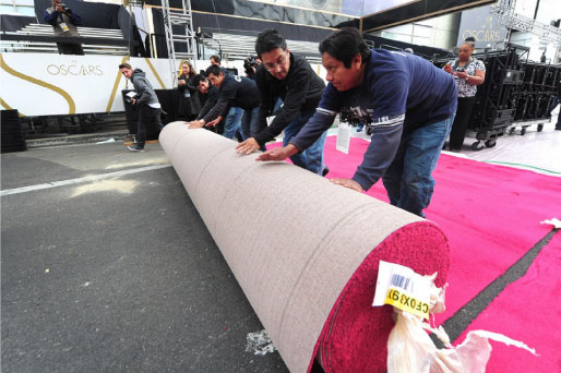
Nowadays, the actual event may seem overshadowed by the red carpet. Just look at this video of Oscar preparation – workers rolling out the red carpet and a huge amount of photographers and media in place to depict that very moment.


rc_3


It might be as well really stressful moment for celebrities in terms of perfectionism. All the world is watching every detail, manicure, hair, make-up, dresses, jewellery, manner of walking, everything. In the event of Emmy’s 2014, E magazine also prepared so called ‘clutch cam’ and ‘mani cam’ so the viewer could see every detail even closer. Walking the red carpet can actually be a nightmare. Celebrities might not eat for days or even weeks before the event. You can look at how many results you find when searching on google for ‘how to be red carpet ready’: tips on diets, workouts, pills and many many more.

We developed some kind of camouflage pattern for being invisible in the nature. Can we also be invisible on the red carpet? Viktor&Rolf dresses can represent one way of reaching invisibility but I searched for more examples where celebrities tried to disappear.


rc_10


I think that Viktor&Rolf caught really well this current obsession. Suzy Menkes, Vogue fashion journalist, expressed it in a good way: ‘two brilliant minds catching a sociological thread.’ [x] I can only agree with her words. Red carpet represents a new value of our lives. If we think about the idiom ‘red carpet treatment’ I have one suggestion for future. Maybe we will have real red carpet treatments. Covering our body with red carpet for certain amount of time will cure illness and give back lost self-confidence.


Your life on a thread


Tuesday, November 25, 2014

In the Boijmans Van Beuningen currently is an Exhibition called: The Future of Fashion is Now. One of the participates is Lara Torres.
Her work ‘an impossible wardrobe for the invisible’ takes part in the ‘New Values and New Stories’ part of the Exhibition.


About the part ‘New Values and New Stories’ the autor, Jose Teunissen, writes in the book of the exhibition: “Today’s designers are trying to recline and recalibrate the fashion system in a number of ways. The designers of the new generation are quick to criticise the fashion system, the compulsion to engage in overconsumption, and concepts such as brand identity a local identity, but they are also importing fashion with a new set of values. One important example is the Slow Fashion movement, whose goal is to render the fashion production system more transparent by using as many local materials as possible and by setting up a circular economy with direct lines running from producer to consumer. It is essential that the fashion product itself acquires a new, sustainable value so that its life extends beyond that of a single season.”

I underlined some words to make the connection to Torres reframing those words.
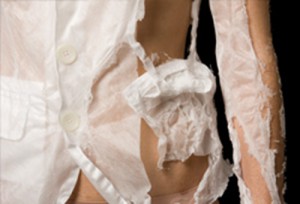
Overconsumption’ Her collection can only be worn once. What does that have to do with overconsumption? The waste can also be dissolved. And because of the dissolving there is a need for more clothes because you cannot wear the clothes again. Is ita good thing, to only wear clothes once?
Slow Fashion’. Her clothes dissolve slowly, but are gone forever. If it is connected to the ‘Slow Food’ movement, does it take long to make the clothes, are they worth the wait? Torres made such a fast disappearing collection, that the focus on a longer staying collection (not only one season) raises. And what about ‘Slow Design‘ movement in general. Is her work also an ongoing project? Comparing it to her previous work, maybe it is, maybe only for herself and not for her projects.
Transparent’. Her work is literally transparent when it is dissolved.
Direct lines’ She is using normal seams, so you could say that that’s literally, again, the direct lines of the producer to the consumer. You can see the way of using the seams by the producer.
Torres became interested in the relationship between clothing and memory. She wanted to approach fashion from a theoretical, artistic and investigative point of view.
She did research to make more transience, temporary clothing.

Screen Shot 2014-12-10 at 20.39.35

For example her Effacing Series, a project she did before she started with an invisible wardrobe. With this new project Torres made a wardrobe collection, from a material that dissolves in water. So the clothes could only be worn one time. There is nothing ‘touchable’ left from what was made, only the photos and the videos.

The dissolving part was the part that took my attention. For me it was intriguing to see how people became half naked when they came in contact with water. Fragile. The naked truth.

And when I read more and more about what her meanings were behind the material, it became more interesting. First I wanted to do similar research on dissolving material and maybe even find dissolving ways to connect them (for example a dissolving threat). But when I figured it took Torres years of material research, I thought maybe not. Nowhere she did write or say what she used as a fabric. It dissolves, that’s why it is nowhere to be found, except in Torres’ mind.

When I was reading about the material I also bumped into her concept, unavoidable. In the beginning I was maybe  a little too focused, or intrigued, into the material and I didn’t have a good look on her concept. But after a while it got stuck in my head.

As an explanation to her works, she is talking about the loss of the object and the documentation of this loss. The action of effacing the clothes leaves a trace (the seams) translating a strong relation with memory and forgetfulness.
But how can you memorize an object, or even the loss from it. Do you get attached to it? In this case you do, the clothes are getting very close to your skin and in the end it is not ‘hiding’ your body anymore. Is that what clothing does for me? Does it hide my body, or are they showing my body? I don’t know.
There is a very subtle line between hiding or showing although they are an opposite. In one way you hide what you want to show in private. Do you?
When we put on our clothes in the morning (or any time) we feel our clothes, but after a while, we are not aware anymore that we are wearing clothes. Habituation they call it in behavioral science. How can you remember clothes if you are forgetting that you are wearing them? You do remember the itchy Christmas hand-made sweater from your grandma. Do you remember the itchiness or the sweater, or that you thought it was itchy. In other words: Does your body remember it, the same way that your body remembers how to walk, or does your mind remembers it?

Lara3mood1.2

‘When the fabrics have dissolved, all that remains are the seams and the memories of the clothing.’  Did She write  in the Exhibition book about her work.
Can the seams be seen as a red thread of life? The continuing of life and the route it takes. Because when the water ‘attacks’ the clothes the seams are creating their ‘natural’ way to stay on the body. Is this how the water attacks us, human beings, because we don’t take enough care of the world. Does it have to do anything with the global warming? Our fight against water, which is also one of the main reasons we are alive?
Or can the remaining of the seams be seen as the memory of the edges of pain, or the edges of luck. Are the containing threads only there to give a suggestion of what was before, what happened? We remember only the outline of our memory. A friendship for example, we only remember the fights, the getting back together, but most of the things you did together you forget. Because they were ‘normal’ like having tea a hundred times, you will only remember at most five of the tea parties.
The seams are on the other hand also sticking how they were suppose to be, in other words, the seams are still holding the knots Torres used in designing her wardrobe. They are staying like they are supposed to stay. And then I am coming back to the literal interpretation of the ‘direct lines’ and the ‘transparency’. Because of the visual seams we can see the handwork of Torres. And with that she makes a very clear line between consumer and herself as a producer.

Textile writer Tania Candiani


Tuesday, November 25, 2014


TaniaCandiani1


Tania Candiani, Woman, Mexican, 1974, Textile, Language, Artist …


Tania Candiani was part of the exhibition“ The future of fashion is now”, in Rotterdam. In this show, designers and artists try to show some different and new ways to see to the fashion world.

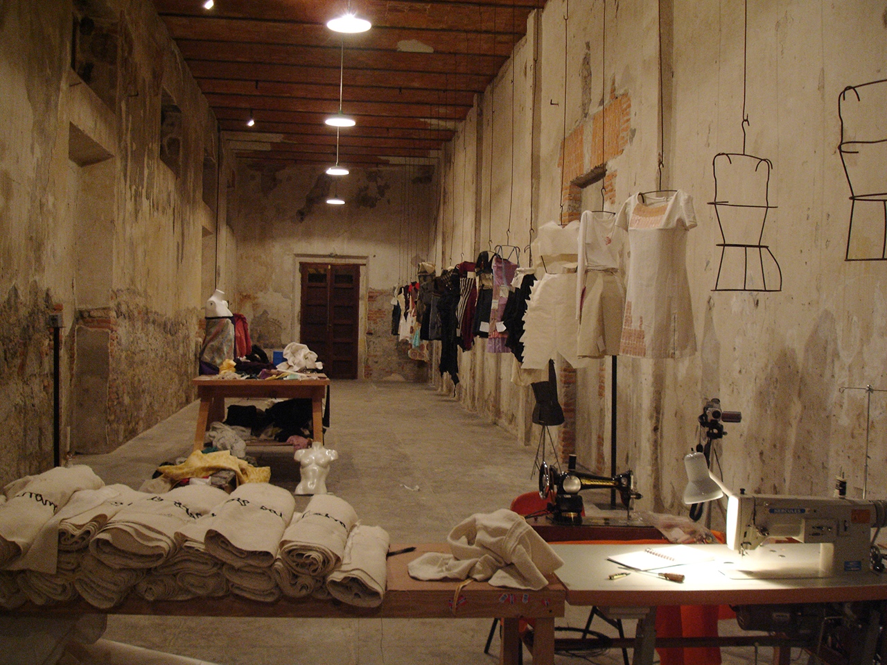
Tania Candiani exposes a big roll of fabric joined with some clothes and dresses. The finality of this work is an installation with fabrics, thread, metal hooks, sound and video. This work was showed almost at the end of the exhibition, a space that, according to me, didn’t support it as much as it could have. Therefore, all my attention wasn’t driven towards the installation as a whole, but only on this big role of fabric.

The title “ La Constancia Dormida “, which stands for Constancia Asleep, makes me think of the collections of stories, including Constancia, y otras novelas para vírgenes (1989; Constancia and Other Stories for Virgins) by the Mexican novelist and short story writer Carlos Fuentes. The theme of these stories, which is about the people and culture from Mexico City, is maybe a influence in Tania’s work.

The role of fabric, that I mentioned before, was exposed on a table and stitched with text. The language used was Spanish and it was about thoughts, feelings and stories of one certain group of people or community, that were influenced by their economic, political and social environment. This context situates her work in the last of the four themes which divided the exhibition: “Fashion Activism: Community and Politics”.

Being influenced by the reaction of these people, she used them as her subject for her story-telling. The textile is then used as a narrative tool as she explains it in one of her statement: “ My research processes take as starting point language, text, the political implications of the domestic, of what is public and private, and of “the others.”

“Translate strategies amongst systems –linguistic, visual, phonic– and practices, generates equivalences and associations (…) textiles have been present in my work as tailoring, as a narrative resource and as labor, socially embedded with meaning. Tailoring as design is a contact point with architecture, where the space distribution of the plans as sewing patterns re-signifying the idea of inhabited space or the utopia of an space that could be inhabited“.

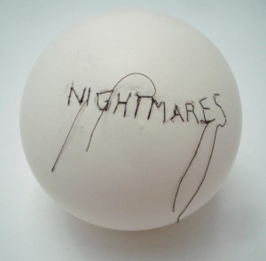
nightmares_option_1

Tania Candiani – Artslant

4354648_1_l

Tania Candiani – Lot 88

I chose Tania’s work because I really like the simple and minimalist way she approaches two big ideas, in one hand the fashion world and in the other one, a more conceptual idea about community in a political and economical environment. Also, the way she uses textile and combines it with text gives me a big and strong feeling of nostalgia. The way she characterizes the political and human energy really fascinates me and awoke my curiosity. This feeling of nostalgia that is present in her work, makes me land back directly to my home country. This nostalgia and spirit of story telling is something that characterizes the Portuguese personality and community, bringing me even more closer to her work.

By listening to the people in different environments, Tania tries to save the stories and the atmosphere into the fabric by sewing it, and giving it an individual perspective. Through this act of sewing, I see Tania’s work as a memorial where she keeps all the moments and happenings, as a saving for the future, which for me is a really beautiful act. The act of sewing, reminds me of a scar or a tattoo that Tania is stitching in the fabric. By expressing these left marks, it connects us to our individual or common marks, which originates from situations and memories that we experienced. These marks which makes us the person or the people that we became. So it’s like creating and materializing all the spirit, thoughts and feelings from a specific and certain place, time and community.


This way of making art reminds me also of some works, for example, Louise Bourgeois, Tracey Emin and in the traditional bordering from Portugal.

tumblr_nd2py1rbml1rotipro1_1280

Louise Bourgeois

tracy-emin-blanket1

 Tracey Emin

mh-e603-02g

By having this in mind, I realize that textile can be really strong, powerful and expressive as a subject or a material. It was interesting to see how her work can become, in a way fashion but still textile with a sculptural character. It questioned the fashion world and trying to find or to create this small limit between fashion and textile, becoming in the end something else. Different than the world of fashion that we know now, but still an expressive future form of fashion. This makes her piece relevant, for me, in taking part of this exhibition “ The future of fashion is now “.


constancia6


The invisible fashion


Tuesday, November 25, 2014

I am not really into fashion so I didn’t know what to expect during the exhibition and even by looking at the website of The Future of Fashion is Now I had no clue whether I am gonna appreciate this kind of art or not. My fondness for Adele Varcoe started when I visited the exhibition. It was divided into 3 parts and it was the last one which seemed to me totally unclear and thereby intriguing. Ironically it was precisely this part –New Values and New Stories– in which I found this  amazing artist who is taking fashion into a higher level, looking at it not only as an outfit but more as a factor indicating our behavior.

Adele Varcoe is an Australian artist. She is not strictly a fashion designer but her works are directly lined with fashion. She is creating experiences which are suppose to show the social effects on clothing. Adele is mostly constructing group performances in which she brings people together in order to explore the elusive nature of fashion. She wants to outline the sense of self which is heightened through the clothes.

Imagine Chanel

While making her performances she likes to mix the participants, working with artists, models but whats mostly important with the public. She is interested in revealing how fashion influences the interactions and relations between people. Adele often uses the quote “perception of dress” which in her opinion is the subconscious behavior of the society depending on what we wear and in what situation we are.

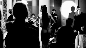
The performance which I saw in the Boijmans exhibit and which invited me to learn more about Adele Varcoe was the salon fashion show Imagine Chanel. It was in 2012 when she came up with the idea of presenting fashion experience through language. She used the descriptions of garments from 1920s till 1960s Chanel archive at the Victoria and Albert Museum and the Powerhouse Museum as material to reveal the role which our imagination plays in looking at fashion. The main goal of this performance was to highlight that fashion is not something that exists as dress only. The fashion show is led by a woman reading the descriptions of Chanel outfits while nude women circle between the audience acting as they were wearing all the precious, described cloths. This situation gives the audience a broad field where by using their imagination they can design their own clothes worn by the models.

03-Adele-Varcoe

Adele’s concept is based on the professional opinion of a sociologist Yaniya Kawamura [x] who claims that : “Fashion does provide extra added values to clothing, but the additional elements exist only in peoples imagination and beliefs. Fashion is not visual clothing but is the invisible elements included in clothing”.

Here comes the link between her work and the name of the third section of the exhibition: New Values and New Stories. I am really fascinated by her way of thinking. It looks like if she is taking a broad working space which is fashion and approaching it from a totally unconventional side. I think the point of conceptual art is to influence the audience and show them something which is not obvious. Working with subconscious behavior and reactions upon “invisible fashion”, Varcoe is putting new values to clothing which is actually our second skin changing our behavior and social interactions.

Each of her works is often closely connected to the broad area of fashion sociology. It is claimed that in fact, fashion is not about clothing but more about the basic process that propels modern life, and it is the outfit which structures the psycho-social development of a modern person.

A similar  concept was to be seen in Varcoe’s other exhibit in the Boijmans Museum called ” Feeling of undress”. This movie was even less about fashion itself but more about the social behaviour and human interactions.

Some other sociologist like Georg Simmel states; ..” that fashion refers to a general phenomenon, in which it becomes a type of social horizon point where the individual interest and taste comes across the collective”. He once wrote “Fashion represents nothing more than one of the many forms of life by the aid of which we seek to combine . . . the tendency toward social equality with the desire for individual differentiation and change”.

I think after experiencing her art or being part of it, we start to realize some behaviors and actions which are natural for us but we can never see them consciously. Varcole gives us an opportunity to set aside our subconscious actions and observe how the natural behavior is chaining depending on what situation we are in.

I think the most interesting part of being an artist is to use your creativity and open minded thinking to show the audience something new, in this case something totally normal but not realized in everyday live. I think its also interesting how she links the scientific knowledge in the area of sociology to play with the human mind and gives people the opportunity to experience and then realize the way of human behaviors by taking part in her art performances.

(A)dressing the dead


Monday, November 24, 2014

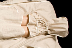
The exhibition “The Future of Fashion is Now” in the museum Boijmans van Beuningen in Rotterdam included Pia Interlandi’s project “Garments for the Dead” in a depiction and a proposal of what fashion can be about in the future. Pia Interlandi, an Australian fashion designer and a former biology student, made a series of biodegradable garments for dressing the dead, in a way that respects the human body after death, but also the environment.


PROTOYTPE_Interlandi_12_LARGE

 PROTOYTPE_Interlandi_08_LARGE


Interlandi’s work on “Garments for the Dead” started upon the death of her grandfather, when she was tasked with dressing his corpse in a suit. She then realized that the suit, and the last garment he would ever wear, was done without much thought and was even difficult to put on, so she came to the realization that the clothes where actually made for the living and were not suited for death. What is more, the materials used normally in these occasions are chosen for practical qualities such as longevity and expense, so the fabrics are mostly synthetic, like nylon and polyester. These fabrics can outlast a corpse, and actually prevent it from decomposing naturally. They are often non-biodegradable, and the chemicals used in their manufacture can leach out into the environment. Nylon manufacture creates nitrous oxide, a greenhouse gas 310 times more potent than carbon dioxide, and making polyester uses large amounts of water for cooling, along with lubricants which can become a source of contamination. Both processes are also very energy consuming.

http://www.greenchoices.org/green-living/clothes/environmental-impacts

Pia Interlandi started experimenting with soluble materials in relation to the human body. This exploration allowed her to dissolve the borders between the clothing and the skin, and explore our relationship to clothing as second skin. Ultimately, she made the burial garments since that would be the last skin which would be placed upon us, and literally and symbolically merge with us in our decomposition and dissipation into the earth.


 shroud_02_large

tailored_jacket_09_large

“Death,romance and mystery were notions I aimed to embed within my own exploration of the shroud as it pertained to soluble fabrications.”


I find this material research particularly interesting as an artist, since I believe that the material choice is the beginning and the first source of my projects and that good knowledge of and feel for material create unlimited choices. It is always important to understand what is needed in the design and use the material in a way that supports the idea.

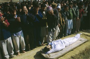
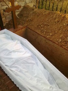
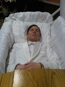
But it is also interesting for me as a former history and archaeology student, since dressing the dead has always been an important ritual in most human cultures. In ancient greek burial traditions, the dead were washed with oil and dressed by the female relatives in a type of clothing that befitted the deceased status in life. For example, if a person was recently married, he/she wore wedding attire in death. Sometimes they also put coins on their eyes or mouth in order to pay for the boat which would take them to the other side. Mayans sprinkled their corpses with the shavings of the red mineral cinnabar, since the color red was associated with death, and then wrapped in cotton for burial. Muslims still use burial shrouds which are made of white cotton or linen, and Orthodox Christians use a burial shroud which is usually decorated with a cross. In jewish traditions, shrouds were made of either white cotton, wool or linen, but the intermixture of two or more such fibers was forbidden.

A muslim, (https://www.youtube.com/watch?v=8mTXXnbYuVc)

muslimbody

a jewish (https://www.youtube.com/watch?v=E-UOilfKvKc)

funeral2_2174168b

and a christian orthodox funeral: (http://www.youtube.com/watch?v=Rz98pntRiAM)

zosimas3

Most of these burial traditions and materials are strongly connected to religion, but also strongly related to each other, and it’s interesting to see how universal some aspects are. It is actually a part of human nature, rather than merely a cultural habit. I also believe it’s not coincidental that in the modern western world, where religion is not as important as it used to be, or as it still is in some parts of the world, the rituals and the materials are also not so important anymore, and it’s done without much care. I remember my grandmother, who was a nurse but also dressed dead people numerous times, saying that it was really hard to put on the suits that the relatives chose and it had to be done the same day the person passed away, otherwise it would get too stiff. As Interlandi says, these suits are made for the living and are mostly manufactured and quickly chosen.

coffin

That is why I believe that Interlandi’s work on “Garments for the Dead’ is an innovative project in terms of respecting human nature and nature in general in a poetic way without any religious context, and mainly though the use of material.  She has managed to focus on what is common for all humans, by using only what is important for the most tangible part of the burial, which is dissolving in the ground. Therefore, I believe that it couldn’t be more spot-on when put on display at “The Future of Fashion is now” in Boijmans, but also in relation to the section of the exhibition “Material and Experiment”, since it is a matter of material research in a way that the material itself can express an idea. Inspired by her work, I would hope that the future of fashion could be more focused on the qualities of the materials and our human nature, with no cultural, religious or non-religious barriers.

Thoughts on Lucy + Jorge Orta


Friday, November 21, 2014

image_107_image1

Nexus Architecture

3020760-inline-i-1-human-centipede-ad-agency-part-2

The Human Centipede (2)


At the Boijmans Van Beuningen’s The Future of Fashion is Now (Fashion, Activism, Community and Politics), Lucy + Jorge Orta showed their work Nexus Architecture x 25 – Nexus Type Opera.tion. In Nexus Architecture (2001) they zip together the clothes of a group of volunteers. The idea is to depict the loss of individuality in a cluster of social relationships. We are all connected; “Each individual keeps an eye on, and protects, the other. One individual’s life depends on the life of the other. The warmth of one gives warmth to the other. The physical link weaves a social link.” I refer Nexus Architecture to the horror film The Human Centipede by Tom Six. ‘’A mad scientist kidnaps and mutilates a group of people in order to reassemble them into a human centipede, created by stitching their mouths to each others’ rectums.’’ The victims basically have to wear each other to survive, of course an extreme version of “Each individual keeps an eye on, and protects, the other. One individual’s life depends on the life of the other. The warmth of one gives warmth to the other. The physical link weaves a social link’’.


Screen Shot 2014-12-08 at 20.43.57Screen Shot 2014-12-08 at 20.46.44Screen Shot 2014-12-08 at 20.44.17Screen Shot 2014-12-08 at 20.44.30


Nexus (which means link or tie) Architecture is a symbolic work which I find to be a shame as there are examples of functioning clothes which actually do realize bond and equality, for example school uniforms. I wore a school uniform as a child and my experience was that wearing a uniform built team spirit and unified. Also prevented the pressure of having to have status symbols such as branded clothes and thereby made the economical differences less visible in school. However I did feel a lack of freedom to express myself. Other areas where uniforms are used is for example in the military, prison, finance and sports. The idea is that if you are wearing the same uniform you are friends and you help each other. But even if we wear the same fabric and colors we are not always friends and we do not always help each other. To tell how the world works Orta metaphorically connected the uniforms physically (what happens to me will happen to you) which automatically also becomes literal. The work is executed in a bold and direct way which I do admire. The doubts I have about the work not being applied to people in a direct (functioning) way may depend on the way it is presented…


At Boijmans Van Beuningen’s Nexus Architecture was presented as an installation. But during performances, Orta gives the participants commands, setting the whole group in motion, ‘’emphasizing the loss of humanity within the collective’’. Depending on the participants engagement in following the task it can either be or not be a working organism. I believe that Orta is not making a political statement but rather questioning the political ideology of today and the future. Maybe the importance of both communism and capitalism, the group and the individual.


In general I was fascinated by the room of Activism, Community and Politics in the The Future of Fashion is Now exhibition because I respect artists like Orta who try to break down and deal with these large and relevant questions. I have to make 10 designs on the subject Ebola for design class which is a subject far from my control, and to me it is a motivation to see how Orta can manage similar matters. Orta has an optimistic approach in both content and aesthetic. But I can not help but question if the work of Orta maybe is too playful? I feel slightly split about the fact that world issues are ”anesthetized” when artists take them on. As the beauty overshadows the message but at the same time maybe this is necessary when wanting to communicate to the western world. It is a paradox. In any case I think that it is couregous to deal with such serious matters. Later on one can argue if a work is successful or not, if the artist does harm or good. I may be cynical but it is hard for me to understand the motive of why Orta has cared for the complex of global problems such as the ecological environment/global warming, sexism, refuge and immigration policy, the hostility towards the Romani people, the biomedical ethics of organ donation and homelessness as these subjects differ so much from each other. But then again it is arguable that a team of two artists do not share the same mind and therefore bring different issues to the table. Anyway Orta has surely succeeded in raising some of  the spectators awareness or opinion as I have just written a text about this.

Parallel Landscape


Friday, November 21, 2014

In general the work of Aliki van der Kruijs explores the relationship (context) between colour, culture and environment with a specialization in textile. Nature is material and subject at the same time. During the master Applied Art at the Sandberg Institute (2012) Aliki juxtaposed her graphic- and fashion design background into a practice where textile as information-carrier plays a fundamental role.
Her thesis Parallel landscape is part of CONTEXTILE: a research into colour, context, text & textile. This thesis is not about what colours are but attempts to see what colours can do.
 

pl1
To read the full thesis you can click the image above or link to ISUU where it is published among her “Traveling concepts” like Made by Rain and others.

Aliki vd Kruijs at ISUU.com


BOOKParallellandscape1-2

Parallel Landscape, Sandberg Institute thesis by Aliki van der Kruijs 2012 : graphic design icw Lena Steinborn

quotes:

Colour is everywhere. Everything is coloured. Colour is always the characteristics of something. Colour is an ever-changing self. Can colour support itself? Where does colour become visible? How do we make use of colours? Can colour become an environment in itself?

The remarkable thing about colour is the way it takes place. Visible as well invisible. This thesis is not about what colours are but attempts to see what colours can do.

I tried to find out how colours are changing location and dimension. It’s a thesis on how colour takes place parallel to the landscape in which they emerge.


See through the whole


Wednesday, November 5, 2014

‘Voices’

Designed by former UNA-Designers (Hans Bockting + Mark Diaper)

As a start of my ‘guiding’ through my research I will write down a few sentences about the designers/design agency of the book. Just a few sentences because the designers doesn’t seem to have the need of sharing a lot of personal background information on the internet, I don’t feel the need of sharing their personal information as well.

Mark Diaper who was part of the UNA design agency at the time of creating the book, founded his own design agency “Eggers + Diaper” (1999, Berlin) together with Birgit Eggers.

The former UNA design agency existed from 1987 untill 2007, founded by Hans Bockting, Will de L’Ecluse and Henk Hoebé, who all went seperate ways by 2008.

quote; “Kenmerkend voor het werk van UNA is de grote aandacht voor het evenwicht tussen vorm en inhoud, oog voor het detail, respect voor traditie en een zekere vorm van speelsheid.(playfullness, !imporant! to translate!, as I found this interesting for my research, looking at the work of Hans Bockting) Eveneens tekenend voor het bureau is de lange relatie met zijn opdrachtgevers. Voor de stad Amsterdam is UNA een belangrijk bureau geweest omdat de meeste opdrachtgevers hier gesitueerd waren.”

“UNA-Designers” is now going on as “Bockting Ontwerpers” (from 2009) runed by Hans Bockting and his wife Sabine Bockting. Hans Bockting is also co-founder of “Traffic Design” and “Concepts”.


.

WDW_CT_vo98_02

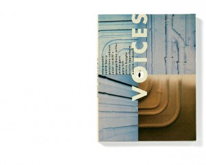
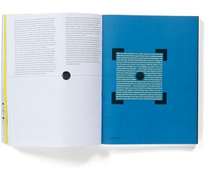
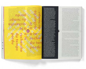
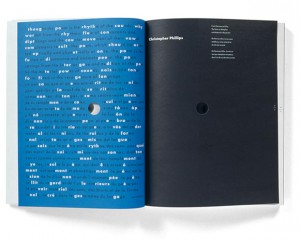
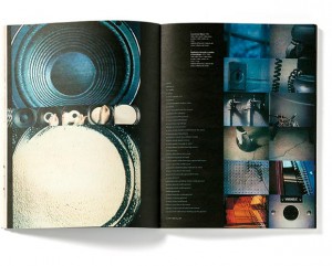
The book I chose for this project is titled “Voices”. It is a book named after an exhibition that once took place, which had the same name as the title.

“Voices is an exhibition that brings together works by nine contemporary artists of different origins and generations, discovering the domain of the visual and the material of sound contributed by the human voice”

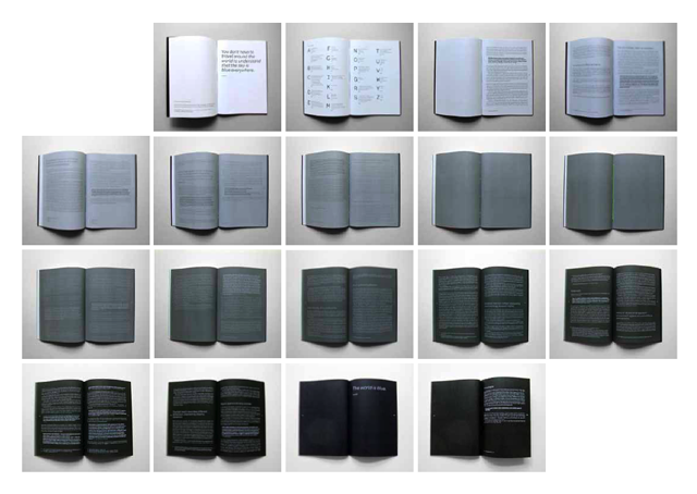
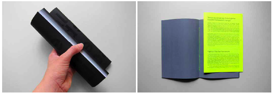
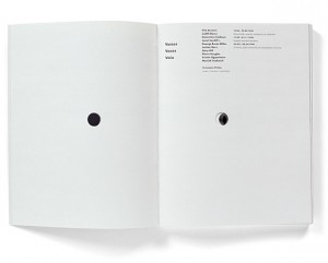
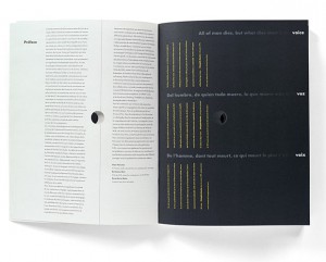
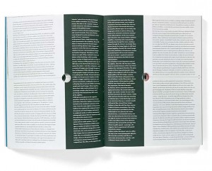
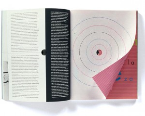
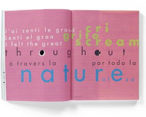
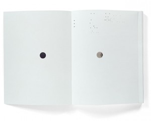
The choice I made for this book was quite selective. As I scanned through the given booklist, what caught my attention most were titles with the word ‘voice’ in it. Probably because of last years Studium Generale that took place with the subject of ‘voice’, but turns out a subject that I have an interest for. I noticed this strong attraction for this word and decided to find a book related to this subject. Immediately my eye fell on this book with on its front cover the word ‘voices’ with big letters centered between 4 images that are filling up/being part of the front cover. The backside is divided in 2 images. On the front cover there is a hole in the letter “O” of the word ‘voices’. You can not see through the hole because the following page is covering the hole with its white. But when you flip the second page you will see (through) the continuing hole till page 33.

WDW_CT_vo98_12

And there is more which caught my attention inside the design, the ‘dividing’. A thin black line through the center of the pages (horizontally/vertically) is attracting my eye. It’s seems like a strange element in the whole of the design. I want to know about this line. Why do I experience this line as unfitting, and why is it at some pages not reaching the opposite side it should do/ and does in other pages. 3 Languages who are divided by those attention-seekers of lines in many different ways, so many notations within the book, within the design, resulting to a bit of my frustration of not be able to ‘read’ this musical score.

WDW_CT_vo98_04WDW_CT_vo98_05
WDW_CT_vo98_07WDW_CT_vo98_11
WDW_CT_vo98_09WDW_CT_vo98_10
WDW_CT_vo98_03WDW_CT_vo98_06

While looking at other work of Hans Bockting, and getting introduced to a calendar from Hans Bockting (Traffic Design,1980), which I played with for a while, every month/page a different surprise in it’s full meaning, small attachments, opening/closing/lifting-up/changing material/sizes/colours, TACTILE SENSATION & FEEDING FOR THE EYE, again the sheet music work which I can hardly handle following from start until the end, but knowing it works perfectly as a whole. Let’s play it again.

After some plays I questioned myself why for godsake I am always attracted to such a full-filled mixture of information/ images/elements/things going on in, as now researched ,a book,design. Translated into my experience of observation “CHAOS”!

It is for my personal perspective exciting to see as much as possible, as many possible variations of information on a surface , in design, images etc. ! MASS !

I like to see mass and take time to discover every quality within that mass, but at the same time it is in general the case that I get stuck in the beginning of the discovery, losing track of what I am actually seeing while zooming in on a particular element/part, raising questions, no answers, no guide-through,raising frustration,loosing interest in zooming in on the following element, and taking it as a whole, but not really understanding.

Looking at my personal way of living, way of working, WORK, I consider myself as a possible face of the word ‘chaos’. I am attracted to chaos, but I would be happy if the chaos could be read in the way of the music sheets. In my personal way of working, I have taken steps back from mass into simple and clear, to understand the way of quality of less and the non-questionable/for itself-speaking element, in order to get to combining variables into a creation not-longer experienced as chaos as ‘?’,. My so called chaos who creates the heart/ the melody in the music sheets.

I decided to send a letter to Hans Bockting with the question, how Hans Bockting can permit himself the freedom to create such a playful diversity of work.

I did not get any response ……………………………………………………………………………………………………………………..

…………

…..

.

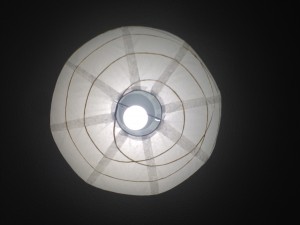
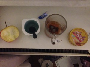
Then at one moment in thought, I looked up in my room, seeing my lamp.

IMG_0111

The circle. my escape out of the chaos.

IMG_0100IMG_0101
IMG_0102IMG_0103
IMG_0104IMG_0105

I had returned to the holes-element in my chosen book. My melody maker within my daily-life chaos. I saw dots in everything. The very clear round shaped element just made me understand.

WDW_CT_vo98_01

circles.

dots/points/holes.

the simplest element of visual design.

The defining characteristic of a dot is that it’s a point of focused attention. Dots settle themselves in space and provide a reference point relative to the other forms and space around it.

Dots are the focal points in our compositions. Dominance.

Dots create a relationship with the space around it. The two most important relationships formed are the proportion of the dot and the space around it and the position of the dot within that space.

As dots increase in size we start to see them as shapes, but they still retain their dot-like qualities and characteristics. A square placed in the white space of a page is still a dot. It still attracts visual attention to it, which again is the dot’s defining characteristic.

WDW_CT_vo98_17

Dots centrally placed within a composition create symmetry and are neutral and static, though they tend to dominate the space around them. Dots placed off center create asymmetry. They are dynamic and actively influence the space around them.

Serenity is my outcome of the research. I look through the holes of the book again, but now only focussing on what I see through the circle-out-cut on the following page. I will find the rhythm, I will find the voice.

Rietveld library catalog no : 708.5-cat-50


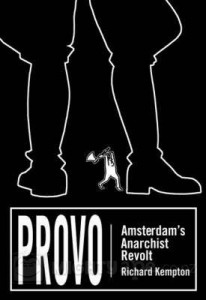
PROVO | Amsterdam’s Anarchist Revolt


Thursday, October 30, 2014

Provo | Amsterdam's Anarchist Revolt

designer: Josh MacPhee


The title of the book strongly indicates that it is of political context. Being myself concerned with politics, especially in a period of great upheaval (globalization/economical crisis) like the one we are in now, and coming from a country where politics itself plays a significant role in its history ever since the ancient times, this book instantly attracted my attention.

It is recognized that art is part of a practical activity that can change the world. In many cases it comes into existence in response to certain definite problems. Leon Trotsky has written that art can play a dual role within society: That of the mirror and that of the hammer. In other words, what he means by that, is that art has the ability of reflecting the movement of society while also forging consciousnesses inside it. Provo is representative of such case.

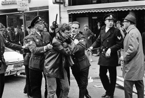
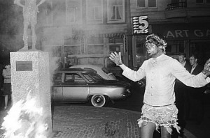
Provo is based on a political struggle in the mid 60’s, that focused on provoking violent responses from authorities using non-violent bait. It is an Amsterdam-based anarchist, political, social and art movement. Its interventions where staged into the symbolic and everyday spaces of Holland. What is interesting to look at, is that the activists involved with this movement, where really creating their own distinctive posters, graphics and other forms of art, such as political spectacles and street theater, illustrating their beliefs and intentions.

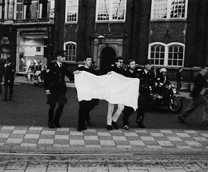
Walls and words, silk-screen posters and hand printed flyers where the revolutionary media passed out in public. The Provo radicals would carry out total black or even totally blank banners, purposely provoking the police in a ‘ludic’ attitude. They would relate themselves to Dada, constructivist movements, Bauhaus and other Russian ways.

wit

They took existing rules and decided to play within them, to see how far they could push the limits of those rules.
They were not allowed to use actual slogans, so they decided to use unwritten banners. They made use of the ambiguous nature of play: They were protesting, but at the same time not protesting. There were no forbidden slogans on their banners, but at the same time, the slogans were ever so present throughout their absence.


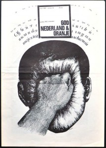
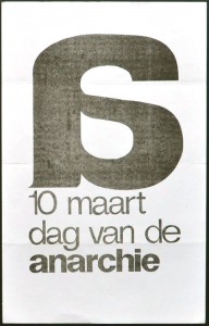
pro0102-provo-artists-book-god-nederland-oranje  Anarchy


http://www.experimentaljetset.nl/provo/

http://www.experimentaljetset.nl/archive/interview-graphic-no-24


It is a simple, black & white book. Its design is intentionally simple, in this way successfully highlighting the content of the book, erasing any type of decorative matter. Looking at it’s outline, it is clearly characterized within the Provo attitude. It is not modern or in any way trying to draw attention through some kind of unusual graphic design. The pages are matte and the text produced with a bold, black typeface. The only evident, decorative detail are some thick black lines and squares either on the sides and bottoms of each page or in the beginning of a new chapter. The ink on the paper seems quite thick, giving the impression that if you rub the pages in the book you are almost able to scent, as well as feel it.

Consequently, it successfully carries out a very strong depiction, that the book itself, could be an original Provo pamphlet or poster. The do-it-yourself feeling is well portrayed through its design. The cover of the book itself is also represented by a successfully eye-catching Provo poster, illustrating a pair of gigantic feet ready to be chopped off by a tiny white figure.


Photographic documentation from the book:

ANP01_13385083_X
AdamCanon_45


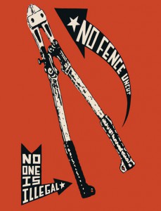
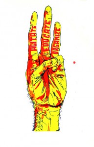
The designers background totally reflects upon the the books context and therefore explains his design. Josh MacPhee is a Brooklyn based artist, activist and archivist. He is also a print-maker and a self-taught historian of 21st century left politics. He established a distribution system called ‘Justseeds’, a decentralized, worker-owned cooperative of twenty-five other artists. Justseeds relates to social and environmental movements and issues in order to get more radical art projects out to the public. Their work illustrates an extraordinary aesthetic range of radical movements during the past 50 years and explores the rise of powerful countercultures that evolve beyond traditional politics, creating distinct forms of art, lifestyles and social organizations. MacPhee’s simple aim is to use art, such as visual and graphic work, to inject protest politics into public discourse.

Besides Justseeds, MacPhee also organizes  the ‘Celebrate Peoples History Poster Project’, an ongoing poster series in which  different artists create posters to document and remember moments in radical history. He himself, has a big collection on political posters. For instance, he collects Cuban political posters as, while according to him, they are some of the “most aesthetically diverse, experimental and impactful in the history of political posters.”

http://www.justseeds.org/subjects/anarchism/


We cannot delude ourselves. No art has ever only served itself. We ought to support and defend the art born within resistance, the art which fights and contributes to equality and fairness.


04pcnofence_400043Steps1_400

Josh MacPhee :
No Fence Uncut /offset printed postcard • Three Steps /3 color screenprint 

Rietveld library catalog no : 947.6 kem 1

A wise man


Thursday, October 30, 2014

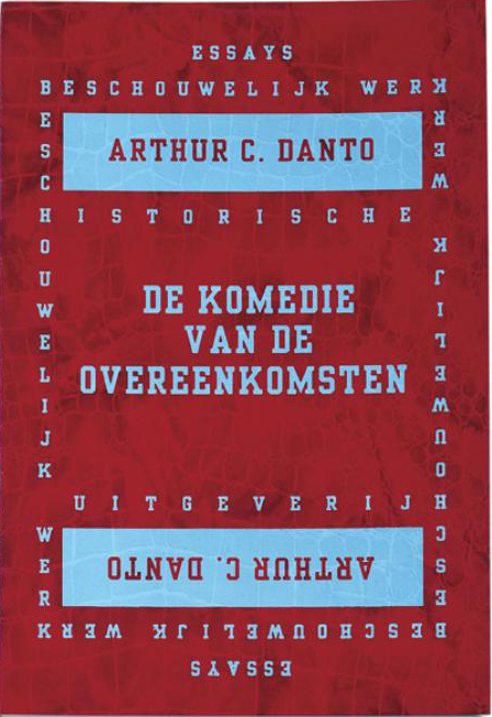
I chose this book because of it’s dark red crocodile/snake like cover, with its light blue text. The cover is soft and flexible, but still stable and firm. I spotted the book immediately by its contrasting colors, and small thick size. I like the fact that the first two, and last two pages associates to the cover by their light blue block color, clear of text. The design is strong, graphic and individual.
The book is mostly all text, except for one page with a picture of a painting.
But i really like how the text is setup in ‘boxes’ placed in the middle of the page, very simple.

The book is called ‘De Komedie Van De Overeenkomsten’, designed by Felix Janssens a dutch graphic designer that lives in Holland. He is now working as Creative director at the company Total Identity. I’ve been talking with the designer over email about this very special and eye-catching book of his, and he agreed to answer a few question for me.


Bookcover_red


Why did you chose this cover/design?

The cover is part of a series ‘beschouwelijk werk’ (reflections) of renowned historians. I always look at publishing houses like Gallimard or Penguin, how they made these series…. only type, but in a way it pops! by making it physical with the leathers it really became something tactile, a sensation for the senses. But its not only the cover that matters, the interior is like a comfortable living space.. comfortable, with some sparky details. Smooth papers, easy to hold in your hands for a longer time…
The type, the combination of the industrial Egyptiëne display font and a Garamond-like body typeface, the mirrored border on the cover…. an art-deco appraoch that fitted well to the titles in the series.


Did you decide on your own, how the design was going to turn out, or did the author have any inputs?

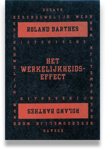
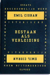
Since the concept was applied for more books like Cioran, Blumenthal, Barthes and others, it was finding the right combination of colours and textures.


barthes_werkelijkheidseffec blue-yellow-shade


Why those colors?

Red and blue, complementary… high contrast… and like you wrote, a blue that’s off normal, slightly lighter than you would expect… making it look younger. Juvenile.


Why the size?

The size is comfortable in you hands while reading. Slightly more wide than a pocket would be. It makes it more like a little catalog…


How long did it take you to figure out the design?

I can’t recall, but normally these processes start with an intuitive idea,

which becomes starting point and goal, without being a dogma or fixated idea…
Its the accumulation of what you’ve seen without being concrete yet. Typography and book design, it’s pure intuition for me. The moment one starts to rationalize or describe it, it becomes false. It’s the space of pure abstraction which you have to keep ‘open’, which you have to prevent from putting to literal meanings (design) on top of it.


What does your agenda look like when you get a job to design a book? Where do you begin, and how many samples do you go through, before you find the right one?

You’re right it’s a generational process. More recent i designed in collaboration with the artist Willem Oorebeek the book Monolith2, starting with a white book to be filled. It was like a painting process.
Normally book design is about planning, this time it was like growing, creating, shaping, molding… very interesting. And different!
For a good book, physical qualities play a big role. So different samples in weights, binding types and finishes are being made. Also for the series of the HU/Beschouwelijk Werk.


I’ve discovered that you have been using the same design, for other books writing by other authors, but in different colors, whats the idea behind that?

Like i said before, to create a series, with enough differentiation between the volumes, colour combinations are like a personal comment on each book.


What is your opinion of this book?

Danto as very specific ideas about art and art history. Radical, and unconventional. I like that.
To be honest, i don’t feel myself equipped to judge about this book- I am more influenced by philosophers, economists and sociologists.


Do you often buy books mainly because you get fascinated by its look?

Do I buy books? less and less. After collecting books for years, 4 years ago I stopped buying books. It just didn’t give meaning anymore. I think that most designers collect books for their looks, the design or the designer. Just a few actually get read.
So it was with me. I rather preferred experiencing things in reality… Now I buy/want a book because of it’s content, the overview it gives me. So books now fascinate me by the content, regardless of their looks. But if they look good, it’s not too bad 😉


Would an ugly/less attractive book cover/design (in your opinion) keep you from buying or looking into the book?

No, an ugly book may enter my domain. You wouldn’t discriminate a child or dog by it’s looks either? It’s their inside what matters.
Would you trust somebody who’s too good looking? But it proofs that design is just a dream, a phantasy when disconnected from it’s primary function. A book, a chair, a bread, a bicycle, all objects we use.
But now, Bread can be bought for more then 5 euros on the Noordermarkt! a bread! how about that? That Bread is more like a conversation piece for guests and friends…it’s a today’s authenticity fetish. 4 slices of industrial fabricated C1000 bread allow me to cycle for 200km. The c1000 bread is the ‘ugly book’ under the breads, yet it’s functional.
The Noordermarkt bread is the ‘design book’ under the breads- it is validated by it’s “sign-value”.


Do you always work in colors?

The Identity color codes project learned me a lot about colors. About the psychological dimensions apart from cultural differences. It tought me a lot about the limits of symbols. Colour is free, free to use, to adapt to. It’s inclusive. Symbols are exclusive.


What is your top 3 favorite book designs?

It can be any type of books, just 3 that caught your eye and you have to own them.
I lost a great part of my collection/archive a few years ago…. but these ones I carried with me
Walter Nikkels made a beautiful book with Lothar Baumgarten “Carbon”, The Custom Road bike or Viewing Matters from Hans Haacke

Rietveld library catalog no : 700.6-dan-2

She put a spell on me


Thursday, October 30, 2014


Boezem

The book was staring at me. With its big shiny, purple letters saying BOEZEM, the Dutch word for bosom, and its firm, solid appearance, almost like a brick. What could this book be about? Anyway, this title, the bookmaker must definitely have been aware of the confronting and maybe also provocative impact it has on its audience. Me, in this case. I found it daring. I found it also daring that there was no picture, no nothing on the cover, except for those letters. I felt like touching the book.

I lifted it from the shelves and it surprised me once again. Whereas I had considered the book as quite minimalistic and probably consisting of just the two colours black and purple, it actually had this very subtle grey pattern on the side, looking a bit like stars in the galaxy. When opening the book it had more surprises for me. So much information! Totally not the white, sterile pages that I had expected, with maybe equally sterile pictures and once in a while a minimalistic amount of text. There were drawings, there was text, dark green as well, and both black and white pictures and full-page colour prints…


Yellow-coverred-cover

OrangeDesign-coverNewspaper-cover

“I want to make books with a high amount of density and content.”

Says Irma Boom, the designer of BOEZEM. You can say that in that sense, this one is a very typical book of hers. Just during a first sec google-investigation, I found out that she is probably the most famous Dutch book designer of the moment and that she has made over 250 books. It made me wonder; if I had known this designer Irma Boom, would I have known that the design of BOEZEM was hers? In other words: if a person makes this many books, is his or her ‘handwriting’ visible in every single one of the books? Is it even inevitable? And maybe even more important: would a clearly visible signature of the designer rather thwart or support a proper presentation of what the book is about?


It made me wonder about what it specifically is in that makes people like her books so much. I knew that I had already experienced it in kind of an intuitive way, when getting drawn to her design for BOEZEM. And the way I responded to this book must be an experience a lot of people have when seeing one of her books. Otherwise, she would not have been praised so much as a book designer. But what are the more concrete causes for this?

In order to find out more, first I decided to get more informed about her books; about what kind of projects she has done and about the books` appearances. I started searching on the internet for interviews and articles and I also went to the bookshop Nijhof & Lee that has two bookshelves dedicated to Irma Boom`s designs. To get more of an overview, to hold the books, and experience them as the objects they are. Some of her projects that were the most striking to me, seemed to be also the most famous.

For example, there is the SHV Thinkbook (not in the book shop) which is a jubilee book for SHV, a family owned company with interests mainly in the energy-industry and it is a collaboration between Boom and the art historian Johan Pijnappel. It weighs a little less than 4 kilograms, has 2136 pages and is made up of poems, quotes, letters, advertising, interviews, reports, speeches, memos and photographs from the company`s archive. The book has no page numbers, because it is not meant to be read from beginning to end, but as a ‘voyage’; you have to discover things by coincidence. The touch of Irma Boom becomes maybe the most expressed in all the little details: the poem on the side, the text on the cover that only becomes visible after the book is being used, the fact that there are a lot of pictures in it of family members with their dogs…

Another example is N°5 Culture Chanel, a book printed with no ink, because all the text and all the images are embossed. Just like the perfume, you see it, but it`s not there. This book as well has some interesting detail. The book for instance has a height of 5 centimeters, referring to the name of the perfume, and it is fully white and goes in a black box, referring to the relation between Chanel and black and white.
Furthermore, there is Colour Based on Nature, which consists of colour diagrams that are derived from 80 natural locations designated as UNESCO World Heritage sites. The book pages have to be torn open in order to let more diagrams appear. Another notorious example is Sheila Hicks: Weaving as a metaphor. One of the many beautiful details are the rough edges that refer to Hick`s tapestry.
Just some examples, but they already show how varied the projects are that Boom has done. Every book is a totally different object, having an original style adapted to the subject and interesting new details, and with a totally different format.
 

“Perhaps every book I make is kind of a failure that I constantly  want to improve by the next book.”

Book-image_IrmaBoom

But still this does not necessarily exclude that there are some resemblances throughout Boom’s designs, because there definitely are. They differ from returning details – little obsessions maybe – to approach of book design, but one thing is clear: they are indispensable for a Boom-design.
What the books are known for in the first place, is their object-like quality; they are almost like pieces of architecture. This I experienced when seeing BOEZEM and having the association of a brick. Boom sees the book as a container of a lot of information, an ongoing thing, with a permanent quality (of spreading information), in contrast to the internet. And this of course should be manifested in and attained by the design of the book. This is also why the book’s edges are almost always incorporated into the overall design: to make it one whole. Besides, a lot of the books ask for interaction and this way a relation is stimulated between the viewer and the content.
Next to that, attention to detail is what is most essential for a Boom-book. Through those exceptional details, Boom is really able to make –mostly symbolic– links between design and content. Otherwise there is these recurrent little features Boom seems to be fan of, such as embossing, reversed chronological order, and every publishers` worst nightmare: the white cover.
But actually most of all, her books scream uncommonness, everything in it is opposite of what you would expect.
So, the designs certainly have things in common and are in that way sort of connected, very much also approach-wise. You can call this Irma Boom’s signature, but I think it would go too far to define her signature by an obviously present personal ‘imprint’.

But let’s get back to the other questions I raised in the beginning of the article. As a book designer, is it actually desirable to have your signature visible in your designs? And if not, is it even avoidable?
 

“Making a book you should do with your heart, intuitively”

If this is Boom’s belief, how can her own ideas and preferences of aesthetics not prevail? But still, by saying that she wants to make the book for someone and not just a book, you might actually conclude that Irma Boom tries to keep out anything that refers to herself, as a book designer and as a person, so the book can be fully centred around its subject. You could translate this statement of her as the aim for objectivity. But just have a quick look at her books, and you are assured that her books are far from objective. Her taste, her humour, and her willingness to experiment always become apparent.

And the fusion of Boom with a subject, it seems to work. The adding of a little subjectivity, so to speak, seems to lift the subject. It seems to give it a structure, a context, a voice maybe… This effect is also enhanced by the fact that she is often the editor of a book as well. Maybe this kind of ‘subjectivity’ that Boom incorporates in her designs is part of what makes her so successful. So, in case of Irma Boom, she is sort of depending on her signature and thus it is very desirable for her and her audience.

From a different viewpoint, if someone, a publisher, a company, or an artist asks her if she wants to make a book for them, wouldn’t they want, the ‘handwriting’ of Boom, to shine through in the design a little bit? She is so renowned that it is such an honour if she makes a book for you. Let it be visible, they would probably think. Besides, it obviously sells better when people know that she is the designer, or it could mean something very good for one`s career… look at Sheila Hicks. The many awards winning book that Boom made for her, instantly gave her a huge career boost. Of course, you can also question why customers buy one of Boom’s books in the first place. Is it because they are actually drawn to the book itself? Or is it because they are drawn to the fact that the famous Irma Boom has done the design? Looking at it in this way, does Boom’s signature perhaps stand in the way of properly presenting the subject? Anyway, fact is that the people she makes books for are almost always very content with the outcome. And who knows better if the subject is well presented, than the subject itself?

Simple as it is, that is what Boom does: she evokes excitement. At the time, her own wild ideas excited herself, and through realising them she shares with us that feeling. Going for the realization of these wild ideas, it also takes some courage, and I think this is also something a lot of people respond to. Boom is not afraid. She is not afraid to personally connect herself to the subject, she is not afraid to not know at forehand what the exact outcome will be, she is not afraid to take her time (it took her five years to finish the SHV book), and she is definitely not afraid to do the uncommon. But most of all, she is not afraid to disappoint her clients or to not do what they want. The risk-taking in combination with her ingenuity and eye for beauty are always the recipe for a special result. Most people love this specialness, but of course a risk-taker has a lot of enemies as well. In the beginning it took Boom probably a lot more courage to not listen to them than nowadays, since she is a very respected and many awards-winning book designer.

It all started with that very intuitive attraction to a book that turned out to be made by one of the world`s most famous book designers. Now it ends with me feeling like having at least partly unraveled the magic behind it. But even if I might have unravelled the magic a little bit, the spell that Irma Boom`s books put on me, is definitely not broken.

Rietveld library catalog no : 05547


Don’t judge a book by its cover


Wednesday, October 29, 2014

Esther de Vries is a graphic designer specialized in book design. Among many projects, she made two books on her father, the sculptor Auke de Vries. The two books, dealing with the same artist, are yet very different, the first one, Auke de Vries Photo Archives, being much more intimate than the second one, Auke de Vries: Sculptures, drawing and work in public space, which is more meant as an chronological overview on the evolution of the artistic career  of Auke de Vries. But what is surprising is that both books are very different from the first impression the reader can get just by watching the cover.


Indeed, at first sight and because of its very strong cover and size, the biggest book seems to be one of those very classical and sometimes deadly boring art books that present an exhaustive view of the work of an artist. But going into the design and the content of the volume you can experience it as an actual novel object. A lot of different materials are used in the book, making it exciting to go through, and a great importance is accorded to the process, thus gathering a collection of sketches, photographs and forms that helped or influenced the artist with his sculptures, and even pictures of the artist working in his studio. On all those pictures the text is set in an unquestionable playful way, sometimes even covering the images.


An other particularity that makes the book playful and thrilling is the use of very thin pages presenting a compilation of different forms, cut from a photograph of a work of the artist and magnified. Those pages refers to the collection of forms that the artist developed and used constantly in his work. Esther was keen to scatter that through the pages as, what she calls, an alphabet.


As for Photo Archives, the fabric and very simple cover makes it look at first glance as a secondary book, very small and discreet, soft, not meant to go through the years as the other one. But once more the design and content makes it very special, in a precious and sprightly way. While the other book is meant to present mainly the evolution of the artist’s works, this photography book shows through the collection of pictures the process that took place even before the artworks, as a wandering in the thoughts of the artist.


Here the relation to the reader is completely unusual, as there is no chronological order or reading direction. The reader, who is more a viewer since

there is no text, can open the book in the middle, at the end, or open the same page again and again, led to wander in the same way that the artist was wandering when he took those pictures.


archive_04


This is also a quite seducing book, designed between rule and coincidence with a set of colors and places for the pictures that are sometimes cut in two by the Japanese binding, leading the reader to focus on a particular shape that recalls Auke de Vries’ work. I noticed that the two books are very different from the first feeling you can get from them.


Yet, maybe Esther’s work, or at least these two books, deals a lot with feeling. That is to say the very strong feeling that the reader gets or is given in both cases of the close connection between the work of the artist and the design of the books. They pay homage to this work. It might has to do with the fact that both books where initiated by Esther herself, and not commisioned, hence the liberties in the design. This is also caused by the very long process that the designer went through while making those books, meticulously choosing each picture and composition, trying all the colors with each image again and again, changing direction until being fully satisfied, regardless of time.


All that makes both works very touching and the enthusiasm of the designer becomes very apparent, discovering a treasure made of all those pictures and willing to share it, making it as complete as possible to preserve the emotion aroused by the pictures themselves.

Rietveld library catalog no : Vrie 5 (

Rijksmuseum library catalog no : 832 E 13 (


Log in
subscribe