Alvar Aalto was born 1898 in Finland that was ruled by the Russian federation. Aalto’s generation was heavily influenced by National romanticism and the “fennoman”-movement which had the goal to create finnish culture, art and ultimately a independent nation. Finnish national romantic style was very decorative and even complicated, reminiscent of art nouveau. Aalto’s work seem to be a comment or a reaction to this atmosphere.
Aalto graduated as an architect in 1921, when Finland had been independent only for few years. The time for dusty hardwood vitrines, and massive decorative stone buildings where fading to the background. Aalto was on the verge of a new time, and it showed in his designs. In his early career there where a few very influential projects, and the Paimio sanatorium was one of them It was one of the first buildings where he designed everything regarding this building, the whole experience.
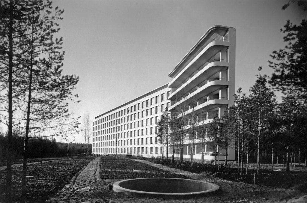
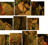
paimio sanatorium
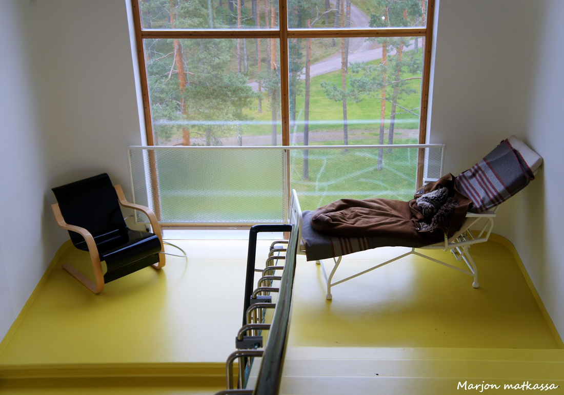
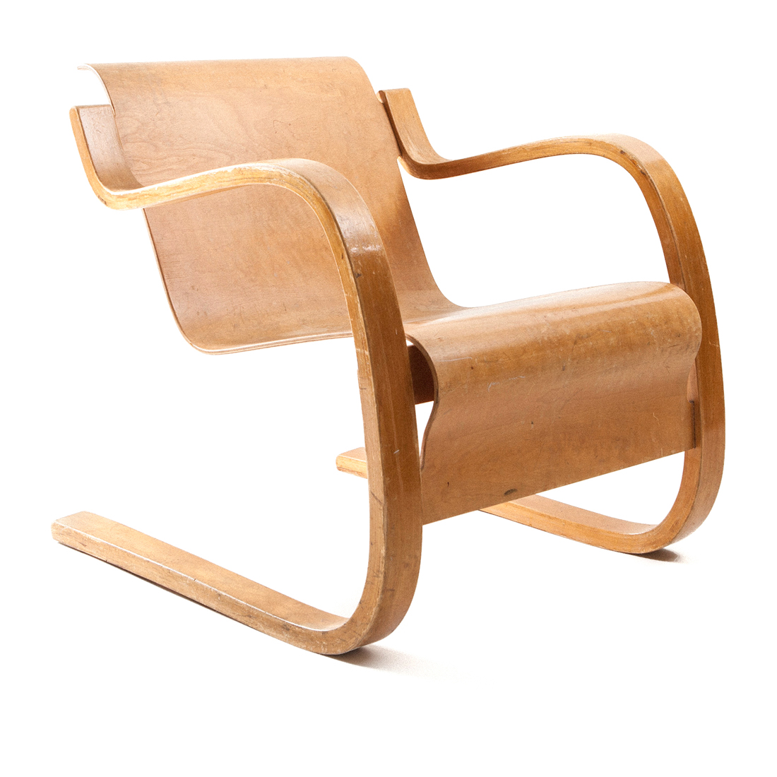
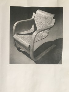
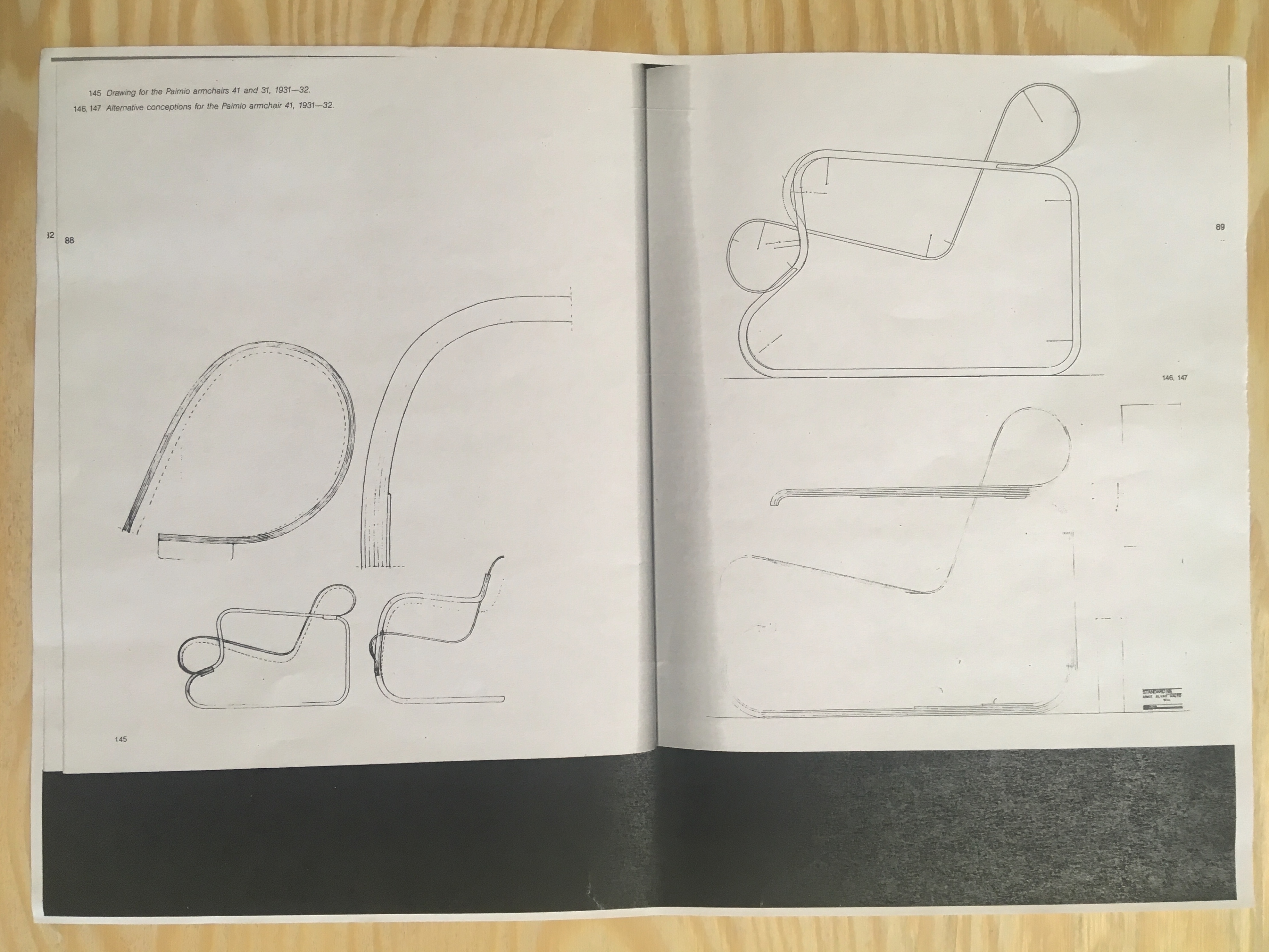
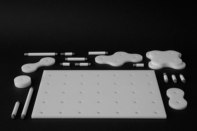
What is it like to sit in a chair, and what do you see when you look out of the window. Is the position comfortable, or the material pleasant? And of course, what does the chair look like when you are looking at it. The lounge chair 31/42 was designed in 1931 for the common areas of Paimio sanatorium, and received all sorts of publicity after that since it was a part of the finnish pavilion in Paris world exhibition in 1937, and after that was exhibited in New York MoMA in 1938. Today it is one of the most iconic designs from him.
As I started researching this chair I mostly found auction sites selling this chair between 4,000-8,000e most of them had the same description text about Aalto and the curved wood.when I searched in finnish I found a bit more. The auction sites, Aalto foundation and Aalto museum, on top of that I found a pile of news websites asking “Is your grandma’s chair worth thousands of euros?”-or something similar. Internet research gave actually very limited information on the actual chair.
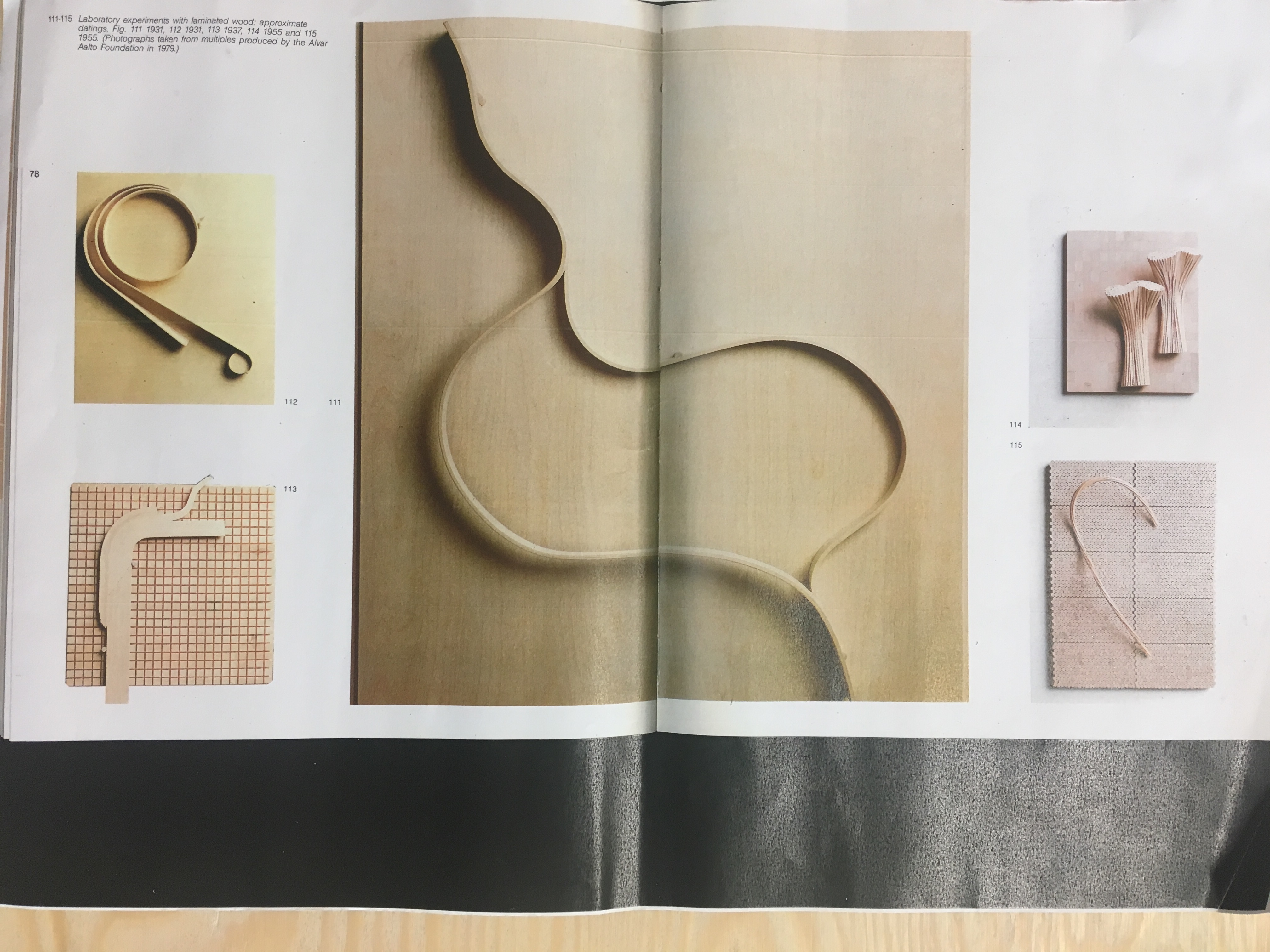
Next I looked in the Rietveld Library and found 1 book regarding Aalto’s early career and wich mentioned this chair and was from 1965. This book already gave me a lot more information regarding the making of the chair, how it relates to other designs from him at the time, and what is the mindstate in which Aalto actually made this chair, what is the so called “philosophy” behind it. The curved wood was a specific asset wich was also emphasised on internet about this chair, since it is the most unique feature in it.In this book there is a quote that explained his view from me very clearly:
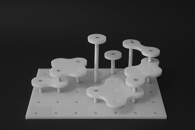
“In order to achieve practical goals and valid aesthetic forms in connection with architecture, one can not always start from a rational, technical standpoint – perhaps even ever. Human imagination must have room to unfold. This was usually the case with my experiments in wood. Purely playful from with no practical function whatsoever”-Alvar and Aino Aalto
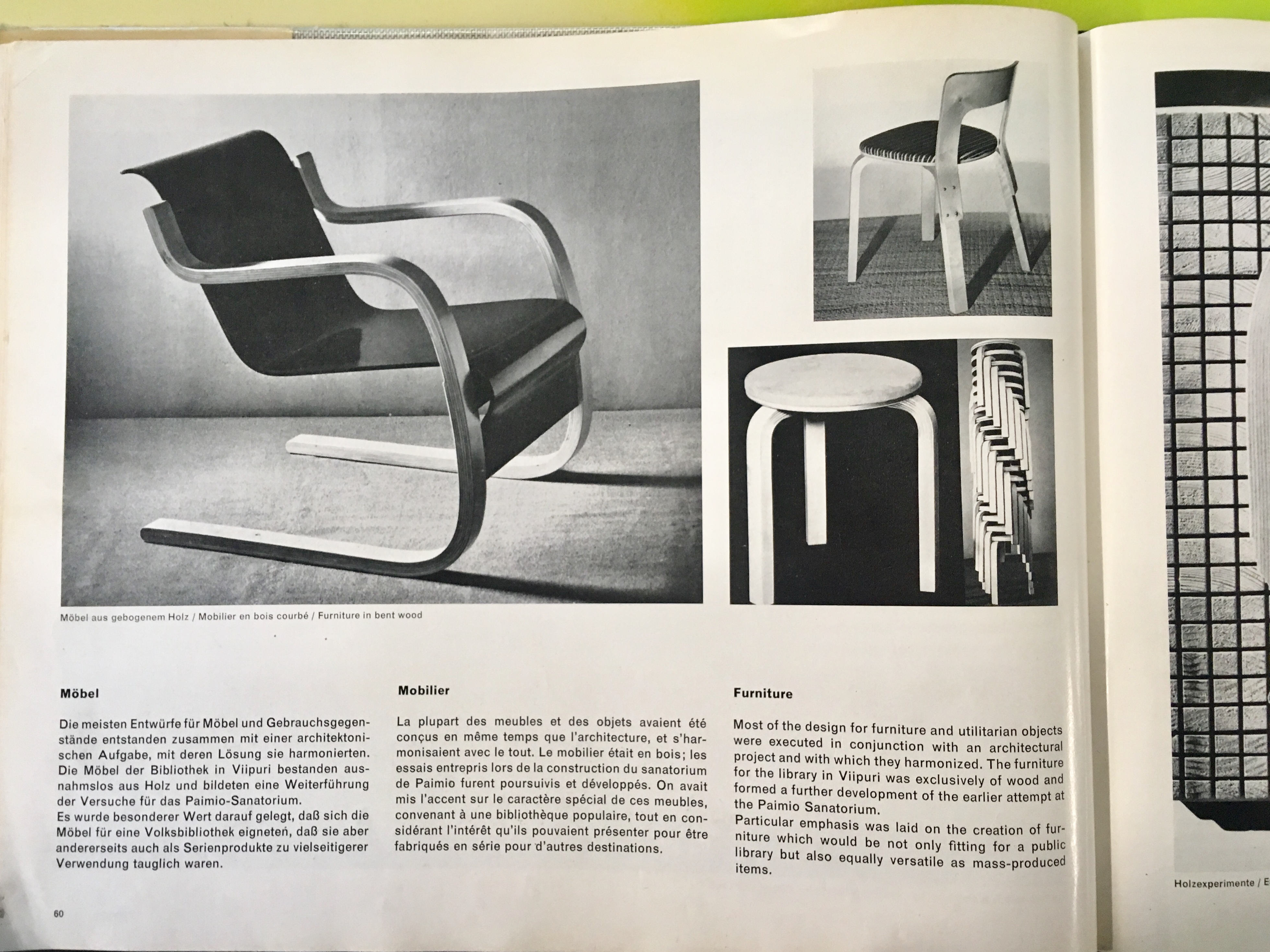

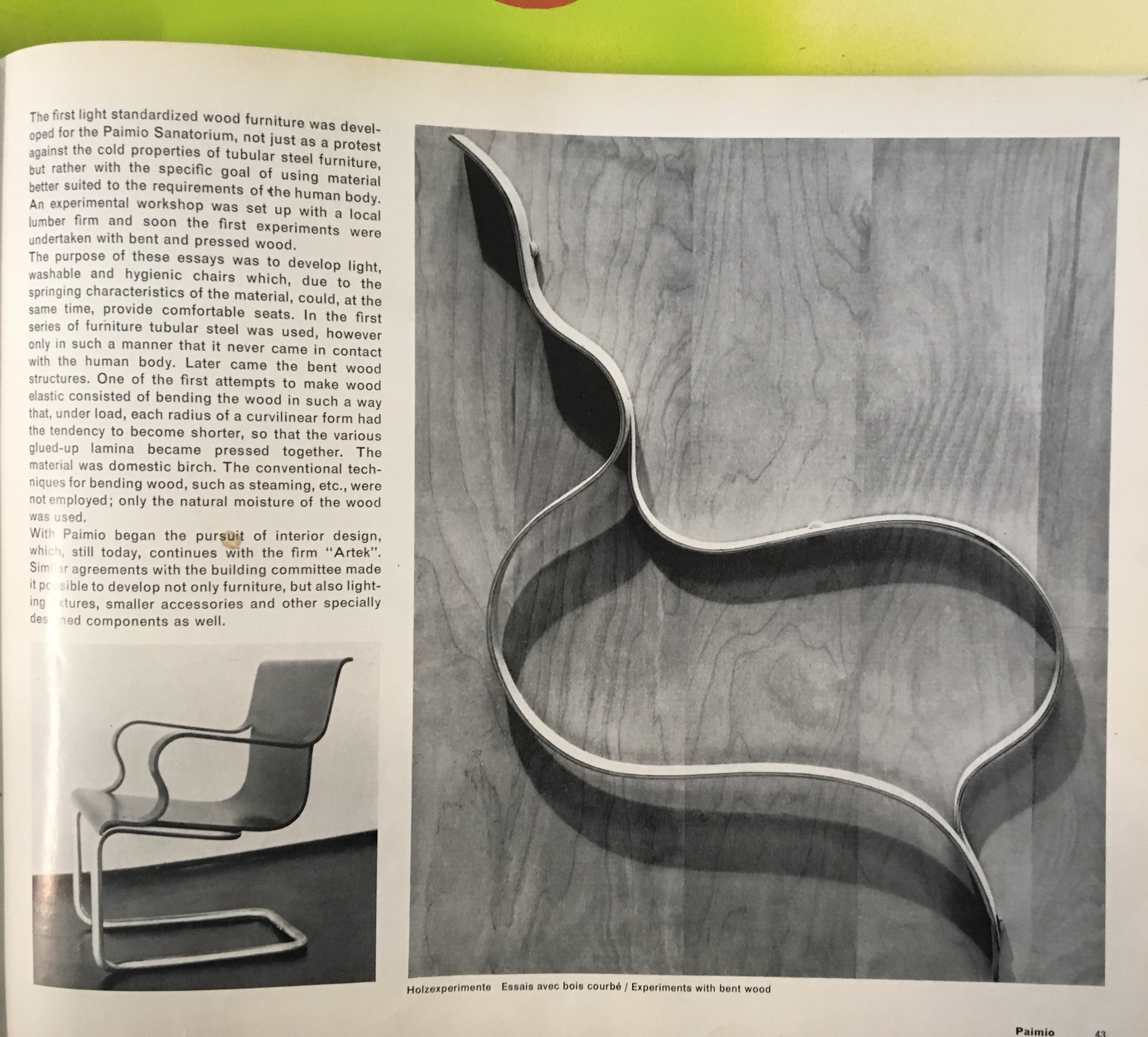

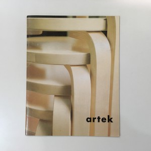
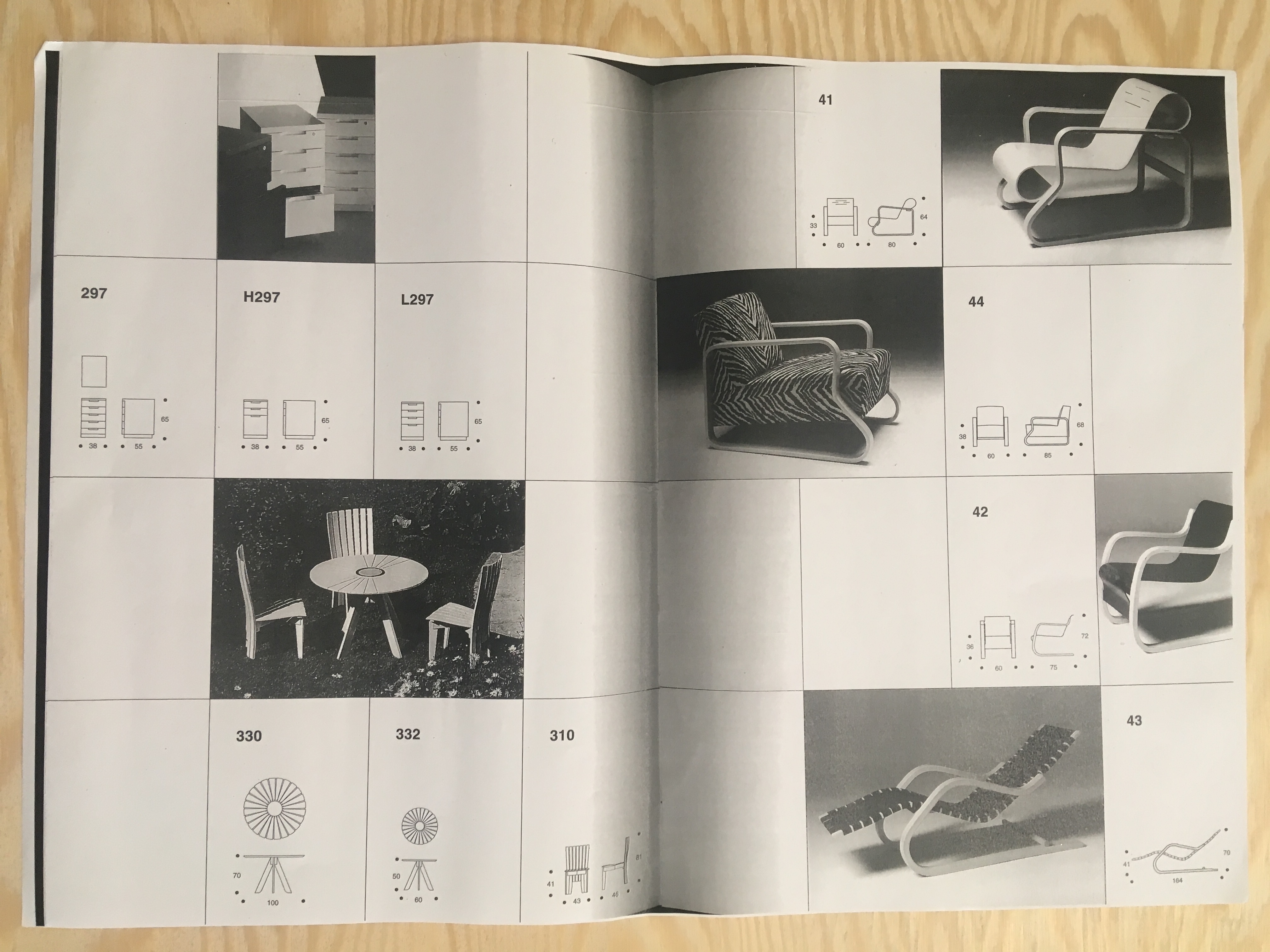
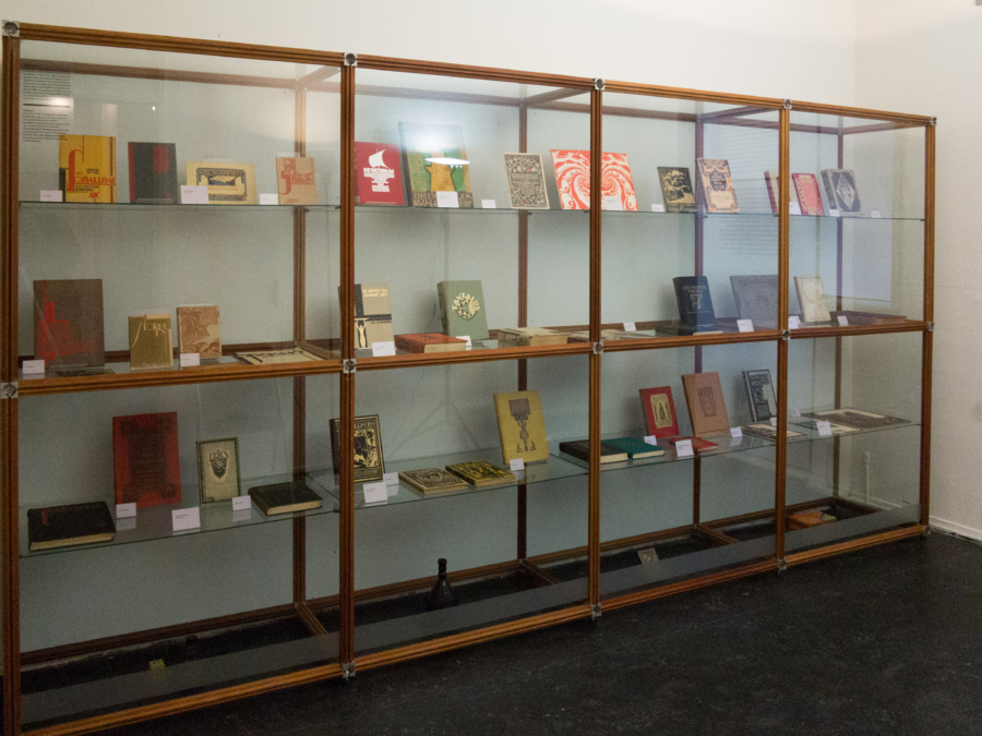
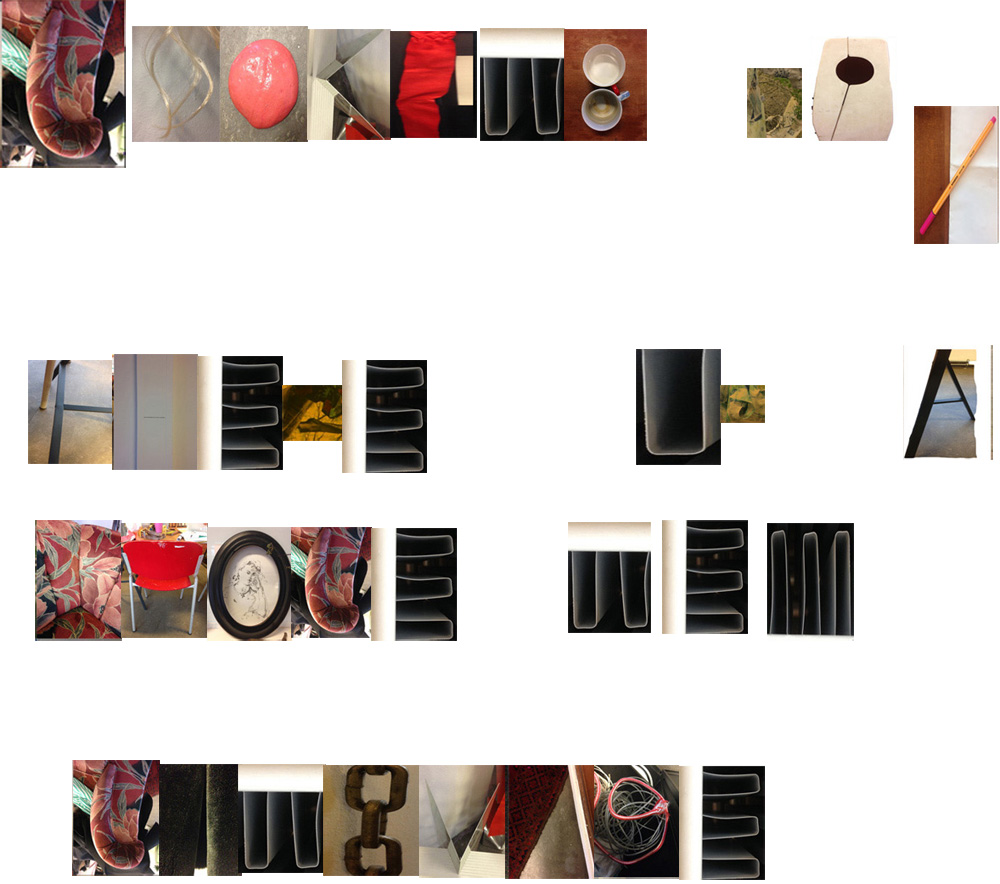
Final step in my research for now, was the stedelijk library. My goal was to find original advertisements and maybe a pamflette of the chair in New york MoMA. I did not find original advertisements from the 30’s, but i did find artek publications that the museum had collected and a magazine MoMA had published on Aalto’s Furniture and glass designs. There were also two books which were very useful for this research a book about aalto from 1938, showing how this chair was displayed and viewed at the time. The Other book was called Alvar Aalto furniture, and this book showed the evolution of his chairs as well some sketches and experiments on the curved wood on this chair.

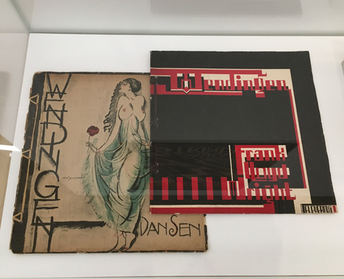
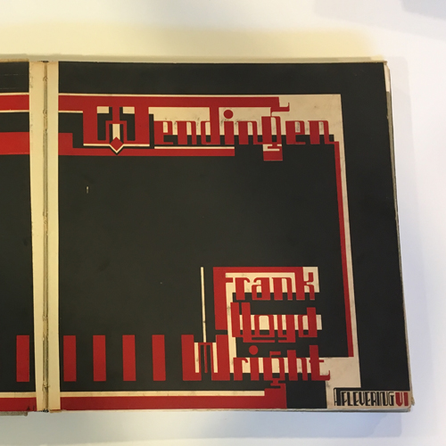
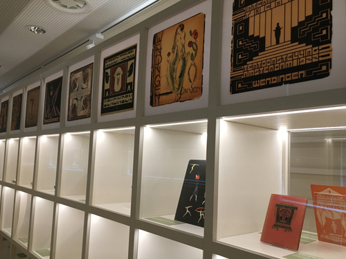
 MoMA magazine
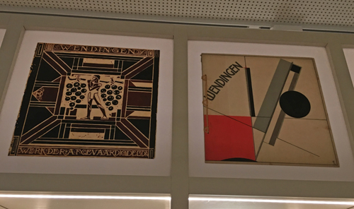
 written in 1938
My research is not over yet. My next step is to search finnishpublic libraries and Aalto university department of design’s library and compare the information to the one I collected in the Netherlands. After that I have to go to jyväskylä where the Alvar Aalto museum is, and try to find some original finnish publications of this chair there, since they could not do much for me on the phone.


