Skip to Content Skip to Search Go to Top Navigation Go to Side Menu


William Klein’s City Portraits


Monday, May 21, 2018

The American-born French artist William Klein (1928) is a multifaceted photographer and filmmaker, known for an unconventional style of abstract photography and in the same media a revolutionary approach to fashion. This text, however, focuses on his series of photo books portraying the cities New York, Rome, and Moscow.
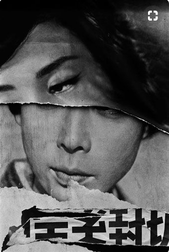
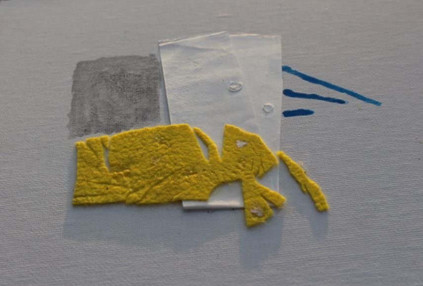
This research had its starting point in Klein’s posters for the magazine Domus; As elaborated later in the text, Klein experimented to a great extend with a sort of “trashy”, or maybe just honest, way of expressing “city life”. Domus began to publish Klein’s experimental graphics/photography as front covers for the magazine in 1952. Among the covers were a very rough way of handling photography and typography to be seen: William Klein would torn his own work apart and put the ripped parts back together in an uncouth order.  As a visual language this lack of perfection and polished finish seems to find its inspiration in the actual torn posters one sees on walls in the streets of big cities. Having this style of “torn” magazine covers in mind, this research dives deeper into Klein’s visual language [x] describing the life of a city.

domus-cover-William-Klein_950 Schermafbeelding 2018-05-31 om 12.48.21

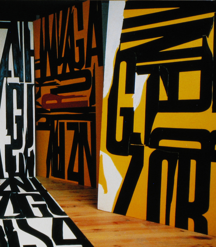
Klein studied painting and never received formal training in photography. One can argue that this “lack of technical education” made his experimental approach to the media possible. He would have to find his own way. This experimental and playful way of working with a medium is also present in Klein’s graphic work, as for instance seen in various posters, where Klein mixes photography, painting, collage, and typography.


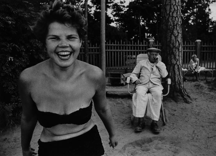
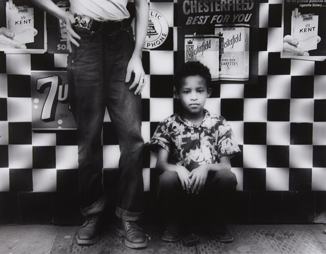
His lack of academic photography training also showed itself as a virtue in his genre-defining photo books portraying cities that Klein visited. The first one, “New York” started as a photographic diary. When Klein came back to his hometown after six years of studying in Paris, he found momentum in this medium, that he had never really used before, and executed the extensive series in just 3 months. It was also a reflection of him returning to the streets he walked growing up and seeing new representations of people and situations he experienced there. The blurry, close up, in the actual photographs where not popular at the publishing houses but eventually broke through and had a huge influence on what we know as street photography. The next book, “Rome”, was made shortly after Klein moved there to be an assistant to Fellini.

klein-11 hb_1989.1038.2

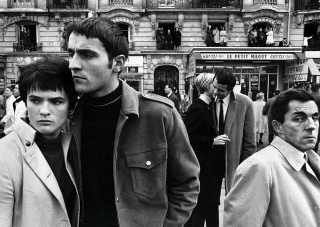
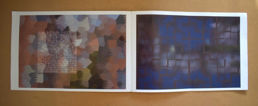
left: image from 'Rome'©59 / right: image from 'Life Is Good and Good For You In New York'©56

Having two very separate relationships to the two cities must have affected the way Klein approached the photographic investigation. With this background in mind, you can distinguish some differences in these portraits. “New York” contains more pictures of children, a way for him as the protagonist to relate back to his past experiences in the space. He even says in an interview that he sees many “self-portraits” in the series. While “Rome” has similar stylistic features, you can glimpse more of an outside view, even in the way people look back at the camera.

5734df6218267979e8f5e2bae92f128c

379_1_large

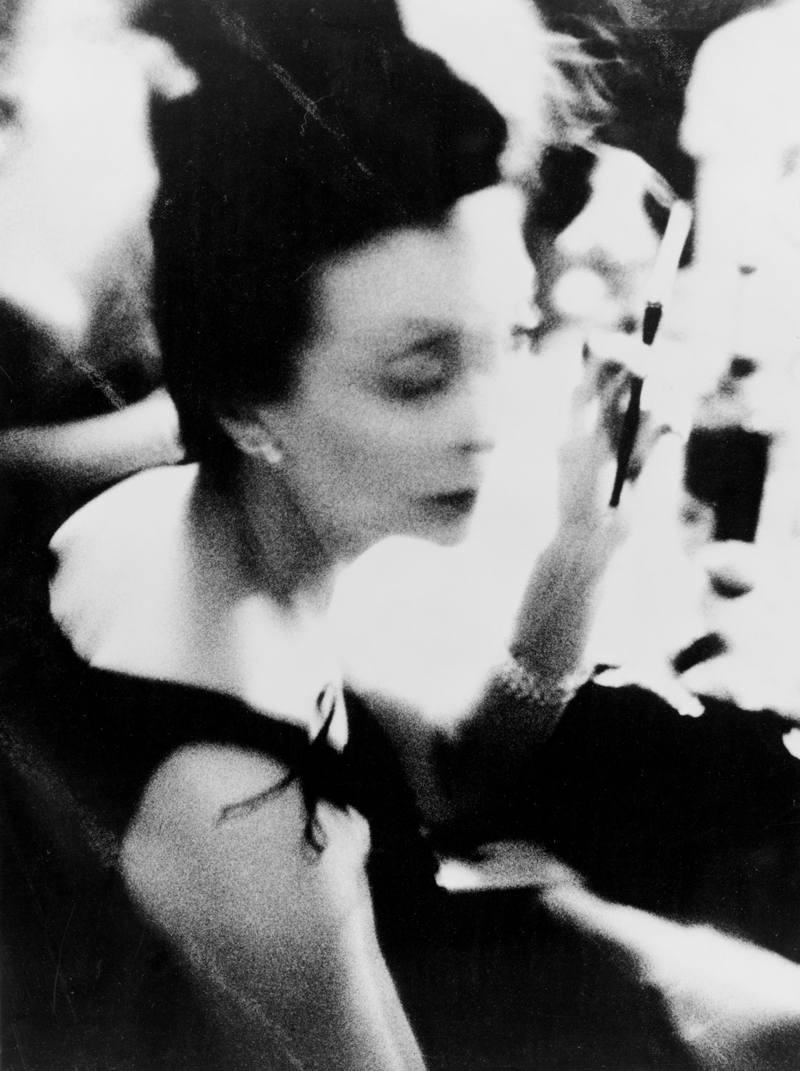
One strong characteristic that separated William Klein from the start and became one of his signatures, was the use of motion and blur causing blur. This expression was developed in Paris when he was trying to document a mural he had painted. The wall consisted of a row of rotating panels, that when captured on an image created geometrical shapes with obscure lines. This discovery would be very crucial to several of the branching that his practice took, but would not be well received initially by traditionalists.

When Klein originally tried to publish ”New York” it was perceived as being ”too ugly, too seedy, too one-sided”. The publishers were used to, and wanted to, see the city portrayed in a romantic light. The high class, the architecture, the richness. Klein’s approach was instead semi-aggressive, unpretentious, focused on the people, and had no interest in being a promotional tool. This, for the time, controversial viewpoint would, however, be very welcome when he made the ”Moscow” book, the third in the series. The western/American picture of Russia was (and still is, but maybe even more extreme back then) extremely alienating and one-sided. His book depicts a lively and multifaceted Moscow and is considered to be the book in the city series where he comes closest to the subjects.

124532-1474570722-04Klein_William_bikini-xl

Sarah Boxer wrote a review in 2001 in New York Times [x] of two of his shows, where she brings up the notion that the authenticity in Klein’s pictures might be partially staged. Specifically, she talked about an exhibition where his contact sheets are being magnified and displayed. The contact sheets had notes in the shape of circles, arrows, and crosses, singling out the pictures that Klein had chosen to use when he originally developed the film. What made her questioning was the decoratively ”perfect” manner in which the lines were made. A lot can be said about this. Klein was originally a painter, so that could be an explanation for the way the motions of his hand could come of as decorative by default. Anyhow, it is interesting because much of his legacy, and the tradition of street photography in general, is built on the purity and honesty of the content. Though some of his works are known to be staged, it still has proved itself to be able to catch an essence in a community in a superior way.

Klein4

A general problem in culture is the inevitable tendency for rebellion to become stagnant. As a direct consequence of success and the finding of a language that comes with age, groundbreaking eventually becomes mannerisms. Klein has been lucky to keep a youthfulness about his work, often by sporadically changing lanes and looking for limits to cross in another niche. This quality has made him a prominent figure in a variety of photographic disciplines and testifies the importance of diversity that the market often overlooks.

csm_Lempertz-1058-130-Photographie-William-Klein-Candy-Store-New-York_f1d3875b82

Gothic 1500 “Fractur”


Monday, May 21, 2018

What is Gothic? Gothic was the culminating artistic expression of the middle ages, occurring roughly from 1200—1500. The term Gothic originated with the Italians who used it to refer to rude or barbaric cultures north of the Italian Alps.

 According to Christopher Wren’s Saracen Theory, Gothic style had nothing to do with the Goths, rather it was a style influenced by a number of factors including Saracenic art —an Islamic influence from the Crusades.

Blackletter type is often misleadingly referred to as either Old English or Gothic, two terms that are only partially accurate.Blackletter is an all encompassing term used to describe the scripts of the Middle Ages in which the darkness of the characters overpowers the whiteness of the page.  From Type and National Identity by Peter Bain and Paul Shaw.

Blackletter also known as Gothic script, Gothic minuscule, or Textura, was a script used throughout Western Europe from approximately 1150 to well into the 17th century. Was used in the Gutenberg Bible, one of the first books printed in Europe. This style of typeface is recognizable by its dramatic  thin and thick strokes, and in some fonts, the elaborate swirls on the serifs. Blackletter typefaces are based on early manuscript lettering.

Gutenburg

Gutenberg Bible First page of the first volume

It continued to be used for the Danish language until 1875,and for German until the 20th century. Fraktur is a notable script of this type, and sometimes the entire group of blackletter faces is incorrectly referred to as Fraktur. Blackletter is sometimes referred to as Old English, but it is not to be confused with the Old English (or Anglo-Saxon) language.

With Blackletter typeface’s has 4 important type of calligraphy can be identified as Textura , Rotunda , Schwabacher and Fraktur.
 

Ekran Resmi 2018-05-27 22.03.47
 

Gothic Fraktur typeface identified with “Latin alphabet” in northern european texts , which is called “ German alphabet “ part of typeface of “ Latin alphabet”.

The word “ Fraktur” or “Gothic” sometimes applied to all of the “Blackletter” typefaces.

The original word itself come from “Fractus” (broken) of Latin frangere ( to break ) the same root as the English word “ Fracture “.


Where Is It Coming From?

First appear of Fraktur typeface during 16th century , when Emperor Maximillian I commissioned the design of the “ Triumphal Arch” woodcut by Albert Dürer and a whole new typeface style created specifically for this purpose designed by Hieronymus Andreae.

Triumphal Arch, woodcut by Albrecht Durer in 1510

Fraktur typeface for printing matters created by the Augusburg publisher Johann Schönsperger at the series of Maximillian I’s works like prayer book or the illustrated Theuerdank poem (1517).

With time Fraktur become really popular and get used in German speaking world and areas under German influence (Scandinavia , The Baltic States , Central Europe) . In the 18th century the German Theuerdank Fraktur developed by Leipzig typographer Johann Gottlob Immanuel Breitkopf to create Breitkopf Fraktur.

Typeface Fraktur still in use German speaking areas and countries as well as Norway , Estonia , Latvia and small part of Sweden , Finland , Denmark.

In the late 18th century to the late 19th century, Fraktur was replaced by Antiqua as a way of showing the classicist age and emerging cosmopolitanism in most of the countries in Europe that had previously used Fraktur. This change was argued in Germany, where it was known as the Antiqua–Fraktur dispute. The shift affected mostly scientific writing in Germany, whereas literature and newspapers continued to be printed in broken fonts.

The Fraktur typefaces remained in use in Nazi Germany, when they were initially represented as true German script; official Nazi documents and letterheads employed the font, and the cover of Hitler’s Mein Kampf used a hand-drawn version of it.

However, more modernized typefaces of the “Gebrochene Grotesk” such as “Tannenberg” were actually the mainly popular typefaces in Nazi Germany, specially for running text as opposed to decorative uses such as in titles.

These typefaces were designed in the early 20th century, mostly the 1930s, for grotesque versions of blackletter typefaces. The Nazis mostly used these typefaces themselves, though the shift remained controversial and the press was at that times named for its frequent use of “Roman characters” under “Jewish influence” and German immigrants were urged to use only “German script”.

On January 3, 1941, the Nazi Party ended this argument in the modern day scripts including Antiqua. Martin Bormann issued a circular to all public offices which declared Fraktur (and its corollary, the Sütterlin-based handwriting) to be Judenlettern (Jewish letters) illegal for any way of using it. German historian Albert Kapr has said that the those times German Government had understood that Fraktur would inhibit communication in their lands occupied at World War II.

1941jewishfonts


Fraktur or also known as Gothic script is a typeface that was and still is used in many different context. It starred around 1500 century the script is recognizable with his broken edges.  Sometimes both terms are equated with each other; then all gothic letters are called “Fraktur”. The letters of the Fraktur seem broken, hence the name; in addition, they are high and narrow. the fraktur was dated in the frans gothic period  first the hand writing scripts came and after that the print version. Besides the 26 of the modern Latin alphabet , Fraktur includes the B (Eszett) , vowels with umlauts and the ? (long s). Some fraktur typefaces also include a variant form of the letter “ r “ known as the “ r “ rotunda and many a variety of ligatures which are left over from cursive handwriting and have rules for their use. Make no distinction between the majuscules “ I “ and “ J” ( where the common shape is more suggestive of a “ J “ ) , even though the minuscules “ i “ and “ j “ are differentiated.


Use In Modern Age

Fraktur is today used mainly for decorative reasons: as an example we can look some of old German newspapers such as the Frankfurter Allgemeine, also the Norwegian Aftenposten, still print their name in Fraktur (also some newspapers in European countries and the U.S.) and it’s also very common for bars and restaurants signs. In today’s decorative way of using it, the traditional rules of Fraktur about the use of long s and short s and of ligatures are often don’t comply anymore.

1280px-Frankfurter_Allgemeine_logo kopyaaftenposten.750
Now and days the type phase gets used for differed things  as products, Music bands and clothing brands. It’s mostly see as with heavy metal bands and black hoodies. But now more high fashion brands use the fraktur lettertype for there new collections.

SnoopDog MOTORHEAD

Album Covers of Snoop Dogg and Motorhead

For example in 2016 Vetements made a collection and also Kanye West made a commercial products with in that year in conjunction with his new album release  “The Life of Pablo”.

Ekran Resmi 2018-05-27 21.20.20Ekran Resmi 2018-05-27 21.20.16

The Long Sleeves Kanye West designed for his album - Vetements 2016 collection

Today a lot of streetwear and other fashion brands use the gothic type phase different subcultures in the fashion industry pick up on the Fraktur font the street wear labels, Juicy haute couture for example this velour tracksuits it’s kind of girlish  clothing brand and a particular group of people that wore that, but with this font on the back of the pant is pretty funny also the decorat with a lot of shiny things.

Ekran Resmi 2018-05-27 21.24.41


Eye Movement and Words


Monday, May 21, 2018

When we read, our eyes do not move left to right in straight steady lines; the eye goes back and forth. The movement is a combination of small rapid jerky movements, saccades and fixations, where our eyes actually stop.

When we read a text, our eyes do not move in a straight line across the page. They make skips from words to words call saccades. They also skip words, repeat words, and fixate on words.

In the image, the dots show the fixations.

 Image 1

The brain creates the illusion of smooth line and that we read every word. But the eyes fixates on only about 60% of the words we read. The eye will fixate on the less familiar words. The brain will complete, fill in the blanks.

The are three regions of  perception:

  • the Foveal region takes up only 1 to 2% of your total vision, which is around 3 to 6 letters we can see very clear;

  • the Parafoveal region is around  24 to 30 letters which are not perceived very clearly;

  • the Peripheral region is everything else we perceive, such as gross shapes.

The page, the screen where the letters are written on, give us a frame in which our eye will stay in during the reading process. But what happens when this frame disappears?

20curtain12 large_9232d231-14e0-4598-9bd2-9a1b592dc775

Arktype Curtain and "Fire Basket"by René Knip

René Knip challenges this idea with his Curtain Arktype typeface. This typeface is meant to be hung up in a space. It is taken out of the paper into a 3D world even though the typeface itself stays flat.  The work balances between the 2 and 3 dimensional. One could call it 2,5 dimensional. The white negative space of the paper around the letters does not apply to this typeface anymore, as so is the frame given by the paper or screen in which a text is normally written on/in. The negative space is the breathing room around the subject that determines how appealing it looks.

Now that it is hung in the air, you will have to determine the frame.  You will perceive the surrounding and the text as a whole. The eye will change the way how it is perceiving the text. This is also due to the fact that the letters are connected vertically even though the words are placed horizontally, still, this will guide your eye in a different way.

An interesting thing happens to the text that has now lost it frame. It is no longer just the text that creates the visual narrative, since the text is immediately influenced by its surroundings. The two are inseparable. The Curtain Arktype makes the viewer experience reading of text in a different way. As said before, the eye does not pay equal attention to every part of a text or every letter. The eyes move around, locating interesting parts of a scene.

When reading a text created with René Knip’s 3D typeface, there is almost too much for the eye to focus on. The eyes of the beholder make jerky saccadic movements from the text to the background, finding interesting parts everywhere. The words become truly visual, where meaning is created not only by the meaning of the text, but also by their sight. Furthermore, negative space has become positive, as it has become defining creator of context.

The text and the surroundings become equally important and following that you will look to it more as a composition between the text and space. Your eye movement will be guided by the shapes around it, an eye movement which is closer to one looking at a painting, sculpture rather than one reading words.


ONES AND ZEROES


Monday, May 21, 2018

Grid comic

READA-LEGIBILITY OF FORM

Tracking   the    mutability    of    forms    of    logographic    script    to    pictorial    images    and    back    again,    we    wondered,    how    are    these    forms    created?    While    creating    is    the    act    of    mark    making,    it    is    also    the    reading    of    the    mark    that    realises    its    objective.    How    do    these    marks    come    to    be    read,    and    who    reads    them?

As    a    single    unit,    type    is    able    to    express    itself     independently    through    its    form.    From    the    pictorial    evolution    of    early    ideographic    and    mnemonic    characters    (e.g.    Hieroglyphs,    Indus    script,    Oracle   Bone    Script)    to     typographical    manipulations    of    the    modern    age    like    three-dimensional    fonts    or   Toki    Pona,    the    image    of    a    printed    character    possesses    a    compelling    representational    force.    Be    it    logographic    or    asemic   (see   Asemic    magazine),     something    can    be    ‘read’    in    the    image    of    the    type,    even    if    there    exists    no    content    that    can    be    extracted    from    a    surface    reading    of     its     writing.

 Indus civilisation unicorn seal

Pictographic unicorn seal 

The    way    in     which    type   is    assembled    to    be    read;    like    building    blocks    stacked    upon    each    other,    individual    letters    at    their    most    basic     and    mutable    are    formed    into    words,     sentences    and    paragraphs.    As    always    a    system    of    structure    is    needed    for    random    bits    of    buildable    content    to    be    organized    meaningfully,   language’s    orthology    is    the    grid    that    gives    single    units    of    type    the    ability    to    function    as    part    of    a    larger    picture.    This    can    be    seen    in    letterpress    printing,    where    typesetting    treated    each    character    as    a    block    of    type    that    could    be    moved    and    arranged    into    boxes    of    legible    text    in    the    composition    of    the    page.

The    form    of    type     and    its    structure    both     lend    to     its    ‘readability’,    which    appears    to     occur    one    block    at    a    time.    To    understand    how    such    ‘reading’    might    work    we    can    move    to     the    pictorial    roots    of    type    where    some    similarities    between    the    component-centric    reading    of    images    will    surface.    For    example,    unlike    the    way    in    which    we    treat    type    in    writing,    focusing    more    on    the    spelling    out    of    words    and    thus,    used    to    glossing    over    the    small    units.    The    way     in    which     type    is    broken    down    and    treated    in    typesetting    and    by    digital    processing    systems,    unit    by    unit,    is    also    mirrored    in    the    way    whole    sceneries    are     pieced,      tesserae     by    tesserae,    in    roman     mosaics.

Screen Shot 2018-05-28 at 21.40.55

Underlined text above translated to mosaic 

THE UNDERLAYING GRID – MOSAICS & BIT PLANE

Early    roman    mosaics    were     simple    constructions    of    dark    Tesserae   and    light    Tesserae,    relying    on    the    dramatic,    harsh    contrasts    of    these    colours    to    sculpt    forms    on    the    two-dimensional    plane.    A    binary    system    like    this    creates    a    yin-yang    situation    of    positive    space    and    negative    space,    filled    and     unfilled    pockets    within    a    structure    that    controls    the    presence    of    these    two    factors.    The    stark    contrast    between    the    negative    space    and    positive    ‘filled’    space    of    a    mosaic    lay    is    instrumental    in    carving    the    form    of    a    glyph    from    the    empty,    unfilled    space,    thus    creating   a    mark,    an    indication    of    presence.    Established     before,    the    link    between    pictorial    representations    and    type    is     evolutionary,    but    stems    from    the    simple    act    of    mark    making.    In    leaving    a    mark,    a    definition    of    a    ‘readable’    form    from    the    senseless    blank    space    is    created,    images    pieced    together    in    mosaics    and    paintings,    penned    verses    in    manuscripts    all    produce    by    various    marks    a    ‘readable’    concentration    of    meaning.     However,    unlike    calligraphy    and    letterpress    printing,    which    deals    with    an    active    method    of    mark    making    by    addition,    the    way    in    which    mark    making    occurs    in    mosaics    can    be     described    as    the    ‘surfacing’    of    a    distinction.    It    is    this    definition    not    by    addition    but    rather,    distinction,    that    draws    an    interesting    link    between    the    laid    mosaic    surface    and    the    bit    plane    beneath    the    impenetrable    screen    of    our    computers.    Digitally    rendered    type    and    warriors    in    mosaics    appear    to    be    drawn    from    the    blank    space,    even    if    the    forms     are     so     clearly     distinct    from    their    backgrounds,    they    inherently    belong    to    the    weave    of    the    grid    interlocking    the    entire    plane.

Caupona di Alexander e Helix

Floor mosaics of the Severan Period @ Caupona di Alexander e Helix

Bit Plane img 1         <Bit plane img 2

Bit plane image slicing 

This    can    be     attributed     to    the      shape     of     Tesserae     which     allowed     for    a    tight     fit     of     pieces     within     the     structure    of     a     mosaic     lay     and     naturally     with     its     geometry,     producing    a    grid      network     that      flowed     through     the     entire      mosaic.     More      importantly,     it     also     determined     the      placement     of      other      pieces,     functioning     independently     as     a     growing   support     system.     The      bit      plane   of   a   computer    functions      on     a      similar     grid     logic     in   developing    computer     graphics    (see    4:14    Ivan    Sutherland’s   Sketchpad,   40:44   for   graphic  animation )     that     allows      for     simplified       organization     of     information      and     systematic     mapped      identification    of     what     should    go    where.    With    the     grid     system     making     for    an     efficient     positioning     of     negative     and     positive    ‘marked’    space,    with    both    being    created    simultaneously,   as   opposed   to   a    hierarchy   of   surface-to-type.    As   a   result,   we   see   a   single   grid   plane   (surface)   created   containing   both   contrasting   elements,    a   ‘reading’   of   such   a   surface   becomes   more   attentive   to   the   qualities   of   form   in   type,   as   something   carved   from   the   plane   itself   and   therefore   intimately   tied   to   the   surface   upon   which   it    exists.   Eventually,     mosaics    evolved     to     contain     elements     of     gradation     and     cutting     of     Tesserae     to   accommodate   circular   shapes,   making     for    more     elaborate     and    decorative    lays,    much    like    how    bit    computers    from    the    80’s    have     played    up    their    resolution    game.    What    doesn’t    change    is     the    language    upon    which     the     form     is     communicated;    inter-woven  presence    and     absence. 

ascii art

ASCII art

animated_binary_pic_2_by_palaios


ONES AND ZEROES

 The    translation    of    alphabets    into    Morse    code    produces    a    type    that    can    be    transmitted    via    electrical    pulses,    audio    tones    and    mechanical/ visual    signs    (heliograph/ Aldis    lamp),    one    that    while    can    be    recorded    in    print,    is    transmitted    in    a    form    distinct    from    the    printed    aspect    of    type.    Morse    relies    on    a    binary    system    of    dots    and    dashes,    or    equivocally,    flashes    and    pauses,    positives    and     negatives,    ones    and    zeroes.    The    materializing    of    this    information    as    ‘readable’    content    on    the    bit    plane    follows    a    series    of    conversions  of   data,   text   and   instructions   from   the   same    binary     system   (e.g. B=01000010)    to     corresponding     alphabets,   actions    and   responses     and     in     the     process     computers    read     each     letter     as     a     series     of     1s     and    0s   (or   any   other    two-symbol   variant) ,     which    to    us    remains    complexly    coded    when     left    untranslated.    Yet,   to   a   reader   who   recognizes   the   tightly   knitted   fabric   of   language,    presence (1)   and   absence (0)   are   meaningfully   placed   to   form   a   legible   and   therefore   visible   picture. 

Aldis Lamp

Aldis Lamp

If    we    were    to    consider    how    non-humans    read    or    what    type   would    be    in    a    situation    unable    to    relate    itself    to    print,    we    could    say    that    the   attention   to    presence    and    absence,   down   to   how   a    character   materializes   itself,    being    conscious    as    well    of    the    textural    fabric    in    which    it    materializes,   will   form   the   basis    of    the   behavior    of    such    a    type.  

Heptapods

Heptapod Logograms 

Arrival (2016)

Space in the Metro universe


Sunday, May 20, 2018

How do we recognize a map? That is the main question rising when we stand in front of the new decorations that appeared in differed Metro stations in Amsterdam. Together with design bureau Fabrique, Group A architects was responsible for the design [x] and renovation of stations along the Oostlijn Metro in Amsterdam.  Group A has created a design that is not only a return to the basis of the original design’ but also reflects ‘a vision of the future’. In an interview for Grafik.net website, Rene Knip, the main designer of the project, said: I’m taking the walls of stations and starting to tell things, I’m leaving it open — stories that are not understandable but everybody wants to read. I give type the opportunity to mean something, I give the people visual material to build meaning, a visual story that is free to dive in – the way they do it is their story.”

 
metro 1
Photoshop sketches for visual language tableaus for the renovation of the Oostlijn metro in Amsterdam, 2013

 
When looking at these decorations, they immediately receive the shape of mystery maps revealing unknown places. They become a visualization of a secret landscape or an imaginary place. The reason that we see those unknown images and connect them to maps might be the language that was used in the design of the decorations. The use of red broken lines and empty dots, above a white background, connect us to the visual language of the Metro maps, but also to childhood treasure maps that uncover precious secrets. Knip described that the Metro designs were inspired by childhood experiences.

The Metro stations can perform as a universe on their own. When we look at a Metro map, we find out it is very much composed by straight lines, even though the path in fact is not straight. The maps are not designed in a way that allows you to find your location in the world, but instead they give a relative information of where is your station in the order of the Metro station system. Your location is relative to the route you are on.

In this universe there is an order of actions that you have to perform in order to get to your destination starting with passing your ticket to enter. Once you arrive, you pass your ticket again and go back to the outside world. The Metro maps are the maps of a parallel world, that is connected to the locations outside, but also has existence of its own. You can travel under the city in a parallel universe that its whole reason of existence is to allow you to pass between places. In New York, abandoned Subway stations are becoming a strange space in which things are changing and transforming according to time.

 
metro 2
The tiling on a platform at Chambers Street has become significantly damaged

 
When we step out of the metro, and in our way out we see the decorations on the wall, it’s clear for us that they don’t try to illustrate the outside world. Why do we still relate ourselves to those maps? We know what it is but we don’t understand it, we recognize it as a metro map but we cannot read it. Maybe the motive of fantasy that they hold, the fact that they are almost something familiar, but not completely, is what gives it its power.


metro 3

Amsterdam’s Metro map

 
Is it possible that the way the decorations communicates might change with time? when we look back at something in time, we might not understand the meaning of it, but this appearance of something that it constructed by rules might give us the feeling that there is a meaning hiding behind the unknown language. An example for this can be the hieroglyphs found inside the pyramids in Egypt. No one had used the hieroglyphs for more than 1,500 years, but since discovered, people knew that the hieroglyphs are not only decorations on the Egyptian kings’ grave tombs. Even though people believed that the hieroglyphs has a meaning, they were decoded only after hundreds of years, with the discovery of the rosette stone that was found in 1799. The stone is inscribed with three versions of a decree issued at Memphis, Egypt in 196 BC during the Ptolemaic dynasty on behalf of King Ptolemy V. The top and middle texts are in Ancient Egyptian using hieroglyphic script and Demotic script, while the bottom is in Ancient Greek. As the decree has only minor differences between the three versions, the Rosetta Stone [x] proved to be the key to deciphering Egyptian hieroglyphs.

 
Maybe in hundreds of years, the cultures following ours will come across those Metro decorations that has the quality of a secret map or a secret language, and will try to find the meaning lying behind those vague maps. Maybe when that happens, they would be able to find their own Rosetta stone [x}, and give new life to our symbols, that will receive a new form and meaning.

tumblr_o6swairt5L1r54c4oo1_1280
Linear IKEA Store “Transit” Strip Map
 

emojis


Sunday, May 13, 2018

So what it basically iS?

.                                    Symbols, that help to describe/show things/emotions.

Did it all start from the primitive period, when people drew animals on the walls of the caves, using images and signs in order to describe?

2017-01-092_1300


Or from the first ‘:)’ in the poem from 17th century?


emojis


Anyways, it became popular in the 90s when in SMS people started using emoticons. Emoticons are punctuation marks, letters, and numbers used to create pictorial icons that generally display an emotion or sentiment.
Actually, it officially started in 1982, when in Carnegie Mellon University the joke in online message board went wrong and made a huge misunderstanding. Dr. Scott E. Fahlman came with a proposal to use emoticons in order to define jokes and non-jokes.  : – )

Kao(face)moji(character)s are Japanese emoticons ¯\_(?)_/¯ .

e(picture)moji(character)
the first emoji was made by Shigetaka Kurita in 1999 for the first Japanese mobile internet platform i-mode.
(the 176 original emojis are now part of the permanent New York MOMA collection)

In 2011 Apple (of course) made them famous by adding them in iOS 5, but only for the Japanese version.                                  (2 years later Android joined 🙂
After noticing the growing popularity of emojis around the world they added them to every keyboard.
Now every user can switch from English or German to emojis’ keyboard.

With the help of Unicode Consortium    (- a non-profit group that maintain text standards across computers) (and Google’s petition to get emojis recognized  )             emojis are (almost) everywhere.                                                                                                                                                                                                    O-:

in 2010 Unicode accepted 625 new emojis proposed by Apple.

in 2013 the US Congress Library added the ‘Moby Dick’ written in emojis languages

in 2014 the gender and skin-color issues raised

in 2018 157 emojis were added.


You can propose your emoji and explain why it is necessary to add it                                                                                                 http://unicode.org/emoji/selection.html

2 times a week the Unicode meets up to discuss wether the pasta should be on a plate or in the bowl

wether it is important to add a sugar cube to emojis’ list

wether the girl’s haircut should be till shoulders or longer

You can go to https://emojipedia.org/                if you are not sure in the meaning of the emoji and do not want the misunderstanding to happen

You can go to                                                             if you want to analyze the emojis you are using

http://emojinalysis.tumblr.com/                                                                            (sometimes they can tell more than your daily horoscope from Cosmopolitan)


http://emojitracker.com/                       if you want to know what is in trend on Twitter


We are now way more reachable for any person in the world

We are now able to understand people without words


                           are emojis the new Esperanto?

                                                                                                                                                                How are they effecting us socially?

In Japan, where the emoji was born, there are declining birth rates due to people loosing interest in romantic relationships.

 Hikikimori – a group of young men who dont leave the house and only communicate through technology.

                             We are loosing the power to communicate face to face.

However, Match.com released data proving that the more emojis a singleton uses on their dating site seems to result in more dates, therefore more sex.

      Our phones have become priority.               In general, if someones phone pings they stop their real life conversation for their phone.

Emojis are  proven to help dyslexic people – they help us to sense emotions in bland messages.

                                                                                                             what is the future of emojis and our language?

Colour System Project


Wednesday, May 9, 2018

January 30th

Hi all,

Sunny morning, the colours are back!  pilz

Colour systems are created from very different starting points and urgencies, often related to a specific application and context. Some are based on observations, others on textual theories or visions. They can be technical, poetical, philosophical, tactical or speculative, they can be developed “for home use” or for a large audience or group of users. They are both political and personal, and almost always related to ideology.

Here’s the story about a fake art movement SPECTRA. Also all the other bulletins in that section (from ‘Umberto Eco: THE COLORS WE SEE’ till ‘James Langdon: NOW IN COLOUR’) are on colour-related  topics.

The  question is to develop a new colour system. A colour system that comes from your own, subjective starting point. Medium, scale, application, etc. is up to you. It would be interesting too if you all develop a colour and  a visual, graph-like representation as part of your colour system,

This was how the project started and ended with the publication of all process documentations which you can read if you scroll down.


April 4th

But before you do,


Look at all the colours we created, silkscreened with Kees Maas as part of this project and glued on the Rietveld Billboard. The next day it was a sunny day..


Builboard_Colours2


– All Color Names–
–Night Sky Violence, Walking on Light Tears, Sancho Panza, Lost-Diving-Mask-Green, Sickatoum, Sea Bird Blue Goes Dancing, Retired Rosy Brown, Flu Blue, Lost in Some Wax That Game Out Of Shrek’s Ear Green, Uta Grass, Hope Empty, Lizzard Wizzard, Capitalistic Pink, Maria Markan, I’ve Got Leaves In My Eyes, Tolerant White, Dragon’s Egg, Daniel’s Jeans, Adolescent Moss, Glass White / Glaswit, Don’t Be Blue Boo –


WORK IN PROGRESS

 
Read the rest of this entry »

A Letter of Rejoice


Monday, May 7, 2018

During the research of Isaac Newtons colour-wheel I had the image of colour being spread into flakes, much like flakes in the paint of cars. Another thing is also the separation of the colours within the prism that is projected by Newton. These to points gave life to the idea of the book: A letter of rejoice.

 
Screen Shot 2018-04-03 at 14.49.44

 
The colours of cars come in every shape and form just like the rainbow. With the paint from cars as a starting point I went out in public trying to gather as many photos of car colours. With no system in what pictures of cars I took I quickly gathered +70 pictures of different car colours. Looking through the pictures on a laptop one thing was clear. The reflection of the sun changes the colour of the car. A black metallic will turn into a less black and a bit more dark blue.

 
Screen Shot 2018-04-03 at 14.51.33 Screen Shot 2018-04-03 at 14.51.53

 
The reason for the dramatic change in this case is because of the blue sky reflecting in the paint. This was the case with some of the colours. Some will stay true to their original colour while some change significantly. In order to create a system I had to select the images of cars that were relative to each other and remove them from the collection. Reason being to create a book that isn’t boring to look through. Reading a book where at least 50% of the images are difficult to distinguish from each other can be, quite frankly, boring. Another reason for some of the images being removed is because of the main inspiration which was a catalogue from 1982 by Porsche (911 G (1982) – COLOUR CHARTS AND PAINT COLOURS).

 
Screen Shot 2018-04-03 at 14.52.14Screen Shot 2018-04-03 at 14.52.29

 
In the catalogue the colours are far from similar. This is to make it easier for the buyer to choose a colour for the car they want to order.
Using the Porsche catalogue as a template for the project I sculpted my own “German” catalogue. For this I used Adobe Illustrator. Anyone can set up an illustrator page like the catalogue from Porsche. Its just like copy paste. However the real obstacle was to name every colour in the book. In order for the text to become alive and for the reader wanting to read on wards the text needed to be related to what I felt when I see the specific colour. The text attached to each picture but in total it creates a story and that’s what I wanted to create. A story with no end nor beginning. If the pictures were to be switched around the story would still be the same because of the nonlinear course of the text. One restrain that I wanted to keep from the Porsche catalogue was that the text shouldn’t be any longer than a few sentences. A lot can be said with just a few words. A lot can be felt with just a few words. A lot can be misunderstood with just a few words.

Screen Shot 2018-04-03 at 14.52.54 Screen Shot 2018-04-03 at 14.53.09

design theory process compressed (1)

Layout became like so:
flakes of colour pdf compressed

The draft for the catalogue looked like so:

flakes of colour sample flakse of colour sample 2

This draft is very close to what I would imagine the catalogue looking like back in 1982. Or at least my interpretation of what it could look like. However it is also very plain and it doesn’t have any flare to it. When making a book the outside has to reflect whats on the inside. It was therefore back to the drawing board.

Screen-Shot-2018_1400
Using Adobe Illustrator CS6 to set up the pages

A few problems were to be considered when I was changing the catalogue into a book. What page size, matte or shiny paper, the printing setup etc. All these problems are something that can be difficult to choose from but once you narrow it down to what you want it look like it is fairly simple. I went for A3 paper, so I could fold the A3 and have two A4 pages on one A3 page, and a different setup with the order. The reason being that the pages with images now could be on shiny paper while the text pages could be on matte paper.
The experience of going through a book like this is a lot more enjoyable.
Rather than having to flip the pages upwards its now the normal way. It also changes the characteristics of the book it self. Before it was leaning more towards the original catalogue from Porsche where as now its something on its own. The departure from the catalogue is a great improvement.


letter of rejoice 1 letter of rejoice 2

letter of rejoice 3 letter of rejoice 4


Orders can be done on my instagram account @carlottolinde


chasing after something unclear


Sunday, May 6, 2018

good

At first I thought of two spheres, one based on pigment, and one based on light. The spheres would hold all colours, but on the outside, the pigment-based sphere would be black and the light-based sphere would be white. It was kind of an immediate response to the three-dimensional colours system shapes I saw during our presentation on already existing colour systems. A lot of artists and taxonomists from this presentation had decided on a certain shape either two or three dimensional, which would hold all, or at least all (for them) relevant colours. These two spheres I had in mind were maybe an ode to the two things I believe decide colour; the pigment an object contains from itself, and the light that makes it possible to receive the colour by the eye. The pigment-sphere is black, with a white center (all other colours exist somewhere in between the white and the black), because this creates a bigger arera of black in opposition to white, just like the more pigment something contains, the darker the colour gets. The same goes for the white sphere, as more light will eventually create white, and no light at all will create complete darkness (black).

But far before I started working with this idea, even before I completely thought it through, I started to doubt. Because, if light and pigment completely depend on each other, than what reason is there to “pin down” colours, in a system? Of course I could create a scale model, animated version or a couple of drawings of these spheres to show what the colours inside are like and how they work, but what would be the use of that if anyone seeing it in a different room, with different light would receive it completely different?

I wasn’t sure how to continue now, as the word “system” felt like I had to make something clear, or at least something that can make sense and be repeated in multiple situations, which I thought wasn’t really possible with something and changeble as colour. It took me a while to realize that I should just start working with colour, and not worry too much about it making perfect sense. But as soon as I realized, I got sick and didn’t do much more than lay in bed. This, in combination with the feeling that colours mostly depend on how our eyes perceive them, made me want to approach the assignment in an unconcious way. A couple of nights I slept with a different colour light in my room. Afterwards I tried to capture what my dream was that night, and if there was any noticeable difference from the night before. Though I remembered the dreams well, it was surprisingly difficult to pin them down. I wanted to show the general feeling of the dream, and no specific details or story lines. I wanted to capture them in a simple way, in which the sense and atmosphere of the dream is immediately there and clear to anyone.

I noticed that sleeping a shorter amount of time had a different influence on the dream than sleeping the entire night. If i only slept an hour or two with the coloured light on, I could clearly remember the first random associations mix up with the usual memories and thoughts I have when I’m awake. To put it differently: I felt myself fall asleep, and I felt myself sleep, and then I felt myself dream and then I felt how an alarm clock woke me up and brought me back to the logical world. Within those few hours, there was not enough time to form coherent, “full” dreams. I dreamed in feelings and associations, not about stories or places or people. I think the lights had some effect, in the short term.


yellow light  Yellow light, 8 hours, no clear difference from my usual dreams, except that everything was darker, This corresponds to an old dream I have each time the morning sun shines into my eyes: That my eyes don’t work and there is a black spot in the middle of my eyesight.

geel 5


green light Green light, three hours. Some images I had with this one were of dark wood furniture and music instruments.

groen


light blue light Light blue light, 1 hour (maybe shorter). This one had very clear images, as I was still half-awake. I woke up pretty soon too, so that I remembered them very well.

lichtblauw


red light Red light, 8 hours.

rood 2


purple light Pink/purple light. 2 hours. I dreamed about textures and places, no clear story lines involved.

roze


dark blue light Dark blue. I don’t remember how long I slept. I dreamed about people crossing a busy highway in the dark, so there were a lot of orange headlights.

blauw


I really liked the coloured light and the many effects it had on the colours I was used to, so I wanted to do a little more on it and show what a power the light has. I had two coloured lamps change constantly while painting, so that the way I choose the colours wasn’t like usual. Thinking about it, maybe it were better if I had painted something realistic, so that the choices I made had more of a purpose. The painting then would also “make sense” in one light, but not in the other.


blue light painting green light painting

orange light paintingpink light painting

purple light paintingwhite light painting


In the end, I still feel quite confused about what I did in this assignment.
By focusing on the things that go around unconsciously in my head, I can never be sure if I have “catched” what I was chasing after.


Camouflage


Sunday, May 6, 2018

We started this project by choosing a color and trying to find a match in our surroundings. And instead of searching for the solid color objects have, I started to look at the colors that were reflected in certain objects and how the colors change in the shadow. So when we were asked to make a color system I started thinking about working with reflecting colors. But after researching the CIE-1931-system and reading about all the other really mathematical systems I got a little bit confused.

8.-Liz-West-Our-Colour-Reflection-2016.-Image-Credit-Hannah-Devereux-660x400

A color system was now in my head something that was very structured, had a mathematical origin, even and could be presented in graphs. So when I was working with the reflection of color I soon got stuck on trying to systematize this. First, I did some visual research on the different ways materials reflect color. I did this so I could maybe make my own objects which would reflect the color. But I didn’t see how to make this into a system. I thought maybe using different gradients and different materials to get various color reflections, but I didn’t really think this was a real system.

static1.squarespace So I moved on…

This is the moment when I got really stuck. First, I just tried to research a lot of different color systems and came up with a few ideas, but never really worked them out. So when I was talking with a classmate about his color system I mentioned the idea of using google maps to get an overview and then I thought why don’t I use google maps for my color system, because for the first time I had the feeling I could approach this in a systematic way. There was already a lot given in Google Maps, almost everything is already visualized and there’s also already some sort of system, countries are divided by regions and cities by neighborhoods and so on. So I could make a color system out of this. Maybe measuring the green in different capitals, by taking screensavers of google maps and pixelate the capitals in color graphs and look at the graduation of the green. So I opened google maps, and Photoshop and started to take some screensavers and pixelating them.

1616 kopie7 kopie 3715 kopie153 kopie3

But when I was working with this, it felt so easy to just make a graph of the green in capitals and only making a screen shot and pixelating it. So now when I made screenshots in google maps and edited them in Photoshop I slowly started to let go of the idea that it had to be confined in this systematic approach.

9-kopie-29

This was I think the first time there was some freedom for me in the assignment. So I just played around with the pictures, editing them in Photoshop.Although I still felt that what came out didn’t really made sense, I tried to ignore this feeling for a while and just see what happened. What came out of editing these photo’s more freely were all kinds of camouflages of the city. For the first time in the project I gave myself the space to explore what will happen in the making and this at least created something to react to. Now I had these pictures, I had to find a way to bring them together in a next step. The most obvious way to do this is to make a booklet and this is what I did.

Screen Shot 2018-05-18 at 17.22.51

DSC_0431

But I knew this wasn’t the best way to present it. Not only because it was a badly published booklet, but the pictures also needed something extra to make them work. Now they’re just plain pictures in a book without getting a clear notion of what they represent. I had a talk with Matthias and we both agreed that maybe the best format for this is to bring it back into the city, to give the pictures a context. So what I’m now going to do is making posters and put them up in the city and photograph them.

In the end, I think I learned that I should have given myself the freedom to let go of this rigid idea of a system and to try out things earlier. Because when I did this it became more fun to do and there was also more room for other possibilities.

DSC_0419

The Pursuit Of Completeness


Sunday, May 6, 2018


ColourCard-4


Once in a time, lived a young hero who found himself on a quest: the pursuit of completeness. He traveled across the lands, west and east, observing cultures and reading the ancient texts. He discovered so much on his journey, and came across many wise sages who offered him mysterious advice. And yet, the hero found that the more knowledge he gained, the more distant his goal seemed to become. At certain moments the target would completely disappear and he would be left raw and dizzy, lost. In these moments he would cling even more desperately to the words of the wise-men, reading, researching, searching obsessively until his vision would once again appear in the distance. But it was hopeless, it hovered like a mirage on the horizon, never any closer no matter how fast he ran towards it.
On a particular night, exhausted and alone, stuck but stubbornly holding onto hope, the hero fell into an unexpectedly peaceful sleep. It was as if his body was floating gently on a warm sea, and, in the eye of his dreaming mind, an image appeared: A full rainbow across a grey landscape. It was so dazzlingly crisp and clear, so bright and vivid. The air was still and perfectly silent and in that moment the hero knew that he had received the sign that he had so desperately been needing. He woke up with the new day, crying tears of joy and gratitude. His quest was far from being over, in fact he was certain that the hardest challenges were yet to come but, finally, he had clarity and direction. He would leave his texts behind, all his pointless, distracting knowledge and set out on his own path.

The next night, as the hero was sleeping, he dreamed of the devil and of fear. The dream was bathed in a red glow and the devil knocked on his door. Terrified, the hero resisted but then a calmness came to him. He opened the door and invited the devil in and together they sat down for a meal.

The following night, the hero dreamed of a woman of the night in an orange dress and a fight against yellow men, a dream of guilt and shame but also of an incredible strength and willpower.

The night after that, he dreamed a beautiful dream of the woman he loved. Lost together in the night, in an empty world, they mourned the loss of all those they had once loved but, gazing into each others eyes, saw the eyes of their parents and friends and past lovers and they smiled in their hearts.


ColourCard-1     ColourCard-2     ColourCard-3


The hero could feel it in his body. Finally it had come! Life was guiding him. So strange and peculiar these dreams, so profound the significance of these colours! The full spectrum of life, in the full spectrum of the rainbow. Now he understood red, orange, yellow and green with an understanding beyond words. Oh silly, silly words he laughed. It was all in the colours, it was all in life always. The hero fell asleep that night full of anticipation, but the blue dream did not come. Nor did it come the next night, or any of the nights that week. No blue, indigo or violet dreams. He started to worry, he had made such incredible progress. He was almost there but now he could feel himself slipping away again. Weeks went by and the hero had no dreams. The colours which had once seemed so vivid now seemed dull and meaningless. Life seemed dull and meaningless and the hero mourned the loss of those clear, bright eyes he had once looked through. Weak and confused, he reached again for his books. He was desperate to understand and so desparate to feel that beautiful way once again. But, remembering how certain he had been of their futility, he put them away again.

Gathering up strength, the hero resolved to set himself out into the world to search for the answer. If the colours would not come to him, he would go and pull them out of whatever situations he found himself in! He would do whatever it took. He started with painting the dreams he had had. And then he painted paintings with all the colours of the rainbow, trying to understand what they had meant to him and how they were in relation to each other. He came to some interesting, intuitive understandings. It seemed that the first four colours existed on the foreground plane and the blues and purple in the background plane. The further he explored this, the more obvious it became to him that there was a divide. There was the realm of human emotional experience, of textured and colorful personality, all belonging more to the material world and then there was the realm of the spiritual, the land of the soul which belonged to a mystical, divine world. Yet how to split this mystical world up into blue, indigo and violet, he could not yet work out. He needed some kind of way to access them.
Remembering his earlier dreams, the hero went in search of the devil. Let me find the adventure that will take me through the full spectrum, he thought. He kept his ears and eyes open and wandered the land. After weeks of following symbols and signs he found himself, one dark night, approaching a huge and abandoned church. He heard a terrible, hypnotic chanting inside. He quietly pushed open the door and looked inside. There was a huge crowd of all terrifying, evil beings; men with knives and guns, gangsters and crooks, giants and witches and demons. They did not notice him as he crept inside. He was scared but calm in his determination. He looked to the front of the church and saw, standing by the altar, a man leading the chant. The hero’s ears singled out the man’s voice and he was gripped by an incredible torment. The voice was so

big, powerful and so direct. It felt like it was calling him directly. He was filled with fear and immediately regretted his ever having come here. He wanted to turn and leave but the voice was so beautiful and hypnotic that he could not. He was trapped in indecision but then the calm voice of his red dream came back to him, ‘open the door and let him in, offer him something to eat and drink’. He watched himself as he pushed his way to the front of the crowd to stand in front of the devil. The devil slowly turned his fiery eyes upon the hero and as he did this the hero felt his body fill up and he stood taller and he felt amazing and powerful and he lifted up off the floor and reached out his arms and roared. The crowd of people roared back and he flew up higher and higher spreading himself out more and more until, all of a sudden, he came crashing down to the ground. He felt a sharp sensation in his face, it took him a second to realize what had happened and then he got up and started laughing at himself. Walking back through the crowd, his nose bleeding, he laughed because it seemed so funny how seriously he had been taking it all.


ColourCard-5 Tarot7-1


Beccio


Thursday, May 3, 2018

After studying and researching on William Benson cube colour system, based on a geometrical approach to the harmonious use of design colours, we had the announcement of creating our own colour system.

I looked to my predecessors and so, I decided to create a colour system based on a personal approach and a personal use. As a starting point I tried to figure out elements and interests of my life that could be and not be related to a colour system.

The thing that interested me the most between all the ideas I had sketched down was wind. I was really intrigued how to combine such a powerful element as wind to a colour system. The similarities between this two element is the representation of both of them.
The diagram of the wind (Wind Rose) is used in order to know which directions the 8 major winds (and sometimes 8 half winds and 16 quarter winds) blew within the planet. In fact there’s no difference between cardinal directions and the winds which blew from the same points. Wind roses use 16 cardinal directions, such as north (N), NNE, NE, etc., although they may be subdivided into as many as 32 directions, so that creates a distinction between the degrees of each cardinal point ( North corresponds to 0°/360°, East to 90° exc.)

circle rosa dei venti R

At the beginning I tried to give more of a strict or scientific approach to the work and to create something actually handy. In fact many airport, such as Amsterdam have records of how the wind had blew during the years. The diagram below demonstrate how the wind rose for Amsterdam shows how many hours per year the wind blows from the indicated direction. Example SW: Wind is blowing from South-West (SW) to North-East (NE).

My idea was to create a system based on how the wind blows in the city of Amsterdam, during a period of time, I wanted to actually use the records from the airport so to relate each cardinal point to a colour.

amsterdam rose wind

After reflecting on my idea for a while I realize that I was unsatisfied and things such as the difficulty of reaching the records and a big lack of interest and real personal approach on the theme were influencing my working process.
I started to reflect again on the idea that I have of wind and how I feel about it and after a while I found the perfect way to combine my interests to the work.
Wind is really almighty element that influence our existence, something that never stop blowing and will never stop. So I had to put this power in to my work and include it in to it.

I decided to work with coloured smoke emitter, and to bring my colour system where it belongs.
My initial idea started when I went to the beach and under the “eyes” of the camera I positioned 4 coloured smoke emitter on the sand. One for each cardinal point and then turned them on.
Since the regulation of the Netherlands doesn’t allowed smoke emitters with an high percentage of gunpowder, as expected due to the power of the wind, the emitters in my possession barely worked (result in the picture below).

Screen Shot 2018-05-06 at 17.18.43


The attempting of creating a land art piece, worked quite bad, consequently to solve the problem the solution was to work with the idea of the wind as an untouchable and floating element.
I decided then to create a performance in the spray-painting room of the main Rietveld Academie building, a really loud place caused by the ventilation of the room that reminds me a lot of the sound of the wind or how loud the wind can be.
click here for the performance.

Color Swatch


Tuesday, April 10, 2018


Screen Shot 2018-04-10 at 23.12.43 Screen Shot 2018-04-10 at 23.12.37 Screen Shot 2018-04-10 at 23.12.31Screen Shot 2018-04-10 at 23.12.26

We were asked to make a colour system.
And in the first phase of assignments, we were asked to go over medieval colour systems that made no sense. I’m not a mathematician.
I even once wrote an article about how little of a mathematician I am.
That’s how little of a mathematician I am. Or am not.
The word system really bugged me.
I thought it had to have a religious structure that made sense and was clever at the same time.
Then I thought, no, It’s okay, it can be anything;
because this is Rietveld and you can get away with a lot.
But then my mind went back to it having to be a system.
System. Mechanism. Complex. Arrangement. Order.
ORDER. Structure. Network. Institution. Rigorous. Mathematical. Detailed. Exact. Accurate. Meticulous. Diligent.
These were some of the words that kept hitting my brain. Some Icelandic ones as well.
Then I thought again, no, this is Rietveld. Everything will be okay.
It can be anything.
Once I calmed myself down, after a week or so,

I thought of a painting I’d wanted to make for a long time. I had never actually made it but the idea of it was in my head.

The idea was to collect every single swatch from a paint colour swatch board in a store like GAMMA or Praxis, and exhibit it.

color swatch wall installation

From that idea, came this one: I took all the colours swatches from the wall at GAMMA, or at least I am pretty sure I took every single one… It was very confusing and I almost went blind while doing it because they were SO many.


After that I had around 500 swatches.
So my next thought was to arrange all of the swatches by preferance.
I played a game with my friend where she handed me a colour swatch and I had to choose
if I liked it, hated it or thought it was “okay”.

The ones I loved went to the top, the ones I thought were okay went in the middle and the ones I hated went to the bottom. Then I layed them down next to each other, forming a rectangle. It was fun, it was fast, but I wasn’t sure what to do with it. It made an interesting mosaic.

[Insert VIDEO HERE]

FullSizeRender5_950 photo-compositie_950


This idea of arranging colours by my own beauty preferances,
came from another idea I had at the beginning of the assignment.
I drew this picture, below, of colors I liked at the top and the ones I didn’t like at the bottom.


bookscreenshot


Then, these two ideas formed into one.
I painted different kinds of colour combinations that I liked, hated.
Matthias, my mentor, had shown me this book by Sanzo Wada (1883-1967), it is a really thick book with billions of beautiful color combinations. I was very intrigued by it and it made sense now what I should make, my own preferance of color combinations, in the form of a swatch stick.

IMG_4962_950color_waaier_950

So, that’s what I did….
I painted on transparent building plastic because it’s smooth
like a baby’s bottom and it is see through
so when I had painted, I could pile them up
and from there they would form all kinds of different paintings&combinations.

FullSizeRender1_950FullSizeRender2_950

My forms are mildly inspired by Hans/Jean Arp’s paintings and sculptures,
but sometimes I just did what ever, and sometimes the
bigger the colours are the more I loved or hated them.
Depending on my mood.
Here you can see Hans/Jean Arp’s form’s stacked on top of each other
forming a composition.

Jean Arp
Meanwhile having this assignment in my head I thought A LOT about colour
combinations, more than I’m used to. It was nice..


05:24 Colour System


Tuesday, April 3, 2018

Light is paramount for us to see any colour in the first place, so I began creating my colour system with this fundamental thought in mind. I started with our obvious source of light, the sun, noticing the subtle changes in light from sunrise to sunset and how it effects the appearance of colour. I wanted to record this somehow, but then I began thinking about the importance of artificial light and thought it would be necessary to include it in my system. The first source of light I turn on when the sun begins to set is a filament lamp on my desk, from there I began thinking of solution of how I can combine these two essential sources of light and the ways in which they effect one another as the day progresses. I wanted to keep it as simple as possible so I took a white (white to ensure that the interference between the natural and artificial light was clearly visible) piece of paper slightly larger than A4 in size as a surface to reflect the light off of. I placed the paper on my window, positioned the filament lamp above and a camera directly in front of the paper, the time I completed this set up was just before sunset and is when I documented the first image. I was unsure if anything would be captured when photographing the paper, perhaps just a light to dark gradient but unexpectedly I was amazed to see how the colours in the image almost exactly resembled the colours in the sky at that moment in time. I decided I wanted to record the progress of how the light emitted from the sky and the filament lamp interact on this white surface from sunrise to sunset. I waited until the weather was forecasted a day with few clouds and from when the sun came up I took a photo every two hours until the sun set, producing a timeline of photos. After repeating this twice more and observing the sky enough I concluded that my final colour system was not going to be series of images showing a timeline, I found the certain hours which I thought were of most importance to take the images showing the interaction between the two lights on the paper.Sunrise, Noon, Sunset, 15 minutes after Sunset and Midnight.

1 Sunrise 3 Sunset 7:47, 17:58

2-Noon 5 Midnight 12:00, 17:12

4 After Sunset 00:00


COLORBLIND PHOTOSHOP


Tuesday, April 3, 2018

COLORBLIND PHOTOSHOP

To a lesson of color

from the German Zur Farbenlehre

Goethe focused his notion of colour on the spontaneous sensory experience. His theory is based on how colors are perceived by human brain. He’s not looking for a material definition as Newton did.

He did a lot of experiment, describing phenomena such as coloured shadows, refraction and chromatic aberration.

After some observation, he deducted that Newton’s theory was missing something about colours. He didn’t see darkness as an absence of light but rather at polar to and interacting to the light; colour is a result of interactions between light and darkness.

Goethe’s studies began with the experiments which examined the effects of turbid media such as air, dust, and moisture on the perception of light. He observed that light seen through a turbid medium appears to us yellow. He took the example of the sun seen through the atmosphere: when you look at the sun rising it appears yellow red, the particles there are, the more the sun is red. Otherwise, when we look at the sky we actually look at the darkness of the space. The blue of the space are the particles from the atmosphere reflecting the sunlight, so we have light on obscurity ( more the layer of particles is thin more the sky is dark blue).

From this starting point, Goethe developed his theory on the polarity of colors: real close from the light there is yellow then red, and real close from the darkness there is blue then green. He also concluded that colour is a dynamic process from his experience with a moving prism. He founded a spectra different from Newton, adding: cyan, yellow and magenta.

Goethe also include aesthetic qualities in his colour wheel under the title “allegorical, symbolic, mystic use of colour”:

cercle-chromatique goethe

red is beautiful,orange is noble, violet is unnecessary, yellow is good, green id useful and blue is common. These six qualities were assigned to four categories of human cognition: the rational (red/orange), the intellectual (yellow/green), the sensual (green/blue) and the imagination (red/ violet).

Goethe also made the “rose of temperaments”, an earlier study (1798/99) by him and Schiller, matching twelve colours to human occupations or their character traits (tyrants, heroes, adventurers, hedonists, lovers, poets, public speakers, historians, teachers, philosophers, pedants, rulers), grouped in the four temperaments: melancholic, choleric, sanguine and phlegmatic.

Goethe_Schiller_Die_Temperamentenrose


Should your glance on mornings lovely

Lift to drink the heaven’s blue

Or when sun, veiled by sirocco,

Royal red sinks out of view –

Give to Nature praise and honor.

Blithe of heart and sound of eye,

Knowing for the world of colour

Where its broad foundations lie.

—Goethe

watch this movie about light, darknes and colours


A little story about Daltonism
Early in the 18th century, Isaac Newton discovered color spectrum through his experience with a prism.normal + vison ++

During his experiences, he discovered that human eye is not capable to distinguish the combination of colors: thus at the intersection of a green and a blue light beams, the human eye perceive cyan.
Then in 1801, the doctor and physician, Thomas Young expose his theory of the trichromatic vision: three colors must be enough to recreate all the colors. In addition, when those colors are mixed in the same proportion, it gives white. Thereby he explains human color perception by the action of three retinal nerves which are excited respectively by red, green and purple. Disorders of the colored vision result from the malfunction of one of these nerves. He also shows that accommodation is ensured by the deformation of the crystalline.

This theory is confirmed by the Scottish physicist James Clerk Maxwell (1831-1879). He publishes a series of research on color perception and color blindness.
The scientific name of the anomaly is “dyschromatopsia“, but it is generally known as “Daltonism“, a term created by the physicist Pierre Prévost after the name of its discoverer: the English chemist John Dalton. The latter published the first scientific article on this subject in 1798, “Special Facts About the Vision of Colors” in a communication to the Manchester Literary and Philosophical Society, following the realization of his own disability at perceive colors. He had also noticed that his brother had the same abnormalities, without concluding as to a possible genetic origin. It is only two centuries later, in 1986, that Jeremy Nathans locates the genes responsible for color vision and publishes this discovery in his treatise “Nathans, J., Thomas, D., Hogness, DS Molecular genetics of the human vision of colors: the genes coding for blue, green and red pigments, Science 232: 193-202, 1986 »

dantonisme

Thus humanity with the apparition of electronic devices searched for a color system for screens based on his owm perception of colors. The RGB system appears for electronic devices. Indeed, RGB is a device-dependent color model: different devices detect or reproduce a given RGB value differently, since the color elements (such as phosphors or dyes) and their response to the individual R, G, and B levels vary from manufacturer to manufacturer, or even in the same device over time. But still, even if RGB is based on human perception, computer are not working the same as the human eyes.
From this research, I asked myself: what if Photoshop was colorblind? My starting point for the project was photos of colorful flower, that I modified on Photoshop with different mechanism. I based my project on the six differences types of colorblindness depending on which sensors (cones) red, green or blue is touched by the illness and if it’s missing or just dysfunctional.
Applied to the RVB system, if a cone is missing I deleted all the layer corresponding to the color missing cone on Photoshop and if it was only dysfunctional I was only playing with the value of the layer. As if it was “more or less colorblind”. All the experience was a game with the different RVB layers, showing how different a computer and a brain with a missing or dysfunctional sensor or not going to recreate or perceive the same colors even if RVB is a color system based on human perception. It appears to me that the computer was more powerful in a way because it was capable to make up a lot more of colors than humans with different type of colorblindness.

 originals

 Capture2_1


final works


_V0A6105test3 copie 5 _V0A6074test2 7
_V0A6096 V0B0R100 test 4 _V0A6088 test_1 3
_V0A6079 200V 220B -150R test  2 _V0A6078test 1

changing colors of fruits


Tuesday, April 3, 2018

Color is very important to me. But my fascination of colors has been more unconscious, even though i haven’t thought consciously about choosing colors, it has been playing a big role in my work.
When i started my research into colors i noticed that what i found very interesting about colors, is usually how almost every color is to be found in nature. I am fascinated by how nature is always changing, and by that also changing colors. I started to research into how food changes over time. I find it interesting how the perception of the color, tells us about the ripeness and by that also the taste. As an example, we never buy brown bananas, we usually always try to find the red or yellow mango, trying to avoid the green. it is a knowledge that we unconsciously choose from. Even though that we all know a Banana should be yellow to be ripe, we still have very different ideas on which color is the most perfect for a certain type of fruit. Personally i think that bananas are perfect when they are still green. What i also find compelling is how, the fruit peel has another color than the inside of the fruit. By that the peel somehow is an expression on how the inside is feeling. I find this as a way of the fruit expression itself in the form of colors.

I find it very interesting how food can change to much during time, not only in the same tones of one color, but completely different colors. Milk as an example can go from being white to green, when rotting. In this case, the green color would be a very clear sign that the product would be too old. On the other hand, when a mango is green, it would also be a clear sign that it is not ripened yet.

As a first step of creating my own system, I bought different fruit and vegetables, and placed them in the corner of my kitchen. Here i photographed them each day for a week, and studied how they changed color. Unfortunately, the problem was that the lighting on the fruit in every picture were very different, and by that completely changed the colors in the photographs. I therefore had to redo the whole process again, to make sure that the results could be used for a system. I then build a small photo studio, so i would be sure that the light would be the same, and wouldn’t change the color of the fruit. I bought new fruits and photographed the fruit in the studio for 2 weeks, to see how the colors evolved. I collected 14 pictures of each fruit, but i chose only to use the first weeks pictures.

 
Screen Shot 2018-04-03 at 08.32.33

 
I used the photos to make a digitally color scheme, and i wanted to use the exact same colors as the one on the pictures by using photoshop. After deciding that i wanted to make a color system based on how fruits changes colors, i was looking for a medium to present the final system. I chose to use stickers, because i wanted to somehow bring the project back to where it all started. I thought of fruit stickers, and on how they are always used in a way of advertising. By making one colored stickers, i feel that the sticker as a medium is taken away from being commercial to being something different.

 
yellow-strokes_1200 red-strokes_1200

 
Unfortunately my printer wouldn’t take the sticker sheets, so i had to make the colors by hand. I printed out the digitally made color schemes from the photos, and made color test from them, and painted sticker sheets with gouache paint. Of course by using this method you will not get the exact same colors as digitally, but now i feel that it is a blessing in disguise, that the printer did not work. Now the colors of the sheets has more debts than when printed digitally, and also i like that none of the colors are exactly the same, and in nature it is not either.

 
color-circles_1200

 
I still have the feeling that the system is not completely finished. I am still thinking about how i can make the final step. But I think that I have to take both the fruits and the stickers back to the supermarket, where it all started. I really enjoyed the process of following something change. When i took the pictures, i didn’t recognize that the colors was changing, but when comparing the pictures, it was very easy to see the change in color.


Gaze Order of the Shades Harmonium


Monday, April 2, 2018


Everything around us has a color, from the ground we walk on to the sky above, the world we see is anything but black and white, never achromatic. Some people prefer to wear black clothes while others feel them selfs most comfortable in white, empty spaces. Red light automatically makes us cautious, while green lets us know that it is ok to go. Could the colors you see actually influence the way you feel and the decisions you make in your life? In fact colors can represent many different feelings, moods, and concepts. There is reason why people have certain favourite colors or why some shades become color of the season in fashion. By looking deeply at the colors of the things a person is choosing in their everyday lives, a cognitive perspective could help to understand the reason of this occurrence. Colors are one of the many things that play a part in our daily lives, whether we realize it or not.

colorbottles_1200
nail colour analysis

The starting point for my color project was observing my own personal color choices. I made an attempt to look consciously at my closest, most colourfull surroundings –my wardrobe, my make-up kit and my personal belongings. I was inspired by color analysis, also called skin tone color matching, personal color or seasonal color. It is the process of finding colors of clothing and makeup to match a person’s skin complexion, eye color, and hair color in cosmetics and fashion industry. The goal is to determine the colors that suit best persons natural coloring and it was popular in 1980. My aim was to simply observe how often I would choose certain shade over the other, so to determine it’s importance in my personal color system. The colors that I like to wear most are from variety of pink-purple-blue. I do tend to avoid red items, as I associate it with aggression, except for classic red nails. Interestingly in my paintings and drawings I use a lot of red, usually combined with contrasting blue. When I’m sad I tend to surround myself with gray and brown. In general observing people’s behaviour in context of colors we can agree that colors are communication as well as they have direct influence on us. Many examples show that when people see certain colors they feel different emotions. Bright colors portray happiness and excitement, dark colors are more somber and sad, and those in between trigger all kinds of activity within a person’s mind and body.

DSC_0735 copyDSC_0740

wardrobe colours

 When you look at an object, the “color” of that object that you see is actually the wave length of the light reflecting off of the object itself. Color as feature of our vision don’t exist without light. From what we know, the primary colors are, red, yellow and blue. Followed by secondary colors and then more complex color mixtures including green, purple, orange, black, grey. Red expresses passion and draws attention to itself, positive and negative, and it has also been known to cause a rise in a person’s blood pressure. Yellow is the color of happiness, but if it is seen in too large of quantities it can have an ill tempered effect. Blue is the most popular color of mens wear, it is calming and basic and shows to lower blood pressure. Green reminds us of nature and tranquility, purple represents royalty, orange is often very friendly, and white is the color of cleanliness and purity. On the darker side of the spectrum is black which we see as depressing and bold and even grey that can make one have a feeling of loss and sadness. The other significant aspect of colors I focused during my research for the project was color combination and contrast. As I discovered color where never to be alone, there no such thing in nature as perception of a single color without influence of other shades. They can be contrasting or complementary or may appear to change a tone of each other when they are together. A very good example of this phenomenon is glitter. Glitter describes an assortment of small, colourful, reflective particles that comes in a variety of shapes. Glitter particles reflect light at different angles, causing the surface to sparkle or shimmer. Since prehistoric times, glitter has been made and used as decoration, from many different materials including stones such as malachite, galena, and mica, as well as insects and glass or nowadays from plastic.

Screen Shot 2018-05-09 at 16.11.34

So it it something that appears somehow consistent but hard to describe as one single colors, more like seeing few colurs at the same time. Something like this may occur in synesthetic experience when sensorial perception can link a colur to a smell or a word. Also people having hallucinations whether caused by substance or medical condition can have problems with describing a color or seeing a single color at once.

box_book_stones_9006B9E55CE-7BE1-416F-9CCE-B7AB6C149792

14 stones, 12 colours

In my color sytem I decided to extract 12 colors as a basic set of shades of nature. Instead of white and black I introduce metallic colors of gold and silver. A metallic color is a color that appears to be that of a polished metal. The visual sensation usually associated with metals is its metallic shine. This cannot be reproduced by a simple solid color, because the shiny effect is due to the material’s brightness varying with the surface angle to the light source. In addition, there is no mechanism for showing metallic or fluorescent colors on a computer without resorting to rendering software which simulates the action of light on a shiny surface. Consequently in art would normally use a metallic paint that glitters like a real metal. I think it is a great emphasize of unique and variable nature of colors. Metallics are both light and shadow at the same time. By applying seemingly synthetic medium of color to the organic surface of stoned a specimen of colour system is created. A circle of colors is closed and harmonious. The shades remain unnamed as they are intuitively recognised. Together as a part of the project I created an abstract acrylic painting, which tries to represent full range of shades.It is an expressive palette of colours that are dripping, smudging and shining. It it a vibrant landscape with it’s only inhabitants – colours. Created this painting as an exercise for perception of colors and becoming color sensitive.


painting_900

Untitled, 2018, 80x90cm, Acrylic and spray paint on cardboard

As well as photo book with silver/gold covers that can reflect the photographs in a various tones. It is a publication with no text, just blurred, abstract photographs that focus on the colours in my surrounding.  To experience the colour with metallic reflection I flip the cover to overlap the page.

CFB87241-6C91-4896-92F2-5C017EC798E6F2D8C4B0-129F-4456-96C9-D7403DA3B7C7

B8CFC5E7-EEF9-4116-AB5D-1879C3C5CE7F


Log in
subscribe