Saturday, April 18, 2009

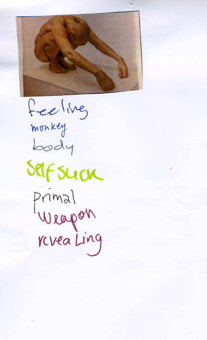
On request of Gray Magazine #5 (yearly published on the occasion of Rietveld’s final exams show) 40 students of the Foundation Year, guided by Henk Groenendijk and Tine Melzer, unleashed a two day project to create a new context for a highly varied 20.000 slide images archive. André Klein, now chair of Fine Arts and Sandberg Applied Art Dept, compiled these slides over his 25 year long career of art history teaching.
We could only guess after the motives and meanings that bound these images together in a dynamic process of ever changing contexts and wonder what new context of relation they would have in the eyes and minds of the basicyear students. The uninhibited existence of a ‘democratically’ selected 1000 reproductions, registrations and images was given new meaning through a process of retagging with subjective keywords. In the 2 day process new contexts and connections were created, processes where discovered, and results presented in a physical display of image related tag-lists and monumental alphabetical (key)word lists. I am a kid
I burn
ice
ice cube
iceberg
ice cream
Iceland
ideal
IKEA
ill
illusion
Illustration
image
imagination
immigration
imitate
imitation
immaterial
impale
imperfection
impossible
impression
in scene
incest
inconvenient
increasing
identical
India
India
Indian
industrial
industry
infinity
influence
information
ink
inner space
innocence
inquiry
insane
insect
insecure
inside
insides
installation
institute
instruction
instruments
integrate
intellectual
intense
interaction
intercourse
interest
interference
intergalactic
interior
intertwine
intimacy
intruder
invasion
invention
invisible
invitation
irresponsible
island
isolation
it
Italy
itch
Awareness surfaced about the relation between content and image and word and form and content in the contexts of our own terms. Tagging images uncovered these relations


some of the question we asked ourselves were:
The mechanisms of images and imagination on one side and the mechanisms of names and naming on the other – where do they both meet?
What is the link between what we see and how we call it?
What is the process of agreement with the other(s) to find relevant and appropriate names?
Is tagging also a kind of ‘baptizing’? Or rather an act of memory and memorizing, how things are called?
What is the level of interpretation when we have to give an image a tag?
What is the relationship between tag and image, word and view?
:

download Gray Magazine # 5 [this is a 44 MB document] :
For more information on this and other lecture projects based on the same archive, read Gray Magazine #5. Get your own hard copy from the Library
.
By admin
/ Categories: art, image + language, instalation, lecture, Scripties, Various Tags: 50-TravelTags, benchbed, body, call 0800300, denial, dick, feeling, Gray Magazine, IKEA, imagination, keywords, monkey, pipe, primal, revealing, sleepover, slide, smoking, surrealism, tagging, tagging images, weapon
No Comments
Thursday, April 2, 2009
I tried to find some relation from illustration to art, but the problem was that i couldn’t find any book that i need. I was thinking about Carl Larsson, swedish painter and interior designer. I think his watercolors combine perfectly art and illustration. But there was no book about him in library. After i was thinking to use music albums covers. Many bands use art works as a covers (like Sonic Youth used Gerhard Richter and Richard Prince paintings as a covers).
Finally i chose book “Masters of animation” by John Halas. I think many frames from animations could be present as a beautiful illustration. Inside this book i found short chapter about “my own” master of animation Yuri Norstein. I woudl like to present his brilliant movie “Hedgehog In The Fog”:
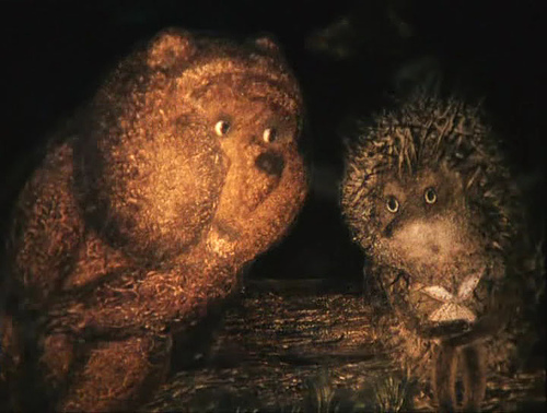
hedgehog in the fog (MOVIE) <———(follow this link!!!!!!)
cat.no. 799.7-HAL-3
keyword: illustration
Wednesday, February 11, 2009

Which is everything I’m not. I like systems. I like structure. I like planning and going after the plan. I like schedules to follow and get annoyed with people who don’t. I’m always on time, and get anxious when I’m running late, even five minutes!
But why does all of this sound so negative?
I don’t find it negative though. I find it a quality. It makes sense and it works in a lot of cases. Like for instance in public transport, sleep, opening hours, work and even time is logical constructed for world structure.
And I don’t want to feel stupid waiting in the rain and my friend calls me, “ I’m late – sorry”! But I do – why?
Is it me – am I too controlled? Or is it everyone else who simply doesn’t care?
What is most effective – and again is effective good or bad. It’s like a circle I won’t get anywhere with.
posted by Maria Gondek Keller Pedersen
Saturday, January 17, 2009

“Create a siamese twin with the fabric you have” was the assignment Emma Olanders and her classmates were given when starting the textile design lesson during the exchange project. Emma and a classmate started working with dependency by means of having a nylon stocking between them and letting Emma actually hang from it. They tried out different ways of hanging, pulling, pushing, giving and receiving weight with different materials between different body parts. They discovered that there are some things that you can do on your own. Having a partner, those small movements or pressures when pushing become unpredictable. The way they were depending on each other and giving/receiving weight has a rather strong connection to the dance technique “contact improvisation“.
posting by Nadja Voorham, photo by Benno Voorham
Thursday, May 22, 2008
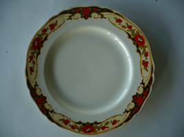 The Alfred Meakin plates I own, are like most of my belongings, second hand. I got these plates because the over organic and curly pattern looked beautiful and at the same time so fake and corny to me. I always enjoy this friction in things I own
These plates, like most Meakins are inspired, by nature not just in its patterns but also in the shape. They were not made anymore after 1937 and still, all modern Meakin plates, and also most porcelain, are in a nature theme. I find it interesting that throughout history one thing has not changed and that is the urge to recreate nature, even out of something as lifeless as porcelain, while at the same time bending real nature to our desires. Creating things that have a beauty like nature and that are at the same time cold and fake. This friction that works both ways is what really grabs me.
http://www.terhitolvanen.com/html/woodland12.html
http://nl.youtube.com/watch?v=XL1aCkKR0h4
Thursday, May 22, 2008
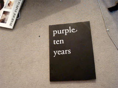
Since almost two years I have a copy of the ‘Purple ten years’ supplement that came with their fourteenth issue. I like it because of it’s rawness, sensibility and inconspicuous complexity.It doesn’t contain texts, only b/w photographs of ripped out pages of former issues of Purple. Issues that were published between my fourth and twelfth age. I’ve never seen the magazine to that time. But since then every page of ‘Purple ten years’ was flipped countless times. But still everytime I discover stomething new. Sometimes visual gags, connections between pages, people and their work or others. The page that attracted my attention while the research showed two pages three dimensional laying in space and seem to be from a photo series about Susan Cianciolo. An so far unknown name to be but her work looks highly interesting!

