Skip to Content Skip to Search Go to Top Navigation Go to Side Menu


"color" Category


Color Harmony?


Wednesday, November 28, 2012

Up to the 1960’s, existing color systems were based on experiments performed in a dark room.

Another method was used to create the Coloroid System. The perception of colors happened by observing colors in compositions within a wide view-field, resembling a more real life situation.

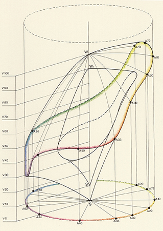
Coloroid is a three-dimensional color space which is related to the CIE color measurement system using its characteristics; hue(A), saturation (T) and luminosity (V). Nowadays we all use these characteristics in Photoshop to make changes in light-intensity, brightness etc.

Unique to the Coloroid system is it’s aesthetic value, due to a model based on observation conditions resembling real life. Research also included color preference, biophysical and psychological effects and colors used in different art and architectural periods.  Based on results involving nearly 80,000 people, rules were formed and named the Color Harmony.

With these rules designer software has been developed to create harmonious color groups. 

For me it’s difficult to accept the aesthetic value of this system, as I believe Color Harmony to be subjective. Also this database is created over a period of 50 years with results resembling this time period. Is this the color harmony of the past? Will we have changed our mass Color Harmony- maybe created a love for clashing colors or is Color Harmony the base on which every eye at any time period feels comfortable?

As a start to the research of the aesthetic value, I tried to download some designer software based on the coloroid system. Unfortunately the software is being sold for 199 dollars and as I am not a download for free expert, I gave up the software.

I found more articles on research being held based on the coloroid system and discovered architecture to be a returning subject.

The coloroid system is based on tests resembling a real life situation, how can this system be translated back into the real world?

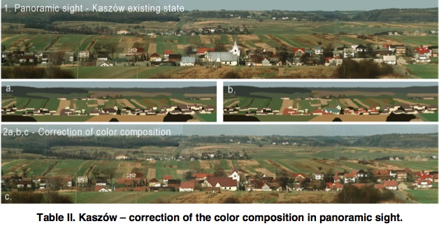
For example: a paper about color in rural architecture and landscape in Poland.  The village is an example of change in architecture over the last 100 years. Color is not longer related to function. New materials are used creating a great diversity in building style, scale and proportion, which resulted in a visual chaos. Only the visual chaos, as the author is describing, is subjective; as I do not agree on the (digital) correction he shows in his paper.

Websites created with software based on the coloroid system are products produced for the mass. Just as architecture is a product produced for the mass. I ask myself, what does my surroundings look like, is it harmonious to me?


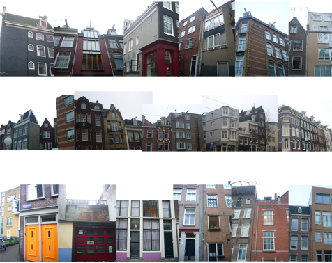
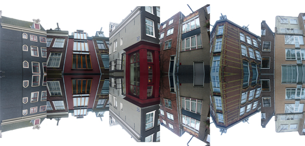
Over a week’s time I take photographs of street views, buildings, my surroundings. I make a collage of the pictures to get an overall view of my personal color harmony.

Only, these buildings are designed by architects. They have already chosen the harmony for the people. They might have based it on the surroundings or decided to create something standing out. So my selection of the surroundings is still based on some other person’s harmony.

The only way to create my harmony is to change the colors, choose the colors, and even mix the colors by my own hand to be completely harmonious to me.

How do I choose the colors? How do I choose the color composition?

I use the collage as a base to make different color combinations, they will be silkscreen printed on a large roll of paper, all connected. The result is a color line where you can find your harmony, going forward and backwards on the roll.

A idea of what the paper roll will look like in the nearby future. Online version under construction.


A while ago I found this online version of a Chinese handscroll, a panoramic view of the surroundings. Translating this ancient roll back to this our digital age is a amazing connection. So after the screen printing is done, I’m going to create an online-digital-version of my color-line, so we can either manually or digitally scroll to find our harmony.

Cause aren’t we all looking for harmony?

That’s why the silkscreen printed color circle has an intense blue color, the color of twilight. The time of the day where I believe all to be harmonious, where I reflect upon my day, my surroundings-


A Planetary Color System


Wednesday, November 28, 2012

French painter and sculptor Michel Albert-Vanel, specialist in color and symbolic representation of color, presented his  Planetary Color System in 1983.  Making relation to the color system by Eswald Hering,  Vanel accepted  six psychological primary colors assembled by antagonistic pairs: black and white, red and green, yellow and blue which mixed result in 64 combinations.

Vanel focuses onto the effects of the color sensations and says that colors are not abstract concepts but real sensations, not experienced in isolation but in groups. There are no isolated colors as one color is necessarily related to the other ones and their sensation also depends on surrounding, lighting, texture, size.

There are three new parameters introduced: chromatism (the conventional scales of hue, brightness and saturation of a single color), contrast (three scales to describe mixtures of colors; for hue, brightness and saturation) and material (three scales – from active to passive, from transparency to opacity, from matte to glossy).

The planetary color system is represented by planets appearing as the primary colors, orbited by many small moons as secondary colors. Using planets as a representation makes it possible to move into multidimensional universe of color combinations and to always go further in the smoothness, into the galactic dust.

The term planet in this color system, is used only as a visual representation, as a sphere. There is no real connection to the planets in our universe. Though this use is arbitrary, my experience is that we all make this connection in our mind. As we experience colors, according to Albert, in groups, in relation to each other, I thought about the relation we, human beings, create with each others too. How do we see each others? Do we see us in color? Do we have colors? Maybe sometimes.

There is an expression: “after she saw it, it became dark in front of her eyes”, or another one: “when we are in love, we see everything pink”.

What can be the meaning of the pink color and possible source of the term ”pink love”: see this link..
or other interesting links about the color meaning, and this ‘pdf’ about color and energy.


The  energy or frequency a person emits has a color, though it is not visible to everyone or we have to remind ourselves we can see it, learn it again. The energies, therefore, created between people, in mutual interaction, get mixed just as they do in this color theory: into the scale, darker, lighter, under the influence of a few factors.


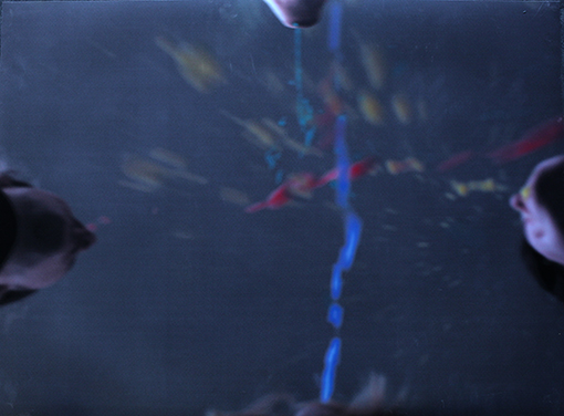
The starting point is a human body, for me a representation of a planet. It is a micro-cosmos, a representation of the macro-cosmos. As the planet interacts to another one, color to color, body to body, a new experience happens. Red, blue, yellow and green are primary colors used by Albert. I used them too. Since it was, and it is for now, impossible to capture the colors the body emits, I wanted them to be visible, produced by the body, out of the body, from the body. Four persons and their bodies created a fountain, a galaxy of colors, as explosion of colors. It becomes an experience documented in a form of one photograph. My wish is to remake it in the form of performance or video, where this creation, motion would be directly visible, we would see it happening.
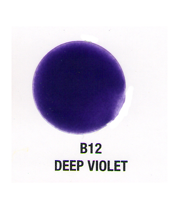
Color has a strong connotation for me. I experience it in a synaesthetic way (look). Green and blue are cold, red and yellow warm. Also they carry more levels when I use them. This time I needed to create just one color out of these. If I mix them, I get brown, and this time, for me, there is no brown in the galaxy. It had to be deep, attractive, also dangerous, clear and not, sublime. Deep violet. The color of the galactic dust. Created out of warm and cold, red and blue. The color in between the planets.

Colors do talk; Albert-Vanel says that through the tarot he made in relation to his system.
Ask, observe.. and see.. is another phenomenon discovered by the Russian electrician Semion Kirlian, we can capture the energy of the body which radiate it. For more information about that follow this link to… photography and the “Aura”

Thank you for the colors..

Distinguishing Colors


Wednesday, November 28, 2012

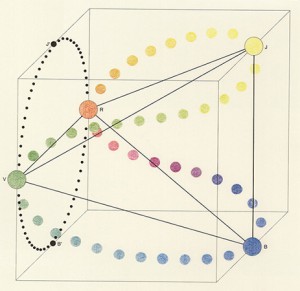
Tobias Mayer [1723 – 1762] was a self-taught mathematician. In 1758 he invents the so called “Colour Triangle” which is a color-system based on his research of how many colors the eye is capable of distinguishing. He took red (R), yellow (Y) and blue (B) as the three basic colors, more specific: cinnabar, massicot and azurite.
He started using a system called “The-Twelve-Part-Rule” to find the colors distinguish by the eye. He assumed that twelve was the perfect amount of parts from the three colors to mix. For this system he made this formula: R4Y4B4 and in this formula he would change the amount of the three colors by always ending up with the result of twelve parts in all. In the end it led him to 91 different colors that where distinguishable for the eye. Afterwards he applied black (K) and white (W) to create light and dark in his 91 colors. With black and white he would use up to 4 parts of either black or white, but still with the limit of 12 parts in all, formula: R3Y2B3K4 (or W4). This led him to 819 different colors that the eye was capable of distinguishing.

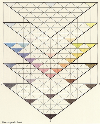
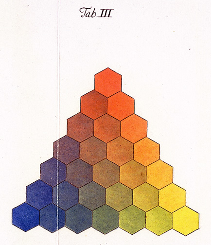
As shown on the attached picture no.1 The Colour Triangle by Tobias Mayer is, at least for me, not showing more than 66 small triangles with 33 different colors and 303 small white triangles, which is not really concur with explained results of his calculations. So I must admit that I don’t really agree that these colors shown in the Colour-Triangle are the colors the eye is capable to distinguishing, because that is exactly what I can’t do with at least 336 of the triangles. His Colour Triangle was not published, but in 1775 G. C. Lichtenberg made a replication of the Colour Triangle which is a triangle with 28 different colors taken out of the research by Tobias Mayer shown at the second picture.

MY INTERPRETATION AND FINAL PROJECT

What I found both interesting and important was to solve the mystery about the 786 missing colors in his color system and especially the missing GREEN.

*

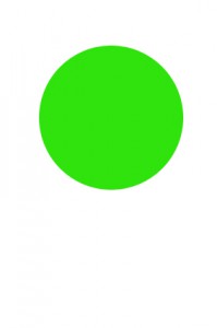
By the way; in my silkscreen print I made the circle a typical grass-green color. I chose that color to highlight which color I really missed in his system although it makes sense considdering how Mayer calculated and mixed his 819 different colors.

*

First I was thinking to actually mix all colors by using his mathematical system. But soon I found out it was too comprehensive to work as mathematical as he did with exact amount of paint in 819 different mixes of colors.

If he really did it I give him credit for that!

*

Next idea was to make the spectator experience the colors and experiment with them by mixing the colors themselves.

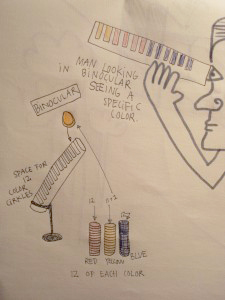
My first thought of the final result was to make an binocular where you could put inside 12 round plexiglass-circles in either the color blue, red or yellow and then try to distinguish the different color-result by looking through this binocular.

Unfortunately
the plexiglass was way too thick and strong in color
so it was not possible to mix the colors through them.

*

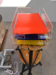
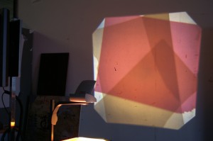
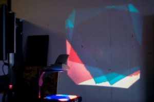
Then I tried to do it with transperant paper on a light table. It worked out really good. It was much easier to mix the colors and it worked out with his mathematic system. The result where really strong and captured the spectator to keep adding more papers to the light table continue making different combinations.

*

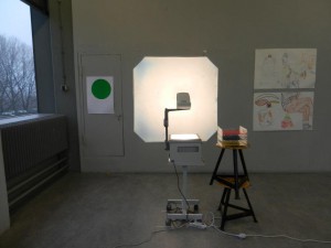
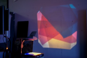
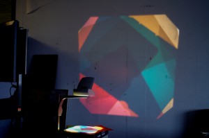
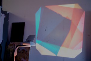
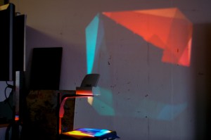
I ended up using a projector to make it even stronger.

Next to it the transparent paper in red, yellow and blue was placed.

And then it was up to the spectator to make different results of which colors it was possible to get in that method of finding colors distinguishing for the eye….

The various try outs I present here are a remake of the real hands-on presentation.

By trying these different ways of mixing the colors I really got confirmed that it is absolutely strange that Tobias Mayer didn’t end up with a green or at least greenish color in his system. There came up green nuances and green color, but somehow he couldn’t distinguish them from other colors.

I was happy to get the possibility to mix the colors my self and let others do the same. Also just to enjoy the beautiful end result of what was projected on the wall!

*

You Name It!


Tuesday, November 27, 2012


ISCC-NBS-System is a color system that has given colors more efficient names. Inter-Society Color Council (ISCC) and National Bureau of Standards (NBS), an American government agency, first proposed the color system in 1932. Its initial purpose was to name the individual blocks of the Munsell Color System, which classifies colors by hue, value and chroma.


Moreover, just like how Munsell Color System (on which it is based) works, the colors of ISCC-NBS-System are determined under the condition of average daylight and normal viewing. However, instead of naming the colors by symbols, ISCC-NBS-System identifies the colors with the general and understandable terms so that everyone can use it without difficulties and confusion.

ISCC-NBS-System opens up a simpler way to name colors that does not confuse people with symbols and numbers. Actually, it is the most familiar way people name the colors and it is how we were taught to describe the colors. People simply name the colors by the basic colors that they are already familiar with and if more accuracy needed, they add adjectives in front to describe the darkness, brightness and etc. The system was close to what everyone has accustomed to name colors, except it organizes the language.


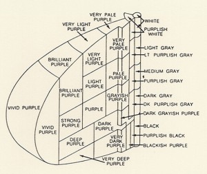
It's a good example of a diagram of ISCC-NBS-System, unfortunately only in Japanese, but you can still get an idea how it is structured

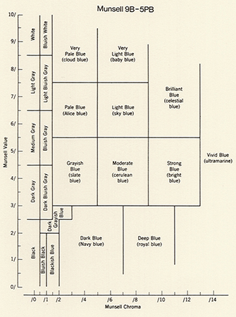
ISCC-NBS-System’s basic hues are red, orange, yellow, green, blue, violet, purple, pink, brown and olive. These colors have intermediate categories so that the names indicate the combination in colors, for instance, reddish orange and yellowish green. Finally, these categories are subdivided into 267 categories. Appropriate modifiers are added before the hue names: vivid, brilliant, strong, deep, light, dark and pale, although not all hue names have modifiers. As a result, the color should be called something like dark reddish gray.

According to ISCC-NBS-System, the name of the color is decided upon the viewer’s choice. It will be orange if the one sees it as orange even though it is red to the others. The names reflect how the viewers see the colors. The colors may be called differently depends on the viewer’s physical conditions, their educational or cultural backgrounds and any other facts that can limit their judgment. For instance, when I went to buy my school uniform in America, I first learned that khaki was not the color that I used to think of, which was close to dark green. My khaki uniform was light brown instead, what I used to call beige. South Korea and the US have given different names to the one color. The name of khaki was no longer important, what mattered was that I could describe the color.


My school uniform of Notre Dame Academy and its khaki skirt of which I had trouble describing the color

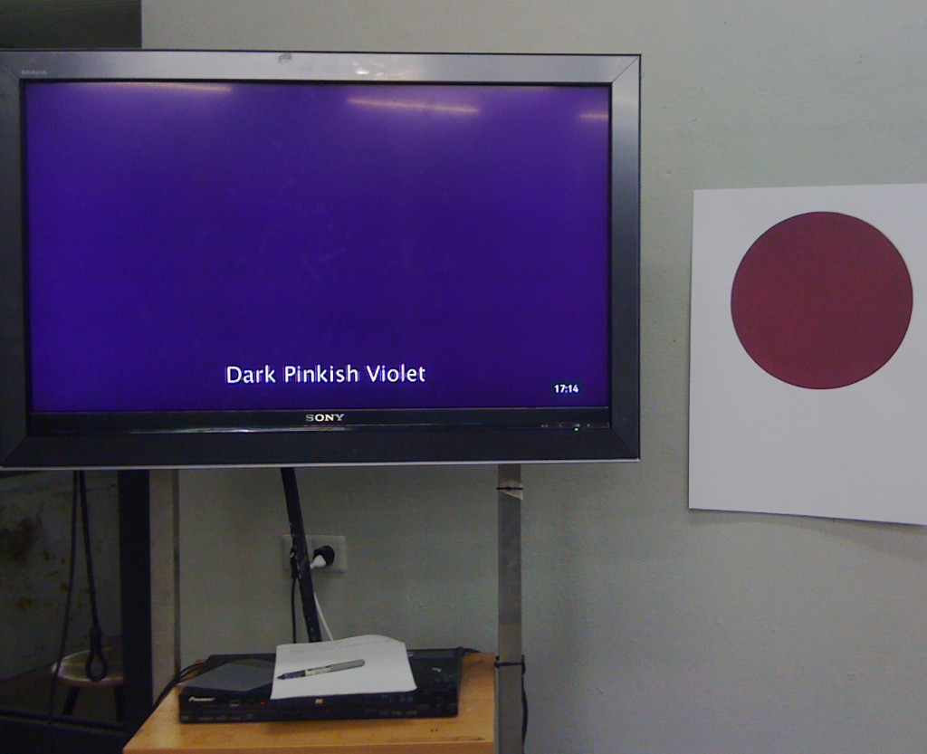
The given names under ISCC-NBS-System’s rules show the one’s characteristics. The decision on naming the color is made personally and objectively so it naturally shows one’s personality and background. I have a problem differentiating violet, purple and pink. They become even more uncertain when the adjectives are added. When the colors get darker or brighter, they lose their vividness and it is hard to decide to call them with specific names. To me, violet is close to dark pink and dark violet is hard to distinguish from dark purple.


Get the Flash Player to see this content.


The short movie that I made shows the color that confuses me the most, which is the mixture of violet, purple and pink, with different color names based on ISCC-NBS-System rules. It is 54 seconds long and shows 18 different names, one by one, every 3 seconds followed by the blinks. It is one loop so the names continuously change. The names describe one particular color, which is the color of the background. The viewers can come up with different colors for those names if the color is not shown because it was my personal decision to choose that color for those names. On the other hand, the color tricks the eyes as if they are different colors because of the blinks, but in fact, the only change in the movie is the text. The text contains all possible combinations among these three colors.


Left, the movie playing in loop, Right, the silk screened color. I have to say that the colors look completely different in picture, on computer screen and when you see them yourself

As a last step, the class, as a group, experienced the silk screen. I tried to print the color in the movie without looking at the color I already chose in the movie. However, the silk screened color turned out to be completely different than the one from the movie. It was much brighter and more vivid than the color on the screen. It was interesting to experience impossibility of duplicating the color and possibility of creating limitless colors with one name because it can be conceived differently depending on who names it.


Attempted colour system project


Tuesday, November 27, 2012

This is a text about how I made a project translating colours into tunes and tunes into a sculpture. My process; how I went from colour wheel to sculpture:


Ignaz Schiffermüller was an entomologist – someone who works with the part of nature that works with the scientific study of insects.
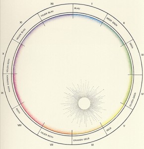
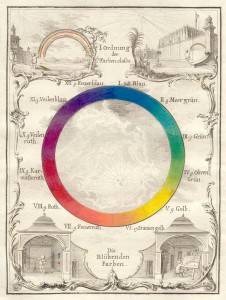
He wanted to make a wheel where the colours instead of Newton’s system (which related the area of each colour to wavelength, and the sizes of the colour compartments varied) had the same size of segment. He assumed that there is a knowable natural order to colour, one that would confirm the relationship among all forms of knowledge and he wanted to create a system that showed the links between the understanding of colour in different fields – natural history (and classification), natural philosophy, and artisan practice.


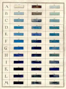
The colour wheel, he published in 1772, have as well twelve colours, including the three primaries, the secondaries formed by their combination, and six tertiary colours. Each colour has 12 x 3 colours, so the system is in all 432 different colours. Within each species are shades, a bright or pale state and a dark or deep state, as well as the original. He chose blue, his first color, to demonstrate this part of his system. The series, labeled A through M, shows the range of colors from bluish white through blue-black.


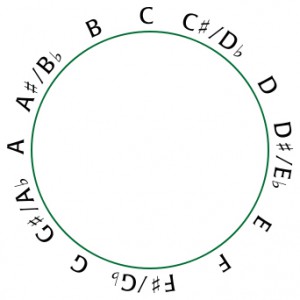
Schiffermüller for example wished to make the colour wheel nuanced, so it would express the logical connections between musical and chromatic harmonies: In music, especially classical music, chromatic harmonies means a twelve system musical scale with twelve pitches, each a semitone above or below another:

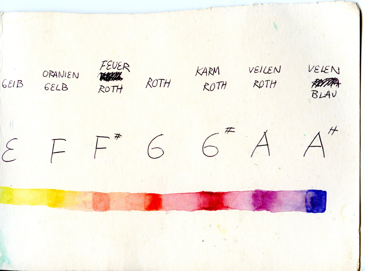
Because Schiffermüllers intention was that the music and the colours should have a logical connection, I decided in this project to translate the colours into tunes. I did it by taken Schiffermüllers colour wheel and compare it whith a chromatic wheel. Blue therefor became C and so on.

I chose two different songs for comparing: One by Justin Beeber and one by J.S. Bach; I started out with the tunes, tranlated the tunes into letters and then I used my system to translate the letters into colours:


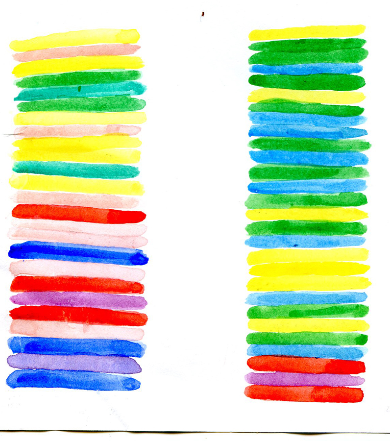
I started out by painting squares in a line of watercolour for each song. I wanted to take it a step further not ending up with a small paper of colourlines. It was to close to an A4 paper of tunes, like the tunes I tranlated into colours. I wanted to create another visual outcome, which you like music – you listen to and not read on a paper – could be in, walk in it or around it, but make it a very different experience than listening to the two music pieces.

Here is the translation from tunes of Justin Bieber into colours:

The one the left is the beginning of both songs(J.S.B to the left):


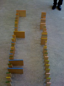
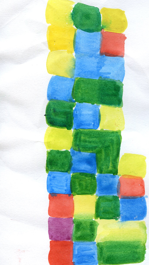
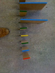
A colour sculpture was an idea in which I could have all these aspects included. But something was missing: The  rhythm of the music! I started cutting out pieces of MDF, which sizes related to each other by size. The biggest piece was the whole note, the half of this note a half note, half of that size a quater note, half the size of a quater note a eight note and so on. Here you see two whole notes and seven quater notes translated into pieces of wood:


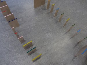
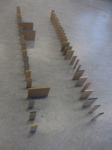
It became a sculpture, which you can not just read, but you are able to walk a round it. The Justin Bieber part of the sculpture, has primary colours and is very easy to look at while the Bach part has a lot of secondary and tertiary colours.

It’s not the meaning that the work is about music. It is first of all a study of translating from one media into another and ends up being a sculpture which two part defers from each other in shape and colour field. The MDF pieces I cut out according to the length of to tunes to give a feeling of the differences three-dimensional instead of two-dimensional. Though both two parts of the sculpture has the same look, the colour scales and transition of size gives a different felling. The Justin Bieber song has a very sharp look because there are almost no secondary colours and also the sizes of the wood pieces have a less softer look than Johan Sebastian Bach.


This sculpture is not made as a model, but I would love to make it in a larger scale so one could walk around inside it. Then I would have painted the colours on the surfaces on the sides instead of the top. Standing in one of the ends of the sculpture the colours would look more compressed the more you looked to the opposite end of the sculpture.


Log in
subscribe