Skip to Content Skip to Search Go to Top Navigation Go to Side Menu


Archive for November, 2010


dear city of Amsterdam..,


Friday, November 19, 2010

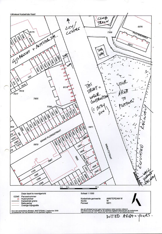
Hereby I introduce you to my proposal for the ‘Parooldriehoek’ at the Wibautstraat in Amsterdam.  It is the result for our latest design project at the Gerrit Rietveld Academy. For this project, we had to choose a building from architect Gerrit Rietveld as our inspiration before thinking about a new construction for de Parooldriehoek.

Below, you can read about my inspiration, starting points, development process and important factors in the translation process. I will also explain how my starting points eventually converted into the final design. Hopefully you get inspired by this proposal.

starting points and inspiration
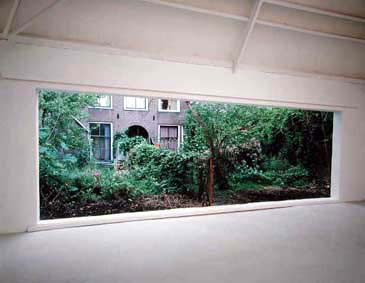
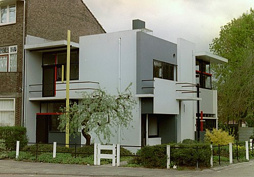
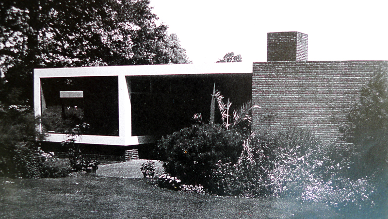
Earlier on this designblog, I had already referred to the ‘Huis Singelenberg’ of Gerrit Rietveld that I specifically admire because of it’s simplicity, and the perfect balance between open and closed. I allowed myself to get inspired by this design for my proposal.

Gerrit Rietveld is widely admired for his timeless thoughts on viewpoints and placing windows. The choice of specific viewpoints was one of my starting points for this project.

The Parooldriehoek is situated at the ‘entrance’ of Amsterdam. Therefore, this place definitely needs a construction that welcomes the visitors of Amsterdam.
I tried to focus on the view from the road that comes out of the tunnel.
The goal was that the building is the first thing you see when entering the city. A landmark that can be used as a reference point.
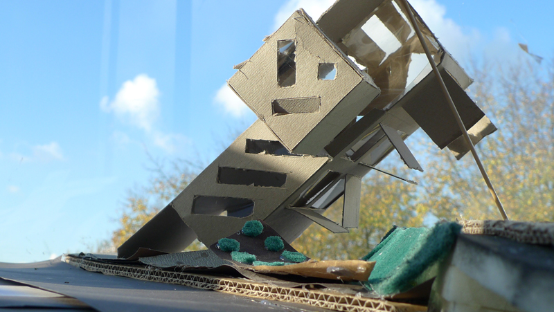
(more…)

my oyster


Thursday, November 18, 2010

REDESIGN THE PAROOLDRIEHOEK BY USING AN ARCHITECTURAL BUILDING, DESIGNED BY GERRIT RIETVELD, AS AN INSPIRATION FOR YOUR PLANS.

I did not consider the essence of the assignment. First I wanted to do research how I could give the space an interesting shape. I had visited the place as Carla Boomkens asked us to do. Unfortunately, I had still no clue how to design a building for this place.
Rietveld’s architecture is a typical demonstration of his logical connections, glass, primary colors, openness and reliability. A building has to invite you in. During the process I’ve chosen specific elements and used them to create my design. Also I found inspiration in contemporary art. The work ‘The World is my Oyster’ by Job Koelewijn was my driving force behind the design for the top section, which mostly determined the shape of the building.

"The World is my Oyster", Job Koelewijn

I started making models out of cardboard, and waited till the last moment to make the floor plan. This gave me the freedom to design a building that corresponded to my wish, and not to the restrictions of the environment.

I used certain principals/elements which I used to dictate my first models, glass for example. I wanted to incorporate the vegetation on the exterior as much as possible to the interior of the building, both to create an open space and to directly link the outside world with that on the inside. This didn’t work out, because of the shape of the building. Later I discovered the building was not correctly positioned towards the slope.

With the other model I’ve made, I put more emphasis on (for me a more fascinating aspect of Gerrit Rietveld’s work) interior, especially on the connections. The most famous chair from him, despite the cliché, it has a brilliant connection.  I took that connection for the support of my building. Unfortunately this didn’t work out either, because the supports became more a decoration than a functional addition. In the final model I’ve kept this idea but translated it into my own connection.

I’ve created three models in SketchUp. I used the three main issues as starting points for my digital designs: the involvement of vegetation, the work of Job Koelewijn and the translated connection of the famous Rietveldchair. I made a digital design that corresponds to the environment: a railway 8 meters in height surrounding architecture, the streets, and a green field with trees. Actually, this helped me a lot to see how the buildings reacts on its environment, and vice versa. I really believe that people should not make environment their own (that is to say destroy it by trying to mold it into something other then what it is), but take the environment as an advantage to enforce the power of the building the building.

(more…)

Living like Rietveld


Wednesday, November 17, 2010

“Transform the empty triangle next to the wibautstraat, inspired on one of Gerrit Rietveld buildings”, was the assignment. So the first thing to do was getting inspired by one of Rietveld buildings.

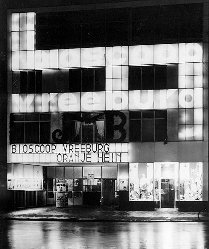
When I heard about the living room above the Vreebug cinema, I was immediately intrigued. Not about the way it was build, or about the way it looked. It was about the way Rietveld lived. With a whole family in one room, divided by curtains in the night. It was the simplicity and sobriety witch was the heart of Rietvelds findings. When he was asked in 1929 to design the Cinema, he created his own house above it.

An other very important element of Rietvelds works, witch also was one of the most  substantial things of the living space above the Vreeburg Cinema was the view over the city (Utrecht).
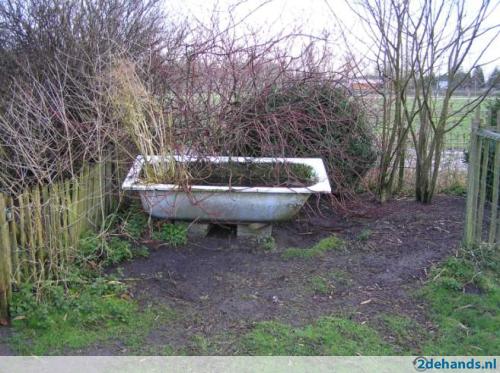
So I decided to make something with a certain sobriety and the centre of the idea had to be the view. I also wanted to do something with the sudden shapes, stops and parts sticking out. First I had made a triangle by witch I lifted up the whole area for 10 mtr. Real sharp edged and rigid. I wanted it to be an uplifted public garden with stairs in the grass. I did something with the nostalgic feeling

of bath tubs,  the ones you always see between the cows. Getting a little bit of country into the city.

I also made sudden stairs as I call them. Stairs that stop and don’t bring you anywhere, a kind off maze.

(more…)

Gerrit Rietveld Inspired Winter Park


Wednesday, November 17, 2010

The basis for this project was to design an architectural structure to be placed on a bare piece of land on the Wibautstraat. The piece of land is unique, not only because of its shape, but also because of its proximity to the metro lines, because it includes a hill, and because it is flanked by two bridges, one a major highway to and from the city. The project was to take all of these elements and create a scale model for something that could be placed on this plot. In my case, inspiration came from two different sources. As part of the project, we were required to choose one or two of the buildings designed by Gerrit Rietveld. The second part of my inspiration was to give the structure purpose and thus give me a better idea of the shape it should take.

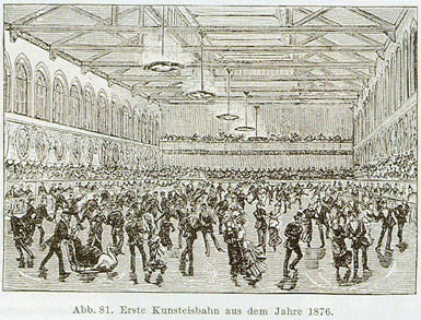
When we started this project, I immediately thought of a park, due to what is already there: grass, trees and such. However, Amsterdam already has many and lovely outdoor parks and another one is perhaps not necessary. However, there is still no winter park here, nor in most cities, I think. So my plan became to create a sort of building that would function as a winter park, with protection from the elements, but also giving as much of an impression as possible of being outside. The most obvious reference for such a project is the old palaces and winter gardens in London in the 1800s. The other great aspect of those winter and pleasure gardens was that they were really places to meet and to be seen, another aspect I wanted to incorporate. Some of the larger issues with this situation – that the space is not so large, and also that there is so much happening around the surrounding area – would make it difficult to create any sort of intimacy within.

(more…)

Wibautstraat


Wednesday, November 17, 2010

Come up with a solution for a specific place at the Wibautstraat, Amsterdam.
In the current situation it exists out of a field of grass with some threes en shrubs on it. It has no specific function.

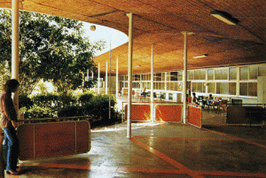
I started with a book full of inspiration. I chose to pick the home of handicapped, the mgr. Verriet Institute to base the project up on. The mgr. Verriet Institute is designed by Gerrit Rietveld and you can find it in Curacao, Willemsstad.
In the tropical climate of Curacao, Rietveld had the opportunity to let himself go and create his ultimate architecture, not closed but open space!
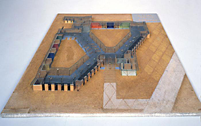
In fact the building exists mostly out of a floor with a roof on small round columns. At the garden side there are no walls but panels that do not go all the way to the roof, so the room above is open.


Here you see a picture of the building and a picture of the model of the building, the building is not build completely as the idea was, because there was not enough money.

On the picture I saw it felt like a hallway around a garden and the garden was like an extra room, only with a roof of tree crowns.
I get the feeling of inside while you are outside (the opposite of Rietveld thoughts). This really inspired me, so I took it as a starting point. (more…)

Concrete Choreographies


Sunday, November 14, 2010

I have a big love for dance, where space is explored, described, by the moving body. This interest for dance, inspired me to reflect on body, space dance and architecture.

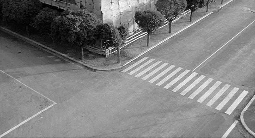
Our bodies are always in a dialogue with their surroundings. Looking at our everyday environment, streets, buildings, its intersections, they shape our movement through the space. Sometimes there are stairs, floors, curves, or slopes, which have more choreographic potential than others, they challenge me to make a certain movement or walk in a different rhythm.

film still from Michelangelo Antonioni’s film ‘l’eclisse’

Choreographers and architects both work with space. Like architecture, a choreography is constructed in a well considered way. The big difference is that a choreography includes the aspect of time, a sequence in its construction, where architecture doesn’t.

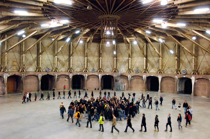
‘body/space’, a project by choreographer Krisztina de Châtel

together with the Academy van Bouwkunst Amsterdam.

Myself being a designer I tried to bring these two worlds of dance and architecture closer together, by making a product.

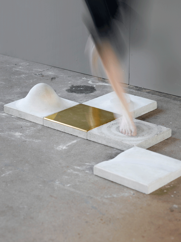
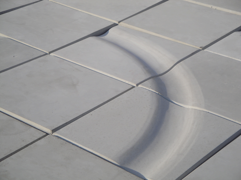
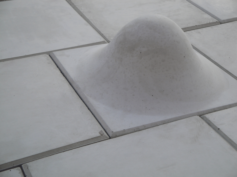
Concrete choreographies, is a series of concrete paving stones, which will encourage people to dance in the streets. Varying in shape, size and surface, every tile is designed to facilitate a specific movement.
With these tiles, building choreography gets materialized. Depending on the paving patterns, the stones will give rise to new choreographies, leading the stroller into a dance where rhythm, repetition, balance, speed, direction and gesture play a part.

photo by Vincent van Gurp

The movements I chose for designing the tiles originate from a personal experience during modern dance class. With these basic movements multiple choreographies are possible.
After mapping and understanding these movements I searched for shapes and finishing, which would serve and even strengthen them.

The size of the tiles, 30×30 cm, fits the grid of existing streets and squares. The used material, concrete, also fits the existing surroundings. But, as a contrast to the straight grid of the street, my tiles have curved forms, which is more fitting the dance and the human body.

With this project I would like to show how interesting moving by foot can become. Now things designed for movement or play in a city, are always for either skaters or children. But why not for someone who is walking outside, and who likes to take a dance path?
With concrete choreographies I try to move people, invite them to see the urban space as a place to dance a little.


Pomme van Hoof is a 2010 graduate from the Design Academy Eindhoven dept "Man and well being" www.pommevanhoof.com


Log in
subscribe