Skip to Content Skip to Search Go to Top Navigation Go to Side Menu


Archive for May, 2012


A Printed Book History 8 : like early comix books


Monday, May 21, 2012

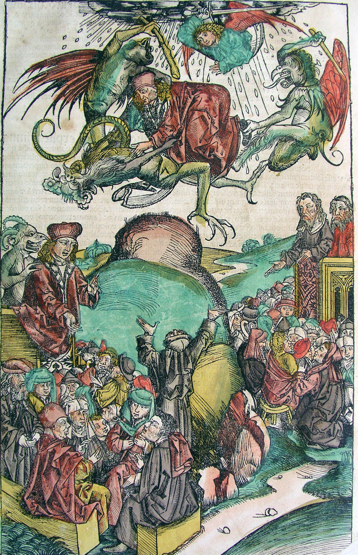
The Nuremberg Chronicle 1493

Nurenberg Chronicle, from 1493 written in Latin by Hartmann Schedel and illustrated by Michael Wolgemut, is a biblical paraphrase (incunable), world known because of it’s impressive woodcut illustrations, and the impressive quantity of them, making it the most richly illustrated book of the incunable period.

I chose this book mainly because of the woodcuts, and their (religiøse fortællinger-ord?!) value. The illustrations were colored afterwards (mainly with watercolors and tints), by different artists, and I like the lightness of the colors, compared to the heaviness of the text-printing, which is dense and firmly detailed. The coloring makes the illustrations (subjects) more digestible and vivid. Still the illustrations are very strong and loaded with absurd, fairytale-like figures and settings.
The images work with the text in a very active way, and has almost more importance/prevalence then the text itself, that gives the book a more artistic and aesthetic value, than only the literary value. It reminded me of the fist comic books.[x]

The fact that the images are so strong and prominent made me think in the beginning, that the book in it’s time, the 15th century, was somehow not elitist, as was the case in general for books- if one couldn’t read, there was no access to the content. With so many images, the book invites the illiterate to understand the stories and messages. But on the other hand, the book must have been such a luxury, so only some certain groups of society had access to it. Though the Chronicle was also published shortly after the Latin version, in a German one, what might have spread the notion of it in the countries closer connected to the German language. I would have liked to have an impression of how approachable the text might have been, compared to the immediateness of the images.
So, I made my choice by instinctively being attracted to this (both imagery and textual) classical, mastodon piece of historic religious literature.

post by Francesca Burattelli


A Printed Book History 7 : Außen – Innen : was ist drinnen?


Sunday, May 20, 2012

When it comes to the background of my choice, I pick something that is organized, especially when I pass the day which is quite unfocussed. What I mean ‘Organized’ in this context is, something simple, straight, and propagating a messages well whatever it is. On the way to the exhibition place, many different things on the street were distracting me a lot. Also the fact that i need to see many things at the place, made me think about only rest. Fortunately, a scale of the exhibition was not that large, besides the thing that i wanted to see was very clear. Although there were tons of texts that had enough power to give me a positive impression, I was looking for a book which had a story or visual language as simple as it can be.

In the last part of the exhibit place, I found the image that i was looking for.
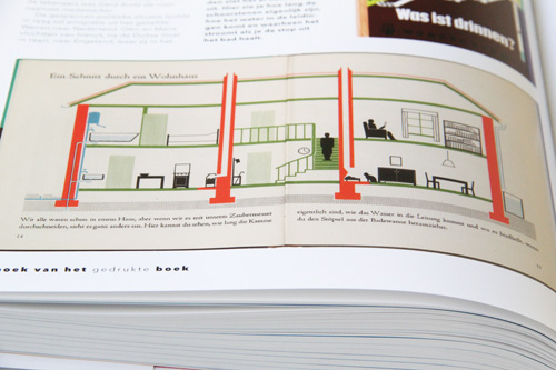
It was a book with a simple Isotype image with few colors but very skilled way of drawing. The image was telling a story very well. The only pity was, that the full text was written in German, which I can not understand. However, the Isotype-styled image was intriguing enough for me to look at. Even though it was based on a spontaneous choice, I liked it quite a lot. Because of a connection between the motive of my choice and the memory from my childhood, imagining the time, I was drawing a number of sketches for my dream house and played a game about building a house and making a story out of people living in that house. I enjoyed telling a story with a basic image, which gives a hint to what kind of upcoming story will be expected. The memory of mine and the image from the book in front of me were connected very well. That is why I felt interested and considered this book to be my favorite among other books. Maybe the Isotype drawing was simply nice. It was a simple thing but made me feel happy on that occasion.
The book I found was:’Außen – Inne’ : was ist drinnen? ( what’s inside? ) by Marie Neurath Vienna 1956.

Marie Neurath (1898-1986 and husband Otto worked according the “Vienna Method”. which was later renamed Isotype: International System of typographic Picture Education.

post by Boyon Kang

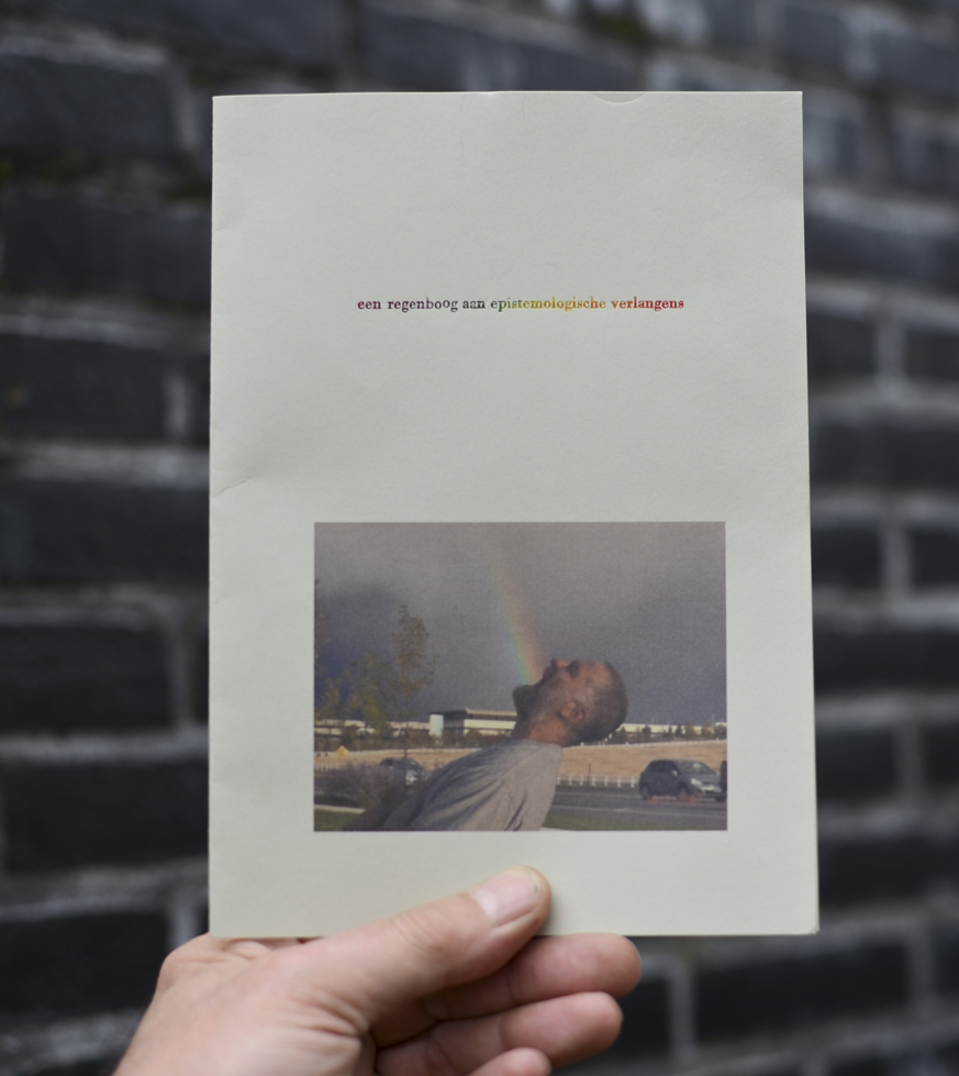
A Printed Book History 6 : Een regenboog aan epistemologische verlangens


Friday, May 18, 2012


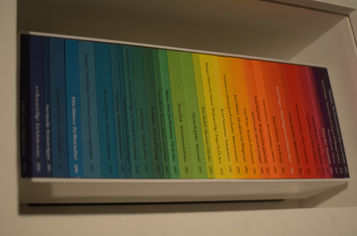
the edition Suhrkamp designed by Willy Fleckhaus, 1963

In de collectie viel me op hoe vroeg sommige visuele elementen en experimenten al voorkwamen, hoe secuur en grafisch de encyclopedische tekeningen uit de periode voor het gebruik van fotografie waren, hoe imposant tastbaar en onhandelbaar de grote boeken met hun uitpuilende handgelegde papieren waren. Maar ik heb iets heel simpels gekozen om de overgebleven 300+ woorden aan op te maken:


Een serie boeken die bestaat uit uitgaven in verschillende kleuren waardoor de boeken samen een regenboog vormen. De boeken spraken me ook inhoudelijk aan, bij elkaar vormen ze een collectie waar je behoorlijk cultuur kritisch en radicaal dan wel wijs van zou worden (de collectie bevat een aantal niet canonische filosofen en figuren en leek me daarom des te interessanter). De serie is een selectie die door zijn vormgeving compleet probeert te zijn maar duidelijk niet conventioneel is. Voor mij is deze regenboogcollectie een simpele maar daarom niet minder mooie manier om te appelleren aan het verlangen om een serie boeken te hebben gelezen en ze herkenbaar en toch gedifferentieerd in de kast te hebben staan. Bovendien vormen ze een geheel, zijn ze bij elkaar een ‘compleetheid’, een overzicht. Ze lossen het epistemologische verlangen in van ieder die een boek koopt en daarmee hoopt alles of tenminste alles van iets te weten te zijn gekomen.

Los van elkaar zouden de kaften zomaar een kleur zijn, of zou het je juist op kunnen vallen dat de kleur bijzonder is, een tussenin-kleur, de ene kleur noch de andere. Ook zullen een aantal boeken uit de collectie steeds een ander kleurenpalet vormen. Dat palet ontstaat ondermeer door de voorkeur van iemand voor bepaalde boeken uit de serie. Het heeft ook iets kinderachtigs of oppervlakkigs om boeken op kleur in te delen, op ‘vorm’, niet op ‘inhoud’. Ik denk dat gezien de inhoudelijke zwaarte van de boeken juist de nuance van de verzameling als complete verzameling ?het hele scala wat je ermee te zien en te lezen krijgt? wordt benadrukt.

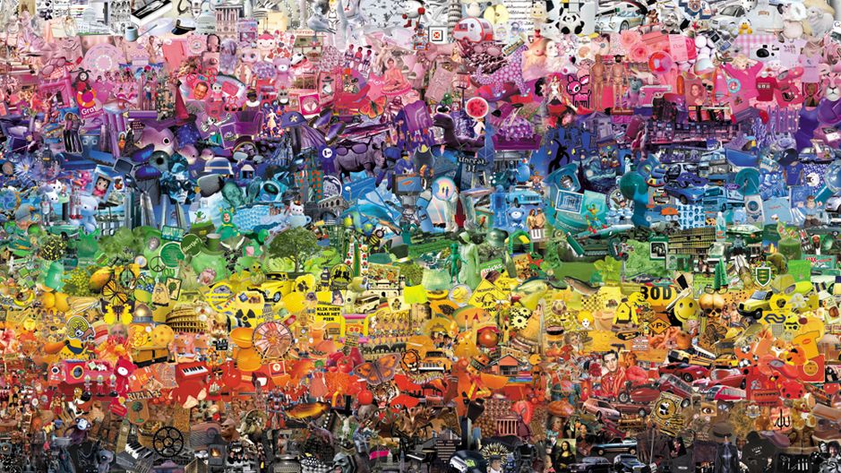
Wat de tentoonstelling me ondermeer duidelijk maakte is dat er bepaalde dingen bestaan die aantrekkelijk zijn en blijven, en dat het misschien die dingen zijn die grafisch kunnen worden genoemd als je er mee breekt of speelt. Sommige grafische clichés kregen in de tentoonstelling voor mij als het ware hun oprechte bron of context terug. De regenboogcollectie had een dergelijk cliché kunnen worden, maar misschien is het daar te aantrekkelijk en te uniek voor gebleven. Na wat onderzoek op internet kwam ik erachter dat op een paar andere regenboogboekuitgaven en een op kleur geordende boekenwinkel in New York na, vooral juist andere dingen op kleur gesorteerd worden. Vele collecties bestaan uit objecten uitgegeven in alle kleuren (vooral objecten waar je er meer van nodig hebt of kan hebben, zoals glazen, pennen, sokken, groente en fruit etc.) Rangschikking op kleur wordt veel gebruikt om wellicht functionele redenen. Maar ik vind het idee of vermoeden dat een regenboog collectie ook als een poging kan worden beschouwd om compleet te zijn interessanter. Dat idee laat zich ook illustreren door het werk Wonderkamer (2004) van Arnaud van den Heuvel. Vooral de ondertitel maakt de poging om een alomvattend overzicht te geven expliciet.


“An installation with all the images of the World in a room, sorted by color”.

concept
Visitors of the Wonderkamer (Miracle Room) enter an image-flow: a collection of thousands of images taken from their original context on the internet and arranged in a coloring scale from black to white.”

post by Victorine van Alphen


A Printed Book History 4 : Judge A Book By Its Cover


Friday, May 18, 2012

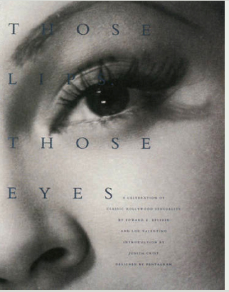
“Those lips, those eyes” by Edward Z. Epstein & Lou Valentino.

Designed by Paula Scher, New York, 1992


They say “never judge a book by its cover”, but I do.

I judge books by their cover all the time, but not only books, I judge everything buy its cover (at list at the first impression).

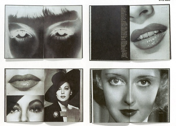
This book is full with beautiful black and white photographs of the stars of Hollywood’s Golden Age, people who were screen legends who burned up the screen and captured the very embodiment of sensuality with a special emphasis on their eyes and lips. I’ve chosen this book because it is full with covers to judge, both literally and metaphorically.  Each photo to me looks like the cover of some book\magazine or like a poster\advertisement, and each iconic figure is also a “cover to judge”. That makes the book twice as interesting to me. I can look at each page or each photo and think about it, do I like the photo? Is it well made? What does it tell me? And so on. But I can also look at each character and have my thoughts about them, about their looks, do I recognize them? What do I know about them and what does the picture tell me about them? This book with it pictures still gives those feelings even after so many years, these photos are still so sensual and glamorous which makes them relevant even today.

Besides, when something is concerning the mysterious and tempting life of old Hollywood, that is reason enough for me to choose it.

post by Tamara Aharoni


A Printed Book History 3 : Complutensian Polyglot


Monday, May 14, 2012

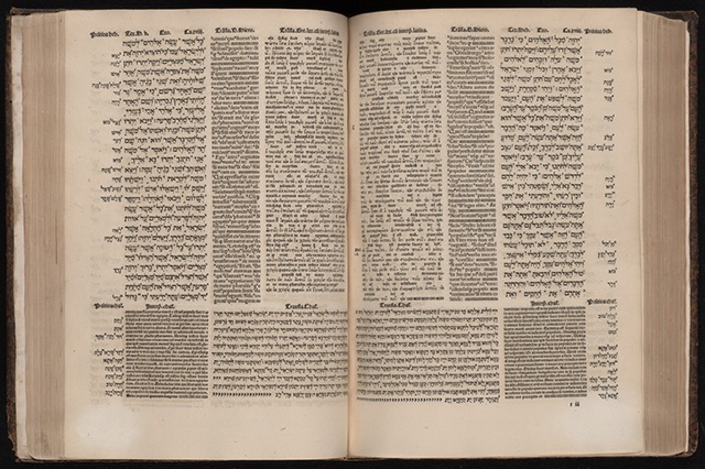
The Complutensian Polyglot Bible, 1514

With my clothes still wet and after being forced to leave all my stuff in the lockers, I was finally ready to be impressed by one of the books in the vitrines. We were the only visitors at the whole “UvA Special Collections”, and after the difficult and rainy bicycle ride we were no more than 10, a small group from different nationalities which in a way resembled the layout of the Complutensian Polyglot Bible.

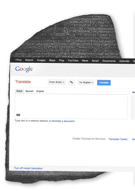
Printed in Alcalá de Henares, Spain in 1514, it was the first bible made in more than one language, Hebrew, Latin and Greek. Translation is always a problematic thing to do, specially in such as “precise” text as the Bible but not only in terms of meaning, using the same book for more than one text seems like a pretty risky design work. The first example of such a hard labour would probably  be the Rosseta stone [x], that became the most useful tool to understand the hieroglyphs from old Egypt. Made in 196 b.C and as well in three scrips, Egyptian, Demotic, and Ancient Greek, but with a pretty classical way of arranging the different languages, in three different paragraphs.

The main characteristic that makes the Polyglot Bible specially appealing is precisely the way that the text is arranged in the page, in parallel columns of different sizes that also combine different ways of reading (as it happens with the Hebrew and the other two languages). That idea seems really modern, and the look of the page looks quite similar to the once of a modern newspaper. If I think in contemporary polyglot texts the first examples that come to my mind are the magazines from the airplanes or the mails from the school, and in both cases one language follows the other, so the same meaning never shares the same space with all the troubles that come with that. After a small mental struggle trying to remember a similar graphic structure I realize that now we can find it in something that we all use, Google Translate.

post by Juan de Porras Isla

A Printed Book History 2 : wonderbaerlyke verbeeldingh ende tael


Monday, May 14, 2012

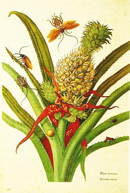
Maria Sybilla Merian

‘Over de voortteeling en wonderbaerlyke veranderingen der Surinaemsche insecten’

Alleen al vanwege de titel verdient dit boek het om goed te worden bekeken. Er gaat zoveel bewondering maar tegelijkertijd objectiviteit en bovenal precisie van uit, dat het direct mijn aandacht trekt. Evenals het formaat overigens, wat vrij groot is – daar houd ik van. Het maakt het lezen, het bekijken van de letters en de illustraties tot iets gewichtigs. Iets heel fysieks.

De titel en het formaat maken hun beloften waar. In ‘Over de voortteeling en wonderbaerlyke veranderingen der Surinaemsche insecten’ vertelt Merian in beeld en in taal op een degelijke maar heel betrokken wijze over het onderzoek dat zij deed naar insecten, tijdens haar verblijf in Suriname. Haar observaties beschrijven de werkelijkheid, maar vullen de werkelijkheid ook aan. Het is met name dat wat ik erg mooi vind aan dit boek.
Ook haar woordgebruik vind ik bijzonder. Dat gaat natuurlijk al gauw, omdat de taal die ze gebruikt in deze tijd zo ongewoon is. Maar de manier waarop ze de woorden naast elkaar zet, met een goed gevoel voor ritme, zorgen dat de zinnen me bij blijven. Vooral deze, hoewel ik die opschreef: ‘De kleine gecoleurde bladeren, dicht onder de vrucht zyn als een rood fatyn met geele vlakken vercierd, de kleine uitspuitzels aan de kanten groeijen voort als de rype vrucht afgeplukt is, de lange blaaden zyn van buiten ligt zee groen, van binnen gras groen, aan de kanten wat roodachtig met scharpe doornen voorzien.’ De tekening begeleidt de tekst perfect; de twee slagen er wat mij betreft in om naast elkaar hetzelfde en toch ook een ander verhaal te vertellen. Geen van de twee maakt de ander overbodig. Ze vormen samen een charmant geheel.

post by Rosa Smalen

A Printed Book History 1 : De letter… n


Wednesday, May 9, 2012

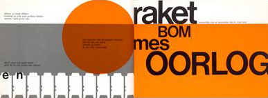
“De letter… n” by Remco Campert and Wim Crouwel, 1966

At “The printed book : a visual history”, I was most interested in the book “De letter… n” by Remco Campert and Wim Crouwel. What attracted me most was its’ hard, yet clean graphic style. The book was opened on a page that read ‘raket bom mes oorlog’, ‘rocket bomb knife war’, in thick black letters of various sizes on an orange and white background. ‘Raket bom mes oorlog’: every word gets its’ own separate line. The opposite page displays an orange ball that may remind us of the sun or, in this context, may just as well be a nuclear explosion.

As the books in the exhibition are set up in glass cases, I wasn’t able to flip through the book so, maybe because of the content of this particular page, the graphics in “Het gejuich was massaal”, a book about dutch punk the the late 70s, immediately came to mind.

Looking at the page again, something else comes to mind.

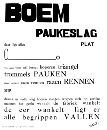
Paul van Ostaijen was a Belgian poet who started experimenting with typography in his poems in order to translate, among other things, rhythm and sound to the reader. He started in the 1910s with quite safe try-outs, mostly experimenting with different letter-spacing and word-spacing. In the 1920s, he went all out and experimented in a big way with font types and sizes. His best known example is “Boem paukeslag” from his 1921 book “Bezette stad” (“Occupied city”). In this poem, single words – keywords really – are connected and form some sort of narrative through the use of typography. In a similar way, raket bom mes oorlog are keywords but form an understandable whole due to the rhythm and context that is created through the graphics and typography.
post by Lieven Lahaye

Didn’t I see this before?


Wednesday, May 9, 2012

Have you ever had this strange, but uncertain feeling that you have experienced something before? An overwhelming sense of familiarity? A moment you are not sure if something similar or the exact same thing already happened? Then you belong to the majority of people who have had a déjà vu. Scientists are still unsure how to explain this phenomenon. Some try to link it to memory functions, claiming that familiar events can trigger memories of forgotten information. Some say it’s a more like a “memory check” of our brain: a signal that there is a conflict between what we think we’ve experienced and what we actually did experience.

There are other interesting theories as well that try to explain a déjà vu:

Precognition: We have the power of foresight. A déjà vu is the evidence that we are actually able to predict the future.

Reincarnation: We have lived before. A déjà vu is the surfacing of a hidden memory, evidence of a previous existence.

Higher dimension: Our consciousness actually exists outside of our physical bodies in a higher dimension, and when a déjà vu occurs, it’s a brief moment when that separation becomes clear.

Parallel universes: There are other versions of ourselves, living in parallel universes. A déjà vu is a moment we share a memory with an alter ego of another universe.

Precognition: déjà vu is the evidence that we are actually able to predict the future.


Didn’t I see this before?

When browsing through the internet, we often experience this feeling of familiarity. Links and tags create a confusing net of intertwined information, often taking you back to a page you have been before. But because of the information overload we are exposed to, we are often not sure. Maybe you experienced it while surfing through the Design Blog, using the various tags. And you asked yourself, didn’t I see this before?

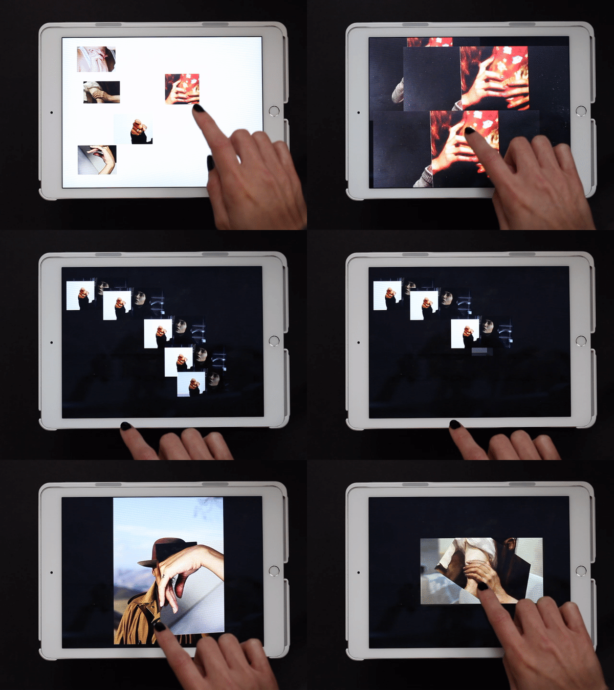
In a web app I created for iPads you can move along stories told by various images and collages of hands. Sometimes you end up at a point you think you have experienced before. But is it really the same, or does it just familiar? You might just have had a


dejavu-gif

déjà vu.


Hans-Peter Feldmann’s Artist Books


Wednesday, May 9, 2012

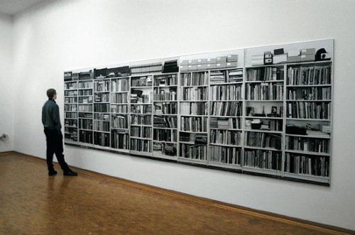
Hans-Peter Feldmann (born 1941, Düsseldorf) is renowned for a distinctive use of photography and ready made objects in his work. At the end of the sixties Feldmann started to collect series of images from widespread visual culture as well as his own photographs. These series are displayed differently in printed matter as well as exhibitions.
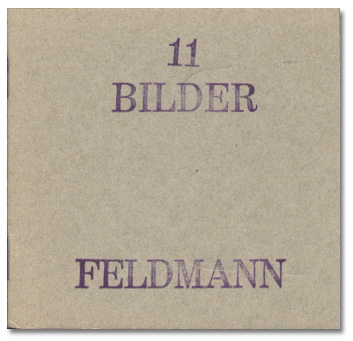
From 1968 onwards Feldmann produced artist’s books, comprising a substantial part of his oeuvre and of major influence on the development of artist’s books as an independent medium.  In the first period Feldmann made Bilder Hefte, a series of tiny books at times containing only one image. Some books demonstrate a photo series of a single theme, like Die Toten, press photos of victims of political terrorism in Germany, and Alle Kleider einer Frau, a sequence of individually photographed objects. Other examples encompass disparate imagery without any enforced interpretation.
In 1995 Feldmann founded the magazine Ohio together with fellow photographers. This exhibition includes six issues of Ohio magazine that were made by Feldmann himself. Ohio magazine and Feldmann’s artist’s books greatly inspired younger generations of artists.

The exhibition is curated by Frank Mandersloot from his own collection supplemented with a loan from the private collection of the c/o Konrad Fischer Galerie, Düsseldorf, and organized in close collaboration with the librarians. Feldmann’s work is displayed on exhibition tables specially designed by Mandersloot for this occasion. From the 12th May – 2nd June 2012 the exhibition ANOTHER EXHIBITION: artist’s books by Hans-Peter Feldmann takes place in the library of the Gerrit Rietveld Academie, Amsterdam, with about hundred books on display made by Feldmann between 1968 and 2012.


Log in
subscribe