0
|
|
|
|-Observing a timeline, we can see it is partitioned into
|three parts: past, present and future. We have knowledge
|of the events that took place in the past and we
|experience those of the present and we cannot know what
|future holds for us. The same basis can be applied as far
|as books are concerned. The idea proposed, is based on
|the linearity of a timeline (it’s core structure).
|A library whose key principles are continuity and
|chronological order. A library filled with books from the
|beginning until now, and the rest empty, only to be filled
|with books in the future.
|
|–The clarification systems are reviewed periodically, so
|that they can adapt to the constantly changing environment,
|in which moves humanity, and be consistent with the
|developments taking place in the world. Both in terms of
|new phenomena (e.g. new fields of knowledge, new
|technologies and new political conditions) and for
|reviewing the old phenomena (e.g. elimination of prejudices).
|
|
|—Past belongs to the past. “Quod periit, periit”, What
|has happened has happened and it cannot be changed.
|Nobody can write a book at the past. People, most of the
|times, want to relate, to identify themselves via dates
|and chronological order. One, remembers who he is and
|where he came from, his roots, his beginning and his
|present, through particular events that happened on
|specific dates. As far as art is concerned, a field
|where chronological cohesiveness plays a big role by
|itself, everything has to do with time. For example,
|regarding the authenticity or non-authenticity of an
|artwork; the sources which an art historian resorts to,
|show that a work belongs to a particular artist, or to
|identify the origin of the project, or the date of its
|creation, or in order to document whether an
|interpretation of other historians is or is not accurate.
|This linear chronological function shows us the process of
|knowledge methods of expertise, of knowledge regarding the
|use of materials, of production, of technical achievements,
|all conquered by man over time.
|
|
|
|—-Helen Bakalo wrote in her book “Rhythms
|and Definitions of European Art, 1980″:
|“…The time in which events take place, seems
|immobilized; it has no fluidity at all. The clues
|that would reveal to us the continuously changing
|present do not exist. It is as if we recreate the
|past mentally, only after its registration in our
|consciousness, not like living it with our senses
|and partaking dramatically…”.
|
|
|
|
|—–The systematic study of the past, based on
|chronological order, focuses primarily on human
|activity up to the present time. This study of
|events includes not only historical records, but
|also the causes that led to them. In addition to
|this, we appreciate more, objects that are old
|and damaged, as it is somehow believed that they
|are able to hide wisdom from another era. Using
|this kind of classification, we can derive
|information and details and not only a simple
|historical order. We can observe social issues,
|topics, problems, ideas which kept people busy at
|that specific period. Book binding, preference to
|covers, colors, font, topic, quality of paper,
|which decision took the graphic designer, even the
|number of published books, can give us a lot of
|information for the time period in examination.
|For example: During the 90’s, many libraries decided
|to withdraw many of their books because of an
|innovation, the internet. Later they regretted this
|decision but it was too late (another historical
|event of our timeline).
|
|
|
|
|
|——It is not about an impersonal way of research.
|It is more of a personal matter. If, for instance,
|someone is interested in me, in finding information
|about me at a particular time period, that someone can
|just think about my date of birth
|(incidentally 19/05/1995) and discover many things about
|my childhood, the way that I grew up or even some of my
|habits and interests, drawing information from the input
|data of such a classification and getting to know what it
|was like growing up in those times. It is not only
|necessary to find and read ones biography, but also to
|understand the events that affected and developed that
|particular one.
|
|
|
|
|
|
|——-All in all, the compatible “search” can be
|changed. We will not be lured just from a fancy title
|or a nice colorful book cover, in order to decide for
|a book. We will “search” based on how far we would like
|to dive into the past, the present, or to the presume
|of the future; based on our needs.
|
|
|
|
|
|
|
|——–Note no1: This plan is working much better in a
|bigger scale. A small collection of books, for example a
|personal one, can depict obviously the taste and the
|development of a person, as a kind of a diary with thoughts.
|But in a bigger scale, this can be seen from an
|anthropological point of view and by many more aspects,
|as mentioned above.
|
|
|
|
|
|
|
|
|———Note no2: A possible ergonomic solution could be
|the addition of the date of publication, on the spine of the book
|
|
|
|
|
|
|
|
|
|
\/
Archive for April, 2016
o————-> Are you in the right timeline???
Monday, April 18, 2016
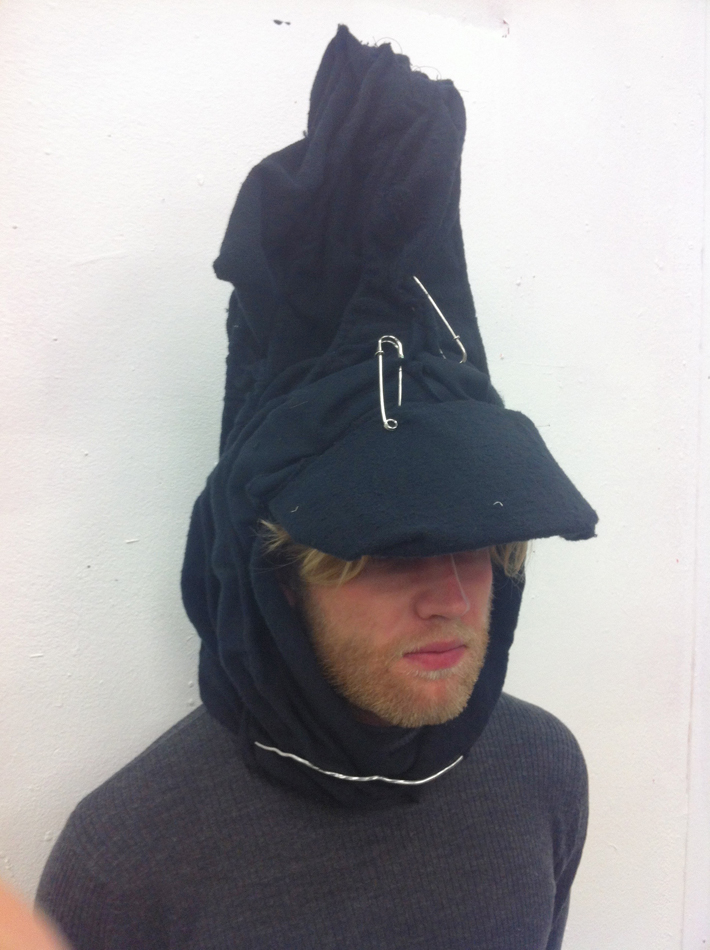
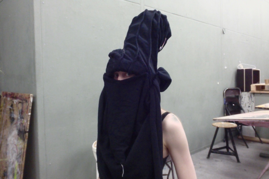
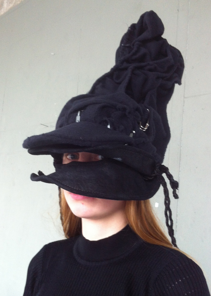
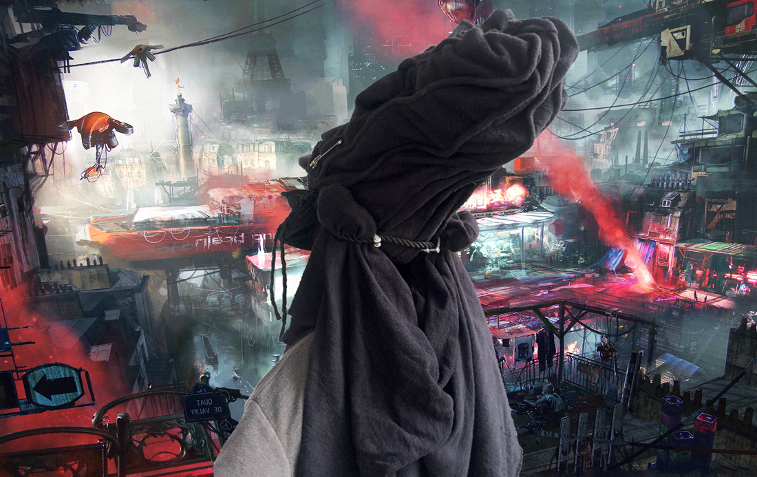
Distant future hoodlum hero’s hat
Monday, April 18, 2016
My first choice was Tails. The fast flying little fox from SEGAs retro platform game Sonic the Hedgehog. Me and my ten years older sister played that back in the 90’s. It was rad! She was Sonic of course and I was Tails. I researched Tails a bit, turns out he’s a he not a she and his real name is Miles Prower, a pun to Miles per hour because he so fast. But his identity is maybe a bit too two dimensional, literary and metaphorically. And I was stuck with to simple ideas, not wanted to complicate my not so complicated relation to this little lovely creature.

Lets move on.
So I needed to think of a new person. Roy Batty played by Rutger Hauer from Blade Runner (1982) came to my mind. He is a “Replicant”, a robot who together with his Replicant friends rebel against their predetermined work-for-humans destiny. And then “Major” from the renowned classic anime Ghost in the Shell (1995). She is a cyborg cop, that faces questions about humanity while fighting a new life form, a computer virus with a free will. And I can not help of thinking of Leeloo Dallas. The tangerine colored hair girl from The Fifth Element (1997) played by Mila Jakovovich. She is a bodily product of an experiment to create the perfect human, but who escapes her birthplace, the lab, right away. A forth person unavoidable to think of is Arzach. Created by french comic book author Moebius. Arzach is a half human, half (?) whose self assigned mission is to guard the planets. Never on one or the other side of a conflict, just a fighter for peace.
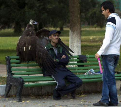
But I also think about a bum in a carbon box on the street. With layers of clothes that lost their color. With all the time in the world to turn inside to his or her own thoughts. One with a personal outlook on life. One who everyone recognize. One who is around. A rambler.

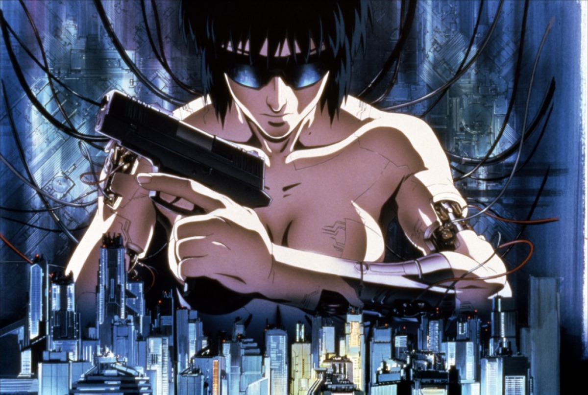
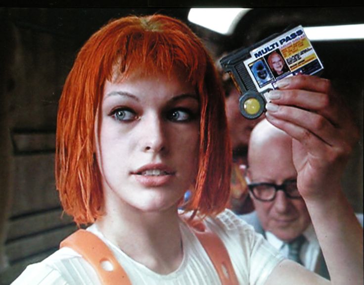
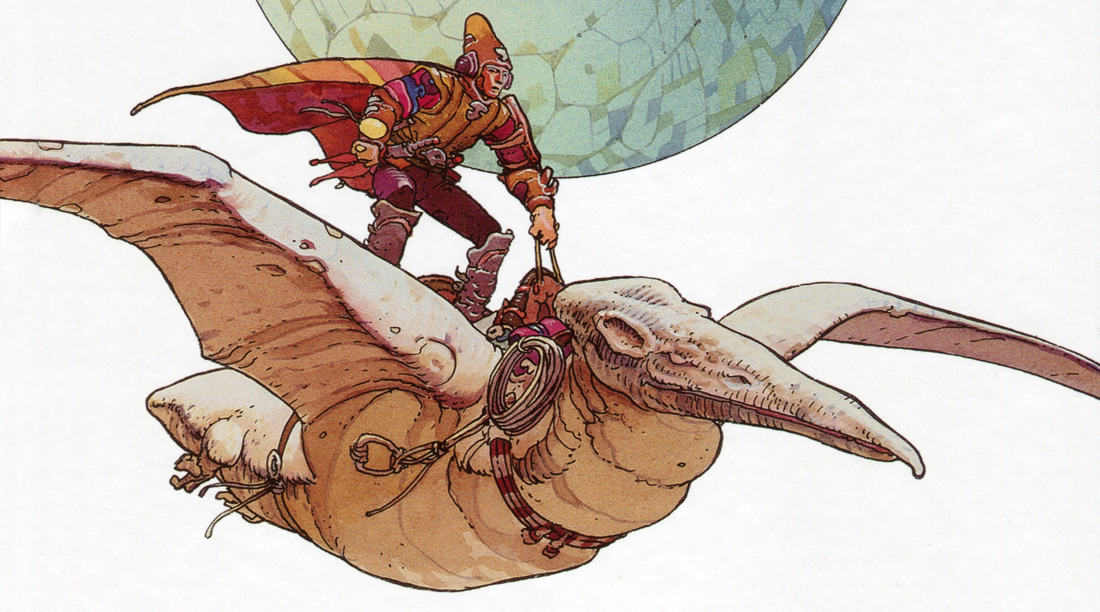
Roy Batty The Replicant, Motoko Kusanagi aka Major, Leeloo Dallas and Arzach

And below, some guy in a park with a vulture
What I did was to combine the persons in my head, creating a somewhat abstract genderless sci fi hoodlum. Who only exist in my mind, and barely not even there. I am also stuck in a aesthetics far away from the clean cliché futurism. And closer to the bum.

A way to further define my person is perhaps describe her environment. First of all its not in a known place but in a nonspecific dystopic far future. A environment similar where my persons described above are use to themselves. Its a supercity, to big for any authority to control. Left to its own self sufficiency. Every man and woman to him and herself and a free open market. In many ways, life for people is back to more primitive ways, but with an endless access to advanced technologies. The half mined out metallic asteroid Omega in the video game Mass Effect may be the represented place. A messy sanctuary for bandits and outlaws.
The Fifth Element Akira
I know I wanted to work solely in black, maybe to make a little challenge for my self since I always prefer color.
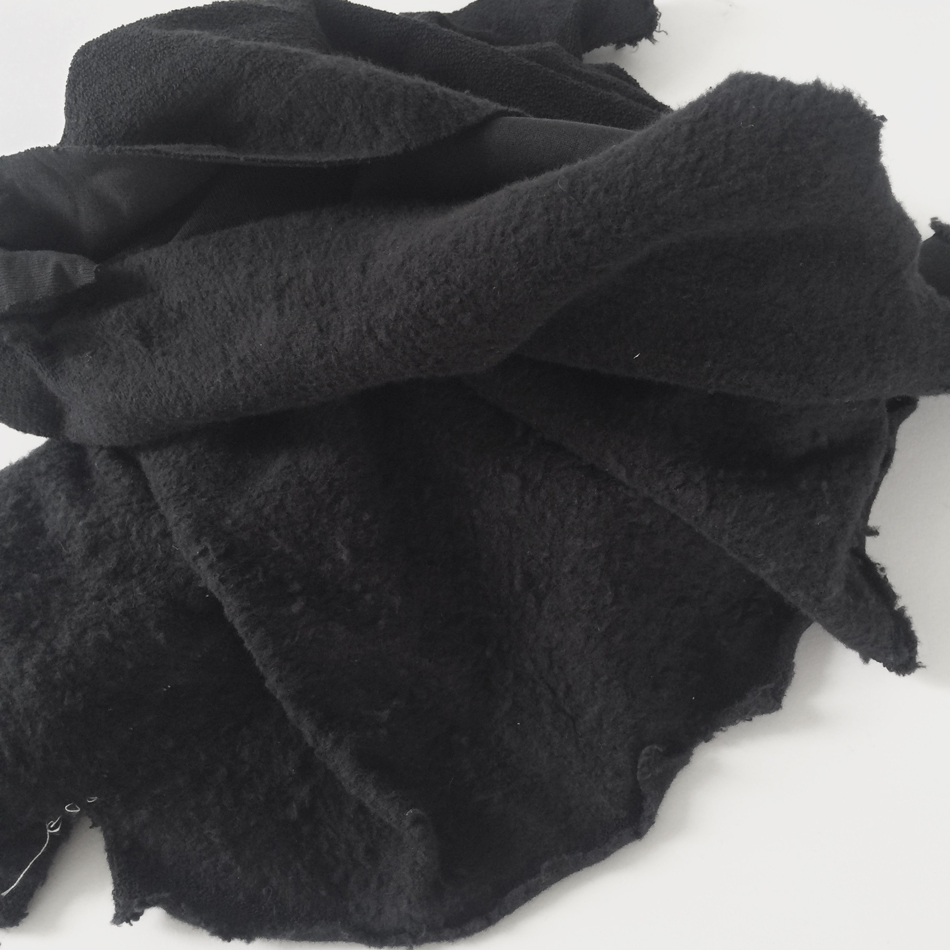
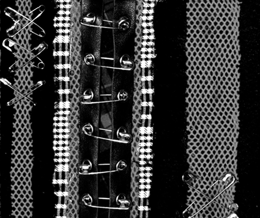
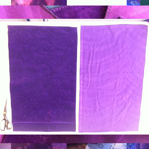
I wanted a rough worn-out feeling. As if my person been around a lot, wearing the hat through fail and foul. I went to a fabric store to find some second hand leather but an old jersey fabric with pilling and nubs caught my attention. On waterlooplein I found a old leather hat which was soft in material but tough in attitude. I brought it with me for inspiration and material.

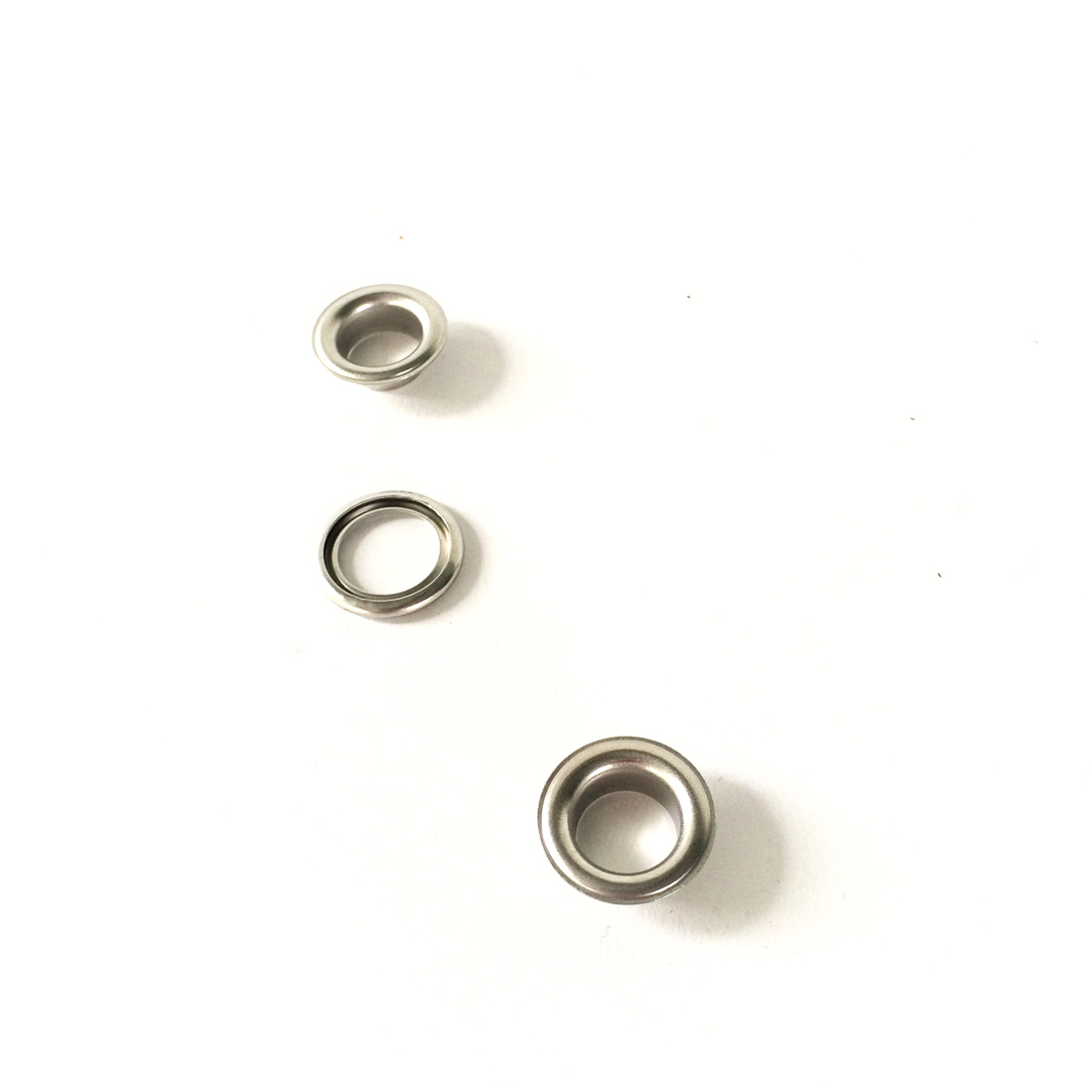
Since I wanted a little bit of PUNK to the hat, and to avoid making just another wizards hat I added some METALL.
like these eyelets and of course safety pins.

I needed a way to make a big stable shape. So I sewed in metal sticks to be able to form a shape I want.
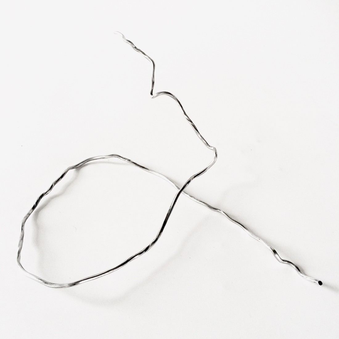
I liked the look of the needles sticking out like spikes before I sewed the sticks in. I made some tryout on how I could keep them there instead, but decided it was to dangerous and non-practical. I want my person to have a wearable hat she can be active in.
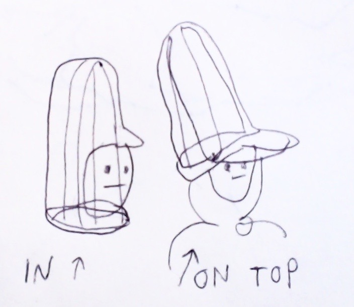
With the bendable metal base I could try different shapes. Head in the hat skeleton or on top.
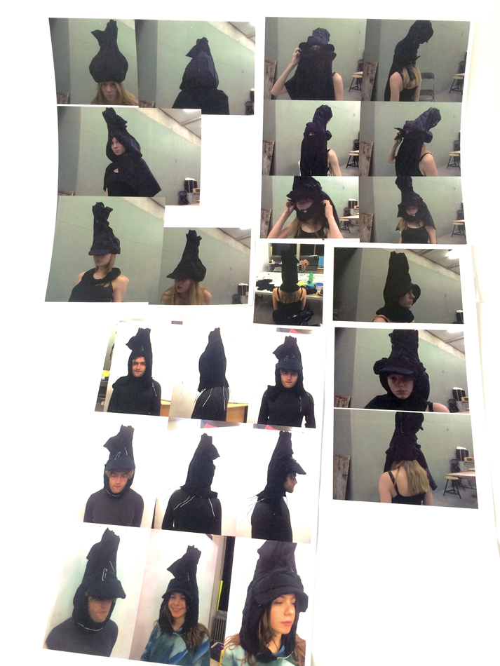
Many try-out on the shape of the hat. Like a cone, onion or a smashed cylinder?
On how to where what type of cap. Small one, round one, multiple ones, on the back, under the chin?
On how to were a cape. And if to wear a cape. Be anonymous, be protective?
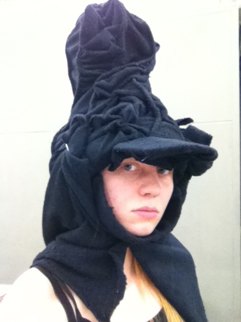
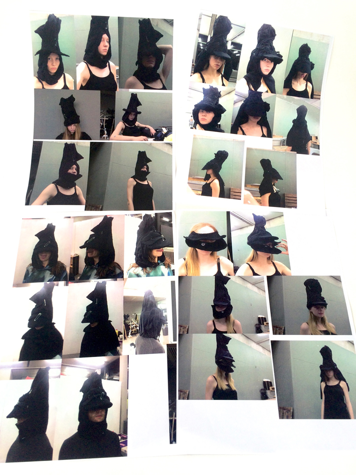
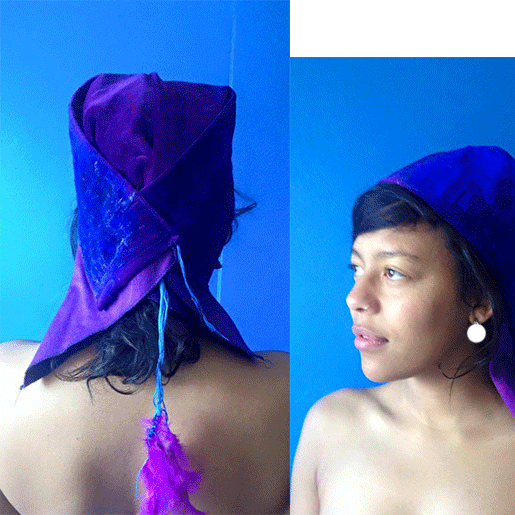
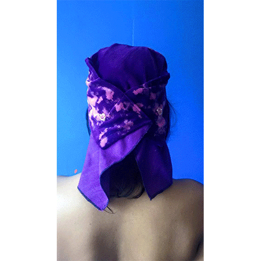
I heard in a movie about superheroes ones that capes are really unhandy because they get stuck everywhere. We liked the idea of a cape. I decided to make a detachable cape. I wanted to have “big ears” on the hat. The cape now has “big ears” that are used to fix it to the hat, together with a black rope. Very convenient. I decided to have three caps in the front. It makes an odd but not crazy look. The person wearing it looks cool and mysterious. It covers almost the face whole but you still have mouth and eyes and nose accessible, so it is comfortable.
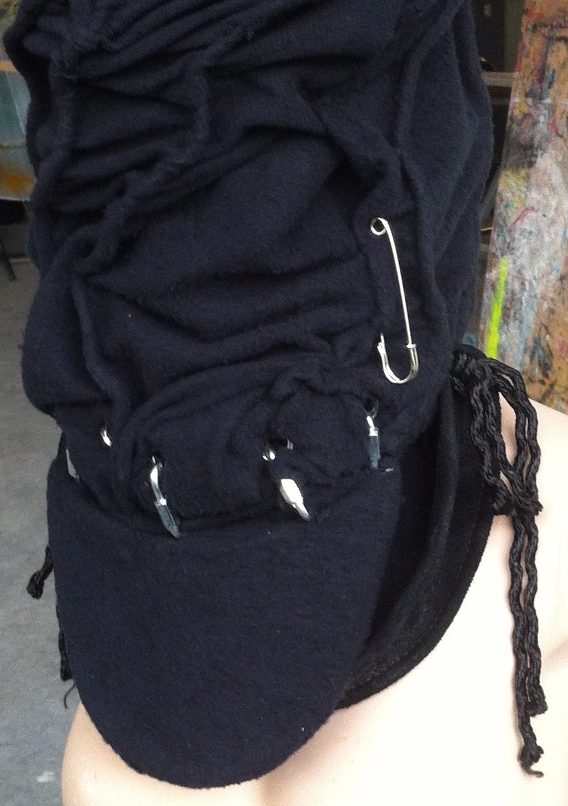
Everything is attached together more or less only with the eyelets, pins, ropes ect. You can more or less see the construction from outside.
Result


Thin to Thick…Thick to Thin
Monday, April 18, 2016
Library is an international transit point of knowledge where people arrive and depart by spending some hours with the books or any form of educational materials.
Whatever method you choose to store your books it is important to organize your books so that the students, teachers or an individual reader can find the things they look for easily. To classify books, comprehensive cataloging systems, like Dewey Decimal system, or the Library of Congress Classification system are in common use but I believe, for every collection we don’t need to follow (necessarily) these systems.
The best way to start organizing your collection is to split the books into fiction and non-fiction, or storybooks, schoolbooks etc.
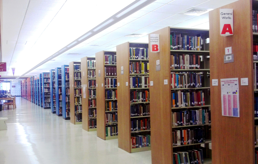
After that the complexity of your organizing depends on the size or the thickness of the book collection, or let’s say according to the Volume. In general it is better to group books by subject than by author.
After that classification (fiction/non-fiction), the complexity of your organizing depends on the subject of the content of the books. Most of the library collection starts with a tag line “ SUBJECT ” and or sometimes in an alphabetical order or by volume (which is rare). In general it is always better to organize a collection in an easy way to access method because often it is tiring to search or get a “particular book” in a library.
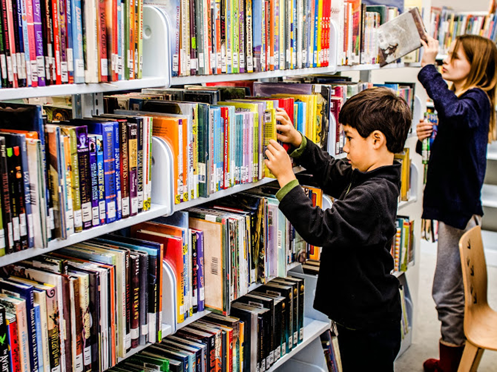
As libraries are public space, all the time different people, from a philosopher to a beggar, children to amateurs, visit it. All the time in advance it is not sure which book from particular authors or subjects someone who visits the library will choose. Sometimes they just want to go random through the books. These people are more interested in the title of a book and its volume rather than whom it’s written by or what the content exactly is. After going randomly, they try to figure out their own taste of reading. Technically, cover, color and images of the book attract these kinds of readers.

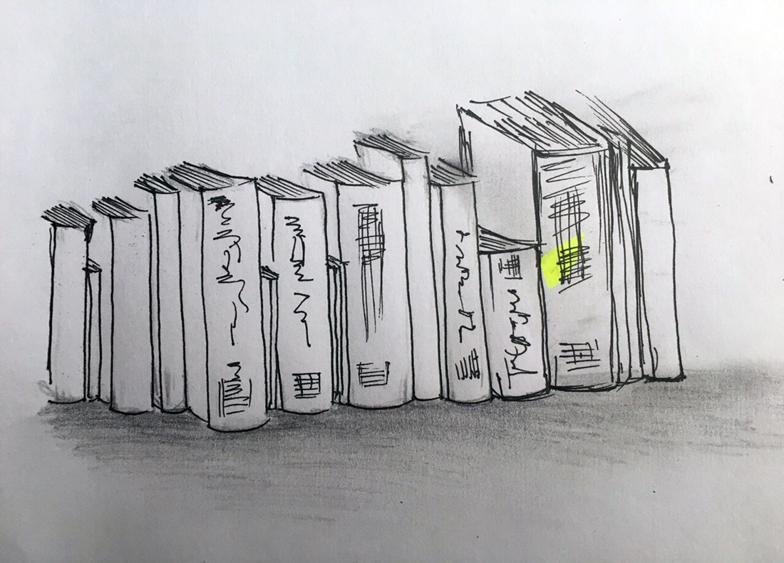
Being so curious about the size and the color of a book, it comes first in our sight neglecting its neighboring small and thinner books. And those thinner books look just like a single drop of water in a giant ocean.
Readers, who are amateur and confused, hardly figure out thinner books (although they are without distinction) through the bookshelves.
I always think that the identity of thinner books disappear being a sandwich between two giants. As the book is out of sight and hard to find. And most of the times, all the attention are attracted to thick and bulky ones.
When books are separated according to the subject or title, the biggest fear is still to loose the value (visibility in the crowd of thicker books) of thinner books.
After visiting many libraries, I started thinking, what might be the best idea to bring these thinner books into highlight? What could be added to the traditional book management systems of libraries so that one doesn’t need to be specific while selecting books and still make contact with all kinds (thicker to thinner)?
How to organize the books in any library, so that they don’t get obscured by the world of thicker books and make them visible and valuable?
One and only solution to bring all thinner books into highlight is “separate all thinner books from thicker ones”. Instead of classifying books according to the size, height, color, subject, it could be more profitable to organize them according to their thickness. This is how all the thinner books (which are lost in the bookshelf), comes into highlight and their values are saved. And the readers pick up those books automatically.
- How to start?
- Organize/ display books according to their thickness.
History ->Thickest-Thicker-Thick-Thin-Thinner-Thinnest
OR
Fiction -> Thinnest-Thinner-Thin-Thick-Thicker-Thickest
It may also be worth organizing book collection according to the grade or level, where books for younger readers or children can be stored in a lower shelf, and philosophical or difficult books for older readers in a higher shelf. Book published nationally and internationally can also be categorized in the same way I mentioned above.
After categorizing all the books according to their subjects and contents, it will be very easy to place them according to their thickness. By using this method, all the books get their identity, space, importance and appreciation. And there will be less confusion and tiring in searching the respective book of one’s choice. The thinner books are highlighted too in compare to thicker. They can be in reader’s sight very easily and reader doesn’t need to spend too much time in search of the thinner sized book which normally hide in between the thickest books.
As this method is very useful, there is high probability that readers will give equal importance to the all books.
- Where?
This system of managing books can be handy and useful for almost all types of libraries. As public libraries are open for all kind of people and crowd, this system can be easier for people to figure out particular books whether it is thick or thin. This method of handling books in a library will be (I believe) very inviting for new amateurs readers especially who enter the library with an intention to read something but don’t know what to read.
In school and home, the same system or method can be followed. As we know in a classroom and in a house, there are no big collection of books. Every one knows where and how she/he has placed the book. But still it will be very functional to organize the small collection according to their thickness as it will help to create a fun environment for the readers (from small kids to bookworms). This system must be kept very simple to encourage pupils to browse through the collections.
Universities libraries can implement this system too, so that during their small break time they can quickly go through all kinds of books with out loosing their time. Thinner books are better for short breaks.
Conclusion
By using this method of distribution or classifying books in a library, helps books, an easy approach. Technically too, it will be very handy for an individual collector or librarian to take care all the books, from thinnest to thickest easily and can keep good records.
Her Previous Incarnation
Sunday, April 17, 2016
"Don't ask from where I have come,
My home is far, far away.
Why do you wander so far? Wander so far?"
- "Olive Tree" by Sanmao
Sanmao to me was an incurable romantic, a lonely dreamer and a gifted drifter who had spent most of her life travelling and writing. The stories and the journals she wrote beautifully reflected the unforgettable journeys she undertook, the incredible places and people she had seen. Sanmao studied philosophy in Taiwan and continued her education later on in Spain and Germany. After her study and the tragical loss of her fiancé, Sanmao returned to Spain and there she made up her mind to follow the sunset of Sahara . Her life as a drifter and a writer then began.
I’ve always been very much moved and inspired by the stories of her life journey, as her writings didn’t only describe the wonderful experiences of her trips but also illustrated the difficult realities she had to deal with. (Here is one of her stories – “The Mute Slave” collected in the book “The Stories of Sahara”.) Because of her kindness and courage, she was able to prepare herself to face all the challenges and risks of her adventure. To me Sanmao’s writings mean much more than a travelogue, significantly they stand for her values of life. Therefore, I decided to take Sanmao as the person/source of my inspiration for this “Identity” design project.
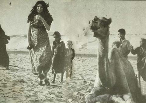
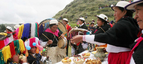
As I was quite familiar with her books, in her writings what interested me the most was her fascination with her previous incarnation. In the book “Wan Shui Qian Shan Zou Bian”, she wrote that she had always believed she was an Ecuadorian Indian girl in her last life. When she traveled to one remote village hidden in the Andes, she felt immensely connected to the highland, as if she had come back to the homeland of her previous life. As she wrote, in her last life she was a Cañari (“an indigenous ethnic group traditionally inhabiting the territory of the modern provinces of Azuay and Cañar in Ecuador”) girl named Hawa. The name Hawa in their language means heart. She was a pharmacist’s granddaughter who lived her entire life happily and peacefully in the village of the silver lake (also known as the lake of heart) till her death.
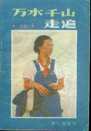
“Wan Shui Qian Shan Zou Bian” in Chinese
As her imaginary previous life fascinated me so much, I decided to design the headpiece based on her last life story and research on the indigenous inhabitants of Ecuador as a starting point. It was at first difficult to figure out the ethnicity of Hawa in English and there was no Chinese information regarding the ethnic group she belonged to. However, after several rounds of research on the history of the indigenous people of Ecuador, I was able to confirm that Hawa’s ethnicity was Cañari. Research on history, culture and custom of the Cañari was then further conducted.
Interestingly, I found the Cañari indians loved wearing hats. “Those of you who have been following our South American journey know how important, and ubiquitous, hats are to the people of the Andes. Fedoras are to be found everywhere, stovepipes are not uncommon, and the Cholas of Bolivia have turned blower hats into a jaunty fashion statement of national pride. Many wear straw hats, and in Ecuador at least, have them refurbished by painting them to make them last longer. I must also mention Panama hats, which are not from Panama at all, but are exclusively an Ecuadorian creation”, Alison and Don wrote in their post “The Cañari of Ecuador, a ‘palace’ and a pig”.
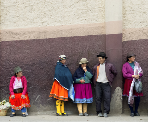
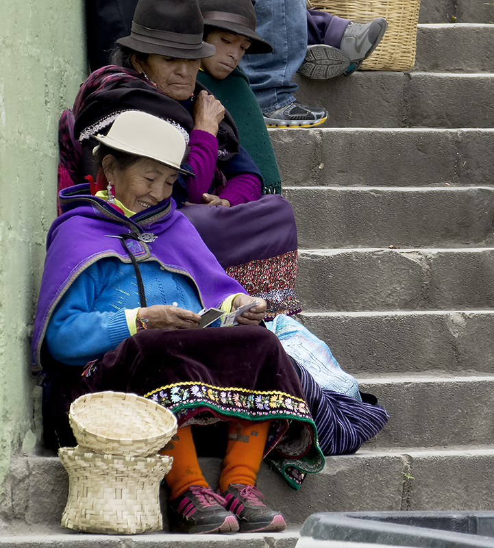
Nevertheless, among the different types of hats they wear, I found one kind that was particularly special. The hat is made with a wide brim and many strands of colourful yarns falling from the edge. The Cañaris usually wear it for festivals and celebrations.
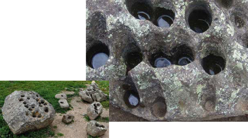
On the other side of my research, I discovered the Cañaris created a very unique moon worshipping system using large rocks. “The Incas worshipped the sun, but the Cañaris worshipped the moon. There are 28 holes on the larger rock, one for each day in a lunar month. Each hole is drilled at a different angle and when water is added, the Cañaris would look at the reflection of the moon in the small pools. This was their way of receiving messages from their god. The other “holey rocks” were most likely used to hold paint (for painting faces, textiles, etc), “ Mellisajane14 wrote in her blog “Ingaprica: Incas in Ecuador”.
After a few rounds of research, I began to develop ideas for the design of the headpiece for Hawa. In the end I decided to make masks for her to wear, as I believed Hawa – the preexistence of San Mao should be a vague figure without revealing a clear face.
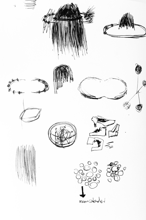
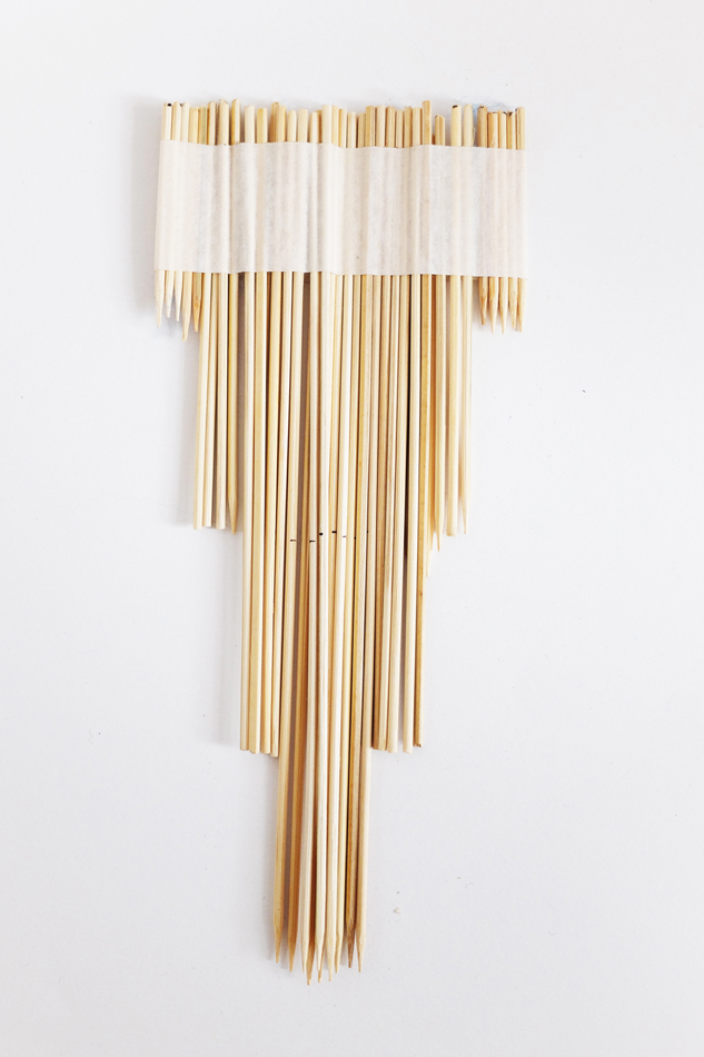
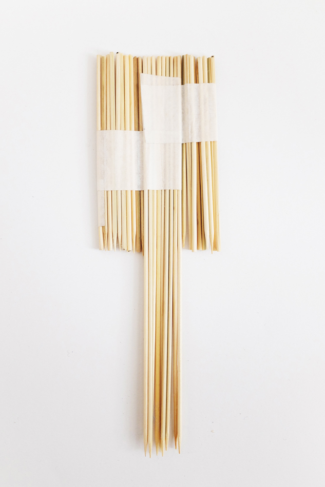
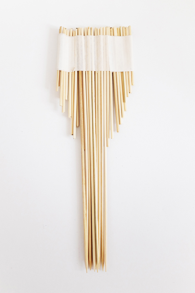
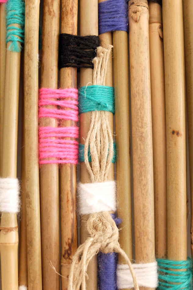
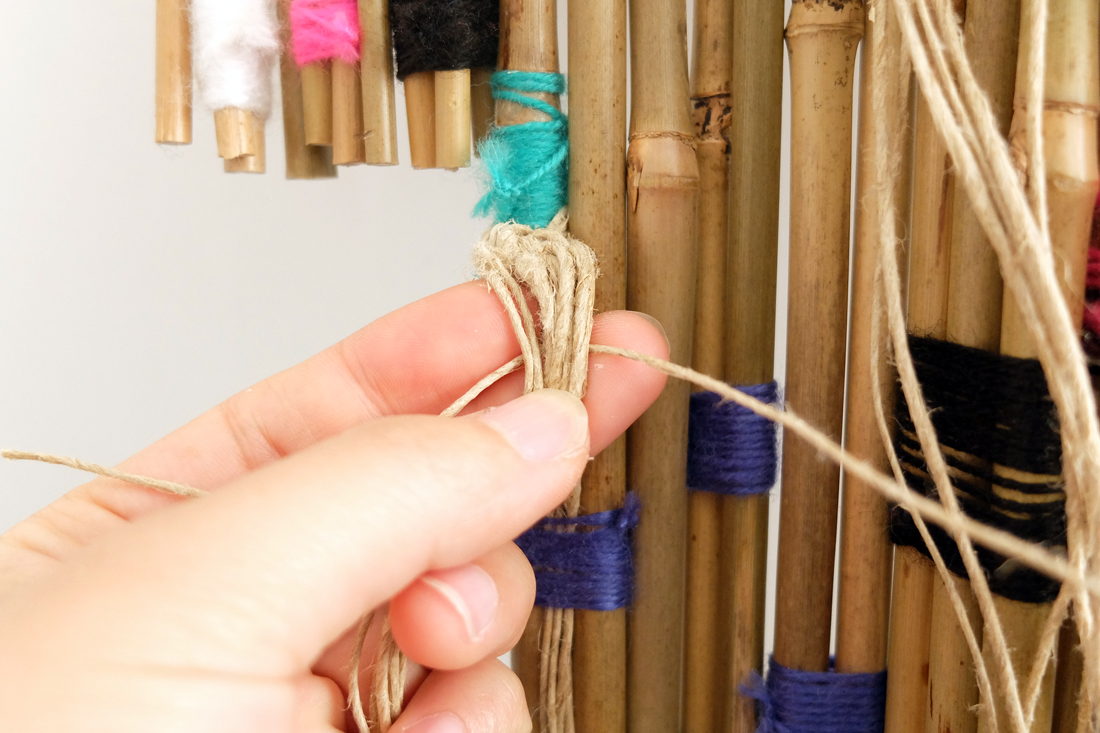
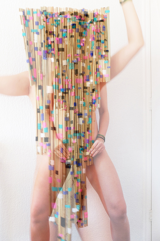
Meanwhile, inspired by those bright, colourful yarns and holy rocks, I planned to seek and experiment with similar and relevant materials so as to resemble the Cañari elements. Wood and bamboo were selected due to their primitiveness associated with the Cañari indians. Clay and small rocks were also applied, echoing those incredible rocks.
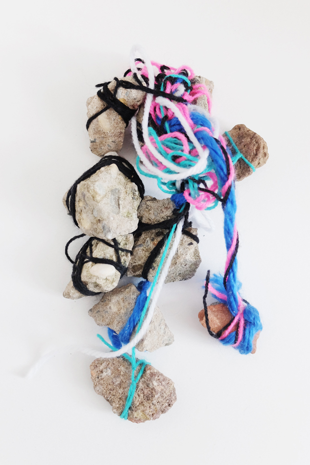
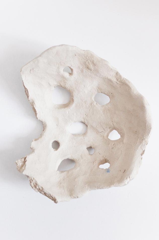
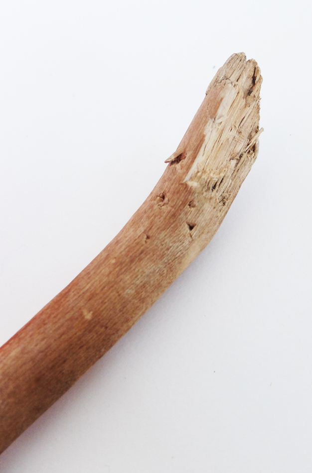
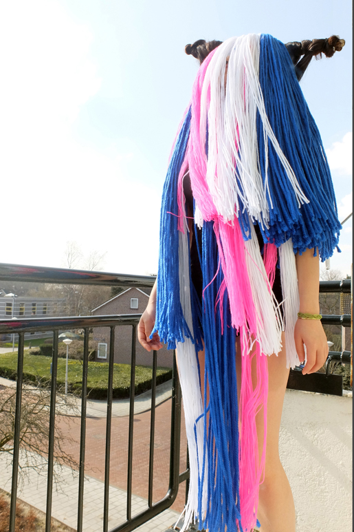
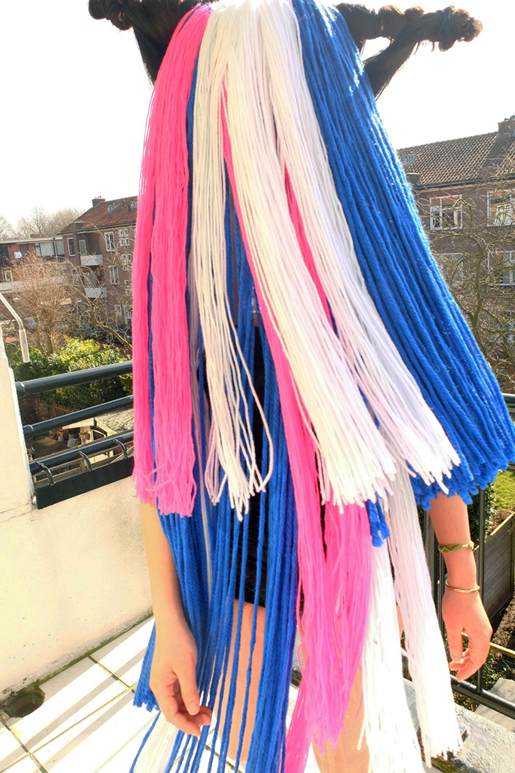
After the experimental trials with materials, a clearer image of the mask that I wanted to make gradually emerged. The try-outs with the clay mask as well as the small rocks didn’t turn out strong enough to mirror the Cañari moon worshipping system. However, the results of colourful yarns in combination with wood and bamboo were quite intriguing. Hence, I decided to further continue the mask concept mainly using yarn, bamboo and wood. As the techniques of applying yarns I developed during the experiments were different, I was suggested to make two masks using both techniques (yarn with wood and yarn with bamboo). In the first technique, long strands of yarn in selected colours were made and locked to an organic-shaped wooden stick that was found in the street, creating the idea of a mask that could cover most of the body. While in the other one, yarns were applied as components to bind the bamboo sticks.
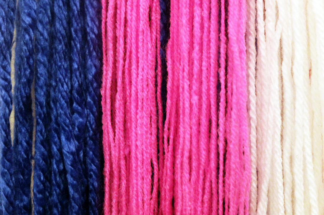

As I discovered that yarn strands in volume and layers would turn out more visually powerful in the form of masks, and bamboo sticks bound with brightly coloured yarns placing vertically would create a refreshing effect. Therefore, I decided to continue working on the mask of yarn strands by creating more volume in layers. On the other hand, I tried to come up with a few scale models to explore the overall shape of the bamboo mask. I found that a mask of bamboo sticks in different lengths and a more or less geometric shape could be primitive and fit well in the Cañari vibe. I eventually chose one shape that I thought would connect to the story the best and made a paper mock-up of it.
Simultaneously, I kept working on the mask with layers of the yarn strands. In the initial plan, hemp rope was used to coin around both the ends of the wooden stick, building a vast contrast between the fineness of the yarn and roughness of the rope, while small gaps were left between the yarn and the rope for hair fixation, creating a way for Sanmao/Hawa to put the mask on. However, I discovered it would be even stronger to leave out the hemp rope and cover the rest of the wooden stick using only hair.

As for the bamboo mask, I continued building and finishing it according to the mock-up and came up with another means of fixation by attaching a few strands of straw rope to tie around Sanmao/Hawa’s body. The process of building was a bit struggling due to the difficulty of binding the slightly bended bamboo sticks.
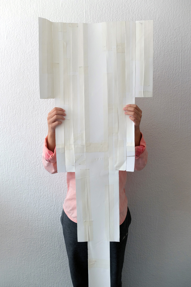
Nevertheless, after two months of efforts, the masks were eventually finished. Although there were struggles and doubts, I was quite happy with the process as well as the results. After finishing the works, I decided to try them on for photo documentation. As you can see, the photos were taken in different settings. Wearing the colourful headpiece with the long yarn strands, I thought that it was necessary to feel the wind and frame the yarn flying moment at my balcony. I felt spiritual and being transformed into a shaman from an Andes tribe. It was incredible. When I firstly put on the bamboo mask, I felt the urge of being completely natural. I wore the bamboo mask naked and did some tribal dancing and humming in my room. I felt happy and free then. In the end, I decided to keep the pictures taken at the balcony original and fresh, while adding some effects to the photos of the bamboo mask, making it a bit strange and whimsical.

I’m certainly glad that my father introduced Sanmao’s books to me at my younger age, when talking about the relations between writing and experiences of life. Without her journeys, I believe that she couldn’t have told so many wonderful stories. And it definitely helped me to rediscover myself and to a certain extend shaped my view/values of life. To me life is a long journey after all. I made these two masks for her/ her previous incarnation in remembrance of her free spirit. These two masks carry special meanings to me, as they were made for Sanmao – an incurable romantic, a lonely dreamer and a gifted drifter who I feel deeply in common with.
Goodbye Sanmao.

Ed galsmo & teh koeb
Sunday, April 17, 2016
Op het moment dat ik mijn boek uit had gezocht in het paviljoen, ben ik afgegaan op de associatie die ik had met het boek. Het voelde als een van de eerste boeken waar ik vroeger zelf in ging kijken. Het eerste wat ik deed was snel bladeren, de layout en de plaatjes bekijken. Daarna bekeek ik de voorkant en de achterkant. Het enige waar ik naar keek, waren de visuele aspecten en niet de inhoud.
De stofomslag is een tijd beschouwd als niet belangrijk, het werd alleen gezien als bescherming van het boek en werd vaak weg gegooid. In deze tijd is de omslag wel een duidelijk onderdeel van het boek maar vaak is de visuele content totaal anders dan die van de cover van het boek. De omslag moet het boek aanprijzen en meteen duidelijk maken welk gevoel je kan krijgen van de inhoud. De meeste covers van de boeken met een stofomslag zijn heel minimaal, bijna altijd hebben ze alleen maar een kleur met de tittel van het boek op cover of op de kaft.
In de bibliotheek die ik bedacht heb kom je binnen in grote ruimte waar alle boeken op kleine stapeltjes liggen. Het enige wat je ziet is een kleur en een titel. De stapels zijn combinaties van boeken die aan elkaar refereren. Als ik boeken bekijk of lees zie ik altijd wel een bepaalde link met een ander boek. De stapels worden gemaakt door de mensen in de bibliotheek en de werknemers. Zo ontstaat er een wisselwerking aan informatie en associaties puur op informatie. Bijvoorbeeld als je een een onderwerp hebt over verschillende hiërarchieën in de middeleeuwen dan kan je een boek hebben over de werking. Of je hebt een boek van een filosoof die zijn visie er op loslaat. Een boek dat geschreven is in het heden en terug kijkt op de situatie of het is juist een boek dat in die tijd is geschreven. Op die manier krijg je heel veel interessante links van informatie door verschillende mensen. En de link die een persoon legt tussen de boeken kan weer heel erg verschillen tussen de link die jij er mee legt.
Met die gedachte van gebundelde informatie ga je naar de volgende ruimte met je stapeltje boeken. Die ruimte staat vol met boek omslagen. De bezoeker van de bieb gaat met het stapeltje in zijn hand lopen door de ruimte en is op zoek naar omslag met het juiste gevoel voor zijn combinatie aan informatie, de keuze van de omslag is dan ook volledig subjectief. De omslagen hangen tegen de muren aan. Maar ze hangen allemaal op een verschillende hoogte dus op dat moment komt het boeken stapeltje ook weer goed van pas, door op de boeken te staan kan je bij een bepaalde omslag komen. De bedoeling is om je volledig uit te strekken, de omslag waar je dan bij uit komt moet je pakken. De omslagen waar de bibliotheek het meest blij mee is hangen dan ook het hoogst zodat die zo min mogelijk worden gepakt. Er zijn vijfhonderd dertig verschillende smalle gangen met muren van drie meter hoog. In die gangen hangen alle stof omslagen. Die zijn ook weer onder verdeeld op bijvoorbeeld omslagen met huilende kinderen op de voorkant, covers met blauwe letters of Indiaansen rituelen. Al die dingen zijn dus weer gebaseerd op het visuele aspect. De zijwanden van de gangen zijn helemaal leeg. De stofomslagen hangen alleen aan het eind van de gang zodat het even tijd kost voor dat je de omslagen helemaal goed kan bekijken. Dus het eerste wat je ziet als je naar binnen kijkt in de gang is een soort van sfeer aan kleuren van foto’s, tekeningen en letters.
Waneer de bezoeker zijn omslag en boeken heeft gevonden neemt hij ze mee naar de de laatste ruimte. Daar gaat de omslag in een grote machine waar de omslag om de boeken heen word gewikkeld. Als de bezoeker het stapeltje dan volgende keer meeneemt legt hij de stapel op de eerste rij met alle stapels die weer terug moesten naar de bibliotheek. Als er dan nu weer iemand anders komt kan hij/zij de combinatie bekijken en bepaalde boeken er weer tussen uit halen die hij/zij nodig heeft voor de combinatie. Maar doordat hij eerst nog moet zoeken door de combinatie door die van iemand anders kan hij/zij nog weer op andere combinaties komen.
JAPAN’S “TIN DRUM” ALBUM WAS NOT MY INSPIRATION.
Sunday, April 17, 2016
I A M W HI M S I C A L
I A M L O O S E
I A M G R AC IO U S
I A M I N LO V E
A N D I S A Y T HI N G S
I S H O U L D N O T S A Y
Oh, it was such a glorious day. A new assignment, a new struggle. Exciting, i’d say.
I couldn’t imagine who to pick.
See, we had to choose one very special person to use as a subject or better said, starting point, for this project.
“D E S I G N A H E A D D R E S S”,
A sentence said a bit too much during the last few weeks. However i was motivated. So motivated that i started collecting materials, before even knowing who to pick as a subject. Who the hell would be good enough for me? What about some current and past obsessions? Radiohead’s Thom Yorke? My favorite artist, Anish Kapoor? I could’ve taken quite a leap, by using a fictional character. Rocky Horror Picture Show had a lot of great characters to base something on. How about Frank-N-Furter?
Nothing was interesting enough for me and nothing really sticked to me.
After doubting for quite some time, i made my decision. Olof Dreijer!
For readers who don’t know who that is; Olof Dreijer is one halve of the Knife. A Swedish electronic duo, consisting of siblings.
I’ve been listening to them for quite a while now and they became one of my most favorite musical acts and after seeing them live on the 6th of may, back in 2013, i became obsessed. I have all their mp3’s, almost all of their records on vinyl and even listen to Karin Dreijer’s (Olof Dreijer’s sister) 90’s band “Honey is Cool” .
I A M G E T T I N G O F F T R A C K
After deciding whom to pick, i did some spherical research. Collecting images of landscapes, materials and weird textures that i thought would be inspiring for and to me, regarding the project.
The collected images are based and connected to the different almost completely unnatural sounds, used in the Knife’s and Olof Dreijer’s other projects’ songs.
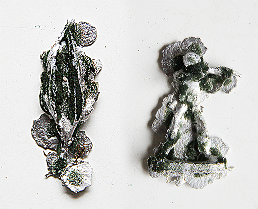
What really sticked to me was the amount of metal and plastic imagery between the collected images. Noticing this, i disregarded my former material choices and decided to use something more rich. I ordered 5KG tin/lead and started playing around with it.
First i made molds of objects (toy-soldiers, plants, self-made statuettes) using polyurethane foam, floral foam, clay and plaster and of course dripping tin into the earlier said molds. The results were surprising and inspiring, but didn’t really fit to what i wanted to succeed.
I A M G E T T I N G E X C I T E D
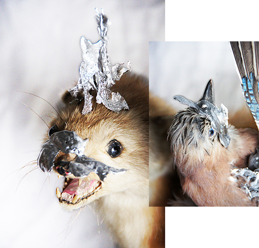
I know now and i knew back then, that i like(d) being unorthodox. Thus I wanted to make headdresses for the dead, AKA taxidermy’d animals. Still having most of the earlier made abstract tin shapes, i started putting them to use. Even though it looked quite good, I found out that this wasn’t the way to go. In this case it was all about aesthetics and not so much about Olof Dreijer. This is something i could use in a future project, but it was very disconnected from the wanted atmosphere.
I A M M O V I N G O N
Most of my end-products came from improvisation and experimentation and even though i can be a wild card at times, I did know I wanted to base the mask on my own face. This was logical, to me, as i was the one who’d wear it to feel / be like Olof Dreijer.
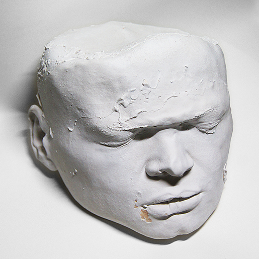
I made a mold of my face and afterwards poured some porcelain plaster into the mold, with amazing help of a peer (I am in doubt if i should name her by her name or not). Having a lot of trouble with keeping the mold completely in shape, the plaster cast turned out a bit misshapen and crooked. However in the end i was satisfied with the result, as it was inspiring to see how it turned out and i am inspired to do more. I want to make plaster casts of everything.
I A M H A P P Y
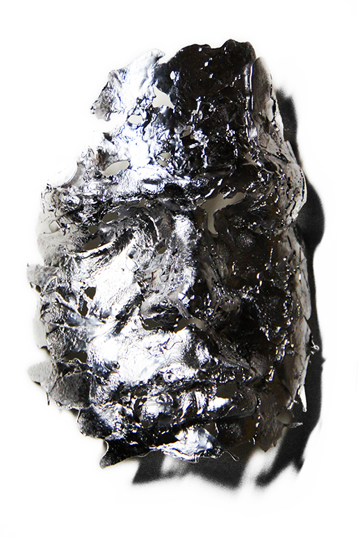
After making a plaster cast of my face, i wanted to go trough several other proci, before deciding that i was finished with the project. The first one being, making another mold of the cast, using silicon. When it was completely dry, i took it of the plaster and the result was as magnificent as I hoped for. Not having to0 much time to waste, I went on to the next step. Dripping tin into the latest silicon mold, resulting in several masks of my face.
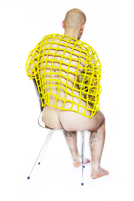
This being a step and not a result, i started playing around with plastic rope, whilst burning the skin off my fingers by attaching the pieces in this manner. I created a grid-mask, using my head as a base and painted it yellow (making a low-key reference to the Knife’s first album’s cover) and when it was dry, i attached two of the tin-faces to the grid using copper-tread.
I B E C A M E D I S S A T I S F I E D
Soon after finishing the headdress, i wanted to make a sweater to go with it. Using the same grid in the same dimensions and painting it in the same color, it became a unity. It became a whole. The sweater is a bit of a hassle though. It’s quite sharp and i had to accept it hurting me constantly, when wearing it. And thinking about pain and pain-relief, i knew this was still not enough.
I A M B L I N D

Using clay to make a mold of old sunglasses, i started experimenting with the same dripping techniques to make the wanted shape for my soon to be glasses. Also i decided to use glass that was in my own eye-strength, so i’d be the only one that’d be able to see through them.
I AM S A T ISF IED
This was it and it still is. I presented them, in a very non-humble way, as it is! A peer wearing the headdress and myself wearing the sweater and glasses.
I got good feedback and i am very grateful for this project and how it turned out
I AM DONE
I AM DONE
I AM DONE
I AM DONE
Since books can’t fly, lets angle them instead
Saturday, April 16, 2016
Since books can’t fly, lets angle them instead
I’m usually a patient and thorough person. My apartment is always in an acceptable order, I iron my clothes, I bike at an average pace, I don’t lose my patience when I stand in the slowest line at the grocery store. If I start reading a book, I always finish it sooner or later.
But; whenever I visit a bookstore or a library, and I get confronted by thousands of books, I completely lose my patience.
I know that there is a very clever and simple system to find what you are searching for, and that someone carefully placed every book in alphabetic order, neatly lined up on the bookshelves. But when I stand before the books, I get the same anxious stomach ache as when someone asks me a simple mathematical question that I usually can answer in one second, but in the stressed situation I turn red and stutter that I don’t know.
So how could I avoid this brain-freeze related paralyzation in the context of books?
Solution:
So lets start with the order of the books. The order is usually determined by the alphabetic order of the authors name or the title, which makes sense since it’s both practical and logical, which I’m a big fan of.
Now imagine that you stand before the alphabetically organized bookshelf, turning the pages in Hendrikje Koersen’s poetry collection De witte boot. You are now amazed over the treasure you found, and start to eye the bookshelf after more poetry.
Here is the interesting part:
Imagine every book containing poetry, magically hoovering in front of the bookshelf, making it easy as a piece of cake for you to find.
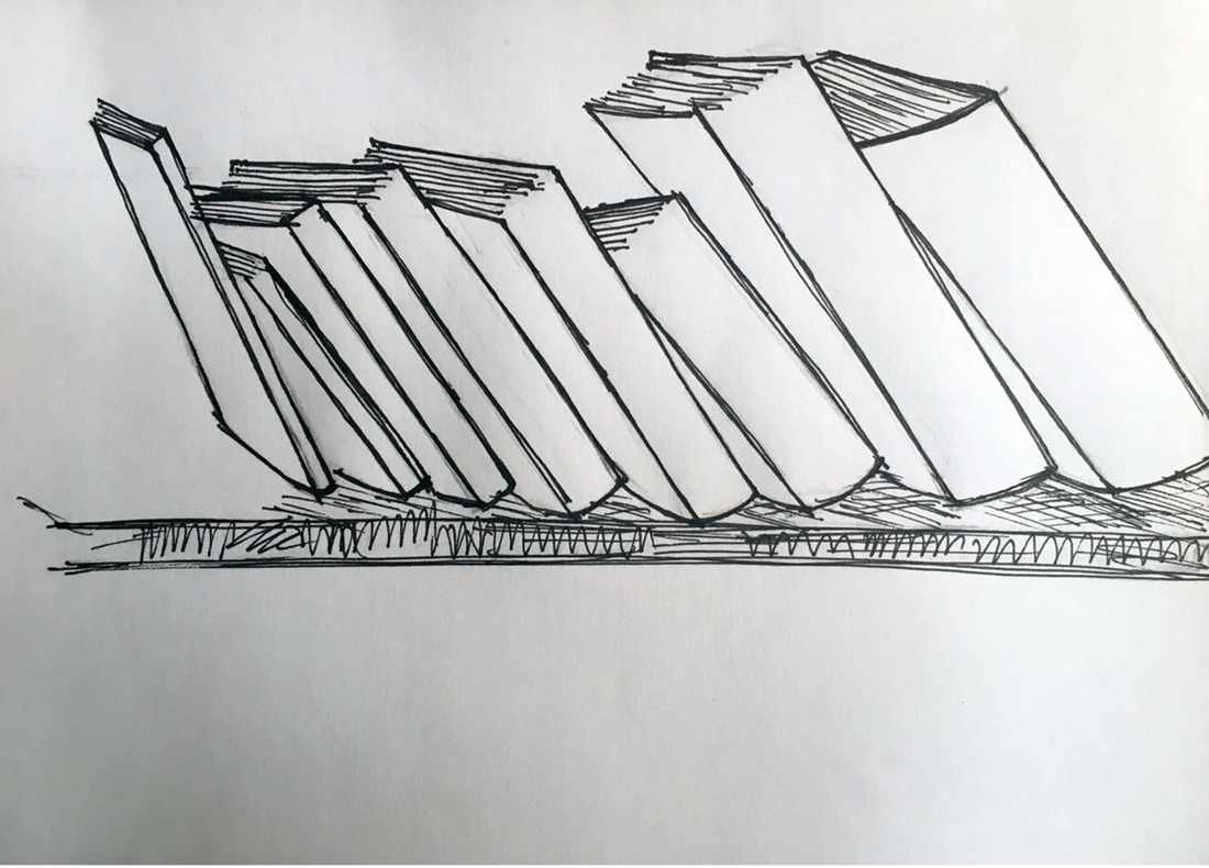
Sounds good right? Unfortunately I’m not a wizard and therefore not in a position to change the laws of nature, but I can however physically highlight a category of books, by tilting the short-side of them, so they hang over the bookshelves end, pointing out in the room, without actually falling down.
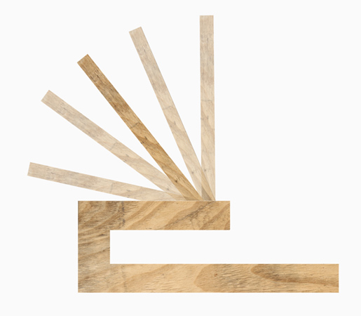
To angle these books, you could use a very simple wooden tool as in the illustration below.
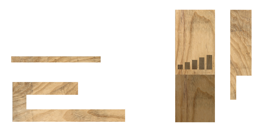
Left picture: Angler, viewed from the side
Right picture: Angler, viewed from above
How:
I have chosen to call this tool an angler, since it is used to literally angle books. (Angler is also the word used to describe a person who is doing angling, a kind of sport fishing, which is fitting since you hold your fishing rod in a angle similar to my wooden tool.)
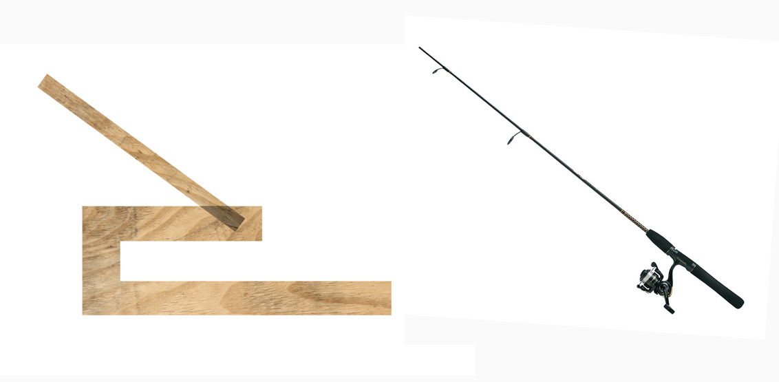
Left picture: The Angler
Right picture: Fishing rod
The angler-tool is made of a very simple construction of wood. It can both be used in singles or in groups, but in the context of bookshelves, I will describe the usage of multiple angler-tools.
To use it you first have to fasten it to a bookshelf, and then put it in the angle that is needed. You can choose from five different angles, each representing a different category.
I have chosen to represent poetry, architecture, design, photography and fine art in this scenario, since I study at an art school where these subjects are the most presented in the school-library. In theory, you could add even more angles to the tools design, but I believe that that would affect the clarity of the category’s in a negative way.
Picture: The five different angles that can be used
The tool has five angles, each representing on of the category’s above.
The angles are:
90
110
130
150
170
The angle 170 will be most far out from the bookshelf, and thus also highlight the book. I want to use it as a category for Poetry, because I believe that poetry it is an underrepresented subject that is read the least in art schools in comparison to other subjects. Having this subject highlighted could direct more attention to poetry and maybe influence someone to take a look in the book, even if this person usually does not read poetry.
Angle 90 would be used for books about Fine Art, since I believe that Fine Art is the subject with the highest quantity of books, which therefore makes it important for them to stay further back so they don’t block the view of the angled books, hanging out a bit from the bookshelf.
It is also a category of books that are often used for research in an art university, so it is important for their title to be visible to make them easy to find.
Angle 110 would be used for the Design-category, for the same reason as Fine Art.
The 130 angle would be used for Architecture, and angle 150 for Photography.
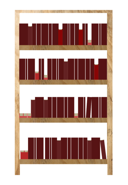
Picture: Illustration of how a book-shelf using the angler could look.
Result:
By using this angler tool system a modified bookshelf will look like a relief due to the books protruding in different angles. If you are looking at the bookshelf from a distance, you should have an easy time recognizing the different categories by the angle of the books. Looking at the bookshelf from a closer distance, you would be able to find your book by using the alphabetic order.
By making the bookshelf look like a relief instead of a plain overview, it will invite the viewer for a more tactile experience of the books, because you are not only able to touch and see the spine of the book, but also the front and back side, the material of the cover and the colors of the pages.
The tool may only be a small object, but it would affect not only the angle of the books physically, but also the viewers visual perception of the bookshelf, both from far and close distances.
Between Proud and Amibitious
Saturday, April 16, 2016
by Marguerite Bonneil
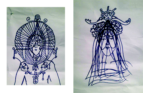
who has been proposed to design a headpiece for someone of her own choice.
You want to know about my design process ?
How do you want me to explain it to you clearly ? It’s such a mess …
OH I LIKE IT //1// Bring your shits and sheets
First aim. Find a character. Find an universe. Find an aesthetic.
You didn’t ask me to create a headpiece.
No, no, no. You asked me to design it.
So, if I wanna be free in my design,
I should design my own character.
Let’s see what I want to work with,
let’s hang this stuff on my wall,
and see what comes out of it…
I WANT SOMETHING WHICH IS
TELL A STORY //2// Colors, characters and desires
I want to tell a story, a story for grown-ups,
to remind them that we are never the same,
to remember that we never know what is going to happen.
I want to tell a story about materialities,
about this objects among us, in which we recognize ourselves so well.
I want to tell my fascination for objects, who are so human,
because they all reflect one human’s mind.
Here is the beginning of the story;
(this is a slow gif, be patient)
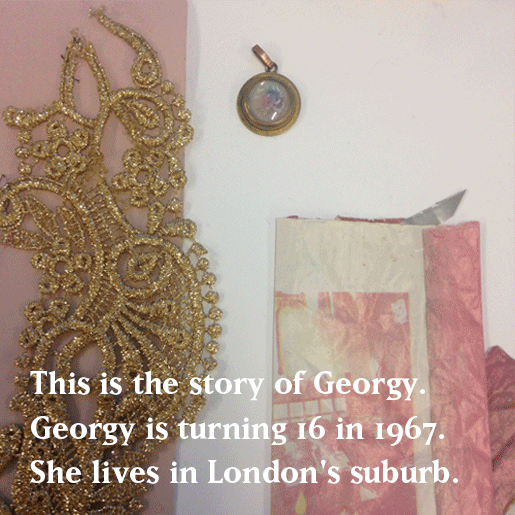
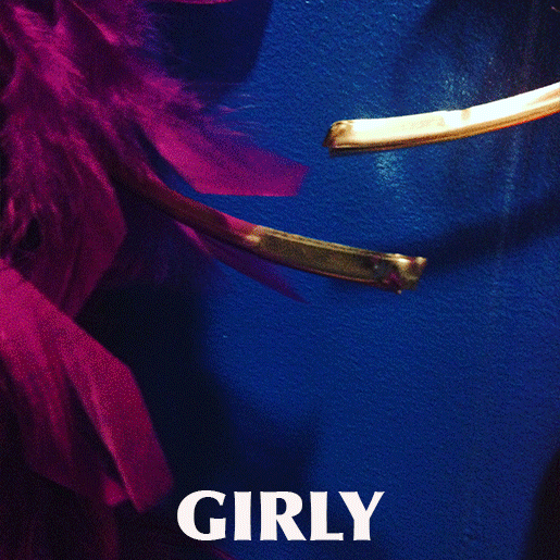
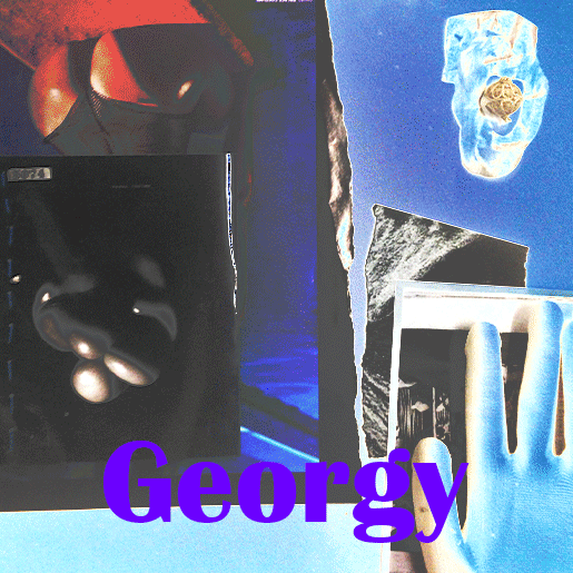
Gold, Clear Pink, Sand and soft.
Those are the materialistic translations of Young Georgy.
–
Georgy has a neighbor, a creepy neighbor …
Slimy, Latex, Yellow, White, Creamy, Blury. Those are the materialistic translation of The Creepy Guy.
He looks at her through his window when she’s going to school.
And when she’s coming back.
Georgy met a new girl, Kristy, she became her friend.
Her BFFFE (Best Friend First Forever & Ever).
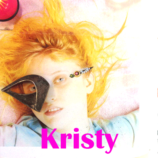
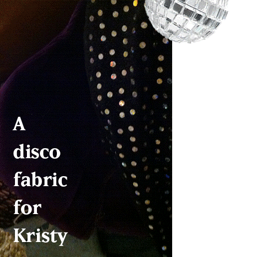
Fluo, Shiny, Plastic, Too much. Those are the materialistic translations of Kristy.
As you may have understand Kristy is the one who is gonna free Georgy.
Adventurous, gorgeous, extrovert, insolent, our girls discover London’s night life. As usual, they went out on a Saturday.
Georgy is gonna tell you what happened.
So now, we have a story with 3 characters.
At one point they were 4, including a man that Georgy would meet at this party.
As you will understand everything didn’t happened as it was supposed to.
And I wanted to show the Georgy Before (16 years old) and the Georgy later (20 years old).
Cool blue, dark, This is how Georgy would materialistically look at her 20-tieth.
4 HEAD PIECES, YOU WILL MAKE 4 HEADPIECES.
TRYING-OUT // 3 // Sounds Like Ready-made
And here comes the mess … In my time, in the productions and of course in my head.
Due to a loss of phone, and nothing else to take pictures, this part of the process suffers of a lack of documentation.
–
–
“Marguerite you’re really a magpie”
(It’s this bird who gathers all the shiny objects)
Short travel to Frankfurt, lucky to go to Ambiente.
This fair is what I would describe as the supermarket of the supermarkets, all kind of product design for your house, your kitchen, your garden … professionals come there from all around the world to select what they will sell in the shops of their various brands, in one, two or three years.
I’m really happy to see that it’s the first edition of the Jewellery section in there, and I go to look for some inspiration…
“As your work is more intuitive I would advice you to make a model you can work on.”
Let’s make a model in clay, try too put all my precious objects all around this head. Begun to make some pearls …
“Marguerite, I would love you, not to use pre-made pearls or elements, but to make your own materials.”
Here are some really bad pictures of some (really good ?) try-outs.
Enjoy the quality of the details !
Use materials / create your materials.
What is trying out ? When are you done ? When is it enough ?
How does your material constraints and lost your abilities ?
“Oh now I know what I wanna do ! I want to write a play !
So I need to find my comedians and then I’ll be able to make it on their heads, Georgy will be my roommate, The Creepy Guy will be a friend. And who will be Kristy ? I think I can be Kristy … ”
“Hey come here I need your head”
“Here I am, what is your problem ?”
“No… I don’t have any problem. Just need your head, sit here, please.”
“Ah… I thought I was smart…”
“I don’t want be the creepy guy, I wanna be the sexy one”
“Me, actress ?!? Your model ?” (biggest smile ever)
So. My process is in a mess.
I don’t know yet which try-out is for who, even it’s more or less define from the color… I begin to write some part of my play which doesn’t go anywhere, I prevent myself to tell my teacher about it. I want to work with materials I don’t have, and I don’t want to work with material I have. As usual, I’m more speaking about what “I’m busy with” than really being busy with it.
SHOWING CODES//4// how to make a choice ?
In this way I decide to make decision !
I decide to make first a “structure”, a fabric structure, and then the other elements will find their place, naturally (I hope).
FIRST STRUCTURE, GEORGY.
As Georgy is the main character, and that she has two mind steps, it’s the first headpiece I will focus on.
Young and then (a little bit) older, she shifts from clear pink, to strong blue (indigo or Klein), between this two colors is the violet.
The two structures will be violet. The two structures will be the same.
SECOND “STRUCTURE”, KRISTY.
SEWING PROCESS
Between Proud and Ambitious //last// Holidays, Prada and All-nighter.
When does your life melt with Georgy’s ?
Do you remember being the shy young Georgy ?
Are you now the seductive shiny ass Georgy ?
Have you ever been ?
Will you ever be ?
How did our filmsy rose Georgy lost herself ?
What really happened during this Bacon night,
How did Kristy disappear ?
Did she loose herself in some hairy arms ?
And here is our Creepy Guy.
THIRD STRUCTURE, THE CREEPY GUY.
“
Who is behind it /!?
Saturday, April 16, 2016
[audio:https://designblog.rietveldacademie.nl/wp-content/uploads/2016/05/we-want-to-thank-all-our-friends.mp3|titles=”We want to thank all our friends” by Session Victim]
Tessa used to be a regular guest at the well known Studio 80 on Amsterdam’s Rembrandtplein. She would come here to dance, celebrate and have a good time on the weekends. Eventually becoming a part of the Studio 80 family. Knowing Tessa, it doesn’t seem very surprising, that the management has asked and offered her a place as the door host, as I have gotten to know her as a very friendly and warm personality.
She is obviously fascinated and driven by the music, the vibe and the immense sense of freedom, which a club can provide. Letting a feeling of time escape and falling full body into music and dance.
She became a very familiar face over the years working her way up into the management, knowing almost everybody who came to visit the “Studio” regularly. However Tessa has a huge thing for hats, head pieces and the occasional costume. She would change outfits and if you only met her a couple of times like I did, you might not recognize her.
Studio 80 sadly shut it’s doors at the end of January 2016, however they did so with one hell of a goodbye. I have rarely heard such good music, in such exciting ways and locations.
With this assignment coming up and all of this fresh on my mind, it seemed like the perfect idea to do a head piece on the young, hat fascinated lady, who made this great club what it was. However there is one more factor, that we figured out a little later; She was the first “Amsterdammer” I have talked to, when driving from Düsseldorf to Amsterdam with my dear friend Martin, to hear some real music. It was her time of working as the door host.
In Studio 80 there was always a sense of moving. Wether this was a graphic design, a light installation or just playing records while sitting on the couch for a big audience at the goodbye event. The Studio 80 people would come up with the craziest concepts and all the guest would support this „hype“ without question.
Tessa obviously played a very social role in the club and as all of us know, it’s not easy getting along with everybody. Although I felt that she would be perfectly up to the challenge, I wanted to give her the ability to change her appearance quickly, but also to disappear when she feels the need to.

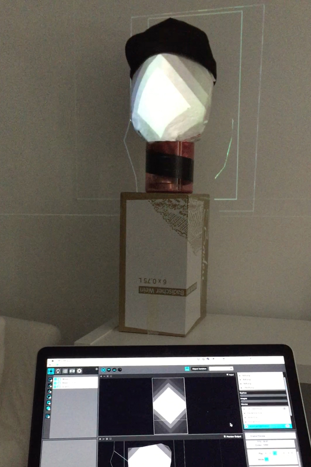
I recently got in touch with the idea of doing a projection and then mapping it onto a three dimensional object. For me it was something I always wanted to try and dig myself into, because I was absolutely curious what the outcome would be. This way I had the ability to change or to create scenarios for a lot of different situations. Which I felt could come in handy on an entire evening of meeting people and disco.
Deciding to move forward in this direction I felt it was time to talk to Tessa about my wish to do this project on, to ask her questions and to get a better feel of what makes and drives her. My main question was where Tessa draws the line between her very social & fun job and her own personal private live. She made it very clear to me, that this line exists boldly and that social media such as facebook benefits her with her work. Happy to hear that!
The goal for the next step was now to create a wide variety of content. For me this should include character change, light, darkness, motion but also graphic design. Of course the projection content should focus on the ability of disappearing as well as blending in and supporting a greatly motivated Amsterdam when it comes to music.
However first I had to figure out the technology. I found a basic projection mapping software named „Madmapper“ early during the project. After doing research on the software I understood, that the content would now have to be created using animation and cutting programs (like aftereffects and premiere pro). It would then be imported into the projection software and masked to the face it was later projected on.
Starting of with pens and paper I started experimenting what could be possible and although I was trying to come up with possible content, I was amazed how these lines, shapes and colors could change a face just like that.
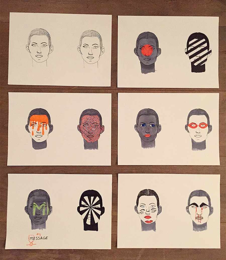
After transforming a lot of these ideas into animation something was still missing. I felt, that something being human imagery. It did not yet make sense (almost alienating) to project something on a human face, not including any visual aspects of it. Filming the portrait of several people, I excluded some of their eyes, mouths, faces, to underline a certain feeling with an interesting visual response.
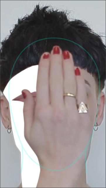
the green line is the mask for mapping it onto a real face
The last big challenge in this project was now, to tie together the pieces without telling a story. All the projection content is intended from me to leave the narrative to your imagination. This was especially hard, because a translation of one animation into the other felt storytelling to me in most cases.
https://www.youtube.com/watch?v=v-IXYLVMbEY
I believe, that this projection could be something nice for Tessa to „wear/carry“. It does not only (as initially intended) give her the ability to hide and disappear, but also to show her mood or a need, and to enjoy herself.
Sweeter than heaven, hotter than hell
Saturday, April 16, 2016
De enige persoon waar ik steeds opnieuw een gat in de lucht voor spring als ik haar live kan zien is Florence Welch van Florence and the machine. Niet alleen omdat haar muziek mijn hart doet smelten, ook haar extravagante uiterlijk tovert een glimlach op mijn gezicht. Florence haar hele leven, muziek en stijl is opgebouwd uit een intrigerende combinatie van het goede en het kwade. De onderwerpen in het leven die haar inspireren zijn altijd twee contrasten, gebaseerd op de renaissance, die samen hand in hand gaan. Voorbeelden hiervan zijn liefde en dood, tijd en pijn, hemel en hel.
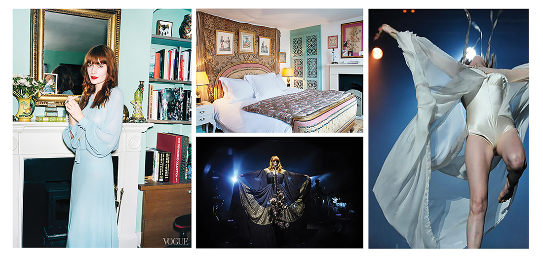
Haar bijna over romantische ziel is niet te scheiden van haar melancholische kant. Ik kan me hier zelf enorm in terugvinden in mijn melodramatische sprookjeswereld. Al vanaf haar kindertijd zong ze vol liefde en overgave op uitvaarten. Een roze kanten sluierjurk gecombineerd met een doornkrans is een voorbeeld van hoe ze dit nu in haar stijl laat terug komen, maar ook tekstueel komt dit terug in haar muziek. Dit steeds op een metaforische wijze:
“The stars, the moon, they have all been blown out
You left me in the dark
No dawn, no day, I’m always in this twilight
In the shadow of your heart
I took the stars from my eyes, and then I made a map
And knew that somehow I could find my way back
Then I heard your heart beating, you were in the darkness too
So I stayed in the darkness with you”
Na heel wat research kwam ik er op uit dat ik een soort sluier wou gaan creëren. Waarom een sluier? Omdat een sluier zowel bij een bruiloft als een begrafenis gedragen wordt. Het onderscheid hierin is terug te vinden in de kleur en vorm. Om hier een middenweg in te kunnen vinden ben ik met deze 2 elementen in mijn achterhoofd beginnen schetsen. Omdat Florence zo een extravagant persoon is ging ik nogal snel over te top met mijn ontwerpen en werden deze veel te bombastisch. Om deze reden heb ik er voor gekozen om mijn startpunt te veranderen en niet naar de vorm te kijken, maar te gaan experimenteren met het materiaal.
Florence hele leven, stijl en muziek is opgebouwd uit lagen, zowel letterlijk als figuurlijk. Haar leven en de inhoud van haar nummers schommelen op en neer tussen drama en vreugde. In haar kleding is dit figuurlijk terug te vinden door de metaforische elementen alsook letterlijk door een gelaagdheid te creëren met stof.
Dit is daarom dan ook mijn uitgangspunt geworden. Op vlak van materiaalkeuze heb ik deze dualiteit weergegeven. Enerzijds is de romantische kant terug te zien. binnen het kleurenschema bestaande uit goud, pastelblauw en vurig oranje. Voor het materiaal heb ik gekozen voor liefelijke stoffen zoals tule, kant, paillettenstof en extra fournituren: kralen en franjes. Anderzijds is de melancholische kant weergegeven met zware zwarte stoffen, latex en rubber.

Deze twee voorgaande elementen vertalen zich in mijn project ook aan de hand van mijn werkwijze. Ik ben begonnen met het liefdevol, zorgvuldig en handmatig samen naaien van de verschillende materialen, laag op laag op laag. Op deze manier heb ik tientallen kleine lapjes gemaakt. Stuk voor stuk heb ik deze lapjes voor 5 à 10 minuten in een zeer warme oven gelegd. De verwarming door de hoge temperaturen zorgden voor een agressieve reactie op de bewust uitgekozen, synthetische stoffen. Kleuren zijn vervaagd, randen zijn verbrand en omgekruld. Maar, het belangrijkste van alles is dat alle lagen weer zijn omgevormd tot 1 laag, een nieuw stuk textiel, een textielsoort waar alle elementen zich hebben samengevoegd.
Binnen dit project heb ik zoveel mogelijk geluisterd naar het materiaal zelf. Om hier naar te kúnnen luisteren moest ik mezelf eerst heel wat vragen stellen. Welke stoffen zullen verschrompelen? Welke stoffen hebben hogere temperaturen nodig dan anderen? Wat is de reactie op de kleur? Gaat er wel iets gebeuren met de kralen of pailletten? Welke laag bevestig ik het beste vanonder? Welke dan weer het beste vanboven? Dit waren vragen die ik alleen kon beantwoorden door het daadwerkelijk te testen.
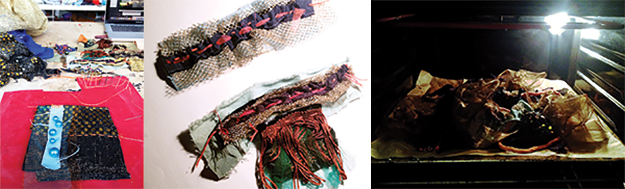
In deze experimenten heb ik ontdekkingen gedaan die veel anders uitpakte dan ik had verwacht. Soms was dit bijzonder positief. Zo had ik nooit verwacht dat mijn goedkope gouden paillettenstof wat zo uit een carnavalswinkel lijkt te komen zou veranderen in een luxueus uitziende stof die lijkt bezet te zijn met gouden kralen. Een andere fantastische reactie was wanneer een stukje badmat zo extreem heet werd dat deze samen vloeide met het zwarte latex en zo terug samen 1 materiaal vormden. Soms waren deze resultaten ook iets minder positief. Zo veranderde mijn goud-zwarte fijne tule in harde zwarte draden en smolt mijn blauwe fleece vast in plastieken klonters.
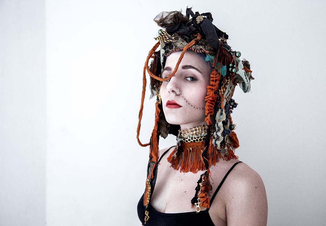
Met mijn nieuwe gelaagde textiel wou ik opnieuw lagen creëren om uiteindelijk mijn headpiece in elkaar te zetten. De moeilijkheid hierin was dat ik geen enkel startpunt had voor de vorm. Ik had duidelijke ideeën over hoe ik de vorm voor mij zag, maar het visuele beeld wat ik mij in mijn hoofd gevormd had sloot niet aan met het materiaal dat ik gemaakt had. Daarom wist ik dat ik terug opnieuw naar mijn materiaal ging moeten luisteren, wou ik hier iets moois uit kunnen maken. De headpiece is een puzzel geworden van alle stukken stof die ik gemaakt heb. Ik ben gestart met een basis waarvan de vorm te vergelijken valt met een doornkrans. Vanaf deze krans ben ik naar beneden beginnen te werken. Omdat logischerwijs stof altijd naar beneden hangt en gesmolten objecten ook naar beneden druipen was het voor mij ook vanzelfsprekend om het van boven naar beneden te laten lopen als een waterval. De kleine lapjes vloeien in elkaar over of overlappen elkaar en vormen samen met de krans zo terug 1 geheel, een headpiece gebaseerd op mijn inspiratiebron, Florence Welch.
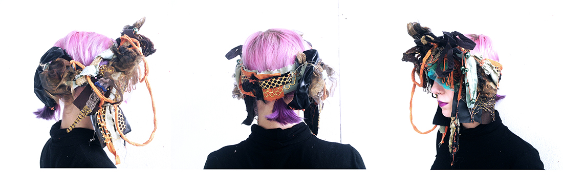
Wanneer het hoofdstuk gedragen wordt voel je je iemand met een hogere status, iemand met een wilskracht. De vorm van de headpiece stuurt het lichaam ook automatisch in een zelfverzekerde houding. Als ik naar het eindresultaat kijk zie ik een mengeling van de renaissance, een hoofdstuk dat Cleopatra zou dragen en een traditionele Indische bruid. Ik vind het ergens vreemd je je zo fabuleus gaat voelen bij het dragen van iets dat als een soort beschermende helm je hoofd bedekt. Maar, aan de andere kant ook erg kwetsbaar. Je voelt bij iedere beweging hoe delicaat en fragiel het materiaal en de constructie is. Ik heb een kledingstuk gecreëerd waar je met liefde mee om moet gaan, net zoveel liefde als ik er in gestoken heb om het te verwezenlijken.
Tapestry of knowledge
Tuesday, April 12, 2016
Structure of library and structure of textile.
It’s all about information and network.
First of all what is a structure ?
- the way in which the parts of a system or object are arranged or organized, or a system arranged in this way
- the arrangement of particles or parts in a substance or body ex: “molecular structure”
- the relationship or organization of the component parts of a work of art or literature
I get interest in the structure of materials, and in especially structure of fabric. Then I looked for the definition of fabric.
- structural plan or style of construction
- the basic structure of something
- A distinctive, complex underlying pattern or structure:
contexture, fiber, texture, warp and woof, web
I decided to assimilate information to threads which are connected to each other in an interweaving organization and which need each other to create a textile and here a complet knowledge.
Then, I considered the book not as an object which is part of a shelf but as a composant of it. As the equivalent of a thread in a piece of fabric. The library couldn’t exist without books as the textile without threads.
A book is already subject to an organisation and structuration : composed of letters making words, sentences, informations on a theme.
Paragraphs, pages, chapters, subjects. All the elements are accumulated and are mixed.
It’s the same in the library. All the books make links to other ones : by there subjects, the movements, the contexts they deal with, or the references they make.
An artist is part of a movement which combines several artists. Thus we already acquire new information to organize. We also have to take in count that a movement is included in a period of time which makes echoes to events and context.
Thus, HOW TO ORGANISE BOOKS IN A LIBRARY ?
First, I decomposed the notion of book and the notion of textile in the form of a web in order to understand and make a link between Textile and Book. I realized this two approaches shared the notions of Web-work and Information. Then, it came the bas e of my concept.
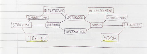
This structure made of links, interweaving of subjects, shared thematics is the base of the organisation I would like to try.
I took a book by chance in the library and decided to put it in the center of a « web » made of criteria and information.
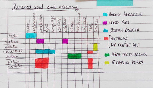
It was a book about Marina Abramovic’s works and I made a list of the criteria which were related to this book.
Criteria
-Artist book : Marina Abramovic
-Categorie : Conceptual art
-Technique : Performance, video
-Subject : Body, pain
-Collection of the book : Museum of Modern Art Oxford
As we could expect, this book is already linked to many others in the library and we can look for books which the same criteria.
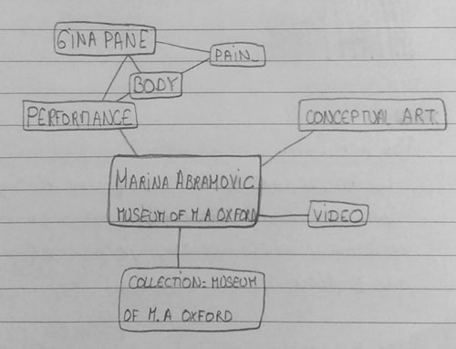
This way of selection and organisation let us the possibility to associate information on a subject more efficiently. The research we make can be more detailed and in depth
Thus, this tidying of books is undertaken through a web, a kind of tapestry of knowledge.
But many criteria can be considered and we could even use tags for each books :
Marina ABRAMOVIC’s book :
#Marina Abramovic
#Artist book – Monograph
#Conceptual Art
#Performance
#Body
My first idea was to take one tag # for one thread. And thus, to consider that the tags are representing by the warp strings, and each book by one weft string.
Now, let’s take the same book as above. We have this book about Marina Abramovicwhich which refers to five tags and thus, refers to 5 strings in the warp.
All these related words can complicate and confuse the organisation we try to make. But what is interesting, is the fact that each tag # is also linked to another one, so linked to another book in the library.
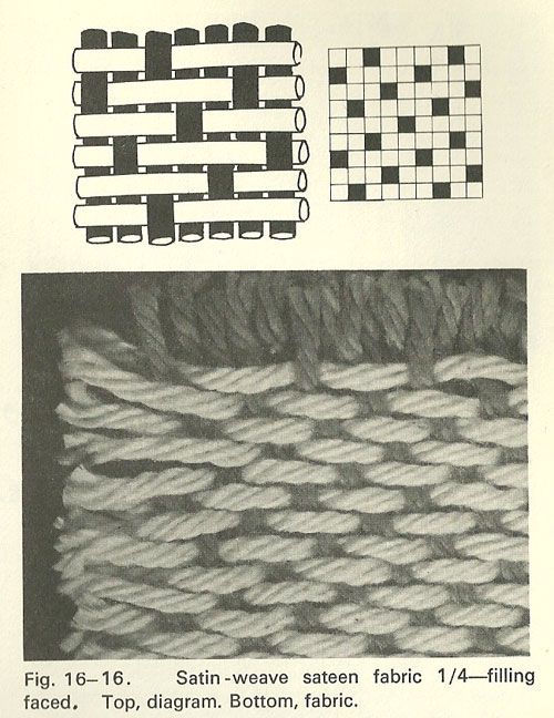
But before, I would like to introduce briefly the principe of warp and weft :
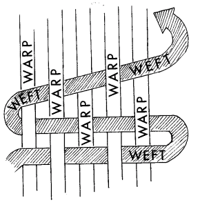
The warp threads are held in place by the loom while the weft thread travels over and under the warp threads.
Books are related to each other because of the subjects, themes and notions they deal with. I chose three books in the library, that I’ve represented by colors weft threads in the weaving :
Colors of the threads in the photo below :
Marina Abramovic book
Marcel Duchamp book
Joseph Kosuth book
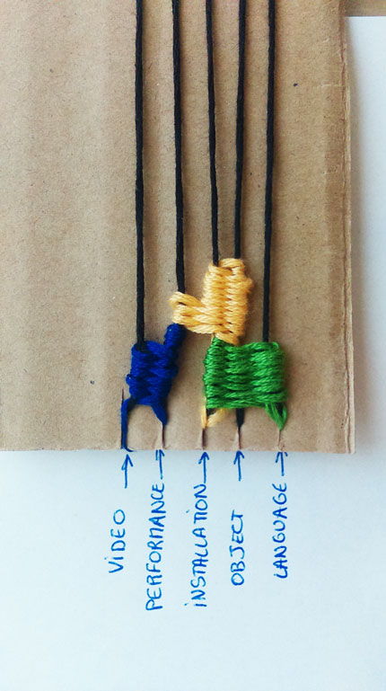
Indeed, we remark that two of the books I’ve chosen share some notion. For instance Marina Abramovic and Marcel Duchamp’s books broach the notion of performance. Thus, in the weaving the weft threads which correspond to them will be weaved on the warp thread that correspond to “performance”.
With this way of thinking, the organization of books lets appear a pattern and create a weaving.
A tapestry which reflects how the books are organized.
However, this research of layout and combination reminded me the Jacquard Loom and its mechanism.
Then, I get interest in the paper tapes constructed from Punched Card made for controlling textile looms in the 19th century.
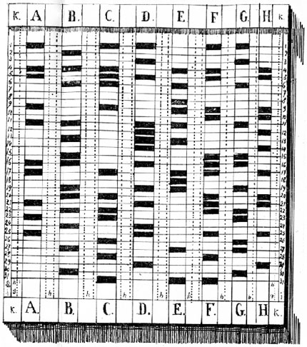
I choose to represent the thematic and subject tags by the horizontal threads (the weft strings) and the technics/medium used tags by the vertical threads which correspond to the warp strings.
Then appears a kind of pattern, created by the different locations of the book in the “weaving organisation”.
Each blocks of colors corresponding to a book, I transposed them is a uni-color pattern.
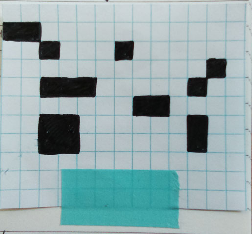
Then, by combinations we can put the books in a “web”. And as the punched cards, each marks (here in black) contain information and their positioning in the structure correspond to the way their will be tidy.
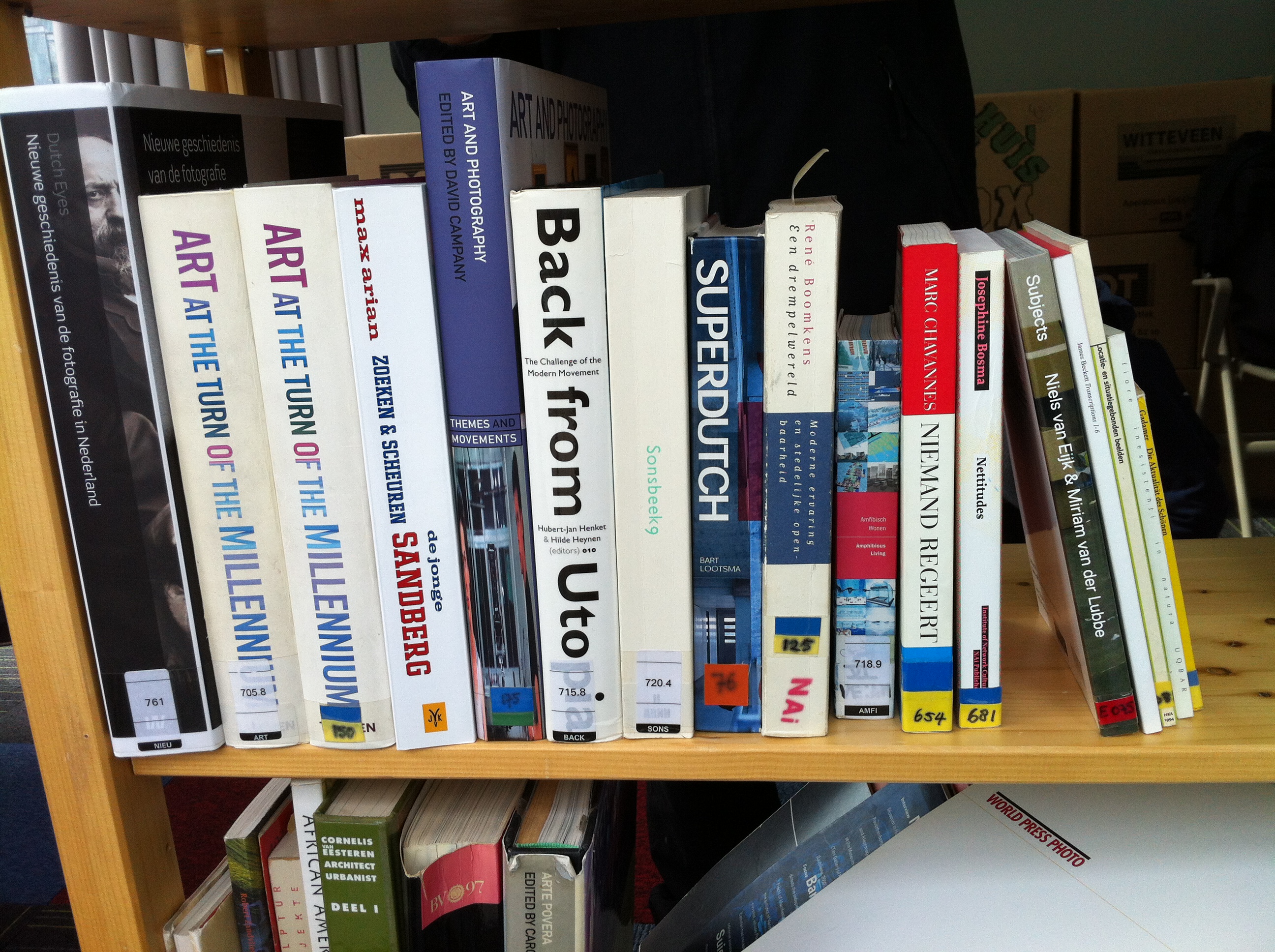
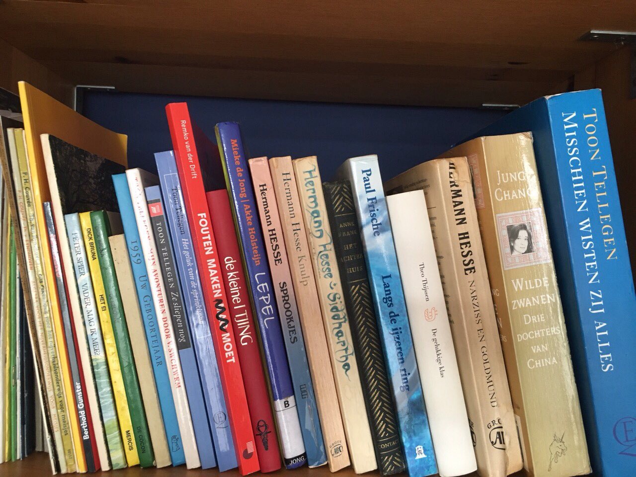
FULL SPECTRUM BOOKSHELF
Tuesday, April 12, 2016
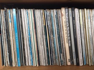
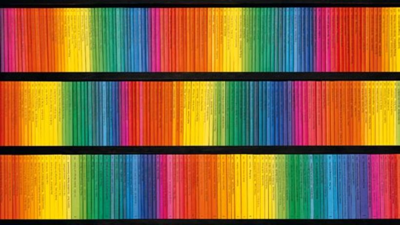
Some find comfort in mess and even manage to bring a certain order and coherence in it. As for me satisfaction comes in organization. By organization I imply functionality as well as visual clarity. When I found myself in front of a very extensive pile of book clarity was what I needed. My own bookshelf is sorted out by size, my clothes rack by color, stretching from black to blue through different shades of green, grey and pink. It brings order in the room. I know where things go and where exactly I can find them. I decided to experiment with my own bookshelf.
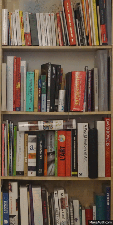
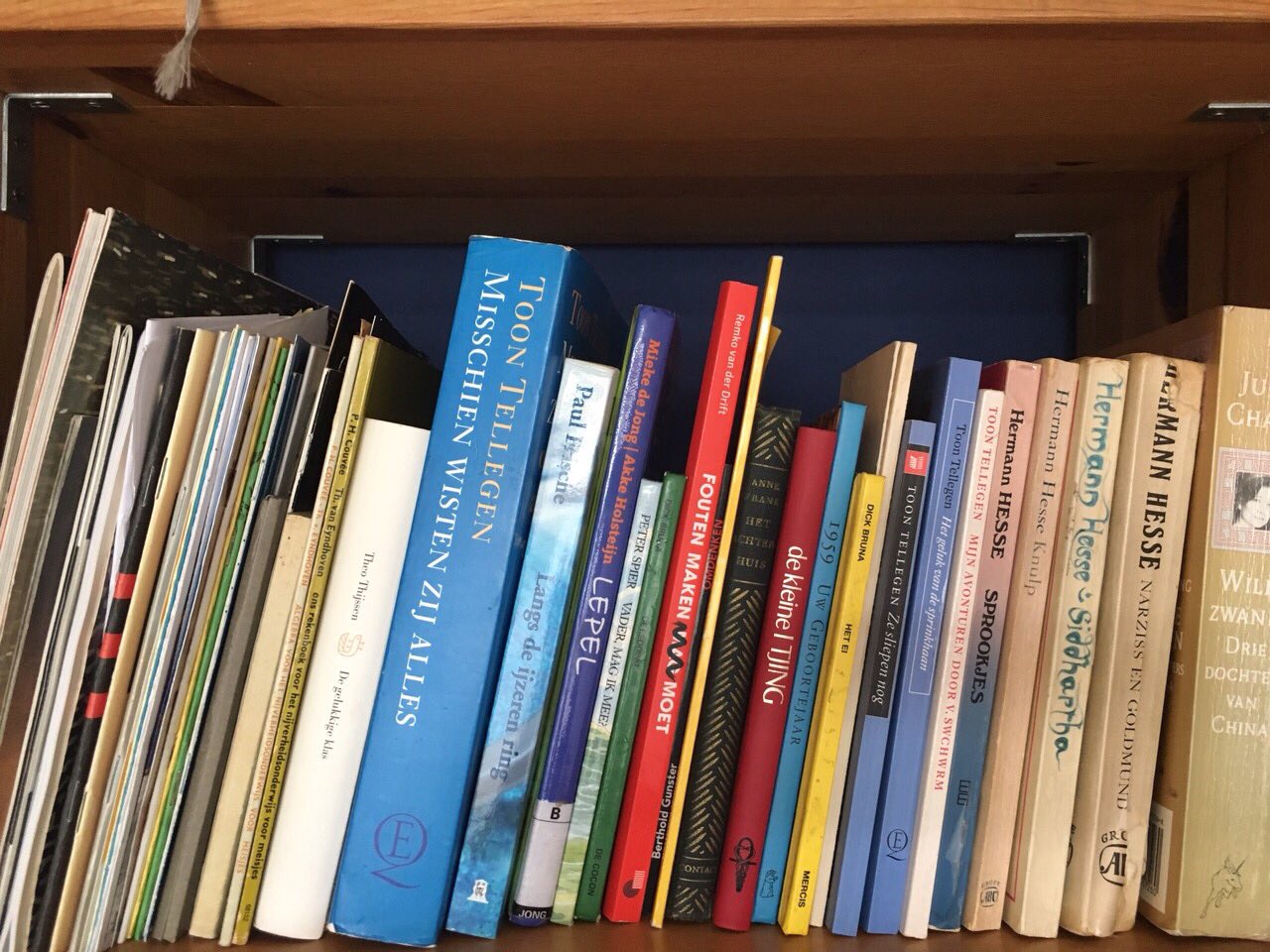
From grey to black. One entire shelf for the white ones. Brown, then yellow, red then come all the different colors from the visual spectrum. Although not all the book edges come with a singular color, the writing on it need to taken in account. The typography, its size and its color can completely change the order from one book to another. Organizing a library in such a way is a never-ending game. Taking one book out means it needs to go back in the exact same spot. At any moment the order can be ruined but finding the right former location is the same feeling as fitting the last piece of the puzzle in the whole picture.
A bookshelf organized by color is not only a piece of furniture filled with books, it becomes an architectural piece. The color coordination makes it a whole with a strong visual character. As the color together convened makes it look pleasing, it forms a new building, a construction in the space. Using books to build up the space is the main material of Fernanda Fragateiro. This Portuguese artist transforms books in “material prima”, which she uses to make her sculptures. What was supposed to be read before now is to be seen. By using books in her works Fernanda Fragateiro creates series of abstract sculptures in which the holder of the content turns into the actual content of the piece. However this content is closed and sealed and so forth silent. She picks the books for their visual property not for the content of it. Sometimes she even makes the books herself in order to get the right colors. This way the book is reduced to its only material quality and its symbolic value.
Another example of someone sorting books by color is Willy Fleckhaus who designed the edition Suhrkamp from Suhrkamp Verlag. He created a very specific though simple visual identity consisting in the rainbow colors. He developed a highly ordered layout of evenly spaced rules with a single weight of Garamond for all the text but then gave each of the original 48 covers in the series a separate color, so that when lined up in order their spines formed a perfect graduated rainbow. The result was to make the series instantly collectable.
This visual identity is very specific to that edition and is still going on right now. In general a series represents a group of books which visually and thematically accompany one another and that are designated as series titles by the publisher. In a successful series the individual titles interact with one another, frequently presenting different perspectives on similar themes. By recreating a similar color ordered system as Willy Fleckhaus I was aiming towards a unity of the library. Books now relate to each other not through theme or author. They all have the same thing in common that makes them a whole rather than individuals. They stay distinctive in a sense because their content has nothing to do with the order they are placed in.
Some accidental situation can yet be fortuitous. Combinations happen while not expected. I find it most beautiful to randomly pick a book in a library. This organizing system creates the randomness for you and allows you to discover other books and not only the one you were expecting. A library needs to be able to surprise you and give you more than the Internet. Internet cannot give you random. You type in a request knowing already what you want. It then makes connections for you based on words, topics, or dates. That is also something I noticed while reorganizing my bookshelf; I have not be noticing a lot of books before because they were drowning in the whole mess. I put them together and discovered a bunch of them looking for their color. In the end I must have spent a few hours doing that getting caught by some unknown books on my way. I realized I have two volumes of New Perspectives in Drawing from PHAIDON editions: Vitamin D in english and Vitamine D2 in french. I opened both of them and definitely got new perspectives on drawing because doubled.
In this randomness I still find some order. Publishers working together with authors design, decide on how a cover should look like, what the colour should be according to its content. The example that comes almost immediately is the black cover and yellow typeface of most detective novels. Moreover how a book is physically designed, advertised, distributed, not only determines whether it is part of a series, but also who will purchase or read it.