Skip to Content Skip to Search Go to Top Navigation Go to Side Menu


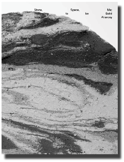
Stone, Space, Me; Pretending to be Solid


Sunday, October 30, 2016

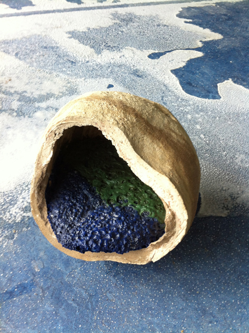
How to enter a stone? by knocking? stroking? breaking it with a hammer? or by curving a door in order to step inside?

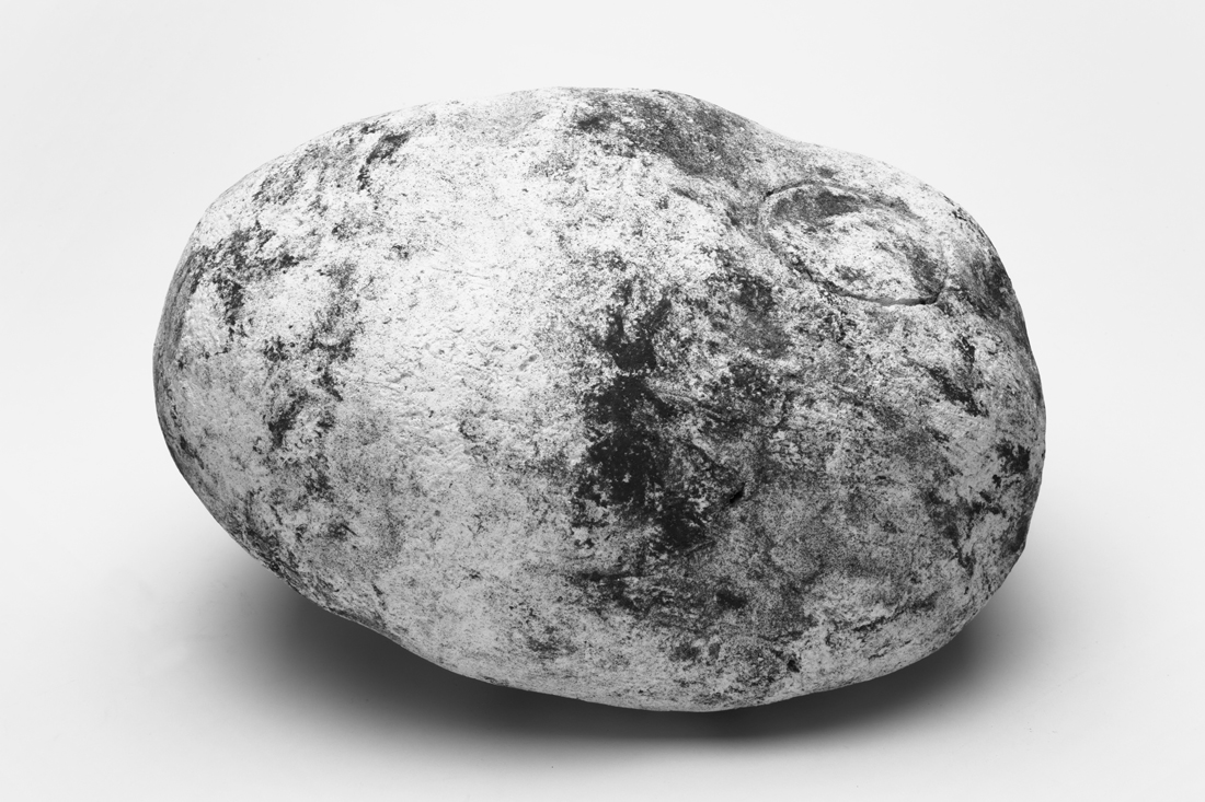
Thinking and imagining about how it must be like to dwell inside a stone and take part in the universal creation, I find my search. Focusing on the human ability to relate, think and imagine spaces in objects, I create a link between the interior of stones and human memory and imagination.


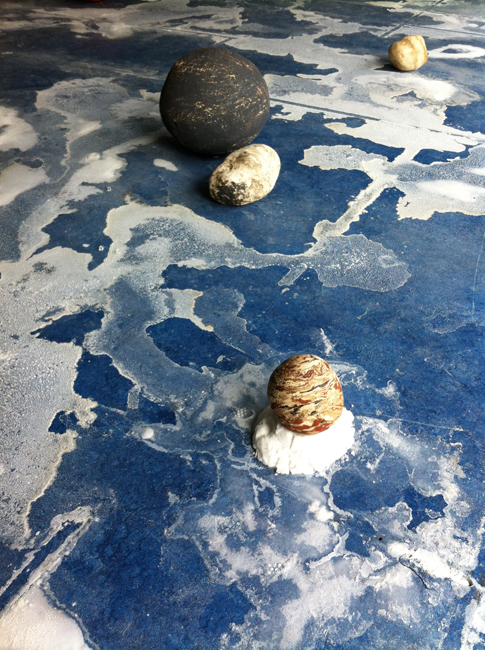
6_Naama_IMG_1100

Pretending to be Solid, Naama Aharony, Gerrit Rietveld Graduation show, 2016.

( solid as stone they say…)

Along with personal notes and thoughts of dwelling a stone, I collect, trace and place cultural narratives, legends and philosophical thoughts contemplating the meaning found in stones. Through those I look to change the perception of stones being solid, suggesting to look at it as constant movement. The mind then becomes the traveler, moving through environments, places and spaces the stone I hold may offer. Those spaces are changing, coincidental, circumstantial.

This writing can be seen as a collection of short texts where the shared ground is memory, imagination and the stone. It will not necessarily talk about actual caves, walls, floors or corridors that might exist in the interior of stones, but will be researching the potential content of the stone, the meaning and narratives this stone might bring. And although while reading you might drift away from time to time, one will always go back to the ground, and the stone.


650-_MG_8700
For my graduation project, I was focusing on the relationship between man and the stone. I wanted to work on the way people approach and perceive stones. To open up the understating of A Stone to discussion and new ways of seeing. To create tension between what people usually think of a stone and the sensible perception I am offering them.

<wall-stone_950 Overvieuw_650 IMG_6344_650

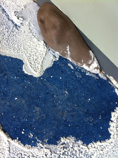
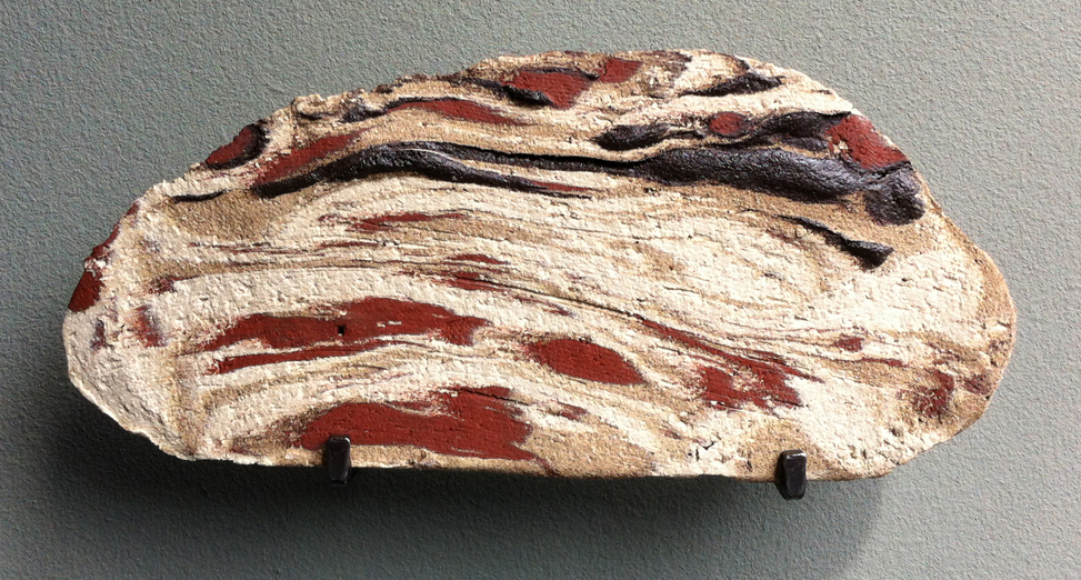
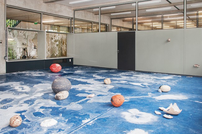
Writing the thesis and researching on different layers the stone offers, pushed me to create my own, man-made stones. Using ceramics, a study of oxide glazing and experimenting with different firing programs, enabled me to create a divergent collection of stones. Where each of the made stones carries different qualities, tells a chapter, a layer and where all together they create a story.

IMG_6343_1100

The installation ‘Pretending to be Solid’ consisted of the stone collection I have made, creating a constructed landscape inside the room. The spectators were invited to walk through the room, in-between the placed stones. Through the walk, I looked to evoke a personal contact between the spectator and the made stones. Which was for me, a place for memory and imagination.


cover_image_shade download this thesis by Naama Aharony
all rights to this thesis are property of the author © 2016


Utopia on a small scale


Friday, October 28, 2016

Utopia could be characterized as a place where all the problems we experience every day have been resolved. And for that, it could be a way to criticize the society we live in. Utopia is also a no-place as the etymology of the word itself tells us. And for that, it is a place that has not and also can not be realized. Nevertheless, utopian thinking has been and still is a basis for political ideas. A scale model can be one of the steps for developing or realizing a project. So isn’t it just so smart to combine the two ideas in one’s artistic practice?

I’d like to start with – maybe the most famous utopian scale model – Monument to the Third International. Tate.org.uk calls it the “world-famous symbol of utopian thought”. It is a never realized project for a communist building that was supposed to serve various governmental purposes. But it is also a symbol of modernism, for it was the first project using steel and glass. And in its ambitions – at this time it was supposed to be the highest building on earth – we see the utopia. It looks in a way like the biblical Tower of Babel – the symbol of man’s vanity –  a building so great and enormous it cannot exist. Even though the tower has never been realized, it is vital in our Europian culture. Not only as a part of Russian avant-garde history, but as a symbol of utopia.

Tower Bawher Theodore Ushev : National Film Board of Canada

Utopia is a social project, but as history shows us trying to implement it in society fully can be fatal. Swiss artist Thomas Hirschhorn tries to do so on a smaller scale. He has made sculptures referring to various philosophers and thinkers like Antonio Gramsci, Baruch Spinoza, George Bataille or Gilles Deleuze. He places his works in selected areas, where with members of the local communities it becomes a sort of inclusive, intellectually stimulating event. His sculptures seem to be social scale models. Scaling not space but time. Making use of their temporality. Hirschhorn calls them “social commitments”.

I want to make non-hierarchical work in non-hierarchical spaces. The work is not something more in the museum and something less in the street; this is essential for me. I am concerned by equality and inequality in all forms. Thus I do not want to want to impose hierarchies (…) I am not interested in prestige. I am interested in community.

Thomas Hirschhorn, Interview with Okwui Enwezor, 2000

 Be sure to see it for yourself:

 
Spinoza Monument in Bijlmer Amsterdam, 2009
 
and
 

Thomas Hirschhorn: "Gramsci Monument"

Another artist that plays with the idea of utopia is Bodys Isek Kingelez. He builds scale models that represent the future state of cities/villages that already exist in the Democratic Republic of Congo. What the cities are in his scale models is not necessarily the desired way he imagines future, but rather a capitalist utopia – an inevitable way in which cities are transformed in a logic of consumerist society. Depending on how you look at it – it could be a utopia or a dystopia.

Kimbéville is a real town witch, given time, will exist; it is not an effigy made up of well-known brand names witch is doomed to remain a maquette. (…) This maquette is a promise of something real. The attractions of this town include a plethora of services, hotels and restaurants. Sometimes with an American flavor, sometimes Japanese, Chinese or European, not to mention African fare. 

The town has it all, from sun-up to sun-down, and for forever and a day. The artist, Kingelez, prophet of African art, is striding towards a new world witch is more modern, more prosperous and a better place to live.
Bodys Isek Kingelez, The Essential Framework of the Structures Making up the Town of Kimbembele-Ihunga (Kimbéville), 1993-4


Utopia is a way to criticize the society we live in. Dystopia serves the same role but utopia does so by providing/imaging an alternative to what we have, whereas dystopia points out the risks that society might face in its development. Dystopia is a utopian project that went wrong.

(…) there remains something subversive about these attempts to celebrate the beauty of utopia as inherently totalitarian while maintaining a critical distance from the implications of this attraction.

Pil and Galia Kollectiv – The Future is Here

The ultimate dystopia has been indeed realized in a history of human activity and probably is still in realization in places like North Korea. But for western people, the most horrifying part of the world’s history is likely to be the Second World War. The unimaginable dystopia that has been created by the Nazi government is the concentration camp, where the idea of efficiency has been realized to the point where a mass genocide could be profitable in the logic of capitalism.
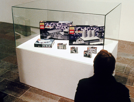
Polish artist Zbigniew Libera has made an art piece in dialogue with this historical fact. It’s 1996 “Lego. Concentration Camp”. He used popular Danish construction toy to make a scale model of a concentration camp.

IslBG
Holocast LEGO 1996 by Zbigniew Libera ©2016


the ‘de Jong’ vision


Friday, October 28, 2016

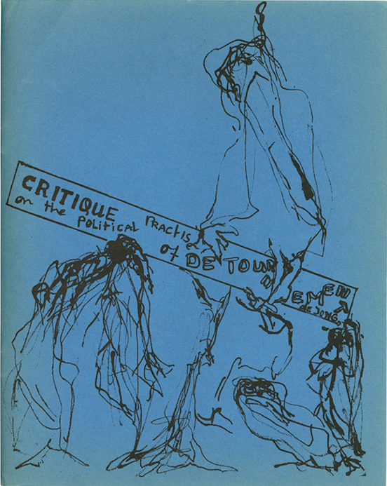
With this article I will try to provide the reader a good insight into the Situationist Times that were published between 1st of May 1962 and the Fall 1967 during the Situationist movement [ x /y ].

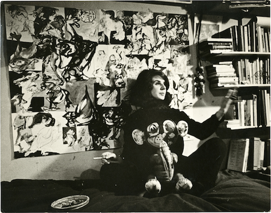
First of all, about the woman behind these tremendously enriching compendia:
Screen Shot 2016-10-27 at 15.27.44

Her name is Jacqueline de Jong, she is a dutch graphic designer, artist and sculptor, born in 1939 in Hengelo to Jewish parents.

She encountered Asger Jorn in 1959 in London, which will lead to a very significant liaison and finally to her entrance into the Situationist International.

1960, when she entered the movement she then started to participate in conferences at the Central Committee and was the representative of Holland – in the same year she received a postcard with the message :”Now all of Holland belongs to you.”[z]

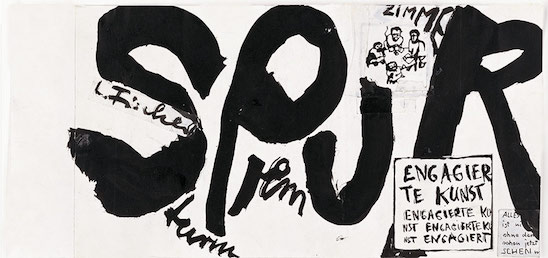
This stamped her membership of the SI where she remained active until 1962, when in the same year the German and Scandinavian Situationists saw expulsion by Guy Debord due to a long-standing friction between the aesthetic and political aspects. Because of her solidarity with the German Situationist Gruppe SPUR, she was expelled/ resigned in Febuary 1962.

As the division between the Debord circle and the German and Scandinavian Situationists widened, De Jong stayed impartial.

Her vision was to produce an international, completely free and multicultural magazine based on the most creative Situationist ideas.

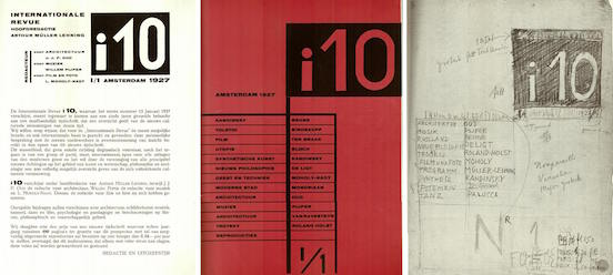
De Jong’s major inspiration stemmed from the late 1920s magazine  i10 International Revue published and edited by the anarchist Arthur Lehning between 1927-1929, it featured contributions from Schwitters, Moholy-Nagy, Bloch, Kandinsky and many others. The new approaches to typography and graphic design apart from the interest in radical political views were so compelling and intriguingly in synch with the aesthetic sensibilities of the avant-garde with which she traveled.

For her the idea of a magazine with content made up of an wide-array of artists and intellectuals beyond aesthetic and geographical constraints was appealing and aided her in attempts to find new ways of disseminating the Situationist ideology.
25 32_Montage_i10_0

Screen Shot 2016-10-26 at 15.15.21

“How it started was getting thrown out of the Situationist movement. I had already announced that I was going to make an English — multi-language, but English language sort of magazine in 1960 in Brussels. And it was because of the French — Internationale Situationniste — I said : let’s make an English one. […]

There was SPUR — as a German one, a French, I.S., but no English language magazine for the Internationale Situationniste. So that was my suggestion, and I had bought i10, I think, a year before. And it was the most interesting magazine, I mean also in typography, I’d ever seen. […]”
komitee-spur


The first two issues speak a very similar visual language, with drawings and articles. The first issue she started with the whole SPUR trial while they were on trial in Germany for blasphemy and pornography — she published the whole court process in this issue, including the so-called dirty pictures and blasphemic texts.

They would travel to places and protocol their results of applying Situationist tactics as détournement and dérive.
Screen Shot 2016-10-27 at 15.41.01


The following issues are quite different, as De Jong found herself very captivated by the concept of topology, she would compile visual information and material in a very meticulous research on various subjects, with the highly diverse contributions in form of highly informative texts – also in different languages, or even various languages in one cohesive article.

The issue that started this whole idea of compiling visual material throughout time and culture was the third issue — the British Issue which she entirely by herself edited and published.

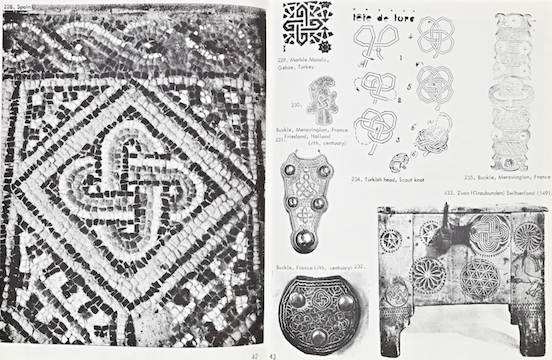
Apart from few highly interesting and profound texts by Anton Ehrenzweig, Max Bucaille and Georges Hay this issue mostly concentrated on the ‘Typologoy of Knots’.
26eb8604-d5ba-11e5-82dc-0ccf45e730cf

276b0d02-d5ba-11e5-9b94-ef59c5f2b2b2

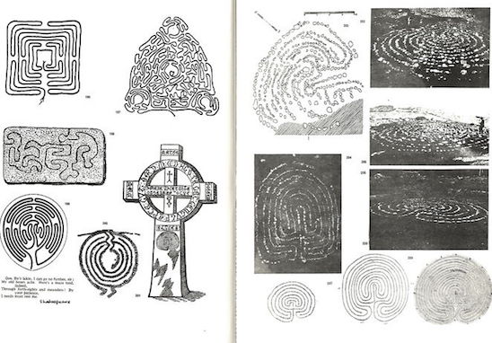
De Jong did not intend to make a series of issues with topological content, but what happened was that she solely recognized the topological pattern that was developing, but where she drew inspiration for the Issue #3 was from walking the Gotland labyrinths.

She described her experience:

I don’t really remember why I took the idea of labyrinths. It might have been because we went to the Gotland. We walked into the labyrinth there. And out. That’s the problem. Into a labyrinth is one thing, but getting out of it.. but there’s always a system to it. […]

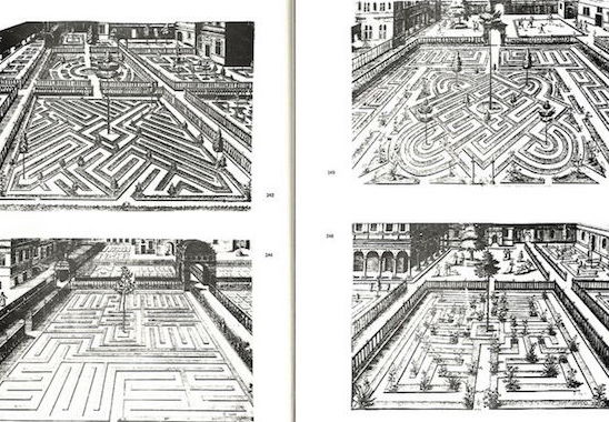
Which led her to publishing this extraordinary content on labyrinths, she asked the people in her network, such as her former history professor Jaffé and Aldo van Eyck to write an article on this subject. Simultaneously Peter Schat and Lodewijk de Boer changed the name of their opera from ‘The Paradise Bird’ to ‘Labyrint’.
 

0f45ed4a-12b5-11e6-867c-622f567ced44

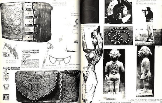
Issue #5 provided an enormous amount of visual and verbal content on ‘Rings and Chains’, which was the logical development of sequences, and again people were asked to contribute to this specific subject.

But this was also the starting point of the publishing and distributions to take a critical turn. Jorn had to sell some of his paintings for the publishing to take place, there were problems with the printing office after which they relocated to Copenhagen for Issue #5.

This cohesive way of content focusing on a certain topological subject started turning into a maniacal hunt for De Jong, she initially wanted to do an issue on Wheels, but due to certain other coincidental situations she changed her course, this time inspired by Walasse Ting‘s One Cent Life she advanced to compiling a very visually different issue, which will finally lead to being the last one.


One Cent Life was a book featuring lithographs and screenprints contributed by artists such as Pierre Alechinsky, Karel Appel, Asger Jorn, Roy Liechtenstein, Allan Kaprow, Andy Warhol, and many more.
“Lots of things were happening, actually at the American Center. Happenings were starting. Yoko Ono came and we were all very much involved in movements that got more and more international. We did some things like parties and exhibitions, and I mean really working together, having enourmous shows together and I mean it became lively, it became really something important.
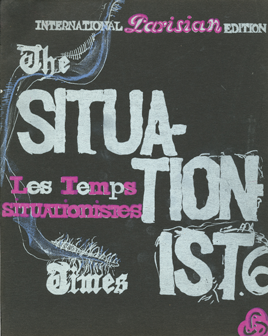
 

Screen Shot 2016-10-26 at 15.15.47

JACQUELINE DE JONG : THE SITUATIONIST TIMES #6
FACSIMILE 1962-67, CURATED BY JOHAN KUGELBERG, PUBLISHED BY BOO-HOORAY NYC, 2012
Rietveld Library no: 700.2 jon 1

 I wanted to show this spirit in a printed way. […] I wanted to do something cheap, but beautiful, and perfect. I said I could make a Parisian One Cent Life, and very cheap, if all the artists do the same colors, the same size, and it’s the size of the Situationist Times. […]”

She went to a lithographer, and many artists were asked to work on this issue, come four times to the printer and make four colors. What also was part of her considerations was the fact that this issue was meant to cover the costs of the next issue, she didn’t want to depend on Jorn selling his paintings.

It was published finally, and it was unique. It was shown at La Hune, which was a bookshop for art and it peaked its distribution, unfortunately to very complicated and shady reasons the publishing of The Situationist Times was put to a halt by outside circumstances which I find very tragic in that sense.
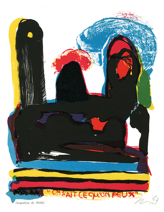
Screen Shot 2016-10-26 at 15.16.03

I feel like she could have gone on with this process of working with collaboraters and contributors from all different backgrounds specialized in a certain field and enriched society with this knowledge made accessible to the reader in such a visually magnificient way – if it wasn’t for those outside circumstances that she had little control of.

But then again I wonder if exactly the way things turned out created the emphasis of this compilation of knowledge and visual manifestation of that time’s zeitgeist, giving it more significance, but also compelling me to wonder about the what ifs, or what would an issue on a different topic that I personally find quite interesting have been like? Because I find it quite striking in her way of compiling especially the topological issues, she crossed borders and cultures and time, which really caught my interest, and I almost want to argue that it was accidental because in a way she possibly just wanted to provide the most accurate and rich information on a certain topic with contributions from other people she dragged into this quest.

In that sense, her ambitious hard work and struggles to give us this content and share it with the world and people like us from a different time and mental state is solely, and tremendously enriching, but highly questionable if these were aspects of her consideration. The way I perceived it she solely wanted to share something of the present in the present, but in such an eager and energetic way that I can feel the literal energy of De Jong when I flip through the pages of each issue, the dedication and meticulous arrangement.

I highly advise the reader to go to the library of our academy and let the visual language speak to you. I derived profound inspiration from it – the way of the arrangement and editing, visually as written, concomitant the content itself as well of course.

The International Situationist Times facsimilé edition at Rietveld Library cat.no. 700.2 jon 1
Freestanding Architecture


Thursday, October 27, 2016

What can you do for the world?
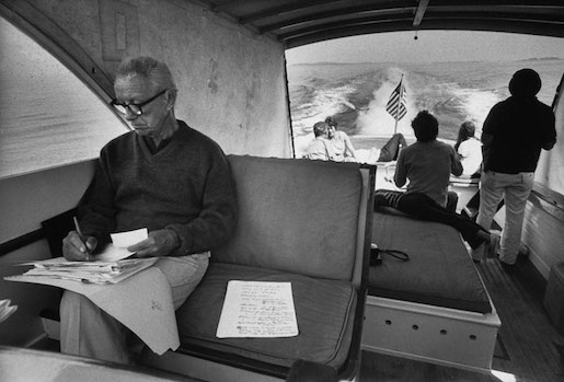
A man who had already been expelled from Harvard twice, a man who had taken his own company into bankruptcy and suffered from alcohol abuse due to remorse for his daughter’s death from childhood paralysis. And it even goes so far as to think of jumping into the icy waters of Lake Michigan.
 
00826792.JPG
 
At this point the reader must already be asking himself, “Should I really know this man?” My answer is yes, because this man decided to make an experiment that consisted in finding the answer to the following question, in his words:
“To discover how much a miserable and unknown individual with a dependant wife and a new born child can do for the benefit of all mankind.”


buckminsterfuller_drawing


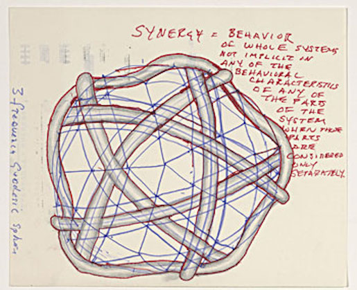
Synergy – one of the key words to understand the world in which Fuller lived. It describes the unexpected effects that arise within a system that could not be predicted by the individual analysis of its parts. From the synergy comes the holistic vision that guides much of Fuller’s ideas.
The conception of the planet as a regenerative system where each organism being guided by its instincts of survival also ends up playing a secondary role that helps to balance the planet as a whole. As, for example, a bee that in obtaining the nectar for its survival ends up helping in the reproduction of the plants through the pollination.
According to Fuller, the alienation of man from nature in migration to large urban centers has caused mankind to lose this notion of how nature works globally and to consume resources in an irrational and unsustainable way because of its ceaseless pursuit for money.
However, Fuller believed that the technology and resources that mankind already has is sufficient to supply it with food, home and transportation. However, he believed that this revolution should not come by the control of people’s thinking through speeches or violent revolutions, as did and presently do many heads of state, but by a design revolution.


7193_815104ed949f9deaf45165c4b8337013


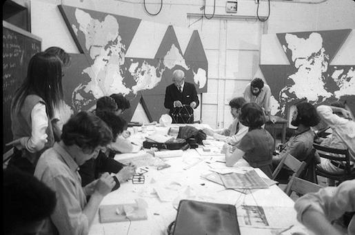
Such a revolution consisted in proposing practical and sustainable solutions as alternatives to the problems of humanity, which would make the population’s adherence to a sustainable way of life much faster. Since this solution does not disprove the educational effects of people’s awareness, Bucky came up with a game called World Game to educate people about this holistic view of resource use.
“Make the world work for 100% of humanity, by spontaneous collaboration, without ecological damage and without harming anyone.”

Buckminster Fuller’s inventions were called artifacts, all built on the idea of doing more and more with less and less, using maximum efficiency by using resources and technology to build sustainable solutions.
 
dymaxion-14D153A04D54F0383C7
 
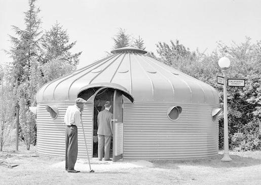
I think his project ‘’dymaxion house’’ relates to this story. It is designed in the late 1920’s but not actually built until 1945, the Dymaxion House was Fuller’s solution to the need for a mass-produced, affordable, easily transportable and environmentally efficient house. What fascinates me is that the whole construction is build around one central extremely strong mast, it has the same kind of idea as an umbrella.
The house was even self-sufficient, heated and cooled by natural means, that made its own power, was earthquake and storm-proof, and made of permanent, engineered materials that required no periodic painting, reroofing, or other maintenance. You could easily change the floor plan as required – squeezing the bedrooms to make the living room bigger for a party, for instance.
The round shape of the building minimized heat loss and the amount of materials needed, while bestowing the strength to successfully fend off a 1964 tornado that missed by only a few hundred yards. And the Dymaxion only weighs about 3000 pounds versus the 150 tons of an average home!


Biosphere15


From this project we can move on to his next building project what became his lifework;

The geodesic dome.

The geodesic domes were responsible for making Fuller world famous. They are extremely lightweight structures, however quite resistant because of their ability to distribute the stresses applied at one point throughout the structure. As the geodesic domes have a spherical shape, this construction has a high volume per surface ratio, which results in a lower consumption of materials and less heat exchange with the environment, resulting in savings in air conditioning costs.
The part what interested me the most was the difference between the dome and his other project, the dymaxion house. This building is standing because of one mast, and the dome has none, it is standing because of the smart construction. So actually it is in that sense the opposite of each other.
These projects were based on what Fuller called the Science of Comprehensive and Anticipatory Design, which was characterized by thinking holistically, anticipating problems, proposing a solution through prototypes, and testing it scientifically while the whole process is documented.
 
IMG_MDA100513_1600px
 
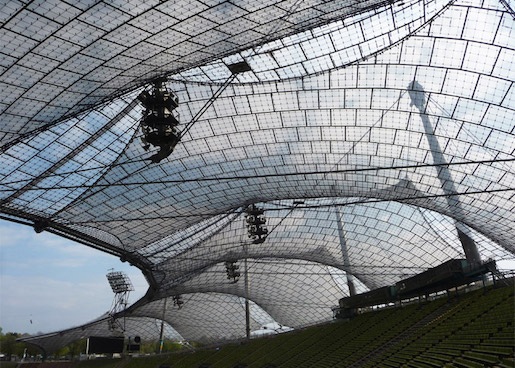
Fuller’s elegant geometries, pioneering principles, and holistic thinking have left their mark on contemporary architecture. In the field of art, he has probably left his deepest mark on the work of Olafur Eliasson, partly due to a personal connection. One of the key staff members in Eliasson’s laboratory-like Berlin studio is Einar Thorsteinn. The Icelandic architect not only worked closely with Frei Otto, the creator of the suspended roof constructions for the Olympia grounds in Munich, but also with Fuller himself.

You can definitely see the similarity in the base of this stadium. I have been here myself in 2009, and i was really impressed by the design, for me at that moment it felt really modern and futuristic and I was surprised that this stadium was build in 1972.


Frei-Otto_Pritzker-Prize-laureate-2015_dezeen_784_24


Fuller left a great number of contributions and ideas in the most diverse areas such as engineering, architecture and education, serving as inspiration for several alternative movements and communities. His thoughts in favor of a collaborative, sustainability-focused world are increasingly present and more discussed.


The future that never arrived


Wednesday, October 26, 2016

Most major cities in Japan were left in ruins after the second world war, in particular, Nagasaki and Hiroshima. In the post-atomic bomb area, Japan was democratized and turned into a nation with a pro-American orientation. As a response to the human and environmental catastrophe, and as with the growth of the Japanese economy in the early 1950s, proposals for urban redevelopment began to appear. This is when the first concrete example of urban planning with ideas that would later come to define the metabolism movement appeared. You can argue that it started with the designing of the reconstruction of Hiroshima. The Japanese architect Kenzo Tange and his team of architects was commissioned to make this plan.


Skærmbillede-2016-10-26-kl.-11.52.20-e1477475212731

Hiroshima Peace Memorial Museum / Kenzo Tange. The initial plan was presented in 1949 and the building was made in 1955. source: "Hiroshima mon amour [1959]"


In the 50’s Kenzo Tange was very oriented towards the international architecture scene, note the resemblances between the memorial building and the work of Le Corbusier. He also met up with and found inspiration in an architect such as Aldo Van Eyck who was in many ways in opposition to the “functionalism” of Corbusier that was criticized of ignoring its inhabitants. Van Eyck created the orphanage next to our school, and took part in coining the architectural movement structuralism that Tange also defined himself within.


stringio

Orphanage / Aldo Van Eyck build in 1960. source


In short you can say that they shared some of the same ideas in creating spaces where the relationships between the elements are more important than the elements themselves – built structures corresponding to social structures. It wasn’t until 1960 that the movement was actually defined, by the architect Kiyonori Kikutake who created their first manifesto together with the architect Fumihiko Maki and Kisho Kurokawa:
Metabolism 1960 : The proposals for a new urbanism ”.
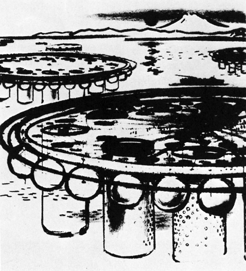
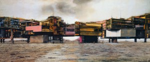
The name arrived to an other member of the movement, Kionory Kikutake, as he was working on a floating metropolis, his “Marine City” project.


f1a08d4588868d9fa499de503ea10830

Marine City / Kiyonori Kikutake 1958. source


The word “Metabolism” comes from Greek and translates to “change” but also refers to the life-sustaining transformations within the cells of living organisms. As the name might suggest? they pushed that buildings and cities should be designed in the same organic way that life grows and changes by repeating metabolism.
The “Marine City” is one of many projects that was never realized but played a central role in the works of the Metabolists. It was this vanguard idea of taking on new space whether it be the ocean or the sky that was the foundation of their way of shaping “the future”. At the same time it required developing and making use of new technology. None of the experiments and realizations were made by single individuals but drew on the big think-tank that the Metabolist movement was from artists and writers to scientists and industrial designers. The “marine city” was a proposal for a solution to the rapid population boom especially taking place in Tokyo in the years after the war till the brink of the 60s. Kikutake believed that the ocean was the only valid space to develop in times of an imbalance between population and agricultural productivity.


Ikke-navngivet-2

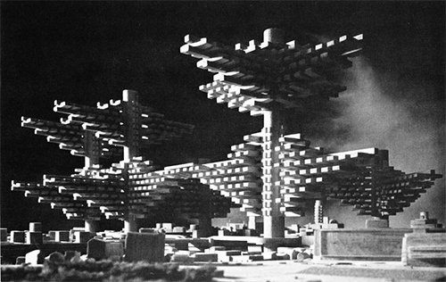
City in the air / Arata Isozaki 1961. Never realized.


As such sustainability was surely an integral part of this movement as well as resilience considering how the risk of earthquakes and tsunamis make for tough conditions in japan – especially for urban concentrations. Structure wise the Metabolist movement was characterized by taking certain architectural steps towards recognizing this. A main idea was to design architecture to be built around “spine-like” infrastructure on and around which pre-fabricated replaceable parts could be attached being almost cell-like. At the heart of this setup is also reorganization of the relationship between society and the individual.
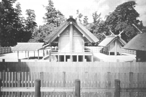
Another important inspirational source was found in old Japanese shinto religion and a specific Ise Grand Shrine that carries the ritual of being created anew every 20 years. This is an example of how the Metabolists as a movement was wearing multiple meanings, being both modernists and traditionalists at the same time.


3593435_orig

Ise Shrine having been in continual existence since 690 C.E. source


The Metabolists respected environmentally-conscious boundaries and the material in which they worked. This gave them the pride, and also reluctance, to not be parted from their vision. To demonstrate and construct only that of ideas was monumental enough.


d509b918eb0ce40de810f7eb7dec9561

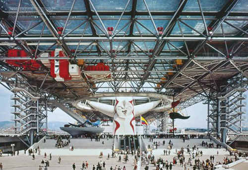
Festival Plaza / Kenzo Tange and the artist Taro Okamoto, Osaka Expo, 1970. source


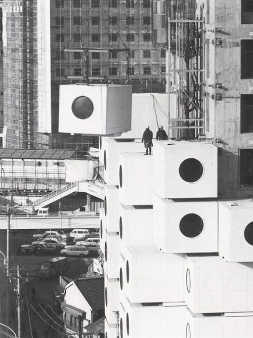
After 10 years of development and growth within the Metabolist Movement, the structure that was metabolism came to a climax, exhibiting some of their finest work, at Expo 70’ in Osaka, Japan. It was around this time that Kisho Kurokawa’s project, The Nakagin Capsule Tower, began construction. A process that took only 30 days to complete.


e54f98c738a6bd64cb007ca9ce72a0d6

Nakagin Capsule Tower / Kisho Kurokawa 1972.


This building would serve as an “icon” to the movement. After the Expo 70’ took place in Osaka, individual architects from the movement began to take a step forward personally, focusing more on individualism and self-driven growth. Ideas about sustainable development within the 21st century are not new ideas; they have spread through a continuous evolution. An end sometimes not only existing as an end, but that of a new beginning.
 

text by Christian Stender and Ivan Fucich


Wandering and Wondering


Wednesday, October 26, 2016


lost

Defining psychogeography by breaking it down into two parts: it’s the psychological and the geographical. Psychogeography was used by Situationist as a study of the specific effects of the geographical environment on the emotions and behaviour of individuals. They were creating a channel of communication between the city and it’s citizens to strive for a better habitat and to create an utopia.
We are all born into this world with a natural curiosity for our surroundings, and based on our early interactions and experiments we created our own interpretation of an Utopia. When we are thinking about our personal Utopian space, we are describing how different places, smells and colours make us feel and behave. We are transforming our desires into objects we like, materials we feel comfortable with, people we trust and streets we know.

There are many environmental factors like our surrounding people, possibilities, opportunities and social facilities that can influence our desires. This makes me question if we should pursue our desires unconsciously (surrealist) to keep them as honest as possible. Sometimes I feel that our real desires change as soon as we think about it and act like it. When we are not conscious, we are not able to change them. A big part of these influences are the many choices we have nowadays. The amount of choice is overpowering our true desire, which makes it hard to feel satisfied. This might be the reason why our desires are changing and transforming itself over and over again. Because of the many choices we have to tend to get lost in between purpose, desire and satisfaction.


DSC01934

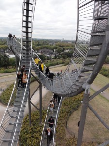
"Tiger & Turtle - Magic Mountain" by Heike Mutter and Ulrich Genth


To let go of these desires and expectations for a little while we can do a “Dérive” through the city. This was introduced by Guy Debord in 1956. The concepts origins are in the Letterist International Collective based in Paris, where the dérive was a critical tool for understanding and developing the theory of psychogeography.
The dérive is an unplanned journey though a landscape (mostly Urban) where the participant is following a new logic that let’s them experience the landscape again, and that will force us to see what we would otherwise ignore.

Where a dérive in those times was all about exploring the streets and its environments, I think that a dérive nowadays has a lot more to offer: while we are having a moment of un-defined time in this “always-online” and time-focused world we are living in, the architectural spaces are inviting us to move. The choices we make are becoming an exercise of creating alternative ways of interpretation instead of passively following the traditional map. We are challenged to take courage and to get lost solely in order to find one’s way again.

    Hereby I recommend everyone to get lost every once in a while


  1. [x] [ This site is created by a psychogeographical collective, where they write (and photograph) their wanderings and mapping of the past, present and possible ]
  2. [x] [ This is a beautifully written portrait of a place, based on history and personal associations. ] 


Adding the contemporary to the psychogeography:

Nowadays, digital mapping and mechanisms of exploring geographic environments by using mobile phones or pc’s have reached a high level of development and importance. You can find a traveling guideline for the most simple things as well as very detailed environments from all over the world. This way current knowledge has transferred the concept of impossible into possible. ( there even exists an application called “derive“ that is helping you to get lost…….. ) It reminds me of the interpretation given by Situationist for the absence of utopia: “No utopia can no longer be available because the conditions to become reality already exists” Yet do these things only exist to maintain the current state of things and not to serve the needs for quality life.

This knowledge and technology has created the development of Urban Interactive Installations and happening of interactive challenge. This whole new way of investigating and the human involvement in geographical environment has developed into another way of using psychogeography, where artists started to work by the theory of the Situationist and tried to approach the dynamics of human presence and behavior. In fact, in many cases the artists who use the terms of dérive and psychogeography are not practically associating their work with the impression of these concepts, as originally interpreted.


    Examples of Interactive installations:
  1. [x] [ 14 interactive installations in NYC ]
  2. [x] [ “Sway’d” – Interactive Public Art Installation in Salt Lake City ]

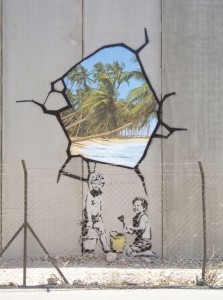
Also the Situationist have inspired many street artists, especially in term of content and composition . These artists are expressing their imagination on the wall by using the techniques of détournement and the construction of Situationist to create a whole new atmosphere in the city.


BANKSY - 2007unnamed

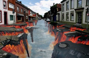
BANKSY - 2007 [above] • Edgar Mueller - Lava Burst


“The revolution in everyday life, breaking its present resistance to the historical (and to every kind of change), will create conditions in which the present dominates the past and the creative aspects of life always predominate over the repetitive ones. We must therefore expect that the side of everyday life expressed by the concepts of ambiguity (misunderstandings, compromises, misuses) will decline considerably in importance in favor of their opposites: conscious choices and gambles”.

– GUY DEBORD May 1961

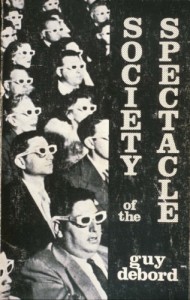
[x] Here you can read “the society of the spectacle” by Guy Debord. The book consists of 221 theses where he traces the development of a modern society in which authentic social life has been replaced with it’s representation.


The Flower Children of Architects


Tuesday, October 25, 2016

The 60s was a very significant era in terms of cultural and technological advancement. It was the era of counterculture, and a social revolution. It was the “space age”, in which there were countless advancements in technology and space exploration. It was an era of optimism and playful experimentation, in which there was a rise of avant-garde and outlandish sensibilities in art and design.
 

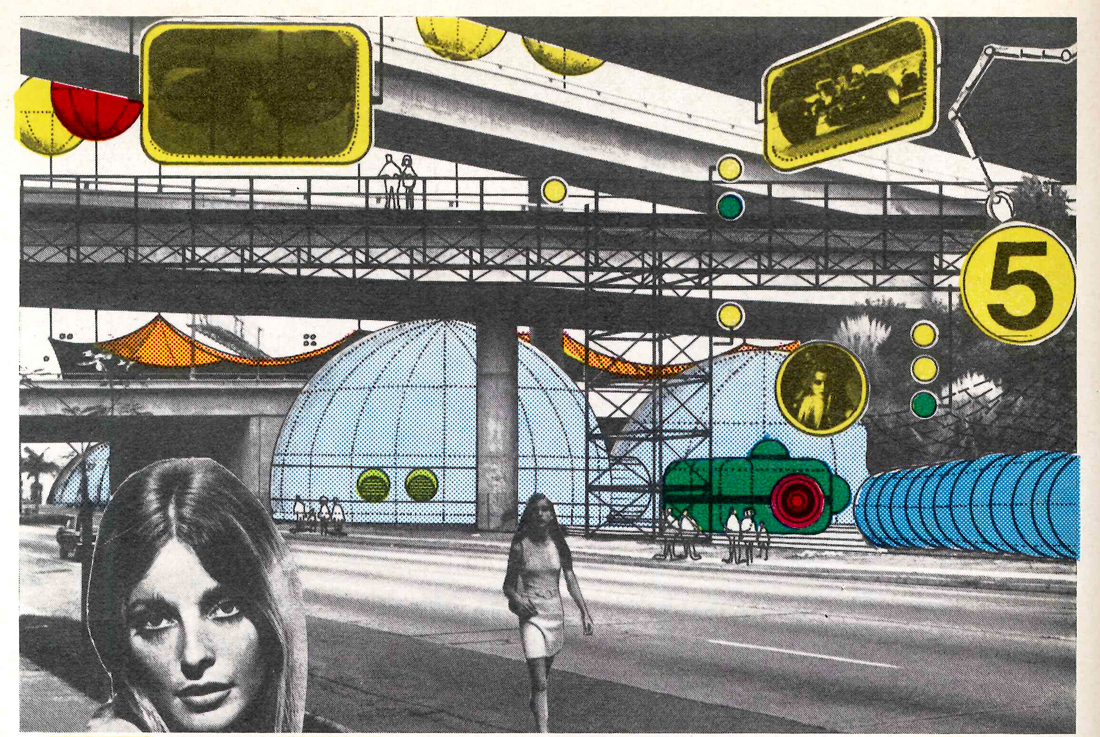
1964-Archigram-Instant-City-1100

Archigrams pop-art aesthetic

England was one of the main countries which experienced the counter culture of the 60s very intensively, so called the “swinging sixties”, and this reflected evidently in art, design and architecture. Archigram is an example of a highly visionary, avant-garde architectural movement from that time and place. They were very experimental and pro-consumerist, and were very significant in that they questioned and opposed to the traditional conventions of modernist architecture and city-planning, finding it to be too homogeneous and lacking of individuality. They defended individualism; that each person should be able to be part of the design process of their own homes, those homes should be personalized. They also defended expendability; that cities could change and grow constantly through time. They were highly influenced by trends of the era in their designs. Their aesthetic was very in line with pop-art, with lots of imagery of consumer products in their designs, which makes sense considering their pro-consumerist stance, and their perception of housing as a consumer product. They were very technologically forward and optimistic, and indubitably utopian.
 

The Plug-in City

The Plug-in City

The Plug-in City is an example of one of many of the outlandish designs proposed by the members of Archigram. Designed by Peter Cook in 1964 – the leading figure of Archigram; it proposed to have modular residential units which would be plugged in to a central infrastructure mega-machine. Adhering to the ideal of expendability, the modular units could be carried around by cranes depending on necessity and preference.
 

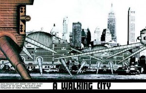
The Walking City

The Walking City

The Walking City is another project, proposed by Ron Herron in 1964, which proposed a nomadic city infrastructure in which none of the components of the city are tied to a specific location. Robotic structures would roam around, depending on where the owner wanted to take it.

Incontestably, none of their projects were actually realised. Their projects required technological advancement which would be far from where we are even in our current times. Even if one of their projects were attempted to be built, it would require funding. Indeed, their projects were quite utopian and optimistic, in true 60s fashion.
 

Constant's New Babylon

Constant’s New Babylon

Utopian ideals in design seemed to be a common theme running through the era throughout the western world, another example being Constant Nieuwenhuys; a Dutch designer/artist who also proposed similarly utopian projects, which were also far from being realised. He also defended individualism, and was opposing to the traditional conventions of homogenous modernist city planning, but didn’t necessarily stand by pro-consumerism. He also made a proposition for a nomadic city, in which playfulness and creativity were inhibited.

There seems to be more of a cynical and pragmatic attitude in our current times, so these utopian ideals and optimism may seem superfluous to us 21st century folks (including me, when I first started reading about them, I was quite cynical about their outlandish projects) – but, perhaps such an optimistic and utopian attitude, and playfulness is exactly what we need, in our current world infected by political turmoil, and conservatism.

Project inspired by The Walking City
The Archigram archival project

The island of Utopia


Tuesday, October 25, 2016

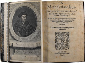
A page of the 3rd publication from the first english version of Utopia, made in 1597 by Raphe Robinson

A page of the 3rd publication from the first english version of Utopia, made in 1597 by Raphe Robinson


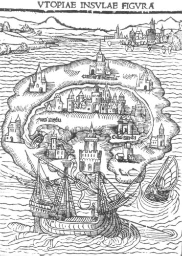
The book Utopia was published in 1516 by Thomas More. The word itself means “nowhere”, from the ancient Greek language. As it is said, it was written to give an example of a better society rather than the one of  Europe in the sixteenth century could be like.

As I started reading it there was just one question that kept arousing into my mind: how could the Utopians be so willing to obey the rules? Was More making use of his famous black sense of humor when he designed them?

The Utopians are a group of devoted, placid people; they all dress with the same garments and eat in big cantines. Their sense of community is greatly strong. They agree with all the rules. But that sounds so atypical. More, as many other utopians have done, created a little society where human feelings as fear, hate, jealousy and rage almost didn’t exist.

In fact, many utopic authors created a world in which these feelings didn’t exist either. Like the dystopian work of Aldous Huxley, “A Brave New World”, in which humans take pills to be constantly happy. Most utopias are made to terminate all bad feelings. But why not learn to control them and coexist with them? The deeper the pain, the deeper the joy. A world without these feelings would be a passive world. And in a passive world, there’s little space for big strokes of imagination and self-thinking. How boring would that be…
 

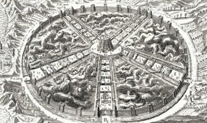
An example of how the island of Utopia could have looked like Isola_di_Utopia_Moro
An example of how the island of Utopia could have looked ~ how it was illustrated in the first edition

 
That lead me to think that most utopias are dangerous. As they represent the most ideally perfect aspects of society/mankind, and perfection is a subjective concept, they are very susceptible to not to fit the personal needs of every human being. So they can easily set apart any person who doesn’t correspond the same ideal, and put her in a cage.

Hitler almost realized his own utopia, and drove many people to serve him in this savagery. Maybe the others could sympathize with him because they saw, too, the heaven in Hitler’s mind. However after the discovery of the Holocaust, utopias could never be the same.

I’m not sure if I could, as many people do, relate that much Thomas More to the humanists of the 15th century. They put for the first time men before God, seeked the ability of the human being to think by itself and break with traditions, and supported more the science rather than the superstition. Thomas More was a deeply religious person, and he even stated being God’s servant when he was executed. However, his book Utopia pursues the finest achievement of a human community in what regards society organization, behaviour and education. So to have gone gone so deep into the matter, shouldn’t More have had a real passion for humanism?

More’s book is not easy to read. Used as we are, “free” educated thinkers from the 21rst century, to judge and compare everything with our current times, I think it’s difficult to put yourself into the mindset of the 15th century. I believe it’s a truly visionary book to be written back in that time, when religion had a considerable place in the european population, taking big imporance in every act.
 
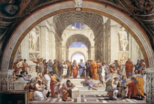
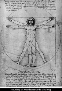
atenas Renaissance artists from the 15th century seeked, too, to find perfection and utopy in the human body

Renaissance artists from the 15th century seeked, too, to find perfection and utopy in the human body

And exactly 440 years after Utopia was published, Constant Nieuwenhuys started working in New Babylon. His structures were motivated by the devastated cities he saw after World War II; he started thinking about how architecture influences daily life, and how it creates a specific environment depending on its shape and interior organization. When I thought about Constant and More together, I couldn’t imagine such differents idealists. But as soon as I started going deeper into his ideals, and tried to understand them, I could see some resemblances. On one hand, I think they were united by the fact that they both had a fascination for anthropology. Constant and More put a great effort into imagining, each one their own way, ways to enhance culture and society. What would have happened if we combined the community of More with Constant’s architecture? Perhaps it would have been a total failure, as it is like combining two opposite worlds that scream for way divergent paragons of life. Constant architecture was made to play, whereas iddleness was totally forbidden in More’s book.


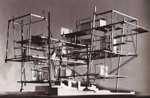
An example of one of Constant's scale models for New Babylon

I can also imagine that some art tendencies would have been banned in Utopia. As they hide, as well, butcher houses because it stimulates human violence, they would have probably limited art to just beautifully looking things that appeal to “nice acts”.

But what More, with his deeply religious faith (which maybe nowadays would have been translated into a deep love for mankind) would have designed for nowadays? Aren’t we almost living in a utopia right now, isn’t Amsterdam some sort of bubble? How would he would have felt in our current capitalist world? He was not an artist but I believe he had a deep love and understanding for humanity. Which doesn’t take him that far from art..


An Open Hand


Monday, October 24, 2016

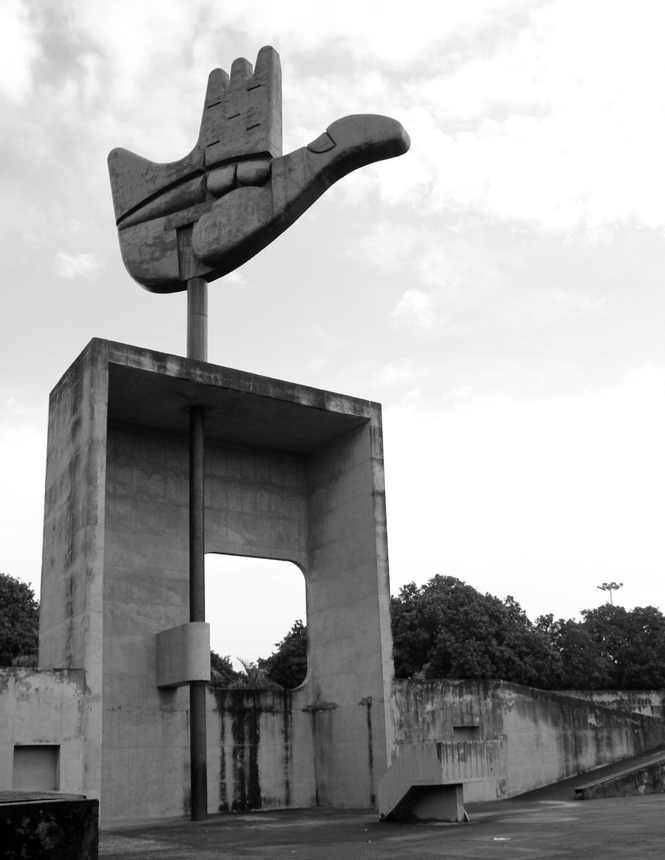
Imagine a

sculpture, 26 meters  red,  yellow ,green metal

reaching into the sky   –    an open hand,

waving with every breeze.

The Hand
click on picture to see more beautiful pictures of Chandigarh
made by Fernanda Antonio for Arch Daily

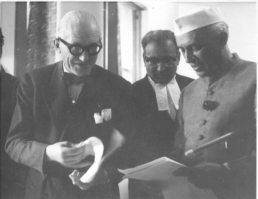
Corbusier-and-Nehru
left: Le Corbusier right: Jawahal Nehru

an open hand [interview]

open to give and open to receive,

a recurring symbol in the work of Le Corbusier

a sign of peace and reconciliation.


The city of Chandigarh was planned to be the capital city of the province of Punjab.
Punjab was left without a capital after India’s decolonization , leading to the partition of East and West Punjab. Lahore, the former capital of Punjab, became part of Pakistan in 1948.
Just three years after leading India to independence, Jawaharlal Nehru, India’s prime-minister, commissioned the planning of a new capital to the architects Mayer and Nowicki.
Nowicki died in a plane crash in 1950 and Le Corbusier was asked to finish the project in 1951.

Being less popular  in Europe and the U.S. at the end of his life Le Corbusier, was hungry to realise his ideas had the ambition to realise them in one last big project: building Chandigarh gave him that opportunity. With the personal blessing of India’s prime-minister Nehru, who called Chandigarh his dream city.
It is important to state that there were already plans for the city of Chandigarh and it is false to believe that Le Corbusier planned the whole city himself, which he did not.

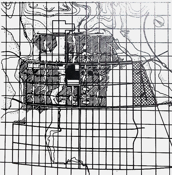
chandigarh-Corbusiers-plan

Chandigarh as planned by Le Corbusier

Le Corbusier’s plan was very similar to the one prepared by Mayer and Nowicki, changing original curved road networks with rectangular ones and grid iron patterns for fast traffic roads. Mayer’s Urban Village became a Sector in Le Corbusier’s plan. The idea was to build a Garden City without high skyscrapers, embodying big ambitions of social living conditions for its citizens. Le Corbusier’s modernist ideas about light, space and greenery were widely incorporated in the plans.

Chandigarh in numbers:
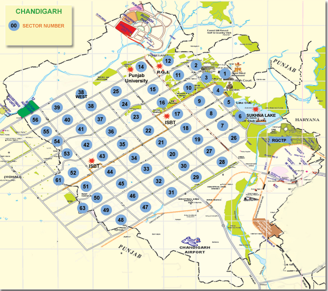
1.000.000 citizens (and growing) : divided over 57 sectors :
each sector is 800m x 1200m (resembling a traditional Indian ‘mohalla’) :
the city has 8 types of roads (these are all labeled)
Every sector has its own public spaces to centralize the daily life of citizens and avoid scattering all over the city..

chd_map

this pictures links to an interactive map of Chandigarh!

V1: arterial roads which connect one city to another

V2: urban, city roads

V3: vehicular road surrounding a sector

V4: shopping street of a sector

V5: distribution road meandering through a sector

V6 residential road

V7: pedestrian path

V8: cycle track

Fietspaden-in-Candigarh


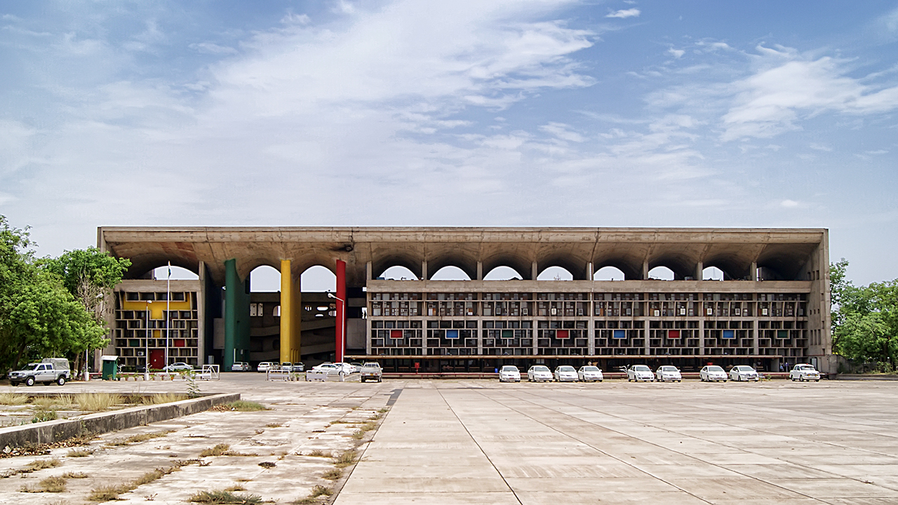
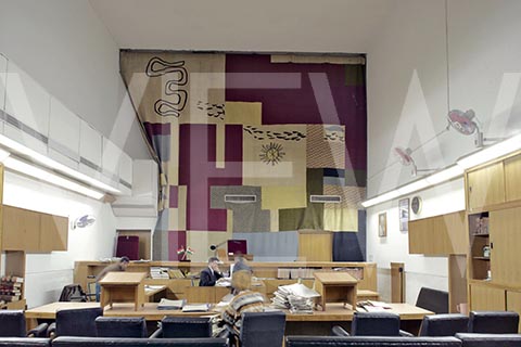
the Capitol Complex with the High Court designed by Le Corbusier: a concrete structure with columns of the recurring red, yellow and green, with a structure of rectangles starting from the first floor ending in bigger rectangles (now with air-conditioning in them) bending towards the streets, and after a solid concrete ceiling, a gap held by other pillars to make way for a great concrete roof including a canopy, so if you can stand out of the sun in front of the court


SONY DSC High_Court_in_Chandigarh_India

the Capitol Complex with the High Court

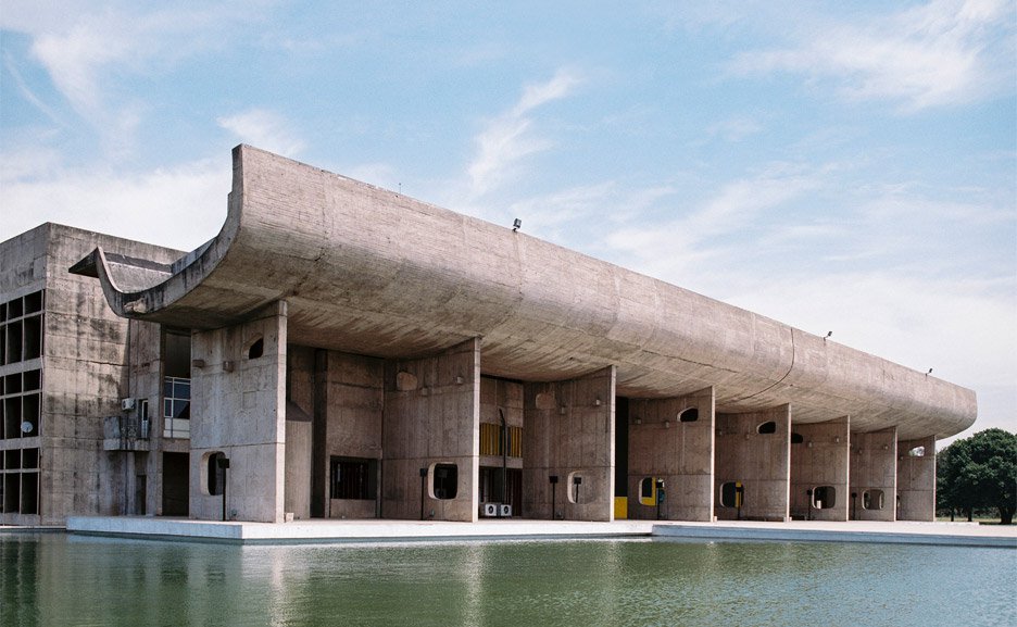
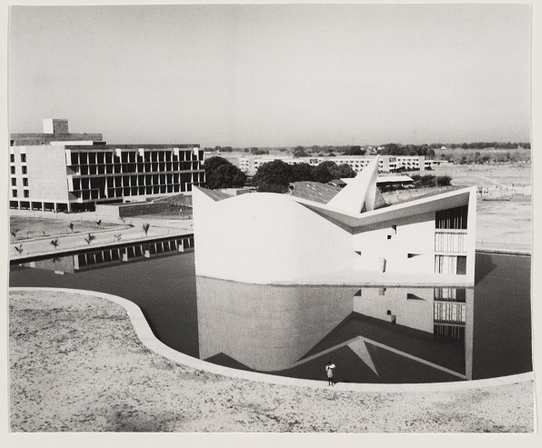
The Legislative Assembly is of the same concrete grandeur, but with a big superficial pond around it; it is less high and more rectangle than the High Court, there is a massive canopy held by thin walls with square windows in it, this is the place where the Assembly of Punjab ánd Haryana (a state which separated itself from Punjab in 1966 on a linguistic basis)


chandigarh-Assembly

The Palace of Assembly by Benjamin Hosking for Dezeen The picture links to an article and more beautiful pictures of the concrete buildings in sector 1
With merely naming Le Corbusier, I do not do justice to his cousin Pierre Jeanneret who was leading the design of the structure of sector 1 and designed multiple other buildings, like the University:
 

Candigarh_former University_Campus

Former University building designed by Pierre Jeanneret

By designing he perfect city, Le Corbusier’s hand stretches out to touch each individual life ledin Chandigarh. By designing an environment based on smaller sectors, Le Corbusier, Mayer, Nowicki, Piere Jeanneret and Jane Drew understood how overwhelming big cities can be—in that aspect, I think they were ahead of their time. Recent studies show that Chandigarh is the wealthiest city of India and also has the happiest citizens, therefore I think, the life long learning experience formed Le Corbusier and I believe that Chandigarh is one of his masterpieces. Chandigarh certainly earns it’s place on the Unesco World Heritage list, which he obtained this year.


poetry-reading

Public listening to poetry at the Open Hand Monument last December picture [links] to the facebook page of a poetry collective


Ideal space and small play in urban life


Monday, October 24, 2016

Situationism is an artistic, philosophical and political movement between 1957 and 1972, influenced by Dada, Surrealism, and Lettrism. The movement was developed by Situationist International (SI) and mainly made up of leading figures like Asger Jorn, Guy Debord, and Constant Nieuwenhuys. At first, they were principally concerned with the “suppression of art”, that is to say, they wished like the Dadaists and the Surrealists before them to supersede the categorization of art and culture as separate activities and to transform them into part of everyday life. From 1962, the Situationists increasingly applied their critique not only in culture but also to all aspects of society.

Look at this video link I found on Youtube. It will be helpful to your understanding regarding an overview of Situationism.

Spectacle society, Guy Debord, 1967

Spectacle Society by Guy Debard 1967 [download copy]


The ‘Spectacle’ is a central notion in the Situationist theory, developed by Guy Debord in his 1967 book, The Society of the Spectacle. Here is a good description of  the ‘Spectacle’.

Debord’s concept of the ‘Spectacle’ is a form of commodity fetishism. Debord emphasized that the spectacle is not a collection of images, but rather, “a social relationship between people mediated by images.” … The ‘Spectacle’ is “the concrete inversion of life” and the “autonomous movement of non-life.” The principle of the spectacle is “non-intervention.”  … For Debord, capital accumulated beyond a certain threshold is transformed into images. Debord updated and expanded upon Marx’s theory of commodity fetishism, applying the idea of reification to all areas of social life.

As I understand [x],  ‘Spectacle’  means the society of kind of mass media, capitalistic and consumerism.  The post-war capitalism was changed to ‘consumption’ capitalism through the economic boom. For instance, the revolutionary ‘worker’ who was producing in a factory became a conformist ‘consumer’ shopping in the market. The Situationist believed that consumptive lifestyle was isolated human from society and criticized this  ‘Spectacle’  environment also.

I think they didn’t want to conform to some social structure because capitalism didn’t allow it, to imagine human’s fantasy. I supposed too because the social atmosphere was focused on a function to make mass production. And also, the modern city planning didn’t leave space for imagination or expression. Most of the architecture were influenced by modernism style with technological advances, thus the building came out of functional and formalized form. Therefore they had doubt why we have to live in functional space without our desires.  Therefore some of the artists start to dream of utopia.

The Dutch artist, Constant Nieuwenhuys, proposed the ‘New Babylon’ which is 1960s imaginary city concept. He expressed his ideal new world and believed that new environments would be created where everyone would be free to move around as they wished. His work implied a new form of urban life.

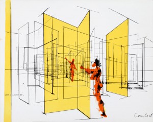
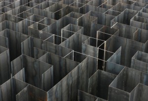
I was impressed by his work ‘Labyrinthine Space’.

constant_labyrinthine5steel_labyrinth_02

'Labyrinthine Space / Doorlabyrinth' by Constant (up) / 'Steel Labyrinth' by Belgian artist Pieterjan Gijs and Arnout van Vaerenbergh (down)


To me, it looks like an imaginary space for play. Of course, different feelings are awoken, depending on the viewer’s insight. I felt that going through unlimited revolving doors. All of the doors seems to be taking me to other connecting spaces. So you can  imagine this to be a new exit or entrance to go or do something, whenever you go through the revolving door. If so, it really needs our boring reality as a small play. I made my ideal space using revolving door’s image easily as below.

DoorCollage_1100

My ideal  space 'Unlimited doors' influenced by Constant


At this moment the majority of the population on earth lives in an urban environment and the digital information era is attempting to decrease our play entirely. It says, even if capitalism develops more, it does not create the spare time to dream yourself. Perhaps we have lived only as conformist consumers and not as creative producers in modern society. At this point, Constant’s utopia project is and will be an excellent source of inspiration to find a solution in contemporary life as I experienced myself in that small “play space” through the revolving doors. I guess this meaning of “play” could be slightly different from what the Situationist wanted. Of course, we are living in a different period. Nevertheless, the critique of Situationists has relevance to the contemporary debate. So, it could be a good alternative measure in our society and we know such a change is possible through various appropriate behaviors. So I suggest; consider to find your own small play from now on.


When Le Corbusier ideas meats the middle east


Monday, October 24, 2016

Le Corbusier was a well-known architect who designed in many ways, the foundations of architecture and building systems in the way we are observing it today. Le Corbusier was one of the first architects who has developed the way to take advantage of concrete. His modern building designs were inspired by his vision to adapt the architecture to the industrial age. The buildings should “work” as a machine that serves the residents, as he was claiming. He wanted to create utopian structures and  surroundings that would fit the working people and provide them the best quality of  life. He developed a theory of urban planning based on simple, non-decorated, functional design


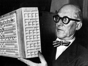
Le Corbusier looking on a scale model of on of his designs. You could definitely see the connection between it and the Brutalists.

Le Corbusier, looking on a scale model made for one of his designs. You could definitely see the connection between it and the Brutalists architecture.

 
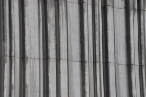
Inspired by his ideals, the Brutalist architecture style was developed. The Brutalist architects were broadly active in Germany, UK, France, Italy, Australia, Israel, Yugoslavia, Japan and the US. Mainly at the first half of the 20th century until the seventies. Brutalist design is characterized by the exposed cement and simple functional structure. The structure supposed to represent the essence of a building, therefore the most important elements are the materials, space and form. The name, Brutalists come from Le Corbusier’s expression (French) – Béton Brut, which means raw concrete.

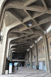
One example of an utopian Brutalist experience is in Be’er Sheva. “The capital of the desert” in Israel. After Israel was established in 1948 the new government encouraged the building up modern, progressive projects. The new developing country had a lot of new migrants coming from all over the world. Their vision was to make all these people feel and act as one united nation. Even though they were coming from such different backgrounds, they were bound to be as one. As more and more newcomers continued coming, there was a constant need of new buildings. That aspect gave the chance to many architects to bring to life very unusual plans.

 
b75b020d-f1bd-4d09-af15-3abf5f0f7fcb Beton Brut
Ben Gurion university : Be'er Sheva • A typical .Béton brut (French) raw and concrete wall texture

 
The leaders on those days believed that they were designing the future society of ideal new kind of people under a socialist narrative. Moreover the architecture was a tool that could represent this ideal society and help shaping it. Therefore they were even dreaming of having a large modern, green, “western” oasis. A city in the desert area, that before that wasn’t as developed or inhabited with many people. To bring the civilization, the great strong structures that represent a progressive, successful society


05_pp_bw

Women walking at the fifth neighborhood, Be'er Sheva. After it was recently build


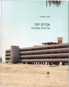
One of the most famous projects in the city was designed by Avraham Yaski and Amnon Alecandroni. They were planning a very long building that was part of an utopian neighborhood – a large scaled housing project, called “The Fifth Neighborhood” – in Hebrew “Shouna hei”. This neighborhood was designed as “A Model Neighborhood” and it includes different architectural projects that were supposed to show different kind of modern, progressing attitudes towards the deserts conditions.

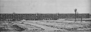
The most well known one, that also became as a symbol for Israeli Brutalist building is the Quarter Kilometer Long Building . This project was completed in the 1960s. It used to be considered as the longest block in the Middle East. The Idea was to build such a long building that will block the wind and the dust, then in the surrounding of it they were building up lower houses that enjoyed from protection of the larger structure. Inspired by Le Corbusier the first level is only pilots and is being used as an open space. The building is very geometrical and simple and there are any windows that have a wide conceit frame to differed it from the strong sun shine.

Back then, they were really dreaming about having great life quality, adjusted to the weather conditions. The creators of this building, neighborhood and city believed that they could subjugate the natural conditions of the place if they would just build in the right way. If it would be big enough, massive enough – the desert will surrender to the architecture. They were planning this buildings to be designed and built in high quality  standards, for medium class residence. Eventually when utopia meets reality different things happen. Despite the innovative design, this building “has become an urban legend bleak, a magnet  for problems and crime.” Avraham Yaski, the leading architect “of the project referred to it as a “conscious tryout that completely failed”


he quarter-kilometer block

The quarter-kilometer block, today.

Be'er Sheva, Israel

The longest block in the middle east. 1960. Be'er Sheva.

Today many people criticize the Brutalist style, claiming that the exposed cement, the rough structures and the simple geometric shapes looks massive, neglected, aggressive, ugly and represent the way the regime was trying to force this unreal utopia version. Building in the same way they where trying to led the people as one machine that needs to serve a certain kind of a national dream.
While wondering about that I find my self split between a respectful, even amazed feeling towards those architects that dared to dream and to try something that was so revolutionary at the time and the feeling that this vision of great wide buildings with European meadow in the desert is so alienated and disconnected from the traditional way of surviving in this landscape
I think that this contradiction represent a very familiar complexity that exists in the Israeli society still today. The contradiction between the utopian vision of being part of the European culture (in that case architecture and urban design) and the fact that the country is based in the middle east, that lots of the civilians are coming from middle eastern, north African countries and that it is surrounded with very reach culture that makes it impossible to fully deny those other influences that pops up and stand against that utopian vision. In a way the quarter kilometer block is a living example for that complexity


A cover of the book: Avraham Yasky, Concrete Architecture. A monograph on Yasky's work by Sharon Rotbard

A cover of the book: Avraham Yasky, Concrete Architecture. A monograph on Yasky's work by Sharon Rotbard


Homo Ludens


Monday, October 24, 2016


The human being is qualified as « homo sapiens », the man who knows and « homo faber », the man who makes. « Homo ludens » is the man at play.


So i decided to find out more about Constant Nieuwenhuy’s « homo ludens » and the context.

We are in the period after the second world war, everything is destroyed and has to be rebuilt. Constant had an utopian vision of how we could re invent our world, and for him it was a real possibility. We had to forget how we did thing in the past (traditions, routines, processes, plans…) and create a new world from dust, that he called « New Babylon ».


The people of the « New Babylon » world are called the « homo ludens ». He insisted on the importance of play. Something joyful, pleasant and adventurous in our daily lives. People could transform, recreate our environment according to their new needs. Everyone could use his creativity as he wished. Art would exist as part of our day-to-day existence, everyone would be an artist. He puts the human in the centre of everything. Mobility is another key dimension because it was getting easier to travel across the world. Constant saw the new babylonians as a new race of nomads with unlimited freedom to decide about the appearance of their surroundings.


Staircase


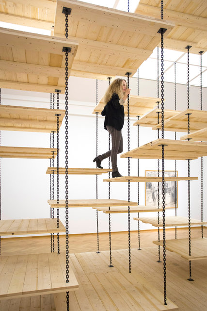
I think this staircase is the perfect representation of Constant’s idea of « homo ludens ». The stair’s principal function is no more the useful part of it, to go up and down. The amusement of going up and down is what it is about. It isn’t the most practical staircase but when you go up or down, you have fun.


The opposite of this new concept of a « ludic society » is the society we are in now, a « utilitarian society ». A society based on the exploitation of the human being’s capacity for work in any kind of domain. « Utility » is the principal criteria of a man for his activity. The creative man can only claim his right on rare occasions.


The « ludic society » on the contrary is freed from repetitive production work. It would be a « classless society » with no more hierarchy. A society were individuals developed and discovered their own creativity with others. Constantly at play, an uninterrupted process of creation and re creation.


How would « social justice » work in this new world ?


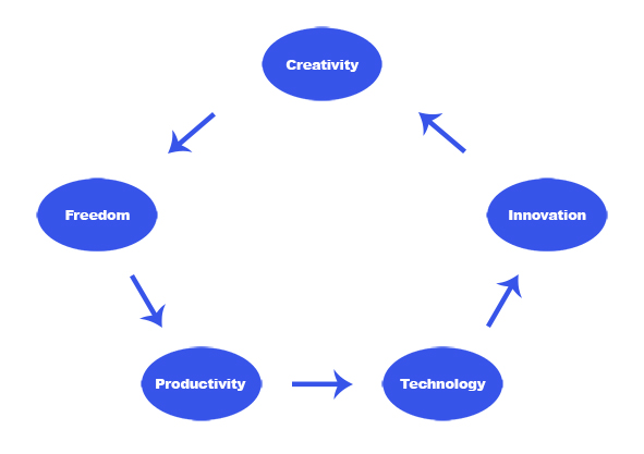
Equality and freedom between everyone is the principle of social justice. Freedom depends not only on the social structure but also on productivity. Supposing we are in a world where people create daily, if there is no production then this society doesn’t work. Productivity depends on technology. The new technologies we discover every year give us new ways of doing things, more possibilities, more freedom for the « homo ludens » to play with.

With theses new possibilities people innovate, make something new, re do, renew, rebuild, restore, transform, change… This is in effect the role of a designer but in this world there wouldn’t be any constraints.


Schema2


These innovations can be used in all kinds of activities. For instance, Constant imagined that air conditioning in  « New Babylon » does not only serve to recreate, as in a « utilitarian society » an « ideal » climate but also to make it possible to vary the ambiance to the greatest possible degree.


Technology and innovation enable creativity. For example, we can now bring to reality what was a simple 2D image on a computer. There are many kinds of innovations but I think that artificial intelligence (see also : 7 trends for artificial intelligence in 2016 ) is going to be the major innovation that will have an impact on our society and really affect our creativity in the future.


Imagine a world where « homo ludens » would be able to have artificial intelligence (AI) assistants. You could not really make the difference with a human. They would have all the data of the world in their system and would use « deep learning » .

« Deep learning » is different learning methods where the AI has advanced audio and visual analysis skills (facial recognition, voice recognition, computer vision…). They would be able to modify their attitude based on the past, they learn. If you are a bit curious about this subject I advise you to watch the tv series « Westworld  ».

With all this data and advanced technology IA assistants could give to « homo ludens » a different perspective about their production and bring real technical and practical support instantly. It would be similar to the character « Jarvis » in Iron Man. What is interesting about this AI is that it is invisible.


Artificial intelligence and « homo ludens » could work well together but AI can be dangerous if it is not well controlled.


the pleasure of the unknown


Monday, October 24, 2016


P1360433
 
Guy DEBORD - Concept of "Derive"
How could people renounce to act, to move into a defined space?

“Follow the line. Walk. Turn left. Straight on. Turn right.”
Everyday is the same way. Wake up, go to work, one way. Finish work, go back home, same way. Same streets. Same sidewalk. Same hall. Same way to move into a defined space. I’m bored. I have the feeling of being programmed. I walk as an automate. The way I’m moving is determined by the space. A space, which has been built to create a certain kind of movement. Movements chosen by the hand of the architect.
I’m bored.
I want to derive.
I want to EXPLORE.
I want to be excited.
Let’s break the routine.
Let’s take the chances as a guide.
Let’s follow the chances.
The derive is defined by Guy Debord (a French Marxist theorist, writer, filmmaker, member of the Letterist International, founder of a Letterist faction, and founding member of the Situationist International) as a fast technical way to go through different atmospheres. It is deeply linked to the space and to how people recognize it. The right words are “the psychogeographical thought”.

The human being evolves during his life through different spaces. He is acting, moving because of his feelings but also because of the space he is in itself. If the space is small, without windows, just made of walls, he will turn around in circles like a wild beast, searching for some space to explore. Put him into a wide space, with no walls, maybe he will run, maybe he will walk but he will have the freedom to explore. The space, thus, determines our behavior.
The chances has an important repercussion on the derive, even if the mind and feelings about the space, are still the elements which affect your choices. You’re walking in the street without any goal, you want to get lost, to explore. To your left, there is a narrow passage, it seems calm and quiet. To your right, there is a big street, noisy and full of people. Which one would you choose? Which path will attract you the most? Your feelings will help you choose.
The derive is something you can do by yourself, alone, but it has more impact in a small group. People can help you discover different places you don’t know, they can help you appreciate it. Also, a group of 4/5people maximum can create a different energy than if you were just by yourself.
 

arton38

 
The exploration supposes a kind of calculus which helps you to know where you are going. That’s what the map is for. In your daily life, you just know the streets you need to take to be at specific places. Take a map and start to look at what is around you will help you to understand how the city is built and how you can play with it.
“What if today, I decide not to turn left but I chose to go right, to get to my office?”
A small change of your routine can have a very positive impact on you. Your attention will be different so you will start to feel the pleasure of the unknown.

First cover Guy Debord’s book

In architecture, the derive creates new spaces, new ways to go, to move and to determine the space. 

Everyday you take the lift, go to the 3rd floor and open the second door on the left to your office. No excitation. Tomorrow, you will climb the stairs, try a new way to move and you will rediscover a place you thought you knew.

Why not create a place where the owner could remove the walls to make the space bigger or smaller? A place where he could be his own architect, a place where, he has everyday, the possibility to create his own space. For example, in 1955 a building was built in New-York in which three four room apartments could be turned into a big twelve room apartment thanks you moving walls.
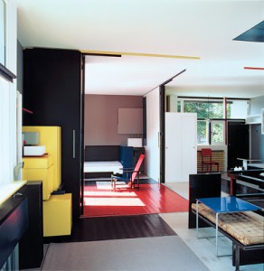
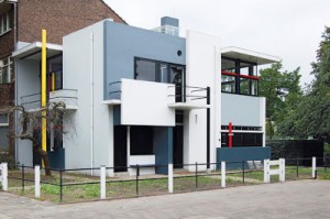
Also, one of the most famous architecture of De Stijl movement, the “Schröder House”, illustrates very well this idea of transformable space. The Rietveld Schröder House in Utrecht was built in 1924 by Dutch architect Gerrit RIETVELD for Mrs. Truus Schröder-Schräder and her three children. She commissioned the house to be designed preferably without walls. It is visually very simple with its use of primary colors and geometric shapes. The outside-inside boundaries seem to blur, thanks to its many windows that open up completely to welcome nature indoors.
 
mulder-rietveld-schroder-house-living-room mulder-rietveld-schroder-house
 
This house is a great exemple of a home you could easily transform to suit the weather, your mood. The simple and straightforward house was made using long-lasting, affordable and standard materials like concrete, glass and wood, with floors made from rubber and even some small cork areas in the bedrooms, for standing when getting out of bed. A doorbell and a long horizontal window that only open a small area to receive the post straight to the working desk inside. Upstairs, three bedrooms and a living room area around a central staircase and fireplace can be dynamically turned into a open big open space when opening wide up the sliding the walls.
The whole idea of derive deeply echoes Constant’s work. After WW2, the artist saw the destroyed cities as a possibility to rebuild them in a different way. He started to think about a New Babylon, a city that would offer to his citizens a new way of life, a new way to explore the space. Stairs, ladders, open spaces, light… Everything in his mock ups gave the user the possibility to create his own space, his own movements, his own rules. On a certain level, we can say that Constant wanted to give us the possibility to derive. This idea echoes Guy Debord ’s sentence, “One day, people will build cities to derive”.
To my mind, i think that with or without those utopic cities, we already have the possibility to derive. As human beings, we are building our own limits. If we decide to see our everyday life as a playground, if we push ourselves out of our landmarks, out of our comfort, we became the actors of our derive. The main problem of derive is finally how we accept to deal with the notion of freedom, the freedom we are giving to ourselves.

CONSTANT SPACE AND COLOUR


Monday, October 24, 2016
constant-nieuwenhuys

Constant Anton Nieuwenhuys (21 July 1920 – 1 August 2005)

After the end of the war the housing problem in the Netherlands was the ‘number one enemy’. In the early 50s Nieuwenhuys was seeking for new pathways in which art could contribute to reconstruction of the post war Europe. He envisioned an art that was at once “lyrical in its means and social in its very nature” (1956). That period of time was crucial for Constant.

After the Cobra period, Constant Nieuwenhuys’ work becomes more abstract. It develops more and more towards spatial experimentation and architecture. He starts to study architecture with the books of Aldo van Eyck. During that period Constant comes up with the question of how the construction of a city contributes to the quality of life. He starts to realize how the modern structures that surround us influence us. Before that, in the Cobra time he focuses on collective art and rejects individual art, now he goes even further by striving for a synthesis of arts. He tries to break the boundaries between art professions like painting, sculpting, architecture and technology, he feels like they need to be eradicated. In this period of time Constant is searching for artists with the same views as him; he works together with architects like Gerrit Rietveld, Aldo van Eyck and Stephen Gilbert.


(Symbolic Representation of New Babylon), 1969.

(Symbolic Representation of New Babylon), 1969.

The exhibition “Constant. Space + Colour. From CoBrA to New Babylon” at the Cobra Museum in Amstelveen, showed that development of Constant’s work.
Constant worked together with many different artist during his life and was not afraid to experiment with his style and way to approach his work. He both painted, made sculptures and made graphic work. It was very clear when you walked through the exhibition at the Cobra museum that his main approach have been space and colour during his lifetime. Constant’s development from Cobra to New Babylon was told by a narrative and you were guided through the exhibition that represented both his avant-garde experimenting paintings and his urban architectural sculpture work.

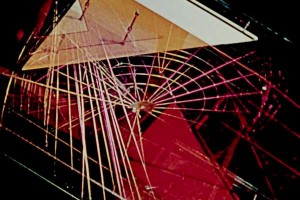
Shown at the exhibition was this one video installation called Gyromorphosis which is made by Hyman ‘Hy’ Hirsh. Most of the works in the exhibition were presented live as maquettes whereas Gyromorphosis was the only digital piece that displayed the New Babylon ideas not by Constant himself, which was attention grabbing.  Hirsh was born in Pennsylvania in October of 1911 and was an American photographer and experimental filmmaker. He was also one of the first filmmakers to use electronic imaginary. From looking at more of Hirsh’ work it is possible to make a conclusion that he treated films as malleable objects by constantly editing and re-editing them, mostly using live music instead of pre-recorded soundtracks. Hirsh did in fact dedicate himself to working with the describing form as seen in his other works. In Gyromorphosis,which he made while staying in Amsterdam, Hirsch strives to display the kinetic qualities of the New Babylon structures of Constant Nieuwenhuys. One by one he puts parts of the structures in motion and films the details with colored lighting having them overlap each other, appear and disappear. He creates a sensation of acceleration and suspense suggested by the work itself. He uses music from the Modern Jazz Quartet which becomes a great part of the piece; rough and blunt shapes together with very soft sound creates a great contrast that is hard to miss.

Gyromorphosis, 1954

Gyromorphosis, 1954

Hirsh works with the describing form, which is a way to represent the weight and space of sculptural form on film.”To realize this aim I have put into motion, one by one, pieces of the sculpture and, with colorued lighting, filmed them in various detail, overlaying the images on the film as they appear and disappear. In this way, I have hoped to produce senstation of accelaration and suspension which are suggested to me by the sculpture itself.”, says Hirsh. (note by Joost Rekveld). It is a way to describe in moving images what is fundamentally still. You might say that a sculpture is described by the space around it, described by the the experience or the touch. The moving image places the viewer in another position and remove the viewer from the direct and individual experience. The individual sense of the material, surface and environment that you experience during a first hand encounter with a sculptural form is now in the describing form framed through the lens of a filmmaker. It’s a document caught in another time and scape than the one you experience yourself in front of the actual sculpture. It is in the tension between these two states that avant-garde filmmakers, and the artists themselves, have brought their singular and experimental approaches to filming form. Another artists, who actually have worked with dynamic videos of this kind as well was László Moholy-Nagy, who while working at Denham studios created kinetic sculptures and abstract light effects. Artists present new ways of using the moving image to offer other and different perspectives on sculptural form.

Spending a lot of time thinking about the principal behind the idea of putting Hirsh’ work in the New Babylon we have decided to look for a direct search of answers (contacting the curator of the exhibition). Thanks to Laura Stamps, modern arts curator at the Gemeente Museum The Hague we got a clear answer. She explained to us that the exhibition was not only consisting of the works Constant has made in the specific time of the New Babylon but also his steps towards it, for example there is a whole room dedicated to the time frame of Nieuwenhuys being a part of the Cobra movement, and another one dedicated to Constant’s research of the ‘synthesis of arts’. Mentioning all of the previous periods and having a separate space for them in the exhibition plays a very important role because that is what influences the development and new ideas and methods of working, which will eventually lead to the creation of the New Babylon project. Then alongside the artworks the curator chose to show a selection of of documentary material (pictures, collages, flyers, correspondence and films). Laura has mentioned that for her ‘Gyromorphosis’ also functions as a sort of documentary material because it is a film in which the artworks of Constant play a lead role. Hy Hirsh is the maker but the film is obviously a collaboration between the two. The way the film is made – it gives you a psychedelic, new age feel – reflects the time that it was made in very well. The curator has integrated this film (as well as other documentary material) because it gives you a feeling against what background New Babylon was created.
To summarize this research, it is important to mention that the pathway of an artist is a very important factor of his work as whole. Constant Nieuwenhuys in this case, going from Cobra to the New Babylon, which stylistically are so different from each other, are still tightly connected. Collaborations with others, Hy Hirsh for example, also plays a big role in the whole process, giving it the needed documentary aspect.

text by Vica Allakhverdyan and Sofie Bredholt

Utopian…


Monday, October 24, 2016

After World War II, much of Europe is in ruins. People in Europe had experienced two world wars in three decades, many wanted peace and quiet and to try going back to the old order. Women who, during the war, had gone out to work would now stay at home. Some young people who had grown up during the war wanted to explore the newly won freedom. The young artist Constant Nieuwenhuys was one of these young people. He and his family went into hiding to avoid registering for ‘Kulturkammer’ (Nazi Chamber of Culture) so that he could continue to sell his art. When they hid in the house of Constant’s brother in law, his brother introduced Constant to philosophy. He began to read Karl Marx which would be a great source of inspiration for him later on.

1948 Constant created the international artist collective CoBrA. It was a collection of radical young artists from northern Europe who was against war, nationalism and militarism. They wanted to explore a new freedom through art and new perspectives through child- and folk art, mixing different materials and work collectively. Many of them were also Communists, who didn’t see it as the function of art to hang in the bourgeois homes. After CoBrA, Constant concentrated on his project New Babylon, creating models, collages and paintings to figure out what a post-marxist society would look like. His models show buildings that rise up on pillars from the ruins of the old capitalist society. ‘Homo Ludens’, man after a revolution, that no longer need to work as all the work had been automated by machines. He is no longer a worker but spend his own life and time for play. All land in New Babylon was owned collectively and the models show horizontal buildings for a horizontal community, and large open spaces as architecture was not to limit the spawning of Homo Ludens. Instead, it could constantly be modified to needs and desire.

In 1974 Constant gave up the development and presentation of the New Babylon project after nearly two decenniums of exploration. Many saw the project as utopian but for Constant it was a potential and real future. In the New Babylon society, people are connected through a large building that stretches around the world. A place where everyone can be received as mentioned by Mark Wigley, author of “Constant’s New Babylon: The Hyper-Architecture of Desire” a digital folder of the books content that we have got access to today –connected with our phones– and through which we can attain the content independent of place both during the day or at night.

When I went through the exhibition New Babylon at the Gemeentemuseum Den Haag, I thought of today’s socialism and the ideas that an alternative society is something strange and impossible. The ideology of today tells us that we live in the post-ideological era, liberal democracy won the cold war and so also the hegemony of ideological thought. We are told that we can move freely we can become anything if we work hard. Today Constant’s ideas seem naive and detached from reality ‘his idea is a utopia and today we have come to realize that we live in the best of worlds’. Today we are told that we are free. By calling something a utopia we take away its revolutionary strength, Constant is harmless because he hangs in an art museum. His models are ornaments from a naive era. When we leave the museum we leave the naive dreaming behind and come back to our “post-ideological” society.

We have acquired the freedom of choice in what we consume, but that is also as far as our freedom extends. Jens Nordfält, a doctor in store marketing, explains how the architecture of a supermarket is constructed to make us consume. At the entrance is placed freshly baked bread to make you hungry. In the back of the store is placed everyday goods that everyone needs so that one will go past many goods and increase the chance of spontaneous shopping. Placed by the checkout is sweets and cheap small goods that one can indulge in when one has been good and done ones weekly shopping. This is not play nor neutral and free from ideology, but instead reflects the capitalist utopia.

The Concept of Détournement


Monday, October 24, 2016

Détournement is a technique. Détournement is a style. Détournement is a tool.

  • To really understand the concept of this tool, first we have to get to know it’s origins.

When we speak about détournement, the first and the most important figure we have to mention is Guy Debord.

Debord was a Marxist theorist; writer and filmmaker who is mostly known for his activity and leading membership of the Situationist International ( SI ).

In 1950, at the age of 19, Debord joined an avant-garde movement called Letterism, led by Isidore Isou. After two years Debord splits off and creates a radical group, the Letterist International.

Shortly after this collective of rebel artists and theorists was founded ( 1952 ) , détournement was claimed by this certain group.

The very first publication ( and description ) we can find on their desires; announced by Guy Debord and Gil J Wolman in 1956, was the ‘ A User’s Guide to Détournement ‘ .

After we did these very basic studies on the genesis of our subject, we can go deeper in search of the meaning and, so to say, the use of détournement.

  • Every movement, every new style claims current things and situations to change. They all have the same purpose: leave the old, the used behind and create, express something new. In our case Guy Debord’s movement was a very radical, even revolutionary way of changing the meaning of art, or better, the production of it. Debord and the situationists all agreed on the fact that art could no longer stay a chic, luxurious, high class production. Rather they believed and strived for art to have a deeper, educational input. They broke down the walls of the classical and the bourgeois way of looking at and creating art by taking different elements of already existing works and transforming them into something new, to express another meaning. These changes don’t necessarily have to be drastic or aggressive. The point of it is to change a small component but then with this small detour, changing the overall expression and audience. They mainly aimed political situations and circles, but only in a peaceful and respectful way.

A very important figure and example in this case would be Asger Jorn. Jorn was a really good friend of Debord, therefore he was highly inspired and led by the situationist concept, styles and ideas. In his paintings series called The ‘Defigurations’ , we can clearly explore the idea of détournement. His works are mainly driven by political issues and his frustration with established structures and authorities within society.

Another well known example is Marcel Duchamp’s L.H.O.O.Q. where he simply adds a moustache on Mona Lisa. With this small adjustment which first looks funny and sarcastic, Duchamp changes the whole meaning of the original Mona Lisa, that presents a laid back, carefree woman, but with this detour he presents the restlessness of the women’s sexuality.

  • At this point i find it more important to come up with more recent examples for détournement.

Let’s say you go to a restaurant, you get a piece of toast and a strawberry. Then you take a bite of this strawberry and you realise that it is actually a tomato. This is a concoction by the radical Star Chef Grant Achatz called ‘ strawberry / tomato ‘ . His cuisine is amazingly revolutionary as he transfers every simple ingredient into something more, something different. With this, he presents the meaning of modern cooking on a new level that is more of a performance or art than just making food for the guests. The food itself loses its meaning, it becomes the show, the whole experience. He takes a simple vegetable a normal herb or an ordinary ingredient but then the way he cuts, boils, combines them he creates tastes, techniques and culinary styles that we have never experienced before.

Another very important figure and illustration from our daily life is Banksy. We are not quite certain if Banksy is one person or a group of revolutionary artists, but the works we find and see under Banksy’s name are carrying the biggest recent political and social issues from these days.

In our case Banksy () could be one of the best examples how détournement works. In these works we can find well known images of current situations, famous moments and people, companies and figures. The way Banksy transforms these pieces, irrevocably opens our eyes on actual problems in our society, on existing and known political debates. The only small detour Banksy has, is that the way it’s propaganda exists might be more aggressive or intense by publishing them on public places, than the basics of détournement were created.

  • However, we face an important  and interesting question now. What if we detour détournement? How far can détournement go? How can or should we divide it from anarchy?

Or maybe peaceful propaganda is not enough at all these days anymore…?!

I assume it might not be. I believe that nowadays within such an aggressive society, political parties and their choices; we have to fight the “rival” with clear, harsh and rebel tools.

So answering our questions: it is almost a mandatory for us artists and philosophers and writers, comedians, journalists or simple working class people and for all medium that is capable of, to take the peaceful elements of détournement to a next,  advanced level. We do have to go further and show our dislike or disagreement, even if it has to cross laws and politeness, for the sake of change and recognition. We have to apply effective and more powerful tools to our ideas and requirements  for them to be realised.

Constant Nieuwenhuijs en Rem Koolhaas


Monday, October 24, 2016

Constant Nieuwenhuijs. Een verbinder van autonome kunst en moderne architectuur. Wij gebruiken Constant als vertrekpunt en zoeken naar de relatie tussen zijn werk en dat van de Cobra kunstbeweging en Rem Koolhaas, een moderne architect. Hoe het werk van Constant door de cobra beweging is beïnvloed, en de ontwerpen/ideeën van Koolhaas weer door Constant, als in een kettingreactie.
 

Overeenkomsten tussen de Cobra beweging en Constant’s ideeën over New Babylon en architectuur in het algemeen.

De utopische denker Constant Nieuwenhuijs heeft zijn roots in de schilderkunst. Tussen 1948 en 1951 was Constant zeer actief binnen de Cobra kunststroming. hij was er mede oprichter van.

Cobra kwam op na de tweede wereld oorlog. Na deze heftige en gruwelijke tijd doorleeft te hebben waren kunstenaars opzoek naar een wedergeboorte. Iets om steun uit te halen of iets om te kunnen relativeren. Cobra kunstenaars vonden onder andere hun inspiratie in kinderlijke en primitieve kunst. Hiermee konden ze hun zorgen over de toekomst van kunst en menselijkheid uiten, die beschadigd waren voor de traumatische ervaringen uit de oorlog.

De kunstenaars streefden naar een utopische wereld, waarin vrijheid centraal zou staan. Dit vonden ze door te breken met het artistieke verleden en esthetica en een nieuwe kunststroming te creëren waarbij spontane activiteit en expressie het belangrijkst was.

Vanaf de jaren ’50 wordt het werk van Constant werk abstracter en ontwikkelt het zich uiteindelijk meer in de richting van ruimtelijke experimenten en architectuur. Hij bouwt een stad van de toekomst; New Babylon, vormgegeven in schaalmodellen, collages, tekeningen, landkaarten en meer. Hij wordt zich steeds meer bewust van hoe gebouwen om ons heen mensen beïnvloeden. Het valt Constant op dat de meeste moderne constructies vooral praktisch zijn en saai en dat ze nauwelijks ruimte bieden voor een speelse en creatieve manier van leven.

1

2

Burning Earth‘, uit 1951 (boven), een schilderij door Constant aan het einde van zijn Cobra periode. Je ziet al meer interesse voor ruimtelijkheid in zijn werk. Waar het voorheen altijd plat is geweest. Ook lijkt de constructie rechts achterin het schilderij bijna op een van de latere werken van Constant. Een New Babylon compositie, (onder).
 

New Babylon is een radicale, doch logische opvolging van de Cobra periode in Constants carrière als kunstenaar. In beide is een diepe drang te zien, een zoektocht naar vrijheid en verandering. In het New Babylon project van Constant gaat hij uit van een alternatieve, volledig geautomatiseerde maatschappij, waarin arbeid overbodig is. In zijn ideeën over deze moderne en vooruitstrevende samenleving is de mens vrij om zich volledig te richten op het ontwikkelen van creatieve ideeën. De spelende mens bepaald zelf het uiterlijk van zijn leefomgeving. In beide levensfases zoekt constant naar zo’n alternatieve levenswijze. Zowel in de cobra beweging als in de New Babylon tijd was Constant opzoek bezig naar een ideologie van ultieme vrijheid en spel.

In beide delen van Constants leven drukt hij een utopie uit, geïnspireerd op wat er op dat moment in de wereld aanwezig was en wat hij daar graag anders aan zou zien.
 

Relatie Constant Nieuwenhuijs en Rem Koolhaas

Zowel Koolhaas als Constant gaat uit van de sociale functie die architectuur te bieden heeft. Het heeft de kracht mensen met elkaar te verbinden doordat ze in een bepaalde ruimte zijn met een bepaalde ambitie, een functie.

Bij Rem Koolhaas zie je duidelijk dat de persoon die zich in zijn architectuur bevindt, een gebouw van hem betreedt, onderdanig is aan zijn ontwerp. Een voorbeeld hiervan is de Nederlandse ambassade in Berlijn.

In dit gebouw is er een deel met een glazen vloer waardoor je bij mensen met een rok of jurk inkijk hebt in het kruis.

3

4

Dit veroorzaakte bijvoorbeeld al een probleem bij de opening van het gebouw. Bij deze opening zou de toenmalige koningin Beatrix aanwezig zijn. Zij draagt altijd een jurk of een mantelpakje.

Het idee dat je onder de rok van de koningin kon kijken als men zich op de etage eronder zou bevinden, zorgde voor een schandaal. Maar dit werd uiteindelijk simpel opgelost door er een loper te leggen voor de opening van de ambassade. Het gebouw heeft ook richtlijnen die je naar bepaalde hoeken en punten dwingen te kijken.

6

5


Rem Koolhaas straalt met deze keuzes een bepaalde brutaliteit uit. Het gebouw wordt een ervaring voor diegene die er binnentreedt en gedwongen is zich aan deze ervaring over te geven. En dat zie ik in ieder ontwerp van Koolhaas. In ieder van zijn gebouwen voel je zijn aanwezigheid sterk. Hij laat het gebouw als een gids aanvoelen die je er heel natuurlijk en toch gedreven doorheen leidt.

Tijdens het onderzoek kwamen we terecht bij een filmpje over het theater wat Rem Koolhaas heeft ontworpen voor Taipei. Het is interessant om te zien hoe hij naar theaters kijkt.


We zien een duidelijke connectie tussen het Theater in Taipei van Koolhaas en de stedenbouwkundige plannen van Constant. Rem Koolhaas bouwt hier een nieuw gebouw over een reeds bestaand gebouw heen. Het theater wordt over de nachtmarkt heen gebouwd. Hiermee wil Koolhaas twee werelden combineren die beiden ‘s avonds floreren. Hij vertelt in het interview dat in Taipei de mensen laat naar bed gaan. En is het nachtleven dus heel belangrijk. Hij gaat in op hoe mensen zich gedragen, waar ze zijn en waarom. Hij analyseert en onderzoekt ieder detail voor dat zijn ontwerp tot stand komt.

Het idee van een nieuw gebouw over een bestaand gebouw heen bouwen, in plaats van de nachtmarkt te verplaatsen, zoeken zij naar een manier om het oude en nieuwe samen te laten komen, is door Constant geïnspireerd.

Koolhaas slaagt er in allebei om ruimte zo efficiënt mogelijk te gebruiken.

Zo worden verschillende werelden gecombineerd. De code van het combineren houdt Koolhaas ook binnenin het gebouw aan. Hij plaatst de drie ruimtes naar elkaar toe met het podium als centrum. Als publiek zit je om de drie podia heen alsof je in een arena naar sport zit te kijken. Alleen heb je dat als publiek niet door. Iedere tribune wordt als aparte zaal gezien. Per tribune kijk je naar een andere voorstelling, zoals je dat in de klassieke theaters ook hebt. In iedere zaal wordt een andere voorstelling gespeeld. In deze constructie kun je de schotten tussen de drie podia weghalen. Hierdoor creëer je een nieuwe ruimte. Dit geeft een breder perspectief voor het gebruik van deze ruimte. Voor theatermakers is dit een interessant gegeven. Ze hebben nu meer inspraak en keuze in het gebruik van ruimte. Voor andere doeleinden wordt de ruimte nu ook interessant. Koolhaas slaagt er hier in om zoveel mogelijk uit een ruimte te putten. Zodat deze nog functioneler gebruikt wordt.

We hebben het idee dat je in de gebouwen van Koolhaas nooit alleen bent. Hij maakt scheidingen maar toch weet hij de ruimtes niet zo te isoleren dat het afgesloten en op zichzelf bestaat.

Constant en Koolhaas zijn eigenlijk de hele tijd op zoek naar hoe ze mensen met elkaar kunnen verbinden door de functies die architectuur als doel heeft.

text by Eefje Stenfert en Renée Zadelhoff


Log in
subscribe