Skip to Content Skip to Search Go to Top Navigation Go to Side Menu


Welcome to my homepage!


Tuesday, January 3, 2017

by Noémie Courtois

The Internet arrived like an ufo, bringing a promise towards the future. When it became accessible to the broad public, users started to play around and share their hopes, dreams and productions with  the global village in which their children will be living. The birth of the Internet created a specific utopic spirit and everybody was invited to the party.

‘‘And here comes everybody ; moms teens, celebs, goths, tots, gamers, nerds and artists’’. Everybody else, Cory Archangel, 7 [x]


20131231131117-7c05877a


The Internet changed a lot over the last decades, this utopic spirit began to fade and its users with it. Today, these webpages have been hidden and forgotten by everyone. Luckily, our digital heritage defenders do exist and are truly active ; there seem to be a resurge of our digital culture and artefacts.

In my thesis, I’m exploring the Internet in a sociological and archeological perspective. I’m developing the idea of a ‘digital folklore’ (cf Olia Lialina ) ; Today more than before, there is a wish to keep traces of our digital tradition. The defenders of our Internet culture are fighting against the forgetfulness of a material that henceforth belong to the past. This thesis is a contribution to save that part of history that went missing in the fast Internet evolution.


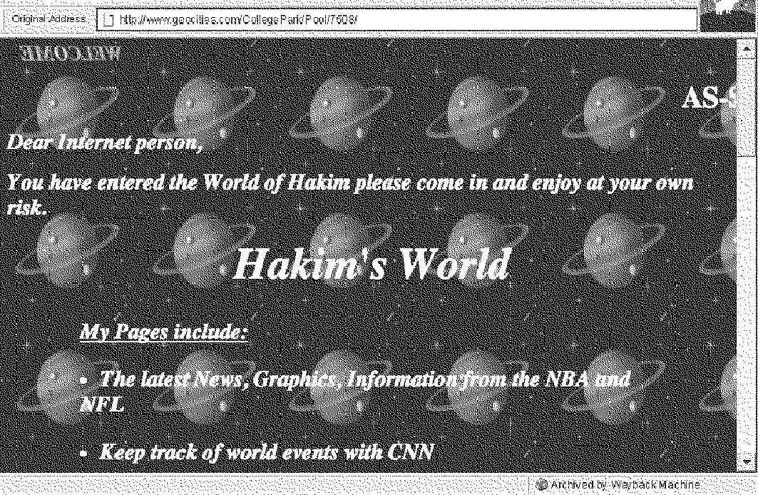
hakims


The first users of the Internet were the first digital tribes and they were living in a specific environment:

‘‘A structural, visual and acoustic culture you could play around with, a culture you could break. There was an ocean of options and one of the options was to be different. (…) It was bright, rich, colorful, naive, slow, personal, direct and under construction.
It was a web of sudden collections and personal links. It was the Internet of personal pages and personal collections. It was the web of indigenous and barbarians, the web for the amateurs soon swept by Internet experts’’

A vernacular web, Olia Lialina, p19 [x]


img5

 
The importance of the first tribes lays in the spreading of the Internet architecture and culture. The shutting down of GeoCities (the biggest hosting service at the time) marks a shift in the Internet history : only a very small part of webpages have been saved,  there are holes in the shallows of the World Wide Web and pages are filled with dead links.


ghhj

Shot(picture?) of one of the many digital ruins, where images have been replaced by the icon "image not found".

They work as a religious triptych and are inspired by traditional construction : The birth, the life and the death

They are the remains of the first digital tribes : structures that were once complete and have fallen into a state of partial of complete disrepair. These digital monuments became places of worship, places where you can remember this specific time where movement and construction were the core of the online activity.

This specific idea lead me to my graduation project:

« Incidentally they’re all gone,
well not exactly gone… more sort of… absent… »


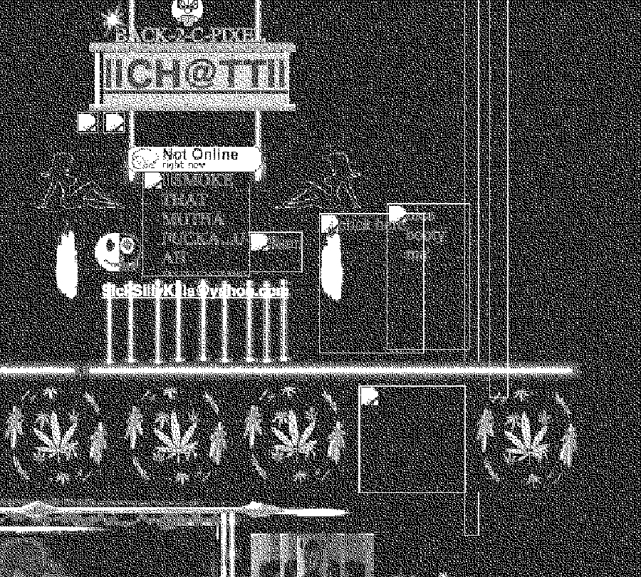
unnamed (1) nonot3

taps2 nonot tapes4

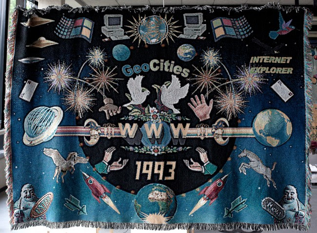
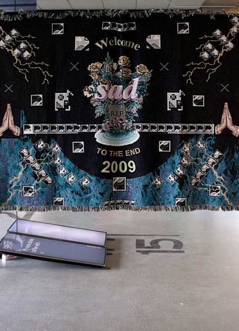
The 3 tapestries were part of the graduation show.
They work as a religious triptych and are inspired by traditional construction : The birth, the life and the death

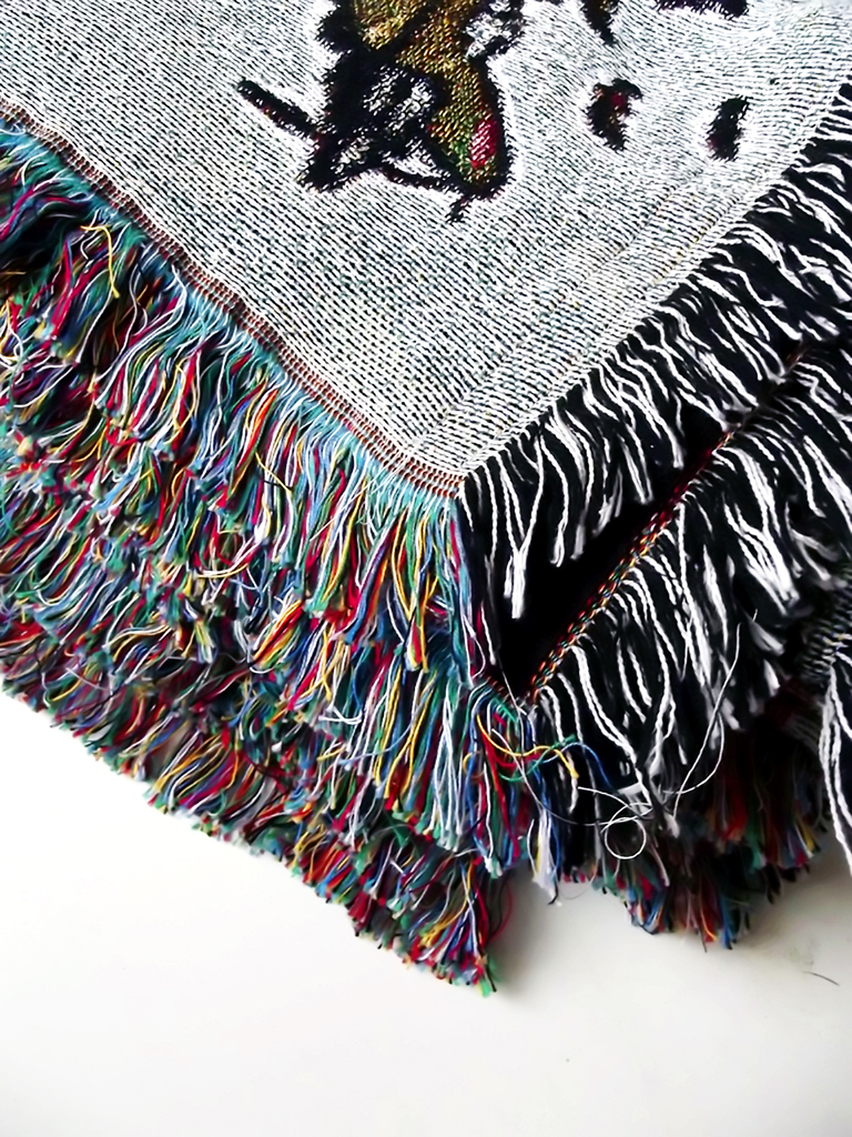
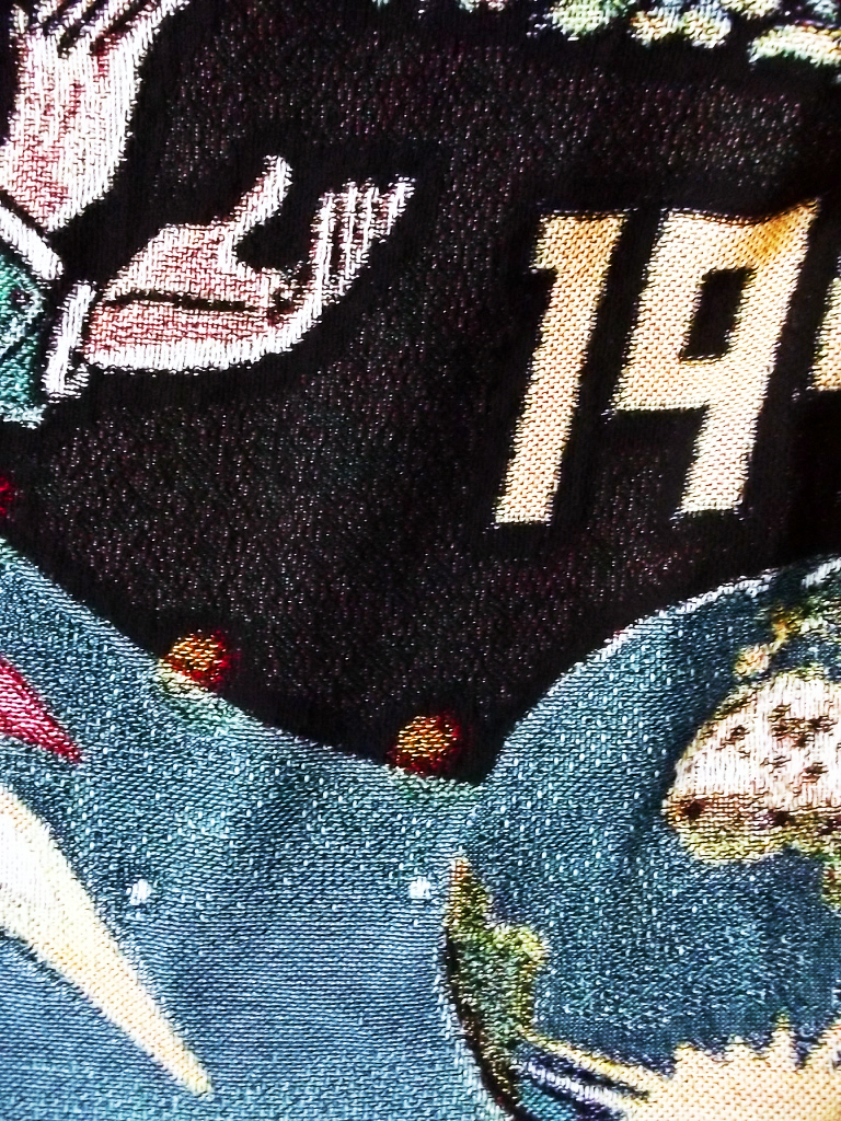
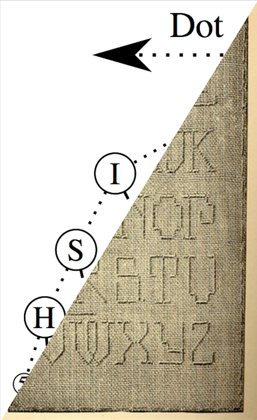
The tapestries pay tribute to a web that is gone or -say- hidden. They work as a religious triptych and are inspired by their traditional construction : The birth, the life and the death. The idea of making tapestries came into my mind quickly while writing my thesis. Initially, tapestries were made to educate illiterate and uneducated people about subject of war, religion and so on. Whilst contributing on saving the history, they were also made to make a space warm and welcoming (such as the first webpages). The connection between the Internet archeology and tapestries was really straight froward; they also recall the computer screen and pixels.


thesis_900 [click on image] to download this thesis by Noémie Courtois

all rights to this thesis are property of the author © 2016 http://courtoisnoemie.tumblr.com/ [x]


willit


Approaching the Archive


Sunday, December 11, 2016

‘Approaching the Archive’ begins from a coincidence that becomes an unexpected point of access to the archive and book collection of artist, writer, editor and graphic designer Will Holder, in the context of his exhibition ‘Sorry! NO we don’t do REQUESTS’ at Kunstverein in Amsterdam.

The essay deals with the successful as well as the unsuccessful attempts at trying to grasp a lot of material in a little space, and the systems that one makes up in order to organize and process content through. Moreover, it is an essay about books and the stories and associations they convey, as well as it is about the finding of an unexpected relationship between ‘typography’ and ‘topography’.

Will Holder click on the image to download the pdf

A visit in Pieke Bergmans studio


Saturday, December 10, 2016


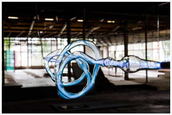
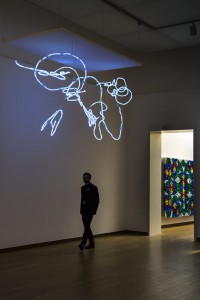
At the moment you are exhibiting in the Stedelijk Museum in Amsterdam with your installation Phenomeneon. Now I am really excited being here in your studio in Amsterdam to talk about your projects and you as an artist.


piekebergmansstudio2


There is surprisingly much space in here. In what kind of room are we?

It is an old factory building. We actually just moved into this studio a few weeks ago. So we are still in progress about rearranging the space, like removing the ceiling and creating small office rooms. There are not a lot of my works here yet but I can show you around…


The Phenomeneon project gets a lot of admiration with its mesmerizing appearance. I am really interested in the production process and the applied techniques. Could you tell me more about it?

Yes, sure. Not everyone realizes that light in this case is gas. People think it is a really new technique, but it is actually an old one. I do like light a lot. It is a very beautiful material to work with and I discovered many different effects. People are getting so much information nowadays it is hard to get their attention. But in this case I think it is a perfect combination of technique and mystery.


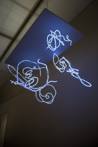
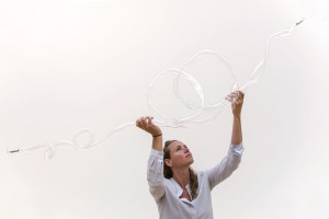
Phenomeneon-Cloud-Pieke-Bergmans-2016-photo-Mirjam-Bleeker-12-400x600 Phenomeneon-Cloud-Pieke-Bergmans-2016-photo-Mirjam-Bleeker-1-900x600


When you mention the mystery it makes me think about the moment when walking closer to the installation and realizing that the neon light moves through the organically shaped glass. The light runs through it and you start to follow its way.

Exactly! That makes it feel alive.


Are the organic shapes made to play with the intensity of the light?

The intensity of the light is defined by the width and length of the glass. In the end it is just playing. Its like a three dimensional painting. Like when you have a brush and you choose the pressure of your brushstroke.


I can really see how playful you shaped the glass. Are there any other factors affecting the form?

Yes. The installation consists of seven separate parts. It was difficult to do because they are all handmade and quite big. The biggest one is almost six meters.


Phenomeneon-Cloud-Pieke-Bergmans-2016-photo-Mirjam-Bleeker-7-900x600 Phenomeneon-Cloud-Pieke-Bergmans-2016-photo-Mirjam-Bleeker-15-400x600


You cannot see where they are connected which gives the impression of one very long piece and makes me question the process.

It starts sometimes with a simple observation. I was questioning why neon light is always a straight tube. Most people saw the shape as a limitation, for me it is more a possibility. With the understanding of the technique I could have come up with so many ideas about the design. One reason for the process and especially the shapes of this project is that I am a person that is always interested in setting things free.


How is that combinable with your background as a product designer? I can imagine in this area the focus is more on creating something specific.

Yes. It is mostly about creating something perfect. I basically didn’t believe in that concept. That is why I turn nowadays much more to art. I try to stretch the borders within the functionality. But now I am also more free about creating something that has nothing to do with functionality even if I started from this ‘other world’.


Do you have an idea of an aesthetic that deeply touches you — an idea of personal beauty in ‘your world’?

Yes and that’s only for myself. I have no idea what the public thinks. I am not commercial in that sense. I don’t do works someone else wants. I think it is a power within the simplicity. Like this table over there. Its so simple but at the same time it is fragile and the surface a bit wobbly. You are wondering if it collapses or not. So it is also about the balance. I am looking for this tension. I like to use things that already exist in my environment and I take them out of their context. If I work with big companies then often lots of things are possible. All the equipment is available. It happens fast that things are getting too complex. Then it looses its quality. I am striving for purity and simplicity.


Do you think mass-produced objects have less individual quality?

Oh, I don’t think there is such thing in mass-production. Every object is exactly the same. The best design is multiplied: ‘the Golden Mean'[x]. I don’t want to judge mass production because its designed for optimal purpose. But if you study nature, then everything is unique. You can not find one olive tree that is the same. Not one animal or human. We are all different. Thats why I create production lines that produces unique objects. It would be great if people would spend a tiny little moment to witness these individual unique differences. It is hard to make people feel something or even make them wonder.

When I was studying I really admired a lot of designers or artists for their capability and their way of looking at things. I also really understood that it was not my way. But when you are young you are not really sure about your way. That is sometimes a bit confusing. So you have to find your own strength, your true fascination. And after some time by simply doing you feel more and more secure and comfortable in choosing what you want to do. At the end it is about experience I would say.


I read an article where you said you take already existing working processes and change them to give materials space to let them expand in their natural way. What is your fundamental inspiration concerning your working process?

If I compare my own mind to nature I am a bit disappointed. Because whatever nature is doing in terms of gravity or elasticity or any other effects basically — I could have never come up with this. The result is so much better than everything I could have ever designed. So I just started going into the direction of letting things happen. But of course in a quite distinguished research. I have to do it over and over again until I understand why and what happens when. And then I pick out something to focus on.


Do you have plans for further projects based on the idea of Phenomeneon?

Yes, for sure because now we developed the techniques and finally we can start to play. Basically I am looking forward to the opportunities in the future. To be able making more things happen within the world of Phenomeneon. If you discovered something you are really fascinated about, I think it is important that you spend some time in making more pieces because mostly they get better and better.


Check out Pieke Bergmans official website for more information.


Meeting with a shape explorer


Tuesday, December 6, 2016

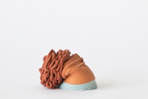
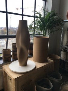
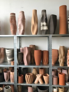
Olivier van Herpt is young Dutch designer from Eindhoven, he graduated in 2014 form the Eindhoven design academy. We discovered his work at the “Dream Out Loud” exhibition in the Stedelijk. Both of us were strongly attracted by the 3D world and process in the show. Therefor van Herpt’s work seemed like the most instructing of all regarding his process but also due to the final objects themselves. The other aspect that catches our eye was the combination of brand new technology and crafts, (3D printing/ceramics, weaving). Van Herpt’s work consists in making ceramic shapes (vase looking shapes) with 3d printing machine that he engineered for it. We were therefor even more fascinated not only by the shapes but even more by how he got there. We had the opportunity of meeting him in his studio and ask him more about his work and work process.

The conversation immediately focused on his work process.
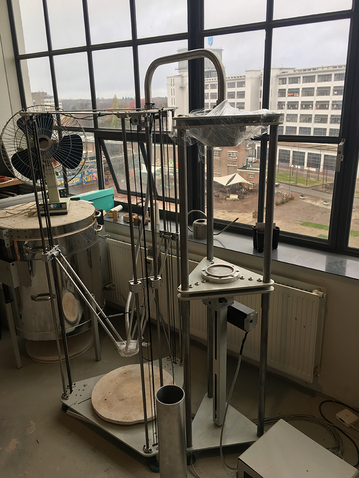
It all started when he was still a student at the academy, he was already interested in 3D printing and was taking ceramics as minor. He also mentioned that he had always been interested in the technical part. But was quickly limited by the technical possibilities of the machines at the academy, size wise, material wise and so on. This is when he started thinking about making his own. His approach was also mainly to combine different techniques. He therefor though about a machine that would combine man action and machine made. He wanted to have an interaction with the machine. That combination also takes place in the process of designing the object and making the object. Van Herpt had some help from student friends at the beginning but not from manufacturing industries. He started with a small machine and they got bigger with time. He designed and engineered the machines himself and learned the technical part while in the process of creating them. Also as a designer, unlike an engineer, he already had an idea about what the machine had to look like from the start. That give it a different approach but of course he had to adapt to technical issues and the machine had to adapt on what he wants to make. « It’s a parallel process between the object and the machine. »

3d-dripping

3d-printing-ceramics-1

After graduation he focused on experimenting with the machine with different techniques all about randomly approach « dripping » with different materials, such as wax, and bee wax. At the time he was experimenting with soft clay by softening it with water but had quickly explored all the possibilities with it so he then decided to focus on ceramics, dive deeper into it and use hard clay for which he had to build a new machine. Again we can see the close relation between the process of making the machine and the object, how one is to the other, and the constant need to develop a machine that is adapted to the material (hard clay).

IMG_8799

The second machine he made for the hard clay is basically like a pomp, he described it as an ‘extruder’, the innovative aspect to it is its openness and the possibility to interact with the machine that works with any kind of hard materials : « the machine is really like a tool » that he uses to make objects with. He explained that there were two ways of working with the machine. You can decided to interact with it or not. The most basic shapes are hand made. Some of the shapes are design then put into the computer and then when a machine prints it then it is machine made, or you can shape it yourself on to the machine because the machine is not closed.
This is it’s way of renewing an very old craft (ceramics). It is a human versus machine collaboration. The shapes of the products are all unique you cannot make one twice. Because of the use of clay it is also fast to make and always reusable until you cook it. It is then possible to make a lot of different try-outs and and shaped it until you are satisfied with it. Meaning that there are endless combination of shapes possible to explore. He also sees it only as the beginning and very much as an on going process of experimentation.
«It is only the beginning » as he said « it can be really random but also really controlled » which gives a bigger range of possibilities, also with the use of different colored clay, creating very different kind of shapes. He also told us that he recently started to experiment with new materials such as porcelain.

IMG_8795 IMG_8790

He is in process of creating a new machine, even bigger, to have the possibly of making bigger shapes and objects. Having the possibility now of collaborating with different fields, which was his idea in combining techniques, he is enthusiast in working not only with designers but also with artists, architects, interior designers and even industries. for example industries ordered his machines for other purposes.

This research project by Daria Nakov and Raphaelle Hugues is based on the "Dreaming Out Load" design exhibition curated by the Stedelijk Museum Amsterdam

Why Make Carpets?


Sunday, December 4, 2016


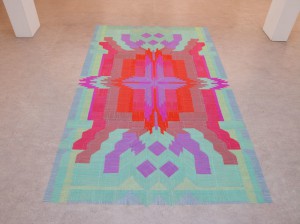
The designers Bob Waardenburg, Marcia Nolte, and artist Stijn van der Vleuten are the collective We Make Carpets, who are represented with the pieces Stirrer Carpet, Cocktail Carpet 2 and Umbrella Carpet 2 at Dream out Loud in the Stedelijk museum Amsterdam.

Umbrella Carpet 2, 2015

Umbrella Carpet 2, 2015


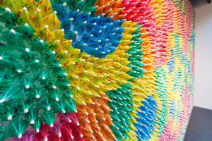
We Make Carpets create both big and small patterns from simple products, such as cocktail stirrers, paperclips, candy bars and spices. They manage to create these patterns and structures, that is not only pleasing to look at but they also question how we see these products, by finding the beauty and characteristics within each material.

In all their work there is a clear systematic process. It is important when selecting a material that it relates to the location where it will be exhibited. It has to suit the place and/or theme, since both the space and material will influence one another. Most of the time they won’t even manipulate the material at all.

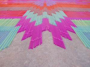
Then comes the question how to place the material. I think it is important to remember that the qualities of the material will decide a big part of how the pattern is going to look like. For example in Straw Carpet (2014) where the straight shape of the straws guides the pattern from the center and outwards.


straw 1

Straw Carpet, 2014

Straw Carpet, 2014


Carpet Carpet, 2015

Carpet Carpet, 2015


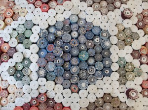
In one of their later works (Carpet Carpet, 2015) for the carpet factory Ege the group used leftovers from the factory itself. They collected 3500 cutoffs from actual carpets to create a carpet that covers the floor and one of the walls in the exhibition space.
What makes this piece interesting is that all these cutoffs come from different carpets, which makes each piece to stand out in colour.
After counting, sorting and measuring the pieces, the group could eventually find a way to puzzle them together by making a pattern, divided by white carpet rolls, to avoid getting a blurry mess of colours.


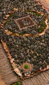
They also experimented with other materials, like in the piece Forest Carpet (2009), where they bring in materials from the nature into an exhibition space.  This is actually their first carpet together.

They also experimented with other materials, like in the piece Forest Carpet (2009), where they bring in materials from the nature into an exhibition space.
This is actually their first carpet together.


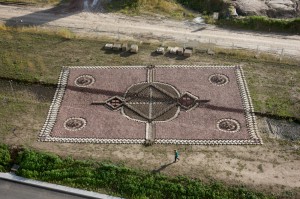
Their 6th carpet, Brick Carpet (2011), was made from 40 000 bricks and measured 42 x 70 meters.

Their 6th carpet, Brick Carpet (2011), was made from 40 000 bricks and measured 42 x 70 meters.


Connecting these objects even more is that they are so useless most of the time. They are at the bottom of our consumption list. For instance, we only buy paperclips because we might need a few of them, and we don’t even notice how beautiful they really can be.

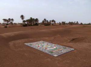
We Make Carpets really see the beauty in recycling, as shown in Bottle Carpet (2012), a project that appeared at Maroccos Taragalte Festival. The work is made entirely of empty plastic containers of various shapes and colours to comment on contemporary consumer aesthetics.


Bottle Carpet, 2012

Bottle Carpet, 2012

I find it really interesting that We Make Carpets are using different products/materials for nearly every carpet that they make, and yet they always end up with a great result. They seem to know what possibilities and limitations there is within each of the materials, and it makes me curious to study the material itself, since I think it’s obvious it can be of importance.

Though their systematic way of working, without manipulating the materials too much, does not fit me very well, I still like the idea to create new patterns like this and I would like to explore this method in my own way, to find out what I can learn from it.

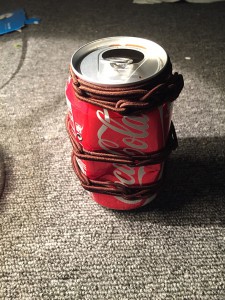
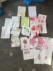
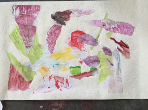
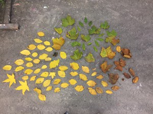
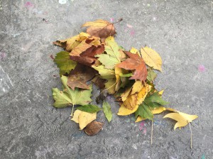
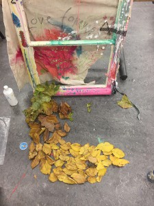
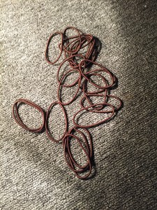
I made a few tests with leaves, painted A4-papers and rubber bands, to try and find out what unique characteristics they have.

gummigummi cola

papperpapper 2

After I spent a little time with these few products, by collecting, sorting and observing, I definitely got a better understanding of the importance in both quality and quantity of each material.

löv 2löv

löv 4

The leaves even ended up as an additional element for another of my projects.

There are big ambitions in We Make Carpets work and they seem to have an optimistic view on the future. There is some kind of sarcastic feel within the materials, and how they use them, that tells me there is hope that everything will be environmental friendly and people will be healthy, with no littering, and that this can only be reached if we really start to look and question those products that we as consumers are purchasing.

Bio Fashion Future Fashion


Tuesday, November 29, 2016


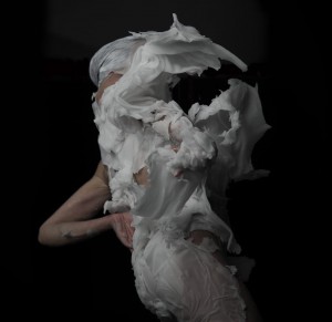
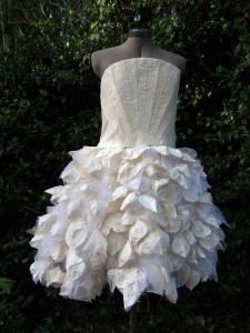
In ‘Dream Out Loud’ in Stedelijk Museum Amsterdam Bart Hess exhibited a range of wax molds, looking like dresses, that were made around a female model titled ‘Digital Artifacts’. His concept being that everyone can print their own reusable ‘second skin’, a garment fitted exactly to an individual body. If everyone would be able to print their own so called ‘personal uniform’ (a set of clothing that is to be worn daily) it would result in a decrease of the production process of garments in countries like China and Bangladesh, “saving” the people involved from their horrible working conditions. The problem here is that, for one, not many people own a 3D printer and that, in this time of resource scarceness, virgin material would still need to be used (for the making of 3D printers and for new printing material).

For an interview with Bart Hess about other works click here.

barthess  Digital Artefacts, Bart Hess_02CBs
‘Digital Artifacts’ by Bart Hess for the ‘Dream Out Loud’ exhibition in het Stedelijk Museum Amsterdam.

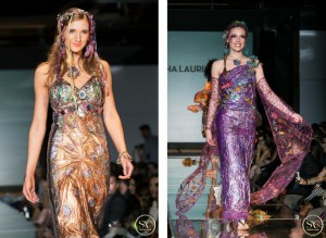
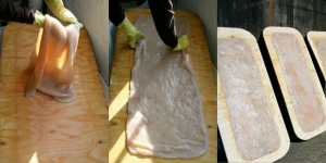
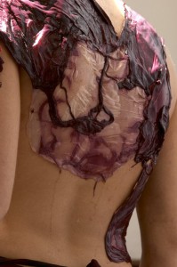
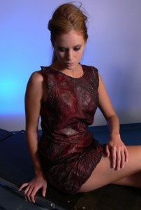
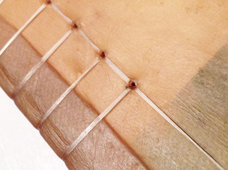
Although Bart Hess’ idea of the personal uniform is durable, the (re)printing of it is not. As a more eco-friendly alternative, new developments are arising in the world of textiles; bacterial fabric, which enables us to grow clothing from bacteria and fungi. Another name for it, founded by Sacha Laurin, is ‘Kombucha Couture‘, referring to the Kombucha fermented green tea that is used in the process. Kombucha mixed with sugar and SCOBY (Symbiotic Colony Of Bacteria and Yeast), left inside a container in a warm, dark room will feed the yeast and bacteria. This can be done by anyone from home (see the previous link). These will grow threads of cellulose, which will layer and eventually form a watery consistency which then needs to be dried out. What is left in the end is a fabric like structure and that can be sown into garments and jewellery. As shown below Sacha Laurin has mastered the element, making beautifully coloured, natural and durable garments.

For more information on biomaterial and a done home experiment see Jana’s blogpost titled Material Alchemy.

sachalaurinn  sachalaurin

Pieces of ‘Kombucha Couture’ by Sacha Laurin.

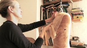
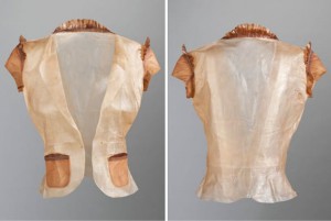
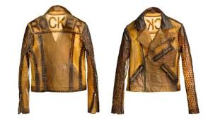
Suzanne Lee of BioCouture is another fashion designer who is working with bacterial fabrics. In various TED-talks she she explains her process and further developments she has made regarding the colouring of the fabric. She for instance found out that due to the matter’s high level of water absorbancy the bacterial fabric does not need more than one dip in indigo to make it blue, whereas cotton needs several, making it much more durable. It can also be coloured with natural materials such fruit and vegetable pulp, turmeric and others like metal (which will turn it black). Another thing is that if the fabric is placed around an object or body while it is still wet it will dry conform to the corresponding forms and shapes, creating a second skin.

bacterialfabricgrowth  biomaterial
Left: Growth of cellulose with Kombucha.
Right: Wet Kombucha cellulose left to dry.

maxresdefault  Biocouturegarment

Left: Suzanne Lee draping the wet Kombucha cellulose onto a mannequin.
Right: The dried garment made out of bacterial cellulose.

biocouture4

Biker jacket made out of Kombucha fabric and iron nails, which turns the material black naturally.

https://www.youtube.com/watch?v=UQBhwVD5rAE

Another way of using microbes to create fabric-like materials is the process of fermentation. This process is found in the making of wine and beer and it can be used to make biofabrics by letting the microbes grow a layer of cellulose on top of the wine or beer. This is part of the research that is being done for the ‘Bioalloy‘ project by of the University of Western Australia since 2005 until today.

Beer-Dress-dummy    wineDress41  wine-dress-3

Fermented dresses made out of beer (left); “The Beer Dress”, and wine (middle and right); “Micro’be by Donna Franklin and Gary Cass for Bioalloy.

The problem Bart Hess encountered in his search for a second skin can be solved with bio fabric. His problem being that none of the materials he tried (such as wax, latex and foam) would let the skin breathe enough for it to be bearable to wear for a long time. Coming from a breathing organism itself the bacterial fabric will let the skin breathe and will act in a more similar way than plastics and other synthetic materials will. This fact brings it closer to being a second skin. Besides, everyone growing their own clothes would be much more environmentally friendly than everyone printing their own clothes, which would mean that everyone would have to own a 3D printer. Firstly, because bacterial fabric is biodegradable waste material made by bacteria/fungi whereas plastics are not biodegradable. Secondly, because the 3D-printing would require the use of new materials and electricity, which bacterial fabric does not necessarily.

However, a big problem with bacterial fabric is that it is highly water absorbent. Once it comes in contact with rain or sweat the fabric will start to swell, making it unpleasantly slimy to carry on your body. More and more research is being done on the front of bacterial/fungal fabrics, by Stichting Mediamatic in Amsterdam for example (you can read their articles on fermented fashion and bio-couture). They have an aim to find consistencies that would be usable as textiles for fashion, it should not be too difficult or time-consuming to find a way to make bacterial fabric water resistant and/or repellent. All the research being done also means that the concept of everyone growing their own clothes is realizable in the not so distant future.

biofabricbiofabricc

Patterns made out of Kombucha fabric.

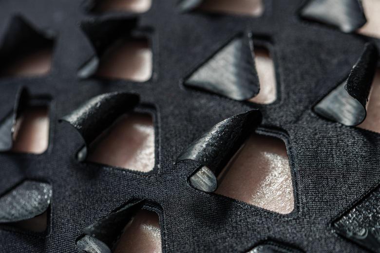
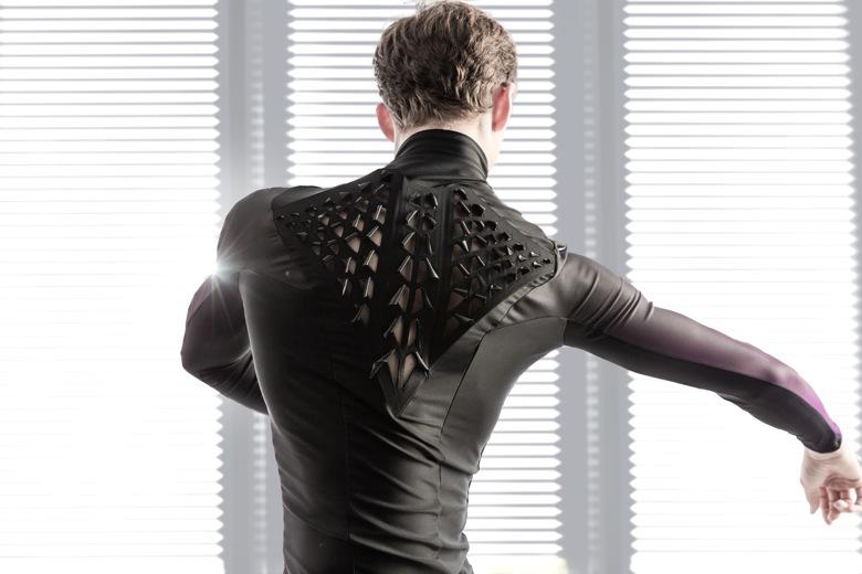
A different development by MIT (Massachusetts Institute of Technology) is the adaption of a Japanese cooking bacteria, the so called Baccilus Subtilis, to react in size to moisture and humidity levels. When they are sown into garments and strategically placed on the body in flaps they will open and close depending on the heat and amount of sweat the body radiates, allowing the skin to ventilate. This development comes one step closer to finding the second skin (and the personal uniform) that Bart Hess is looking for. It could provide us all with a personal uniform, starting a movement of slow fashion and fighting crises such as overproduction, environmental waste and resource scarceness.

second-skinsecond-skin-2

The bacterial flaps by MIT sown into a garment.

So, in conclusion, I will state that bio fashion, more specifically; bacterial fashion, is the future of all fashion. The production level of garments is higher than ever due to the speed in which trends nowadays come and go. At the same time, the earth’s resources are being drained and it’s surfaces polluted, human population is rising and life expectancy is increasing. As you can hopefully see, this is not a durable combination and something has to change in the way we produce and consume. Thus, we have to slow down the unsustainable rhythm of fast fashion that we are in and we can do that with the help of microorganisms, now.


Material Alchemy


Monday, November 28, 2016

Living in a time where we turn our resources into waste in high speed makes me very much wonder about the time where our planet’s virgin materials will be depleted. Our constantly growing world population leads to a growing demand for materials. Since materials are fundamental to everything we engage with, new ways of manufacturing them are needed.

Is there a way to turn all our waste back into resources?

Diving back into the mystical secrets of twelfth-century Alchemy led the Amsterdam based designer duo Studio Drift to a way of transforming our chemical waste into something new. By processing initially considered intractable chemical residual material, Studio Drift explores an entirely new way of gaining a material resembling to the volcanic glass Obsidian [x].

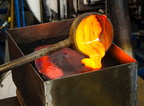
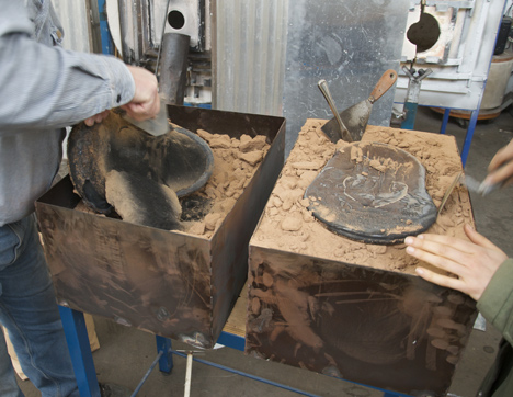
After a particular heating process, the glowing mixture can be poured into molds and the obtained outcome is a material with its very own unique characteristics. It sounds like metal, looks like glass and is heavy as a stone.
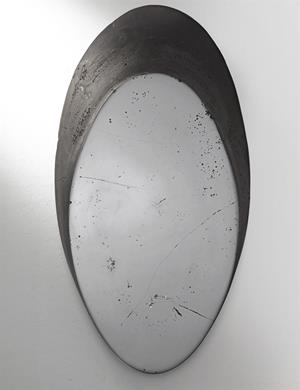
When I look in the polished black surface of this synthetic obsidian, my own effigy gets reflected by the waste.


The Obsidian Project made by Stuio Drift


But do we even need all those resources to produce materials we can only hardly recycle later?
While many designers are intently trying to close the cycle of production and recycling to support a circular economy, alternative ways of producing material without any need of resources are considered.

The current generation of designers, alchemists and scientists are crossing the boundaries to explore the unexplored and reshape the future by growing living organisms as materials.
Dealing with a lot of various materials in my every-days study awakes huge interest in the process of replacing toxic materials with long-term, sustainable material solutions.

Following the steps of designers and scientists I started to research about approaching materials in unconventional ways. With the advancements of synthetic biology a palette of futuristic ways to grow material by itself are evolved.
To gain a better understanding of the process and potential of these materials, I started a project of exploring one of those self growing organisms myself.
Inspired and fascinated by bio-materials that grow by themselves I decided to explore Mycelium, a material grown out of convenient Mushrooms such as Fungi.
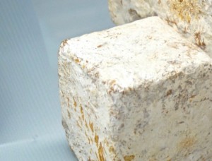
A small research led me to Mediamatic, where I met Wouter Hass, the expert mycologist and owner of the Amsterdam-based Mycophilia. With a lot of enthusiasm he gave me a closer insight in his work. In a mostly self-built laboratory he searches for the unexplored potential of Fungi. Not only as regards taste he admires the mushroom, he also grows big blocks of Bio-Material out of it, which can be used as isolation and packaging material and later be composted.

Mycelium_1100

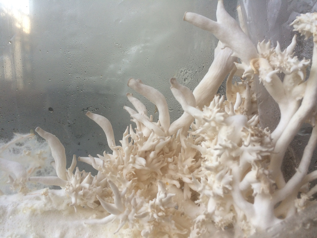
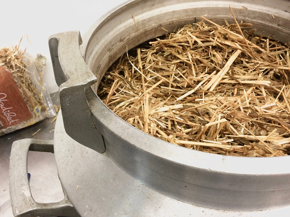
After our interesting conversation about the whole process, I could not wait to gave it a try myself. Following Wouters instructions, I sterilized straw by cooking and cultivated it with Fungi spores. Stored in a plastic bag in the dark, fruiting bodies constructed by white fungal network with reproductive structures are growing. These structures are called Mycelium. In the woods these strains transfer the nutrients, as well as they detoxificate dead plants.

Mycelium in straw_1100

After a few weeks it grew to a block which I now separated in pieces. These pieces I placed together with jute in a mold, made out of two buckets. Humidified and covered by a foil it is stored in the dark of my closet again. If everything works out well, the pieces will soon grow together and overgrow the jute.

After a process of fully drying the Bio-Material the potential of this organism seems to be endless. The Outcome is a light but strong material. Alternatively to letting Mycelium grow into its supposed shape, it can even be 3D printed. Its developments can be found in fields like fashion, design and architecture. It is used in form of a leather-like textile, furniture, packaging as well as construction material and many more as I saw at Dutch Design Week 2016. [x]

By further developments of Mycelium, many ecologically harmful materials could probably be replaced by a fully compostable product that merges science and nature.

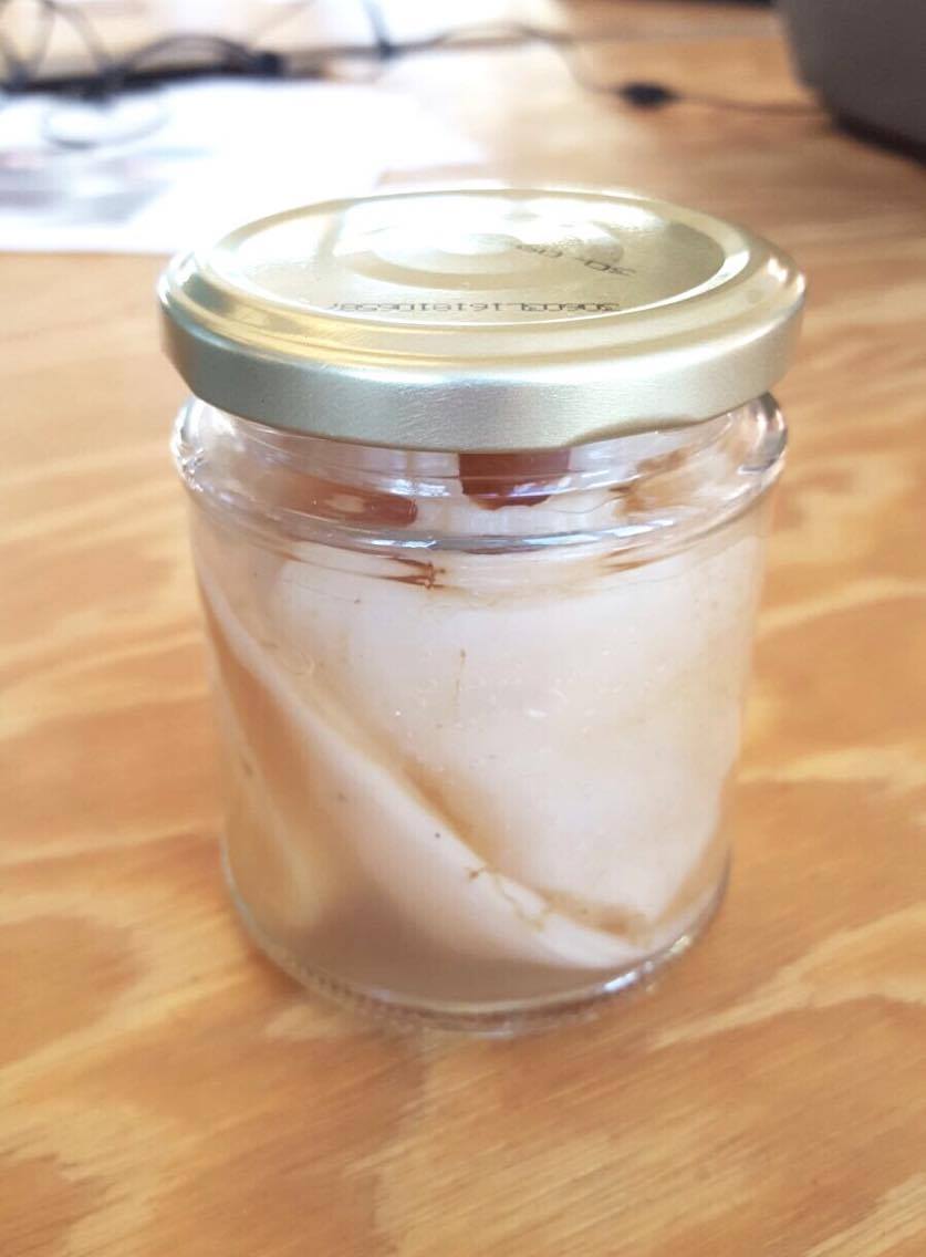
Another ongoing personal research of growing materials is about bacteria. By culturing the bacteria of Kombucha in sugared tea,  a healthy drink is made.Further than that it grows a slightly transparent surface. As soon as this surface reaches the desired thickness, it can be removed and dried to a skin-like material. An inspiring conversation at the pop up Pet-Shop [x] from Waag society made me curious to give it a try myself.

15515939_1303318213024749_1234556940_o 07ae5c6530a9461aad20c6b0c46b5644

Fashion designers such as Suzanne Lee [x] and Sacha Laurin [x] are important pioneers in growing clothes from bacteria. A closer look into the usage of grown textile is given  in the very interesting blogpost ‘Bio Fashion Future Fashion‘ by Alba. Considering one kilogram of cotton requires 23.000 l water and mostly grows in developing countries, Kombucha couture seems like a fundamental step into a more economical future to me.

The palette of possibilities of synthetic materials gained without using the world’s last resources is literally growing in many directions. Other impressive designers such as Laura Lynn Jansen & Thomas Vailly even found a way of growing Stoneware which can be seen here.

I consider those developments of biologically grown material as a good start to solve one of our biggest global issues and I am very curious about the first outcome of my own try outs which i want to keep updated here. Meanwhile Deezen has some really nice articles to read more about synthetic material.

De diepte van stadsbloem in stenen stad


Monday, November 28, 2016

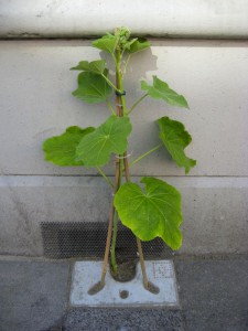
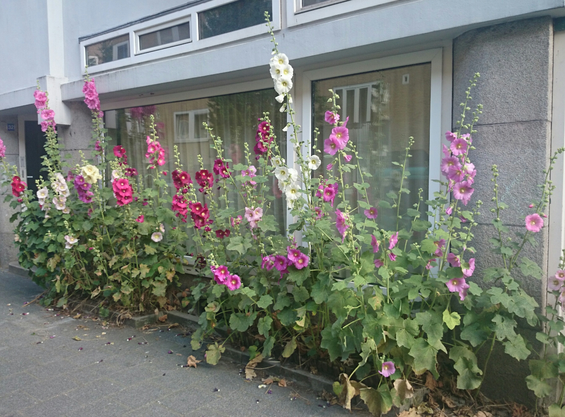
Lopende door de expositie Dream out Loud , in het Stedelijk museum, voel ik mij aan getrokken tot de stokroostegel van Patrick Kruithof, waarna een zoektocht volgt waar deze intuitive verbondenheid vandaan komt.

Stokroostegel_Plant_Bamboo

De eerste stappen in deze zoektocht leken mij duidelijk. Van wie is dit werk, wat en waarom, waren de eerste vragen die bij mij op kwamen. Deze werden al grotendeels beantwoord door de algemene informatie tekst naast het ontwerp. Patrick Kruithof is een ontwerper en kunstenaar gericht op het creëren van een duurzamen ervaring. Zijn projecten, ontwerpen en ideeën zijn makkelijk te realiseren in het dagelijks leven maar bieden op de lange termijn een plezierige exspansie op dit leven. Met zijn werken probeert hij dan ook een tegenhang te zijn voor de consumtiemaatschapij, waarbij juist de focus ligt op het korte gelukzaligheidsgevoel waarna weer een leegte ontstaat en men nieuwe impulsen opzoekt.

De stokroostegel is een ontwerp bedoeld voor de straten van voornamelijk Rotterdam. Deze stad staat bekend om zijn stenige uitstraling vanwege de vele nieuwbouw als gevolg van de bombardementen in de tweede wereld oorlog, het simpel aanbrengen van de stokroostegels zou de stad een groener en vrolijker aanzicht moeten geven. Daarnaast heeft de stokroos grote bladeren wat zeer  goed is voor het afvangen van CO2 en is het probleem van erosie bij het verwijderen van stoeptegels voor de groei van planten verholpen doordat er dankzij dit ontwerp zowel een tegel als plant aanwezig is. Hiermee is het ontwerp een groene en duurzamen innovatie. De tegel [x] is zo ontworpen dat de stokroos ondersteund word door twee toe te voegen (bamboe)stokken. Verder heeft de bloem niet veel nodig hij is namelijk zeer sterk en groeit zonder al te veel problemen, de stokroos is een mooi symbool voor de veerkracht van de Rotterdamse inwoners. Ook groeit de stokroos niet in de breedte maar in de hoogt dit is wederom een symbolische verwijzing, dit keer naar de skyline van Rotterdam.

a 2 rotterdam

a stokroos

Dit beantwoord echter nog niet de vraag waarom ik mij persoonlijk aangetrokken voel tot dit ontwerp, dus dook ik dieper in de materie.
Eén van de eerste verbanden die ik legde was met het boek ‘ Een nieuwe aarde’ van Eckhart Tolle. Tolle stelt namelijk dat de bloem, na miljoenen jaren van enkel groene begroeiing te hebben gekent, als verlichting van de plant zich aan de wereld toonde. Dit zou ook de reden zijn waarom de mens zich zo aangetrokken voelt tot deze schoonheid. De bloem is het venster op het vormloze, de voorbereiding voor een diepere verandering in het menselijk bewustzijn.

Vanuit dit startpunt ben ik verder gaan zoeken naar de betekenis van natuur voor de mens in de stad. Hierbij stuitte ik op verschillende onderzoeken die aantonen dat de aanwezigheid van natuur een grote invloed heeft op het brein.
Zo blijkt dat bepaalde centra in de hersenen die in verband staan met angstreacties en met het verwerken van emoties rondom beloning en straf bij stedelingen verhoogde activiteit vertonen wanneer zij worden blootgesteld aan kritiek. Dat het emotionele systeem van stedelingen anders werkt dan bij de mens op het plattenland is dus letterlijk zichtbaar in de hersenen. Wanneer deze sociale stress een chronisch karakter krijgt heeft dit invloed op zowel de psyche als lichamelijke gezondheid. Zo speelt stress een grote rol bij het ontstaan van burnout, depressie, angst en schizofrenie. Het lijkt dan ook logisch dat mensen  in een stedelijke omgeving meer last hebben van depressies en gevoeliger zijn voor stress en omgevingsprikkels.

Bomen en planten zorgen voor een verplaatsing van de aandacht in de hersenen van de stedeling. Waar waakzaamheid en gerichtheid op de visuele buitenwereld in de stad de boventoon voert zorgt natuur voor een focus op de binnenwereld meer reflectief en op jezelf georiënteerd zijn, ofwel het nu ervaren. Stad en natuur doen dus een verschillend beroep op deze twee vormen van aandacht. Gebleken is dat de mogelijkheid te reflecteren een sleutelrol heeft in het omgaan met stress. En dus heeft de aandacht die ontstaat in de natuur  een positief effect op de omgang met kenmerkende problemen van de stedeling.

Om hierop in te spelen zijn er al verschillende vormen van psychische hulp gebaseert op dit gegeven, zo bestaat er tuin- en natuurtherapy.
De drempel om positieve effecten van de natuur te ervaren is namelijk verassend laag. Zelfs een natuurfoto of -film vergemakkelijkt het al om met stresvolle ervaringen om te gaan. De aanwezigheid van een bloem in het straatbeeld heeft dus ook invloed op onze psychische welgesteldheid.

bos

En daar ontstaat een interessant draagvlak in mijn zoektocht.
Om meer te weten te komen over hoe Patrick Kruithof dit soort diepere filosofie betrekt in zijn werk zoem ik in op een ander project van hem.
Lange tijd heeft hij zich bezig gehouden met het onderwerp ‘het nu’. Dit project bestaat uit een onderzoek over het nu en visualiseert zich in een verzameling quots. Met het uitgangspunt dat ‘het nu’ veel te bieden heeft,  maar de mens hier vaak te weinig vanaf weet en voornamelijk in het verleden of de toekomst leeft. Het doel is dat deze studie Patrick zelf en de aanschouwd zal leren over het belang van leven in ‘het nu’.

The Moment Quotes ?@themomentquotes · 2 mei 2011
“There is only one #moment for us to live, and that is the present #moment.” (Thich Nhat Hanh)

En daar ligt het verband met mijn intuitive verbondenheid tot het ontwerp van Patrick Kruithof. Zijn werk, waaronder de stokroostegel, spreekt voor mij over een diepere filosofische beweging; het proces van bewustwording.
Het proces waar ik op dit moment sterk mee bezig ben.

Here comes the future. Circumventive organs, bioprinting and bioart


Monday, November 28, 2016

Some works initially aim to touch your feelings and to change your carefully complied seeing of life. They can cause a whole pattern of various emotions from the complete abhorrence to inexpressible delight. I walked through the halls of the “Dream out Load” exhibition and noticed a small group of people gathered around something that seemed to be very interesting. “That’s gross!” – Somebody exclaimed but continued starring at the subject of interest. I love gross and in a second I found myself looking at the “Circumventive organs” by Agi Haines and a short footage about implanting the organs inside the artificial (I hope so?) human body. From that moment I would start calling her “a mad scientist” of the design. What she designs is not posters, not buildings and even not that fancy clothing you are wearing. The subject of her focus is mainly a human body and organs.

Electrostabilis Cardium by Agi Haines on vimeo

With the introduction of bioprinting the possibility of new organs is becoming a reality. The ability to replicate and print cells in complex structures could mean different cells with various functions could be put together in new ways to create new organs we would take millions of years to evolve naturally. Frankenstein-esque hybrid organs could then be put together using cells from different body parts or even different species.

This short film envisions the surgical procedure designed for the fitting of Electrostabilis Cardium, a defibrillating organ using parts from an electric eel that can discharge to release an electric current to the heart when it recognizes it going into fibrillation (heart attack).

Alongside the film are other ‘Circumventive Organ’ designs including Tremomucosa Expulsum an organ that uses rattlesnake muscles to release mucus from the respiratory system of a person who suffers from cystic fibrosis and dispel it through the stomach, as well as Cerebrothrombal Dilutus which contains cells from the salivary gland of a leech and releases an anticoagulant when it feels the pressure of a potential blood clot in the brain as a way of avoiding a stroke.

Agi Haines’ mind-bending, hyper-real sculptures function in an epistemological limbo, existing somewhere between art & science, technology and ethics, and present and future. Haines creates pieces that are uncanny, transgressive, and sometimes conflicting, stunning in their insight and repulsive in their execution. Her near-future world is one in which rattlesnake muscles can be 3D-printed, inserted into the human body and used to combat cystic fibrosis.
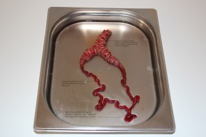
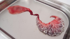
image815-02926-532-Electrostabilis-Cardium.jpg-490122_1_1

I chose Agi’s work as a main topic of my research because bioprinting and bioart is something that intrigues me a lot. Though I was never familiar with bioprinting, I was always interested in this incredible and magical world of the body and it’s insides, how it lives, transformes, reacts and evolves.  I am fascinated by the possibilities of 3D bioprinting and how it can affect the evolution process. My belief is that the future of design lays in more extensive work with human body as a material and If I will be given a chance to take part in the process of organ designing, I would be glad to create something useless and provocative. In the interview Agi explains how the organ printing works: living cells mixed into cell-friendly material, such as collagen, that will make a scaffolding for cells to grow on. Then the organ is being printed layer by layer, just the same as an ordinary 3D printer works.

The ability to replicate and print cells in complex structures could mean different cells with various functions could be put together in new ways to create new organs we would take millions of years to evolve naturally. Haines envisions what it would be like to not only replicate existing human organs, but also produce newly designed, improved organs for implantation as (curative) therapy for chronic diseases and defects. In the same way, animal cells with useful properties might even be employed to create organs with entirely new properties. An organ that incorporates eel cells could conceivably function as a natural defibrillator, delivering a resuscitating electric shock in case of cardiac arrest.
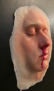
"If you prick us do we not bleed" work by Agi Haines

If you prick us do we not bleed" work by Agi Haines

… can we consider bioprinting as an art form?

I keep on asking myself this question, because the border between biology, genetic engineering and art rapidly disappears, or, more likely, has already disappeared. Tissues, organisms, organs and bacteria became a media to create works of art. They have been used in the same way as one artist would use the paintbrushes or the materials from the Rieveld’s trashcans.

Even before the bioprinting, American artist Eduardo Kac established the name “Bioart” for his works. Kac considers himself a “transgenic artist,” or “bio artist,” using biotechnology and genetics to create provocative works that concomitantly explore scientific techniques and critique them. In 1998 he comes up with his work “Genesis” that explores the intricate relationship between biology, belief systems, information technology, dialogical interaction, ethics, and the Internet. The key element of the work is an “artist’s gene”, i.e., a synthetic gene that he invented and that does not exist in nature.
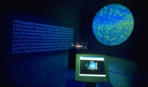
"Genesis" by Eduardo Kac

Another project of Eduardo Kac was famous glowing rabbit called Alba. By injection of green fluorescent protein (GFP) of a Pacific Northwest jellyfish into the fertilized egg of an albino rabbit he creates the bunny that can glow green when illuminated with the correct light.
“GFP Bunny” has raised many ethical questions and sparked an international controversy about whether Alba should be considered art at all. “Transgenic art brings out a debate on important social issues surrounding genetics that are affecting and will affect everyone’s lives decades to come,” Kac is quoted as saying.
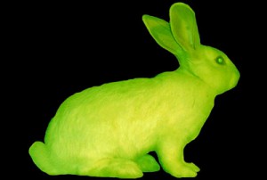
'Alba' glowing in the dark bunny, by Eduardo Kac

'Alba' glowing in the dark bunny, by Eduardo Kac

Faced with some operations our aesthetic but also ethics sense is often put in a critical position. We are forced to redefine the border between animate and inanimate world and our definitions of subject and object. Indeed, when the symbolic and material boundaries of humans opened to technology, some considered it as hospitable, however many found it offensive or even dangerous. One of the main concerns about bioart is that people view it as an unnecessary use of living organisms. While the use of living organisms is often tolerated because they are used for research and thus improving the quality of peoples’ lives, bioart is often criticized as an uncalled-for practice because of the role of aesthetics in the artworks. In addition, bioart creates uncertainties among the public because bioart projects such as eugenics are undertaken by artists and not researchers. Nevertheless it is important to bear in mind that (bio)artists also need to do research prior to conducting their experiment or artwork.

Coming back to bioprinting as an art form, I would also like to mention the Dutch artist Diemut Strebe and her 3D printed Van Gogh’s ear. She created the replica ear using living cells from van Gogh’s great-great-grandson. The ear itself is made from actual living tissue and was 3D printed into a shape resembling van Gogh’s left ear. The ear is currently being displayed in a German museum and is suspended in a clear display case full of a nourishing liquid that is expected to keep it viable for many years. The artist has also added a microphone to her installation so you can actually speak to the replica of Vincent van Gogh’s severed ear [x].
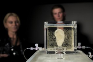
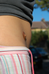
'Sugababe' by Diemut Strebe

"Sugababe" by Diemut Strebe • "Body Modification for Love" by Michiko Nitta

Another artist, who is trying to make our life more interesting, bypassing the ethic issue, is Michiko Nitta and one of her works – Body Modification for Love. It is an idea which could be developed in the future – a technique for genetically growing selected parts of another person on another person’s skin. What Nitta is proposing is for example a nipple of ex-girlfriend or a mole of ex-boyfriend. Patch of living hair would be also possible to grow on somebody’s else arm. It is supposed to be a new form of tattoo as Nitta says. Parents are always upset when their kid makes his first tatoo. How upset they are going to be now, when their beloved one would come up with a nipples on his forearm?

The options are endless and there are a lot more projects, researches and artists I could also mentioned here. There are a lot of things to discover yet and who knows – maybe in the nearest future our bodies would be modified and consist of artificial organs? Not the best scenario, to be honest..
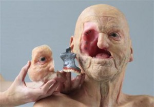
3d-printing

This research project is based on the "Dreaming Out Load" design exhibition curated by the Stedelijk Museum Amsterdam
CREATING WORLDS


Sunday, November 27, 2016

.. Those kinds of worlds that swallow you whole, the worlds where time stand still and you forget your body. It doesn’t have to be an intellectual or logic world. The worlds you discover in your childhood was often better – more fantastic. Maybe because children’s mind are not so constricted. I loved to emerge myself in books and movies. Now in our world of massive possibilities of streaming we have a free choice of worlds. Who doesn’t love Game of Thrones? I might be a bit more into those kind of worlds than the average, so I was really pleased to find another little world in Clair Verkoyens works. I saw a design work of hers in the exhibition “Dream out loud” at the Stedelijk Museum. Three ceramic bowls with three-dimensional worlds added on. The idea of creating new worlds are an interesting possibility that, for me at least, feels like the work leaves the idea of design and move towards something that looks more like an art concept.

clairV
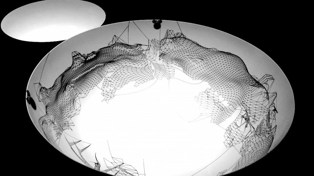
She uses a generic 3D software program to make the animated landscapes and the little creatures “making” it. She is creating the landscapes with shapes and then deleting the solid part so only the lines are left. The landscapes on the bowls exhibited at the Stedelijk Museum are made with a collage technic, where Clair Verkoyen samples and merges her 3D animation together and make the universe.

As to the question why does this little universe belong on ceramics the answer is, that it maybe does not? It seems nevertheless that it has been a natural process of her design career to this point, working first with 2D, then 3D and shifting from photoshop to 3D animation. In connection to Clair Verkoyen’s work the Stedelijk Museum presents, as exhibition text, the history of the Dutch tradition of importing ceramics from China. And it is true that Clair Verkoyen bought the ceramics in China but it was more because of fascination of material rather than a nod to history.
I have seen more post-internet art works around for the last couple of years, and for me Clair Verkoyen has used some of the same technics of working – creating worlds – (besides the obvious: that the work made by/on the computer program). Why does post-internet artist make utopian worlds? I have seen a work by Cécile B. Evans named “What the heart wants”. It is an animation about the connection between human and technology. Her world is set in a futuristic, sterile and a bit barren world where human and technology has merge so much that it is hard to find out what is what.

Ed Atkins work has esthetically similarities to Cécile B. Evans’s work because the formal presentation (screens/projection) and something else I can’t put my finger on. I perceive Ed Atkins animation works differently, he creates a narrative or a statement and the world he creates somehow implied. And that is the thing about making animation, it has to be created from a blank screen. Because of the digital medium these artists uses it to open up a new platform to show there art. Serpentine Galleries has a website connected too their gallery this opens up fore another art form ‘Net Art’.
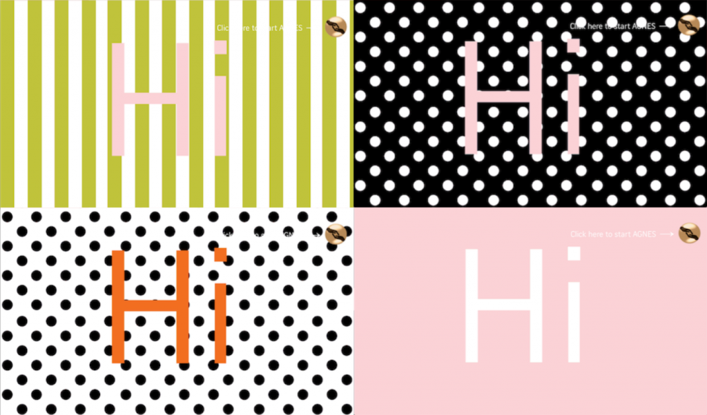
The differences between ‘Post-Internet Art'[x] and ‘Net Art'[x], is that in Postinternet it is able to be both online and offline. Where ‘Net Art’ only exists online. In the depth of the internet you can be friends with AGNES at the interactive part of the webpage of Serpentine Galleries.

agnes

AGNES is made by Cécile B. Evans. I have visited AGNES several times during this writing assignment and mostly she follows a pattern but one time she encouraged me to think about the idea of herself and showed me a place where I could learn to write HTML code.

Cécile B. Evans seems captivated by the though of involving others in process of her work. At the exhibition “What the heart wants” Cécile B. Evans had created a part named: “Working On What the Heart Wants”.  Here she shows how the animation/movie was made through chatroom bits, pieces and conversations between her and her programmer. Somehow it a very natural nextstep because all of us have a computer so in principal we can all make our own world and what is more important is that everybody can access it. Public art on the internet makes the definition of art even wider. And raises the question: Can the game SIM’s (as an example) be art? It’s interactive like AGNES and it is a world where you create houses and relationships.

All this research made me realize that the worlds created by Clair Verkoyen, Cécile B. Evans and Ed Adkins in whatever medium they work in are very complex and speaks to the observers fantasy. Nothing is given and more observations opens up new layers of experiences. I love being emerged into those kinds of worlds I find in art, literature and movies.
Being able to make worlds is a specific kind of magic.

Hella Jongerius and the in-between-state of Design.


Sunday, November 27, 2016

Within a era where design industry has been mostly focusing on how-to-reach at quickest the largest market possible by basically allowing marketing and communication departments to take the lead and most companies are sales-increasing-oriented, there’s a figure I’ve been admiring a lot for a certain capability to break this kind of mechanisms. Dutch designer Hella Jongerius has been an attentive observer of the industrial production process and its weaknesses and I could think of her as a designer capable to give the design industry a remarkable, somehow playful response.

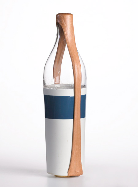
Chicle Project, material experiment for The Nature Conservancy, 2009


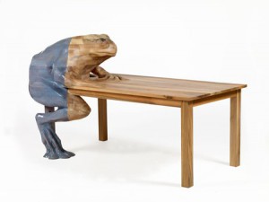
By having a broad look here and there to her work, I could figure out that the strength of her designs lies in their between-state for both caring about details and imperfections and still being able to fit into an industrial production rhythm. In her work I see some sort of generosity which looks up back to the past (not just to appropriate herself – as most designers nowadays would do – of principles such as authenticity and sustainability) by giving it a further value as a result of her never-ending research around life and ”afterlife” of objects. What strikes me about Jongerius’ design approach is that she pushes design to an almost imperceptible limit which oscillates towards an artistic process. Hers seems to me closer to an art-related way of processing research, brain storming, sketching ideas and projects themselves starting as sketches, always caring about some imperfection which can emerge through unexpectedly magic come outs. This is at least what it means dealing with handicrafts. Something that she has discovered already in the 90s when giving the design industry imperfection as an answer. Concerning to Jongerius, design should firstly be communicative. This is what design is about. Its function lies mainly in its communicative power which can be measured at different levels of meaning.  Even ugliness can be very a strong means of communication. Since handicrafts primarily deal with the impossibility to produce perfect finished products, she has considered it as her own vehicle to face the anonymous perfection that industry has been producing for more than a century. In most of her works, she is been playing with the imagination of the user, by creating fore ex. a ”frog table” which is basically a frog seating at the table itself and a question which comes along with that is: why do we need imagination for (a specific) utility? isn’t use already enough?


Frog Table [Natura Design Magistra] 2009

According to the Dutch designer, there is a persistent prejudice concerning the essential difference, drastic separation between designs that are made to be purely functional and expressive designs which are able to tell stories which go beyond themselves as objects.

Once again the function of design has assumed new meanings and contents. It cannot be formulated strictly depending on terms of use or comfort.
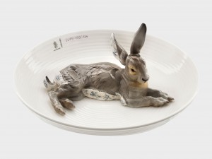
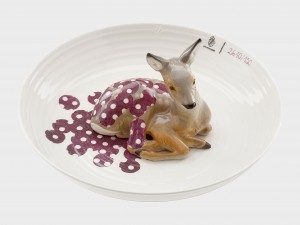
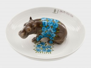
Sometimes the core signifier of design can actually be its paradoxical non-functionality > animal bowls < a project started in 2004 for which Jongerius is been selecting different pieces ouf of the Porcelain Manufacturer Collection of Nymphenburg – as a celebration of age-old crafts and treasures found within the Nymphenburg archive, in Germany.


Bowl with hare / Bowl with fawn / Bowl with hippopotamus

Some other aspects that I really appreciate about Hella Jongerius’ work are the experimentation with the more diverse materials and her deep passion for colours I feel somehow very close to.

In 2009 she’s been leading a project for The Nature Conservancy [x]. In this particular project Jongerius is been experimenting with the natural material of chicle, derived from the rain forests of Mexico. The project itself consisted of a group of internationally renowned designers who have been participating, initiated by the American Nature Conservancy, an organization which strives to protect sustainable materials for use in contemporary art, design and architecture. The results of the project were shown for the first time at the Cooper-Hewitt National Design Museum in New York.

Chicle project [x]


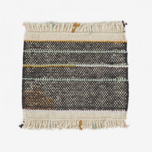
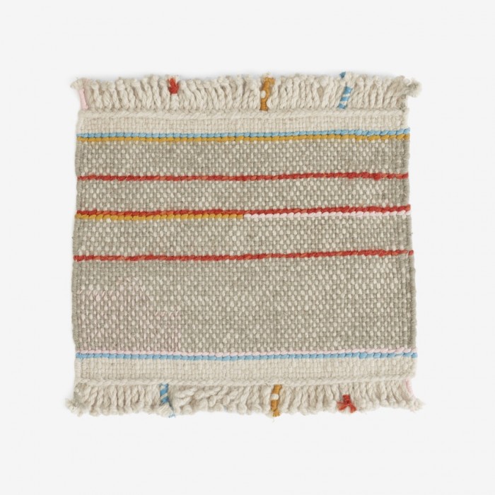
Argali Rugs, 2015

For this project Jongerius has created – within a palette of six colours typical of Nepalese yarns – Kilim rugs which have been hand woven from special Tibetan wool from Argali – a wild sheep breed that resides in the Himalayan mountains. The yarns themselves have been hand spun by local weavers, and their naturally faded colours and irregular character lend each rug a truly individual appeal. Each rug incorporates several design details, including a hand-embroidered area with silk yarn – a reference to an old tradition of repairing the rugs. The fringes are braided, a practice that also refers to an old custom in Nepal – this for its decorative appeal.


argalic0231©danskina

Argali for Danskina [x]


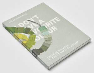
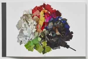
There are some many things which should be told about Hella Jongerius, that comes almost difficult to make a choice ouf of the huge amount of her research. Jongerius has been the Art Director for colours and materials at Vitra for many years, during which she has developed Vitra Colour & Material Library together with a quite recent book ‘I don’t have a favourite colour’ which basically refers to the establishment and +further development of an intelligent system of colours’, materials and textiles that make it easy to create inspiring environments in offices, homes and public spaces. It is definitely an interesting book since the Dutch designer has been illustrating her method of research and the application of its results to the Vitra product portfolio.


'I don't have a favourite colour' [x]


Jongerius way of dealing with the design experience is very fascinating for me since I’ve always felt quite far away from the design process, very related to super appealing – almost perfectly finished products.
Her installation/selection within the textile archive of KLM company for Dream Out Loud exhibition at the Stedelijk has been so inspiring for me. It confirmed me further my pre-existing love for textile matter. It immediately brought me to a sort of aesthetics that I personally feel pretty much related to. By reading part of her book Misfit and her .Manifesto. Beyond The New written together with Louise Schouwenberg so many exciting questions came up – concerning the contemporary era – where are we going to? design/art? this over exploited back to the roots feeling and the over flooded quantity of emerging designers. What can design add to the world of plenty? and What is functionality in the here and now?


Techno Beauty


Sunday, November 27, 2016

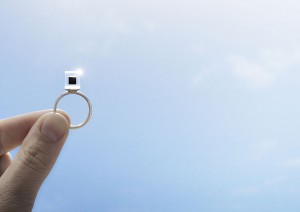
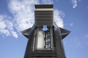
We humans have created technologies and machines to enhance our lives, we invented cars to liberate ourselves, built all kinds of factories to raise efficiency, but now these innovations are striking back, making the environment extremely polluted in high-density cities; some visible, while others may be invisible, but still left the real impact on our daily life and health. Think about donating 50 euro to get a Smog Free Ring[x], which contains smog filtered from 1000 m3 of air, in order to support the Smog Free Tower and Smog Free Project by Studio Roosegaarde.
Will this make a real contribution to solve the problem of pollution? By purchasing a Smog Free Cube, Ring, or Cufflink, are you purchasing a souvenir, a design or are you building your association with the Smog Free Project, the anti pollution movement?

Smog_Free_Ring2324-7394-image
Daan Roosegaard’s Smog Free Ring • Smog filter in Bejing

Our technical interaction with artworks has only developed within the last decade at the level of using touch screen to improve the understanding of drawings, but now in the art and design world, both these two elements have been introduced to the real application domain.

3 Dune by Daan Roosegaarde, Photo Tomek Whitfield_originalFigure-1-X-Ray-Examination
Daan Roosegaard’s public interactive landscape Dune (2006-2012) • John Constable: The Great Landscapes” 2006


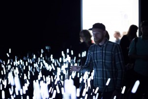
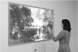
To gain a better understanding of this change, we can look at Daan Roosegaard’s public interactive landscape Dune[x] (2006-2012) which interacts with human behavior, and the Tate Britain exhibition “John Constable: The Great Landscapes[x]” in 2006. The Great Landscape used X-Ray examination and Drawing screen to help the visitors to obtain an understanding of Constable’s working practice and techniques through body movements in front of the X-Ray projection and figure movements on the touch screen (Engaging Constable: Revealing Art with New Technology), while  Dune served itself, stood for a hybrid of nature and technology, artwork and the way to present the artwork. It is composed of large amounts of fibers that brighten and made sounds according to the sound and motions of visitors. Both enhanced social interactions with the help of sense-based technologies and being recorded with cameras and microphones in order to study and analyze people’s interactions, Dune and The Great Landscape had quite different starting points.

The visual impact of the eyes decrease as the other senses are heightened due to the introduction of tactility and sound, thus the aesthetic value is no longer of primary importance and the design opens up a broader spectrum of uses and practicality. This also explains Daan Roosegaard’s later works, how he uses modern technology to deal with multiple subjects; such as the relationship between intimacy and body (high-tech fashion project Intimacy[x], 2010), the historical heritage and sustainable idea (Van Gogh Path[x] [x], 2014), the power and poetry of living with water in Netherlands (Waterlicht[x], 2015 and Icoon Afsuiltdijk[x]).

The modern presentations of art and design in museums and galleries provide personal and collaborative experiences as The Great Landscape did, but Roosegaarde’s tactile high-tech environments enable the viewer and space to become one, not only because it can encourage more people to interact with each other and the environment simultaneously, but also because the technology leads the viewers to become both users and performers, thus the art raises people’s awareness of public issues.

Concerning its unique background associated with environment protection and sustainable development, the Smog Free Ring distances itself completely from traditional souvenirs in a museum and the association created by purchasing it, just as putting yourself in the Dune and reacting with it stands apart from the traditional way to appreciate an artwork. But is this different to other design works which also aim to serve a better life?
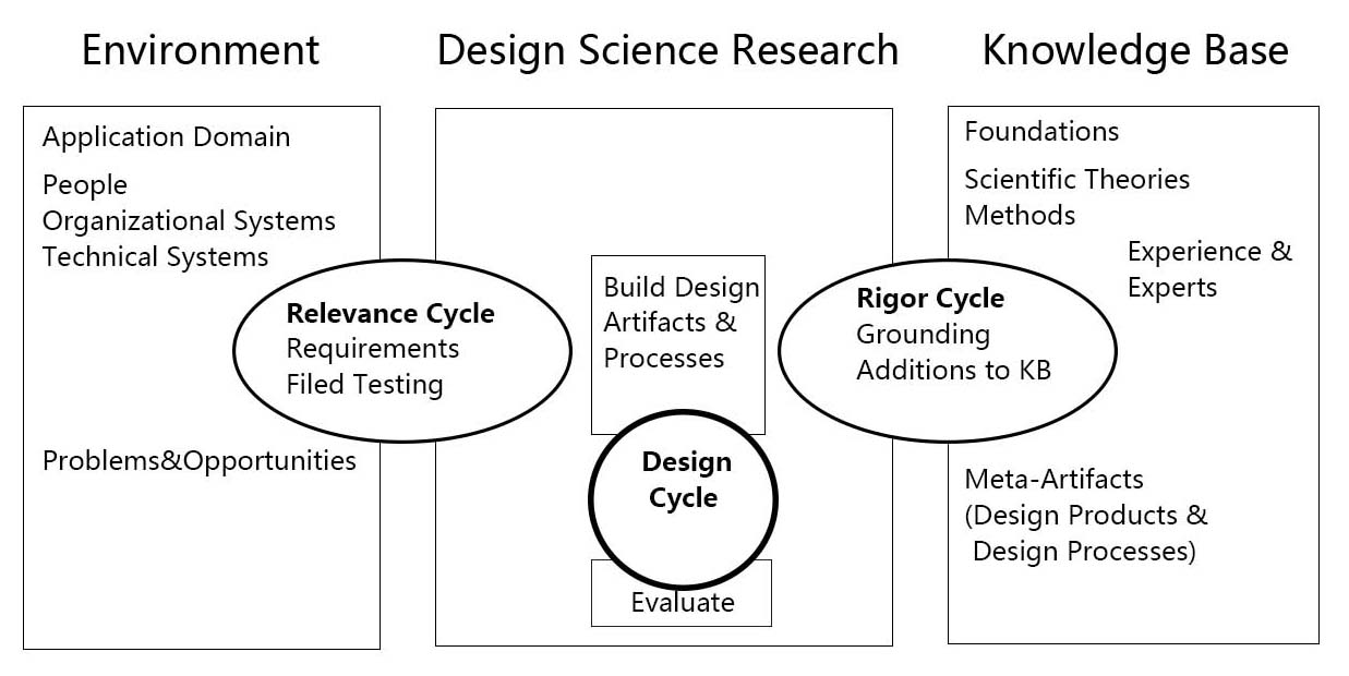
As science and technology are an essential part of his work, I want to introduce the Three Cycle Review of Design Science Research from Alan R.Hevner’s “A Three Cycle View of Design Science Research”.

design-cicles

A Three Cycle View of Design Science Research [download as pdf]


Design Science Research is motivated by the desire to improve the environment by introducing new and innovative artifacts and processes. The Three Cycle Review of Design Science Research consists of Relevance Cycle, Design Cycle and Rigor Cycle. Good Design Science Research often starts by identifying problems in an actual application environment or recognizing the potential to improve a practice before a new problem occurs. When applied to the Smog Free Tower, people’s neglect towards air pollution interested Daan to think about building the largest purifier in order to solve the problem. In the Relevance Cycle, the air-polluted environment is not only where the problem is found, but also a testing field in order to see if the design results meet the criteria. Then, they moved to Rigor Cycle and the knowledge base and found the existing air purification technology which is used in the hospital. Following the search for technology, they moved to the internal Design Cycle, and built the Smog Free Tower based on the original issue found in the environment and the technology found in the knowledge base. While the artifact is being built, field testings are input from the relevance Cycle and the design and evaluation methods to Relevance Cycle and Rigor Cycle. After several rounds of improvement, The Smog Free Tower and The Smog Free Ring, which contained both technology and beauty were born.

To give a brief conclusion, pragmatic science, interaction between human, responsibility for the living environment and beauty are core components in Daan Roosegaard’s works and in the future world of art and design. But not only the world of art and design, or let’s say, since art and design has gradually found their new position in 21th Century, they will no long serve aesthetics as the core matter. Techno Beauty, as how Daan Roosegaard described his own works, may becomes a direction in design to beautify and save the world.


Can high-end designs have any social significance?


Sunday, November 27, 2016

On first sight I loved Formafantasma’s designs, they held a certain elegance and beauty in their simplicity, the back to basics materials, gathered from the natural world juxtapose themselves, feeling both strong and delicate at the same time. It brought out my childhood fascination, I recalled scavenging for treasures on the British beaches of my childhood and taking them home to make new creations or to merely bring a glimpse of the natural world into my home in the dense, man-made city. These designers took this fascination, a primal human action of scavenging/collecting to an industrial level, contemplating the natural world by sampling, casting, weaving, reshaping their materials, making connections between unlikely materials to form a delicate balance between the rough and smooth, fragile and strong.

Formafantasma -Craftica
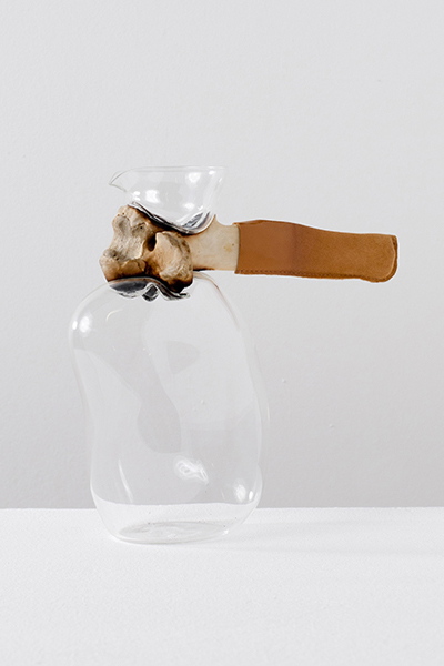
Bone Jug, 2012 (Cowbone, leather, mouth blown glass) from Craftica series

Their work is fascinating also because of the delicacy with which they deal with their subject matter, not only with the physical properties of the materials but the symbolic and historical meaning. Their project Craftica for instance is an investigation into leather, highlighting our ancient roots of hunting for food, tools and body protection. They channel prehistoric tools, durable tools for survival made of bone and stone, combining the simplicity of these ancient tools into a modern aesthetic.

Tools of bone were originally a practical use of materials but are now becoming a design statement, a hark back to our ancestral heritage, a sign of simpler times within a society too lazy to source sustainable, durable materials, instead opting for the cheap, easy version –mass produced materials with processes which are quickly damaging our environment.

formafantasma_craftica_6 formafantasma_craftica_14
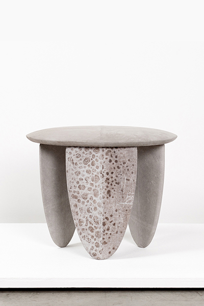
Wolffish stool, 2012 (Wood, vegetal tanned wolffish leather)
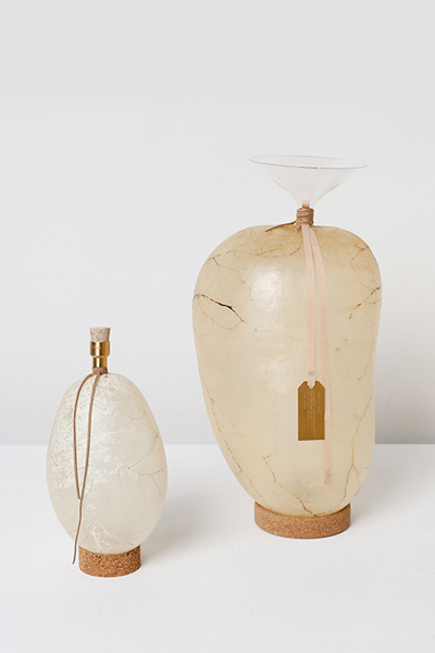
Bladders water containers, 2012 (Pig and cow bladders, brass, mouth blown glass, cork)
from Craftica series

It is designers such as Formafantasma who are questioning this use of cheap, destructive materials, replacing them with more sustainable/unique alternatives. With each piece you can see where the materials came from and you question the story behind each material; the fish skin leather –a by-product of the fish food industry, in Alaska alone there are 2 billion pounds of fish by-products every year including fish skins which are often dumped into landfill or back into the ocean, left to pollute the water and kill off species’ (x article on an Alaskan start-up using salmon skin leather), or the cork leather –by harvesting the species of oak tree, Quercus Suber of their bark to form cork every 9 years rather than harming the trees it helps them live longer. Therefore, these designs are refreshing in a society where we don’t know where so many of our products come from.

However all of this comes at a price, an unlabelled price, a sale inquiry at a high-end gallery. Does this step into the elite then diminish the beauty or sustainability of these objects? These products, inspired by those that were once precious items necessary for survival then become an expensive showpiece. The matters of sustainability aren’t so important, it then becomes about the recognition and the money. Is it enough that they are potentially inspiring a next generation of designers, or inspiring the people that visit the Stedelijk museum to think more about where their everyday products come from? This engagement with the issue of the way we deal with our resources engages the viewer but it doesn’t solve the problem, instead it benefits the designer, giving them the recognition of being a sustainable designer making unique products.

So, are there sustainable, affordable designers out there who are actually impacting the way we live? Of course there are many design companies trying to come up with solutions to these problems, a good example is material science company, Evocative who have developed Mushroom Materials, a sustainable building material made from agricultural byproducts and mushroom Mycelium; these provide a natural alternative to common synthetic packaging and the company have experimented with using this as both packaging and a material for product design, producing stools and tables, as well as offering an affordable DIY pack. This opens up a way of buying products that are good for our environment, in addition to encouraging people to make their own products. A number of different designers have experimented with Mushroom Materials, for example architectural studio The Living built an organic tower Hy-Fi for the annual MoMA temporary structure, a biodegradable material was therefore perfect for the temporary building. By creating this innovative material Evocative have opened a door to a new future material that could replace the depleting materials that are destroying our environment.

giy-bag_1024x1024Hy-Fi-by-The-Living_dezeen_784_0

Grow It Yourself, Mushroom Material from Evocative $10
Hy-Fi, 2014 The Living Pavilion made with Mushroom Material

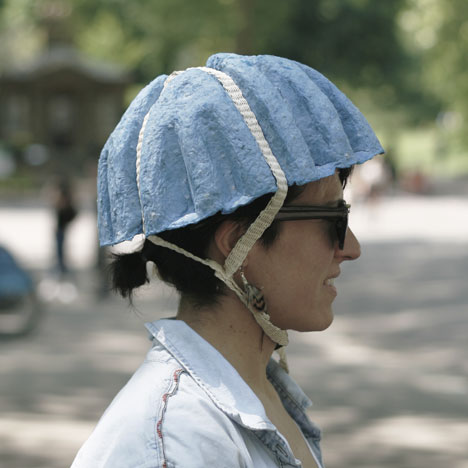
Another example of innovative sustainable design is the Paper Pulp Helmet designed by Tom Gottelier, Bobby Petersen and Ed Thomas, who made use of the many discarded newspapers around London’s transport system and recycled these to form helmets which would potentially cost £1, thus a low-cost environmentally-friendly solution to bike safety in the city. The design was just a prototype but the cheap and recyclable material/process is a perfect example of the future direction of design we need to take in order to preserve the planet.

dezeen_Paper-Pulp-Helmet-by-Tom-Gottelier-Bobby-Petersen-and-Ed-Thomas_1

Paper Pulp Helmet, 2013 Tom Gottelier, Bobby Petersen and Ed Thomas

In my research I found it very difficult to find these examples, searching for ‘sustainable product design’ offers a lot of high-end designers with very expensive products or similarly to Formafantasma prices aren’t shown and they are presented in galleries more as a work of art than a sustainable design, therefore they aren’t presenting an immediate solution.

Perhaps we need government schemes to encourage designers/bigger companies to use better materials and to sell these products at affordable prices so they can compete with the mass-produced products that are often badly made and harmful to the environment. In recent years we have seen many countries across the world introduce a charge for plastic bags in supermarkets. This due to the fact that around 8m tonnes of plastic makes its way into the world’s oceans each year, posing a serious threat to the marine environment. The charge was introduced by the government to try to influence consumer behavior and the result is massively affecting the amount of plastic waste, in England the number of single-use plastic bags was reduced by 85% over the first six months. If governments enforced similar rules on other products; introducing taxes to products with harmful materials then perhaps it could influence consumers to opt for better sourced products.

We, as consumers have brought about this problem, being so materialistic yet simultaneously too lazy to source sustainable products; we are struck by the aesthetic of a product and buy it without thinking where it came from or the ethical implication, just as I was struck by Formafantasma’s work in the Stedelijk, not considering the possible downsides of the designs. If there was a large scale enforcement of better quality, environmentally-friendly products then maybe consumers would think more before they buy.

Ocean Cleaning and Excessive Dreaming


Saturday, November 26, 2016

Ocean Cleaning

‘A group exhibition that explores one of today’s most relevant topics: social design. The twenty-six designers featured in the show ‘dream aloud’ about a better world, and try to figure out ways to solve today’s complex societal issues. Venturing beyond aesthetic design, these designers show us ideas and technologies that can change the world.’

A steadily growing annoyance takes hold of me as I wander through the exhibition. Most projects at the Dream out Loud exhibition seem to me to be primarily about aesthetics and do not really concern themselves with providing solutions for today’s social and environmental issues at all. Quite an amount of goodwill is required to even see them as ‘social design’.

Projects that do engage with socially relevant subjects tend to focus on symbolic solutions that should rather be seen as ways to raise awareness for a problem rather than to actually solve it. From a practical point of view these solutions are most of the time completely unrealistic, or solve such a marginal part of the problem they deal with that their actual impact can be disregarded. Of course the designers are mostly aware of this. It is even stated on the website of the Stedelijk Museum.

But nonetheless, it leaves me thinking that the engagement with societal issues serves the promotion of the design and the designer rather than the other way around.

SONY DSC

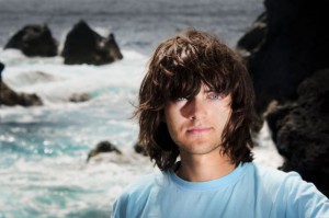
One project breaks the rule. Ocean Cleanup, initiated by the Dutch student Boyan Slat, of whom I included a picture. When still in high school he devised a plan to clear all of the worlds’ oceans of the plastic that it has been polluted with in the past decades. He wants to use the ocean’s own natural currents to filter all the plastic out, eliminating the need for a costly moving vessel to drag the net. Although the feasibility of the project is not unanimously agreed upon, there is a good chance that it can, and will, be executed.

Ocean Cleanup provides a very real solution. In this it is different from all the other projects at the exhibition, and accordingly, it remains unmentioned in most [x] reviews [x] I’ve read [x]. A disinterest in the project can also be felt in how the Stedelijk mentions it on their own website as a ‘giant vacuum cleaner’, which is simply not what it is. One could argue that it is not even design. Boyan Slat is an engineer. I bet he has probably never even seen an art school or a gallery from the inside. Decisions considering the aesthetics of his project do not seem to even remotely interest him. Save for the purpose of promotion, of course, which is crucial for the funding of his plan, and probably also the sole reason he submitted his project to the exhibition in the first place.

What Slat is doing is, bluntly stated, vastly more important than design could ever be. Planting roses in the streets of Amsterdam to ‘make the city a little greener’ or making dresses using wax simply doesn’t compare to actually cleaning the entire ocean. It’s not even on the same planet. In a hundred years, when the whole exhibition and its content is long forgotten, the Stedelijk might not even be there anymore by then, his work will still be visible in the clearness of the water. And the beauty is that Boyan Slat himself probably doesn’t even care about being remembered, or how his project relates to the world of design. He just wants to clean the ocean.
 

Excessive Dreaming

I’m watching a TED Talk by Boyan Slat. As I just told you, he’s a pretty great guy. You know those motivational quotes you sometimes see on Facebook? Or those posters you sometimes see on Central Station? He’s living them.

Boyan Slat Dream II
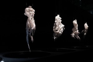
He’s totally got it. The entire ocean. Quite literally the biggest thing on Earth.

Thinking of numerous impressive feats Boyan Slat has already accomplished, the prestigious institutes and people he has worked together with, the magazines and newspaper articles he has been in, I cannot help myself but to feel a slight sense of embarrassment. What am I doing here, sitting in my bed with my laptop, trying to get started on a relatively simple writing assignment, half-concentrated, slacking off from time to time into the wonderful world of distraction that is the internet, when there are so many great problems to be solved? I’m roughly in the most comfortable position imaginable if you think about it. I’m a white middle class guy from a wealthy nation, with loving parents, good education, a fully functional body and everything else the majority of people on this planet do not have according to statistics. My current lack of initiative stands absolutely unexcused.
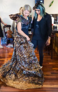
Luckily, help is on the way. The video is flanked by a series of suggested video’s on how to learn any language in less than six months, how sitting down can kill you, how to know your life purpose in under five minutes, how to become a ‘memory master’, whatever that may be, how to become a millionaire in three years, how to retire by the age of twenty, and so on.

It seems all the wisdom I need to succeed is right in front of me. If Boyan Slat can do it, so can I. He is only one year older than me. Really, what am I doing here in my bed with my laptop? No more time to waste! There are more than enough grand issues to be taken on, there has to be at least one for me to solve. Can’t be too hard. I only have to get myself together, to take control, and to get up and do it! I can already feel the energy flowing through my body. This is going to be great. I’m going to be great. Nothing can stop me anymore!
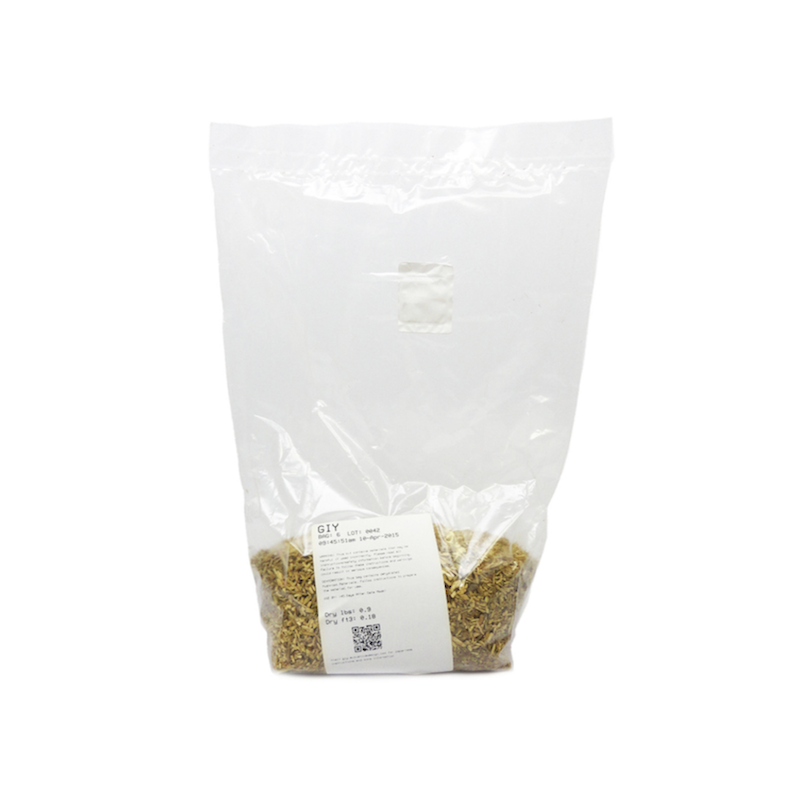
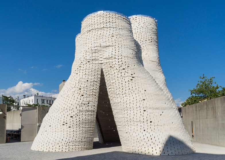
So I close my laptop, forcefully throw back my blankets, step out of my bed, do some more stretches because my legs are asleep, realize I actually really have to finish this assignment, and sit back down again.

Everyday life does not seem to let big dreams get in its way.

Distance makes perspective


Thursday, November 24, 2016


Design Methodology, Logic, Mathematics, Geometry, Counting, Systems, Translation, Meaning, Value, Obsession, Graphic Design.
For this Design research project I have tried to relate myself or the way that I work to the work of Pavel van Houten. In a way I will temporally adopt Pavel van Houten’s way of working maybe or the way that I interpret it to research his work (or maybe more my own work ?)
 

PVH-behand2-D.acton
 

After our museum visit to Dream out loud I thought I recognized in his work something which I use in my work: a strange system that generates a certain visual language. He used the database of the project Treeful to create new wallpaper for artis. Because of this I thought out of all of the people that are present in the exhibition Dream out loud his work spoke to me the most. I started looking in to all his work and I also visited him to talk to him about his work. After I talked to him I understood what his work is about. Also he seems to be very aware of his position as an artist and uses this in a very clever way to help people understand things that he wants them to understand or look at in a different way.

When does something become valuable?

So now the focus of my research has shifted for now I have the desire to understand myself in that way. What do I want to say what do I have to say is necessary? How do I distance myself far enough so that I can see what it means. How do I find my way of working? Perhaps these questions are to big and will take a lifetime to answer.
Can I find anything about this topic? Yes I remember this:

‘Jewelry attitude’ as a way of looking at the world


Monday, November 21, 2016

Stone needs a special care and appreciation to shine. Conversely, any stone can shine if you care for it. In my thesis, I am exploring the particular kind of value which derives from the personal observation and appreciation of seemingly ordinary objects. Furthermore, I examine how this value can be shared with others through an inscription of observer.


P1110820_72dpi

Roger Caillois author of "The Writing of Stones" [x]


There is a picture book which is called EVERYBODY NEEDS A ROCK, written in 1974 by Byrd Baylor, an American author of picture books for children. With her sparse poetic prose, she gives us ten rules for finding our own special rock. The rules of the book are highly sensuous, therefore it rather becomes a kind of tool, to switch our mind and invite us into observing mode; they change our way of looking at things surrounding us.


IMG_2063

"Everybody Needs a Rock" by Byrd Baylor [x]


Through the invitation to the observation of neglected objects – in the case of the book, ‘rocks’ lying on the ground start to gain our awareness and appreciation. This awareness and the observer’s eyes brings new value into existence. This value is perhaps not only applied to rocks, but also to anything ordinary around us. A piece of plastic rubbish on the ground next to the rock could get the same attention as rocks, if the one looking, could appreciate it.


sae_72dpi


My graduation project has started with an inspiration from an article about a new kind of rock found in Hawaii, which contains plastic debris. According to the article, the rock won’t be decomposed, but will remain in the ground forever. Therefore those rocks have been considered as a potential marker of humanity’s time on earth – a kind of our generation’s rock. It led me to imagine that people in the far future dig those rocks out from the ground and appreciate it like a ruby or diamond.


plastiglomerate2


Based on the principle of the formation of the stone containing plastics, I have collected plastic rubbish and natural materials surrounding it such as twigs and shells on the street. I melted them down together, cut, polished and obtained plastic gem stones out of it. From that point, I observed the different qualities in each stone that I made, and turned them into jewellery. By caring and celebrating such a neglected object – plastic trash, I tried to generate a new value of it, and give people a new way of looking at the world and new encounters in everyday life [x].


IMG_3756.retouched_72dpiretouched101.2_72dpi

graduation presentation Sae Honda ©2016


Writing the thesis gave me a great insight and I started to understand my graduation project more and more in the process. Moreover, it eventually led me to realize why I chose jewellery as a medium.
The essential role of a jeweler is perhaps not dealing with rare materials, but rather reading the signs in any material and inscribing them through a process of making and caring. The jewellery attitude could be a way of looking at the world, and a way of creating the new value.


EVNR_BOOK_COVER_A4  [click on image] to download this thesis by Sae Honda
all rights to this thesis are property of the author © 2016 www.saehonda [x]


Walking with a Line


Monday, November 21, 2016


“For there to be lines, do there have to be a surfaces, or can lines exists without any surfaces at all?”Tim Ingold


IMG_09452.cover_image

Images: A Line, collaged book, graduation project, 2016

Making a line basically means connecting point A with point B, but it does not matter whether the line is connecting two points in geometry or people waiting in queue. It is a fundamental form that is defining, shaping, connecting or dividing. A line can be on its own, or in close relation to other forms. It can exist in space or simply be drawn on a paper, there are an endless number of possibilities.


IMG_0972 IMG_0963

Images: A Line, collaged book, graduation project, 2016

This thesis “Walking with a Line” describes a line as a form appearing in different kinds of fields. It shows about 30 examples of various types of lines across a history, biology, astronomy, maths, art and so on. The text is structured as a simple kind of dictionary which you can just flip through and start reading wherever you want.


2.cover_image download this thesis by Jolana Sykorova
all rights to this thesis are property of the author © 2016


Log in
subscribe