Skip to Content Skip to Search Go to Top Navigation Go to Side Menu


Now that I know why


Tuesday, December 8, 2009

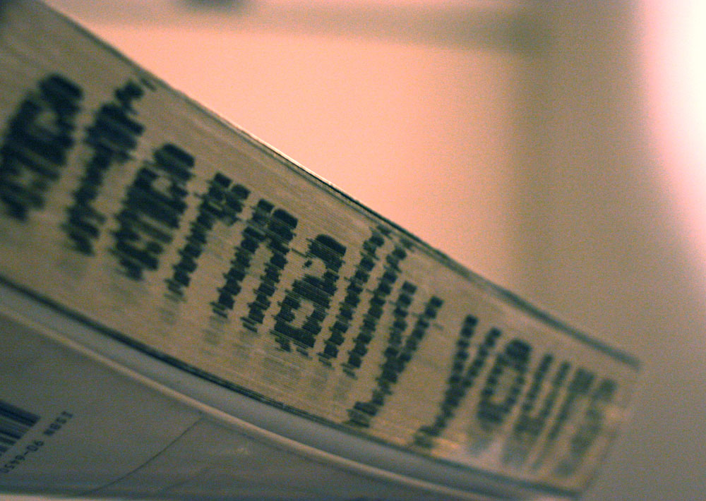
The Second Design Book I choose to read and write about is one I picked out because of its beautiful side containing the text “eternally yours.” Also on the cover picture you see a couple kissing caught my eyes. When opening this book you see more photos of couples in love. Also this book is a sort of edited version because its full of marks made by former readers. This gives me the feeling that the book is very interesting, without even reading it. In my last posting I wrote about my questioning about the Why? Now I found out what the most important reason is to pick one book over the others. It’s not about the texts cause I can hardly find the effort to read it. It’s about my unconscious mind. For people who are interested in this book and not in my personal bullshit you can find this book about visions on product endurance in the library of the Gerrit Rietveld Academy under the number 770,6 hin 11

“The Nude…”


Tuesday, December 8, 2009

In the first books I choose, everything was planned. Every stroke and detail. Design is a view of something. From something which is mostly they same in somebody’s mind as in reality.

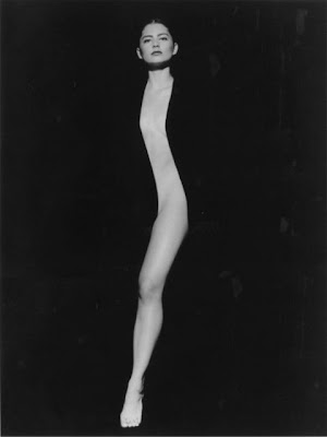
My other book is about photography, photography from naked people. It is called: “The Nude in Czech Photography”

I was inspired by tags from the second book, originally, realization and process. Human body, every body is original. Every body is unique, there is no body the same. The product in my other books are all things were you can make more of the same.

I have choose nudes photography because it is always about process and realization. If you ask a person to pose, you have to read their body language. You have to understand the light and try to photograph the energy from the person. A photo shoot is a ritual where your ideas become really with your improvisation.

Process from the photo is just as important as by design. In photography are photoshop and the dark-room two of the most important items. In the end I think that this book “The Nude” totally is related to my other books but also totally different.

(from the personal library)

No objectiveness


Tuesday, December 8, 2009

Browsing through the library for the last time, I thought it was time for a different approach. So instead of searching, looking, considering for at least half an hour or maybe even longer, I just run into the library and get the first big book I see. Without even wondering if it is about art or design (well, ofcourse I know it is about art, but there is a story to tell you know), I borrow it. Once outside the library I see the book is about the work of Tadao Ando. My conclusion is that you can not be objective or random towards anything. The reason for this conclusion is that when I tried to borrow a random book from the library, I still get back with a book about a person whose work I really like. This book about this person. I knew it before, but through this project I am more certain about it, no one can ever be objective. That can turn out to be pretty good, but also pretty bad.

Backwards


Tuesday, December 8, 2009

I find myself in the library yet again, after waiting two hours for the library to open. Still not completely awake, I walk past the row of art books, not even bothering to touch them.
Some jump out, but on closer inspection they do not really capture my attention.
The other side of the bookcase then? Close to frustration, my eye falls on a book. Not only interesting typography –tying it, together with its width, to my fist post– but also chinese chracters! Or so I believe..
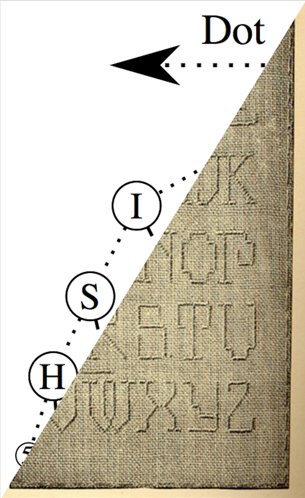
It turns out to be a book case, containing two books, both with a dull brown/beige color, but an unique texture. The pressing of the letters on the spine has made them lie a little deeper than the coarse fabric.

The books turn out to be Japanese and not Chinese. The text runs from top to bottom and right to left. But they are not entirely Japanese. The thinner one of the two books has english text added to it’s photo’s. They’re quite old fashioned and depict Japanese fabrics.The bigger book sheds a bit more light on what the books are about. Japanese book are read from right to left, and this book is read that way as well, but at the end (our our western beginning) there is a small english introduction. The first book, containing the photo’s, is a study of Okinawan textile fabrics. The book lying open in from of me contains a study of the cultural value of said textiles.
Though the subject is quite boring, the book is a work of art in itself to me. Unable to decipher even the smallest meaning from the beatiful characters, it gives me a feeling of helplessness. In a world where almost everything is understandble and rich in information, this is the opposite. It reminds me of China, where not a thing can be read or understood, and you feel like an outsider looking in, enabling you to see things you do not ordinarily see because you have to rely on other means of finding meaning in things.

The link between my two earlier choices is easy through my tags, alsmost all of them apply on these books; they are fat, have an interesting texture and typography, the inside contrast not only with our culture but through their dated appearance and sublect also contrasts nicely with these modern times. And at last culture, which these books have in abundance. The only one missing is nudity, but on the other hand, this is about textiles and fabrics, and what are those used for? Exactly clothes to cover our nudity 😉

The link between design and art is quite difficult to make at this point, because my two earlier choices (one book on sculpture and one on chinese art) where more art books, while this book is almost more a design book then those were.. Maybe I did things in a Japanese way; backwards!

779.1

Anitalink


Tuesday, December 8, 2009

My interest in film drove me to write my name on the contact list of “The New Anita/De Nieuwe Anita“, a film theatre/bar in Amsterdam. Ever since I have been receiving almost weekly information about the projected films in “Cinemanita“.

Funny thing is, like I said before, I  have been receiving emails from “Cinemanita” for more than a year already and for some reason, once I began this research, I did not place an immediate relation. It seems like a never ending discovery of unusual connections.

So I went into my gmail to see an email from “Cinemanita” received at 10:05 in the morning today, a few minutes after I posted my last Anita, Color post.

The email begins like this:

—————————————————-

SUNDAY DECEMBER 13

20:30
BLIND CHANCE (PRZYPADEK)  1987
Directed by Krzysztof Kieslowski
122 minutes
In Polish with English subtitles

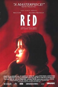
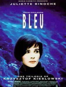
Film Director Krzysztof Kieslowski is best known for his trilogy

Three Colors (©93/94), but before he headed for France he made some absolutely stunning films in his homeland of Poland. Of all the films he made, many consider ‘Blind Chance‘ to be the best… and some consider it the best of his career.

—————————————————–

“Three Colors”!. Surprised? Actually not.

“De Nieuwe Anita” / “Cinemanita”.
www.denieuweanita.nl Frederik Hendrikstraat 115, Amsterdam, The Netherlands

The Color of Anita


Tuesday, December 8, 2009

How can one relate a name through/with art?

Once I entered the library I walked the same isle but turn my back into the one I had been looking at for the last 2 postings. Now, I had in front of me a cabinet full of names. Van Gogh, Warhol… among many others. So, how can I relate a name with another name?

– I found no solution immediately –

I remember having once a conversation about how names, days of the week, words, etc, can give a feeling of color to certain individuals. The whole theory also applies in a more scientific way when it comes to sound waves in music. I wonder if you have ever seen a colorful symphony…

Immediately I decided to think about Anita . I was sure there must be something that catches my attention, something special. It always seems to work that way when it comes to Anita .

So I searched, my eyes went up and down, side to side quickly through the archive. On the right hand corner a thin small booklet with what it seems like a paper cover sticks out from all the grey thick names. It was not only catching my attention due to its bright colors but also due to the physical position of the booklet; It was sticking half way out as if someone had started the job for me.

Once I took out the six page booklet and opened it I found inside several painted portraits of women. To tell you the truth, I was not surprised, like I said before, there is something special with this Anita . I then shifted my focus on portraits, leaving the first two posts behind, and moved again to my focus on the color of the cover.

Almost like a kids riddle I identify “orange on the outside, yellow on the inside… Can you guess what it is?” Interesting how these two colors remind me of Anita for some reason. At least reminds me of a certain aspect of the name.

Once at home I research on the meaning of colors:

-Yellow is the color of sunshine. It’s associated with joy, happiness, intellect, and energy.

-Orange combines the energy of red and the happiness of yellow. It is associated with joy, sunshine, and the tropics. Orange represents enthusiasm, fascination, happiness, creativity, determination, attraction, success, encouragement, and stimulation.

It is not only Anita’s intellect, energy, creativity, attraction, success, but Maria’s combined fascination, determination, encouragement, and stimulation towards this assignment which gave color to what it is now for me a symbol.

-To my surprise, once I rented out the book, it was not identified by the computer. Hence, it has no reference number, just a reference color.
Public art


Tuesday, December 8, 2009

Searching for the last time with my tags I found another tiny book. Without noticing it when I borowed it, I now see (looking for inspiration) that the introduction of this book is in fact written by Sandberg. Writer of the first book I picked. This one is not about his work but I did notice in the library that the introduction is in four different languages, like there were many different languages in my first book. This book is about some kind of exhibition in 1965 in the Vondelpark. I know it’s a weak link to the housewives but because this is such an accessible way of showing art to a lot of people, this exhibition is perhaps also visited by some jewelry-making-housewives.

725.8 cat 1

Beautiful braille


Tuesday, December 8, 2009

When I open this book I was overwhelming because it was full of beautiful braille. Also the page color is white. It has no images. I can not read braille, but I tried to read it. First I closed my eyes. Then I felt full of braille, but it was very difficult to recognize different words. After I changed my mind. Let’s look at braille as a art. It has nice texture. Each page has different texture. Some braille parts are like foam, other parts are very complicated. I think the shadow makes it complex as it is also braille itself.  There is page a light number upside. It is different than in a normal book.  But I am still wondering about this book’s content. Maybe it is nice to let it be unknown. This book makes you aware of braille as an art.

book number.726.8 cat46

This is a Rietveldproject


Tuesday, December 8, 2009

This book contains nice typography. It has a blue hard cover. This book consists of only 7 words which are

( ik. jij. zie. ben. denk. wat. dat ).

It has no image only text. It looks like a poem. The right side has only sentences. The left side has nothing. I think it is done on purpose by the author, so we can concentrate more on the text. It has a space for thinking. The right side has an odd page number. It start from 5 to 45. I found two interesting things in this book. First page has ( 12 l ABC l QX l 12 l ABC l QX l 12 l ABC1 ) . It looks like some signal or quiz for me. Last page has information about this book. This book is Rietveldproject nr. 50. It makes me curious about Rietveldprojects. this book makes sense about thinking space and using only 7 words. That’s what I like in this book.

book number. 758.3 rie 2a

New way of looking at architecture


Tuesday, December 8, 2009

Using my last tags, I found a really interesting book from an artist I already knew before. Because I found something with the words architecture and library, which were the most important tags of my last post, I was surprised, to find a book which is so nice even when I had to search quite specific.

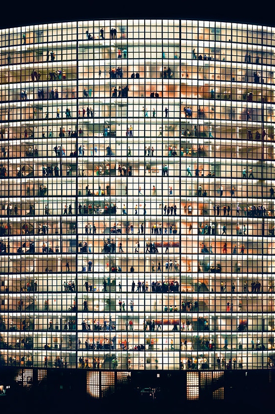
Andreas Gursky makes pictures that are famous over the whole world. In my first post I told something about a book which is totally focussed on libraries. But this book shows not only libraries, but it shows a whole content of buildings photographed on a way only Andreas Gursky is able to. He makes pictures that show a new view on a building. Most of them are enormously big, or extremely complicated. They show an index of these buildings.

It is related to my second book because Andreas Gursky also photographed some interesting libraries and museums. And that is also the reason it is related to my first book. The difference between the books, is that this book is all about photography of the buildings. That’s why the images in the book are so interesting. In this book, the main subjects are the photographs of Andreas Gursky, in my other books it was about the building itself.

I think it is really interesting I found this book. Andreas Gurksy is one of my favorite photographers, and combined with the subject of this book and my earlier books, it is a nice collection if you want to know more about the architecture of the library, and specially when you want to see some brilliant pictures. It all fits together, but I think it also fits really well in the project we worked on.

Public Library Amsterdam: 761.2

Blue pinocchio and his fairy go to Istanbul


Tuesday, December 8, 2009

I was looking in the art department of the library and found a book about folk art of Istanbul, in the time of the rising of the Ottoman Empire. When I looked through the pages I found that it was about getting a glimpse of the lives people (read, the sultan and rich people) lived in those days by showing the art, and the artifacts the people used. You can very well see the style of the period in the statues and the paintings and also in the cups, they drank out of, the rugs they walked on,the plates they ate from and the many other furniture and things they used. In short, for me this book shows the way the world looked in that period. In the same way that for us Pinocchio is a well known item now. He would look very strange and out of place in the world of Constantinople, especially if he was blue. To me this is a good link with design and art for both reflect the mentality of the times we live in.

703.6 -cat-1

Contrasts


Tuesday, December 8, 2009

As I let my fingers caress the spines for a second time, I cannot simply let my personal preferences surface. Instead I let my fingers stop at big books, interesting letters, big old tomes and backs with interesting colors. With the latter in mind I pull out a thin yet big book out of the shelf. A smooth, new spine, with bright yellow letters on a background of bright red, turning to pink. How could it not attract my attention? ‘China now’ is the title and the front immediately makes my decision easy; naked Asians running through a hallway accompanied by red airplanes. How can one resist opening such a book?

The art of a people, suppressed and unable to produce art freely until recently, is fascinating. Different mentality, history and culture make their art unlike any western art in my opinion. And it is refreshing to see modern art from such a different angle. It is nice that not only the cover has beautiful contrasts, but also our cultures and countries. (me being Dutch)

Satisfied I carry the book to the check out desk, to take it home and immerse myself in another world and go back to the busy and colorful markets of Beijing and Chengdu.

CHINA NOW 707.9

Mystery to Surrealism


Tuesday, December 8, 2009

The word in my mind was the tag which also linked to older posts, Mystery.

Beside that I also wanted to find some images that could show technical or absurd feelings, but I was not sure, just a kinds of feelings, because the first post was about a sort of unknown special skill.

I saw this book, Women Artists and the Surrealist Movement. Females are sensitive. Maybe I could find a link to mystery things there. And this book remind me a Chinese character “Yin”which from the word “Yin-Yang”,It is not only about gender, also many things unclear or unreal.So, I use Yin as a tag word.

The art works inside the book seemed dreams, subconscious, inner desire, myth and pagandom.

The image with one glove holding an other one, reminded me of the image with the feet from last post. It was not a bloody ritual, but the numbers under the gloves, and the dice hold by the white glove seemed to reveal something.

708.4 cha 1

Random


Tuesday, December 8, 2009

The people on the cover of this book were the main reason that I chose this final book for the posting. On the front cover there is a group of people wearing the same outfit: English police uniforms. Even though everyone is dressed in the same uniform everyone is different from each other. This made make me think immediately about the tags which I was focused on in the previous posts namely: nomadic, reality, and city. After opening the book I saw even more faces of random people inside. It is not clear whether they are all from the same city and whether these people are traveling at first sight. It does not matter to me who these people are, and what they do, what interests me is the fact that this book is all about people.

Book nr: 12958

Treasury


Monday, December 7, 2009

Excited.

Fulfilled with excitement I rushed to the library. I entered the room for the third time.

Now.

Finally.

The forbidden part unlocked. Like a child in a candy shop. Delightedly seduced by all the delicacies.

All of a sudden the assignment slipped away.

One book after the other blew air into my face, while the images caressed my eyes.

At once.

The notion.

A mission.

To find an escape from reality, but was I not absent for a while. Withdrawn from my boundless fantasies, disappeared into the space between time and space.

Entwined in thoughts, the book in my hand scattered the light.

Déjà vu.

This time the reality was soft and friendly. The green glittering smiling at me.

Still one goal to achieve.

What does all this candy have to do with the other books.

What is art in comparison to design. With these questions in mind my fingers danced on the covers of the books.

Gently.

Still following shape of the books.

Faster and faster.

Until the dark force was clearly sensible. Everything was dragged inside.

The book still resting in the palm of my hand.

Even questions were redeemed to exist.

The answer appeared.

Art is like the cover of the black book, endless and deep. With an absorbing force, whereby it is expanding.

Is design among one of them.

Not recognizable as such, is that clear.

Boek nummer: 705,9 -Li- 1  en -toe- 1

1000 Contemporary political posters


Monday, December 7, 2009

For this last posting I wanted to find a book wich I could connect to my other two postings. In the search system of the library I searched on the tagword ‘754.‘. Out of the hole list of search results one title popped out as ‘could be interesting’. The book was in the design category and had the title: ‘Prop Art over 1000 contemporary political posters’ . So on the cover of this book you could already find two tags of my previous posts (1000 and 754.). Political posters always try to convince you of something that the party who spread them stands for. In that way this book is also connectable to the tagwords direction and signs.

The book itself is filled with pictures of political posters, some of them in color. Most of the posters have something to do with war, or the remembrance of a war. But next to them are also posters shown about ecological movement and the women’s liberation.

754.1 -YAN-

Your body is a battleground


Monday, December 7, 2009

Thinking of women artists and graphic design leads me to the work of Barbara Kruger. It connects design, feminism, art and references also to my personal story, namely of seeing an exhibition of her work and loving it.

The work of Barbara Kruger can be qualified both as conceptual art and graphic design. She combines black and white photographs with phrases set in vivid colors, juxtaposing imagery and text. Her work addresses the complex interconnection of gender and the marketplace, and criticizes sexism and the circulation of powers within cultures.

I find her work interesting because it is interdisciplinary. She is not bothered by formal qualifications (is it design, is it art, is it politics?), but instead says that she likes to work with words and images. She wants to address her audience directly, and chooses the medium which she finds fitting. This ‘no fuss’ attitude in combination with the content of her work is inspiring.

708.4 Isa 1


Log in
subscribe