Skip to Content Skip to Search Go to Top Navigation Go to Side Menu


"art" Category


Super Nice Witteveen High Chair by Gerrit Rietveld


Sunday, September 29, 2013


images

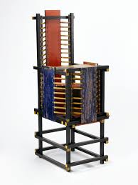
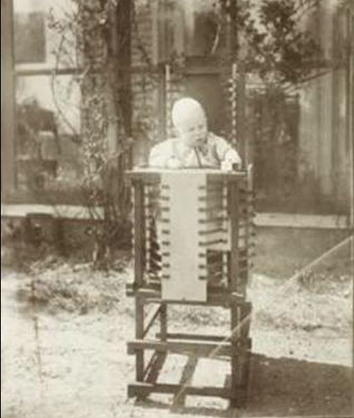
I have chosen this object  because I didn’t realize what was his main feature at first. Which made the object very mysterious for me. It looks like a chair but I thought it could also be one made for kids (the gate would protect them from falling and the table help them eat). And their is also a hole in the middle of the seat! So I have come to the conclusion that it is a high chair toilet. I love this object because of all the colour Rietveld used. I thought  the lines present on all the file of the chair  make it look very graphic. It reminds me of the tribal art which consists in painting their bodies with lines. As you can see on the picture represented below.

images

My opinion could be a little extreme but I cannot stop thinking that this chair looks like an instrument of torture. It should be comfortable to welcome a child but it is raw wood, and there are no cushions to absorb to body. The vertical and horizontal bars also vaguely recalls the prison world.

torture wre

In fact, this chair was made for Hendrikus Johannes Witteveen Junior, the future minister of Finance who was born in 1921. It is almost identical to the original one, built in 1918.
According to museum experts the Witteveen chair is important because it is the first example of Rietveld’s use of primary colors, a key step in the development of his Red, Blue Chair, considered as an icon in Dutch art history. Even in our school, a lot of students have fun and try to make their own one. Some friends have it on their balcony! Rietveld designed it in 1918, under the influence of The Stijl movement that he has integrated in 1919. This chair is painted with the primary color palette added black, white and gray and a touch of yellow, so specific to this movement. Initially designed with a natural wood finish, Rietveld gave it these colors later, in1923, after officially joined the movement.
What’s The Stijl? It is an “avant-garde” movement, founded by Theo van Doesburg, with the active participation of Piet Mondrian. will destroy the Baroque through the use of colors and “pure” forms in dynamic equilibrium, as visually weightless.  According to Marek Wieczorek “most of its members envision a utopian environment through abstract art, universal harmony in the full integration of all the arts”.


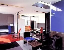
In addition to being a designer, Rietveld was also an architect. I have chosen the Shröder house to illustrate it. I haven’t visit it yet but I already have some really good echos. It was Rietveld opinion that sleeping, eating, bathing (in short, whatever people do at home) should be conscious activities that require a certain amount of effort : letting down the table or making up the sofa bed. Rietveld also was of the opinion that the size of the room should be in agreement with the time spent there. The ideological approach of this house lead a strict view on architecture. Truus Shröder was the ideal client : after the death of her husband, she ask Rietveld to built her a new house. It was the first house of Rietveld which was an exuberant experience for him! He came to a type of design which does not strictly define a space, but instead lets it breath by means open and closed planes, varying lines, colour accent and incidents of light. In this from all sides asymmetrical composition, the transition  between inside and outside are fluently and surprisingly.

RietveldSchroderHuisPhotoErnstMorits   images (1)

Rietveld had deeply left its mark and is always present around us (I know it’s a little easy to say that because we are  studying in one of its architecture but whatever …). His manner to rethink the space make that he will be remembered !

Abstract Language of Space and Light – the Metaphor of Perception in Space for Correspondence


Saturday, August 31, 2013


Melancholia_rietveld graduation show2013Ji Sun Nowh


Writing this I discovered a new aesthetic language through the “way of looking” and the combination of possibility and imagination latent in it. This tends toward the potential unknown reality. The artist has an insight to see through various worlds and this inner eye allows the artist to experience the

other world beyond reality. Melancholia03_ Jisun Nowh_redu The work created by this artist is the very gateway leading us to this place across time. Through the operation of thinking and recollecting, we are able to bring out the invisible time and space, experiences, reminiscence, and subconscious. What I have attempted to represent using a metaphoric form of visual language is the faint outlines of the invisible beings, the lingering ambiance of light, and the emotional respiration coming from the stream of subconscious, all experienced through the mutual perception of time and space.

Melancholia04_ Jisun Nowh_redu Melancholia02_ Jisun Nowh_redu
My work intends to be vacant and open rather than to express many things. This is to induce the viewers to read the work as a reflection of their own experience and sensibility. I found that architecture and art consist of the inner abstraction and the perception of light and I have experienced the process of the works in this thesis that starts from the convergence of form, line, color and sensibility and develops into sculpture, painting and building involving space and light. The combination of form and color awakens the sensibility inside this. I tried to enable a more direct visual experience and bring out the abstract forms to the real space in order to substantiate them.

The geometrical Melancholia01_ Jisun Nowh_redu forms in these works are  imaginative spaces waiting to be filled with serene experiences.
I brought this abstract language form into my work and it will be originate from the restoration of imagination through the “way of looking”. I wish it did not remain in the state of merely reflecting the inner space but rather to be continuously reborn through various interpretations by being read as different stories and experiences.

text by Jisun Nowh [graduate student department of Inter Architecture]

 
Pdf-icon Download my thesis: ”Abstract Language of Space and Light;
The metaphor of perception in space and light for correspondence
 

A story of…


Monday, May 27, 2013

Beginning of a story tree
1683,
mentioned in printers
forgotten for many winters,
The scabbard?
The millboard?
no CARDBOARD!
paper?
no
heavy-duty paper!
The Kellogg brothers,
and by the others,
being used
being wrapper
flaked corn cereal shelter,
heat-sealed bag
for when you need to bake,
than being named
not to be ashamed,
“the brand”
by demand.
Kieckhefer Container Company
“hmmm good idea”
money!
honey!,
being use more
even offshore.
After all,
the way of carton being swerved ,
Being observed
Being tested
Being developed
being differed,
Containerboard
Folding boxboard
Solid bleached board
Solid unbleached board
Binders’s board,
being bored?
Ok,
let’s talk about
CCM,
two paper type paper,
higher grammage
problem?
no!
advantage.
The strength!
like sandwich,
line
wave
line,
brown
white,
poorness
majesty,
till 20th century,

(more…)

Not all boys dream of being kings, not all girls dream of being queens


Sunday, May 26, 2013

 
The intimacy of Grayson Perry´s drawings and the DIY characteristic
of punk and queer movements


The first time I came across Grayson Perry´s work happened on the same week I had a discussion with my classmates regarding minorities and the quantity of women inside the art academies X how many of them do we actually see in contemporary art galleries and museums.
Not only for briefly getting to know his beautiful works, but I was mostly glad to hear he was a successful and Turner Prize winner artist who also happened to be a transvestite. He made it out there despite for his choice of appearance or behavior and above all: his body of work does speak about all of these matters in a very subjective and personal way.
I hadn´t thought or researched much more about Perry until I visited the Hand Made exhibition at the Boijmans van Beuningen museum in Rotterdam with the Foundation Year. For my surprise the centrepiece of the exhibition was The Tomb of the Unknown Craftsman, by Grayson Perry.

The Tomb of the Unknown Craftsman is a tomb in the shape of a ship, which has been cast in iron, a floating reliquary that is forever earthbound. This, he says, is the tomb of the unknown craftsman, dedicated to the many thousands of artists over the centuries whose work survives but whose names will never be known. The political and whimsical aspects of the work promptly awakened my curiosity and interest in his art, so I decided to start researching about him.

Perry is mainly known for his ceramic pottery and tapestry, where he combines classical forms with his drawings and sketches. The drawings have a strongly autobiographical aspect, often depicting himself as Claire, his feminine alter-ego, and his teddy bear, Alan Measles, as a representation of the father figure, always providing comfort and affection. Many of his works picture sexually explicit content and for that reason they have been raising harsh criticism among art critics. But Perry habitually portrays the life of the working class as well as inciting discussions about minorities, sexuality, class and race. He has said, “I like the whole iconography of pottery. It hasn’t got any big pretensions to being great public works of art, and no matter how brash a statement I make, on a pot it will always have certain humility… For me the shape has to be classical invisible: then you’ve got a base that people can understand”.

Looking closely to the drawings on the pottery and trying to understand what they wish to communicate I could not help but think that their guerrilla-like motto and storytelling elements reminded me of the punk zines and the DIY (do it yourself) aesthetic of the punk and queer movements. In my mind, the way Perry uses the form of traditional vases as a free base and platform for the materialization of his thoughts immediately related to the intimacy and freedom of speech of the hand made booklets.
The hand made zines played a very important role in the punk movement in the late 1970s. Through the making of a zine one could express his own or a group´s principles and spread the word while being able to escape from the control of the publishing companies and media. In my opinion the exceptionally underground aspect of it is what provided the freedom necessary for the makers to loosen up from any possible apprehension regarding public judgment in order to feel welcome to express their most genuine political thoughts. I can recognize this very same bravery and freedom of speech in Perry´s drawings.

For Perry art should be able to communicate to the public and not only to the high-class art related intellectual minority. He also reflects on crafts as a form of art and in an interview to the Victoria and Albert Museum in London, he mentions that craft and art are greatly linked and that is actually one great thing about it. Craft by definition is something that can be taught to someone else, you can teach someone how to throw a pot and they can become as good at it as you. Whereas art is very much linked to an individual vision and it´s not necessarily something that can be taught. One can be derivative and take up someone elses vision but he won´t ever become that person.
Perry calls himself an artist and craftsman and he makes use of crafts as a solid and clear base for his art, a base that becomes a tool for the expression and carriage of his message.
Not surprised I discovered Perry was involved in the Chelmsford punk scene in the late 1970s, he lived in squatted houses and at some point shared a house with the pop singer and transvestite Boy George, who became an inspiration for him. He is also the father of Flo, a 21 years old girl, and the husband of the author and psychotherapist Philippa Perry.

PIETER STOCKMANS THE GUY WHO FELL IN THE PORCELAIN


Saturday, May 25, 2013


Could craft be seen as art, or the other way round? Is it even possible to combine these two?
According to the broad work of Piet Stockmans, the answer seems to be clear. 

Pieter Stockmans is a well experienced ceramist, born in 1940. He worked for the Royal Mosa Maastricht, taught at the art academy Genk and the Design Academy at Eindhoven. From 1989 he started to work as a freelancer, which he is still doing these days. Al the work he makes, is a signature for himself. Piet is devoted to his work, and this devotion/passion is what brought him to the level he is working on now, you could almost say he is obsessed with the material so he knows the qualities of it. He searches for the essence, the edge in his designs, in material, and in function of the object after this, the material became the way of expressing himself. He thinks from the possibilities that the china is giving him. Not only the possibilities, but also limitations are an inspiration.


His tableware is an experience, its light, thin, sophisticated, fragile, beautiful, elegant, clean and minimalistic. A cup becomes something more than just a holder for your drinks, as soon as you touch it, you feel the fragility, and the almost sharp edge on your lips. Next to his spotless tableware he also has other projects, he exposes his work in several museum, does projects for public spaces, he designed the tableware for the prince of Monaco for instance, he sells fabricated works in stores and still does handmade. Just recently he cooperated with star restaurants and master-chefs. This collaboration was very valuable for both of the parties. The plate should be a compliment to the dish, it should replenish each other. Instead of just being an tasteful dish and a nice designed plate. These two things come and work together. With this kind of corporation you clearly can see that Piet changed the approach, of something we take for granted as an everyday routine, into a certain appreciation.


Is Piet Stockmans an artist, a designer or an ceramist? And according to the Boymans van Beuningen ‘handmade’ exposition, what is his relation to that? 

He strives for authenticity in his work, that is of main importance and also he tries not to loose himself in the technical advantages of nowadays so we can label him as authentic. What is it, that his work expresses. Piet is searching for new possibilities and challenges which is important. His approach towards his own work is very artistic. It becomes autonomous. What I found also interesting about it, is that how far can you go if we talk about art and design. With his tableware, is it not art because it has a proper function? Does art have a function? In his philosophy comes forward his way of dealing with a process or way of thinking. In which, hopefully, we all can recognize ourselves.


His philosophy,

“Creation is founded on doing, not thinking;
the act of making, brings forth ideas which in their turn give rise to other ideas;
gradually, along the way, strange as it may seem, decisive choices are made.
Like the automatism of the plowing farmer,
or the habit of prayer,
or the recital of mantras,
or else the repetition of an everyday gesture.
It is a search for simplicity, for calm, for physical well-being.”
Piet Stockmans 


For the outside world it can be hard to define the work of Piet, because you can organize his work in three parts, artistic, craft and industrial. For Piet himself those lines are thinner then we are experiencing it, he is continuously moving between them without any distinction from each other. The things is when he is designing for an tableware project it can inspire him for any kind of new work: the evidence that each part is closely related. I think we have to take in account what the artist is trying to say with his works, what is the purpose? What is the thought behind it? What is the artist willing to express? And last but not least how does Piet think about it himself? He says, “I am a designer,  because doing one artwork doesn’t make you an artist” which is true. I find this a modest profiling. In case of Piet Stockmans, I think if we not divide his work in several segments, and see it as one, Piet is in my eyes definitely an artist, and also a designer and also a ceramist.


http://www.pietstockmans.com/


Interview Piet Stockmans (in Dutch)

History repeats itself.


Wednesday, May 22, 2013

Does this mean you make the same mistakes twice?

Do we re-live our past but in a different atmosphere?

Can we see our future in the history of time?

It is surprising how the sum of the past and the future can result in the present. As well as in the last book I’ve chosen, I have the feeling that two different time spirits come together.

The layout and especially the letters used on the cover of this book are very old fashioned; the use of soft orange dyes in a round shaped fond combined with a black and white frame. A frame which reminds me of origami class where at least six women with the age of forty-five and higher are sweating over a piece of paper trying to construct a whooping crane. But the picture of the cover doesn’t correspond to my slightly ironical conclusion at all. It is a picture of two wooden beams with beautiful shapes on the end of each beam. The shapes are perfectly opposite so that they can fit together as two pieces of a very complicated puzzle. It looks very modern, like something they use in high tech vehicles or space ships.


At present, the title began to dawn on me. It said: ‘The art of Japanese Joinery’, made in 1977


After a small peek into the content of this book, it occurred to me that it was filled only with old Japanese ways to attach two or more pieces of wood together. Not in the prefab-style we attach stuff these days, but on the most exquisite, caring and futuristic way possible. I felt for a moment so angry at our IKEA society where everything has to be cheap so you can buy a new sofa every four years, not caring about old handicrafts and their gift to make the most refined details. Details of such beauty that you have to suppress the urge to dismantle your closet only to see how it has been made.
The tender approach of something so simple as to attach two pieces of wood together reminds me of the first book I had chosen, where Nabokov describes individual letters of the alphabet in the way he experienced them.

Affection, or at least attention, for stuff we work with everyday, like the feeling of a specific letter, a symbol or a construction, is very rare these days. We don’t seem to have time to notice these small ‘gifts’ in the rush of everyday life. So next time you go to the library, go with an open mind and grab the very fist book that draws your attention. You’ll be surprised what comes out.

Rietveld Library cat.nr: 694.1

Color in Relation to our Lives


Friday, March 29, 2013

A bright pink page of the book drew me to it. It was lying in a showcase in the Stedelijk Museum amongst many other objects and flyers, but the brightness of the opened page made the book stand out. On the left page you could see a picture of an Indian girl sitting behind a table. On the table in between her hands was a small heap of bright pink powder, almost the same color as the bindi on her forehead. The page on the right was a page of bright pink textile.

This book (put together by Nikki Gonnissen and Thomas Widdershoven) shows works and gives a feel of the work by Fransje Killaars, a dutch artist who graduated from the Rijksacadamie in 1984. In the beginning of her career she mainly made paintings, but it is her later work, her textiles, which attracts me most.

I read in an article about Fransje Killaars that she is fascinated by the power of color, the relationship between people and textiles and the way textiles are bound up in daily life. I was able to take a closer look at the book in the library of the Stedelijk Museum and I was surprised to see how much more attractive Fransje Killaar’s work is portrayed in that book than for example the images on Google search. It was then that I realized that like Fransje Killaars I was not only fascinated by the power of color, but especially the combination of colors in our daily lives. Seeing Fransje Killaars’ textiles transforming an old attic

space into a bohemian paradise,
or seeing her carpets thrown over a washing line hung amongst palms

seems to play much more on the imagination rather than seeing the fabrics placed in the middle of a white clean gallery space.

In a gallery space the work is merely about colors; about the contrast between them and the brightness that a color can have. Yet for me the excitement comes when you find bright colors in someone’s kitchen, when colors pop up amongst plants, how sunlight can give a color different shades and all colors on the knit sweaters of the Rietveld students in the winter.


I caught myself playing around with this fascination on my guilty pleasure.

Instagram

I try to eat an orange every day, but before I get to peeling it I like to take a picture of the bright orange against the clothing I am wearing that day. I have realized that by doing so I put a frame around a moment or literally make a snapshot of the moment. It may be only esthetics, but for me it is quite a luxury that you can find such esthetics in everyday life.
The combination of color and the sense of touch is another element, which I find rather appealing. Holding the skin of an orange against a green, wool knit sweater, running your hands over a an orange shag rug or a purple suede dress is often much more exciting than looking at the same colors on a 2d canvas. Do not get me wrong; I have nothing against the great color field painters, who can use colors in a fragile and moving way. These painters succeed in translating emotions into color, into paint, but when it comes to the exuberance of a color or the contrast between them I think this can be best portrayed in a more hands on manner.

The brightness and the vividness of the use in colors in Fransje Killaar’s textiles seem to be more about the celebration of life, about the joy that a blotch of color can add to every day scenery. The use of color in her work is about the beauty of variety. It is not without reason that a mixture of joyful and interesting people is referred to as colorful. The pink page in the book was what had grasped my attention, but the comparison made with the girl holding the same color pink in between her hands and a trace of the color left as a dot in between her eyes is what made me linger and look at it more carefully.

To find expression


Tuesday, November 27, 2012


What are colours and where do they come from?


Isaac Newton


Isaac Newton was born in 1642 in England and was amongst others a physicist and mathematician. He began exploring what colours were and where they came from in his twenties. With the help of a prism that he put in front of a ray of sunlight Newton could project a rainbow spectrum. To be certain that it was not the glas colouring the light he then added a 2nd prism into the path of the spectrum to see wether the colours would change.

This led him to the understanding that light alone is responsible for colour. He discovered that colours are light of different wavelengths and that white light is a mix of all colours in the rainbow spectrum.


He also invented the colour wheel by taking the colours refracted from the prism and placed them in a circle based on the mathematical calculations of their wavelengths. This made the primary colours to be arranged opposite their complementary colours, for example yellow opposite violet. This made the complementary colours enchant the opposing colour through optical contrast.

The circular diagram became the model for many colour systems and his research was the beginning of what we know of light today.


My interpretation of the project was to get a better understanding of light and also therefore the lack of light. I wanted to have an experience only for me instead of doing a work that would tell something to others. So I decided to do an experiment where I would instead of using the light use the lack of light and try my living as a blind person for a day.

How I came to this conclusion is because of Isaac Newton and his thirst for knowledge. I could not stop thinking about how he had been in his room, doing experiments. If everyone would do that, what would happen then? What would I like to try, to find out?

When I decided this is what I want to do, I tried on a scarf to cover my eyes with, found a long enough stick to walk with and then when it was time I took the items and used them to partly disable- partly help me. My work ended up being me walking blind to school, sitting in the classroom on presentation day and just listening to everyone, taking pictures of everything with my camera and finding my way to the toilet, which was the hardest part. After class my friend Susanna led me to an empty room where she filmed me talking and also when I took my blindfold off. The film I will show you is the part when I take the blindfold off. It was a very hurtful experience for the first couple of minutes.

Hurtful in the way that you could not focus on anything other than yourself and the pain. At the same time you appreciate what you have so much more. To be in a state where you are robbed of something, of one of your senses, is an awakening as much as it is a new beginning. My day as a blind person was a day of anger, chock, surprises, frustration and appreciation.

Get the Flash Player to see this content.

I think that my way of working with this project was very fruitful for me and also opened my eyes for a new way of thinking. I have realised that my works do not need to be telling for anyone else other than me. If they do it is just an bonus. I also liked the exploring of my emotions in regard to what I am doing and also try to just “be” in the state you put yourself in and to experience it fully. It can also be a product of importance.

The Silkscreen print I did was Blood red and it relates to my project in the sense that they

both were an act of me corresponding with myself mostly. The day we got the assignment of the Silkscreen print I decided I would do the colour of menstruation blood.

I really liked this assignment and the fact that we had a long time to work on it. The fact that we got to discuss our works also adds as talking is a just as important part as working, a lot of the time. If you are afraid to say something I think often it is because you are afraid that what you are doing is wrong. What you need to know is that nothing is wrong instead what you are doing is right, and that your friend that is doing the exact opposite of you is also right. When you speak up you get a chance to grow and see your work in a new light and maybe then the work can also better from it.


Stedelijk Design Show 2012 /Future Highlights


Tuesday, November 27, 2012

17 Rietveld's Foundation Year students visited the "Stedelijk Collection Higlights /Design" in the newly opened Stedelijk Museum. Marveling at some masterpieces of Interbellum design or surprised –a little further– by the Scandinavian design some of us know so well from our grandparents homes, we arrived at the last part of this "Depot Salon" wondering what a 2012 selection of Design could be.
Researching contemporary design we composed the "2012 Supplementary" which we present in this post. From the exhibit "Stedelijk Collection Higlights /Design" we all selected a personal best and made it the focus of the researches published as part of the project "Design-in-the-Stedelijk"


Miniatures by Sheila Hicks


Sunday, November 25, 2012


(born Hastings, Nebraska, 1934.) Painter, Textile/Fiber/Weaver, Artist.
 
 
At the Stedelijk Design exhibition my attention was quickly drawn to the textile area were a lot of gripping works was exhibited. Most of the items appeared very autonomous and were presented as art displayed in frames, on glass tables or hanging down from the ceiling. Probably the smallest section of pieces (size A4) made of colorful weaved threads caught my attention – they were made by the American artist Sheila Hicks.
It is hard to say what it actually was that dragged me into her small and actually very simply and straightforward made artworks. I had the feeling of looking at a continues (paintless) painting with numerous layers. I was sure that something interesting had to be hidden behind those threads and probably made by a person with a lot of experiences and an interesting background.
The Stedelijk has written an appealing text on the wall about textile as art and how the industrial movement has influenced the textile scene and how the old stereotype that textile work was women’s work has changed through the time.

Sheila’s woven textile pieces are attractive because I neither could categorize the style or the period. Something in them looked familiar but at the same time like something I had never seen before, I consider it like a hybrid of different cultures and nationalities, emphasizing the use of different materials. The way it was presented was also interesting, in small frames, side by side. Very organized and strict but the threads stood out very randomly in a way. I really wonder why Sheila Hicks made these small miniatures and to understand that my research is based on her biography and her history.


Sheila Hicks is educated in Fine Arts at Yale University. She started as a painter and turned her carrier into weaving and working with fibers – from 2 dimensional work to 3 dimensional work. Her miniatures (the ones in the Stedelijk) reflect her past as a painter as you can translate them to weaved paintings. These are works she has done through her whole career, besides that she is well known for her big weaved sculptural installations and wall decorations.


In her studytime one of her professors was Josef Albers, the Bauhaus master who had settled in The United States because of the pressure of the Nazis regime. Albers was the director of the Department of Design and transplanted some of Bauhaus ideals to Yale University that is reflected in a lot of Sheilas earlier work for instance the patterns, her choice of colors and the geometry and abstraction just like the classic impression of Bauhaus.

With Josef Albers [x], Sheila worked in a kind of color laboratory, and did extensive research on materials, plastics, paper, wire and plaster, that could also be one of the resons why she often weave different objects into her work. Since the 1960’s, Sheila trained in the modernistic Bauhaus tradition, as a unique way of mixing autonomous art with the traditional craft of weaving. In an interview she says: “However, when I was at Yale I had exposure to art history. I took ‘Art of Latin America,’ with Dr. George Kubler, and I chose to write about textiles because he had given a lecture showing beautiful old Peruvian mummy bundles.’’ Those textiles, she recounts, made a strong impression on her. She realized she needed to find out how they were made — not just how they looked. “At that point, Albers — Josef Albers — saw me struggling in my painting booth on improvised looms that were not looms; they were just painting stretchers that I used to tie yarns into tension, and he said he would take me home and introduce me to his wife.’’ His wife was Anni Albers [x], who is perhaps the most well-known textile artist from the 20th century. Anni Albers was a former bauhaus student and helped Sheila with a lot of work in the beginning of her carreer. I believe that her past as a painter and her influence from Anni Albers/ Bauhaus tradition could have caused Sheila Hicks  – through her whole carrier – to continually make these small, straight forward, minis/miniatures beside her other work (3 dimensional). Notwithstanding that, Hicks played an important role in the transformation of textile art during the 1960’s. Textile artists changed the dialogue and understanding of textiles as sculptural pieces in addition to two dimensional works.

The story tells that Sheila is always carrying a loom – and every time she has a moment she starts weaving. As written above I find a lot of her miniatures look very ethnic, and that is probably because she has traveled a lot through her live. In the late 50s Sheila went to Chile, Mexico, India and Morocco and worked with different Local Artist. There she was inspired [x] by their weaving techniques, color theory and architecture.


To understand and try to experiment myself (right image above). I found this old loom and tried to weave a miniature my self and totally understood why you can get addicted to weaving. In a way it is very meditative and when you first get a grip on it – it is very uncomplicated and just a pleasure to do.

I also found this book at the Library of the Stedelijk:


A book of Irma Boom called ”Weawing as a methopor” with her collection of her miniatures. The book displays over fifty of Sheilas woven textile pieces
Not that this research should be about Irma Boom, the maker of the book (graphic Design) But she need also a cadeau. The book is amazing beautiful, and present all Hicks miniatures in a very nice way. All the pieces are presented in a beautiful layout – a nice red line through the book (e.g.colours) so you almost feel like looking in someone’s sketch book. The Book stand out very personal. I can only recommend you to go to the library of Stedeljk and check it out and have a look in all the other books. A new book was recently published on her textile installation at the Mint Museum’s Atrium [x]

Sheila Hics miniature is a constantly sidework through her life. I would translate it to weaved diary paintings. It is impressing!!


Wouter Dam – Unexpected way of working


Monday, November 19, 2012

Organic but still fixed, Simple but far from boring. Soft curved and sharp edges. The not expected material for this fragile form. Not as visible as it should be, standing low and unfortunately not visible from different sides. You would not place this object directly in the design section of the Stedelijk Museum but after research I could surely place it better in its context. After telling people which object I chose a lot of them didn’t remember the piece. A pity because it’s beautiful but also logical because of his hidden position. I couldn’t say directly why I was touched by this object but after some thinking I noticed it refers to my interest for curved forms, layers, shadows, inside and outside and the material clay.

When I started my research. I directly found out that Wouter Dam was a student at the Gerrit Rietveld from 1975 till 1980 what made me directly more motivated and interested for this research. Accompanied and guided by Jan van der Vaart, an influential ceramist for the Netherlands  famous for the new design of the famous tulip vase., Wouter Dam explored shape and volume which he would continue during his career. Unfortunately there is not much more written about this time in the Rietveld Academy. From 1985 onward he was able to make enough money to live from selling his work, allowing him to spend more time in perfecting his technique. His early work gives an impression what his later work will look like. After his first phase of still recognizable vases, the vases started more breaking the symmetry but still suggest a latent ability to contain. In phases of 5 years you see a clearly development, every step is logical coming out of the one before.

Wouter Dam concentrate at the space the works take over. He doesn’t decorate his objects but focus on the form of his ceramics. He begins his abstracts sculptures on the wheel, although you don’t see this in the first glance. First he makes 10 to 12 cylinders which he then cuts open and join together in another way. Sometimes it’s a technical challenge, to make sure that it is perfect but still an example of hand-crafted workmanship. It is hard to stay close to your original creative idea and produce it. Sometimes he put more time in making the correct supports to make it than the actual sculpture itself, but critical for good results. Another technical challenge is finding the perfect stage of hardness to assemble the sculpture from the clay rings.
The colors of his works are soft and sensual chosen to enhance the shape. The colors are slightly added in different layers to find the perfect suiting color for the form and do the most for the light and shade. In his previous periods he uses only one color for his forms but now he sometimes add a little bit of another color too but only support the already existing lines.

What was also interesting for me were the different connections and impressions people made after seeing his work. Some describe it as a forms inflated by air like a sail filled with wind who billow and swell. Others refer it to human forms, feminine forms, popped cocoons or wooden boats crashing in the waves. There isn’t a direct mention. He strives for a vague memory of a real thing, just a hint. There has to be enough room for the viewer to let his imagination run free. That is for me a good reason to explain why this object fits the design section of the Stedelijk Museum. I can see this object refer a vague memory of vases. Vases of his older work but also vases of other artists. Modern times give you more the opportunity to think bigger and extremer than round vases. By putting this object in the design section you give a hint of the period we live in.

His work is mainly bought by collectors and museums sold in private art galleries for all over the world and he is notable popular in Tokyo. I can’t wait for his next steps in progress they don’t look big but for me it is an interesting thing. So I hope to visit on of his galleries soon.

Grayson Perry – Strangely Familiar


Sunday, November 18, 2012


I had walked around the design exhibition of the New Stedelijk for about an hour, when, after rows and rows of Swedish cutleries, german engineering and dutch design homes, my eyes fell on a piece of pottery by an English artist. His name was Grayson Perry and the work was Strangely Familiar, a ceramic vase acquired by the museum in 2000, contrasting quite a bit from the otherwise dutiful and rather dull exhibition. The vase show blue human figures engaged in sadomasochistic sex over a background of British suburbia. A sentence is written upon it: ‘DADDY DON’T HIT ME, MUMMY STOP HIM...’


A few years back I studied archeology at the university of Stockholm, and for me the most inspiring part of the studies was antique art. The evolution of art in the early centuries of history, in Sumeria, Egypt and Greece is a favorite subject of mine. When I see the pottery of this contemporary artist I recall the faces of Achilles and Ajax, playing a game of dice on the black-figure pottery of 6th century BC Greek painter and potter Exekias I saw at the Vatican Museums in Vatican City. Grayson Perry pays heed to this tradition and the images on Strangely Familiar remind me of the bacchanals, and is not far from the courting of young boys, often shown in both black- and red figure pottery painting. His splashing text, as recited above, also goes back to the way Greek painters wrote text on their pottery.

Perry discovered early on that he was of a masochistic nature and at the same time a transvestite, which reflects in a lot of his work. His earlier works where in film, but as the medium failed him he found it more interesting and effective to use ceramics, tapestry, metal-works and other applied art forms. Here the beauty and usefulness of the work hid the underlying layer, which sometimes would be sexual or violent, but always and more importantly a vehicle for criticism; comments on social injustices and hypocrisies. Here I find the explanation of why we find Grayson Perry, the artist, in the design exhibit of the Stedelijk. He is surely an artist, and a well-read one at that, but his works are in the field of applied arts. They are essentially meant to be used and useful, in the same way Greek artist made vases that were commissioned by the wealthy families.

Although this is an interesting distinction, that in fact places Strangely Familiar directly in my path, I don’t think that Perry’s vases will ever be used as such. I believe they are works of art in their own right, and the reason we find them alongside teapots, telephones, Bauhaus and De Stijl is a question of definition, and Perry’s choice to work in traditionally applied art forms.

At the same time it is argued that art and design has moved closer to each other in later years, and that they in some cases are indistinguishable. An artist can easily work as a designer, while a designer successfully creates or uses art in his projects. That this is a later development I realized in the halls of the design exhibit, where the visitor moves through rooms chronologically and thematically ordered to show works of great design. As the rooms become more contemporary, I feel there is a certain shift, from usefulness and immediately perceived function towards less obvious designs, that are more autonomous. It is in this last room I find Strangely Familiar.

I am drawn to it, at first by the likeness to a dear subject of mine, the Greek vases, but then I am intrigued by the subject matter of the vase itself. At this moment I haven’t heard of this artist, but the work speaks volumes about him. When I later read about him in the library, I learn of his life as a cross-dresser, artist and art historian. He has practically become a hold house-name in England, and apart from his own work, he writes books about art and curates shows for museums. In 2002, the Stedelijk held a solo exhibition for him, which in turn made him a Turner Prize-winner the year after. He accepted the prize while in his cross dressing-persona Claire.


Further reading and video:
"The Thomb of the Unknown Craftsman"; Grayson Perry in the British Museum until 26 February 2012
http://www.channel4.com/programmes/in-the-best-possible-taste-grayson-perry/4od


Poster No. 524 The Deconstruction of the Contemporary Poster


Sunday, November 11, 2012

For three months, Rianne Petter and René Put (teacher at Graphic Design) collected posters hung throughout the city of Amsterdam, a total of 523 different posters. They carefully studied and deconstructed this collection according to their most important features, researched certain elements such as text, image, color and composition, isolated and then reconstructed them to create new images. Poster No.524 makes clear how a creative research process works, and is designed so that more generalized meanings about posters and visual culture are made visible. Jeroen Boomgaard and Jouke Kleerebezem’s texts both deepen and contextualize Petter and Put’s individualistic approach, while at the same time exploring the historical meaning of posters in public space (including a history of poster design since 1900) [x]

The book > Poster No. 524 < presents their researches, revealing how a creative process unfolds, how art operates in public spaces and how one goes about creating a visual identity.

Material related to the project will be on display at the Rietveld library from Monday Nov. 26th till Dec. 5th /2012. The project was developed at the Research Group Art and Public Space at the Gerrit Rietveld Academie and the book is published by Valiz. They pursued this research with the support of a grant from Fonds BKVB.

Variations of the Incomplete Cubes 2D, Sol Lewitt


Friday, November 2, 2012

Sol LeWitt  „ Incomplete Open Cubes“:

In the 1960s, Sol LeWitt began to investigate the cube, one of the most basic geometric forms.

He started with the question: If you take an open cube and systematically subtract its parts, how many variations are possible? LeWitt identified a series of 122 unique open cubes with three edges (the minimum number needed to suggest three dimensions) to elven edges.


A choice is always a limitation.


Wednesday, October 31, 2012


Guy Rombouts


Guy Rombouts (Geel, 1949) is een Belgisch beeldend kunstenaar.

Hij is opgeleid als drukker en heeft in de drukkerij van zijn familie en voor het Nieuwsblad van Geel gewerkt, tot hij in 1975 voor het kunstenaarschap koos. Sinds de jaren ‘70 werkte hij aan alternatieve communicatiesystemen. Zijn fascinatie met taal en letters leidde in 1983 tot het Drieletterwoordenboek.
Sinds 1986 werkte hij samen met Monica Droste (1958-1998), met wie hij ook trouwde. Samen met haar ontwikkelde hij het Azart-alfabet, met letters die een vorm in een lijn, een kleur en een geluid combineren. Op basis hiervan maakten zij een aantal, meest drie-dimensionale, kunstwerken. Het eerste werk waarmee zij bekendheid kregen buiten de kunstwereld, was het ontwerpen van de Letterbruggen (1994) op het Java-eiland te Amsterdam.
Ook na de dood van zijn echtgenote maakte hij werken, waarin het Azart-alfabet wordt gebruikt, zoals de Lettertuin (hersteld in 2006), bestaande uit betonnen “letters” in Burcht (Zwijndrecht) bij de Schelde.
Er bevinden zich enkele werken van Rombouts in het Museum van Hedendaagse Kunst Antwerpen (M HKA).


Azart alfabet

“Monica vond de naam Rombouts niet universeel genoeg. In een oude Franse tekst was ik het woord Azart tegengekomen. Dat woord kan verwijzen naar het alfabet en – via het Franse hasard – naar de arbitraire relatie van taal en werkelijkheid. Daar konden we beiden mee leven.” 

— Guy Rombouts

azart alfabet


A choice is always a limitation.


(more…)

[kh]


Wednesday, October 31, 2012

Slavs and Tatars

Slavs and Tatars was born in 2006, devoted to the polemics and intimacies between the east side of the Berlin wall  and the west side of the Great wall of China,  in easy words ‘’Eurasia’’. The  group explores time relations between  Slavs, Caucasians and Central Asians, groups that belong those lands.

The beforehand mentioned collective has mainly language , architecture, politics, mystical stuff, etc… as the main focuses of their researches, practices and magazines,  but is possibly through the multiplicity of languages  around  Eurasia by which  Slavs and Tatars build connections between disparate subjects as new ideologies ,old histories and  some  places, is by this way that some cultural affinities and geographical identities arise from unexpected  places and  never minded sources . Its is by their great interest in language by which their work take place in the public space, trough institutions or media, to the public sphere.

Slavs and Tatars interest in Eurasia  because its relevant role politically, culturally and spiritually , It  position belonging two continents make  languages there played a big role in a practical, historical and sometimes  sacred way, (they point to some old  an recent mystical protests which are reflected in the changes of affinities and differences until nowadays).

Khhhhhhhhhh

In this edition  Slavs and Tatars seeks for  the changes of language ,across Eurasia ,from a close and personal  perspective, but at the same time understanding it  from a discreet distance. Their phrase  ’’ Times are changing , consequently the scales we use change ‘’ takes a real meaning with the idea of substitution which examines, rethink and self-discover  the role of mysticism in social revolutions, metaphysics of protest. It is under the name of ‘’ Khhhhhhh’’ by which they try to show these changes.

x, ? , ?  or  ? ,  all these belong  [Kh]”  but with almost different graphemes, sounds, roots and roles. We can considerer [kh] as a linguistic totem  who plays different iterations in different  languages across Eurasia, To begin I think is important to understand the phonetics of [kh], it begins in the  vocal tract , in a rasp over the throat ,is at this friction  where [kh] ends and other letters begin.

It is remarkable the role that [Kh] has in different languages, I can describe like an example the Persian word for house— (khaneh)— begins with [kh],  while other persian words also related to ‘’shelter/house ‘’  has the the [kh] like a beginning or beside it, okhraniat (to protect), kholia (care), khibarka (hovel) … khlev (cowshed [Kh] followed by [l], produces an entirely different meaning to a [kh] followed by [r]. Changing the [l] of the Russian  (khlam, junk), into an p [r: junk is sublimated and becomes (khram, shrine).

In some historical points languages get richer. New words brought by foreigners, neologisms forged by common parlance, among many others, It is at this point that [Kh] suffer certain transformations and get the acquisition of new multiple meanings. Certainly some ideas and stories from foreign lands bring new symbols, whose with the time becomes in letters , those  will have an  inherent correspondence between the sound—or shape—of itself (the letter )and its meaning, One example could be the eight letter of the Hebrew ”?” (chet), which in other languages becomes in almost  different symbols and letters, as examplesi can show:   Syriac «, Arabic ?  and Berber ?,  Greek Eta H, Latin H, Cyrillic ?, the remarkable part of this is that these letters are always regarding at some point to their real background, Hebrew ?  (chet),  like in the Hebrew these are positioned in the 8th position of its respective  alphabet.

serpentine (click over serpentine)

At this last point I would like me to show 2 names of interesting importance in the changes of languages across Eurasia, especially in the early 20th century, Velimir Khlebnikov  whose work connects cultural roots and linguistic ramifications, he did experiments with consonants ,nouns, and definitions spelled out in a simplest form, there  are some of its 1920s essays who mark a clear line  between what we considerer old readers and new, his work was classified as hermetic, incomprehensible:

The sun’s rays in the dark eye
of an ox
and on the wing of a blue fly,
like a wedding’s line dance
that streaked past above him.

And Rudolph Steiner, who searched  for a language of thought. He was looking for the process ‘’from the figure to the thought/ form ‘’, and how our bodies will be able to make a real union with one or another kind of being, something similar to this last statement could be turning the reading normal book into a manual and lately into an artist book, according to him it will lead to a ‘’high level of spiritual insight’’.

“Style, however, requires continuity of thought. Anyone setting out to write an essay and to write in style ought already to have his last sentence within the first. He should in fact pay even more attention to the last than to the first. And while he is writing his second sentence, he should have in mind the last but one. Only when he comes to the middle of his essay can he allow himself to concentrate on one sentence alone. If an author has a true feeling for style in prose, he will have the whole essay before him as he writes.”

Text in silence


Wednesday, October 31, 2012

Ed Ruscha is an artist who mainly works with text. His works have been assigned to pop art at the start of his career. As pop artists put common objects into images, such as, advertisements, magazine, cartoon, Ed Ruscha started his career by dealing with so called typical images and texts. Soon he began to focus on text.

For more information about a brief introduction about the artist (Click!)

When I faced his works for the first time, I thought that meaning of text must be influential on his works regardless the artist’s intention because text is tremendously powerful. At the same time, a question was raised about his approach to text. What is more, I also realized that some of Ed Ruscha’s works has a similarity with a Korean conceptual artist Yi-so Bahc’s one. So, this essay will explore some of Ed Ruscha’s methods to handle his subject by both investigating a couple of his paintings and comparing to Yi-so Bahc’s ones.
 
A change in dealing with subject
 
Ed Ruscha did not intend to convey messages but wanted for viewers to enjoy text itself as an image. To achieve his purpose, it was important for the artist to make viewers experience his point. In fact, his earlier works were relatively illustrative and expository. For instance, in ‘20th century fox’, relatively many imagery elements – such as the angle that the text was drawn or the horizontal thrust – were provided to explain what the artist would like to mention about the text directly.
 

Ed Ruscha, "Large Trademark with Eight Spotlights", 1962. Whitney Museum N.Y.

 
However, Ed Ruscha has kept trying to reveal a text itself in his paintings and minimize other unnecessary elements. He has eliminated illustrative elements from his paintings, and at some points, only a vague background and a text were remained.
 

Ed Ruscha

Ed Ruscha, "Voice", oil on canvas 16 H x 20 W (inches) 1968

 
An artist who keeps silent
 
Ed Ruscha once said at an interview, “Words are pattern-like, and in their horizontality they answer my investigation into landscape. They’re almost not words – they are objects that become words.”As he commented, he sees words as objects. However, suggesting text as an object must be arduous. How can it be possible to force viewers not to read words but see them as an object though it is natural to read text? Although I doubted, the result is successful. Explaining with an example of my experience, when I looked at his paintings, I have completed viewing a painting by reading words on it and kept reading another words on the next painting.
By the way, even though I thought that I was reading text, there was a strange aspect that I could not remember the text I had ‘read’. I merely could remember an image which consisted of an uncertain background and text in the middle of the image as if I recall a painting. That is because the text in Ed Ruscha’s paintings keeps silent and did not convey any information like the text in newspapers. It can be clarified by comparing with Yi-so Bahc’s drawing as this reaction is the opposite of that of Yi-so Bahc’s case. Following is Yi-so Bahc’s drawing showing an installation for the phrase, ‘We are Happy’. Yi-so Bahc’s work encourages viewers have a question, “Are we really happy?” Furthermore, viewers remember they have seen a message rather than a drawing. In Yi-so Bahc’s case, the text conveys a message and does not exist as text itself. In other words, each drawing of each artist shows text in common, yet viewers’ reactions are clearly different.
 

Yi-so Bahc

Yi-so Bahc, "We are Happy", 21x30cm 2004

 
To achieve Ed Ruscha’s goal of enjoying text as an image, he took a position of being objective. That means, he strictly eliminated unnecessary or descriptive elements. Then the artist entrusted enjoyment of his works to viewers. There is another comparable example of works from the two artists which deals with stains in common. In Yi-so Bahc’s work, which titled as ‘A long story’, the artist dropped artificial tears on a spot of a paper one thousand times repeatedly, and an invisible stain remains on the paper. Tears usually implies something emotional reaction and encourages to imagine that an important event happened. Also, the title has a role that helps viewers to approach the artist’s thought. Yi-so Bahc utilised elements that he dealt with to emphasise his message, and consequently, the message in the work is strengthened by all of the elements.
On the contrary, in Ed Ruscha’s case, he collected various kinds of stains then made a book. He titled the book as ‘Stains’. The artist collected various images repeatedly and categorized them as stains. Every stain was treated as a mere stain itself, and no other explanation was given why the artist did that work. What is more, the title indicates repetitively the content of the book-stains. Ed Ruscha commented like following. “It’s nothing more than a training manual for people who want to know about things like that.” and “I think with Stains there was no latitude for any kind of manipulation of the image. In other words, the stains were exactly what they were stated to be. They were like little droplets in the middle of a piece of paper; there’s no gestural opportunity, no opportunity to do anything else besides simply dropping the liquid on the paper… I didn’t want it to look like art. I wanted it to look like a stain.”The artist merely introduced his work as ‘stains’, and viewers should explore what they are looking at themselves.
 

Ed Ruscha

Ed Ruscha, "Stains", Portfolio of 75 mixed-media stains on paper, 1969

 
As the artist followed manners which is used in objective investigations, such as, a biologist gathers specimens, Ed Ruscha does not suggest his opinion directly, but exposes objects.
Ed Ruscha keeps this style through most of his works. The artist’s message is hidden or unclear, while his subjects reveal themselves as an object. This style sometimes can causes a trouble that viewers cannot acquire any clue to understand his work at all. However, it is obvious that his style is efficient and proper to implement his subject firmly. As mentioned in the beginning, I was curious about Ed Ruscha’s approach to text as I have dealt with text as a material and thought about how to develop it. So it was entertaining to know that his works are controlled not to be swept away by the meaning of the text as my work did not either. Furthermore, his works were supposed to be enjoyable for the artist as a sort of play experimenting with text and other elements. The Rietveld Library just aquired a beautifull book about Ruscha’s latest self curated exhibit in the KunstHaus-Bregenz. This book show his latest work and also all his famous books
 

*Works Cited from "Ed Ruscha" by Richard D. Marshall [Phaidon]. Recommended reading also: Cotton Puffs, Q-Tips, Smoke and Mirrors: The Drawings of Ed Ruscha


Log in
subscribe