Skip to Content Skip to Search Go to Top Navigation Go to Side Menu


"Projects" Category


Three stones, and more various sections


Sunday, March 12, 2017

In the design exhibition of the Stedelijk museum, when you see the objects displayed in terms of “surface”, you can see what you can feel in the three kinds of stones obtained from nature and human touch.

velo speichen kette

Bernhard Schobinger -Zurich CH [1946] • velo speichen kette [1988]

These three different kinds of stone, and they are fragments of a huge object that contains their own time and story.
They were also woven into a spoke chain, a part of a bicycle, and became a jewel with objects made by human beings that seemed to fit. This seems to be pretty rough, but the combination of color and the trimmed stone and bicycle key chain is harmonious. Also, the inscription of each other method makes another section, and the meaning that each section conveys has come to me very symbolically.
In Schobinger’s work, we can see that there is already a concentration of colors in combination with what exists in nature, its meaning, and personal experience. And it can be guessed that it is also meaningful to collect the  minerals that is made by volcanic activity, one of the quartz-the second most abundant mineral on the planet he chooses, and weave them with iron, a familiar material in everyday life. It was also interesting to me that the selection of quartz minerals with colorful colors, especially in minerals.
The general view of the occasional visit to the stedelijk museum and the perspective of looking at a particular viewpoint – surface gave me a very different analysis. The reactions of the surface of objects with different physical properties and the created, intended surfaces were found at the same time and when they were discovered sequentially. It gives us a sense of unexpected angles, such as fine touches on the outside, exotic patterns, physical properties itself as well as their meaning.

Untouched


Tuesday, March 7, 2017

IMG_3031_1100

Irene Vonck / From Rhythms of Space series 1995

When material is manipulated to make-believe, touch becomes irrelevant for the experience of tactility, the physical experience of touch is exceeded and the brain is provoked. “From the rhythms of space” touches upon the idea that when contact between bodily surface and the object displayed is censored the viewer perception is (mis)leaded into dissonance with reality. This visual contradiction appears when the associations between the artwork as a whole and the material used in brut is not coherent.

Soft

Malleable

Comforting

Pretend

Fake

Play

The art piece appears to be made of cloth but instead it is made of airbrushed stoneware. None of this adjectives mentioned prior seems to describe the properties of cooked stoneware; this is because construction of tactility is build upon the pillars of experience and imagination since we cannot come in contact with it. Due to this I believe this work of art belongs to FAUX (in which nothing is as it seems) and AGENCY (in which paint takes the power back). Colour and subtitle sinuosity trick the viewer, the black colour gives the piece a sense of heaviness whilst the red interior an association with felt fabric. Paint definitely becomes an important element; it gives the object a sense of elegance and mystery and of course exhilarates the desire of touch. There will always be something very special and curious in tactility, in objects that seem ambiguous, objects that lure the viewer into doing what it is highly prohibited – TOUCH. When exploring an art gallery/museum/space etc., objects can be quite novel to us and thus, as young children do, we might feel the urge to touch, touch to understand, touch to explore, to grasp on the full experience of wonder. But … when we cannot touch ( and this is what fascinated me this time)it becomes pure mental construction and sense of touch is replaced by sense of sight.

PINK GHERPE


Wednesday, March 1, 2017

gherpe-lamp-by-superstudio-for-poltronova-1968

Walking through the design collection of The Stedelijk Museum, this weird pink object in a glass vitrine caught my eye. A lamp designed by the Italian design studio ‘Superstudio’. The lamp was designed in 1967 and went in production under the name of GHERPE. This lamp is one of the examples of the ‘antidesign’ movement. This was a movement against the commercial and functional design of Italy in that time. To get a better idea of this movement,  the text by Elena Martinique gives a good view on ‘antidesign’. It made an ironic reference to the mass production. Considering the exhibition ‘Designing the Surface’ at ‘Het Nieuwe Instituut’, you could connect this lamp to the chapter: ‘In which nothing is as it seems’.

Nowadays, and probably back then, the lamp gives a cheap feeling, the feeling that is easily connected to Kitsch, also a feeling ‘Superstudio’ wanted to evoke.  A lot of futuristic aesthetics all combined in one object. The aspects of this object are screaming to the audience. The color wants to jump in your face and the material wants to fall down to show that it is not breaking. So the surface of this object is there to raise questions and false assumptions.

images-2

The shape fools your mind as well. It wants to tell you I am everything but a functional object. But of course this pink unit has a function. It gives you light in the dark and most of all a subject to talk about when you have nothing to say anymore. ‘I would never say this is a lamp’, is the sentence you hear the most when you show this object. In this case ‘Superstudio’ did a great job in their mission to create antidesign and a reference to kitsch and mass production. You do not know what it is, you do not know if it is cheap or expensive and you do not know if you like it or not, because your eye keeps caught by it, but you certainly have an opinion about it.

You could connect this object to a previous text I wrote for the Supplementary Surface Show [x]. A text with the subject ‘surface that changes‘, it changes by light. This is of course also happening in the case of Gherpe. First, Gherpe is an object without a functional look, but as lamp (light source) it changes to an object with function. In the previous text it is about Albedo 100, a reflective spray. It is completely not functional without light, so impossible to see a function. When it hits light, the function starts in a split second. Two different objects, with a lot of similar characteristics.

Rebellious jewellery


Wednesday, March 1, 2017

Marble that looks like concrete, oxidized silver casts and penetrated diamonds – the jeweler and artist Karl Fritsch plays with the use of material and with the common perception of jewellery. By using different techniques, he challenges his profession’s tradition and the notion of value.
What makes a ring valuable? How does it need to look and feel to be wearable? Having these questions in mind, Karl Fritsch interprets jewellery-making in a new way through unusual combinations of different material. For example, in contrast to the process of marbleizing, where artists try to paint a surface that looks as close to real marble as possible and even go to special schools to learn the techniques of painting faux marble, Fritsch doesn’t want to achieve a look that is familiar to our eyes. Instead, he works with real marble and leaves it in its raw state.

fritsch1

Karl Fritsch, RING 2008 coll. Stedelijk Museum

The Stedelijk Museum in Amsterdam displays five rings and one brooch of Fritsch that perfectly illustrate his unconventional approach. One striking piece is a ring made out of silver, sapphire, quartz and marble. On first glance, the materials used seem crude; however, when you look closer, you notice the materials are actually real marble and precious stones. Fritsch plays with conventional ideas of what a material should be in the jewellery world. When we look at high end jewellery we tend to expect perfect finishes and nicely polished stones with smooth surfaces. However, the marble of the piece seems more like concrete and the silver doesn’t have a shiny but dark surface due to the oxidation.

fritsch111995.1.0228

Karl Fritsch, RING 2003 and BROOCH 1994 coll. Stedelijk Museum

Karl Fritsch is known for his unique working methods and techniques, ignoring social conventions and traditional standards. Precious stones like diamonds are usually finished in a specific way. The treatment of the surface – the special cutting and sanding of the material give diamonds their value. Nobody would dare to ‘destroy’ the surface since the gemstone would instantly lose its value. However, Fritsch does exactly that – he penetrates diamonds, sapphires and other precious stones. By ‘destroying’ the value through damaging the surface Karl Fritsch is able to give the pieces another layer of value. His pieces are unique and blur the line between common conventions of jewellery-making and fine arts. His former professor Otto Künzli described his rebellious works “as if [he] repaired the broken ring[s] with a golden chewing gum”. His interpretation of jewellery turn rings and brooches into wearable pieces of art

How deep can you go?


Tuesday, February 28, 2017

Lucie Rie’s story
Born as Lucie Gomperz in Vienna, she grew up in a Jewish family of Sigmund Freud consultants. After studying pottery at the Vienna Kunstgewerbeschule her success came immediately. She could exhibit at the Paris International Exhibition and won there a few years later the silver medal. In 1938, when she was thirty-six years old, she flew to England because of Nazism. She got to know the nineteen years old Hans Coper (also a fugitive of the Nazi regime) and worked with him together from 1946 until 1958.[x]
Mostly Lucie Rie and Hans Coper are called “British Potters” even tough they are neither from England but refugees.


b8664daaf9878f8c048a90abc6101aca


Lucie Rie’s speciality

In some parts of her life she didn’t see a purpose in her objects. But at least with the work of Coper it came fully back to her. She was not following the conventional process of bisque-firing her work, then glazing and re-firing it. Instead she was very experimental and loved to put her glace direct onto the unfired clay before the first bisque.


surface


Lucie Rie in the Stedelijk

In the Stedelijk Museum you’ll find two vases and a plate by Lucie  and a corporation work with Hans Coper. The objects go back to 1953 when Rie and Coper mostly worked together. Rie’s series shows mostly white glazed vases in porcelain. Her work on the surface was very creative. For these objects she used needles to make scratches in the porcelain, which she filled with another colour of glaze. From the look you cannot say if the objects are out of earthenware or something else. Fed with some knowledge you get to know about the content of the ceramics — porcelain. The corporation with Coper, could have been from nowedays. A tea service set in stoneware, black glace — timeless. Even though Coper was mostly a assistant to Rie both names are engraved in the ceramic.


Coper-Rie


Lucie Rie’s surface

Lucie Rie’s way of dealing with the surface attracts me a lot. It is hard to simply stand in front of it in the museum. You want to interact with her art.

«She found her satisfaction in a needle.

A needle to change the surface.

Drive it deep to change the outside — the visible.

To change the way it feels under your hands. Striation.

My imagination.

But, you’re standing in front of a big thick safety glass.

Her object far away of your senses of touch.

Trying to experience the surface by simply looking at it.

How?

Will I ever experience what she experienced with her hands?

I don’t want to see it from the inside.

No.

I want to feel the surface like she did, sitting on the throwing wheel.

Layering glace on that shape.

Let it dry a little.

Take the needle.

Carve through the porcelain — long elegant scratches.

How must it have sounded?

Fill the scratches with a dark colour.

Fire it.

How did the look change?

Let it cool down.

Hold it. Enjoy it. This softness. Smoothness.

Gently drive the finger around the belly of the vase.

Oh, I wish I could experience the surfaces of Lucie Rie’s.»


Ceramic surface study

Lucie Rie used among other things the needle to manipulate the surface. In my first text I showed work by  Ekaterina Semenova who found other inspiring ways to do so by… using milk — old, food waste milk.

Faux Mucus Vases


Monday, February 27, 2017

 
Wanders Wonders Wanders Wonders Screen shot 2017-04-29 at 12.43.46 PM

'Ozaena, Sinusitis and an other vase from the Airborne Snotty series

 
This collection of vases is an example of the creative possibilities of digital production methods, such as 3D scanning and printing.
This series is a materialization of human sneeze, and they’re all called after nasal cavity diseases. The products are made out of enlarged three-dimensional mucus particles emitted during a sneeze. They’re constructed from layers of polyamide powder.
The holes to hold the flowers were made during the process of fabrication to give utility to the object and make it functional.

Trying to relate this with the subject of ‘surface – Act III – faux’, nothing is what it seems. Nobody would ever expect these vases to appropriate the form of mucus and human sneeze, and nor either to be a vase, that holds flowers.
The surface in this case is important due to the fact that it would have been impossible to create such form with another material, like clay, wood or metal.
The fact that is microscopically scanned and printed after it makes it precise, an exact copy or big reproduction of a molecular substance.
 
The Airborne Snotty Vases names and where they come from.

Ozaena: A discharge of fetid matter from the nostril, particularly if associated with ulceration of the soft parts and disease of the bones of the nose.

Coryza: A runny nose. The word coryza came from the Greek koryza thought to have been compounded from kara, head + zeein, to boil=boiling over from the head.

Pollinosis: An inflammatory response in the nasal passages to an allergic stimulus. Often includes: nasal congestion, sneezing, runny or itchy nose. Also known as Hay fever.

Sinusitis: Inflammation of a sinus. The condition may be purulent or non purulent, acute or chronic. Depending on the site of involvement it is known as ethmoid, frontal, maxillary or sphenoid sinusitis.

Influenza: An acute viral infection involving the respiratory tract. It is marked by inflammation  of the nasal mucosa, the pharynx and conjuctive and by headache and severe myalgia. Fever, chills and prostration are common.
 

The making off : Airborne Snotty Vases : Marcel Wanders Studio 2001


To sum up, both of the text I wrote relate somehow to light. Light that tries to imitate the original. You can also read it in my first text here [x].


Extravagant kettle


Monday, February 27, 2017

bollitoredesignblog


This kettle has been designed by Richard Sapper, a well known german designer. Richar Sapper started as a designer at Daimler-Benz, then, as he wanted more freedom in creation, he moved to Milan and started working for Alberto Alessi  in 1958. He had an obvious proximity with the Italian editor. Alberto Alessi is one of the most influent designers, he especially worked on “emotional kitchenware“. (see more of his works: Alessi index)

The first Bollitore 9090 was released in 1980 and was the first to be exposed at the Moma in 1983. The Same year, the Bollitore 9091 with melodic whistle came out [x].

Alberto Alessi's presentation of the Bollitore 9091.

The Bollitore 9091 has the same design as the 9090, with a very reflective silver surface, a golden spout and a black handle.

By placing a golden chorister whistle (little tubes meant to tune wind instruments) on top of the spout, Richard Sapper is adding a poetic aspect of a melody to the very materialist function of boiling water.

In both editions, the design of the kettle is not the most influent element but the surface is the most important. The materials completely transform the kettle, the meet of silver gold and black makes it extravagantly popping out, and seducing.

Using the minimalistic aesthetic, he is making the viewers wonder about the object itself, its design, its function.

« For him, the form follows the function but his notion of function is going far beyond pure material aspect. In his projects, he is always aiming for a sort of «  spirit function, he loves when his objects have a soul » Alberto Alessi.

Richard Sapper is here seeking for a poly-sensorial object, that appeals more senses than a regular kettle.

Sapper’s Bollitore is also making us reflect about the function of our everyday items.

The kettle has been completely transformed by the material covering the surface of the object, the match of shiny silver and gold has a very attractive effect which directly disturbs the perception of the object behind.

The luster of the Bollitore is perfectly inappropriate to a regular kettle situation. A surprising feeling I also felt with the Fordite, when I realized it was just paint layers component of a precious stone look.
Both of the Fordite lustre and the Bollitore lustre are disturbing because it’s making the perception of the object more ambiguous.


Hidden treasures


Monday, February 27, 2017


Mondrian Secret
Mondrian secrets by Miguel-Ángel Cárdenas


I felt a sudden burst of nostalgia when this work first caught my eye. It is pretty clear why; this assemblage piece is mainly made out of toys, which are easily connected to the idea of childhood. The work is very colourful, but all the colours are slightly faded. I do not know if this is because of the age of the work, or if he used these slightly faded colours on purpose. Maybe it was the light of the museum.

The work consists of tiny plastic objects, which are partly covered by an orange layer of more plastic material. Two donut-shaped objects are attached to the orange layer. The orange layer reminds me a lot of a life vest. This life vest association gives this layer another layer of (probably unintentional) meaning. The whole assemblage is attached to a piece of wood, which makes it look more like a painting then like an installation. The Stedelijk museum apparently thinks the same, because the work is classified as a painting.

The toys are put in order by their colour, which makes the work almost satisfactory to look at. I start to wonder what kind of objects are hidden underneath the parts that are covered. Where did the artist get these objects from and why did he choose these specific objects? The work reminds me a lot of a dream I used to have as a child; a swimming pool completely filled with toys. I realize that this is the main reason why the work is interesting for me, and why it made me feel nostalgic.

After making up all these associations I looked at the name of the piece. The piece is called Mondrian Secret. And suddenly, the whole work changed. The orange layer is representing the painting, and the toys are the secret insides of a Mondrian painting. The painting is faux, because it hides the true nature of the work.

The creator of this piece is Michael-Angel Cárdenas, a Colombian-Dutch artist. The media he uses varies a lot, from drawings and paintings to video installations and assemblages. He is the most well known for his video work. When he came to the Netherlands in the early sixties, he brought with him a lot of new developments in arts. Art movements like New Realism and Pop Art where not really active in the Netherlands. Important themes in his work are sexuality and his Colombian background. If you want to read and see more of the artist, read this article or watch this catalogue.

Earlier, I wrote a post about Ron Arad’s Concrete Stereo. A similarity between Mondrian Secret and Concrete Stereo is the way the surface is approached; both are covered up or hidden by a different material than the core of the work. In Concrete Stereo, the fragile sound system is hidden by a thick layer of rough concrete, giving the work another meaning and feeling by adding a layer. In the case of Mondrian Secret, the playful toys get hidden away by a layer, that is representing a painting that already exists. In the case of this work, the meaning of the actual Mondrian work its referring to changes.

We associate Mondrian’s work with mathematical precision. Cárdenas’ interpretation hides a layer of playful, colourful plastic toys.  The surface of the painting is supposed to represent something that hides the “true nature” of the painting.  A bunch of toys and plastic objects, organized in order of the rainbow colours. Put together with the same precision as Mondrian painted.

I wish I could read


Sunday, February 26, 2017

Write me something

and I will try

Try to read

Corrie_de_Boer_borduurwerk_op_linnen_3


Gekleurde brieven (Coloured Letters) is a work from Corrie de Boer made in 1977 and exhibited in the Stedelijk Museum, as part of the permanent design collection.

9 letters_small

Corrie De Boer, colored letters (detail), 1977, embroidered linen

The work is called nine letters hung next to each other. Embroidered letters on white a4 linen in different colours. None of them actually readable, but giving the intention something was written. This was a work that talked to me a lot. The colours give their own feeling to letters, even though there is no content. Each letter has got its own colour. Dark green, light green, yellow, orange, red, burgundy, purple, dark blue, light blue. Emotional content.
There is always an intriguing relation to text and the surface. Is the ink in or on the surface?
I wonder what happened  if I would be allowed to touch the letters with my fingers, that could maybe make it possible to read the letters, like a blind person. Since these letters only seem to be real, but looking closer nothing is actually readable, no real word is used in the embroidered letters. The empty whiteness inside of the embroidery becomes an imaginable type (a letter).
A similar situation takes place in the catalog accompanying the exhibition Surface.
In this case the embossed text, white letters on a white glossy paper, is clearly part of the surface, although it is also tangible or touchable. The texture of the letters is enabling the observer to read the title of the catalogue. The play with floodlight makes it visible and forces you to play with that surface in the light to read.


I like to sit on a bamboo chair ActIII_FAUX

Cover with embossed text and content page in which the inverted text is the surface too. catalog designed by OK-RM. • Chapter ActIII - FAUX, where the inverted text is the surface itself

 
Surface and Subject-matter are each others equivalent as the inside of the booklet was also not a clear description of what happened during the exhibition. It became a work on itself. It was a poem a theatre play.


Reflection


Sunday, February 26, 2017

Bildschirmfoto 2017-02-26 um 15.56.29

Since I moved to Amsterdam I regularly visit the Stedelijk museum. The last time I was here it was different. Normally I just wander around but this time I was looking for something. A surface that would be interesting for me.
The last Text I wrote on the design blog was about the Iridium coated Oakley glasses with a colorful reflective surface. The object I want to write about this time, Slaapkamer-ameublement, is very much related to the previous text. It is a bedroom mirror designed by Elmar Berkovich in 1930.
A mirror is a reflecting surface, historically made of obsidian , silver, bronze, or aluminum. Today, most mirrors are made of glass, with a silvery, metallic, or amalgam backing. They serve many purposes, ranging from personal grooming to exploring the universe and they are also a common theme in art and Philosophy.[x]

 
Berk106-01_1000px
Elmar Berkovich: slaapkamerameublement, 1930 [x]

 
At its simplest, the mirror reflects what is positioned before it. In viewing ourselves in a mirror, we see what we recognize as self although this reflection is an image reversal of what others see in looking at us.
Sometimes I have some weird experiences when I look into a mirror. You know that you are looking at yourself but sometimes it feels like it is not you that is looking at yourself but rather yourself observing another person. We recognize ourself but actually, we do not know how we really look like. We only know how other people see us with the help of a mirror.

Bildschirmfoto 2017-02-26 um 15.57.04

The philosopher  Jacques Lacan, based his ideas on the human infant’s response to its image in the mirror.
Lacan’s theory is not about the mirror as a reflection of self, but about the mirror as the constitutive element in the construction of the self and self-recognition. This theory is interesting in my opinion because it suggests that we define our selfs by what we see in the mirror and therefore what others see in us. We describe ourself for what we are, but we cannot describe ourselves from outside or in formal terms. It is not us, it is just a reflection.
 

Plaster My Emotions to the Surface (faux)


Sunday, February 26, 2017

I like to own a piece of design from Memphis group design studio.
A piece of design from Memphis group is a shoe.
A shoe is from Adidas.
A shoe is covered in a Memphis group surface. 

Adidas ZX9000 Memphis Group

The many times I’ve been visiting the Stedelijk I always end up at the same part of the permanent exhibition. The Memphis group’s furniture and lamps. The reason for my interest is not the actual artwork but rather a particular colorway.

A couple of years ago I was in Berlin on the hunt for some new sneakers. I found myself caught in-between big names such as Adidas and Nike.

The question I would like to answer with this essay is, if Memphis group this day managed to tip the scales in favour for Adidas (ZX9000 Memphis Group) would it be just as a matter of style, or was it actually the essence of capitalism in the shape of a surface.

Is the shoe an imitation of an artwork or actually one by itself? If you plaster a stone with a Picasso painting is it then not still a Picasso painting?

This depends on your point of view, what did you lay your eyes on first? When I found interest in the shoe covered in the Memphis surface we have to keep two aspects in mind. First: I did not know that Memphis group was behind the design. Second: I did not know what Memphis group existed.  All I had in my mind was a wildly designed Adidas shoe that was like something I had never seen before. Does my perception of the shoe change now as I do know these influencial factors. Do my impressions of the shoe change under the influence of these two qualities, as the changing colors of the object in my previous text change under the influence of heat [x]

I brought my piece of Memphis covered Adidas mock-ups back home with me. I like to view them as a piece of art, hence I have not been wearing them until this day. They are still in the same shoe box I bought them in, resting in the archive of my parents basement to be looked at but never worn.


Memphis Group
Memphis Group furniture

I like to own a piece of design from Memphis group design studio.

A piece of design from Memphis group is a shoe
A shoe is a piece of art from Memphis group
I would not step on an artwork from Memphis group.

Future Lights


Wednesday, February 22, 2017

I wrote about the 3D pipes screen saver (Windows 95) and how that connected to surface . Now, I want to write about ‘Ashoka’ by Ettore Sottsass. I think I keep picking works that make me feel nostalgic in a way. This work reminds me of the furniture my grandmother had and the sports equipment we had in the gym at my old school.

Ashoka

  ''Ashoka'' - Ettore Sottsass

Ashoka is a lamp made in Italy and is connected to the Memphis art group. The name Ashoka, Comes from an ancient Indian emperor who ruled almost all of the Indian subcontinent from 268 to 232 BCE. After fighting an insanely destructive war, Ashoka (who’s name means ”painless or ”without sorrow”) converted himself to Buddhism. Connecting to the artwork, H.G Wells wrote in his book The outline of history fittingly: ”… the name of Ashoka shines, and shines, almost alone, a star.” Learn more about Ashoka here.

The work is made by Italian artist and designer Ettore Sottsass. In connection to surface I think this work shows a combination of surfaces that already existed to show a surface of the future. Sottsass was influenced by pop art and the fact that even poor people wore bright colours. When he came back from a trip to India, he was determined to make a new futuristic style of furniture which we now know of as Memphis Group or Ettore Sottsass

The lamp has a lot of movement in its design and looks cheerful and humoristic. This is mostly because of the colours that the Memphis group used. Critics once called it: ‘‘A shotgun-wedding between Fisher-Price and Bauhaus’’. Since the object is a lamp, the light from it is covering all the surrounding surfaces and makes its presence inescapable when it is turned on. The actual surface of the lamp is shiny and plastic looking. This is interesting, because the actual material is painted metal. The lights used in the lamp are E14 light bulbs and halogen up-lights. Interesting is to read about how Sottsass suggests the flow of electricity in it’s design . To quote from the text: ”Consider the Quisisana ceiling lamp, by Ettore Sottsass, from the Memphis collection. It also uses metaphor to suggest the flow of electricity and makes an ostentatious display of mechanics, but it engages users in a broarder argument that expands the idea of function in everyday life.”

Slim – ‘In which the future is superficial’

With its cheeky design and colours, speaking about futures that are made up from a colourful past, this object connects perfectly to the theme Slim. The future is superficial and completely seen in this object. No surprises or unexpected events will happen. The future is just a sum of all things past and this is the prime example of that. When turned on, all the surfaces near the lamp will be covered with the presence of the lights from the future. In my previous text, I wrote about a screensaver that also connects to the theme Slim. Both of these items have an exciting connection since they are so futuristic and they both want to break loose of their surroundings. Ashoka and the screen saver also both create a surface that is futuristic but not practical at all. The forms of both the subjects are here to excite and make for nice design, which shows a superficial, shallow future.

faux is functional


Wednesday, February 22, 2017

FAUX


TedNoten_ChewBrooch
Chew your own brooch • Ted Noten [1998]


who’s Ted Noten?

He is a Dutch artist who studied at the Rietveld Academy and at the Academy for Applied Arts. He works with themes of the unusual and familiar. The designer plays with our symbolic values and perception.


what’s the piece about?

Noten hands you a chewing kit, you chew the gum and send it back to him. In return he’ll give you a replica of your chewed creation but this time as a wearable brooch made out of silver or gold. Anyone can become a jewellery designer.


how’s that faux?

It is triggering to see the combination of the famous green gum pack next to the golden jewellery pieces when you encounter the work in the museum. Questions arise and curiosity grows. Then you realize the piece was created from saliva and teeth, and the gum pack is a replica of the real “doublemint gum” brand.

doublemint_0.351

Wrigley's Doublemint Gum


 A treasured replica

Ted Noten copies the recognizable design of the pack to attract the viewer’s eye and make the subject clear as most of us know this brand. As an audience you are appealed by what you think it is, but it actually isn’t. He fools us, trying to get our attention, and succeeds. However he adds his own instructions and name, and through a simple gum pack, sets the rules.

Also, the final pieces shown in the exhibition are the golden replica, which aren’t what the chewers created. It is a copy, even though it is more valuable than the original, it is still a copy, an imitation.

“It is said that imitation is the sincerest form of flattery, but it sometimes follows function (…)” (Het Nieuwe Instituut booklet)

In this case, no one would have worn a sticky piece of gum on themselves, but many would adore wearing a golden reproduction of what came out of their mouths (and still proudly say they made it). The function of the final piece is the reason why they accept the falseness of it.

There is a clear link between Chew your own brooch by Ted Noten and The Transylvania Archive by artists Marta Volkova and Slava Shevelenko (https://designblog.rietveldacademie.nl/wp-content/uploads/2017/02/VanilleOugen_screenshot.jpg). These three artists are trickery masters and no one blames them for it. Both of the pieces question the capacity of viewers to see through the surface and discern its core. Imitation is used plentifully and effectively but it isn’t perceived as immoral. As a matter of fact, imitation is the powerful characteristic that elevates them.

In conclusion, the copy of the gum pack served the function to explain the project visually, and the golden jewellery which is a reproduction of the actual creation serves the function to be functional.


When the surface is sticking it to the man


Tuesday, February 21, 2017

At the design section of the Stedelijk Museum I felt an attraction towards objects that glitter and sparkle instantly. The jewelry collection was filled with extravagant pieces made from expensive materials and with a shiny finish that effectively seduced me. But in the middle of all of these flashy designs I found a simple and minimal bracelet made from lusterless rubber and with a small bulge in the middle as the only detail. As it was in such contrast to the other items, it raised my curiosity.

Gold macht blind

Otto Künzli, Gold macht blind (1980)
galvanized rubber, gold


Otto Künzli created his jewelry piece ‘Gold macht blind’ in 1980. It’s seemingly just a simple rubber bracelet, but Künzli claims that under the surface a ball of pure gold is concealed in the rubber. Instead of letting the gold do its job by shining and seducing the viewer, Künzli has decided to cover it up by a cheap, industrial and unpolished material. He raises the tension between what you experience on the surface and your desire to dig inside and reveal the gold. This way the bracelet comments on our destructive greed towards everything that glitters: “If the owner wants to know with certainty whether gold is concealed in the armband, he must destroy it.” (x)

concrete stereo

Ron Arad, Concrete Stereo (1983)
Concrete, steel wire, electronics

Gold macht blind was made as an effort to undermine the expectations we have that jewelry is supposed to be decorative and flashy symbols of status and rank. This way Künzli’s bracelet has a lot in common with the industrial-looking record player covered in concrete, Concrete Stereo, Ron Arad created in 1983, which I described in my last text (x). Both works play with notions of value, and whether objects with lusterless surfaces can be desirable, and both artists create works that devalue status symbols. While Arad was part of the punk movement, Künzli is known for his humorous “stick it to the man”-attitude [x].

It’s obvious how ‘Gold macht blind’ with its matte rubber surface is in huge contrast to the sparkling works seen in the collection LUSTRE from Designing The Surface. Just like Arad’s Concrete Stereo [x] I find it fascinating how Künzli can convey his anti-elite opinions by playing with our expectations to what the surface of a piece of jewelry is supposed to look and feel like. By removing the shine and luster, the jewelry piece appears valueless, even though beneath the surface gold is hiding.


Designing the Surface Supplementary Show /New Institute


Monday, February 13, 2017

bieb_15029_mahoniehout-03_950

Gebr.A.R.& P.van der Burg /wood and marble painting examples in color 1876


Supplementary Surface Show Under Construction


20 students of the Rietveld Academy’s Basic Year visited the exhibition “Designing the Surface” organized at the New Institute Rotterdam (2017).
The intriguing aspect of surface, an issue that is generally avoided in a discussion about the context of content, raised our curiosity.
The exhibition and the accompanying publication was inspiring as were other additional exhibits like ‘Screen Savers’ or various shows in adjoining musea.

/FAUX /PATINA /LUSTRE /TEFLON /AGENCY /SLIM

Curious for our reflections on these subject?

Chose an image and click on it.

We assembled this small supplementary research show for you to enjoy.


PastedGraphic-4

FelineH VanilleOugen

SimonMarsiglia Screen shot 2017-02-13 at 12.05.50 PM CeliaNabonne

KaanKorkmaz JimKlok

Screen Shot 2017-02-12 at 11.43.35 PM

KimLang OfiaBaytocheva FelineHjermind

NadjaSchlenker JohannesZ

Parelstrik vantablack

blauw_400


The Rebellious Anti-Catalogue


Wednesday, February 8, 2017


Wie die Räume gefüllt werden müssen

How the space needs to be filled


Front cover

This thin book with its soft flappy cover gave me a sense of preciousness.
It needed two hands to hold, it urged for my attention.
The white lp-size cover, its simple black typography yet incomplete
title made it mysterious. It sought more effort than a
quick look to discover the meaning.

LP-sized cover

Front and back cover

Flipping through the pages I was completely
surprised and somewhat confused as more and
more empty pages revealed themselves.

Beginning the book with white pages

Then eventually three huge images of an installation appeared. I would probably not have looked at them with as much care and appreciation
as I did, if it was surrounded by visual or written information.
The silent white pages that led up to these images made them
more valuable. The emptiness was key to this aura of worthiness.

1st image installation Aernout Mik

2nd image installation Aernout Mik

3rd image installation Aernout Mik

A fourth smaller image appeared after a few empty pages.

4th image installation Aernout Mik

The series of images started and ended with a white bar, suggesting a
beginning and an end of the empty space.

Transition emptiness to 1st image

Transition 4th image to emptiness

Than the catalogue ends with emptiness.

The last image disappears in white emptiness

Ending the book with white pages

In The Elements of Graphic Design [x], Alex W. White explains the functionality of emptiness in graphic design:

”Emptiness is silence, an open field, a barren room, a blank canvas, an empty page. Emptiness is often taken for granted
and thought best used by filling in. It is generally ignored by all but the few who consciously manipulate it to establish
contrast, to create drama, or to provide a place of actual or visual rest.”

The emptiness creating visual rest and drama are actually
simultaneously existing in this book. One would think
drama and visual rest would not be ableto co-exist.
The impatient ongoing episode of flipping white pages,
the dramatic surprise of a sudden huge image and then
the visual rest to read the image with great care.

Pjotr de Jong, the designer [x] and a dear friend of Aernout Mik [x],
shed some light on the being of this book. It all started with an
exhibition in Hannover. Aernout Mik had won the Preis des
Kunstverein Hannover 1995 alongside two German artists,
Bernhard Büttner and Michael Stephan.

The three artists were given a space in which
they were able to show their art. The German
artists asked the director ‘how the space had to be filled’.
Aernout [x] was astonished by this question and made it
clear that no one but himself would decide on how his
space was going to be. He took this German question
and used it to title his work.

He [x] was asked to make a catalogue for this
exhibition and this book is the result of that.
He rebelliously decided to make
the ultimate anti-catalogue. Bare emptiness
was in a similar style to his exhibition space,
the dominant theme.

Pjotr and Aernout spent their whole budget on
the most expensive synthetic paper available.
They maximized the size of the images and printed
them on full pages. Pjotr stated that the images
were badly printed because of the synthetic paper.
In my opinion they added to the mystery of the book.

This probably is the least informative catalogue ever made,
yet it’s the most memorable one I ever came across.

Aernout Mik : Wie die Räume gefüllt werden müssen. /Rietveld library catalogue no : mik 6

It wasn’t a spontaneous encounter. I looked for it.


Tuesday, February 7, 2017

encounter

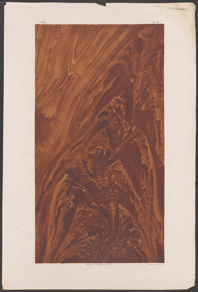
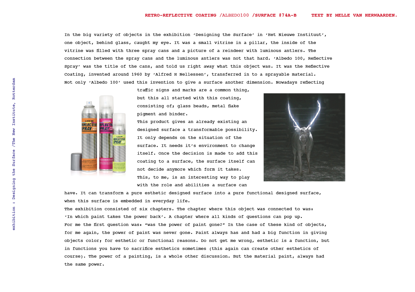
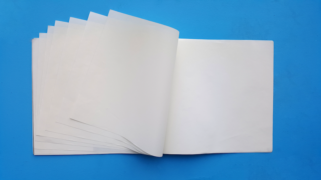
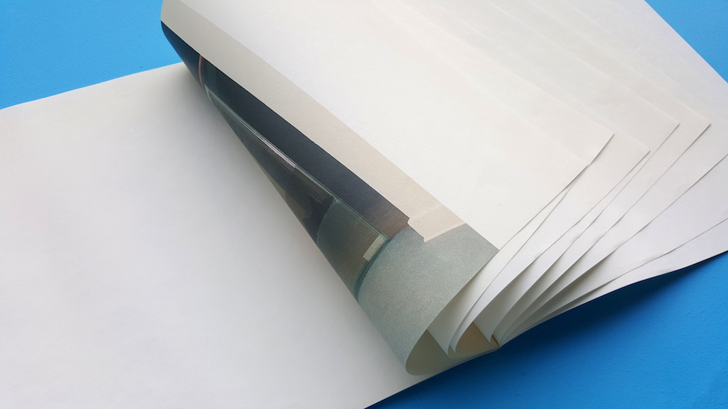
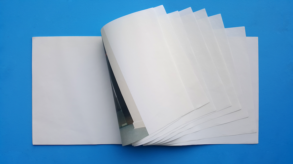
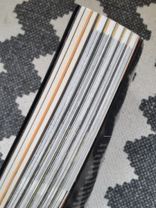
Coarse antique white paper. Slick bright white paper. Corresponding with these two feelings 70’s architecture gives me. This vintage feeling of the past, but in its day so modern and progressive. The book feels historic yet contemporary. I feel like I’m holding a treasure in my hand. This book; 17 by 24 centimeters, comfortable in one’s hand and easy to carry with you. Beautiful pictures in black and yellow printed on this coarse paper feeling like an old precious book in my hands.

cover side1

O B S E R V A T I O N S:

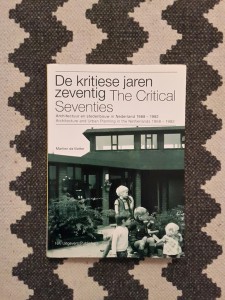
First of all, the book is titled “De kritiese jaren zeventig”, which I think is genius. The 70’s way of spelling “kritiese” is used in the titel, rather then the contemporary “kritische”. The book, designed by Beukers-Scholma, is linked to a 2004 exhibition with the same name. Their work contains several award winning designs.

ocean14 ocean12

overlay4 overlay1
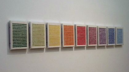
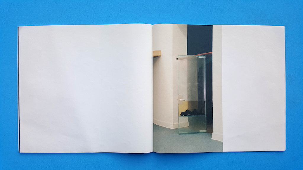
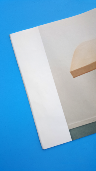
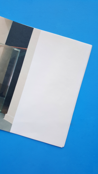
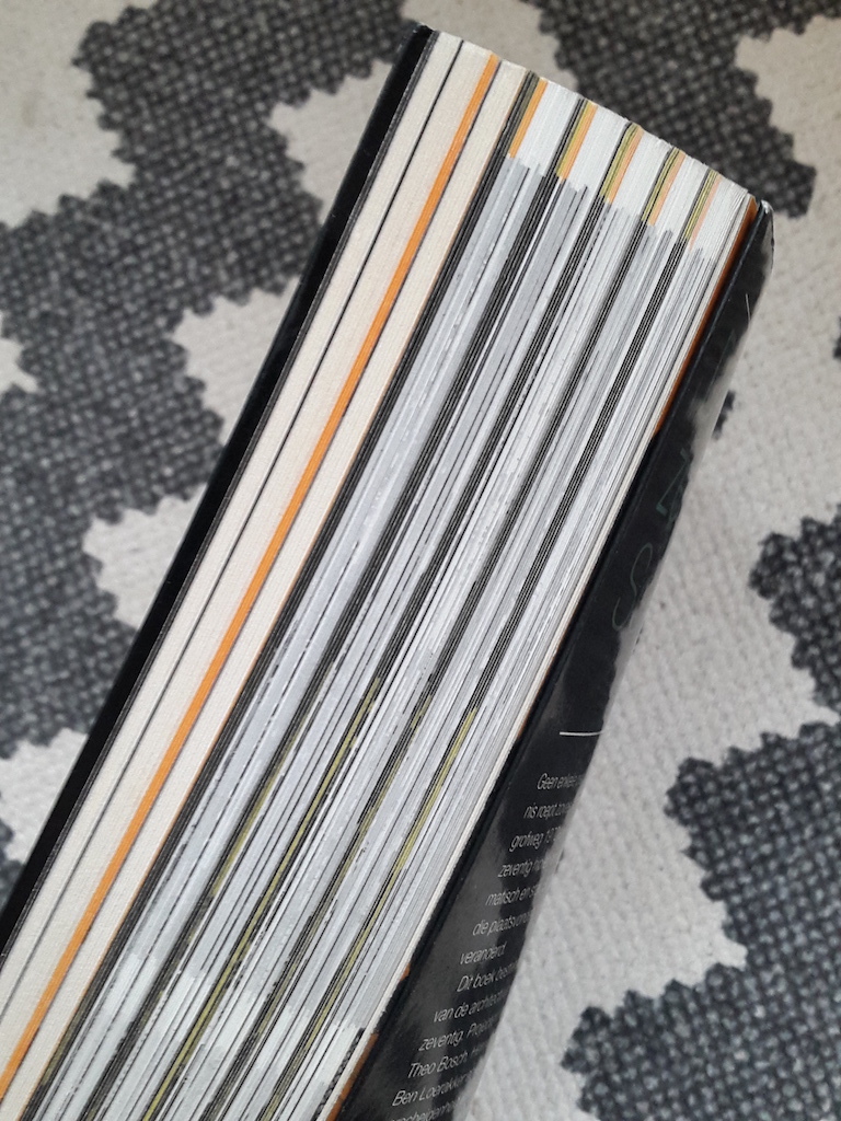
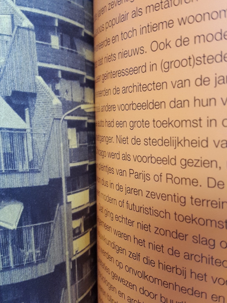
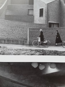
The book consists of 2 types of paper: coarse antique white paper and smooth bright white coated paper. Furthermore it contains 3 types of pictures: black and white, black and orange, black and yellow. The coloured pictures are like black and white prints on coloured paper.

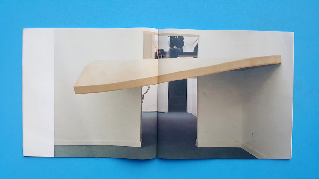
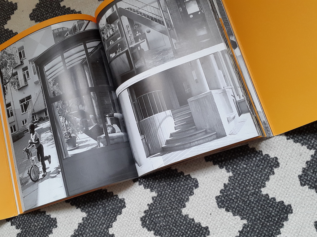
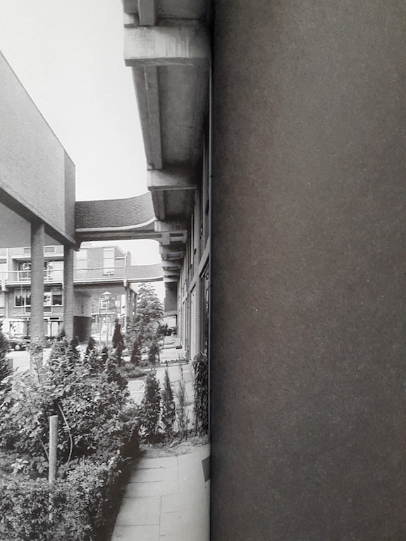
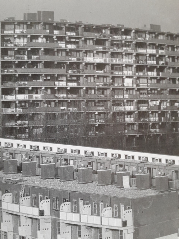
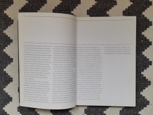
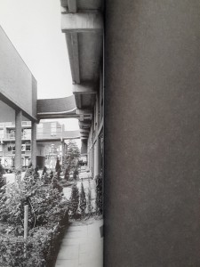
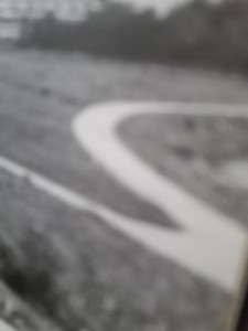
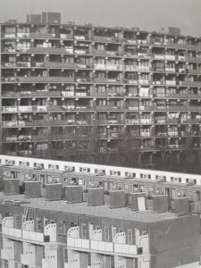
Black and white prints are used for specific buildings. Every chapter is divided in paragraphs that deal with a building. The pictures of these buildings are in black and white on coated paper. The texts are also printed black on white coated paper.

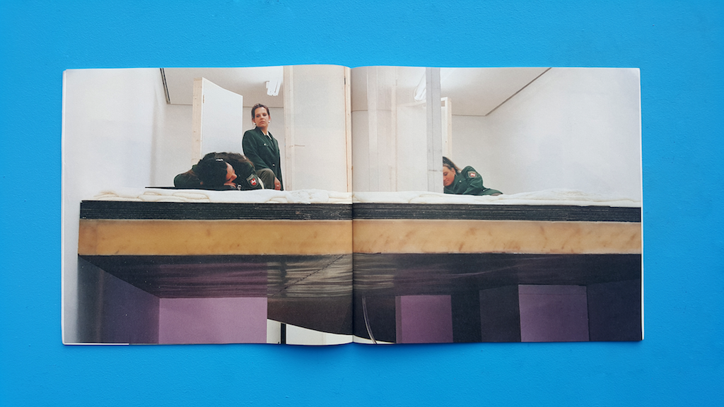
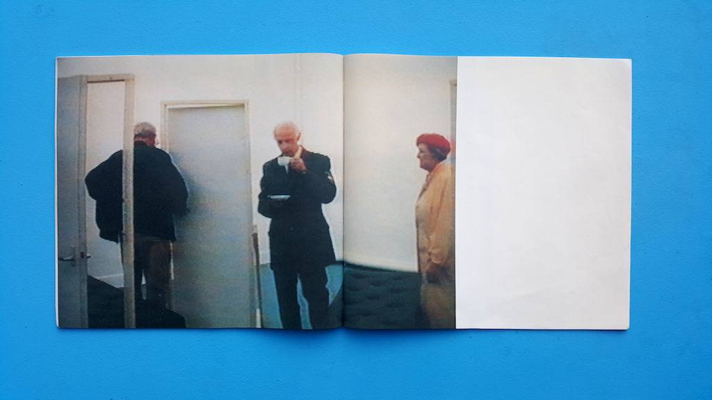
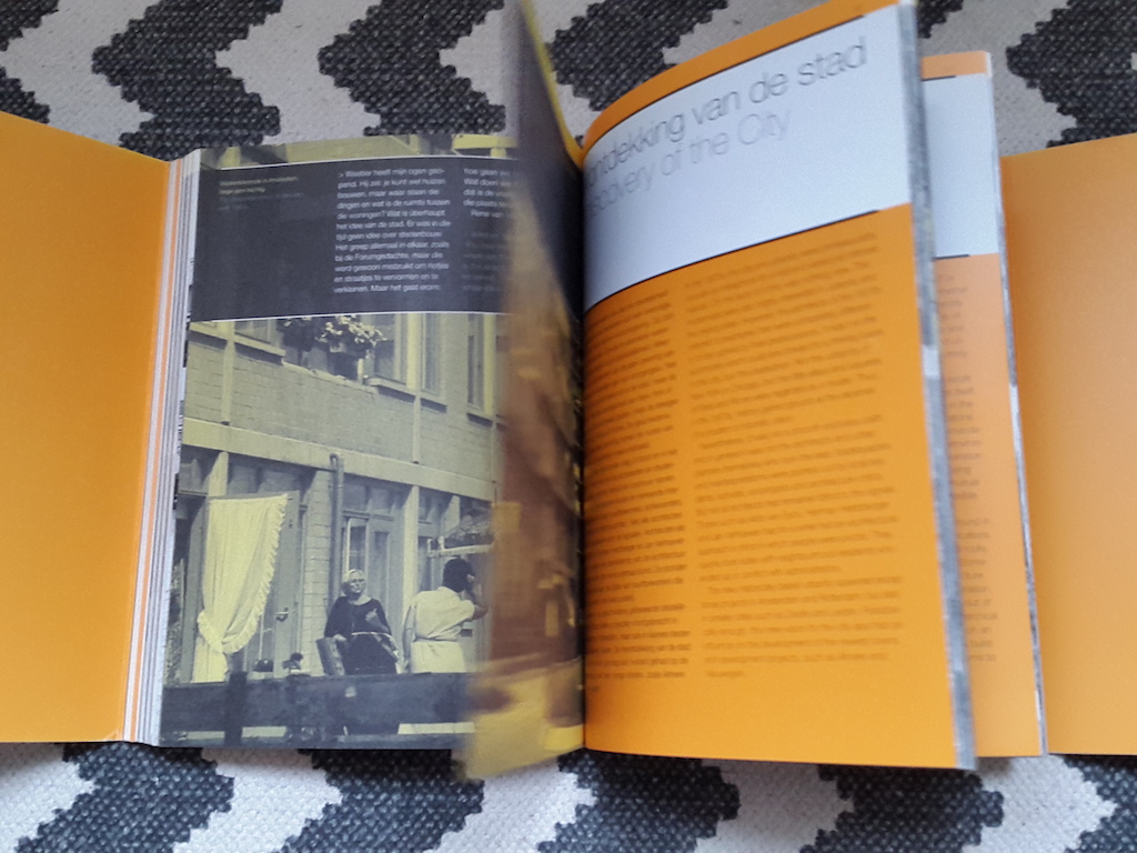
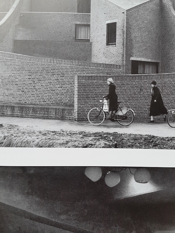
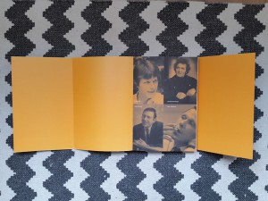
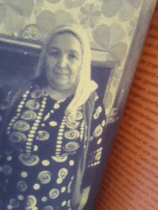
The colour yellow presents scenes: People or streets. They are accompanied by relevant quotes and precede the introduction of every chapter. They are printed on antique white paper.

Orange is the colour being used in the general introduction as well as every chapter’s introduction and the first and final page of the book. The black and orange pictures that introduce the book are printed on antique white paper. The single orange introduction pages for each chapter are printed on white coated paper.

THOUGHTS:

How can I not read this book? Knowledge, knowledge, knowledge. I’m not, I’m not reading. But I see words, I see sentences, their meaning is clear to me without doing effort and so I want to read, I want to continue what my mind processes without conscious effort. This coarse paper feels so…… coarse? soft? Old? Precious I guess. I know this book is about the past. And we’re making the same mistakes all over again. Humanity makes the same mistakes all over again all the time everywhere, always. Why is there so much violence, why are people so unhappy. And I mean unhappy, unsatisfied in a well-developed country. This book evokes so much in me. And it’s not the architecture, not so much the design, but the fact that I know it’s about the past and I am not happy about the world and… Past, present, past, present and I wonder; where is this going? The design of the book anticipates on the context very well. At least on the fact that the book is about the past. And the design feels like the past, it feels like not now. Old pictures, blurry pictures, pictures in black and white, black and yellow, black and orange. Then again I also think this book is bullshit. Pure bullshit. Like everything contemporary related to architecture; this quasi science. Conceptual bullshit about how architecture makes a better world. But it doesn’t because we are inherently messed up. People are insane.

ocean9 ocean15

woman ocean8

Let's try to take a step back.

vagueandblack2vagueandblack

The book feels like an escape. Just like how I can get lost in google maps, looking at buildings, I can get lost in this book

pic5pic6

The book makes me passive, receptive. Maybe that’s how I am in general. No I’m not. I’m creative. I create. I’m not that passive. But then again I am. Well at least lately I am. Sigh. I just want to see, touch, feel, sense the book. Which is okay. I guess. That’s the assignment. But then again, am I researching? Is this going anywhere? No. I just want to get lost. Lost in the images of the book. Lost in the colours of the book. Why do I enjoy looking so much? I do it so much. Just watching buildings. Going on google maps or biking around the city and just looking at buildings. Getting lost in watching them and enjoying them. I can hide my face behind the book. I like it. I want to disappear……………………….

With drawing and painting I tend to write a lot. Write previous to painting or using written words in paintings. I tend to write a lot. In this assignment however. I seem not so capable of writing. Even though I’m writing now. The book makes me very passive. Makes me want to see the book, feel the book, read the book, but not write about the book.

Now how did this all start? How did I end up picking this book? It started with a list of books we could choose from and I decided to look for books about architecture and found this lovely book about 70’s architecture. I happen to have a thing for post-world war II, pre-90ties architecture, so I had to choose this book. Then the book also happened to be so well designed. Also, the text is not only about the architecture but the whole social context of the 70’s. The book contains beautiful pictures, not only of buildings but also of people and sceneries. Sceneries of the 70’s. This book is a history book and its content is wonderfully converted in its design.

It wasn’t a spontaneous encounter. I looked for it.

mystery

De kritiese jaren zeventig : architectuur en stedenbouw in Nederland, 1968-1982 = The critical seventies : architecture and urban planning in the Netherlands, 1968-1982. /Rietveld library catalogue no : 719.22 vle 1


Log in
subscribe