Skip to Content Skip to Search Go to Top Navigation Go to Side Menu


"Projects" Category


A soft seduction


Thursday, November 29, 2018

I looked up books with my first keyword: soft.
Soon I got guided to the first floor in the library section 779,0 .

It was my first time in that section of the library, and that somehow made it feel like an adventure. A search for something I didn’t even know yet.
The section is all about textiles, wowing, carpets and all subjects related to fabrics. That pleased me, and I would occasionally take out a book I found interesting.

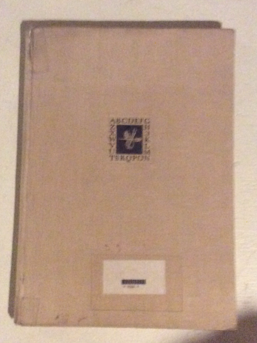
But then as I was gliding my hands though the shelf, I found it: A soft velvet book, in the shade of deep marron red. “De fluwelen verleiding” by Hans ferrée.

My immediately impression of the book reminded me a lot of my previous choice. A5, slim and with an unfamiliar language on the cover.
But the more I looked the more it gained its own personality and charm.
It makes quite an impression: velvet make one think of value and the rich cursive letter speaks of abundance. It claims your attention – this book is far from modest.

The nature of the velvet welcomes you. It felt like it had been waiting there for me, begging to be touched. The color made it immediately important – royal.  Such a deep red color gives it a certain association with power, history, strong emotions, and even a touch of danger – a blood red warning. A glimpse of fobidden fruit.

The title “De fluwelen verleiding” is written in clear-white cursive and quite demanding, as the take on a certain space on the cover. The text quickly realized to be Dutch by Henk Groenendijk, and translated to: “The velvet seduction”. Amazing. Suddenly the book seems more erotic and sensual.

In the middle of the front there is an odd symbol: an interesting graphic mark in black and white. It is the only shiny part of the book, which only adds to the mystery. The pattern of the mark reminds me of a small carpet on a loom. A quite nostalgic feel.

The back is without words, as to say that red velvet is enough information, and the spine quite worn, the letters almost dissolved. Maybe from the tool of time, or maybe from greedy hands?

You could imagine such a book to be too much – distasteful and kitsch.
But for me it is quite the opposite. I see this book as a classic.

779,0 fer 1.

Grey Hypocrisy


Thursday, November 29, 2018

Continuing my Quest for the Dull. I did not find any books by the tagwords connected to my previous result: ’Boring’ or ‘Seductive’. Only the third and less subjective ‘Interior Architecture’ gave a match. Though, this match wasn’t the ‘right’ book for me, in the sense that it was maybe too mediocre, but its neighboring book did catch my eye. It looked kind of dull, but at the same time demanded an autonomous authority. Not so dull after all, and therefore forcing me to adapt the definition of my Quest. Perhaps it was the rather small size (15 x 15 cm.), or the textless spine. I realized how the blanco spine is actually quite a sensation in this library, considering that most books contain either a title, some text or other imagery on this part the book. At the same time did this book blend in well with the rest. Just like all other copies, it is plasticized, and then some: front, back, top, bottom – everything drenched in the monotonous clammy layer by the name of adhesive cellophane. A perfect recipe for blending in, at least in the world of books.

Even though this grey square of about 50 sheets of paper could be considered boring, there are a few elements that make this otherwise invisible copy stand out by its demand for adapted care-taking. For example, the thinness of the book made it impossible for the librarian to place the code sticker in its entirety on the spine, the rest of it had to be placed on the cover. I can imagine when doing this job, the irregularity of books like this is quite bothersome. A visual rupture in the repetitive rhythm of the surrounding stickers. Besides, because of this invisibility, it is harder for a person wanting to look up a book only by the code he/she was given by the library’s database. Maybe that’s why I was drawn to it, the code was missing, or at least not visible at first sight. Maybe that’s why this book has this size; it only wants to be noticed by people who don’t follow the code, but choose by its appearance only. A stubborn little fella, this “cDIM Valencia”. Hypocritical even. Its innocent appearance, yet sneaky way of asking for attention.

774.4 cat 17

Fear and Loathing in the Library


Wednesday, November 28, 2018


The library in the Rietveld Academie is organized in a spiral form and looking through the books in it’s shelves is much like wandering the streets of Amsterdam as they circle around and around. This layout motivates random discovery but abstains in aiding any targeted intentions.

Luckily, the assignment did not require any knowledge of the library or the contents therein.

With a vague idea of which sections we were to choose a book from, I gazed upon the tall typography section. The individual shelves are lined with countless textbooks and magazines; each bearing their distinct design along the spine. The magazines tend to utilize bright colors, which, when aligned beside one another, blur into an inaccesable mass. Amidst this sea of color I spotted a tall beige book with a black title. The contrast to the surrounding books made it unique. The book’s individuality in this context can be attributed to it’s age; It was printed in 1955.

I took the book off of the shelf the study it in detail. The cover is made of laminated canvas and the title on the spine reads: ALBERT KAPR DEUTSCHE SCHRIFTKUNST.

The font reminded me of the font found on my family grave. Sturdy and very legible with well proportioned serifs. The front depicts a small white on black graphic of writing tools in a frame of black letters. The graphic is humble and unassuming; almost disappearing into the distance of the large beige cover. The first page reads in German “Versuch einer neuen historischen Darstellung” almost apologetically labeling itself a mere  “attempt”.

This honesty won me over immediately and I started leafing through the book. Old battered pages depicted forgotten fonts and the names of their creators. I recognized the name Schneidler from old correspondences between him and my grandfather that I had been reading that very morning. This made me feel like a historian piecing together the forgotten past of his ancestors. Maybe F.H. Ernst Schneidler held this very book. All speculation aside, I seem to have picked the book because I subconsciously recognized aspects of my own identity presented in print. I am book. Book am I.

 
757.3 kap 1

    This is honey.

Matter of taste.


Wednesday, November 28, 2018

Network, collage and rebel were the keywords for my second book search. This time I found it quicker than the first time. I went up, walked to the fashion book shelf and grabbed the first book that I saw. The reason for me to walk immediately to the fashion book shelf is simple; because I am just more interested in fashion than I am in graphic design or architecture. And there it was, exactly what I needed and also one of the books that I considered taking the first book search I did a week earlier. 

The cover of the book appeared to be a collage. In my opinion not the most exiting collage I have ever seen because of the simple, minimal and grey colors. But also because of the words on the cover and the cutout of an outfit which is, on one half, not totally “finished” yet. Or they just didn’t want to show their opinion about the content of the book.  

While I was browsing through the book I noticed that my first association was my second keyword; network. First of all, because of the few black and white fashion images. And second of all, because for some reason I always associate fashion with networking. Probably because I live in a surrounding where a lot of my friends work in fashion, go to parties and show their faces in the most beautiful outfits. A topic I also spoke about in my first text.

I see a lot of similarity between my two chosen books. But only from the outside, not from the content. For instance they are both the same size, and the are both fashion related. But I also see a big contrast in the two books. Where one is more rebellious formalized, the other is, for me, more focust on the minimalistic graphics.  


907 bog 1

Oma’s aan de top het feesten kan niet op met oma’s aan de top.


Monday, November 26, 2018

Part 2

In English.

I wrote the first part of this assignment in Dutch because I can express myself way better in my mother tongue than in a language I’ve mostly learned from the webs.

And I have to be honest with you; I’m terrible at grammar.

Anyways.

Here’s the deal.

The assignment was to find a book that covered all the tags (preferably) from the previous book we choose from the library.

Easy peasy lemon squeezy.

Well, for me it was an easy one man’s one minds one seconds job.

My tags from the previous book were; pink, fashionable and difference.

Since the last book caught my attention by its colour; pink. Had me at the fashion and identity and since it was a timeline to show the difference between the different years I choose difference.

Which are, of course subjective tags since they have something to do with my opinion.

To get back to the way it worked out for me; I immediately figured that the most fashionable things are to be found in the fashion section.

It can differ from person to person but for me it’s fashion that’s fashionable.

I choose the same strategy: keep your eyes open for the colour pink and then I wanted something that had difference in it, keep in mind: I was not looking for a timeline.

My eyes caught a book that contained some pink spots and a pink brand name; now I did not know what was written about the subject precisely, but I knew Barbie.

The book I choose almost in a split second is a book about Barbie in different time areas and different clothing styles and I could not Imagine a book that would fit better than this one.

This is a book too that concerns my heart and reminds me of my grandma big time.

She collects old barbie dolls and makes them clothes, I once got a vintage barbie myself and a book about 50 years of barbie.

Plus; I played a lot with the barbies when I was younger. Maybe these factors effected my brain a little.

But I’ve got to say this;

I’m happy that my mind leads me to what I like (which is not weird at all and very logical). I forgot that your brain is an unconscious piece of mush hand that’s great.

So hereby; I’ll add one tag;

Oma.

gerrit rietveld academie library : catalog no. 906.6-jac-1

I-dentity


Monday, November 26, 2018

Ik snap een hele boel niet en mensen snappen het niet als ik zeg dat ik een hele boel niet snap. Ik bedoel er ook niet mee dat ik het serieus niet snap; eigenlijk bedoel ik dat ik een vreselijk verward en chaotisch persoon ben en dat ik mij nooit ooit goed kan focussen op iets. Dat heeft natuurlijk heerlijk geholpen bij het uitzoeken van een boekje omdat wij een boek moesten uitkiezen vanuit ons innerlijke gevoel. En mijn innerlijke gevoel en innerlijk leven schreeuwt; kies op kleur liefje. Dat deed ik ook. Dit was een eitje voor mij; aangezien ik altijd een boek uitzoek doormiddel van de kaft en letterlijk bijna nooit een boek met een lelijke kaft koop. Dus ging ik maar met de meest hippe kleur van 2018; roze, want ik volg de trend en ik vind het genieten. Ik greep met mijn zweterige knuisjes naar het lekkere boekje en voelde meteen dat het asmr voor mijn hand was. Sommige boeken die kan je zo verrukkelijk bewegen en dan maken ze ook een vol-boek geluid; waar ik persoonlijk uren naar kan luisteren. Flexibel en sexy. Gadver nee een boek sexy noemen is echt iets waar mensen voor opgepakt moeten worden. In ieder geval pakte ik het boek op en liep ik er een paar jaren mee rond terwijl ik verder opzoek ging. Boek na boek na boek na boek na boek na boek en ik bleef met dat ene boek ‘wat eigenlijk een van mijn eerste keuzes was’ rond paraderen. Het boek was ondertussen mijn lichaamstempratuur geworden en zodra ik dat opmerkten bedacht ik; lol, deze wordt ‘em bitches. Hij werd het dus. Natuuuuuurlijk ging ik erin bladeren; om precies te zijn heb ik het hele boek bekeken op weg naar mijn huis; ong 1;30 min; omdat het een easy read was, daar mee bedoel ik: Geen tekst en alleen maar plaatjes en ik vond hét echt leuk, nul spijt van mijn keuzen want het boek is van i-D; een magazine over identiteit en vooral identiteit onder jonge mensen. Ik moet nu wel een klein beetje uitleggen wat de inhoud is om te kunnen uitleggen waarom ik het leuk vind. Het is een boek met de tijdlijn van i-D van tachtiger jaren tot en met 2000. Elke bladzijde is de voorkant van i-D of iets typerend van die tijd met een toepasselijke quote van een persoon die in die tijd beroemd was. Nu kom ik op waarom ik het leuk vind; Ik hou van tijdlijnen, verschillen tussen ideeën van de tijd bekijken, mensen kijken en ik hou enorm enorm van verschillende soorten stijlen bekijken en gewoon een beetje plaatjes loeren. Daarbij kwam ook dat mijn favoriete actrice die groot was in de jaren 80 door de film Betty Blue er ook in zat en daarmee was het voor mij eigenlijk al priem. Kortom; geen spijt van mijn keuzen, geen spijt at all. Groetjos Minnon.

gerrit rietveld academie library : catalog no. 754.5-jon-1

Dries Van Noten


Thursday, November 22, 2018

“My eternal soul,

Observe your vow

In spite of the night

And the day on fire.”

-Arthur Rimbaud, A Season In Hell


The big gazing eyes on the cover of the book grabbed my attention at the first sight,It reminded me of this poem from the French poet Rimbaud.


I also like it in black and white.It is not that I don’t like color. On the contrary, I think I like color too much to tolerant it being abused in a wrong way. And I don’t always have enough time to find the right color or the right combination of colors, so to keep everything minimal, I developed this obsession for black.


I also like it because the whole book is very thin, I like the artists who keep things minimal.I believe they spent more time in choosing behind the work, to only keep the best things.


When I opened the book, the vogue and zoomed-in images, it’s almost becoming some kind of abstract painting.I can only see the back of the models in the most of pictures, that also makes me feel attracted, the mystery in the movement go their body. They come and go at ease, at their own pace. They are very independent while I felt invited, but there is no pressure that I have to either.


I also really like the casual and comfortable feeling when they are in those clothes, they can run and dance at ease.It is them who is wearing the clothes, but not only as a living hanger to present those clothes.I think fashion design for me, in the end will come back to the point of how it actually makes you feel when you wear it.Do you feel comfortable in it? Do you feel restricted ?Does this clothes make you feel more of being yourself or somebody else?If it is somebody else, is it a better person or a worse person?


Information about the book:

Dries Van Noten   Women’s Collection Summer 1998

907.8

industrious art : innovation in pattern


Thursday, November 22, 2018

Strolling around a library without having an idea what you’re looking for, felt just as difficult as drifting around a supermarket without knowing what to eat… I found myself a bit lost in feeling what I wanted. Hoping that all of a sudden I’d instinctively grab a book and have an inner feeling telling me it was right. Which didn’t happen the way I expected, but did eventually happen.

The first thing I noticed as I picked up the book I chose, was the complete contradictory which was visible by the title and the cover. A book about textiles, with a textile cover, covered with a plastic layer. 

Is this done on purpose? What does it serve for? For the sake of protection? The sake of deifying? 

On the first sight they immediately play with layers, plastic, prints, the textile cover.

The black big square where the title is shown on, feels badly placed. A bombastic frame which gives a feeling of ‘harshness’, creates an opposite atmosphere of the rest of a book. 

All seems to be a courageous game. Super well designed, but risky. 

Colours jumping from soft green and blue, to bright orange. Straight, direct lines, covered by seemingly hand drawn, disorganised patterns. As an organised mess. And to think this was just the cover. 

Thick, narrow (29 cm), not quite even pages, which show bright, colourful, and diverse displays. From documentation, to installations, finished works, sketches . This resulted in a feeling of  ‘travelling’. By the diversity of the pages, there was a curious feeling arising, not knowing what to stumble on on the next page. As writing about it now, I realise I find it a playful, coordinated book.

The few lines that are written are carefully placed. Usually in the upper right corner. On the background, leaving all the space for the work, which tell  and show you most. 

But the real decisive moment was when I looked down. I was wearing the book.

Yes this is the right book to take.


779.7-stro-1


Show your face.


Thursday, November 22, 2018

The first reason for me to choose this book was because of the form. The book had a strong appearance because of the size, compact but heavy. Also I loved the fact that it didn’t matter were you started. You could begin in the middle of the book but also at the end. The randomness where to begin was a very important part for me to choose this book. It didn’t tell a story but it gave you an impression of the time and subject of the book. The raw and tacky images were cut together and therefore intense to look at. It got my attention because, for instance, it gave me inspiration to make more collages. The book is very well designed for someone like me, very visual. I think allot in visuals in order to understand a concept or subject. The moment I took this book from the bookshelf and quickly looked through it, my hart made a small leap and so I knew that I had to take it.

As I was browsing through the book I immediately had an emotional relation to it. I thought about my mother. It felt like I was browsing through her student life, it had the same atmosphere as her stories about that time. Crazy parties where people show a different side of them or wear extravagant clothes, alcohol, drugs, sex. To provoke or really to be themselves? To create a conversation or to rebel against the “normal” society? To really want to be a part of something. Of course all these thoughts came after looking at the book and knowing more about the content. But also this was my subjective reaction to the book. I tried to relate these thought to myself and my surrounding. Am I living the design of this book at the Rietveld Academie? Am I experiencing life like a collage? Do I also have to dig in to the centre of this scene in order to be part of something? To show my face at every event that is taking place, to socialize and network? Or can my work speak for itself and be successful without people knowing me? 


907.8-fri-1

Beige Seduction


Thursday, November 22, 2018

What book to pick in an art academy’s library? Each one so carefully designed, asking for individual attention and therefor disappear into an abundance of ‘designiness’. It makes me long for the boring book that could potentially surprise me with its content. Perhaps one of those plastic file folders on the top shelves hide some curiosity. Unfortunately, I find out that these are not for students to be looked into – the Quest for Boringness continues. My eyes are caught by a book with a textless beige spine, carrying only the library’s tag: “718.6 pov. 1”.

The color is more band-Aid like beige; it would blend in well with my skin, or my grandmother’s sweater. The surface is slightly textured, but the book’s front has been plasticized by the library for protection. To me, this adds to the sensation of monotony, since so many other books were treated the same way. All individual books have been esthetically democratized by this layer of plastic. This endangers even the most exotic looking book to drown in a pool of textureless mass. This book’s only unique touch might be its shape, which, unlike most surrounding books, is wider then it is tall. Nevertheless, it still hasn’t excited me. Bingo.

Flipping through its pages, I see prints of black and white photographs depicting shop windows, -interiors and -facades. Repeatedly placed on every other page, accompanied with a short description. These photos focus on the design (architecture) that is used to sell other design (product). These designs are made to lure the viewer in; not by their boringness, but their promise of exclusivity. Not much unlike these books in the library. In search for the dull, I ended up with a book about seduction and exclusivity.

I’m quite fascinated by these images. Maybe because I once worked as a sales assistant in a luxury fashion store. A frequent visitor was a well-known Dutch architect, whose experience in designing various (Prada) stores apparently made him a valid person to complain about our bad lighting system. It was too yellow and not bright enough. However, I think he kept visiting our store for its unpretentious appeal; no overly designed cabinets, shelves or fancy lighting systems. A store with a no-nonsense atmosphere; selling quality products through quality service. Like a boring book with neat photographs.

code: 718.6 pov. 1


Softness of the alphabet


Thursday, November 22, 2018


In the library, I was first overwhelmed by the fact that I had to make a choice.

Because of my mood, I was drawn to all the books which seemed to hold a certain amount of history – in other words, old and mysterious.
I was lingering at a big blue book with no inscriptions, when I first saw it:

SCHRIFTKUNDE, SCHREIBÛBUNGEN UND SKIZZIEREN
Ein kleines Lehrbuch der Schrift für Setzer und Graphiker
– Von Jan Tschichold
Almost too thin to be of any importance. A5, 77 pages, and rather uneven around the edges. The color is a light slightly yellow brown, the main title in black capital letters and the further inscription in dark toned orange cursive.

Maybe I felt a bit of myself reflected in the design, or maybe I was drawn by the nostalgia and romance I often ascribe to objects which are a bit ‘old-fashioned’.  A weakness of mine.

Immediately I felt the need to give this book a certain personification.
To claim that this book has a character, and with it a history hidden in its scruffy pages.  It is almost stoic, with its simple design.
Moderate, German = serious, important.

The plastic cover for protection is exhausted, and has been repaired, giving the book an even dodgier look. The plastic reflects the light and makes me think of grease shining on the forehead of old sweaty men.

Although my German is a bit rusty, I try to decipher the title; SCHRIFTKUNDEN – ‘the art of writing’.
The text on the back is a bit more confusing, but overall I get some words: Typographic, graphic art, learning and maybe something about photography too.

The backside only confirms my notion of this book and its author.
Jan Tschichold makes his own introduction of the book, mentioning its precise size (148 x 210 mm), number of edition (112), publisher, something about the paper and the prize of the book (5 Franken), which I find amusing.

Typography – the artwork of creating letters and numbers.

The beauty of an alphabet has always fascinated me.
I remember making up my own alphabets as a child:
Aa, Bb, Cc, Dd, Ee, Ff, Gg, Hh, Ii, Jj, Kk, Ll, Mm, Nn, Oo, Pp, Qq, Rr, Ss, Tt, Uu, Vv, Xx, Ww, Yy, Zz, Ææ, Øø, Åå. I would write them over and over again.
Different sizes, lengths of the lines, curves, dips and turns,
Words as drawings, numbers as symbols. Somehow it was important for me to claim the letters. Taking over, making it into my personal alphabet, in a sense conquering the language.

After this notion I felt softness. A sense of safety mixed with the slight sadness of nostalgia. I remembered other things. Smells, touches., sounds.
And I felt grateful.

Book number, 757.4-tsch-5


“I HEARD THEY RIPPED IT OFF”


Wednesday, November 21, 2018

The first thing that caught my eye was the title together with the typo; “I HEARD THEY RIPPED IT OFF”. The typo looked like the way I write by hand; With bold letters and a melancholic undertone. The book gave me a homemade impression, and right now I really want to make a book based on what I write and draw in my journal, like one of those books that more look like a public notebook( Had bookbinding workshop for the first time the same morning). The aesthetics of the book worked as inspiration for me, which was one of the reasons I chose it. Generally I like books that look like weird notebooks you have stumbled across somehow. When I go thrift shopping I always look for old journals, like peeking into lives of strangers I probably never will meet.

The title had my kind of humor, for me humor is key; Seeing something which applies to your own sense of humour is kind of like seeing something written in your own language when you are traveling. Furthermore the title intrigued me and I wanted to know more about the title and the person who came up with that quote. I don’t like when things are too obvious, I want to feel as if I have stumbled across something  secret.

The cover was very minimalist with only a stripe of black “spray paint, a bit mysterious in a way, and very graphic ( Black and white). I like when things are a bit mysterious yet graphic at the same time, I suppose you can see that in the artworks i make. The book was small and simple and the pages “raw” in a way, again working as an inspiration for my eventual future book. I always prefer books that are small and simple, too big and too fancy books takes up too much space and attention. Also that day I had a small bag which might have affected my choice of a small book in order to fit.  When I peered through the pages there where different small texts written in straggly handwriting together with a few drawings, which gave me the impression of looking into someone’s journal. Exactly the inspiration I’m currently looking for. I wanted to know more of the content, it felt very personal and humorist yet serious in a way.

rope


Wednesday, November 21, 2018

I picked out my book because of the colours and the way the book is bounded together. I had bookbinding class today so i was more focus on the way the books are made. The most spines are the same. But not this one! It is made with a lot of attention and care. The rope makes it a bit raw, and the pages makes the book soft. They look more like fabric. They look sweet and in balance. The colours of the pages remind me of today. A beautiful autumn day with a lot of sun in the perfect time of the season where the leafs are having all this beautiful colour. They make me smile and think that every season has his own character.

Its looks so modest on the last shelf of the bookcase. and I felt a bit the same. More focussed on myself then the outside world, specially when I am looking for a book. I felt immediately that this was my book. When I took it from the case I saw that it had the same colour of my shirt. But it was not a boring flat colour. The front was more a life. It was made with different paper. It looked recycled. You could almost see the parts of the other papers where it was made from. There was no text but it didn’t need it. Also the back was amity.  Except from the two yellow round stickers. I think the Rietveld placed them there for the order in the library. It fits my book. The yellow rounds where placed at the right place. I didn’t get the inside of the book. In the front there where more pages pointing in different directions. They are cute and necessary. It looks fragile hanging on this few ropes but also strong enough to hold itself. Anyways the pages looks together didn’t fit but that made it interesting to look at. I saw some black and white pictures, I love black and whit pictures. I just developed some myself last week.

758.3rieb4

The Tribal World


Wednesday, November 21, 2018

Thursday, November 22, 2018
The book „Tribal Tattoo Design“ is a little yellow book with silver printed shiny letters on the cover that spell the tittle. It is a square small soft covered book around 15cm x 15cm. The color is very vibrant and stands out. Not necessarily a kind of yellow I very much like but neither I mind. A lemon little toxic looking yellow. Next to the tittle is a sketch in outlines only, showing a human body from behind with tribal looking tattoos on the arms, pine and legs.

The first time I saw this book it attracted my attention in the hands of a classmate of mine. The book was open so the images inside attracted me in the first place. Simple outlines only sketched body with traditional tribal tattoo art from different regions in the world. I immediately wanted to look through the book because I’m very interested in diverse tribal history, body art and tattoo art for a longer time now.

The book looks vey simple. If I would have seen it just on the shelf the cover would not attract me at all and blend into the surroundings. On the inside of the book the most oft it are pictures so it attracts to look through. Around the images is a lot of space it attracts the eye with a lot of space and just tattoo and human body doodles. It is easy and fun to look through. The book gives you an eutectic feeling and brings some inspiration as information that you can simply absorb with your eyes. A nice little handy book for some illustrative inspiration for people who are interested in tribal culture and a look on beauty outside of the western world. A nice looking book on the inside and not spectacularly designed from the outside. A very simple little like-able book.

Book number 908.9 din 1

Ideograms’ first fascination


Wednesday, November 21, 2018

Thursday, November 22, 2018

I was first attracted by the back of the book : placed among hundred of others, this thin pale blue back on which we could read – or rather just see in my case, as i can’t understand Japanese- the fine title.
At first sight, this book also looked a bit like a notebook -due to the black cover and the worn out aspect of it-  maybe this is another thing that appealed my attention as I have a special affection for notebooks/sketchbooks, everything randomly sketched and unfinished.

I wouldn’t have picked up this book if there wasn’t those yellow pages in some parts of the book (p.73-88 and p.93-108 and p.121 to the end). They have a different quality of paper : less soft and shiny than the other pages wich mostly depict photographs of masks (the book’s subject I guess). We could also notice more clearly in those parts, how the contour was shining in gold , as if the book was made out of cult paper.

There is also this recurrent fascination for Asian ideograms, that implies a complete inability to understand the meaning of what the book is about , consequently bringing  a focus on the the form and how beautiful compositions the writings create. Ideograms and the all language and culture brought with it become drawings and pure contemplation for me, more than a clear explanation and precise knowledge.
My reaction is a typical European person’s reaction who become quickly fascinated by all this « exotic » aesthetics , anchored in a culture, a language, cods and signs & symbols she can’t totally understand. However, I found this naive reaction, from the moment it becomes conscious, also beautiful. This feeling can be brought closer to the feeling we get in front of an artwork , or in our everyday life, when at a sudden moment, a sort of spark -made out of several elements brought together by coincidence at this precise instant- brings beauty to the present situation.

772.5 CAT 3

Searching for books


Wednesday, November 21, 2018

Thursday, November 22, 2018
I was asked to choose a book that attracted me the most. So I was walking in the library, checking books in different sections. Everything was ordered in categories. It took me around 15 minutes before I found something that attracted me. When I was looking at one of the many shelves that was in front of me, I saw the word “colors” on one of the books and i didn’t even notice in which category it was. It attracted me because I love colors in general, they make me feel happy. I held the book in my hands it was “heavy”. I looked at it! On the cover was written “stop” in Arabic. It felt like it was a sign from the universe telling me to stop searching and take that book. I opened the book and it was full of pictures which attracted me more to it. Because I am that person who can’t concentrate for a long time and read big texts. I rather watch pictures, documentaries or films instead of reading. In the same time i found it pity that i don’t learn or get knowledge from books and therefore i try to learn and get knowledge from experiences in life like ( meeting people with different backgrounds, traveling to other countries, listening to people stories and listening to my own stories ). As i also think that each one of us individually is a book with their own stories and knowledge that we should try to share in the library of life.   It’s funny! that a few months ago i was in the park next to where i stay and there was a big round sign (big circle) with a walking woman/man on it (as you can see in the picture that i attached to the text). I took it with a friend of mine by using a screwdriver home, and kept it home. I like the circle shape it has and i use that a lot in the art i make. Unconsciously i might have picked the book because of that sign i have at home now and it might inspire me for my art.

Naked Dog


Wednesday, November 21, 2018

Thursday, November 22, 2018
Last week we had to look for a book for our design project. I had to look for a book related to design, but here was the catch. I was not allowed to look at the information in the book just its exterior, i had to find a book that attracted ore displeased me only on subjective grounds.

While I was walking through the brand-new library of the Rietveld academy I was primarily buzzy with looking at the library itself. The nice plants they put to the sides and how well put and nice the place looked. In my head a school library is supposed to look old fashioned and dusty not a nice looking clean place like this. Then again, I did not have that much experience with library’s. This was not because I do not enjoy reading. On the contrary I enjoy it to much, so much so that every book I end up liking I want to have as my one. This is why you will not find me in a library but more in a bookstore.

While my head was wandering about like that my eyes fell upon a rather shabby looking book in compere’s ant to all the other rather fancy looking books in the shelfs, the book did not have a title and instead had a cover of what seemed a group of friends siting tighter naked with a dog. The picture did not shook me or anything instead it made me instantly curios what it could be about. For me (someone who is very new to the concept of design) this seemed like a very odd picture to put on the front of a design book. But then again, my idea of design is much more of that of a very clean and tight looking piece than what I was holding. Halve confused and curios I went to the man behind the desk who was the head of the library and asked if this book was also part of the design departed ant and to my surprise it was. This book that seemed to be hand bind with the group of naked friends on the cover of witch in my eyes it looked more like a fine arts project was an actual design book, well…. That made it clear I had made a decision
book 779 -won- 1


Log in
subscribe