Skip to Content Skip to Search Go to Top Navigation Go to Side Menu


"Projects" Category


FURTHER DOWN THE INFORMATION HIGHWAY


Wednesday, October 6, 2010


The size of the indexed World Wide Web is 15.66 billion pages (http://www.worldwidewebsize.com).

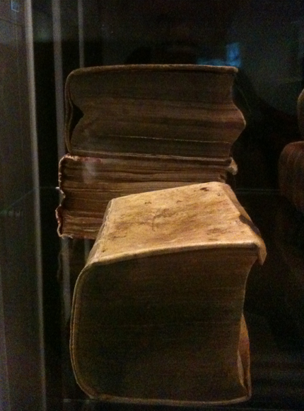
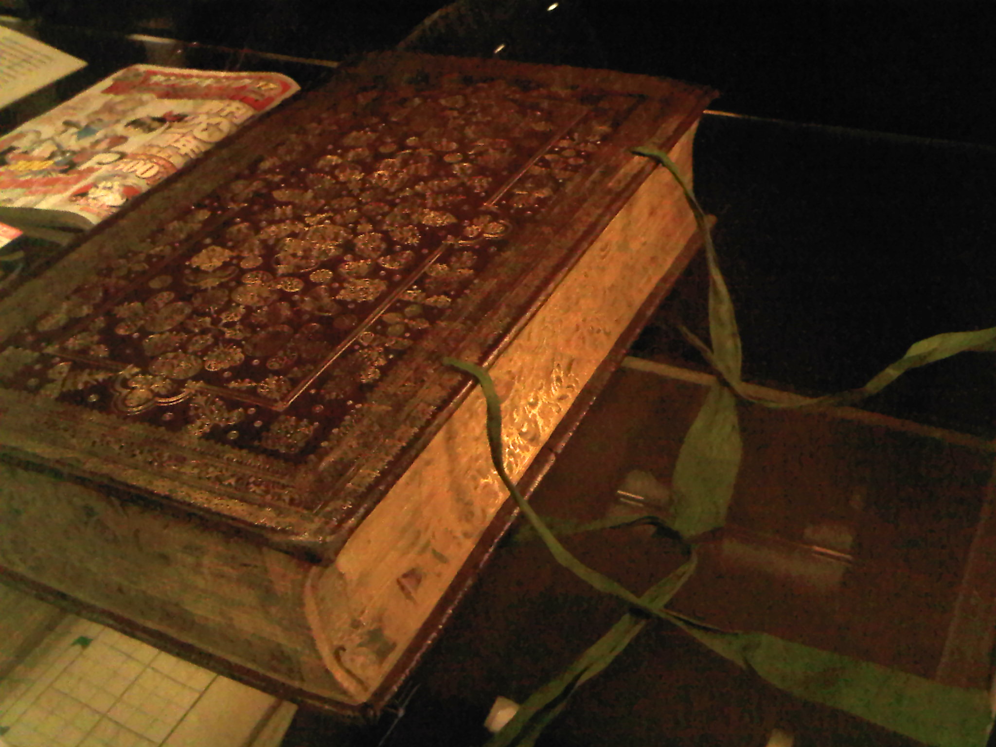
The year is 1924. That’s a long time ago. That’s why this book smells of old grandpa.


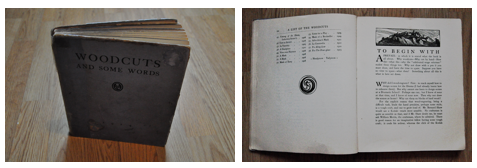
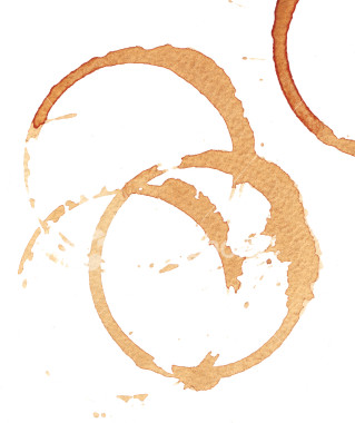
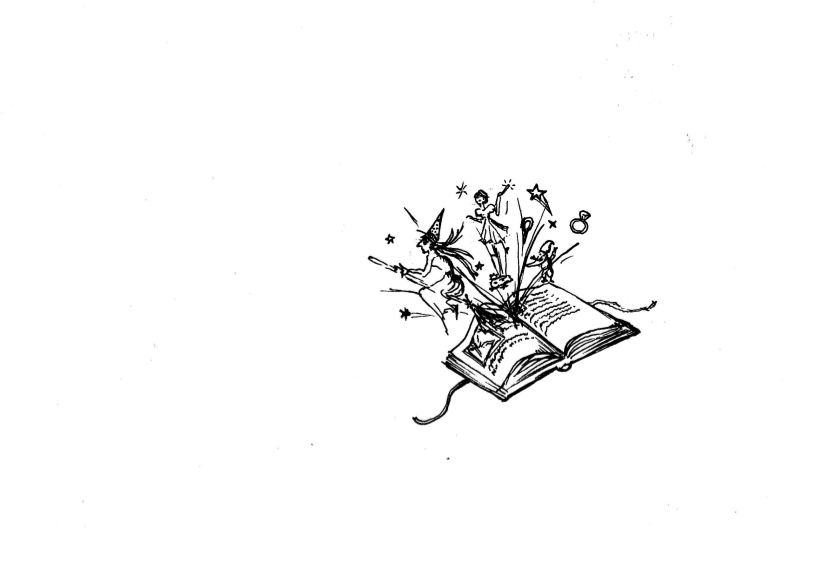
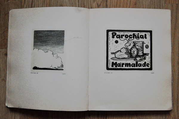
The title is intriguing. “Woodcuts, and some words”. An honest title. Plain simple. As if the phrase “what you see is what you get” was authored for this book only. It doesn’t have a fancy wordplay. Someone once upon a time spilled coffee on it. Maybe also dropped a cigarette on it. Drank coffee and smoked cigarettes, while glancing to it’s precious content. This book I’m holding in my hand is some book. Extraordinary. Classic. Both fragile and pretentious at the same time. The thick papers, the fine composition on each page. So elegant and authentic. So anti-industrial, so handmade. This book can teach you how to make woodcuts…

– It’s like an old school version of one of the many ‘how-to’ videos on YouTube. I’m actually holding an offline version of a ‘how-to’ video. It makes me think of information, and how we approach and handle the nonstop floating information on the WWW.

What is the actual difference between information in a book and information on the internet, besides the limited/unlimited amount? I recall my teacher saying something like: “I will recommend you all to buy the book and not make scans and read them on your computer… because… it’s nicer, you know”. What makes us grab a book instead of browsing the web?

What is the fuss about a book in general? Is it because it’s capable of generating a certain feeling or a certain “vibe” which will never be generated from the most awesome and well-made webpage? Is it the typography on the paper, the quality of the paper, the fact that you can touch it and that it isn’t ongoing?

There’s an enormous difference between getting information from a book and getting information from the internet. I, myself, is having a hard time keeping track on the endless amount of available information on the internet. It’s interesting that the information about any subject on the internet is unlimited. It’s like having unlimited access to ‘knowledge’. There’s always more. You’re never finished. It’s ongoing. It will always follow time, never become obsolete.

The information in a book is not developing. There’s a last page. A period. It’s printed and can’t be changed in a sec. No further links. No sudden brand new pages. No updates. No hidden information. What you see is what you get. And *that* somehow puts the whole ‘info on the internet’ in perspective. You never see what you get, until it’s there. Always floating, constantly changing. Eternal information.


Rietveld > lib. cat. no: 755.1

OUTDATED OR ANTIQUE?


Sunday, October 3, 2010

Once every often when browsing between the many beautiful glossy covers in libraries I come across a tattered old book that I feel I need to save. Especially when held together by peaces of tape and covered in coffee stains of it’s previous users, I am convinced it needs my love and attention. This book ticks all the boxes.

Inexplicably immediately memories pop up of me hovering at my fathers desk while he is working. Looking up to him and his work which I don’t fully understand. Then again, my father was a graphic designer and my associating him and that specific memory with a book on typography might not be that strange after all.

The book “Drukletters hun ontstaan en gebruik” (Printing types their origin and use) by M.H. Groenendaal is filled with old mysterious languages I can’t read. Worlds of knowledge I can only imagine. Wonderful shapes I love looking at. Shapes that take me to exotic places, inhibited by people you now only find in books. Or maybe the way words used to look before I could read. Wasn’t it a fascinating thing? Adults staring at pages covered with weird lines that didn’t make any sense for hours at a time. You could only imagine what these lines told them. It was almost like a secret society to me, and I couldn’t wait until I was invited in. This is what intrigues me most still, something I cannot understand and therefore let’s my fantasy run wild.

When you start reading the dry factual text, however, all mystery of meaning evaporates. Fantasy disappears and is replaced by hard fact. Being a hopeless dreamer, naturally I was let down a bit.

But then I come across delightful sentences that have now regretfully almost disappeared from use, and instantly I am charmed again.

The book by Groenendaal is actually a very thorough reference work on the history of typography. Dealing from the earliest types of passing on information; such as cave paintings; and the development of the alphabet, up until the most contemporary typographers of the seventies.

As the book is written before the computer age when the phototypesetting was hardly introduced yet, it’s not completely unfair to say it is heavily outdated.

However I am glad to find that the book is still widely used and it is often referred to in new publication to date. Also, earliest copies of “Drukletters” are now sold as book antiquities. It is safe to say that it really has no need for me to save it.

Rietveld > lib. cat. no: 757.3 1F

Considerations on the matter of drawing.


Sunday, October 3, 2010

What is drawing? Is it possible to define it as one of the basic way of expression of mankind? I think so. And as a so elementary medium it is also possibly the most versatile. That’s why I’m so fascinated by this powerful medium, I guess.

The sign traced on the ground, at first, and then on rock, paper and many other materials is the most immediate gesture, which remains for the future. It is something that survives the moment it is done, it’s time itself expressed, and gives the possibility of a general overlook on the process of tracing, and therefore of thoughts. As an expression of time it’s the best medium to communicate something of that moment, every idea, process, image. The zeitgeist of a precise moment. Applying the drawing process in history, humanity had described itself for millenniums, and the language didn’t replace this medium, and overpassed its power.

There’s a book who in which this process appears evident, a book who inspired these considerations: “The New Yorker Album of Drawings 1925-1975” by Penguin Books (ISBN 0140049681). It is a collection of cartoons from the famous american magazine, all the cartoons from several artists, Saul Steinberg, William Steig, Richard Taylor, Peter Arno, Charles Barsotti, Geoge Booth, Barney Tobey, James Thurber and Charles Saxon among others, that contributed to its celebrity and authoritativeness. Many designers and artists worked and keep on working for the magazine, expressing by cartoons the daily facts, the ideas they had and their considerations on every topic that comes into their mind. The book as a powerful archive of human activity, a window open on a huge part of social, cultural, politic context of our times.

idea - gesture - sign

Through a closer look to its cartoons it is possible to spot many of the concepts i’ve mentioned in the first lines of this essay. For instance, this cartoon by Steinberg, in its essentiality, holds the articulated concept of the idea that becomes gesture and then sign, being able to disclose its nature. It happens, as in this case, that the sign itself tells much more than a thousand words. In fact, I won’t spend more words on this concept.

i say flower, what you get?

But drawing is also subjective, being the expression of a singularity. In this cartoon the dancing girl expresses something through her gesture (which, in this case, don’t concretizes itself into a sign), but every one of her class mates gets a different concept from the one she feels. It’s clear that, so as in tracing sign everyone puts something of him/herself, in acknowledging it the viewer puts what is part of his/her experience of the world. This causes the fact that drawing as a medium is also very personal, and even if is possible to state that there are not good drawers and bad drawers (the sign is not objective, but reflects the exact image of the drawer), is also possible to say that a good drawing, on the field of expression, is the one that communicates in the best way the concept that inspired it, and the purest it is, the better the idea goes straight into the viewer.

drawing is a personal and a collective processConsidering the history, thou, the drawing had always been the way to describe the zeitgeist of a period, through the widest range of expressions. Is it personal or or collective, then? Is it the personal expression of a singularity or the collective depiction of a society? I think that it is both, depending on the scales we can consider drawing, as the process that turns the expression of a singularity into a depiction of a society is also a collective process.

Another question. The culture influences the art of drawing and drawing itself builds consciousness and culture. Is there a good use we can make of it?

more police lines, please!

Rietveld > lib. cat. no: 738.8 new

The sensation of touching


Friday, October 1, 2010

Rietveld > lib. cat. no: 12928

Hoe?! ‘The Fat Booty of Madness’


Sunday, September 19, 2010

Weldoordacht geklad en geklieder is wat er in mijn hoofd knalde toen ik dit boek uit de schappen trok.

Gewicht, omvang als dat van een saai oud wetboek. Maar uiterlijke kenmerken die speelsheid en frisse veranderlijkheid verraadden.

Het is een boek over sieraden, hedendaagse sieraden om precies te zijn. Allemaal ontworpen door (ex) studenten van ‘Munich Academy for Applied Art’[x]. Blad voor blad ontdek ik, dat mijn kennis over sieraden nog armer blijkt te zijn dan ik dacht. Dat, terwijl ik me verbaas over de vele opties en keuzes in materiaalgebruik, vormgeving, grootte.


Wat zijn hedendaagse ofwel autonome sieraden nou eigenlijk?


Is de term ‘Autonome sieraden’ niet wat de Engelsen een oxymoron noemen?

Een stijlfiguur zoals ‘knap lelijk’ of ‘oorverdovende stilte’?

Deze term lijkt in te gaan tegen het idee dat deze sieraden een toegepaste kunstvorm zijn. Dus daarmee, geen autonome. Wat is het verschil tussen een antieke trouwring en een neonkleurige kunststof ring in de vorm van een schedel? Misschien heeft symboliek ermee te maken, misschien het verleden. Voorheen hadden de sieraden behalve een decoratieve misschien wel meer een praktische functie.

Status, afkomst, burgerlijke stand en noem zo maar op.

Voor mij is de kunst van sieraden een toegepaste kunstvorm. Het is kunst dat op het lichaam gedragen word en heeft de functie de drager te onderscheiden van anderen, Of iets toe te voegen bij hem of haar. Iets wat hij of zij niet nodig heeft, maar wat alleen geld in verband met hem of haar.

Maar dan, een kunstwerk dat ‘ toevallig’ gerelateerd is aan het lichaam en alle eigenschappen bevat van een sieraad. Is dat kunstwerk per definitie een sieraad, dus dan ook toegepast?

Nee, vind ik niet.


the mystery of constructivism


Thursday, September 16, 2010

When we were at the Irma Boom: Biography in Books exhibit, my eyes caught this inconspicuous book. First I walked passed it, I did see the book but didn’t really noticed it. After a while I came back to see it and I found it really interesting. The book is really thin and also not big but not to small too. The book was opened so I couldn’t see the cover of it. I only saw it was an orange cover. It was opened at a page with a constructivistic drawing of a boat, on the other page you saw three lines of text and another drawing that is hard to describe. It looked really graphical, something I really liked!  It was so minimalistic and that was what got my attention. I didn’t really wanted to know what it was about. But I found out it is a poem book. Maybe that broke the mystery of the book a little bit. I’m still thinking about putting the poems in a translatormachine.

The book also has a really interesting index on the right side of the pages. Every page has it’s own little logo with some Russian word above it, it’s probably about the subject of the poem, but still I don’t get the little logo’s. All these little mysteries made the book so interesting to me

The man and the sea


Thursday, September 16, 2010

Sea. Water. Home. Words you said minute ago is gone. It disappeared in an endless space. Somewhere in between 0°55‘.654N 40°25‘.522W and 15°00‘.411N 28°51‘.315W, or maybe somewhere else. It just a spot in a middle of the ocean. You reached that point and went away.


Eleonoras first Atlantic crossing. A kind of logbook“.Two books, different size but the same landscape on a cover. The sea and a small line of the sky, blue color mixed with a calmness and secrets. The coordinates on a book cover looks like a silhouette of a ship on a horizon line, just passing through. Pointing the space. There is something very mysterious about this book. Finger print on a side of the book, its like a signature of a man who went all the way from Gibraltar to Rio de Janeiro, but also it reminds me the look in to the sea from above. Also it shows that this book is personal, and important for a man. It could be a logbook, but somehow it looks like a diary of a man and the sea. What makes this book really interesting, is the difference between two books. At first you may think that small one is the same as big one, just the different size. But the small book has all photos made on the trip, big one only the sea scapes. I imagine how it really looks, for now I cant see that. Just a space where you can catch an image and let it go, into the endless space.

A piece of wood.


Thursday, September 9, 2010

In media res. Irma Boom. Can’t believe she worked on a book for 4 years. 4 years. That’s a lot of time, a lot of energy. A lot of passion. I guess one can easily sense the passion and effort that she puts in the books she makes. I admire her.

But then, there, amongst the passion and well-trimmed books, I find a piece of wood. The book seems hard on the surface. It’s like you can count the growth rings in it. Hard and mushy at the same time. A paradox. It has a story to tell. Kinda like this old grandpa full of wisdom, full of mystery, full of everything you can imagine. Yet it kind of reminds me of those big pieces of cheese. They have also wholes in them, as the book has scratches and bruises here and there. And I guess they, too, have some sorta history. A cheese history, I guess.

I find myself deadly curious about that book. It is enormeous. I wonder how thick the papers are, I wonder how many hands have touched it. I wonder how large the typography is, I wonder how it smells. I wonder if it’s one long story. Oh my, it sure is mysterious. I find myself wondering if it really has pages in it. Or maybe it’s one of those fake-books with a whole inside. No. It is a real book. A modest book. A proud book. A book with a story. I guess that’s kind of ‘meta’. A story that has a story.

The end.

Song Through 21st Century Eyes


Thursday, September 9, 2010

I have to admit, that this was the first time I’ve heard of Irma Boom, although I have already seen a few of the books she has designed before.

Her way of thinking and working has always seemed to me kinda normal/typical for a good graphic designer – passionate, curious, perfectionist and stubborn.

Chinese brush set of 3

I have chosen the Song book, because it seemed to me like an example of a well designed book. What I liked the most about the book is, that  (like Irma says in the description) the colors of the  pages are based on traditional Chinese color schemes. This detail made the book special/different than a normal book/ to me. It is something I don’t understand. I don’t know about those color schemes, but this made me want to know more.

At first, what caught my eye was the red silk foldable chinese box covered with red silk from the outside, bright pink inside.  The book is about two different chinese ceramics styles – that’s why it’s all white, with a blind-stamped vase on the matte porcelain looking cover. The pages paper is yellowish, about 90gr thick, makes a feel of silk again. I can clearly see, how the paper color works together with the print. It feels exactly like it should- expensive and exclusive. Most of the book’s contents are images, but the text is written in both english and chinese.

foldable_box_book

Micro-organisms living in these typographies


Thursday, September 9, 2010

Hurry Up. Pick a magnifying glass before you miss it. Before you flip your page and the dust on the left corner falls off. Deeper in that letter. Deeper in the ink there is a whole other story to be told. A story that might or might not explain why these tiny books aren’t bond for the human eyes. It’s something to make you question. Raises up curiosity. Something to make you intrigued to dig deeper for results. You start to question why she wants you to believe that from these tiny dots a new creative perspective can be born. You can almost see yourself behind a microscope. Ready to believe that there is a tiny living organism in the “E” that spells Essence. The essence of what you have been missing with your eyes. It makes you want to wish that Alice’s potion existed.

It makes you want to be your fingertips. It makes you want to slip right through the glass box.  A glass box filled with tiny dots and endless possibilities. Just laying there. Ignorant of your presence. Not for you consumption. While you still look through the lens of the microscope. You can almost imagine that there’s these tiny species living together. Compromising with the closeness of each other. Zooming in, you can see why she wants you to make an effort and research. By discovering this you’ll look back and give credit to what you can’t read with your naked eyes.

Look for the unusual (1)


Wednesday, September 8, 2010

The SHV Thinkbook was the book that catched my eye, because of the passionate story Henk told us and also because of the vitrine that showed some try out versions of the book, experimented with paper, way of binding, the cover size. It made me look up to the wall and back to the vitrine all the time, to try to find out the story of the book and to try to see the problems she met and the way she solved them.
I think it was important to me get get to know the book in some way before liking it. I see books as object were you don’t only look at, you want to feel the weight, you want to feel the structure of the paper went you turn the page, you want to have a close up to see how the ink is printed on the paper, you want to smell the book you might even want to make a little loving fold in the corner of a page you want to remember.

The only think that i had in the back of my head all the time when i looked at the SHV Thinkbook, was this sentence that i read or heard which was the instruction Irma Boom got for making this book and that was; ‘Look for the unusual’
Maybe in settled book, and publishers land this is a very unusual book, but in my perspective books can be way more unusual.

Some thoughts about books being an object that store information, in a handy, clear, protected and unusual way…

unusual books

unusual books 2

History.fairytale.Dream.


Wednesday, September 8, 2010

There’s always something in old books that attracts me. I think it is the way that an old book already can tell you a story without even open it. There is a history going on in that book, many hands touched it, carried it, let them tears drop on the pages, all of that and the leather cover with the gold embellished patterns and the painted flowers on the sides are telling me that this book was special, actually Albert Magnus, a main Dutch bookbinder, gave this book  to his bride for their wedding in 1664. I’m curious what will be inside, but I cannot reach it because of the thick glass that’s protecting it from the world outside. Maybe I don’t want to open it, because now I can dream of beautiful  bedtime stories and fairytales that can be in the book. I can already see the big curled detailed first letter that asks you to take some time to read the lines without putting the book aside for a while.  Well, in this century grooms usually don’t give their brides gifts like this, so for now I can only dream of living in the century when they did…


Every Thing Design


Wednesday, September 8, 2010

When I was looking for some really nice book to look deeply, this thin white line peeler design caught my sight. Also this small black book was in between two big books-It was grey cover with big white letters and two book that can see back and front side-white cover with big black letters and front side, there is blue colour picture). That is why I can see it right away at that moment.

This really thick and nicely painted black colour book is attractive for me who really like simple design with only black and white colour. And drawing of peeler with thin white line on the black colour cover was so amazing, because that peeler seems making me peel-off the page by page and discover new pages afterwards. I have to peel-off one design if I want to see next design. Like I am looking for something through page by page. Even I feel the first page is the oldest one and last one is the latest one.

Also at the side of the book, not the book cover, there is big and thick white letter which interested, too. It can be simple white letters on the black background, but it looks not that simple if I see little bit closer. Because of the paper inside, black background is not same black as book cover. Also when I look at it little bit more closer and closer, I can see there is other colours, not just white and black. It was very funny that I discovered something I don’t really want to discover from that black and white book.

HOT SHOT


Wednesday, September 8, 2010

One of the first things that strikes Me is the enormous amount of love and energy Irma Boom manage to include within her books. The endless dummy samples to find the right presentation format, the anti-commercial printing and binding methods and the endless corrections are all part of it. It almost feels like the books of Irma Boom are from another planet.

For that reason I found it hard to pick out one particular book, so I asked myself the question; what is for Me the most important part of a good book, the reason to just grab the book and get lost in it. For Me a book is really about a good cover at the first place, one that strikes my attention by being unusual or reminds my of something else I’m interested in, so after I realised what is important I picked the CAR GIRLS book by Jacqueline Hassink

Car Girls

That particular book immediately reminded me of the LP “Grand Prix” by the Belgian band Vive La Fête.The cover (and also the cover of the LP) gives me a kind of exciting feeling, the idea that it’s really cool to drive really fast ( I don’t even have a car) and to have a sexy “Car Girl” like girlfriend behind the steering-wheel.

Why is this happening to me?


Wednesday, September 8, 2010

Als je langs de rijen loopt, wat een geweld.

Een boekomslag die je bij de lurven pakt, een boekomslag die je verwonderd, eentje die je doet reageren. Des te groter de reactie, des te intenser het exterieur bij je aankomt.
Ik was niet zozeer opzoek naar het wow-effect, maar simpelweg naar een boek waarbij ik me comfortabel bij voelde. Een middenweg van gevoelens van nieuwsgierigheid en het vertrouwde. Ik vond ik dit bij het boek ‘OMA 2008’. Ik ervoer dit boek als onherroepelijk direct maar niet schreeuwend om aandacht, het evenwicht ervan beviel me. Zonder te weten waar de inhoud over gaat .(Dit is onmogelijk te raden, de voorflap bevat geen text)

Het ontwerp straalt een bepaald soort anonimiteit en helderheid uit die mij niet alleen aanspreekt, maar die mij misschien zelfs fascineerd. Misschien ben ik jaloers op bepaalde kwaliteiten die ze bezit, haar orde en gekristalliseerde duidelijkheid. Misschien word er met me gespot, Zij die pronkt met haar krachtige lijnen en wiskundige precisie.

‘Ah but don’t you know not ever to judge a book by its cover?’

Het boek laat een duidelijk contrast zien. Zowel letterlijk als figuurlijk. Naast het vanzelfsprekende contrast van het patroon aan de buitenkant, is er ook nog een contrast in het opzicht dat het boek een zelfverzekerdheid uitstraalt en wilt opvallen maar tegelijkertijd alles verzwijgt over de inhoud, wat we noemen een ‘tease’.

Langs de rijen…Ik moest stoppen. Maar te lang kijken is ook niet aangenaam. Alweer haar Geweld.

The book that tantalizes me


Wednesday, September 8, 2010
The Braille book is lying behind a glass showcase. There is no information or description next to it. It is opened in the middle, so I can see two silver staples. The book is completely white. The size of it is like a magazine. I can see that the cover isn’t thicker than the rest of the pages. I can’t see the back and front of the cover, so I don’t know what it looks like. I choose the book because, at first, it doesn’t give me any information. I also choose it because it doesn’t have any letters or words on it, so can’t read what it is about. Even if I knew how to read Braille, I wouldn’t know cause I’m not allowed to touch the book. WANT TO TOUCH IT BUT CAN’T!

The Braille also attracts me in another way. When I look at it as if it is some sort of art, I see a beautiful pattern in the little bumps on the white paper. I can only imagine what it will feel like… The way the book is presented behind the showcase, makes me look at it from different angles. When I sit down on the floor, it is as if the book is coming towards me like a big white bird with spread wings. The book also looks empty to me, in a way, but there’s actually a whole story in it. It gives me room to image what the book is about. This book is part of the private collection of Irma Boom, so besides all the books with letters and photos, she also kept this one. I guess, in some way, it interested her. I don’t know if it attracted her in the same way as it attracted me. I guess I’ll never know why the book is lying there.

Passion , Inhumanity + Transformation


Wednesday, September 8, 2010

I was so touched by one book named “ SHOT ‘’, published on 2009 ( I didn’t find the name of the writer ) and it is about hurting pages transforming from green to red and hunting. Men aiming their guns towards the flying birds.. carrying chickens  ..these are the pictures that symbolizes the passion of human. And the transformation of green to red  symbolizes life and death. The voice in writer’s work is speech that passes through us, that comes from another times and place and whose destination is unclear even while its tone is often insistent, perhaps violent

I think the book is very seriously written against the animal killing. I questioned, why don’t they just shoot the clay instead of the real animals? Is it a social or biological passion? I really found that human beings are continuously being away from the line of humanity. What a nightmare !

The cover is red in color ( symbolizes the blood ) with ten holes with some big writing on it and I felt the holes are the eyes of the animals and looks very sad and are pleading human for help. If you look the holes continuously, you can feel the environment of fear, grief amd tears. The book looks like a closed box. Its opening is not like the normal book as we have to open the lock first. And the right side of the book ( from where you starts turning ), is locked by one iron like metal tool in the shape of an arrow. I think this has very special meaning as arrow always kills. The semi round side symbolizes the expansion of the life and the point part, end.

It was a great moment to be the part of an  book exhibition of known artist Irma Boon in Amsterdam.


Log in
subscribe