Sunday, April 5, 2009
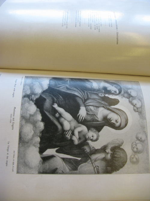
Under dust of ages I’ve been here, waiting. After years, years and years I grow tired of me and mine. I guess that’s happened to my readers a long time ago. though my facts remain true, my language gets older. I have always been wise but slowly I was forgotten…
cat. nr. -corr-2
keyword: wisdom
Thursday, April 2, 2009
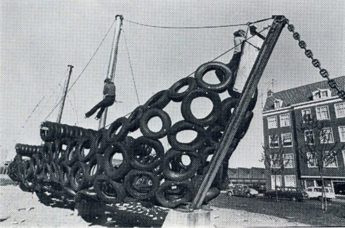
It is possible for the human being to adapt to all kinds of environments and situations, but without a stimulative environment, inhabitants easely get the feeling of lonelyness, boredom and estrangement. “Beond Shelter” is a publication published in connection with the Dutch contribution to the 1976 Venice Bienale in which Tjeerd Deelstra, Hein Reedijk and Gijs van Tuyl give a comment on –current housing– situation at that time in the Netherlands.
As a result of the construction projects of the Dutch suburbs in the 70’s, the architects no longer knew for whom they were designing. They no longer had the same importance in the final say of their projects. It was more up to the construction companies to decide the size of the projects and architects kind of forced in to massive scale buildings. Whole suburbs where competed in few years, leaving no space for inhabitants to give their own charm to the area.
If the speed of construction for new dwellings could be more critically planed and the scale reduced, it would be possible to experience a direct contact between the inhabitant and the architect, or even architecture without architects to let the neighbourhood grow organically and let it have the characteristics of the inhabitants.
cat.nr: 719.1-cat-1
keyword: freedom
Thursday, April 2, 2009
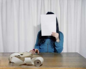
And again repetition. It’s also ironic, to repeat a search for repetition. But this time it’s different:
this time it’s art;
this time it’s pink;
this time it’s really big;
this time it’s Sophie Calle.
But still it’s repetition
A letter, over and over again, but the same letter. 30 women from different ages, professions, layers read it, interpretate it into what they think is the content. Now suddenly it seems not to be about the same letter anymore, but it is!
Repetition in language apparently is different than repetition in forms and shapes.
Language has a personality to it that by the slightest (miss) interpretation or (miss) understanding, the content seems to change. So now it’s not a repetition of the same letter 30 times, it’s about 30 different letters.
I get confused now, because I seemed to think that our interpretation of forms, prints and products would be more alike for everybody. Because a form is a form and a product is a product. Because we learned a cup is to drink from, we see a cup to drink from.
We also learned the meaning of words, but somewhere through life these meanings seem to form itself into (slightly) different ones.
Our idea about forms and products are also changing through life, but it somehow seems to me that there is more of a conventional thing to it, or al least a less personal one. At least the function.
cat.no. -call-2
keyword: repetition
Thursday, April 2, 2009
Bailey’s exact term turned out being “montage” and, “compilation” standing quite close, came time to define the terms. Unfortunately, only Wikipedia was at hand and, as long as it hasn’t been functioning for at least two hundred years, I refuse to give credit any non-scientific information published on it.
Left with too precise requirements for search engines or flaneuring around, I asked for advices—leads on compiling art. I got back the exciting yet enigmatic book title approximated as Postmodernist exhibition. Of course there was nothing in the library, nor in the Centrale Bibliotheek Amsterdam or even on the internet.
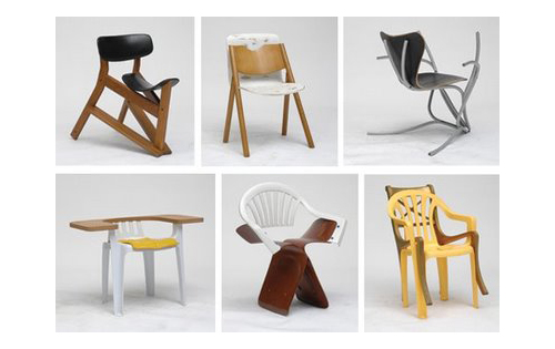
Martino Gamper’s work—100 chairs in 100 days particularly—, questioned by Christian Brändle in the catalogue of the exhibition Wouldn’t it be nice… wishful thinking in art and design, could be related to that montage/compilation method. I would actually really like that connection, the emphasis on the blurry design/art shift, but I’m afraid it would be a little too much indebted to sophistry.
I’d rather come back to the ten books originally found. Four (as well) came from the art section—Local time and New York paintings and art of the steppes and vanishing animals. Out of these four is to be a postmodernist exhibition.
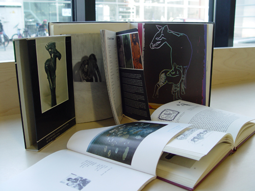
Within the previously defined grid they spell: Independent animal. Design books said: Animal gives.
cat.nr: 705.8-cat-184 + 707.8-sie-1 + 702.4-jet-1 + -war-9
keyword: give
Thursday, April 2, 2009

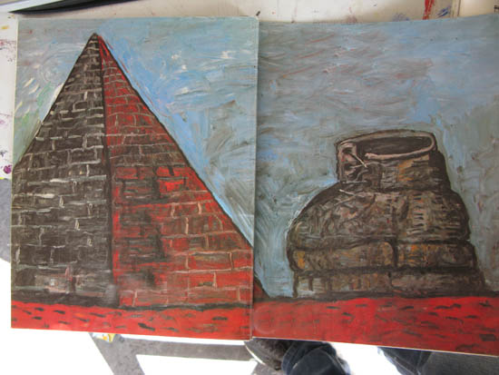
Our sculpture teacher gave us an assignment this monday: To make a sculpture based on a painting by Philip Guston. He had also brought a book. I looked at it, and to my great surprise I had found a third pyramid. The painting on the cover is called “Pyramid and shoe”.
Guston, who first was an abstract expressionist, begun painting cartoonesque images of his everyday life and looking at them is like taking part of it.
About the painting pyramid and shoe:
“In pyramid and shoe (1977) the two objects named meet litteraly on an equal footing. The latter being no less rooted in place than the former, it represents the individual and the ephemeral confronting the anonumous , the collective and the eternal”.
cat. nr: GUS 3
keyword: pyramid
Thursday, April 2, 2009
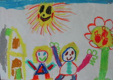
I found a strange book with drawings made by children pasted inside. Why were they pasted inside, and why was only the first drawing printed in color.
The first drawings were made by children between 4 and 7 years old, the drawings at the end of the book were made by COBRA artists.
Language makes one look into the world in a specific way and the other way around; language reflects our ‘views’ on the world.
Children at the ages of 4 and 7 don’t look as conceptual at the world as adults do. Children mostly make use of essential basic-shapes by expressing their feelings and visualizations. Many modern artist seems try to get back to the essential by deconstruct the visual world. The understandable visual world falls apart and becomes one in abstraction.
cat.no. 705.8 zwa 1
keyword: visual language
Thursday, April 2, 2009
I tried to find some relation from illustration to art, but the problem was that i couldn’t find any book that i need. I was thinking about Carl Larsson, swedish painter and interior designer. I think his watercolors combine perfectly art and illustration. But there was no book about him in library. After i was thinking to use music albums covers. Many bands use art works as a covers (like Sonic Youth used Gerhard Richter and Richard Prince paintings as a covers).
Finally i chose book “Masters of animation” by John Halas. I think many frames from animations could be present as a beautiful illustration. Inside this book i found short chapter about “my own” master of animation Yuri Norstein. I woudl like to present his brilliant movie “Hedgehog In The Fog”:
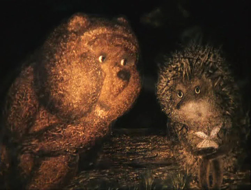
hedgehog in the fog (MOVIE) <———(follow this link!!!!!!)
cat.no. 799.7-HAL-3
keyword: illustration
Thursday, April 2, 2009
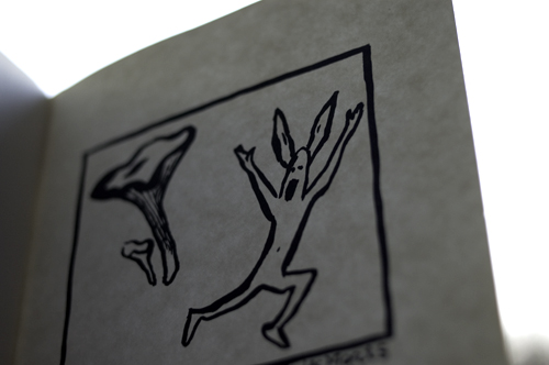
I was walking around with the keyword in me mind: connection… And this nice little book jumped out.
This connection is really good. The human being fighting against the nature. One of the pictures shows a animal/person running away from a chanterelle, -Or is he just yelling “Hurrah” because he find the chanterelle, meanwhile he is wearing a rabbit costume?
This is a art book. A really art book. I don’t understand the connections anymore. The logic is gone!
It seems to be another way of communication, a more free way. I have to look at this book as an art book, and use another way of thinking.
cat.nr: -mut-3
keyword: connection
Thursday, April 2, 2009
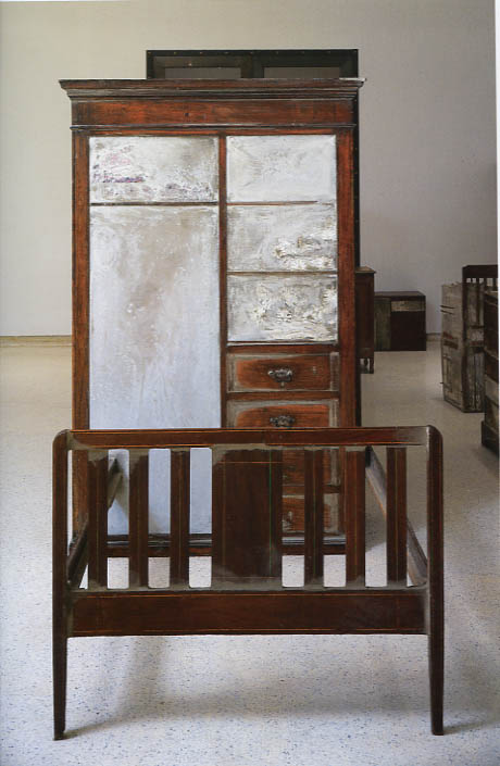
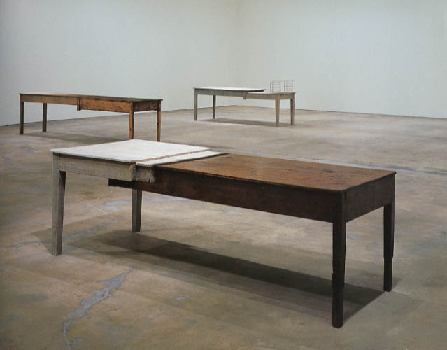
Doris Salcedo is a columbian sculptor who works with the seemingly fragile subject of memories. Salcedo has for years travelled the land of Columbia, searching out and listening to the stories of people who have witnessed and survived the cruel civil war. People that have lost parents, siblings, spouses, friends and neighbors to guerillas, drug gangs and military death squads. These stories Salcedo translates into beautifully unnerving sculptures. She works with everyday objects such as wardrobes, chairs and tables and she turn them into assemblage like sculptures.
In the Untitled series chairs and wardrobes merge into each other in solid blocks held together by concrete. The concrete fill out the hollowness inside the wardrobe and the space under the table as if trying to fix the memories and keep the secrets these spaces holds. In the work Unland the orphan tunic, two table halves becomes one, dependent on each other they create a new unity. Salcedo takes everyday objects and by slightly changing them she turn them into symbols for human relations and carriers of memories.
I feel affected by these works. They are curious, narrative, they want to tell the story but still don’t give away the secrets. I feel like this is art that wants to change the world, not in a big revolution, but by telling stories and changing us a tiny bit at the time, so slightly that it can barely be noticed. I’ll end this with a quote from the artist;
`I know that art doesn’t act directly I know that I cannot save anybody’s life, but art can keep ideas alive, ideas that can influence directly our everyday lives, our daily experience.´
cat.no. -salc 1-
keyword: fragile
Wednesday, April 1, 2009
Constructing patterns, all around the world.
That’s what they do in my last book also.
But now in a more emotional way, rather than functional.
Here its more clear what their dreams, fairs and thoughts are.
Outsiders,
as we call them,
just because they see it from their own vernacular perception.
More pure, more spontaneously, out of visionary need.
They are more independent from what we consider art.
cat.no: 705.9-car-1
keyword: culture
Wednesday, April 1, 2009

A part off this book is about connecting differents parts.
All these nice objects and combinations…
The pictures are so clean, there are a silent feeling on the pages.
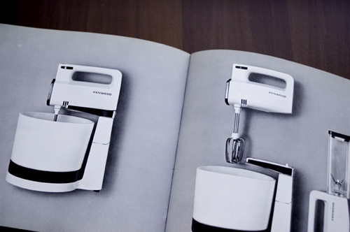
The pictures shows different kind off machines- mostly from daily life such as iron, hairdryer and mixer.
-It’s the perfect world – I will stay here for a while…
In my imagination I can see the young women standing there with her brand new iron. Proud and pleased with herself.
-Did she change a bit?
A woman with a iron. Is more than a woman without..?
Here there is a very nice mixer, with a lot off possibilities.
You can put parts together in new combinations.
– Is this what we have as a human being? – 3 separate tools?
and then we just have to combine them in different way, so it fits with the situation we are in.
How many tools do we have?
-are they changing over time?
They are, I think.
cat. nr: 772.9-pen-1
keyword: connection
Wednesday, April 1, 2009
Mijn zoektocht mislukte De link tussen beide teksten, die eerst niet helemaal duidelijk was, heb ik wel gevonden. Omdat we in een tekst elkaar altijd iets duidelijk proberen te maken was mijn laatste boek het meest heldere boek dat ik in de kast zag staan. Het boek bevat allemaal verschillen ’dingen’, dat is bovendien ook de titel van het boek: Dingen. In dit boek zie je bijvoorbeeld een ontwerp van een beker. Eronder staat in zes verschillende talen de betekenis van de afbeelding plus de manier waarop je het woord uitspreekt. Toen ik dit boek ontdekte, kreeg de zoektocht naar mijn televisie opeens heel ander perspectief. Ook andere mensen zijn geobsedeerd door objecten, door beeld. Dus dat andere perspectief is de fascinatie voor vele mogelijkheden van communicatie.
cat.no. 772.9-cat-50
keyword: beeld
Wednesday, April 1, 2009
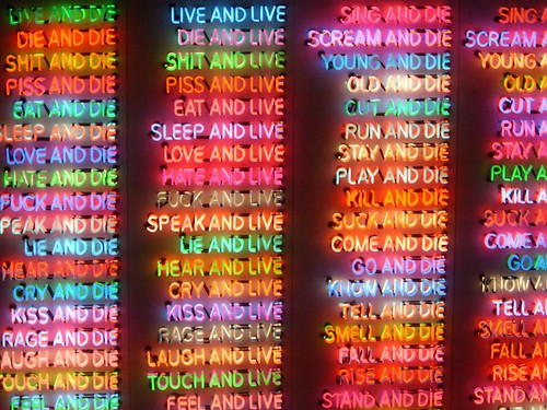
As a final post on flaneurship and neon lights in the city landscape, I chose to write about Bruce Nauman. This might seem confusing, because his works are usually displayed in a gallery or a museum, quite isolated from the busy city environment that was my starting point for the first post.
Nauman made some installations with neon light, some containing text, others consist of images only. I chose these three examples from the mid-eighties (One Hundred Live and Die, 1984, Seven Figures, 1984, Mean Clown Welcome, 1985) for the more or less brutal messages they communicate. I still don’t know what the medium neon in itself expresses. This needs a more elaborate research. I’ll try to give a short comparison between Nauman’s work and the neons in Vegas. Comparing these two types of neon signs arise questions about this romanticist (yet uncanny) idea of a flaneur who gets sucked into a dreamworld of lights in the city. The common divider between these works of Nauman and for instance the neon signs in Las Vegas is immediacy. Both types of signs are attacking the viewer, but the effects are parallel reversed to one another. Nauman plays with a system of repulsion, while in a competitive commercial context (such as Las Vegas), neon signs would rather be used to evoke attraction. Still, I think both have to do with desire.


cat.no. -naum-8
keyword: neon
Wednesday, April 1, 2009
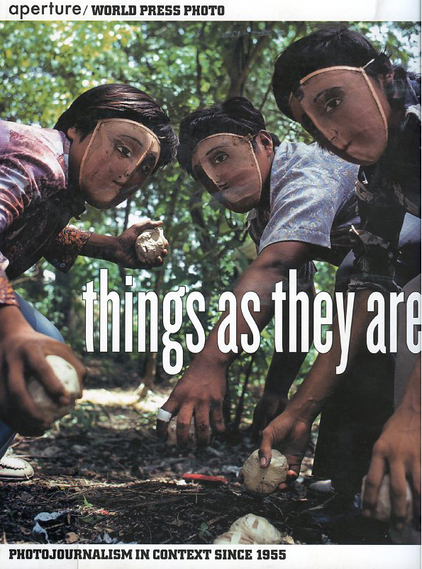
“things as they are” is a book reflecting photojournalism of the last 50 years.
it is a documentary about the development and change in this specific genre, but also very useful as an overview of of social, political and enviromental topics, concerning the media in this timeperiod.
Its definition as an artbook functions, because it is dealing with the medium photography itself, aesthetics, how they change, but also with the investigation of reality and how it is and has been shown to us.
It’s great flipping through it for the matter of inspiration, information, investigation, interest and the aestetical experience.
cat.no. 761.6-pan-
keyword: overview
Wednesday, April 1, 2009

you should not pick up “guerilla advertising” if you don’t have at least an hour to flip through this book.
it is reporting about advertising campagnes of various kinds.
numerous firms and organisations (e.g. nike, addidas. mcdonalds, the protestant church, the united nations, amnesty international, unicef or oxfam) with different approaches such as provokation, investigation, simply advertising or social criticism are represented in this book.
the methods are new; investigation of space and the use of human habits in western society are part of the adverting strategies.
there is several opinions about the capitalistic aim of advertising itself, but in my point of view is this book dealing with a lot more than only the selling aspect of it. definately worth a glaze… or two.
cat.no. 754.5-lue-
keyword: overview
Wednesday, April 1, 2009
When browsing the exciting digital world that is the library catalogue I came across a title containing the evocative, mystic word… vorticism. Conjuring up images of covert religious sects full of sinister hooded eidolons walloping around subterranean crypts. Muttering arcane, paeanistic assertions filled with astonishing amounts of radiant, completely redundant verbosity. These esoteric figures adulated to the apotheosis of the vortex.
Not completely to my surprise it was nothing of the sort. It turned out to be something rather less inclined to cliché’s and more inclined to paintings.
cat. nr: 705.8 cor-1
keyword: develope envelope
Wednesday, April 1, 2009
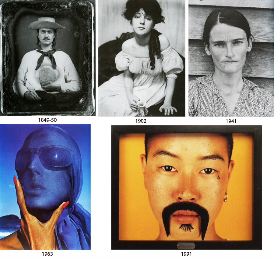
While I was looking for the book, which could give me some materials about identity, I found, that there are not that many books about photography in our library. So, I decided to stop on this History book, which includes photos from 19th-20th century. I have chosen a portrait genre. But I found that it’s difficult to talk about this topic objectively, showing just a few examples. The idea was to show changes in society, that led to the changes in photography also. Not only technical innovations had influence on it. I can say that now we have a good material, good inheritance, that we can use in our work. And, of course, our present time has it’s own identity, interesting, what kind of changes it will leave after.
book no: 761-WAR-1
keyword: identity
