Skip to Content Skip to Search Go to Top Navigation Go to Side Menu


"product design" Category


Julia Lohmann, dierenactiviste en designer


Friday, January 21, 2011

Cow benches (2005)

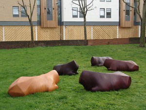
Ik heb me verdiept in het project Cow benches (2005) van Julia Lohmann, een serie van 18 leren banken in de vorm van koeien zonder kop en poten. Het leer is van koeien, en het is in precies dezelfde positie op ‘het dier’ (in dit geval schuim en hout) geplaatst als op het destijds nog levende dier. Haar concept: we zitten altijd op leren banken, maar je beseft niet dat het leer van koeien komt. Als je op een Cow bench zit, besef je je dat wel.

Wat mij interesseert in Julia Lohmann is dat ze in mijn ogen een dierenactiviste is, en dat door middel van design probeert te uiten. Ze schreeuwt niet om aandacht in demonstraties waarbij ze bloed op bontjassen gooit. Ze wil juist de consument zelf laten ervaren dat leer niet alleen een product is, maar ook deel van een levend wezen is geweest, dat wij voor onze consumptie geslacht hebben. Dit zorgt wat mij betreft voor een veel intensievere beleving dan een demonstratie.
Ik vraag me af of zo’n letterlijke weergave van haar onderwerp sterk genoeg is om het publiek te confronteren met hun dubbelzinnige, hypocriete houding ten opzichte van dieren.

(more…)

Bas van Beek – Designing critical design


Friday, January 21, 2011

Bas van Beek, head of the Rietveld Academy Designlab department, teacher and practicing product designer is in almost all interviews and other bio’s described as the bad boy of design in the Netherlands. Not only this nickname as well as the fact that most critics writing about him seem to agree on his position in the field made me interested in Bas van Beek as a person, as a teacher and head of designLAB and most of all as an independent design professional at Archiploitation.

Van Beek's "Royal Rip-Off's"

Van Beek started studying interior-architecture in 1993, studied interior design in 1997, but never finished these studies. Simultaneously he studied interior architecture at the Willem de Kooning Academy from which he graduated in 1998. His final thesis, about a 3D scan of his own faeces as a critic on computer generated architecture, repeatedly sets the tone for most of the critics writing about him. During his studies he did 2 brief internships in Architecture offices. After his graduation Van Beek started his career as an independent design practitioner.

Back then, the Dutch government was supporting starting artists and designers with start-up grands. Putting Van Beek in a position in which he could start to examine what was going on in Dutch Design at that time without direct pressure to design to survive.

(more…)

De schoonheid in wetenschappelijk geïnspireerd design


Thursday, January 20, 2011

Joris Laarman, inmiddels 31 jaar, heeft zijn eigen lab sinds 2004, samen met zijn partner Anita Star. Zijn insteek is om een object een verhaal te laten vertellen. Hij vertelt dit in een filmpje dat te zien is op Youtube. In zijn werk maakt hij gebruik van een combinatie van design en wetenschap. Hij zoekt daarbij naar de grens tussen waar zijn ontwerpende functie nog een rol kan spelen en waar de wetenschap het overneemt. Design gaat voor hem over het overbrengen van een gevoel. Wetenschap daarentegen is gebaseerd op wetten en regels. Het verschil tussen deze twee aspecten is dus groot. Waarschijnlijk is dit verschil de reden waarom ik als toeschouwer een onwerkelijk gevoel krijg. Zo had ik, bij het bekijken van zijn werk Paper Starlings het idee dat ik naar een projectie van papieren vliegtuigjes keek. In werkelijkheid blijken de vliegtuigjes microrobots te zijn, en dus echt. Joris ziet zichzelf liever niet als designer, maar eerder als kunstenaar.

(more…)

Dutch Design Profiles


Tuesday, November 23, 2010

Designblog made a new link; to DUTCH DFA (Dutch Design Fashion and Architecture) “video profiles”. Presented at the latest 2010 DDW (Dutch Design Week) these profiles are part of DFA’s 4 years program that aims to strengthen the international position of these design sectors. Do enjoy the short video’s. Check out also Premsela Institute the much more interesting Dutch Platform for Design and Fashion. Have a look at their program of lectures and exhibits and their “pioneers of Industrial Culture Podcast series“.

To celebrate the exhibit Misfit of Hella Jongerius at the Rotterdam Boymans van Beuningen Museum –which we visited with E-group last week– and the kick-off of DesignTheory’s latest focus “The Designer as Artist.….”, based on an article in the 2010 5th issue of Metropolis M

we present . . .

Concrete Choreographies


Sunday, November 14, 2010

I have a big love for dance, where space is explored, described, by the moving body. This interest for dance, inspired me to reflect on body, space dance and architecture.

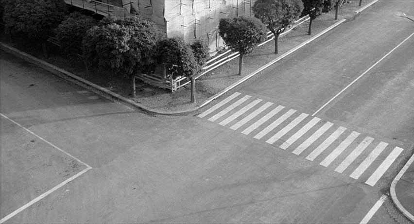
Our bodies are always in a dialogue with their surroundings. Looking at our everyday environment, streets, buildings, its intersections, they shape our movement through the space. Sometimes there are stairs, floors, curves, or slopes, which have more choreographic potential than others, they challenge me to make a certain movement or walk in a different rhythm.

film still from Michelangelo Antonioni’s film ‘l’eclisse’

Choreographers and architects both work with space. Like architecture, a choreography is constructed in a well considered way. The big difference is that a choreography includes the aspect of time, a sequence in its construction, where architecture doesn’t.

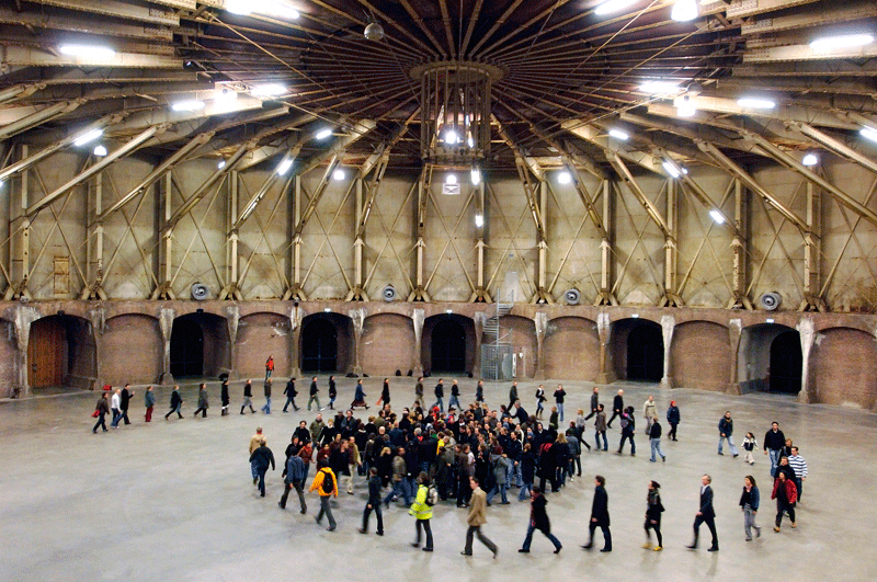
‘body/space’, a project by choreographer Krisztina de Châtel

together with the Academy van Bouwkunst Amsterdam.

Myself being a designer I tried to bring these two worlds of dance and architecture closer together, by making a product.

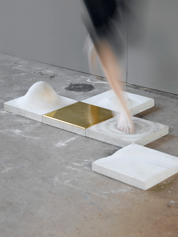
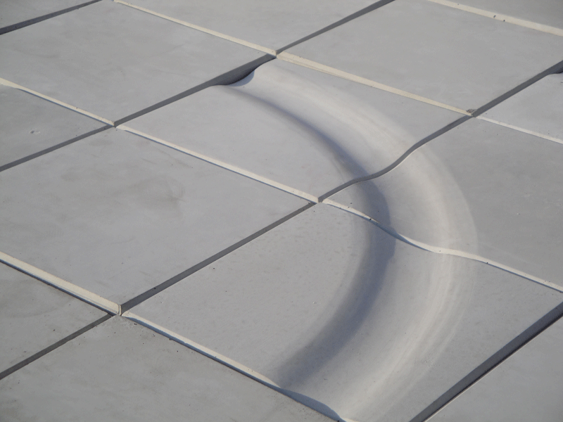
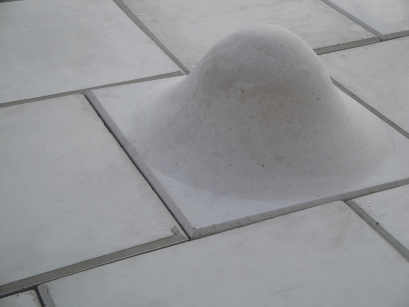
Concrete choreographies, is a series of concrete paving stones, which will encourage people to dance in the streets. Varying in shape, size and surface, every tile is designed to facilitate a specific movement.
With these tiles, building choreography gets materialized. Depending on the paving patterns, the stones will give rise to new choreographies, leading the stroller into a dance where rhythm, repetition, balance, speed, direction and gesture play a part.

photo by Vincent van Gurp

The movements I chose for designing the tiles originate from a personal experience during modern dance class. With these basic movements multiple choreographies are possible.
After mapping and understanding these movements I searched for shapes and finishing, which would serve and even strengthen them.

The size of the tiles, 30×30 cm, fits the grid of existing streets and squares. The used material, concrete, also fits the existing surroundings. But, as a contrast to the straight grid of the street, my tiles have curved forms, which is more fitting the dance and the human body.

With this project I would like to show how interesting moving by foot can become. Now things designed for movement or play in a city, are always for either skaters or children. But why not for someone who is walking outside, and who likes to take a dance path?
With concrete choreographies I try to move people, invite them to see the urban space as a place to dance a little.


Pomme van Hoof is a 2010 graduate from the Design Academy Eindhoven dept "Man and well being" www.pommevanhoof.com

Rietveld App


Sunday, October 31, 2010

The Rietveld Architecture iPhone application, which people can download via http://itunes.com/apps/rietveld, the App (free, version 1.2, developped by Vincent Verweij ©2010) will help you find all the Rietveld buildings and houses in the Netherlands that still exist.

The Centraal Museum has launched the Rietveld collection online. Visitors of the website will find more than 8000 objects by Gerrit Rietveld (1888-1964) kept by the Centraal Museum. The objects in question consist of mostly 8000 archive items and almost 300 museum objects, most of which furniture. Many people are familiar with the red-blue chair and the Rietveld Schröder House, but Rietveld designed many more pieces of furniture and houses. The website collectie.rietveldjaar.nl provides a complete overview of Rietveld’s entire oeuvre. It is quite unique that such a large part of a designer’s work has been retrieved.
The online Rietveld collection http://collectie.rietveldjaar.nl/ consists of almost 300 museum objects from the collection of the Centraal Museum and approximately 8000 archive items. The latter are owned by the Foundation Rietveld Schröder Archive and have been held by the Centraal Museum since 1985. The Rietveld Schröder Archive is the archive which was kept up to date by Truus Schröder at the Rietveld Schröder House in Utrecht. It consists of huge architectural drawings to personal scribbles on business cards.

Mighty Market


Wednesday, June 2, 2010

Super Mighty Market

– Same rules but BIG difference ? Not all supermarkets must be created equal.

‘There is no other material a designer can work with that is so close to the human body and soul as the material of food’

Marije Vogelzang

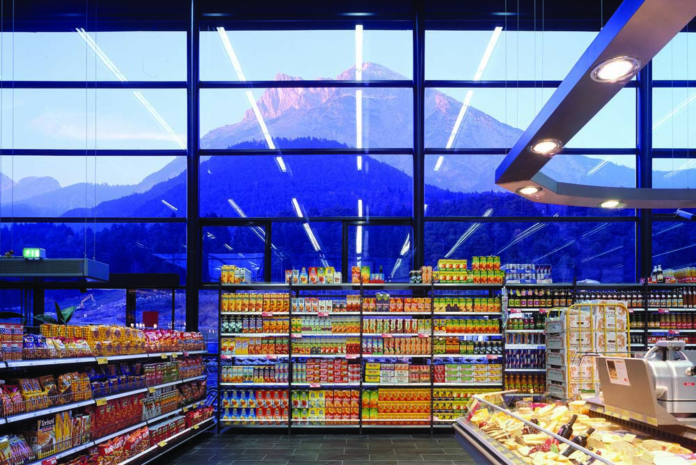
Welcome to a new generation of spaces dedicated to food culture, where ? Located inside my very own head.  Please cross over to my ideal dreamworld as this space does not yet exist anywhere else. Over here I design a supermarket  – only it is not really just a supermarket – it is more of a space where design, art and food can meet – becoming more like a Mighty Market.

The dream begins with a beautiful architectural form screaming in need for a revival. The structure of what was once a beautiful spacious building whose glory has passed, now sits ghostly waiting in suspension like those christmas ornaments in storage that wait all year for december to arrive. In order to orchestrate the “revival” of my dream food space – it must not only have that “feel good quality” that makes you want to hang out there all day, but also allowing it to be inspiring and stimulating in a way that makes you think about how we relate to each other, our social food culture, how it’s context affects our behavior and choices.  Naturally, being a food lover – wannabe- healthy- eater myself as well as an art and design enthusiast, I became interested in finding a “glue” for all these to exist under one context of food culture and how its role affects our senses and perception.
In order to create my dream SUPERmarket THE MIGHTY MARKET I had to think about its social, psychological, chemical, technical and ethical core values. No employees but team members for starters. Environmentally friendly and with a fun attitude. I also didn’t want my supermarket to have the same old shoe box boring construction as most supermarkets do. I mean have you noticed how boring grocery shopping can be? So it definitely can’t have an uninviting interior like the cold, dark, dull, crowded interior in most grocery shops. My Dream Mightymarket has to be part renovation and part innovation – not just to refurbish and old existing iconic building such as one of ‘BEST’ old buildings but

a combination of both, bringing also new ideas of design into one unique place.

Small things make things big and even little changes to an approach can make a big difference. With this in mind,  I dream of the inside – it will be subdivided into areas such as a gallery for instance, where food exhibitions and lectures are given maybe  by someone like Daniel Spoerri who’s been an icon of the food art movement since the 60’s. A space in which I dream of bringing in people to host events like Marije Volgezand or Droog,  some nutrition specialists and chefs as well as artists and designers such as Ayako Suwa who’s emotional food art won her international acclaim in 2008 .

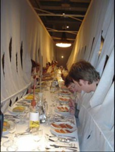
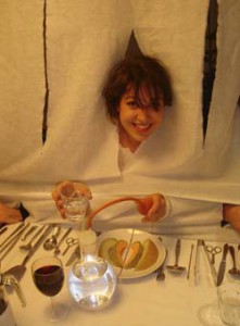
‘Designed by Marije Volgezand for a meal for Droog design, she hung the table cloth to the ceiling as a means to conceal signs of status like clothing. The meals were served on plates that had to be shared as she supplied the guests with unusual eating utensils for this purpose.’

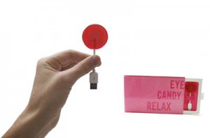
Back to my dream. Incorporated but not occupying the same space you can find an area for home appliances that follow the same motto for innovative conscious design.  Everything in this alter- space-s is meant to make you feel something, and actually the whole supermarket is designed to make you feel something – in other words, it is designed to make you become aware of your senses. The rails for the stairs are cold to the touch to wake you up. Similarly all the senses are thought of in every detail of the stores design and even the lay out of the products is carefully thought through. From the lighting to the sound, even the sense of smell is incorporated to bring different sensorial experiences.  Some of the products you would see in this supermarket wouldn’t be the ideal healthiest, although its main focus IS the organic and healthy, and the selection of others redefined. Some of the products you can find at the Mighty market are for instance “EYE CANDY” by the Play coalition for Beta Tank who use something called sensory substitution to allow you to see images contained within the candy.

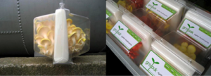
The packaging of products can’t stay behind and would have to be considered – it must aim to avoid sacrificing freshness amongst other factors in favor of warehouse storage as well as its reusability . Playing an important role as an example leader is ‘ Grown in transit’ by Design Academy Eindhoven graduate Agata Jaworska whose concept is simple: the food grows in the package as it is in transit to reach you changing the label from ‘best before’ to ‘ready by’.

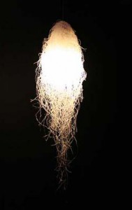
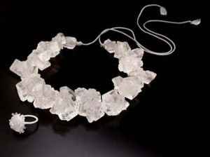
At the eating area you would find ‘tasteful design’ and edible design pieces such as cutlery made out of food etc.. maybe since it is my dream, Nosigner would design the interior which would feature for instance his light unit “Spring rain” made out of bean starch vermicelli, which is edible when boiled (meaning no trash- zero!), or sell things like the ‘Unsustainable’ necklace by Greetje van Helmond for whom choosing food as material is a comment on the impermanence of fashion.

But the dream doesn’t end there. At the Mighty Market you can use books as currency which will eventually create the mighty market interactive library.

Wel bekome !

Growing chairs


Saturday, May 29, 2010

Growing your own design-chair, made out of living trees, grass or crystals – sounds interesting?

Nowadays, more and more designers are working with nature, instead of against it. They’re combining unpredictable, living objects with well-thought design and come up with new ways to make creative and durable furniture.

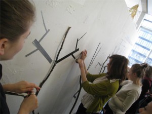
In a workshop, given by graphic designer Ayumi Higuchi, students had to create trees out of black tape. Every student received one role of tape and together they had to make a tree on the wall. It was interesting to see how this worked out – you’re able to control your own decisions, how and where to place the tape on the wall, but you can never completely control what the others will do with their roll.
This concept – not being able to direct the final outcome of a project- is closely related to the trend of ‘growing designs’. One could speak of an ‘eco-trend’, a form of slow design in the furniture-industry. In recent years, more and more designers experiment with the combination of nature, and the natural forms it grows in, together with practical and smart designs. We can see this most clearly in the design of chairs. Chairs that mingle the, in a way, unpredictable side of nature with the well-thought side of modern furniture design.

Just like with the trees made of tape, designers are using elements in their work that they can never fully control – and they do this on purpose, because it makes the outcome more interesting. One can only predict the way the final work will look like. And, commercially speaking, it’s a smart way of working. In the IKEA-era, a time in which identical chairs can be bought for just a few euro’s,  buyers are now looking for more unique, durable designs – they don’t want to see how the chair they just bought is also to be found in the living room of their neighboor.

Below, you’ll find some interesting projects that illustrate this new design-trend. All working very differently, they still show simular starting points.

First, there’s the work of Christopher Cattle that really shows the concept of taking the time to make an object, being very aware of the process of designing and being able to constantly make small changes in this process, to try to change the outcome. In this case it’s the use of growing trees, to make a small stool. The making of one can take about 5-7 years and you can make it bigger, stronger and higher by working together with the growing process of the tree itself. As you see on the image, the stool is made from three sycamore saplings that are ‘trained’ and grafted together around a plywood jig to form the tripod base of the chair. In an interview, Cattle points out:

Growing furniture […] can be used to demonstrate that it is possible to create genuinely useful things without adding to the pollution that industry inevitably seems to produce. Trees are self-generating […] It’s free and it’s non-polluting. Training and grafting trees as they grow are established traditional crafts, and wood is durable but it’s also biodegradable, so it doesn’t have to end up in a hole in the ground. I call this Grownup furniture as it’s the result of mature thinking.

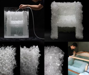
Another project in which a designer is working with nature, is the ‘Venus Chair’ by Tokujin Yoshioka‘s. This chair might not be that comfortable, it is a nice concept in which design and nature can get along. The object is made from growing natural crystals.
The Venus Chair is grown in a tank, the production process is half controlled by Yoshioka and half left up to nature, therefore giving space for interesting developments in the work. Yoshioka says: “I […] feel that incorporating the principles and movements of nature into ideas will become something important in future design.
This is a prototype of his crystal-chair.
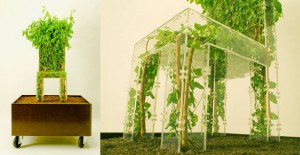
A work that is ready to use, is the design developed by Michel Bussien. It’s called the ‘Growing Chair’. It’s potted and on rollers, but you can of course remove the box and put it in your garden. A nice see-through chair, a very good example of letting nature, literally, fill up the design. To use the complexity and beauty of natural forms and include this in new designs – to almost ‘reconstruct’ nature, without having to bend and force the natural shapes in a dramatic way.
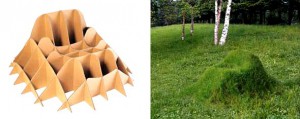
Also great for your back garden is ‘The Grass Armchair’, by Purves & Purves. Again, working with a frame, this chair is ‘leading’ the grass. It will almost dissapear in the landscape, being completely covered up with the surroundings, you’ll have to be careful while mowing.
The chair is made of biodegradable cardboard which you fill with gravel and soil, seed with grass.
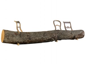
Finally, this last example is made by the Dutch ‘Droog Design’. It’s the so-called‘Tree-trunk bench’ by Jurgen Bey. In his design ‘A fallen tree can serve as a seat. The addition of bronze classical chair backs makes it a proper piece of furniture, a crossing between nature and culture.
The designer makes clear, very firmly, that ‘it is ridiculous to transport trees when they are locally available.’
It is because of this statement that only the chair backs are for sale, thereby forcing the buyers to really find a tree, that’s already there, to use. Thereby making the buyer very active in the process of the design. Although this tree is not growing anymore, it’s still a nice way of using natural shapes and transforming it into a design.

All these projects show how you can make unique design in a new, eco-friendly way. A ‘movement’ that will probably set the trend for future designs and will constantly inspire designers to work in a creative way with what’s already there.
Ghost Science?


Thursday, May 27, 2010

During a workshop of Ayumi Higuchi about ‘rules’ I saw one of the books she brought with her to class. One of them was “Design as Art” by Bruno Munari. While reading, I noticed he was clearly writing in and for another era, but his ideas about visual, graphic and industrial design are still working. It’s a modern classic about how we see the world around us.  I have an obsession with modernism of an earlier era. I don’t know why exactly. But I know that something is haunting me. I constantly seek references of music, book, clothing and product design from the past. I wanted to write about examples of where I see these references, and what is it exactly that is haunting us and what enhances this power of haunting.

Lets start with Apple, almost everybody I know owns a macbook or an I pod. Most people don’t know that every single product at Apple, from hardware to user-interface design, is based on old designs for Braun during the 50s and 60s made by Dieter Rams. Jonathan Ive from Apple design is clearly inspired by him. Dieter Rams gives the clues for the products of the past present and the future of Apple, he is a furniture maker, architect and product designer.

Maybe a few of you are familiar with my next example, the magazine Monocle. Its an international magazine with its headquarters in London. Its more a book than a magazine, about international affairs, business, culture and design. Tyler Brûlé is Monocle’s editor-in-chief and chairman. He is the guy who brought neo-classic post-European modernism to lifestile publishing. Writers and photographers from over 50 countries deliver stories on forgotten states, political figures, emerging brands and inspiring design solutions. Monocle also works with impressive illustrators who contribute to the magazine periodically. Here are a few examples of illustrations made for the magazine.

Andrew Holder

Lab-Partners

Adrian Johnson

Notice the vintage inspired style and color composition. Few of the readers know that this is not the first Monocle. There was another Monocle , a virtually forgotten, but important magazine that was published from the late 1950s to the mid-1960s. the new Monocle however actually looks nothing like the old Monocle.

Maybe all this nostalgia is not for the recent past, but more for the future that it promised, but never came. I present you Hauntology. Hauntology is derived from haunt and ology.

Hauntology is the opposite of nostalgia. The term goes back to 1848. Marx and Engels stated ‘A sprectre is haunting Europe, the spectre of Communism’. It was introduced for the first time in 1993 by Jacques Derrida in his work “Spectres de Marx”. The future can only exists in relation to the past. We are living in a time when past is present, and the present is saturated with ghosts of the past. In hauntology, the present is not only haunted by ghosts of the past but also by  ghosts of the future. Jacques Derrida talks in the documentary “Ghost Dance” about ghosts being part of the future. In the documentary a student asks Jacques whether he believes in ghosts. He answers “Le phantom c’est moi”. In this case, yes it could be himself, since he is asked to play himself and without knowing it, he lets a ghost speak for him, he lets the ghost play his role.

Cinema is the art of ghosts, a battle of phantoms, its the art of allowing ghosts to come back, and let them speak for you. Watch the interesting documentary “Ghost Dance” (1983), starring Jacques Derrida.

My last example, hauntology can be found also in music. Recording label Ghost Box is an English recording label by graphic designer Julian House and musician Jim Jupp. They describe themselves as a label for artists that find inspiration in library music, folklore vintage electronics and haunted television soundtracks. The name Ghost Box itself is a reference to television and the way previous experiences with this medium can haunt your real-world experience.

I agree with Jacques Derrida that cinematography and telecommunication enhances the power of ghosts and their capability to haunt us. Music also contributes to this power of haunting. To prove it, listen to some of these examples of haunted music and let the ghosts of the past and future speak for you.

Memoryhouse

Broadcast and The Focus Group

Mordant Music

SI Module or total table design


Tuesday, March 23, 2010

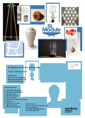
SI Module is the portable platform for Applied Arts and Autonomous Design, initiated by Sandberg Institute Applied Arts department.
On a special table a system of modules will be build. The sizes of these modules are variable, depending on the size of works exhibited.
SI Module, was part of Object Rotterdam

three more links inspired by the design fair: Object Rotterdam
1•Odd Designs on Film, 2•Richard Hutten "playing with tradition", 3•Total Table design
The Object Rotterdam excursion was part of the Basic Year "form-lab" workshop

shape


Monday, March 15, 2010

There is a period in everybody’s life where one is still unable to speak. It’s the time, your very early childhood, before you ‘re taught a language. In that period, you look at every object as what it is, not at the function or the meaning it might have. That is a way of looking at things I really like. Later when you’re encouraged to speak, you loose your ability to look at things ‘as they are’, because you start giving names to things. You start naming things and thus start categorising things.


There is a certain kind of break in your existence, from now on you look at things and try to lable it, you don’t see it as an original and unique whatever-it-is any more. The French psycho analist Lacan (who made a very complicated theory about all this) calls this phase the symbolic order as apposed to the other phase that he calls the imaginary order . Very revealing stuff, if you ask me.

Our workshop was about shape, not meaning. The thing as it is, not the concept behind it. An attemt to try and let you look at an object in the way described above.

Judging from the results that can been seen under the category “form-lab“, presenting most of the processes I witnessed, I think it worked at least for some of you.

Come and read!


Monday, March 15, 2010

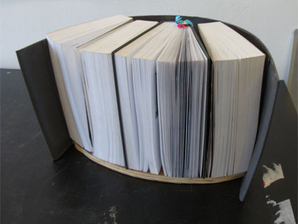
The aim of the project was to be capable of using the shape and quality of one object for developing another, completely different object. I decided to use my favorite chair as starting point for the assignment. While working I realized that I couldn’t solely rely on the factuality of forms. Rather I had to work on a more intuitional level; I had to interpret and translate shapes and texture into certain qualities.  I ended up making a bookshelf out of a chair.

Some general remarks on the chair:

  • 50ties
  • The chair can be divided into two parts, namely the seating and the legs. The parts differ in style and function, yet they seem to contrast each other in style -hard and soft, different movements-.
  • The chair is top heavy.

Qualities of the seating:

  • The round shape of the seating gives a sense of intimacy and protection.
  • The round shape has an inward movement that is inviting and suggests openness. It makes you want to sit down and crawl up into it.

Qualities of the legs:

  • Straight, elegant legs.
  • The legs have a vertical movement. The legs are scuffed all around and they seem to narrow down towards the end which also gives them a slight horizontal movement.
  • Breaks with the softness and inviting feeling of the seating.

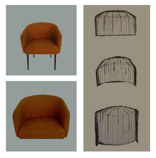
Left: photo of the chair and the seating. Right: different sketches bookshelf

Left: photo of the chair and seating.
Right: different sketches of the bookshelf.

Idea behind the bookshelf:

  • The round shape and inward movement of the bookshelf corresponds with the seating of the chair.
  • The shape of the bookshelf gives a sense of intimacy and protection, which is also similar to a book cover.

The idea behind the books:

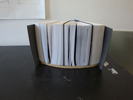
  • The books are placed with their covers towards the bookshelf, which gives one a peak into the books by just looking at them. The placement of the books is a literal expression of openness.
  • The pages of the books are meant to contrast the round shape of the bookshelf, similar to the way the legs and the seating of the chair relate to each other.

As can be seen in the sketches above I experimented with the general form and feeling of the object by placing the books in different ways into the bookshelf. Ultimately I had to conclude that the last sketch (the books placed in a crown shape) is corresponding best to the heavy, warm feeling of the chair. Furthermore the crown shape of the books helps to enhance the qualities and the shape of the bookshelf as they are reversed in form.

Several sights of the bookshelf -the actual result.

The Oily Object


Tuesday, March 9, 2010

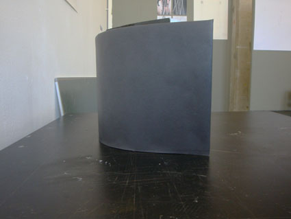
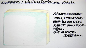
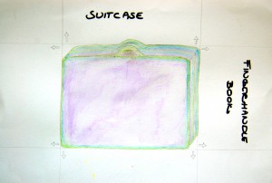
Simplistic form, makes me think of suitcases, briefcases, boxes.

4 angles from the front side and back side. 8 in total.

Design of simplistic form. Based on angles.

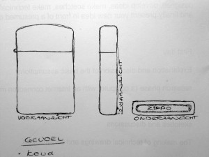
Obvious similarity with the zippo. Detail from the side put on the top.

Very minimalistic outcome. For me it’s about aesthetics.

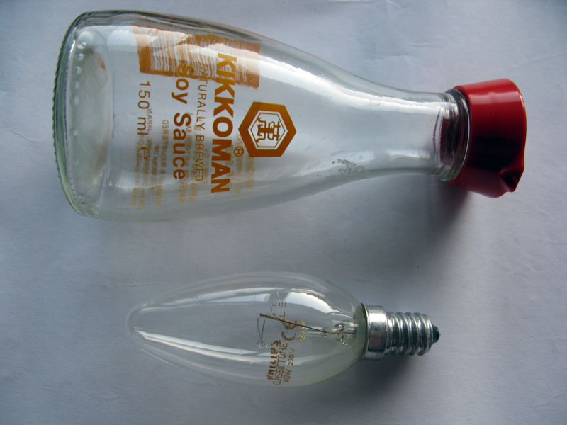
Red Glass And Orange Text.


Thursday, March 4, 2010

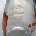
Deformed Text Graphic element Kikkoman's universe

Transparent
 Deformed letters and symbols when you look through the glass
Reflections

brother and sister

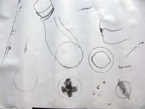
Another object that fascinates me is a lamp.
Today I came to realize that they actually are brother and sister.
Two elements:  Shiny transparent fragile glass - vs - Strong non transparent cap/top
Symmetry    -    yrtemmyS
As less as possible. Form follows function. No extra’s.

Exit

A Sketch

Sketches

Product Follows Form

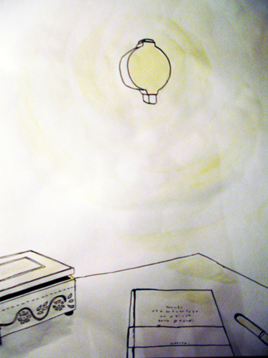
sketch of how it will look

No extra's: Lamp and switch are now one
Reflections are now replaced by light

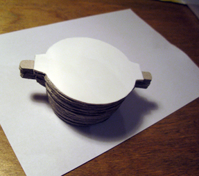
The Model

Balance

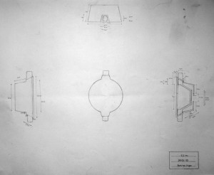
technical drwing
Logical symmetrical system

(Eventually) two elements: Plastic and Glass

Or four? Lamp and Switch included

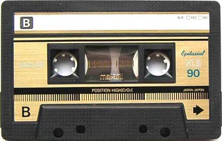
Maxell 90 Gold


Thursday, March 4, 2010

For me sound is something mysterious, because I’m deaf. during my childhood I was fascinated by music cassettes (casette-bandjes). People love these things. For me it was hard to imagine.
Something coming out of the cassette that I couldn’t see.
some more interesting elements:
– gold/black – variety volume of lines – symmetrical holes – two hole with teeth – rectangle with round corners – easy to put in pocket – parallel lines–

scale drawing “make invisible visible”

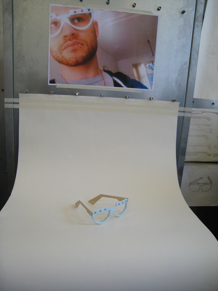
final presentation

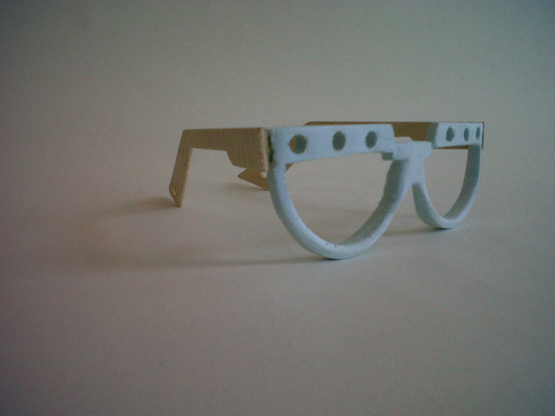
Exploring the possibilities for translating the idea into a product brought me to a new space for viewing the designwork. I fell in love with the PET-foamboard material and thin woods. I could change the shape and lines (movement).
During the translating I solved the technical problems/errors that I couldn’t see in my scale drawing. I had to wear the showmodel glasses in order to solve these problems and find the right shape (nose-holding, hinge and degree angles).
I’m happy with my first design product translation from the (inaudible) cassette-band and I don’t mind wearing it.

Spinning spacetool


Thursday, March 4, 2010

What I found interesting about the original object and wanted to use for my own design was the temptation to spin the handle and the hypnosis from looking through the transparent plastic.
It’s a simple and appealing 80’s kitchenware; sharp, round, white plastic meets metal, functional and no I-pod edges.

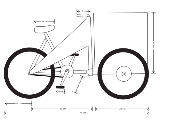
Sara‘s initial object was her cool black leather shoes (click here to see details), and we decided to work as a team, creating a  cargo-bike by the interesting combination of spinning space and rock’n’roll coolness.

The cylinder shape of the kitchen tool is used for the cargo box, which is made of a metal frame covered with strong white plastic band, braided in and out between the vertical bars of the box, which give the box a mix of curves and straight lines, just like the black leather shoes.

The intriguing contrast of white plastic and silver metal that we find in my original object is transmitted to the bike, through the white handles, cylinder and saddle versus the silver metal frame.

The shoes have a special pattern that we transformed into the triangular part of the frame, which gives the bike a distinctive and cool look, and by biking on it you immediately get into the ongoing rhythm of elevation and falling of the pedals, that makes you continue.

What’s more tempting than to make the wheels spin, by taking a ride on the Spinning Space Bike?

The Poodle Puzzle


Thursday, March 4, 2010

Bad Dog !

you’re so cliché.
i dislike poodles.
it’s not important.

.

.

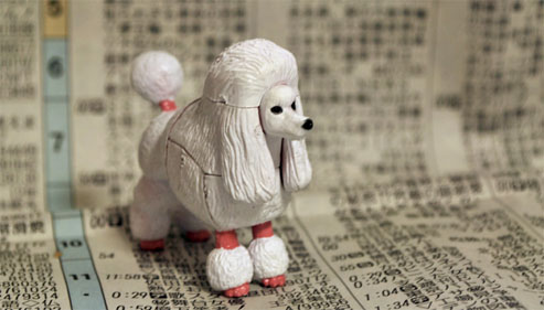
the shape fits my hands  /  i can feel the cuts  /  a butchers cut  /  i take it apart  /  thirteen pieces   /  interesting objects  /  organic shapes meeting straight cuts  /  male- and female-forms appear  /  mingle them  /  one piece  /  the function dissapears

form is all I have left

.

.

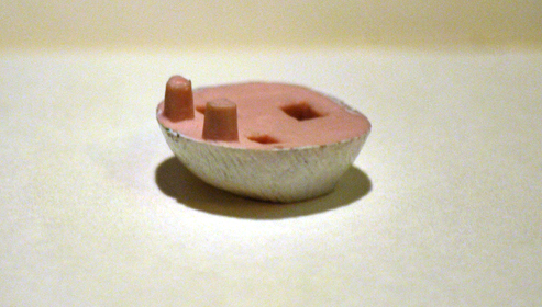
the product is based on one specific piece.

it’s an organic shape beautifully cut off.
the form suggests something is missing.
it belongs somewhere.

.

.

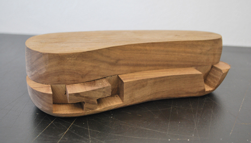
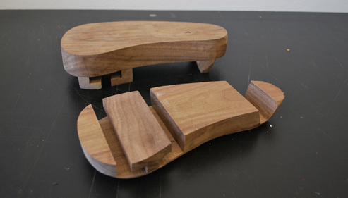
it reminds me of a japanese wooden shoe.
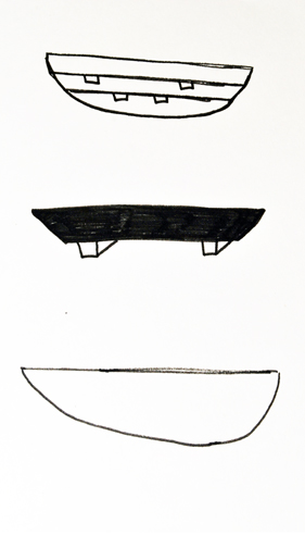
a shoe that can be altered to personal specifications.
able to constantly change the pieces.
creating variation in heights, materials and systems.

.


Log in
subscribe