Skip to Content Skip to Search Go to Top Navigation Go to Side Menu


"architecture" Category


Mondrian, Rietveld, Theosophy.. wait, what???


Wednesday, October 18, 2017

Have you ever heard about theosophy?

We didn’t either, but check out this article because then you’ll know how it influenced Mondrian and Rietveld’s work.


Theosophy– what does this even mean?


theosophy


It is a unity of Religion, Science, and Philosophy that combines a variety of belief systems in its search for an underlying universal harmony. Basically, it is everything, therefore you have to be very focused to understand what specific ideas it defends and how is this shown or practiced in art and life in general.
It is also a doctrine of religious philosophy and mysticism (so it isn’t a religion itself), but holds that all religions contain elements of truth.
Theosophical writers hold that there is a deeper spiritual reality and that direct contact with that reality can be established through intuition,  meditation, revelation, or some other state transcending normal human consciousness.
Theosophy has influenced many artists among whom were Wassily Kandinsky, Piet Mondrian, Gauguin, Malevich, Gerrit Rietveld (and some others from De Stijl movement) and Pollock too. This beliefs played a crucial role in the work of this artists, whose works were seemed to search for the understanding of spirituality.
All in all, theosophy seeks to integrate perception and thought, the natural world and the spiritual work, science and religion.


How did theosophy influence De Stijl


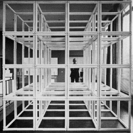
De Stijl magazine was publishing the group’s design work combined with theoretical writings which also contained mysticism. Members were deeply influenced by theosophy which was also an important part of Bauhaus. You can see that in the way they rejected any form of naturalism in favour of a formal abstraction that connected the movement with Russian Constructivism.

De Stijl group wanted to create a new kind of art, architecture and design in order to raise a disillusioned humanity from the horrors caused by World War 1 and as many artists throughout Europe, they attempted to liberate the arts from tradition. They wanted to change art from individual to ultimate, universal. Their vision was based on deconstructivism – reducing the universe to fundamental elements and forms – the vertical and horizontal lines became the symbols of universal harmony, to which were added primary colours red, blue and yellow along with black, white and gray (considered non-colours). Even if you don’t understand the deeper meaning of theosophy, these are the things you can recognize in artworks of De Stijl movement.
Anyways, members were aiming towards geometrical and technical art which would be an experience as a whole. They were trying to give art a spirit of forms and mystification.
What was important for them was purity in architecture, the absence of organic and personal forms. Like theosophists, members of De Stijl believed in the presence of deeper spiritual reality, whereas a direct contact is established through a state transcending normal human consciousness. They brought a sense of material, intellectual and spiritual unity to art, architecture and design.
 

theo-van-doesburg-neoplasticism-composition-vii-the-three-graces1917 eb3bc17f85aec4c6a9be84a677c1bcdd--geometric-art-abstract-shapes

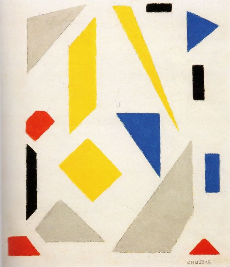
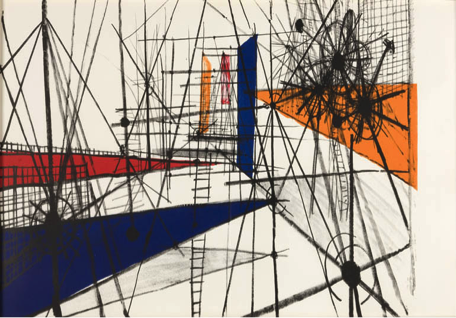
Theo van Doesburg’s work related to Neoplasticism – a work from Vilmos Huszar

Mondrian as a member of De Stijl


His path to Neoplasticism


Mondrian intensified gradually his expressive manner of painting and began to have a more and more intensive use of colours, that eventually lead him to the need to depict the visible aspects of reality.
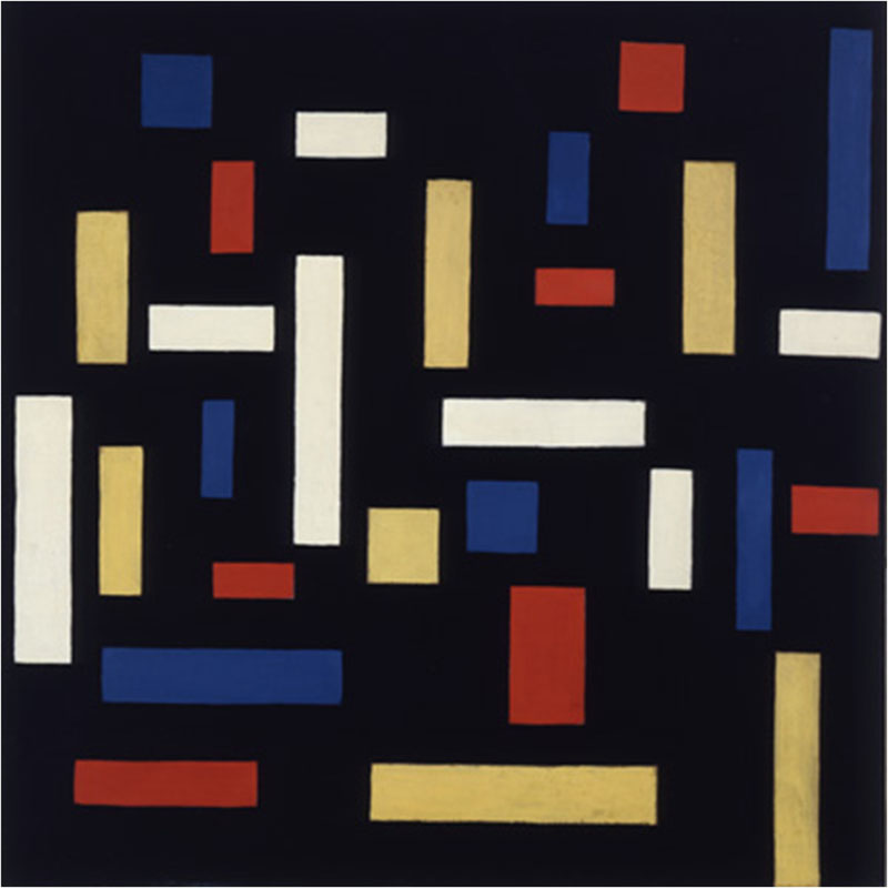
From 1908, Mondrian began to work in search for a truly form of painting. The artist came to the conclusion that the pure, intense, inner colours (the primary colours) and a simple manifestation of the line (horizontal and vertical) could help reach an abstract form of art that would be suitable to the spirit of the new modern age.
In 1917, Mondrian and Theo van Doesburg founded the group De Stijl. Mondrian used this magazine as a vehicle for his ideas on art, and it was actually in the magazine where he defined his aims and the term Neoplasticism. Though Mondrian established his only visual manifestation/painting style: Neoplasticism, based on philosophical and moral considerations associated with theosophy, this name was also applied not only for his work, but also for the art that the De Stijl circle practised in the different areas.
The intention would be to use the form and line to reduce the visible reality to its essence. So, in Neoplasticism, all the abstraction is connected with the reality. The elements are displaced from their visible form, but reflected in an abstract dimension.
As Mondrian himself considered:

”As a pure representation of the human mind, art will express itself in an aesthetically purified, that is to say, abstract form. The new plastic idea cannot therefore, take the form of a natural or concrete representation – this new plastic idea will ignore the particulars of appearance, that is to say, natural form and colour. On the contrary it should find its expression in the abstraction of form and colour, that is to say, in the straight line and the clearly defined primary colour.”

Mondrian uses the basic elements of painting: line, form and colour in their purest, most fundamental state, creating compositions with different lines and planes, verticals and horizontals, neutral and primary colours in a universal visual language that everyone could understand intuitively.
Two years later, the architect- designer Gerrit Rietveld joined De Stijl, which had a significant impact on the Neo-plasticists’ ideas and production.
Influenced by theosophy’s ideas, Mondrian reduces all elements to straight lines that cross and form various sized squares and rectangles and restricts the palette to pure neutral primary colors and black, white and grey. This was his proposal to represent the universal order, rather than the physical meaningless world.

Mondriaan in Stijl 1         Mondriaan in de Stijl_950

Modrian’s texts on Neoplasticism

How is Neoplasticism connected with theosophy?


Piet Mondrian was raised in the protestant church and later on, in 1909, joined the Dutch Theosophical Society, which was one of the main spiritual movements in the Western society at the end of the 19th century. This Society was founded in the United States but quickly spread throughout Europe and had an immediate influence on art, particularly in the Netherlands. In fact this influence was so visible that forty Dutch artists participated in the exposition organized in 1904 in Amsterdam for the Theosophical Society’s International Convention.
From this time on, theosophy was to be a major influence in life and work of Mondrian.
In the journal De Stijl [x], Mondrian published some articles about the influence of Theosophy. In this articles, the artist analyzes the role of traditional art that he considers as a consequence of the lack of harmony inside of man (conflict between matter and spirit) and the imbalance between man and nature. For Mondrian, theosophy was the answer to this imbalance. Theosophy principles could, in his ideas, bring consciousness of the self, and as a result, bring the harmony in this relations.
For him, when the consciousness of individuality or, in other words, the concept of spirit emerges, two conflicts emerge with it. The first one would be the conflict between this individual spirit and his physical body. The second one, as a consequence of the first one, is a confrontation between man and nature, generating a ‘disharmony between man and his surrounding,’ or simply ‘the tragic in life’ as the artist considered.
In this way, we can consider that Neoplastic art arises from the same principal as traditional art does- from the perception of an imbalance inside of man. However, Neoplastic art tries to represent an absolute truth directly: the idea that if the artist represents it, is because he knows it, and not just some partial and accidental truth as traditional art seems to do it.
The aim of Neoplastic art is the representation of the absolute, almost like religion. By reaching this goal, he would be able to help the common man finding his inner balance. How? Modifying the external world to another one capable of bringing some inward balance: by transforming the surrounding environment, he would transform the man itself, and consequentially the society.


“Art –although and end in itself, like religion– is the means through which we can know the universal and contemplate it in plastic form.” (Mondrian, 1918)


Neoplastic art’s objective is to restore in man a balance with his environment, lost when man gains consciousness of his own individuality. Neoplastic art should be dissolved and fused into and with life.
For the artist himself, neoplastic art shouldn’t be limited to painting but rather extends to architecture and urbanism, and in this way make a real change in the environments. Mondrian considered that each artistic disciplines should perform a specific role, and together they should reflect the common harmony of the universe.
Therefore, for Mondrian, painting’s task would be to act as the guide for the rest of the other disciplines and eventually be dissolved, if the task is successful, into architecture, urbanism, life.
We can consider that theosophical beliefs are expressed in Mondrian’s neoplastic work, both, theoretically and concretely, in a constant demand for a true theosophical art.
Art is, in this way, a reflection of the absolute, “the Radiating Center” (as Theosophy calls it), which is the original force, creator of everything (idea that nature and spirit are manifestations of the same original whole: universal/cosmic order).
The artist, thereby, is the “translator” of a higher reality, and his works must repeat the representation of this “Radiating Center”.
Art should reproduce the conflict between opposing elements and the solution for that same conflict. The image of harmony cannot be static, but represented by multiple dialectics: two levels of elements, among which, simultaneous oppositions are produced (line/plane, vertical/horizontal, female/male, color/colorless…) The universal force/cosmic order/ the harmony, is so expressed in the duality between this contrasts.
While searching fot the harmony between opposites, Mondrian aims to help common man access his own inner harmony. By transforming the entire natural environment, the artist would establish the balance and reflect the image of the common origin of all creation: of the absolute. In this balanced environment, the common man can reach his inner equilibrium.


mondrian2

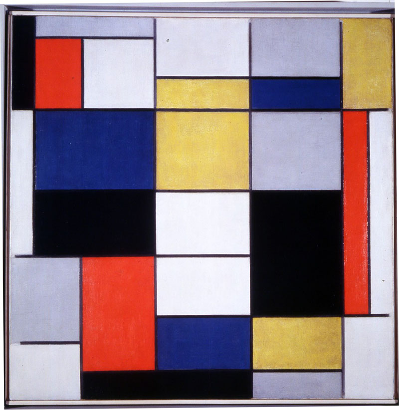
 Composition A, Piet Mondrian (1920)


Gerrit Rietveld as another member of De Stijl


He was born in Utrecht in 1888. His father was a cabinet maker and when just a little child, Rietveld joined the family workshop. His apprenticeship was steeped in the traditions of the Arts and Crafts movement which can be seen in his early work (first attempts of furniture design).
In 1911 he opened his first shop in Utrecht and started studying architecture. As many others, he was influenced by Frank Lloyd Wright’s architecture. By 1919 he became a member of De Stijl and became friends with its members Huszar, Theo van Doesburg, Robert van t’Hoff and others.


What influenced Rietveld’s work?


Theosophy played a major role in Mondrian’s art, but since Rietveld was a member of De Stijl too (although he never actually met Mondrian), we can also see the influences of the proclaimed philosophical ideas in his work.
In De Stijl architecture and design, Cubism was again influential but so also were Frank Lloyd Wright’s Prairie House designs, with their asymmetric free-flow of interior and exterior spaces. Despite all that, Rietveld’s ideas were more down to earth and less philosophical that the ones of Mondrian and Doesburg. He didn’t speak frequently about his work. Therefore the interpretation of it is based on the more philosophical tenets of the other De Stijl artists (members were very different considering a way of thinking) and it sometimes seems as if the designer’s voice may have been overshadowed.
Rietveld’s painted Red/Blue chair became the archetype of the movement, it was also the first time that the De Stijl colours, usually used 2D, (on Mondrian and van Doesburg’s paintings) were applied to a three-dimensional object. It was the first major piece of furniture to accord with the movement’s principles – conceived as a spatial composition, conspicuously disregarding comfort, traditional construction techniques and concepts of decoration (built on a series of horizontal and vertical planes, provides a clear expression of the group’s ideas).

rietveld1
Gerrit Rietveld: Red and blue chair


With the Schroder’s house Rietveld created a totally original vocabulary in building construction and in the treatment of interior living space. The complex, asymmetric cubic construction of horizontal and vertical planes and lines encloses and releases space in a three-dimensional equivalent of a Mondrian painting. Linear elements are red, blue, yellow or black; surfaces white or grey.


 schroder housecover-schroder-house-rietveld-utrecht
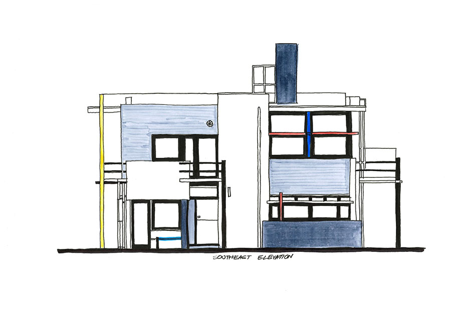
Gerrit Rietveld: Schroder house


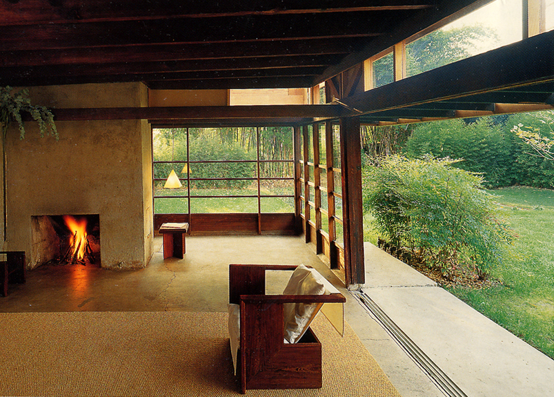
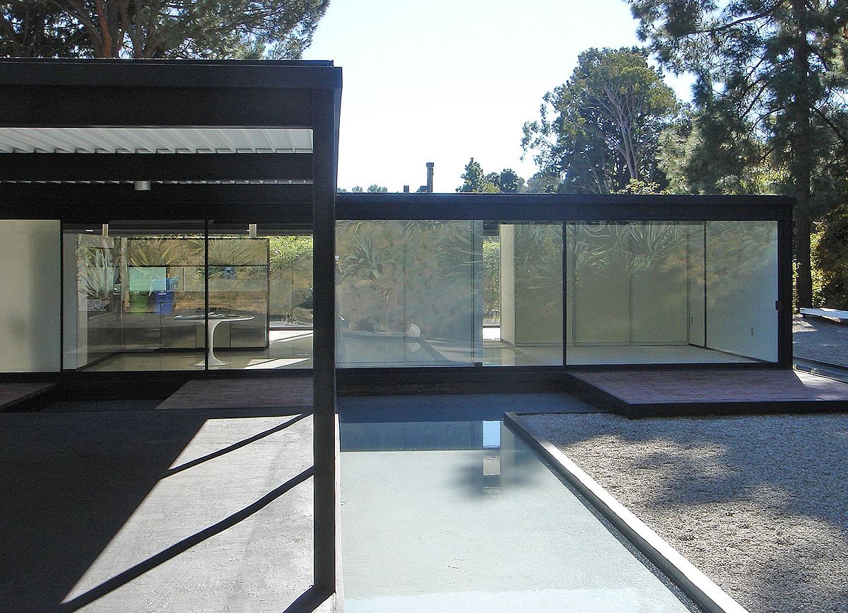
A major effect on Rietveld was also Frank Lloyd Wright’s work who was a functionalist and a part of an International style. The most influential details from his work were the flow he produced between interior and exterior and also the use of verticals and horizontals. You can also see that in Rietveld’s last work, Gerrit Rietveld Academie where glass surfaces are made in a way you can see through the building, therefore it merges with surrounding nature.


Fallingwater

robie-house-02-2

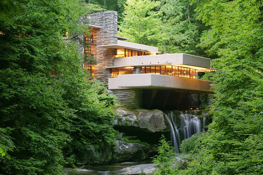
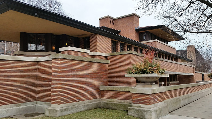
Frank Lloyd Wright: Fallingwater Frank Lloyd Wright: Robie house


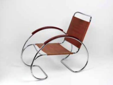
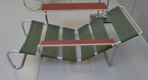
While quickly recognized as a major contributor to the development of Modernist architecture, interior and furniture design, Rietveld’s later work was largely confined to furniture design. Most known examples are his tubular steel and wood Beugelstoel chair, wooden Zig-Zag chair and wooden Crate chair. Among his other design work was the Netherlands pavilion for the 1954 Venice Biennale and a sculpture pavilion in Arnhem, Holland, built in 1955.
His furniture was designed for a mass production to be available to a large audience, even though at the end is wasn’t mass produced nor standardized – no two versions had the same dimensions.
It’s funny how when you see buildings, you mostly don’t think about the theoretical background of their form. Until we started making this research, we were more focused on functionalist features of buildings and which movement or era they belong too, but now we find ourselves thinking: ” Do this shapes represent some philosophical ideas?”


To conclude …


It’s interesting how the abstraction of Mondrian and Rietveld’s work seems to be so far from theosophical ideas – when you see the chair or a painting you don’t make an instant connection.
Mondrian and Rietveld both seems to try to make art that could reach the majority of people –a painting that would have an universal meaning (Mondrian) and a furniture that would be available for masses (Rietveld) – Art for everyone, art that would make life better. In a way, one can consider it an utopian idea, since the majority of people does not really understand the theosophical thinking … So the question remains: How educated should someone be when experience their art? Or in other words, to what point do you have to be aware of the purpose of the work to have the full experience of it? [x]

Get the Flash Player to see this content.

Now you know. Awesome, isn’t it?

a cooperative research by Neza Kokol and Carlota Bóia Teixeira Neto

In with the out


Wednesday, October 18, 2017

We questioned ourselves on this new ideology De Stijl was confronting itself with in the early 1920s. One of them being the notion of inside and outside in architecture. As we found out by researching aspects of the Stijl after viewing the exhibition « Architects and Interiors » in the Gemeentemuseum of the Hague, there is a significant new way of looking at architecture in that period of time. Architects wanted a style that was more connected with their own time and ideology, traditional architectural rules were no longer significant. When we look at the scale models of the Maison d’Artiste by Theo Van Doesburg and Cor van Eesteren , designed in 1923, we can see the transition of walls that flow from inside to the outside. Trying to dissolve lines but also creating a way to incorporate the outside into the building. An interesting factor at the time was the creation of big windows and the opening up of space, which created a deeper connection to the exterior. Another example from around the same time is the Schindler House built in 1922 in Hollywood. By creating a massive wall that can be opened up between the garden and the living room, Rudolph M.Schindler created a space that can connect the inside with the outside.

Schindler house

Schindler House

Our next lead took us to the Case Study House project (1945-1966). A project consisting of 36 planned houses that were published in the Los Angeles based Arts & Architecture magazine. After the second world war there was an advance in technology and material. Architects worked together with the magazine to create new ways of seeing and constructing liveable homes during the population boom at the time. Even though not all houses were actually build, these plans were a hot topic among American architects. These houses were characterised by flat roofs, glass walls, modular design and steel frame construction. They neatly integrated into the sites with an emphasis on indoor-outdoor living. One of the first examples that can indicate a fusion of inside and outside is the plans for the Greenbelt house, where the architect tried to create an open space in the middle of the house that could be used as a place to store crops and other vegetation. Another project is the #21 case study by Koenig, where an irrigation system that surrounds the steel construction helps cool off the house itself. The design emphasise harmony of materials and balance between interior and exterior through the use of terraces, water, glazing, and skylights. Many more of these projects were about the connecting and fusing of the outside with the inside. Elizabeth Smith, Chief Curator of the Museum of Contemporary Art in Chicago, talks about this combining of inside and outside elaborately among other subjects in this lecture.

Case Study House #21 by Pierre Koenig

Case Study House #2, Pierre Koenig


If we look back in time, structures that connect the inside with the outside have already existed for a long time. We can take the example of the engawa in Japan, having the entire house surrounded by a ledge and being able to open up all doors and windows creates a connection between inside and outside. Recreating these structures and ideas. It’s almost like there was a necessity to be out in the open again in the 1900s and after. Today we can still find traces and marks of this ideology strongly present all around us in our contemporary world. What is being outside? What is being inside?

The Japanese Engage

The Japanese Engawa

In recent architecture we can find a lot of traces leading back to this ideology of bringing outside and inside together. Big windows for example are still a highly used aspect in a lot of houses. However, not all modern houses really look into the effect of this blending of an outside and inside. And there also seems to be a genuine difference in houses that have the the possibility of indoor and outdoor blending and houses that are created for the soul purpose of bringing the outside inside continually.

Let’s compare this difference by first looking at the OZ House by Andrade Morettin Arquitetos Associados. The house is made, similar to some of the Case Study Houses, out of a concrete framing that holds the big windows and walls. The south facade of the house made of glass opens up all interior areas allowing it’s openness to the views of the surrounding vegetation. It has the possibility of creating an outdoor/indoor connection by opening the doors, so it may or may not use it’s features. This way you are not limited by the outside forces, they can be ignored by isolating the house from them (closing the connection).

OZ house by Andrade

OZ house, Andrade Morettin Arquitetos


Inside Out by Takeshi Hosaka

Inside Out, Takeshi Hosaka

A great example of a house that tries to bring the outside in continually is the Inside Out building by Takeshi Hosaka. Intended to create a house for two cats and a human couple, the house was not focused on the human perspective alone. In this house there is only a few spaces that are able to be closed off to the outside, the rest of the building is open and connected to the wind, rain and sun. The ones living in the house have to adapt and live with these weather conditions and live accordingly. So in this example the outside has taken it’s place as a constant force inside of the building. The occupants have only one room (the living room) that they are able to control. Another less extreme house that takes the outside in is Casa Ilhabela by Studio MK27. By creating privacy around the house using walls and plants, they created a situation where they were able to take out the walls of the lower level and create one big space that is inside and outside. This space is a living room, but also a garden area. Having some outside forces, predominantly temperature and weather, continually coming through the living room makes this another example of a house that is bound to the outside. However on the first floor of the building, there are bamboo shutters in front of the balcony areas that can be opened up. Together with a pair of doors that can also open up the first floor to the outside. Having the possibility to also have an outside/inside connected space on the first floor. This house is balanced between the concept of a continuous outside in the inside and a possible outside in the inside.

Designers, architects and artists are also questioning the idea of bringing the outside indoor by bringing the nature into the interior space, incorporating scenes of nature. This transition with the natural world blur the lines and barriers between inside and out.  Bringing trees and other elements of nature inside, these projects question what is possible within the confines of erected walls. The artist Jean-Marc Navez incorporates trees that reach the ceiling and occupy the whole space to underline the bringing of outside into an indoor space. Through the incorporation of indoor trees the divisions between the home, office, landscape and environment are blurred.

Jean-Marc Navez

Silène, Jean-Marc Navez, 1984


Up to now this article has been about building houses and bringing whatever is outside of those buildings inside. But there are also lots of houses that are build to be enveloped by nature, by building into already existing structures like mountains, hills and trees. These give you a feeling of literally living in the outside. Some of these houses also have the ability to use their natural structure to create effects in the inside of the house. Sometimes they can control warmth or certain weather effects. For example earth sheltered homes like the Icelandic turf houses, are build into a hill to ward off cold winds. They also use turf to build thick layered walls that can keep the warmth inside. This technique of holding warmth is a great example of how to be sustainable.

Icelandic Turf house

Icelandic Turf house

This aspect of sustainability and our carbon footprint are quite popular and important in our most recent history. From this thinking comes a new way of creating houses, so called eco-houses. Here is a small video about an eco-house build by a couple in Norway. As you can see in the video, a lot of these houses can generate warmth and energy by themselves and leave almost no negative traces. A few of these new houses even have the ability to sustain growth of plants. By doing so the house itself is creating a connection between itself and the outside. Mostly build out of natural and renewable materials, they shape the way we look at modern constructing and living. A great example of a material used in a new experimental way is the mushroom that they used to make bricks for the Hy-fi construction of David Benjamins. Having bricks made of mushrooms that can be grown in 5 days, but that can also be easily composted afterwards is a very nature friendly and innovative approach to constructing. It shows us a glimpse of what we might be able to use in future construction of buildings.

Hy-fi by David Benjamin

Hy-fi, David Benjamin

Thinking about these concepts of sustainability and carbon footprints we also come across another question. Should we think about our plants and animals? Recent architects have been busy thinking of ways to incorporate the outside forces but are now also busy finding ways to cooperate with the life around us. One of the bigger projects that used this way of thinking is that of the Gardens by the Bay in Singapore. A project based on two major elements: human involvement and stimulating nature. One of the keys to this project were the supertrees. A number of man made trees that stimulate the growth of plants on them. Even though this is not about housing it shows us a new perspective and way of looking at construction.

Supertrees of the Gardens By The Bay project

Supertrees of the Gardens By The Bay project


So how will we adapt to new ideologies in the future?

Will we see self-growing houses or constructions that don’t depend on traditional aspects like walls and floors? Structures that blend the inside into the outside? Blend man-made with natural? In this technological era we might be able to control all these aspects of living a bit more and we have a broader understanding of the outside forces. But as nature is always changing, it’s still not certain if we will be able to control the outside. And if so be truly able to create an outside environment that is at the same time our inside.

a cooperative research by Billy Jansen and Chiara Moscatelli

Niban-Kan building, Tokyo


Thursday, May 18, 2017

Walking around Shinjunku, Tokyo’s district, one may have noticed the unusual buildings standing out on its east side.
The Ichiban-Kan (“building number one”) and the Niban-Kan (“building number two”) were designed by the architect Minory Takeyama in 1966. They were commissioned by a Korean Toyota salesman, asking him to design both buildings at the same time, and finally completed in 1969. Respectively, one was home of 49 tiny bars distributed through its eight floors, and the other hosted bars, clubs and sauna.

Slides from the 1970s, reproducing the two buildings. Domus Archive


In 1977, the cover of Charles Jenks’ The Language of Post-Modern Architecture features an enigmatic Japanese building. It raises the Niban-kan as an icon of Supergraphics, along with its adjacent brother building the Ichiban-kan.
Niban-Kan’s colored surface has been painted over by now, blending now with Tokyo building’s flat designs.
But what made this building so special, beside its colorful surface ?

ea51f7eab203dca46b02e89a28e9f475

In the 60’s, East-Shinjuku was the land of protest and porn, where one could meet the radical, intellectual, and other underground Japanese subcultures. This area’s hyper activity led to an important street competition, where signs and speakers had to be bigger and louder.
Minory Takeyama was challenged to implant a new architecture in the given context. It had to stand out of this saturation of lights and neons, while blending in with the energy of the district.

big_373446_6621_5street2

Entrance of the Ichiban-kan building


Japanese architecture is typically vertical, where each floor has a common area with entrances to shops and bars. As architecture was being more and more influenced by western design in term of multi-storey models, Takeyama exploited the local past of architecture and brought the verticality back to the front, creating a vertical street through the facade. The late-Modern “High Architecture” aim to reveal the movement directly from the outside, such as what’s going on, and how to get there.
The front shows the circulation, to arouse curiosity. This is completed by signs that bring an informative layer to the surface. At night, neons reflect on the glazed area, which emphasize the gap between the surface and the platform, and reveal part of the building’s activity.

big_373255_2410_5coppia

Left: a view of the Niban-kan interior today. Right: The same space with the original flooring, as seen in a 1970s Japanese publication, Domus Archive


The Niban-kan and the Ichiban-kan are representative of Tokyo’s relation between private and public space. You can go from the street to the seventh floor without encountering a door. By directly opening to the street, those buildings breaks the boundary and transmit a feeling of public space from the street.

big_373446_9514_4street

Entrance of the Ichiban-kan building, with a direct access to the outside


In the exhibition “Designing the surface”, The Niban-Kan was presented as an item from the, ‘agency’ category, through Charles Jenck’s 1977 bookcover.
Agency is an action or intervention producing a particular effect. Minory Takeyama’s colorful and ambitious buildings were possible to realize at that time, far from the actual strict rules of urban planning. This freedom made it possible to bring local tradition in the actual architecture and –promoted by Charles Jenk– become a figure of Post-Modernist Architecture.

Screen Shot 2017-05-18 at 02.43.21

Screen Shot 2017-05-18 at 02.41.21

Ichiban-kan and Niban-kan seen from Google street view 2016

Architecture became almost a banal experience, we are surrounded by buildings that we don’t question much, because the more we see them, we forget them. We take design for granted. But sometimes one stands out and makes you travel.
It’s fascinating how design, by small changes of the interface, can revolutionize the way we experience our environment.


Charles A.Jencks, The language of Post-Modernist Architecture 1977-1987, London. New Institute. exh.cat.no.61-agency

It wasn’t a spontaneous encounter. I looked for it.


Tuesday, February 7, 2017

encounter

Coarse antique white paper. Slick bright white paper. Corresponding with these two feelings 70’s architecture gives me. This vintage feeling of the past, but in its day so modern and progressive. The book feels historic yet contemporary. I feel like I’m holding a treasure in my hand. This book; 17 by 24 centimeters, comfortable in one’s hand and easy to carry with you. Beautiful pictures in black and yellow printed on this coarse paper feeling like an old precious book in my hands.

cover side1

O B S E R V A T I O N S:

First of all, the book is titled “De kritiese jaren zeventig”, which I think is genius. The 70’s way of spelling “kritiese” is used in the titel, rather then the contemporary “kritische”. The book, designed by Beukers-Scholma, is linked to a 2004 exhibition with the same name. Their work contains several award winning designs.

ocean14 ocean12

overlay4 overlay1
The book consists of 2 types of paper: coarse antique white paper and smooth bright white coated paper. Furthermore it contains 3 types of pictures: black and white, black and orange, black and yellow. The coloured pictures are like black and white prints on coloured paper.

Black and white prints are used for specific buildings. Every chapter is divided in paragraphs that deal with a building. The pictures of these buildings are in black and white on coated paper. The texts are also printed black on white coated paper.

The colour yellow presents scenes: People or streets. They are accompanied by relevant quotes and precede the introduction of every chapter. They are printed on antique white paper.

Orange is the colour being used in the general introduction as well as every chapter’s introduction and the first and final page of the book. The black and orange pictures that introduce the book are printed on antique white paper. The single orange introduction pages for each chapter are printed on white coated paper.

THOUGHTS:

How can I not read this book? Knowledge, knowledge, knowledge. I’m not, I’m not reading. But I see words, I see sentences, their meaning is clear to me without doing effort and so I want to read, I want to continue what my mind processes without conscious effort. This coarse paper feels so…… coarse? soft? Old? Precious I guess. I know this book is about the past. And we’re making the same mistakes all over again. Humanity makes the same mistakes all over again all the time everywhere, always. Why is there so much violence, why are people so unhappy. And I mean unhappy, unsatisfied in a well-developed country. This book evokes so much in me. And it’s not the architecture, not so much the design, but the fact that I know it’s about the past and I am not happy about the world and… Past, present, past, present and I wonder; where is this going? The design of the book anticipates on the context very well. At least on the fact that the book is about the past. And the design feels like the past, it feels like not now. Old pictures, blurry pictures, pictures in black and white, black and yellow, black and orange. Then again I also think this book is bullshit. Pure bullshit. Like everything contemporary related to architecture; this quasi science. Conceptual bullshit about how architecture makes a better world. But it doesn’t because we are inherently messed up. People are insane.

ocean9 ocean15

woman ocean8

Let's try to take a step back.

vagueandblack2vagueandblack

The book feels like an escape. Just like how I can get lost in google maps, looking at buildings, I can get lost in this book

pic5pic6

The book makes me passive, receptive. Maybe that’s how I am in general. No I’m not. I’m creative. I create. I’m not that passive. But then again I am. Well at least lately I am. Sigh. I just want to see, touch, feel, sense the book. Which is okay. I guess. That’s the assignment. But then again, am I researching? Is this going anywhere? No. I just want to get lost. Lost in the images of the book. Lost in the colours of the book. Why do I enjoy looking so much? I do it so much. Just watching buildings. Going on google maps or biking around the city and just looking at buildings. Getting lost in watching them and enjoying them. I can hide my face behind the book. I like it. I want to disappear……………………….

With drawing and painting I tend to write a lot. Write previous to painting or using written words in paintings. I tend to write a lot. In this assignment however. I seem not so capable of writing. Even though I’m writing now. The book makes me very passive. Makes me want to see the book, feel the book, read the book, but not write about the book.

Now how did this all start? How did I end up picking this book? It started with a list of books we could choose from and I decided to look for books about architecture and found this lovely book about 70’s architecture. I happen to have a thing for post-world war II, pre-90ties architecture, so I had to choose this book. Then the book also happened to be so well designed. Also, the text is not only about the architecture but the whole social context of the 70’s. The book contains beautiful pictures, not only of buildings but also of people and sceneries. Sceneries of the 70’s. This book is a history book and its content is wonderfully converted in its design.

It wasn’t a spontaneous encounter. I looked for it.

mystery

De kritiese jaren zeventig : architectuur en stedenbouw in Nederland, 1968-1982 = The critical seventies : architecture and urban planning in the Netherlands, 1968-1982. /Rietveld library catalogue no : 719.22 vle 1

content vs appearance?


Monday, January 30, 2017

In high school, my teachers always thought that the content of a book was more important than the appearance. I had to choose my books based on the texts inside of those. Opposite to what I was asked to do high school, in this Basicyear I was asked to choose a book on its graphic design. I was pretty surprised when I was told to because I am totally not used to do that. I liked the idea of it immediately. At the same time, I actually did not really get why we had to reflect a book’s appearance until we had this guest presentation of Elisabeth Klement, a teacher from the graphic design department in Rietveld. She showed lots of books where she did the graphic design for or just really liked. She told us that the content of a book is dependent on the looks of it and also the other way around.
So when I was wandering through the library, this specific peachy/sand/pink colored book caught my attention immediately. I remembered that Elisabeth showed this one in her presentation. I took it out of the shelves and saw this nice bold font on the front saying: ‘From A to K, Aglaia Konrad’

CjX_gJGUkAEgtE7

The book is like an encyclopedia. In an alphabetically placed order, you go through a list of words which refer to the rapidly advancing process of urban globalization. The content is focused on the relationship of society and spaces and how they change. On the cover of the book, the letters and words A to K are spread playfully over the cover. The A and the K are echoing behind the title as big geometric shapes which remind me of modernistic buildings from the past 50 years. graphic designer Linda Van Deursen made the decisions about the fonts, the cover, and the initial layout. She created an architectonic feeling in all these choices. The co-designer of the book is Eva Heisterkamp, a freelancer who got this job from Linda because she thought the job would suit her.

Aglaia Konrad is an Austrian photographer. She has a fascination for architecture, urbanization and especially their transformation. This leads into rough photographs of abandoned buildings, unfinished constructions and city infrastructures without any human beings involved. She experiences architecture and urbanization as something overwhelming. Something elusive. It is not simply about architecture but about trying to understand space and how it becomes nature itself in at a certain point. She studies the signs and codes, actions, representations and meaning of the architectural system.
Last year she had a solo exhibition called ‘From A to K’ in Museum M in Leuven. Paired with this exhibition she decided to publish a book included all the terms referring to her studies in alphabetical order. The photos featured in the book are her works from 1950 on till now.

Screen shot 2017-03-06 at 4.57.46 PM

Linda van Deursen acclaimed international fame. Together with Armand Mevis she established the graphic design studio Mevis & van Deursen in 1986. Linda Deursen has been head of the graphic design department at Gerrit Rietveld Academy from 2001 till 2014. She is a critic at Yale School of Art since 2003. The agency has done great things. For example identity projects, organizing events, exhibitions. One of their more recent projects is the logo and identity for Museum of Contemporary Art Chicago. They were awarded for several art prizes as the Amsterdam Prize and the Grand Prix at The Brno Biennial
Recently they also design the printed version of the magazine South as a state of mind: DOCUMENTA 14.  A magazine which is being published four times biannually till the opening of the exhibition in Athens which is paired with documenta 14. The magazine could be seen as a manifestation included critique, art, literature and research.

10620522_899477763401936_3140987939653089023_n

Eva Heisterkamp was a student of Gerrit Rietveld Academy, she graduated in 2007 in the TxT department. Joke Robaard was head of the department back then. After having worked for Mevis & van Deursen for four years she now became head designer of Stedelijk Museum in Amsterdam. I was especially interested in her role in the whole design project I was wondering how much she had to say about the layout and division of the content. She answered me all my questions clearly in an email.

After analyzing this book the past few weeks, I could tell that the design of the book made the content stronger. Using Times Ten and Univers as main type fonts is very convincing. The fonts are formal but also a bit playful because they are a bit horizontally stretched. The empty space between the words refers to the emptiness of the decayed cities. The repetition of the words in alphabetical order refer to the repetition of modernistic buildings and the recurrence of urbanization. Every page has a vertical line placed on the left side, which accentuates the vertical aspect of modernistic cities where all buildings are raising to the sky. The book sometimes still seems under construction like cities themselves are. At one page you just see a row of O’s on the left side and a picture placed over what used to be ‘ the rest’ of the word which starts with an O. The pictures are most of the time black and white except for some pages. Eva herself decided which pages she wanted to be in color and which ones to be in black and white. There is also another book which is all printed in color but less editions of those were published.

thumbnail_IMG_4334

Aglaia selected the pictures per chapter. She communicated this to Linda and Eva. Eva told me that through the whole process a lot of things changed and she could decide a lot in the design process. For example this case she told me that the font size of the essays were smaller in the beginning. In the last correcting round, the authors of the texts disagreed with the font size. The whole layout shifted, which made it very hard to finish the book in time. I find it very remarkable and a bit funny that the title refers to an unfinished alphabet because the design itself also seems like ‘unfinished’. Eva noted that here and there are some mistakes been made in the design, but I think we will find it out ourselves.The content, the appearance and even the process were constantly progressing. It all was endlessly in juxtaposition. That’s why I think content and appearance are always dependent on each other.


Aglaia Konrad, from A to K /Rietveld library catalogue no : konr 2

Transitions – from autonomous to applied arts


Sunday, January 29, 2017

A line, a letter, a page, a building, a photo, a book – separate stages that can either stand by themselves or remain transitioning points while executing somebody’s vision. It is common that an artist starts one’s creative process with making a sketch or writing down a sentence that popped out in the head, though, later on this idea might get a completely unexpected appearance. After the piece is created it will most likely be documented in a book, that sometimes serves as an autonomous work. Therefore, it is important to choose a right graphic designer to collaborate together for this process.


For my design research, I have decided to look into Alon Levin’s designed book ‘De Paviljoens: Journal of a Building 1992-2004’ that is a documentation of the former contemporary art pavilion in Almere.


7267-630-435


virselis

According to the Artistic Managing Director of the Museum De Paviljoens, Macha Roesink, the aim of this book was to expose the complexity of building such as De Paviljoens and document the history in a case study of the life of a building, in the form of a journal composed of accounts by many of the people who have been involved.


814-454-296

Museum De Paviljoens


The building is transportable, like the ultimate kit, but it is standardized to meet building regulations. Documenting it in a book clearly makes it even more handy. I think it was not accidental that Alon Levin was invited to design the book as he himself works transiting from fine arts to design. To understand the concept of his way of working, it is important to look at his other projects.


In A. Levin’s book ‘Things Contemporary’ published by Dexter Sinister & Alon Levin, 2009 he talks about his interest in man’s eternal pursuit of order; not the ideal of order, which renders things absolute, resolve and static, but in the actual process of organizing things, which inevitably falls short. Artist takes up forms such as the triumphal arch, the victorious podium, or the Ferris wheel, and translates them into model-like wooden constructions and plaster forms reminiscent of the model. It creates images for the ambiguity of success and failure, for the instability of ideological, economic and scientific systems. Analogous to the accumulation and formation of knowledge in the “free encyclopedia” Wikipedia also Levin prefers, when he reused, deconstructed or repeated individual elements of his own works. Data, buildings and documents appear as moving building blocks in a constantly transforming and updating view of the world. To process this information, he uses charts, diagrams and transforms his knowledge into abstract geometrical shapes that later become sculptures or installations. Space-grabbing constructions from simple materials available in the construction market are based on the exploration of the technical and architectural achievements of the Western world and their significance for contemporary society.


tc

tc2

Things Contemporary published by Dexter Sinister & Alon Levin, 2009
 

Even though, it seems Alon Levin himself does not see switching from graphic design to fine arts as transitioning, I was curious to find out when and how do these two spheres meet. His pieces and texts are based on invoke either the incalculably large or the immeasurably small, hence the mathematical sublime, the way in which they thematise structure and collapse points. Using the design made for ‘De Paviljoens: Journal of a Building 1992-2004’ and photos of various installations I tried to create some ‘systems’ that could represent their ‘shape’. I discovered he used three sizes for the font, therefore a zigzag in my drawings representing ‘text’ in the book is in three different sizes. Considering purified and structured shapes he applies into his pieces I decided to replicate both pages and 3D objects into slightly modified, geometricized shapes. At some point I realized a certain rhythm appears, which blurs the line between two subjects of my research.


1

2

3

Left – sketches of installations by Alon Levin, Right – schemes based on ‘De Paviljoens: Journal of a Building 1992-2004’


In fact, these two ‘sequences’ I made are just my interpretations of Levin’s creations. They might transit into something new and exciting at some point and that would probably be sort of an example the way the original author was building them. In ‘Things Contemporary’ he admitted that during his studies at Gerrit Rietveld Academie he wanted to understand the power of manipulating information: not just consume it, but to actually make it. To try and understand how all the information we ingest daily is organized and what the thoughts and structures behind it are. I think one of the best representations of this attitude is in his project ‘The Basics of Growth’ that dealt with similar ideas in botany as in economy, making some comparison through books that A. Levin had published himself. The content of these books was from Wiki that provides the material for the content of a book. He later on transits from the book into 3D structure based on the same subject, which in this case was a greenhouse on the rooftop of the office building.


53_DeVoeght_Levin

The Basics of Growth

I presume researching the history of the pavilions, he applied this same method in a reverse version – firstly, understanding the building with its context and then transmitting it into a book.

Throughout my research I learned that the endless cyclical game is the fundament of Levin’s work – a natural flow that drives him from one medium to another.


De Paviljoens : journal of a building, 1992-2004 /Rietveld library catalogue no : 700.4 pav 1

Stone, Space, Me; Pretending to be Solid


Sunday, October 30, 2016

How to enter a stone? by knocking? stroking? breaking it with a hammer? or by curving a door in order to step inside?

Thinking and imagining about how it must be like to dwell inside a stone and take part in the universal creation, I find my search. Focusing on the human ability to relate, think and imagine spaces in objects, I create a link between the interior of stones and human memory and imagination.


6_Naama_IMG_1100

Pretending to be Solid, Naama Aharony, Gerrit Rietveld Graduation show, 2016.

( solid as stone they say…)

Along with personal notes and thoughts of dwelling a stone, I collect, trace and place cultural narratives, legends and philosophical thoughts contemplating the meaning found in stones. Through those I look to change the perception of stones being solid, suggesting to look at it as constant movement. The mind then becomes the traveler, moving through environments, places and spaces the stone I hold may offer. Those spaces are changing, coincidental, circumstantial.

This writing can be seen as a collection of short texts where the shared ground is memory, imagination and the stone. It will not necessarily talk about actual caves, walls, floors or corridors that might exist in the interior of stones, but will be researching the potential content of the stone, the meaning and narratives this stone might bring. And although while reading you might drift away from time to time, one will always go back to the ground, and the stone.


650-_MG_8700
For my graduation project, I was focusing on the relationship between man and the stone. I wanted to work on the way people approach and perceive stones. To open up the understating of A Stone to discussion and new ways of seeing. To create tension between what people usually think of a stone and the sensible perception I am offering them.

<wall-stone_950 Overvieuw_650 IMG_6344_650

Writing the thesis and researching on different layers the stone offers, pushed me to create my own, man-made stones. Using ceramics, a study of oxide glazing and experimenting with different firing programs, enabled me to create a divergent collection of stones. Where each of the made stones carries different qualities, tells a chapter, a layer and where all together they create a story.

IMG_6343_1100

The installation ‘Pretending to be Solid’ consisted of the stone collection I have made, creating a constructed landscape inside the room. The spectators were invited to walk through the room, in-between the placed stones. Through the walk, I looked to evoke a personal contact between the spectator and the made stones. Which was for me, a place for memory and imagination.


cover_image_shade download this thesis by Naama Aharony
all rights to this thesis are property of the author © 2016


Freestanding Architecture


Thursday, October 27, 2016

What can you do for the world?
A man who had already been expelled from Harvard twice, a man who had taken his own company into bankruptcy and suffered from alcohol abuse due to remorse for his daughter’s death from childhood paralysis. And it even goes so far as to think of jumping into the icy waters of Lake Michigan.
 
00826792.JPG
 
At this point the reader must already be asking himself, “Should I really know this man?” My answer is yes, because this man decided to make an experiment that consisted in finding the answer to the following question, in his words:
“To discover how much a miserable and unknown individual with a dependant wife and a new born child can do for the benefit of all mankind.”


buckminsterfuller_drawing


Synergy – one of the key words to understand the world in which Fuller lived. It describes the unexpected effects that arise within a system that could not be predicted by the individual analysis of its parts. From the synergy comes the holistic vision that guides much of Fuller’s ideas.
The conception of the planet as a regenerative system where each organism being guided by its instincts of survival also ends up playing a secondary role that helps to balance the planet as a whole. As, for example, a bee that in obtaining the nectar for its survival ends up helping in the reproduction of the plants through the pollination.
According to Fuller, the alienation of man from nature in migration to large urban centers has caused mankind to lose this notion of how nature works globally and to consume resources in an irrational and unsustainable way because of its ceaseless pursuit for money.
However, Fuller believed that the technology and resources that mankind already has is sufficient to supply it with food, home and transportation. However, he believed that this revolution should not come by the control of people’s thinking through speeches or violent revolutions, as did and presently do many heads of state, but by a design revolution.


7193_815104ed949f9deaf45165c4b8337013


Such a revolution consisted in proposing practical and sustainable solutions as alternatives to the problems of humanity, which would make the population’s adherence to a sustainable way of life much faster. Since this solution does not disprove the educational effects of people’s awareness, Bucky came up with a game called World Game to educate people about this holistic view of resource use.
“Make the world work for 100% of humanity, by spontaneous collaboration, without ecological damage and without harming anyone.”

Buckminster Fuller’s inventions were called artifacts, all built on the idea of doing more and more with less and less, using maximum efficiency by using resources and technology to build sustainable solutions.
 
dymaxion-14D153A04D54F0383C7
 
I think his project ‘’dymaxion house’’ relates to this story. It is designed in the late 1920’s but not actually built until 1945, the Dymaxion House was Fuller’s solution to the need for a mass-produced, affordable, easily transportable and environmentally efficient house. What fascinates me is that the whole construction is build around one central extremely strong mast, it has the same kind of idea as an umbrella.
The house was even self-sufficient, heated and cooled by natural means, that made its own power, was earthquake and storm-proof, and made of permanent, engineered materials that required no periodic painting, reroofing, or other maintenance. You could easily change the floor plan as required – squeezing the bedrooms to make the living room bigger for a party, for instance.
The round shape of the building minimized heat loss and the amount of materials needed, while bestowing the strength to successfully fend off a 1964 tornado that missed by only a few hundred yards. And the Dymaxion only weighs about 3000 pounds versus the 150 tons of an average home!


Biosphere15


From this project we can move on to his next building project what became his lifework;

The geodesic dome.

The geodesic domes were responsible for making Fuller world famous. They are extremely lightweight structures, however quite resistant because of their ability to distribute the stresses applied at one point throughout the structure. As the geodesic domes have a spherical shape, this construction has a high volume per surface ratio, which results in a lower consumption of materials and less heat exchange with the environment, resulting in savings in air conditioning costs.
The part what interested me the most was the difference between the dome and his other project, the dymaxion house. This building is standing because of one mast, and the dome has none, it is standing because of the smart construction. So actually it is in that sense the opposite of each other.
These projects were based on what Fuller called the Science of Comprehensive and Anticipatory Design, which was characterized by thinking holistically, anticipating problems, proposing a solution through prototypes, and testing it scientifically while the whole process is documented.
 
IMG_MDA100513_1600px
 
Fuller’s elegant geometries, pioneering principles, and holistic thinking have left their mark on contemporary architecture. In the field of art, he has probably left his deepest mark on the work of Olafur Eliasson, partly due to a personal connection. One of the key staff members in Eliasson’s laboratory-like Berlin studio is Einar Thorsteinn. The Icelandic architect not only worked closely with Frei Otto, the creator of the suspended roof constructions for the Olympia grounds in Munich, but also with Fuller himself.

You can definitely see the similarity in the base of this stadium. I have been here myself in 2009, and i was really impressed by the design, for me at that moment it felt really modern and futuristic and I was surprised that this stadium was build in 1972.


Frei-Otto_Pritzker-Prize-laureate-2015_dezeen_784_24


Fuller left a great number of contributions and ideas in the most diverse areas such as engineering, architecture and education, serving as inspiration for several alternative movements and communities. His thoughts in favor of a collaborative, sustainability-focused world are increasingly present and more discussed.


The future that never arrived


Wednesday, October 26, 2016

Most major cities in Japan were left in ruins after the second world war, in particular, Nagasaki and Hiroshima. In the post-atomic bomb area, Japan was democratized and turned into a nation with a pro-American orientation. As a response to the human and environmental catastrophe, and as with the growth of the Japanese economy in the early 1950s, proposals for urban redevelopment began to appear. This is when the first concrete example of urban planning with ideas that would later come to define the metabolism movement appeared. You can argue that it started with the designing of the reconstruction of Hiroshima. The Japanese architect Kenzo Tange and his team of architects was commissioned to make this plan.


Skærmbillede-2016-10-26-kl.-11.52.20-e1477475212731

Hiroshima Peace Memorial Museum / Kenzo Tange. The initial plan was presented in 1949 and the building was made in 1955. source: "Hiroshima mon amour [1959]"


In the 50’s Kenzo Tange was very oriented towards the international architecture scene, note the resemblances between the memorial building and the work of Le Corbusier. He also met up with and found inspiration in an architect such as Aldo Van Eyck who was in many ways in opposition to the “functionalism” of Corbusier that was criticized of ignoring its inhabitants. Van Eyck created the orphanage next to our school, and took part in coining the architectural movement structuralism that Tange also defined himself within.


stringio

Orphanage / Aldo Van Eyck build in 1960. source


In short you can say that they shared some of the same ideas in creating spaces where the relationships between the elements are more important than the elements themselves – built structures corresponding to social structures. It wasn’t until 1960 that the movement was actually defined, by the architect Kiyonori Kikutake who created their first manifesto together with the architect Fumihiko Maki and Kisho Kurokawa:
Metabolism 1960 : The proposals for a new urbanism ”.
The name arrived to an other member of the movement, Kionory Kikutake, as he was working on a floating metropolis, his “Marine City” project.


f1a08d4588868d9fa499de503ea10830

Marine City / Kiyonori Kikutake 1958. source


The word “Metabolism” comes from Greek and translates to “change” but also refers to the life-sustaining transformations within the cells of living organisms. As the name might suggest? they pushed that buildings and cities should be designed in the same organic way that life grows and changes by repeating metabolism.
The “Marine City” is one of many projects that was never realized but played a central role in the works of the Metabolists. It was this vanguard idea of taking on new space whether it be the ocean or the sky that was the foundation of their way of shaping “the future”. At the same time it required developing and making use of new technology. None of the experiments and realizations were made by single individuals but drew on the big think-tank that the Metabolist movement was from artists and writers to scientists and industrial designers. The “marine city” was a proposal for a solution to the rapid population boom especially taking place in Tokyo in the years after the war till the brink of the 60s. Kikutake believed that the ocean was the only valid space to develop in times of an imbalance between population and agricultural productivity.


Ikke-navngivet-2

City in the air / Arata Isozaki 1961. Never realized.


As such sustainability was surely an integral part of this movement as well as resilience considering how the risk of earthquakes and tsunamis make for tough conditions in japan – especially for urban concentrations. Structure wise the Metabolist movement was characterized by taking certain architectural steps towards recognizing this. A main idea was to design architecture to be built around “spine-like” infrastructure on and around which pre-fabricated replaceable parts could be attached being almost cell-like. At the heart of this setup is also reorganization of the relationship between society and the individual.
Another important inspirational source was found in old Japanese shinto religion and a specific Ise Grand Shrine that carries the ritual of being created anew every 20 years. This is an example of how the Metabolists as a movement was wearing multiple meanings, being both modernists and traditionalists at the same time.


3593435_orig

Ise Shrine having been in continual existence since 690 C.E. source


The Metabolists respected environmentally-conscious boundaries and the material in which they worked. This gave them the pride, and also reluctance, to not be parted from their vision. To demonstrate and construct only that of ideas was monumental enough.


d509b918eb0ce40de810f7eb7dec9561

Festival Plaza / Kenzo Tange and the artist Taro Okamoto, Osaka Expo, 1970. source


After 10 years of development and growth within the Metabolist Movement, the structure that was metabolism came to a climax, exhibiting some of their finest work, at Expo 70’ in Osaka, Japan. It was around this time that Kisho Kurokawa’s project, The Nakagin Capsule Tower, began construction. A process that took only 30 days to complete.


e54f98c738a6bd64cb007ca9ce72a0d6

Nakagin Capsule Tower / Kisho Kurokawa 1972.


This building would serve as an “icon” to the movement. After the Expo 70’ took place in Osaka, individual architects from the movement began to take a step forward personally, focusing more on individualism and self-driven growth. Ideas about sustainable development within the 21st century are not new ideas; they have spread through a continuous evolution. An end sometimes not only existing as an end, but that of a new beginning.
 

text by Christian Stender and Ivan Fucich


The Flower Children of Architects


Tuesday, October 25, 2016

The 60s was a very significant era in terms of cultural and technological advancement. It was the era of counterculture, and a social revolution. It was the “space age”, in which there were countless advancements in technology and space exploration. It was an era of optimism and playful experimentation, in which there was a rise of avant-garde and outlandish sensibilities in art and design.
 

1964-Archigram-Instant-City-1100

Archigrams pop-art aesthetic

England was one of the main countries which experienced the counter culture of the 60s very intensively, so called the “swinging sixties”, and this reflected evidently in art, design and architecture. Archigram is an example of a highly visionary, avant-garde architectural movement from that time and place. They were very experimental and pro-consumerist, and were very significant in that they questioned and opposed to the traditional conventions of modernist architecture and city-planning, finding it to be too homogeneous and lacking of individuality. They defended individualism; that each person should be able to be part of the design process of their own homes, those homes should be personalized. They also defended expendability; that cities could change and grow constantly through time. They were highly influenced by trends of the era in their designs. Their aesthetic was very in line with pop-art, with lots of imagery of consumer products in their designs, which makes sense considering their pro-consumerist stance, and their perception of housing as a consumer product. They were very technologically forward and optimistic, and indubitably utopian.
 

The Plug-in City

The Plug-in City

The Plug-in City is an example of one of many of the outlandish designs proposed by the members of Archigram. Designed by Peter Cook in 1964 – the leading figure of Archigram; it proposed to have modular residential units which would be plugged in to a central infrastructure mega-machine. Adhering to the ideal of expendability, the modular units could be carried around by cranes depending on necessity and preference.
 

The Walking City

The Walking City

The Walking City is another project, proposed by Ron Herron in 1964, which proposed a nomadic city infrastructure in which none of the components of the city are tied to a specific location. Robotic structures would roam around, depending on where the owner wanted to take it.

Incontestably, none of their projects were actually realised. Their projects required technological advancement which would be far from where we are even in our current times. Even if one of their projects were attempted to be built, it would require funding. Indeed, their projects were quite utopian and optimistic, in true 60s fashion.
 

Constant's New Babylon

Constant’s New Babylon

Utopian ideals in design seemed to be a common theme running through the era throughout the western world, another example being Constant Nieuwenhuys; a Dutch designer/artist who also proposed similarly utopian projects, which were also far from being realised. He also defended individualism, and was opposing to the traditional conventions of homogenous modernist city planning, but didn’t necessarily stand by pro-consumerism. He also made a proposition for a nomadic city, in which playfulness and creativity were inhibited.

There seems to be more of a cynical and pragmatic attitude in our current times, so these utopian ideals and optimism may seem superfluous to us 21st century folks (including me, when I first started reading about them, I was quite cynical about their outlandish projects) – but, perhaps such an optimistic and utopian attitude, and playfulness is exactly what we need, in our current world infected by political turmoil, and conservatism.

Project inspired by The Walking City
The Archigram archival project

An Open Hand


Monday, October 24, 2016

Imagine a

sculpture, 26 meters  red,  yellow ,green metal

reaching into the sky   –    an open hand,

waving with every breeze.

The Hand
click on picture to see more beautiful pictures of Chandigarh
made by Fernanda Antonio for Arch Daily

Corbusier-and-Nehru
left: Le Corbusier right: Jawahal Nehru

an open hand [interview]

open to give and open to receive,

a recurring symbol in the work of Le Corbusier

a sign of peace and reconciliation.


The city of Chandigarh was planned to be the capital city of the province of Punjab.
Punjab was left without a capital after India’s decolonization , leading to the partition of East and West Punjab. Lahore, the former capital of Punjab, became part of Pakistan in 1948.
Just three years after leading India to independence, Jawaharlal Nehru, India’s prime-minister, commissioned the planning of a new capital to the architects Mayer and Nowicki.
Nowicki died in a plane crash in 1950 and Le Corbusier was asked to finish the project in 1951.

Being less popular  in Europe and the U.S. at the end of his life Le Corbusier, was hungry to realise his ideas had the ambition to realise them in one last big project: building Chandigarh gave him that opportunity. With the personal blessing of India’s prime-minister Nehru, who called Chandigarh his dream city.
It is important to state that there were already plans for the city of Chandigarh and it is false to believe that Le Corbusier planned the whole city himself, which he did not.

chandigarh-Corbusiers-plan

Chandigarh as planned by Le Corbusier

Le Corbusier’s plan was very similar to the one prepared by Mayer and Nowicki, changing original curved road networks with rectangular ones and grid iron patterns for fast traffic roads. Mayer’s Urban Village became a Sector in Le Corbusier’s plan. The idea was to build a Garden City without high skyscrapers, embodying big ambitions of social living conditions for its citizens. Le Corbusier’s modernist ideas about light, space and greenery were widely incorporated in the plans.

Chandigarh in numbers:
1.000.000 citizens (and growing) : divided over 57 sectors :
each sector is 800m x 1200m (resembling a traditional Indian ‘mohalla’) :
the city has 8 types of roads (these are all labeled)
Every sector has its own public spaces to centralize the daily life of citizens and avoid scattering all over the city..

chd_map

this pictures links to an interactive map of Chandigarh!

V1: arterial roads which connect one city to another

V2: urban, city roads

V3: vehicular road surrounding a sector

V4: shopping street of a sector

V5: distribution road meandering through a sector

V6 residential road

V7: pedestrian path

V8: cycle track

Fietspaden-in-Candigarh


the Capitol Complex with the High Court designed by Le Corbusier: a concrete structure with columns of the recurring red, yellow and green, with a structure of rectangles starting from the first floor ending in bigger rectangles (now with air-conditioning in them) bending towards the streets, and after a solid concrete ceiling, a gap held by other pillars to make way for a great concrete roof including a canopy, so if you can stand out of the sun in front of the court


SONY DSC High_Court_in_Chandigarh_India

the Capitol Complex with the High Court

The Legislative Assembly is of the same concrete grandeur, but with a big superficial pond around it; it is less high and more rectangle than the High Court, there is a massive canopy held by thin walls with square windows in it, this is the place where the Assembly of Punjab ánd Haryana (a state which separated itself from Punjab in 1966 on a linguistic basis)


chandigarh-Assembly

The Palace of Assembly by Benjamin Hosking for Dezeen The picture links to an article and more beautiful pictures of the concrete buildings in sector 1

With merely naming Le Corbusier, I do not do justice to his cousin Pierre Jeanneret who was leading the design of the structure of sector 1 and designed multiple other buildings, like the University:


Candigarh_former University_Campus

Former University building designed by Pierre Jeanneret

By designing he perfect city, Le Corbusier’s hand stretches out to touch each individual life ledin Chandigarh. By designing an environment based on smaller sectors, Le Corbusier, Mayer, Nowicki, Piere Jeanneret and Jane Drew understood how overwhelming big cities can be—in that aspect, I think they were ahead of their time. Recent studies show that Chandigarh is the wealthiest city of India and also has the happiest citizens, therefore I think, the life long learning experience formed Le Corbusier and I believe that Chandigarh is one of his masterpieces. Chandigarh certainly earns it’s place on the Unesco World Heritage list, which he obtained this year.


poetry-reading

Public listening to poetry at the Open Hand Monument last December picture [links] to the facebook page of a poetry collective


When Le Corbusier ideas meats the middle east


Monday, October 24, 2016

Le Corbusier was a well-known architect who designed in many ways, the foundations of architecture and building systems in the way we are observing it today. Le Corbusier was one of the first architects who has developed the way to take advantage of concrete. His modern building designs were inspired by his vision to adapt the architecture to the industrial age. The buildings should “work” as a machine that serves the residents, as he was claiming. He wanted to create utopian structures and  surroundings that would fit the working people and provide them the best quality of  life. He developed a theory of urban planning based on simple, non-decorated, functional design


Le Corbusier looking on a scale model of on of his designs. You could definitely see the connection between it and the Brutalists.

Le Corbusier, looking on a scale model made for one of his designs. You could definitely see the connection between it and the Brutalists architecture.

 
Inspired by his ideals, the Brutalist architecture style was developed. The Brutalist architects were broadly active in Germany, UK, France, Italy, Australia, Israel, Yugoslavia, Japan and the US. Mainly at the first half of the 20th century until the seventies. Brutalist design is characterized by the exposed cement and simple functional structure. The structure supposed to represent the essence of a building, therefore the most important elements are the materials, space and form. The name, Brutalists come from Le Corbusier’s expression (French) – Béton Brut, which means raw concrete.

One example of an utopian Brutalist experience is in Be’er Sheva. “The capital of the desert” in Israel. After Israel was established in 1948 the new government encouraged the building up modern, progressive projects. The new developing country had a lot of new migrants coming from all over the world. Their vision was to make all these people feel and act as one united nation. Even though they were coming from such different backgrounds, they were bound to be as one. As more and more newcomers continued coming, there was a constant need of new buildings. That aspect gave the chance to many architects to bring to life very unusual plans.

 
b75b020d-f1bd-4d09-af15-3abf5f0f7fcb Beton Brut
Ben Gurion university : Be'er Sheva • A typical .Béton brut (French) raw and concrete wall texture

 
The leaders on those days believed that they were designing the future society of ideal new kind of people under a socialist narrative. Moreover the architecture was a tool that could represent this ideal society and help shaping it. Therefore they were even dreaming of having a large modern, green, “western” oasis. A city in the desert area, that before that wasn’t as developed or inhabited with many people. To bring the civilization, the great strong structures that represent a progressive, successful society


05_pp_bw

Women walking at the fifth neighborhood, Be'er Sheva. After it was recently build


One of the most famous projects in the city was designed by Avraham Yaski and Amnon Alecandroni. They were planning a very long building that was part of an utopian neighborhood – a large scaled housing project, called “The Fifth Neighborhood” – in Hebrew “Shouna hei”. This neighborhood was designed as “A Model Neighborhood” and it includes different architectural projects that were supposed to show different kind of modern, progressing attitudes towards the deserts conditions.

The most well known one, that also became as a symbol for Israeli Brutalist building is the Quarter Kilometer Long Building . This project was completed in the 1960s. It used to be considered as the longest block in the Middle East. The Idea was to build such a long building that will block the wind and the dust, then in the surrounding of it they were building up lower houses that enjoyed from protection of the larger structure. Inspired by Le Corbusier the first level is only pilots and is being used as an open space. The building is very geometrical and simple and there are any windows that have a wide conceit frame to differed it from the strong sun shine.

Back then, they were really dreaming about having great life quality, adjusted to the weather conditions. The creators of this building, neighborhood and city believed that they could subjugate the natural conditions of the place if they would just build in the right way. If it would be big enough, massive enough – the desert will surrender to the architecture. They were planning this buildings to be designed and built in high quality  standards, for medium class residence. Eventually when utopia meets reality different things happen. Despite the innovative design, this building “has become an urban legend bleak, a magnet  for problems and crime.” Avraham Yaski, the leading architect “of the project referred to it as a “conscious tryout that completely failed”


he quarter-kilometer block

The quarter-kilometer block, today.

Be'er Sheva, Israel

The longest block in the middle east. 1960. Be'er Sheva.

Today many people criticize the Brutalist style, claiming that the exposed cement, the rough structures and the simple geometric shapes looks massive, neglected, aggressive, ugly and represent the way the regime was trying to force this unreal utopia version. Building in the same way they where trying to led the people as one machine that needs to serve a certain kind of a national dream.
While wondering about that I find my self split between a respectful, even amazed feeling towards those architects that dared to dream and to try something that was so revolutionary at the time and the feeling that this vision of great wide buildings with European meadow in the desert is so alienated and disconnected from the traditional way of surviving in this landscape
I think that this contradiction represent a very familiar complexity that exists in the Israeli society still today. The contradiction between the utopian vision of being part of the European culture (in that case architecture and urban design) and the fact that the country is based in the middle east, that lots of the civilians are coming from middle eastern, north African countries and that it is surrounded with very reach culture that makes it impossible to fully deny those other influences that pops up and stand against that utopian vision. In a way the quarter kilometer block is a living example for that complexity


A cover of the book: Avraham Yasky, Concrete Architecture. A monograph on Yasky's work by Sharon Rotbard

A cover of the book: Avraham Yasky, Concrete Architecture. A monograph on Yasky's work by Sharon Rotbard


Constant Nieuwenhuijs en Rem Koolhaas


Monday, October 24, 2016

Constant Nieuwenhuijs. Een verbinder van autonome kunst en moderne architectuur. Wij gebruiken Constant als vertrekpunt en zoeken naar de relatie tussen zijn werk en dat van de Cobra kunstbeweging en Rem Koolhaas, een moderne architect. Hoe het werk van Constant door de cobra beweging is beïnvloed, en de ontwerpen/ideeën van Koolhaas weer door Constant, als in een kettingreactie.
 

Overeenkomsten tussen de Cobra beweging en Constant’s ideeën over New Babylon en architectuur in het algemeen.

De utopische denker Constant Nieuwenhuijs heeft zijn roots in de schilderkunst. Tussen 1948 en 1951 was Constant zeer actief binnen de Cobra kunststroming. hij was er mede oprichter van.

Cobra kwam op na de tweede wereld oorlog. Na deze heftige en gruwelijke tijd doorleeft te hebben waren kunstenaars opzoek naar een wedergeboorte. Iets om steun uit te halen of iets om te kunnen relativeren. Cobra kunstenaars vonden onder andere hun inspiratie in kinderlijke en primitieve kunst. Hiermee konden ze hun zorgen over de toekomst van kunst en menselijkheid uiten, die beschadigd waren voor de traumatische ervaringen uit de oorlog.

De kunstenaars streefden naar een utopische wereld, waarin vrijheid centraal zou staan. Dit vonden ze door te breken met het artistieke verleden en esthetica en een nieuwe kunststroming te creëren waarbij spontane activiteit en expressie het belangrijkst was.

Vanaf de jaren ’50 wordt het werk van Constant werk abstracter en ontwikkelt het zich uiteindelijk meer in de richting van ruimtelijke experimenten en architectuur. Hij bouwt een stad van de toekomst; New Babylon, vormgegeven in schaalmodellen, collages, tekeningen, landkaarten en meer. Hij wordt zich steeds meer bewust van hoe gebouwen om ons heen mensen beïnvloeden. Het valt Constant op dat de meeste moderne constructies vooral praktisch zijn en saai en dat ze nauwelijks ruimte bieden voor een speelse en creatieve manier van leven.

1

2

Burning Earth‘, uit 1951 (boven), een schilderij door Constant aan het einde van zijn Cobra periode. Je ziet al meer interesse voor ruimtelijkheid in zijn werk. Waar het voorheen altijd plat is geweest. Ook lijkt de constructie rechts achterin het schilderij bijna op een van de latere werken van Constant. Een New Babylon compositie, (onder).
 

New Babylon is een radicale, doch logische opvolging van de Cobra periode in Constants carrière als kunstenaar. In beide is een diepe drang te zien, een zoektocht naar vrijheid en verandering. In het New Babylon project van Constant gaat hij uit van een alternatieve, volledig geautomatiseerde maatschappij, waarin arbeid overbodig is. In zijn ideeën over deze moderne en vooruitstrevende samenleving is de mens vrij om zich volledig te richten op het ontwikkelen van creatieve ideeën. De spelende mens bepaald zelf het uiterlijk van zijn leefomgeving. In beide levensfases zoekt constant naar zo’n alternatieve levenswijze. Zowel in de cobra beweging als in de New Babylon tijd was Constant opzoek bezig naar een ideologie van ultieme vrijheid en spel.

In beide delen van Constants leven drukt hij een utopie uit, geïnspireerd op wat er op dat moment in de wereld aanwezig was en wat hij daar graag anders aan zou zien.
 

Relatie Constant Nieuwenhuijs en Rem Koolhaas

Zowel Koolhaas als Constant gaat uit van de sociale functie die architectuur te bieden heeft. Het heeft de kracht mensen met elkaar te verbinden doordat ze in een bepaalde ruimte zijn met een bepaalde ambitie, een functie.

Bij Rem Koolhaas zie je duidelijk dat de persoon die zich in zijn architectuur bevindt, een gebouw van hem betreedt, onderdanig is aan zijn ontwerp. Een voorbeeld hiervan is de Nederlandse ambassade in Berlijn.

In dit gebouw is er een deel met een glazen vloer waardoor je bij mensen met een rok of jurk inkijk hebt in het kruis.

3

4

Dit veroorzaakte bijvoorbeeld al een probleem bij de opening van het gebouw. Bij deze opening zou de toenmalige koningin Beatrix aanwezig zijn. Zij draagt altijd een jurk of een mantelpakje.

Het idee dat je onder de rok van de koningin kon kijken als men zich op de etage eronder zou bevinden, zorgde voor een schandaal. Maar dit werd uiteindelijk simpel opgelost door er een loper te leggen voor de opening van de ambassade. Het gebouw heeft ook richtlijnen die je naar bepaalde hoeken en punten dwingen te kijken.

6

5


Rem Koolhaas straalt met deze keuzes een bepaalde brutaliteit uit. Het gebouw wordt een ervaring voor diegene die er binnentreedt en gedwongen is zich aan deze ervaring over te geven. En dat zie ik in ieder ontwerp van Koolhaas. In ieder van zijn gebouwen voel je zijn aanwezigheid sterk. Hij laat het gebouw als een gids aanvoelen die je er heel natuurlijk en toch gedreven doorheen leidt.

Tijdens het onderzoek kwamen we terecht bij een filmpje over het theater wat Rem Koolhaas heeft ontworpen voor Taipei. Het is interessant om te zien hoe hij naar theaters kijkt.


We zien een duidelijke connectie tussen het Theater in Taipei van Koolhaas en de stedenbouwkundige plannen van Constant. Rem Koolhaas bouwt hier een nieuw gebouw over een reeds bestaand gebouw heen. Het theater wordt over de nachtmarkt heen gebouwd. Hiermee wil Koolhaas twee werelden combineren die beiden ‘s avonds floreren. Hij vertelt in het interview dat in Taipei de mensen laat naar bed gaan. En is het nachtleven dus heel belangrijk. Hij gaat in op hoe mensen zich gedragen, waar ze zijn en waarom. Hij analyseert en onderzoekt ieder detail voor dat zijn ontwerp tot stand komt.

Het idee van een nieuw gebouw over een bestaand gebouw heen bouwen, in plaats van de nachtmarkt te verplaatsen, zoeken zij naar een manier om het oude en nieuwe samen te laten komen, is door Constant geïnspireerd.

Koolhaas slaagt er in allebei om ruimte zo efficiënt mogelijk te gebruiken.

Zo worden verschillende werelden gecombineerd. De code van het combineren houdt Koolhaas ook binnenin het gebouw aan. Hij plaatst de drie ruimtes naar elkaar toe met het podium als centrum. Als publiek zit je om de drie podia heen alsof je in een arena naar sport zit te kijken. Alleen heb je dat als publiek niet door. Iedere tribune wordt als aparte zaal gezien. Per tribune kijk je naar een andere voorstelling, zoals je dat in de klassieke theaters ook hebt. In iedere zaal wordt een andere voorstelling gespeeld. In deze constructie kun je de schotten tussen de drie podia weghalen. Hierdoor creëer je een nieuwe ruimte. Dit geeft een breder perspectief voor het gebruik van deze ruimte. Voor theatermakers is dit een interessant gegeven. Ze hebben nu meer inspraak en keuze in het gebruik van ruimte. Voor andere doeleinden wordt de ruimte nu ook interessant. Koolhaas slaagt er hier in om zoveel mogelijk uit een ruimte te putten. Zodat deze nog functioneler gebruikt wordt.

We hebben het idee dat je in de gebouwen van Koolhaas nooit alleen bent. Hij maakt scheidingen maar toch weet hij de ruimtes niet zo te isoleren dat het afgesloten en op zichzelf bestaat.

Constant en Koolhaas zijn eigenlijk de hele tijd op zoek naar hoe ze mensen met elkaar kunnen verbinden door de functies die architectuur als doel heeft.

text by Eefje Stenfert en Renée Zadelhoff


Spaces in Between


Tuesday, April 19, 2016


Spaces in Between


Unsorted, disarranged, unorganised library, full of elements placed according to different components, which have an order or perhaps do not have it at all, just existing in an unrestricted randomness. Which ironically speaking could actually be seen as the same thing, since a lack of order is also an order in itself. Chaos with a clear beginning and ending kind of like a bad book. What exactly did I find there…? Big books, small books, orange, white, shiny, mat, hard, soft, precious, forgotten, books that are filled with content, wedding books. Books of a specific nature, books that are about nothing at all, ones that wait for attention and ones nobody cares about. Art books, design, educational, pointless, and sharp and blunt, basically all you can find in a library. I was asked to find a solution for the lack of structure in their position on the shelf. So the primary question that I am asking myself is; what is the point of doing it at all? Of course the obvious reason would be the easy access to the content, otherwise lost in the madness of disorganisation. However, I still struggle to understand why to bother ourselves with creating this specific order, if in the end it is still the same amount of books in the same space? Somehow I think this action is irrelevant, especially if we put so much effort into creating a puzzle that can be made in an infinite amount of ways… according to any system that a specific person would find attractive or interesting (depth weight, etc).


    In the name of captivation and curiously-provocative passage, I am trying to crack this system of easy predictable result, which in my opinion is rather obvious to foresee if you limit yourself by the boundary of an actual shelf. Instead of doing that I would rather step out of this radius. The concept that I tried to create is aiming to expand the perspective on how we view the book. What is a book actually? In short, it is a box of content pocket size captured by the single pages glued together, now isn’t that somehow equal to the very idea of a book shelf, in which many different books are aligned in the same way as the pages, however this time at a larger scale of information? Somehow I believe it is possible to see these systems as parallel ones. If a thousand books make a library; then, so to a thousand pages, and further, a book can also be seen as a pocket size bibliotheca.


The establishment of the fact that from now on, one copy can stand on its own, gives me the possibility of putting in on a pedestal and seeing it as something autonomous, in other words, let’s give the books the space that they deserve. There is no reason why they should be kept together in one place since in the end it’s just creating a bigger chaos. Let us treat books as unique objects instead of piling them on top of each other. As absurd as this sounds, to create an order you have to separate everything from each other and never put them back together again.


For my next step, I have chosen ten books from the shelf that I eventually turned into their own autonomous libraries, spread all over the city; one book for one building. I did this by searching for the places that seemed to me as the right environments for the books.  The main question that I had to ask myself, is how do I decide what aspect of the book should be the main criteria for the location, the physicality or the content. Not to leave it too vague, by physicality I mean the literal materiality of the book and where it could fit in the space of a building, so in the end it seems as the space was designed for the book and not reversed. In this case of preciseness, the dilemma of leaving the content out of the picture was not so disturbing anymore. However, after I found the main foundation that would determine the way of approach, I decided to take it further and only use the fore edge  of the books (opposite side to the spine), which presents it as more of an anonymous object rather than a work.


The result of this practice was the creation on ten completely autonomous bibliothecas, in ten different buildings. This created a situation in which a book stopped being a book, but rather a body living in perfect symbiosis with the surrounding environment.


12966812_1097222463654098_999562320_n


12992332_1097221753654169_1811051460_n


IMG_4769


IMG_4770


IMG_4777

Turbulant Times for Tubular Chairs


Monday, October 19, 2015

In the Boijmans Van Beuningen museum Design Derby exhibition there were two chairs that use a different main shape to catch your eyes and bring them to ‘ their side’ of the show. In both cases, the armrests follow this main shape; the rests of the Dutch chair are symmetrically shaped by an oval, while the rests of the Belgium chair are asymmetrical and sturdy angled.


Screen Shot 2015-11-23 at 20.28.27Screen Shot 2015-11-23 at 20.30.00

The Auping fauteuil, 1931 • The Chaise Lounge by Gaston Eysselinck, 1932


Despite this difference, the chairs are rather similar because of the chrome-coted construction parts, the use of wood in the armrests, the shared function, and the same exact period in witch these chairs were made (1930’s). Without any background information you could say that these chairs were made by the same enterprise or you can take it the other way around; these designs could have been competing with each other back in the day. This tension field spiked my interest to take a closer look in the history of both designs. Are they that different?

Examinating these chairs further I found that the same Dutch designer movements influenced the choices that were made in both of the designs. Designs meant for modern progressive consumers. These influences include Dudok [x], J.P.Oud [x], Gerrit Rietveld and De Stijl movement [x].

In the 1930’s Auping decided to broaden their horizon and manufacture a line of tubular living room furniture including the Auping fauteuil. At this time, this branch was not important. The designer of the fauteuil was not even linked to the chair itself. Later investigation concludes that the unknown interior designer Ben Reynsdorp is likely to be the designer of this magnificent chair. (jaarverslag 2014 Bojimans.nl [x])

At the same time, at the end of heroic period of the Avant Garde, the young architect Eysselink succeeded in assimilating these influences in a highly personal way. He went after Rietveld and designed his own home in Gent and manufactured fitting and unique furniture;

House_Eusselinck

“In 1932 he designed all the furniture for this house. It is tubular steel furniture [x], of which the stacking chairs and the large recliner are the most interesting. He hoped to manufacture the furniture at a later date, with the name FRATSTA (Fabriek voor RATioneelse STAalmeubelen – Factory for Rational Steel Furniture), an enterprise which in fact proved unsuccessful. Eysselinck is the only architect in Belgium from the period between the wars to produce a ‘collection’ of tubular furniture.”

The latter brings me by another less fortunate similarity found; both chairs were part of lines that initially were not well received in the market and this brought production to an end in both cases. As said, the enterprise of Eysenck went bankrupt after only two years. His unique “machine à habiter” was not mentioned by the media. Auping on the other hand, focused on the improvement of their bedding and the continuing of their existing production lines in the crisis. They did not continue the production of tubular living room furniture as it was not as popular as their beds.

Nowadays Eysselink is seen as one of the great in Modernism. The Chaise Lounge [x] even got a re-edition in the 70’s; a modern and luxurious implementation.


474199.jpg;jsessionid=9E51294DBFF433EB0AE8992185C93492

The re-edition of the Chaise Lounge by Gaston Eysselinck, 1970's


The Auping chair ultimately got the attention and the designer the credit he deserves. Both chairs flourish at the Holland – Belgium Design Derby Exhibit and defend the honor of their ‘native countries’.

But ‘What differs the Chaise Lounge from the Auping fauteuil?’ you might ask. These chairs can not possibly be from the same designer for one major reason: The Auping fauteuil is not designed by Eysselinck’s ‘Form Follows Function’ regime. The armrests of Auping are used in a more decorative way than Eysselinck would have wanted. This makes that, although these chairs may look very similar, my gut feeling was right and they can be categorized in a whole different way.


Tabula Rasa


Wednesday, June 3, 2015

rei-kawakubo copyConstant_Nieuwenhuijs_(1974)


1. Rei Kawabuko


Rei Kawakubo is a Japanese fashion designer. She first studied fine arts and literature at Keio university but then later thaught herself how to design and started making clothes under the label Comme des Garcons. In 1973 she incorporated it as a company. Soon Comme des Garcons became a label preferred by the Avant-garde. Kawakubo designes clothes with a modus operandi more familiar to conceptual art than to fashion.


11261966_916720045016664_1635637135_o

Rei Kawakubo
and Yohji Yamamoto,
1983


During the 1980s, her garments were primarily in black, dark grey or white but later more colors were added. The materials were often draped around the body and featured frayed, unfinished edges along with holes and a general asymmetrical shapes. Comme des Garcons is often referred as anti-fashion with their austere, deconstructed garments and the focus is more on the three-dimensionality of shapes and not so much on the surface and finish. By all these means Kawakubos designs challenges the traditional notions of beauty in fashion.


11310958_916720195016649_1749574529_n 11287469_916720101683325_2021034115_o 11281749_916720151683320_342495459_n

Rei Kawabuko,
1997


In 1997 the spring/summer collection was an ironic commentary on female vanity and advertisements for cleavage enhancing bras and figure sculpting thights. These designs suggest that the mind no longer need to submit itself to the dictates of conventional notions of beauty, but it is free to find it where it will. Also that beauty may not reside in the places what our culture suggests but more in our own imagination.


What is beautiful doesn’t have to be pretty

Rei Kawakubo


Working together with other professionals like photographers and architects their approach in fashion is very collective. Kawakubo wants to be involved in all aspects of her business like photography, graphic design etc.


11354448_916720235016645_731800098_o

Ensemble
Rai Kawabuko
1997


Ensemble is a top and a skirt from collection Body Meets Dress, Dress Meets Body. It is made of cheesecloth stapled together in layers of pattern sections. The sculptural silhouette and the complex piling reflects Japanese ideas about the garment, which is seen as a construction in space. Here the garment is an autonomous sculptural object and it is no longer dependent on the shape of the human body.

This garment was part of a exhibition in Booijmans museum under a theme: Tabula Rasa. I think Kawakubos design fits quite well to the theme because she has been quite groundbreaking in her field by challenging the traditional idea of beauty in fashion.


2. Constant Nieuwenhuys


Constant Nieuwenhuys (1920 Amsterdam – 2005 Utrecht), also known as Constant is dutch. He is a painter but he touched other fields such as sculpture, music and, what interests us, theory and architecture.

His brother Jan Nieuwenhuys, who was born a year after him also became
an artist and their paths are closely related as they founded together with Corneille, Asger Jorn, Karel Appel and others the Experimentele Groep in Holland in 1948. It is important to mention that all those people then took part to the CoBrA movement which we all know and which was a period when Constant painted a lot and a lot of beautiful paintings.


Constant

Constant Nieuwenhuys
Maskierte Ungehorsamkeit
1948


Constant took part to the theorizing of CoBrA. In Wikipedia I found his theory resumed to six points, I translate it here.


– Realism is the negation of reality
– Who denies hapiness on Earth denies Art
– No good painting without great pleasure
– Civilization admits the beautiful to excuse the ugly
– The best painting is the one reason cannot admit
– Imagination is the way to know reality


After CoBrA, he briefly joined the revolutionary Art movement International Situationist (from 1958 to 1960), led by Guy Debord, between others. Asger Jorn was there as well. This part of his life is really important to understand his work New Babylone.

The International Situationists were influenced by Marxist thinking and wanted to end the class society and the merchandise dictatorship. Their thinking is well explained in the book Society of Spectacle Guy Debord wrote in 1967. Guy Debord is an important character to understand New Babylon because in 1956, he theorizes the Derive in his text La theorie de la derive.


One or several people experiencing the Derive are renouncing, for a laps of time more or less important, to the reasons to move and to act they generally know…

– Guy Debord, Theorie de la derive, 1956


societeduspectacle

Image used for the cover of one of
Society of Spectacle editions


New Babylone was supposed to be called Deriville. It is a utopian city in which the defaults of capitalism (and of society of spectacle) does not exist anymore. In this sens, it fits very well in the Tabula Rasa theme.


imageproxyboijmans

Constant NieuwenhuysNew Babylone
1966


3. Tabula Rasa


Even though the history and works of Constant and Kawakubo aren’t similar, they work in different fields, different puposes and connections are hard to find, we see that in those both particular works, some interesting aspects can be joined.


The first aspect is the use of architecture thinking for works that are not only architectural. Kawakubo, in Ensemble, thinks the garment as a construction in space, which means that she works with the object but also with the void it creates. Ensemble is a garment created using architecture.

Constant tries to build an utopian city, he has no choice but using architecture (he also made some beautiful models of New Baby- lone). The sketch we are talking about can also be seen as a piece of Art because the city was never built, it was only a big project that, I think, even Constant himself did not think he would see become real. New Babylon is a piece of Art using architecture.


The second aspect is related to the idea of Tabula Rasa. As we saw, Constant relation to it is quite obvious, he wants to built a new city for a new kind of human. In other words start everything again.

Kawakubo, in her garment, tries to challenge our traditionnal idea of beauty and to find new aesthetic values. We saw in Ensemble that the garment becomes autonomous from the body form an can be seen as a sculpture too.


Wednesday, June 3, 2015

SLOTHOUBER AND GRAATSMA

jan et willliam

Jan Slothouber is a Dutch architect and designer who often teamed up with his colleague William Graatsma who had the same background. We could also call them artists… Indeed, their status isn’t so clear. They both have been trained as architects working for the DSM (Dutch State Mines) in which they had the kind of privileged position to be very free in their buildings and creations. This way they could develop their interest : cubic constructions.
Considering the art movement of the time (i.e Cobra) as too elitist,they were much more interested to work with CUBE a simple, basic and humble shape, easy to reach for everybody. Also, working with such a basic and geometrical shape opens a lot of possibility and a much bigger diversity of work than an already complicated shape, usable only in a certain context.

According to this view on the Art Scene, they liked also to qualify themselves as « anonymous » and to work around social issues. But, they became famous when the Stedelijk Museum asked them to do an exhibition called Four Sides: Size, Shape, Colour, Letter (Vier Kanten: maat, vorm, kleur, letter). From this exhibition started a big enthusiasm around them, including lots of exhibitions and presentations, such as the Venice Biennial from 1970. [x]

Slothouber-Graatsma_vierkantenSlothouber-Graatsma_vierkanten2

Starting this period they built the Centre for Cubic Constructions (CCC) for which they are very famous. But a few years later, when they’ve been asked to design stamps in favor of children charity, and they used their now famous style to give those stamps value, a lot of people were very skeptic regarding this choice : Slothouber and Graatsma were indeed judged too « avant grade » not accessible enough for the average people. Which is exactly for what they were fighting against.


RICHARD ARTSCHWAGER

artschwager

Richard Artschwager is an American sculptor and painter. He Studied Science and Mathematics. After studying he worked as a cabinet-maker. He got to be pretty successful with his furniture untill his studio and all his contents was destroyed by a fire in 1958. After this he started to work more as an artist, this was in the time that abstract expressionism influenced the arts.[x]

After the 60’s his work is mostly pop- minimal- and conceptual art.
His work had a dichotomy between painting and sculpture, abstraction and representation, industrial manufacture and hand craftsmanship. The works are on one side sculptures and on the other hand pictures of objects. His craftsmanship for making furniture enabled him to make artworks with an identity and function that brings subject materiality, form and space into a balanced combination. Artschwager experimented with basic forms and materials, for example in his work Handle (1962), a handrail shaped in to a frame. The work is simultaneously pictorial and sculptural. Via an utilitarian and aesthetic approach he creates works that emphasize space.

In 1963 Artschwager starts to work with Formica, a new material, synthetic laminate, which was used a lot in furniture making because it was cheap and resilience. Artschwager: “It was Formica which touched it off. Formica, the great ugly material. the horror of the age, which i came to like suddenly because i was sick of looking at all this beautiful wood.” For Artschwager the Formica is a picture of a piece of wood. If you take that and make something out of it, than you have an object. But its a picture of something at the same time, its an object. By covering box-shaped plates with Formica in different colours and textures he creates a composition of domestic objects. In this way he pushes a painting in to three dimensions. mirror/mirror – table/table (1964) and later on triptych II (1967)

table 1964

mirror-mirror-table-table-1964_800 Table and Chair 1963-4 by Richard Artschwager 1923 - 2013


SCALE

This research is about the differences between art and design, we compare an artist and a design couple that both had their artworks in the exhibition ‘Setting the Scene’ at the Boijmans van Beuningen Museum. Both of our artists/designers shared the room themed by scale. To which extent is this the right theme to connect them to?

Scaling down is used in architecture to present large designs for building projects in a manageable format, as a floor plan or a scale model. Design and art also use scale models as way of crystallizing and communicating ideas and research. They can be used to experiment freely with form, scale, material, and details – after all a model does not always have to have a ratio of one to one in the real world.

Scaling up or down need not always be a practical solution; it may be and end in itself. A functional object can be made dysfunctional by enlarging it, reducing it or making it from unconventional material. Deviating from the human scale changes an object’s relationship with the human body. And if you enlarge a recognizable pattern far enough it transforms into an abstract structure of its own accord. The surrounding space is also a factor: you see things fundamentally differently when you see them from a distance or stand very close to the object. Scale changes one’s view of things.


CONNECTION WITH SCALE

We think that in Artschwagers work scale isn’t a central point. The alienating effect of modifying scale, is something that Arschwager achieves via material and playing with assumptions. The way he works is different but the result has similar aspects. The work in the exhibition, Counter III, is probably the only work that has a different proportion, but we think his works more relate to form and space. A form that is recognizable for his works is the cube, which is a central shape as well in the works of Slothouwer en Graatsma, our artists relate more in form than in scale. Indeed they’re using the cube for its simplicity and thus the diversity of composition it offers. Slothouber and Graatsma are then able to play endlessly with scale. The cube can be the piece in itself, as well as an essential element (like an atom) to build a bigger form not necessarily with a cube shape. The cube can be the final object or the substance of the object.
genicapart-inspirations-07

grid

SlothouberGraatsma

There is a clear difference shown between art and design that also matches the common view on this distinction, the works of the artist are not for use even though they look like in first sight, the works of the designer are based on shapes that are not immidiatly recognisble as domestic objects.


Log in
subscribe