Skip to Content Skip to Search Go to Top Navigation Go to Side Menu


"book design" Category


A Printed Book History 6 : Een regenboog aan epistemologische verlangens


Friday, May 18, 2012


the edition Suhrkamp designed by Willy Fleckhaus, 1963

In de collectie viel me op hoe vroeg sommige visuele elementen en experimenten al voorkwamen, hoe secuur en grafisch de encyclopedische tekeningen uit de periode voor het gebruik van fotografie waren, hoe imposant tastbaar en onhandelbaar de grote boeken met hun uitpuilende handgelegde papieren waren. Maar ik heb iets heel simpels gekozen om de overgebleven 300+ woorden aan op te maken:


Een serie boeken die bestaat uit uitgaven in verschillende kleuren waardoor de boeken samen een regenboog vormen. De boeken spraken me ook inhoudelijk aan, bij elkaar vormen ze een collectie waar je behoorlijk cultuur kritisch en radicaal dan wel wijs van zou worden (de collectie bevat een aantal niet canonische filosofen en figuren en leek me daarom des te interessanter). De serie is een selectie die door zijn vormgeving compleet probeert te zijn maar duidelijk niet conventioneel is. Voor mij is deze regenboogcollectie een simpele maar daarom niet minder mooie manier om te appelleren aan het verlangen om een serie boeken te hebben gelezen en ze herkenbaar en toch gedifferentieerd in de kast te hebben staan. Bovendien vormen ze een geheel, zijn ze bij elkaar een ‘compleetheid’, een overzicht. Ze lossen het epistemologische verlangen in van ieder die een boek koopt en daarmee hoopt alles of tenminste alles van iets te weten te zijn gekomen.

Los van elkaar zouden de kaften zomaar een kleur zijn, of zou het je juist op kunnen vallen dat de kleur bijzonder is, een tussenin-kleur, de ene kleur noch de andere. Ook zullen een aantal boeken uit de collectie steeds een ander kleurenpalet vormen. Dat palet ontstaat ondermeer door de voorkeur van iemand voor bepaalde boeken uit de serie. Het heeft ook iets kinderachtigs of oppervlakkigs om boeken op kleur in te delen, op ‘vorm’, niet op ‘inhoud’. Ik denk dat gezien de inhoudelijke zwaarte van de boeken juist de nuance van de verzameling als complete verzameling ?het hele scala wat je ermee te zien en te lezen krijgt? wordt benadrukt.

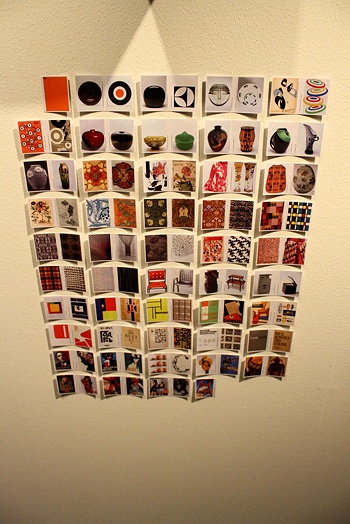
Wat de tentoonstelling me ondermeer duidelijk maakte is dat er bepaalde dingen bestaan die aantrekkelijk zijn en blijven, en dat het misschien die dingen zijn die grafisch kunnen worden genoemd als je er mee breekt of speelt. Sommige grafische clichés kregen in de tentoonstelling voor mij als het ware hun oprechte bron of context terug. De regenboogcollectie had een dergelijk cliché kunnen worden, maar misschien is het daar te aantrekkelijk en te uniek voor gebleven. Na wat onderzoek op internet kwam ik erachter dat op een paar andere regenboogboekuitgaven en een op kleur geordende boekenwinkel in New York na, vooral juist andere dingen op kleur gesorteerd worden. Vele collecties bestaan uit objecten uitgegeven in alle kleuren (vooral objecten waar je er meer van nodig hebt of kan hebben, zoals glazen, pennen, sokken, groente en fruit etc.) Rangschikking op kleur wordt veel gebruikt om wellicht functionele redenen. Maar ik vind het idee of vermoeden dat een regenboog collectie ook als een poging kan worden beschouwd om compleet te zijn interessanter. Dat idee laat zich ook illustreren door het werk Wonderkamer (2004) van Arnaud van den Heuvel. Vooral de ondertitel maakt de poging om een alomvattend overzicht te geven expliciet.


“An installation with all the images of the World in a room, sorted by color”.

concept
Visitors of the Wonderkamer (Miracle Room) enter an image-flow: a collection of thousands of images taken from their original context on the internet and arranged in a coloring scale from black to white.”

post by Victorine van Alphen


A Printed Book History 4 : Judge A Book By Its Cover


Friday, May 18, 2012

“Those lips, those eyes” by Edward Z. Epstein & Lou Valentino.

Designed by Paula Scher, New York, 1992


They say “never judge a book by its cover”, but I do.

I judge books by their cover all the time, but not only books, I judge everything buy its cover (at list at the first impression).

This book is full with beautiful black and white photographs of the stars of Hollywood’s Golden Age, people who were screen legends who burned up the screen and captured the very embodiment of sensuality with a special emphasis on their eyes and lips. I’ve chosen this book because it is full with covers to judge, both literally and metaphorically.  Each photo to me looks like the cover of some book\magazine or like a poster\advertisement, and each iconic figure is also a “cover to judge”. That makes the book twice as interesting to me. I can look at each page or each photo and think about it, do I like the photo? Is it well made? What does it tell me? And so on. But I can also look at each character and have my thoughts about them, about their looks, do I recognize them? What do I know about them and what does the picture tell me about them? This book with it pictures still gives those feelings even after so many years, these photos are still so sensual and glamorous which makes them relevant even today.

Besides, when something is concerning the mysterious and tempting life of old Hollywood, that is reason enough for me to choose it.

post by Tamara Aharoni


A Printed Book History 3 : Complutensian Polyglot


Monday, May 14, 2012

The Complutensian Polyglot Bible, 1514

With my clothes still wet and after being forced to leave all my stuff in the lockers, I was finally ready to be impressed by one of the books in the vitrines. We were the only visitors at the whole “UvA Special Collections”, and after the difficult and rainy bicycle ride we were no more than 10, a small group from different nationalities which in a way resembled the layout of the Complutensian Polyglot Bible.

Printed in Alcalá de Henares, Spain in 1514, it was the first bible made in more than one language, Hebrew, Latin and Greek. Translation is always a problematic thing to do, specially in such as “precise” text as the Bible but not only in terms of meaning, using the same book for more than one text seems like a pretty risky design work. The first example of such a hard labour would probably  be the Rosseta stone [x], that became the most useful tool to understand the hieroglyphs from old Egypt. Made in 196 b.C and as well in three scrips, Egyptian, Demotic, and Ancient Greek, but with a pretty classical way of arranging the different languages, in three different paragraphs.

The main characteristic that makes the Polyglot Bible specially appealing is precisely the way that the text is arranged in the page, in parallel columns of different sizes that also combine different ways of reading (as it happens with the Hebrew and the other two languages). That idea seems really modern, and the look of the page looks quite similar to the once of a modern newspaper. If I think in contemporary polyglot texts the first examples that come to my mind are the magazines from the airplanes or the mails from the school, and in both cases one language follows the other, so the same meaning never shares the same space with all the troubles that come with that. After a small mental struggle trying to remember a similar graphic structure I realize that now we can find it in something that we all use, Google Translate.

post by Juan de Porras Isla

A Printed Book History 1 : De letter… n


Wednesday, May 9, 2012

“De letter… n” by Remco Campert and Wim Crouwel, 1966

At “The printed book : a visual history”, I was most interested in the book “De letter… n” by Remco Campert and Wim Crouwel. What attracted me most was its’ hard, yet clean graphic style. The book was opened on a page that read ‘raket bom mes oorlog’, ‘rocket bomb knife war’, in thick black letters of various sizes on an orange and white background. ‘Raket bom mes oorlog’: every word gets its’ own separate line. The opposite page displays an orange ball that may remind us of the sun or, in this context, may just as well be a nuclear explosion.

As the books in the exhibition are set up in glass cases, I wasn’t able to flip through the book so, maybe because of the content of this particular page, the graphics in “Het gejuich was massaal”, a book about dutch punk the the late 70s, immediately came to mind.

Looking at the page again, something else comes to mind.

Paul van Ostaijen was a Belgian poet who started experimenting with typography in his poems in order to translate, among other things, rhythm and sound to the reader. He started in the 1910s with quite safe try-outs, mostly experimenting with different letter-spacing and word-spacing. In the 1920s, he went all out and experimented in a big way with font types and sizes. His best known example is “Boem paukeslag” from his 1921 book “Bezette stad” (“Occupied city”). In this poem, single words – keywords really – are connected and form some sort of narrative through the use of typography. In a similar way, raket bom mes oorlog are keywords but form an understandable whole due to the rhythm and context that is created through the graphics and typography.
post by Lieven Lahaye

Hans-Peter Feldmann’s Artist Books


Wednesday, May 9, 2012

Hans-Peter Feldmann (born 1941, Düsseldorf) is renowned for a distinctive use of photography and ready made objects in his work. At the end of the sixties Feldmann started to collect series of images from widespread visual culture as well as his own photographs. These series are displayed differently in printed matter as well as exhibitions.
From 1968 onwards Feldmann produced artist’s books, comprising a substantial part of his oeuvre and of major influence on the development of artist’s books as an independent medium.  In the first period Feldmann made Bilder Hefte, a series of tiny books at times containing only one image. Some books demonstrate a photo series of a single theme, like Die Toten, press photos of victims of political terrorism in Germany, and Alle Kleider einer Frau, a sequence of individually photographed objects. Other examples encompass disparate imagery without any enforced interpretation.
In 1995 Feldmann founded the magazine Ohio together with fellow photographers. This exhibition includes six issues of Ohio magazine that were made by Feldmann himself. Ohio magazine and Feldmann’s artist’s books greatly inspired younger generations of artists.

The exhibition is curated by Frank Mandersloot from his own collection supplemented with a loan from the private collection of the c/o Konrad Fischer Galerie, Düsseldorf, and organized in close collaboration with the librarians. Feldmann’s work is displayed on exhibition tables specially designed by Mandersloot for this occasion. From the 12th May – 2nd June 2012 the exhibition ANOTHER EXHIBITION: artist’s books by Hans-Peter Feldmann takes place in the library of the Gerrit Rietveld Academie, Amsterdam, with about hundred books on display made by Feldmann between 1968 and 2012.

Chain of Connections


Monday, April 9, 2012


Sometimes it happens when you think that you do not have any relation with something, suddenly you find a chain of connections with yourself.


Richard Niessen – graphic designer working and living in Amsterdam, the Netherlands. Since 2006  he works together with his wife Esther de Vries. The main focus was – search for a relations between Richard Niessen and Gerrit Rietveld Academie. Richard Niessen graduated from the Gerrit Rietveld Academy in 1996. Esther de Vries graduated from this Academy as well in 1998. I selected some fragments from interviews where they mention the Rietveld Academie:

“The class in which I graduated, in 1996, we all started on our own. I think there was a need for a new generation. We were the first generation of creatives that were used to using computers. I think there was also an economic boom; a lot of clients wanted to work with young designers. Linda van Deursen had been teaching us and she was very influential. Ajax won the Champions League in 95 so she called us her Champions League.” 

“It’s one of the best schools,” says Niessen, “because it takes students seriously. Also, great designers teach there. A lot of art schools in Holland are more like schools, but the Rietveld is different…”

“It’s also because there are lots of interesting students,” adds Esther de Vries. “Everybody wants to go there, so they get a great selection of people to choose from. It generates a lot of talent.” 

“Students at the Rietveld are taught that they shouldn’t ever expect to earn any money,” laughs Niessen. “Most people prefer to stay poor and do exciting work. Sometimes we’re asked to work with commercial clients but it never works out because they see a piece of work and say ‘we want that’.” 

“Rietveld is a quite particular school. Rather than being taught in a certain style, you are trained to have an attitude. Students aren’t given straightforward assignments like ‘make a letterhead’ or ‘design a business card’. You are encouraged to be autonomous, to adopt a more art-like approach, to work more conceptually. Of course at the time I wanted to make letterheads, but after I left I was thankful for the training. It’s attitude that prepares you for anything, and you have plenty of time to find your own style after you graduate. Now I always start by thinking about what is the most interesting aspect of an assignment for me.”

(more…)

The man and the sea


Thursday, September 16, 2010

Sea. Water. Home. Words you said minute ago is gone. It disappeared in an endless space. Somewhere in between 0°55‘.654N 40°25‘.522W and 15°00‘.411N 28°51‘.315W, or maybe somewhere else. It just a spot in a middle of the ocean. You reached that point and went away.


Eleonoras first Atlantic crossing. A kind of logbook“.Two books, different size but the same landscape on a cover. The sea and a small line of the sky, blue color mixed with a calmness and secrets. The coordinates on a book cover looks like a silhouette of a ship on a horizon line, just passing through. Pointing the space. There is something very mysterious about this book. Finger print on a side of the book, its like a signature of a man who went all the way from Gibraltar to Rio de Janeiro, but also it reminds me the look in to the sea from above. Also it shows that this book is personal, and important for a man. It could be a logbook, but somehow it looks like a diary of a man and the sea. What makes this book really interesting, is the difference between two books. At first you may think that small one is the same as big one, just the different size. But the small book has all photos made on the trip, big one only the sea scapes. I imagine how it really looks, for now I cant see that. Just a space where you can catch an image and let it go, into the endless space.

Micro-organisms living in these typographies


Thursday, September 9, 2010

Hurry Up. Pick a magnifying glass before you miss it. Before you flip your page and the dust on the left corner falls off. Deeper in that letter. Deeper in the ink there is a whole other story to be told. A story that might or might not explain why these tiny books aren’t bond for the human eyes. It’s something to make you question. Raises up curiosity. Something to make you intrigued to dig deeper for results. You start to question why she wants you to believe that from these tiny dots a new creative perspective can be born. You can almost see yourself behind a microscope. Ready to believe that there is a tiny living organism in the “E” that spells Essence. The essence of what you have been missing with your eyes. It makes you want to wish that Alice’s potion existed.

It makes you want to be your fingertips. It makes you want to slip right through the glass box.  A glass box filled with tiny dots and endless possibilities. Just laying there. Ignorant of your presence. Not for you consumption. While you still look through the lens of the microscope. You can almost imagine that there’s these tiny species living together. Compromising with the closeness of each other. Zooming in, you can see why she wants you to make an effort and research. By discovering this you’ll look back and give credit to what you can’t read with your naked eyes.

Look for the unusual (1)


Wednesday, September 8, 2010

The SHV Thinkbook was the book that catched my eye, because of the passionate story Henk told us and also because of the vitrine that showed some try out versions of the book, experimented with paper, way of binding, the cover size. It made me look up to the wall and back to the vitrine all the time, to try to find out the story of the book and to try to see the problems she met and the way she solved them.
I think it was important to me get get to know the book in some way before liking it. I see books as object were you don’t only look at, you want to feel the weight, you want to feel the structure of the paper went you turn the page, you want to have a close up to see how the ink is printed on the paper, you want to smell the book you might even want to make a little loving fold in the corner of a page you want to remember.

The only think that i had in the back of my head all the time when i looked at the SHV Thinkbook, was this sentence that i read or heard which was the instruction Irma Boom got for making this book and that was; ‘Look for the unusual’
Maybe in settled book, and publishers land this is a very unusual book, but in my perspective books can be way more unusual.

Some thoughts about books being an object that store information, in a handy, clear, protected and unusual way…

unusual books

unusual books 2

Every Thing Design


Wednesday, September 8, 2010

When I was looking for some really nice book to look deeply, this thin white line peeler design caught my sight. Also this small black book was in between two big books-It was grey cover with big white letters and two book that can see back and front side-white cover with big black letters and front side, there is blue colour picture). That is why I can see it right away at that moment.

This really thick and nicely painted black colour book is attractive for me who really like simple design with only black and white colour. And drawing of peeler with thin white line on the black colour cover was so amazing, because that peeler seems making me peel-off the page by page and discover new pages afterwards. I have to peel-off one design if I want to see next design. Like I am looking for something through page by page. Even I feel the first page is the oldest one and last one is the latest one.

Also at the side of the book, not the book cover, there is big and thick white letter which interested, too. It can be simple white letters on the black background, but it looks not that simple if I see little bit closer. Because of the paper inside, black background is not same black as book cover. Also when I look at it little bit more closer and closer, I can see there is other colours, not just white and black. It was very funny that I discovered something I don’t really want to discover from that black and white book.

HOT SHOT


Wednesday, September 8, 2010

One of the first things that strikes Me is the enormous amount of love and energy Irma Boom manage to include within her books. The endless dummy samples to find the right presentation format, the anti-commercial printing and binding methods and the endless corrections are all part of it. It almost feels like the books of Irma Boom are from another planet.

For that reason I found it hard to pick out one particular book, so I asked myself the question; what is for Me the most important part of a good book, the reason to just grab the book and get lost in it. For Me a book is really about a good cover at the first place, one that strikes my attention by being unusual or reminds my of something else I’m interested in, so after I realised what is important I picked the CAR GIRLS book by Jacqueline Hassink

Car Girls

That particular book immediately reminded me of the LP “Grand Prix” by the Belgian band Vive La Fête.The cover (and also the cover of the LP) gives me a kind of exciting feeling, the idea that it’s really cool to drive really fast ( I don’t even have a car) and to have a sexy “Car Girl” like girlfriend behind the steering-wheel.

Passion , Inhumanity + Transformation


Wednesday, September 8, 2010

I was so touched by one book named “ SHOT ‘’, published on 2009 ( I didn’t find the name of the writer ) and it is about hurting pages transforming from green to red and hunting. Men aiming their guns towards the flying birds.. carrying chickens  ..these are the pictures that symbolizes the passion of human. And the transformation of green to red  symbolizes life and death. The voice in writer’s work is speech that passes through us, that comes from another times and place and whose destination is unclear even while its tone is often insistent, perhaps violent

I think the book is very seriously written against the animal killing. I questioned, why don’t they just shoot the clay instead of the real animals? Is it a social or biological passion? I really found that human beings are continuously being away from the line of humanity. What a nightmare !

The cover is red in color ( symbolizes the blood ) with ten holes with some big writing on it and I felt the holes are the eyes of the animals and looks very sad and are pleading human for help. If you look the holes continuously, you can feel the environment of fear, grief amd tears. The book looks like a closed box. Its opening is not like the normal book as we have to open the lock first. And the right side of the book ( from where you starts turning ), is locked by one iron like metal tool in the shape of an arrow. I think this has very special meaning as arrow always kills. The semi round side symbolizes the expansion of the life and the point part, end.

It was a great moment to be the part of an  book exhibition of known artist Irma Boon in Amsterdam.

Little red


Wednesday, September 8, 2010

Adults are used to collecting big toys like cars or antique furniture.
Kids are used to collecting small toys like puppets, useless crystal balls or colorful stickers.
When I was a kid I also collected small postcards and teddy bears.
They lived in an old candy box that I got from my grandma.
Now there is something lying in may hands that reminds me of those dearest small things that are so valuable for every adult.

These fragile memories from the past childhood help grown ups to keep a child in their souls.
Otherwise if a pure and cold rational view of the world dominates it’s going to kill that sparkle.
I think that Irma Boom with her tiny books reminds adults of the small child that still lives in their souls.
Even when it’s buried somewhere deep inside.
Just holding this tiny book in someones hands inevitably brings a childlike smile to their face.
I find these moments very important in someones life.
Even if that book is about Ferrari engines or the latest research in nanotechnology.

My best friend lives in Russia. She is an artist and a photographer.
She sends me these “children’s” gifts that she has made herself.

Take care of your childhood.

everything is design, design is for everybody!


Tuesday, September 7, 2010

Every Thing Design is a book by Hatje Cantz which presents a large number (more than 700) of design works from the collection of Zurich Gestaltung Museum. It mainly shows prints and posters, but includes also a wide range of other objects from many famous designers. The book is, among books designed by Irma Boom (and some of her own library), on display at the Bijzondere Collecties Gallery, in Amsterdam.

everything design!

First of all the cover: it’s all black, with a white cheap potato peeler; visually it makes concrete what the title say: everything is design! Design is for everybody! The layout of the book presents the objects making interesting comparisons and associating them in couples which have a sort of connection. What’s interesting, in this couples, is that they do respond to a logic that can be less obvious than expected, as a time, place or artist order, but very explicit. Mainly, they are similar objects and visuals from very different periods and uses but with the same strength, the same conceptual value, the same way to visualize the zeitgeist of the period. So the cover of issue one of the magazine “Neue Grafik” (1958) showing the text perfectly insert into a square grid, is associated to a typeface from the early 20s’, the “new graphic” of the time. Two more recent comparison: the first shows the (famous) poster from Obey’s art for the electoral campaign of Obama in 2008 and the (as much) well known poster of Bob Dylan drawn during the 60’s by Milton Glaser, while the second present the famous Levi’s commercial with the Michelangelo’s David dressed up with Levi’s jeans short, with a more recent HnM’s poster of a beautiful and sensual girl wearing a tiny bikini. In the first couple is explicit the high moral value of the person represented, with the “Che Guevara alike” glance of Obama in the “hand-crafted”, old school appearance of the poster, and the streamy colorful hair of an outlined-comic looking Bob Dylan which transforms the pacifist songwriter into an icon. In the second there also is an iconic value which is a bit “debunk”, and while 30 years ago this value was embodied by a masterpiece of art, nowadays it is just the body of the women to be sold.

What i liked the most is the comparison that offers, which i think it’s a fundamental way of thinking in art and design, and the general look that encourages, contributing to shape better the word “design”, depicting the spirit of the time and taking it away from the idea of a competition between world known designers to create the most posh version of a lemon squeezer, and giving it the role of a discipline which applies to many levels and fields, a way to better resolve mankind problems. Design must be everything for everybody!

Thinking over the Thinkbook


Tuesday, September 7, 2010

When going inside the exhibition of Irma Boom I decided to look for the one book that made me want to grab it, huddle in a big fluffy chair and disappear behind it.

The SHV Thinkbook attracted me because it is plain black on the outside, like in the past many books were. Some of these ancient books also being on display (part of the private collection), I can see where she might have got her inspiration from.

Books to me are objects I love being around. They often bring back sentimental memories of a snug warm house and evenings spent divulging my favourite books again and again. And so does this book designed by Irma Boom.

I always thought there is something fascinating about books that are plain on the outside. They hardly reveal any of its mysteries at first glance and thus makes me curious about its contents. When you open it a whole world opens up before you. I wasn’t disappointed now. When you open the SHV Thinkbook you find colourful page after beautiful colourful cotton page, 2.136 pages of them! Within the letters of the title are hidden. Also, on the edge of the pages you can read a poem by Gerrit Achterberg.

Irma Boom wanted the book to be a voyage. For me the voyage already starts with goggling at its cover. Alas, that is as far as I am going to get, since it wasn’t allowed to touch any of the books.

All I can say is: it is a mighty shame I wasn’t allowed to take it home with me and discover its many secrets.

the information man


Tuesday, July 20, 2010

Project based on a story told by American artist Ed Ruscha in an interview in NY Times 1972. Experiments inspired by this story were conducted and filmed. Project by Christopher West and Alban Schelbert [click image for movie]

Quoting graphic designer Julia Born from ‘Capsule over Kunst boeken’…

The information Man is an interesting story of artist Ed Ruscha, who tries to imagine what happens or has happend with his books. It deals with the live of a book. How it is used (or not), the book as an object etc…… This is what I always find interesting. The book as mass product, which starts to lead an individual life due to its distribution, changing its appearance too. I used this story for an assignment once and later it became the theme of the book ‘Beauty and the Book‘ resulting in a visual essay in coöperation with photographer Johannes Schwartz

Ghost Science?


Thursday, May 27, 2010

During a workshop of Ayumi Higuchi about ‘rules’ I saw one of the books she brought with her to class. One of them was “Design as Art” by Bruno Munari. While reading, I noticed he was clearly writing in and for another era, but his ideas about visual, graphic and industrial design are still working. It’s a modern classic about how we see the world around us.  I have an obsession with modernism of an earlier era. I don’t know why exactly. But I know that something is haunting me. I constantly seek references of music, book, clothing and product design from the past. I wanted to write about examples of where I see these references, and what is it exactly that is haunting us and what enhances this power of haunting.

Lets start with Apple, almost everybody I know owns a macbook or an I pod. Most people don’t know that every single product at Apple, from hardware to user-interface design, is based on old designs for Braun during the 50s and 60s made by Dieter Rams. Jonathan Ive from Apple design is clearly inspired by him. Dieter Rams gives the clues for the products of the past present and the future of Apple, he is a furniture maker, architect and product designer.

Maybe a few of you are familiar with my next example, the magazine Monocle. Its an international magazine with its headquarters in London. Its more a book than a magazine, about international affairs, business, culture and design. Tyler Brûlé is Monocle’s editor-in-chief and chairman. He is the guy who brought neo-classic post-European modernism to lifestile publishing. Writers and photographers from over 50 countries deliver stories on forgotten states, political figures, emerging brands and inspiring design solutions. Monocle also works with impressive illustrators who contribute to the magazine periodically. Here are a few examples of illustrations made for the magazine.

Andrew Holder

Lab-Partners

Adrian Johnson

Notice the vintage inspired style and color composition. Few of the readers know that this is not the first Monocle. There was another Monocle , a virtually forgotten, but important magazine that was published from the late 1950s to the mid-1960s. the new Monocle however actually looks nothing like the old Monocle.

Maybe all this nostalgia is not for the recent past, but more for the future that it promised, but never came. I present you Hauntology. Hauntology is derived from haunt and ology.

Hauntology is the opposite of nostalgia. The term goes back to 1848. Marx and Engels stated ‘A sprectre is haunting Europe, the spectre of Communism’. It was introduced for the first time in 1993 by Jacques Derrida in his work “Spectres de Marx”. The future can only exists in relation to the past. We are living in a time when past is present, and the present is saturated with ghosts of the past. In hauntology, the present is not only haunted by ghosts of the past but also by  ghosts of the future. Jacques Derrida talks in the documentary “Ghost Dance” about ghosts being part of the future. In the documentary a student asks Jacques whether he believes in ghosts. He answers “Le phantom c’est moi”. In this case, yes it could be himself, since he is asked to play himself and without knowing it, he lets a ghost speak for him, he lets the ghost play his role.

Cinema is the art of ghosts, a battle of phantoms, its the art of allowing ghosts to come back, and let them speak for you. Watch the interesting documentary “Ghost Dance” (1983), starring Jacques Derrida.

My last example, hauntology can be found also in music. Recording label Ghost Box is an English recording label by graphic designer Julian House and musician Jim Jupp. They describe themselves as a label for artists that find inspiration in library music, folklore vintage electronics and haunted television soundtracks. The name Ghost Box itself is a reference to television and the way previous experiences with this medium can haunt your real-world experience.

I agree with Jacques Derrida that cinematography and telecommunication enhances the power of ghosts and their capability to haunt us. Music also contributes to this power of haunting. To prove it, listen to some of these examples of haunted music and let the ghosts of the past and future speak for you.

Memoryhouse

Broadcast and The Focus Group

Mordant Music


Log in
subscribe