Skip to Content Skip to Search Go to Top Navigation Go to Side Menu


"color" Category


”Farbenkugel ”


Monday, February 3, 2014

Schermata 2014-02-06 a 22.57.12

Colors //

Philipp Otto Runge, born the 23 july 1777, died the 2 December 1810, he was a German Romantic Painter, friend of Goethe (that wrote a ”brick” book about colors; ”Theory of Colours”) in short, they shared the same interests. Runge dedicate his life on accurate, almost ”scientific”, drawings, painting and he dedicate him self on the studies of colours and creating a colours system.

For him there are three colors (blue, yellow and red) what he wanted to do is create the complete kind of colors resulting from the mixing of them, among them self and black and white. The result is a  sphere illustration similar to planet earth with two poles of black and white and colors are mixing each others in all direction and depth. The easy way to visualize his idea I think is to imagine it as a three-dimensional sphere that you can as well dissect (like an apple) and inside discover colors mixing among each other.

527px-Runge_Farbenkugel

What I appreciate on the ”Farbenkugel” is his ambition on creating a complete illustration of the relation between colors, and the obvious benefit that you can have from it.

With the fact that he is a painter you can see that his colour studies influenced the way he is handling colours (x;x) in his paintings that make me interested on choosing some of his paintings, simplify them and select some colours with the use of pastels, than be playful and let the process lead me to create something.

illustrazione-copy Philipp_Otto_Runge_005


The process//

First of all I selected some of his paintings and then I made some abstractions based on the similar color that you can see in his works, then I cut out parts, square and lines of the abstractions. Build forms and experiment and play around with them.

An interesting point of the “Farbenkugel”, if I´m not wrong, is that in the center of the sphere, or rather the core, all the colors are mixed and give black, I decide to pick a gray because of adding some white from the upper pole of the color sphere:

1903285_10151905931406314_1697678139_n

Actually, the more I was experimenting and trying out, the more I was getting insecure and confused.
Finally I decided to focus on the square selection and zoom/ abstraction of his painting.

Prova2-15_redu A2pastel

Prova2-9_reduprovaA2_redu

So I selected some of the more or less 5 x 6 cm cut outs, scanned them and printed them in A3. But then I still didn’t know what to do with them.

I questioned myself what should I do? So i pick up the camera and start filming but….

I was getting more lost and far from the original idea.

Whit this color system I must say that I learned to not underestimate or doubt the first idea, but go for it and finish it.
So this is a video clip showing the concept of extraction of colors on the first idea that I had, and if I followed correctly maybe I had some more image exemples…

Get the Flash Player to see this content.

Newton colour system


Sunday, February 2, 2014

Isaac newton color system
Sir Isaac newton invented the color wheel, allthought i believe there were other color-wheels before, Isaac newton invented a few new aspects to the color wheel that were significant to our understanding of light and colors in the spectrum.

Color system picture:

wheen met kleuren

Newton made a box where daylight came in and through a prism divided in 7 colors, then he aims mirrors on this position to bring the colors back to white light again to prove his point. he figured out that al the colors have a different segment size on the spectrum. After Newton had used a prism to separate daylight and count seven individual colors, it appeared to him that, when considering color-hue, this was a closed system. By taking the violet end of the spectrum and linking it to the red start-point, he thus created a convincing circle of colors.

dark room

This happened in England 1704 and the system has the colors Red, orange, yellow, green, cyan blue, ultramarine blue, violet blue.

He also thought of colors like music, red as D orange as E f as yellow. G as green, A as blue, indigo as B and violet as C.

Newton created white from all colors again. From this idea he created a wheel that is used as kids toys today.
If you spin it really hard you would get white.

Color wheel:

objectcolorwheel


To start working with this system, i focused on light at first and try to experiment with light from the computer screen.

Get the Flash Player to see this content.

Get the Flash Player to see this content.

After that i focused on the music aspect. I tried to make a random song on an organ.

Then i made in after effects also a random shape that would move in a circular shape that would eventually turn into white. While i was working on it something went wrong with the audio and the tuning went up a few notes. This made it sound like an arcade game and without really much thinking a tried to do something with that but then i noticed that i was illustrating and moved on to the next step.

Here are some pictures of the movie:

film4 film2

film1 film3

first color system on sound:

Get the Flash Player to see this content.

In the end i was not happy with the piece, its song seemed a bit too finished or a pretty song and the shape of the circular movement also didn’t really make sense to me so i started over.

To keep it not to disconnected i recorded my voice when watching the previous made movie and try to react on it in a more primitive way. Then some notes came out, i tried to find the notes with a recorder/tuning device and timed there duration and see which color the notes have on the spectrum. Then i made a pallet and with this pallet in front of me i manually drew lines in after effects, since it’s actually a line that comes from the division of light into colors, but now interpreted trough a manually human action.

Later i reflected on why i choose for this manually drawing action and i figured it had something to do with me trying to visualize the joyful experience of newton being in this dark room with mirrors an prism and 2 way light from one end of the white light to the other end of the white light and standing in the middle of a space filled with colors mixed with the dancing happiness of finding this discovery, because if you see only the pallet spectrum image that i made then it is almost a computer like generated empty image, a data, a fact, a statistic from a to b. i choose to draw the lines vertically on the screen to give the impression that the circle of colors (and therefor light) is flat and moving in a circle which is including the space of the spectator and only documented on the computer screen.

New Color System:

Get the Flash Player to see this content.

It was pretty hard to get the timing right since i don’t know the program that well and while i was making it i didn’t know what i was making since the line disappears after letting go of the mouse-click but it is then recorded on the video. i had to cope with the limitations of the program or my knowledge of the technique and see what comes out in the end without being able to undo one step because then you had to redo the whole thing which i did several times. i thought that drawing color in terms of light had an importance to the piece since a computer screen is made of light but in the end i wonder if the limitations of the program really benefited my approach so next time or maybe the next step i will avoid using a program like this and explore a more manual and direct approach.

Naming Colors


Saturday, February 1, 2014

The first thing that I noticed about the image of the color system was the shape of a cake. And that was the only thing that seemed interesting about it. The second thing I got from the image: people have the urge to label everything. Why finding a thousand names for every little nuance of a color?

02isc

In the 1930s the ISCC-NBS-System was established by the Inter-Society-Color-Council in Amerika. The aim was, to create a color system that designates color for science, art and industry. The system consists of a set of blocks which is based on the color system from A. H. Munsell.

Between the years 1955 and 1976 the americans K.L. Kelly and Deane B. Judd developed the ISCC-NBS-System and reduced the color in increasingly fine blocks. For the definition of the colors they used the three parameters hue, value and chroma.

The system consists of 13 basic color categories which are further divided into more and more specific hues so that there are in the end 267 named categories.

In the example of the purple-segment you can see that Judd and Kelly used more or less subjective variables to define the color nuances: vivid purple, brilliant purple, grayish purple etc. When it comes to naming colors it is almost impossible to find the right definition that accords with everyone’s association. That might be the point, why the ISCC-NBS-System could not find enough popularity.

For the translation of the ISCC-NBS color system into my own concept, I chose as the main leading elements the shading of colors and naming them.

MG_9823_redu

As we can clearly see in the concept of the ISCC-NBS color system, naming colors is a very subjective manner. So I tried to see that as a chance for me, finding names for colors from an intuitive, very subjective point of view, knowing, that it is only the truth of my sense. I screenprinted first a color circle and chose a light purple, because it was used in the ISCC-NBS color system as an example.


Also the fact, that people have the urge to define and name everything around them, I found an interesting element to work with. So I started in my very close surrounding to take pictures of plain color objects. To each color I found one specific name that intuitionally felt right for me.

MINT GREEN

mint green

OCEAN BLUE

blog6

DISCRETE YELLOW

blog10

WARM BROWN

IMG_7787 copy

SHY VIOLET

blog5


With the chosen colors images I made a poster.

designblog

Shades Of Blue


Thursday, January 30, 2014

Ignaz Schiffermüller was an 18th century biologist who was particularly interested in butterflies. He created two colour charts, one of which was comprised of 36 shades of the colour blue, which Schiffermüller thought would make distinguishing between blues in the nature he was observing easier. This very particular motive for creating a colour chart inspired me to try and recreate something equally charming and with an equally egotistical goal. I decided to try and make forms which could be delicate and natural, but abstract at the same time, like shapes of colour, but which would pertrude from a surface and create shadows, forming “shades” of blue.
Here is a link to see the original colour chart.[x][x]

My piece is made up of only 20 pieces.

DSCN3714_redu

IMG_4158_redu

The Bel Air chair


Thursday, September 26, 2013

2011EN5032_jpg_l 2006AG2159_jpg_l


I think it’s pretty obvious why someone would want to write about this the iconic ‘Bel Air’ chair by Californian designer and ceramist Peter Shire. It’s simply not just another designer chair we see every day! “Quirky but sophisticated, playful but not over-the-top” was my first impression on this piece. There were also many questions that popped in my mind. The quarter circle backrest and the ball shaped “chair leg” for instance – why are they there? Why in such forms? And what about the rest of the design? It’s one of those designs that made me so curious, so now let’s get it started…
Born and raised in Los Angeles, Peter Shire’s often revealed traces of the surfing culture in his homeland through his work, always so full of colours and “cheerfulness” : I see the sharp line of the quarter circle which is in contrast with the round form of the elbow rest. The backrest is partly based on shark fins, and on the Stevens House by architect John Lautner (see below), located on the beach in Malibu.

John-Lautner-Stevens-House-78-Malibu-Colony-Rd-3_0


One thing interesting thing about Peter Shire is that, his design are very creative reinterpretations of normal forms. His work can be seen as art rather than solely functional designer objects (which he also explained in this interview). A good example would be the teapots he designed. Looking at how the teapots appear in various shapes and “movements”, I start to wonder if they are maybe 3D drawings rather than just real teapots (but can some of them really function properly as a teapot..?)


IMG_15841 7292938_1 Peter_Shire_City_Hall_Teapot_2003_630_88

Some of the teapots by Peter Shire


Now back to the Bel Air chair – of course it does function perfectly as a chair (given it has all the essential elements of a chair: seat, back, legs..), but it can also easily fall into the category of ‘art work’. Take a look at the chair again, doesn’t it look like a giant sculpture composed of geometrical shapes, or something you can find in a kids playground? 

And this is exactly the kind of playfulness and quirkiness that I like about the chair. This piece has so much to examine and look at. Everything changes when you look at it from different angles. Yet the elements come together very well, like a harmonious explosion of shapes and colours.


bel_air_peter_shire_memphisbel_air_peter_shire_memphis_facebel_air_shire_memphis_milano

AP0200_1_peter_shire_400AP0200_2_peter_shire_zoom


Now, the best part of the design has to be the bright orange plastic ball. I can totally imagine everyone looking at it twice, or more. No regular looking chair leg is found here, instead we only see this plastic ball giving a memorable twist to the piece of work, truly an uncommon but fun element to look at. It definitely brought the final result to a whole new level.

It didn’t surprise me a lot when I found out the super fun Bel Air chair was the most important contribution of Peter Shire to the Italian design group Memphis. Yes, the quite crazy and very much groundbreaking Memphis Italian group, always challenging the narrow constraints of traditional Italian furniture design. Peter Shire’s involvement in the Group came about after his ceramic work attracted the eye of Ettore Sottsass, one of the founders of Memphis. Sottsass found Shire’s ceramics “fresh, witty, and full of information for the future”. The group invited Shire to Milan to work with them.


memphis-group2011ET6775_bedin_superlamp_bulbedettoresottsasscarlton1981
The word “ordinary” just doesn’t exist in the dictionary of the Memphis…


As previously mentioned, the Memphis design held the intention to break away from the conventional and conversation sides of general retro classic Italian furniture design. So let’s recall a bit: traditional Italian furniture has been popular since renaissance periods and was used by the royalty. One can easily associate words like “classic”, “elegant”, “deluxe”, “expensive” with the style. Colours that are commonly used would be, let’s say, white, ivory, gold and brown etc.

On the contrary, the Memphis stroved to design products which were much more than just furniture—but also political statements, existential metaphors, and visual poetry. Everything. The Memphis were expert at communicating their ideas with colourful decoration and asymmetrical shapes. They have also been described as “bizarre”, “misunderstood”, “loathed”. It’s simply a collection with endless possibilities and surprise.

As for the style and works of Peter Shire, I can see that they do fit perfectly into the Memphis aesthetic.

One nice comparison with the Bel Air Chair would be the Kristall pedestal table by DE LUCCHI Michele (see below). Initially we see colourful and eye-catching components in just one table: a bright yellow top, black and white body, and four blue-gray legs. It reminds me of the first time I laid my eyes on the Bel Air chair. So unique, so eccentric, so unforgettable. Just like the Bel Air chair, the structure of table looks rather simple. Yet there are so much to look at when the graphics come as a whole: the brights colours, forms, shapes, and the very much Pop Art inspired tone…


gueridon-kristall


The Memphis just isn’t too Memphis without asymmetrical shapes. So here we see this table appears in such manner (It was in interpretation of the Apollo XI Space Mission, in case you wondered). The outwardly placed yellow top in the Kristall pedestal table gives a similar result as the bright orange plastic ball in the Bel Air Chair. They are not simply placed there to form a asymmetrical shape, I see them much more than that – the ultimate surprise and highlight of the work. Indeed, the table top and the chair leg both give a little “bizarre” and asymmetrical twist to the final look of the pieces of furniture, revolutionizing common objects, which is pretty much a very important part of the spirit and essence of the Memphis style.

Abstract Language of Space and Light – the Metaphor of Perception in Space for Correspondence


Saturday, August 31, 2013


Melancholia_rietveld graduation show2013Ji Sun Nowh


Writing this I discovered a new aesthetic language through the “way of looking” and the combination of possibility and imagination latent in it. This tends toward the potential unknown reality. The artist has an insight to see through various worlds and this inner eye allows the artist to experience the

other world beyond reality. Melancholia03_ Jisun Nowh_redu The work created by this artist is the very gateway leading us to this place across time. Through the operation of thinking and recollecting, we are able to bring out the invisible time and space, experiences, reminiscence, and subconscious. What I have attempted to represent using a metaphoric form of visual language is the faint outlines of the invisible beings, the lingering ambiance of light, and the emotional respiration coming from the stream of subconscious, all experienced through the mutual perception of time and space.

Melancholia04_ Jisun Nowh_redu Melancholia02_ Jisun Nowh_redu
My work intends to be vacant and open rather than to express many things. This is to induce the viewers to read the work as a reflection of their own experience and sensibility. I found that architecture and art consist of the inner abstraction and the perception of light and I have experienced the process of the works in this thesis that starts from the convergence of form, line, color and sensibility and develops into sculpture, painting and building involving space and light. The combination of form and color awakens the sensibility inside this. I tried to enable a more direct visual experience and bring out the abstract forms to the real space in order to substantiate them.

The geometrical Melancholia01_ Jisun Nowh_redu forms in these works are  imaginative spaces waiting to be filled with serene experiences.
I brought this abstract language form into my work and it will be originate from the restoration of imagination through the “way of looking”. I wish it did not remain in the state of merely reflecting the inner space but rather to be continuously reborn through various interpretations by being read as different stories and experiences.

text by Jisun Nowh [graduate student department of Inter Architecture]

 
Pdf-icon Download my thesis: ”Abstract Language of Space and Light;
The metaphor of perception in space and light for correspondence
 

What if the content DIDN’T matter


Thursday, April 11, 2013

Already as a young girl I had this specific love for libraries, though I’m scared they don’t love me back that much because I always seem to forget to get the books back on time… But anyway, being in a library felt like an adventurous gateway to all this different worlds and lives.

As a kid you make a decision on whether you like the cover or not, or on the amount of nice pictures in a book. When you grow older, the content starts to matter more and more, until it is the only thing that counts.

So last week I went to a library as if I was six years old again. Not thinking about a topic, just looking around and seeing which book catches my eye. And after some sniffing around, I found it: the book I didn’t know I wanted. On the uttermost left corner of a bottom shelf of the graphic design section, it was hiding. It had a small cover made out of a black fabric, like a luxurious pocket size notebook. But when I grabbed it, it didn’t seem to stop! Thinking it was a small notebook; it appeared twice as long as I thought it would be. Completely black, even the letters on the cover were black. It said: ‘Vladimir Navokov’. Given the fact that I found this booklet in the graphic design section, I would say, it is a rather odd place for a book of this old Russian writer.

The explanation would soon follow, because when I opened the book, it appeared to be filled with beautiful descriptions of fantasy’s Nabokov had when he thought of a specific letter. Each description came along with an illustration of the described letter. It seemed to be a new dimension of learning how to read.

This whole booklet breathes a sense of care and love for detail, a feature I can relay to a lot when I think of my own work. Even the smell is part of it. Exploring a publication on every detail you can find in the cover and layout, but without really knowing the content. And when I was studying this book, on the ground of the graphic design section of the library, I felt like I was six years old again.

Rietveld Library cat.nr: 757.3

Color in Relation to our Lives


Friday, March 29, 2013

A bright pink page of the book drew me to it. It was lying in a showcase in the Stedelijk Museum amongst many other objects and flyers, but the brightness of the opened page made the book stand out. On the left page you could see a picture of an Indian girl sitting behind a table. On the table in between her hands was a small heap of bright pink powder, almost the same color as the bindi on her forehead. The page on the right was a page of bright pink textile.

This book (put together by Nikki Gonnissen and Thomas Widdershoven) shows works and gives a feel of the work by Fransje Killaars, a dutch artist who graduated from the Rijksacadamie in 1984. In the beginning of her career she mainly made paintings, but it is her later work, her textiles, which attracts me most.

I read in an article about Fransje Killaars that she is fascinated by the power of color, the relationship between people and textiles and the way textiles are bound up in daily life. I was able to take a closer look at the book in the library of the Stedelijk Museum and I was surprised to see how much more attractive Fransje Killaar’s work is portrayed in that book than for example the images on Google search. It was then that I realized that like Fransje Killaars I was not only fascinated by the power of color, but especially the combination of colors in our daily lives. Seeing Fransje Killaars’ textiles transforming an old attic

space into a bohemian paradise,
or seeing her carpets thrown over a washing line hung amongst palms

seems to play much more on the imagination rather than seeing the fabrics placed in the middle of a white clean gallery space.

In a gallery space the work is merely about colors; about the contrast between them and the brightness that a color can have. Yet for me the excitement comes when you find bright colors in someone’s kitchen, when colors pop up amongst plants, how sunlight can give a color different shades and all colors on the knit sweaters of the Rietveld students in the winter.


I caught myself playing around with this fascination on my guilty pleasure.

Instagram

I try to eat an orange every day, but before I get to peeling it I like to take a picture of the bright orange against the clothing I am wearing that day. I have realized that by doing so I put a frame around a moment or literally make a snapshot of the moment. It may be only esthetics, but for me it is quite a luxury that you can find such esthetics in everyday life.
The combination of color and the sense of touch is another element, which I find rather appealing. Holding the skin of an orange against a green, wool knit sweater, running your hands over a an orange shag rug or a purple suede dress is often much more exciting than looking at the same colors on a 2d canvas. Do not get me wrong; I have nothing against the great color field painters, who can use colors in a fragile and moving way. These painters succeed in translating emotions into color, into paint, but when it comes to the exuberance of a color or the contrast between them I think this can be best portrayed in a more hands on manner.

The brightness and the vividness of the use in colors in Fransje Killaar’s textiles seem to be more about the celebration of life, about the joy that a blotch of color can add to every day scenery. The use of color in her work is about the beauty of variety. It is not without reason that a mixture of joyful and interesting people is referred to as colorful. The pink page in the book was what had grasped my attention, but the comparison made with the girl holding the same color pink in between her hands and a trace of the color left as a dot in between her eyes is what made me linger and look at it more carefully.

DRESS-INDEX #6


Monday, February 11, 2013


C82% M79% Y46% K45%

 A mysterious dark blue was the starting point of my observation,

 I could see this color on everybody, combined with lighter tints of blue and black,

wearing simple jeans and very little accessories.

 And most of the time a comfortable sweater in the same color.

The connection between the school as a building and the students in it became clearly visual for me;

people walking down the blue stairs transforming into a different scene

like a landscape with elements that make sense between each other.

Students sitting on the floor working on their projects are getting camouflaged with the surrounding,

and become just a dark spot on the ground.

I based my research on these two observations;

the dark blue sweater and the camouflaged people.


I started experimenting with the conventional clothes that I constantly see at school.

I tried out different ways of wearing them, getting new forms and textures.

I also experimented with daily tools like scissor,

school materials and basic materials like tape and plastic bags to finish off the clothes.


The shapes I got were really interesting.

Especially the one that came out from a simple sweater,

which I turned into a strange hoody giving it an urban-hip-hop feeling which I also perceived at school.

The tension of the fabric created on the shoulders by the way of wearing the sweater,

makes you bend a bit to the front like the people working on the floor.

I created a skeleton out of the sweater, a basic structure,

and then I worked on the details based on some objects I used in my research,

scissors, tape and a plastic bags on which I drew some black patterns with marker

I painted the leggings with the same gray scale from the building

They turn into live pillars supporting the heavy structure, cracking with the movement of each step.

The On-Colour-Project


Friday, January 25, 2013

No better way to welcome the students back on the academy after their X-mass holidays. With the end-years fireworks still in mind our color circles accentuated the snowy white carpet of this wintery month

Thanks to the excellent cooperation of the Silkscreen department, printing and routinely sticking the posters to the billboard, so we could enjoy the colorful results of one of the Foundation year’s student latest projects.

These circles were part of a project initiated bij Henk Groenendijk and Matthias Kreuzer as a cooperation between the Design and Design Research classes.
An amount of randomly selected color-sytems were distributed among the student after which they researched substantive backgrounds and the possibilities to base a work on that. The objectivity of science (subjective as the sometimes seemed) was used as an impartial starting point. Parallel to that process a color was determined representing the project or an element of the research. This monochrome color was printed in small print run using silkscreen printing technique. Interaction between research and the creative process is documented on Designblog under the “On-Colour-Project” project

For the Open-Day Hansje van Ooijen (chair) composed here own subjective variant, as a backdrop for the Foundation Year’s Open-Day meeting place.

Researchers / editors: Group B students
Initiators / guides: Matthias Kreutzer and Henk Groenendijk
printing / posting: Harmen Liemburg and Kees Maas

From colour to sound


Wednesday, December 12, 2012

The CMN colour system was created in 1986 in Italy. It shows how colours change. How they can get brighter and eventually become white (bianco) or darker, thus resulting in black (nero). They can also become transparent (trasparente) or reflective (speculare). The CMN-86 colour system is about how colours appear, change and disappear. Going from dark to bright and from reflective to transparent, a specific colour can become very different, this system takes that fact into consideration, as the only one!

This system takes the shape of a tetrahedron, originally met in Plato’s geometrical ideas of colours. It can be combined with other systems in order to not only express the origins of the colours but also reflect the intentions of the observer. C is for “colori” an etymologically interesting word that means “something disguised and revealed”. In other words, something is taken away from white light (original essence) so that the object is revealed.

Synesthesia is a condition in which one sense (for example, hearing) is simultaneously perceived as if by one or more additional senses such as sight. Another form of synesthesia joins objects such as letters, shapes, numbers or people’s names with a sensory perception such as smell, color or flavor. The word synesthesia comes from two Greek words, syn (together) and aisthesis (perception). After some research I found out that synesthesia is divided in different types according to what senses are involved. The specific one concerning sound and color  is called Chromesthesia. I wanted to use that as a base for my work and try to find a way to combine this scientific fact with the colour system I’m working on.

Instead of imagining a color moving and evolving into the tetrahedron, let’s imagine a sound.

thus:
Color = sound
Bianco = high pitch
Nero = low pitch
Transparente = puissance
Speculare = delay

I first decided to work with sounds of everyday-life like opening the fridge, cooking, turning the light on. I wanted so see what could happen to this typical sounds within this new system.
These sounds were finally too complex and couldn’t really make the system clear and understandable, I preferred to use a really simple and pure sound and make it move in the system to reveal its logic. I made a book so, while you are listening, you can see where the sound is located on the tetrahedron and, therefore, grasp the system.

[audio:https://designblog.rietveldacademie.nl/wp-content/uploads/2012/12/1-track-011.mp3|titles=1-track-01]

[audio:https://designblog.rietveldacademie.nl/wp-content/uploads/2012/12/2-track-02.mp3|titles=2 track 02]

[audio:https://designblog.rietveldacademie.nl/wp-content/uploads/2012/12/3-track-03.mp3|titles=3 track 03]

[audio:https://designblog.rietveldacademie.nl/wp-content/uploads/2012/12/4-track-04.mp3|titles=track 04]

[audio:https://designblog.rietveldacademie.nl/wp-content/uploads/2012/12/5-track-05.mp3|titles=track 05]

[audio:https://designblog.rietveldacademie.nl/wp-content/uploads/2012/12/6-track-06.mp3|titles=track 06]

[audio:https://designblog.rietveldacademie.nl/wp-content/uploads/2012/12/7-track-07.mp3|titles=track 07]

[audio:https://designblog.rietveldacademie.nl/wp-content/uploads/2012/12/8-track-08.mp3|titles=track #08]

[audio:https://designblog.rietveldacademie.nl/wp-content/uploads/2012/12/9-track-09.mp3|titles=track #09]

[audio:https://designblog.rietveldacademie.nl/wp-content/uploads/2012/12/10-track-10.mp3|titles=track #10]

[audio:https://designblog.rietveldacademie.nl/wp-content/uploads/2012/12/11-track-11.mp3|titles=track #11]

[audio:https://designblog.rietveldacademie.nl/wp-content/uploads/2012/12/12-track-12.mp3|titles=track #12]

My project consists of the translation of a visual system regarding colour to a visual system regarding sound. The original CMN system shows how colour appears, changes and disappears,  from black to white, across reflection and transparency. This system is a way to apprehend a colour and its nature within a defined scientific tetrahedron-shaped space. Applying it to sound give us a way to approach sounds in a different angle, sounds can become autonomous elements of our environment.
Then, we could imagine to use this system on other matters like smell, touch, feelings, … and give a tangible and reachable reality to the unspeakable.

Colour Made of Light


Thursday, November 29, 2012


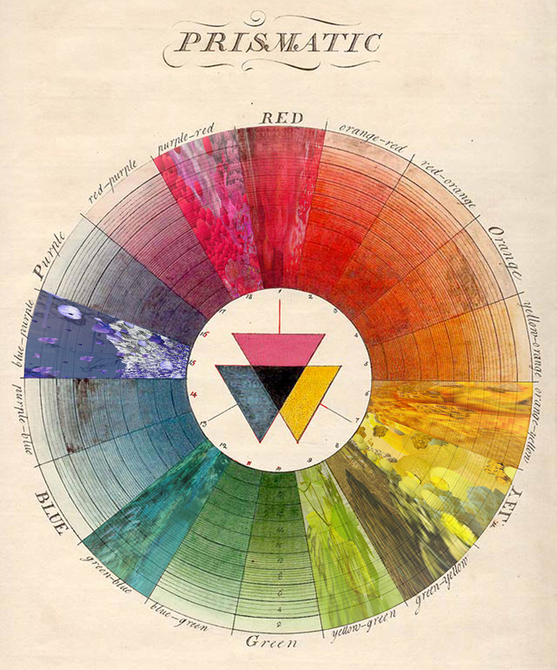
Research – RGB system

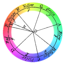
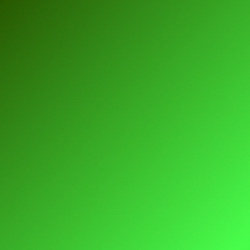
The RGB system [X] is a colour system generated by light. It is based on the light primaries of red, green and blue.When combined, red and green light rays produce yellow, blue and green produce cyan, red and blue produce magenta. Red, green and blue mix to create white (light).[X]

The RGB colour model 
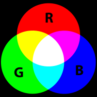
is additive in the sense that the three light beams are added together, and their light spectra add, wavelength for wavelength, to make the final colour’s spectrum.

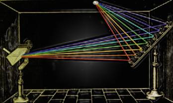
The choice of primary colours is related to the physiology of the human eye; good primaries are stimuli that maximize the difference between the responses of the cone cells of the human retina to light of different wavelengths, and that thereby make a large colour triangle.

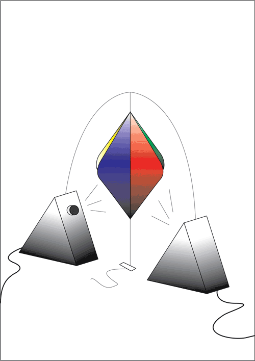
The RGB system was developed in conjunction with television technology. The surface of the screen is covered by tiny points, each with a diameter of approximately 0.2 mm, containing phosphorescent materials (molecules). Normally, three types are selected to transmit red, green or blue light after excitement by beams of electrons (after they have absorbed energy).

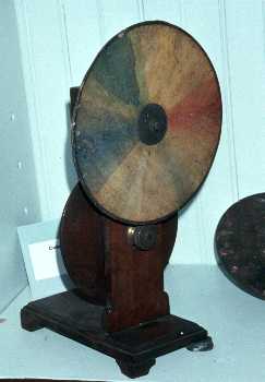
Colours on the television screen are created by a special form of additive light mixture known as a partitive mixture. The partitive light mixture is created because the human eye is incapable of perceiving the many hundreds of thousands of points — the triads of red, green and blue patches into which they are organised — individually, and can only register the mixing effect of all RGB-triads together, with brightness being regulated by the intensity of the electron stream which triggers the phosphorescence.

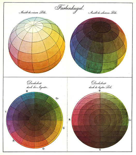
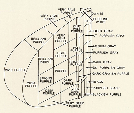
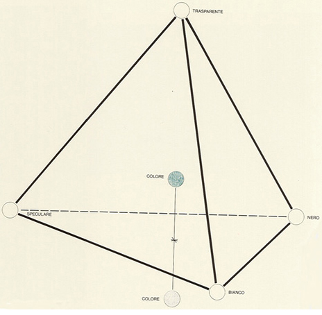
The cube construction has been verified as the most suitable system for this particular range of colours, with each of its edges being divided into 16 equal parts numbered 1 to 15. These numbers are sufficient to specify the trichromatic composition of each colour.

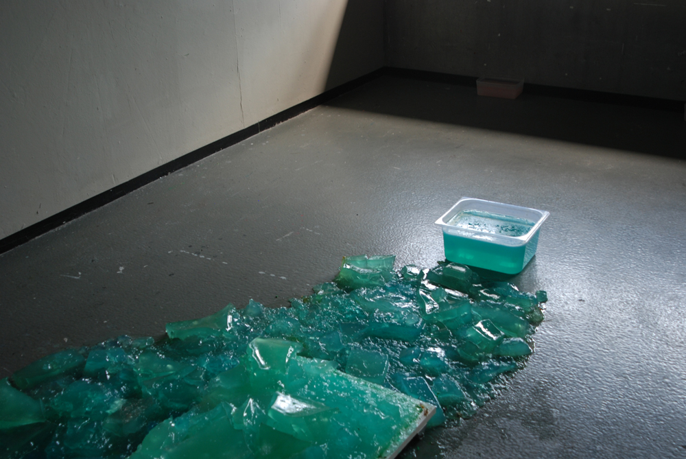
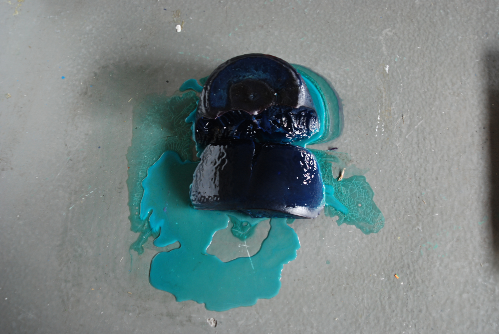
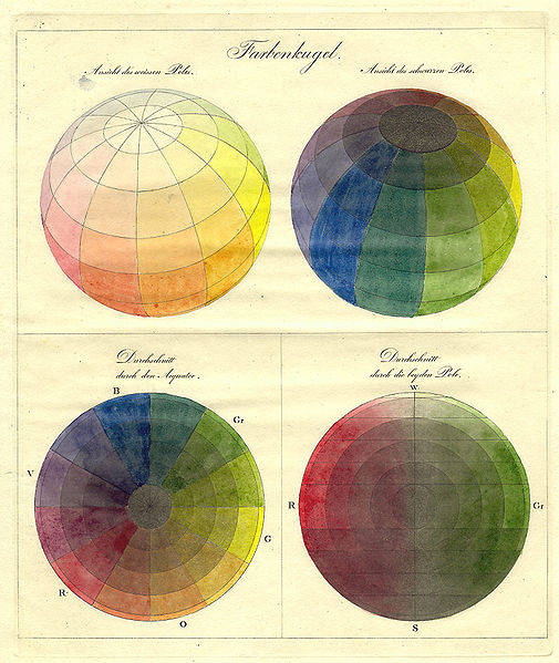
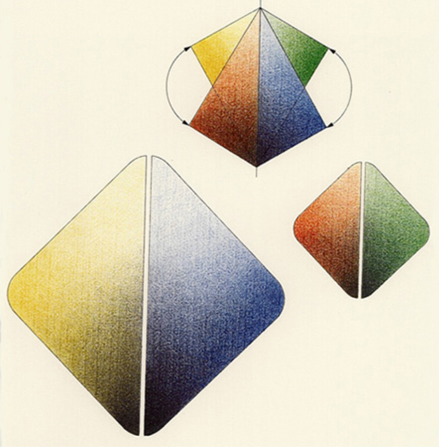
The eight corner-points of the cube are occupied by red , green and blue, the subtractive primary colours magenta, yellow and Cyan, and the achromatic colours white  and black.

All colours in the RGB system 
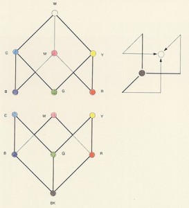
can be concentrated into two subgroups, one centred on white and the other on black. The chromatic form extends from black (0, 0, 0) along the edges of the colours to reach the white tip (15, 15, 15) — the maximum intensity — after passing two corner points.
The RGB colour model itself does not define what is meant by red, green, and blue colormetrically, and so the results of mixing them are not specified as absolute, but relative to the primary colours. When the exact chromaticities of the red, green, and blue primaries are defined, the colour model then becomes an absolute colour space, such as sRGB or Adobe RGB.


PROJECT

& silk-screening


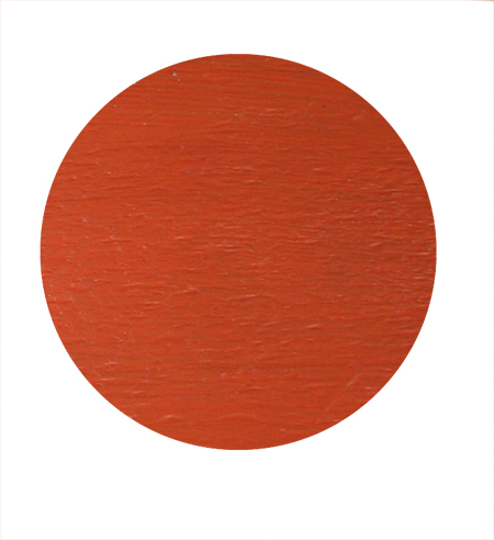
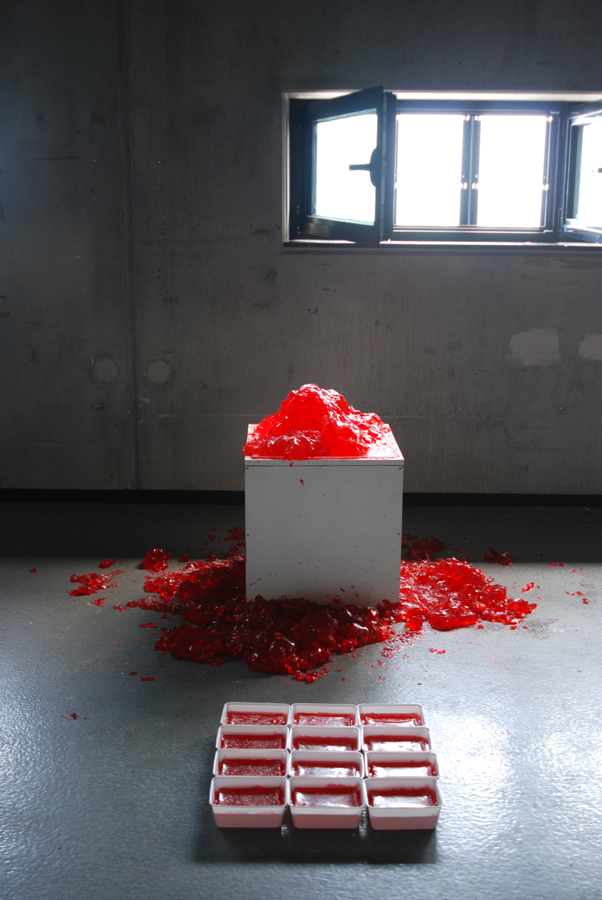
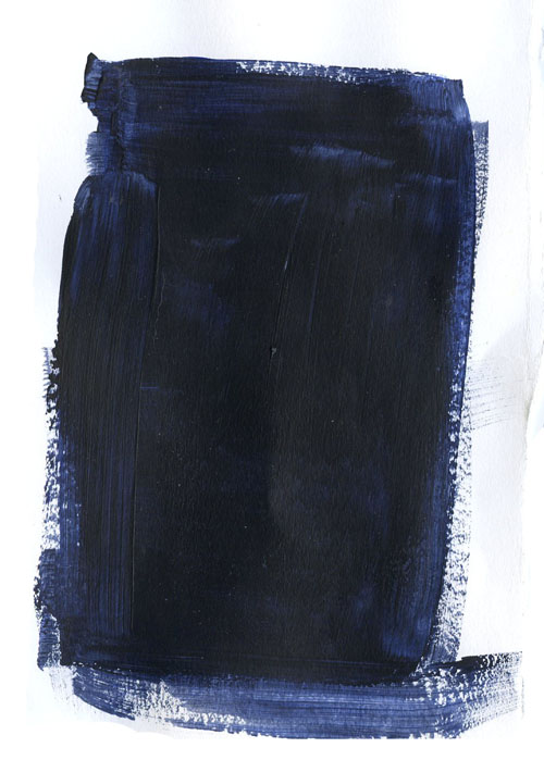
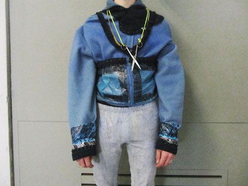
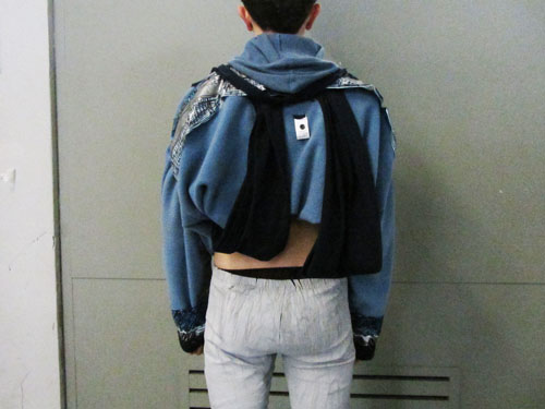
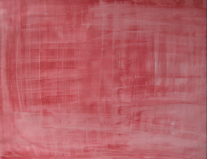
The colour I silkscreened during the progress of my project was connected to the red I used as a starting point for the RGB project. They were not the same red, but still *red“.  The red I used as a starting point for this project (RGB) was on my mind somehow, I’d been with this red for a while so maybe that’s why I still had it in my head, I don’t usually consciously spend this much time with one specific colour.

I was thinking about this RED, so that was the colour I was most curious about to silkscreen. I liked seeing the red in that process. It became tomatosoup red, not like the red in the project, which reminded me more of blood at the time. But maybe it’s also dependent on your mood, how you see red.

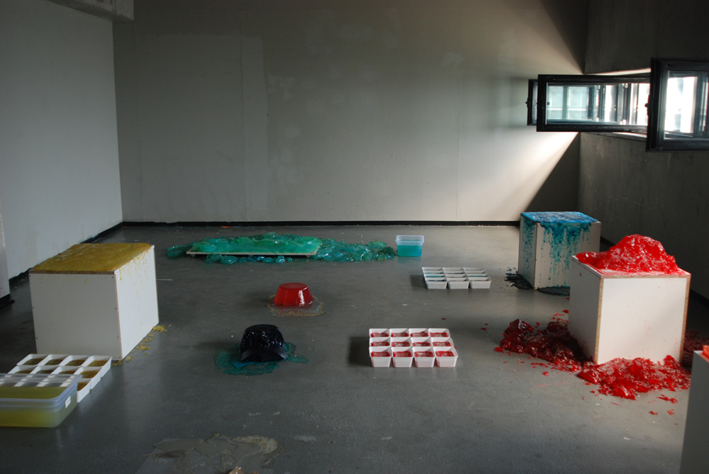
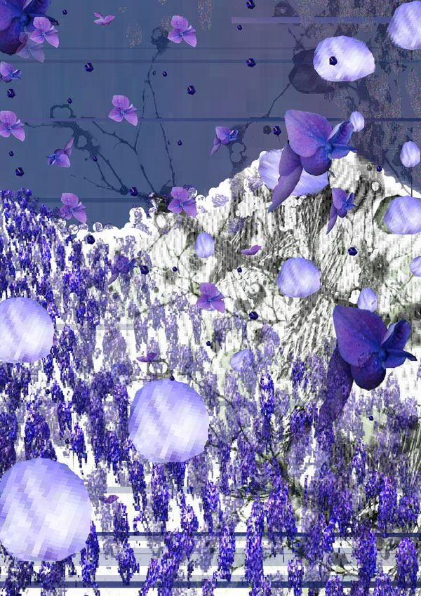
The project began with my research on the RGB system, colour made of light. How you see what you see on a monitor. Your eyes are fooled. What they don’t see, is that what is actually on the screen are millions of tiny dots, molecules that change colour when stimulated by electrons, into red, green or blue. Where they overlap we see yellow, cyan or magenta. And all of the hues that can be formed out of these components (read this research for more). So all of the fantastic images you can see on a screen are just tiny dots changing into three different colours and overlapping. Layers of light form the image. White light illuminates or dims the colour.

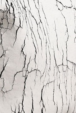
This was my starting point and this is what I went into throughout my research on colour. Seeing how colour is or can be composed, by  looking at it like a monitor screen. On which you see an image, but you know it’s actually only dots, and you want to see the dots, but if you do that you have to go up to the screen really close, and then you loose the big picture. Is it possible to see the tiny dots as well as the big picture? For humans, on the monitor this is generally not possible, so I tried to explore this „seeing up close, far away“, on a different medium, than a monitor.

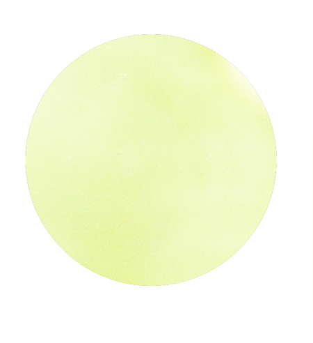
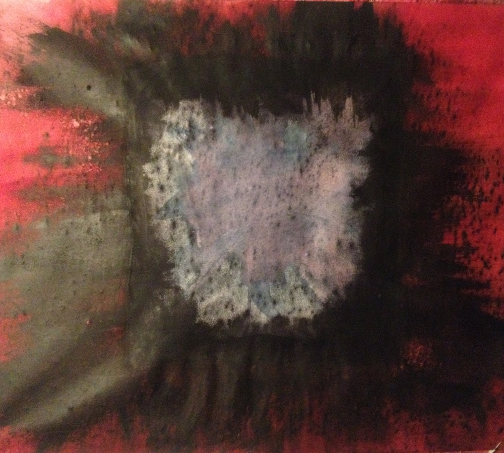
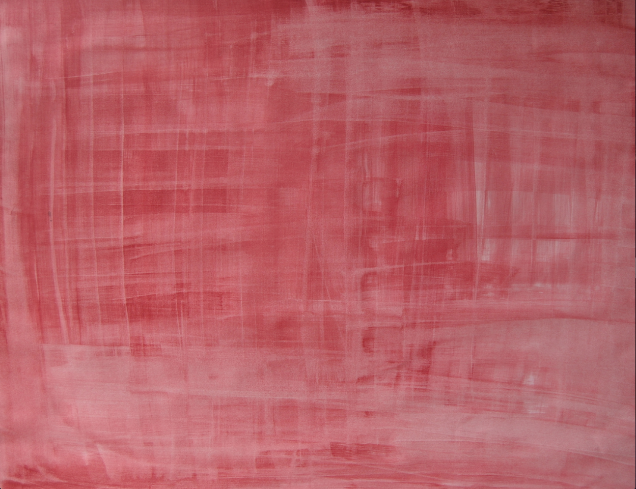
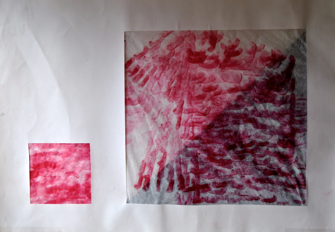
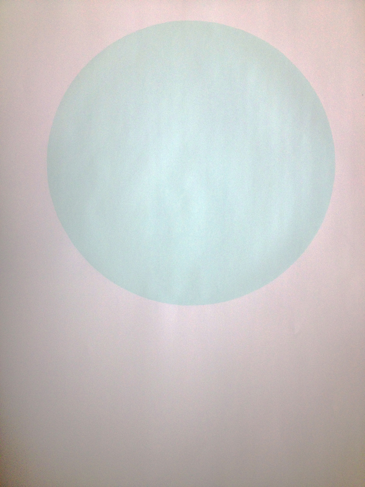
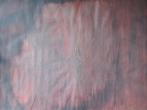
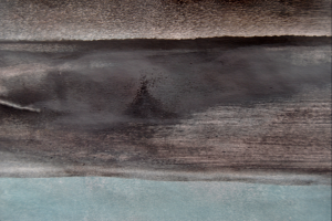
My first experiment, I did on a white paper surface was my „white light“.

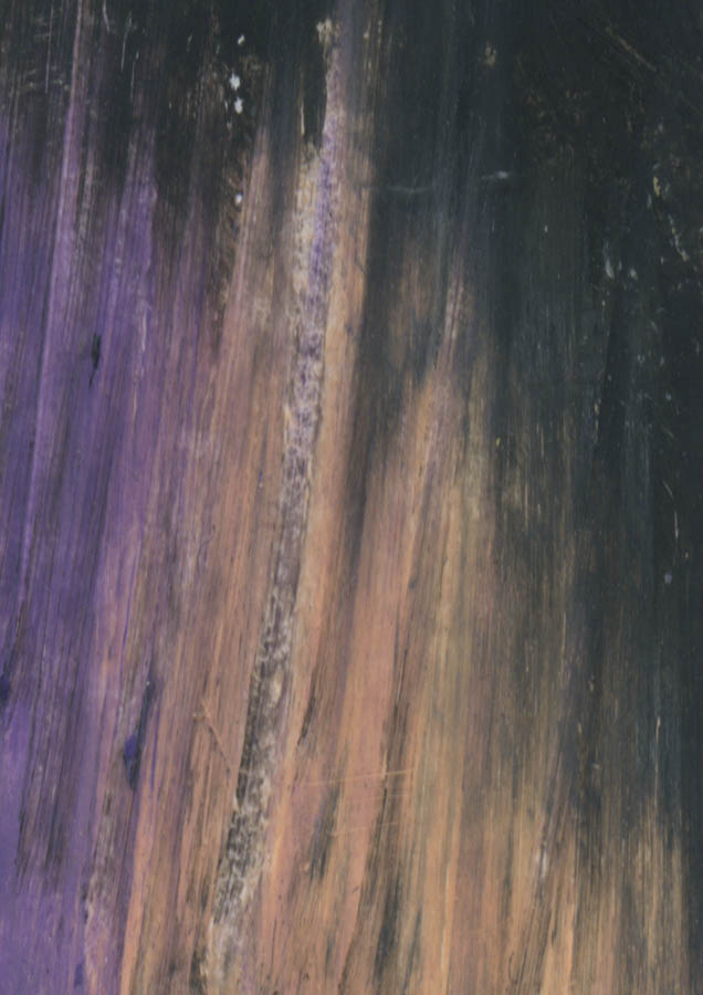
On it I applied a shade of red I mixed out of different reds. I used a small soft roll you would usually use for painting walls, which has a sponge effect, it absorbs and release. With this I felt I had more room to  deal with the white paper as a 3D Object not just as a surface. With this sponge roll I could press colour into the sheet of paper as well as absorb it  depending on how wet/dry the paper and/or roll was.


If I used a lot of water for example, I could  „wash“ the colour out. I would say it was like trying to tear the colour apart, going through all of its layers, and seeing what sort of image this creates.

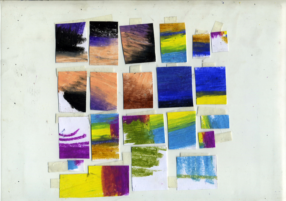
To this stretching the colour/revealing it’s layers, I added another colour and tryed a more soft approach, using more soft movements to try and get the colours to overlap as they wanted to .


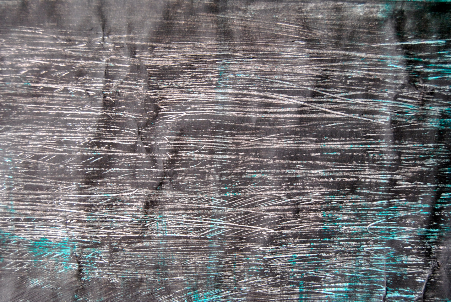
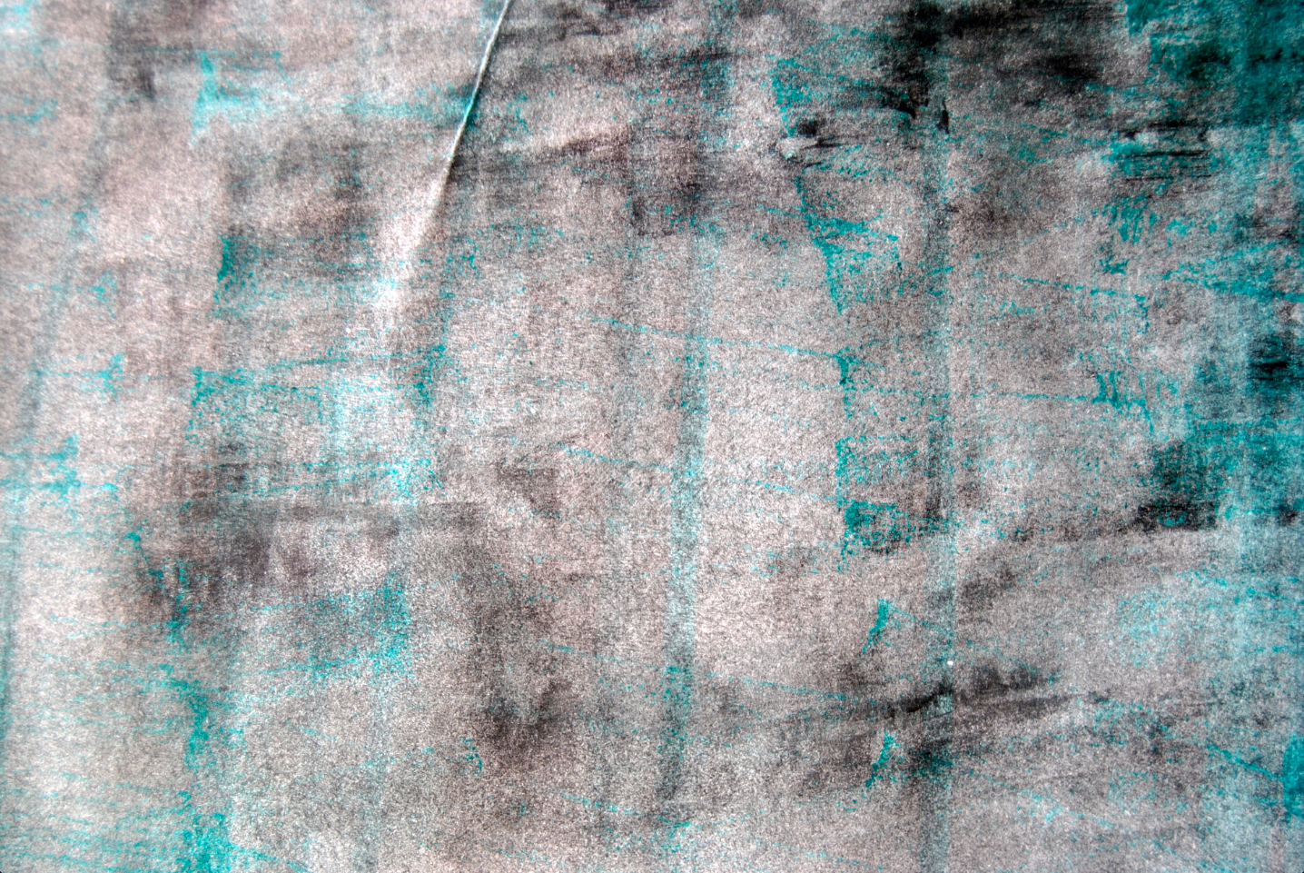
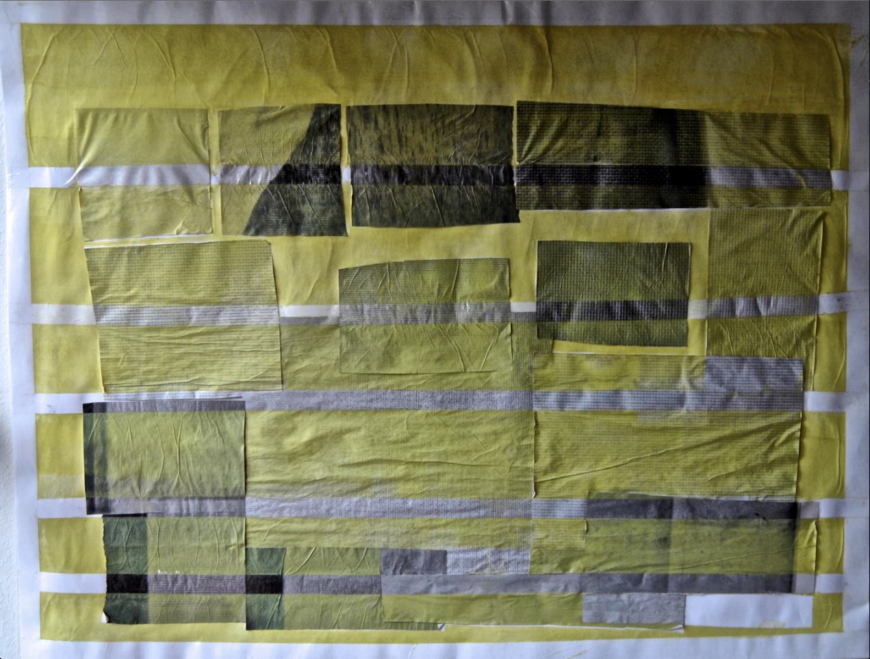
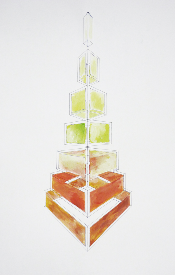
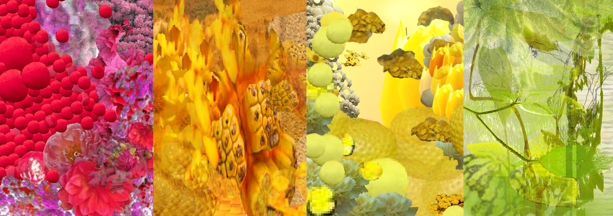
Basically what I did in the next experiments was working with layers. Concentrating on the single colours and how they change, according to the different tiny particles or pieces they are made up of.


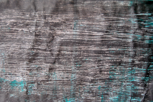
At some point I worked with black as well as white, to see how colours react when you add light or dark, above or underneath it or both. Sometimes I would let one part dry longer so the different layers of colour wouldn’t mix to see if it made a difference.


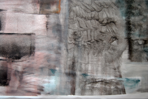
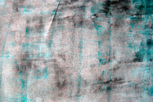
I also tried creating different patterns/structures, to see how a pattern or a structure, for example one made up of dark and light particles underneath the colour, takes an effect when you look at the big picture.

For this I also tried using my lower lip to create a colour pattern to find out if a colour looks different when it is applied in a lower lip pattern.


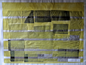
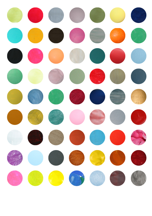
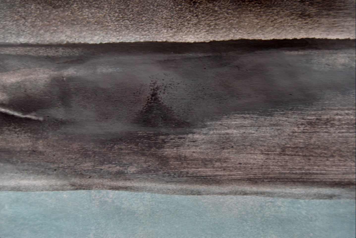
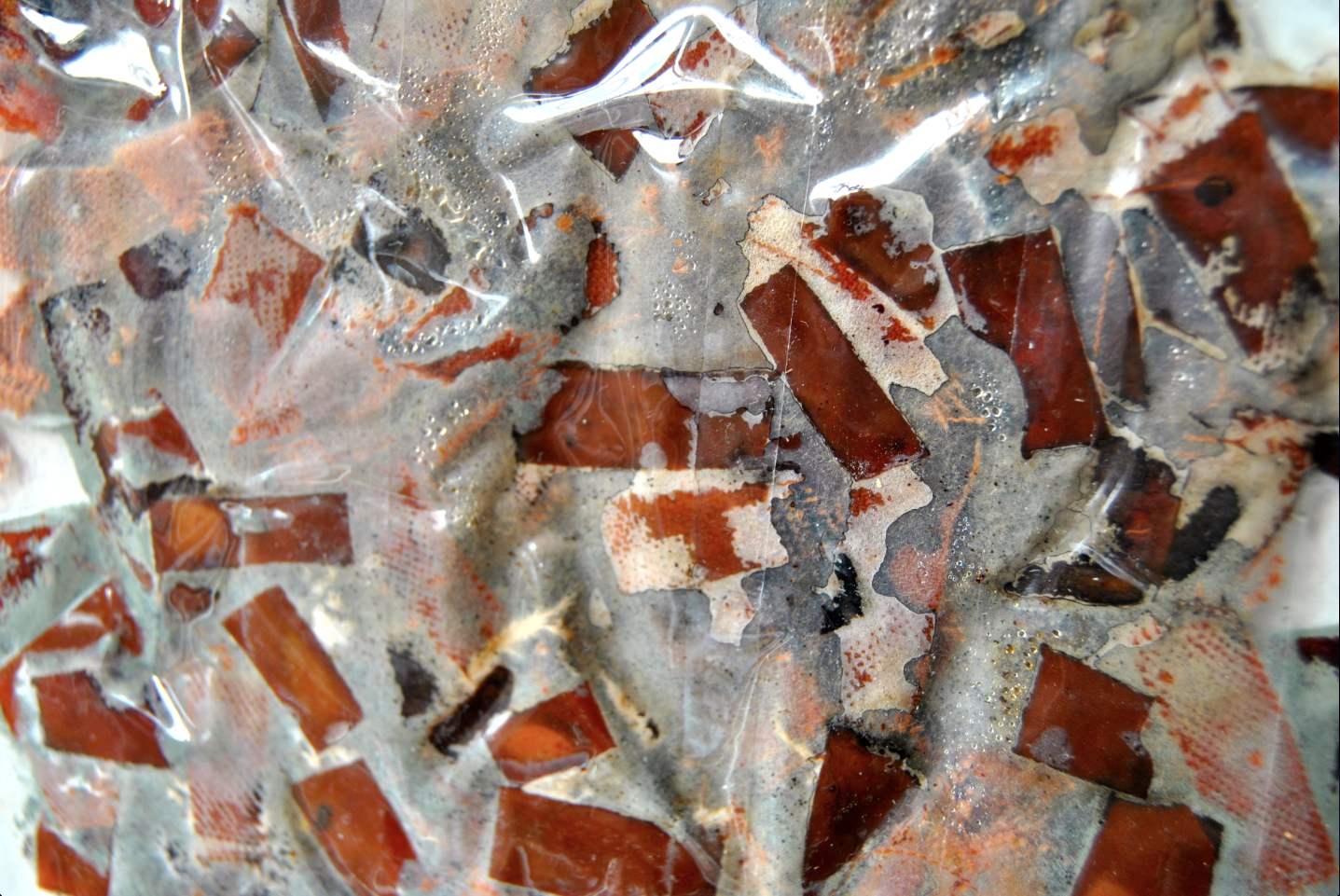
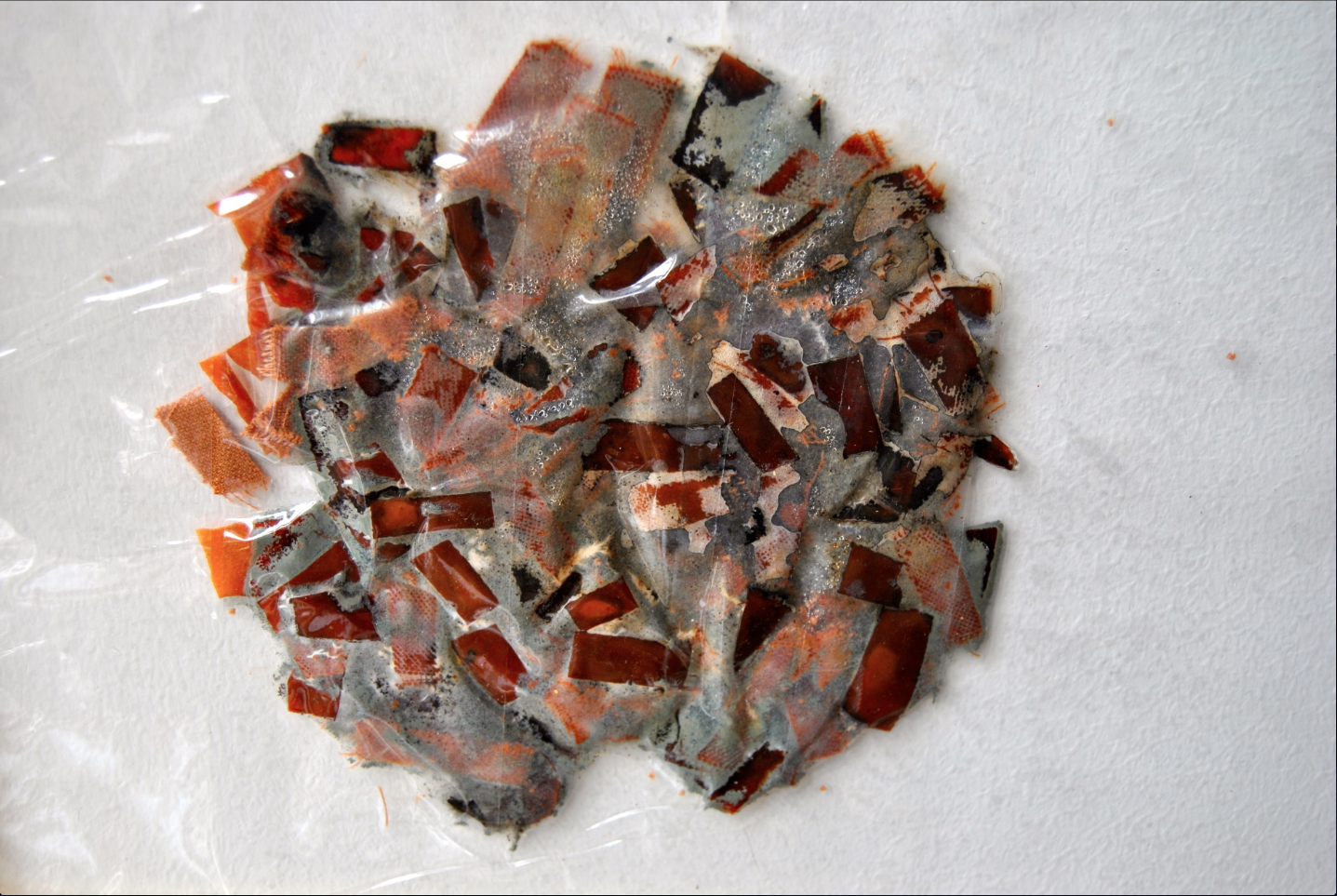
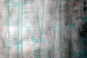
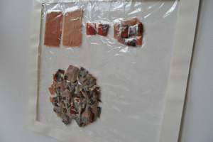
The last experiment I did, was cutting material things into small parts so I could mix them and when you see it from far away maybe you see a new colour. I made for example, an orange colour out of khaki fruit skin, and an orange velvet textile, both of which I cut into very small pieces and then mixed. After about two weeks it started to rot, and green mold was added to the colour scheme.


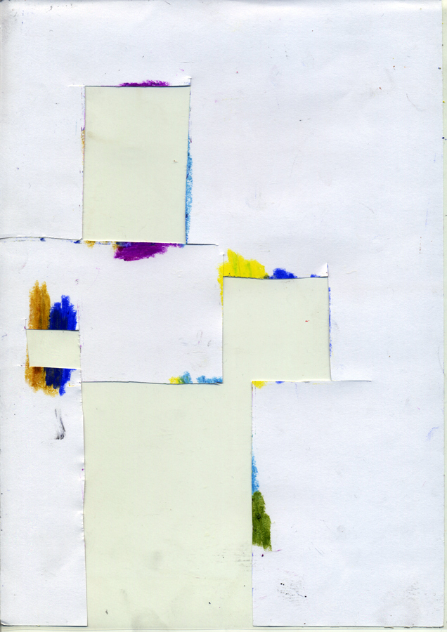
With other experiments I got lost in the big picture and it became a more pictorial. Still I was working up close, concentrating on small sections at a time, looking for effects this can have on a colour when you take one (or many) steps back.


Philipp Otto Runge’s colour sphere & the three-dimensionality of colour


Thursday, November 29, 2012

Philipp Otto Runge (1777 -1810) was a romantic painter. He’s considered to be one of the best of his time. His interest in colour was the natural result of his profession as a painter. He invented a colour theory which he eventually published, encouraged by his friends, in 1808 in the form of a manuscript. He was pen pals with Goethe and they exchanged their ideas on colour. Goethe also featured him in one of his books.  Sadly he died young and his efforts where soon overshadowed by others.

His goal was to establish the complete world of colours resulting from mixtures of the three, among themselves, and together with white and black. He presented this in the form of a colour sphere, shown below.

Featured are the primary colours red, yellow and blue. They have the same distance to each other. The secondary colours orange, purple and green also have the same distance. The upper part of the sphere is white; the colours become lighter. The lowest part of the sphere is black; The colours become darker.  Red, blue yellow, black and white have the same distance from each other.

The colours shown on the outer layer of the sphere are the most pure. You could, for instance, also cut the sphere. In the middle of the sphere you could see a muddy colour (grey/brown). It’s every colour together so it doesn’t have any characteristics.

—————————————————————–

For my own project I took the idea of three-dimensional color. It’s already there in the original drawings from Runge, as shown above. This idea of three-dimensional color and the way Runge has dealt with showing this already offers some nice problems which I used as a starting point.

For instance:

-You can’t (to a certain extent) show three-dimensional colour in a two-dimensional way, in other words you can’t show the three-dimensionality of the color sphere by making a drawing of it.

– The only thing that works like the colour sphere is the colour sphere itself. For example; if you take the fruit ”mango” you will see random spots of red and green on the outside and yellow on the inside, there’s no order, like with the sphere. There are no logical transitions and grades. From red to yellow is logical. From red to green not.

-The colour sphere cannot be a colour triangle or colour square. It only works as a globe.

I started investigating these thoughts; The problem of three-dimensionality, the problem of the colour itself and the problem of shape.


With this in mind I started investigating different ways of showing color. On different surfaces; paper, textile. With different materials, paint etc. I started looking for objects, things and even animals which I thought could be interesting colour-wise. Taking them apart to see the colour inside. Decomposing and analyzing.

In the end I took an onion. The advantage is it’s simple shape, round, and the way it’s already layered. It has different layers of colour, ready to be peeled off.

Philip Otto Runge was of course a painter. To stay close to those roots I used actual paint to get the right colours of the onion. I painted on the onion itself to see if the colours where alike and for me it was a big part of the project; it’s quite hard to get the exact colors. As Runge used his colour sphere to discover and examine the colour of paint, and how to effectively use it, it was a nice experience to work with this material myself in such a way.


Now I had the colours ready; I could start thinking about the shape, or the application of these colours. I thought about applying the colour to various things, for instance; architecture. In the illustration I made below one can see how this could be done. There are seven rooms that fit into each other. I took them apart and spread them out in the illustration in different layers. The last ”room” is actually a pillar. You can’t go any further.


I silkscreened this colour. It reminded me of the light of the sun at the beginning & end of the day, when it only touches the top part of houses, trees, clouds. A gold, deep and warm yellow with a little bit of mustard. One of Runge’s works, ”morning”, inspired me to choose this colour.


/In progress/

Moses Harris, The Natural System of Colors


Thursday, November 29, 2012


Moses Harris [entemologist engraver 1730 – 1788] examined the work of Isaac Newton, and tried to discover all the variety of colours that can be determined from principal colours : red, blue and yellow
Harris presumed that these colours, when are mixed with each other can form all the colours and tints (660) in the nature.

Nature was his guide and assistant , as the arrangement of the principal colours is systematized according to those reflected by the prism, where we find the orange colour lays between the red and yellow, green between yellow and blue and purple between blue and red.
These colours coming in continues succession gave him the first idea that they should be placed in a circle. He thought that this order agreed with what seems to be demanded by nature.

The nature of the thing divided the the whole into two parts: prismatic and compound


He noticed that
PRIMITIVES – red yellow and blue are most common especially in wild nature
MEDIATES – orange green and purple are the colours that mother nature decorated most of the flowers

To show all the variety of colours Moses Harris created segmented circle and its identification system.
He applied water colours in layers what allowed the subtle transition between colours and shades.
According to Harris explanation, the primitive prismatic colours each use the use three parts of a single color (red, yellow, or blue) while the mediate prismatic colors are two-to-one combinations of the primaries, determined by their position on the circle.reference. From this information, we can assume that each compartment received at least three washes or layers of color and perhaps as many as twenty, the number of shades or tones Harris designates within his circle. It is unlikely that Harris used as many as twenty color layers to create the deeper tones in these plates, however: It simply was not necessary. The narrowing size of each arc gives the perception of color darkening, and Harris may have taken advantage of that effect, just as he relied on the white paper surface to aid representation of the lighter shades. It is likely that Harris used some smaller number of color washes—three or six, perhaps—for each of the eighteen colors in each of the two circles.

He linked colours with some pigment, fruit or flower

PRIMITIVES:
Red – Vermilion – Wild poppy
Yellow – Kings Yellow – Butter flower
Blue – Ultramarine – Corn flower

MEDIATES:
Orange – Red orpiment – garden Marigold
Green – Sap green – Leaves of the lime-Tree
Purple – Hairy sheep scabius – flower if the common Judas tree

COLOURS CIRCLES

PRISMATIC:
Red, orange-red, red-orange, yellow-orange, orange-yellow, yellow, green-yellow , yellow-green green, blue-green, blue-green-blue, purple-blue, blue-purple-purple, red-purple, purple-red

COMPOUND
Orange, olave-orange, orange-olave-olave,gren-olave, olave-green-green, slate-green, green-slate-slate, purple-slate, slate-purple-purple, brown-purple, purple-brown-Brown, orange-brown,brown-orange

equal amounts of red + blue + yellow = black
equal amounts of purple + green + orange = black

white is seen as the lack of colour

Contrasting colours lay on the opposite sides of the circle
According to Harris his colour system has both practical and philosophical uses. He mentioned an experiment in which blue arises from the orange of the candle flame. These are the contrasting colours that lay in the circle opposite to each other

There is nothing known of the contemporary use of these color circles.


MY research OF THE MOSES HARRIS COLOUR SYSTEM

Moses Harris presumed that these colours, when are mixed with each other, can form all the 660 colours and tints  in the nature.
The ones that he himself actually found in the nature were just 6 of them (red yellow blue green orange purple).

Where this small amount of examples comes from? Moses Harris lived in the XVIII century, when there were not many ways of transport and traveling was not easy and common. He was most probably, just looking around in his surrounding.

Nowadays, we live in the globalized world and traveling is an everyday thing. We have planes,  cheap flights and we can reach any place of the world.
Moreover we can also travel in the cyber-space through the internet. Internet is an enormous source, all the world is there. Its a very big source of information. Most of the people use it daily, to search for different kind of info, to  check our email and also for the social networks among which the most popular is Facebook.

Facebook is a huge personal (but not only) information area. Members post

photos from their journeys.  Next to the photos of people and architecture one of the most popular are photos of nature.

I find this modern world and digital media a very interesting topic, that is why I decided to search in the photos of nature taken by my Facebook friends posted during their whole existence on Facebook

I found many photos of nature  in a bunch of different tints, but still many are missing.

I was thinking what would be a great way to present them and decided to make collages  that  take a way a bit the realistic look of plants. make them more abstract ( each 10 tints ) .


blue- purple   / purple-red  /  orange-yellow  /  yellow    / yellow-green

I am still in the process of creation. At the moment there are many parts of the Moses Harris circle to be filled in. It leaves the open space for other people. If any of you is interested to search for the nature photos of their friends, please do that and send it to me : a.d.radzimirska@gmail.com
I am pretty sure that together we can fill in every segment of the whole circle of Moses Harris.


Herman Ebbinghaus, Deconstructing the Phenomenon


Thursday, November 29, 2012

Introduction

Herman Ebbinghaus (1850-1909) was a German psychologist, who pioneered the experimental study of memory, was the first one to talk about the learning cube and is known for his discovery of the forgetting curve and spacing effect. He has also discovered a color system, based on a double pyramid colored Red Blue Green and Red after Leonardo da Vinci’s idea. The idea was that due to the variation of brightness, those four colors can be separately distinguished. He strongly believed that being aware of the physiologists discovery,  in the eyes retina there are only three photo-sensitive substances who are responsible for the phenomenon of colored vision and its anomalies. He published in 1893 in the Journal of Psychology in Germany, a “Theory of Colour Vision” – in which he mentioned that humans perceive colors through higher mental processes. He had then discovered that if one of the combinations of pyramids, red and green or yellow and blue have a common base in a three dimensional space and that base spins (as seen in the image), two white hues are produced and the brightness is linked to the speed of the spin. It is a purely phenomenologically oriented portrayal of colors in which the complementary pair does not find a place opposite one another. The double-pyramid has then came to be a stronghold of phenomenology, an era in which colors were simple came to a close. After Ebbinghaus discoveries physics could never be certain again about the nature of light and it’s wave and particles properties that have also been discovered at the same time by Albert Einstein.    

The Machine

It really got me by surprise me that i couldn’t find any other source or any other image besides one website. All about this color system is theoretical, it hasn’t been applied into action. So i was curious to see this phenomenon happening. My first attempt was to create a physical machine with two rotated round edge squares, one would fit into the other and with the help of two air blowers, it would turn.The machine didn’t have much success as i realized immediately, it was an interesting shape but the squares didn’t turn fast enough therefore the phenomenon couldn’t appear. After creating the machine i wondered whether a digital form could be more efficient.

  (more…)

Google Image Search Color Filter Slideshow


Thursday, November 29, 2012

Athanasius Kircher, is the man behind de Coloribus (1646). The basis for all combinations is a linear construction which, apart from white and black, operates with three colors (yellow, red and blue). The special position of green is red also placed in the center. Green is located at the overlap of yellow and blue.

The diagram of the theory shows that all colors (yellow, red, purple, green, and blue) are derived from mixtures of black and white. This had a big influence on the color theories in that time and remained influential until Isaac Newtons’s experiments with light refraction. The prism, and its effect on light, was something already known to Kircher. He accounted for his colors by noting that the brightest occur after passing through the thinnest side of the glass, and the darkest after passing through the thickest side of the glass. But newton was the one who defined the right order of the rainbow colors. And Newton also discovered that colors are light of different wavelengths and that white light is a mix of all colors in the rainbow spectrum, something that Kircher didn’t find out.

In Kircher’s book that contains eight chapters which deal with the multitude of colors, investigate the colors of transparent stones, or colors of plants and animals. For example, he questions himself why four legged animals do not seem to be golden, and why insects and birds adopt all of the colors.  And why the sky appears blue, but he never reached a satisfactory answer.

*

During the research on Kircher’s color-system I was looking for an answer that wasn’t there. The color system was just a view from one guy, a long time ago and there wasn’t that much to understand about. It was just what it was. So for that reason I chose to just leave the colors for what they were and chose to use the image search option in Google. The first time I used a white to green gradient, and the second time a black to green gradient.

Green to white

and the second time a black to green gradient.

Green to black


It was pretty interesting that the images weren’t any photo’s, but all gradient or flag like images. I found it very interesting how the different images or flags float into each other, and wanna to combine pairs of images which should create a new image.

I made a JPEG from every color in the color-system in Photoshop, using the RGB colors to create the colors. I dragged the colors in chronologic order in the image search-bar and made some more screen captures of all the results.

What was even more interesting were the titles of the images found in Google. Titles like: "2334452-90081-a-tightly-woven-yellow-and-black-stripes-texture-that-works-as-a-seamless-pattern-in-any-direction.jpg" or "The Colour Green.jpg"

Because of that I had the idea to make a book with all the found images, ordered in chronologic order with the title of image. But because of the big amount of money, what I needed for the book and the idea that the images where from internet. And so belonged on the computer, I decided to create a slideshow of the images and use the voiceover function in Mac for the titles. I did everything in chronologic order (except for the color green) I decided to put the red before the color green (as you can see in the color scheme it wasn’t really in the middle, so I had to choose if I putted it before or after the color red.

Get the Flash Player to see this content.

During editing the video I tried to make a kind of system using a different style for each type of file. And also the same slide in the Color that I used to find the images.

I’m very happy with the end result, although it went in a different way than I expected to be. But I’m fine with that. With this I learned to accept the results that you find during the research, and not to manipulate or change it. But deal with what you have, and only change the medium if necessary. Why not use video or why relate nothing to the computer if your material is found on the computer. But this depends on what the images try to say, or what the images say to you and what you want to do with it. I really have to take some more distance of the results in my research, most of the times I try to be too much in it, because of that I lose the reflection on, and the actual core of, the collection of images or results of what I’ve made. And because of that I sometimes do too much with the things that I’ve made. I kind of ruin the core of the images in that way.

The color that I silk screened as part of the process has something to do with the fact that the colors between black and white are derived with mixtures from green according to Kircher’s color system. I decided to add a little bit of neon

green in thewhite, so it became almost white but also green. It almost look like a glow-in-the-dark circle as you can see.

I feel I know you, Nature.


Thursday, November 29, 2012

Johann Wolfgang Goethe (28 August 1749 – 22 March 1832) was a German Writer, artist and politician. Goethe devoted a large part of his life to the study of natural phenomena. Although Goethe especially was known as a poet, he saw his own scientific work as his greatest merit. Yet few had appreciation for Goethe’s scientific work, though some modern scientists, like Henri Bortoft and Reinhold Sölch, get greater understanding of Goethe’s learning.
Johann Wolfgang Goethe analyzed colours from a physical perspective. In his views, there are two basic colours: cyan and yellow. Cyan originates from viewing dark through light, like you view the sky during the day. Yellow originates from viewing light through dark, like you view light in a dark area. Goethe based his colour theory on this interaction between light and dark.
The intensification of the basic colours leads to other colours. If the colour yellow is intensified, it leads to red. If blue is intensified, it leads to violet. This can be seen in the sky when the sun goes down. This is also an explanation for the categorization of cold and warm colours. According to Goethe green is the neutral colour between cold and warm, like the colour of plants. Magenta, or purple as Goethe calls it, is the balanced connection between light and dark, because it carries light as well as dark elements.


The colour theory of Goethe can thus be seen as the star of David. Two similar shaped triangles lapping over each other: a triangle that faces down and an overlapping triangle that faces up. The triangle that faces up has cyan in the lower left corner, yellow in the lower right corner and magenta in the upper corner. The triangle that faces down has violet in the upper left corner, red in the upper right corner and green in the lower corner. Smaller triangles can be extracted from the two large triangles that show alternative possibilities. In these smaller triangle Goethe pays attention to secondary and tertiary colours. He also analyses colors in relation to psychology. Colours ranging from yellow to red are analyzed as the plus-side, whereas colors ranging to blue are referred to as the minus-side. Here Goethe connotes the plus-side with warm, positive associations and the minus-side with more dark, negative associations. This is what he calls the sensual-moral effect of colours.

The German poet and philosopher Johann Wolfgang von Goethe describes a journey through the Harz Mountains in a very compelling manner, in the middle of the winter. The reader will be absorbed by his writing, like he would be walking around in a painting, when he writes about vague violet shadows of a group of trees and overhanging rocks in the noonday sun lighted by a yellow snow. As the hours pass, these shadows deepen from a deeper blue to a dark yellow-orange tone sunlight. As the sun reaches the horizon and a purple light covers the entire landscape in a red glow, the shadows turn green. Goethe describes almost a fairy-tale like landscape painted in the colors red and green. The story is part of Goethe’s color theory and is a typical example of the empirical experiences on which this theory is based.

Goethe’s color theory was published in three sections: If Beiträge zur Optik I (1791) and II (1792) (part III, Von den Farbigen Treasures remained unpublished), if Didaktischer Teil in 1808 and finally in its entirety, under the title Zur Farbenlehre in 1810. It is an extensive work with a special status in the world of culture and science. From the beginning there were numerous outspoken advocates and critics. Present day Goethe’s color theory is not considered scientific, i.e. not in accordance to the scientific physical principles based on Newton. In the Romanticism around 1800 science was viewed in a much broader sense. Natural philosophers intermingled empirical research with their own vision and passion, based on literature and art. In their views colors were not only physical wavelengths, but also individual observations with the sentimental values and emotions.

Artists, especially landscape painters, felt a deep connection with this way of reflecting on colours. They viewed colours and reproduced them in a manner that the viewer could relive this observation. Pure scientific facts are not enough to describe the color world, in their views.

Twilight sinks down from above us,

Swiftly all the near is far:

But first shining high above us

Radiant is the evening star!

Everything is drifting vaguely,

Mist steals upwards to the height:

And the still lake mirrors darkly

Black abysses of the night.

Now in all the eastern distance

I suspect moon’s gleam and glow,

Slender willow’s trailing branches

Dally with the neighboring flow.

Through the play of moving shadows

Trembling lunar magic shines,

And a soothing coolness follows,

To the heart now, through the eyes.

When I started reading his poems, I immediately linked the poems to his colour theory. The romantic way of describing the natural phenomena inspired me to collect all sentences that actually describe a specific light of the day in different landscapes. His words spoke to my imagination and it naturally formed the idea to search for the landscapes, which refers Goethe to. I found a big collection of images and made a selection out of it. Because Goethe’s Theory was based on the light we see in nature I have chosen a film projection. In this setting the viewer can immediately disappear in the meaningful words centered in a similar surrounding as a sort of meditation.

Get the Flash Player to see this content.


The moment I had to make silkscreen-printed colour, I was compelled  by the appearance of the moon after reading this poem and tried to bring this feeling back in just one colour.


Log in
subscribe