Skip to Content Skip to Search Go to Top Navigation Go to Side Menu


The Grey Area between Art and Design


Thursday, June 4, 2015

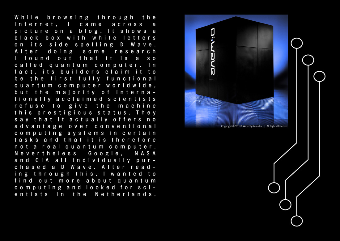
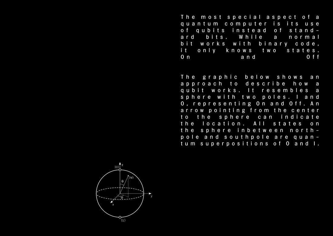
We got the assignment to pick one artist and one designer at the Boijmans van Beuningen Museum, and that’s what we thought we’ve done. However, after researching Lars Englund and Niek Kemps we realized that they both are considered artists.  This mistake manifests the confusion of the grey aria of what an artist and designer can be.


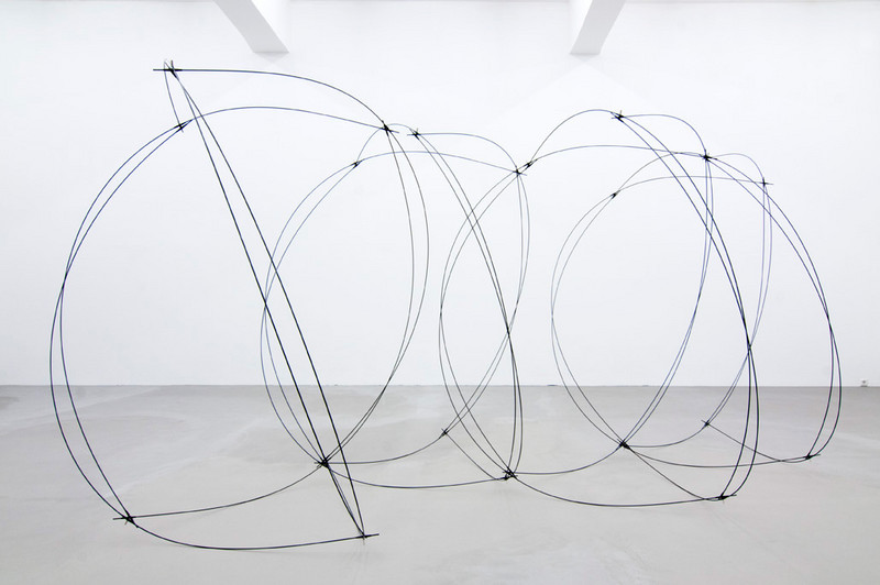
Lars Nittve, director of the Moderna Museet in Stockholm, stated that Lars Englund, Swedish sculptor, could not be put into a drawer: “Not abstraction. Not concretism. Not minimalism. Not even post-minimalism.” For the last 50 years he has been a leading figure in the Swedish art scene, beginning as a painter, but finding himself in sculptures.

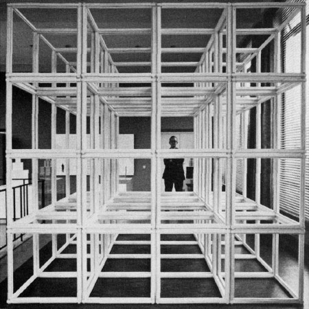
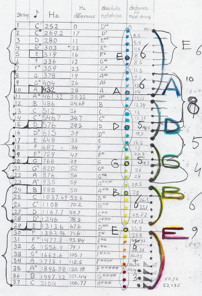
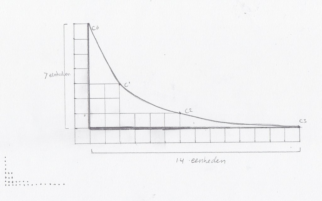
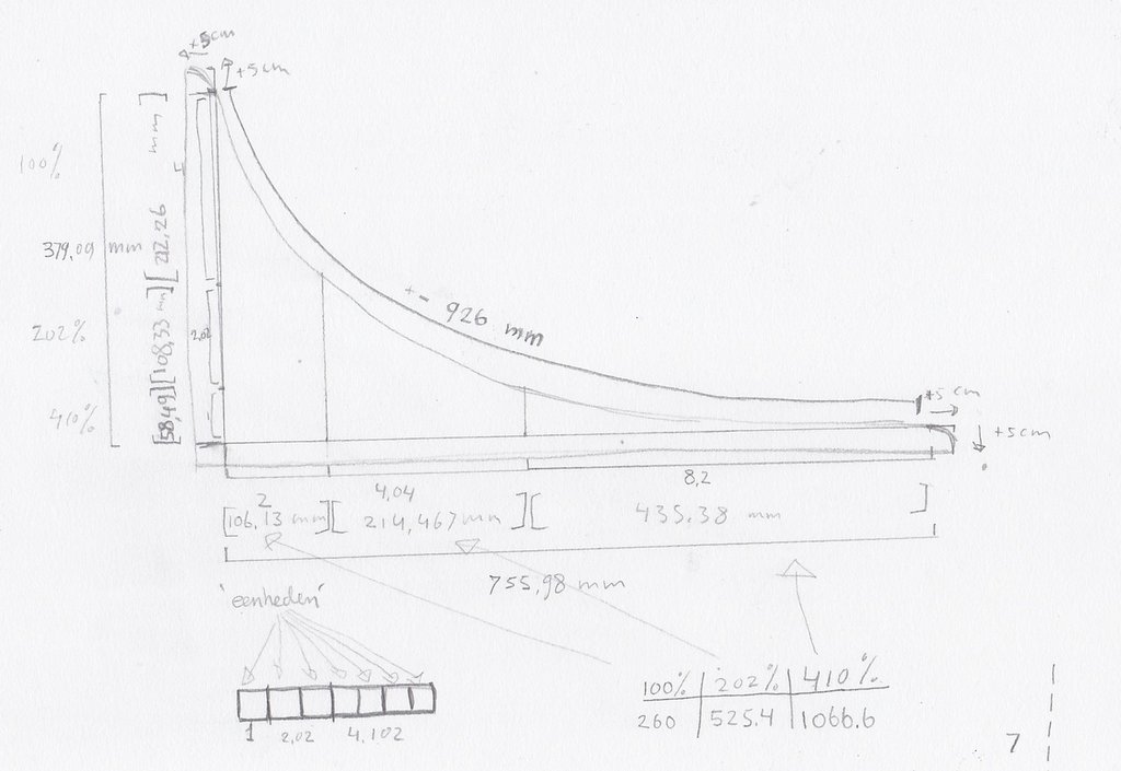
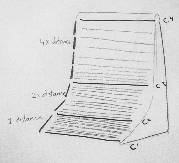
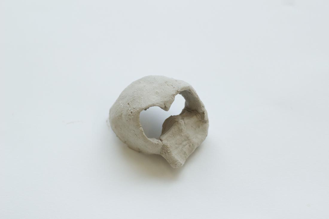
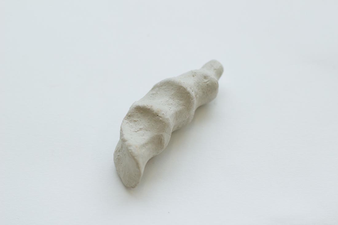
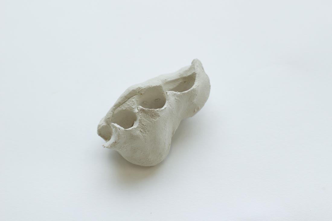
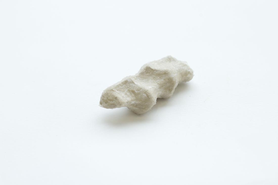
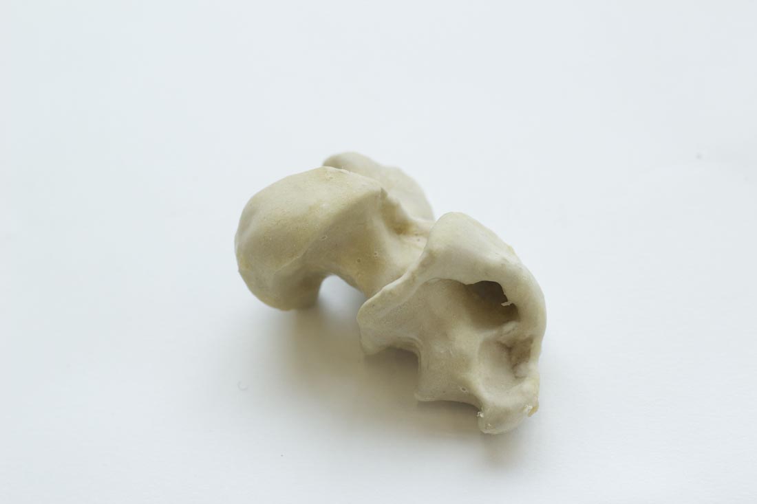
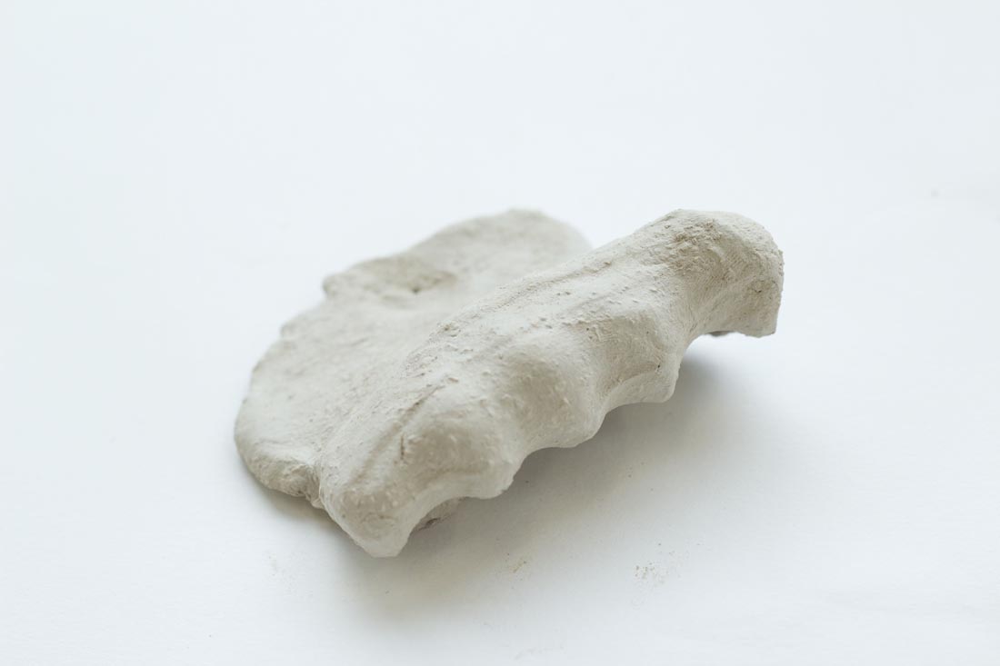
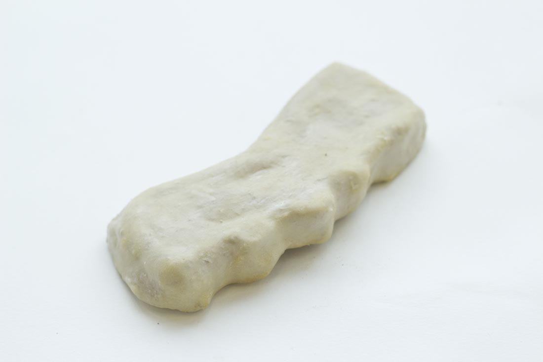
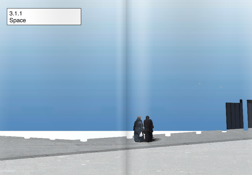
What he took from painting is the line – some of his sculptures seem to be drawings in space. And this is what his work actually is about: space. Space and volume, density and lightness, surface and emptiness. About inner and outer space.

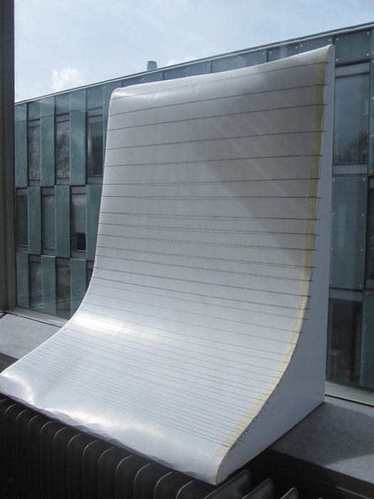
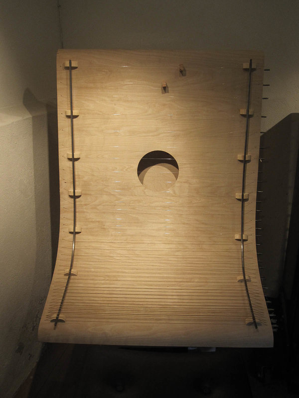
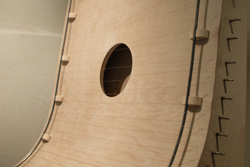
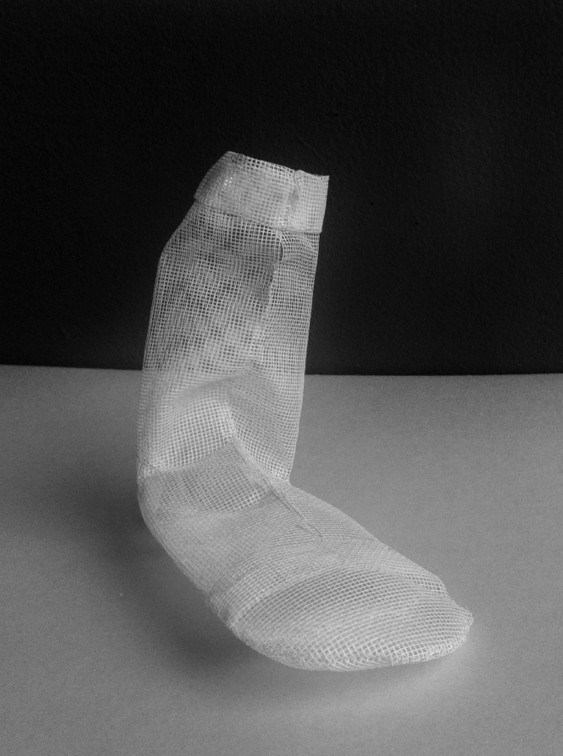
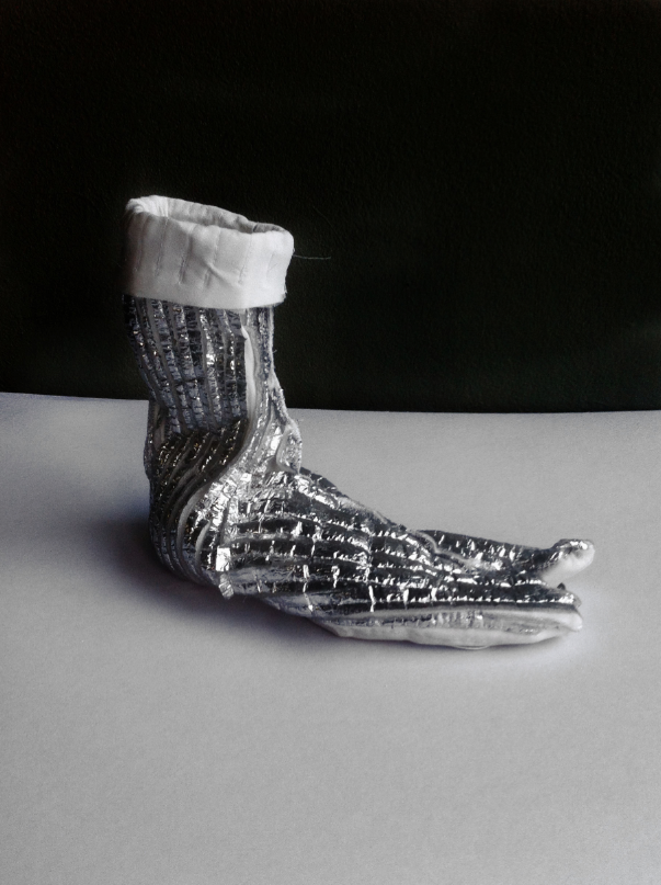
Built from thin metal or thick black rubber, solid concrete and see-through plastic, he invites the visitor to “enter my works – but only with your mind”.

The intensity between something and nothing builds up tension, questions about empty space open doors to philosophical conversations. His often very simple means leave room for the viewer.

Over the last 50 years Lars Englund didn’t only make 40 public sculptures in Sweden, he also presented the country at the Venice Biennale in 1978.

Unknownlars2

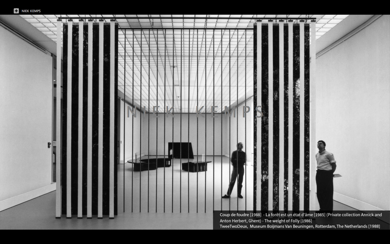
Niek Kemps is a Dutch artist born in 1952, working mainly in Holland and Belgium. He has done several noticeable monuments all over Holland. Since 1979 he has done over 50 exhibitions and are a part of the collections of Stedelijk Van Abbemuseum in Eindhoven, Stedelijk Museum in Amsterdam and Museum Boijmans Van Beuningen in Rotterdam to mention a few.

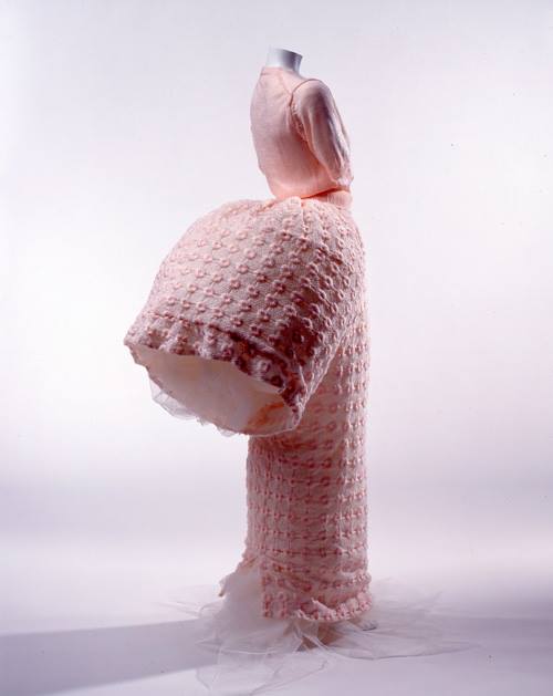
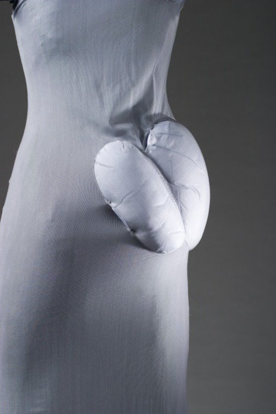
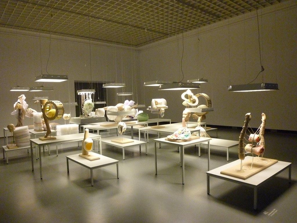
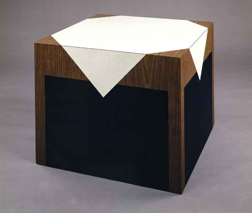
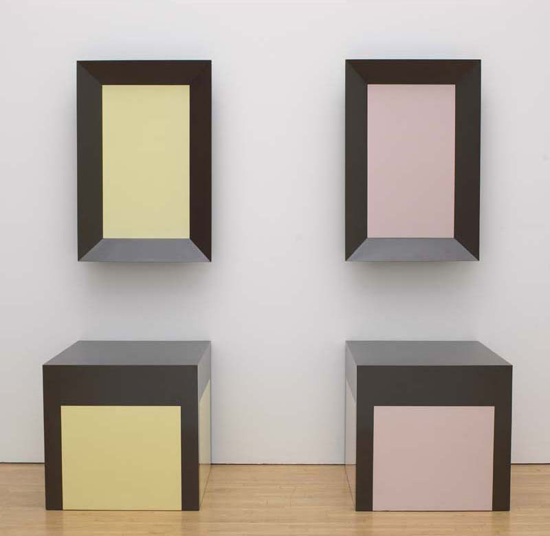
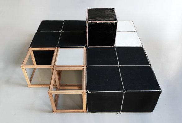
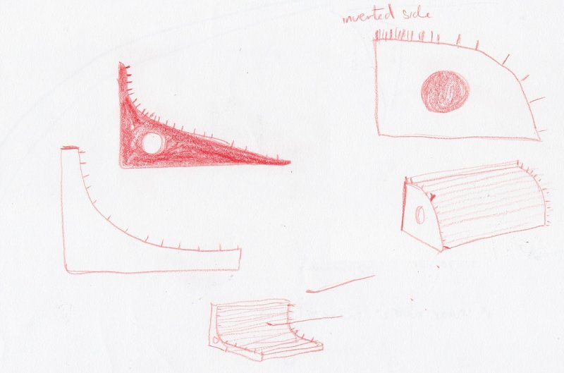
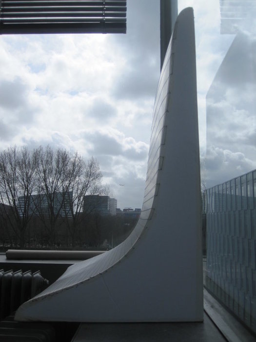
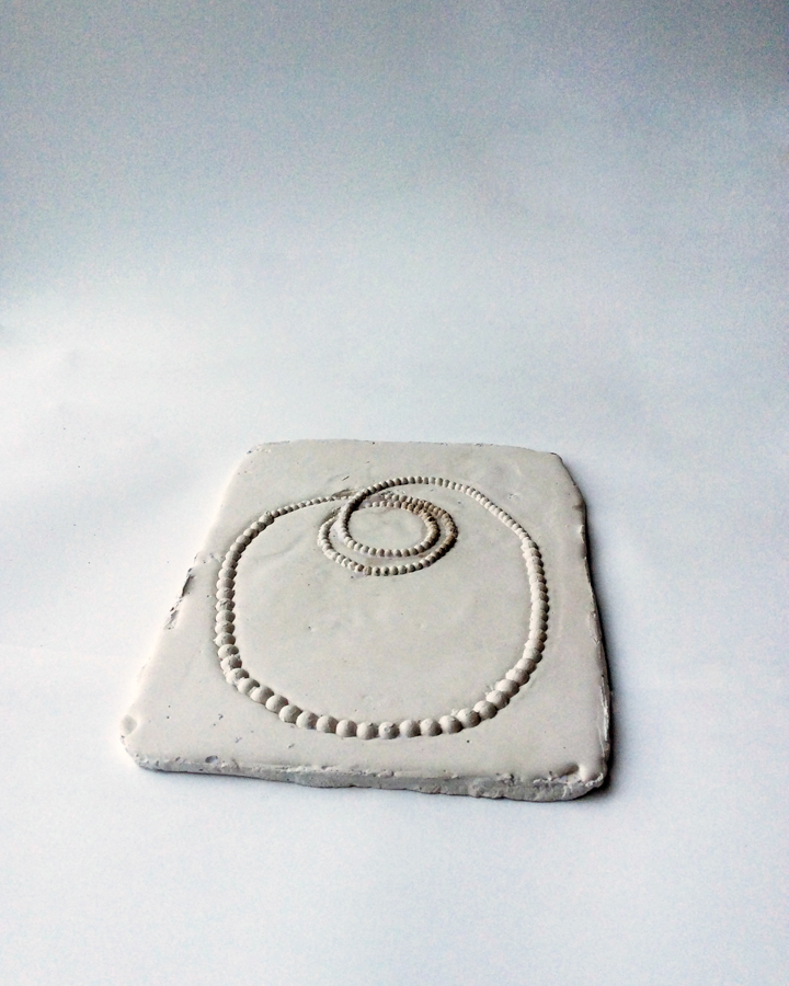
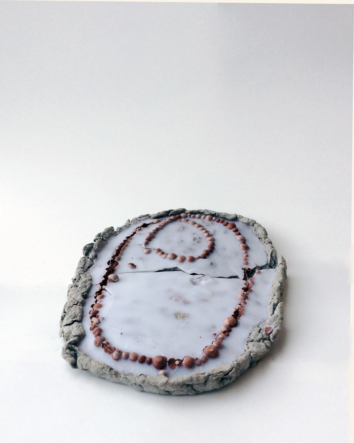
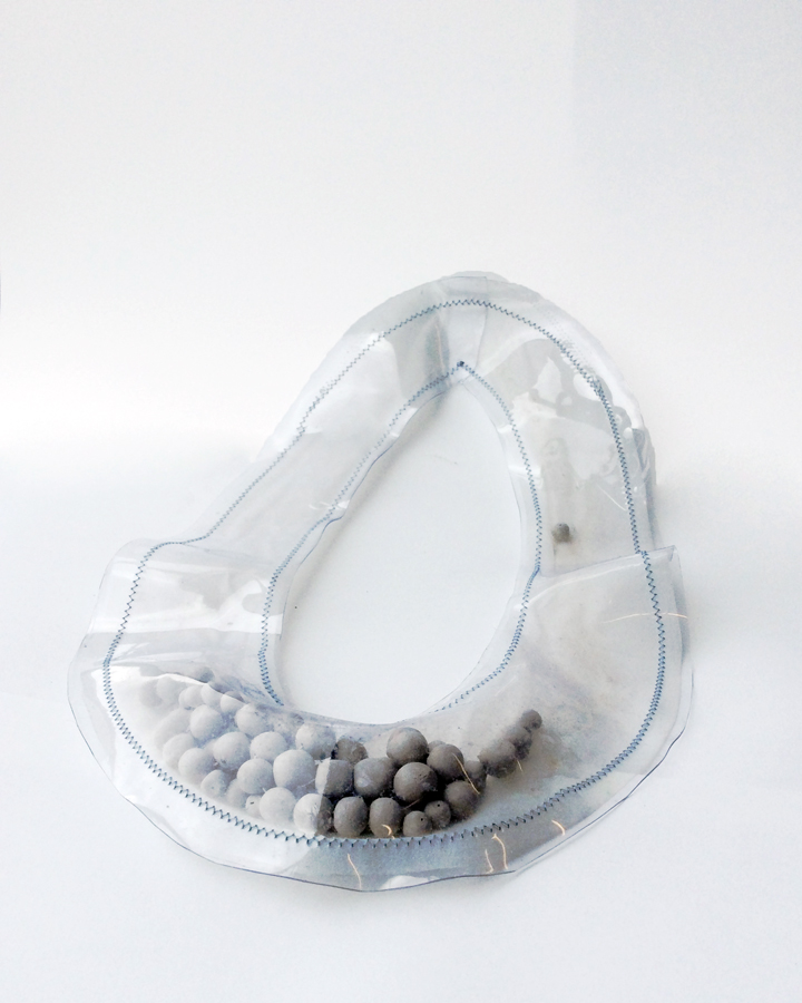
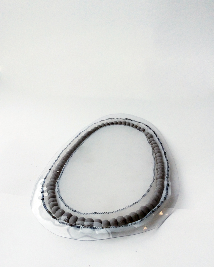
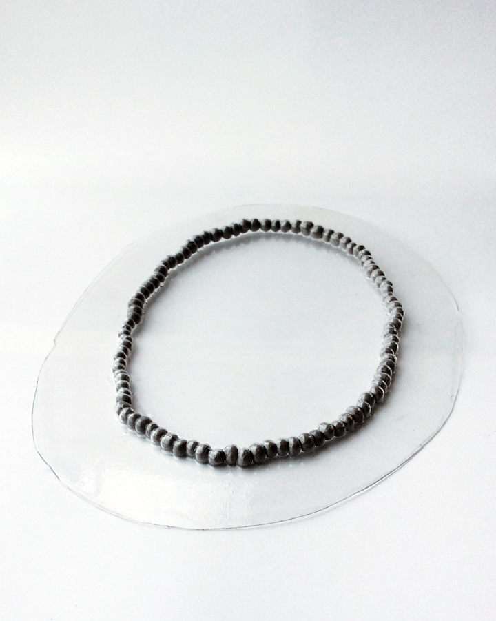
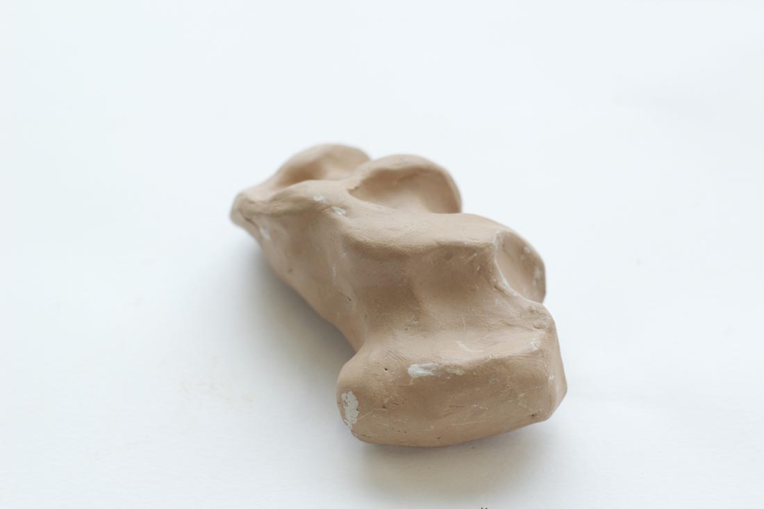
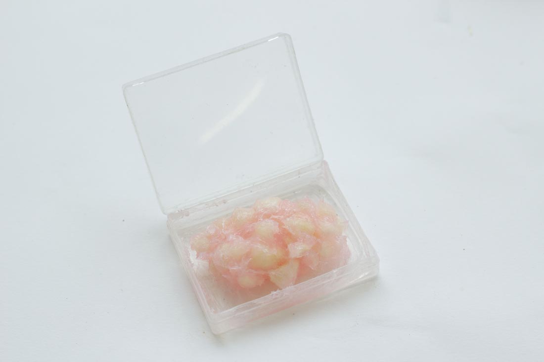
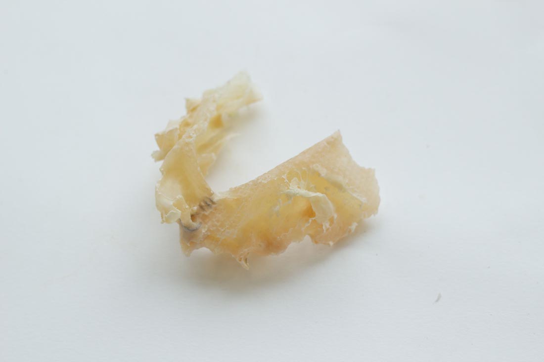
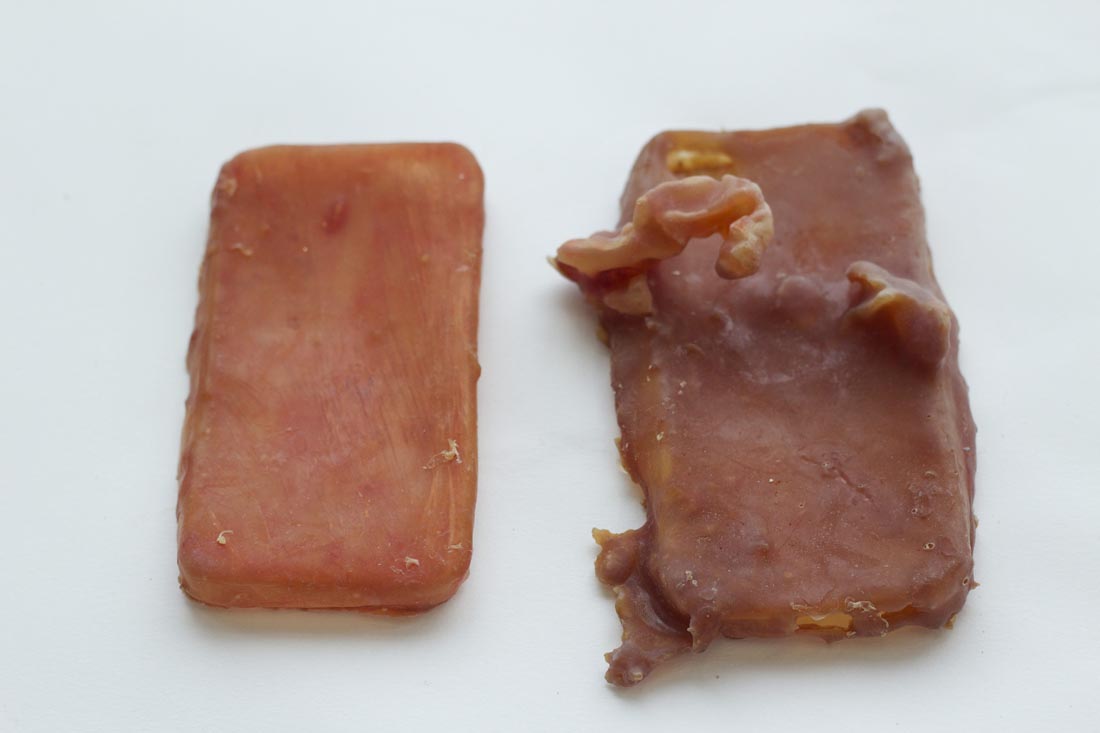
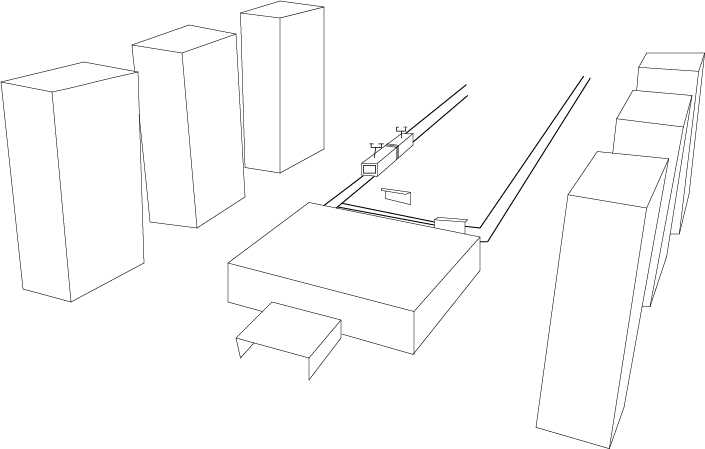
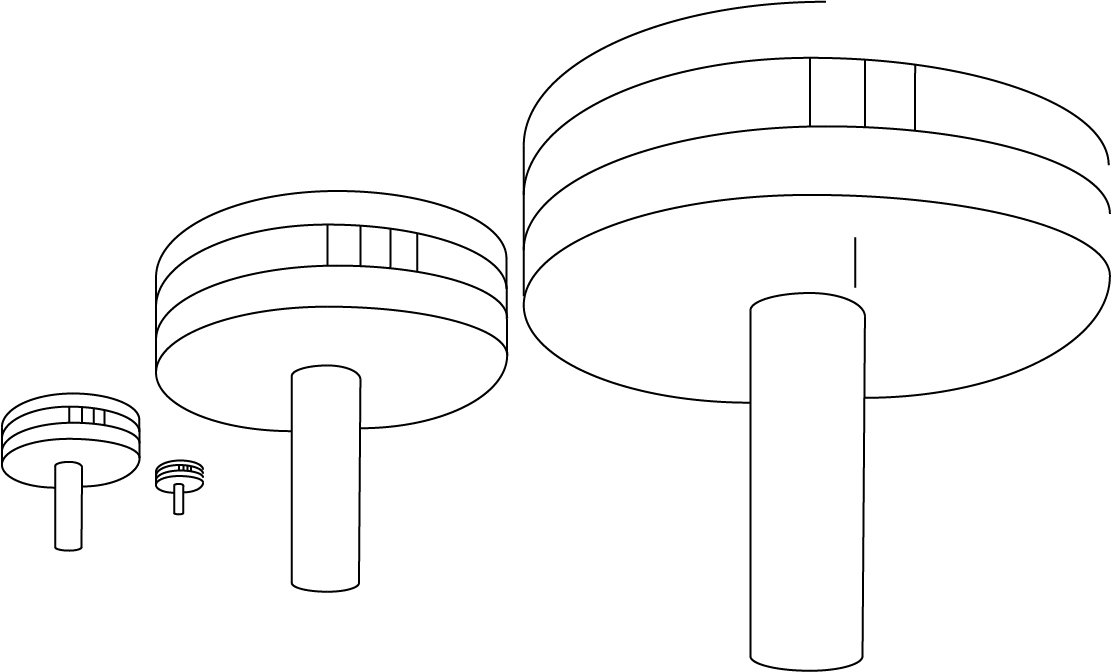
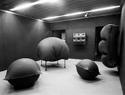
Monos II presented in the room titled mass at the Boijmans van Beuningen Museum is one half of an oval egg shape hanging on the wall, reminds one of the shape of a belly. The surface is covered with beige polyester and plaid. The work almost creates an optical illusion of infinity. When the oval space that he created is dividing the light, it generates this “never-ending” impression. In his other works one can see a re-appearance of negative and positive space. As well the creation of space to divide and manipulate light. An example is Memory Watch from 2004. In this work he divided/created space with huge half moon shaped screens with a texture similar to human skin. In this installation, one can view the same themes returning again.

Bildschirmfoto 2015-05-21 um 12.33.19 Bildschirmfoto 2015-05-21 um 12.33.25

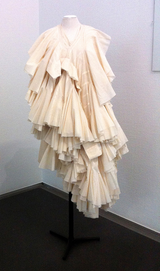
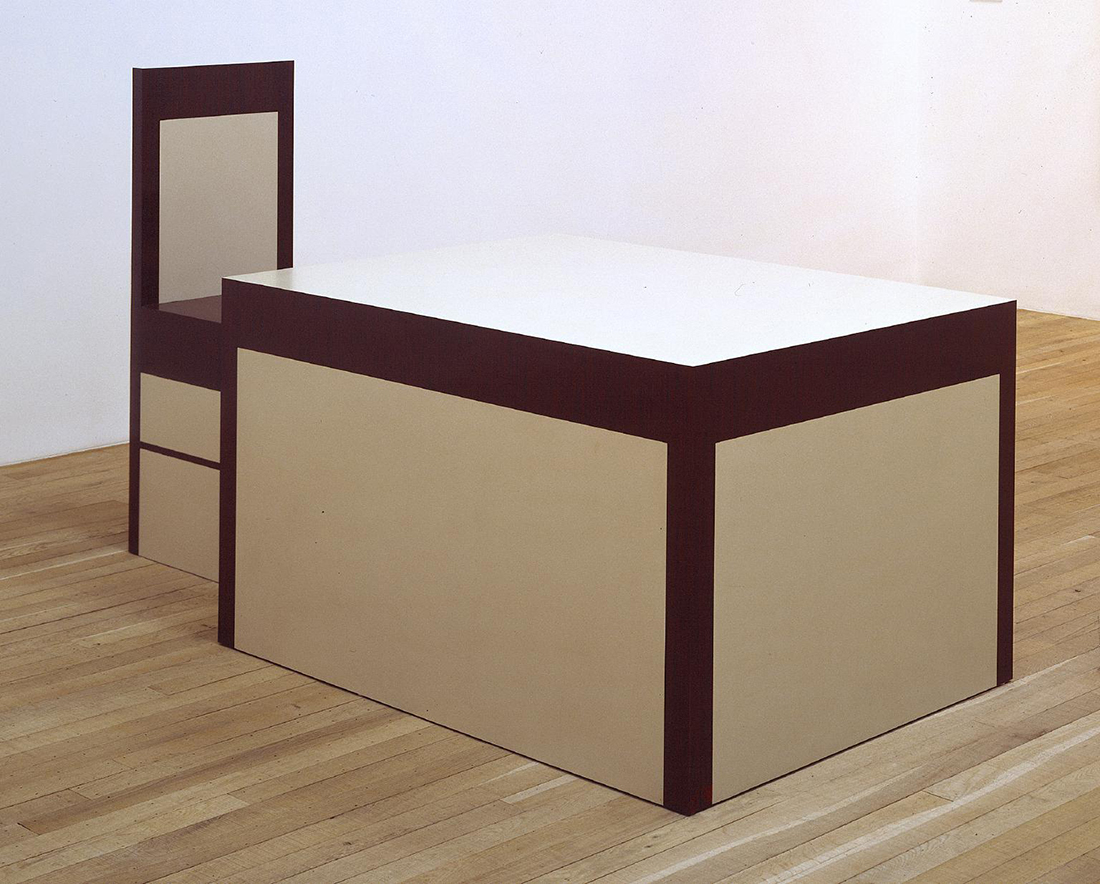
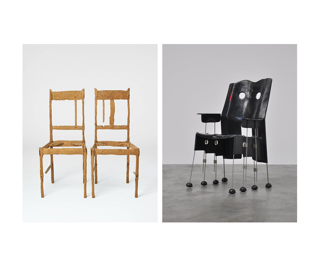
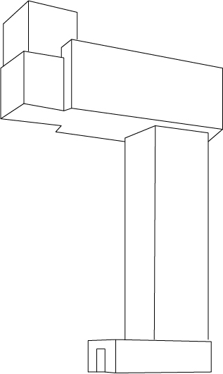
In the exhibition „Setting the Scene“ in the Boijmans van Beuningen Museum Rotterdam work of Lars Englund and Niek Kemps was put next to each other in the category Mass. Now it wasn’t as easy to tell who of them was an artist and who a designer, due to the shape and the setting of the works. Englund’s piece “Volume” could easily have been a design piece. Also our background knowledge about the artists and the spare guidance by the museum led to confusion and made it impossible to tell the difference.

While diving deeper into the works of Kemps and Englund, we found several similarities between the two: the architectural aspects in their work, the usage of space and non-space, the in- and excluding of space.We nearly got the impression, that they were the Dutch and the Swedish version of the same concept.  Both of Englund and Kemps work falls in to a group of artists that could be perceived as designer and architects due to the structural appearance of their work.

Also in the approach of the artists themselves towards their works you can see that they are artists, and not designers, since their objects have a lot more depth than mere functional objects. If you review the artworks from the exhibition in the context of the whole oeuvre of the artists the artistic essences of the works appear.

Why the works were put under the category “Mass”? We don’t know, since the works are more likely being labelled with words like volume, surface, space, density or lightness. The concept of comparing works from the fields of art and design was clear to us, however the categorization in the different rooms caused more confusion than clearness. We would have wished for a more open approach and a more clear  connections between the artists and designers.


The then contemporary pirate- The now lost artist


Thursday, June 4, 2015

The then contemporary pirate- The now lost artist


Once upon a time,
a baby was born.

Thirty three years later he disappeared.

It’s a fascinating story indeed as only a true captain with stone-strong beliefs and trustful instincts could proceed with such an ambition.
Aye! A captain he was. But in reality he was an artist. Or, thats what we like to call him nowadays. Or maybe what he really was is a contemporary pirate.I mean, he did have his own boat and he did start a journey that would last days and nights. And nights. And days. Until humanity never heard of him ever again.


BUT:

Before the ship had sailed/ Primary time

He was unconsciously building this plan into his -back then, clueless- mind, and he had to go through different processes. But he was too sad to tell anyone.
His interests varied from falling into the Amsterdam canals to falling from roofs and such.

A rebellious soul, a living concept I would call him.
Or a concept with legs. (And the rest.)

He failed the exams at the famous art school ‘Gerrit Rietveld Academy’.
But he got in the Otis Art Institute. and managed to not only graduate, but also win the heart of his Dulcinea, the daughter of the principal.
And now I have to apologise if this story is too cliche for your taste, but it’s not my fault, that’s the actual story.


The theme of that day: Arrangement 

I will need to make a small twist though.

So the other day I was passing by a flower shop. Quite a nice one I must say. Behind the vitrine, there was a vase with a beautiful bouquet of three colours: Red, blue and yellow. A person was standing behind the vitrine and behind the vase and he was arranging the bouquet; it seemed like he didn’t like the yellow or the blue flowers as the next time I passed by the vitrine(few hours later), the bouquet was consisting only by red ones. It was a funny coincidence, later that day I found myself arranging my markers from red to yellow, green, blue and purple. And after that I was doing the same with my clothes and even my food. Yes. Funny.

The disappearance 

Well as I can’t hear anyone laughing and I have no idea what this text is all about, I will now silently walk away.

Tabula Rasa


Wednesday, June 3, 2015

rei-kawakubo copyConstant_Nieuwenhuijs_(1974)


1. Rei Kawabuko


Rei Kawakubo is a Japanese fashion designer. She first studied fine arts and literature at Keio university but then later thaught herself how to design and started making clothes under the label Comme des Garcons. In 1973 she incorporated it as a company. Soon Comme des Garcons became a label preferred by the Avant-garde. Kawakubo designes clothes with a modus operandi more familiar to conceptual art than to fashion.


11261966_916720045016664_1635637135_o

Rei Kawakubo
and Yohji Yamamoto,
1983


During the 1980s, her garments were primarily in black, dark grey or white but later more colors were added. The materials were often draped around the body and featured frayed, unfinished edges along with holes and a general asymmetrical shapes. Comme des Garcons is often referred as anti-fashion with their austere, deconstructed garments and the focus is more on the three-dimensionality of shapes and not so much on the surface and finish. By all these means Kawakubos designs challenges the traditional notions of beauty in fashion.


11310958_916720195016649_1749574529_n 11287469_916720101683325_2021034115_o 11281749_916720151683320_342495459_n

Rei Kawabuko,
1997


In 1997 the spring/summer collection was an ironic commentary on female vanity and advertisements for cleavage enhancing bras and figure sculpting thights. These designs suggest that the mind no longer need to submit itself to the dictates of conventional notions of beauty, but it is free to find it where it will. Also that beauty may not reside in the places what our culture suggests but more in our own imagination.


What is beautiful doesn’t have to be pretty

Rei Kawakubo


Working together with other professionals like photographers and architects their approach in fashion is very collective. Kawakubo wants to be involved in all aspects of her business like photography, graphic design etc.


11354448_916720235016645_731800098_o

Ensemble
Rai Kawabuko
1997


Ensemble is a top and a skirt from collection Body Meets Dress, Dress Meets Body. It is made of cheesecloth stapled together in layers of pattern sections. The sculptural silhouette and the complex piling reflects Japanese ideas about the garment, which is seen as a construction in space. Here the garment is an autonomous sculptural object and it is no longer dependent on the shape of the human body.

This garment was part of a exhibition in Booijmans museum under a theme: Tabula Rasa. I think Kawakubos design fits quite well to the theme because she has been quite groundbreaking in her field by challenging the traditional idea of beauty in fashion.


2. Constant Nieuwenhuys


Constant Nieuwenhuys (1920 Amsterdam – 2005 Utrecht), also known as Constant is dutch. He is a painter but he touched other fields such as sculpture, music and, what interests us, theory and architecture.

His brother Jan Nieuwenhuys, who was born a year after him also became
an artist and their paths are closely related as they founded together with Corneille, Asger Jorn, Karel Appel and others the Experimentele Groep in Holland in 1948. It is important to mention that all those people then took part to the CoBrA movement which we all know and which was a period when Constant painted a lot and a lot of beautiful paintings.


Constant

Constant Nieuwenhuys
Maskierte Ungehorsamkeit
1948


Constant took part to the theorizing of CoBrA. In Wikipedia I found his theory resumed to six points, I translate it here.


– Realism is the negation of reality
– Who denies hapiness on Earth denies Art
– No good painting without great pleasure
– Civilization admits the beautiful to excuse the ugly
– The best painting is the one reason cannot admit
– Imagination is the way to know reality


After CoBrA, he briefly joined the revolutionary Art movement International Situationist (from 1958 to 1960), led by Guy Debord, between others. Asger Jorn was there as well. This part of his life is really important to understand his work New Babylone.

The International Situationists were influenced by Marxist thinking and wanted to end the class society and the merchandise dictatorship. Their thinking is well explained in the book Society of Spectacle Guy Debord wrote in 1967. Guy Debord is an important character to understand New Babylon because in 1956, he theorizes the Derive in his text La theorie de la derive.


One or several people experiencing the Derive are renouncing, for a laps of time more or less important, to the reasons to move and to act they generally know…

– Guy Debord, Theorie de la derive, 1956


societeduspectacle

Image used for the cover of one of
Society of Spectacle editions


New Babylone was supposed to be called Deriville. It is a utopian city in which the defaults of capitalism (and of society of spectacle) does not exist anymore. In this sens, it fits very well in the Tabula Rasa theme.


imageproxyboijmans

Constant NieuwenhuysNew Babylone
1966


3. Tabula Rasa


Even though the history and works of Constant and Kawakubo aren’t similar, they work in different fields, different puposes and connections are hard to find, we see that in those both particular works, some interesting aspects can be joined.


The first aspect is the use of architecture thinking for works that are not only architectural. Kawakubo, in Ensemble, thinks the garment as a construction in space, which means that she works with the object but also with the void it creates. Ensemble is a garment created using architecture.

Constant tries to build an utopian city, he has no choice but using architecture (he also made some beautiful models of New Baby- lone). The sketch we are talking about can also be seen as a piece of Art because the city was never built, it was only a big project that, I think, even Constant himself did not think he would see become real. New Babylon is a piece of Art using architecture.


The second aspect is related to the idea of Tabula Rasa. As we saw, Constant relation to it is quite obvious, he wants to built a new city for a new kind of human. In other words start everything again.

Kawakubo, in her garment, tries to challenge our traditionnal idea of beauty and to find new aesthetic values. We saw in Ensemble that the garment becomes autonomous from the body form an can be seen as a sculpture too.


To be an artist, to not be an artist


Wednesday, June 3, 2015

John Baldessari


John Baldessari is  known for his dot pictures, pictures in which a dot is used to shift the meaning of the appropriated (for example from a magazine or newspaper) material. This is how he works in general, appropriating existing forms, like pages from magazines, scenes from famous movies, pictures that people take at famous scenery, that mostly relate to mass media or mass culture, then using minimal gestures to change the meaning of this material. One could say his art is visceral since there is no space for hands on work but only of plan executed.

ribbon-cutting21 john-baldessari-dotprint

John Baldessari belongs to a stream of artists that would rise to fame in the seventies, forming the last somewhat coherent group of artist that could be called a movement. This movement is designated the Pictures Generation and group artists like Jack Goldstein, Sherrie Levine, Richard Prince, David Salle, Robert Longo, Louise Lawler, Barbara Kruger, Cindy Sherman. All of these group up in America in a time were tv and mass media were omnipresent, and there art praxis is a reflection of this. Baldessari formed an central figure in this group as was the teacher of a big part of the artists to would grow up and become representatives of this group. Also was he one of the first to gain attention with a type of art that could not find in the categories of former times: Minimal Art, Conceptual Art and Institutional Critique.

Here are some links to a few of his movies:

John Baldessari teaching alphabet to a plant

John Baldessari singing the conceptual art manifesto


Christophe Coppens


I have chosen to work with Christopher Coppens, who is an Belgian accessory designer originally trained as an Theater director now to be Artist.

What’s interesting regarding Christope in the exhibition is that he works in an area between fashion and art, as he puts it himself, though he recently completely stopped his fashion career to make art, though his fashion brand was very successful including clients as Rihanna, the queen of Belgium and so on.

unnamed 
For me it’s meaningless to place his work in any of the boxes, he sure does walk on the line  for instance his hats morphs into human faces, handbags that are shaped like animals, a swan and a lamb to mention a few. Which quickly makes you start thinking in the veins of an artwork.

When he chose to become an artist full time, he shut down his fashion firm and left it in bankruptcy, i think it was to be taken serious as an artist and not to be viewed ”just” as a multidisciplinary craftsman,
It seems to me that CC is a material based craftsman first of all, with a vision for different materials, accessory designer or artist, the title to me does not seem to matter much, maybe it was important in CC steps towards feeling comfortable with his creations.
He felt that the fashion world he surrounded himself with had an unfriendly sphere towards the more artsy, folks were ready to spend money buying from Christophe Coppens: The Mad Hatter’s designs but only the products, the stories and the processes behind each piece did not matter(im sure it did to some).

The first exhibition from Coppens transition from designer to artist.
For the show Coppens destructed by different means most of his belongings, suits, furniture, credit cards and business files, a kind of ritual, which he then turned into different sculptures.
The exhibition consisted of sculptures which Coppens refers to as Mountains, made from ceramics primarily. A ongoing tendency in these pieces is that it seems that the ceramic material is being eaten by fabric, swallowing the shapes. A visual reflection upon his feelings around a conflict he seems to be caught in.


 It is a collection of inanimate objects, s stuffed animals or toys, that are viewed through the windows of a small house. A shop beside the house sells miniature versions of the objects (a method deployed to great profit by artists including Takashi Murakami).


No reference was an installation by CC, in which he questioned the origin of his profession as a accesories designer, going back to point zero without any references, hence the title. The installation consisted of 33 haute couture accesories, that were presented as work in process and during the opening hours he would work on the pieces, invite people to join(if you were handy enough) and invited the public backstage of the ”hectic” fashion world.


Christophe and John

We now turn to the final question, does it make any sense to put Christophe and John together in one room, under the banner of the Abject. This question should be answered negatively, and for many reasons. First of all does John Baldessari’s work not fit to the theme of the abject because his work doesn’t concern the abject, and if his works, taken out of context seems to deal with the abject in a superficial manner it is solely because he deals with the abject how it is represented in mass media. Second of all does Christophe’s work not fit the abject because the term the abject refers to something quite deep, and following the theories from which his notion stems, quite fundamental. To deal with this topic in a design manner changes it so much that we cannot speak of the abject any more in its original sense, it becomes funny, witty and superficial, it is just used as a tactic of Christophe Coppens to give his work some extra artificial layering that makes it appear as “art”.

Lastly to combine the two in one exhibition is quite senseless, they have no relation whatsoever: different background, different views, different approaches, different topics. We can sum it up by saying that the noon of the artists relate to the abject, nor to each other.


                John Baldessari - Teeth (Tanden)  No References (2008)


Wednesday, June 3, 2015

SLOTHOUBER AND GRAATSMA

jan et willliam

Jan Slothouber is a Dutch architect and designer who often teamed up with his colleague William Graatsma who had the same background. We could also call them artists… Indeed, their status isn’t so clear. They both have been trained as architects working for the DSM (Dutch State Mines) in which they had the kind of privileged position to be very free in their buildings and creations. This way they could develop their interest : cubic constructions.
Considering the art movement of the time (i.e Cobra) as too elitist,they were much more interested to work with CUBE a simple, basic and humble shape, easy to reach for everybody. Also, working with such a basic and geometrical shape opens a lot of possibility and a much bigger diversity of work than an already complicated shape, usable only in a certain context.

According to this view on the Art Scene, they liked also to qualify themselves as « anonymous » and to work around social issues. But, they became famous when the Stedelijk Museum asked them to do an exhibition called Four Sides: Size, Shape, Colour, Letter (Vier Kanten: maat, vorm, kleur, letter). From this exhibition started a big enthusiasm around them, including lots of exhibitions and presentations, such as the Venice Biennial from 1970. [x]

Slothouber-Graatsma_vierkantenSlothouber-Graatsma_vierkanten2

Starting this period they built the Centre for Cubic Constructions (CCC) for which they are very famous. But a few years later, when they’ve been asked to design stamps in favor of children charity, and they used their now famous style to give those stamps value, a lot of people were very skeptic regarding this choice : Slothouber and Graatsma were indeed judged too « avant grade » not accessible enough for the average people. Which is exactly for what they were fighting against.


RICHARD ARTSCHWAGER

artschwager

Richard Artschwager is an American sculptor and painter. He Studied Science and Mathematics. After studying he worked as a cabinet-maker. He got to be pretty successful with his furniture untill his studio and all his contents was destroyed by a fire in 1958. After this he started to work more as an artist, this was in the time that abstract expressionism influenced the arts.[x]

After the 60’s his work is mostly pop- minimal- and conceptual art.
His work had a dichotomy between painting and sculpture, abstraction and representation, industrial manufacture and hand craftsmanship. The works are on one side sculptures and on the other hand pictures of objects. His craftsmanship for making furniture enabled him to make artworks with an identity and function that brings subject materiality, form and space into a balanced combination. Artschwager experimented with basic forms and materials, for example in his work Handle (1962), a handrail shaped in to a frame. The work is simultaneously pictorial and sculptural. Via an utilitarian and aesthetic approach he creates works that emphasize space.

In 1963 Artschwager starts to work with Formica, a new material, synthetic laminate, which was used a lot in furniture making because it was cheap and resilience. Artschwager: “It was Formica which touched it off. Formica, the great ugly material. the horror of the age, which i came to like suddenly because i was sick of looking at all this beautiful wood.” For Artschwager the Formica is a picture of a piece of wood. If you take that and make something out of it, than you have an object. But its a picture of something at the same time, its an object. By covering box-shaped plates with Formica in different colours and textures he creates a composition of domestic objects. In this way he pushes a painting in to three dimensions. mirror/mirror – table/table (1964) and later on triptych II (1967)

table 1964

mirror-mirror-table-table-1964_800 Table and Chair 1963-4 by Richard Artschwager 1923 - 2013


SCALE

This research is about the differences between art and design, we compare an artist and a design couple that both had their artworks in the exhibition ‘Setting the Scene’ at the Boijmans van Beuningen Museum. Both of our artists/designers shared the room themed by scale. To which extent is this the right theme to connect them to?

Scaling down is used in architecture to present large designs for building projects in a manageable format, as a floor plan or a scale model. Design and art also use scale models as way of crystallizing and communicating ideas and research. They can be used to experiment freely with form, scale, material, and details – after all a model does not always have to have a ratio of one to one in the real world.

Scaling up or down need not always be a practical solution; it may be and end in itself. A functional object can be made dysfunctional by enlarging it, reducing it or making it from unconventional material. Deviating from the human scale changes an object’s relationship with the human body. And if you enlarge a recognizable pattern far enough it transforms into an abstract structure of its own accord. The surrounding space is also a factor: you see things fundamentally differently when you see them from a distance or stand very close to the object. Scale changes one’s view of things.


CONNECTION WITH SCALE

We think that in Artschwagers work scale isn’t a central point. The alienating effect of modifying scale, is something that Arschwager achieves via material and playing with assumptions. The way he works is different but the result has similar aspects. The work in the exhibition, Counter III, is probably the only work that has a different proportion, but we think his works more relate to form and space. A form that is recognizable for his works is the cube, which is a central shape as well in the works of Slothouwer en Graatsma, our artists relate more in form than in scale. Indeed they’re using the cube for its simplicity and thus the diversity of composition it offers. Slothouber and Graatsma are then able to play endlessly with scale. The cube can be the piece in itself, as well as an essential element (like an atom) to build a bigger form not necessarily with a cube shape. The cube can be the final object or the substance of the object.
genicapart-inspirations-07

grid

SlothouberGraatsma

There is a clear difference shown between art and design that also matches the common view on this distinction, the works of the artist are not for use even though they look like in first sight, the works of the designer are based on shapes that are not immidiatly recognisble as domestic objects.


Living on the edge of a chair


Monday, June 1, 2015

desingart

CHAIRZ

Lie van der WerfGaetano Pesce Green Street Chair 1984

Gaetano Pesce (1939) was an Italian architect and product designer who reconciled his interests in the fine arts with design in the 1960’s. Pesce, like many of his fellow contemporaries associated with Radical Design, sought design solutions that did not conform to the standardized forms associated with mass manufacture and mass consumption. His works challenge the commonly known concept of a chair, playing with the border of sculpture and objects of daily life that belong to the design world. Pesce continued to play a prominent role in progressive design circles over the following decades, placing greater emphasis on architecture in the 1990s. His multi- and interdisciplinary work known for experimenting with new materials and resin, which has become his signature material, was celebrated in an exhibition at the Centre Georges Pompidou in Paris in 1996.

gateano-pesce

Lie van der Werff (1962) graduated in 1992 at the Royal Academy of Arts in Rotterdam and in 1994 at the Rijksacademie in Amsterdam. She was part of a group of sculptors that brought back the figurative in art and started using natural materials again. Recognizable shapes from animals and humans were reintroduced. This went against the sculptures made at that time, when sculptures mostly consisted from abstract and geometric forms made from industrial materials. Van der Werff makes use of the fictive story behind textile and applies her findings to her imaginary animals. Next to textile she also uses wood and clay to translate her ideas into reality. Looking at her work on her website, her work seems highly theatrical. She is a bit as an Alice in Wonderland, who wears dresses that are too small and hangs out with fictive animals.

lievanderwerff


Form

How often do we stop and think about the hook we hang our coat on, or the knife we use to butter our bread? Our daily life is a succession of assumptions and presuppositions. We are not always aware of the multitude of shapes and objects we surround ourselves with day in and day out.

Form and function are seamlessly linked in our minds: trousers belong on our legs and a door hinges vertically, not horizontally. By contrast, when an artist or designer alters the form of such an easily recognizable everyday object, takes something away or changes the context in which it functions, the ingrained meaning of the object is subverted.

description in Setting a Scene at the Boijmans van Beuningen


An artificial connection

We started our research based on the connection made by the Boijmans van Beuningen Museum. In the exhibition of Setting the Scene the following questions were asked: What are the differences between design and the visual arts? And how far apart are they?

When we walked into the theme room assigned to us at the museum, we quite quickly chose our subject of interest. In the room we saw a chair that looked like a sculpture and two chairs that looked exactly like chairs but weren’t meant to sit on. We were immediately interested in this combination between the work of Gaetano Pesce (designer) and Lie van der Werff (artist).

There was something interesting about the chair from Pesce, because although we clearly saw that it was a chair, it looked very sculptural. Nevertheless you could see that the user was taken into consideration, there was no doubt where to sit. But material wise the designer was working on the boundaries of design. The eight thin legs under the seat of the chair almost made it look mechanical, almost like it could walk. The fine arts approach of the material (metal, glass fiber and polyester) lifts the chair from being ‚just another designed chair’. This Green Street chair is a result of Pesce’s research of the chair-ness within the chair.

In this exhibition under this theme, the chair makes perfect sense. Pesce’s chair raises the question of how far can you go with the idea of a chair? When is something still recognizable as a chair?

Looking at the chairs of Van der Werff that caught our attention, on the contrary, there are no undefined shapes involved. She used the archetype of a chair and without obeying the rules of design, she transformed it into a dysfunctional object. By processing the wood in her own way she made the chairs unable to sit on, changing them into sculptures. Through the processing she changes the design object into personal sculptures, changing their history, giving them a story and (probably) makes the viewer wonder what happened and to whom they belonged to. Van der Werff’s chairs raise the question of how long can you chop before the chair collapses? How long can you chop until the chair is not a chair anymore? When does it lose its original identity? How can another form arise through transforming an object?  But looking at her work in general, these chairs are the only possible work of her oeuvre that would fit this theme.

The work of Pesce and Van der Werff are as far apart as can be, not only looking at the chairs they made. They are not from the same time, not from the same country, not from the same discipline and never use the same materials or even use a concept that is alike. She is a lover of natural materials and colors, lives in her imaginary world and uses herself as part of her art. He, with a love for bright colors, is always looking how far he can go with materials and shapes to disten himself and his work from reality, while keeping it playful. We have to conclude that she only fits this Form theme with these chairs she made in 1992, whereas he would fit the theme with more chairs of his hand, whilst the theme of the room is also the research in his work.

So when the function is taken away, we can apply only the idea of the contemplative concept of an object. Where does design become fine arts? And where does fine arts become design? Should the distinction still be made?
To keep the answer as applied to the now as possible, we can talk from our own position as art students. We are from a generation of designers and fine artists that graduate at the Gerrit Rietveld Academy with a diploma that doesn’t make a distinction between the two practices. So the fact that it is changing inside the art schools means that the distinction will disappear more and more in the future. So, let’s mingle.


Harp of Pythagoras


Saturday, May 30, 2015

Why are things the way they are? That is a question I can never stop asking. Every day I find myself completely fascinated by things that other people seem to take for granted. I just cannot get used to the simple fact of existence.

One of my most recent questions: “Why do we always tune our instruments the same way?”  This is the question that sparked a whole design research of which the outcome was to be a mathematical music instrument.

At the start of my research, I decided to visit my old piano teacher. I asked if he had some time to think with me on the subject of musical tuning. When I met up with him though, it was quite evident that he was not a music theoretician. He did encourage me to find out by myself, so I headed his advice and did a lot of research.

The science behind the instrument: Pythagorean music theory

0501_gaffurio_pythagoras

When starting this project, I did not expect to develop such a great fascination for a man who has been dead for over 2500 years and would probably cringe at the mere thought of modern music. Pythagoras had some very interesting theories about harmony. He believed people could be healed spiritually by listening to harmonious tones. He developed a tuning system based on exact mathematical ratios to create perfect harmony. He used the most harmonious interval (3:2) the perfect fifth as his foundation.

Sound file: perfect fifth

[audio:https://designblog.rietveldacademie.nl/wp-content/uploads/2015/05/perfect-fifth.mp3|titles=perfect fifth]

By stacking fifths upon fifths he developed a 12 tone system. The framework of our modern 12 tone system called “equal temperament”.

mtp01

The 12 different tones in an octave as shown on a piano keyboard.


Mathematically Pythagorean tuning is perfect. It describes the almost exponential nature of sound exactly. This way he could play the musical equivalent of the golden spiral. Pythagoras saw truth in these harmonies. It was his way of communicating with the heavens.

The most fundamental difference between Pythagorean temperament and equal temperament is the difference between a circle and a spiral.

 41-43spiral

Pythagorean tuning shows the golden spiral of fifths. Because the spiral of fifths is a spiral shaped system based on stacked fifths, the fifth intervals are in perfect unison, but the octaves are in dissonance.

Sound file: wolftone

[audio:https://designblog.rietveldacademie.nl/wp-content/uploads/2015/05/wolftone.mp3|titles=wolftone]

This dissonance is also called a “wolf tone” because it resembles the howl of a wolf.

The wolf tone, is by no means the result of a faulty calculation. It does however create a problem for music playing. This problem is referred to as the Pythagorean comma. A quite ironic name seeing as Pythagoras did not believe in decimal numbers. The Pythagorean comma actually prevents you from playing more notes than the range of an octave because the 13th note will be slightly out of tune (though you could play perfect fifths into infinity). Pythagoras had a solution. He just did away with note 13 and upwards!

circle

Equal temperament avoided the problem caused by the Pythagoras comma, by converting the spiral into a circle. The comma is still there, only spread out between all the notes. Everything sounds kind of okay, because everything is out of tune in the exact same way except for the perfect octaves (which you can play into infinity). Now we can play music in every key, but there is little harmony left.

Can the comma be solved? No. It cannot be solved because it is a fact of nature. Perfect octaves and perfect fifths cannot co-exist. No power of 3:2 can ever be a power of 2:1. Pythagorean tuning sought to find truth and equal temperament standardised it for the sake of convenience.

I found this very interesting, I wanted to hear the perfect fifths, so I gave myself the task to design an instrument based entirely on Pythagorean tuning. Not only would it have to be tuned in the right way, I also wanted the design to reflect the tuning, so I could understand it better.

Creating the instrument

First I had to calculate the notes Pythagoras did not care about (note 13 and upwards), so I could make an instrument with more than 12 notes. That way I would be able to hear the perfect natural disharmony Pythagoras shied away from.

Luckily someone I know had already done the dirty work for me:

rsz_img_3861

Here is the chart I used to come up with the absolute frequencies of my instrument.

And here is the list of absolute frequencies:

rsz_scn_0006

It has 37 strings from C1 to C4 where A2= 432 Hz.

Sound file: Pythagorean tuning of my instrument and equal temperament

[audio:https://designblog.rietveldacademie.nl/wp-content/uploads/2015/05/Pythagorean-tuining-and-equal-temperament.mp3|titles=Pythagorean tuining and equal temperament]

Sound file: dissonance between Pythagorean tuning equal temperament

[audio:https://designblog.rietveldacademie.nl/wp-content/uploads/2015/05/Dissonance-between-Pythagorean-tuining-and-equal-temperament.mp3|titles=Dissonance between Pythagorean tuining and equal temperament]

I was struggling to think of a meaningful design for the instrument. Out of nowhere it hit me

 rsz_1rsz_1scn_0003rsz_1rsz_scn_0005

I drew the distribution of the frequencies of my instrument in these graphs and I realized the shape of the graph would be the perfect shape. It visualizes the exact near exponential nature of the tuning system. I even decided to place the strings at their corresponding spatial position on the instrument. From down to up, the strings grow increasingly farther apart from each other.

 rsz_img_3864 rsz_rsz_scn_0004-1 rsz_scn_0002


Final design and model

rsz_scn_0001 rsz_rsz_img_3410 rsz_1rsz_img_3409


Stages of building

rsz_img_3852 rsz_img_3854-2-1

The instrument is made from birch plywood. The inside is reinforced with massive wood to resist the tension of the strings.

Final outcome

rsz_img_4414

                                                                                                         rsz_img_4412 rsz_ca2_0060


Sound file: some sounds of the instrument (not tuned to pythagoras)

[audio:https://designblog.rietveldacademie.nl/wp-content/uploads/2015/08/HARP-.mp3|titles= some sounds of the instrument]

Math is nothing other than stating things as they are. I only realised this during my research. It is the very foundation whereon math is based. It is the thing whereon my instrument is based. It shows tuning systems as they are. It does not hide the perceived disharmony. Creating this instrument has truly showed me how bad our attempts are at grasping the nature of reality. We are trying to create harmony with notes that actually form dissonance. It’s complexly ridiculous.

As an art student I say I made an interesting discovery. As a musician I say I have created an incredibly ridiculous instrument and I am very happy with that.


Package for Jewelry


Thursday, May 28, 2015

For the collaboration project I met Nadine Kieft, a young jewelry designer based in Amsterdam. I got in contact with her via her website. Her work looked fresh and trendy, not so traditional and a style that people would love to buy in these days. This was important for me because I was curious how she is working. How she is getting in contact with people and how she is organizing the sales of her work. Because her work looked so nice, I thought that she was a popular designer. I sent her an email and we made an appointment to meet for one hour or a little more. She told me that she was busy but that she could make a little free time for me.


mad3  mad2

In the beginning of my process I experimented with candle wax and plaster to make molds. It ended up as jewelry which is captured in materials, almost like fossils.


I met her on a Thursday in January. I visited her in her atelier in the East of Amsterdam. She had a really nice working space. Not super big but enough space for the small works she makes.

I got a nice cup of tea and from that moment we talked about her work and her life as a jewelry designer. She told me a lot about how she started and about her study. She studied at a Jewelry Crafts School in Amsterdam. She learned the craft there but later in her life she discovered that she did not got the appreciation for her work she deserved. It is super hard for her to get an exhibition space in a gallery for her jewelry simply because she did not study at an art academy. Because of that she is forced to sell her work via organized jewelry markets. These markets are quite expensive to join. To rent one stand on the market she had to pay around 1500 euro’s, what is quite a lot if you are just started with your own business.
Nadine told me about the rest of the organization she has to do for her business. It became clear for me that the part of organization, promotion, talks with customers, and website issues, is bigger than the part of designing and making jewelry. It is the bitter sweet truth about being an artist. It made me think. It made me think about the jewelry she makes, that the outside, the part that has the shiny stones and gold is not only the work but that there is much more inside one jewelry piece, namely all the organization around the piece.
I got an image in my head of a ball containing three layers. The ball is a symbol for the jewelry. The core of the ball is the concept, the personal part of the work. The layer around the core is the materialized work, for example the jewelry piece with gems and gold. The outside layer is the organization of the work. The promotion, the connections with people, all the things that are invisible to see but what is almost the most important part of the jewelry piece. The outside layer is invisible and visible in the same time. It leads the eye to the work. Without this layer it will be hard for the artist to sell the work and to make a living out of it.


mad6 mad1

The second step I made was working with layers and experimenting with different materials. I was inspired by the look of a traditional pearl necklace, using clay to make the beads by myself. The fossil slightly changed in a roughly made package. Still the material was not speaking to me as if it was a real package. 


My thinking process went on. How to make an “organization” for a jewelry piece? What is “organization” exactly and how to materialize it. These questions where constantly in my head. As always, I got stuck with all these problems, I tried things out containing the “organization” idea but most of the hick ups didn’t work. It took me a while to find the right word for the “organization” to give it a more materialized meaning. I came up with “package”. Organization is the packaging of the jewelry piece. This helped me by developing an idea and when I am writing this I am in the middle of the making process.


mad5 mad7

I made a material change to plastics. Namely because plastics immediately speaks to me as a material mostly used for packaging. I used two different kinds of plastic, a transparent one and a semitransparent one. I sewed the layers together and captured the necklace inside. The thread of the first necklace broke inside the package, though it is possible to wear this jewelry piece.

The second try out is a little more advanced. I used a different kind of thread, but the middle part of the plastic is still there what directly means that this piece is not wearable yet. The aim is that the middle part is part of the package but easy to take out if you want to wear it as a necklace. I like the plastic material but still it is not package-like enough. An advantage of this material is that it is flexible, what makes it nice to wear.

At this moment I am still in the process of making the ‘organization’ for a necklace. The package and the necklace has to work together as a symbioses. Step by step I come closer to the end result of my jewelry piece.

Experimenting with different materials is something what I really like to do and what I can do a lot in this project. Now I am focussing on finding a way to use plastics to capture the jewelry piece. Finding the right plastic is harder than I first expected. For the last experiment I made, I used the vacuum machine. Unfortunatley the plastic I can use for this machine is too thick and hard to bend. It will not form around the human body, which I find important for jewelry. I have to find another solution for this and will try to stick with the vacuum machine because it gives the perfect look of something what is packaged. Soon I will visit a cheese shop where I can vacuum one of my necklaces with there soft, thin, package material for cheese.


mad4

Necklace, captured in a not bendable plastic.


How an object becomes a part of us.


Monday, May 18, 2015

So

I don’t know why  I have this anxiety about smartphones.

Maybe, it’s about dependence, it’s about feeling like something is missing when you don’t have it with you, like an actual part of you is missing.

Do we need smartphones, to avoid loneliness ? The relation we have with our phones are so intimate, we hold them in our hands, they connect to our bodies and become an extension of it.

My research became really visual as I found images that spoke stronger for themselves than what I was writing. Here is a selection :


existenz_controller Images from the Cronenberg’s movie ExistenZ came back to my mind. In the movie, the design of this object really intrigued me, this “game pod” [x] that could have been electronic but that is made in a really organic way. They plug it in their spinal column to be able to connect to it and play. Human and the machine are then one.


glove-one-the-wearable-phone-is-real-2 Brian Cera is a designer that did this phone/glove called Glove One [x]. He says: “It presents a futile and fragile technology with which to augment ourselves. A cell phone which, in order to use, one must sacrifice their hand. It is both the literalization of Sherry Turkle’s notion of technology as a “phantom limb”, in how we augment ourselves through an ambivalent reliance on it, as well as a celebration of the freedom we seek in our devices.”

 Another picture that was significative in my research

Capture d’écran 2015-03-24 à 18.45.45


Of one of my first steps, I made this picture to visualize what I wanted to do

 cellphonealien1


Quite fast I started to make some objects with clay as I wanted to work with touch and the feelings of materials in my hands. I wanted to make an object that you could use instead of your phone. An object that would be made with organic shapes and give a  conforting feeling. After using clay I wanted to try softer materials, more fleshy, I started with silicone and end with latex. Here is the evolution.

_MG_8411 - copie1 _MG_8383 - copie

_MG_8384 - copie _MG_8385 - copie

_MG_8396 - copie _MG_8401 - copie1

_MG_8403 - copie1 _MG_8404 - copie1

_MG_8410 - copie _MG_8415 - copie1

_MG_8426 - copie1 _MG_8429 - copie1

_MG_8435 - copie1

_MG_8436 - copie1

_MG_8452 - copie1

This is my final object, made out of latex.


I & O


Sunday, May 17, 2015

q1

q2

q3

q4

q5

q6

pic1

pic2

pic3

pic6

Sound Sock


Saturday, May 16, 2015


Startingpoint

The startingpoint to my design project  was my interest in costumemaking and theatre. I arranged a meeting with the costumedepartment of the Nationale Opera & Ballet in Amsterdam. During my visit I gained insight into the process of costume making and was struck by the amount of detail, creativity and knowledge that goes into every piece.

What inspired me most was the fact that the goal is to create the perfect illusion, to make something look like the real thing in order to make a play, character or story believable.

First Tryouts

To kick off my research I applied the idea of creating the perfect illusion onto the example of a sock. The questions I asked myself were:


How is a sock constructed?

-What happens when commonly used materials are replaced?

-When is a sock a sock?


tryout2


When taking a closer look at my try-outs it was clear that replacing common materials with new ones not only affected my object’s appearance but could potentially change its function. All of a sudden that sock had turned into something more. I decided to investigate this aspect more closely by moving away from the idea of simply creating a visually authentic object, like it is mainly the case with costume making. Instead I tried to find a new or added function that would derive out of the use of a different material.

All the materials I had used so far in my research had/made very distinctive sounds. In the following steps I therefore narrowed my focus on 3 basic movements, 3 distinctive sounds and 3 different materials with the goal of making a sock that makes sound.


 Sound

When making music, people like to tap their feet. When I play the guitar myself the rhythms in my right foot can be reduced to these three movements:

kdungtaptick


*kdung*

*tap*

*tick*


After having limited and simplified the movements I chose three different materials that would fit each of them and represent them with a suitable sound, looking for a high pitch for the area below the big toe, a short tap for the footpad and a dull, low sound for the heel.

Metal (big toe), plastic (footpad), plaster (heel); shaped to match my own footprint as it taps the floor:

3materials


Final Object

To combine these three sound-elements into one wearable and therefore flexible and fitted object, I needed a third component. For that part of my final object a material research I had made earlier on during the process, a combination of jersey fabric and metallic isolation material, seemed to have all the needed qualities and even came with an additional effect: a rustling, swooshing sound as the foot is being bent, the final sound.


final


Playing the Sock

Trying to play with the sound-sock I noticed that it takes a quite some practice. Even though the number of different sounds is limited to three they can be used with a lot of diversity, combined, separated, fast and slow. The following video gives a brief idea of how the sock sounds and can be used:
 

Get the Flash Player to see this content.


architectural rendering: about


Saturday, May 16, 2015


Screen Shot 2015-05-16 at 2.34.29 AM

Screen Shot 2015-05-16 at 2.35.28 AM

Screen Shot 2015-05-16 at 2.36.35 AM

read it all on ISSUU

Through the stages of chewing gum.


Saturday, May 16, 2015


                                              oO.oO

                                       .oO.oO.oO.oO.oO

                                    .oO.oO.oO.oO.oO.oO

                                       .oO.oO.oO.oO.oO

                                             .oO.oO


.oO  STAGE 1 : Culinary World
[audio:https://designblog.rietveldacademie.nl/wp-content/uploads/2015/05/STAGE-1.mp3|titles=stage 1]

.oO  STAGE 2 : Roel Oostrom
[audio:https://designblog.rietveldacademie.nl/wp-content/uploads/2015/05/STAGE-2.mp3|titles=stage 2]

.oO  STAGE 3 : First Sketch 
[audio:https://designblog.rietveldacademie.nl/wp-content/uploads/2015/05/STAGE-3.mp3|titles=stage 3]

.oO  STAGE 4 : GUM!
[audio:https://designblog.rietveldacademie.nl/wp-content/uploads/2015/05/STAGE-4.mp3|titles=stage 4]

.oO  STAGE 5 : Maizena Experiments
[audio:https://designblog.rietveldacademie.nl/wp-content/uploads/2015/05/STAGE-5.mp3|titles=stage 5]

.oO  STAGE 6 : Chewing
[audio:https://designblog.rietveldacademie.nl/wp-content/uploads/2015/05/STAGE-6.mp3|titles=stage 6]

.oO  STAGE 7 : Hunting For Material
[audio:https://designblog.rietveldacademie.nl/wp-content/uploads/2015/05/STAGE-7.mp3|titles=stage 7]

.oO  STAGE 8 : Perfect Wrapping
[audio:https://designblog.rietveldacademie.nl/wp-content/uploads/2015/05/STAGE-8.mp3|titles=stage 8]

.oO  STAGE 9 : Experience Of Chewing
[audio:https://designblog.rietveldacademie.nl/wp-content/uploads/2015/05/STAGE-9.mp3|titles=stage 9]


.oO THE GUM                                              .oO THE DIP 

SONY DSC    SONY DSC

.oO THE PACKAGE

SONY DSC


dis play


Friday, May 15, 2015


who inspires you?

she asked

who?

I thought…

what?

I thought then…

meet this person and get inspired

make a work out of this experience

she said

and so I met a fashion designer

young man

very pretty

he said that fashion is like a colouring book

we have certain outlines and we have to fill the ´surface´

and then he said a lot of other thing, too

and made me pay for his coffee

and then, biking through Albert Cuypstraat, I was thinking of the colouring books

and about what it is, that we are filing the given shape with

finding:

Yamaha

Pepsi

24

N-power

Avis

I love sport

Fedex

Virgin

Bronx NYC crew

Alpinestar

nike just do it

WELLA PROFESSIONALS

keep calm and swag

avatar

dr.Oetker

clothing is a billboard

I understood

a display which is touching every single corner of our lives except the shower corner

and then I thought further what makes us want to proudly wear a company logo on our chests and how could we make a use of this display that we are constantly wearing

and then I did not know what to do for a while

and then I knew again

I made a plan to make a comfortable universal sweatshirt which will have a displaying function beside the warm keeping, protecting and covering one

what would I fill the surface with?

what surface?

I wondered

and so I bought a surface

blank, grey sweatshirt

I decided to make a use of the existing shape of the sweatshirt and challenge the idea of temporary and replaceable advertisement on it

but how?

I thought

Removable sleeves?

but how?

adding a zipper?

or a velcro?

zipper

and so I added a zipper on the sleeves and by doing so, I allowed the printed advertisement/ promotional element to be easily removed or replaced by another one

I made a list of small businesses that I really truly want to support and promote

I gathered the logos of all of them


2mala1 mala kopie


the print will come on the sleeves

I made another decision

but how?

screen print?

okay

the screen print studio works on the base of appointments

you must discuss your idea with the screen print assistant first

then an appointment is made

attention: it sometimes lasts over two weeks

you start printing with the assistant

hopefully you can work independent later

costs

yes costs…

no

I am not going to screen print my logos

what else can I do?

transfer print it

of course

I printed my logos onto a specially coated transfer paper

then they were applied onto textile under the heat press

and there it was

logos on my sleeves

I looked at the sweatshirt in my hands

I wanted to wear it immediately

and I did

and it felt good

but it did not feel good enough

so I took it off and looked again

and after some time I wrote down

70cm metal zipper standard + another sleeves + velcro pocket question mark

and then I went to Jan

and made another pair of sleeves

black

I put transparent, removable pockets on them

and I like them a lot

and then I looked again

they told me I have to look and reflect on my work during my process

so I did

I reflected

and I asked myself

what is it that I have now?

sweatshirt design?

yes

and what else?

and then I started my analysis

see here: video


33 16

1 21


center expansion


Friday, May 15, 2015

i was interested in the term “meta-modernism” that i had been reading about, so when we got this assignment i decided that i wanted to focus on that topic.
i found an artist named Jonas Staal that works in a meta-modernistic way.
before my meeting with Jonas i made some research about his work, and when we met we went straight into discussing his works.
he had one work about a new prison model, a thesis by the leader of the Freedom Party MP, Fleur Agema.
(book is called Art, Property of Politics III: Closed Architecture if you want to read more. you can download the publication with this : link)

this publication became a starting point for me, as i was inspired to change/improve/alternative solution of an existing structure.
i decided that i wanted to “minimize” the gap between the suburbs and the city center, a topic that have been very discussed in Swedish media lately.
to enter this topic, I felt that starting with something I already know would be a good starting point. to this took me back to Sweden, mainly in Gothenburg.
i tried to find out what have been done/tried to be done, to “solve” it.
there were a lot of different approaches.
i am going to mention some of them briefly:

–       back in 1985ties if you were a Swedish citizen and moved to the suburbs, you got 15% of your rent.
–       some apartment buildings had rules, that X apartment is only for Swedish citizens, in apartment Y you can only live if you are a non-Swedish citizen, and in apartment Z you can only live if you are over 50.
–       a large number of high schools have been built outside the city center, to send people outside of the center.
–       building large shopping-malls with a number of exclusive stores that can not be found anywhere else in Gothenburg.
–       building villa-neighborhoods and schools for kids age 6-12.

with this knowledge in my mind, I started sketching up a city plan, as you can see below.
citylayout


hus5


my idea behind this plan is based on what have been tried before. but how come those plans did not work?
why do I go out of the city center?
with these questions in my mind, i decided to make a construction plan where student housing/cheap housing, is built around a galleria with some exclusive stores.
when i leave the center it is because i am going to visit someone or if i need to go to a specific place to buy something.
the area i decided was a place where it was possible to make fast collective traffic and effective bike lanes into the center and out to the neighborhood.
instead of creating a new area, how can i expand the already existing center?
here are some try-outs where i try to add to already existing buildings:


hustry12345SvampHus


designhusgrej


HusRiktigtExampel_1100


with the try outs above, i tried to use the space that would not take up space on the ground but still expand the construction of the building.
in the last picture, i was trying to work with two buildings and a piece to connect them, that made made me think of Tetris, and my work took another direction.
into something you can always keep adding as long as you have the right pieces.


tetris3   tetris5


tetris4


TetrisIRL TetrisIRL3


Note cup for composers


Friday, May 15, 2015

I met my professional, Niek, a music student, for this cooperation design assignment. Since he is a composer, I am more interested in way how rhythm is made than the way how sound is made, which means that my direction is related to composing rather than instruments.
Niek told me how he usually makes music: when he has an idea he normally writes them (music notes) down on his notebook and then deals with it when he goes home. However sometimes he has no inspiration, especially when he wants to make something new. Then I found that I can make a tool that helps composers make new ideas in an extreme helpless environment. I went directly to the language of composers: staff (stave). Simply speaking, staff is the thing that tells musicians on which moment which tone should (or will) come out, the position of notes tells how high or low the tone is and different shapes of notes tells the length of the sound.
pianonotesdiagramsmaller

images_muzieksleutel

My idea was to create new pieces of staff as a starting point for composers. Once there is one good part of rhythm they can finish the rest. Since Niek and I made the conversation during drinking coffee, I found that a cup can be a good form for the tool — small and functional. The point was to produce new pieces of staff completely random and potential of unlimited results.
1st step:
Thinking to make a tea set with a transparent cup and a plate with five circles or arcs which represents the staff. When the composer spin the cup on the plate, from above he can see the handle of cup point out different notes. I studied a lot of round patterns but finally found out that it can’t work at all. The handle always points the same note or a same piece of music. Then I realized that the circle staff isn’t necessary.

Cirkles_1st-period2

2nd step:
I researched how notes can move at the bottom of the glass.

s1


3rd step:

I turned to make a transparent cup cover with traditional blank staff (five straight lines) and put five to seven flowing dots as note at the bottom of the cup.

s2s2-2


4th step:

Decided to let the cup itself carry all functions, which means that there’re no additional part for it, also simplify the shape of the cup. The black notes work better than white ones since they can be seen through tea or colored soft drinks.

s3-1_500s3-2_500s3

adjust

(this is a .gif, click to see the whole)

It is a pity that people from glass workshop told me that it is not so possible to make this cup precisely with glass because the whole process will be in a hot environment, the liquid and my hot glue notes won’t survive.  Despite that, I’m quite happy about the result, and the experiment is telling me that this cup really works.
Check it and you can ask me for that piece of ringtone ~

Get the Flash Player to see this content.


Object of Curiosity


Thursday, May 14, 2015

When we got an assignment to contact a person that influences and fascinates us I got lost for a moment. There are simply too many people whom I would be curious to meet and ask about their work and inspirations! After a couple of failed email conversations with hard-to-reach professionals I decided to try another way. My inspiration came spontaneous as a follow up of my daily curiosities. I personally find it very stimulating for my own working process to make a step aside from the main route and see what is it there behind the corner because you never know! Following this simple idea I went to a butchery I have been to recently. I already had a short encounter there with a butcher Mike and a video of him slicing slaughtered pig. Therefor we met again and I had a great opportunity to spend some time at the butchery with the best butcher-guide! During that meeting I discovered the world of modern dutch butcher and afterwords continued on searching for the best object i could make to tell the story of this meeting. In the text below you can find all the process steps that led to the creation of the final piece- OBJECT of CURIOSITY.

First Reaction: Right after the meeting I decided to quickly summarize what had happened and what material I have now. I had a sticker with all of the information about the pig Mike was slicing and loads of videos documenting almost the whole meeting. I decided to make a list of tags which would describe that meeting.

Sticker from a piece of meat  2tags-about-the-meeting-copy

First tryout: My first idea was to make a fan with sharp knifes used as blades. I thought it would be a funny metaphor for the meeting. Chilling plus being dangerous.

First idea fan of knifes


Second tryout: Understanding that the fan idea is too flat I decided to try to make something what the butcher could use. Here is a sketch of some kind of logo/identity proposal.

second idea logo


Third tryout: After talking to my teacher and classmates I decided to go away from my direct design solutions and think more about what was my experience like, what made this meeting so special? The experience was unexpected, though the location of the meeting suggested some narratives, and the main conclusion I made was that my own curiosity led my towards this happening. I started sketching to figure out what object can look common but yet carry something surprising in it and trigger peoples curiosity at the same time.

2third-idea-taste-the-curiosity-copy


Final idea: To go further I decided to ask my friends in what situations they feel the most curious? Receiving their opinions I understood that all of them were naming the situations where the communication with other people involved. At this point it became obvious for me! That now I want to make something that I can give to others, something that will become something else when used by people. And here came the idea to make some kind of lottery ticket called OBJECT of CURIOSITY. It will help people to create their own Object of Curiosity and at the same time will be object that contains the curiosity in itself. Here is the first version of it.

Final idea- object of curiosity tryout Final idea- object of curiosity tryout 2


Final design: To make it look more like a lottery ticket I made a design for the object and used special techniques by applying scratchable lines on it.

objectof curiosity final version


Final move: To finish my project I asked two of my friends to test OBJECT of CURIOSITY and sketch their own Objects of Curiosity. Here below is what came outcome.

object of curiosity used by ValdemarValdemars object of curiosity


object of curiosity used by RubyCURIOSITY-ruby_900


OBJECT of CURIOSITY is a lottery ticket to the greatest trip of your imagination! In this object I tried to combine suspense with excitement, make it open and closed at the same time and, above all, interactive. This is a metaphor for the process of my work and a useful tool for others.


!BE CURIOUS!

#STICKY #SWEET_SMELL #MUSELS #VACUUM #MAFIA #BLOOD #SLAYERS #DELIVERY #FRESHLY_SLICED #HASH #FREEZER_ROOM #SALTED #DRIED #EX-ANIMATOR #GANGS #JEW_BUTCHER_FROM_30s #AIR_CONDITIONER_IN_A_WARDROBE #WINNER_OF_2013 #CLEAN_EVERY_WALL_EVERYDAY #BUBBLES #SHARP_KNIFE-THE_MAIN_RULE #STAB_YOURSELF #CHILL #FAMILY_BUSINESS #CUSTOMERS #BACTERIAS #SALAMI #HOOKS #HAIR_STYLING #VAN_PERSIE #FOOTBALL #DRUNK- AGRESSIVE WOMEN HARASSMENT CHILLED MEAT TO TASTE BETTER #YOUNG_MEAT- NO_TASTE #TEENAGE_MEAT #CUT_CLOSE_TO_THE_BONES


Log in
subscribe