Skip to Content Skip to Search Go to Top Navigation Go to Side Menu


Marion Molle’s irresistible graduation book


Thursday, November 12, 2015

Saying if you like a book or not, is easy.
I am not talking about the content of a book, but the object itself.
When you hold it in your hands, you can feel it. Do you want to open it? Do you want to browse through it? Do you like the texture? Do you feel comfortable? Or do you simply like to hold it?
Most of the time you don’t need to ask yourself these questions.

I was in the library, only one book really appealed to me in this way.

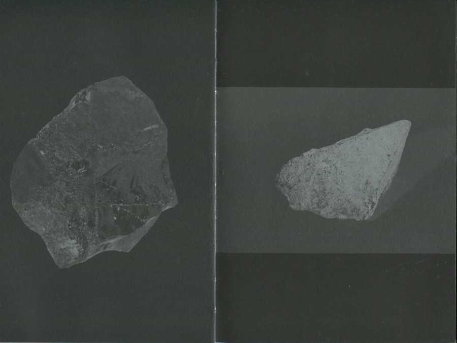
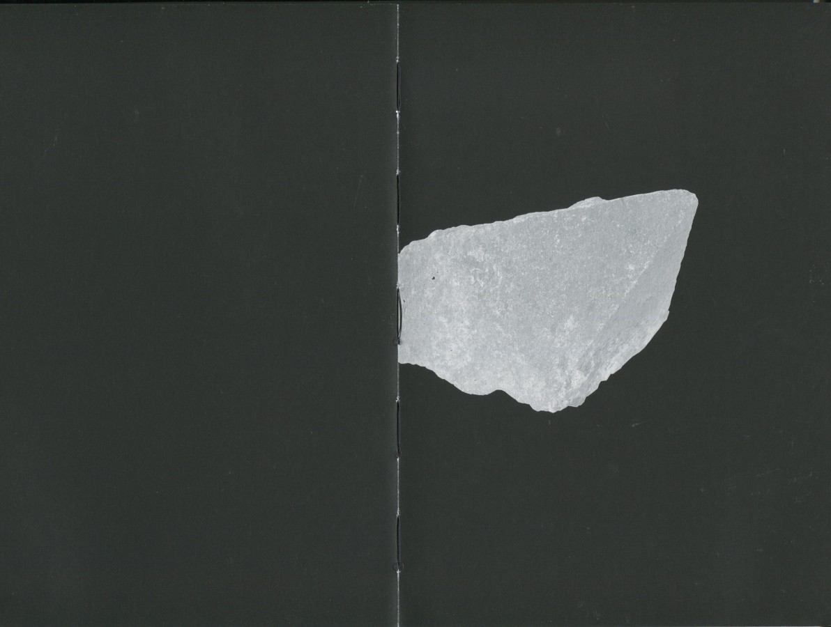
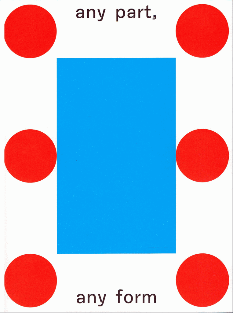
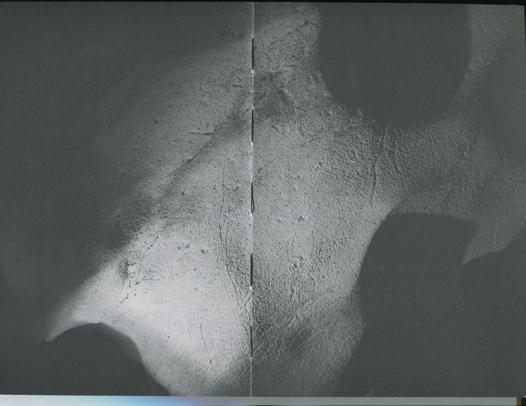
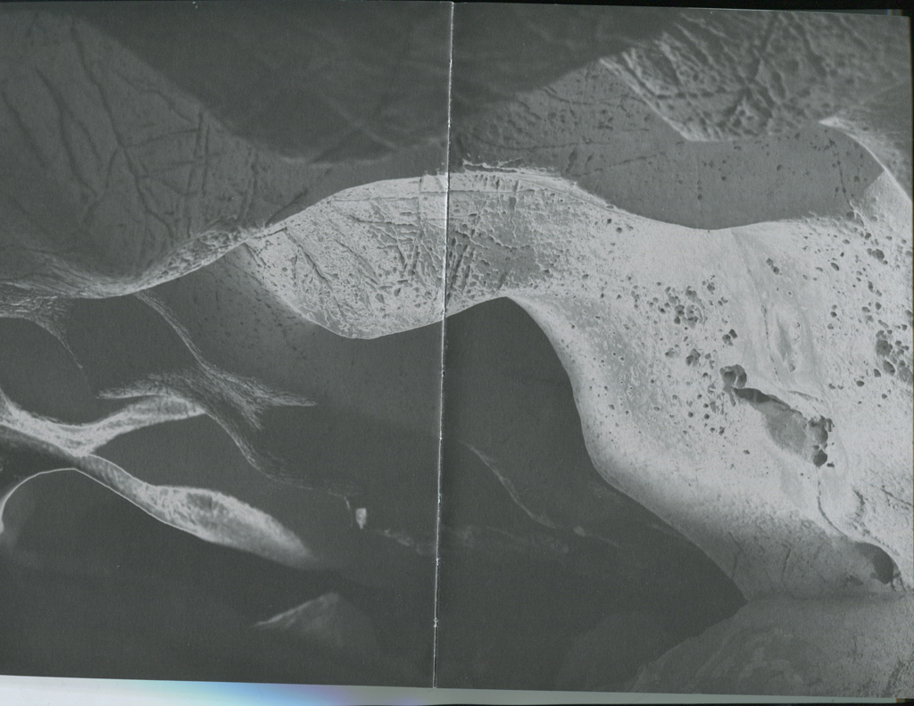
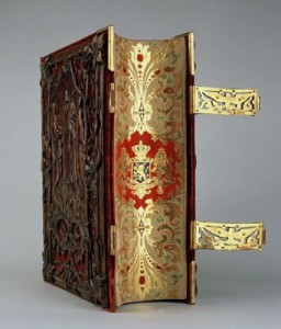
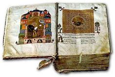
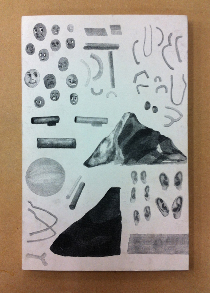
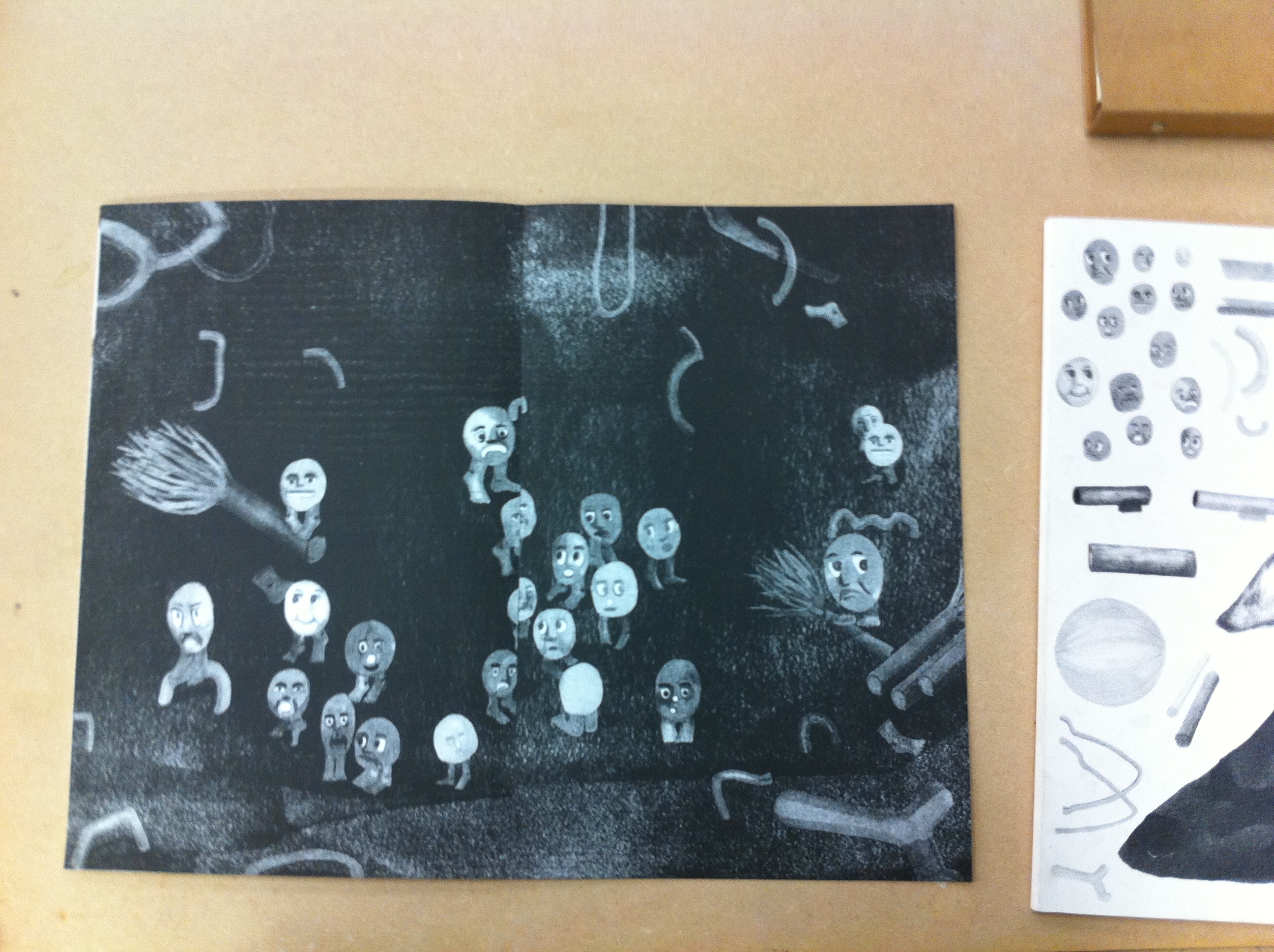
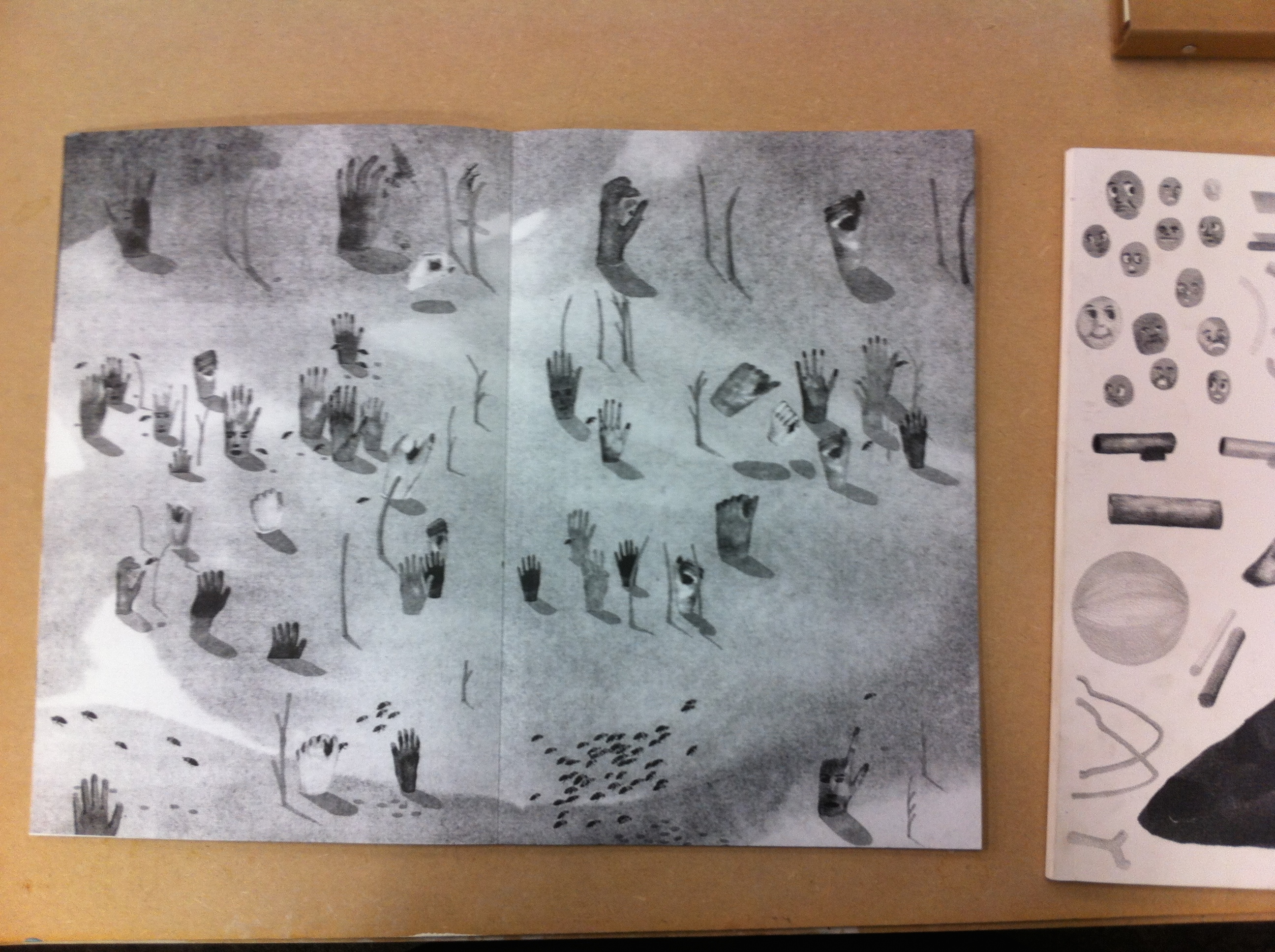
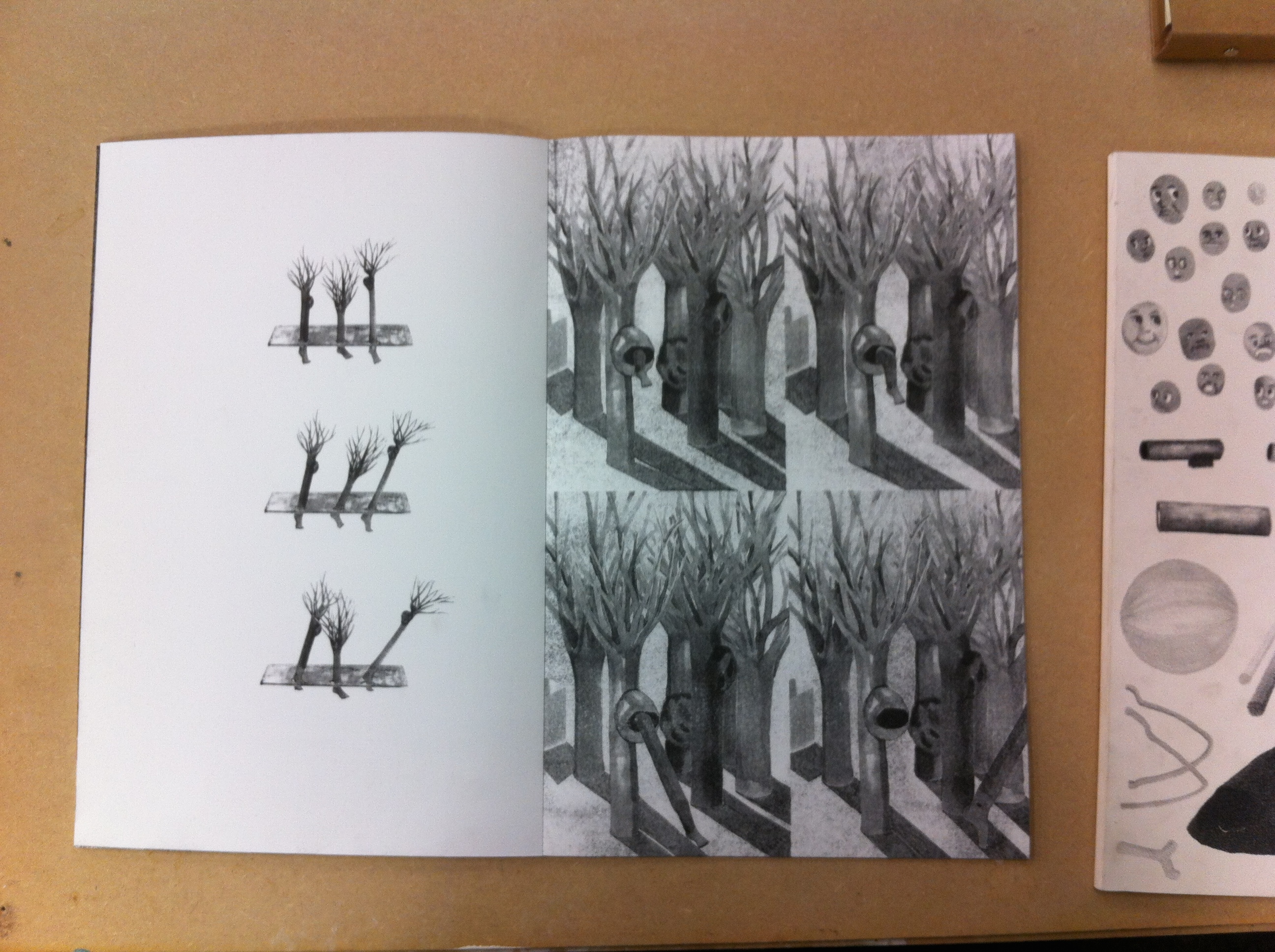
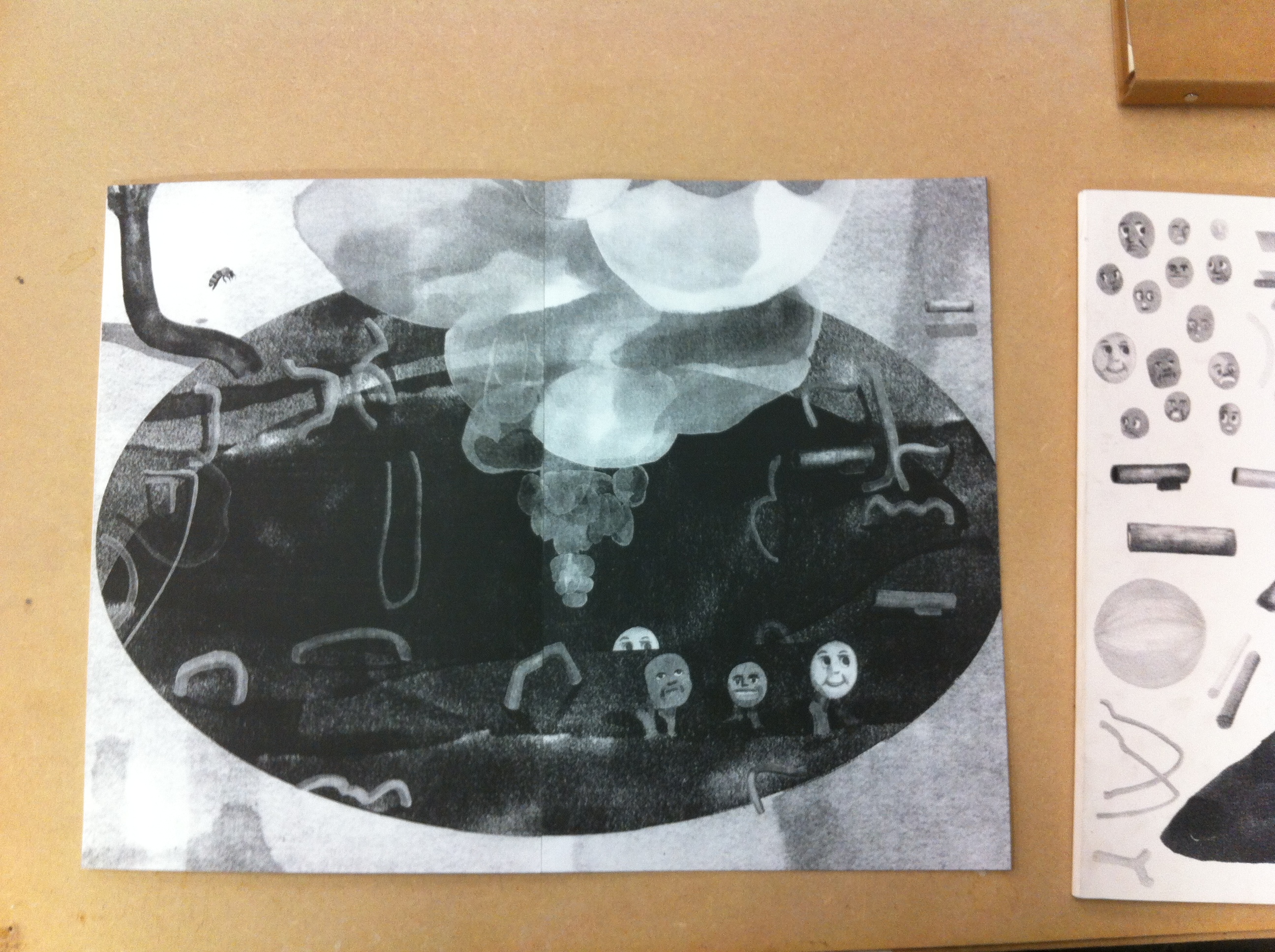
Imagine a big book, not thick; fine, approximately the size of A3. You can’t open it directly. You need to remove its white cardboard sleeve, printed with small drawings. Now touch the pages. They are made of a strong, mat and smooth paper. The binding is glued, and almost invisible. All your attention is directed to the black and white drawings. Moreover, you can see some gap between the pages. I like those imperfections, and its mysterious aspect. No text, no title. Only a story about hands, bees, mountains and animated trees going through 34 pages, full-bleed risograph printed. By the way, should we consider the front and back covers as pages of this book? I have no idea. I should just ask it to the author.
Author or artist?
After a long moment I found a discrete hand-written name in the left bottom of the back cover : Marion Molle. Marion told me she graduated from the VAV department last year 2015.
I should send her an email, after which i will tell you more.


IMG_cover_950


Before sending an email, I need her address. I search on google Marion Molle. the first link is her website, you should go and have a look :

ScreenWebsite_MarionMolle_1200

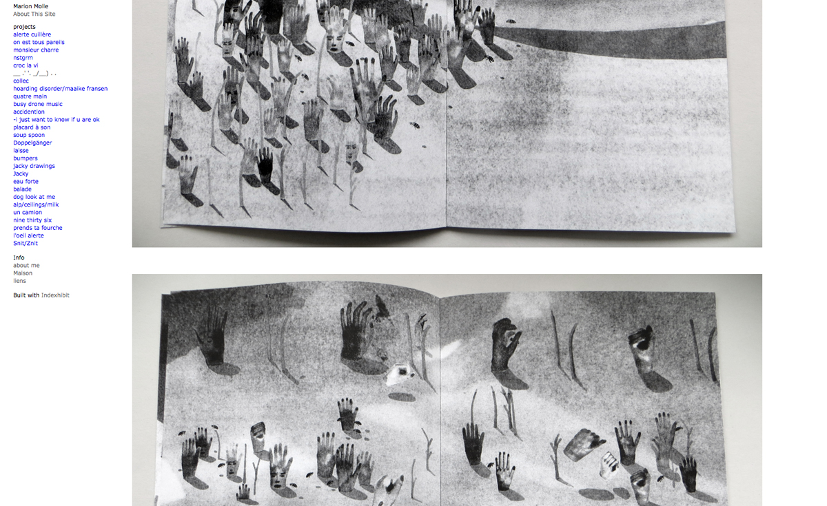
I thought maybe I will find some information about her project. After I scrolling over all her projects, I finally find her book. There is no caption, only photos. I look at the section info, and get her address. Email sent. I asked for further information about her work, with a catchy sentence « tell me more ».
2 days after, she told me a lot more.

Capture d’écran 2015-11-30 à 00.52.34

Her principe is quite unconventional and not that easy, but I will try to explain it to you as accurately as possible. To start with, here is the recipe she used to make this nice book you cannot resist opening when you are at the library.

At the really first beginning, she drew some separate elements with an alcohol-based ink marker on a white background. Then she scanned and associated them to make new compositions. She has some ideas about how they could interact, but she didn’t need to think about it before working on photoshop, which gave her new possibilities. Afterward, she printed the images and draw over again, to add shadows for instance. This way, she compares her small first drawings as ‘puppets’ that she combined to discover unexpected associations. To end up, she scanned them a second and last time, and print the news images with the risograph, which flattens the images and gives the sensation of an unique layer. In this printed technique, you can only work with one color layer at the time, and furthermore, the result is constituted of huge ammont of minuscule dots. That is one of the reason she chose risograph :
she was now able to give a new texture and appearance to her drawings (among other reasons of course, as the price, risograph printing is way more cheaper than laser printing method).

IMG_5217

IMG_5208

This way, her complete work has been guided by the technique of the risograph printing. For instance she wanted to have the biggest book as possible, but the risograph allows to print on a A3 maximum. This fact explain also the binding, as she couldn’t print two pages on a same format.

IMG_5213

IMG_5216

Moreover, she didn’t want to give up with those independent elements. She first thought about making another book. But she made up her mind and used them for the cover of the book. So that when you grab it, you have this collection of images appearing as a foretaste of the unknown story hidden inside, ‘enveloping the book with its ingredients’, (as you can see on the very first picture).

By the way, remember, this mysterious aspect comes from the fact the book doesn’t have a title. Actually, it has a title, but not a textual one.

__ .’ ‘. _/__) . .

This is the title. You may ask why, me too. In fact, she found weird to feel obliged to add some text to a book. Therefore this following of punctuation marks was the solution to her problem. But in case she needs to give it a title, she calls it ‘bee book’.

After that, I asked her some question about the meaning of the story. Her really first intention was to conceive a book for children about bees. The insects would have made absurdist ‘tasks’ in a world organized in a way as our human society but with a complete different logic. She would refer to this human aspect, using human body parts’ shapes (that what may explain the hands and the faces). But finally, she tried to make the narrative interpretation of the story, as free as possible, trying to activate the reader’s imagination. This way, she considers the end of the book likewise the beginning of the story.

After two long messages in which she answered to each of my questions, the discussion seems ended. However I remember that I forgot to ask her one more questions : “are you an author or an artist, or even a designer?” I send her another email, but I have no news. I hope one day I will be able to tell you the answers.


For the moment, go to the library and have a look, it is worth it

Rietveld library catalog no : graduation publication 2015


Elvis lives forever


Thursday, November 12, 2015

part 1.1 bm

Very intuitively I picked up this book. The bright, contrasting colours were screaming for my attention. The colours reminded me of those beautiful 80’s ski jackets.


ski-jacket_3

nice

Next came the tactility. The moment you take it in your hands it feels like a good, quality book. The cover is a tough silkscreened fabric sheet which looks and feels substantial. The silkscreening is neat and professional. However when opening the book you see that the cover isn’t even attached to the rest of the book properly. It’s just folded around the pages. The book also slides around quite a lot within the cover, making it very susceptible for damage around the corners.

On further examination I found that the design of this book is actually full of contradictions. The paper on which text is printed is not the same as the paper on which the images are printed. Very high quality images are placed right next to very low quality images. There are two different fonts used. The text is printed in seven different colours. And Part I and Part II are in the same book, except you have to flip the book around if you want to read them both. All of these little disagreements within the design of this book are what made this publication so exciting for me.

François Girard-Meunier is the designer of the book; Graceland to Graceland. Graduated from the Rietveld Academie just last summer 2015, so he is a fairly new player in the Amsterdam design world. Nonetheless, his design for Mie Frederikke Fischer Christensen’s (a fellow graduate student) book “Graceland to Graceland” is more than noteworthy.

There’s just something childishly interesting about bright colors, which draws one’s eye to this book. The use of these bright and very contrasting colours reminded me of those amateur-built websites from around 2000. Which would tie in very well with the content of the book, elvis being quite a cult-figure with a fairly large amount of fans. The colours emit a certain immaturity, as if someone very unaware of conventional graphic design really wanted to make this book look as ‘beautiful’ as possible. And by doing so, that individual crammed in as much visual stimuli as possible. However, when reading the appendix (written by the designer himself) it became clear that all of these elements are actually a ‘leftover’ of the text editing proces.  “As multiple annotations came and disappeared within the editing proces, we [François Girard-Meunier and Mie Frederikke Fischer Christensen] somehow found [it] meaningful to keep a form that suggested this process.”


text         text         text


Moreover, not only the colours are striking about the text, the fact that François also used two different fonts to distinguish the interviewer from the interviewee is also very interesting. A certain distance is created between the two characters by letting the interviewer ‘speak’ in Arial and the interviewee in Times LT. When taking into account that the Arial typeface has mostly taken the position that the Times typeface had before, one could argue that this symbolizes the younger interviewer versus the older interviewees. In a sense that the interviewer is now more relevant than the Elvis fans. In this publication the focus lies more on  the reasons for these fans to be fans than on Elvis himself.

Furthermore, a plethora of images is showcased. Seemingly randomly stacked on top of each other and in different levels of quality. the pictures seem to be taken from all over the internet. Not only good resolution pictures are used but also quite bad quality stuff, watermarks included. The one thing they have in common though is their relation to, or, representation of; Elvis. This aesthetic is reminiscent of the ones found on fan-made websites, created to lift their idol to a higher level by posting as much images of him as possible. No matter the quality or the context, the only thing that matters is Elvis.
This is also what drew me to this book. These details supposedly try to reenact the feeling of a very DIY website. It takes a good eye to spot these kind of fan-made characteristics and even better eyes to imitate them. Then again, when reading, and hearing François talk about these things, these kind of decisions seem to have a more layered argumentation: “the massive amount of material that, even though not ‘clean’ are great forms of representation that show how diverse and polysemic a character such as Elvis Presley can become after being transformed into a mythology.” 
He turns the tables. Instead of all these image just being an illustration of the interviews, they are actually a representation of what the ‘myth’, Elvis, can mean.


plethora         plethora         plethora


The inside of the book also features two types of paper. One a bit more glossy that the other. The images being printed on the glossier one. This division also suggests a certain budget, as if there wasn’t enough money to make the entire book out of glossy paper. Which again, ties in with the aesthetics of these amateur fan-pages. When listening to François however, this was exactly the point. All individual materials used in order to make the book are of quite high quality, there is just a lack  of coherence (literally and by figure of speech) between the materials.

All of these clashes in the design and in my way of thinking about the book and the original intentions of the designer make me realize that this book is actually so much more than what I had anticipated it to be.


Rietveld library catalog no : graduation publication 2015


A Book where images are Still


Thursday, November 12, 2015


The Nature of Photographs_back The Nature of Photographs_cover
I choose this book because I like how the front cover looks. In the upper left corner, there are small letters saying ‘The Nature of Photographs’, but the main part is the picture: one of the pictures described in the book.

It shows a man’s hand, firmly holding one photo against the horizon. It’s a photo of a white ferry, slowly proceeding on black waves. The man’s sleeve is also white, and you can see rough wrinkles on it.

The sea is covered with wavelets, and light from them is diffused into the sky. The sky is of a lighter tone than the ocean itself, and there is a belt of white on top of everything …as if responding to the dark colors below. It creates a comfortable rhythm of black, gray and white.

One characteristic of this book is that the cover does not just place the picture of a hand among other elements composing it (to have a glimpse of what is inside the book, as most of pages are mainly occupied by photographs). Instead, the designer uses the photo as a base of his design: a black square of “PHAIDON” comes in lower- left corner, in response to the ferry-picture. Title, same as all of the text inside, is written in a ‘typewriter’ font. In this way the text becomes very subtle, like a transparent brook running through all the pages, sometimes long but sometimes as short as 3 lines.

Old Man with apples    Garbage


"Old man with apples", a small, anonymously taken picture is accompanied by a text concentrated in upper-left corner, while huge pictures with a lot of details often have very little text

All of this indicates that the designer tries to show the pictures in balanced way with the text.

1. Importance of font-design

The names of designers of the book are Henrik Kubel and Scott Williams. The two established a London-based design studio A2/SW/HK in the year 2000, two years after meeting each others as post-graduate students at the Royal College of Art, London. A2/SW/HK is now a member of ‘Alliance Graphique Internationale’, AGI, which consists of 440 influential graphic designers.
In 2010, they launched A2-Type, a new type foundry with a selection of 15 fonts specially created for print, screen and environment. It releases and distributes over a decade’s worth of specially crafted typefaces, ranging from serifs and sans serifs to handwritten types, angular types and ornaments.
The two designers have a rule to create a new typeface for each of their new works, whether it is a book-cover, a brand identity or a signage for an exhibition. For example, a thin font that reminds you of cutting-lines of stamps,  because its lines are hardly attached to each other, is called “Danmark”: it was used for a set of stamps designed by the duo.

postmarksDanmark


Another example is “Beckett”, which was made for series of books by Samuel Beckett, an Irish avant-garde novelist, poet, and theatre-director.

Beckett-ref-1   beckett-top_bold


2. How do they work?

A2/SW/HK have a conceptual approach. Their design ranges across various media including print, screen and interiors. (here, on their website, you can see a huge portfolio consisting of almost 50 works.)

From an interview with ‘Eye‘, an international magazine on graphic design, we can get an idea of their way of working on projects.

As eye magazine declares,  their attention for the materials, process and artifacts becomes clear as soon as you enter A2’s studio, located on the third floor of an old textile warehouse in Hoxton, London,. In case of stamp series for the first of James Bond books Casino Royale, it took the designers 2 months to research and retrieve every single edition that was published over last 50 years.

Casino royale


It is interesting to see how the style of illustration changes in accordance to the visual cultiure of the time.


3. Metro

The process of creating a font includes testing various typefaces and weights with one another, applying them across point sizes, and making sure it “looks right”, as Scott Williams mentioned in an interview with Aperture.

A project that shows up on top of their current website is “Moscow Sans” – a font designed exclusively for Moscow Department of Transport, DOT. The duo art-directed and designed the font in collaboration with Margaret Calvert, type and pictogram consultant, and Ilya Ruderman concerning design of Cyrillic script. The system of a custom typeface in 4 different weights, along with unique pictograms, is being applied to all the stations of Moscow Metro within this year. Compared to the gorgeous interiors of Moscow Metro, the signs look very bright and have a lot of difference in style from the station building. However, there is nothing wrong in the most important piece of information standing out from its context, and thinking of a rush in metro, I think A2 solved the complicated metro-system in a clear way. A straightforward, bold font, but at the same time round and warm, is easy to read; the station’s sign is written both in Russian and English, with one number and one color that has been assigned to all the 12 stations of Moscow Metro.


Moscow

Moscow is a capital city, and they say Moscow Metro is world’s 6th longest and the most crowded metro outside Asia. When there are more people and the lines are more complicated, it is essential to see what you really need in a short time: what station is it, which line. Therefore, I think design by Henrik & Scott is very user-friendly, displaying information in a plane, sensible way.


4. New Rail Alphabet

Another typeface which was designed by Henrik Kubel is New Rail Alphabet, which is a revision of the British Rail alphabet, used in UK’s National Health Hospitals, rail stations of Denmark and Britain, and BAA airports. Margaret Calvert, designer of the original alphabet, used to teach Hendrik in his younger days, and therefore, when adjusting it for digitalization, Kubel was able to link the font to handwriting of Margaret Calvert. Two points were altered in the original: one is its height, which used to be taller before, as slim tall fonts were considered to be fashionable when it became first in use in the 60s.

British Rail

5. A thought-through book

The more I read about the two designers, the more I understood that the large part of the body of their work is font-design. Sometimes they only have a name of a certain brand, so they find the best way to communicate with those letters that they have.

Returning to the book, (about which I haven’t talked so much .. its font is indeed designed also specially for this book, but as photographs are playing main role in it, text becomes more airy – different from letters in logos, that have a lot of visual layers.)

I think each photograph is shown, or “exhibited”, in a very thought-through way. Reading through it, I feel like it is a photographic gallery, where not only a picture itself, but the white space around it and size are taken into consideration. It is hard to find pages where pictures are placed in the same way.

Rietveld library catalog no : shor 2

Words used as objects


Wednesday, November 11, 2015

 
The front page of the book is plain white, with nothing but text – that’s not so special, you would think. But the designer of this book, Experimental Jetset, describes their methodology as ‘turning language into objects.’ And so it is possible that a plane white cover with nothing but the title and a few words could catch my eye.

DSC_0145_cover

Experimental Jetset is a small Amsterdam based design studio, founded by and still consisting of 3 designers: Marieke Stolk, Erwin Brinkers and Danny van den Dungen. They all studied at Rietveld academy and formed Experimental Jetset together in 1997, after their graduation.


DSC_0148_1 DSC_0146_2

Not only on the cover of “Wij Bouwen Nieuwe Zinnen” (building new sentences) are words turned into objects – through the whole book, this theme comes back. “Wij Bouwen Nieuwe Zinnen” is an art catalog, presenting an overview of the exhibitions, and their contributing artist, that took place in W139 gallery between 1999 and 2002. Every exhibition that is described (in words and in pictures) starts with a blank page, like the cover of the book, with in the same block wise shaped sentences describing which exhibition it was, when it took place and which artist contributed to the exhibition. The space that doesn’t have to be used for this information, is filled with word-objects saying constantly one thing: We Build New Sentences. In the pages that follow, pictures and texts are showed, a bit like you would expect it to be in a catalog, except the fact that the bottom of the pages is always reserved for the word-objects. Always you can find in the bottom of the page the name of the exhibition that is further described on the page, but the rest of the space in the bottom of every page contains more word-objects, which continue saying through the whole book: We Build New Sentences

DSC_0147

DSC_0149

At designboom.com Experimental Jetset gives a very clear explanation of how they work with words as if it were drawings or ‘objects’. ‘Originally, the word ‘graphic’ is derived from the proto-indo-european base-word ‘grebh’, which simply means ‘to carve’ or ‘to scratch’; but in greek times, the word ‘graphikos’ referred both to the act of drawing and writing. In a sense, we do believe that the current practice of graphic design still refers to this classic notion – the idea that writing is a form of drawing, and drawing is a form of writing.’

The way Experimental Jetset uses words in a certain shape and the repetition of this shape, I had never seen before. Because I am no designer, I am unable to see direct influences in the work of Experimental Jetset, but according to themselves they are influenced by all kinds of things, from punk to what they call ‘the late-modernist landscape’ in which they grew up. This is one of the reasons for their frequent use of the typeface Helvetica. ‘It’s only logical that this late-modernist dialect can be detected all throughout our work. we’re simply not the kind of people who feel it’s necessary to suppress one’s own dialect.’

‘We feel strongly connected to the Dutch graphic design tradition, much more than we feel connected to contemporary Dutch Design. Contemporary Dutch Design is often perceived as very ironic, and overly personal; something we have absolutely no affinity with. At the same time we do realise that our humourless and rather dogmatic way of designing is sometimes interpreted as ironic or even deadpan. We have learned to embrace this awkward friction.’

So though they invented a very original style, they did this in the ‘language’ they grew up with, and they often use nothing more than words and letters itself. I would call their work honest, and I think that is one of the things that I find so interesting and pleasant about their work.

Experimantal Jetset claims to have no affinity with ‘overly personal’ contemporary Dutch Design, but when I started my research on Experimental Jetset, it stroke me how many interesting comments the designers of Experimental Jetset make about themselves – in interviews, but also in the book the designers made about their own work: Statement and Counter-Statement. Notes on Experimental Jetset. These comments show a different image of the group: a very open group, eager to talk about how they work, how they come to certain designs, and even make personal notes on their own work. This is, according to themselves, to reflect on their work. In an interview they mention their way of using these texts: ‘Around 2005, we decided to make our first proper website, we thought it would be interesting to include texts like these. Mainly because we don’t necessarily see our website as a portfolio, attracting possible clients – we see it more as a diary, or a personal archive.’ So in this sense, and maybe that is different from the ‘contemporary Dutch Designers’ they are talking about, they are very open about their way of working and about their work-proces, rather than putting personal issues in the works.

The good thing about the many comments Experimental Jetset makes about their work and their way of working, is that it is easyer to put the work in a perspective. The fact that the designers point out their influences themselves, that they describe their own method, is a parallel to their work itselve – works that are always very open. The designers of Experimental jetset are not these artistic magicians who do magic tricks – they use means that are recognisable for everyone, they explain what they do and why they do it and this brings the honesty and clarity in the design and the concepts of the designers.


Rietveld library catalog no : 705.9

Ray


Wednesday, November 11, 2015

cover of Ray by Susanne Kriemann

What could ‘Ray’ be about I wonder? What kind of ray? Ray who? Stingrays? Electromagnetic radiation?
After holding this book for long enough to determine that it has nothing to do with any of these, the mystery of the content, for that moment, became irrelevant.
The matte, black and grey photograph of what seems to be a large rock amidst a rockier landscape provokes the question further, but this provocation is quickly smoothed out by the incredibly soft texture of the cover in which to run your hands across with pleasure.

Apologies Susanne Kriemann, for I am without doubt that this is an interesting book, but my other senses are currently occupied…

Opening the not-so-glossy, smooth publication that is creating such an aura of intrigue, is all the more satisfying. With black pages and a silver typeface to contrast, I am immediately drawn in by the first few images; a double page, inverted radiograph of two keys – unlocking this mystery at last perhaps – two saturated photographs of landscapes and hand written material.

page_trees

By cleverly playing around with the orientation and size of photographs; some with an opposing black page, others wedged between boundaries of silver, is just one of the ways in which Radim Pesko, designer, creates more invitation to go deeper into this book.

Scan-6-text

The simplicity in using a plain Typeface (F Grotesk Light) can be overlooked, with text positioned only on the far left and right of the page, giving the centerfold its black depth.

This dark and light theme gracefully continues throughout the book, with a few pages of text, followed by changing and developing perspectives of more atmospheric images.

This layout has been well thought out, even down to the threaded binding, this book has a particular attraction about it.

Finding an instant connection with a publication is a rare and enjoyable experience.

Sacrificing myself to the curiosity that had built up, just by holding the book and skimming through the pages a few times, I decided to delve into the contents.

Obscurely at first; broaching a subject that we are so familiar with, and such an integral part of every crevice of our lives,  yet we barely give it any thought. Written in such a way that doesn’t seem to want or need to give too much away, which matches the design impeccably.

When talking about light, to a photographer especially, the layers upon layers of this incredible source we take for granted becomes aparant, and goes deeper than expected.

Rooted in geology, rocks and the landscape; our connection and consciousness with the Earth, are essential in Kriemanns research. The birth of photography and introduction of electrical lighting, the minerals extracted, right down to the mine from whence it came; the corruption that followed blinded by human desire, to the growth into the world we live in now, with the glare of an LED screen ever present and almost impossible to escape.

A somewhat poetic approach, exemplifying more than just the artificial. As humans we are connected to the landscape and geology of the Earth, both physically and psychologically, as much as we continue on the unscrupulous path we tread.

An enticing read, with interesting extracts from contemporary writers and stories of the past, many angles are covered and stones unturned. This goes deeper than a photography publication, but more like an exploration into the process; the why, where and how we have reached the conditions we are in today…

This conceptualization must have also attracted Pesko to work on the design. For him, methods in working number 1: have an interest!

If you are not drawn in by the concept or idea, then you will not produce a successful outcome. With ‘Ray’, he brings forth an approachability to a book that I have not encountered before.

I could have returned ‘Ray’ to the library weeks ago, but I didn’t want to. It felt too nice and I had not finished reading it. But also the photographs, are wonderful, and mysteriously come together and take form as you read on. I want a copy of my own.

So how is he able to hit the mark? Well not only is a peak in Pesko’s interest essential, but also an element of humanitarianism; doing it for the people and the community.

After gaining plenty of knowledge studying at art academies in Prague and London, then completing a post-grad at ‘Werkplaats Typografie’ in Arnhem, he began designing for a magazine.  The history of all typeface-design, and the idea that you could make a part of that history, was an interesting thought for Pesko, and when design became more serious a deepening interest and work on commissions helped to form his own preferences and continue to develop his skills.

Successful working method number 2: be comfortable with your own limitations. That’s when it got more interesting, as his style became more refined and he was easily able to pull together key elements.

Formerly based in Amsterdam and once a teacher at the Rietveld Academie,  he now primarily works in London as an independent graphic designer. Whatever the project, I think Pesko has developed a good approach to his way of working.

Lesson 3: You begin with no material, until you start drawing, then allow your concept to grow. In each typeface created, he is also finding its own story, and history.

Playing with weights, styles, layers and colour, there are “endless combinations and infinitive variations”, which gives him a sense of freedom. A freedom that he also shares… At RP Digital Type Foundry established in 2009.

‘KILL YOUR TIMID NOTION”

is one of the many examples that have been used to preview his fonts. This information is automatically saved to his website. From Amsterdam Weather Forecast, BBC News and New York Times, to tv show The Wire and other websites and sources. Hundreds of these headlines are cataloged and published in the ever updating book ‘Specimen’, along with new and indicative fonts.

”DESIGN FICTION; GOLDEN ORB SPIDER FARM”

His distinctive family of fonts, whether in response to changing conditions in production or individually adjusted according to the space they occupy, are highly recognizable forms with the design remaining in the defined project.

Working method number 4: VISUAL is important.

Emphasized in personal projects such as the book ‘Informal Meetings’. A collection of photographs made during his travels to different places.

‘any part, any form’ is the follow up to this, and also the beginning and the end. No other text is included in this book. Discoveries of interesting encounters between space, architecture and water, each photograph seems to reference the other, forming a narrative and giving the images a natural flow, without the addition of text. A blue rectangle and textured red circles on the cover are all this book needs; relating to the title and content, everything makes so much sense, without giving it all away at first glance.


cover of 'Any Part, Any Form' by Radim Pesko [x]

 
Similarly in the design for Ray; the links form themselves. Ah so that is a Quartz Crystal on front cover… nice.

Teaching number 5: Let me take you on a journey, let me be your guide on this path of realization that you have already begun, you just don’t know it yet.

Okay, entice me a little more why don’t you, that is fine with me.


Scan-12

Scan-11

Rietveld library catalog no : kri-1


Turbulant Times for Tubular Chairs


Monday, October 19, 2015

In the Boijmans Van Beuningen museum Design Derby exhibition there were two chairs that use a different main shape to catch your eyes and bring them to ‘ their side’ of the show. In both cases, the armrests follow this main shape; the rests of the Dutch chair are symmetrically shaped by an oval, while the rests of the Belgium chair are asymmetrical and sturdy angled.


Screen Shot 2015-11-23 at 20.28.27Screen Shot 2015-11-23 at 20.30.00

The Auping fauteuil, 1931 • The Chaise Lounge by Gaston Eysselinck, 1932


Despite this difference, the chairs are rather similar because of the chrome-coted construction parts, the use of wood in the armrests, the shared function, and the same exact period in witch these chairs were made (1930’s). Without any background information you could say that these chairs were made by the same enterprise or you can take it the other way around; these designs could have been competing with each other back in the day. This tension field spiked my interest to take a closer look in the history of both designs. Are they that different?

Examinating these chairs further I found that the same Dutch designer movements influenced the choices that were made in both of the designs. Designs meant for modern progressive consumers. These influences include Dudok [x], J.P.Oud [x], Gerrit Rietveld and De Stijl movement [x].

In the 1930’s Auping decided to broaden their horizon and manufacture a line of tubular living room furniture including the Auping fauteuil. At this time, this branch was not important. The designer of the fauteuil was not even linked to the chair itself. Later investigation concludes that the unknown interior designer Ben Reynsdorp is likely to be the designer of this magnificent chair. (jaarverslag 2014 Bojimans.nl [x])

At the same time, at the end of heroic period of the Avant Garde, the young architect Eysselink succeeded in assimilating these influences in a highly personal way. He went after Rietveld and designed his own home in Gent and manufactured fitting and unique furniture;

House_Eusselinck

“In 1932 he designed all the furniture for this house. It is tubular steel furniture [x], of which the stacking chairs and the large recliner are the most interesting. He hoped to manufacture the furniture at a later date, with the name FRATSTA (Fabriek voor RATioneelse STAalmeubelen – Factory for Rational Steel Furniture), an enterprise which in fact proved unsuccessful. Eysselinck is the only architect in Belgium from the period between the wars to produce a ‘collection’ of tubular furniture.”

The latter brings me by another less fortunate similarity found; both chairs were part of lines that initially were not well received in the market and this brought production to an end in both cases. As said, the enterprise of Eysenck went bankrupt after only two years. His unique “machine à habiter” was not mentioned by the media. Auping on the other hand, focused on the improvement of their bedding and the continuing of their existing production lines in the crisis. They did not continue the production of tubular living room furniture as it was not as popular as their beds.

Nowadays Eysselink is seen as one of the great in Modernism. The Chaise Lounge [x] even got a re-edition in the 70’s; a modern and luxurious implementation.


474199.jpg;jsessionid=9E51294DBFF433EB0AE8992185C93492

The re-edition of the Chaise Lounge by Gaston Eysselinck, 1970's


The Auping chair ultimately got the attention and the designer the credit he deserves. Both chairs flourish at the Holland – Belgium Design Derby Exhibit and defend the honor of their ‘native countries’.

But ‘What differs the Chaise Lounge from the Auping fauteuil?’ you might ask. These chairs can not possibly be from the same designer for one major reason: The Auping fauteuil is not designed by Eysselinck’s ‘Form Follows Function’ regime. The armrests of Auping are used in a more decorative way than Eysselinck would have wanted. This makes that, although these chairs may look very similar, my gut feeling was right and they can be categorized in a whole different way.


Design Holland and Belgium


Wednesday, October 14, 2015

The composition of the ceramic vases Belgian artist Rogier Vandeweghe and vases Dutch artist Jan de Rooden.

subscription

Firstly, I’d love to explain why I’ve chosen ceramic vases for this essay. I imagine how the fingers are buried in soft brown slimy mass when I am thinking about creating a vase. I remember a few stories associated with clay from childhood. I grew up in a village. I loved poking around in the mud, but I had a special passion for the mud formed after rain on the roadway. Vehicles in the village – trucks, and the land under the wheels was pressed carefully because of heavy machine. As a soft mass, it was very pleasant to touch. Mud was becoming really strong as soon as it started to dry. I loved to do the round cakes of this manure. A day after i used to threw them on the floor and watch them breaking into pieces. This is the first thing I imagine when I’m thinking about ceramics. It seems to me very important to understand people, what events have affected them, how their personalities formed. An artwork produced by the artist containes all the information about his life, sensibility, condition. That’s why I’d love to highlight some events in the biography of Rogier Vanderwede and Jan de Rooden.

Born in 1923, he was the youngest son in the family. They moved a few years later to Beernem. From 17 to 23 years old, he studied at the Art Academy in Ghenthe. In the year of 1974 he was followed by a short internship at Joost Maréchal. In 1948 Rogier formed a business with his elder brother on the basis of fathers larger company. Their studio was named ‘Perignem (Latin for “through the fire”). In 1954 he married in the Church of St.Anne in Bruges on Maryanna Pyck (the collection vase that i chose called: Rogier Vandeweghe en Maryanna Pyck). Maryanna worked since 1952 as a ceramics painter at Perignem. As soon as regular production was established, Rogier decided to change direction towards a more modern product. The cautious, rather conservative attitude of Laurent and especially of Cecile Roets, which is in complete contrast with the radical and total renewal sought by Rogier, are the direct cause of the rupture between the two brothers in the summer of 1956. In 1957, Rogier Vandeweghe didn’t pay much attention to make his first ceramic production. In some cases, his wife Myranna Pyck painted the initials “RVDW”, eventually adding “Sint Andries”, with cold enamel after the firing. Soon however, Rogier adds this mark with glaze. In 1960, the workshop is named “AMPHORA».

Jan de Rooden Born in Nijmegen in 1931. When he was 5 years old his mother died. From 6 to 14 years old, he was admitted to Elementary School of the Heilig Landstichting. The landscape around us formed a beautiful country to grow up in. “In November 1944 I left home for the Passionist monastery in Mook September 1952 I became novice in the Passionist monastery in Pey, but after nine months I left the novitiate forever. Ultimately I could not reconcile myself with life in a monastery. I found that life too cut off, too safe and too well-provided for. ” As autodidact he started working in the studio of ceramist Lucie Q. Bakker in Amsterdam in 1956, and in 1958 started his own studio with Johnny Rolf with whom he later married.

Rogier was studying in artistic school and Jan at theological collage. But the story of the two artists is like when they meet their women and begin to follow their way.

I feel a similar sense when i am looking at the vase, I find something natural in that. Vases Jan de Rooden remind me about the forest, the surface of the vase is like a bark of a tree overgrown with moss and seabed, shells overgrown with silt. Vases Rogier Vandeweghe remind me of the mycelium, or forest spirits, or rocks. I like that he used black clay, I’ve got a association with caves and coal mining. From vases is completely different. Jan de Rooden used a simple sealed form. It gives a sense of confidence and stability, which in combination with glazing, creates the effect of natural stone. Rogier Vandeweghe several vases connects one composition and shape of these vases is like a bottle, but shorter, with a thin neck and a narrowing nizu.eta composition looks like a beehive. The Rogier Vandeweghe vase can be used rather only as an object, and the Jan vase may well accommodate some flowers.

In conclusion I would say that the facilities are beautiful.

Marshall Moderism


Wednesday, October 14, 2015

IMG_0377_2

The Design Derby exhibition at Boijmans Museum in Rotterdam compares what was happening in design in the Netherlands and Belgium from 1815 to present day. Pieces were picked as representative of the era of design in both countries, which allowed you to make comparisons of the objects for design and aesthetic value, but also by being displayed chronologically, you are able to see where on the timeline they place and thus allowed you to to understand the context in which they were designed and the preceding works/ inspiration. I picked two pieces from the 1950’s produced during the post war reconstruction period; a fascinating time for the reestablishment of design as a social, economical and cultural actuality.

I chose two pieces with very similar aesthetic qualities and obvious connections visually/materially, produced a year apart they are from exactly the same period so can be perceived from a single point in European history despite different national situations.
The first piece is a bookshelf designed by D.Dekker for Tomado – Dordrecht in 1958, The shelves are a genius design, with simple brackets on either side and tin trays which can be slotted in at any level, there’s a variety of combinations/arrangements of the unit so they adapt easily to any room.

Tomado Bookcase

The second is desk and chair by Jacques Seeuwes, designed for the architecture department of the University of Ghent in 1959. The only colour used is a bright blue Formica on the table, which compliments the soft dark tones of the oak seat and foot rest.  Its a vivid primary colour which is fitting with the modernity that was being practiced in the design at the time, when the chair is tucked under the table, there is brilliant flow of the basic forms, and the subtleties in angles of the chair suggest a certain spring to it by highlighting the ergonomics which contrast to the stubborn rigidity of the black tubular frame, they both exhibit a neo-plastic approach to design. This is collection of research i made in order to further understand the situation of each country after the war and how design fit into their society at the time. What were the inspirations/ defining influences in the Netherlands and Belgium which concluded in two very similar pieces of furniture.

Jacques Seeuwes Desk


De Stijl introduced an important merging of art an design by promoting an Utopian philosophical approach to aesthetics. The goal was to catch timeless beauty in spare precision, De Stijl movement was a reaction against the excessive decoration of the Art nouveau that preceded. It was an attempt at a universal language in design and aesthetic, that applied rules which erased all subjectivity to the artist because the individual was loosing its significance, ideals of the period shift from visually heavy to visually light and ‘de Stijl could be seen as social redemption.

During the post war reconstruction period, Tomado thrived because its products represented the incoming modern Dutch household; cheap, affordable, functional furniture. The core of Tomado string furniture was formed by pragmatism, before the war there was a demand of bits and bobs and comfort in clutter, but in the aftermath, there was a desire for a fresh functional way of living to maximize efficient recovery and thus wanted to be surrounded by practical and rational possessions. Tomado’s minimalist airy structures symbolized the modern age, and these bookshelves in particular were commonly present in households around the country, just like IKEA is nowadays.

tomado bij charlie ikea


The Dutch government returned to the Netherlands from its exile in London in 1945. The government, while in London, had created plans which would speed up the country’s challenging industrial and economic reconstruction, there was no conflict between industry and the arts, because the Netherlands has a trading history and sourced its cultural input from its colonies in Asia. This meant that recognizing the need for mass production to furnish homes wasn’t politically opposed and the dutch produced functional furniture for the masses with talented designers appointed to every sector, Marshall Aid investment into the Netherlands accelerated industrialization and by 1950, 38% of the population was working in manufacturing or some form of industry.

In Belgium, there is a rich history of the arts and crafts from their own country because they had no interest in their colonies in Africa. This meant that high level professional craftsmen worked hard to produce and design quality products, and then after the war they were fighting against the industrial takeover. However there were a lot of poor factory workers and thus mass production was a cheap necessity, people weren’t as encouraged by the government to pursue design careers whereas in the Netherlands every state company had a designer.

Marshall Aid played a large role in the modernization of Europe, with the investment to rebuild its financial economical and industrial systems, and along with the money came the intention to inject a new ‘spirit of productivity’.

e4436177fef81c8674471797ff6828ba f_10547351_1

In Belgium they funded the Belgium Office for Increasing Productivity (BDOP), which supported The Design Centre. Design in Belgium was struggling to find its place in society, The Design Centre aimed to broaden the understanding of design as a social, economical and cultural phenomenon, however, the BDOP demanded a definition of design which was appropriate to the contribution towards the economic efficiency, it was struggling to leave behind the origins of design promotion, dominated by national export interest and be recognized for its social and cultural value by the Belgian government, this was frustrating because of course they believed that design is the most visible and pervasive cultural manifestation of a country at any time.

Industrial design was redefined in Belgium  in the 1950’s, and planted foundations in 1954 under the reign of the first social-liberal government.
Industrial design is a creative activity whose aim is to determine the formal qualities of objects produced by industry. These formal qualities are not only the external features but are principally those structural and functional relationships which convert a system to a coherent unity both from the point of view of the producer and the user. Industrial design extends to embrace all the aspects of human environment which are conditioned by industrial production.

With this definition you can understand how the values of De Stijl integrated easily with this new wave of industrialization. Design was being viewed as a practical notion where productivity and efficiency is key, with such a mechanical demographic, it makes sense that the prevailing approach to design in Belgium was that of De Stijl – the international modern style, and easy to replicate in industry.

After WW2 De Stijl became known as the International Modern Style. However without Theo van Doesburg to lead the way and enforce the ideals and definitions of the movement, the strict pre-war rules were broken. The post-war reconstruction forcing society to depict a new way through complete disarray towards the future, efficiency was key and maintenance of artistic values weren’t withheld so preciously. Broader structural design properties of industrial materials could be worked with more easily in mass production too and the extreme ideals of De Stijl were not practical anymore.

To conclude, the unifying desperation of each country to rebuild after the upheaval of the war and the catastrophic state in which the Nazi’s left, meant the productivity objectives that accompanied the Marshall aid from U.S, persisted to define the countries’ reform and thus profitability and potency heavily determined design of the post war era.


BIG CHUNK, little purpose


Saturday, October 10, 2015

When I first heard about the task of choosing a pair of compared design objects in the Boymans van Beuningen exhibition “Design Derby” –where Dutch design is being compared to Belgium design– I thought it was going to be a long and painful process since I have never been interested in design. Especially not in furniture design which I know nothing about. It was a relief when I found out that the exhibition was well organized and the objects presented were described in an understandable manner. At first I had to take several strolls through the exhibition before I realized what my choice should be, and it was no other then the Grandfather clocks. Seeing them made the choice so easy that I even didn’t think about how hard it would be to compare them. That turned out to be difficult, since only later I realized I know nothing about the styles of design and even the point of owning one is completely unclear to me.

002_rb-image-1778000

So these are the clocks that I ended up choosing, The one on the left is Designed by a Belgium artists Georges Hobe and architect Antoine Pompe in 1902 while the other clock at the right is designed by a Dutch designer Christiaan Wegerif also in 1902. You can see that both of the clocks are made at the same time, yet they are completely different. The Dutch designed clock is much more masculine and solid, also it has more detail and decor in general. The Belgium clock meanwhile is famine and is more about the function, It hasn’t been overly decorated and is just as complicated as it needs to be in order to serve its function. To have a general idea of what similar types of clocks look like and how they are the same or different you can visit this link that sells german grandfather clocks or this that sells grandfather clocks in general and has some background info as well.

So after the exhibition I thought to my self what the reason was of making this, (now seemingly) foolish choice that seemed so easy and clear at the moment I made it. Suddenly it clicked to me; my grandmother, she used to have several Grandfather clocks, and only now I started understanding how sad it is that I never paid attention to them. I never had the chance of asking her why does still keep them. My grand mother was very old and as I noticed, the clocks just became closer to her with time, after she got moved to an old people home, she took only few belongings with her, few pictures, bottle of cognac and one of the grandfather clocks. I guess there it served as a reminder of past and the overall importance of time.

So due to the lack of information on the specific Grandfathers clock’s of my choice I decided to do a general research and the first thing that was unclear to me was the origin of the name “Grandfather clock” why not Grandmother clock or just Tall clock? Once again it all comes down to pop music, its named after a song “My Grandfather’s Clock” performed by an American songwriter named Henry Work [x], who wrote a song about a clock which stopped working the same minute of the day when the last surviving owner died and happened to be a grandfather, you might think that this is a made up myth but let me surprise you that the chances of this actually happening are pretty high since the less expensive clocks at that time needed to be wound every day or they just stopped working. The Grandfather clock is usually 1.8 – 2.4 meters tall and is a weight driven pendulum mechanism that is located in the tower or the waist of the body, this kind of clock was first developed in 1670 by an English clockwork William Clement.

Longcase_clock antique grandfather clock Friese staande klok

Until early 20th century these were the most accurate time keeping technologies so they were often kept by huge businesses and rich households. Now they only serve as decorative objects since it needs a lot more maintenance then a everyday wrist watch and most people now don’t have the TIME for that. Since I have a very limited interest and knowledge of history I decided to take a look at some modern day grandfather clocks, and I was rather sad to find out that with few exceptions they are not made by hand anymore and they have all become electronic. So I found very few companies that still make handcrafted clocks but only this Kauffman’s company offers to make a clock costum made just for you and how ever you want it so it has a much higher value and can relate to a specific family which in this case I think is very important. Though I must admit that the clocks made by hand then and now are not pleasing to my taste, and I find the modern ones more aesthetic and visually appealing for example this black and simple clock.

BLACK_CLOCK_1

At the same time by loosing the need of a huge item that serves only the purpose of showing time they now serve new purposes that previously just couldn’t fit in the same casing with a pendulum mechanism. They can have built in drawers or be used as book shelves a and probably many other new purposes could be thought of. Here you can see the same clock as previously but opened and instead of the pendulums you have a set of drawers, that could be used perhaps for your dirty underwear that you wish to hide from the public eye.

BLACK_CLOCK_OPEN

Another great function but a rather ugly outcome.

CLOCK_BOOK

I think the shape of clocks should not be forgotten, they just need to be redesigned to serve more purposes then showing time or they can just as well turn in to art pieces since they have such a strong image and meaning as a thing on it’s own, for example artist Maarten Baas has done few works that relate to grandfather clock directly or to time in genera. Most related to this subject would be his work “Real time” where instead of the usual clock face there is an LCD screen within the clock that shows a human inside the clock drawing the time on the clock face. Read about three contemporary artists that explore the general concept of time.

I personally don’t like clocks at all since they just keep reminding me of the amounts of time I have wasted on useless activities. So I would need a grandfather clock that goes backward and is constantly fooling me or doesn’t show time at all. Something like this…

CLOCK_FOR_ME


The 2 Visions


Tuesday, October 6, 2015

The Design Derby exhibition in Rotterdam is a friendly (or not) competition between Dutch and Belgian designs. It is presented as a playful and colorful route where, in chronological order, designed items are paired up for the viewer to compare the contrast between them. Some of them are not iconic (one of the works exhibited is even a student work from 2014) but I chose a rather famous pair (or pairs). I chose to write about the famous (or infamous) hoof-Tabi shoes by Belgian designer Martin Margiela and the Iron Lady shoes by Dutch designer and shoemaker Jan Jansen.

subscription

I have chosen these pairs of shoes because they stood out to me as interesting takes on what is beautiful, what to wear. They both have unusual and innovative designs with a strong vision. They have visual, emotional and conceptual impact, but they are also quite different.

Martin Margiela (born 1957 in Genk, Belgium) studied in the Royal Academy of Fine Arts in Antwerp and graduated in 1979. He is known for his avant-garde designs that break rules of aesthetics and are often with extreme proportions and deconstructed appearances. He has worked for luxury fashion houses such as Jean Paul Gaultier and Hermes before opening his own brand.

Margiela is continuing the work of Japanese avangardists such as Rei Kawakubo (Comme Des Garcons) which was started in 1980. This movement rebels against  the luxury fashion world with it’s unusual designs who challenge viewers to reconsider their ideas on clothing and beauty among others. Margiela often makes use of the post modern architectural concept of deconstruction. Deconstruction is characterized by fragmentation and distorted sharp shapes. It displays interest in manipulating the surface of the structure. Visually, these structures are characterized by unpredictability and a sense of “controlled chaos”.

subscription

He has maintained a low personal profile and was rarely photographed, staying behind the scenes of his fashion shows. Perhaps due to the hectic nature of the fashion industry, he has resigned in 2009.

His creation from 1989, the Tabi shoes, were inspired by the Japanese shoes of the same name that have a characteristic appearance similar to cattle feet. They are almost anti-aesthetic and opposite to traditional femininity. Although they are sometimes heeled, they can be quite repulsive at first glance. The first thought of visually pleasing high heels are not of ones that are completely closed off, with bulging seams and a shape similar to a camel’s hoof. The silhouette has become a classic for the Margiela brand and it has been reconstructed and revamped many times. The designs are often gritty and minimalistic, the most radical example is perhaps the version of the Tabis that is sold only as a sole and includes clear masking tape to connect it to the foot. The design is aligned with Margiela’s asexual and deconstructed esthetic.


Martin Magiela • Tabis Shoe

Jan Jansen is a Dutch shoe designer and maker, born 1941 in Nijmegen. He has been fascinated with shoe making from a young age, as his father was manager of the children’s shoe factory Nimco. He interned in a shoe factory in Brabant and took evening drawing lessons in the art academy of Eindhoven. Jansen studied shoe making further in Waalwijk and Rome. He has several shops in the Netherlands, including one on Rokin street in Amsterdam. His designs are extravagant and colorful, but maintain a certain classic appeal. Jansen says he’s not concerned with trends and market forces, and he mostly makes what he thinks himself beautiful.

subscription

Unlike Margiela’s Tabis, The Iron Lady shoes are extravagant. They are propelled by an exaggerated heel made of bent metal at the back and a pedestal-like piece of metal in front that seems to leave the wearer in mid-air. Two intertwined prominent straps connect it to the foot in a compelling illustrative way. The classic femme fatale red is on display, with a suggestive upside down heart shape in the front. Perhaps Jansen inspiration, his wife, and his love of timeless classic design which focuses on beauty contribute to his design aesthetic which is often colourful and full of lyrical and aesthetically pleasing organic shapes. They have an abundance of detail that keeps the viewer looking. While Margiela’s shoes and general design esthetic is a commentary on the high fashion luxury world that he perhaps reluctantly belongs to, Jansen’s design are not interested in trends. Not many people would wear them, but they are purely esthetic.

I don’t know what these two particular designers say about their respective nationalities, and do they fit the bill of Dutch and Belgian design. I’m not sure people’s esthetic and artistic integrity can be narrowed down in that way, especially in our time when each artist wishes to express him or herself and create something completely new. But it is definitely interesting to look at these two completely different takes on wearable art.

Designing A Country


Monday, October 5, 2015


Why is it interesting to examine the differences between Dutch and Belgian design? The exhibition that was supposed to make me understand what was interesting about comparing the two countries design-wise, made me even more confused. As I strolled down the beautifully curated paths of the Design Derby, I saw Dutch and Belgian design objects cleverly placed next to each other to make the viewer see the clear differences between these two very closely related countries. The problem was that every time I had concluded something drastic about one of the two being more art nouveau, constructivistic or a clear example of de Stijl movement than the other, I would see two new objects and be surprised that my conclusions were far fetched.

What I should have done instead of just casually taking a glimpse at the beautiful objects, was reading what was written on the walls next to them. This I found out by googling the relationship between Belgium and Holland, and figuring out that they have a closely related history, but developing different socio-economic statuses during the 20th century.

Hereby I found the answer to why this exhibition is interesting and relevant, not only to people familiar with the history of the two countries, but in general for people who want to understand how a design object can express a whole time period or the mindset of a country just in the way it’s shaped.

Here, for example, the two logo’s of respectively the Dutch railway system, and The Belgian Metro. Similar in their form, you think by first eye sight, but if you look closer you see significant differences.

NS-Logo_200logo-metro-brussels_200

Dutch >•< Belgium

The Dutch logo was made in the 1960's, a golden age for corporate design in Europe, with Holland and Switzerland as two of the main providers. This logo was made by the still existing Graphic Design company, Studio Dumbar, who created a whole Identity for the Dutch railways; way finding signs, tickets, the look of the outside of the trains etc. The logo is a symbol, no letters are needed, because this symbol is supposed to be strong enough to remind every Dutch person that 'here you can take the train', and maybe it even contains more than just that simple fact. The railway system of Holland is a public institution, it's a representative of the Dutch culture, signaling to both the people of the country itself and the outside. Maybe this is why the same company was chosen to design the identity of various other public institutions: to give the whole country a graphic identity. This shows a very visually conscious country, knowing the importance of a graphic identity.

Here an example from neighboring country, Germany  and Swiss, with  their big company's representing the country, the airline Lufthansa and Swiss-Rail. Other examples showing the strong, straight lined, European corporate design of the 1960's.

lufthansa-book-cover Swiss-Railways

Logo design by Otl Aicher 1963 and Joseph Müller-Brockmann 1982

The Belgian logo is a bit different in it's look. Less sharp, less serious with a lighter blue colour and a rounded and assymetrical shape. What is the most significant difference when you look up the history of this logo, is that it was made, not by a big company that knows about Graphic Design, but by a small and vagely well known Sculpturer, who never, before nor after, had anything to do with Graphic Design in a traditional sense.

Also interesting is, that if you google Brussels Metro Graphic Design, the images that turn up are far less clear than what turns up when you do the same to the Dutch Railways. This being said, it is also important to have in mind that the Belgian logo was designed in the 1980's, a slightly different style period in the history op graphic design. Less clear, more post modern, pointing in different directions. This shows in the logo being both sharp and soft, geometrical and asymmetrical, as if  it was shaped in the hands of a, yes, sculptor.
 
Skærmbillede 2015-10-05 kl. 23.06.18 Skærmbillede 2015-10-05 kl. 23.06.34

Google Search images for Dutch Railways and Brussels Metro


What is the difference between a waiter and a piano player?


Monday, October 5, 2015

The world opened a new window in 1844, when the public entered “French Industrial Exposition” in Paris. Quickly afterwards, various large public exhibitions were held in different parts of Europe. In 1851, the first-considered International Exposition was held in London called “Great Exhibition of the Works of Industry of All Nations”. A new platform was born, where art, science and technology from different countries were brought together.

In the process of the development of the platform, the pavilions became a tool to improve the image of each country from 1988. A study called “Expo 2000 Hanover in Numbers” by Tjaco Walvis showed that 73% of the countries at Expo 2000 were primarily interested in improving their national image. The world fairs had evolved into big vehicles for national branding.

 “In the desert of life the wise person travels by caravan, while the fool prefers to travel alone”, (African proverb)

As the importance of the pavilions’ look grew, the budget grew with it.

world's fair

At Expo 2000 Hanover, the average investment pr. pavilion was €12 million: A budget that made governments doubt their participation since the benefits were often assumed to outweigh the costs.

In a world today, where branding is a key asset: Is it possible for the artwork to stay as strong and sensuous to the audience? Does the creation of a salable layer (that has to be considered and assessed) leave the message behind? When a world fair tries to destroy the line between exhibition and exposition, is it possible to make both’ part equal?
Creating a community inside of the world fairs figurative walls is interesting. But at the same time, I’m constantly aware of the galleries’ need to sell. Does art lose its artistic value if it has to be salable? And does the price affect the experience of art?

CHART ART FAIR had its debut in Copenhagen 3 years ago. A Danish offer of how a world fair could look like. The CHART director Simon Friese wants to establish an international art platform for the Nordic region: “The ambition to do CHART in the first place was actually to make a platform that had the curatorial level to be able to attract an international audience coming here (…)”

CHART ART FAIR

But in the crowd, I feel like the gallery presentations convey get lost. The event has been located the same place all three years: Kunsthal Charlottenborg. In the 17th century surroundings, the location won’t disappoint you, but in the big spaces I feel an enormous distance between the art pieces and me as a viewer.
Before you are invited indoor, you can see advertising on display in different shops around town. Large video installations were put in shops as a warm-up before the fair this August. But every shop they have chosen had a specific status and price range. The locations were obviously chosen to attract an audience with a high income: because the buying of a ticket is only a small part of the money that’s exchanged inside the fair’s walls. If you’re interested in ownership, you can take the matter up with the gallery owner you can find next to every stand. Gallery owners you also can meet in the lounge section solely for specific members of the art world. (Some transported in limousines).
But why do I care? Do I want to play a role in the social club of the arts? Even though CHART is a new-born, the number of viewers has increased with 50% the past two year. Apparently, there are a lot of people, on national and international ground, who are interested in a Nordic art platform. Simon Friese and Denmark’s most famous gallery owners are those men who rule the roost, since they decide the selection of the approx. 28 galleries which are participating.

World’s Fairs are great scenarios to enlighten upcoming art and new ideas. The first telephone by Alexander Graham Bell was shown at Centennial Exposition in 1876. And the infrared touch panels were finally presented to the public at the 1982 World’s Fair in Knoxville, Tennessee, after 40 years of research. A lot of people, including myself, imagine the World’s Fairs to be like in the 1950’s, but the medium has changed.

Bell's  telephoneFirst touchpad 1982

In the old days, the rich would cross the sea to see the wonders firsthand, but the internet put an end to that. “I don’t know today how a World’s Fair can be viable, because everybody has a camera in their pocket,” says Louise Weinberg, World’s Fair Archive Manager at the Queens Museum. With everybody having art from each corner of the world in their pocket, you don’t need to go to foreign countries. With the internet, the outcome of World’s Fairs has been a massive slump.
Is CHART trying to transform art into a trade again? At Kunsthal Charlottenborg, the artwork or art “actions” seem like entertainment you can quickly pass without being further included. Is that the intention of the yearly event? And then I cannot not think about; are artists meant to serve the rich?

pearl and sophia bible


Monday, October 5, 2015

This article aims to compare two bibles, Sophia bible from Holland and  The Mother of Pearl bible from Belgium, both found at the Design Derby Exhibition at the Boijmans van Beuningen museum in Rotterdam.

b8eef0808b9ba6c571c9db492c59d6f9-256x300

The ‘Sophia bible’ was made by Dutch publishers ‘Uitgeverij van Goor’, a family run business who specialized in Children’s literature.                                           It was made for Queen Sophia and the Dutch King Willem III in 1855.  It was called the Sophia bible, after King Willem’s wife Sophia of Württemberg. It was for public sale, but two very ornamental copies were reserved for the Royalty.

2d22868db9545eb3f67b7743278292b7

The bible is bound with calf’s skin and velvet,  decorated with wooden graphics and golden clasps. Sophia bible is illustrated, suggesting that it’s function was more ornamental than informative.

(Taking it’s style from Art Nouveau, )

The 19th century was a time of civil unrest in the Netherlands, as there was much conflict between the Protestant and Catholic churches. In 1853, King Willem gave permission for the Roman Catholic bishop hood to be restored. Although the Royalty remained favorable to the Protestant Church, this elaborately decorated bible could have been an attempt for the King to neutralize the differences between the two sides, as it’s ornamental design refers far more to Roman Catholicism, than to the more humble, Protestant style.

173d5793d5c188ad286e461e737ffc09

The Mother of Pearl bible, published by the Belgian publishers ‘Brepols‘ in 1882 is a small, silver bible made from Mother of Pearl, gold leaf and copper. It’s Art Deco Style owes to the geometrical triangles, it has a small clasp and is made to be kept close at hand. This may be because the popularity of Christianity was declining in the late 19th century, meaning people wanted to protect and prove their faith. A pocket sized bible would mean people could read from it on the streets, either preaching from it, or using it to prove a Christian identity. In 1882, Belgium was Roman Catholic, so the pearl bible was too. The Belgian publisher ‘Brepols’ was a family run business, who coincidentally also specialized in children’s literature.

The two bibles are vastly different, firstly and most notably, in size, sophia bible is very big compare to the pearl bible .They came from two different ideas of how to practice Christianity. The Sophia bible is purely ornamental, the desire to look inside is great, but the idea of using it as book for Christian practice seems less so. The Belgian Pearl bible is used for reading every day and following faith. It’s hard exterior prevents it from damage, so it is designed to be portable.

Secondly, the design styles. The Belgian bible follows Art Deco, somewhat unlike the rest of Belgian design in the 19th century. It’s symmetrical triangles, it’s ornamental pearl cover and the small copper clasp  make the bible elaborately shiny, but also visually very simple. The Dutch Sophia bible was made in the Style of Art Nouveau. It’s design follows Neo-Classicism and Baroque revival design which was popular in Holland in the 1800’s. It’s ornate wooden floral patterns, it’s huge golden clasp and it’s royal red binding make the bible decorative, fitting well with the rest of Dutch design from that period.

Lastly, there is a difference in the Status of the bibles. The Sophia bible was made for Royalty, already this calls for intricate and decorative design. Before the second half of the twentieth century, there seemed to be an unspoken rule that design for Royalty must be elaborate and ornate and just because of this, it creates a huge bias in the design of this bible. The pearl bible is vastly different as it was made for upper middle class Roman Catholics. It was designed far more simply, you would not recognize it as a bible unless you looked inside, whereas the Sophia bible gives it away with the ornate effigy of Christ on its cover.


In conclusion, these bibles are vastly different. Although both using expensive, decorative materials, one is over-designed looking at it from a 21st century eye, whereas the other is far more simplistic. The pearl bible’s Art Deco design is more modern than the Sophia bible, which screams Art Nouveau. They were used for different purposes, I imagine the pearl bible more actively so than the Sophia bible, owing to it’s sheer size and weight. The Sophia bible is probably more fragile than the pearl one, as it has many thin, decorative wooden features which may not survive a fall from table height. The bibles are 30 years apart which was enough time for design styles to change quickly, especially in the second half of the 19th century.

Written Colaboratively with Freja Björnberg

PEOPLE NEXT DOOR


Monday, October 5, 2015

The design derby took place in the Boijmans museum. It is about the confrontation of Belgian and Dutch design objects from 1815 till today. The collection covered all kinds of design; from glass and ceramics, prints, furniture, fashion, even up to cars. The exhibition was ordered chronologically and all the items from each country were presented next to each other into two big lines.

Does this make sense and do you really find out more about Dutch and Belgian design by looking at it like that? This is an attempt to find out as much as possible through two chosen objects from the exhibition.


table carion OLYMPUS DIGITAL CAMERA

Francois Carion table [x] and lamp [x]

Firstly, a small round table by the Belgian designer François Carion. He built this table between 1925 and 1930, the materials he used for it are iron and pink glass. The wrought iron is one of the key symbols of his work and he used it for a lot of other designs as well.


ravesteyn chair ravesteyn

Ravensteyn chair presented at the "Exposition des Arts Décoratifs et Industriels Modernes in Paris 1925 [x]

The second is this chair by the dutch designer Sybold van Ravesteyn, who was born in 1889 in Rotterdam. Van Ravesteyn is a nationally famous architect who designed some quite important projects in Holland, for example the central station in Rotterdam [x] (shutdown in 2007) and also various residences and furniture [x]. The presented chair was designed in 1925. It is made out of wood and painted in geometrical shapes in black and white, designed specially for mister Rademacher-Schoers bedroom with the matching nightstand for his house in Utrecht.

To find out more about the artists it is important to understand the circumstances of life and therefore their inspirations.
First of all, after the first World War progressive designers took advantage of the knowledge of material and techniques they had gained during war. That’s why for example it was also a big topic to design the first cantilever chair out of tubular steel which was used by famous designers like Mart Stam, Marcel Breuer and Mies van der Rohe.

Moreover some big art movements were going on in this time; from 1890 until around 1910 Art Nouveau was a big influence mainly inspired by natural forms and shapes and therefore you can find many dynamic flowing lines and mainly asymmetrical shapes. Art Nouveau was seen as a harmonization between nature and design, and also a way of life. In the same time the Arts and Crafts movement was going on, which was an big influence from Great Britain; the movement was mainly about the combination of work and art. From France came the important Art Deco movement. Art Deco was defined by stylized and two dimensional representation of floral and organic designs. The industrial production and lack of shadows and natural elements was the new sign for modernity and the overtake of Art Nouveau. The absolute climax of Art Deco was the Exposition Internationales des Arts Décoratifs et industriels modernes 1925 in Paris, which defined the movements name.

Another movement was De Stijl in Holland. Famous contributors included painter Piet Mondriaan and of course architect Gerrit Rietveld. Their work is mainly known as plastic art which is a pure abstraction in form and colour. It is about the reduction to the essentials by only using primary colors (among black and white) and the limitation to use almost only vertical and horizontal directions. The most famous example is the Red and Blue Chair by Rietveld in 1917 which can be also seen as a three dimensional painting of Mondrian.This chair was also invented for mass production which expresses the mood of time in Holland at that moment.

Also because in most middle class houses in Holland and with the higher class in Belgium it became common to use a gas stoves instead of a big oven in the kitchen,  people didn’t gathered only in their kitchens anymore as nice and cozy place to stay but in their whole houses. There were other heated rooms, even central heating, as well and furniture became much more important in general.

I choose these two items mainly because of their difference, despite being designed and produced at almost the same time. This shows how many different influences the countries and artist themselves had during the time, which makes the derby more interesting, it is nice that you can find several elements of the ongoing movements in these two pieces.

arts and crafts   william morris niebelungenlied

Art Deco Jug • Charles Robert Ashbee (1904) [x

Art Deco Interior • William Morris Niebelungenlied (1860) [x]  

In Carions table for example I can find lots of flowing formed shapes and the motive of nature a characteristic of Art Nouveau and the Arts and Crafts movement which is coming mainly from Britain. I wanted to give another example for this movement because there are so many similarities to Carions work  in C.R. Ashbees work  (1863-1942) who was a British major designer for the arts and crafts movement. You can find simply the same elements and materials as Carion used in his works. In Interior Design wood was also a big thing  you can see that in the Red House from William Morris, who is actually seen as the founder of this movement and his friend Philip Wood. They designed this house in England together and until now it is a well known example for the Arts and Crafts movement.

18_designparade_jt130711   Bar Aubette

Art Nouveau Interior • Sybold van Ravesteyn room of Villa Noailles [x]

De Stijl Interieur • Theo van Doesburg Aubette (1928) [x]

Ravesteyn’s work which in this period consists of only geometrical shapes and very limited colours shows influences from the Dutch de Stijl movement, which is very much connected to Rietvelds work, who was also designing for private houses . But also artists such as Theo van Doesburg in whose Maison-Atelier de Theo van Doesburg de Meudon in Paris where he lived himself with his wife. It is quite obvious that both artists have similar inspirations and approaches in their work. In the picture you can see “Aubette” a collaboration between Hans Arp and van Doesburg for a cinema in Strasbourg which is very loyal to the de Stijl rules.

All in all from this exhibition as an example we can see the impact and influences countries get from other countries. As here seen in Holland which is more orientated on the East with Germany and the Bauhaus movement as there were also many refugees coming from there and they choose Holland as neutral country. In contrast to Belgium which was more focused on France and even Britain so therefore the south and west.

Moreover it is an interesting fact that people lived next to each other, but also very different, because there was a border between them. This has changed so much today where there is internet and it is so much easier to to cross borders to find inspiration online and not having to depend on the values and movements being part of the countries itself.

Mart Stam and Gaston Eysselinck ‘s chairs


Monday, October 5, 2015


chairs mart stamjpg

What first stroke me about those two chairs is how similar they look.

I thought they were made by the same designer. It’s funny because at first I was attracted by the colour of Mart Stam’s chair. Yellow is for me the colour, of happiness and brightness. I also thought that it was very modern and appealing in it’s shape and colour. I then saw that they were made in the 1930’s which surprised me because I believe they haven’t done anything so modern ever since.

Obviously throughout the last century we have discovered a lot of what arts have to offer and gone deeper and deeper in to the meaning of it. Just as Gaston Eysselinck’s did with his chair, pushing simplicity and minimalism to it’s most extreme point and aspect. I believe this is why Gaston’s chair is much more depressing sad even then the one of Mart Stam, because he has pushed the concept just a little bit too far.

eysselinck_10

The other aspect is that, they did it one year a part from each other but seemed to have had no kind of link what so ever, it means that in a way they had the same intention and were inspired more or less by the same idea. Both countries were at the verge of something new because of economical, social and political changes.

Gaston Esseyelinck Typist chair is way more simplistic and sad in a way, and maybe more to me I guess this is because of its wooden colour which brought me back to my teen years when I was send to an all girl catholic boarding school, where we had wooden bench as chair’s in our classes. Gaston Eysselinck’s rigid design reminds me of that a lot. They are not a very cheerful memory, so I might not be objective about it but as a involved spectator I can’t really be objective because of all these emotions that are brought in me be the design piece and this what it is meant to do. In that point of view Gaston Eysselinck’s chair worked on me by bringing back emotions even if they weren’t cheerful ones.

I believe the difference, is also the approach to the product of design it self. Mart Stam’s chair was meant to be sold for the mass so the idea of quantity enclosed in the design was appealing to that mass. Gaston Eysselinck, only

mart stam ellow chair

managed to make this one and didn’t manage to commercialize it. I believe he pushed his idea a little bit to far in the simplistic way, in wanting it to be to much avant-garde maybe to functional in the construction and lost himself in the process, or maybe just by being raised in Belgium in a Protestant society which obvious influenced him.

The exhibition itself didn’t interest me so much probably because it was so organized and most of the objects were not well presented in my point of view but when I saw those two chairs, even if Gaston’s one didn’t cut my breath, they were standing out in the crowd. Until a few days ago I could not say why but it’s because they aren’t just chair they are like architectures which makes sense as both designers were architects. The forms and shapes are very simplistic but very researched well thought.

Beautifully, according to me they are simply beautiful; “less is more” is a concept I completely agree with. And which applies here in its entire complexity, it is because those chairs are so simple, that they are so modern, triggering in me those emotions.

Mart Stam manage to create a chair that is still today a reference to any designer or architect that wants to create a chair.

He didn’t just create a chair. He developed an idea that brought out a lot of the new ideas at that time, but in 1930 proving that it could be simple and beautiful, was an achievement and innovative.

If you go to Ikea or any department store today you will find many chairs that will be in a way coping those chairs. This is why it is such an invention because we are still using it as a reference without even realizing it.

BEAUTY OF LACK IN A FORM


Monday, October 5, 2015

Museum Boijmans Van Beuningen in Rotterdam with it’s exhibition Design Derby, was a starting point in my research about design objects and empty space in their form. Exhibition in itself had a huge task to make, it was comparing two countries: Netherlands and Belgium in years 1815 – 2015 in their history of design, in their possible differences and similarities. You could easily dive in home furnishing, textiles, projects of interior decoration (even if it was on the pictures), posters (which by the way collected the whole dynamics of social and political situation at a time) and many more. Design Derby is one of those exhibitions or I would even say shows, during which you can spend hours on watching and contemplating, literally eating what you see.

As soon as I enter the museum I am vanishing for a few hours, as was the case exactly here. At first very carefully I studied the objects until, while passing from one half to the other half of the exhibition, I came across some chairs. Chairs from which I didn’t know yet who, when and why they were made. They were known to my eyes, popular through the times, translated into many other forms of furniture.

Like in a football match (as the situation compared in the interview with curator Mienke Simon Thomas http://arttube.nl/en/video/Boijmans/Design_Derby) Netherlands on the left with Mart Stam (Martinus Adrianus Stam) and his ‘cantilever tubular steel chair‘ (1927) and on the right side Belgian architect, furniture designer Gaston Eysselinck’s ‘office chair for typist‘ (1931).

 Mart Stam chair       Screen Shot 2015-10-04 at 22.24.24 copy

Both chairs are throwing in our eyes the amazing similarities. For Mart as well as for Gaston functionality was the most important thing. Form follows function and form is derived from function. For each destiny has to be a place. All this was dictated by the specificity of the times in which lived both creators. Shortly after World War I, damages especially in Belgium were enormous, economical situation was not the best for those who would like physically construct modern buildings. Despite the negative situation, technical progress is rising and with that faith in the future designers travel, meet, exchange ideas, communicate through new magazines (Werkbund G, ABC etc.). This gives freedom, freshness of development and creation, so needed after the hard, not so productive war times.

Mart’s chair, the icon of the modernist interior, looks in some way as a machine, it is smooth with its minimalist shape., with its slim figure and its perfectly bright, clean matching surfaces. In the same places will fit also good Gaston’s chair for typist, it will highlight even better its modest appearance.

My first meeting which described above chairs gave me a feeling of surprise, something attracted me in them, seduced but still not knowing what. It would be much easier to discover this riddle by sitting on them … but you know it was not possible to complete that at the museum. Then I got it! Such a simple answer. It was this empty space in the back part between the seat and a floor. This emptiness in the chair which gives you the possibility to hang in the air. These chairs were chairs for dreamers made by dreamers. Were explaining the spirit of the time in which its creators were living, their believe in future, freedom after the War, Utopian modernism.

With that feeling I went into the research. Internet did not give to me any juicy information and in the library I did not find any solutions in language that I’m able to operate. Resigned, I started to look through the pages of an other books in the field of design. In every few pages, in front of my eyes were appearing objects with desirable “chairish” looks. Let’s take into consideration for example Bridgestone Cycle (1985) designed by Giorgio Giugiaro.

Blouson Brigetstone

Of course, the whole project of the bike is deeply thought out so as to satisfy in the best way its function. Surprisingly it is a family bicycle, although it looks more sporty (maybe because of the whole shape). The specific form of the frame, its uninterrupted line and shape of a steering wheel, brings convenience while driving, pedaling becomes easier, plenty space for the knees, even if you want you can attach seating for a child. The design of steering, its suspension seduces the eye like in an example of a chair.

Funscate

I had very similar feeling with shown above, funscate (1985) design by Ravarini Castoldi. Although there is no significant steering suspension any way the designer uses it between the pipes for its function and captivating gentle curvature.

Coming back to the chairs with a special hanging feature, I would like to introduce you to few more dreamed examples. Heinz Rasch developed his own interpretation of Mart Stam’s ‘cantilever’ chair but more warm, soft shaped one (see below).

Heinz Rasch chair

An other designer, as well known as Mart Stam, Marcel Breuer (Hungarianborn modernist, architect and furniture designer) also developed and improved extensively described above chairs. Their constructions are more resilience, thereby, more comfort. Visual division between seat and the base disappears by using continuous supporting frame.


Marcel Breuer chair  Marcel Breuer chair

My beloved lack in a form is called ‘white space’ or negative space. Even if empty it says a lot. Having the same or an even more surprising message to tell than ‘filled space’. It is used not only in furniture design but also and maybe more in graphic design. Examples below:

trojkat  kulka

neg space

Some people have a huge fear of empty space, perceiving it as undeveloped. It looks for them like a mistake,. They are trying at all costs to fill it with whatever, ruining at the same time the appearance and first of all message. As for me, I am swimming in ‘amor vacui’, appreciating aesthetic minimalism, unfilled surfaces, limiting elements in art works or surrounding space.

Empty space in those objects bears its function which is always fulfilled. For me it is a negative space that it renames thanks to the positive role that satisfies, thanks to the transparency of form and seduction which is giving by interfering with the eye. Empty space described here can give us a feeling of comfort or discomfort, can attack us with its size or just only appearance, it may cheer us with clarity and translation. One is for sure, it will always say or do something to us not without reason.

Playing with the System


Thursday, June 4, 2015


In the Booijmans exhibition ‘Setting the Scene’ both a work of Joep van Lieshout and Bas Jan Ader are shown next to each other in the theme room System. Does it make sense to combine these artists and to place them in this category? We try to answer this question by looking at the oeuvre of both artists.

JOEP VAN LIESHOUT

The work of van Lieshout  that is shown in the exhibition is 12 crates, 12 stones. By ‘accident’ van Lieshout found out that they exactly fit together. But this is not all that random, because almost everything around us is build according to a system of standard measurements.

But 12 crates, 12 stones is not really representative for the work of Van Lieshout, aesthetically it looks like an outsider. He does however frequently use the notion of System in his work, but rather in the sense of human systems.

Joep van Lieshout, 12 stones - 12 crates, 1987

A good example is his work slave city (2005-2008). In the concept for this city, van Lieshout  developed a system to re-use human bodies. The inhabitants that are not suitable for work can be recycled.

Van Lieshout, Zero Foot Print, 2008

Next to  this conceptual approach van Lieshout makes a lot of visual work showing the human system. In his organ sculpture series he took parts of this inner system outside of the body in a big and stylised form.

Van Lieshout, Organs - Penis XL, 2003

He also took the shape of organs into design and architecture. A great example is the CasAnus, a giant sculptural enlargement of the digestion system. The inside contains everything that a comfortable hotel room has, and for 120 euros you can spend the night in it.

Van Lieshout, CasAnus, 2007

If I reflect his work, I would say that Van Lieshout uses the human body system in two major ways. Both provocative (showing the inside, using body as flesh, focus on genitals) and functional (recycling, using shapes for design).


BAS JAN ADER

Bas  Jan  Ader’s  work  Primary  time  is  also  shown  in  the  the  room  System  as  wel. The   connection  to  this  video  with  the  theme  is just as  Van  Lieshouts’s  12  crates  12   stones-­  totally  obvious:  a  bouqetue  of  flowers  are  variously  arranged  by  variating   colour.

Bas Jan Ader, Primary Time, 1974

But  is  Bas  jan  Aders  further  ouvre  related  to  this  theme  as  wel  or  is  it  just  this   specific  work  that  fits  in?   On  fitst  hand  I tought  the last  example  was  trough.  But  when  I  made  a  small   investigation  on  his  work  I  saw  it  was  very  accurate  to  place  him  in the  room   “system”.   When  you  look  at  the  whole  ouvre  of  Bas  Jan  Ader  you  can  recognise  a  certain   struggle  with  the  system.  For example  in the  “fall”  serie”.  He  falls  from  a  roof,  from  a   bike,  from  a  brach,  etc.  He  puts  himself  in  situations  where  the  fall  is ineveteble,  the   gravity  wil  win  overpower  anyway.  In  this  work  he  is  dealing  with  the  rules  of   gravity:  a  deadlocked  system.  He reveals in  a metaphorical  way  how  this  system  is   overpowering  us.

Bas Jan Ader, Fall II, Amsterdam, 1970

The  work  “PietNiet”  shows  Mondriaan-­alike  paintings  with  no  horizontal  &  vertical   lines  but  only  diagonal  lines,  with  letters  in  them forming  the  statement  “piet  niet”   (what  means  “no  piet”).  Also  in  this  work  you  can  recognise  this  urge  to  uncover  a   system,  in  this case  more  related  to  the  artworld.

In  his  famous  and  fatal  last  work  “in  search  of  the  miraculous”  he  tried  to  cross  the   ocean  in  a  little  boat.  This  failed  and  he  died somewhere  on  the  the  atlantic  sea.  It’s   very  clear  that  he  challenging  mortality  here;  the  ultimate  system  that  we  all  obey.   Bas  Jan Ader  as  a  filibuster  who  used  poetic  metaphors  who  that  the  attempt  to   bring  down  every  system,  even  if  its  doomed  to  fail,  and maybe even,  especially   because  its  doomed  to  fail.


CONCLUSION

Bas  Jan  Ader  and  Joep  van  Lieshout  both  deal  with  systems  in  their  work.    At   van  Lieshout  work  this  is  more  a  fascination; he isolates  and  enlarges  certain   systems  in  a  -often  humoristic-­  visual  language.  To  play  around  and  to  investigate   them.  Bas  Jan Ader  is more  challenging  the  system,  he  tries  to  break  them  down,   what  gives  a  more  philosophical  note  to  his  work.  And  maybe, because  all his   attemps  fail,  you  can  even  call  it  romantic.

On  the  other  hand  is  there  also  a  big  thing   these  artist  might  have  in common;  an  awareness  of  how  many  systems  are  dictating   us. Bas  Jan  Ader  plays  around  with  the  systems  of  life  itself,  Joep  van Lieshout  is   finding  this  challange  maybe  more  in  the  artworld.  He breaks  the  distuigishment   between  art  en  design  and  he  makes  it inpossible  for  the  vieuwer  to  put  a  stamp  on   his  work.  Maybe  smart from  van  Lieshout  to  find  this  chalange  in  the  art  world  and  not in the real world, because – as Bas Jan Ader showed – playing around with the systems of real life can be fatal.


Log in
subscribe