Skip to Content Skip to Search Go to Top Navigation Go to Side Menu


Universal Language


Thursday, February 18, 2016

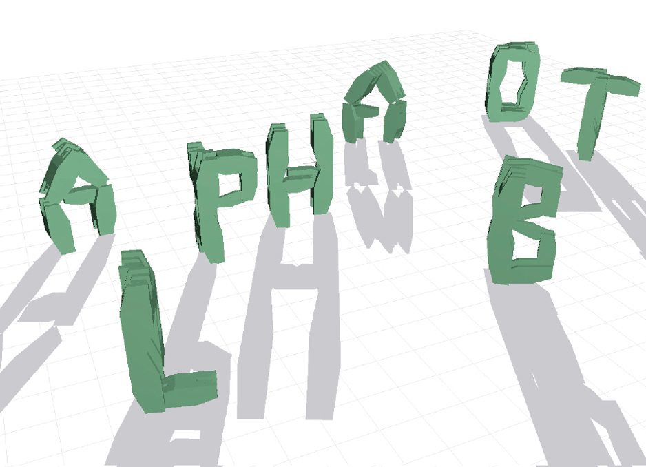
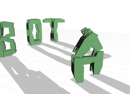
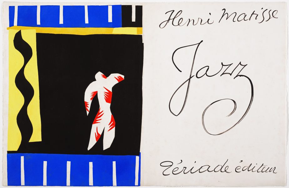
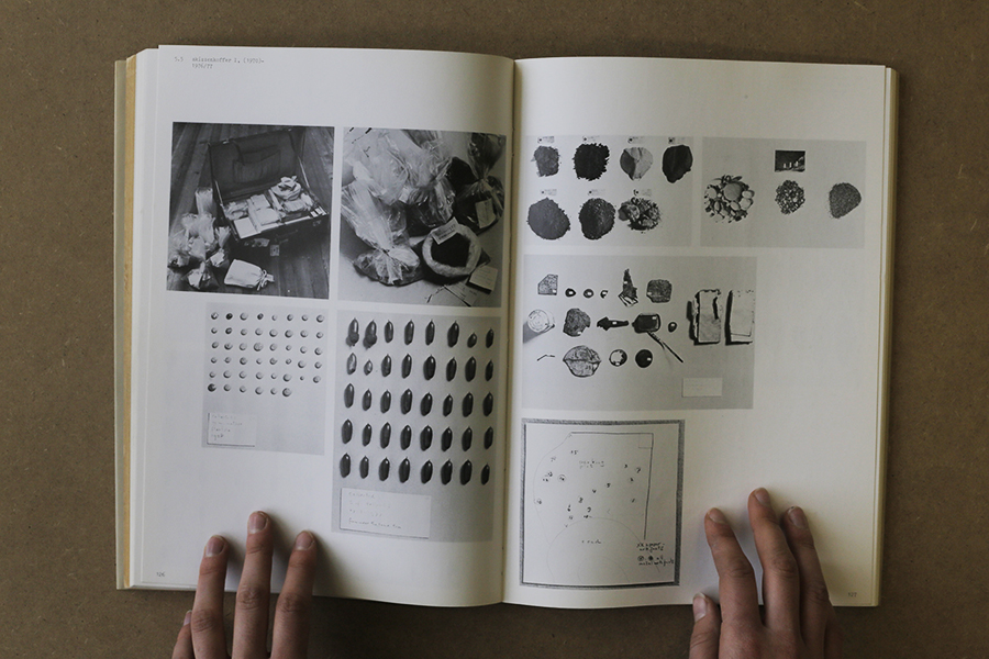
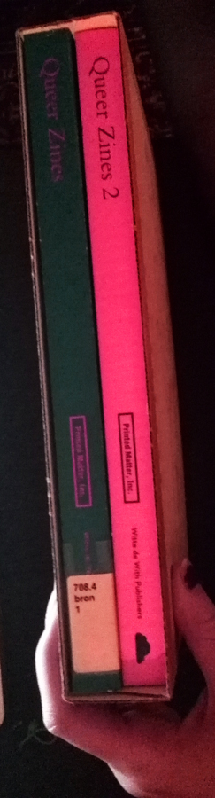
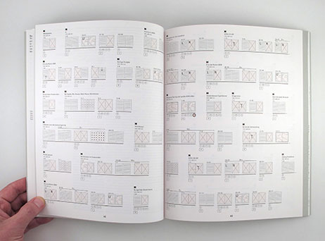
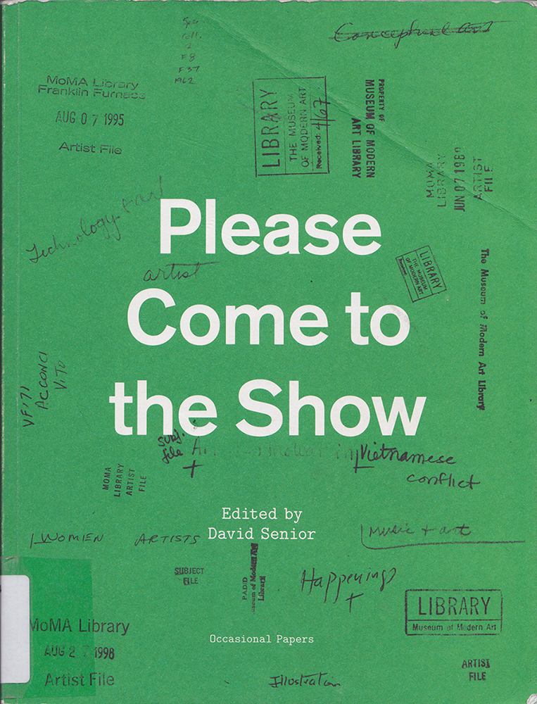
Juli Gudehus is an active German graphic Designer born in 1968. In her book Genesis she made the translations of the Genesis from the Christian Bible or the Torah in English, French, German, Italian, Spanish and in a more interesting way, in Pictograms.

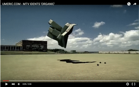
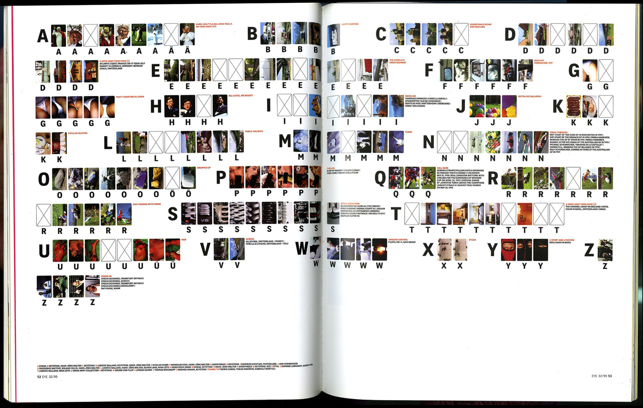
Pictograms exist since cave art; they give information by a figurative drawing. It’s a common language that everybody can normally understand.


Genesis_1500


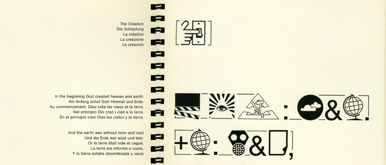
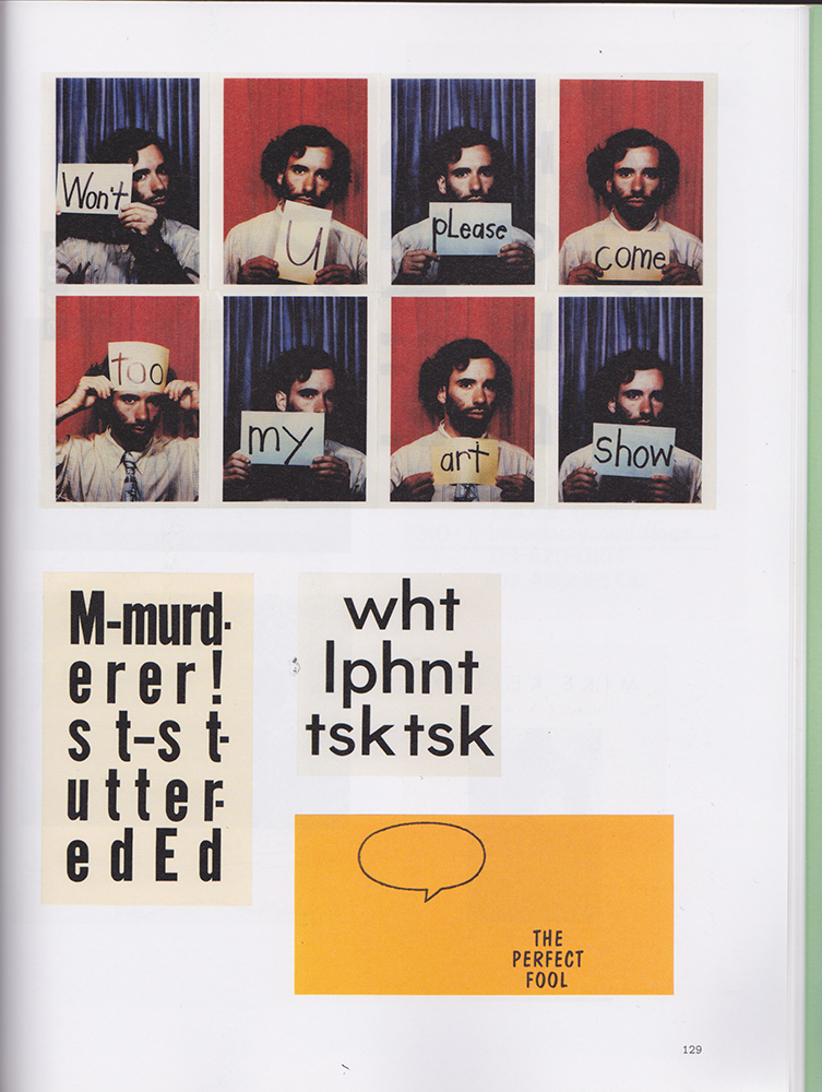
So this book is really about communication and most of all about universal communication. However, there is a lot of irony in it because the genesis also talks about the Babylon tower or how the humans where divided by god by confounded the language. The book which dignify the actions of god try to neutralize the consequences of his action.

This interesting paradox guide me to different universal languages. I will sum up with all these short discoveries.

First of all Esperanto, it’s an international language talk in 120 different countries. This Utopian idea was born around 1870 from Ludwig Lejzer Zamenhof. Its purpose is to be a second language and a bridge between cultures. This language avoids the risk of loosing cultural identities.

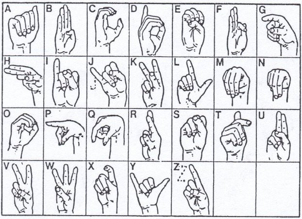
The sign language is another universal language which appeared around the fifth century BC. It’s a body language and manual communication uses at first to exchange information between deaf and mute people. Later it extends in basics exchanges in everyday life. The need to standardize an international sign system was discussed at the first World Deaf Congress in 1951, when the WFD was formed. In 1973 they published a standardized universal vocabulary.


International sign language alphabet

After the oral language and the body language the writing language of mathematics was constructed. First of all, you need to know that in each language the words have two components: the “signified”(abstract idea of language) and the “meaning”(concrete form of language). It’s a part of why languages are more difficult to assimilate. However, mathematics only use the “meaning” of the language and its why ambiguity can’t happen. Without these ambiguity mathematics looks like the more clear way of communication. Moreover, you can find mathematics everywhere in our human world: for example it rules the perfect way honeycomb is build or what we are wearing or eating today. And because it constructs our world it must be the universal language of this planet. But after all maybe mathematics is only a projection of humans on their environment. That is why I finally focus my investigations to the extraterrestrial communication or how human trying to communicate with something unknown. I continued this research on the hypothesis that this inter galactic language must be mathematics.


measurements


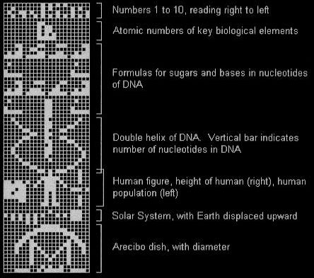
In 1974, the mission Pioneer 10 send the message Arecibo some 25 000 light year away. It was a binary message write by Frank Drake an American astronomer and astrophysicist. The binary system represents numeric values using two different symbols: typically 0 (zero) and 1 (one). Binary is what rules our digital world today and used by almost all computers and phones. The final picture of the message give information about the Earth and Humans: numbers,atomic composition of our principals components(as hydrogen or carbon), how our DNA structure looks like, how humans looks like , how tall we are, how many we are and where in the galaxy. Because of this long message distance we didn’t receive an answer yet and there is not a big probability to get one. In fact this operation was more about showing the capabilities of human technologies.

Here is a link to sent your personal binary message.


Arecibo


Another attempt took place in 1977. Two Voyagers spacecraft took aboard a gold phonograph record disc with 110 pictures of Earth and human life and 1 hour and 30 minutes of sounds and musics. A diagram on the record explained how to use it, partly written in binary arithmetic. The purpose is the same as a message bottle in the ocean but its goal is not anymore to communicate with an extraterrestrial life, it is also a time capsule for the future human generation.

This is a present from a small, distant world, a token of our sounds, our science, our images, our music, our thoughts and our feelings. We are attempting to survive our time so we may live into yours.

President Jimmy Carter

voyager-golden-record-images-supermarket-NAIC


Cosmic connection is the first TV message for extra terrestrial life. The message is transmitted from Toulouse (France) the 30 September of 2006 during the evening to the star Errai of the constellation Céphée and also on TV. The star is 45 light year from the Earth so we will maybe have an answer on 2096. The originality of the program is that the televiewers could send their own message out of the galaxy. These messages were shown in the same time as the TV show which was about the evolution of extraterrestrial idea from our society. But more than sending a message, this event was about sharing the thoughts of humans on extraterrestrial life.

capture


As all these messages tried to communicate with the outer world, they try to communicate with somebody or something with a capacity of understanding equal or more superior and of course similar with human. If an extraterrestrial life is not build on a mathematical logic, they may have some difficulties to receive and decipher our binary messages. But the hope to unite the nations under a same language is still present: even if the utopian and minor languages such as Esperanto, sign language and mathematics are not becoming complete universal languages. More than 1.8 billion people can more or less speak English. After decades of migrations and globalization, this language is probably the future of the universal language. Even before mathematics.

the death of a letterform – towards a new identity


Friday, February 12, 2016

screedbot

stop imagining that a book must have one line, that wraps over and over again, in the same way that onE side of a record album has only one groove, And see a text like a symphony with many voices running continuously in any directIon.

every voice is a body on its own.

it moveS, It grows, it makes decisions. each letter is alive in its own world. enter this world and don’t be worried, like all good video games it teaches you how to play as it goes along, and gets more and more challenging as your skills within this world grow. the game stays one teasing half-step ahead of yoU but that’s why you play on.

ask yourself: what is possible to do with, within, and without language?
letters, words and other symbols are information we surround ourselves with every day. transferring messages from A to B, typography is an image we created, an image-language we are dependAnt on.
in print, type is fixed, stAtic and permanent. on-screen –though not permanent– type is largely inanimate. text remains an inactive tool of communication. our current understanding of type assumes it to be of static nature, limited to properties such as form and colour. Introducing temporal media (Video/animation) changing with time, type is growing A new property.

type behaves. type evolves. or as the artist eduardo kac put it in 1997:

”type becomes fluid”

considering the dynamic capabilities of conteMporary, digital media, our static definitions of type seem very outdated.
early feature films contained temporal typography, featuring largely static text, presented in sequences and subjected to cinematic transitions. it was not until the 1960s when alfred hitchcock’s north by northwest (1959) opening title sequence—created by saul bass— hit the screens, containing animated text, featuring credits that “flew” in from OFf-screen, and finally faded out into the film itself. a similar technique was also employed by bass in psycho (1960).
Since then, motion graphics, particularly the brand identities of film and television production companies, increasingly contain animated type. they hAve become trivial.

look at MTV’s idents from 2010:

www.GIFCreator.me_RbEVlP

MTV ident ‘organic’ (1/12)

several animated bricks fly around over a football yard, a yard possibly all american teenage kIddies can Identify with. an everyday life scenery in which each part of this ‘brick-matter’ seems to move independently, following an instinct i don’t understand. eventually, after a moment of non-control, Each brick is being drawn to one another to form the brand’s identity
– a moving ‘M’ connecting with a ‘TV’.

moving shapes, merging into one.
2010’s animation at its beSt – but this we know already.

nikita pashenkov, creator of Alphabot (2001), a virtual robot that may transform to take the shape of any letter of the alphabet,  was one of the first programmers who gave life to a type being that consistently alters its form.
a single form may present multiple letters through processes of morphing, rotation or DEconstruction. multiple forms may present a single letter through processes of reorganization. the ‘alphabot’ transforms, firstly becoming the letter ‘A’, then ‘B’, and so on. without moving, It changes; it assumes a new identity. by this iNvention, type started to transform and mutate, to hide and interact. yet its new identity of behavior remains controlled by the human hand. the user types in a command – the robot translates – the letTer acts.

Nikita01-440x318

i ask

 you answer

A > B

the relationship remains uneven.

asking about the post-human condition, our role and relation with the machine or the digital world is a field I want to explore. human humanizing his surrounding. liking the letter’s motion to human gestures would therefore be a reasonable step to take when it comes to giving type a ‘life’. suddenly the letter has a leg, an arm, a finger pointing towards an information, i long to discover. he she it nods or shakes his her its body into a wild dance. he she it helps me by speaking my language. i feel connecteD, I am close to  ‘A’ – to ‘B’. but especially this way of personification is indicating the human’s urge to control his surrounding. i want To understand you, so you have to be like me.

let me suggest another relation.

what about a dynamic text in independent motion, a typography in complete metamorphosis? changing within space rather than moving across space (opening title sequences), merging from and into illegible visual elements?
a new self-sufficient algorithm, making own decisions for you to observe and thErefore creating a character with character, an identity expressing itself. a new ‘aliveness’ among us?

one body/many letters, many letters/one body

i am many.
a letter Is many.

in ‘beer’, a flash animation by komninos zervos (shown above), each letter undergoes a process of metamorphosis. two letters merge, becoming a single form, and thereby introducing a third letter. other Forms Move Independently, Adopting The Shape of one letter, then morphing into another. the forms, in flux, change between legible letters and abstract glyphs. their fluid deformation leads to new identities looking at the examples given, one can notIce that most of them come from a tIme between 5 and 15 years ago.

 where are the contemporary examples?

there is, at present, no substantial research into the properties and perception of fLuid typography. familiar methods for the analysis of typography have failed to keep pace with the development of digital technologies as they do not allow themselves to grow and allow additional dimensions such as fluid type’s capability to react and behave. there is an urge to re-evaluate our understanding of the nature of type just as to accept the notion that a single letterform may have various autonomous identiTIes.

nevertheless there do exist contemporary examples for other fluid forms of autonomous life within the worlds of the non-human or non-animal, namely the technological, alGorythmical.

take a look at ian cheng’s `emissary forks at perfection’

a Digital (a)live simulation and (foreveR) Ongoing story (2015- the very now) on screen in which cheng created different life forms through algorithms. beyond human control, an artificial intelligence called talus tWenty Nine manages the landscape, compulsively gambling on which character survives and which one may see the light of this randomly animated world for the first time. pushed together to occupy the same landscape, each form threatens to destabilize and mutate the other. “here, a story mAy escape its classical fixity and indefinitely procrastinate its conclusion.”

but back to typography.

giviNg type an autonomous life beyond control, you may ask yourself,

what’s in there for you?

if the game seems to only lead you towarDs lost battles and dead ends,

why should you keep on playing?

rethinking the human urge to find productivity in all that surrounds him Is a value to question. a certain un-readability arising from non-constant, fluid words, slogans and messages is indeed confusing but this situation of senselessness at first sight leADs to an encounter asking way more about the relation between human and a the letter itself. think of your probably long gone tamagotchi friends. you buIld a relationshIp by observIng them, listening to their needs, caring for them, so they care for you.

A = B

37485-Tamagotchi-Pink-Heart_R1

so why not entering this world of uncertAin messages hidden within the abstract structures of unreadable forms and images if there stilL Is the chance of reaching this certain point, as you’ve learned enough, to get into the neXT Level?

aS you know, the game stayS onE teasiNg halF-STep aheAd of you.

bUT that’S wHy yOU

pLAy ON

The Impossibility of Neutrality


Friday, February 5, 2016

Neutrality. Growing up in Sweden, the term has been a part of me since I was born, and a part of my country since before any of the world wars. It is defined by Merriam-Webster as “the quality or state of not supporting either side in an argument”. It is used throughout society in everything from neutral tasting yoghurt to neutral states in politics. But what does it mean? And is it even possible? I chose to explore and discuss a part of this which is dear to me as an art student, image making.

I started exploring neutrality through a work of Swiss designers Müller + Hess called The Impossibility of Neutrality, which is a commission by the English graphic design magazine Eye. It is an attempt to create an alphabet consisting of imagery instead of typography. Each letter in the alphabet has been replaced by multiple images. They chose multiple images because different people have different perceptions of what an image could represent. So to make this more precise, the viewer can look at multiple images to understand which letter the sender is trying to convey. The work deals with typography, text and photography, and how it is impossible to be neutral in imagery.

Impossibility-neutrality_1_1300

The Impossibility of Neutrality ©1999 by Müller + Hess, first published as Max Bruinsma's article Reduced to the Max in Eye-mag #32

From this work I went onward to The Photographic Dictionary by Lindley Warren. The Photographic Dictionary is a website with photographs representing words. Each word in the dictionary is represented by a photograph. The word that is represented by the photograph below is the word embrace. What happens in this work, just as in Müller + Hess’s work, is that the impossibility of neutrality becomes very apparent. The representation of the word becomes very personal, and in every image there are many messages that the viewer can read into, and every image can be interpreted in many different ways. An image can not show something neutral, as text can. Or can it?

bgk 007

Embrace by Brendan George Ko through The Photographic Dictionary

Stock photography is often used as an image that can just be interpreted in one way. It is a photograph showing something in a very non-personal and mostly objective way. It is used widely by, for example businesses, who in this way can acquire quality imagery for their business at a lower cost. When using a stock photography service, the user searches for a word or a phrase, and the matching photograph appears. For this to work, the image has to be non-personal and work for a specific use within many different contexts. Does this mean that the image is neutral? And does it apply to all types of images? Images showing people can hardly be neutral I think. Most of them show an accepted norm for the human being which they send as a message. But let’s take something else as an example. Let’s take this image of U.S. dollar bills. I believe it is more or less neutral. It portrays the dollar bills as they are, no more and no less. I feel it is not carrying any messages more than the concept of U.S. dollar bills. But then again the concept of U.S. dollar bills holds a lot of messages in itself, within everything from geography to economy and politics. And also, the bills are stacked irregularly and have creases on them, which makes me think of money that is earned in illegal ways, passed on in duffel bags.

_3LITEN

Dollar bills by iStock

Another type of neutrality which I think is interesting is when an image or a message has been used so many times and in so many different contexts that it has lost its original meaning and doesn’t really say anything anymore. An example is the art sold at IKEA. It has been bought, sold and shown so many times in so many different contexts that the original context or message is completely lost, and it now doesn’t really represent much at all. Maybe this isn’t neutrality, but more some kind of visual confusion or loss of context. But just like the stock imagery, these images are often just used to replace one word, which in this case is decoration and/or art. This makes these images neutral in the way that most people don’t really experience or see anything when looking at these images, but instead just see a materialization of the word decoration or art.

Ikea_Art_Liten

Audrey Hepburn from Breakfast at Tiffany's by IKEA

Something that I think fits very well into this discussion is the word perception. Perception is defined by Merriam-Webster as “the way you think about or understand someone or something”. People will always have different ways of perceiving things, and when looking at an image, the image is always interpreted regarding to the perception of the viewer. Perception connects to what the viewer has seen, heard and experienced before. This is why the portrait of Audrey Hepburn from IKEA has lost it’s original context. Because it has been seen more often at IKEA or as a decorative art piece, than in its original context. This is also why we are able to find different messages and meanings in what at first glance appears to be a neutral image of dollar bills shown above. If the bills would have no marks and stacked in a perfect order, then the assumptions and the messages we are able to read into the image would still be there, just that they would be other messages and meanings. And because of perception, my conclusion in this essay is that it is impossible to be neutral. Whatever image is presented, the viewer or user will always be able to see one meaning or another in an image, and an image will always be able to be connected to something in the life of the viewer and therefore be interpreted through this experience.

On a side note I also believe it is a bit funny that Müller + Hess are Swiss, from the viewpoint that Switzerland is supposedly the oldest neutral country in the world. I wonder if any of their government officials read that issue of Eye Magazine.

Modula Ribbed into a 3D art object


Thursday, February 4, 2016


PMoRib

Modula Ribbed by Zuzana Linko ©95


Above picture with the font Modula Ribbed by Zuzana Licko caught my interest because of the shapes with spikes and the black color. To me they seem very rough and science fiction-like in their aesthetics and simplicity.
 

. . . can Zuzana Licko´s font Modula Ribbed be transformed into a 3D art object and how?


First I want to know a little bit about Zuzana Licko, the font Modula Ribbed, J. Abbott Miller, the history of 3D Printing and what is 3D art before answering my question in a conclusion.


 MD_Licko_Van_Portrait_640

Zuzana Licko and her husband Rudy VanderLans


The designer of Modula Ribbed Zuzana Licko is the co-founder of Emigre, together with her husband Rudy VanderLans. She was born in 1961 in Bratislava, Czechoslovakia and emigrated to the U.S. in 1968. She graduated with a degree in Graphic Communications from the University of California at Berkeley in 1984.

Emigre, Inc. is a digital type foundry, publisher and distributor of graphic design related software and printed materials based in Northern California. Emigre Magazine was published between 1984 and 2005 and was one of the first independent type foundries to establish itself centered on personal computer technology. It holds exclusive license to over 300 original typeface designs created by a list of contemporary designers ().
 

– – – – –


The designer J. Abbott Miller was born in Indiana in 1962 and studied at the Cooper Union School of Art. Before joining Pentagram (a design studio) as partner in 1999, he was director of design, writing, and research at a multidisciplinary studio founded in 1989 his interest in “the public life of the written word” took shape through magazines, exhibitions, symposia and books. He is also the designer and editor of 2wice magazine.

In an interview with Eye magazine Abbott describes himself, “I am sometimes a very formalist designer, looking for metaphor and concept at every turn… I am a great admirer of typeface design, of the skill it requires, and of the subtlety it brings to the apprehension of content…” .


51q9JVpUF+L__SX315_BO1204203200_-190x3002016-01-21-17_07_52-e1458324987163-576x1024

Dimensional Typography by J. Abbott Miller


In his book “Dimensional Typography” he explore the spacial potential of typography in virtual environments. He showed examples of how the normally flat and static realm of the letter was subjected to spatial and temporal extrapolation.


abbott_dimenp

Polymorphous (right) designed by J. Abbott Miller and Zuzana Licko´s Modula Ribbed (left).


J. Abbott Miller designed Polymorphous based on Zuzana Licko´s font Modula Ribbed. It is a design seemingly inspired by textured prophylactics; he developed the “f” into a rubbery, three-dimensional avatar, bristling with nipple-like protuberances, designed for heightened reading pleasure in intimate settings.
 

– – – – –


Through my research I learned 3D printing refers to various processes used to synthesize a three-dimensional object. In 3D printing successive layers of material are formed under computer control to create an object. In 1981, Hideo Kodama invented two early Additive Manufacturing (AM) fabricating methods of a three-dimensional plastic model with photo-hardening polymer. AM uses an UV exposure area that is controlled by a mask pattern or the scanning fiber transmitter. Then in 1984, Chuck Hull developed a prototype system based on a process known as stereolithography, in which layers are added by curing photopolymers with ultraviolet light lasers.

Futurologist and author Jeremy Rifkin believes that 3D printing signals the beginning of a third industrial revolution. Using the power of the Internet, it may eventually be possible to send a blueprint of any product to any place in the world to be replicated by a 3D printer with “elemental inks” capable of being combined into any material substance of any desired form.

Abbott designed Polymorphous in 1996 12 years after the invention of 3D printing. Authors Jason Edward Lewis and Bruno Nadeau said about Abbott´s Polymorphous “… is type built for 3D virtual environments. Although it is possible to integrate standard outline fonts into the third dimension..”.
 

– – – – –

 
A 3D art is a three-dimensional work of art such as sculptures, sound art, installations and ceramics. Everything we can touch can be perceived as a three-dimensional object. For example, a 3D digital object is no longer confined to a virtual space since the technological development of 3D printers and this technique is used in many areas. Artists such as painters and sculptors illustrate their work through 3D technology. By creating a 3D model the artist is able to print the object and reproduce their design as a tangible object.


OLYMPUS DIGITAL CAMERAOLYMPUS DIGITAL CAMERA

My 3D object


After reading and learning about 3D printing, I tried to make my own 3D object from Zuzana Licko’s Modula Ribbed letter f.
First the f character was created in the 3D drawing software Maya, to successively be printed in two parts (it was too big to be printed in one piece in the machine in CadCam) in a dark gray plastic. After 2 x approximately five hours the two parts were printed, and I sanded their bottoms with thin sandpaper to get the surfaces perfectly straight, so they were easy to glue together. After gluing I sanded off the excess glue with a kitchen scourer until I was finished and extremely pleased with the object.


2016-My3Dprint_1100
 

I conclude that it is possible to transform Zuzana Licko’s font Modula Ribbed into a 3D art object as designer J. Abbott Miller proved in 1996 and I did myself just now. We turned Modula Ribbed letter f into a rubbery, three-dimensional avatar, bristling with nipple-like protuberances.
 

On recordings (…)


Monday, February 1, 2016


henk2

listening to a 70’95’’ audiobook on a white cotton pillowcase

During the GRA Graduation Show 2015, the thesis “On recordings (…)” was displayed in the Graphic Design Department reading room as an audio piece. The different parts of the thesis have been recorded as separate mp3 files and reassembled together as a playlist. The text written by Émilie Ferrat is read by her, while her references are read by Ben Clark. The mp3 files were being played from an iPod, hidden in a white silkscreen pillow, displaying the title of the thesis and its references, which were printed at the back of it.
An extract of the first part, is available here.
Soundfile : “Memorizing litterature” (…)

[audio:https://designblog.rietveldacademie.nl/wp-content/uploads/2016/01/Hi-Mary_Celina-Yavelow.mp3|titles=perfect fifth] For any inquiries regarding the project, please contact: emilieferrat@gmail.com.
Pillow_backside-references

references on backside pillowcase


.Pdf-icon download this thesis “On recordings (…)”

Emilie Ferrat,
was also nominated for the GRA Awards 2015: Category Applied Arts in collaboration with François Girard-Meunier. To read more .... link


Ceramics with Émilie / Ceramics with François


Tuesday, January 26, 2016

650-Emilie_Ferrat_and_Francois_Girard-Meunier_RV_lowres_1 Rietveld Graduation Show

Émilie Ferrat [x] and François Girard-Meunier [x] graduated from the Department of Graphic Design. As part of their graduation show they presented a collaborated project ‘Ceramics with Émilie / Ceramics with François.’ This project was chosen by an independent jury to be nominated for the Design Award and was for that reason part of the exhibition ‘Selected Gerrit Rietveld Academyie Awards 2015’ organized in Castrum Peregrini [x].

Screen shot Peregrini-show

Castrum Peregrini Presentation


Ceramics with Émilie / Ceramics with François

‘The medium is the message.’ These words of Canadian philosopher Marshall McLuhan still offer room for artistic exploration. Because how exactly the message changes when the medium, or the material, is changed remains shrouded in mystery. In their collaborative project, graphic designers Émilie Ferrat and François Girard-Meunier use a classic yet surprising approach: dialogue.
 
Screenshot_Selected-images1
 
    The installation consists of a video of the two designers conversing and a number of glazed clay models –a mobile telephone, for example, and shot glasses, jigsaw pieces and some undefinable models– with which Ferrat and Girard-Meunier stretch the boundaries between form, material and meaning. A new plain field is established. The video shows their fresh and resolute debate on their progress in working with ceramics – a new material for both of them. The dialogue is explicitly overacted, which stresses the artificiality of the form (a recorded conversation about models they made earlier). The overacting harmonizes nicely with the glaze on the clay models: a shiny layer upon robust content. The spoken and material form are one.
 
Screenshot_Selected-images2
 
    ‘Do you think it’s the ceramics that is giving meaning to our talks,’ one of them asks, ‘or rather that our talks are giving meaning to the ceramics?’ The relationship between words and things is a complex one. It is a relationship that has puzzled many philosophers, artists and linguists. By deliberately speaking as amateurs, ferret and Girard-Meunier open up a new perspective on this relationship.
    The material prompts conversations that lead beyond just ceramics: design in a broader sense, a philosophical ‘brain in a vat’ argument, personal insecurities and the history of art, these are all subjects that lay hidden in the material. The ceramics function as a conversation starter: the medium turns out to contain many messages.

text by Thomas van Huut [x]


for full length video [19 minutes 54 seconds] contact François Girard-Meunier


Forgery and Appropriation, Art opposed and compared


Thursday, January 21, 2016

In ‘Can Forgery be Appropriation Art and Vice-Versa? (bachelor’s thesis Art & Design, Gerrit Rietveld Academie), François Girard-Meunier questions and tries to compare the processes of two seemingly similar forms of “copying” artworks and ask on which terms they could be considered as their opposite.

img1_small

7th Avenue Garment Rack with Warhol Flowers (1965) Elaine Sturtevant

The act of copying has multiple connotations depending on the cultures and eras on which it is performed. It can be a proof of mastery and an honest tribute (esp. in China), a mandatory step (from emulation to creation) towards producing genuine artworks or, as we know it, an underlying statement of looser value (lack of originality, usurpation of the original).

img2_small

Mark A. Landis

A forgery is a specific type of copy that tries to conceal its origin and passes as the original. An appropriation is a type of copy which clearly states that its author takes over an authored form and makes it his own while retaining the properties (and embracing) that links the copy to its predecessor. One can see the two practices as illegitimate and legitimate opposites.
We value experiences with artworks (or life experiences in general) with different criteria. Sight is one of the most impactful stimuli of the human kind, so aren’t we surprised by believing what we see?
Which leads us to the hypothetical confusion of seeing two images which might look exactly the same, while having contexts, meanings and intentions which are obviously divergent.

img3_small

Left: Woman in Blue Reading a Letter (c. 1663) Johannes Vermeer, Right: Woman Reading Music (1935-40) Han van Meegeren)

This essay takes takes as source material works of famous forgers (Elmyr de Hory, Han van Meegeren…) and early Appropriation Artists (Elaine Sturtevant, Mike Bidlo…) and seek to figure out what makes a work of art a work of art in terms of attitudes, discursive frameworks and intentions. The two practices are looked at with the magnifying glass of their opposite’s framework, to see if by stretching any definition they could be thought differently.


download_over download this thesis   “Can Forgery be Appropriation Art and Vice-Versa?”  If what differentiates an art forger from an appropriation artist is a matter of intention, then on which terms one could become the other?

Jazz


Thursday, December 10, 2015

Part 1

Library, spines facing you, from every direction. The opaqueness of all this knowledge is overwhelming to put it mildly – your head spins of confusion. The environment breathes an air of calmness, yet great anticipation, as if the myriads of hardbound works of literature and art are eagerly yearning to reveal their insides.

You stand still indecisively – you feel yourself on the narrow interface between on the one hand panic like running down the narrow corridor, to the door, halfway collapsing onto the floor and dying, and on the other hand siting down, indulging yourself in every publication that catches your eye, never leaving.

You regain your grip on reality. You see a bright yellow rectangle in front of you. You reach for it and you look at the front cover.

The cover of Henri Matisse's Jazz

You look at the cover for a solid minute. You like the bright yellow colour and the sturdiness of the cardboard. You look at the image on the cover. Primary colours have always fascinated you immensely. The blue night, the black figure, the yellow stars, and above all the tiny Red Dot as a heart. You are intrigued – you know of this man, Henri Matisse. In your head appear images of bright coloured faces and dancers, composed with mildly crude yet incredibly accurate brush strokes. You also like jazz, and wonder what this book could be about. Filled with curiosity you open it.

The inside of Henri Matisse's Jazz

That’s it. You’re taking this one.

What appears to be a great and interesting book, turns out to be – according to knowledge that you have newly obtained – merely a small, relatively unimpressive excerpt from the original Jazz. Published in German, this small yellow book is actually a book within a book. A book about a book. The middle set of pages are reduced size copies of all images of Jazz. A ten-page introduction preceeds it; succeeding are German translations and a timeline of Matisse’s life. The design of the yellow book is not very striking – minimalist but conservative, done by the publisher. Judging from the looks, the middle part – the excerpt from the original Jazz – is by far the most exciting.

The original is a thick pack of folded paper, twice as wide and twice as high as the yellow booklet you have found in the library. Twenty colour prints, of which fifteen that span two-page spreads are included in the unbound book, together with seventy pages of huge, handwritten cursive text in French.

Marveling at the bright and bursting colours you wonder – How? Why? What does it all mean? You want to find out everything about this book, so you start researching and reading, to learn more about how this artwork came to be. As you learn more and more you suddenly find yourself 74 years in the past, in the south of France.

Part 2

You are now Henri Matisse. It is the summer of 1941, and you are 72 years old. You are living in a suburb of Nice, and you own a nice house with a flowery garden, a big studio and a personal assistant. The gods of health have not been benevolent to you – you were diagnosed with abdominal cancer a few months back, and though doctors have removed the tumour, you suffered from serious complications. You have been on the brink of death for a while, and since then you’ve been only slowly improving. Standing is possible but laborious, so you prefer to lay down on your bed.

Matisse and Assistant

You have tried to pick up painting again, but it is tiring and difficult, and virtually impossible from a laying-down position. Thus, the ultra-creative human being you are, you have invented alternative methods of creating colourful expressions of expressionist effervescence: the cut-out method. Simple but very effective: cut-out pieces of paper, laid on top of each other to create compositions. You have used this technique before when making paintings, but only as an aid to perfect the lay-out, never as a means to an end. Your assistant dyes paper with pure, unmixed gouache and you use scissors to cut them into any shape you want. Easy and less labor-intensive than painting, you really like this method.

Matisse Cutting

You feel that scissors carry way more feeling for line than a pencil or brush ever will. You feel so much more improvisational and spontaneous, and your life after your near-death state feels like an artistic renaissance. You feel like cutting out people, and flowers and trees. Flowers are so amazing to make, since the natural world is not hindered by preconceptions of classical art. As you once famously said:

Nothing in the world is more difficult than painting a rose, since before he can do so, he has first to forget all the roses that were ever painted.

Full of inspiration, you start to create one, two, twenty collages. You write handwritten text, loosely accompanying the themes of the collages. The text is very big because you feel it is necessary in order to be in a decorative relationship with the colour prints. Your publisher likes the book and wants to print it: 100 copies without text and 250 ‘deluxe’ copies with text. The copies are printed by brushing paint over metal stencils made in the shape of the cut-outs. The paint is the exact same gouache used to dye the paper, so the copies are highly accurate in shape and colour.

Le Toboggan

Page from Jazz: Le Toboggan (The Sled)

The collages depict circus scenes, stories, myths, abstract shapes and personal experiences, in vivid colours and an uninhibited style. The cover displays one of your first collages, the clown, and the title of the book: Jazz. You chose this title because you like jazz, and you think there are parallels with the music on the basis of your unbounded, improvisational and innovative way of working. You consider the previous title, le cirque, not inclusive enough for all the themes the book discusses. In the front of the book you include a ‘table of contents’, an overview of all the collages, with individual titles.

Cover of Jazz

Front and back cover of Jazz

Table of contents of Jazz

Table of Contents of Jazz

The book is received as a wide success and it kick-starts a new stylistic era: the next 12 years, until your death, you will work on more cut-outs. You like the works you have made, though you doubt the artistic quality of the book – you think that the best way of presenting these collages is in their original form: loose pieces of paper, laying on a table in your studio, playful and vulnerable to any gust of wind.

Table The End

Rietveld library catalogue no : mat 17

Process: how to choose an apple?


Wednesday, December 2, 2015


apple


choosing a book without paying attention to the content is like picking an apple based on its skin and form. you never know if the consistence and the taste is reflected by its surface but still you choose it, thinking that the appearance echoes what you want to find inside. this intuitive and impulsive choosing process based on your assimilation faculty, knowledge and cultural education, needs to be done without concession. avoiding everything that incorporates elements which make you doubt is a way to find the precise object that fits your taste. this process can be long but it makes you swim fast through objects and, at the end, allows you to find the right fruit, in which the design and the content are reflecting each other, the materialisation of your desire. this search technique lead me to an old fashioned catalogue issued for an exhibition of herman de vries at the groninger museum in groningen, the netherlands. the book was published in 1980 by the museum itself and is entitled, like the exhibition, “herman de vries, werken 1954-1980”. the design of the book is made by “std suurling treffers designers”. they also came from gronigen and they were, at this time,  the graphic designers of the museum. alongside of working for the museum and being independent designers they were also working at the minerva art academy. nowadays the studio doesn’t exist anymore.


1 3


speaking about the design of the catalogue, the cover appears fragile and at the same time raw, ruff and powerful. the delicate aspect of the book comes from two different components. firstly, the paper used as a protection for the book itself is created by two layers of recycled transparent paper. the weight of times altered the colour of the paper into different shades of beige and adds an antique aesthetic to the object. secondly, in-between this two layers of tracing papers, two real leaves drift with the rhythm of the reader turning the pages. on the website of herman de vries it is said that they came from a western tree called acer campester. strangely the copy from the gerrit rietveld library contains different ones, looking like the leaves of an elm tree, which is really common in the netherlands. we will probably never know, if the artist himself puts different types or if someone lost the original ones and exchanged them. these natural elements encapsulated into the cover protection remind on the origin of paper, namely trees and leaves, and point out that these objects, made for human use, were, first off all, living matter.


Ulmus americana - American ElmAcer campestre - Hedge or Field Maple 5 4


the cover reveals another radical choice: the absence of capital letters. this vacancy occurs in the whole book. most of the time, attributed to the bauhaus ideology of typography, this non-use of capitals could represent the honest approach of the artist herman de vries in his work and his aim to represent nature in it’s purest and simplest form. the first part of the the book, introduced by the director of the groninger museum, frank haks, is mostly composed of texts, essays and poetry by and about herman de vries. the designers chose to create the layout using the aesthetics of a type machine, therefore making use of the typography “courier”. looking at the work of herman de vries, this decision resonates his visual language. the paper being used is another example. it is brown, natural and rough. the second part of the book focuses on showing images of his art works. alongside to this change the paper changes as well. becoming more neutral, it gives the the work all the space needed for expressing itself.


8 10


on the back cover, a curious detail pops up: a red stamp saying “all”. it is hard to understand its visual appearance for different reasons, mainly because it is the first time that we see colour. in addition, the size and the disposition are not fitting with the layout either, they are more strictly constructed. during the research about the artist i came across a video which fulfilled my curiositiy. presenting his exhibition for the biennial of venice, where he was representing the netherlands, herman de vries showed an old mantra printed on a booklet in 1974 in katmandu. the sentence “to be all ways to be” is written in big letters inside of it, the typography and the size are exactly the same as in the book.


11 1998.1.0006(1-36)02_v3


considering the design of this book, it makes a good example for a successful reflection and interaction between the graphic designers and the artist. in this case, herman de vries took part in the making process, adding some characteristics of his own work to the cover. the catalogue therefore got a handcrafted look and gives the impression to handle something rare and authentic. the aesthetic choice demonstrate the graphics designer’s respect for the artist and merge the book with the world of de vries. a bridge is created, giving the book the aura of an artwork.

Rietveld library catalog no : vri 7


Shapes, Space and Harmony


Monday, November 30, 2015

I tried to let my mind be open for new impressions during my selective process. My main goal was to find something that inspires me. Something that I can relate to but still find exciting in a new, different way. I also wanted to find a book with well thought out typography. So I can learn from it. Analyze it and break it down. Pick it apart like an engine.

At first, all the showcased works by students caught my attention and I started going though them. Although many of the works were inspiring—I felt like I had more to see before making a final choice. I started to drift towards industrial design. The aesthetics were nice, with a lot of grids and furniture covering the front pages. But the typography that I was looking for was missing. At last I found a book called “The Future Issue” next to the industrial design section. At first glance, the typography of the cover really struck me. It was well designed, set in black and white, in a balanced layout. I opened the book and saw that it was designed by Laurenz Brunner. He’s known to me from before and an interesting designer, the choice was easy.


Foto 2015-11-24 18 38 12_2

The Future Issue—Vol. III


FUNCTION AND FORM

In 2007 the first volume of “The Most Beautiful Swiss Books” was released. This catalog is the first part of the Back to the Future Trilogy. “The Future Issue” which I found, is the third volume. In order to learn about the design I decided to go back and start with taking a look at the first catalog to see how the design has developed. All three volumes are designed by Laurenz Brunner. A composition of several colorful images are covering the front page. The title “The Past Issue” is written across the center of the cover. The images are positioned in a way so their corners touch each other. Connecting them together, almost creating a spiral effect. I like the fact that it also creates a clear hierarchy among the images. The cover feels well balanced yet without losing tension. Some of the images are rotated. It helps breaking up the square layout and also makes it more difficult for the eye to see the pictures individually. Instead we focus on the whole picture and get the impression of a playful yet organized layout.


Foto 2015-11-24 18 59 00_1

The Past Issue—Vol. I


The second volume in the series, “The Present Issue”, has a similar cover. Yet again we see a composition consisting of colorful images. Although this time, the layout is much more organized. Every image contain the same size, and no one is rotated. They are positioned in a grid, spanning from every corner to the center, also connected by the corners. The titled is allowed much more focus—being set in a larger weight, in a bright red color. On the contrary, the title lose readability as the words are rotated. By comparing the two covers you easily spot the similarities and the differences. It is almost like they are reversed. On “The Past Issue” the images are allowed freedom and the typography is kept minimal. Creating a playful layout. While on “The Present Issue”, the images are static and the typography is allowed freedom. Filling the same function as the images on the previous cover.


Foto 2015-11-24 18 51 09_1

  The Present Issue–Vol. II


Lets jump forward in time and look at the cover of “The Future Issue” (Vol. III). The first you notice is that it does not look anything like the previous volumes. First of all the front page is completely covered in black. Second, there is no images. Only text. Despite this time, an illustration is also covering the page. The numbers in 2009 are spread out in a square with a loose spiral connecting them together. For me the cover feels much more mysterious and cryptic than the two previous ones. It’s atmosphere also works better with the title. The future is something that is unknown to us. Something that lies completely concealed in darkness. The spiral also emphasizes the mysterious vibe and makes me think of space. Which is also something that is very unexplored for us.


Foto 2015-11-24 18 38 12_3Foto 2015-11-24 18 38 40_2


VECTORS AND HARMONY

All three catalogues are set in Circular. Which is a geometric sanserif created by Laurenz Brunner himself. In 2004 he released his first typeface LL Akkurat which shortly became very popular. After it’s success he created Circular which is inspired by Paul Renner’s classical typeface Futura. Both typefaces has a purely geometric approach and a balance between functionality and idiosyncrasy. Circular also possess a recognizable character yet a universal appeal. The geometrical shapes became the representative elements of the Bauhaus design style and you can clearly see the influences in Circular and “The Most Beautiful Swiss books” series. The simple use of color also draws inspiration from the past, working only with red, green and blue. The layout and the typography of the series are simple. Designed in a minimalist way with high readability. Titles set in a clear hierarchy and text set in either two or four columns.


Screen Shot 2015-12-11 at 01.11.25Screen Shot 2015-12-11 at 01.10.27


The way Laurenz Brunner is working with the typography connects the individual catalogs in a clear energetic way. All based on the previous one but with another layer added to it. The design varies but always with the same principles in focus. Laurenz Brunner’s fine harmony between tradition and modernism creates a design that I find engaging and timeless, in a very intriguing way. Function always in mind but set in a contemporary way.

Below you can find some pictures showcasing the typography from all three issues.


Foto 2015-11-24 18 42 49_1


Foto 2015-11-24 18 51 51_1


Foto 2015-11-24 18 51 51_1Foto 2015-11-24 18 56 13_1

Rietveld library catalog no : 758.3 swi 2009

RiCB-D/TRftBL


Monday, November 30, 2015

– https://www.youtube.com/watch?v=KmwZNivC4r0 

1

Rammstein in Contemporary Book-Design


Daniel van der Velden, the man, the genius, the mystery… in terms of designing a series of publications collecting highly
eloquent essays on uprising tendencies and phenomena in contemporary culture, what can you expect from a man giving you this look:


Daniel_van_der_Velden_1000


as he plays the song “Du Hast” by the German band Rammstein on his iPhone 6 to introduce himself prior to a lecture on his work – A whole lot in my opinion.


My research is dealing with a book that was designed by this very man – the mastermind behind Metahaven, an Amsterdam based design and research studio whose work in a way couldn’t be more contemporary. A typical Metahaven design usually even exceeds the expectations of contemporary in its extroverted way of layering and heavy usage of political and economical iconography. The result often is a somewhat futuristic, hardly readable, almost autonomous graphic. A work of art in which a mysterious overflow of visual content makes the purpose of providing information seem of secondary interest. There is a feeling of playfulness to a lot of Daniel’s graphic designs that on first sight does not leave the impression of being the product of a structured research and design process.


You will agree when looking at a few examples…


tumblr_n3khhuX4xS1qeg0aeo1_1000

032c_doppelseiten_032c_26.indd tumblr_myc2z1trxy1qeg0aeo1_900

tumblr_nc0fy1QUF81qeg0aeo1_1000


1.1

My personal analysis: the literal overflow of visual information is to be understood as a representation or comment on the way we perceive information through new mediums in the digital age. In our globalized day and age one is confronted with an overwhelming amount of text and images simultaneously, overwhelming to such an extent that the core of the singular information often gets lost before being processed and saved by its recipient. In that way it makes sense to think of Metahaven’s design as a ‘political instrument’, a term used by the studio itself, emphasizing the important role spreading information digitally has played in recent political uprisings and hinting at the potential the field of design has as a means of communication.


2

A Reason for the Black Label


backcover-1cover


The design of the publication I chose to do my research on doesn’t make use of this ‘visual overflow’-technique at all and is therefore hardly recognizable to be designed by Metahaven – this makes the preceding introduction more or less unnecessary. Instead of multi-layering of various typefaces there is “only” one layer of text in a font that at first sight seems to be Times New Roman – just one layer of black text in a traditional lay out giving only the basic information of the title of the book and its author on a relatively neutral background. One would normally not call this blurry smudge of pink and orange ‘relatively neutral’ but we are talking about Metahaven here and in this context, metaphorically speaking, the design feels a bit like going to church

church-building-clipart-FaithChurch

.

In search of the chaotic element, the signature of Metahaven on the cover page of the book, I stumbled upon this obscurity…
Screen Shot 2015-12-05 at 15.58.27


There it was – the definitive reason for my choice. At last a sign, a seemingly random element – The black label. A bar-like shape on the bottom right corner framing the front page of the publication adding a sense of mystery to the picture. When finally opening the book I felt confirmed of my selfishly made up theory that every Metahaven design was constructed, following an illogical master plan based on a very personal philosophy that is escaping a conventional approach of communicating by introducing the ungraspable – communication through exclusion. As a matter of fact the black label can be found on every single page of the book except for the back cover.
28738-Web_IMG_0588 25472-Web_IMG_0586 28573-Web_IMG_0582


2.1

Imagine going to a concert of one of your musical icons. After having lost a bit of distance and respect due to the mediocrity of the concert experience you feel brave enough to approach the artist himself and ask him about the essence of his work. In the following case this mediocrity was actually more a product of bad preparation and incredibly flat interviewing rather than a bad performance of the man himself – but you should always make best use of your more self-confident moments.

When approaching Daniel after a lecture on Metahaven’s new publication ‘Black Transparency’ I wasn’t too sure about what kind of answers I could expect from this larger than life character and if he was even in the mood of explaining the artistic decisions he made in the process of designing ‘institutional Attitudes’. (By the way the book is part of a series of publications, which is why I consciously decided not to speak about the content in this essay.) After a while of awkwardly standing next to him while he was signing all the publications people had bought I found the moment to ask him my three definite questions:

1.

Times New Roman? Really?

2.

Why the psychedelic smudge of color?

3.

What is the reason for this?

Screen Shot 2015-12-05 at 15.58.27


2.1.1

There is something relieving but tragic about the moment you find out your romanticized idols are actually rational people who have solid reasons for what they do and how they do it.

1.

The font used for the Antennae Series is a rare variation of the Times used to set a fitting stage for the serious approach the series has to the subject of recognizing contemporary tendencies in art, culture and politics.

2.

The Aesthetics of the background images are the result of researching images from thermo-graphic cameras, which are directly related to the subject of the Antennae. In this case Antennas are understood as objects that search and recognize information in their environment.

3.

The Black Label is nothing but a library label, a combining element of the series to make the single publications more recognizable.  🙁
http://survincity.com/wp-content/uploads/images/546500-e1338395736644.jpg

Rietveld library catalog no : 700.4 gie 2


Illegal emotions


Monday, November 30, 2015

shape_cover

    Always when i have to choose a book, i will try to find one that feels nice when i touch it. I prefer softer over the heavy ones. When i held ”The Shape Of Evidence” in my hands, i thought the cover was the most interesting part of it. It has a soft cover, it is comfortable to hold and it resembles the skin of sphinx cat.
    I chose ”The Shape Of Evidence” by Sophie Berrebi because this september one of my friends invited me to the book presentation in the Rijksakademie voor Beeldende Kunsten, but i did not go. However, I am still interested in the role of the document, the archive and the museum in today’s culture.

0004841428_10

    It surprised me later to find out that the designer of the book is Sam de Groot, i had heard his name before, but i had not heard about his graphic design work. Last year, i went to his concert in ”Butchers Tears” and became a big fan of his music he’s been making lately and today, even yesterday. He is part of a Londom/Amsterdam hip-hop duo and he makes the instrumentals for the group. Sam de Groot and Paul Haworth make music and lecture-performance pieces. You can also hear their music on the Red Light Radio (do not miss next concert with the new album ‘Illegal emotions’ in Berlin in the early of next year. I hope they can make it!).
     I thought that a person who makes such a cool music must be cool with everything he does. It is true, i swear. De Groot has also published books under his True True True imprint, which evolved out of his experience of translating and producing the English edition of Nescio’s Little Titans. For a relatively short period of operation, True True True has produced a small yet substantial body of work, ranging from translations to original novels and audio work, developing a unique genre of comedy—typographic or otherwise. This combination as a writer and a publisher has resulted in three short novels produced through True True True (Silk Handkerchiefs, Alone Desperate And Going Nowhere and Andy De Fiets: letters to Robin Kinross). Sam de Groot graduated from the graphic design department of the Gerrit Rietveld Academie, Amsterdam, in 2008. Since then, he has been working as a freelance designer for cultural clients. As I realized later, Sam De Groot is a proud member of the Rietveld Preservation Society. Every Monday he teaches typography students of the graphic design department. 
     I asked him what helps to be so productive. The answer was: ’’I am productive because I like to work and I say yes to many things, which then forces me to deliver’’. He has several interesting design commissions coming up and he holds and directs many workshops. “That keeps me busy enough. I would like to free up more time for music”
In addition, Sam de Groot was a member of the Typojanchi 2013, Seoul International Typography Biennale. In his works Sam tried making something archetypical, anonymous, without mimicking anything specific. He dislikes posh, bibliophile ‘literary’ aesthetics.

shape3_670

     The Shape of Evidence, was the first book in a series, so design for it was made for the whole series, not just for this book in particular. Originally the series was going to be set entirely in the typeface Windsor and the publisher liked it. Despite that the author of the first book of the series, however, really objected to use the typeface with the reason that it did not seem serious. Therefore, Sam had to find something new that would please everyone. What he love about Windsor [x] is that it is so rich in curves and contrast – much richer than the average typeface. In the end he went for a more conventional typeface that still has a lot of idiosyncratic shapes (Eldorado [x]).
He aimed to reinforce this visually unique feature with the exaggerated bottom/outer margins and the non-straight lines that are used for chapter titles, etc. The strategy was to find unusual aesthetics that could still work in a respectable academic context. To explain about typefaces of ‘The Shape of Evidence’ I would like to mention Tariq Heijboer who also graduated Gerrit Rietveld Academie. He created the SKI DATA typeface [x], working with the words, ‘ski’ and ‘data’ what gave him the idea of representing counter-balance. There are two different weights, horizontal and vertically stretched.
The typeface was used by Sam de Groot when he was designing The Shape of Evidence. It was the first title in Vis-à-vis, a new series of books published by Valiz [x]. Valiz is a young company which was established to respond developments in contemporary art, photography, architecture and design in a broad-based and imaginative way. The main focus is on the composition, editing and quality of the text and images.

   I was really happy to work on this assignment because i have a joy of good music in my heart and beauty of good graphic design in my eyes. And this is one more example of how small our world is.

Oh so queer


Sunday, November 29, 2015


Queer-Zines-Box-Set queer_zines_manystuf

Choosing a book

At first it took me a while to even figure out how to find books in the library. All these numbers, letters and no (in my opinion) logical order. So after asking everyone around how they found their book i started to get a grip of the system and chose Queer zines 2.

I walked around, touched, sniffed and saw many many books before my eyes were drawn to the bright colors of this publication. Off course the title spoke to me, although i should not admit that, because in this case i was focusing my research on the design and not the content. Also the fact that these books where in this boring brown cardboard, organic looking box didn’t really made sense to me. These bright interesting neon colors in combination with this organic, trendy box.

When I started looking through the books it looked quite familiar to me. So I dug deep in my memories and remembered all these great queer magazines that i once saw at a exhibition in ‘Witte de With’ Rotterdam. It was old-school, bright, daring and they had a really nice Punky/queer (obviously) design. I remember really liking them. Off course this convinced me to work with this new more modern version of queer zines. Just because i became curious if it could give me that same almost rebellious feeling.

02 AA Bronson & Philip Aarons@

Who made the books

After the last unsold queer zines books were blown away by the American super storm Sandy in 2012, the staff of queer zines found an opportunity to create a better and improved version of the book. The first edition of the book was put together very simple and fast, done by Garrick Gott. They also hired him the second time and in both cases they gave this graphic designer total freedom in whatever he felt was the good decision for the book.

GarrickGott_at-home-with-Koh_250 R-2503151-1287574918.jpeg

Garrick Gott’s studio is based in New York city. The studio focuses on the design and production of fine printed matter. A large portion of the work is illustrated books and catalogs for arts and cultural clients. These can be individual artists, designers, non-profits. But also galleries, museums, institutions and publishers. At this moment Garrick Gott is working on also including film titles and posters in his practice.

Apart from this and the people he worked with I could not find much about Garrick. I did find some interesting details about his marriage and relationships. Garrick Gott is married to Terence Koh, an canadian (born in bejing) artist. Garrick gott is very much involved in the gayscene and this is also why he worked with Queerzines.

If i look at Garrick Gott’s graphic design I see trendy, clean graphic design. I see a lot of bright colors, interesting fonts, and a lot of white. He plays with color, and different kinds of paper (using see through plastic in stead of regular paper he creates new compositions.) I’m trying to put my finger on what it is in his work that does not really speak to me. And I think it has to do something with the fact that if i look at his website, it looks like almost every graphic design website I had to research on my last school, which was graphic design on practical level, and those are just about being commercial. On the other hand I really like what he did to Queer zines, so that brings me to the next point.

antenne.books.queer-zines-second-edition_2 ipp

The design

Let’s take a objective look at the book(s) itself. At first i see a brown cardboard box with a naked man silk screened on top of it. The man is printed in white so it is a bit hard to get a clear picture of him.

You can already see the spines of the bright neon colored books inside the box. We see bright pinks and bright blue colors. If we take the books outside of the box we have two of the same size books in front of us. One in pink and blue and one in orange and blue. Both books are covered on both sides with big images of naked or almost naked men.
If we look through the book you will notice that the whole content is printed in the same dark blue color. Which in my opinion works really well because it brings all these different queer zines together like they are one (and I think that’s the point of this bundle). The fonts change from a typewriter font to a thicker helvetica like font. Sometimes Garrick Gott plays with the fonts of the zines that are on the pages itself.
The images are places in and outside of the columns that Garrick Gott works with. There are pictures, scans, covers and whole articles placed in the book. Some are just really interesting to look at (it’s nice to see the different time and culture in the book) and some need some explanation (which is given). And there are also a lot of interesting interviews shown.
All placed in an interesting way that will keep your attention and will take you further into this rebellious scene.

antenne.books.queer-zines-2_0

antenne.books.queer-zines-second-edition_1

The content

The content of these books are all the queer zines bound together into these bright color books. I like the way Garrick Gott organized the magazines in such a way that they tell you a story about this queer scene. The book takes you back in time and while reading it i think we all imagine ourselves living in this open minded, rebellious, anarchist way of living.
Now that I read the book, having seen the zines in real, I still like the real ones better. But this is because I have seen them in colour and now these are becoming reproduced pictures of persons, creating an image of a certain time and scene. I think you need color to stretch the real picture. Instead of a blue print picture.

I enjoyed studying this book. It is totally in my area of interest and even though I thought Garrick Gott’s graphic design is a bit trendy. I really admire what he did to this book. The more I looked at it the more I discovered.

Rietveld library catalog no : 708.4 bron 1


Element, Fifteen


Saturday, November 28, 2015

15-elements_cover2 15-elements_side 15-elements

front of box • side • 15 elements

When I first saw this book..
I thought that books always have similar size and shape before I see this book. For example, a book is made of one piece and has only one cover. When I saw this book at first, I do not know the series are a book that has one package. Also, I liked different colours in a black package and these books have diverse design and layouts. And I discovered that she used only small letters on the package and covers. I guessed small letters mean elements than capital letters. Moreover, when you open the book, you can see two pagination on the top and  under the page. I am not sure that I guessed a number on the top of a page is a pagination of one element(a book of series) and another under the page means a pagination of all elements(15 series). This is because second number start to 100 and finish to1500.  Actually, this book’s contents are very difficult and boring to reader since it deal with the history of architectural elements, the technical and social developments where they come from but this book design helps to vent. In addition, I could see really different layouts each book because these books have very diverse compositions to almost pages. So, it seems like I read a book but it is not a book.

elements-of-architecture

Venice Architecture Biennial

Design of this book..
Title of the book is ‘ elements’ designed by Irma Boom. This book is a series about architecture and the series is consisted of 15 books about 15 elements of architecture. It means this book is not one but it becomes the one as a black package. You can know what is the elements as seeing the 15 book’s titles. Also, you can find how did she show the ‘elements’ in design because it has 15 different titles, colours, books and contents. It is really interesting to me since she gave how to use the book’s title and concept as design. I realised that dividing a book is really effective for showing a small title. The book has 16 titles that is one big title and 15 small titles and you can see 15 elements before open the book ; floor, wall, ceiling,roof, door, window, facade, balcony, corridor, fireplace, toilet, stair, escalator, elevator, ramp. This book was made for the Venice Architecture Biennale by Rem Koolhaas.

Who is Irma Boom..
Irma boom is a Dutch graphic designer and she makes a book more special. This is her website. She has made over 300 books and her books are exhibited in New York City(MoMA). She is very famous designer internationally and she has lectured at Yale University in the USA. Also, she has been awarded a lot and worked as a critic. This is her website.

How does she make a book..
I was wondering when she make a book, how to approach, get a concept and develop. This means process of making a book. I was looking for some interviews(1, 2) for knowing her and her books. She said “Everything revolves around the development of a good idea; everything else – buying paper, production – are skills that one might or might not have, but the concept is what makes a project succeed or fail.” And she does not approach books like a product designer does. She said “I really approach books for what they are, as books, turning the pages. The object. Sometimes I see books, and I think it could have been a PDF. The regular book is not alive anymore. You can put it on a PDF on the internet, or on a Kindle or iPad, and it’s the same. But my books are something else. They have to be this three-dimensional object. Somebody once said that I’m building books. I really like that expression very much. ”

To sum up, I could realise that a book can evoke a lot of interests by design because I have saw books that made to similar size, techniques and feelings. I agree her opinion that her books are remained as three-dimensional objects because her books are truly special. For example, ‘Biography in Books’ is immensely small and thick. When you see the book in the internet or iPad, you can not feel this shape. Although this book is tiny, it gave very strong feeling to me when I saw. In addition, this is another example. Sheila Hicks: Weaving as Metaphor. This book on the work of textile designer Sheila Hicks. You can see different feelings when you touch the book even surface of the book. This means she just did not use the photos in the book and she made to feel real. So, she won the Gold Medal for the “Most Beautiful Book in the World” Prize given at the Leipzig Book Fair through this book. She does not apply the same style in everything when she makes a book. Moreover, searching about Irma Boom was really interesting since her books had very diverse design. I thought books will be able to disappear at one time except some specific books and be produced a small quantity. There were some intriguing points to me in her interview because Irma Boom and interviewers talked about digital books in her some interviews.

Sheila Hicks

Book number(Rietveld library) _ 710.4 bien 14 lll

that we said, applies


Friday, November 13, 2015

For me it was always easy to come to the quick conclusion THAT if it was about something interesting, it would effect the design on the book automatically. Maybe because it’s true, and therefore I only reached out to books that looked appealing to me, indirectly confirming a satisfaction about the content.

But having to choose a book on it’s look as an assignment put my mind in a different light. Books suddenly looked different to me, and it backfliped reversed on me, and I found myself standing with a book, that I ironically chose only from it’s contents.

Try again.

IMG_2512

I went to the library alone this time, isolated in my own mind I tried a different approach towards the books. Found it. A book that had a picture I found interesting for a cover. A women screaming at some boring conference. Something real is on her mind. the outside cover is a real photograph, continuing onto the back of the book reveling more boring conference room and people reacting to the woman in a social intelligent environment. This I found appealing, to see a book simply being wrapped in a powerful picture. For me this confirms the insignificance of all styling or additional details added, when it comes to the matter of the content of a book. This brings seriousness and action to the mind, which again is reflected on the motive of the picture.

So what WAS happening in the picture? What could possibly be so wrong or mind boggling that you would have to stand up in a crowd and make a fool of yourself to such length that words or arguments is pushed aside leaving the raw fight of shouting, only for the sake of proving something wrong?

This got my attention and I wanted to search more about this exact situation. How hopeless was this situation?

digging a bit inside of the book led me to the photographer providing this picture. Berlin photographer florian Braun took it, but not under the circumstances i had originally thought.

the picture shows part of a performance by Aernout Mik from september 2013 at haus der kulturen der welt, Berlin. A staged photo using actors in a fake scenario.

Florian took the picture for he was his set photographer during that performance.

This founding immediately made me happy, and I was hit by a feeling of being deceived by a cover, and let my thoughts go towards, not believing in everything that looks real. It might as well just be a picture from an artist who specializes in making “conference gone wrong” sceneries.

Which is exactly what this book is about.

Brilliant.

Design

Besides the raw message of the photo covering this book there are other features that triggered my design sense.  The long title that is almost a little poem in itself, made me want to read it with care, and left me a bit confused, which matches the content pretty well. The text is put in a blue semi transparent box, associating that color to the concept of adding a comment onto an existing happening. This color is the only color applied to the pages, and can be some sort of guidance or forever rightful manifestation of research. Even the side of the book has that blue colored text, underlined, as a well known web link to “get further”. Opening the book reveals a whole page of just that deep blue color. Pure treat.

Shown in the picture below is the color. Not used as text but to fill out an area on a picture in the book. The only place in the book where the color is used in a picture or illustration. A nice unexpected mix with the content.

IMG_2699

 What I also liked was the size of the book. About the size of a hand, and an inch thick. For me, this gives an intimate feel of holding the book tightly, and it made me want to treat it as a handy everyday object. I gives associations to a classic on-the-go bible. But without the shiny cover with a divine picture of jesus himself.   useful, not styled or fancy. speaking of non fancy things, inside the book is an incorporated story, shown in simple and fun overhead projector dias show inventing a graphic page consisting on mostly black background. Also you have to flip the book too see it right, but that seems easy thanks to the size and hands on feeling the book is providing.

IMG_2702 IMG_2703


I found it interesting that some chapters in the book is pages that has been scanned. These pages have comments and corrections, leaving a raw and hectic reading material. This is a historic previous example of what this book is centered about.  Being critic and direct about a serious matter if it means something to you.  Letting the reader decide what to read into and what to just swallow as written.. Shown though design and symbolic features this book really enhances new curiosity of reading presented material, and take a physic hands on part by turning and twisting your way though.


Retracing, I swear I use no art at all


Friday, November 13, 2015

retracing

I enter the space and I know my mission.
I know that Today is my lucky day.
I’m heading up for something that interests and feels good to me, only one item is required.
It is an especially pleasing and reassuring occasion because I know what this place could do to me.
I love and hate this place.
As an example I know that I don’t know much, and this, adding a bit of curiosity, could keep me here for a couple of days.
Entering here I am well aware that words can trick, seduce, redeem or amaze people.
I remember that words are doors, that books are sleeping souls and that this open graveyard was once compared to a labyrinth, which indeed it is a sneaky way to describe a prison.
But today I’m blind from any content and this is my luck.
Thousands words laying down like disarmed soldiers, sleeping giants.
I’m blind and that’s the reason why I am wandering between bookshelves touching each spine, trying to use a different sense.

In this way I find the book, or the book shows itself to me.
Only by touching I read its title.
I open it  and I  feel the ink on its pages, the different kinds of paper used. It seems an attempt to remember something lost,it presents pictures in various format, it looks like dialogue between material. I still don’t know what this lost message is, after there is a text that I have not read yet. Anyway I am going to explore it now, trying to retrace it.

retracing.3retracing.2

Artist Rein Jelle Terpstra,
Book Retracing
Publisher Post Editions
Design, Studio Joost Grootens

17:45 12-11-2015

I am starting my research, I flipped twice every page of the book, still haven’t read the few written pages at the end. I am not doing so because I think it will probably be a sort of description of the work, and I would rather focus on the first part.
Like when facing a magician, you don’t want to know the trick from the beginning.
As well I want to keep being blind all those words cause this is why I choose this book, my research method.
Within its covering major capitals that protrudes through the grey linen cover, I can feel a dialogue, and I want to follow to it carefully.
It seems we are facing double track, series of thick deeply back matte pages are followed by glossy, light and shining ones, it is such for all the length of the book.
I figure out that the big thick black pages depict what it must have been a slideshow projection.
projection
In the dark of the room you can recognize the size of 35mm colour film slides projected on a wall, in the background emerge some objects like a desk and a chair. I have no clue what this slideshow is about, the diapositives depict snowy landscapes, flowers, tables.
The photos seems unrelated and the only thing I can feel is a taste as nostalgia and loneliness.
After few pages, this dark thick and deep side crash against a bright, clean and light one.
This new part is showing also some 35mm diapositives, but this time, thanks to the properties of the paper and the print, the images are clear and easy to watch. Still they are presented as part of a slideshow, and sometimes images are cut in half, leaving a white space before or after them.

Bright

For the whole length of the books these two part keep switching, dark and light pages alternate themselves, here you can see how.
If content of the pictures seems random I notice that the photos of one section reappear in the other, the slideshow must be about these 35 mm presented in the white side. My feelings are now confused. I feel like facing a reality (each photo) and being driven from a clear to a dark side of it continuously, as if we were inside a paradox,or like facing a duality a transition.
Like going form consciousness (white and clear pages) to oblivion (dark and blurry ones),from reality to memory.
All images show familiar, personal or peculiar places. I don’t know why the author made this double track, I don’t know why these and not other photos are in it and I don’t know why in this order. I need to know more, I wish I know more.

02:21 16-11-2015

I read the end of the book, everything sounds so funny to me now.
I discover why the book was and is so special to me, why I did chose it and indeed why I was so confused by the way is designed.
As described in the internet “Retracing’ is part of a wider investigation into perception, memory, photography, and the possibility of imagelessness. Rein Jelle Terpstra is working with people who are about to lose their eyesight. He has photographed images that are valuable to them on Kodachrome slides, with the promise to describe the prints after a few years very carefully in words, in an attempt to invoke the images in their heads through language. Earlier Terpstra made a slideshow installation with multiple projectors in which the light images of ‘Retracing’ slowly blend”.
The book that I chose blindly turned out being made for blind people, and it’s content try to describe how an image can disappear.
It simulate how our memories work but it is also an the attempt to save them. In fact Rein chose to make visible something impossible to visualize, to describe the process of disappearing while at the same time reverting it. She crystallize memories in order to give them back to their owner, to change the destiny of a memory while showing us how it can and does fade.
I said it sounded so funny to me because in a cynical way I think that my choice couldn’t be more natural.
Retracing came to me because of my research method, but the real magic lay in the fact that its design has been able to translate the content of the book into a material form. The design of the book, starting from its cover, where the letters of the title are almost invisible and only “vaguely looms out at a certain incidence of light”. The cover already speak about its content starting a tautological circle, the thickness and the quality of the paper, different for different papers and its printing methods.
Every element sustains the concept behind the books giving it a physicality.
Every detail is a confirmation  of the central statement and it strengthen its power.
I wish I know more about who designed the book, I know that his name is Joost Grootens, that he lives in Amsterdam and that following what internet says should look like this:

joost_grootens_portrait


01:32 18-11-2015
I still think how nice it is that a book can speak in so many ways.
For example  I have always appreciate old books, probably because you can feel that somebody (and not something) made it.
You can feel that the personal touch overcome its production, and I can wonder how much work and attention is behind every page.
In this way the page itself is becoming a medium behind the text or the information it is presenting. It feels that reading while touching such a book goes beyond its text.

22:24 19-11-2015
Today we had a meeting regarding our researches. I had more info regarding Grootens, for the entire meeting I had in my hands another book he designed, actually his own book, designed by himself for himself,
and it is GREAT.
I realize I should start a new post regarding this book but I will just say some words about “I SWEAR I USE NO ART AT ALL, 10 years, 100 books, 18788 pages of book design”, (in short ISIUNAAA).

ISIUNAAA_000_cover

First of all, it seems to me as the most rational and efficient work-related autobiography one can person can eventually make, for what I saw so far at least. In it are described all the works Joost made in the last 10 years, first presenting various charts regarding how his projects evolved, with whom, when and how.
As well he show a timeline about how each book or project was connected with others, describing why they were made or how they started, he present a map of the different studios where he worked, which and how many different kind of paper he used, all the kinds of binding methods, typeface, pictogram, pattern, grid and colour he chose for each book.
Here I decide to post some of these schemes and charters to make my amusement understandable.

no-art-at-all-crop-09 no-art-at-all-crop-07 no-art-at-all-crop-04 no-art-at-all-crop-10

The book is a masterpiece of order and functionality, but without losing an intriguing physical effect.
As for RETRACING the book can speak for itself about itself without the use of words, intact in the last part Joost present some samples of the 18788 pages he made, but with a trick. He reverse the order of each page so where it should be written “apple” you will read  “elppa”, this on order to make the reader look at the design without the possibility of reading its content.

00:35 23-11-2015
I found myself thinking a lot about ISIUNAAA,and I am amazed about the attention the author placed in his book, as for the control he has over it and the power of a systematical method. I think Grootens must love his work and in his book his passion manifests powerfully. RETRACING is a vivid example of it and ISIUNAAA is its symbol. It is like an old book, the attention in making it help to create a new channel of communication.

3:09 30-11-2015
It is more than a week that I am collecting memories about the book I saw only for one afternoon.
In the last week I went to the city looking for Grootens magical book, no one has it but I finally found it in Denmark.
It arrived yesterday and I can’t escape from it.
This is the end.
My research end with the beginning of a new one.
I had one more proof how much books are powerful, how much they can speak depending on how much attention they received while making them. I understand that an almost maniacal approach can be useful if it explores carefully the possibility to best way for express an idea and I intend to use this approach for my future researches.
It is important to remember that the focus and attention in the phisical presentation of a work is essential for increasing its power and strength. I am very glad all this happen, I am glad RETRACING pushed me to RETRACE, claiming awareness screaming beneath an almost invisible but powerful surface.

Rietveld library catalog no : ter 1


You’ve got a new message


Thursday, November 12, 2015

please 1 please 8

Please come to the show : the title is calling your attention.

HAVE A LOOK AT THE BOOK ( clic on : look inside )


«I’m inviting you to see my work.»


By that invitation, an artist is offering you a dialogue, a direct form of exchange. It’s becoming personnal, between the two of you. As if you were starting a conversation at this very moment and that will be continued at the exhibition.

Sending. Receiving. Answering ?

Artist. Postal service bridge. Audience.


A first visual step before you see the works, something to give you the curiosity to want to encounter it. By this piece of paper, an interaction is created. The showing process is a way of meeting and making a message resonating through people.

Please come to the show’; what a calling, yes of course I will. 

If the show is in that book, yes of course I will open it.


Because this is what it is all about in here : an archive of exhibition-related ephemera, which means ‘all the printed productions that go along with exhibiting’. All that pages are a tribute to the museum’s memory, an exploration of the ways of inviting people to experience art from the early 1960s to today. As an archaeologist, you dig into the stratified sampling of cultural communication.

Ephemera production relate to a specific time lapse : it gives a physical form to a moment. A moment that is coming or that is already passed. That direct way of seeing the setting and spirit of artist’s practices illustrate range diverse artistic activities. It makes a connection between the artworks and the viewing of it. As a window it enhances it, it disguises it or it gives a really good and simple viewing of it. It is at the same time an experience of the artworks just as much as the art piece in itself.


The information’s display builds a context, a fantasy of the event. The main goal is to attract people, to fan the flame of their curiosity.  We are talking about a place, a day ; the basic information that an invitation gives. Then the display of the words, the image, the size, the paper are adding a specific aspect to the message. Making it unique and appealing .

All this invitation production can be affiliate to the postal art way of thinking. What can you send by post? Basically everything if it is stamped enough and the receiver’s address is readable. The possibilities are rich and various. It is a way to make ideas travel and thoughts physical.  The communication is becoming visible, translated in an object. I’m nostalgic for that thing that we almost never experience : receive an invitation card by post or from someone . It looks much more personal than the new trend of mail-invitations or Facebook yes/like-it/no, I’m coming.  My letter box stays frighteningly empty with that surge of creativity.


invite


« The show looked back at the genre of the printed invitation in the midst of this technological watershed point – which has made it really hard to remember how people communicated in the not-so-distant past. 

During the last five years or so (or maybe it has been a decade?) it’s a regular occurrence to get notices from galleries or institutions announcing the end of their program of printing invitations. 

The example above comes from Brazil – a gallery named Galeria Fortes Vilaca. It has stayed on my desk for a couple of years as a particularly handsome example of the genre. In hindsight, I wish I did a better job at collecting more of these announcements.» 

David Senior MOMA bibliographer and editor of the book


If it’s important to collect and record this kind of production to keep trace of the artistic evolution, it has to become interactive. That is the goal of making a book : let the people use the archive in an active way.

In a formal way the book is an example of how to present an archive in such a way to put emphasis on their impacts, influences and the way they are interconnect.  The display is giving an other layer or makes easy the analysis of the collection process.


please 3  please 5please 2

As the book is a collection of communication medium it’s full of type, there is a lot to see and to read in the images but every thing is breathing on the white background. And there is no text to guide the images, which are free to express themselves. If you need to know more, all details are indexed at the end. No information overdose.

Every page is different; sometimes one image occupies a full page, then there are five images on the same. They are talking to each other, getting into some friction. The eye is jumping from one to another, navigating in the words flow.

Comparing, gathering, opposing.

please 6 please 7

You will come across some famous names of Arts History, making them close and alive. Connecting your art theory book knowledge with some other people real life memories.

In between some green interlude with food for the mind, text becomes more theoretical thoughts about the exhibition, focusing on particular examples and anecdotes about the theme. It enhances some specifics angles of the example and gives various tracks to look at it.

Looking, breathing, thinking.


Texte / image / image / image / image / image / image / image / image/ image / image / image / image / Texte / image / image / image / image / image / image / image / image/ image / image / image / image / / Texte / image / image / image / image / image / image / image / image/ image / image / image / image / Texte.


The graphic design of the book is looking for balance in the elements.
Make it simple, legible but not boring.


This book please to the show is part of Sara de Bondt and Anthony Hudek imprint Occasional Papers. A non profit publisher that is developing a collection of affordable publications focusing on various cultural research subject.

Make the reflexion accessible in the understanding and in the object.

In her works she talks of deconstruction, using and transforming the basics rules of graphic design. She is also talking about the uniqueness of a piece and the correlation between the context and the design.


A book about communicative printed objects are a poetic way of looking at history. It is an alternative way to think about what happens in arts. As someone who is working in the art field, ‘Please Come to the Show‘ is opening reflections on how you are sharing your works, the multiplicity of communication possibilities that are accompanying an exhibition .

Rietveld library catalog no : 700.4 sen1


Log in
subscribe