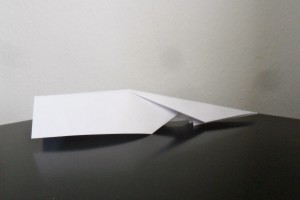
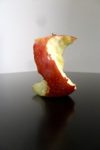
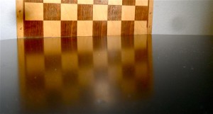
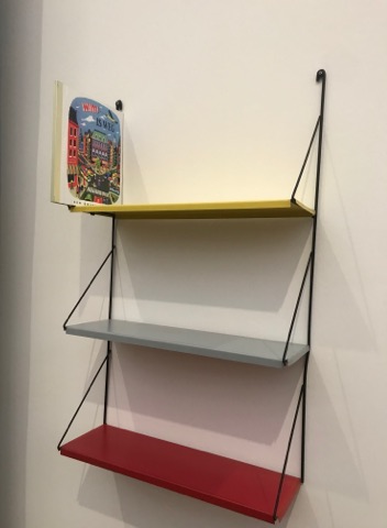
Inspired by Uta Eisenreich ;
Color and sex
Friday, May 13, 2011
A lecture by Linda van Deursen.
A lecture about De Stijl still being relevant in contemporary graphic design
For me the most fascinating part of the lecture was when Linda van Deursen showed that De Stijl is still present within the Gerrit Rietveld Academie. “Everything you do inside or around the school is in dialog with the school”
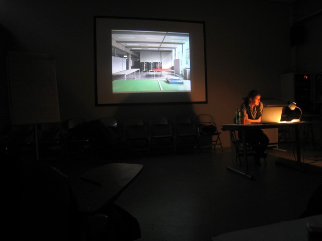
She talked about the building designed by Gerrit Rietveld himself: a simple glass box put over a concrete structure. She also talked about how he chose grey as the most neutral color for the background of the space we work in. According to Rietveld; “students works will give color to the school”.
For outside the working space he did put some color; the primary colors. The floors yellow blue and red, the toilet doors yellow.
I believe that in the beginning there where no male or female tags on the toilet, just the yellow color. I don’t think he would put something that sexist in this concept.
The floor used to be from a less strong material, making it prohibited to wear heels inside the school. This was changed later, so you could wear heels in school.
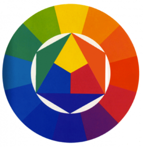
She made me look at this subject in a certain way. Rietveld his primary colors are very open to different possibilities: when you mix the colors, you can make any color you want. This made me think of an opposite way we use colors;
the colors in the routes our two different sexes
It starts before we are even born, the moment your sex is discovered.
Blue for boys, pink for girls.
I see these two routes where we split the things in our lives. For the boys we buy their first pluche football, something from the blue route.
And for the girls their first dress, something from the pink route.
The boys are raised playing competitive games with other boys.
The girls are raised picking out a new color for their dresses,
the first steps of these two very narrow routes in this not so open space.
By the time we are four we already get to see the end of the routes.
We see that we eventually all will get married and have children.
After you have learned this you will soon discover that there is absolutely no way for boys and girls to be on the same route. The world is now split up in to separate sides.
There are of course people that are not able to fit in these routes.
They either go to the other side, to be a boyish girl on the blue side or a girly boy on the pink side or they have to figure out a new route. Since you were given only blue and pink you end up mixing and since pink and blue can only make one color you end up with the purple route.
Start with Rietvelds three colors and there won’t be dead ends like that.
If you don’t fit in your yellow, blue of red route you can mix it up in all directions.
This education could be seen as an alternative space where you won’t get stuck. You can get loose of your brought by view and look in a primary colored base way in a space where this is supported by your surroundings.
Linda van Deursen mentioned in her lecture that she could have made this lecture about anything “I was trying to see if there were some links and there are”. For me there was the link between the blue and pink opposite to the red, yellow and blue.
You can write anything about this and maybe that is what it is about in the greater picture: you apply this institute on yourself.
This lecture was originally called "L’héritage De Stijl à la Gerrit Rietveld Academie d’Amsterdam" and developped within the program connected to the 'Centre Pompidou': Mondriaan /De Stijl
Man Loved, Man lived, Man Ray
Friday, May 13, 2011
To really understand Rayograms, i think one needs to experience it. It is not just about playing with objects on photographic paper in a darkroom. It definitely is more than that.
My first experience with Rayograms was in my second year of high school in Switzerland. It was so new to me. I knew nothing about darkrooms let alone photograms. As a first reaction I went out to the nature and collected whatever i found to be interesting. There were leaves, branches, beads whatever one can find. After playing around enough, i started becoming more picky about my objects. Each object had to be more special, had to have a reason to be there. That is where the process becomes very self reflective. Objects have meaning or associations and you end up questioning them and yourself through them. Until something makes a bit of sense, if not with their meanings, then with their visuals.
Looking at the Rayograms of Man Ray i really started to become curious of his life through the objects he used like scissors, films,keys flies, comb, needle, iron
Especially the negative film 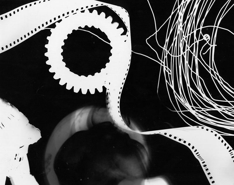 as an object seemed to be reappearing all the time as well as scissors and needles.
Despite their quality as objects, they really make me question their associations and that is where i started researching more on Man Ray’s life. I wanted to know to where and to what they were connected in his life.
Man Ray’s work not only seem experimental they also are very personal. The double thing with ”knowing” though is that once you know it you can never see it in its purest form and that is also quite important in very abstract, open end works like Rayograms.
Rayograms which is named after Man Ray started to come into existence only after he experimented with various mixed medias throughout his life. Thus it is important to know the stages Man Ray went through in his career to see the layers under his rayograms.
It all started at Boys’ High School, where he educated himself by frequently visiting the local art museums where he studied the works of old Masters.
Early works of Man ray includes expressive figure studies 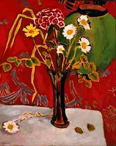 and Cezannesque landscapes made from observations.
Between 1913-1915 when Man Ray lived in a small artists colony in Grantwood, in an effort to keep expenses at minimum Man Ray shared the rent on a small shack with the American painter Samuel Halpert. It was from Halpert that Man Ray emulated the artists’s utilization of contoured form and brightened palette.
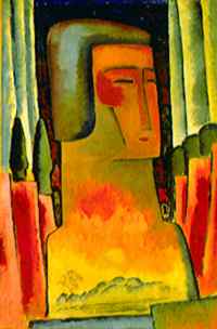
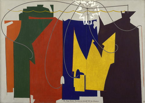 Over time Man Ray removed himself from direct observation of his subjects,reducing figures to flat patterned disarticulated forms and his imagery became increasingly abstracted and artifial.
While living in New York, he became friends with Marcel Duchamp who was interested in showing movement in static paintings. Obviously influenced by Duchamp Man ray’s works began to depict movements of the figures. Later on again like Duchamp, Man Ray made ” ready-mades”.
His work called ”gift” 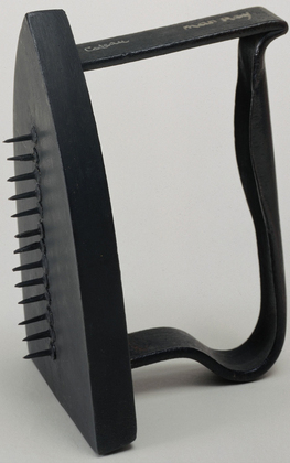 shows influence from both Duchamp and his parents.
Read the rest of this entry »
9 1/2 by 12
Thursday, May 12, 2011
Karl Blossfeldt born in 1865, was like his father before him, a huge lover of nature. This love soon turned into an obsession. For more then 30 years he documented and photographed sections of plants with a self made magnifying camera. No longer revealing them as natural forms but more as abstract forms.
In the time that Blossfeldt began taking photos around 1899, photography was more seen as something scientific. Karl just saw it as documenting to restore our relationship with nature.
At that time his photos shocked and inspired the art world, never before had the world seen plant formations like this, in such great detail. His photos were taken just about 60 years after the first ever photo was successfully produced.
If we look at Blossfeldt’s curriculum vitae, it clearly states he was a sculptor and professor of art, something quite different from a trained photographer or scientist/botanist.
But that didn’t mean he wanted his photographs to be viewed as art. The question remains, was Karl just one of the first macro fanatics studying the biology of plants, or was he an artist looking further then biology or was he both?
This is a question that Karl himself was obviously not fazed by at all. He simply stated:
“My botanical documents should contribute to restoring
the link with nature. They should reawaken a sense of
nature, point to its teeming richness of form, and prompt
the viewer to observe for himself the surrounding plant world.”
If he is trying to do so –trying to reawaken a positive feeling for nature– he is giving it to us, by no system of emotional representation. Just plants against a gray wall. So I’m guessing it is the plants themselves that are supposed to reawaken this in me and I’m not quite sure it is working.
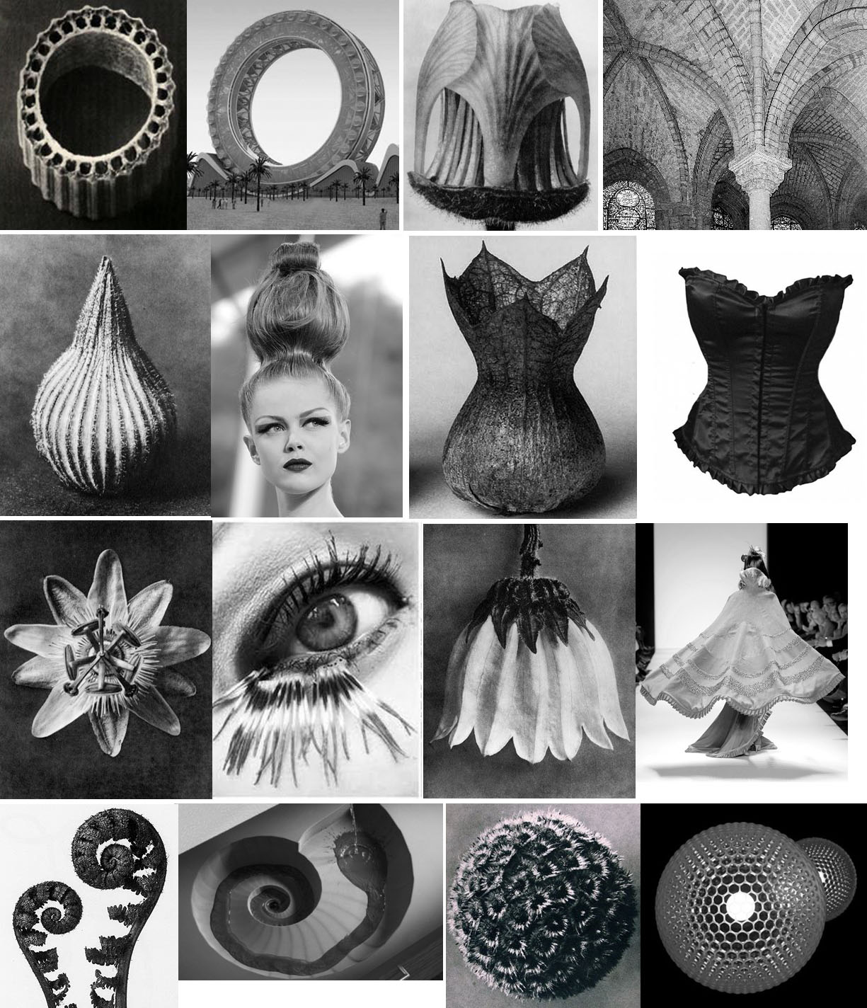
Even if I can’t find an immediate understanding of his work right now, I can at least have an admiration for his ability capture something on camera, no one had done before. For his ability to show how our man made world –with its architecture, fashion, design etc– is visually not much different from formations and patterns found in nature, probably without those designers even noticing it themselves.
Here are a few examples of architecture, fashion and design that is very comparable to the images Blossfeldt created.
code
Thursday, May 12, 2011
The mutual thing between the human genome and vending machines is the fact that they are both working by a certain code, in the terrible future where they will make human clones as organ donors there will be no difference in the code of the ones you save and the ones you sacrifice, vending machines that puts out livers and lungs.
code is a pattern, a repetitive logo ,buildings are made out of codes shaped like bricks ,physical truths are based on codes, if that(x) then that(y) .
code is a routine, even music is made out of code, 3 notes creates a chord, certain structure to create certain effect on the soul, minor chords make you feel sad, major ,makes you feel happy, and D minor makes you feel weird and suspicious .
the anarchistic code of sugar cubes is translated to energy = life . coded slaves can build a pyramid. the world war two was finished by cracking a code . fax could be transferred by codes , time is expanding with codes.
Dolce & Gabbana has a code .
analog photography has no code but mostly it is printed by coded printers, pictures of reality we see are usually made out of pixels in a certain order, dots, squares, circles . the eye isn’t seeing codes its sees forms, the brain translate it to codes, or maybe its the opposite .
Wednesday, May 11, 2011
Due to sickness, I was not able to attend the excursion to “Beauty in Science” in Museum Boijmans Van Beuningen. The name of the exhibition though really triggered my interest but I had heard some rumors that ‘checking the web page of the museum would not be any different from paying the exhibition a visit’. I had a look at the Boijmans website and classmates’ contributions on our design blog and I came quickly to the conclusion that the rumors were likely to be true. I had hoped for stuffed animals, old education books, fascinating scientific tools from out of space and paintings as ‘The anatomy lesson of Dr. Nicoleas Tulp’ – things that I had seen on my favorite floor of the beautiful Naturalis (Leiden) very often and that inspired me every time I had visited this museum. And though I don’t need stuffed animals and fetuses in jars every time I visit something science related – I’m also very open for new experiences – the things I saw on the website were pretty dissapointing and above all, nothing new. Something on the web page of “Beauty in Science” says it all, actually:
In his essay Hans Galjaard writes about how he was moved by a film of 4D ultrasound images of the development of the human foetus made by the gynaecologist Stuart Campbell. This was the beginning of his plan to collect aesthetically pleasing scientific images. In his quest for images he has asked many researchers if they have also experienced such a moment of overwhelming beauty – a so-called ‘Stendhal moment’ – but this was not the case.
So how should we experience this ‘overwhelming beauty’ if even the researchers who contributed footage for the exhibition did not feel anything of this themselves?

s-objectivity
Wednesday, May 11, 2011
“The YouTube slogan is “Broadcast Yourself”, an encouraging motto that calls up associations of a democratic Internet commons where all voices can speak and be heard. Here, it says, is a space for all individuals to create and control a channel of their own, transmitted to the world.”
Elizabeth Clark – What Good is the ‘You’ in YouTube? Cyberspectacle and Subjectivity
http://gnovisjournal.org
What is objectivity? Is it what we learn in school, the universal truths, that are right and won’t change no matter what context? Water will always frozen under 0 degree Celsius. Fair enough, objective truth. But what happens when objective facts are translated in subjective ways? Where is the neutral space there? What becomes of the neutrality of objectivity? We live in a world of exposure, of the self exploting, where the more you show the more you become. So where is the objectivity in all this? Where does it places itself within this world of subjective googles?
Laid Off – Natalie Bookchin from natalieb on Vimeo.
If we take the work of Natalie Bookchin – Laid Off, she shows an objective fact, to be fired, through the light of a lot of different experiences, all of those told by the person fired, in the first person, as if they were talking to a friend, but in fact made for youtube. Here she uses the personal diary of millions of people, put at disposal by them through a videoplateform, to talk about a fact, being fired. There is no maybe in that action, you don’t get “maybe” fired. You are either fired or you are not. But the way this fact it’s told by all these people, expresses more of the sensation of being fired, the feelings, the human side of the objective fact. Though I might question the means of communication that these people felt the urge to use, this self entertainment, I do nevertheless agree that objectivity is useful, but nothing without subjectivity. As one thing can’t exist without it’s opposite. So objectivity has it’s place in this neverending “me” world, it’s neutrality might be hidden under all these personal experiences, but it is the base of any reaction, it gives the impulse of reality that you need in order to jump (or not) into your own truth.
https://designblog.rietveldacademie.nl/wp-content/uploads/2011/05/Screen-shot-2011-05-11-at-6.24.31-PM-161×300.png
Wednesday, May 11, 2011
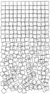
Computer art is any art related to computers – in the display or in the production of the work. It is such a broad term that I did not really know where or how to start. In the 1960s, computers were very exclusive things and the artists who started experimenting with these machines were really doing something that was never done before with tools and techniques that were never used before. But nowadays, digital technologies are integrated in traditional disciplines and therefore it is a bit harder to define where the term ‘computer art’ is applicable.
For what I have see until now in my short life, I don’t have too much affection with digital arts. But that might also have to do with ignorance, and the fact that even my mom can handle computers better than me – sometimes I even edit my photos in Word, something that people would like to kill me for. But when I found an article about algorithmic art, I could not ignore the fact that computers can actually do stuff that goes beyond human capability, and create things that would not be possible without automation, which is interesting, especially when you think of it as something that started about fifty years ago. They now seem a bit ‘flat’, but these works were the first steps into making art that involves science (and maybe also, science that involves art?), which makes me find them truly fascinating. Because these artists really explored the borders of what was possible with new techniques, using them in favor of their creativity, I find the link between art and science in these works much more interesting than in the works in the Beauty in Science exposition.
mystery in beauty
Wednesday, May 11, 2011
First i’ll quote a little bit of wikipedia so that you know, if you didn’t already, what the golden ratio is, because that’s what the subject is and it might be nice to know:
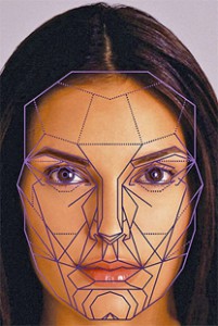
“In mathematics and the arts, two quantities are in the golden ratio if the ratio of the sum of the quantities to the larger quantity is equal to the ratio of the larger quantity to the smaller one. The golden ratio is an irrational mathematical constant, approximately 1.6180339887.”
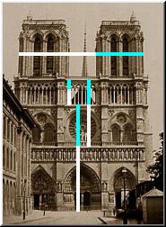
The golden ratio can be found in a lot of things that are considered beautiful, because it gives a certain balance that is liked by humans. It can be found in: nature, music, architecture, human body/face, art, etc.
The golden ratio was already ‘found’ by the ancient greeks, but it was only during the 19th century that they discovered that it carried a beauty that can be connected to art, architecture and nature.
Le Corbusier, a swiss-french architect, developed the Modular, an architectonic measuring system that uses the golden ratio. He used the modular for all his buildings, but he stated that he thought it was a bit sad that the golden ratio was discovered in relation to aestethics, because it took the mystery away from beauty.
The mystery of beauty appeared to be, in much scientific opinion, just the average.
I wonder what is this ‘mystery’ anyway. The beauty of ambiguity, something that keeps you wondering, and surprises you. Because at some point, caricaturing an attractive shape will result into abnormality that that concurrent preferences for averageness will outweigh preferences for the attractive shape dimension.” To put it more simply, Plain Jane is not without her charm.
Moholy-Nagy’s Photograms
Wednesday, May 11, 2011
Lászlo
László Moholy-Nagy was born in 1895 in Hungary. Here he started painting around 1918. Around this period he also moved to Berlin to develop his talent.
Besides painting and photography Moholy-Nagy also made during his life a lot of other art in which he often involved light as a media. He made sculptures, collages, films, graphic design and even more different work.
Here below you see some of his early paintings.
In 1923 Moholy-Nagy became a teacher at the Bauhaus School in Weimar after he got to know Walter Gropius; the man behind the Bauhaus.
The school had a total new way of teaching. Students had the possibility to work with a lot of different materials and were stimulated in there independency and personal development. Information Bauhaus (dutch) or (english)
It was when Moholy-Nagy became a teacher at the Bauhaus that he started experimenting with typography and photography as well. When Moholy-Nagy later moved to the VS, he there started the New Bauhaus in Chicago and continued his experiments with film and photography.
philosophy
Moholy-Nagy believed in art as part of a lifestyle. A collective mentality in which art, together with other aspects of life come together as a ‘gesamtwerk’.
He was convinced of the forming function of art. He saw the ideal society as one in which everybody is practicing art. This would lead -so he thought- to an improved society. He joined the group MA, which believed in the revolutionary potential of art. more on his theory and himself
the photogram
A photogram is a print of something that lies on light sensitive material and then get’s lightened. In other words: A photogram is a form of photography without the use of a camera.
This is, I think, very interesting.
To me it’s fascinating to see the direct forms of a device on paper. It makes in a way the distance between you and the subject on the photo smaller. And the realism of a photo bigger.
So what you see is exactly what it is.
Moholy-Nagy tried a lot of different things. For example the experiments with the light from different angles. And also many try-outs with different types of material; in special the transparent materials.
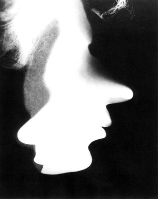
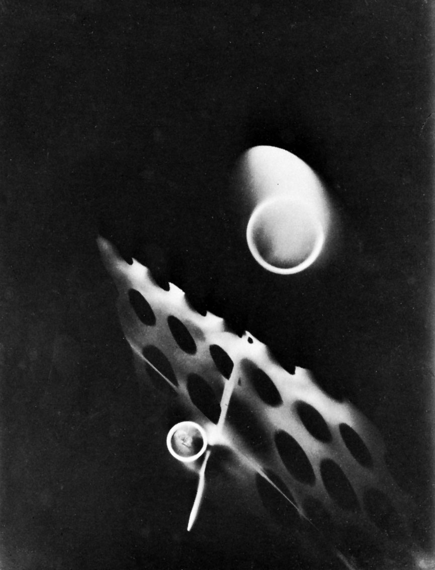
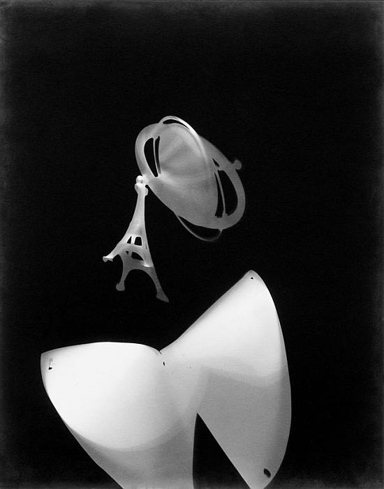
The photogram’s of Moholy-Nagy are often abstract but not always. Lazslo worked with figurative images in the photogram as well. He build figurative images out of form or/and made use of the negatives of other photo’s.
But just to give a little bit more information about the history of the photogram because you might find this interesting (as well as I do) I’ll give you some more facts;
– The first illustrated book containing photogram’s dates from 1843, from Anna Atkins. Not so long after the invention of photography itself.
– In the early twenties there was a lot of experimenting done with the photogram. Notably by Christian Schad and Man Ray.
– from the moment Moholy-Nagy discovers the Photogram (around the time he started teaching at the Bauhaus) he continuously produces them until his death.
concluding
After visiting the exhibition Moholy-Nagy “Art of Light” and seeing all his work paintings, films, objects, collages and a huge number of photograms, I became really interesting in them. By reading about Lazslo and looking at his work I found out that there is so much more to learn about him and this time, which I think will inspire me to design and create more photo’s for myself. Especially in relation to the philosophy of Moholy-Nagy about photography. This because I agree with him about how to make use of black and white and composition in photo’s. Over-thinking the work of Moholy-Nagy resulted into an eye opener into the possibilities of photograms or making use of light in art.
some other sources:

 Moholy-Nagy: The Photograms, catalogue raisonné published by Hantje Cantz / The Art of Light exhibition cataloque(fotogrammen)

Biography Lazslo Moholy-Nagy [Rietveld Library].

general information on photograms

How to make a photogram
Minerals, dead pets, design?
Wednesday, May 11, 2011
When searching for ‘mineral art’, Google suggests I look for ‘minimal art’. When searching for ‘mineral design’, the first hit I find is a website from someone who collects minerals and sells them as design. The first question that arose in my mind was inevitably: is there such a thing as mineral design? Sabine Amory, the woman who ‘seeks the most beautiful minerals she can find for her own collection and for her customers’, simply calls her website “mineraldesignshop.com”, but can you call it design when someone merely finds something beautiful of which Mother Nature is the only maker, and labels it design? I say no. In the art world you can put a ready-made in a museum, and then call it art. But the whole idea of design, is that you design something. You use your brain and your hands to create something new. Or is it old-fashioned of me to think like that? Am I condemning Sabine without a good reason? I decided to ask her, along with two other companies that call themselves ‘Mineral Design’ (mineraldesign.com.br and mineral-design.com). My question was: could you please give me your opinion on minerals as a material in contemporary design? It’s been two weeks now, and I don’t count on a reply anymore. Maybe Sabine doesn’t see herself as a designer after all.
Father and son Blaschka dealing with reality
Wednesday, May 11, 2011
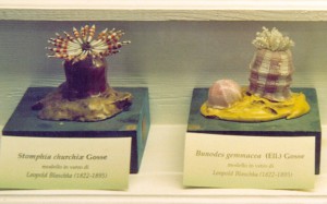
Leopold Blaschkas (1822-1895) came from a long line of skilled glass makers. The family was originally from Venice, but lived in Bohemia, (what is now the Czech Republic). When young Leopold studied to become a goldsmith and gem cutter but then joined the family business and his main work was to produce glass eyes.

 In 1857 his son Rudolph was born but shortly after two tragedies occurred in his life, his wife died in an cholera epidemic and two years later his father too. It was hard on him but he found a way to deal with his sorrow. He was artistically talented and started to look at the nature for inspiration, and sketched what he saw, plants and animals from outside his home and in exotic natural books he found. And then, on a boat trip to south America, he spend his time looking out in the sea around him. There he got struck by and fascinated by the sea animals he saw, those without
backbones especially,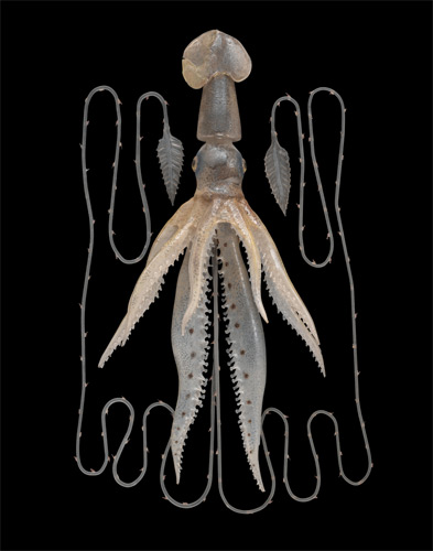 because of the transparency of their skin surface, which reminded him of the glass he was used working with as the glass master he was.
Although he was already one, he and became even more a passionate nature history lover and as a hobby he recreated both plants and animals in glass. After his encounter with sea animals he started making them in glass and then became one of the first who recreated animals from the sea in an accurate way, at that time you couldn’t take photographs under water.
In the late 1850s Leopold was commissioned by a Mr. Prince Camille de Rohan to create 100 glass models of a orchid collection Leopold already had started to work on. His models then got exhibited in Dresden Natural History Museum, This was the start of his career.
Further understanding of ”Beauty in science”
Wednesday, May 11, 2011
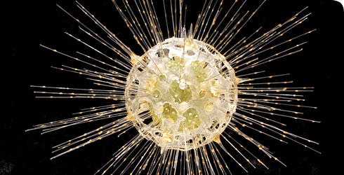
In the ocean, 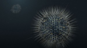 small creatures are swimming around, a form of zooplankton they are, called radiolarians. The name zooplankton is derived from the Greek word ”zoon”, which means animal, and ”planktos”, which means ”wanderer” or ”drifter”, a drifting animal. Individual radiolarians are normally smaller than a hundredth of a millimeter, but some reach the size of a full millimeter or even more which makes it possible to see them with the naked eye. Some species are holding onto each other in a group and may reach a total size of a centimeter and even meter scale all together. The remains of the radiolarian skeleton cover large parts of the ocean bottom and works as radiolarian ooze. The shells of the radiolarians when they die, sinks to the bottom of the ocean, and over time, if enough shells sink together, their skeletal remains become sedimentary rock.
These drifting animals have been a great inspiration in creative fields. They look almost non earthly, both peculiar and beautiful and works as sorts of readymades from nature. An important person in the mapping of the radiolarians is a german biologist called Ernst Haeckel. He named around 150 species during his lifetime. More than a biologist he was also a philosopher, physician and an artist. I find this combination of working fields interesting and the story of Haeckel links to the beauty in science exhibition that is running at the museum Boymans van Beuningen this year. In year 1904 Heackel published a volume called Kunstformen der Natur, which consists of his 100 best prints of organisms from the sea, many of them first described by Heackel himself. Heackels work is a proof for that science and art can operate side by side and that they inevitable borrow from each others world.
It is not only Heackel 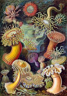 that has been inspired by radiolarians. There are music pieces composed, architectural work and there is even a whole art genre named radiolarian art.
It is indeed something special about the planktons. Their structure is a living proof for that the more even a geometrical structure is, the more solid a construction will be. The shell which is made out of silica, also used when making glass, is inspiring for material oriented people. Radiolarians pattern have been casted and used over and over again and my conclusion is that reality and what reality offers is a fascinating subject and a good design and art recipe.
Radiolarians looks as if they were born out of pure imagination and they make me think of cells from a body, about the depth of the see and of universe in its whole. I get the same feeling as I got at the Boymans-exhibition when looking at a picture of the universe. It made me think how very surreal it is that we live inside that picture, now I think how very surreal it is that us living things, built out of small details, living in that big picture. The picture of the universe made me think about how we so badly want to understand why and about our need of decoding our reality and I suggested that religion, science and art works with the same questions but with different approaches, and now I think it is fascinating that when zooming out and when zooming in, the same magic occurs.
And then I wonder. Why did the picture of the universe got my attention in first place. And why do I react the same way on radiolarians? Not many other creatures inspire in the same way, i haven’t heard about rabbit art for example, or shark art. And why is that? My conclusion is because of the esthetics and because we are forced to leave our everyday proportions. It is actually purely the look of the radiolarian that was interesting to start with, I assume it was the beauty that made Haeckel treat radiolarians in artistic ways. The beauty, not the function they have, or history or further anecdote. It makes me think how important esthetic actually is? Is the magic I try to describe beauty? And is actually the good art and design recipe beauty? Would the radiolarians be interesting if looking like potatoes? I don’t think so. And what would happen if not needing to zoom in and switch from everyday proportions? Would radiolarians be as interesting if they were in human size laying around on every street?
It is somehow comforting that radiolarians swim in the sea and that stars shines from universe. And in whatever field we are working with, we are striving to find our place somewhere in between. And some make buildings and jewelry and other radiolarian art.
Didn’t I see this before?
Monday, May 9, 2011
Didn’t I see this before?
Didn’t I see this before?
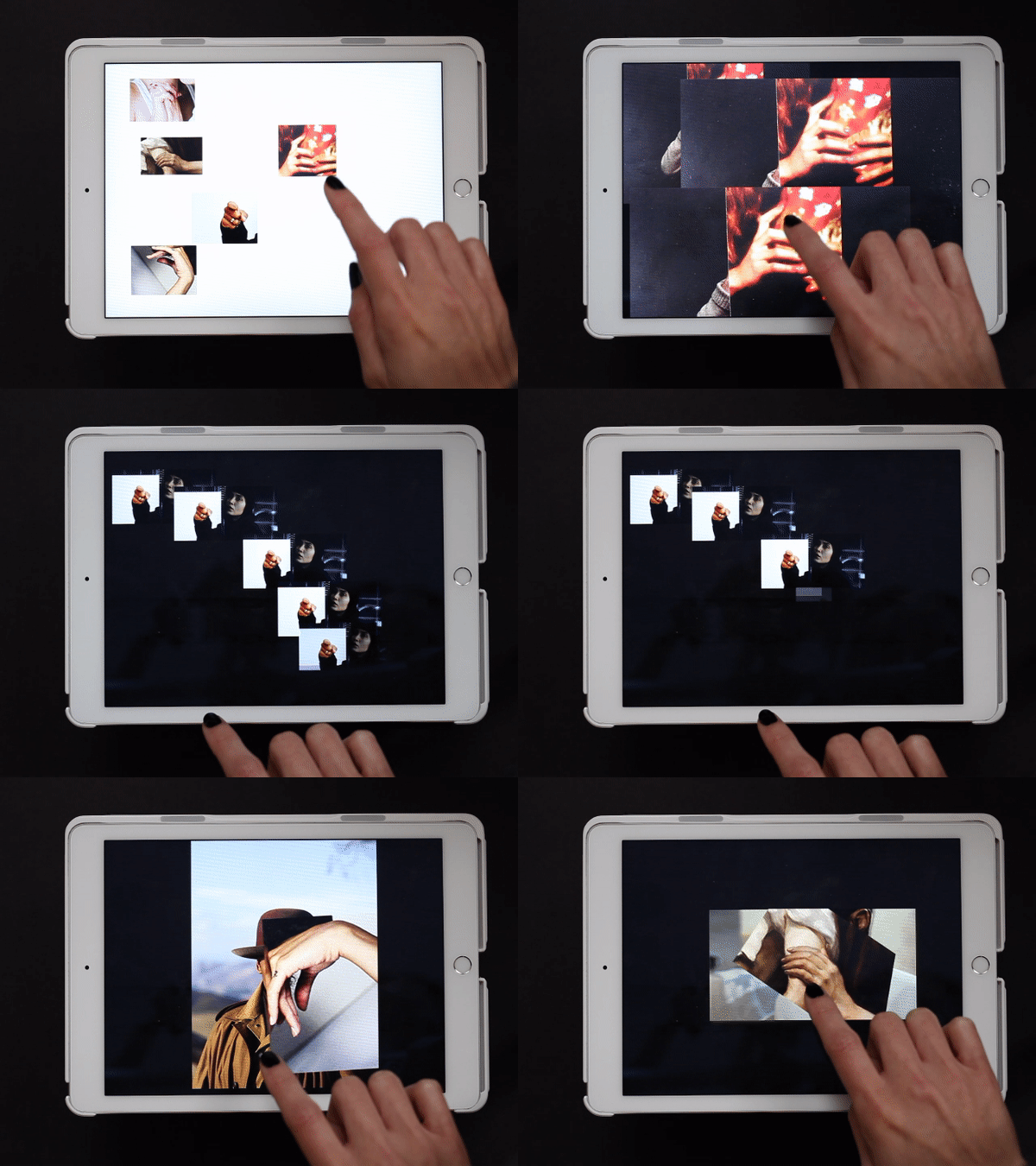
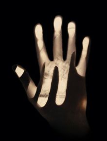
In a web app I created for iPads you can move along stories told by various images and collages of hands. Sometimes you end up at a point you think you have experienced before. But is it really the same, or does it just familiar? You might just have a déjà vu.
Have you ever had this strange, but uncertain feeling that you have experienced something before? An overwhelming sense of familiarity? A moment you are not sure if something similar or the exact same thing already happened? Then you belong to the majority of people who have had a déjà vu. Scientists are still unsure how to explain this phenomenon. Some try to link it to memory functions, claiming that familiar events can trigger memories of forgotten information. Some say it’s a more like a “memory check” of our brain: a signal that there is a conflict between what we think we’ve experienced and what we actually did experience.
There are other interesting theories as well that try to explain a déjà vu:
Precognition: We have the power of foresight. A déjà vu is the evidence that we are actually able to predict the future.
Reincarnation: We have lived before. A déjà vu is the surfacing of a hidden memory, evidence of a previous existence.
Higher dimension: Our consciousness actually exists outside of our physical bodies in a higher dimension, and when a déjà vu occurs, it’s a brief moment when that separation becomes clear.
Parallel universes: There are other versions of ourselves, living in parallel universes. A déjà vu is a moment we share a memory with an alter ego of another universe.
Precognition: A déjà vu is the evidence that we are actually able to predict the future.
In whichever explanation we believe in, the question remains:
Didn’t I see this all of this before?
Uta Eisenreich
Saturday, May 7, 2011
PAY ATTENTION AT YOUR BACK !
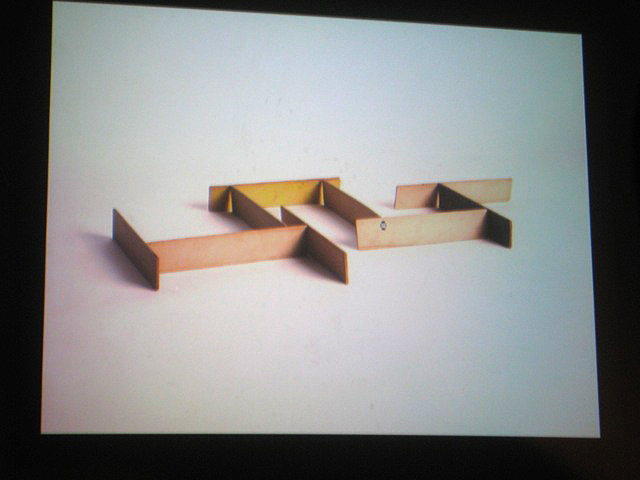
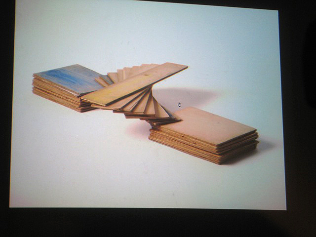
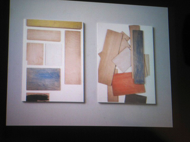
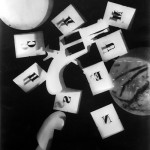
Uta Eisenreich is a Dutch photographer/artist, teaching at Gerrit Rietveld Academie. Looking at her works, especially at her last book “A not B”, I noticed the important role played by her background.
The book consisting of a series of still lives, inspired by non-verbal IQ tests for children. The images show changing combination’s of stereotypical domestic objects. The layout of these tableaux is determined by an underlying logic that the viewer is subconsciously triggered to discern..
She express herself through Photography, Performance, installations and Games. As I mentioned before I was captured by her ability in playing between subjects and backgrounds. I found that book a clear example of balance and contrast between basic elements; all tricked out by “title-suggestion” that create a sort of curios analogy.
Full colors and daily forms give me an idea of comfort.
Known.
While an esthetized light, an independent background create an idea of gravity absence, almost vacuum.
Unknown.
The almost absence of shadows and the extreme perspective, as in the Stenopeic Photography let disappear the deepness creating an optical ? illusion where is easy to get lost in focusing the main subject. Subject and background are on the same plan, they have the same value in the composition. From that originates my interest about the fact that ” a background is always present”. We can not have anything without any background.
Years ago I went to an exhibition of American Landscapes in the XIX century, damn it was boring. Nature, sky, horizon*….I couldn’t find a point to focus on. What is the subject? The main interesting point? It is a landscape, where is the background? Probably it is the landscape itself. Then Monet ‘s Waterlilies…subjects melted with other subjects in different plains ……
After I had the occasion to see a Rothko in person; the absence of conventional subjects led my sense to experience the paintings as a start point. Like a landscape, like a background. I still have to get the point.
Many times I heard discussion about landscape or background in architecture; how to integrate, to camouflage a structure in a determinate location/landscape/background.
In painting as in design as in architecture….. It can be monochrome, flat, floral, fizzy, silent….We can use it to amplify the main subject, or just to diminish it. Everything starts on something else. The Earth’s gravity has perhaps led us to a method of building based on addition;
X + Y
X + Y + K
X + Y + K + H + a canvas, a problem to solve, a rock, a dream, a need, a sheet of paper…
Again –just to remember– isn’t how and where we present art the main important background?
Luckily it is an extremely versatile element. So versatile that we can even give it a determined value and meaning. However it can be an idea if we want.
 *An expert mind pointed out to me that If we look at the horizon in Uta ‘s pictures, it is almost always not completely unbroken. As if she just did not crop it right and a little piece of the set-up shows. A corner or something else…… Like that the 2d effect is brocken as she shows a reference to the 3d set-up.
Don’t you wish you had microscopic goggles?
Thursday, May 5, 2011
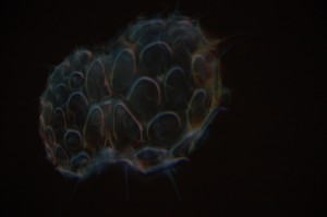 Exhibition rooms were made bare for imagery with such vivid and strange colors and shapes that its hard to believe that these images are in fact real life forms, just microscopically zoomed in. At the beauty in science exhibition in Boijmans van Beuningen museum, this kind of scientific imagery is on display, only taken out of its scientific comfort zone.
You could discuss if this is in its favor or not. On one hand having a different audience looking at ‘scientific’ imagery might give light to those who don’t understand what their seeing, to make use of the visual aesthetic and inspire them. But on the other hand they are also taking a risk, in a way like art, by showing a whole different audience things they understand themselves. A lot of people looking at it most probably won’t.
A majority might end up aimlessly walking around the museum wishing they had microscopic goggles. Just like some who go to art galleries and instead of thinking about the ‘message’ of a painting, instead think something more like: I wonder if her boobs looked like that in real life.
But no matter what they were trying to achieve, this exhibition could certainly change your way of thinking that there’s so much more visually to our world that we couldn’t get our head around it. But I don’t think this is something groundbreakingly new and for allot of people the beauty in science exhibition will do nothing more then the name says, show us the beautiful side of science, but if it will do more then that, I guess is just a matter of opinion.
Germaine Kruip: Modern Silence
Tuesday, May 3, 2011
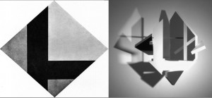
I could talk about the obvious, that Germaine Kruip’s Counter Composition (2008) strongly relates to the Stijl and that she was clearly inspired by Theo van Doesburgs Contra-Compositie. The Amsterdam based artist ![]() got her idea when she found material she wrote when she was thirteen about van Doesburg.
got her idea when she found material she wrote when she was thirteen about van Doesburg.
I could also talk about how a work that is so strongly inspired by a movement that happened more then 80 years ago can still exist in this time.
But to me this is not the most interesting part about Kruip’s work. I can see how Kruip’s work is also very related to now and to her other work, in dynamics and use of light. And I think it is very much acceptable to take inspiration out of other one’s work, if you can make something new and your own out of it. The work is only an echo of the original work of van Doesburg. Van Doesburg emphasizes that the colors, shapes and lines are forming a dynamic contrast, Kruip takes that even further by actually using movement.
The thing that really catches me, which is maybe also obvious, but therefore not less interesting, is the use of simple, subtle images, the silence of it.
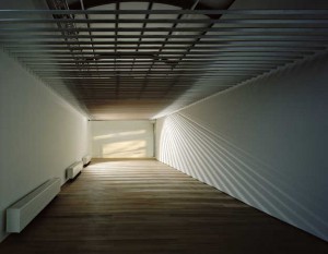
Her work continually changes as the light ![]() changes, using reflections, movement and daylight. In most of her works she is using daylight and by catching it with mirrors or shapes it leaves shadows, the work changes by the minute as the reflection or shadow of the light does. It is serene, sensible and calm, which is very much my taste. It’s not screaming for attention, using bold images, referring to mass culture or other problems in the world. It’s silent and well thought, showing beauty in ordinary things.
changes, using reflections, movement and daylight. In most of her works she is using daylight and by catching it with mirrors or shapes it leaves shadows, the work changes by the minute as the reflection or shadow of the light does. It is serene, sensible and calm, which is very much my taste. It’s not screaming for attention, using bold images, referring to mass culture or other problems in the world. It’s silent and well thought, showing beauty in ordinary things.
I think that noise and action are overrated, but people do not seem to take silence. We are used to the noise, as we are all living in this over civilised world. Even now I’m sitting in my living room writing I hear cars, people closing doors, sirens, once in a while bird, people locking there bikes and this all within a minute. The same counts for images. We are overwhelmed with images.
We live in a world where everything and everybody is screaming, for attention, for power. We are constantly moving, faster and faster. There’s no time to stand still and think. We need to be amused and entertained the whole time and it seems that we got so scared of being bored. The images we see, in movies, tv and also in art, need to be stronger every time, because otherwise it won’t have any effect on us. Everything needs to be more violent, more sexual, more shocking. We’ve already seen it all. But this constant overflow of images is also tiring. Always moving and going forward, isn’t the solution for being bored, maybe it is even the cause.
So in this sense I find Kruip’s work a sigh of relief. Things that aren’t fast, or loud are a very nice change, images that give you space and time for your own thoughts and ideas. ![]() The images that Kruip uses are sober and simple. But therefore not less beautiful, actually in their simplicity they are particularly aesthetic, catching beauty in everyday life.
The images that Kruip uses are sober and simple. But therefore not less beautiful, actually in their simplicity they are particularly aesthetic, catching beauty in everyday life.
Then on the other hand her work also fits very well within this modern world. By using mirrors she is generating fragments of images, a blended image-stream. The shimmers of light could also be associated with city life. The reflection makes you aware of yourself and the other people viewing. Even the speed is quit fast. In Counter Composition the sculpture turning in less then 10 seconds. An other example is Reading Room, (2006-2009), which was exhibited in ‘the Paviljoens’ in Almere, a piece where a light spot circulates through a room, the light and shadow changes as with daylight, but much faster. You are confronted with time, the going of time. But it is also very familiar in this ever-turning world.
So maybe Germaine Kruip’s work is a combination, a combination of this very aesthetic subtlety with references to our fast moving environment. Maybe it is a modern silence.
