Thursday, March 19, 2009
I was looking in the libriary for an interesting designbook and saw numbers of books about design. The reason I chose this book is because I think there is nothing shallow about fashiondesign. In the artworld fashion can be seen as commercial and not meaningful but I think that’s wrong. Fashion is all about meaning, at least it is to me.
Why do you choose to wear what you are wearing today?
What were you thinking this morning when you picked your yellow sweater or your black dress?
Why did you buy them?
This all has a simple answer. Individuality.
Who are you and how do you want other people to see you? How do you feel and how does that reflect by what you’re wearing on other people?
cat. nr: 14975
keyword: individuality
Thursday, March 19, 2009

I am in my mothers tummy… I am playing with myself…
I am born… i am playing with my cuddle toys…
I am 3 years old… I am playing with other children…
I am 14 years old… I am playing with boys…
I am 18 years old… I am playing with men…
I am 24 years old… I am still playing with men…
I am 32 years old… I am playing with my kids…
I am 63 years old… Am i still allowed to play?
YES, I AM…
cat. nr: -cal-2
keyword: playground
Thursday, March 19, 2009

Although this is a completely black book, this book represents the best book designs of 1988.
The design of the books is simple but elegant. Just with the name of the author and the title of the book. Some designs make use of illustrations. There is not much use of different colors. Mostly, two
or three colors on one book. The designs of the books that are the most attractive to me are those with a simple choice of typeface , that represents just the basic information of the book.
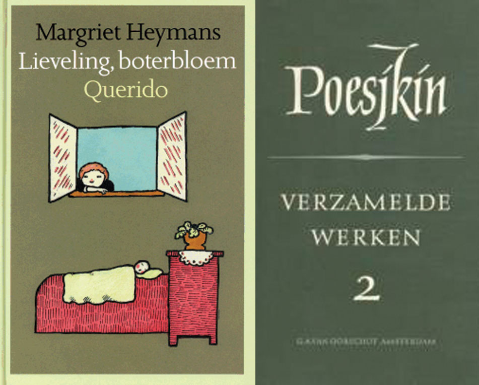
For me the most attractive design of he book is the one that uses very light colors’ for illustrations. Although I already said that the most attractive books, for me, are the ones that use, just words for the design, I found this design the most fascinating in the collection of 1988 because of the simplicity of the illustrations that make the book very stylish. It’s a children’s book of Margriet Heymans “leveling, boterbloek Querido”. The book that is less attractive to me is the book of Poesjkin “verzamelde werken 3”.The reason for that is because of the use of, on my opinion, hideous use of the teletype and large font for his name. The color of the book is dark green that is used a lot in the design of books from that period. Although I like the simplicity of the design of the books from that period, this specific green is not attractive to me at all.
cat. no. 758.3
keyword: best
Thursday, March 19, 2009
Drie jaar geleden liep ik langs een winkel waar een televisie in de etalage stond, ik zocht naar het prijs kaartje; niet te koop stond erop. Laatst liep ik over een tweedehands markt daar was hij mijn televisie; geen geld bij me. Nu keek ik in de bibliotheek van school wie de gene was die het had ontwerpen, het was een raadsel. Iedereen die ik het vroeg wist wel een letter van zijn naam maar ik kwam er als nog niet achter als ik al de letters achter elkaar plaatste.
Maar gister kwam ik er na lang zoeken achter. Je hoeft dus niet meer op de Design afdeling te kijken van onze bibliotheek. Ook al ben ik nu zelf wel nieuwsgierig of hij er toch bij staat.
mijn zoektocht
my search
Thursday, March 19, 2009
“How things don’t work”…I have to admit that title worked as cliché of love at the first sight. Coming into the section of strictly design based field and being obligated to choose one book as starting point of next one month of study didn’t completely contribute to the feeling of being excited about further choice but then this title appeared. For miracle to be even bigger it was in part of industrial design to which one I defenetly don’t feel interested in.
Passing through introduction and first paragraph gave me satisfaction of knowing that there is no possibility of wrong choice. It is about practical problems which modern technology that we are using for every day activities brings and opposite result of the image of comforts and easiness that we expect but it is not critically focused. They don’t directly attack industry for producing all this kind of gadgets… there is a solution and that is inventing, studying, understanding and improving things that are already made or left over. In first chapter discussion about convenience of bathrooms and bathtubs appears, which is quite funny on the first reading. As you think about it more closer it is actually truth. Also what might be interesting is comparison to situation of the same kind of environment that we are situated right now maybe 20-30 years after this book was written.There are some improvements but basic problems are still the same caused by politics of capitalism market…use less make more.
“Societies and the individuals making up social groups ,tend to respond in a number of different ways to each new problem.There is capitalist approach-make it bigger,the technocratic one –make it better,the “revolutionary”solution –portry the problem as an example of an exploitative system ,and pre-industrial romantic fallacy-don’t use it.maybe it will go away by itself.We propose a fifth alternative response-let’s invent a different answer.
cat. nr: 770.6 pap 2
keyword: invention
Thursday, March 19, 2009

I browse dusty books signified by typeface and the often great level of deterioration.
Title, Title, Title, stain, Title, stain, tear and of course a nagging pain in the neck caused by the uncomfortable positioning of the head, necessary to read the titles on the afore mentioned dusty books with ugly typeface justifying their own existence by amazing amounts of crappyness meant to be intriguing.
I browse dusty books and I am very impatient and yes, very annoyed.
I have an assignment to fulfil.
I bend down to take a peek at the lower levels and find: stain, tear, Title, Title, stain, bright clear red outstanding unpretentious untitled fat thing. It was such a relief.
cat. nr: 942.9 chun 1
keyword: develope envelope
Thursday, March 19, 2009

Unique, Traditional Techniques for the Modern Weaver by Marjorie Cason and Adele Cahlander
I’m quite good at misreading. Today’s appeared to have been Waving out of Weaving. The thing immediately came with a very clear image : Someone had wrote a book on visual yodelling. Ancient—it had to be ancient—technique from Bolivia’s vast highlands.
By when I kneed to grab the book my mind was already wandering among bits of sign language notions I could recall, considering amplified variations after the needs of long distance communication. The surroundings of my prey presented unexpectedly high occurrences of the term jewellery and the blown-up pattern on the book cover soon identified itself as woven cloth. So much for highland waving.
While flipping pages, I still got stuck by the amount of weirdly positioned hands, drawn and pictured struggling with threads. I drew them and asked a sign language student to tell me which parts of the series could made sense. It turned out saying : ‘Independent animal west coast gives’.
cat. nr: 779.1-cas-1
keyword: animal
Wednesday, March 18, 2009
The book ‘The Art of Rock’ is about rock posters from 1955 until 1987, ‘From Presley to Punk’ stands on the cover.
I think. Only if you want a clear image of the atmosphere that these poster want to give you, you should not look at them closely. You should just brose through the book. Then you will find out that the atmosphere is mostly about drugs, endless summers and music. I like that. It takes me back to a few years ago when there were these cosy Friday and Saturday evenings with friends and no parents in the house when we just wanted to get as fucked as possible.
Another reason to not look to close at the posters is because most of them are not that good. When you do look good at them and look true all the tricks you will see there is a lot of graphic design creativity, which can work inspiring.
cat. nr: 754.1GRU
keyword: time
Wednesday, March 18, 2009

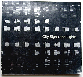
book
I picked the book City Signs and Lights (S. Carr (ed.), Boston, MIT Press 1973) from the Rietveld library. The title immediately brought up associations with Walter Benjamin´s concept of the flaneur, the prototype of the bourgeois consumerist as the socio-cultural product of the earliest department stores in Paris established around 1900. Parallel to this idea is, I believe, the Society of the Spectacle (Debord). The power to attract customers with light commercials like lamps attract bugs, by accepting the existence of Desire within the subject (Deleuze), creates a competition in the city landscape, that alters the landscape into a continuous feed of visual stimuli. This competition for attention in the urban environment leads in its turn to a new set of rules or aestethics for such commercials. This is probably the design part of the fascination: the competition within the city landscape for attention of potential customers that sets the parameters for an aesthetics of a denotation system that functions almost as a parasite on the urban environment.
(The author of City Signs and Lights doesn´t seem to mention a historical context)
The second association I had when I first saw the book, was Wong Kar-Wai´s Happy Together (1998) in which shots of city signs and lights are metaphorical for emptiness and alienation between the two main characters and their environment.
The book in itself does not provide extended written articles, but the title and images provoked associations and ideas about an exhaustive list of topics on the conditions of modern western society, semiotics in general, and the meaning of neon as a material or medium in particular.
cat. nr: 754.5-carr-1
keyword: neon
Tuesday, March 17, 2009
– First week: I grabbed the first book that caught my attention. Something on weaving, because I had misread it and thought it was about waving. I then drew all the hand positions displayed in the book and asked a sign language student to associate the ones he could recognise to words. The result became the starting point of the exploration: ‘independent – animal – west coast – give’.

– Second week: I used the search engine of the library. Typing in, one after the other, the four different words, I ended up with 10 book results. 2 for ‘independent’, 6 for ‘animal’, none for ‘west coast’ and 2 for ‘give’. 4 of the books were fitting within the design field, 2 of the ones found with ‘animal’, 2 with ‘give’.
Wondering about what to do with these four books, I took inspiration from a Wire album cover, On Returning, (a compilation of the three first album covers of the band) and compiled the four book covers.

– Third week: I asked someone for leads. Eveleen, who I asked if she would have ideas on compilation and art, told me to look into a book she heard quoted in a lecture, it was called something like ‘Postmodernist exhibition’. I couldn’t find a trace of the book in the library here, in CS nor on the internet but the idea was seducing.
In the meantime, I came across Martino Gamper’s work, approximately fitting with the subject I gave myself, but I wanted to keep using the system I had set, relate to the defined keywords.
I came back to the 10 books found earlier. 4 of them, as well, were fitting within the art field, 2 of the ones found with ‘independent’, 2 with ‘animal’. I then tried to install the 4 books as a ‘postmodernist exhibition’.
Funny thing is:The selection of the second week, on design, consists of books found through the keywords: “animal give(s)”.
The one on art then consisted of books found through the keywords: “independent animal”.
by Jules Estèves
keyword: sign language