Skip to Content Skip to Search Go to Top Navigation Go to Side Menu


"Uncategorized" Category


Rietveld & Beatles, Identities with a content


Wednesday, May 13, 2009
Building & Identity became subject of plans to move Amsterdam’s Art & Design Academy (The Gerrit Rietveld Academie) to an other location.
Academy and building named after the same conceptual visionair Gerrit Rietveld cause an interesting concourse, in which the identity of our renown academy building is suddenly confronted with an evenly famous and internationally renown educational identity. (link to student research)

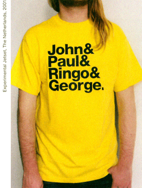
As part of a teachers and students protest against the “ad hoc” plans, celebrating the 42nd birtday of the Rietveld building, a T-shirt was designed after the famous “Beatles” T-shirt by Experimental Jetset, to emphasize this realation between content and identity. Rietveld is building and students and teachers as the Beatles still are John&Paul&Ringo&George. link

Rietveld for Rietveld
www.rietveldforrietveld.org
The goal of this website is to open the discussion on the preservation of the historical Rietveld building for the Gerrit Rietveld Academy, Amsterdam.

Read more about this and all ongoing facts and publicity  ¿GRA becomes GAK?

Neon in Vegas vs Flaneurs in Paris


Thursday, March 26, 2009

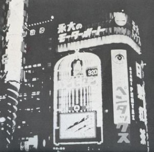
In my previous post I talked about “City Signs and Lights”, about the design of a modern city landscape, attracting customers. City signs are in an ongoing competition for attention. In this post I want to focus on the interaction between the consumer (the flaneur) and the environment. I would like to shift between two cases: the architecture of The Strip in Las Vegas and the passages in Paris, in the first half of the 20th century.

The passage is a covered shopping gallery. The culture philosopher Walter Benjamin wrote about early consumer culture in Paris in his text “Passagen” (1930). He describes the citizen as a flaneur, not as someone who is exposing him/herself, but someone who is exposed to the attractive lights in the shopping gallery. The flaneur is a person who walks through the city without a specific goal. He/She gets into an ecstacy, going from one attraction to the other. The city unrolls as a landscape to the eye of the flaneur, but at the same time, locks him in. Benjamin calls this new city environment a “Fantasmagory”, the city becomes a dreamworld where different rules apply than in reality.

” If there is one place where colours are allowed to clash, it would be the Passage; a red-green comb is hardly noticed here ”

(W. Benjamin, Passagen, 1930)

I believe that Las Vegas is a great example of a modern day Fantasmagory. The city is almost entirely made out of neon signs. After the second world war, Las Vegas was growing extraordinarily fast. The consequence was a speed-up of competition along the Strip (the central road through Vegas). The actual buildings are all more or less the same: low, but a large ground level surface. This has to do with the climate and economical reasons. The outside of the building needs to stand out, both during the day and night. The result is a total mash-up of different styles, quotes, hightened symbolism, eclecticism, all in neon lights.

In the end, the building itself becomes a sign.

Vegas references:

W. Benjamin, Passagen, 1930

R. Venturi, Learning from Las vegas, 1970

Cocteau Twins, Heaven or Las Vegas, 1990

05-heaven-or-las-vegas

cat. no. 700.6-benj2

keyword: neon

Dexter’s laboratory


Thursday, March 19, 2009

“How things don’t work”…I have to admit that title worked as cliché of love at the first sight. Coming into the section of strictly design based field and being obligated to choose one book as starting point of next one month of study didn’t completely contribute to the feeling of being excited about further choice but then this title appeared. For miracle to be even bigger it was in part of industrial design to which one I defenetly don’t feel interested in.
Passing through introduction and first paragraph gave me satisfaction of knowing that there is no possibility of wrong choice. It is about practical problems which modern technology that we are using for every day activities brings and opposite result of the image of comforts and easiness that we expect but it is not critically focused. They don’t directly attack industry for producing all this kind of gadgets… there is a solution and that is inventing, studying, understanding and improving things that are already made or left over. In first chapter discussion about convenience of bathrooms and bathtubs appears, which is quite funny on the first reading. As you think about it more closer it is actually truth. Also what might be interesting is comparison to situation of the same kind of environment that we are situated right now maybe 20-30 years after this book was written.There are some improvements but basic problems are still the same caused by politics of capitalism market…use less make more.
“Societies and the individuals making up social groups ,tend to respond in a number of different ways to each new problem.There is capitalist approach-make it bigger,the technocratic one –make it better,the “revolutionary”solution –portry the problem as an example of an exploitative system ,and pre-industrial romantic fallacy-don’t use it.maybe it will go away by itself.We propose a fifth alternative response-let’s invent a different answer.

cat. nr: 770.6 pap 2

keyword: invention

=)


Thursday, February 26, 2009

I prefer to walk. It keeps me calm. Every time I use my feet as transport I begin to notice unpredictable things in my surroundings. Simply by listening and watching more carefully everyday life becomes more valuable and interesting.

Restless behaviour. To wait for your turn, for someone or something takes a lot of our attention and patience. Slowness is often used as a negative characteristic. However, if you look at nature with all its complexity you understand what the process of time can bring.

Technology in daily life makes us more effective and increases quality time with family and friends. Consequently, tools for communication replace the physical bonding between people.

Telephone, Internet makes everything accessible 24 hours. Everything is in my reach with a couple of buttons. Furthermore, language has become simplified and straight forward, but more impersonal aswell. Our own expressions have been replaced with a combination of two symbols

Thumbsucking for adults


Thursday, February 26, 2009

As you might know, a natural sucking instinct leads some babies to suck their thumbs during their first few months of life, or even before birth. Useally  they stop doing that at an age of 6 months. That means I continued 21 years an 10 months too long. Babies do it to comfort themselves  when they feel hungry, afraid, restless, quiet, sleepy, or bored. And yes, that counts for me aswell. I need it to sooth myself and give my mind some peace. Sometime I caught myself standing in the middle of my room, thumb in my mouth, lost in my own thought, totally away from reality for a minute of ten. Its my way to escape from the sometimes stressed world around me and slow myself down from time to time. I forgot the realization of time. I recommended to all of you. You need some perseverance. Maybe 2 weeks of practise but I assure you its worth it. Say Bye to stress and Hi to your thumb.

standing still


Wednesday, February 11, 2009

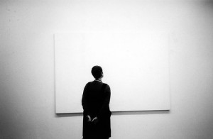
I will start with a beautifull sentence that has inspired me often. ”standing still for a moment, is actually a big step forward. So I stand still the whole day”. This sentence is a complete overview of what slowness is for me. But is this in connexion to any kind of design or art? For me in some cases this standing still adds a big layer in looking at things. By looking at objects and art for more than an hour and from the same perspective, it gives a new strength. But is there a way to make other people expierence this power of standing still. What could design/art add to this?

It needs a Projection


Wednesday, February 4, 2009

For the last time I visited “The Student”, this time busy hanging prints and getting all the little things ready for the exposition. ‘Is this it?’ I asked,

‘No’ she replied, ‘it needs the projection to really work’.

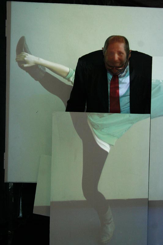
I felt I was taking a look in my own project, as I had been busy for 2 weeks on an installation that was going to project images of Rietveld students on the visitors of the Open Day, giving them the chance to be, for a moment, a Rietveld student.

The artist Jean-Christian Bourcart at some point also thought “It needs the projection” and made the great series “Collateral

forces at work


Thursday, January 29, 2009

Teamwork – ideas – opinions – help – building up something together

It‘s like standing in a big valley and shouting out your thoughts into the void. Some sounds will bounce back at you, some will disappear in mid-air. This is the big plus about teamwork; that ideas are constantly being bounced off each other to see which ones have potential, and which ones will just dissolve on the way.

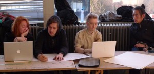
This month our team spirit kept up pretty well, but I also noticed that in a good working situation there‘s always a kind of teamwork going on, even if everybody is working on their own individual project. One should always ask for opinions, and always be ready to help someone by thinking seriousely about their ideas.

So, in the spirit of teamwork

Stuck


Saturday, January 24, 2009

Last week I wrote a posting about a student in the middle of a project, of an exchange of her and other peoples ideas, all seeming fruitful and full of inspiration. This week I visited her again, anxious to hear new developments. She was stuck.

Many artists experience this during the process of making something and a walk around the basic year revealed many tactics in getting back on track:

  • Have a beer

  • Be hungover

  • Go to a junkshop or flea market

  • Make all kinds of small things related to your project

  • Analyze all different parts, what do you want, what does it mean etc.

  • Talk to someone

  • Do something else

  • Find things that are completely non-related.

  • Or just keep on going, stuck is just an idea in your head.

Or do some Automatic Writing, which happens to be also an album of a great band.

Here’s a jam from them, featuring some pictures of your typical inspiration-seeking person.


Thursday, January 15, 2009

A doll, a women, a hospital, something to discuss…
Out of bringing a photo of an old hospital with in front a doll bigger than the women, who made it… the interests were big, and she really liked the photo in its time…
In between she worked with an appointment by a doctor…
Inspired by this situation, she started to create her own reaction to it…
A video of herself with half doll, half human body…
She is walking into the camera and the sentence `do you want to see my penis` is lightning up…

nickname


Saturday, January 10, 2009

mothers, fathers, sisters, brothers, nephews, nieces, uncles, aunts, grandmothers, grandfathers, stepmothers, stepfathers, stepsisters, stepbrothers, best-friends, best-friends mothers, best-friends fathers, best-friends sisters, best-friends brothers, best-friends nephews, best-friends nieces, best-friends uncles, best-friends aunts, best-friends grandmothers, best-friends grandfathers, best-friends boyfriends, best-friends girlfriends, friends, friends mothers, friends fathers, friends sisters, friends brothers, boyfriends, boyfriends mothers, boyfriends fathers, boyfriends sisters, boyfriends brothers, girlfriends, girlfriends mothers, girlfriends  fathers, girlfriends sisters, girlfriends brothers, roommates, acquaintances, vague friends, enemies, haters, ex-lovers, lovers, crushes, flirts, flings, one nightstands, soul mates, dates, relations.

make a list of all the nicknames people gave to you.
make a list of all the nicknames you gave to people.

link to this movie: http://www.youtube.com

posted by Karoenja Woudenberg

Computerphobia


Saturday, January 10, 2009

While working on a Graphic Design assignment, a Rietveld student experienced computerphobia, or fear of computers.
A research team has identified three types of computerphobia and treatment for each. In brief:

The Anxious Computerphobic, with physical symptoms such
as sweaty palms and back tension. Treatment: systematic
desensitization, relaxation techniques, imagining situations in which
computers have been a source of anxiety.

The Cognitive Computerphobic, certain that the computer is smarter than he or she is. Treatment: stop the negative thoughts by “creating a void”, and replacing them with positive thoughts to give a feeling of competence.

The Uncomfortable User, among other things done in
this treatment process, the insides of a computer are shown and
floppy disks are cut apart.

Or you could take a look at: “Fingerprint: The Art of Using Handmade Elements in Graphic Design”
by Chen Design Associates. Or this video X

posted by Arthur Perdijk

Designblog entering it’s second year!


Saturday, November 15, 2008

thanks for reading and enjoy the new show.

As an education project Designblog is constantly changing and developping its content.

Territoriumdrang? Nesteldrang? Claim je eigen domein!


Thursday, May 22, 2008

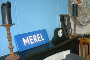
merelthuis Acht jaar geleden kreeg ik van mijn toenmalige vriendje een straatnaambord met mijn naam erop gestolen uit Lunet, een wijk in Heemskerk, een gemeente in Noord-Holland. Sindsdien is mijn Merel straatnaambord overal met mij mee naar toe verhuisd en nog steeds neemt het een prominente plaats in binnen mijn huis. Niet vanwege de emotionele waarde, maar omdat het voor mij doet wat een straatnaambord hoort te doen. Het geeft aan waar men zich op het moment bevindt. Met het bord baken ik mijn territorium af, hier woon ik, dit is mijn huis. Mijn straatnaambord functioneert op deze manier als mobiel markeer object. Het kan een ruimte tijdelijk in mijn eigen domein doen veranderen.

Territoriumdrang / Nesteldrang / Claim je eigen domein

Onbekende objecten en prikkelende puzzels


Thursday, May 22, 2008

marokaanse-lipstick poster_Tanya Keppel Hesselink

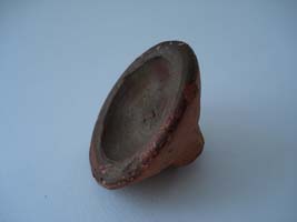
Toen ik dit aardewerken object van mijn ouders kreeg, wist ik niet wat het was en vond het daarom bijzonder. De handgemaakte, simpele vorm en het kleurverschil tussen de binnen- en buitenkant, spraken tot mijn verbeelding. Het voorwerp straalt geschiedenis en cultuur uit en suggereert een zeker gebruik, maar wat voor geschiedenis, cultuur en gebruik, was mij onbekend.
Dit soort mysterieuze aspecten vind ik altijd fascinerend, omdat het de ruimte geeft voor eigen interpretatie, terwijl het toch, zoals een puzzel, een ‘juist’ antwoord veronderstelt. Vanuit dezelfde gedachtegang heb ik eerder dit jaar een poster gemaakt over een voor mij onbekend object.
Het voorwerp dat ik voor deze opdracht heb gekozen, bleek overigens een traditionele Marokkaanse lipstick te zijn die was gekocht op een tijdelijke souk in het Tropenmuseum. Als de kleurstof aan de binnenkant vochtig wordt, geeft het een mooie roodbruine kleur af. Puzzel opgelost!

Trash?


Thursday, May 22, 2008

trashfotoLooking at trash as a designed object has been an interesting opportunity for me to reflect upon the house in which I rented one of the 30 students rooms years ago. It was built for junkies. It is cheap, ugly and has only functional aspects. It is absolutely unpersonal.

I returned to an object that shows both: the reason the houses were built for and at least a few personal things of the people who are living there now. Trash shows a lot about characters and personalities.

Because I used my trashy house many times for my own art projects, I was wondering how deep other artists involve themselves and there art in the world of trash.

I found a lot of different artworks. But here is a link for a website where you can find many different artworks made out of trash, founded objects and recycled materials.
Second a link to have a look at clothes made from recycled materials, too.

some more interesting links: robertpennekamp’s trash art project / Rauschenberg sues artist for selling his trash / Trash vs Design / top 5 chairs made from trash

The only thing that is mine in my kitchen


Thursday, May 22, 2008

rendurLiving in a new country rent apartment which is filled with things that are not mine, I started really looking at the things that where really my own. I did not have a home on my own before and did not have kitchen objects at all.

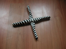
My really nicely designed propeller trivet was my first kitchen object. Fore me it is a symbol of me growing up and having to buy these things that I never thought of. They where just always there in my mothers kitchen.

Cork trivet / jakobwagner / scandenavian design / tips for moving overseas


Log in
subscribe