Skip to Content Skip to Search Go to Top Navigation Go to Side Menu


"art" Category


THE WAY OF A HANDWRITING


Sunday, October 28, 2012

cover of the book Well Well Well containing his differents works, 2010


Letman. Behind this nickname hides a former student of the Rietveld Academy, Job Wouters.  He represents well a very illustrative part of graphic design and type design. This young artist is currently becoming quite famous, with some impressive institutions as clients like Monoprix, Heineken, Tommy Hilfiger, the New York Times Magazine, Playboy, or more recently a collaboration with dutch artist Dries Van Noten for a fashion show. In addition he has just published a book in collaboration with Gijs Frieling, and received the Dutch Design Award for his series of posters called Undercover.


Wouters first started to practice his drawing passion with friends and his brother, sharing their discoveries together. He still often collaborates with his brother Roel, or his childhood friend Yvo Sprey. He was quite intrigued by graffiti, practicing a lot and was particularly interested in street art lettering. This was his first step into the world of typography. In an interview, he said: when I was a youngster I was especially interested in graffiti-writers, who could write their names flawlessly in different styles. The communicative potential of type style was already of great interest to him. It is ironic to start looking at different styles that could communicate your personality through graffiti and finally do the same for corporate firms or advertisements. Later Job entered the KABK school of the Hague in the typography department and then carried his studies further at the Rietveld Academy in Amsterdam, where he graduated in 2004. His great passion for graffiti and handwriting was already very present during his studies. His graduation work was for example made out of 500 posters displaying each name of his classmates, they were handwritten thanks to a huge panel of graffiti styles. Job is definitely interested in underground handmade style of graphic design always keeping aesthetic problems, finalization and communication effects in mind. It is impressive to see a designer like Job who found his way so early, and then sticking to this fundamental base, staying true and evolving all the way.


(more…)

Integrate my Building


Monday, June 4, 2012

inspired by Rem Koolhaas’ Kunsthal Rotterdam (1990).

The Rotterdam Kunsthal is one of the very first of contemporary buildings that have tried to connect themselves in direct ways to their urban surroundings. By using geographical context it attempts to strive placelessness and lack of identity.

The first sketches of the Kunsthal show a changeable space called ‘robot’ which is flexible to all kinds of exhibition concepts with its shifting walls and tribunes. However the concept of adjusting develops further in the process and in his scale models he presents building blocks with two streets cutting straight through the construction.The Actualization: a square flat box located at the edge of the museum park. The building is divided into 4 pieces by an arterial road. It contains 3 exhibition spaces. 650m², 1000m² and 1250m², an auditorium, office and cafe.

Kunsthal

In the following drawings I researched this idea of architectural integration and urban fusion.

Gerrit Rietveld Academie / Hard Rock Cafe

Spui / Vondelpark

Patchwork Metropolis


Thursday, May 31, 2012


‘Patch Work Metropolis’ is a study for city expansion between Den Haag and Rotterdam in The Netherlands by Dutch architect Willem Jan Neutelings.
The initial drawing of the project contains a lot of colors which makes distinction between the places of different character in order to understand and figure out the geographical facts of the area. I was very inspired by the way of using colors and the way it looks, it reminds me of a coloring book.

My project is a book based on this idea. The image on the cover is based on that same drawing, and the content is a simple text describing the project. When you look inside of the book, you can only see white pages which have embossed lines with an instruction saying ‘Color inside of the lines’. By coloring, the text will appear.
 

Rijksmuseum Amsterdam


Thursday, May 31, 2012


(I did some research )?

After seeing wonderful sketches of the famous design for the Rijksmuseum by Dutch architect Pierre Cuypers’, I made a pop-up of the building as a form of a pop-up. click on the image to view the result!

In 1875 architect Petrus Josephus Hubertus Pierre Cuypers won the design-contest for the Rijksmuseum. Before this time he designed little more than a hundred churches, for witch about seventy got realized. Besides that me made designs for monasteries, chapels and did renovations of old churches.

Cuypers was the first Dutch architect who, in his time, used Gothic construction-techniques and put them into practice. Before he made use of the Gothic shapes in a decorative way, until he completely switched to a Neo-Gothic style.

The Gothic revival was a reaction on the cold and strict forms of the Classicism. This came from a nostalgic, romantic interest for the Middle Ages.

Cuypers’ design for the Rijksmuseum featured Renaissance-style arches, neo-Gothic windows and Medieval towers. The function of the building is not clear. From the outside you would not guess it is a museum. However, Cuypers build an ode to Dutch history by combining styles and thereby gives an public lesson in Dutch history.

The design got a lot of critique from the public, the Protestant majority could not cope with the ‘to Catholic’ result. They considered it also to be ‘to Medieval’.

I think it’s a remarkable building, build with a great eye for detail.

During my research I found out that the recent construction work, which started in 2003, is not only focused on modernizing the facilities but as well to bring long gone elements of Cuypers original design back into the building. Like for instance, in the front-hall they remade the mosaics on the floor. The Rijksmuseum hired a specialized Italian company to get the job done. The mosaics are series about the cycle of life, cycle of the year and the cycle of seasons. I’m looking forward to see the work in its final state.

Hans-Peter Feldmann’s Artist Books


Wednesday, May 9, 2012

Hans-Peter Feldmann (born 1941, Düsseldorf) is renowned for a distinctive use of photography and ready made objects in his work. At the end of the sixties Feldmann started to collect series of images from widespread visual culture as well as his own photographs. These series are displayed differently in printed matter as well as exhibitions.
From 1968 onwards Feldmann produced artist’s books, comprising a substantial part of his oeuvre and of major influence on the development of artist’s books as an independent medium.  In the first period Feldmann made Bilder Hefte, a series of tiny books at times containing only one image. Some books demonstrate a photo series of a single theme, like Die Toten, press photos of victims of political terrorism in Germany, and Alle Kleider einer Frau, a sequence of individually photographed objects. Other examples encompass disparate imagery without any enforced interpretation.
In 1995 Feldmann founded the magazine Ohio together with fellow photographers. This exhibition includes six issues of Ohio magazine that were made by Feldmann himself. Ohio magazine and Feldmann’s artist’s books greatly inspired younger generations of artists.

The exhibition is curated by Frank Mandersloot from his own collection supplemented with a loan from the private collection of the c/o Konrad Fischer Galerie, Düsseldorf, and organized in close collaboration with the librarians. Feldmann’s work is displayed on exhibition tables specially designed by Mandersloot for this occasion. From the 12th May – 2nd June 2012 the exhibition ANOTHER EXHIBITION: artist’s books by Hans-Peter Feldmann takes place in the library of the Gerrit Rietveld Academie, Amsterdam, with about hundred books on display made by Feldmann between 1968 and 2012.

” Pure “


Tuesday, April 10, 2012

Approaching the work of Inez van Lamsweerde and Vinoodh Matadin, in contrast with their extremely realistic digital photography reproduction and their vision of the meaning of representation, i begun to ask myself questions on what i could really perceive while facing their works and why. From this idea i ask myself who and how could really possess a neutral analytical capacity, free from cultural influences derived from social background and pattern of thoughts: the answer was children.

Children are ” pure “, meaning free from most external influences in their reasoning, like empty containers ready to be filled with knowledge and information, that can be then used freely in daily socio-cultural relations. From this concept i developed a personal socio-cultural analysis of the possible perception of art by these neutral observers.

I selected from the web four images from the two artists ( picture 1 ),


and then re-elaborated them with different media following my personal taste (that of a student with a analytic approach to the analysis of art work) or simply what’s the picture inspired me (picture 2).

(more…)

the modern man in nature


Tuesday, April 10, 2012

By wearing masks, I attempted to free myself from my ego and access a collective unconsciousness. It is a reaction to the Western urban human being, wallowing in a nostalgic concept of nature, convinced of being able to reach a certain pure natural state within the safe context of taking a course in “primal dancing” or “collaborating with dead ancestors.  quote by Emmeline de Mooij [x]

(more…)

Walking in circles in the Wasteland of that what we call the Basic Year


Tuesday, April 10, 2012


BasicYearBasicYearBasicYearBasicYearBasicYearBasicYearBasicYearBasicYearBasicYearBasicYear
BasicYearBasicYearBasicYearBasicYearBasicYearBasicYearBasicYearBasicYearBasicYearBasicYearBasicYearBasicYearBasicYearBasicYearBasicYearBasicYear


The Basic year makes me think of a lot, I repeat A LOT, of garbage. Not only do we use trash -mostly found along the road whilst biking to the academy- to produce our most wonderful and ‘sometimes’ NOT so wonderful art works. We are also very skilled in re-transforming the artworks again into the state of what we originally found the loose particles that the artwork is consisting of; garbage. This re-transformation is especially noticeable after assessments, which takes place at the very end of every semester on the third floor of our academy. In case you are very interested in this spectacle of transformation? The next event will be due around the 13th of June, Feel free to participate!


WalkingInCirclesWalkingInCirclesWalkingInCirclesWalkingInCirclesWalkingInCirclesWalkingInCirclesWalkingInCircles

While being among great amounts of pre-/ post-garbage and garbage,  it struck my attention that it’s not only us, the Basic year students, who love to work with garbage. Also Pablo Londono Sarria, who graduated in 2011 in  his BA of Fashion at the Gerrit Rietveld Academy, got inspired by- and used materials that he found in the trash for his graduation collection called ‘Pedes in Orbis’.

quoting Pablo himself:

”With ‘carrying’ as the backbone of my concept I developed the story of Pedes in orbis, which is Latin for ‘walking in circles’. This is a story of survival, the survival of seven young men in a distant future. They scavenge the surface of what once was the great western civilization. They are looking for useful scrap, treasures that will help them survive another day walking in circles in the infinite desert. That is what you do in deserts, but not all deserts are made out of sand. I designed the garments using the core elements of carrying such as rolling, tying, strapping, stretching and hanging. I returned to the origin of the backpack: a frame in which hang things. A rolled waistline with elastics secure the trousers, waistbands are made out of tied plastic bags and rope. Messy hand stitching and punched seams of wool I contrasted with the industrial finishing known from sportswear. A different use of contrast is found in the vivid color blocking. My color palette is based on a picture of a sand dune: the orange sand in shades of red turns into pink and purple when it mingles with the blue sky due to the wind. Outflanking the whole collection is the pelican, for it’s pouch is a natural Carrier. The animal and backpack are one, a frame is a container to carry. Trash becomes treasure. This is couture for men.”

Pablo is currently studying in London for his Master degree in fashion. Now, this makes me wonder; will Pablo continue working witch trash or was the use of it just because of the fact that he was under ‘Rietveld influence’ ?


WasteLandWasteLandWasteLandWasteLandWasteLandWasteLandWasteLandWasteLandWasteLandWasteLand
WasteLandWasteLandWasteLandWasteLandWasteLandWasteLandWasteLandWasteLandWasteLandWasteLandWasteLandWasteLand


Just to get you out of this Rietveld Bubble for a moment; we are not the first and definitely not the only one who re-use garbage for whatever purpose. In the documentary Wasteland artist Vik Muniz is followed as he journeys from his home base in Brooklyn to his native Brazil and the world’s largest garbage dump, Jardim Gramacho, located on the outskirts of Rio de Janeiro. There he photographs an eclectic band of “catadores”—self-designated pickers of recyclable materials. Muniz’s initial objective was to “paint” the catadores with garbage. However, his collaboration with these inspiring characters as they recreate photographic images of themselves out of garbage reveals both the dignity and despair of the catadores as they begin to re-imagine their lives.


.

Collecting garbage is relatively easy and common because of its great availability, in contrast with that lies the actual easiness of applying the garbage in to an artwork. I may conclude; ‘some apply it well and others NOT quite so‘.

.


My experiment


Tuesday, April 10, 2012

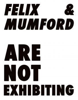
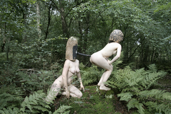
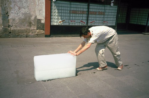
“What is art?” would be a long discussion subject. So there is no discussions about it, I claim my own hypothesis on this question -art is an experiment of telling your personal motion /thought /opinion via any form of communication . Let’s stick to the word experiment.

What is experiment? Wikipedia says An experiment is a methodical trial and error procedure carried out with the goal of verifying, falsifying, or establishing the validity of a hypothesis. I think  everything you are giving to show to other person becomes an experiment based decision because you can predict but you’ll never know for sure how she or he will respond . So every story/ movement/ your daily life processes when viewer involved becomes experiment/art  …if you ever had doubts who you are –my congratulations you are an artist!

Let’s go deep in to the first steps of this kind hypothesis ART creating , the part that is before the “showing out on public” experiment. Richard Niessen (graphic design artist) gave me some background to start from with answering “What is your opinion on experiments ?

-“Well, it’s not that I like to do experimental work because I want to experiment. It’s just that I need to do these experiments to find solutions that do not yet exist. I always believed in work that is very outspoken, but I do not want to lean only on style. So the experiment comes from the search to make something appropriate for the subject, in a radical way. The experiments are always design-driven.”

and “Do you prepare yourself for experiments or sometimes they just happens during the working process ?

-“Sometimes there is little experimentation necessary, sometimes it takes a very long time and a lot of try outs before I come to the right solution. And talking about experiments: there is always this element of risk, like in scientific experiments, you never know if it really is going to work. In the case of printed matter, I only know this when the poster or the book is in the street or in the store. I have the ‘feeling’ that it will work, that’s the hypothesis.”

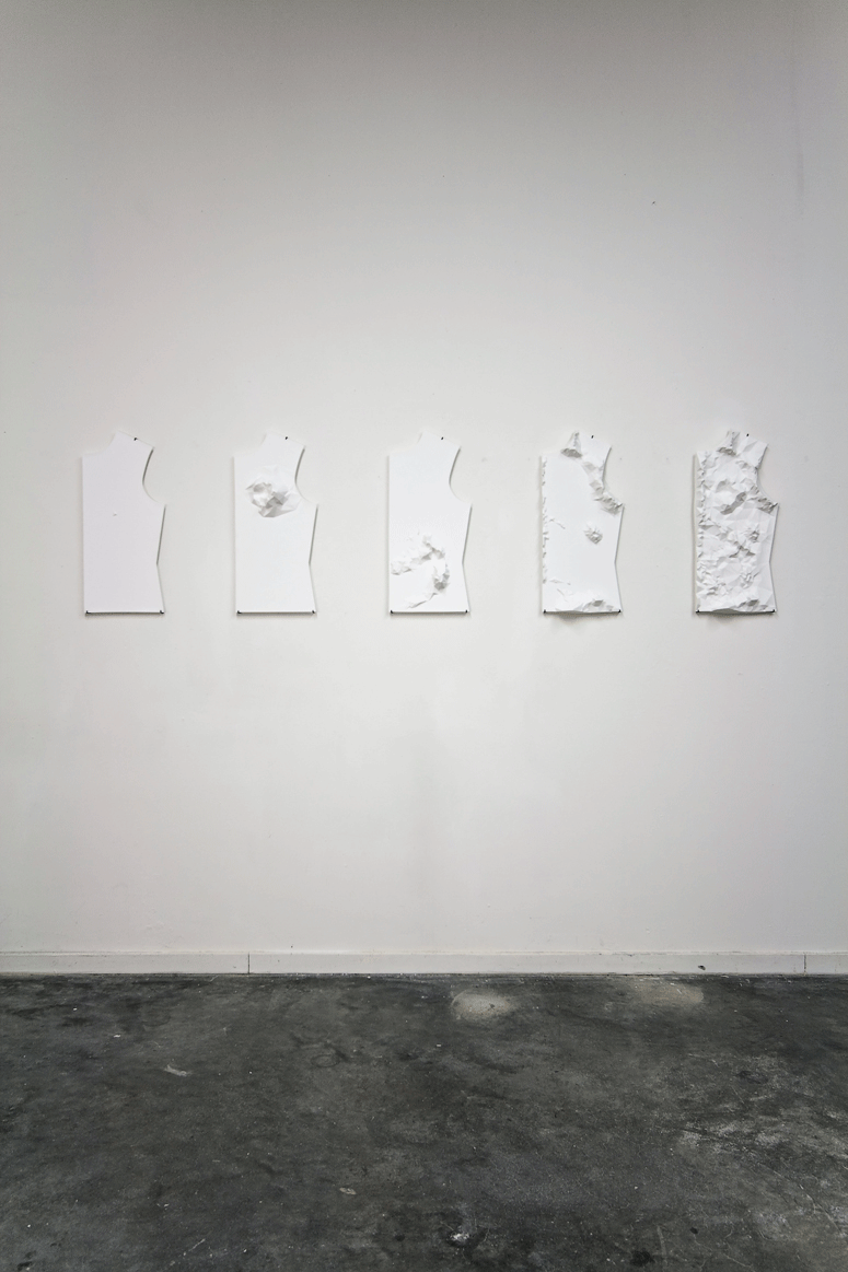
So process of making art piece is experiment based cooperation of doing and thinking.

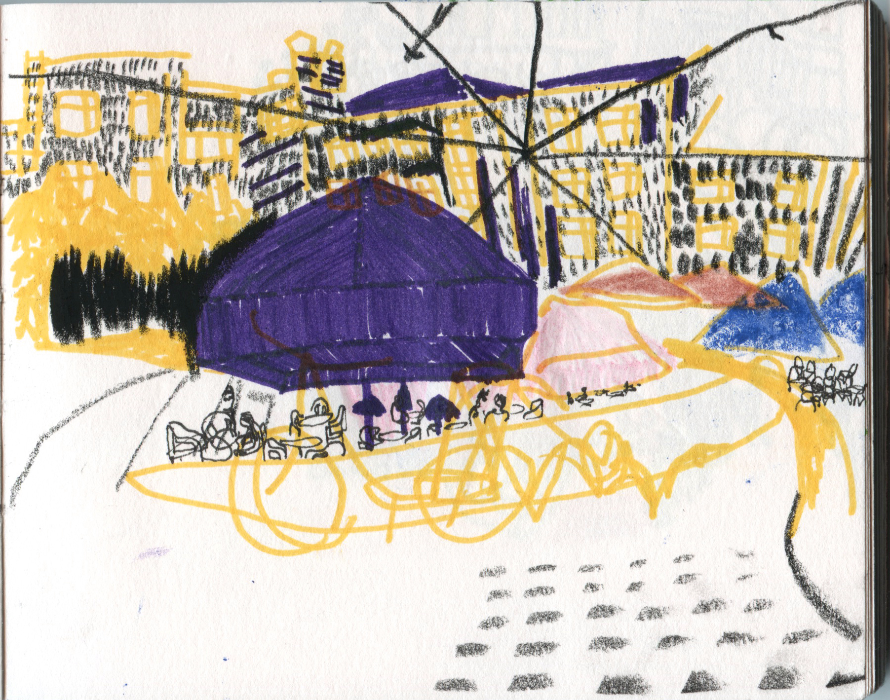
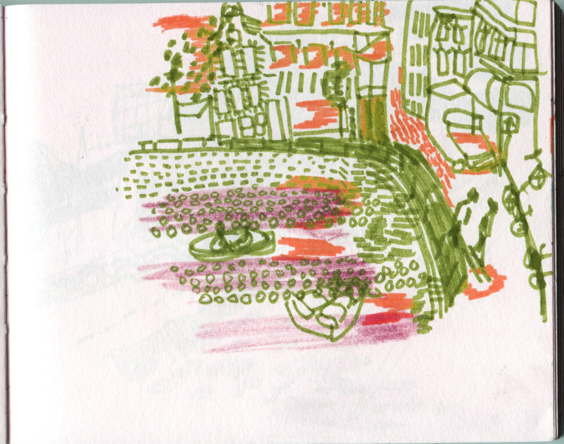
One day on my back way home from academy I stopped with this thought:

Usually materials I am using are like viewers -they act, sometimes predictable sometimes not and my decision is based on the particular stage of creating art /so i become viewer for my own experiment/art. In this moment you can increase your idea to keep it going where it goes or change the way it goes to keep your idea.

So I could use more speakable materials like people to find out flexibility of my thoughts and acts in unusually open way in usual environment .

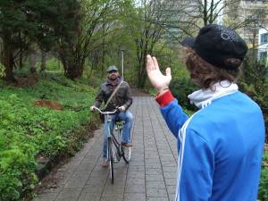
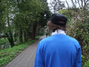
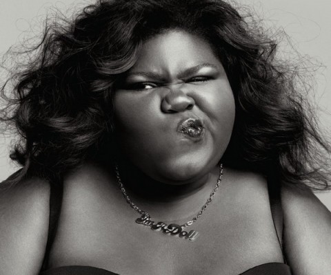
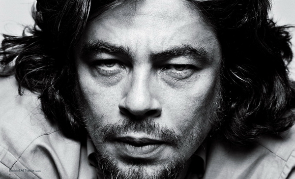
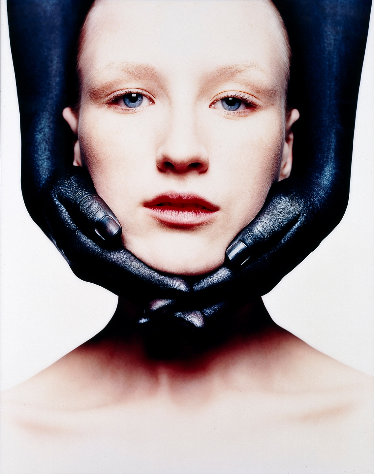
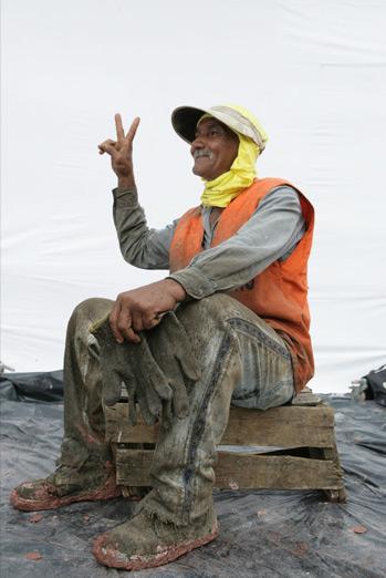
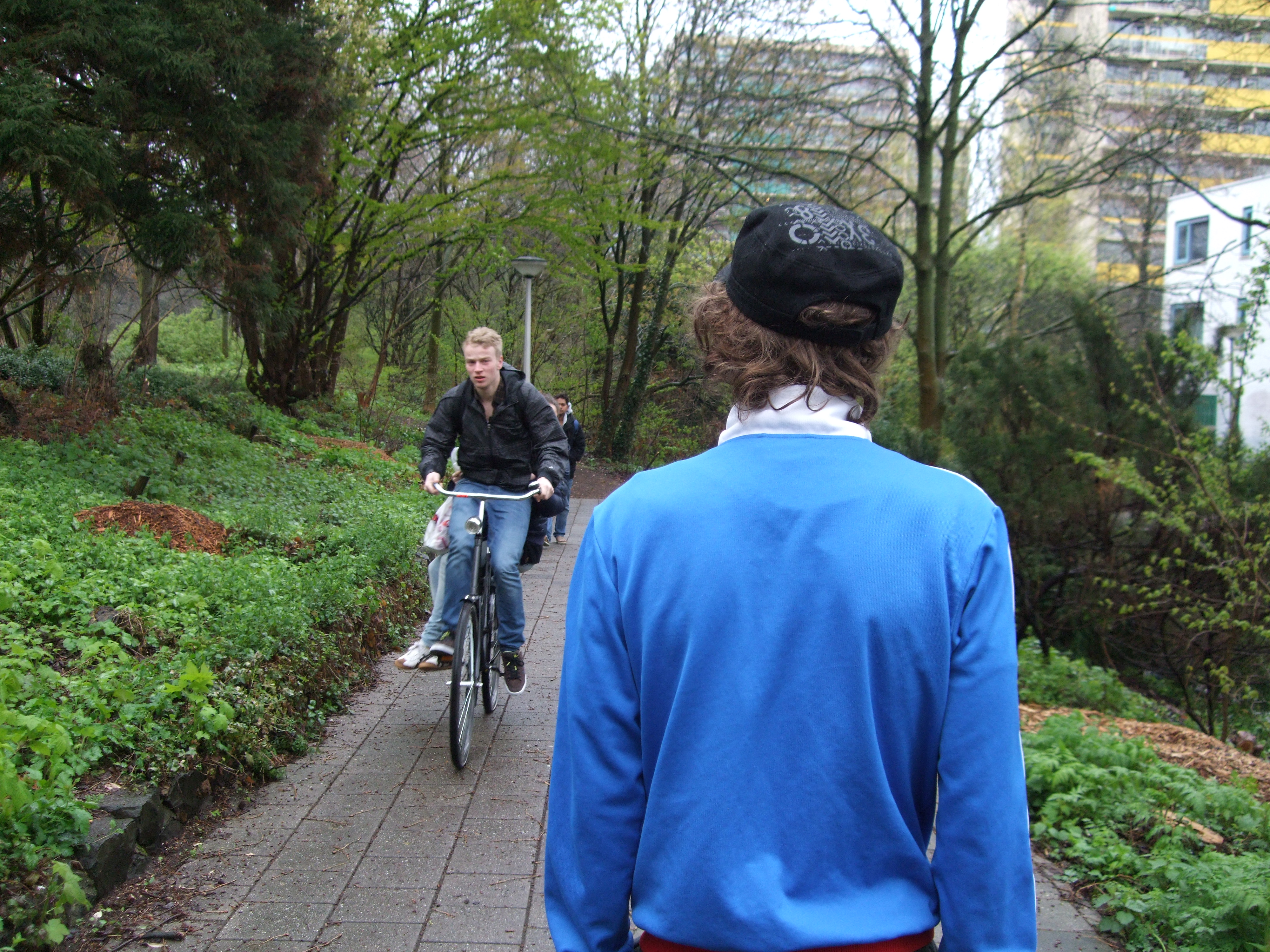
I decided that the simplest moment of our everyday life where we see other people is road (way home or to your job or somewhere, whatever you go) . You “meet” people on the road and you seeing them act somehow/for example you think about them – that’s already an act ,especially if you make serious face during this thinking process ><. The idea is that people can choose reaction or make it up to tell more /show more not just keeping on automate their reactions. I mean If we are an artists…than we are not really good ones. This moment of 3 seconds ,when you look in to the stranger eyes walking by you is used uncreative, it doesn’t go farther than a smile or “hy” I mean that’s great(!), but how much does it says about your mood, day and personality? I do believe you can even start conversation from that , but that’s not colourful on the level of act/standard experiment .But if you have new language involved that was made up on the spot  that’s freedom of expression what allows  to play with this moment as much as you can…as artists in museums playing with their art pieces viewers. Making them wander/questioning/screaming “HELL YEAH” or “NO WAY” !

Playing around with/conclusion of  this hypothesis:


Amstelveen

like I wrote before: I want to try change idea by starting acting and change the way I am acting to keep the idea .


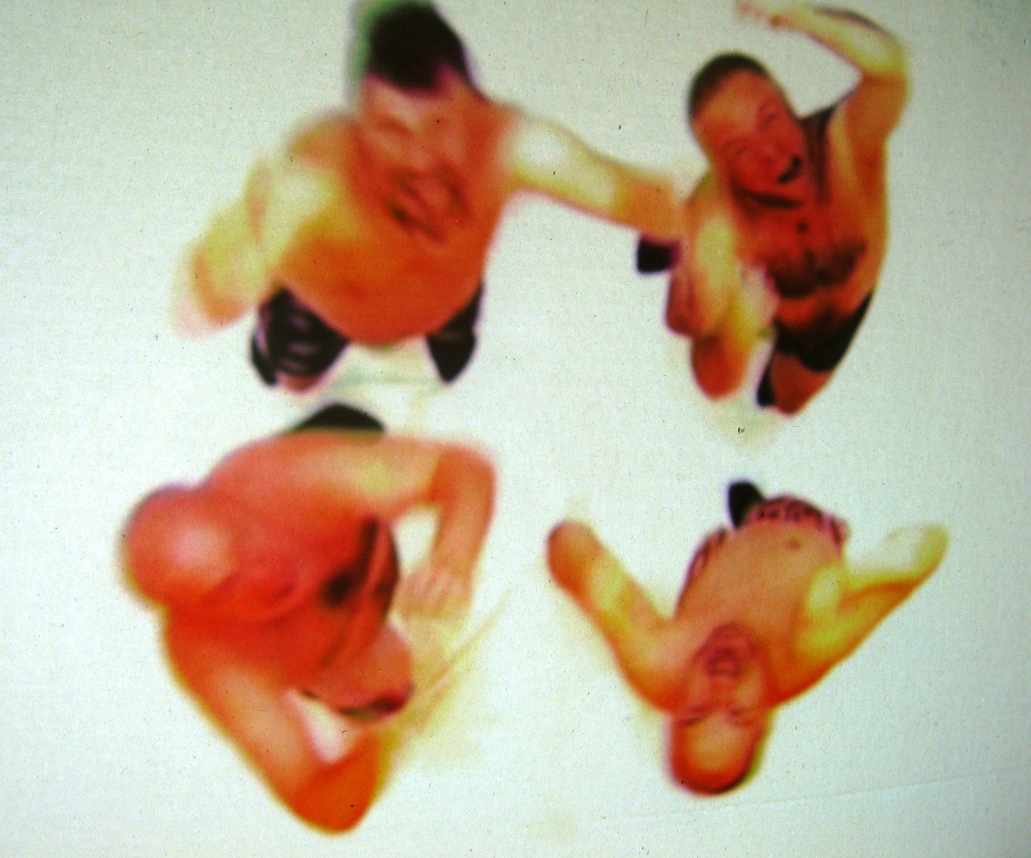
first part: I was pretty tired this morning and i started from showing my mood of willpower to stay awake (“look broadly”)

Amstelveen

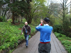
It came out good-people were smiling .


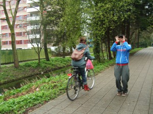
second part: I changed my expression of mood after their reaction on my “look broadly” act.

Amstelveen


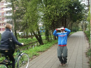
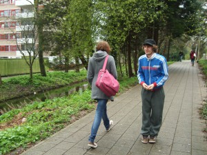
Second part was more communicable, although people where running on their job  and I didn’t interact with anyone longer than few seconds . So I didn’t wait for something more than a smile ,on which I reacted with my expression of happiness.


i approved my own hypothesis with getting  light motion like after visiting a museum ….and exhibiting the same time as well . Bit sad that people didn’t go wild in their own expressions.By reations of some people i did saw that there is difference between museum and everyday life –it’s criterion of insanity.

But if art (as an experiment) process is the same like life process why should we behave in boarders “to look sane”? ……

Amstelveen


p.s.  For me personally I have a feeling that people I met that experimental day will remember this day how they meet my art like a day when they should shown their own.

KEEP IT EXPERIMENTING !

Get the Flash Player to see this content.


How much Rietveld is Felix & Mumford?


Tuesday, April 10, 2012

How much Rietveld is in anyone, who somehow came in contact with this school? I honestly doubt, that there is a real answer to this question. How much are artists influenced by their surrounding? By the people they meet every day? A lot!? At least they chose their professional field to react through their art on what is going on around them. But does a school situation really shape one more than everything that happens afterwards? One might be more open to other opinions of teachers and fellow students though. One might think more about: How much do we have to listen to others to develop? When do we change, when do we improve? Does an academy change us or are we changing the academy? Was the academy first there or the student?
Felix & Mumford think spatial in everything they do; may it be fashion, may it be sculpture. Does this make them artists in the tradition of the architect Gerrit Rietveld?
Trying to find a relation to the work of the Dutch artist couple Felix & Mumford and the Rietveld Academy, I can base this article only on my subjective perception of the educational artistic study programme and the cornerstones of the above mentioned. The duo consisting out of the Egyptian Gamal Eldin Fouad and the Dutch Claire Fons comment on what they see in the world, in the society around them. They seem to work from within, but as someone who walks around with open eyes. It appears, that it is especially the big cities- Berlin and Amsterdam, in which they live, which influence them. Cities in our times- that is where society happens. You can´t get closer to the people: truth and lies, misunderstandings and odd complications. It is an agglomeration of concept material. Felix & Mumford work critical and question conventions through the surprising use of well-known objects.

Day-to-day experience ripped out of context, put in a gallery so that the sudden space around it would make people aware of what they tend to oversee. So what about this big idea, that art could be for everyone, that everyone should be able to comprehend it or- at least- relate to it in some way or another? Most of their work uses an ironic twist to pose a question based on the “treasures” the duo finds- looking and reflecting on what they see.

In their choices, they might be too close to actual life, as that their art could be appreciated by non-art interested viewers. Nevertheless the artists play with the connotation of the Authentic and Honest. Their choice for materials shows a very “grounded” approach with objects and creative tools clearly recognizable from the “real world”, but manipulated (e.g. through a shift in context) to strengthen the artistic idea. The research and process part of a project are at least of equal importance as the final result, but don’t necessarily have to become a part of it in the exhibiting act. Fons and Fouad don’t create art for a purpose in the sense, that it would be a usable tool afterwards. The work functions as an attempt to understand and explain normalities and oddities likewise.
In dealing with their questions, they do not seem to mind classical art genre borders. Felix & Mumford use various media to express their thoughts often including text material. This fact – the department overlapping working-might refer strongest to their Academy background.

Their temporarily focus on language is probably due to Gamal Eldin Fouad, whose own work merely deals with text and who also taught creative writing at the Rietveld academy.
Felix and Mumford aim for a clear visual language, with their art always featuring only but a few different elements. However their work somehow gives the feeling of a certain separation into two parts. While one part strives for poetic subtlety (referring for example to the video, that can be seen in Fashion & Foam at the moment), the style of the other part often refers to urban art and is a somehow more decorative and literal translation. A good example for this would be one of their last projects, called Sub Rosa.

In this work they mapped the remaining graffiti tags around the Rosa Luxemburg Platz in Berlin to draw attention to the city´s restoration and polishing in the curse of the on-going gentrification of the Center. At the end of their somewhat archaeological search stands a painting, which assembles the separate writings to one big memorial piece. One could say Felix & Mumford fit the Rietveld style in their subjects and their execution, how much this is due to an education they followed is albeit hard to detect in a time where the human mind processes so many impression and various information every day.

http://felixandmumford.com/news


Collaborations with the Multidisciplinary


Monday, April 9, 2012

Emmeline de Mooij’s • Mixed Media

Emmeline de Mooij (Delft, 1978), currently lives and works in New York and Amsterdam and has a very detailed collection of works. She works a lot with settings in photography and from what we see she often centers herself like an actor in her own works. From 1997 to 2002 she studied Fashion Design at the Gerrit Rietveld Academy. If you see her work, you can see that she’s not your ordinary fashion alumni because her works are a combination of a lot of disciplines containing, but not limited to: sculptures, installations, photography, graphic design, video and performance art. I guess it’s safe to say her work is Mixed Media galore.

Where some alumni remain somewhat more linked to fashion, or at least to fashion within the ‘logical’ borders of fashion, I notice that there is an interesting thing that happens a lot during and after studying at the Rietveld. Something that I see less at other art schools seems to be more apparent there. The tendency to not-choose just one direction, but have a strong drive towards multi-disciplinary ways of creating their form of art. This is something that I not only see in the work of Emmeline de Mooij, but also in the work of other alumni like Felix & Mumford (Fashion, Installation, Graphic Design and more -),  Soepboer & Stooker (Fashion, Graphic Design and more -) and for example the way Thera Hillenaar doesn’t just make clothes for wearing, but also adds a focus on it’s interactive function.

The following images are taken from the solo exhibition ‘Strip it down baby, give me those bare necessities’ at the Steinsland/Berliner gallery in Stockholm.
What I have mentioned in the above, becomes clearly visible in these photographic images.

‘Strip it down baby, give me those bare necessities’
image © Emmeline de Mooij

image © Emmeline de Mooij

image © Emmeline de Mooij
image copyright - Emmeline de Mooij

In the above work she spent weeks in European forests with her colleague Melanie Bonajo and together they researched and visualized how the modern man compares itself to the outdoors nature.

“By wearing masks, I attempted to free myself from my ego and access a collective unconsciousness. It is a reaction to the Western urban human being, wallowing in a nostalgic concept of nature, convinced of being able to reach a certain pure natural state within the safe context of taking a course in “primal dancing” or “collaborating” with dead ancestors.”

[welikeart.nl/]

I feel that from what I am learning now at the Rietveld, it is very important to try and focus on this collective unconsciousness, or somewhat try to approach and question the way you are thinking, and the way you approach a problem that you come across on your way to making a piece of art. This and the multidisciplinary approach to her works give me the feeling of a strong connection to the Rietveld.

(more…)

KevinPower


Monday, April 9, 2012

Kevin Power welcomed me in his studio, in a building that used to be a school. We sat down with a cup of coffee and I was soon to realize it was his birthday by a numerous of very nice birthday calls.

We talked about his career after he in 1999 graduated the fashion department at Rietveld, for example how difficult it can be to works as diverse as he does (paintings, collages, sculptures, illustrations, installations, costumes etc.) in a commercial context where they need a more clear style. That’s why he got two websites commercial oriented and one more diverse.

Kevin Power has worked as freelancer, made costumes and set designs for Klank Kleur Festival and from 2004-2010 he was hired by Tommy Hilfiger:” to inspire, everything from creating various interactive art projects to making props for stores and showrooms”.

The Atelier

The work space is a storage for previous works that partly will become future works. After being cannibalized to bits and pieces they are recreated and reused containing both the history of its previous function and new dimensions for the present context.

Works are gathered and hidden in corners, paintings put in an untouchable distance and space is cleared to give a fresh start and room to begin a new project, new thoughts and challenges.

(more…)

E/MERGING PATTERNS – Khurtova / Bourlanges


Thursday, March 1, 2012

As part of the Foundation Years design-research project “New Energy in Design” based on the 2012 Boymans van Beuningen exhibit, Marie Ilse Bourlanges and Elena Khurtova were invited to present their work and research. As a sequel to an earlier presentation in the program 3 year ago [x], the development in their work over the years and the ambivalent state of design versus art presented the clear and inspiring ‘new energy’ in their work

E/merging patterns, challenges the Normativity of systems: a care for order, from which one can’t withhold (social, cellular or temporal system), and provides an access to an aesthetic of cancer, ‘beyond well and ill’.

The artists study the grouping of cells that emerge as a new system within a normal ‘baseline’ system. By applying the behavior of cancer cells (uncontrolled growth and invasion) as design parameters, Khurtova and Bourlanges offer an experience of the body that begins where the usefulness of healthy bodies ends.

The work consists of a series of 5 bone china cast objects, and depicts a flat garment pattern, in order to give a dry representation of the body. The flat surfaces are distorted with extruded patterns, relating to different organs or inner body systems. Those patterns are generated from detailed 3D mapping of tumor growth, by the use of algorithmic software implementing uncontrolled growth parameters. The obtained structures are manufactured by CNC milling machine, in order to produce mother-molds for plaster molding and precise slip-casting.

Realized at the EKWC, this project merges the material sensitivity of ceramics and the precision of CAD/CAM technology.

5 pieces – 28 x 62 cm – Bone China (ceramics)

2011


He flew too high, the wax melted, and Icarus fell down into the sea and drowned.


Saturday, January 28, 2012

Come to the edge, he said
They said: We are afraid
Come to the edge, he said
They came
He pushed them…and they flew.

by Guillaume Apollinaire

Design; while going in a more and more functional direction, slowly losing its identity or personality, we can see globalisation in comparison with every object, especially from minimalistic or functionalist movements, there are no more locations, no more things which are related to places . In this case designers; who’ve been born with brick in his stomach. In other words one who lives all their life in the same place and were inspired by local traditions are starting to feeling more tension nowadays.
In the conception of slow design in the way how research has become a scientific experiment or philosophical theory the line between art and design become finer. On the exhibition which was dedicated to the theme New Energy / sustainability /Slow design one object was more related to the art then to the design , but the way of construction it is in the experience of the thing by itself that reflective ideal of positing thought has it’s basis. This statement is an almost perfect description of Panamarenkos notion of indention as creative method because for him inventive thinking must be invested in something, it must be realised in some way.
Thus when Panamarenko speaks of his machines as working, he is not simply talking about function -although this is enormous importance to him – but about the way in which a whole trajectory of new thought, aimed at an empty location of a certain kind? The journey into the unknown, the adventure, becomes embedded in or embodied by a thing. Even if this trajectory is never completed and flying machine, despite repeated attempts at improving the technology, fails to get off the ground, the concept together with the material engagement with the thing itself, will lend it an undeniable sense of purpose. It will make it intelligible, both as an object of technology and as an object of knowledge. Most important of all, it achieves an independent existence as what might best be described as a ‘radically styled’ work of art. It becomes inappropriate to categorize Panamarenko s works according to their appearance within some overarching notion of his development as an artist; we must look at them instead as a types and categories of things, aeroplanes or birds, insects or cars.
The impetus underlying Panamarenko s approach to work is a somewhat sceptical one, and his scepticism is directed at the institutions of both science and art. In this respect, it is part of an important and still current strand of scepticism in the complex weave which forms the history of ideas in the post-war period .
The most basic assumptions of science- it is institutionalised forms and routine methodologies- were being questioned by a generation intent upon pursuing their dreams rather than acquiescing in the face of a technology driven, steadily-intensifying cold war. In the field of art , this same spirit was manifested as a robot and to branch an attack upon the modernist conception of relationship based upon the idea that some profound sense art should demonstrate belief in a world, even a universe , that was potentially analysable, describable and measurable in its entirety.
His sceptical outlook extended to the nature of human existence .Rapid advances In the social sciences were leading individuals to question the biologically singular and rationalist construction of the human subject. For a brief historical moment it looked as though there were no certainties any more and seemed that everything was up for grabs .

As an example is an excerpt from an interview with an artist which reflects the position of Panamarenko about art and design:

If somebody asks me about my profession, I’m ashamed to have to reply: “I’m an artist.” For I consider most artists to be retarded. They always work in relation to the galleries and museums. This goes for all art, of course, art can only exist in relation to museums and galleries, but why should it depend completely on it? 50% should have a reason of its own as well. It should also have been made if the art world with all is crap wouldn’t exist. Most of the time one sees art which is 100% dependent. I absolutely dismiss all of it. My position is very neutral with regards to the general ideas about art. It’s easy. It relieves me of the question how to be anarchistic. It comes without saying, because otherwise I couldn’t make any good work. Without this dismissal my work wouldn’t be free and it wouldn’t contain any attempt of adventure. What a burden, all those stupid galleries and museums! One should analyse these people who have organized art shows for half of all the artists. One really wonders what artists are looking for in the neighbourhood of such jerks.

Make the bees work for you!


Saturday, January 28, 2012

I have always been fascinated by different kinds of materials and combinations of them as there are thousands of different possibilities of the outcome. And especially in art or design works where you can feel that the material was completely ‘understood’ by it’s artist or designer. It was exactly that feeling that I got when I saw Tomas Gabdzil Libertiny’s Honeycomb Vessel #2 in the Boijmans van Beuningen Museum in Rotterdam.

The Paper Vase or the Honeycomb Vases demonstrate a new way and approach of working with materials. This means that natural processes have to be understood and investigated from all different kind of perspectives. I like this thought and I think it is a crucial one for ‘sustainable’ design. We should communicate with our environment and understand it. Therefore it is important to take advantages of the things that are already there. The Honeycomb Vases symbolize this crucial understanding. In collaboration with beekeepers he found a way to make the bees build a vase like shape. The vases are created by placing a basic beeswax mould printed with a honeycomb pattern into a beehive. The bees then start to work with that pattern. It took 40,000 honey bees that worked over a course of one week to create one vessel! Libertiny himself calls this process ‘slow prototyping’. Every vessel has a unique form and they also vary in color and smell depending on the flowers that are in season.

(more…)

John Körmeling


Saturday, January 28, 2012


John Körmeling's "Hi Hi Ha Ha" (1992), Van Abbemuseum, Eindhoven, 2006.

(more…)

“Time Writersz”


Saturday, January 28, 2012

Based on the idea of sustainability and especially the so called Slow Design I want to have a look at one of the works from  Eindhoven based design office EDHV, which were displayed in the Museum Boijman van Beuningen in Rotterdam. 

The work i want to talk about in this Essay is called „Time Writerz“, first exhibited at the Dutch Design Week 2010. It consists out of different plates of wood which have been hidden in the ground and sealed from air and erosion for more then six hundred years. By putting it back to the air the wood comes to life again. To show the ”growing” process there are pencils attached which are holding the wood and are „writing“, documenting  all the movement the wood is making.

EDHV is a creative office that was founded and based in Eindhoven in 2005 by Daan Melis who is a publisher and Remco van de Craats who take care of the design part. They are working in the field of product design, webdesign, motion design and architecture. As the title of the website already shows you „At EDHV, we don’t specialize in anything!“ and ” We can best be described as architects of identity. We work interdisciplinary so all aspects of identity can be fully integrated.“
One of many important things for EDHV is the sustainability of their work. Therefore the most important thing is to start every project with a proper research because this is important to create a sustainable concept or idea. To quote Remco van der Craats: 
”A shape without a foundation has no meaning“. Another key to a good result for him is trust and intensive collaboration between his office and the client.

Remco van de Craats on design


I choose the artwork „Time Writerz“ because it fascinated me for different reasons. For me this work from Edhv is a lot about making change through time visible and here I see the strong connection to a collaboration work I did myself for an exhibition in Munich in an temporary space in the summer of 2011. 

We decided to use very basic geometrical shapes and also keep the choice of colors really simple. It also should remind you of the wooden blocks you were playing with as a kid and also was a direct reference to a old mural that was painted  on the ceiling of the exhibition space. The mural shows silhouettes of houses painted out of the basic geometrical forms and colors. These basic forms were made out of colored wax. Over the sculpture we placed a lamp. The wax was slowly melting down during the time of the exhibition by the heat of the lamp hanging over it. Our goal was to work with the space and also showing the fact that the space, which we were using was temporary, by letting the artwork vanish during the show.
 

Another Artist that works with the same idea of making change visible is Belgian born artist Francis Alÿs. Educated as an architecture in Tournai and Venice, he move to Mexico City in 1986 and soon started to work as visual artist.


Melting wax sculpture

He mostly works with video and performance art. His performance „Paradox of Praxis 1 (Sometimes Making Something Leads to Nothing)done in 1996 in Mexico City is maybe the best example of how Alys worked with the topic of showing the change through time, by pushing a big squared formed ice block through the streets  of Mexico City.


Log in
subscribe