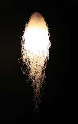
Joris Laarman, inmiddels 31 jaar, heeft zijn eigen lab sinds 2004, samen met zijn partner Anita Star. Zijn insteek is om een object een verhaal te laten vertellen. Hij vertelt dit in een filmpje dat te zien is op Youtube. In zijn werk maakt hij gebruik van een combinatie van design en wetenschap. Hij zoekt daarbij naar de grens tussen waar zijn ontwerpende functie nog een rol kan spelen en waar de wetenschap het overneemt. Design gaat voor hem over het overbrengen van een gevoel. Wetenschap daarentegen is gebaseerd op wetten en regels. Het verschil tussen deze twee aspecten is dus groot. Waarschijnlijk is dit verschil de reden waarom ik als toeschouwer een onwerkelijk gevoel krijg. Zo had ik, bij het bekijken van zijn werk Paper Starlings het idee dat ik naar een projectie van papieren vliegtuigjes keek. In werkelijkheid blijken de vliegtuigjes microrobots te zijn, en dus echt. Joris ziet zichzelf liever niet als designer, maar eerder als kunstenaar.
"art" Category
The hole in Wibautstraat
Saturday, November 20, 2010
Our assignment was to get inspired by a Rietveld building or Rietveld concept, and make a scale model for a new building in the the small triangular park at Wibautstraat, near Amstel station.
At first I and my classmates went to the spot at Wibautstraat to measure the whole area and be familiar with the surroundings.
In the beginning I was looking at the Rietveld Academy’s corners. I guess a lot of people do that, because they are quite fantastic.
I went outside looking at the academy in rainy weather, and I took some pictures of the corners of the academy.
Then I imagined that it would be dirt that surrounded the high corners of the academy building instead of the sky.
So then I got this idea, to put the whole glass building upside down, and then down in the ground, or a big triangular hole at Wibautstaat.
The corner of Rietveld Academy upside down:

Then you would still be close to nature (as Rietveld wanted it), not the same light nature, but a much more dark and deep nature. I liked that idea.
So this was my starting point.
(more…)
Growing Chairs* footnote
Monday, June 7, 2010
In addition to my former post about Growing Chairs, here’s a small footnote – a project more close to home.
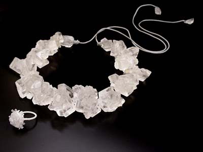
A fellow student in the Rietveld Foundation Year is Ana Oosting,who is working on her ‘free project’. In this project, she works with growing materials. The essay she wrote about this subject is relating to science, focusing on bio art and art in a more general way. In her essay, she also talks about the more simply forms of this, in both nature and art, not specifically to be executed in a lab.
In relation to this essay, she made some pieces in which she experimented with growth – combining nature with art. In one of her works she let two doves build a nest on a pair of slippers (picture below). This changes the shape of the sandals as well as the way the nest is build.


Another work consists of growing different things on crystals. You see a scorpion in crystals (picture above).
Within her ‘free project’, Ana also worked with citrons (she tried to make them grow in different shapes) and she made an attempt to make graffiti out of moss.
In the same way as the designers – mentioned in Growing Chairs – are working, Ana is working together with nature to make interesting new art-pieces.
Mighty Market
Wednesday, June 2, 2010
Super Mighty Market
– Same rules but BIG difference ? Not all supermarkets must be created equal.
‘There is no other material a designer can work with that is so close to the human body and soul as the material of food’
Marije Vogelzang
Welcome to a new generation of spaces dedicated to food culture, where ? Located inside my very own head. Please cross over to my ideal dreamworld as this space does not yet exist anywhere else. Over here I design a supermarket – only it is not really just a supermarket – it is more of a space where design, art and food can meet – becoming more like a Mighty Market.
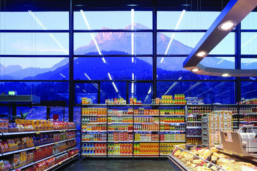
The dream begins with a beautiful architectural form screaming in need for a revival. The structure of what was once a beautiful spacious building whose glory has passed, now sits ghostly waiting in suspension like those christmas ornaments in storage that wait all year for december to arrive. In order to orchestrate the “revival” of my dream food space – it must not only have that “feel good quality” that makes you want to hang out there all day, but also allowing it to be inspiring and stimulating in a way that makes you think about how we relate to each other, our social food culture, how it’s context affects our behavior and choices. Naturally, being a food lover – wannabe- healthy- eater myself as well as an art and design enthusiast, I became interested in finding a “glue” for all these to exist under one context of food culture and how its role affects our senses and perception.
In order to create my dream SUPERmarket THE MIGHTY MARKET I had to think about its social, psychological, chemical, technical and ethical core values. No employees but team members for starters. Environmentally friendly and with a fun attitude. I also didn’t want my supermarket to have the same old shoe box boring construction as most supermarkets do. I mean have you noticed how boring grocery shopping can be? So it definitely can’t have an uninviting interior like the cold, dark, dull, crowded interior in most grocery shops. My Dream Mightymarket has to be part renovation and part innovation – not just to refurbish and old existing iconic building such as one of ‘BEST’ old buildings but

a combination of both, bringing also new ideas of design into one unique place.
Small things make things big and even little changes to an approach can make a big difference. With this in mind, I dream of the inside – it will be subdivided into areas such as a gallery for instance, where food exhibitions and lectures are given maybe by someone like Daniel Spoerri who’s been an icon of the food art movement since the 60’s. A space in which I dream of bringing in people to host events like Marije Volgezand or Droog, some nutrition specialists and chefs as well as artists and designers such as Ayako Suwa who’s emotional food art won her international acclaim in 2008 .

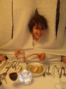
‘Designed by Marije Volgezand for a meal for Droog design, she hung the table cloth to the ceiling as a means to conceal signs of status like clothing. The meals were served on plates that had to be shared as she supplied the guests with unusual eating utensils for this purpose.’
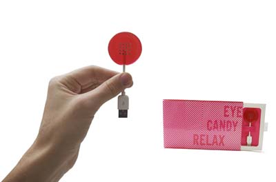
Back to my dream. Incorporated but not occupying the same space you can find an area for home appliances that follow the same motto for innovative conscious design. Everything in this alter- space-s is meant to make you feel something, and actually the whole supermarket is designed to make you feel something – in other words, it is designed to make you become aware of your senses. The rails for the stairs are cold to the touch to wake you up. Similarly all the senses are thought of in every detail of the stores design and even the lay out of the products is carefully thought through. From the lighting to the sound, even the sense of smell is incorporated to bring different sensorial experiences. Some of the products you would see in this supermarket wouldn’t be the ideal healthiest, although its main focus IS the organic and healthy, and the selection of others redefined. Some of the products you can find at the Mighty market are for instance “EYE CANDY” by the Play coalition for Beta Tank who use something called sensory substitution to allow you to see images contained within the candy.
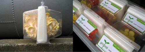
The packaging of products can’t stay behind and would have to be considered – it must aim to avoid sacrificing freshness amongst other factors in favor of warehouse storage as well as its reusability . Playing an important role as an example leader is ‘ Grown in transit’ by Design Academy Eindhoven graduate Agata Jaworska whose concept is simple: the food grows in the package as it is in transit to reach you changing the label from ‘best before’ to ‘ready by’.
At the eating area you would find ‘tasteful design’ and edible design pieces such as cutlery made out of food etc.. maybe since it is my dream, Nosigner would design the interior which would feature for instance his light unit “Spring rain” made out of bean starch vermicelli, which is edible when boiled (meaning no trash- zero!), or sell things like the ‘Unsustainable’ necklace by Greetje van Helmond for whom choosing food as material is a comment on the impermanence of fashion.
But the dream doesn’t end there. At the Mighty Market you can use books as currency which will eventually create the mighty market interactive library.
Wel bekome !
“Prenez soin de vous”
Monday, March 15, 2010
For the first time in fifteen years an overview exhibition on the work of the French artist Sophie Calle is organize in The Netherlands. Central work in this exhibit is “Prenez soin de vous” (Take care of yourself), in which Calle invites 107 women from a ballerina to a lawyer to use their professional skills to interpret an email in which her partner breaks up with her.

Sophie Calle is part of the April 1st BasicYear Design Trip
look for more on Sophie Calle
newspaper article NRC 9/5/2008 (dutch) pdf
Proun. Street Celebration Design, 1921, Lissitzky
Wednesday, February 3, 2010

In this work you see influences of Design, Fine arts, Architecture and Graphic design.
A nice thing of this work is that the upper drawing can stand on his own, and therefore can be divided in Fine arts. What Lissitzky is doing in the painted photo below, can be compared with design. Almost all his work contains influences of Design, Fine arts, Architecture and Graphic design. For myself I see it back the most in this one.
I really like the composition and colour distribution and how Lissitzky combines the 2D/3D perspective, which makes the drawing much more architectural.
I think the later work of Kandinsky is in some way comparable. I’m talking about elements of composition, colour distribution wise and form contrasts.
What’s fascinating actually is that for example in these paintings ( K1, L1, K2, L2 ) the triangles, (half) circles, stripes and composition have so much in common. While the ideas of their work are so different. Kandinsky combines painting with music, which Lissitzky does with architecture.
What I appreciate is the modern way of exposing his work. I like the way he puts his drawing and his street-exhibition in one frame on the cardboard. And the fact that he paints on the photo. The street celebration design reminds me a bit of graffiti in legal manners. In Graffiti you have multiple meanings of doing it. Some do it for the adrenaline-kick, some for the group or competition feeling, some to show their design skills and others for political statements or propaganda. This last example is what I see in a part of Lissitzky’s work.
I think it’s interesting to see how he uses his propaganda work in other work but then he integrates his in his autonomous work (proun. street celebration design).
All in all I think it’s a great work and a unique style. I really admire that Lissitzky makes so many different things, and still keeps it in one theme

El Lissitzky
Thursday, January 28, 2010
From Van Abbemuseums power point presentation I got attracted to a painting by El Lissitzky called “Proun P23, no 6”, in this presentation it has number 51. I have never really been into constructivism, suprematism or any of these kind of movements but I will try to focus on the things I actually like in El Lissitzkys painting. In general, I like the way he is able to leave empty spaces without making it comfortable. I always have to be alert so I don’t fall into the harsh abstractions of his work. The patina or aging paper makes it easier.

In this specific painting, “Proun P23 no 6”, I get the false illusion that he has done the same thing and left an empty space. But in fact the painting is packed. Trying to describe the painting, one can say that it has a fleshy colour in bottom, there are two deep red triangular forms almost meeting in the middle. Preventing them from coming together is a rectangle, a cube and two things that appear more flat, a stick and a square. The cube has a deep green coulor, the other objects are more neutral to the paintings colours. I like the colour composition and that it feels light even though it’s made in oil and on canvas. It’s a nice mix of painting and drawing. I also like the spacial aspect and the loose objects. It’s interesting the way he here presents the abstraction, I mean the space and volume is meeting some very basic shapes that seems easy to recognize and comprehend but makes an intriguing whole.
It’s hard to say anything about the texture of the painting from this point of view, but with the zoom site I attached it’s easier to get a feeling of it. From looking at other modernistic paintings, I really don’t like that dry texture from when the paint is not enough in one stroke or when the canvas is shown too much. These things create a very uncomfortable and also very physical feeling, just like some people don’t like and get chills when scratching your nails against a blackboard. This don’t seem to be a problem here with Proun 23, and I can understand that Van Abbemuseum must be very proud to have this painted Proun in it’s collection.
sculpture in space on figure in future
Sunday, January 24, 2010
In 1913 Victory over the sun was firstly performed in Moscow. From aesthetic perspective, it was Malevich who was responsible for the costumes and decor, we may recall upon this happening as the start of Suprematism.
In 1920, this time directed by Malevich, the opera was performed again. During this period El Lissitzky made his lithographic designs for the nine figures from the opera. Instead of costumes he designed electromechanical puppets. Puppets that would be controlled by one person. Lissitzky deliberately left this concept at the stage of the lithographies, as he had made his mind up that he wasn’t going to be the one realizing the project. “You can do this”, was his vision.


In terms of fashion, there are many ways to encounter these designs. I myself encountered three major elements that can be related with contemporary fashion: technology,expression and giving emphasis to -suprematist- shapes by utilizing them in a different context.
The use of electro mechanism could have easily inspired the work of Turkish designer Hussein Chalayan. This element comes strongly back in his 2007 spring/summer collection, used as a tool to transform. The remote control dress as an interesting outcome of the same mentality.
Dutch designer duo Viktor & Rolf greatly succeed in establishing moods and characteristics through their designs. Making these -invisible- elements visible and more importantly visual. A resemblance that goes up for every figure from the opera designs by Lissitzy.
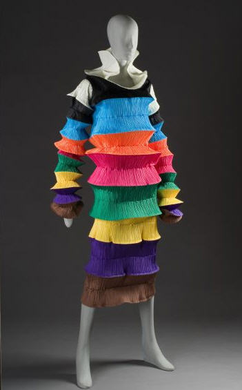
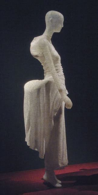
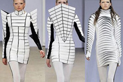
British designer Gareth Pugh touches on these elements too, though in a more abstract way. Abstract in the sense that clothing no longer hold on to the outlines of the human body, but -form wise- is completely free to go into any directions. Great representatives of these elements are Japanese fashion designers -or rather fashion sculptors- Issey Miyake, Rei kawakubo and Yohji Yamamoto.
Kandinsky’s Color Theory
Tuesday, December 8, 2009

Since I have chosen books in which the yellow color has been part of the content in different contexts, I took a book by Wassily Kandinsky for the last posting. The book describes a Color Theory according to Wassily Kandinsky, “Concerning the Spiritual in Art”. Here is his theory of the color yellow and the color that he thinks is the most opposite of yellow (blue).
Yellow means “warm,” “cheeky and exciting,” “disturbing for people,” “typical earthly color,” “compared with the mood of a person it could have the effect of representing madness in color […] an attack of rage, blind madness, maniacal rage.
Blue means “deep, inner, supernatural, peaceful “Sinking towards black, it has the overtone of a mourning that is not human.” “typical heavenly color”
Number: Kan 5
Unique Book
Sunday, December 6, 2009
I entered the library with a goal to find a unique book, and I did.
But what is unique ? Isn’t it pretentious ?
A funny thing happened, I picked a unique book about one of the least unique subjects that I know. Shoe obsession, which is really almost every average woman’s obsession.
The book is a miniature with more than 500 pages of text and images with at least one image of some kind of shoe per page.
Pretty unique.
But what is unique ?
I came to a conclusion that :
Unique Is Not So Unique.

(Unique Shoe)
12178 / 908.3 o’kee 1
A lot of yellow
Friday, November 27, 2009


My second book choice was based on my tag word that was yellow. I went for a book that was completely yellow and hoped that the contents of the book related to my other tags (dot, shapes and forms and jewelry). The book I ended up with was a book made by an artist called Toon Verhoef. I did not find many dots in the book, but there were some. There was no jewelry to be found in this book, but there were many super yellow paintings which had many shapes and forms that could be easily seen as beautiful shapes and forms, as you will find in many jewelry rings, necklaces, earrings etc. I was happy with the book because it was really yellow so was the inside of the book.

Number: verhoe 3
Maurizio Cattelan
Thursday, November 26, 2009
for my third choice of book i chose this monograph on the work of Maurizio Cattelan.
a donkey with a widescreen television on its back- the contradiction(the ancient donkey and the modern television) and absurdity of this picture got me into a conversation with the student returning this book who strongly advised me borrow it. upon looking in it i saw a similar anarchistic italian wit to that of Felini (especially in the chaos of Amarcord).
the book features some of the very interesting projects that the artist has been engaged in from early 1990 to 2000-
Super noi(super us) where the artist has been portraited by 50 of his friends through a police sketch artist.
Spermini the artist created 500 molds/masks of his face, each slightly different representing sperm.
Torno Subito(i’ll be right back) due to unsatisfactory resulting work for a solo show the artist locked the gallery with this sign hung on the front door.
Stadium the artist elongated a table soccer game to fit 25 people, commenting on racist issues on immigration in itali, half of the players of north african descent and half of italian.
i have not finished this book yet but i really recommend it, in the projects as well as in the large, extensive,insightful interview with the artist.

Rietveld library code : -catt – / 1
The Raven
Wednesday, November 4, 2009
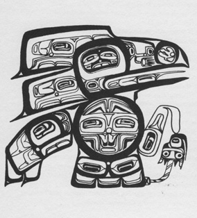
While looking for a book I was in search of something with a personal link to me since this is the first time I expose myself on this blog. Finally my choice was a book called “Indiaanse Tekens en Symbolen” (Indian signs and Symbols) written by Carren Caraway. I chose this particular book for no better reason than for the fact that I have a very strong love-hate relation to Indian symbols and forms of art embracing them. I always found them fascinating and pleasing to look at. But on the other hand they inherit an enormous risk of slipping into kitsch. Especially in pieces of so-called modern art these Indian symbols are often abused to produce gaudy trash. This picture I scanned from page 200 represents the Raven. He’s the central figure in the mythology of the Haida – a tribe that lived on the North West Shore in Canada.
754.9 cara 1
Conditional [Design] Painting
Tuesday, October 27, 2009
Conditional Painting is truly happening in the van Abbemuseum Eindhoven! They call it the Vitruvian Paint Machine.

As part of “Take on me (Take me on)” /Dutch Design Week 17 to 25 Oct 2009, Luna Maurer and Edo Paulus executed a mural painting on pre determined conditions based on the proportions of the body and visitor interaction.


The act of designing is based on rules they say. So Luna and Edo, together with Roel Wouters and Jonathan Puckey, created a manifesto of explicit rules for design.
Visiting their lecture, as part of the “Take on me (Take me on)” event, they made it clear that setting strict conditions does disconnect you from subjective standards and creates awareness in the process. A beautiful time based movie of their “machines” made this crystal clear.

download this research essay: by Jules Esteves: “Conditional Drawing, Conditional Painting” questioning the practice of Conditional Design.
Fragmented concentration
Sunday, October 25, 2009
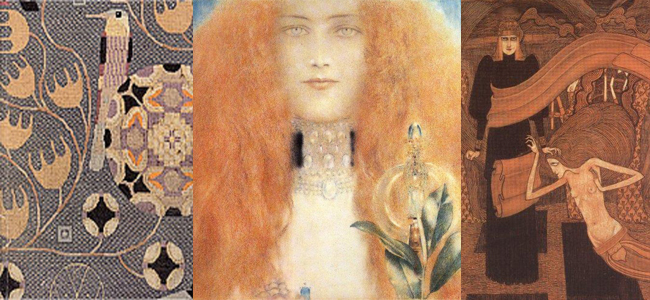
Gustaf Klimt caused alot of commotion in his time (±1895-1910) by breaking taboes of the current politcal artculture. Although Klimt’s work is know as groundbreaking he used alot of existing elements to which he responded by giving them a different interpretation and thus giving populair themes his own posture. Taking elements of all sorts of areas which are liked and combining those together make the definition of what we nowadays call popart.
Zooming in and taking an image or a situation it’s surrounding away makes it into an statement instead of an narration. This objectifying/ distilling let to an more architectural form in which the most known feature of Klimt is visible namely the decorative side.
Which characteristics did Gustaf Klimt use to open the barrier between art and decorative expression?
slowLinking: tagging slow design part 3
Monday, May 4, 2009
Welcome to part 3 of : tagging slow design. This is a worksheet on which all the link-topics and post-it tags collected on the “slowWall” are listed in relation to the research subjects as components of the ‘slow design project’. (researches can be downloaded as .pdf’s).
link topics.
Performance links the Morgan O’Hara research to the one on Julia Mandle. The Julia Mandle research links to the one on Richard Long on the topic street /nature & art, by slow movement to the Kunsthalle Bern exhibit and by sensibility & violence to the Psychogeography research. Psychogeography has the link topic urban life with the Karmen Franinovic research, consumption /destruction /life style with Futurisme, against and pro community with Wim Wenders, evolution of everyday life to Downshifting, and a anonimous link to Maria Blaisse. This anonimous link is not the only one linking Marie Blaisse. Link topics like art and left over, connect this research to Uta Barth. Karmen Franinovic links to Christian Nold by means of the topic mapping, and to Psychogeography by urban life, to Futurisme by life is getting faster & people are getting a social, to Julia Mandle by just stop & think and to Richard Long by the link a way to see. Richard Long links to many other researches: to Sophie Calle by self related art, to Christian Nold through a line made by walking, to Karmen Franinovic linked by the topic a way to see, to Downshifting by choosing slowness. Downshifting links back to Julia Mendle by the link topic us and them, to Psychogeography by revolution of everyday life, to Futurisme tagging the link with designed lifestyle, to Marie Blaisse by us and them, and to the Kunsthalle Bern exhibit by reflect /a closer look. The research on Futurism has some remaining links to Julia Mandle through the topic exploring / explosive / sculptural. Following links from Wim Wenders to Uta Barth is made possible by the topic notice the small things in life, to Christian Nold by moving /memories. Mapping links Christian Nold to the Ambient/Brain Eno research while that last one makes a link back to the Kunsthalle “The Half and the Whole” exhibit creating a take time to cook link.

Reading all the researches the links will surely start to make sense, as will their variety shed light on the specific nature of many of them. Some research subject however did not create any link at all, like in the case of Maison Martin Margiela. And it was 0nly after some discusion that the performance link was created between Sophie Calle and Karmen Franinovic. Uta Barth was anonimously linked to Richard Long which might have been an intuitively act
Post-it tags.
No links did not mean no tags. Time, Maison Martin Margiela for example was closely read and tagged with post-it. This created tags like memories, replica, time(less), can’t relate to it, time, physical picture of memory and the photographical tag to a picture by Mark Manders. Wim Wenders (present in our research list because of his beautifull documentary “Notebook on Cities & Clothes” about fashion designer Yohji Yamamoto) generated also many tags like sublime, I finally found time, hillbilly, surreal, the truth, place, moving. Sophie Calle tagged by the moderator with authorship, generated: life=art, stories, documenting life. Uta Barth looking was tagged: rainy day with half closed eyes, in between places, no left over, sunday. Ambient the research connected to Brian Eno tagged as big here long now was retagged as live the moment, loosing yourself, don’t think, sound. Christian Nold place-ness got tagged with keywords like biomapping, google earth, links, remapping memories. Linked to many, tagged by few. Julian Mandle pause, was tagged with pause from urban flow only. Morgan O’Hara gestures was tagged with trans, transforming, concert-art, transmission, energy of moments, reaction. Maria Blaisse architecture by border between self and not self. Futurism with fast life, life style, save time? Downshifting was tagged with life style too and change assumption. Richard Long tagged as a subject with landscape was enriched with the two tags: exploring fast and slow and perception of space, time and personal potency. Psychogeography with destruction of community, philosophy, socialism, anarchisme and urban live. Finally Karmen Franinovic subtraction, served as a hub for the tags: observe, spontaneous landscape, discover a realy nice place that never be online, easy fast, MTV generation, reflect, and observe. Some researches like Conditional Design re-mapping did not make “the slowWall” and were concequently not linked
added tags from the slow design lecture.
scale, gestures, measurements, relations, sustainability, evolving, creative activism, reveal, expanding awareness, reflect, engage, participal, deceleration, fresh connections, rhythm, probing, (im)materiality, metabolism, reflective consumption, live span, memories, community, record, tracing, (human) body, break (take a break), nothingness, inclusive, transparent, re-mapping, connection to scale
read also: >tagging slowdesign part 1
What’s In A Name: a Project for Gray Magazine
Saturday, April 18, 2009

On request of Gray Magazine #5 (yearly published on the occasion of Rietveld’s final exams show) 40 students of the Foundation Year, guided by Henk Groenendijk and Tine Melzer, unleashed a two day project to create a new context for a highly varied 20.000 slide images archive. André Klein, now chair of Fine Arts and Sandberg Applied Art Dept, compiled these slides over his 25 year long career of art history teaching.
We could only guess after the motives and meanings that bound these images together in a dynamic process of ever changing contexts and wonder what new context of relation they would have in the eyes and minds of the basicyear students. The uninhibited existence of a ‘democratically’ selected 1000 reproductions, registrations and images was given new meaning through a process of retagging with subjective keywords. In the 2 day process new contexts and connections were created, processes where discovered, and results presented in a physical display of image related tag-lists and monumental alphabetical (key)word lists. I am a kid
I burn
ice
ice cube
iceberg
ice cream
Iceland
ideal
IKEA
ill
illusion
Illustration
image
imagination
immigration
imitate
imitation
immaterial
impale
imperfection
impossible
impression
in scene
incest
inconvenient
increasing
identical
India
India
Indian
industrial
industry
infinity
influence
information
ink
inner space
innocence
inquiry
insane
insect
insecure
inside
insides
installation
institute
instruction
instruments
integrate
intellectual
intense
interaction
intercourse
interest
interference
intergalactic
interior
intertwine
intimacy
intruder
invasion
invention
invisible
invitation
irresponsible
island
isolation
it
Italy
itch
Awareness surfaced about the relation between content and image and word and form and content in the contexts of our own terms. Tagging images uncovered these relations


some of the question we asked ourselves were:
The mechanisms of images and imagination on one side and the mechanisms of names and naming on the other – where do they both meet?
What is the link between what we see and how we call it?
What is the process of agreement with the other(s) to find relevant and appropriate names?
Is tagging also a kind of ‘baptizing’? Or rather an act of memory and memorizing, how things are called?
What is the level of interpretation when we have to give an image a tag?
What is the relationship between tag and image, word and view?
:

download Gray Magazine # 5 [this is a 44 MB document] :
For more information on this and other lecture projects based on the same archive, read Gray Magazine #5. Get your own hard copy from the Library
.