Skip to Content Skip to Search Go to Top Navigation Go to Side Menu


"Lissitzky to Moholy-Nagy" Category


SUNrise SUNset


Sunday, March 6, 2011

Beautiful and healthy Sun.

How long I’ve been waiting for you, and finally, of course I m gonna spend all day in a museum.

I was quite disappointed; naaa half disappointed, cause of the Sun, I can t be in a bad mode.

So I went in:

Toilet.Library.Toilet.” Victory over the Sun“movie. Toilet. Wardrobe.

Coffee. Cigarette. Sun !!

The opera has made me forget my pain. I started to love that place instead.

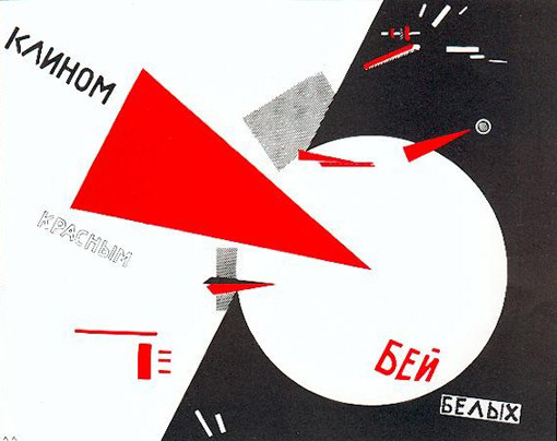
Prokofiev, definitely, he was in my mind with his Dance of the king when I was in the first room.

Concepts expressed by words, reduced to lines, shapes, sharp, direct fired into space. I really like it.

Clear and direct. Art as propaganda, for the mass……Like design?

S#@°!t it must be really hard, if you are a designer, in a way you must be kinda psychologist, a bridge.

Tchaikovsky, Stravinsky, Rubinstejn…….Vivaldi !! the Spring from the 4th season, second floor, big sunny window.

After, that I was no longer interested in individual pieces of art. I quickly started to wander in space.

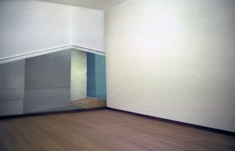
empty.full.shadow.light. The rooms themselves were art boxes containing art.

I couldn’t stop smiling. Wagner: Ride of the Valkyries. I went out.

“manuscripts don’t burn”. I got to laugh about myself

go,

over

The Sun

Essential for life on Earth.

Leegte.


Sunday, March 6, 2011

Als ik denk aan een expositie bezoeken dan krijg ik bijna een onbehagelijk gevoel van binnen. De gedachten aan zoveel verschillende werken, die elk weer een andere betekenis hebben; die elkaar doorkruisen zodra je even niet oplet; die mijn gedachten zullen openbreken zodra ik die niet aan zoveel mogelijk kanten bij mij houd. Het is bijna een soort angst als ik de grote ruimtes binnenloop en mijn blik valt op al het werk.

Ik wil geen entertainment van beelden. Ik wil een leegte. Een leegte van het hedendaagse; van de toekomst; van hetgeen de mens omschrijft. Dat is waar ik mijn rust in vind; mijn gedachten kan laten focussen op de kleine (menselijke) details waar de massa zelden de schoonheid van zal ervaren. Leven binnen mijn eigen ruimte, waar ik een stilte creëer waarnaar ik de kleinste dingen opspoor binnen het visuele om mij heen. Daar zit de adrenaline die mijn brein laat samenwerken met mijn ogen. Binnen de kunst ben in dan ook constant opzoek naar werken die een grote leegte bij mij opwekken.

El Lissitzky met zijn expositie over het theaterstuk ‘Victory of the Sun’ in Eindhoven. Ik heb mij zelden zo opgelaten gevoeld over een nieuwe ruimte binnenlopen in een expositie. Na elke doorgang zag ik werken die mijn hoofd vulde met leegte en vervolgens mijn gedachtes volledig zijn eigen weg lieten gaan. Strakke vormen; hoeken; lijnen; bijna kille afbeeldingen van een mechanische wereld van vormen die, volgens de beschrijving, op mensen gebaseerd zijn. Op afstand alleen het strakke, dynamisch-ogende uiterlijk zien om vervolgens het menselijke terug te vinden in de kleinste details; de fouten. Van veraf zo perfect, maar van dichtbij zo menselijk.

Ik weet nu wat ik wil. Ik wil die grens. Perfectie en fouten maken. En vooral die fouten laten zien.

A “simple” construction


Saturday, March 5, 2011

As a student who already was aware of which direction to choose before applying to the Rietveld my trip to the Van Abbe Museum was no eye opener on that point. Being raised by artist parents and Bauhaus principles in the country side of Denmark I found huge inspiration in the El Lissitzky exhibition well knowing that I want to become a Graphic Designer.

Most of the works of Lissitzky seemed to be constructed out of different objects and colors. Two or three dimensional there was a huge understanding of aesthetics with great influences from the Bauhaus generation. Unlike most of my fellow students who thought Lissitszky was too Russian, constructed, cold and straight eyed I saw great playfullness, movement and joy  (experiments) in the works. Me having a little knowledge in the field of printing I could see that the artist had explored what was possible at that time. I immidiately identified my self with the way I use basic html like color boxes, strokes and helvetica when working with web design. The lack of knowledge or technology is not always a limitation but can also be a huge gift which removes superfluous decoration and focuses on the main idea behind the work. The way he constructs with distinctive geometric forms in layers and makes it look quite simple, even though everything is put in the best way possible, was very impressing. I kept seeing references to cubism and futurism in his sketches which I also seem to have in my drawing. The picture underneath sums up what I have said, with a very simplified illustration that is constructed like both informative text and illustration this silkscreened illustration has references to the beginning where Lissitzky designed children books.

Do You Get It?


Saturday, March 5, 2011

It was quite hard for me to make a decision about one work of the Russian suprematist artist El Lissitzky, since this extreme emptiness and simplicity in images mostly gives me an uncomfortable feeling of being lost. On the other hand, it can also give me a feeling of structure, of organization and a somewhat mysterious clarity. So my feeling towards these means of visual language is kind of ambiguous. What is very interesting about the confrontation with abstract art, is that you either comprehend the piece (because you’ve read or heard about it or simply because you are part of the very same movement), or you don’t. If you don’t, you have to fill the empty brainspace with your own thoughts and ideas about the suggestion that is made or what is being implicated, which is most of the time impossible to guess without any information since it’s so abstract. How does a person that doesn’t know that Malevich’s Black Square is representing the party perceive the painting? And is it wrong if that person imagines that there is another meaning, just for him? I really don’t know.
I partly like how graphic elements are presented by Lissitzky and how they carry a connotation that has to be detected. They become emblems for and references to something so much more than themselves. So they turn into something completely different and in a way unworldly, but in a very modest, unpretentious way, sometimes even a tad clichéd. One of his propaganda posters in the exposition, “Beat the Whites with the Red Wedge” from 1919, is especially nice as an example. The red wedge is a symbol for the active bolshevists who are overcoming their rival, the white movement, interestingly enough represented by a white opening in a black background, which is pierced by the red triangle. I like the simple clarity of his choice, but am not a fan of the additional shapes and letters since they are too mysterious for me and disturb the beauty of the image in my eyes. Then again, it’s propaganda.

Welcome all of you born and not yet dead!


Friday, March 4, 2011

De mens speelt zijn hele leven, elke dag, misschien wel elke minuut, een andere rol. Tegenover elk persoon verhoud je je anders. We leven met masker, kostuum en aangeleerde manieren. Zonder valt niet of nauwelijks te leven.

De ene dag ben je slecht, vijandig, dan weer lief en onschuldig of je voelt je als een zak aardappels.
Als ik me voel als een aardappelzak, zorg ik er voor dat de aardappelzak omhult is door een zwierige jurk en felle lippenstick. Uiterlijk is misleidend. De meeste zullen pas denken dat je een aardappelzak bent als je een jute doek omslaat en muf ruikt.

Mensen reageren op wat ze kennen.

Heb je een goude oorbel in dan ben je crimineel, homo of gabber. Cliche's zijn makkelijk.

Bij een slecht iemand denk ik meteen aan een kauwgom kauwende man met een leren jas en een snor. Dit plaatje zit vastgeroest in mijn hoofd.


[costume for Man with Bad Intentions]

Toen ik het operastuk: De overwinning over de zon, met decors van Kasimir Malevich zag, was ik gegrepen door de vervreemdende taal en beeldtaal. Abstract. Weinig aanknopingspunten, waarin je vastgeroeste denkbeelden zou kunnen terugvinden. Ander taalgebruik, andere tonatie van de stem, abstracte kostuums.
Het karakter, de slechte man, kreeg in dit stuk een hoekig pak aan. Zonder dat het aansloot op zijn lichaam. De vorm van het pak werd eerst gemaakt. Daarna kon de slechte man zich hiertoe verhouden en aanpassen. Zijn bewegingsvrijheid hing af van het pak. In het kostuum zijn geen cliché’s gebruikt. Ook niet in het pak van de vijand, de nieuwe mens , de dikke man enz.

Dit vind ik een welkome verrassing en zelfs een opluchting. Doordat bewegingen, taalgebruik en kleding onherkenbaar blijven, dwingt het je anders te kijken, te denken en te luisteren. Niet te snel te oordelen. Het stuk is een zoektocht naar herkenningspunten in een wereld die je vreemd is. In dit stuk maak je je eigen waarheid zonder het zien van cliche's of rookwolken.

cube design


Wednesday, March 2, 2011

In the “beginning” all was dark… Paintings were hanging in dark rooms and the walls were so filled that one could barely see the landscape paintings for all the landscape paintings in the salon. Anyhow, most people were happy that they could consume the art, just like people since the ancient Vatican sculpture gardens. In 1812 the first “art-only” building was created by the English architect Sir John Soane. Finally! Here the art could be viewed for what it really was, perhaps even art selected with great taste, as Kant would have wanted it.

In the late 19 century the number of galleries and art museums were booming. Every “metropolis” had to have its own museum of art to be a metropolis. When we are approaching the mid 20 century old ways of building institutions of art, often retro romantic, were abandon for more “clean” and architectural deconstructed rooms, an early examples is the Guggenheim in New York. Exiting times.

At the Van Abbe-museum in Eindhoven you can walk around in beautiful, calm, strictly white and spiritual rooms filled with modernistic art. The worlds’ largest collection of Lissitsky paintings are finding its’ place like a perfect sized glove. Modern art for a modern room!

On the second floor an exhibition about art is presented. Or rather an exhibition of art. Or an exhibition of artworks about the modern art museum, but with new art. Or an exhibition on ehee.
When visiting this exhibition a feeling of unrest is present, an urge to maintain the “white cube” intact. The room can only be intact when art is made in respect of the cube. But what happens when people get tired of the white cube, when artist don´t agree that their works need the white cubes, when the curators finds them self unable to fill their holy rooms? Maybe the beautiful buildings of high modernism will slowly decay? Well to calm the museum directors I have taken my responsibility and re-used the modern room to create new room! Deconstructed the deconstructed. A post modern solution to keep modern. Now we all can sleep well.

Proun


Wednesday, March 2, 2011

De gehele expositie ‘monumenten voor de toekomst, El Lissitzky’  trof mij als warrig, misschien mede door het eerst kijken van het theaterstuk, waar hij aan had meegewerkt, uitgevoerd door Amerikaanse theatermakers, lang na zijn dood.
Theater is een ding, experimenteel theater een ander en een video-regristratie van  experimenteel theater nog een stap verder van mijn bed. De bedoeling van de tentoonstelling is om te laten zien hoe dynamisch Lissitzky was, zijn werk is dat ook, vaak onaf, vol ideeën over de toekomst. Maar de meeste dynamiek die ik gevonden heb, zat in het kleinste kamertje van het Van Abbe Museum, het was ook de laatste ruimte die ik nog niet gezien had. Het was een video spel, geprojecteerd op een groot scherm met een comfortabele rode tweezitsbank er tegenover. Het was het spel ‘Proun‘ van Joost van Dongen, mede geïnspireerd op Lissitzky. je was een bal die voortstoof op een buis, je kon vooruit en draaien om de buis. onderweg waren er enkel geometrische vormen die uit de weg gegaan diende te worden, er was geen boven of onder, geen einde, enkel abstractie en zeer veel dynamiek. Wat het Van Abbe probeerde te bereiken via het werk van Lissitzky, is hen gelukt via een video game. Hier raakt de expositie aan de toekomst, en aan dynamiek, de kunst kan nog veel groeien en ontdekken in de wereld van de nieuwe media. Games, web-art, conceptuele kunst op je I-phone van alles is daar mogelijk. Jammer dat hier verder geen aandacht aan is besteed in de tentoonstelling. Het doel was immers een tentoonstelling te maken die lissitzky in deze tijd plaatst. bij het spel stond ook niet van wie het was, waarom het er was of dat het er überhaupt stond. een klein gemis


Log in
subscribe