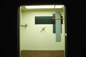
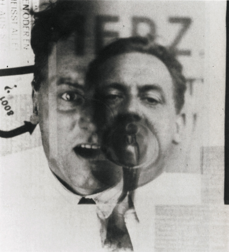
Skip to Content Skip to Search Go to Top Navigation Go to Side Menu


"Lissitzky to Moholy-Nagy" Project


light is art, and in the fusion of all art with life, light is life


Tuesday, May 17, 2011

light is art, and in the fusion of all art with life, light is life
It is quite a bold statement to make, but not a wrong one in my opinion. Light is one of the keystones to our existence, it is energy, warmth and above all it makes us the visually driven creatures that we are. Moholy-nagy introduced photography and film in art as the new media with light as its main ingredient. And with this move he made art accessible for a much larger audience than paintings for instance. He wanted this to be so very much, art in his opinion was something that merged with life itself, worked together with it, to make one big artwork together of it all.
and to that sense in his view light is life.
Of course this was a long time ago, and film, photography now together with other media such as TV and Internet we can’t even imagine a time without them. It might be still be a valid statement today, but it didn’t proof to be only right, now art can also be an idea, an idea only, or a set of instructions of how to execute ones idea. In this view i would now say:

thought is art, and in the fusion of all art with life, thought is life

light is an outside source, which is very important, but animals also experience light. Art is opposite to animals, art is what makes us human, because art makes us reflect upon ourselves, something an animal can not do.  Thought is at first within ourselves and is the source of all human actions. And to express this we can use light to make it visible, but also sound and touch are just as valid means of expression.
Moholy-Nagy thought of art as an collective mentality where art and all other things to life would merge together as one big whole. and trough this way would create a general progress is humanity. again a very noble thought but still incomplete, seen his view on light, and light only as the medium. Touch, smell, sound, taste and light are all equally important medias in which a human can express himself.  Especially because he wanted art to be an overall merging cornerstone to society he might have meant:

Sensibility is art,  and in the fusion of all art with life, sensibility is life

instalation Moholy Nagy using all senses

X + Y + K


Friday, May 13, 2011

+
+

Inspired by Uta Eisenreich ;

Color and sex


Friday, May 13, 2011

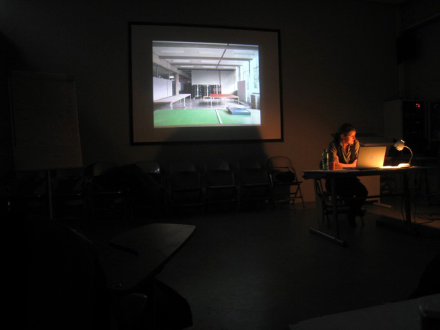
A lecture by Linda van Deursen.
A lecture about De Stijl still being relevant in contemporary graphic design

For me the most fascinating part of the lecture was when Linda van Deursen showed that De Stijl is still present within the Gerrit Rietveld Academie. “Everything you do inside or around the school is in dialog with the school”
She talked about the building designed by Gerrit Rietveld himself: a simple glass box put over a concrete structure. She also talked about how he chose grey as the most neutral color for the background of the space we work in.  According to Rietveld; “students works will give color to the school”.
For outside the working space he did put some color; the primary colors. The floors yellow blue and red, the toilet doors yellow.
I believe that in the beginning there where no male or female tags on the toilet, just the yellow color. I don’t think he would put something that sexist in this concept.
The floor used to be from a less strong material, making it prohibited to wear heels inside the school.  This was changed later, so you could wear heels in school.

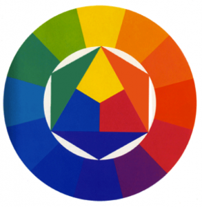
She made me look at this subject in a certain way. Rietveld his primary colors are very open to different possibilities: when you mix the colors, you can make any color you want. This made me think of an opposite way we use colors;
the colors in the routes our two different sexes

It starts before we are even born, the moment your sex is discovered.
Blue for boys, pink for girls.
I see these two routes where we split the things in our lives. For the boys we buy their first pluche football, something from the blue route.
And for the girls their first dress, something from the pink route.
The boys are raised playing competitive games with other boys.
The girls are raised picking out a new color for their dresses,
the first steps of these two very narrow routes in this not so open space.

By the time we are four we already get to see the end of the routes.
We see that we eventually all will get married and have children.
After you have learned this you will soon discover that there is absolutely no way for boys and girls to be on the same route.  The world is now split up in to separate sides.

There are of course people that are not able to fit in these routes.
They either go to the other side, to be a boyish girl on the blue side or a girly boy on the pink side or they have to figure out a new route. Since you were given only blue and pink you end up mixing and since pink and blue can only make one color you end up with the purple route.

Start with Rietvelds three colors and there won’t be dead ends like that.
If you don’t fit in your yellow, blue of red route you can mix it up in all directions.
This education could be seen as an alternative space where you won’t get stuck. You can get loose of your brought by view and look in a primary colored base way in a space where this is supported by your surroundings.

Linda van Deursen mentioned in her lecture that she could have made this lecture about anything  “I was trying to see if there were some links and there are”. For me there was the link between the blue and pink opposite to the red, yellow and blue.
You can write anything about this and maybe that is what it is about in the greater picture: you apply this institute on yourself.

This lecture was originally called "L’héritage De Stijl à la Gerrit Rietveld Academie d’Amsterdam" and developped within the program connected to the 'Centre Pompidou': Mondriaan /De Stijl

Man Loved, Man lived, Man Ray


Friday, May 13, 2011

To really understand Rayograms, i think one needs to experience it. It is not just about playing with objects on photographic paper in a darkroom. It definitely is more than that.

My first experience with Rayograms was in my second year of high school in Switzerland. It was so new to me. I knew nothing about darkrooms let alone photograms. As a first reaction I went out to the nature and collected whatever i found to be interesting. There were leaves, branches, beads whatever one can find. After playing around enough, i started becoming more picky about my objects. Each object had to be more special, had to have a reason to be there. That is where the process becomes very self reflective. Objects have meaning or associations and you end up questioning them and yourself through them. Until something makes a bit of sense, if not with their meanings, then with their visuals.

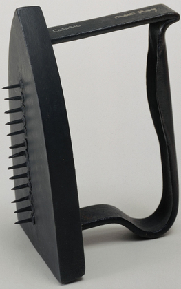
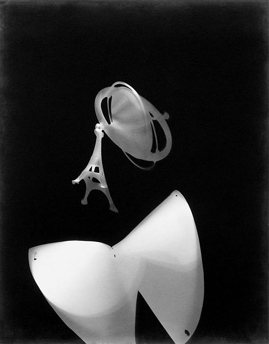
Looking at the Rayograms of Man Ray i really started to become curious of his life through the objects he used like scissors, films,keys flies, comb, needle, iron

Especially the negative film  as an object seemed to be reappearing all the time as well as scissors and needles.

Despite their quality as objects, they really make me question their associations and that is where i started researching more on Man Ray’s life. I wanted to know to where and to what they were connected in his life.

Man Ray’s work not only seem experimental they also are very personal. The double thing with ”knowing” though is that once you know it you can never see it in its purest form and that is also quite important in very abstract, open end works like Rayograms.

Rayograms which is named after Man Ray started to come into existence only after he experimented with various mixed medias throughout his life. Thus it is important to know the stages Man Ray went through in his career to see the layers under his rayograms.

It all started at Boys’ High School, where he educated himself by frequently visiting the local art museums where he studied the works of old Masters.

Early works of Man ray includes expressive figure studies and Cezannesque landscapes made from observations.

Between 1913-1915 when Man Ray lived in a small artists colony in Grantwood, in an effort to keep expenses at minimum Man Ray shared the rent on a small shack with the American painter Samuel Halpert. It was from Halpert that Man Ray emulated the artists’s utilization of contoured form and brightened palette.

Over time Man Ray removed himself from direct observation of his subjects,reducing figures to flat patterned disarticulated forms and his imagery became increasingly abstracted and artifial.

While living in New York, he became friends with Marcel Duchamp who was interested in showing movement in static paintings. Obviously influenced by Duchamp Man ray’s works began to depict movements of the figures. Later on again like Duchamp, Man Ray made ” ready-mades”.

His work called ”gift” shows influence from both Duchamp and his parents.
(more…)

Moholy-Nagy’s Photograms


Wednesday, May 11, 2011

Lászlo


Portret

László Moholy-Nagy was born in 1895 in Hungary. Here he started painting around 1918. Around this period he also moved to Berlin to develop his talent.
Besides painting and photography Moholy-Nagy also made during his life a lot of other art in which he often involved light as a media. He made sculptures, collages, films, graphic design and even more different work.
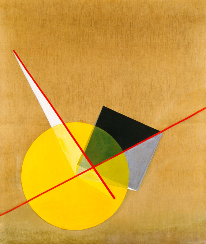
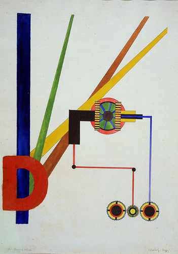
Here below you see some of his early paintings.

In 1923 Moholy-Nagy became a teacher at the Bauhaus School in Weimar after he got to know Walter Gropius; the man behind the Bauhaus.
The school had a total new way of teaching. Students had the possibility to work with a lot of different materials and were stimulated in there independency and personal development. Information Bauhaus (dutch) or (english)

It was when Moholy-Nagy became a teacher at the Bauhaus that he started experimenting with typography and photography as well. When Moholy-Nagy later moved to the VS, he there started the New Bauhaus in Chicago and continued his experiments with film and photography.

philosophy

Moholy-Nagy believed in art as part of a lifestyle. A collective mentality in which art, together with other aspects of life come together as a ‘gesamtwerk’.

He was convinced of the forming function of art. He saw the ideal society as one in which everybody is practicing art. This would lead -so he thought- to an improved society. He joined the group MA, which believed in the revolutionary potential of art. more on his theory and himself

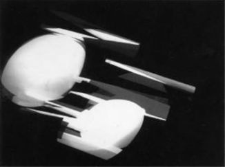
the photogram

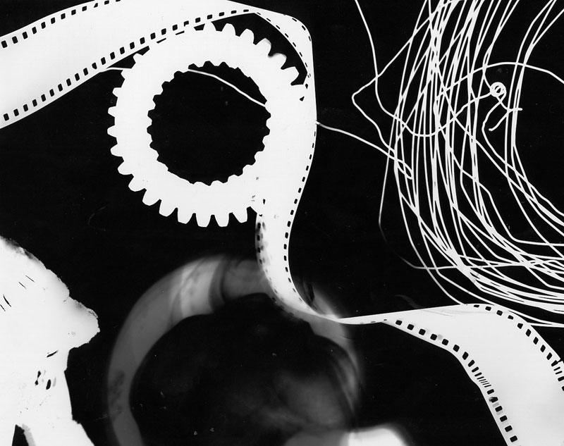
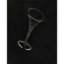
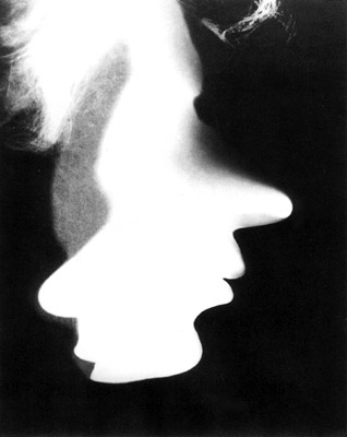
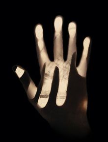
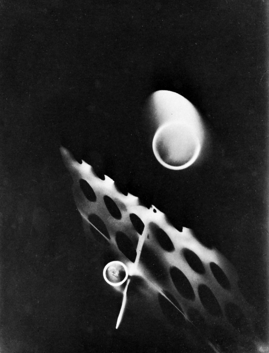
A photogram is a print of something that lies on light sensitive material and then get’s lightened. In other words: A photogram is a form of photography without the use of a camera.

This is, I think, very interesting.
To me it’s fascinating to see the direct forms of a device on paper. It makes in a way the distance between you and the subject on the photo smaller. And the realism of a photo bigger.
So what you see is exactly what it is.

Moholy-Nagy tried a lot of different things. For example the experiments with the light from different angles. And also many try-outs with different types of material; in special the transparent materials.


The  photogram’s of Moholy-Nagy are often abstract but not always. Lazslo worked with figurative images in the photogram as well. He build figurative images out of form or/and made use of the negatives of other photo’s.
But just to give a little bit more information about the history of the photogram because you might find this interesting (as well as I do) I’ll give you some more facts;
– The first illustrated book containing photogram’s dates from 1843, from Anna Atkins. Not so long after the invention of photography itself.
– In the early twenties there was a lot of experimenting done with the photogram. Notably by Christian Schad and Man Ray.
– from the moment Moholy-Nagy discovers the Photogram (around the time he started teaching at the Bauhaus) he continuously produces them until his death.

concluding

After visiting the exhibition Moholy-Nagy “Art of Light” and seeing all his work paintings, films, objects, collages and a huge number of photograms, I became really interesting in them. By reading about Lazslo and looking at his work I found out that there is so much more to learn about him and this time, which I think will inspire me to design and create more photo’s for myself. Especially in relation to the philosophy of Moholy-Nagy about photography. This because I agree with him about how to make use of black and white and composition in photo’s. Over-thinking the work of Moholy-Nagy resulted into an eye opener into the possibilities of photograms or making use of light in art.

some other sources:
Moholy-Nagy: The Photograms, catalogue raisonné published by Hantje Cantz / The Art of Light exhibition cataloque(fotogrammen)
Biography Lazslo Moholy-Nagy [Rietveld Library].
general information on photograms
How to make a photogram

Uta Eisenreich


Saturday, May 7, 2011


PAY ATTENTION AT YOUR BACK !


Uta Eisenreich is a Dutch photographer/artist, teaching at Gerrit Rietveld Academie. Looking at her works, especially at her last book “A not B”, I noticed the important role played by her background.

The book consisting of a series of still lives, inspired by non-verbal IQ tests for children. The images show changing combination’s of stereotypical domestic objects. The layout of these tableaux is determined by an underlying logic that the viewer is subconsciously triggered to discern..

She express herself through Photography, Performance, installations and Games. As I mentioned before I was captured by her ability in playing between subjects and backgrounds.  I found that book a clear example of balance and contrast between basic elements; all tricked out by “title-suggestion” that create a sort of curios  analogy.


Full colors and daily forms give me an idea of comfort.

Known.


While an esthetized light, an independent background create an idea of gravity absence, almost vacuum.

Unknown.


The almost absence of shadows and the extreme perspective, as in the Stenopeic Photography let disappear the deepness creating an optical ? illusion where is easy to get lost in focusing the main subject. Subject and background are on the same plan, they have the same value in the composition. From that originates my interest about the fact that ” a background is always present”. We can not have anything without any background.

Years ago I went to an exhibition of American Landscapes in the XIX century, damn it was boring. Nature, sky, horizon*….I couldn’t find a point to focus on.  What is the subject? The main interesting point?  It is a landscape, where is the background? Probably it is the landscape itself. Then Monet ‘s Waterlilies…subjects melted with other subjects in different plains ……

After I had the occasion to see a Rothko in person; the absence of conventional subjects led my sense to experience the paintings as a start point. Like a landscape, like a background. I still have to get the point.

Many times I heard discussion about landscape or background in architecture; how to integrate, to camouflage a structure in a determinate location/landscape/background.

In painting as in design as in architecture….. It can be monochrome, flat, floral, fizzy, silent….We can use it to amplify the main subject, or just to diminish it. Everything starts on something else. The Earth’s gravity has perhaps led us to a method of building based on addition;


X + Y


X + Y + K


X + Y + K + H + a canvas, a problem to solve, a rock, a dream, a need, a sheet of paper…


Again –just to remember–  isn’t how and where we present art the main important background?

Luckily it is an extremely versatile element. So versatile that we can even give it a determined value and meaning. However it can be an idea if we want.

*An expert mind pointed out to me that If we look at the horizon in Uta ‘s pictures, it is almost always not completely unbroken. As if she just did not crop it right and a little piece of the set-up shows. A corner or something else…… Like that the 2d effect is brocken as she shows a reference to the 3d set-up.

Germaine Kruip: Modern Silence


Tuesday, May 3, 2011

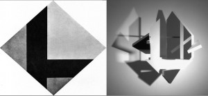
I could talk about the obvious, that Germaine Kruip’s Counter Composition (2008) strongly relates to the Stijl and that she was clearly inspired by Theo van Doesburgs Contra-Compositie. The Amsterdam based artist got her idea when she found material she wrote when she was thirteen about van Doesburg.

I could also talk about how a work that is so strongly inspired by a movement that happened more then 80 years ago can still exist in this time.

But to me this is not the most interesting part about Kruip’s work. I can see how Kruip’s work is also very related to now and to her other work, in dynamics and use of light. And I think it is very much acceptable to take inspiration out of other one’s work, if you can make something new and your own out of it. The work is only an echo of the original work of van Doesburg. Van Doesburg emphasizes that the colors, shapes and lines are forming a dynamic contrast, Kruip takes that even further by actually using movement.

The thing that really catches me, which is maybe also obvious, but therefore not less interesting, is the use of simple, subtle images, the silence of it.
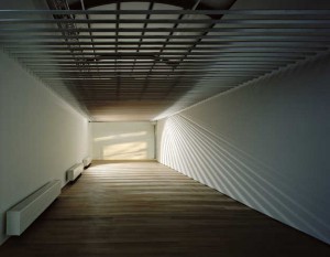
Her work continually changes as the light changes, using reflections, movement and daylight. In most of her works she is using daylight and by catching it with mirrors or shapes it leaves shadows, the work changes by the minute as the reflection or shadow of the light does. It is serene, sensible and calm, which is very much my taste. It’s not screaming for attention, using bold images, referring to mass culture or other problems in the world. It’s silent and well thought, showing beauty in ordinary things.

I think that noise and action are overrated, but people do not seem to take silence. We are used to the noise, as we are all living in this over civilised world. Even now I’m sitting in my living room writing I hear cars, people closing doors, sirens, once in a while bird, people locking there bikes and this all within a minute. The same counts for images. We are overwhelmed with images.
We live in a world where everything and everybody is screaming, for attention, for power. We are constantly moving, faster and faster. There’s no time to stand still and think. We need to be amused and entertained the whole time and it seems that we got so scared of being bored. The images we see, in movies, tv and also in art, need to be stronger every time, because otherwise it won’t have any effect on us. Everything needs to be more violent, more sexual, more shocking. We’ve already seen it all. But this constant overflow of images is also tiring. Always moving and going forward, isn’t the solution for being bored, maybe it is even the cause.
So in this sense I find Kruip’s work a sigh of relief. Things that aren’t fast, or loud are a very nice change, images that give you space and time for your own thoughts and ideas. The images that Kruip uses are sober and simple. But therefore not less beautiful, actually in their simplicity they are particularly aesthetic, catching beauty in everyday life.

Then on the other hand her work also fits very well within this modern world. By using mirrors she is generating fragments of images, a blended image-stream. The shimmers of light could also be associated with city life. The reflection makes you aware of yourself and the other people viewing. Even the speed is quit fast. In Counter Composition the sculpture turning in less then 10 seconds. An other example is Reading Room, (2006-2009), which was exhibited in ‘the Paviljoens’ in Almere, a piece where a light spot circulates through a room, the light and shadow changes as with daylight, but much faster. You are confronted with time, the going of time. But it is also very familiar in this ever-turning world.
So maybe Germaine Kruip’s work is a combination, a combination of this very aesthetic subtlety with references to our fast moving environment. Maybe it is a modern silence.

Agitating emotional language


Tuesday, May 3, 2011

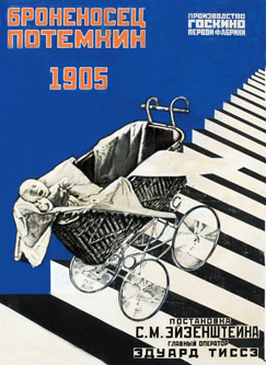
After years of war Russia had to recover itself. An intense artistic activity emerged mainly influenced by works of Kandinsky, Malevich and Tatlin, the fresh generation explored new ways of dealing with art.
Artists searched for a way to deliberately change people’s beliefs through a well-planned strategy of persuasion.

I think the secret of propaganda is more related with the psychological mass event that was happening and it’s still happening in some countries. When people get hectic and they constantly search for the truth Agitprop becomes a serious weapon for manipulating the brain by agitating common political issues and presenting them in such a way that a reaction to it will be born. This reaction to what we see, makes us perceive things differently.

This political propaganda is influencing opinions and convincing people by using an emotional language of problems present day by day in society or politics.
One important artist that I would like to mention in my research about agitprop is Liubov Popova. I personally don’t see Popova as an artist upset by that time limits or by this propaganda that was influencing eyes everywhere. I see her as a free spirit that developed as much as possible. She had quite a broad approach to her art. Works of Popova and Rodchenko were recently presented together in an exhibition, gathering together 350 paintings, models, posters, films, designs and other objects. Before she died she even worked in the theater industry designing sets costumes and creating textile patterns for the first state textile factory in Moscow.

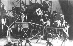
Political theater dynamically involves the audience and it became truly important in that historical context. Popova’s project for Earth in Turmoil 1922-3, a theatrical collaboration with Meirkhol’d is quite impressive, with a montage of political quotations, party slogans and film excerpts providing an ideological commentary on the action. The production was truly equal with a propaganda poster, but it explained itself in a more relaxed and artistic approach. She also had a great  approach for Meyerhold’s production “The Magnanimous Cuckold” with her stage design. The result was a machine moving structure, a very dynamic and pulsating spectacle that succeeded to unite in an organic way the actor and the set, and bring the public closer to the work. Nowadays we may refer to those kind of works as installations.

Tatlin’s influences Popova in a very obvious way, since they we’re working together. In almost all her work she uses geometrical shapes to create the deep space feeling. Popova’s knowledge not even responds to Malevich’s ideas but it pushes them further. A dynamic sense of instability and movement is matched by her use of strong color.

Popova’s personal approach to the Agitprop movement becomes a dangerous technique for manipulating peoples view. I think agitprop is still commonly used as an aggressive way of dealing with community problems and as a way to keep us focused on one of our “group” problems.
Propaganda, is something that nowadays rules our lives with every step we take. When we see a poster or look at the news we should be aware of that  the information is given to us through a filter. This way the entire population can be upset or worried about something.

In my country most of the time those propaganda posters have really no sense of the viewer reaction or pleasure to interact with them. And maybe that’s a strong reason to say that I really like Popova’s work, because her work catches you in a very powerful way.

When you force things by using a really emotional language, then the result is obviously. Popova’s works are considered to be entirely abstract and yet

without any doubt she produced propaganda and educational posters among others. I don’t think the propaganda was more

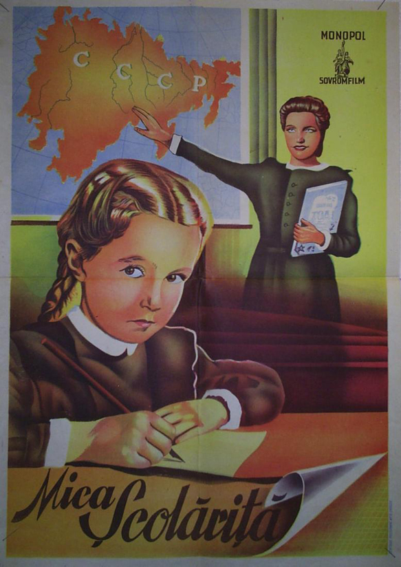
aggressive in the communist times than it is nowadays, or at least this was my experience in Romania. Today political propaganda and suppression works at its very best. And for this I will present the following postcard image from our president’s party. They attack today

exactly  that segment of the population where they know it their propaganda will work. The uneducated, especially religious people without a broad view about political issues. In the communist times artist like Popova, Rodchenko or Lissitzky and others found great inspiration in this subject, and developed it with all their ideological creativity. Today the propaganda is used in a more aggressive way and sometimes it doesn’t even have an artistic approach to it.

Victory Boogie Woogie


Sunday, May 1, 2011

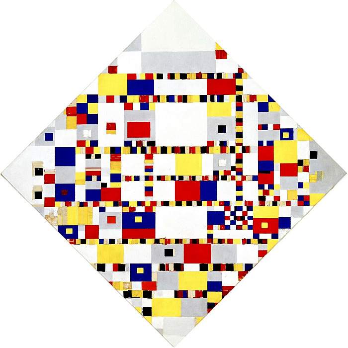
“Victory Boogie Woogie” is the last painting by the Dutch painter Piet Mondrian. It was made but not completed in 1944, the year that Mondrian died. Even though it is unfinished, the disposition of the image is still quite clear. It is a continuation of his last finished painting “Broadway Boogie Woogie”, which it has a distinct resemblance to, even though the canvas of the latter is a simple square, while “Victory Boogie Woogie” is lozenge-shaped and by this deals with space very differently. Still, both paintings consist of multicolored, different sized paint-, plastic- and paper squares, arranged in an asymmetrical pattern in horizontal and vertical lines on the canvas. They seem to be partly interwoven, or layered, which suggests an almost textile-ish feel of the surface, probably partly due to its unfinished state. For both painting Mondrian used only the primary colors and shades of grey. The yellow is much more dominant in the Broadway painting while blue and red are more prominent in the other one.

While it is implied, that “Broadway Boogie Woogie” represents the sparkling lights on Broadway, as well as the streets of New York, filled with the yellow taxis, “Victory” stands for the (New York) city life in general. The lights, the traffic, one might even see the grid of the cities map with its crowded streets and huge buildings. It is strange, since the painting is obviously not trying to portray the scenery realistically; it is more a capturing of an ambiance, the kind of mood you experience when you’re in the middle of a big city. Very intense and maybe even a little overwhelming, a lot of sounds, smells, images, multicolored stuff and people, vehicles etc. surrounding you like a cloud of a heavy metropolis-esque odor, making you a little bit dizzy and leaving you in a state of inexplicable physical fatigue. Especially in comparison with the Broadway Boogie Woogie it feels very crowded, maybe also connected to the shift of the canvas, since this way the squares don’t run parallel to the borders of the canvas.

The fading out of the squares towards the border of the “Victory” painting might be an indication for the non-finishedness, or just a contrast to the filled and almost hectic center. And really, the painting evokes a state of slight confusion, reminds of speed, circulation, movement in general. That is why it fits it’s title (which was not given by Mondrian himself, since he was already dead) quite perfectly, the boogie woogie, a subcategory of blues that came up and was popular in the 30’s and 40’s of the last century, was a piano based dance music, which was very up-beat and fast. Also a characteristic attribute is the frequently repeated leitmotiv, which is perfectly illustrated by the recurrence of the same colors and same shape all over the canvas.

Get the Flash Player to see this content.

This seems to be a bit dreary, it actually is exactly that to me, but I imagine that you can get pretty excited about it when you have the tendency to a passion for Mondrian, I just can’t really call myself a groupie. Yet I do admire the careful arrangement of colors and sizes, this is the most interesting part for me, not the connection to the city or explicitly New York, though I find it curious how Mondrian tries to capture it’s spirit in a completely abstract way. This might be an attempt to find a symbol for the city, valid not for the individual but in the “Universal Reality”. I think this is very nice, you do not have to see a  cab in every yellow square to feel the vibe that enfolds throughout the image. Mondrian sure knew what he was doing, everything is arranged and composed so pefectly that it feels like Mondrian in controlling the motion of our eyes with his Boogie Woogie Paintings. Concluding I would say that, because of my personal taste, I don’t think it’s a painting in front of which I would choose to contemplate a long period of time. But I consider it very interesting and important, since it manages well to transport the artists position towards the city. What is left is the strong impression that Mondrian was immensely infatuated with being infatuated with the Big Apple.

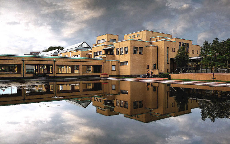
The gemeente museum The Hague/Berlage


Friday, April 29, 2011

“Walk into a new city; naked. Looking down; barefoot. standing outside a train. Looking for an exit; following the exit signs.  Cold stone touching with every step, feeling the pattern on the tiles when eyes are closed. Being invisible. look around; the world loading itself behind every corner. To visit.”


A city is not one thing. It has all the little details people tend to forget or do not see when they walk into a city. A space is never empty; even the air carries the identity of the surroundings. A big problem if you ask me for the city designers. How can be decided if a building fits the city; the persons; the air it’s going to breath?

Let me tell you the story of an architect called Berlage.

Berlage didn’t start his architectural career in Holland, although he was born here. He first tried to build a career as an artist through applying at the Rijksacademie. This didn’t work out, so he took the next step and he went to study in Zürich at the Eidgenössische Polytechnische Hochschule, and after that he decided to make a tour through Europe. He returned to Holland again when big projects were planned and he was to be the assistant of Theo Sanders [x]. Together they made a plan for the competition to make the new Beurs in Amsterdam. Their design was quite historicizing and eclectic. Compared to the, after they stopped working together, design of Berlage itself; which was a much smoother design, and more focussed on modern architecture in one monumental-looking piece which still fitted the surroundings. In this period Berlage focussed more on the Romanesque, than on the older eclectic style. The design of Berlage was realised in 1883. This was the beginning of his career.

The old stock exchange of Amsterdam

One of the other most important buildings further in his career is the Gemeente Museum in The Hague. This was also his last mayor work within architecture. It actually opened its doors after he died in 1934. In the construction Berlage decided, instead of using the upperclass-floor material, to actually use plain bricks for the facade.

(more…)

László Moholy-Nagy’s: FILM


Thursday, April 28, 2011

László Moholy-Nagys films can be categorised into two categories. 1. Films of objects and 2. Films of people…

László Moholy-Nagy was raised in a small village in Hungary during the early 1900 hundreds. In his youth he studied both law and fought in the First World War before he attended an art school. In 1919 he moved to Vienna and in 1923 he became a teacher at the Bauhaus.

László Moholy-Nagys art can be described as abstract constructivism often strict, sometimes humorous and playful. László Moholy-Nagy is not only an abstract painter but also an abstract photographer, teacher, theorist and filmmaker.

Get the Flash Player to see this content.

When considering film-works from László Moholy-Nagy it is tempting to make a psychological journey through the history of a mind.
In the film ”Grossstadt Zigeuner” from 1932 a group of village people, probably in Hungary, can be seen dancing, singing, working, children are playing and animals are running around. The images flashes fast and chaos is present. I consider the films, in themselves, to be a kind of documentation of human life in a certain place at a certain time, memories from his own life. Films of people.

In the other category, the one with films of objects, you find works like the ”Ein Lichtspiel” from 1930. Indefinable objects in constant movement, lit with strong reflecting light, flashing by in short cuts create abstract films. These abstract films seems to reflect city life, structure and the new harmonic world of pure art, politics and thought.

When viewing these two categories it is possible to claim that a strong yearning for self-reflection of human life and history was important for László Moholy-Nagys. By using his own experiences from his diverse life the films undertakes a divers form. Like a rule of nature.

When considering modern art from mid and late 20-century there seems to be a will to purify art as far as possible. Abstract painters used strict forms and the ideas of de Stijl and Bauhaus was strong. When considering this, László Moholy-Nagy’s films can be seen as unfitting in it’s variety and non consistent form.
László Moholy-Nagy himself claimed that good art and design should emotionally reflect the world around us.

Can art reflect life by purifying itself?

Considering the diversity of László Moholy-Nagy’s work and his claim of reflecting emotions and life in his own work it is possible to think that László questioned the idea of purification that his predecessors aimed for. Parallels can be drawn, to the philosophical thinkers of the time, Freud and Marx who structured the realm of truth by purifying theories of human behavior such as Freud’s theories of the unconscious as an explanation of reality or Marx’s claim that the truth can be found in the structure.
In modern thinking, with philosophers such as Derrida in mind, the idea of pureness and truth has been seriously questioned.

“My” “own” conclusion is that László Moholy-Nagy’s “films” indicates the impossible claim that “purity” of “art” truly “reflects” “life”.

more on Moholy-Nagy's films go to [x]

Bauhaus, New Bauhaus, Rietveld


Thursday, April 14, 2011

BAUHAUS, NEW BAUHAUS, RIETVELD

BAUHAUS WEIMAR, DESSAU:
Bauhaus was established as a school for art and design in 1919 by the architect Walter Gropius. The school was originally located in Weimar, Germany but due to conflicts with the National Socialists it was moved to Dessau in 1926 and later to Berlin in 1932, where it was closed in 1933. The Bauhaus was the most influential modernist art school of the 20th century. Bauhaus’s approach to teaching, and understanding art’s relationship to society and technology, had a major impact both in Europe and the United States long after it was closed. The Bauhaus had a profound influence upon developments in all artistic medias such as architecture, graphic design, interior design, industrial design, and typography.

The goal of the artists of Bauhaus was to adjust to the industrial age by creating functional designs. Bauhaus attempted to integrate the artist and the craftsman, to bridge the gap between art and industry and to reunite creativity and manufacturing. Bauhaus emphasized on urbanity, technology and embraced the machine culture of the 20th century. According to Bauhaus the romantic hand making of products in the countryside should be replaced with industrial mass production. The industry demanded a reduction to essentials which meant a removal of former sentimental approaches and visual distractions. Bauhaus was originally a rebellion against the ornamentation and decoration that characterized the architecture, design and art before 1919. Things should now be more simple, functional and honest. With its clear, clean surfaces, rectangular and strict style Bauhaus fits perfectly with contemporary minimalism. Bauhaus was built upon the crafts tradition of England, (Ruskin, Morris) and Germany (Deutsche Werkbund) and concretized thereby a general reaction against the decadent style confusion and upper class ornamentation that characterized the period around the turn of the century.

Walter Gropius wanted a school with a renewed respect for crafts and technique in all artistic media, with an attitude to art and craft once characteristic in the medieval age, before art and manufacturing had drifted far apart. In the school’s early years it was suffering from a romantic medievalism where it pictured itself as a medieval crafts guild without any of the class-distinctions that formerly had raised an arrogant barrier between craftsman and artist. In the mid 1920s Bauhaus School was moved to Dessau and Walter Gropius was replaced by Ludwig Mies van der Rohe in 1930.  The Bauhaus was based on the principles of the 19th-century English designer William Morris and the Arts and Crafts movement that art should meet the needs of society and that no distinction should be made between fine arts and practical crafts (applied arts). It depended on the more forward-looking principles that modern art and architecture must be responsive to the needs and influences of the modern industrial world. Bauhaus was more like a workshop than a teaching institution. It was a “place to built” (Bauhaus) where masters and students after a two-year introductory course worked together in the workshops, where everything from teacups to buildings was crafted using the same principles and by time some of the same idiom.

In the late 1920s, when the Bauhaus in Dessau came under the leadership of the Swiss communist Hannes Meyer the whole school community was informed in a stronger professional and more scientific way. The school’s radicalism and its products were put into a tougher, social context and given a sharper political profile. This provoked the bourgeoisie formalistic and intuitive approach to art and corroded on the political tolerance. As long as the school could be excused as an anarchist hangout for inventive bohemians, it had the right to exist, but as soon as social critic was expressed, the Gestapo would interfere. Despite the fact that Meyer was dismissed in 1930, the school was put into administration and run by the politically far more acceptable Ludwig Mies van der Rohe.

The school is also well known for its faculty, which included artists Wassily Kandinsky, Josef Albers, László Moholy-Nagy, Paul Klee, Oskar Schlemmer and Johannes Itten, architects Walter Gropius and Ludwig Mies van der Rohe, and designer Marcel Breuer.

The motivation behind the creation of Bauhaus came from 19th century’s anxiety about the soulessness of manufacturing and fears about art’s loss of purpose in society. Creativity and manufacturing were drifting apart, and the Bauhaus aimed to unite them once again, rejuvenating design for everyday life. Although the Bauhaus abandoned the sentimentality of the old academic tradition of fine art education, it maintained a stress on intellectual and theoretical pursuits, and linked these to an emphasis on practical skills, crafts and techniques that was more reminiscent of the medieval guild system. Fine art and craftsmanship were put together with the goal of problem-solving for a modern, industrial society. By doing this the Bauhaus school leveled the former hierachy of the arts by now placing crafts on a par with fine arts. With the emphasis on experiment and problem solving the Bauhaus has been enourmously influential for the approaches of arts education in the time after Bauhaus.

NEW BAUHAUS CHICAGO:
As many Bauhaus faculty members immigrated to the United States because of the German national socialist they contributed significantly to the development of North American art, design and architecture. Their ideas were especially well received in Chicago. In 1937 the New Bauhaus design school was founded in Chicago by László Moholy-Nagy who was a former Bauhaus teacher in Germany (1923–1928). Moholy was one of the early masters of The Bauhaus in Weimar and Dessau, but he had to leave in 1933 due to the nazis. The Bauhaus philosophy lived on in the professional work of a few core members who emigrated here among Moholy. Though they left behind their homelands and native cultures they did not leave their convictions and allegiance to Bauhaus principles. The first to take the initiative of continuing the legacy of the original Bauhaus is a group of Chicago business people representing the Association of Arts and Industries. In 1922 the Association of Arts and Industries was established in Chicago to advance the application of good design in industry in order to better compete with European products. The Association hoped to establish a school to train artists and designers to work in industry and some of the members of the Association turned to the Bauhaus as a model of what their school should be. In 1937 the Association had invited Walter Gropius to direct a new design school in Chicago. Since Walter Gropius just had accepted a position with Harvard University, he recommended one of his closest Bauhaus collaborators, László Moholy-Nagy instead. In October 1937 Moholy became director of the school called “The New Bauhaus: American School of Design”. Due to financial problems and other factors the Association of Arts and Industries withdrew their support of the New Bauhaus which had the effect that it did not reopen in the fall of 1938. In February 1939 László Moholy-Nagy opened his own school The School of Design in Chicago. With no support from the Associatioan Moholy was still able to garner the support of faculty and key associates to continue the school Pogram under the name New Bauhaus  – ‘School of Design’. Many of the faculty and students of the New Bauhaus joined the ‘School of Design’ and the school also had the support of former Association of Arts and Industries members, especially Walter P. Paepcke. The School offered day and evening classes, and Saturday morning classes for children. In 1944 the New Bauhaus ‘School of Design’ became the ‘Institute of Design’ which meant a reorganization brought about accreditation of the school and a renewed organizational structure which freed Moholy of the many administrative tasks of running a school. To show the change the old name ‘School of Design’, was replaced by ‘Institute of Design’, and the official typeface was returned to a slightly different version of the font used during The New Bauhaus Era. The school’s academic program consisted of a four-year course requiring all students to take several “foundation” classes depending on their prior education, training, or experience, before selecting an area in which to specialize. Visual Fundamentals, Basic Workshop and Basic Design were among the first challenges encountered by students. Other classes included graphics, shelter design, typography, sculpture, and textile design. Moholy stayed as director of the school until his death in 1946. He was replaced by Serge Chermayeff .  In 1949 the ‘Institute of Design’ became a part of Illinois Institute of Technology during the administration of Henry Heald.  The IIT Institute of Design as it is called today carries the legacy from The New Bauhaus  and offers two professional degrees, the Master of Design (MDes) and the Master of Design Methods (MDM), and a dual MDes / MBA degree program with the IIT Stuart School of Business.

GERRIT RIETVELD ACADEMIE:
The Gerrit RIetveld Academie is a dutch art and design academy based in Amsterdam. The Academy is named in memory of the dutch Architecht and furniture designer gerrit Rietveld. The academy was founded in 1924 after a fusion of three older art academies and acts today as an independent school for higher vocational education. Rietveld has more than nine hundred fifty students of which about 40% come from outside the netherlands.  From 1939 to 1960 the institution was under influence of the functionalism and political views of De Stijl and Bauhaus. This was due to the director Mart Stam who was an architecht with scoialistic political views. In the 1960s Gerrit Rietveld and his Colleagues Joan van Dillen and Johan van Trich Designed a new building for the institute. When Gerrit Rietveld died some years before the the project was carried out and the building was finished the institute decided to honour its builder in 1968 by renaming the academy from Kunstnijverheidsschool to Gerrit Rietveld Academie.

READ MORE IMAGE
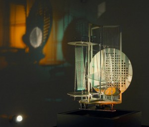
Geometrie/Menselijkheid


Sunday, March 6, 2011

Als ik de El Lissitzky tentoonstelling in één woord moet omschrijven.

Geometrisch.

Zijn werkis  architectonisch opgebouwd uit verschillende vormen, massa en kleuren.
Alles klopt.

Toch knaagt er iets.

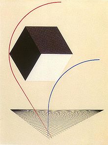
Het begint bij de vergelijking van Malevich en Lissitzky. Waar je bij Malevich nog duidelijk de menselijke vorm kan herkennen, is het bij Lissitsky totaal geëvolueerd in iets anders. Vormen zijn meetkundig opgebouwd, tot iets nieuws, een mechanisch object.
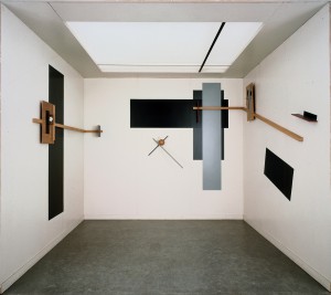
Ik kom aan bij de driedimensionale uitwerking van Proun. Vormen, diagonalen en rechthoekige vlakken. In de kleine ruimte begin ik een zoektocht naar enige zachtheid of compassie. Maar helaas, die blijft uit.


In de volgende ruimte krijg ik een korte flashback naar mijn wiskundelessen op de middelbare school. Opdrachten waarin je moet bewijzen dat iets een vierkant is, de grote van hoeken moet bereken. Ellipsen, parabolen, ingeschreven cirkels, het komt allemaal weer terug. Hoe goed ik ook in wiskunde was, meetkunde bleef iets vaags. Misschien is het dan wel mede door deze herinnering dat alles voor mij vrij abstract blijft.

Natuurlijk begrijp ik hoe belangrijk en opwindend deze ontwikkeling in de beeldende kunst was, dat abstracte vormen gebruikt konden worden om iets uit te beelden, na eeuwen van portretten, landschappen en andere figuratieve werken. Ik denk dat ik ook niet zo zeer het figuratieve mis, maar iets organisch. Een organische vorm of structuur, iets grilligs en niet perfect uitgelijnd en afgemeten.

Maar dat doet niet onder aan mijn gevoel en ondanks dat ik weet dat het een geweldige ontwikkeling was, komt het niet binnen. De hele expositie lang heb ik moeite me te verliezen in het werk. Ik zie de kwaliteit, maar kan niet me er niet overheen zetten dat er een gevoel menselijkheid mist. De geometrie staat voor mij lijnrecht tegen over de mens. In zijn strakke, abstracte vormen kan ik mij niets voorstellen wat nog verder van ons af staat. Het voelt te opgebouwd en ondanks de dynamiek en de visuele taal die zo krachtig is, is relateren dan erg moeilijk.

Nu.


Sunday, March 6, 2011

Kijken alsof je alles voor het eerst ziet. Het laten zijn van wat er om je heen gebeurt en is. Kijken als een kind verlost de wereld van goed en kwaad, het verlost ons van de etiketten die wij geplakt hebben op alles wat we zien. Het enige probleem is dat we geen kind meer zijn en ook nooit meer zullen zijn. Hoe nu verder? Hoe te  zien zonder te plakken?

Laszlo Moholy Nagy liet mij dit ervaren, of tenminste gaf mij de kans dicht bij deze ervaring te komen. Zijn film Berliner Stilleben laat het dagelijks leven in Berlijn zien in de jaren dertig. Het was bijzonder om te zien hoe een camera, het vastleggen van je eigen dagelijkse omgeving je dwingt met andere ogen te kijken. Alles is, niets meer niets minder. Dit werk, dat geruisloos mij een wereld aanbood, zette me aan het denken over mijn eigen wereld. Waarom heb ik het gevoel dat toen, in 1931, de dingen meer ruimte kregen? En waarom denk ik dat als ik weet dat dit niet zo is? En ja, er is maar een conclusie; de wereld die ik daar in dat kleine kamertje in het grote meesterwerk van Berlage aan me voorbij zag trekken, is exact de wereld die ik nu, al schrijvende, om mij heen zie. Het zijn enkel de kinderogen die ontbreken. Moholy Nagy heeft op geniale wijze afstand genomen van zijn natuurlijke omgeving en uiteindelijk, misschien juist  door middel van de afstand,een nabijheid gecreeerd die de verklaring ondergeschikt maakt aan de ervaring. Los van dat hij dit op een zeer gevoelige en in mijn ogen briljante manier heeft gedaan, gaat het mij vooral om zijn alerte gewaarzijn. Je open stellen voor de gewone dingen en het nu de kans te geven in alle eerlijkheid zich aan je te openbaren is een kracht die, niet alleen als kunstenaar, maar ook zeker als mens je meer zal brengen dan wat ook. Moholy Nagy heeft mij op die donderdagmiddag bewust gemaakt van de dunne scheidslijn tussen afstand en nabijheid. En door middel van het tonen van zijn wereld heeft hij mij meer laten zien van de mijne dan dat ik tot nu toe zag. Voor even was ik een kind, zo open, gevoelig en nieuwsgierig. Ik heb gekeken en gezien.

Get the Flash Player to see this content.

Film Preview: Berliner Stilleben, 1931

more on Moholy-Nagy's films go to [x]

Experimental Documentary That Brings Truth Of Daily Life.


Sunday, March 6, 2011

When I walked around In the van Abbemuseum in Eindhoven I was very enthusiastic when I found a beamer projection on the wall which was playing an old movie.
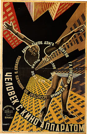
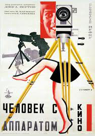
The name of the movie: Man with a movie camera, was new for me, as well was the artist: Dziga Vertov.

As I stood there watching a city was shown to me. this has to be Russia I thought. But I could only guess it. As well as I could only guess to the meaning of the images: the busy street shots at one hand and at the other hand the shots of filming camera’s.
This is the reason I picked this work, because it tickled my curiosity.

The movie dates from 1929. How wonderful and fascinating to look true time and space, I thought.
At home I looked up information and watched the movie completely.
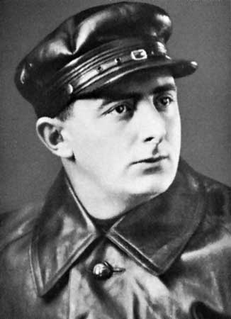
So it appeared to be that Dziga Vertov was born in Bialystok (now a days Poland) in 1896 under the name Denis Arkadevich Kaufman.

Vertov was an idealist. He wanted to show his audience the truth but at the same time let them realize that the truth in a film is manipulated. He does this by showing only shots of what is truly happening; so no theater, script or film set and involving in his movie shots of filming camera’s. With a very experimental movie as consequence.

I find the idea interesting, although it is for me completely different. I don’t mind watching complete fiction, I am more interested in how the images look.
The images in Man with a movie Camera are really impressive. The shots (frozen and moving) are photographical. The editing is in the film is musical.

This is maybe the reason why I fell in love with it. Since my eyes are always searching for photographic images (photo or video) as well as I am interested in the editing of movies.

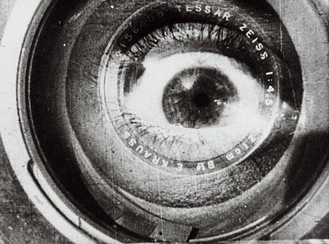
Shot from the movie; the audience eye

for more information and complete movie: link to The Man With The Camera

http://www.brown.edu/Departments/MCM/courses/MC150-03/manovich/manovich.htm
or :

http://donamajicshow.tumblr.com/post/578155092/man-with-a-movie-camera-1929

freedom


Sunday, March 6, 2011

Being forced to see geometry everywhere and anyhow was an interesting experience at Van Abbe museum.
I feel a certain panic when I enter a museum. The urge to discover something to relate with grows bigger and bigger so then I’m obliged to think about the works surrounding me.

In my search for something familiar, I saw a black cube in one of the first rooms of this museum. I had then the curiosity to pas through a claustrophobic space to get in it. The first seconds I was feeling only disgusted by the crowded environment around me.
Proun was presented in this black cube, a black cube, that I associate with a black square so, of course, with political suppression. I was faced with a completely contrasting but yet, perfectly compact universe. As his paintings give the viewer the space feeling, there’s no wonder he is strongly relating with the 3d world as well.

Exploring Lissitzkys well defined visual language made me think more about politics in a way or another, that may be because I feel a certain irony in some of his works.
In a time when society was build on a strictly determined target of organizing and developing masses by being as productive as possible, he was trying to spread positive and gratefulness messages in a world were starving was the main problem. That’s quite ironic.

Still, it seemed to me that Lissitsky was more preoccupied with his intention of exploring and playing with geometrical forms and symbols, rather then with this political propaganda. Lissitzkys interest in so many fields of art, like design, photography, typography and architecture it’s something to admire. That may be caused by the lack of means in expressing one idea, or maybe by his wish of being as free as possible.

His universe condensed in that black cube make me think about his freedom as an artist. His freedom and his natural speed of development that was trying to run away from art propaganda and was expressed in the most simple and abstract way.

Limited by the ”Sun”


Sunday, March 6, 2011

Lissitzky

El Lissitzky

”The sun as the expression of old world energy is torn down from the heavens by modern man, who by virtue of his technological superiority creates his own energy source.”

In most 2 dimensional work of Lissitzky you can see clearly that he left the old world symbols and created new ones with his ability of typography and photomontage. His art is with power and purpose intending to invoke change. The work being very dynamic reflects the dynamism of a change. His very architectural forms also indicate his passion to organize, to build something new with spacial elements like volume, mass, color, space and rhythm.

For me the best representation of the dynamism of his work was reflected in the elevator of the exhibition space. It was as if I was being moved up and down by just the volume and rhythm change in a simple sound created by a crowd of people. Movement being created and represented by Lissitzky in words and colors and shapes was already quite interesting but it being in the form of a simple sound was something else for me.

”uuuuuuuuuuuuuuuuuu” first floor

”aaaaaaaaaaaaaaaaaaaaaaaaaaa” second floor

”ooooooooooooo” ground floor

Sound can be liberating as much as it can be capturing, one could also look at it as being limited in an elevator, the same as being limited in a communist country, or under a nazi regime, or being limited by the lack of technology and opportunities.

The idea at the end of the exhibition was for me equal to that at  the beginning, the part where we watched the opera “Victory Over the Sun” by Malevich  in the library. I was intrigued by the idea of choreography being shaped by the LIMITATIONS of movement caused by geometrical costumes taken from lissitzky’s 2D drawings. I found out after this exhibition that what draws me in is the limitations. They inspire me.

Every limitation requires a different dance which is waiting to be danced.


Log in
subscribe