Skip to Content Skip to Search Go to Top Navigation Go to Side Menu


"Highlight" Category


Room


Thursday, April 20, 2017


I think they live differently. In a different world than mine. They look differently. They do not chase after things that capitalism offers. They live within a concept that is rooted from ages ago. The concept is centered around the immaterial. It is real for them. I would like it to be real for me too, but somehow it does not work. I wonder how it works for them. I think they are happy to have a one focus in life. I feel that my mind is out of focus. I wonder if in a contemporary society one is able to find a grounding. If one has to separate himself to find a clear focus, in order to create a space inside thoughts that are often dominated by information from the outside world.


Saša Karalic / Square


My process started with the interest in people who communicate with immaterial. I thought about contacting psychic mediums or ones who have strong belies in god. I ended up going to a monastery for 3 days. I was welcomed really warm and had long conversations with nuns on religion and their personal stories about their decision to live in a closure. I am not a christian myself, but i am interested in eastern philosophy, that also shares connections with christianity. And in the case of the monastery, the practice of silence was the strongest meeting point for me.


By separating themselves they fill the space with the highly structured concept, that occupies their lives from the very morning till the very evening. I resist to analyze the concept, but I rather focus on their inner state. Which seems to be empty form overdose of various forms of information. They have one form of information that can guide them through all. That information is received in a condition of silence. They said that the noise of the world disturbs the signal. And a closure helps to cultivate it, creating a room for exercise. They lived in a space that was elected for a special meeting, for a vertical sight and inwardness.  Space filled with quietness.


process


The first object I made was a silent book, that contains no written word or image. It was influenced by old religion books i found in the monastery. They were made ofreally thin paper, that was nearly transparent.

Later on I researched believe systems that contain practices or notion of silence and learned what does that mean. I also remembered a composition by John Cage “4’33”, where orchestra does not play any sound in duration of the piece. This piece is not necessarily about the silence, but it is more about the sounds of the environment, listeners are surrounded by. This made me think about the negative spaces, the inversion, the surroundings that are invisible.


The absence of sound is registered as non-existence and non-form. Emptiness is the inner state of things. Things around us are weightless. They do not have any meaning, only our mind creates meaning for them. Objects are silent and transparent.  We are surrounded by space and we float in it.


silent book copy


I thought that the subject of silence could be expressed through a suggestion of the object that appears in mind but not in matter. In Japanese language word MA expresses a gap, a space, a pause. MA is also the thing that takes place in the imagination.


Space is a continuum. It gently touches objects not affecting them. If we would like to, we could see just space around us instead of objects. We could see negative shapes in objects instead of seeing objects themselves. We could experience how much weightlessness and formlessness is around us. Everything around consists of being and non-being, processes of becoming and vanishing.


2 .2

2.3

1.


Soap stone was the material I used for my objects. It is a really soft stone, also called a quiet stone, because of its properties. I carved abstract shapes in them, creating a negative shape of a suggestive shape. An immaterial object that can exist only in mind. Three stone objects work as the reminders of an inverse looking.


The Infinite Script


Tuesday, March 14, 2017


the infinite script_screenshot_1100

“The infinite script” (2016) is an alternative way to look at a human being. It is an uncommon representation of a nature and specifics of mental and behavioral algorithms.
This work is an attempt to visualize a functioning organism as a mechanism supplemented with a human intelligence that uses algorithms. The visibility of the algorithms is created by a computational language and visual information, which are united in one endless artistic research.
A self-development of an artist is a key point of this audible script. It has been performed as a visual monologue of the artist together with the video projection.
 

Thesis by Kateryna Snizhko as a video/animation artwork, presented at the 2016 graduation show as part of the department of photography


all rights to this thesis are property of Kateryna Snizhko © 2016

for more information check out Kateryna's website : http://www.experiolation.com//


Untouched


Tuesday, March 7, 2017

IMG_3031_1100

Irene Vonck / From Rhythms of Space series 1995

When material is manipulated to make-believe, touch becomes irrelevant for the experience of tactility, the physical experience of touch is exceeded and the brain is provoked. “From the rhythms of space” touches upon the idea that when contact between bodily surface and the object displayed is censored the viewer perception is (mis)leaded into dissonance with reality. This visual contradiction appears when the associations between the artwork as a whole and the material used in brut is not coherent.

Soft

Malleable

Comforting

Pretend

Fake

Play

The art piece appears to be made of cloth but instead it is made of airbrushed stoneware. None of this adjectives mentioned prior seems to describe the properties of cooked stoneware; this is because construction of tactility is build upon the pillars of experience and imagination since we cannot come in contact with it. Due to this I believe this work of art belongs to FAUX (in which nothing is as it seems) and AGENCY (in which paint takes the power back). Colour and subtitle sinuosity trick the viewer, the black colour gives the piece a sense of heaviness whilst the red interior an association with felt fabric. Paint definitely becomes an important element; it gives the object a sense of elegance and mystery and of course exhilarates the desire of touch. There will always be something very special and curious in tactility, in objects that seem ambiguous, objects that lure the viewer into doing what it is highly prohibited – TOUCH. When exploring an art gallery/museum/space etc., objects can be quite novel to us and thus, as young children do, we might feel the urge to touch, touch to understand, touch to explore, to grasp on the full experience of wonder. But … when we cannot touch ( and this is what fascinated me this time)it becomes pure mental construction and sense of touch is replaced by sense of sight.

When the surface is sticking it to the man


Tuesday, February 21, 2017

At the design section of the Stedelijk Museum I felt an attraction towards objects that glitter and sparkle instantly. The jewelry collection was filled with extravagant pieces made from expensive materials and with a shiny finish that effectively seduced me. But in the middle of all of these flashy designs I found a simple and minimal bracelet made from lusterless rubber and with a small bulge in the middle as the only detail. As it was in such contrast to the other items, it raised my curiosity.

Gold macht blind

Otto Künzli, Gold macht blind (1980)
galvanized rubber, gold


Otto Künzli created his jewelry piece ‘Gold macht blind’ in 1980. It’s seemingly just a simple rubber bracelet, but Künzli claims that under the surface a ball of pure gold is concealed in the rubber. Instead of letting the gold do its job by shining and seducing the viewer, Künzli has decided to cover it up by a cheap, industrial and unpolished material. He raises the tension between what you experience on the surface and your desire to dig inside and reveal the gold. This way the bracelet comments on our destructive greed towards everything that glitters: “If the owner wants to know with certainty whether gold is concealed in the armband, he must destroy it.” (x)

concrete stereo

Ron Arad, Concrete Stereo (1983)
Concrete, steel wire, electronics

Gold macht blind was made as an effort to undermine the expectations we have that jewelry is supposed to be decorative and flashy symbols of status and rank. This way Künzli’s bracelet has a lot in common with the industrial-looking record player covered in concrete, Concrete Stereo, Ron Arad created in 1983, which I described in my last text (x). Both works play with notions of value, and whether objects with lusterless surfaces can be desirable, and both artists create works that devalue status symbols. While Arad was part of the punk movement, Künzli is known for his humorous “stick it to the man”-attitude [x].

It’s obvious how ‘Gold macht blind’ with its matte rubber surface is in huge contrast to the sparkling works seen in the collection LUSTRE from Designing The Surface. Just like Arad’s Concrete Stereo [x] I find it fascinating how Künzli can convey his anti-elite opinions by playing with our expectations to what the surface of a piece of jewelry is supposed to look and feel like. By removing the shine and luster, the jewelry piece appears valueless, even though beneath the surface gold is hiding.


Designing the Surface Supplementary Show /New Institute


Monday, February 13, 2017

bieb_15029_mahoniehout-03_950

Gebr.A.R.& P.van der Burg /wood and marble painting examples in color 1876


Supplementary Surface Show Under Construction


20 students of the Rietveld Academy’s Basic Year visited the exhibition “Designing the Surface” organized at the New Institute Rotterdam (2017).
The intriguing aspect of surface, an issue that is generally avoided in a discussion about the context of content, raised our curiosity.
The exhibition and the accompanying publication was inspiring as were other additional exhibits like ‘Screen Savers’ or various shows in adjoining musea.

/FAUX /PATINA /LUSTRE /TEFLON /AGENCY /SLIM

Curious for our reflections on these subject?

Chose an image and click on it.

We assembled this small supplementary research show for you to enjoy.


PastedGraphic-4

FelineH VanilleOugen

SimonMarsiglia Screen shot 2017-02-13 at 12.05.50 PM CeliaNabonne

KaanKorkmaz JimKlok

Screen Shot 2017-02-12 at 11.43.35 PM

KimLang OfiaBaytocheva FelineHjermind

NadjaSchlenker JohannesZ

Parelstrik vantablack

blauw_400


Transitions – from autonomous to applied arts


Sunday, January 29, 2017

A line, a letter, a page, a building, a photo, a book – separate stages that can either stand by themselves or remain transitioning points while executing somebody’s vision. It is common that an artist starts one’s creative process with making a sketch or writing down a sentence that popped out in the head, though, later on this idea might get a completely unexpected appearance. After the piece is created it will most likely be documented in a book, that sometimes serves as an autonomous work. Therefore, it is important to choose a right graphic designer to collaborate together for this process.


For my design research, I have decided to look into Alon Levin’s designed book ‘De Paviljoens: Journal of a Building 1992-2004’ that is a documentation of the former contemporary art pavilion in Almere.


7267-630-435


virselis

According to the Artistic Managing Director of the Museum De Paviljoens, Macha Roesink, the aim of this book was to expose the complexity of building such as De Paviljoens and document the history in a case study of the life of a building, in the form of a journal composed of accounts by many of the people who have been involved.


814-454-296

Museum De Paviljoens


The building is transportable, like the ultimate kit, but it is standardized to meet building regulations. Documenting it in a book clearly makes it even more handy. I think it was not accidental that Alon Levin was invited to design the book as he himself works transiting from fine arts to design. To understand the concept of his way of working, it is important to look at his other projects.


In A. Levin’s book ‘Things Contemporary’ published by Dexter Sinister & Alon Levin, 2009 he talks about his interest in man’s eternal pursuit of order; not the ideal of order, which renders things absolute, resolve and static, but in the actual process of organizing things, which inevitably falls short. Artist takes up forms such as the triumphal arch, the victorious podium, or the Ferris wheel, and translates them into model-like wooden constructions and plaster forms reminiscent of the model. It creates images for the ambiguity of success and failure, for the instability of ideological, economic and scientific systems. Analogous to the accumulation and formation of knowledge in the “free encyclopedia” Wikipedia also Levin prefers, when he reused, deconstructed or repeated individual elements of his own works. Data, buildings and documents appear as moving building blocks in a constantly transforming and updating view of the world. To process this information, he uses charts, diagrams and transforms his knowledge into abstract geometrical shapes that later become sculptures or installations. Space-grabbing constructions from simple materials available in the construction market are based on the exploration of the technical and architectural achievements of the Western world and their significance for contemporary society.


tc

tc2

Things Contemporary published by Dexter Sinister & Alon Levin, 2009
 

Even though, it seems Alon Levin himself does not see switching from graphic design to fine arts as transitioning, I was curious to find out when and how do these two spheres meet. His pieces and texts are based on invoke either the incalculably large or the immeasurably small, hence the mathematical sublime, the way in which they thematise structure and collapse points. Using the design made for ‘De Paviljoens: Journal of a Building 1992-2004’ and photos of various installations I tried to create some ‘systems’ that could represent their ‘shape’. I discovered he used three sizes for the font, therefore a zigzag in my drawings representing ‘text’ in the book is in three different sizes. Considering purified and structured shapes he applies into his pieces I decided to replicate both pages and 3D objects into slightly modified, geometricized shapes. At some point I realized a certain rhythm appears, which blurs the line between two subjects of my research.


1

2

3

Left – sketches of installations by Alon Levin, Right – schemes based on ‘De Paviljoens: Journal of a Building 1992-2004’


In fact, these two ‘sequences’ I made are just my interpretations of Levin’s creations. They might transit into something new and exciting at some point and that would probably be sort of an example the way the original author was building them. In ‘Things Contemporary’ he admitted that during his studies at Gerrit Rietveld Academie he wanted to understand the power of manipulating information: not just consume it, but to actually make it. To try and understand how all the information we ingest daily is organized and what the thoughts and structures behind it are. I think one of the best representations of this attitude is in his project ‘The Basics of Growth’ that dealt with similar ideas in botany as in economy, making some comparison through books that A. Levin had published himself. The content of these books was from Wiki that provides the material for the content of a book. He later on transits from the book into 3D structure based on the same subject, which in this case was a greenhouse on the rooftop of the office building.


53_DeVoeght_Levin

The Basics of Growth

I presume researching the history of the pavilions, he applied this same method in a reverse version – firstly, understanding the building with its context and then transmitting it into a book.

Throughout my research I learned that the endless cyclical game is the fundament of Levin’s work – a natural flow that drives him from one medium to another.


De Paviljoens : journal of a building, 1992-2004 /Rietveld library catalogue no : 700.4 pav 1

Programming language as a System of Thought


Wednesday, January 18, 2017

by Medeina Musteikyte

From a conventional viewpoint programming is a process of command execution that brings about a certain result; a problem-solving tool to produce a desired outcome. Aside from its practical usage, coding is expanding to a different sphere of interpretation where new meanings gained, outgrow its primary function.
My essay examines the role of non-function oriented programming, the artistic value of the concepts behind works of code and experimental programming languages. An overview of examples from Algorithmic Auction to ‘Esolangs’ — Esoteric Programming Languages is questioning the boundaries between programming and artistic practice and exploring the creative potential of such method.

bodyfuck – undo from nik hanselmann on Vimeo.


A work of code can acquire different forms and exist as an object, text or music piece gaining new definitions and material qualities.
[audio:https://designblog.rietveldacademie.nl/wp-content/uploads/2017/01/castleman_css_descramble-.mp3|titles=castleman_css_descramble] Likewise conceptual programming languages can be perceived and interpreted by their instructions alone, without executing a command or using a computer. Designed for experience of thinking through them, esolangs unfold the confrontation of computer logic and human thinking in the most rational or the most absurd processes [x].

Sound file: castleman_css_descramble


pdf-scan_cover [click on image] to download thesis by Medeina Musteikyte

all rights to this thesis are property of the author © 2016 : http://medeina.xyz/


Welcome to my homepage!


Tuesday, January 3, 2017

by Noémie Courtois

The Internet arrived like an ufo, bringing a promise towards the future. When it became accessible to the broad public, users started to play around and share their hopes, dreams and productions with  the global village in which their children will be living. The birth of the Internet created a specific utopic spirit and everybody was invited to the party.

‘‘And here comes everybody ; moms teens, celebs, goths, tots, gamers, nerds and artists’’. Everybody else, Cory Archangel, 7 [x]


20131231131117-7c05877a


The Internet changed a lot over the last decades, this utopic spirit began to fade and its users with it. Today, these webpages have been hidden and forgotten by everyone. Luckily, our digital heritage defenders do exist and are truly active ; there seem to be a resurge of our digital culture and artefacts.

In my thesis, I’m exploring the Internet in a sociological and archeological perspective. I’m developing the idea of a ‘digital folklore’ (cf Olia Lialina ) ; Today more than before, there is a wish to keep traces of our digital tradition. The defenders of our Internet culture are fighting against the forgetfulness of a material that henceforth belong to the past. This thesis is a contribution to save that part of history that went missing in the fast Internet evolution.


hakims


The first users of the Internet were the first digital tribes and they were living in a specific environment:

‘‘A structural, visual and acoustic culture you could play around with, a culture you could break. There was an ocean of options and one of the options was to be different. (…) It was bright, rich, colorful, naive, slow, personal, direct and under construction.
It was a web of sudden collections and personal links. It was the Internet of personal pages and personal collections. It was the web of indigenous and barbarians, the web for the amateurs soon swept by Internet experts’’

A vernacular web, Olia Lialina, p19 [x]


img5

 
The importance of the first tribes lays in the spreading of the Internet architecture and culture. The shutting down of GeoCities (the biggest hosting service at the time) marks a shift in the Internet history : only a very small part of webpages have been saved,  there are holes in the shallows of the World Wide Web and pages are filled with dead links.


ghhj

Shot(picture?) of one of the many digital ruins, where images have been replaced by the icon "image not found".

They work as a religious triptych and are inspired by traditional construction : The birth, the life and the death

They are the remains of the first digital tribes : structures that were once complete and have fallen into a state of partial of complete disrepair. These digital monuments became places of worship, places where you can remember this specific time where movement and construction were the core of the online activity.

This specific idea lead me to my graduation project:

« Incidentally they’re all gone,
well not exactly gone… more sort of… absent… »


unnamed (1) nonot3

taps2 nonot tapes4

The 3 tapestries were part of the graduation show.
They work as a religious triptych and are inspired by traditional construction : The birth, the life and the death

The tapestries pay tribute to a web that is gone or -say- hidden. They work as a religious triptych and are inspired by their traditional construction : The birth, the life and the death. The idea of making tapestries came into my mind quickly while writing my thesis. Initially, tapestries were made to educate illiterate and uneducated people about subject of war, religion and so on. Whilst contributing on saving the history, they were also made to make a space warm and welcoming (such as the first webpages). The connection between the Internet archeology and tapestries was really straight froward; they also recall the computer screen and pixels.


thesis_900 [click on image] to download this thesis by Noémie Courtois

all rights to this thesis are property of the author © 2016 http://courtoisnoemie.tumblr.com/ [x]


willit


Approaching the Archive


Sunday, December 11, 2016

‘Approaching the Archive’ begins from a coincidence that becomes an unexpected point of access to the archive and book collection of artist, writer, editor and graphic designer Will Holder, in the context of his exhibition ‘Sorry! NO we don’t do REQUESTS’ at Kunstverein in Amsterdam.

The essay deals with the successful as well as the unsuccessful attempts at trying to grasp a lot of material in a little space, and the systems that one makes up in order to organize and process content through. Moreover, it is an essay about books and the stories and associations they convey, as well as it is about the finding of an unexpected relationship between ‘typography’ and ‘topography’.

Will Holder click on the image to download the pdf

A visit in Pieke Bergmans studio


Saturday, December 10, 2016


At the moment you are exhibiting in the Stedelijk Museum in Amsterdam with your installation Phenomeneon. Now I am really excited being here in your studio in Amsterdam to talk about your projects and you as an artist.


piekebergmansstudio2


There is surprisingly much space in here. In what kind of room are we?

It is an old factory building. We actually just moved into this studio a few weeks ago. So we are still in progress about rearranging the space, like removing the ceiling and creating small office rooms. There are not a lot of my works here yet but I can show you around…


The Phenomeneon project gets a lot of admiration with its mesmerizing appearance. I am really interested in the production process and the applied techniques. Could you tell me more about it?

Yes, sure. Not everyone realizes that light in this case is gas. People think it is a really new technique, but it is actually an old one. I do like light a lot. It is a very beautiful material to work with and I discovered many different effects. People are getting so much information nowadays it is hard to get their attention. But in this case I think it is a perfect combination of technique and mystery.


Phenomeneon-Cloud-Pieke-Bergmans-2016-photo-Mirjam-Bleeker-12-400x600 Phenomeneon-Cloud-Pieke-Bergmans-2016-photo-Mirjam-Bleeker-1-900x600


When you mention the mystery it makes me think about the moment when walking closer to the installation and realizing that the neon light moves through the organically shaped glass. The light runs through it and you start to follow its way.

Exactly! That makes it feel alive.


Are the organic shapes made to play with the intensity of the light?

The intensity of the light is defined by the width and length of the glass. In the end it is just playing. Its like a three dimensional painting. Like when you have a brush and you choose the pressure of your brushstroke.


I can really see how playful you shaped the glass. Are there any other factors affecting the form?

Yes. The installation consists of seven separate parts. It was difficult to do because they are all handmade and quite big. The biggest one is almost six meters.


Phenomeneon-Cloud-Pieke-Bergmans-2016-photo-Mirjam-Bleeker-7-900x600 Phenomeneon-Cloud-Pieke-Bergmans-2016-photo-Mirjam-Bleeker-15-400x600


You cannot see where they are connected which gives the impression of one very long piece and makes me question the process.

It starts sometimes with a simple observation. I was questioning why neon light is always a straight tube. Most people saw the shape as a limitation, for me it is more a possibility. With the understanding of the technique I could have come up with so many ideas about the design. One reason for the process and especially the shapes of this project is that I am a person that is always interested in setting things free.


How is that combinable with your background as a product designer? I can imagine in this area the focus is more on creating something specific.

Yes. It is mostly about creating something perfect. I basically didn’t believe in that concept. That is why I turn nowadays much more to art. I try to stretch the borders within the functionality. But now I am also more free about creating something that has nothing to do with functionality even if I started from this ‘other world’.


Do you have an idea of an aesthetic that deeply touches you — an idea of personal beauty in ‘your world’?

Yes and that’s only for myself. I have no idea what the public thinks. I am not commercial in that sense. I don’t do works someone else wants. I think it is a power within the simplicity. Like this table over there. Its so simple but at the same time it is fragile and the surface a bit wobbly. You are wondering if it collapses or not. So it is also about the balance. I am looking for this tension. I like to use things that already exist in my environment and I take them out of their context. If I work with big companies then often lots of things are possible. All the equipment is available. It happens fast that things are getting too complex. Then it looses its quality. I am striving for purity and simplicity.


Do you think mass-produced objects have less individual quality?

Oh, I don’t think there is such thing in mass-production. Every object is exactly the same. The best design is multiplied: ‘the Golden Mean'[x]. I don’t want to judge mass production because its designed for optimal purpose. But if you study nature, then everything is unique. You can not find one olive tree that is the same. Not one animal or human. We are all different. Thats why I create production lines that produces unique objects. It would be great if people would spend a tiny little moment to witness these individual unique differences. It is hard to make people feel something or even make them wonder.

When I was studying I really admired a lot of designers or artists for their capability and their way of looking at things. I also really understood that it was not my way. But when you are young you are not really sure about your way. That is sometimes a bit confusing. So you have to find your own strength, your true fascination. And after some time by simply doing you feel more and more secure and comfortable in choosing what you want to do. At the end it is about experience I would say.


I read an article where you said you take already existing working processes and change them to give materials space to let them expand in their natural way. What is your fundamental inspiration concerning your working process?

If I compare my own mind to nature I am a bit disappointed. Because whatever nature is doing in terms of gravity or elasticity or any other effects basically — I could have never come up with this. The result is so much better than everything I could have ever designed. So I just started going into the direction of letting things happen. But of course in a quite distinguished research. I have to do it over and over again until I understand why and what happens when. And then I pick out something to focus on.


Do you have plans for further projects based on the idea of Phenomeneon?

Yes, for sure because now we developed the techniques and finally we can start to play. Basically I am looking forward to the opportunities in the future. To be able making more things happen within the world of Phenomeneon. If you discovered something you are really fascinated about, I think it is important that you spend some time in making more pieces because mostly they get better and better.


Check out Pieke Bergmans official website for more information.


Here comes the future. Circumventive organs, bioprinting and bioart


Monday, November 28, 2016

Some works initially aim to touch your feelings and to change your carefully complied seeing of life. They can cause a whole pattern of various emotions from the complete abhorrence to inexpressible delight. I walked through the halls of the “Dream out Load” exhibition and noticed a small group of people gathered around something that seemed to be very interesting. “That’s gross!” – Somebody exclaimed but continued starring at the subject of interest. I love gross and in a second I found myself looking at the “Circumventive organs” by Agi Haines and a short footage about implanting the organs inside the artificial (I hope so?) human body. From that moment I would start calling her “a mad scientist” of the design. What she designs is not posters, not buildings and even not that fancy clothing you are wearing. The subject of her focus is mainly a human body and organs.

Electrostabilis Cardium by Agi Haines on vimeo

With the introduction of bioprinting the possibility of new organs is becoming a reality. The ability to replicate and print cells in complex structures could mean different cells with various functions could be put together in new ways to create new organs we would take millions of years to evolve naturally. Frankenstein-esque hybrid organs could then be put together using cells from different body parts or even different species.

This short film envisions the surgical procedure designed for the fitting of Electrostabilis Cardium, a defibrillating organ using parts from an electric eel that can discharge to release an electric current to the heart when it recognizes it going into fibrillation (heart attack).

Alongside the film are other ‘Circumventive Organ’ designs including Tremomucosa Expulsum an organ that uses rattlesnake muscles to release mucus from the respiratory system of a person who suffers from cystic fibrosis and dispel it through the stomach, as well as Cerebrothrombal Dilutus which contains cells from the salivary gland of a leech and releases an anticoagulant when it feels the pressure of a potential blood clot in the brain as a way of avoiding a stroke.

Agi Haines’ mind-bending, hyper-real sculptures function in an epistemological limbo, existing somewhere between art & science, technology and ethics, and present and future. Haines creates pieces that are uncanny, transgressive, and sometimes conflicting, stunning in their insight and repulsive in their execution. Her near-future world is one in which rattlesnake muscles can be 3D-printed, inserted into the human body and used to combat cystic fibrosis.

image815-02926-532-Electrostabilis-Cardium.jpg-490122_1_1

I chose Agi’s work as a main topic of my research because bioprinting and bioart is something that intrigues me a lot. Though I was never familiar with bioprinting, I was always interested in this incredible and magical world of the body and it’s insides, how it lives, transformes, reacts and evolves.  I am fascinated by the possibilities of 3D bioprinting and how it can affect the evolution process. My belief is that the future of design lays in more extensive work with human body as a material and If I will be given a chance to take part in the process of organ designing, I would be glad to create something useless and provocative. In the interview Agi explains how the organ printing works: living cells mixed into cell-friendly material, such as collagen, that will make a scaffolding for cells to grow on. Then the organ is being printed layer by layer, just the same as an ordinary 3D printer works.

The ability to replicate and print cells in complex structures could mean different cells with various functions could be put together in new ways to create new organs we would take millions of years to evolve naturally. Haines envisions what it would be like to not only replicate existing human organs, but also produce newly designed, improved organs for implantation as (curative) therapy for chronic diseases and defects. In the same way, animal cells with useful properties might even be employed to create organs with entirely new properties. An organ that incorporates eel cells could conceivably function as a natural defibrillator, delivering a resuscitating electric shock in case of cardiac arrest.

"If you prick us do we not bleed" work by Agi Haines

If you prick us do we not bleed" work by Agi Haines

… can we consider bioprinting as an art form?

I keep on asking myself this question, because the border between biology, genetic engineering and art rapidly disappears, or, more likely, has already disappeared. Tissues, organisms, organs and bacteria became a media to create works of art. They have been used in the same way as one artist would use the paintbrushes or the materials from the Rieveld’s trashcans.

Even before the bioprinting, American artist Eduardo Kac established the name “Bioart” for his works. Kac considers himself a “transgenic artist,” or “bio artist,” using biotechnology and genetics to create provocative works that concomitantly explore scientific techniques and critique them. In 1998 he comes up with his work “Genesis” that explores the intricate relationship between biology, belief systems, information technology, dialogical interaction, ethics, and the Internet. The key element of the work is an “artist’s gene”, i.e., a synthetic gene that he invented and that does not exist in nature.

"Genesis" by Eduardo Kac

Another project of Eduardo Kac was famous glowing rabbit called Alba. By injection of green fluorescent protein (GFP) of a Pacific Northwest jellyfish into the fertilized egg of an albino rabbit he creates the bunny that can glow green when illuminated with the correct light.
“GFP Bunny” has raised many ethical questions and sparked an international controversy about whether Alba should be considered art at all. “Transgenic art brings out a debate on important social issues surrounding genetics that are affecting and will affect everyone’s lives decades to come,” Kac is quoted as saying.

'Alba' glowing in the dark bunny, by Eduardo Kac

'Alba' glowing in the dark bunny, by Eduardo Kac

Faced with some operations our aesthetic but also ethics sense is often put in a critical position. We are forced to redefine the border between animate and inanimate world and our definitions of subject and object. Indeed, when the symbolic and material boundaries of humans opened to technology, some considered it as hospitable, however many found it offensive or even dangerous. One of the main concerns about bioart is that people view it as an unnecessary use of living organisms. While the use of living organisms is often tolerated because they are used for research and thus improving the quality of peoples’ lives, bioart is often criticized as an uncalled-for practice because of the role of aesthetics in the artworks. In addition, bioart creates uncertainties among the public because bioart projects such as eugenics are undertaken by artists and not researchers. Nevertheless it is important to bear in mind that (bio)artists also need to do research prior to conducting their experiment or artwork.

Coming back to bioprinting as an art form, I would also like to mention the Dutch artist Diemut Strebe and her 3D printed Van Gogh’s ear. She created the replica ear using living cells from van Gogh’s great-great-grandson. The ear itself is made from actual living tissue and was 3D printed into a shape resembling van Gogh’s left ear. The ear is currently being displayed in a German museum and is suspended in a clear display case full of a nourishing liquid that is expected to keep it viable for many years. The artist has also added a microphone to her installation so you can actually speak to the replica of Vincent van Gogh’s severed ear [x].

'Sugababe' by Diemut Strebe

"Sugababe" by Diemut Strebe • "Body Modification for Love" by Michiko Nitta

Another artist, who is trying to make our life more interesting, bypassing the ethic issue, is Michiko Nitta and one of her works – Body Modification for Love. It is an idea which could be developed in the future – a technique for genetically growing selected parts of another person on another person’s skin. What Nitta is proposing is for example a nipple of ex-girlfriend or a mole of ex-boyfriend. Patch of living hair would be also possible to grow on somebody’s else arm. It is supposed to be a new form of tattoo as Nitta says. Parents are always upset when their kid makes his first tatoo. How upset they are going to be now, when their beloved one would come up with a nipples on his forearm?

The options are endless and there are a lot more projects, researches and artists I could also mentioned here. There are a lot of things to discover yet and who knows – maybe in the nearest future our bodies would be modified and consist of artificial organs? Not the best scenario, to be honest..

3d-printing

This research project is based on the "Dreaming Out Load" design exhibition curated by the Stedelijk Museum Amsterdam

‘Jewelry attitude’ as a way of looking at the world


Monday, November 21, 2016

Stone needs a special care and appreciation to shine. Conversely, any stone can shine if you care for it. In my thesis, I am exploring the particular kind of value which derives from the personal observation and appreciation of seemingly ordinary objects. Furthermore, I examine how this value can be shared with others through an inscription of observer.


P1110820_72dpi

Roger Caillois author of "The Writing of Stones" [x]


There is a picture book which is called EVERYBODY NEEDS A ROCK, written in 1974 by Byrd Baylor, an American author of picture books for children. With her sparse poetic prose, she gives us ten rules for finding our own special rock. The rules of the book are highly sensuous, therefore it rather becomes a kind of tool, to switch our mind and invite us into observing mode; they change our way of looking at things surrounding us.


IMG_2063

"Everybody Needs a Rock" by Byrd Baylor [x]


Through the invitation to the observation of neglected objects – in the case of the book, ‘rocks’ lying on the ground start to gain our awareness and appreciation. This awareness and the observer’s eyes brings new value into existence. This value is perhaps not only applied to rocks, but also to anything ordinary around us. A piece of plastic rubbish on the ground next to the rock could get the same attention as rocks, if the one looking, could appreciate it.


sae_72dpi


My graduation project has started with an inspiration from an article about a new kind of rock found in Hawaii, which contains plastic debris. According to the article, the rock won’t be decomposed, but will remain in the ground forever. Therefore those rocks have been considered as a potential marker of humanity’s time on earth – a kind of our generation’s rock. It led me to imagine that people in the far future dig those rocks out from the ground and appreciate it like a ruby or diamond.


plastiglomerate2


Based on the principle of the formation of the stone containing plastics, I have collected plastic rubbish and natural materials surrounding it such as twigs and shells on the street. I melted them down together, cut, polished and obtained plastic gem stones out of it. From that point, I observed the different qualities in each stone that I made, and turned them into jewellery. By caring and celebrating such a neglected object – plastic trash, I tried to generate a new value of it, and give people a new way of looking at the world and new encounters in everyday life [x].


IMG_3756.retouched_72dpiretouched101.2_72dpi

graduation presentation Sae Honda ©2016


Writing the thesis gave me a great insight and I started to understand my graduation project more and more in the process. Moreover, it eventually led me to realize why I chose jewellery as a medium.
The essential role of a jeweler is perhaps not dealing with rare materials, but rather reading the signs in any material and inscribing them through a process of making and caring. The jewellery attitude could be a way of looking at the world, and a way of creating the new value.


EVNR_BOOK_COVER_A4  [click on image] to download this thesis by Sae Honda
all rights to this thesis are property of the author © 2016 www.saehonda [x]


Walking with a Line


Monday, November 21, 2016


“For there to be lines, do there have to be a surfaces, or can lines exists without any surfaces at all?”Tim Ingold


IMG_09452.cover_image

Images: A Line, collaged book, graduation project, 2016

Making a line basically means connecting point A with point B, but it does not matter whether the line is connecting two points in geometry or people waiting in queue. It is a fundamental form that is defining, shaping, connecting or dividing. A line can be on its own, or in close relation to other forms. It can exist in space or simply be drawn on a paper, there are an endless number of possibilities.


IMG_0972 IMG_0963

Images: A Line, collaged book, graduation project, 2016

This thesis “Walking with a Line” describes a line as a form appearing in different kinds of fields. It shows about 30 examples of various types of lines across a history, biology, astronomy, maths, art and so on. The text is structured as a simple kind of dictionary which you can just flip through and start reading wherever you want.


2.cover_image download this thesis by Jolana Sykorova
all rights to this thesis are property of the author © 2016


Stone, Space, Me; Pretending to be Solid


Sunday, October 30, 2016

How to enter a stone? by knocking? stroking? breaking it with a hammer? or by curving a door in order to step inside?

Thinking and imagining about how it must be like to dwell inside a stone and take part in the universal creation, I find my search. Focusing on the human ability to relate, think and imagine spaces in objects, I create a link between the interior of stones and human memory and imagination.


6_Naama_IMG_1100

Pretending to be Solid, Naama Aharony, Gerrit Rietveld Graduation show, 2016.

( solid as stone they say…)

Along with personal notes and thoughts of dwelling a stone, I collect, trace and place cultural narratives, legends and philosophical thoughts contemplating the meaning found in stones. Through those I look to change the perception of stones being solid, suggesting to look at it as constant movement. The mind then becomes the traveler, moving through environments, places and spaces the stone I hold may offer. Those spaces are changing, coincidental, circumstantial.

This writing can be seen as a collection of short texts where the shared ground is memory, imagination and the stone. It will not necessarily talk about actual caves, walls, floors or corridors that might exist in the interior of stones, but will be researching the potential content of the stone, the meaning and narratives this stone might bring. And although while reading you might drift away from time to time, one will always go back to the ground, and the stone.


650-_MG_8700
For my graduation project, I was focusing on the relationship between man and the stone. I wanted to work on the way people approach and perceive stones. To open up the understating of A Stone to discussion and new ways of seeing. To create tension between what people usually think of a stone and the sensible perception I am offering them.

<wall-stone_950 Overvieuw_650 IMG_6344_650

Writing the thesis and researching on different layers the stone offers, pushed me to create my own, man-made stones. Using ceramics, a study of oxide glazing and experimenting with different firing programs, enabled me to create a divergent collection of stones. Where each of the made stones carries different qualities, tells a chapter, a layer and where all together they create a story.

IMG_6343_1100

The installation ‘Pretending to be Solid’ consisted of the stone collection I have made, creating a constructed landscape inside the room. The spectators were invited to walk through the room, in-between the placed stones. Through the walk, I looked to evoke a personal contact between the spectator and the made stones. Which was for me, a place for memory and imagination.


cover_image_shade download this thesis by Naama Aharony
all rights to this thesis are property of the author © 2016


the ‘de Jong’ vision


Friday, October 28, 2016

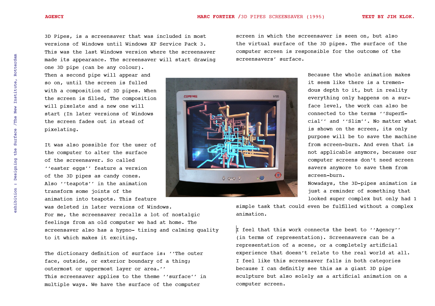
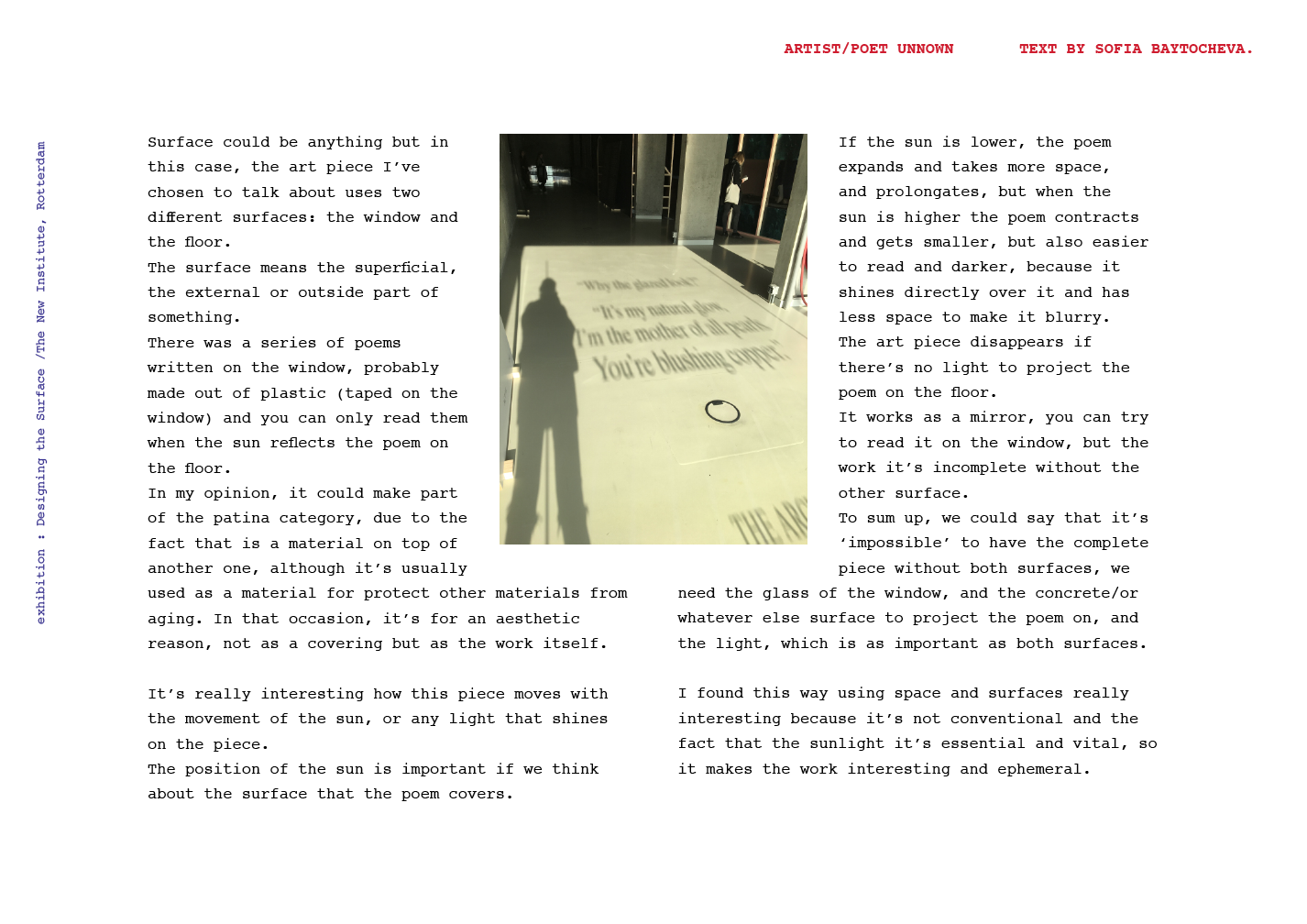
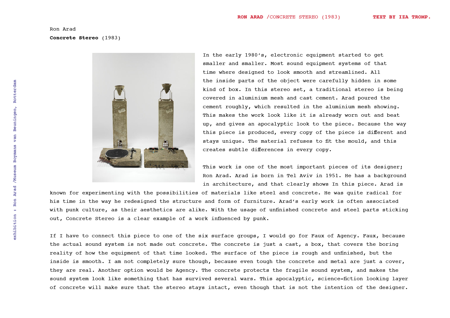
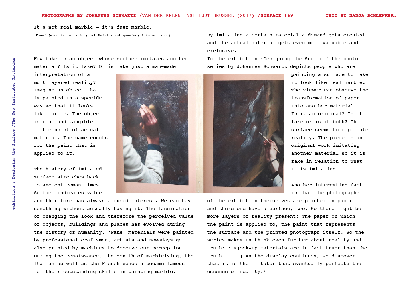
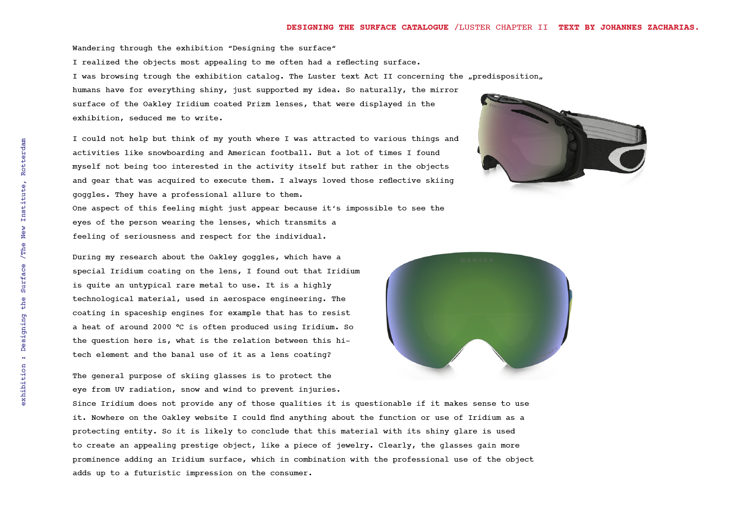
With this article I will try to provide the reader a good insight into the Situationist Times that were published between 1st of May 1962 and the Fall 1967 during the Situationist movement [ x /y ].

First of all, about the woman behind these tremendously enriching compendia:

Screen Shot 2016-10-27 at 15.27.44

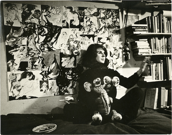
Her name is Jacqueline de Jong, she is a dutch graphic designer, artist and sculptor, born in 1939 in Hengelo to Jewish parents.

She encountered Asger Jorn in 1959 in London, which will lead to a very significant liaison and finally to her entrance into the Situationist International.

1960, when she entered the movement she then started to participate in conferences at the Central Committee and was the representative of Holland – in the same year she received a postcard with the message :”Now all of Holland belongs to you.”[z]

This stamped her membership of the SI where she remained active until 1962, when in the same year the German and Scandinavian Situationists saw expulsion by Guy Debord due to a long-standing friction between the aesthetic and political aspects. Because of her solidarity with the German Situationist Gruppe SPUR, she was expelled/ resigned in Febuary 1962.

As the division between the Debord circle and the German and Scandinavian Situationists widened, De Jong stayed impartial.

Her vision was to produce an international, completely free and multicultural magazine based on the most creative Situationist ideas.

De Jong’s major inspiration stemmed from the late 1920s magazine  i10 International Revue published and edited by the anarchist Arthur Lehning between 1927-1929, it featured contributions from Schwitters, Moholy-Nagy, Bloch, Kandinsky and many others. The new approaches to typography and graphic design apart from the interest in radical political views were so compelling and intriguingly in synch with the aesthetic sensibilities of the avant-garde with which she traveled.

For her the idea of a magazine with content made up of an wide-array of artists and intellectuals beyond aesthetic and geographical constraints was appealing and aided her in attempts to find new ways of disseminating the Situationist ideology.

25 32_Montage_i10_0

Screen Shot 2016-10-26 at 15.15.21

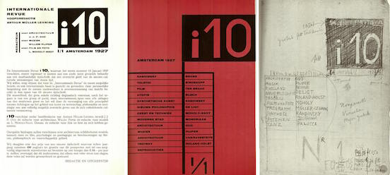
“How it started was getting thrown out of the Situationist movement. I had already announced that I was going to make an English — multi-language, but English language sort of magazine in 1960 in Brussels. And it was because of the French — Internationale Situationniste — I said : let’s make an English one. […]

There was SPUR — as a German one, a French, I.S., but no English language magazine for the Internationale Situationniste. So that was my suggestion, and I had bought i10, I think, a year before. And it was the most interesting magazine, I mean also in typography, I’d ever seen. […]”

komitee-spur


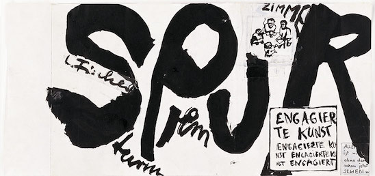
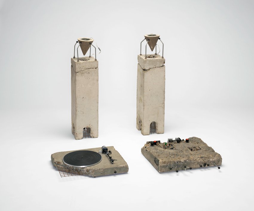
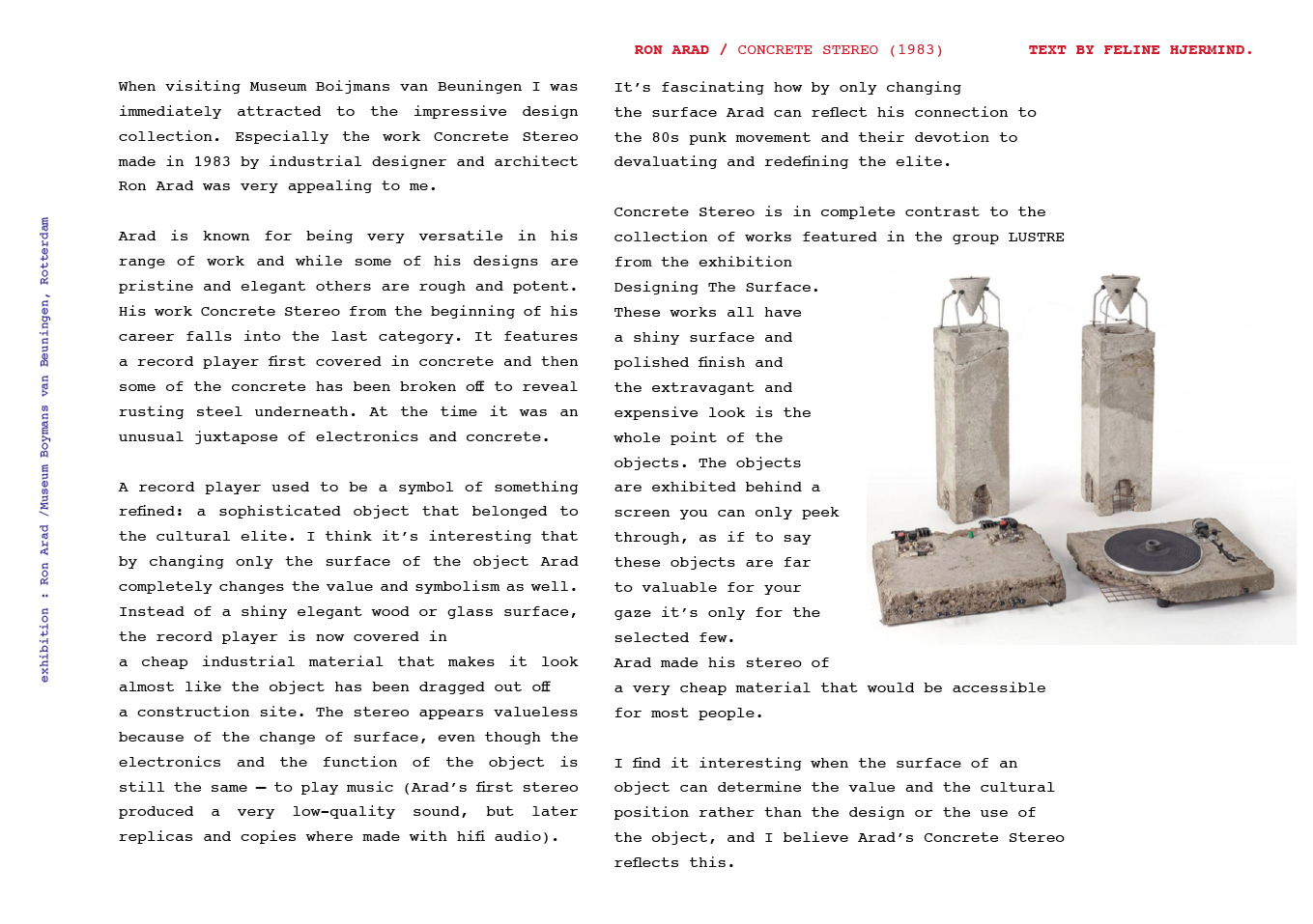
The first two issues speak a very similar visual language, with drawings and articles. The first issue she started with the whole SPUR trial while they were on trial in Germany for blasphemy and pornography — she published the whole court process in this issue, including the so-called dirty pictures and blasphemic texts.

They would travel to places and protocol their results of applying Situationist tactics as détournement and dérive.

Screen Shot 2016-10-27 at 15.41.01


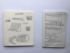
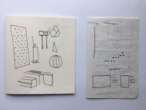
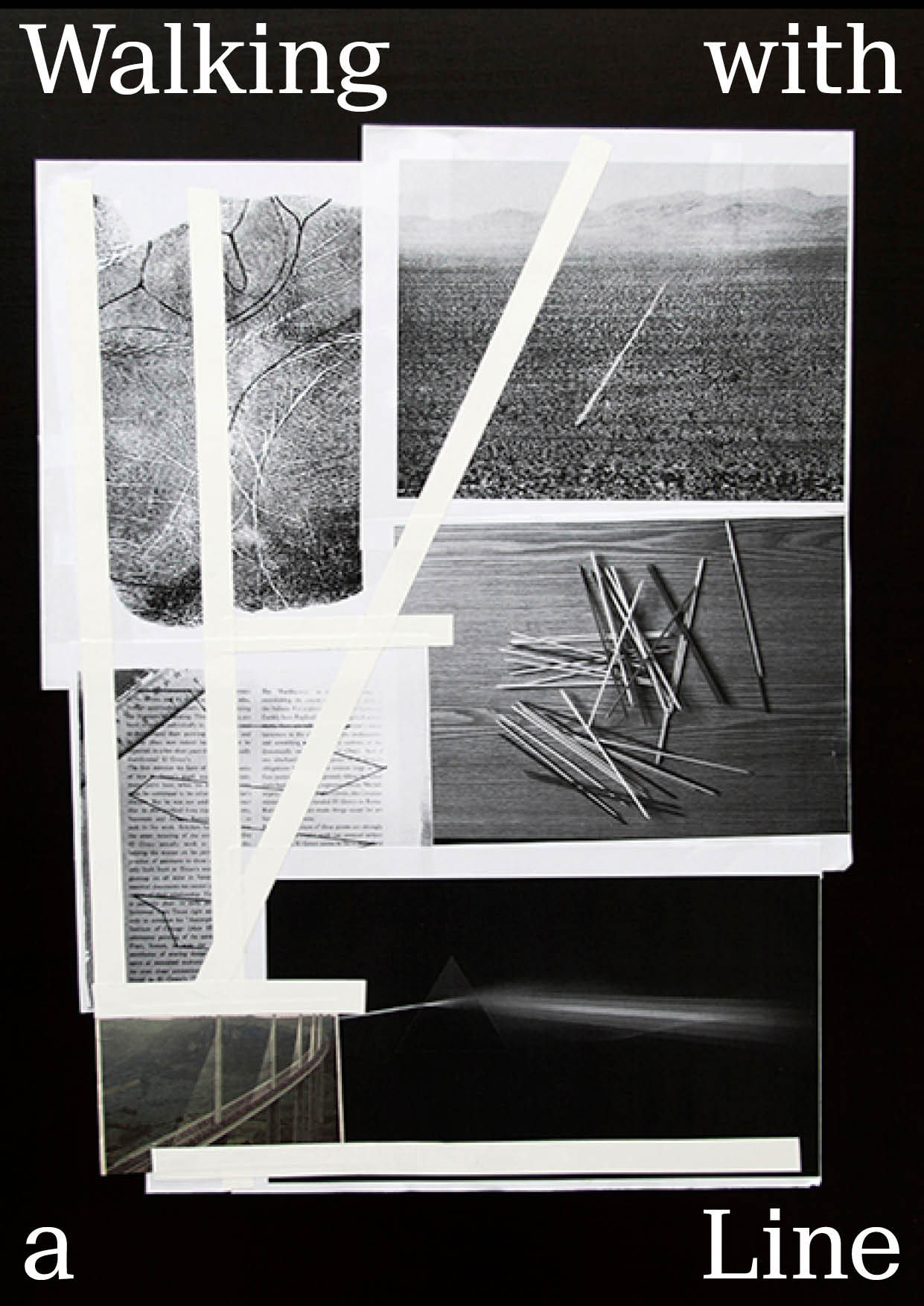
The following issues are quite different, as De Jong found herself very captivated by the concept of topology, she would compile visual information and material in a very meticulous research on various subjects, with the highly diverse contributions in form of highly informative texts – also in different languages, or even various languages in one cohesive article.

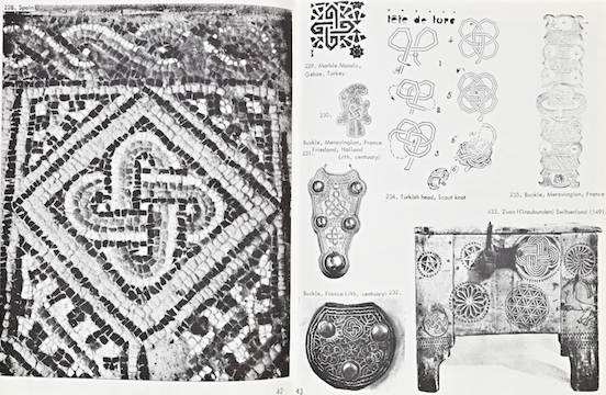
The issue that started this whole idea of compiling visual material throughout time and culture was the third issue — the British Issue which she entirely by herself edited and published.

Apart from few highly interesting and profound texts by Anton Ehrenzweig, Max Bucaille and Georges Hay this issue mostly concentrated on the ‘Typologoy of Knots’.

26eb8604-d5ba-11e5-82dc-0ccf45e730cf

276b0d02-d5ba-11e5-9b94-ef59c5f2b2b2

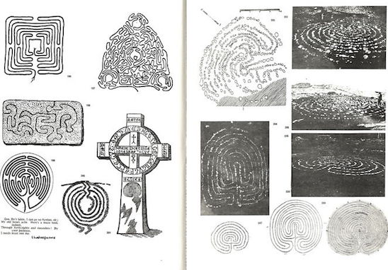
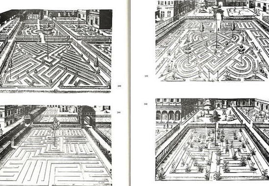
De Jong did not intend to make a series of issues with topological content, but what happened was that she solely recognized the topological pattern that was developing, but where she drew inspiration for the Issue #3 was from walking the Gotland labyrinths.

She described her experience:

I don’t really remember why I took the idea of labyrinths. It might have been because we went to the Gotland. We walked into the labyrinth there. And out. That’s the problem. Into a labyrinth is one thing, but getting out of it.. but there’s always a system to it. […]

Which led her to publishing this extraordinary content on labyrinths, she asked the people in her network, such as her former history professor Jaffé and Aldo van Eyck to write an article on this subject. Simultaneously Peter Schat and Lodewijk de Boer changed the name of their opera from ‘The Paradise Bird’ to ‘Labyrint’.


0f45ed4a-12b5-11e6-867c-622f567ced44

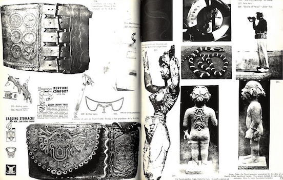
Issue #5 provided an enormous amount of visual and verbal content on ‘Rings and Chains’, which was the logical development of sequences, and again people were asked to contribute to this specific subject.

But this was also the starting point of the publishing and distributions to take a critical turn. Jorn had to sell some of his paintings for the publishing to take place, there were problems with the printing office after which they relocated to Copenhagen for Issue #5.

This cohesive way of content focusing on a certain topological subject started turning into a maniacal hunt for De Jong, she initially wanted to do an issue on Wheels, but due to certain other coincidental situations she changed her course, this time inspired by Walasse Ting‘s One Cent Life she advanced to compiling a very visually different issue, which will finally lead to being the last one.


One Cent Life was a book featuring lithographs and screenprints contributed by artists such as Pierre Alechinsky, Karel Appel, Asger Jorn, Roy Liechtenstein, Allan Kaprow, Andy Warhol, and many more.
“Lots of things were happening, actually at the American Center. Happenings were starting. Yoko Ono came and we were all very much involved in movements that got more and more international. We did some things like parties and exhibitions, and I mean really working together, having enourmous shows together and I mean it became lively, it became really something important.


Screen Shot 2016-10-26 at 15.15.47

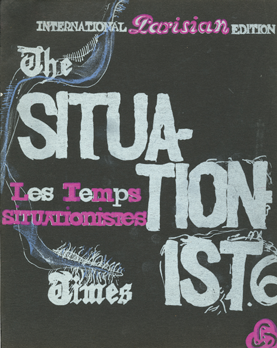
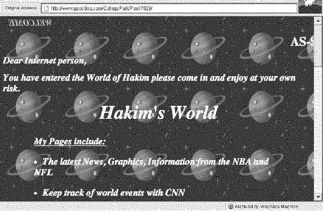
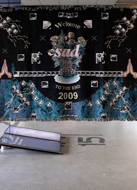
JACQUELINE DE JONG : THE SITUATIONIST TIMES #6
FACSIMILE 1962-67, CURATED BY JOHAN KUGELBERG, PUBLISHED BY BOO-HOORAY NYC, 2012
Rietveld Library no: 700.2 jon 1

 I wanted to show this spirit in a printed way. […] I wanted to do something cheap, but beautiful, and perfect. I said I could make a Parisian One Cent Life, and very cheap, if all the artists do the same colors, the same size, and it’s the size of the Situationist Times. […]”

She went to a lithographer, and many artists were asked to work on this issue, come four times to the printer and make four colors. What also was part of her considerations was the fact that this issue was meant to cover the costs of the next issue, she didn’t want to depend on Jorn selling his paintings.

It was published finally, and it was unique. It was shown at La Hune, which was a bookshop for art and it peaked its distribution, unfortunately to very complicated and shady reasons the publishing of The Situationist Times was put to a halt by outside circumstances which I find very tragic in that sense.

Screen Shot 2016-10-26 at 15.16.03

I feel like she could have gone on with this process of working with collaboraters and contributors from all different backgrounds specialized in a certain field and enriched society with this knowledge made accessible to the reader in such a visually magnificient way – if it wasn’t for those outside circumstances that she had little control of.

But then again I wonder if exactly the way things turned out created the emphasis of this compilation of knowledge and visual manifestation of that time’s zeitgeist, giving it more significance, but also compelling me to wonder about the what ifs, or what would an issue on a different topic that I personally find quite interesting have been like? Because I find it quite striking in her way of compiling especially the topological issues, she crossed borders and cultures and time, which really caught my interest, and I almost want to argue that it was accidental because in a way she possibly just wanted to provide the most accurate and rich information on a certain topic with contributions from other people she dragged into this quest.

In that sense, her ambitious hard work and struggles to give us this content and share it with the world and people like us from a different time and mental state is solely, and tremendously enriching, but highly questionable if these were aspects of her consideration. The way I perceived it she solely wanted to share something of the present in the present, but in such an eager and energetic way that I can feel the literal energy of De Jong when I flip through the pages of each issue, the dedication and meticulous arrangement.

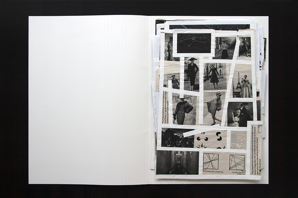
I highly advise the reader to go to the library of our academy and let the visual language speak to you. I derived profound inspiration from it – the way of the arrangement and editing, visually as written, concomitant the content itself as well of course.

The International Situationist Times facsimilé edition at Rietveld Library cat.no. 700.2 jon 1

The Concept of Détournement


Monday, October 24, 2016

Détournement is a technique. Détournement is a style. Détournement is a tool.

  • To really understand the concept of this tool, first we have to get to know it’s origins.

When we speak about détournement, the first and the most important figure we have to mention is Guy Debord.

Debord was a Marxist theorist; writer and filmmaker who is mostly known for his activity and leading membership of the Situationist International ( SI ).

In 1950, at the age of 19, Debord joined an avant-garde movement called Letterism, led by Isidore Isou. After two years Debord splits off and creates a radical group, the Letterist International.

Shortly after this collective of rebel artists and theorists was founded ( 1952 ) , détournement was claimed by this certain group.

The very first publication ( and description ) we can find on their desires; announced by Guy Debord and Gil J Wolman in 1956, was the ‘ A User’s Guide to Détournement ‘ .

After we did these very basic studies on the genesis of our subject, we can go deeper in search of the meaning and, so to say, the use of détournement.

  • Every movement, every new style claims current things and situations to change. They all have the same purpose: leave the old, the used behind and create, express something new. In our case Guy Debord’s movement was a very radical, even revolutionary way of changing the meaning of art, or better, the production of it. Debord and the situationists all agreed on the fact that art could no longer stay a chic, luxurious, high class production. Rather they believed and strived for art to have a deeper, educational input. They broke down the walls of the classical and the bourgeois way of looking at and creating art by taking different elements of already existing works and transforming them into something new, to express another meaning. These changes don’t necessarily have to be drastic or aggressive. The point of it is to change a small component but then with this small detour, changing the overall expression and audience. They mainly aimed political situations and circles, but only in a peaceful and respectful way.

A very important figure and example in this case would be Asger Jorn. Jorn was a really good friend of Debord, therefore he was highly inspired and led by the situationist concept, styles and ideas. In his paintings series called The ‘Defigurations’ , we can clearly explore the idea of détournement. His works are mainly driven by political issues and his frustration with established structures and authorities within society.

Another well known example is Marcel Duchamp’s L.H.O.O.Q. where he simply adds a moustache on Mona Lisa. With this small adjustment which first looks funny and sarcastic, Duchamp changes the whole meaning of the original Mona Lisa, that presents a laid back, carefree woman, but with this detour he presents the restlessness of the women’s sexuality.

  • At this point i find it more important to come up with more recent examples for détournement.

Let’s say you go to a restaurant, you get a piece of toast and a strawberry. Then you take a bite of this strawberry and you realise that it is actually a tomato. This is a concoction by the radical Star Chef Grant Achatz called ‘ strawberry / tomato ‘ . His cuisine is amazingly revolutionary as he transfers every simple ingredient into something more, something different. With this, he presents the meaning of modern cooking on a new level that is more of a performance or art than just making food for the guests. The food itself loses its meaning, it becomes the show, the whole experience. He takes a simple vegetable a normal herb or an ordinary ingredient but then the way he cuts, boils, combines them he creates tastes, techniques and culinary styles that we have never experienced before.

Another very important figure and illustration from our daily life is Banksy. We are not quite certain if Banksy is one person or a group of revolutionary artists, but the works we find and see under Banksy’s name are carrying the biggest recent political and social issues from these days.

In our case Banksy () could be one of the best examples how détournement works. In these works we can find well known images of current situations, famous moments and people, companies and figures. The way Banksy transforms these pieces, irrevocably opens our eyes on actual problems in our society, on existing and known political debates. The only small detour Banksy has, is that the way it’s propaganda exists might be more aggressive or intense by publishing them on public places, than the basics of détournement were created.

  • However, we face an important  and interesting question now. What if we detour détournement? How far can détournement go? How can or should we divide it from anarchy?

Or maybe peaceful propaganda is not enough at all these days anymore…?!

I assume it might not be. I believe that nowadays within such an aggressive society, political parties and their choices; we have to fight the “rival” with clear, harsh and rebel tools.

So answering our questions: it is almost a mandatory for us artists and philosophers and writers, comedians, journalists or simple working class people and for all medium that is capable of, to take the peaceful elements of détournement to a next,  advanced level. We do have to go further and show our dislike or disagreement, even if it has to cross laws and politeness, for the sake of change and recognition. We have to apply effective and more powerful tools to our ideas and requirements  for them to be realised.

The ignorant ‘Homo Ludens’ of the 21st century


Sunday, October 23, 2016

Last September, after visiting the exhibition about Constant Nieuwenhuys’s ‘New Babylon’ in The Gemeentemuseum Den Haag, I delved into his work and ideas. I came a across a movie about Constant titled: City Rising by Metahaven. Intrigued by this contemporary view on Constant’s thoughts of society, I started to examine the thoughts of Metahaven on the web and especially found one of their latest works called The Sprawl (Propaganda about Propaganda), interesting. Having seen the exhibition and both the works from Metahaven, in my opinion the freedom of the individual is central in all three. Though the way the individual is presented by both Constant and Metahaven, especially in The Sprawl is entirely different. This led me to ask some questions:
Can we actually call ourselves free individuals with all the contemporary propaganda thrown at us? Should we act more towards Constant’s ideas? Is Metahaven pushing us into the right direction?
To explain my thoughts and to enlarge upon these questions, first I’d like to shortly introduce Constant’s ‘New Babylon’, Metahaven (City Rising) and The Sprawl and later on give insight to a correspondence between Metahaven and me.

New Babylon
‘New Babylon’ is the imagination of a progressive and modern utopian society by Constant Nieuwenhuys by means of maquettes, drawing, movies, graphics and manifests. In ‘New Babylon’ dynamics are crucial and where the inhabitants arrange their artificial environment. An automated community where labor is unnecessary whereby everyone can fully focus on developing their creative ideas. The individual decides how it’s habitat looks like without any restrictions or creative borders.

Metahaven
Metahaven is a Dutch design group based in Amsterdam founded by Daniel van Der Velden and Vinca Kruk. They’ve already had many exhibitions including the MOMA PS1 in New York and the Museum Of Modern Art in Warsaw. The group released several films and graphic designs focusing on contemporary political and social issues. For this instance City Rising (2014); a homage to Constant Nieuwenhuys’s ‘New Babylon’. The film is an exploration of the individuals’conditions of life, work, and love in neo-liberal times where the architectural maquettes of Constant’s ‘New Babylon’ are displayed in the video. This is a general example of what Metahaven deals with.

The Sprawl (Propaganda About Propaganda)
The Sprawl is a multi-channel video installation, feature-length film and episodic online documentary that considers the “ways in which fantasy can be designed so as to seem or feel like a truth”, as Daniel van der Velden describes and states that the Internet has become a disorganized geopolitical super weapon. Where, for example, funny cat videos distract us from urgent matters and that’s where The Sprawl jumps in by asking pressing questions about the internet in relation to our idea of the independent individual few others dare to ask. Looking at the design one can see that The Sprawl is a paranoid, digital trip in which the form and content keep on influencing each other in combination with futuristic beats and sounds by Kuedo, green screen-manipulations and glitch elements which deliver a chaotic and high pressuring image to the viewer.
All the different parts of The Sprawl, the so called “Shards”, can be found on the website sprawl.space; the interface of the project.

Fullscreen-capture-5272016-103924-AM


The Contemporary Individual
In both Constant’s ‘New Babylon’ and Metahaven’s The Sprawl, there is an interesting and different way how they approach and think of the individual. Constant claims –for his utopia to fully act well– that every individual should be able to free himself from daily routines such as labor, to become an adventurous, playful and dynamic human being, what he calls the ‘Homo Ludens’. So as a community, all individuals can create a new society where everything can be artificially influenced. Metahaven puts a question mark over the reliability of the internet and the information flows the individual engulfs. What is fantasy and what is real and objective? The internet makes extensive use of propaganda where the individual only gets the information certain people wants them to get. The Sprawl is trying to clarify this; that third parties and the internet form the individual by deciding which and what kind of information we can assume to be relevant. Metahaven tries to convince us we’re not that much of individuals at all, because of all the contemporary propaganda thrown at us.

In the correspondence between Metahaven and me, I asked them a question about The Sprawl to better understand the true meaning and purpose of the project.
My question: (Translated from Dutch) “How does Metahaven thinks to convince the individual by means of The Sprawl that the information we absorb in our daily life is manipulated; and in what way their chosen design contributes to this goal?”.
Unfortunately Metahaven didn’t want to answer the question based on the facts that they don’t speculate about their own made work not knowing what will be written about it and they don’t want to interpret their own work; they are of course fully entitled to do so.
However, they did send interesting references to articles which already conduce to better understanding The Sprawl. Troubled I couldn’t completely understand the project first;
from the article of Ruth Saxelby (see link below), it became clear this is actually a conscious choice of Metahaven:

-The Sprawl is less concerned with what “the truth” is, and more interested in the impact that the internet avalanche of conflicting truths has on the reality we experience, both individually and collectively.-

-The Sprawl’s tagline is “propaganda about propaganda,” and its third manifestation—dropped like breadcrumbs across YouTube—is the one that feels closest to the spirit of the project; its fragmentation is a reflection of the way we half-see, half-read, half-understand the world in these hyper-distracted times. But what does propaganda even mean today?-

“I used to think that propaganda was about persuading people. Jacques Ellul who wrote the classic study of propaganda in the 1960s, French philosopher, called it mass persuasion. He didn’t say propaganda was good or bad, he said it was a part of modern society, a part of technological society, a part of mass industrialized society, whether it’s getting people to wear condoms or to get them to become Maoists. Soviet propaganda used to be, ‘Believe in communism, Moscow is the shining beacon on the socialist hill.’”
“Now it doesn’t seem to be about that. It’s just about deconstructing the other side, disrupting Western narratives, of any sort. There’s a steady stream of disinformation whose purpose seems to be to sort of undermine the very idea that truth is provable.”—Peter Pomerantsev, The Sprawl


Metahaven Is Breaking The Propaganda Machine – The FADER
Every individual has the right to create it’s own truth and what to believe. The internet gives us the idea we get equal choices and information flows, though this isn’t true. Big parties as multinationals, internet-companies and media-tycoons or even Metahaven, have a greater possibility to proclaim their “truth”. The individual is often not aware where certain information arises from.
To get back to Constant and Metahaven together. It indeed seems we, the many individuals, are trapped between many flows of information each claiming to proclaim the truth; while no one really knows what is the “truth” nor whether it exists, and far from being able to call ourselves “Homo Ludens”.

a_39078

Constant Nieuwenhuys,’Homo Ludens’, 1964. picto©Constant Foundation/SM


Log in
subscribe