Skip to Content Skip to Search Go to Top Navigation Go to Side Menu


"Highlight" Category


ON DESIGN EDUCATION


Thursday, February 6, 2014


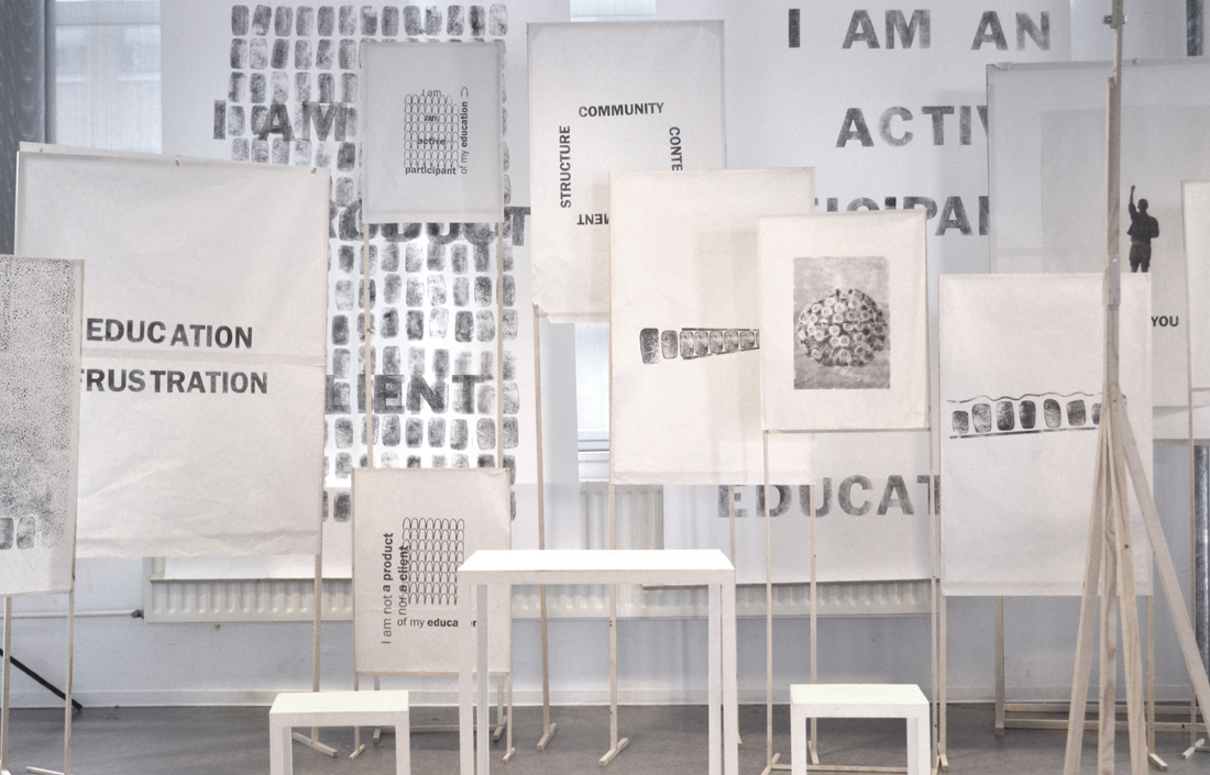
The bricks manifesto is a collaborative version
of ‘this is (not) a manifesto’ to bring people together
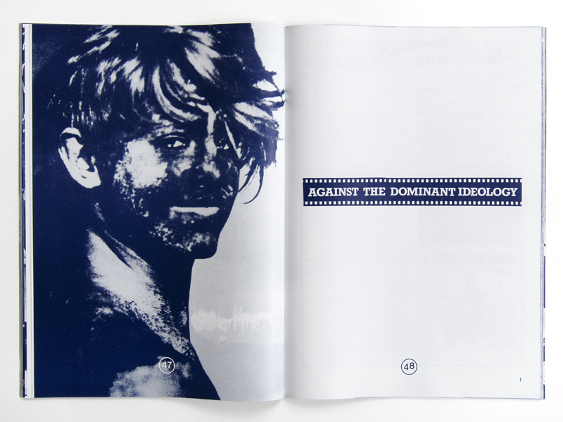
to discuss their education vision during DDW 2012.9

tumblr_inline_ms8phbzUvw1qz4rgp


UnBornLab
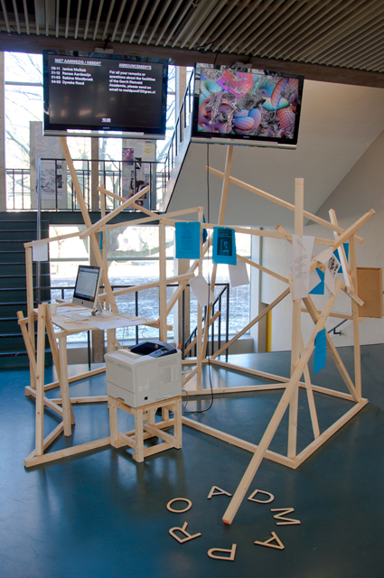
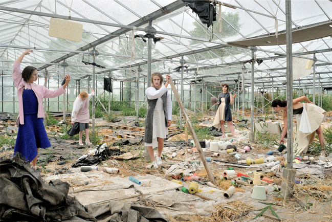
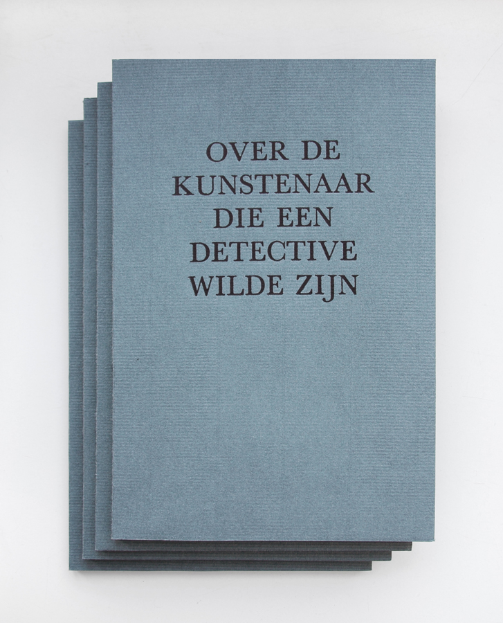
Presented at the graduation show of the Design Academy Eindhoven during Dutch Design Week 2013, UnBornLab is a masters project, initiated by Eugenie de Lariviere, looking at design education from a design student’s perspective.

It was important for me to understand education from my own perspective; as a student and a designer.
Mixing both a field research on a local level, and an academic research on a more ‘global level (that is the European level)I felt the need to always bring the theoretical part into practice, by organizing workshops, discussions, lectures, interviews (etc), in order to grasp an understanding of the big notion that is education.

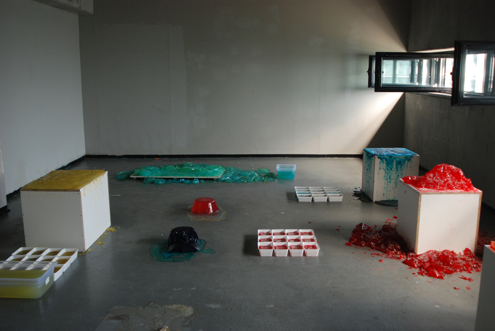
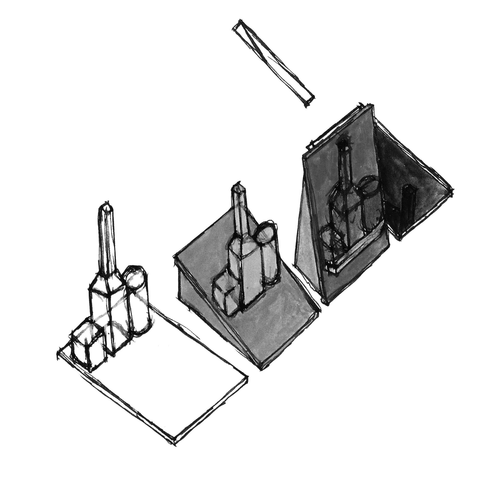
One way to do so was to analyze how the system functions. I was able to get an overview of it by breaking it down into four ‘elements’, which together, represent the main ‘pillars’ forming our schools. These four elements being; community, structure, content and environment, the interactions they have together shapes the different academic institutions we know of.

(For example: Structure = Content implies that if structure makes content, it induces a top-down approach of knowledge, raising the question of knowledge accreditation, knowledge hierarchy, as well as of formal vs. informal knowledge. Whereas Content = Structure implies that if knowledge forms structure it leads to a more bottom up approach of producing and sharing knowledge for example; crowd source and open source systems. The same goes with structure = community vs. community = structure and so on.)

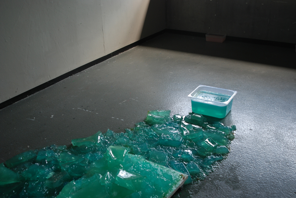
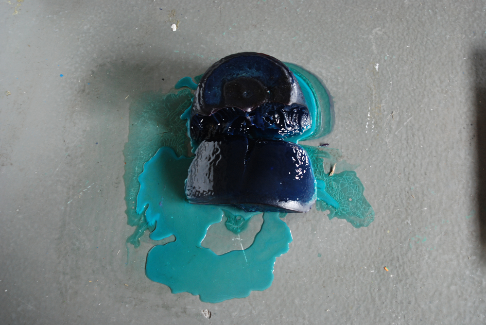
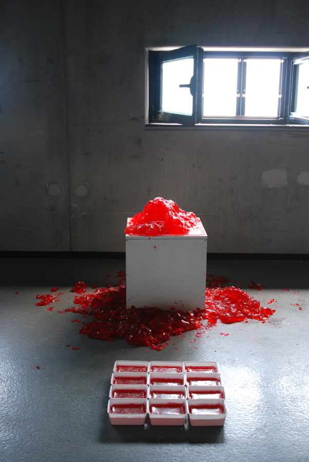
To communicate the concept clearly, I visualized these methods of the ‘four elements’ by quickly sketching them into volumes. It was once again a means of bringing the theory into practice by giving shape to the research. Making it physical also enabled me to reach people who did not feel strongly about the subject.

COMMUNITY-CONTENT_redu CONTENT-COMMUNITY_redu

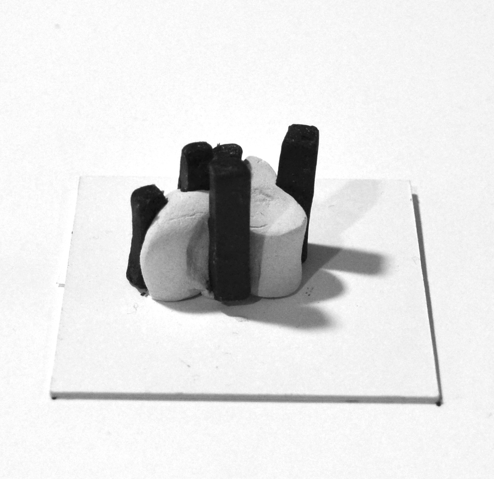
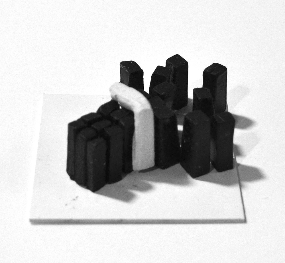
Community = Content  vs.  Content = Community


Following on the idea of ‘rethinking’ education from a student’s perspective, I chose to look further on recent shifts in the relationship between ‘content’ and ‘community’, focusing on students as the bearer of contemporary knowledge.

With the faster availability of information the world is transforming at a greater pace and students are often proven to be quicker to adapt to these changes, may they be social, economical, political (etc). The content they bring in the school, as an addition to the curriculum, comes to show more applicability regarding the world they evolve in. In this process, schools go from being knowledge distributors to becoming intermediate spaces where a dynamic cross-pollination of knowledge happens.

The UnBornLab functions as an experiment to document students’ working processes as the basis for renewing design curricula.
The first step of the project was a blog to bring student’s current research (in this case their thesis topics) outside of schools.

DAE-BLOG

DAE Masters Blog


Believing in the importance of students’ self-taught expertise as a school’s temporary knowledge, the idea evolved in the motivation to create a dynamic archive of this knowledge by building a self-generating library of past researches.

Through a series of short video-interviews students present their work, focusing on the research rather than the outcome. Considering students as temporary ‘experts’ of their subjects, the videos can be seen as short introductions on given design topics. One topic leading to another UnBornLab intends to be the start of a dynamic knowledge database of ‘UnBorn’ designers.

UnBornLab_siteS_screenshot


The CMYK Colour Model


Tuesday, February 4, 2014

the CMYK colour model is short for cyan-magenta-yellow-key (black) and refers to all colours as mixtures of these four process colours. so, within this model, a colour would be described through the quotient of cyan, magenta, yellow and black that can be found in the mixture.

the CMYK colour model is predominantly used in the printing process and is often referred to as four-colour printing (which corresponds to the four inks used). in order to fully understand it, it is vital that we examine another colour model named RGB (red, green, blue) that is used in display devices such as computer monitors. so, whatever you see on a screen is in RGB. however, these colours can only be viewed with the aid of natural or produced light – making it impossible for documents to be printed as exact copies of what can be seen on a screen. this is why these documents must have their colours translated into CMYK prior to sending it to the printer.

all the heavily paraphrased information above seems to make sense on a superficial level, but in fact i find it all extremely perplexing and difficult to grasp. unfortunately i never learned the complex language of science and since it is awfully strenuous to translate a language one doesn’t understand, here is the even-more-technical-side explained by someone who seems to know what they are talking about:

“When two RGB colors are mixed equally they produce the colors of the CMYK model, known as subtractive primaries. green and blue creates cyan (C), red and blue creates magenta (M), and red and green creates yellow (Y). black is added to the model because it cannot be created with the 3 subtractive primaries (when combined they create a dark brown). The K, or “key,” stands for black.” (taken from here)

subtractive-colour_redu

upon my investigation, i found that the aspect of the CYMK colour model that i found most compelling was the simple fact that a countless amount of colours are but a mixture of four: cyan, magenta, yellow and black. this thought was inevitably on my mind for days proceeding my research.


//

the idea for a translation of the CYMK model came to me when i was listening to Billie holiday’s  1941 version of “am i blue?” over a cup of coffee. it started me off on a long trail of thought which went a little like this:

blue? blue?! how has blue come to mean a sad & melancholic mood or person?

although the colour blue is used to describe a specific feeling, colour can also be used to illustrate mood or atmosphere – for instance – in less direct ways. this is apparent in art, music, poetry, prose… but why do we associate certain moods or meanings with certain colours? and more even-more-generally: why do we often have the urge to illustrate colourless things through colour?

i am extremely fond of the randomness of this occurrence  the randomness of the colour blue (with all its different tones) being chosen to represent something that is beyond blue literally, as a colour, a sensory experience…


//

i had the idea of translating the CYMK colour system in a way that i made each colour (cyan, yellow, magenta and black) represent something different. and so i did. i decided that i was going to translate this system into a system that determined the “colour” of one’s day. first, i made a list of things that tend to have an effect on my day. then i selected the four that i felt have the most influence on the “mood” of my day. i proceeded to make them into questions (which can be answered on a scale of 1 to 10):

– how happy/satisfied are you with yourself today? (C)
– how well rested do you feel? (M)
– how good does today’s weather make you feel? (Y)
– how similar is today to yesterday? (K)

each of these questions substitute C, M, Y, and K accordingly. and when answered as a numeral value (from 1 to 10), i have the percentages i need to make a colour with the aid of photoshop. the system i’ve created is therefore a colour-determining tool.

i decided that the colour i’d silkscreen would be the result of my answers to the questions the morning after i created the system. my answers were 5, 5, 3, 1 and made into percentages as shown below:


 …and “the colour of my day” beside my silk-screened circle version:

 circle_redu


//

i knew that to develop my project further i’d have to send this survey around and ask people to fill it out. therefore, i made an online survey using a survey-making-website (which can be accessed here):


this website organized the data which i later used to determine individual colours for each of the 40 people world-wide who answered my survey on the 12th of december, 2013. i mapped out all 40 colours to illustrate the colours of one day, according to the answers of 40 people:

colour-system_redu


a problem i encountered on two occasions was that if 10 (being absolutely) was the answer to the last question: how similar is today to yesterday? (K), then the colour would be entirely black. since the other quotients would be cancelled out, i didn’t want this to happen. so instead, i set the percentage as 95% rather than 100%. even though both appear to be black anyway, i like the idea that there are still undertones of colour. and although it did not stay completely ‘honest’ to my original system – at the time i thought it would be a good compromise.


//

after i was done with the poster shown above, i decided to design a survey of my own (which i would put online and use if i were any good at computing):

i think through this translated colour system, i managed to play on the randomness of colour representations, but also create a functional and fun system (which also has the potential of becoming interactive).

colour-system_total_redu


UnDeR My Own COnstRUCtIOn OF RUIns


Monday, January 20, 2014


while wandering around the city center I become an observer….


ruin_image_5


sPACes considered to be MOnUMents turning out to be RUIns in the FRAGMents of my MeMORIes.


ruin_image_10


what I mean is a …

RUIN

– that what happens to the image from the moment of first gaze
– is in- between
– although beeing a man made it seems to be a gift of nature
– a law of nature that all things must fall into
– is to pass from perfect state into a state of imperfection
– it is a remnant of a future
– a souvenir -and souvenir as a suggested memory
– solitary presence whose reasons we understand less and less


ruin_image_15


Figuring out or misusing a building is an interesting way of defining an architecture for ourselves, and that becomes possible with ruins I am talking about.
Where is a ruin there must exist a natural force which created it. Like buildings which were here before us and lived lives of previous generations, survived repetitive demolition of past dreams of future. sometimes trying to reconstruct from old is just a human inabil- ity to adapt to the new conditions and a fear of letting go. Visually I don’t see a ruin as an old architecture not being able to keep up with the shape which it was designed for. I see it as a transition from design back into nature.

text by Denisa Kollarova [graduate student department of Graphic Design 2013] : the images above are random compositions of the folds and flaps that construct or decapitate the pages of a limited Cyclostyled publication of the essay : more Denisa Kollarova

Screen shot 2014-01-20 at 2.36.21 PM Download this thesis [44Mb]

Cyberflânerie


Tuesday, January 14, 2014

The thesis of Olya Troitskaya “Virtual walking” studies a gesture of strolling in physical and cyberspace.

It looks into the history of a “deliberate walk”, starting from the concept of the flâneur developed by Charles Baudlaire, its degradation by capitalism into the figure of the shopper, its later radical political update coming with the concept of the “dérive”, its development through a notion of “Psychogeography” with Guy Debord and Situationist International and its popularity later in 1990s in artistic and academic circles, building up psychogeographical praxis in various ways.

Physiologie_du_flaneur
Louis Adrien Huart / Physiologie du flâneur

Further the thesis draws a parallel between these historical processes happening in the real space to the ones taking place in the cyberspace.
With the development of capitalism flânerie becomes increasingly restricted. Is it possible that Cyberspace, that can be looked at as an update of a personal, bodily and architectural space, would become a more popular place for flânerie?
If in the 1990s “cyberflânerie” is associated with a free “strolling through information space, taking in the virtual architecture and remaining anonymous”(1), then in 2000s it doesn’t seemed such an intriguing activity as in the early days of the Web.

The processes happening to the internet in 2000s can be considered similar to ones happening in 19th century Paris, lead to the change of its original, playful identity.

live-rmb-city-1
Cao Fei / China Tracy, 'Live in RMB City'(2009) Video
: Courtesy of Artist and Vitamin Creative Space

Various artistic practices are being developed around a cyber stroll. Will they react to the changes happening to the figure of cyberflâneur and challenge its appropriation by capitalism, similar to Debor’s challenging capitalism’s hold over the city? (x) http://www.ceramicstoday.com/articles/051998.htm, last accessed: 06.09.2013

What is the future of the cyberflâneur? Is it possible to learn from Situationist’s example? Where to look for the “dérive” in cyberspace?

text by Olya Troitskaya [graduate student department of Graphic Design 2013] : more www.olyatroitskaya.com


Pdf-icon Download this thesis ”Virtual Walking“


Wolfgang Tillmans : One’s Own Master


Monday, December 9, 2013

Wolfgang Tillmans, (born August 16th, 1968), is, perhaps, known today as one of the most renowned contemporary fine art photographers. He is known as the “documentarian of his generation”, and is much regarded among his peers and contemporaries.

If you have ever encountered Tillmans’ work, whether that might be a single photograph, a spread of his photographs published in a magazine, a book or an installation, the ‘taste’ and presence of the artist himself is inevitable.
It is clear in the presentation of his work, that Tillmans ignores the traditional separation of art exhibited in a gallery from images and ideas conveyed through other forms of publication and presentation, and more importantly is giving equal weight to both.

wolfgang-tillmans-installation-view-serpentine-gallery-london-c

In an interview with Nathan Kernan, Tillmans is reported saying:

“I guess I could have an easier life if I didn’t care so much about all the different manifestations of an image, if I didn’t care about making the prints myself or in my studio, but somehow I see that as being part of my work, and the time spent dealing with a print is also time spent with the work. I understand my work better through this process.”

What stroke me at first as surprising and unusual, was that the artist is designing a book, or better to say is containing his own work, that at first might not have had the intention of being presented in that format. That is actually quite innate to Tillmans.
Through a more dedicated research and engagement with his work I have come to realize that it is quite natural for me to grasp that he, in fact, does design end edit his books himself.

1

1

Concretely, I have found myself acquainted with three of Tillman’s books: Burg, Truth Study Centre and Neue Welt. Burg being the first of the three was published in 1998, and Neue Welt the latest, published in 2012.
All of the three, were published by German publishing house TASCHEN.
Although one might think that having such a big house as TASCHEN publishing your work would almost completely strip you of your creative role in the design of a book, Tillmans stated in an interview [link to full interview], that on the contrary, he has full creative control over the design and content of his books.

The a fore mentioned book, Burg, is a bit larger in format than the latter two, which, on the other hand, incidentally almost completely resemble each other. They were published with the gap of eight years, however if we judge purely by “outside” traits, Truth Study Center and Neue Welt are ‘fraternal’ twin sisters.

5
Unlike Burg, they are both soft-covered and their front cover is completely wrapped with a single photograph, and the author and the title are stated in the same white colored typeface, although the font size of the Truth Study Center is significantly bigger than that of Neue Welt. At the bottom center of the cover states TASCHEN, the publisher.

The spines of the books are, also, both white and use the same typeface, as that of the front cover.

The back cover is, in both cases, a different photograph than that of the front cover.

4

8
In spite of the slight differences, all of the afore mentioned books seem to share the same design principle. They either start or finish with an accompanying essay or an interview on Tillmans and his work, with the text pages being ‘interrupted’ or ‘accompanied’ with smaller scaled images of Tillmans’ work as if to kind of visually demonstrate the written content of the text, that being the case in Burg and Truth Study Center. The two mentioned, as well, end with listings of Tillmans’ biography and curriculum vitae, bibliography and words of acknowledgement and gratitude.
However, the newest of them, Neue Welt seems to have ‘cleaned out’ the ‘unnecessary’

9

information even more, as only the very last page contains publishing information.
What is, also, unique to Neue Welt is that this book has both front and back cover flaps inside which is printed the index of all of the book pages. Except for the pages with the interview, in this book there is not one single spread that does not contain photographic image, from the front to back cover.

6

7
 

Tillmans does not view books as collections/ archives of his work but as exhibition space in themselves. Neue Welt is constructed and should be viewed more as an installation of Tillmans work than a regular book. Whilst browsing through the book (Neue Welt) the white space of the paper becomes equivalent to the white walls of a gallery/ museum. Tillmans designed the book in a same manner he would curate his exhibition. All of the photographs are carefully scaled and placed, not only to be true to the artists style but to give them proper space and interrelation to bring out the best of them and to create a strong work as a whole.

IMG_7458

Interacting with the Neue Welt the holder starts to relate to it and think of it as a sort of portable exhibition.

The way it is designed, the viewer is not only challenged to engage with each singular picture or a narrative that is usually expected in photo-books, but with the connections Tillmans creates between the photographs. Having that in mind, holding his book in your hands feels almost like a privilege. The same kind of privilege one feels when one sees an exhibition of an artist’s work.

IMG_7460

Engaging with these books, for me it was very interesting to see how they become a work of art in itself, through process of design. Although, as a viewer you have the liberty to observe every single image in depth, it is in a way impossible to ignore the whole structure and rhythm of a book as a whole. The artist’s language and modus operandi is inevitable. I ascribe this to the fact that it was the artist himself who designed his books.

IMG_7462

During my studies at the Rietveld Academie, I have myself had the chance to be a designer of my own books, and it was whilst working with the photographic content of my own that I learned how differently does this content work in the medium of a book. The format and structure of a book give the content a new meaning and experience than observing it as single, or even series of photographs printed and pasted on a wall.

I am of the opinion, that it is the artist personal involvement and connection to the content, while designing it that creates this special flavor of the book and it would be interesting to see the direction in which book design would go if more and more artists were designing books on their work themselves.

More on Wolfgang Tillmans and Neue Welt:

http://tillmans.co.uk/

http://www.americansuburbx.com/2013/01/review-wolfgang-tillmans-neue-welt-new-world-2012.html


Rietveld library catalog no: til 3 and til 1

Neue Welt has unfortunately not yet been acquired by the Rietveld Library, but is author's own.

ART, A LINK TO HISTORY


Monday, December 9, 2013


1979 was the year of victories, revolutions, delusions and cultural innovations; it was the year of the end of the Pol Pot regime in Cambodia, the year of the independence of Catalonia and Basque country, the year of Francis Ford Coppola’s „Apocalypse Now“ and the year of the invention of the IKEA Billy bookshelf.


But why do I all of a sudden care about this particular year? Was that year mentioned in the news lately? Or did something happen in that year that I have a connection to?


The year 1979 got my attention through the “Werker 2” Magazine I found in the “San Serriffe” Bookstore [x] in Amsterdam.


werker2_magazine


Werker 2 – A magazine edition designed by Marc Roig Blesa and Rogier Delfos for the exhibition „1979, A Monument to Radical Instants“ curated by Carles Guerra in 2011 in the Virrena Centre de la Imatge of Barcelona dealing with the issues of daily life in crisis of working class young men.[x]


With photographs and texts selected from secondhand publications – printed enlarged in blue-white – they show us the history of young men at work,  of unemployment and of protests. In the very special way they stage the pictures in the magazine, it becomes very obvious that photography was and is still a medium that communicates the essence of a situation.


Skimming through the pages of the magazine I get roped into the images and texts and I am interested to learn more about the historical context.


Why do these old photographs fascinate me so much that I want to know more about them? And would it be the same if I saw them in an ordinary news paper? What is the link between design / art and history?


A lot of artists or designers are dealing with these kind of questions. In our time, in which everything is well designed and life is getting faster with every new technical invention, our eyes are used to being attracted to things that look nice and are easy to get.


That is why it is getting more and more important that art and design connect with history and trigger people with unusual visual elements into getting interested in whats happening all over the world, about history and its connection to today, since a lot of people don’t even read the newspaper anymore. They don’t bother reading long articles anymore, especially if the layout is unattractive and uninviting.


Not only Marc Roig Blesa and Rogier Delfons are dealing with this issue. Other artists since the post-mordern movement, like Ai Wei Wei, El Anatsui and Allan Sekula who also appears in “Werker 2” magazine, are discussing political events with photographs and philosophical essays.


Such political photographs or artworks have there own language which is mostly stronger than just an article in a news paper, because the artists automatically point out their own view on happenings in a visual way. This brings the topics and concerns closer to the audience. It is often so, that we feel more connected to things as soon as we see that these things bring up emotions in other people to which we can relate.


werker2_magazine3


By zooming into old secondhand publications and combining text with images, the two designers Blesa and Delfos display the line between the different worker-movements during the 20th century. They take us on a journey through history in a very atmospheric manner. This intrigues me. The blue-white colours take away the old notion about the photographs and translate them into a modern design. With this simple „trick“ they show us that history from back then is still fundamental in today’s daily life.


To me, this issue of the “Werker” Magazine makes it very clear that design is very important – if you want to reach people, arouse their interest and trigger their emotions, the layout is very decisive. Don‘t just string together texts, add some pictures and that‘s it. Such a design is outdated in the present media world. But if you present your content in a form which is entertaining and at the same time visually attractive, you will not only attract attention, but also lay a bridge between a interesting topic and an interested audience. I think that Blesa and Delfos have mastered this challenge in their “Werker Magazine”[x] in a very succesful way.


werker2_magazine2

Rietveld library catalog no: magazine

The ideas & steps behind making ‘Haphazard’.


Sunday, December 8, 2013

Analyze a book which is interesting because of its design.
So the book needs to be interesting, apart from the content. I discovered that it is almost impossible just to take a book because of adesign however interesting it may be. The content and design are often so closely connected to each other.

With this book it was different.

The first reason why I took it: the cover.

I had really no idea what the book was all about and I also didn't understand the title. No, I just took this book because of the cover. Between all these 'regular' books, there was this one book with a cover made of cardboard. Cardboard? That seems interesting to me.

René Put [x], the graphic designer of Haphazard, told me that you can not ignore the cover.

‘When you see a book, it starts with the cover.’

‘As a graphic designer, you have to deal with a lot of choices by designing a book. The content and form are in my opinion connected with each other. The content always plays a role. Which material is used by the artist? Which ideas the artist wants to tell with the book?’

cover Haphazard

The manner of binding confused me when I opened the book. The way it is bound, on the right side, gives you the idea that half of the book doesn't need to be seen. That it is a secret, hidden.

‘As a designer I’m always looking for inspiration. Once I had seen an Indian account book, this is a long flat book. The idea of having this pile of papers, folding it into a new object, fitted well with the work of Ellert. Ellert is always looking for the border between 2D and 3D objects.’

‘Someone in Den Haag bounded the book. He made four dummy’s for us. We were really content with the last one, the one as it is now.’

‘They call this a Japanese way of binding. But actually a Japanese binding is different because there are more whole in the cover. There are just two holes in this book cover. Afterwards the book is bound by hand in a system which keeps the pages all together.’

‘This is maybe a funny fact to know. The whole research for the book cover, took the most time but cost also the most money because bookbinding is a handicraft.’

binding Haphazard

I have the idea that there's a link between the paper which is chosen and the work of the artist. The artist, Ellert Haitjema, is working with natural materials and material he has found in the streets. This paper looks like recycled paper. Not glossy, it has a more natural look.

‘It’s always a search to find the right paper. Here we’ve chosen for uncoated paper. In this case it was necessary because not all the pictures were in a good quality. To compensate this problem, it’s always a good idea to use this paper because the effect of the bad quality is less. The pictures become also more an unity when they are from different sizes/qualities, all printed on the same soft paper.’

Haphardize_0034

‘This quality of this picture was not really well. That’s why I doubted to publish this one. In the end, we changed it a lot to get it how it is now. There were to many good arguments to place the photo.’


Isn't it a pity that some pictures on the middle of the page, are folded?

‘The pages are turned and that’s also why they get folded. In this example you can see why, on purpose, we’ve placed some photos in the middle of the page. By folding there will be another image then by seeing the photo on the whole page.’

Band 2 Haphazard band 1 Haphazard

‘The cover and the papers inside the book are folded. What we wanted to create when the book is lying on the table, is that the cardboard will end on the first page inside the book. By folding the book, the paper will move, by moving the paper you get a nice cutting edge.’

snede achterkant Haphazard

‘At the last moment I thought of adding something to the cutting edge, it needed to become an experience in itself for the book. We decided to add five colors of grey, so called PMS colors or Pantone colors. These five different colors are printed on the back of the papers inside the book. Now you can see a nice variation of colors in different grey tones which are an experience for the book in itself.’

grijs verloop achterkant Haphazard

‘This book needed to be an object in itself. Just as the objects which are shown within the book.’

‘The good thing about the picture on the back of the book cover is that it shows how the function of this book changed by using it to carry a plate of glass.’

‘The idea for a photo like this (on the back of the book) occurred while we were designing the book: the book needs to be shown as an object itself. This photo for the cover was a bright idea, thereby the whole book design was completed.’

achterkant Haphazard

What I wondered about, when I took this book out of all the other 'normal' books, was; how is someone making a book like this?

For instance, when you're a graphic designer, what kind of steps do you make during the process of designing such a special book. At first, I thought there was no direct link between the design and content of the book because from the design you couldn't get an idea of the content.

In the end, I know better. When you take a closer look, you see that there's a link, off course, but a subtile one. Graphic Designer René Put let me see what is all necessary by making a book. Which choices need to be taken and which ideas are behind all these steps.

‘In my opinion, you can always go back to the book when it is a good book.’


Rietveld library catalog no: hai 4

Design’s Delight by Jan van Toorn


Sunday, December 8, 2013

Design’s delight is a book of which as well the content as the design are by Jan van Toorn, a dutch graphic designer. The aim of his book is to question and to comment the way designers work now. You can tell this by both the content and the way it is designed.

cover

The cover of the book is rather simple, but shows already some of the characteristics of the graphic designs of Jan van Toorn. Various thicknesses of letters have been used, to make distinctions between different sorts of text, the text in the top right corner, for example, is shown as well in English as in Dutch, but to divide these two the English part has been set in bold type.

Another characteristic of Jan van Toorns design is making a text that should incite the reader to “active reading”. He does this by putting the text on a page in different directions, you can see this at the bottom of the cover, where the text has been put upside down, but also at the sides of the cover, where the text has been turned. This stimulates the reader to read the book in an active way, by having to turn it around to read everything it says.

idea ideea

The first pages of the book are used to offer an introduction to the further part of the book. Different pages has been used to write the sentence “design is a good idea desperately seeking images and other forms of truth”, which actually is the core idea behind the book. By spreading the sentence over a few pages, more attention of the reader is asked to figure out exactly which point is made. With every page, a new word is added. Again the text is shown in both English and Dutch, and these two are again divided by setting them in different thickness and types.

essay essaycollage

After the introducing pages the book continues with an essay on ‘thinking the visual’, placed on the page in a simple, clear way, again both in English and Dutch in different typefaces. Still, in the essay, van Toorn keeps adding sentences that have been turned around in the middle of the pages, and the pages after the essay are filled with little pieces of text that have been placed in an almost collage-like way, spread out and turned around over the pages, sometimes even combined with images, encouraging the reader to turn the book around and play with the book in order to read what it says.

afbeldingen

After this part, the biggest text part of the book, van Toorn starts working out the main idea of his book, showing it in a lot of pages filled with different images that have been taking from media like newspapers, television, magazines and various advertisements. Every single thing that is shown in these media has been given a form by a designer. The book is on the role of this designer, and the influence a designer has on the way information is given. In these pages, the most important part of the book, Jan van Toorn explores the opportunities of the role of a designer. He makes various juxtapositions of images from different media, and by doing this he adds a different meaning to them, encouraging the reader to think about these different meanings, and, indirectly, the role of the designer who puts these images together.

afbeeldignen

Most of the pages exist of one big image, shown as a spread, only leaving some white space at the bottom of the pages, where text is shown. Across most of the images other images have been places, but the design changes a lot, sometimes only 1 images are shown or images are placed next to each other in a row. The text below the images, again, has been placed upside down and turned around. Because the text is below the image you make, as a reader, a connection between the two, as if the text is a description of the image shown above. Which often is not the case, but the texts mostly illustrates the meaning of the juxtaposition of the images shown in the pages.

Also a number is shown in this white space, indicating the current chapter you are in, and the title of this chapter is always shown in the top left corner of the right page. At every first page of a new chapter the title of the chapter is also shown in handwritten letters, next to the number of the chapter. Because of this continuous showing of the chapter you are in, there is something that you can hold on to during the reading of the book, because of the chaos of the combination of all the different images, in which a lot happens and which contain a lot of colors, you would otherwise easily lose grip of what you’re reading.

eenalaatste

The next part of the book is again a small text part, on the method and means of dialogic practice. It is designed in a similar way as the essay at the beginning on the book, but now the English and Dutch part are not divided in two columns on the same page, but one page is filled with English and the other with Dutch. The same typefaces are used again to make the separation.

always failing

After this text part different pages are used to write one sentence, just as in the beginning of the book. The design is very similar, only the sentence and the images behind it are different, but as a reader you understand directly that it refers to the start of the book.

nawoord

The last part of the book is the afterword, which is designed the same as the preceding text part.

rug

The book has a glue binding, and because the book contains a lot of images the spine of the book has a blend of all different kinds of colors, which kind of reminds you of newspapers and magazines, and it might as well be a reference to these media, where the images in the book are coming from. You can unfold a part of the back of the cover, which at the inside shows a poster-like design of a text in different sizes. At the outside of this part, the part that is the last page of the book when it isn’t unfold, the colophon and the contents of the book are shown.

achterflapdicht achterflap

All in all, I think the design of the book serves it’s content very well. The combinations of the images and text are very well done, they complement each other on every page. The basic design is very continuous throughout the book, which works very well because the chaos of the images keeps changing. Design’s delight by Jan van Toorn was an intriguing book to research, because of both its content as its design.


private collection

Khhhhhhh


Saturday, December 7, 2013

I was browsing through the list of books acquired this year at the Rietveld Library and I came across the title “Khhhhhhh” by Slavs and Tatars.

Interesting title that made no sense to me and therefore made me curios and furthermore choose the book for my exploration and design research.
Now I know that Slavs and Tatars (S&L) is an artist group and this book is a combination of research and study alongside giving a written lecture and investigation through the book which was published in connection with their exhibition on the topic which the book investigates [X].

Before starting the exploration of the book, to be clear about who S&L is, this gives a pretty good hint: “Slavs and Tatars is a faction of polemics and intimacies devoted to an area east of the former Berlin Wall and west of the Great Wall of China known as Eurasia. The collective’s work spans several media, disciplines, and a broad spectrum of cultural registers (high and low) focusing on an oft-forgotten sphere of influence between Slavs, Caucasians and Central Asians”.

Looking at the book the first thing one notice is of course the cover – afterwards turning the book around, feeling the weight in your hands and looking at the back.

Khhhhhhh, cover

The cover consists of the K and the H’s from “Khhhhhhh” scattered over a picture of a room that looks like a mosque. The letters are in a sort of bad computer game-like font with a thick white border and a filling of grey/silver’ish screen noise. Strange combination which immediately intrigued me and invited me to open the book and look at the inside.The way the letters are scattered is of course a choice which have been made, like everything else in the book, and the way these letters are scattered is no different. They move up and down in a rhythm that divides the cover into sections. Also the effect of the font adds to the feeling of them moving.

The book is slightly bigger than A4, half a centimeter on each side and has a thicker cover but still not hard, which gives it the feeling of a catalog more than a book-book.

The back of the book is a continuation of the mosque room with a big white print on it of an open mouth with the two sentences:”Mothers Tongues” and “Father Tongues” written under it.

Khhhhhhh, cover and back

By looking at the cover and the back you already get a feeling of what the book might be about. Something with letters and a strange pronunciation of /sound from this “Khhhhhhh” + the mosque, the strange print of the open mouth which almost goes “AAAAAAHHHHH” at you, the inside of the mouth with foreign alphabet symbols and finally the Mother Tongues and Father Tongues indicating, again, language and inheritance of tongues/pronunciation.

Opening the book there is no first page with information about the publisher, designer, year or anything, but on the opposite page there is the table of content written in Russian and English opposite of each other as if there was in a way some kind of comparison between the two languages. Maybe the book is about language? The paper is thicker (115 grams), a bit yellowish and has a really nice smell.

As you can see on the picture, the book has chapters and sub chapters.

Khhhhhhh, content


The following page is a Russian text in fat black lettering and two translations of the same text in English and I think Czech. The text says:” Genghis Khan, me you midnight plantation! Dark blue birch trees, sound in my ear! Zarathuse me, you twilight horizons! Mozarticulate me, dark blue sky!” – by Velimir Khlebnikov. I found it interesting that the two first letters in Velimirs second name are Kh. Also Genghis Khan was the leader of the Khan clan in Mongolia from 1175.
Before moving on to the rest of the book I would like to add a quote to give a shorter and probably more precise introduction to the book that might make more sense than what I’m able to explain: ” the book is;  A reconsideration of pedagogy, progress, and the sacred role of language via the perspective of a single pesky phoneme, [kh].Khhhhhhh explores the thorny issues of knowledge versus wisdom and the immediacy of the oral versus the remoteness of the written word thru a fireside chat around sacred hospitality, Velimir Khlebnikov, and numerology.”

After this starts a long investigation of the phenomenon Kh which I, before reading this book, had no idea was a phenomenon in language and how it undergoes different names and symbols in Semitic, Cyrillic, Turkic and Arabic alphabets. Because of the different languages each page consists of an English text, the translation in Russian, pictures from Slavs and Tatars exhibitions and beautiful drawings of the Kh in different languages and in which direction these symbols are to be drawn.

Khhhhhhh, alphabet Khhhhhhh, pages

The choices which S&T has made for this book helps to pass on the investigation/research feeling and works almost like having a wall with a lot of sticky notes and pictures on it. They make this work without being confusing, which very easily could happen, by dividing the pages into sections. As in the table of content, the pages inside the book are divided so the left, slim column is for the Russian translation, most of the rest of the page has the English text and then you have pictures, illustrations and alphabets/symbols scattered over the rest of the page, with descriptions of each picture under each picture + footnotes. Busy, busy pages! The graphic of the lettering becomes more like a picture on the page than a text. Still everything is framed and kept inside a border of approximately 1,5 cm.

Khhhhhhh, pages

There is a lot of information on each page and the drawings, the texts, the translations and images are placed differently on each page so when you turn the page you have no idea what will come at you. As mentioned before this could give a very confusing experience with the book, but instead of being confusing it just keeps you really interested and curious.

S&L them self says in an interview that with their publications they: “Attempt to resuscitate the sacred character of language, from the devotional act of reading to the ritual of the printed word”, – which might be why the book design is how it is,  jumping up and down and moving on the pages as if it was the spoken language with it’s rhythm, different heights and lows and not the printed word.
It is almost impossible to describe the book with words, especially written words, which funny enough makes so much sense considering what the book is about.

Khhhhhh pageshift

To indicate that the book moves into a different area in Appendix A, the pages changes completely and the background is a big photo.

Khhhhhhh, Appendix A

And the same goes for Appendix B, which is the last chapter.
I would really recommend you to have a look at this book and Hey! ….
It’s super easy because they even have a free pdf version uploaded online and on all their other publications www.slavsandtatars.com


Rietveld library catalog no: slav 1

The London Supplementary Design Show


Friday, November 1, 2013


< LONDON DESIGN >


< CAREFULLY SELECTED FOR YOU >


17 Rietveld Foundation Year students visited London in the first week of October 2013 where they composed their own London collection of design highlights.

Items were selected from the collections of many renown institutes like the British museum, Victoria & Albert, The Design museum, Off-site ICA or galleries (The White Chapel, Ravenrow etc…..). What is interesting for us? What do we like and why.

Previous to this trip we did visit the permanent design presentation in the Amsterdam Stedelijkmuseum. Compared to the items we selected and researched there [project: Design in the Stedelijk-3], this show presents a personal comparison between that and those of the London institutes.

If you click on them a caption will appear –just as a in a real museum– presenting information and a personal reflection on why that item was selected.
Researching contemporary design we present this “The London Supplementary Design Show” as a mirror of our own selection motives, an imaginary online exhibition space with items carefully selected for you.

click on images to visit the exhibit


Spira-Ribb Westwood_T-shirt

no_angle_no_poise_tiagodafonseca_2 ChloeMeineck_music-memory-box GatewayRouter_redu

8_snow_white_wrist_redubrave-new-world-lamp_1helmet_cropped

Samoerai-armor Sottsas_London_Item_LeftSottsas_London_Item_Right RavenRow_poster_tadanori-yokoo

MarjorieSchick material 3d printer

selected by Wiebe Bouwsema WillyBrown_redu TrojanColumn_VAA G_Force_Cyclonic_James_Dyson


A piece of (furniture)?


Sunday, September 29, 2013


CRI_157986


Table-chair is a furniture made by Richard Hutten. It’s a two-piece furniture consisting of a chair and a table with an almost shy and invisible character. The interesting thing with this piece is that it’s a illusion of a table and a chair. By closer observation I realize that it’s the relation between the two parts that create the visual expression of a table and a chair, and if you separate them, the expression changes and along with it the whole concept of the furniture. The parts are defined by each other as furniture. Presented separately, you might not even recognize it as a specific furniture. Richard Hutten’s works makes me question what actually constitutes a piece of furniture. It also makes me understand what a big role our associations play when we observe our surroundings. The Table-chair automatically lead our thoughts to a table and a chair, not only by name but also trough its execution. It’s interesting how this piece, with its simple and discreet design, can contain our ideas of what a piece of furniture is.


thedish


Perception, function and behavour
A table usually consists of a flat horizontal surface that is held up by a base of one or several supports. The fundamental purpose of the table is to support various objects in order to relate to them; for overview, work, show, storage.

The table is an ultimate tool when eating dinner. It creates conditions for you to perform the activity of eating. The flat surface of the table support the plate and consequently free your hands and makes it possible for you to use the cutlery. By placing the objects on the table, their relation becomes more clear and also their behavior related to the format of the table. A rectangular tabletop requires structure, the objects relates to the straight lines of the edges. When placing my computer on it it’s constantly relate to the lines of the surrounding. I place the laptop in front of me, push it a bit backwards to get enough space for my arms to be supported. The table support my activity with the object.

I place a sheet of paper onto the flat surface of the table, I then place a pen beside, in perfect line with the sheet, unconsciously I move the pen a bit more to the right, I continue moving it back and forth until it feels right. The right balance occurs when all element are taken into account, table, objects and body and even though my actions are based on sense it’s not a coincidence – It’s about being taught how to behave and relate to the table

At first sight the Table-chair of Richard Hutten behaves like any chair and table and therefore I know how to relate to it, but a  closer look makes me doubt. This piece of furniture requires a new approach and for that I must forget my conception of what determines a chair and a table.

OLYMPUS DIGITAL CAMERA

Within the context
I found myself at the Stedelijk, continuing to observe the Table-chair. One thing is clear; Hutten confuses me. And somehow the object makes me feel tricked. Part of Stedelijk’s design collection, the Table-chair stands on a podium among other famous design-items. Its chosen placement puts Hutten’s work within the context of modern design.

It’s clear that the work is dependent on its two phsyical parts, that together create the image of a furniture. Another important component is its ability to create confusion in the viewer. But also, I wonder if the greatness of Hutten’s furniture depends on the context in which it is shown. Perhaps it’s the context of Design that creates the confusion surrounding the object.

As a distinguished person with a recognized position and an important role within the design world, Richard Hutten can certainly play with the main principles of design. For me, it is obvious that he choose to use the design context, with its limitations as well as its possibilies, to raise issues and questions about how our perceptions and behavior are shaped by of our surroundings.

For me, the most interesting aspect of Richard Hutten’s work is the fact  that he makes them as a designer.

Bless you Hutten!

Abstract Language of Space and Light – the Metaphor of Perception in Space for Correspondence


Saturday, August 31, 2013


Melancholia_rietveld graduation show2013Ji Sun Nowh


Writing this I discovered a new aesthetic language through the “way of looking” and the combination of possibility and imagination latent in it. This tends toward the potential unknown reality. The artist has an insight to see through various worlds and this inner eye allows the artist to experience the

other world beyond reality. Melancholia03_ Jisun Nowh_redu The work created by this artist is the very gateway leading us to this place across time. Through the operation of thinking and recollecting, we are able to bring out the invisible time and space, experiences, reminiscence, and subconscious. What I have attempted to represent using a metaphoric form of visual language is the faint outlines of the invisible beings, the lingering ambiance of light, and the emotional respiration coming from the stream of subconscious, all experienced through the mutual perception of time and space.

Melancholia04_ Jisun Nowh_redu Melancholia02_ Jisun Nowh_redu
My work intends to be vacant and open rather than to express many things. This is to induce the viewers to read the work as a reflection of their own experience and sensibility. I found that architecture and art consist of the inner abstraction and the perception of light and I have experienced the process of the works in this thesis that starts from the convergence of form, line, color and sensibility and develops into sculpture, painting and building involving space and light. The combination of form and color awakens the sensibility inside this. I tried to enable a more direct visual experience and bring out the abstract forms to the real space in order to substantiate them.

The geometrical Melancholia01_ Jisun Nowh_redu forms in these works are  imaginative spaces waiting to be filled with serene experiences.
I brought this abstract language form into my work and it will be originate from the restoration of imagination through the “way of looking”. I wish it did not remain in the state of merely reflecting the inner space but rather to be continuously reborn through various interpretations by being read as different stories and experiences.

text by Jisun Nowh [graduate student department of Inter Architecture]

 
Pdf-icon Download my thesis: ”Abstract Language of Space and Light;
The metaphor of perception in space and light for correspondence
 

Ecosophical Roadmap


Friday, August 30, 2013

intro

Haeckel_Orchidae

“The drawings in Kunstformen Der Natur express Haeckel’s fascination and devotion to the study of nature. Haeckel himself described his fascination for the world he was investigating, mostly referring to his main discovery, the Radiolarius [x], a single cell organism discovered in the depth of the ocean.
“It’s hard to believe that these creatures are single cells, some are like grids, broken nets or stems, others like tiny balls, helmets or bells when others appear to us like tender houses, windmills, fantastic towers.”

These words reflect on how much the artistic impulse of Haeckel seemed to have taken over his wish to be perfectly accurate and neutral as a scientist. His drawings are projections of real observations but they are as much projections of the inner interpretation of the artist’s vision of reality. Kunstformen der Natur was a way for him to unite these two projections in a single work. He by doing so “began to see not only the outer forms but also the inner content, the nature and the history of things”. He’s been trying to see nature as a “single unfolded work of art” by trying to understand the sequences allowing the Radiolarius to be present in such a multitude of forms. By doing so he achieved an astonishing body of work that can be seen as a suspended moment in time, a witness of this wish to leave space enough for observations and fantasy in a single picture. Following Goethe’s attempt to present nature in its diversity and trying to find unity in it at the same time, Ernst Haeckel created hybrid specimens that reflected on his subjective way to create the marvelous and the poetic in order to try to decode the genesis and the evolutionary systems of nature. That lead him to coin the word “ecology” itself.”

Excerpt from “The Curious, the Marvelous and the Particular”
(thesis by Rudy Guedj can be downloaded as pdf at the end of the article)


roadmap

By exploring the potentialities of ecological worldviews, old and new, through theory and art, WHERE ARE WE GOING, WALT WHITMAN? seeked, to accelerate, accumulate, animate and activate our poetical and political understanding of the world. (Introduction of the Studium Generale 2012-2013 “Where are we going, Walt Whitman? An ecosophical roadmap for artists and other futurists”)

The visual campaign for the Studium Generale — designed in collaboration with Sophie Rogg, Olya Troitskaya and Martin Huger –all graduates from the Graphic Design department in 2013— revealed itself progressively. It was trying to both map knowledge acquired during the past lectures, and project on a fictional level thanks to a visual pollution which was growing exponentially on all the mediums we used.

billboard1

The first layer of the campaign, the map, was created before the Conference-Festival as a simple topology arranging references into a single spacial representation. Day after day, the basic map, as all the different supports we used to communicate with, was taken over by a visual infection.

DSC_0030

The creation of each of the collages has been realized as a reaction to the existing publication Kunstformen der Natur (Ernst Haeckel, 1899-1904). These bold interventions on top of the existing drawings shaped a fictional journey throughout the campaign and provided endless interpretations of the very broad topic of ecology today.

Collage_Orchidae calabi-yau-2 poster_3 Haeckel_Kunstformen_Page_065_2
< illustrations Rudy Guedj, Sophie Rogg, Olya Troitskaya and Martin Huger >

“A welcome pendant to the overload of terms and theory is the online Ecosophical Roadmap: an ongoing encyclopedic exercise accumulating (visual) footage that inspired the speakers. (Ecosophical Roadmap) I dare say this experiment is the only contribution to the Studium Generale that practices what it preaches: it actually embodies our way of interacting with the material world, mediated through technology and immaterial digits.”
From : Metropolis M (online reviews)

DSC_0110 DSC_0127
< Studium Generale poster, physical translation Roadmap >

The online roadmap was a way for us to respond to the immediate and ephemeral format of the lecture by gathering notes and other references mentioned during the discussions. It functions today as a remaining archive, an attempt to visualize the many connections that were progressively built up and to emphasize on the important role that plays serendipity in our daily use of technological medias.

text by Rudy Guedj [graduate student department of Graphic Design]

thesis


Pdf-icon Download my thesis: ”The Curious, the Marvelous and the Particular“


Woman of the Shreds


Thursday, August 8, 2013

My thesis “Aufarbeitung” [reprocessing] is based on a historical research on the influence of economical and political crises on fashion and clothing production from a German perspective, says Verena Michels (fashion graduate 2013). My investigation aimed at finding answers on “how can I be a pro-active designer in the current crises and turn shortcomings into innovation? This theoretical research was the starting point for my garment collection.

© PETER STIGTER  FILENAME IS DESIGNERNAME RIETVELD 2013 GRADUATES © PETERS STIGTER RIETVELD ACADEMIE 2013 EINDEXAMEN © PETER STIGTER  FILENAME IS DESIGNERNAME RIETVELD 2013 GRADUATES

photo's Peter Stigter


trummerfrauen The icon of my collection is the so called “Truemmerfrau” (woman of the shreds): former housewives who were empowered and emancipated through physical labour in post-war Germany during the years of restoration. It was a period of hardship and material-, clothes-, and food shortcomings that encouraged black market and innovation through necessity.
When comparing that situation to our current crisis, I find a paradox: the European financial crisis is characterised not by a shortcoming but by an overload of materials, clothes and food, and what we lack are values, work ethics and a definition of what defines quality in times of mass production and over-consumption.
I decided to look for the answer by researching “material”. After experimenting with dust, lint and fabric leftovers, I chose wool as my main material. It is a highly relevant material for me because of its rawness, because it comes directly from nature (sheep, alpaca, goat), protects our body, keeps us warm, and doesn’t need to be washed. I decided to use wool in a non-conventional way, and put it in a context other than knitting.

COVER Rosemarie Trockel wool painting
Rosemarie Trockel wool on canvas, Dark Threat 2 2010, Syz Collection

Inspired by the wool paintings of German artist Rosemarie Trockel who transferred wool from the female household to established art galleries, I developed a new textile. This material is flat, structured, and requires only the exact amount of yarn without waste. It can be produced at home with a household sewing machine. The simplicity of the technique allows me to share it with friends and to collaborate. This can be a relevant starting point for making production communal and local again. I see it as a contemporary translation of the post-war DIY culture and hope my idea inspires others.

Screen shot 2013-08-08 at 12.13.23 PM

photo by Lutz Bauman

My collection book is an archive of visual research, notes and ideas, documentation of material and form research. It includes two chapters of my thesis and a photo series of the end results. The photo shoot took place at KOBOR, the wool store of Koos Koopman who buys yarns from bankrupt companies or factories that produced too much, and sells it at a fair price.

text by Verena Michels [graduate student department of Fashion] : more verenamichels.tumblr.com


Pdf-icon
Download her collection book ”Treummerfrau“, [woman of the shreds]

Pdf-icon Download the thesis: ”Aufarbeitung“, [recollection]
 

Orthogonal Allegory – the reality of architectural plan drawing


Friday, July 26, 2013

In this essay not only does the plan delineate (describes) the basic ‘syntax’ of a building, but it also creates a reality on its own; through allography the plan creates an allegory. This thesis won the 2013 Rietveld Thesis award


The floorplan takes a peculiar position in architectural creation. As a notational device, it translates the conception of a built space to a graphical code. The form of an orthogonal projection of a building abolishes the illusion of space, it excludes exactly the elements that are elementary to architectural expression, “light and shade, walls and space.” Le Corbusier, Towards a New Architecture.
Scan 2
John Hejduk Still Life Museum / Museum for still lifes, could it be possible for the architect to take the natura morta of a painting and by a single transformation build it into a still life?

First and foremost architectural plans are a tool for instruction and documentation of a building process, but the graphic compression of a spatial idea creates a reality on its own. The plan equally takes part in other disciplines, painting, literature (think of Alain Robbe Grillets Jealousy), as it does in architecture.

chamberworks III-H
Daniel Libeskind, Drawing from the series Chamberworks, 1983, Chamberworks, carries in its title the notational character of the drawings, the form of their conception of space.


The planar form of representation is able to develop architectural problems independent from the construction process. It writes a text, different from that of the building, though in an indexical relation they contain each other. The factual information given by the plan creates a metaphor of the building through decisions made in its form of graphical notation, the format of drawing enables architecture to incorporate and appropriate parts of other disciplines, literature, philosophy, painting. The foundations of casual literacy are different from those of architectural, spatial literacy. In John Hejduk’s Architecs wheel the history of literature stands of the same level of elemental necessity, as that of construction materials, forms of depiction and building elements. Still, a plan is bound to an indexical relation towards reality, but it narrates a different story about the building it depicts, just as the story of the building differs from that of the plan. In its abstraction, the plan creates a Sinnbild (symbol), ideograph, allegory of the building.

DP109642
Man Ray, Dust breeding, 1920, Duchamps 'Large Glass' metaphorically turns it into a huge landscape, a pictorial setting.


The text formed from a logic of graphical signifiers, line, plane colour, typography, delineates what a building is about it a two-fold way: Syntactical, as the composition of spaces, and theoretical, as the Weltanschauung (philosophy of life), a complex synthesis of philosophical, religious, social beliefs. In that sense, the architects wheel is an archetypical plan, containing Hejduks complete vocabulary, a model for his architecture, for the narrative of basic shape, rather than a concrete building. Every plan evokes the world in which that building exists, the possibility of a space, just like every lie creates the world in which it is true. The plan formulates principles of grammar, methods of thinking and working, it integrates tectonic space and form and human experiences and conditions that comprise our existence and thus it is essentially philosophic.

dubai_masterplan2
Dubai Masterplan, “It was the precision of my memory which enabled me to demystify the imaginary quality of the dream: surreal and real became interchangeable metaphors.” Raimund Abraham, the architects dream, 1983

text by Anton Stuckardt [graduate student department of Graphic Design]


from the jury rapport: In ‘Orthogonal Allegories, the reality of architectural plan drawing’ Anton Stuckardt has tackled the difficult subject of how the three-dimensional form is two-dimensionally represented. Still Anton manages to make the subject understandable in a very intelligent way and the thesis shows that he is a sharp thinker. The jury also found it to Anton’s advantage that he took his own interest in architecture, and connected this to the field of graphic design. Overall the thesis was compact, powerful and well written with good illustrations.


Pdf-icon Download this thesis:

Orthogonal Alegory – the reality of architectural plan drawing.


Over de kunstenaar die een detective wilde zijn


Friday, July 12, 2013

The Hotel, Room 47 1981 by Sophie Calle born 1953

In L’Hotel (1981) neemt de Franse kunstenares Sophie Calle tijdelijk een baan aan als kamermeisje in een Venetiaans hotel. Ze krijgt 12 kamers toegewezen, die ze gedurende enkele weken zorgvuldig moet schoonmaken. Tijdens haar werkzaamheden documenteert ze de voorwerpen die de gasten in hun verblijf achterlaten. Ze fotografeert de bedden, die soms niet eens beslapen zijn. Ze opent de koffers, bevoelt de zijden stropdassen. Ze leest brieven, die niet aan haar gericht zijn, en maakt aantekeningen van wat ze in de badkamers aantreft. Ze documenteert alles wat de gasten in hun kamers achterlaten. Als een ware detective onderzoekt ze hun levens.
De foto’s en teksten die Calle maakte tijdens haar werkzaamheden als kamermeisje, publiceert ze later in de serie L’Hotel. Met dit werk maakt ze het publiek deelgenoot van haar voyeurisme: ze biedt de toeschouwer een intiem kijkje in het leven van de hotelgasten.

The Hotel, Room 47 1981 by Sophie Calle born 1953

both images : Sophie Calle, The Hotel, Room 47 1981, © DACS, 2004

De kunstenaars die in deze scriptie behandeld worden gedragen zich net als Calle als een detective. In hun werk nemen zij het leven onder de loep: ze verzamelen informatie, onderzoeken deze zorgvuldig en komen vervolgens tot verrassende ontdekkingen. Aan de hand van het werk van onder andere Douglas Huebler, Hans-Peter Feldmann, Arjan de Nooy en Hans Aarsman, wordt in deze scriptie ingegaan op de overeenkomsten en verschillen tussen de werkwijze van de kunstenaar en die van de detective.

text by Rosan Dekker [graduate student deartement of Graphic Design]: www.rosandekker.com


From the jury rapport : The jury found the carefully designed thesis of Rosan Dekker, which looks like a poetry booklet from the early twentieth century, very charming. Scriptie - boeken - Rosan Dekker - Detective_small But the jury was also impressed by the content of the thesis. In her thesis Rosan investigates what we can learn from the artist in the role of detective. Rosan shows in a well-written narrative that the artist should be a detective that asks the wrong questions and takes up the false leads to get the best results. The jury has found that Rosan's is the only thesis that shows good art criticism in that she is not afraid to take in a position and defend it. [thesis nominated for 2013 Rietveld theses prize]


Pdf-icon Download this thesis: Over de kunstenaar die een detective wilde zijn [dutch language]
 

Empty wallet – NO WASTE


Monday, May 27, 2013

“The Sea Chair”

When I first saw the Sea Chair I immediately reacted on the aesthetics – it’s imperfections, hints of craftsmanship, and it’s strange plastic molding. The plastic resembled, though not clearly, marble stone. Soon after I found out of it’s relation to the Great Pacific Patch [x].
The Great Pacific patch is a floating soup of plastic debris covering an area one and a half time the size of USA and is trapped in the currents of the North Pacific Gyre. Many organizations have tried to clean it but it has been deemed as “the worlds largest dump” – feared impossible to defeat.

The plastic debris releases chemical additives and plasticizers into the ocean and finds is way into the food we eat. The fishes and seabirds mistake the plastic for food, as you can see on the picture above showing a Laysan albatross chick (90 % of Laysan albatross chick carcasses and regurgitated stomach contents contain plastics.)

The Sea Chair is made of plastic debris collected from this garbage patch. It is part of a project with the same name lead by design duo Studio Swine, Azusa Murakami and Alexander Groves; in collaboration with Kieran Jones determined to clean this floating dump and lower the production of plastic

The overall concept is to design with sustainable systems while treating the aesthetics with the same importance. With the use of design they form the plastic waste into an aesthetically desirable object. They believe that desire is the factor for change.

The sea chair project uses craftsmanship, together with recycling and protection for the environment, as a part in the ecological cycle. Like a craftman the designer should follow the whole process of production. Studio Swine uses tools and created devices to collect and process the marine debris along the shoreline. The Nurdler is a machine, that was created while being inspired by the miners, sorting plastic from the other waste. The next step is in the Sea Press which is a furnace and hydraulic press that heats and molds the plastic into the stool.

The Nurdler

The Sea Press

The stool is just the start in Studio Swine’s environmental cause. They also want to convert fishing boats into plastic refineries, so that the fishermen would collect plastic instead of fish. They mean that this would lead to lowering the demand for new plastics and therefore also the production of new plastic. Eventually this would also mean that the fisher men could continue fishing instead of picking plastic.

The connection between chairs and the seamen comes from a tradition amongst Britain’s port towns where sailors were required to have carpentry skills for repairing wooden ships at sea and after they retire many of them would continue to make wood furniture, in this case instead of wooden chairs the fishermen would make plastic chairs.

The Sea Chair proves that Eco-design goes hand in hand with craftsmanship and collectivity. Eco-design, since the 60’s, has questioned consumerism, taking inspiration from craftsmanship before the industrial revolution when eco-design was considered a norm and goods such as furniture tended to be made locally by craftsmen using local resources. Studio Swine follows the eco-design concepts of “Do-it-yourself” and engaging the community by making the production process accessible. On their website you can access a manual and video for how to build the devices and create the stool .

Though I desire one of those sea chairs, I’m not gonna be able to make one in this short amount of time. Instead I decided to make the smallest effort in creating from recycling waste material. I was going to empty my wallet from all the “shit” I gathered when I decided to use it as my “waste” material.

So I limited my self to this source material and one tool

I intended to make jewelery or at least functional objects but I’m not a designer so it resulted in something else…


Log in
subscribe