Skip to Content Skip to Search Go to Top Navigation Go to Side Menu


"craft" Category


Her Previous Incarnation


Sunday, April 17, 2016
 

"Don't ask from where I have come, 
My home is far, far away. 
Why do you wander so far? Wander so far?"
- "Olive Tree" by Sanmao 

Sanmao to me was an incurable romantic, a lonely dreamer and a gifted drifter who had spent most of her life travelling and writing. The stories and the journals she wrote beautifully reflected the unforgettable journeys she undertook, the incredible places and people she had seen. Sanmao studied philosophy in Taiwan and continued her education later on in Spain and Germany. After her study and the tragical loss of her fiancé, Sanmao returned to Spain and there she made up her mind to follow the sunset of Sahara . Her life as a drifter and a writer then began.


sanmao in sahara


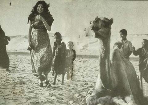
I’ve always been very much moved and inspired by the stories of her life journey, as her writings didn’t only describe the wonderful experiences of her trips but also illustrated the difficult realities she had to deal with. (Here is one of her stories – “The Mute Slave” collected in the book “The Stories of Sahara”.)  Because of her kindness and courage, she was able to prepare herself to face all the challenges and risks of her adventure. To me Sanmao’s writings mean much more than a travelogue, significantly they stand for her values of life. Therefore, I decided to take Sanmao as the person/source of my inspiration for this “Identity” design project.

As I was quite familiar with her books, in her writings what interested me the most was her fascination with her previous incarnation. In the book “Wan Shui Qian Shan Zou Bian”, she wrote that she had always believed she was an Ecuadorian Indian girl in her last life. When she traveled to one remote village hidden in the Andes, she felt immensely connected to the highland, as if she had come back to the homeland of her previous life.  As she wrote, in her last life she was a Cañari (“an indigenous ethnic group traditionally inhabiting the territory of the modern provinces of Azuay and Cañar in Ecuador”) girl named Hawa. The name Hawa in their language means heart. She was a pharmacist’s granddaughter who lived her entire life happily and peacefully in the village of the silver lake (also known as the lake of heart) till her death.


 wan shui qian shan zou bian

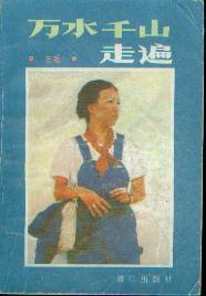
“Wan Shui Qian Shan Zou Bian” in Chinese


As her imaginary previous life fascinated me so much, I decided to design the headpiece based on her last life story and research on the indigenous inhabitants of Ecuador as a starting point. It was at first difficult to figure out the ethnicity of Hawa in English and there was no Chinese information regarding the ethnic group she belonged to. However, after several rounds of research on the history of the indigenous people of Ecuador, I was able to confirm that Hawa’s ethnicity was Cañari. Research on history, culture  and custom of the Cañari was then further conducted.
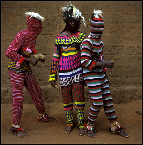
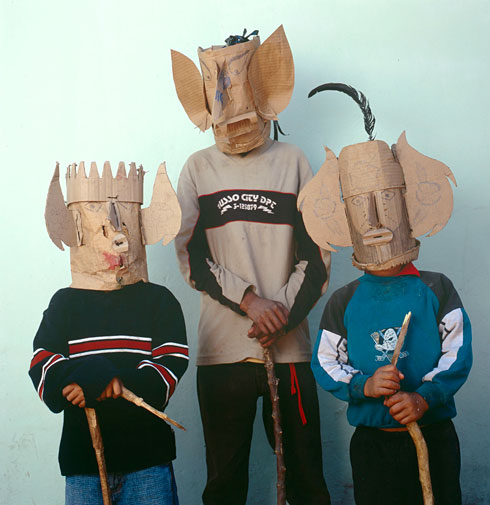
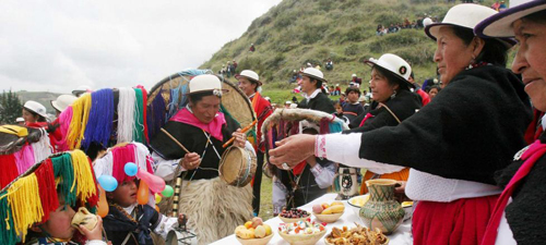
Interestingly, I found the Cañari indians loved wearing hats. “Those of you who have been following our South American journey know how important, and ubiquitous, hats are to the people of the Andes. Fedoras are to be found everywhere, stovepipes are not uncommon, and the Cholas of Bolivia have turned blower hats into a jaunty fashion statement of national pride. Many wear straw hats, and in Ecuador at least, have them refurbished by painting them to make them last longer. I must also mention Panama hats, which are not from Panama at all, but are exclusively an Ecuadorian creation”, Alison and Don wrote in their post The Cañari of Ecuador, a ‘palace’ and a pig”. 


p1450898 copy 500 canaris loving wearing hats2

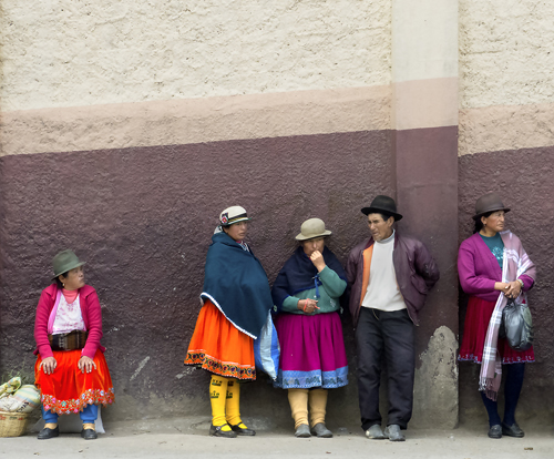
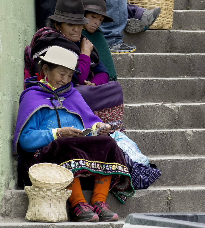
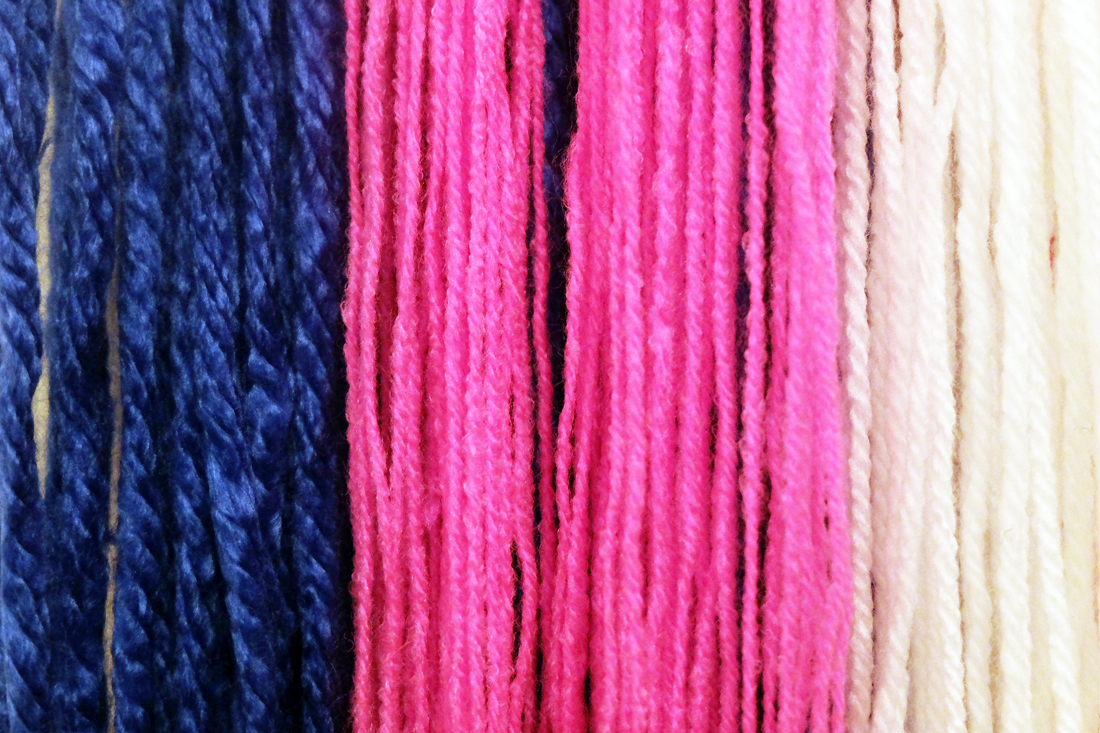
Nevertheless, among the different types of hats they wear, I found one kind that was particularly special. The hat is made with a wide brim and many strands of colourful yarns falling from the edge. The Cañaris usually wear it for festivals and celebrations.


canaris celebration

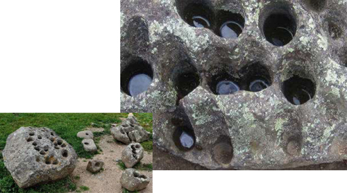
On the other side of my research, I discovered the Cañaris created a very unique moon worshipping system using large rocks. “The Incas worshipped the sun, but the Cañaris worshipped the moon. There are 28 holes on the larger rock, one for each day in a lunar month.  Each hole is drilled at a different angle and when water is added, the Cañaris would look at the reflection of the moon in the small pools. This was their way of receiving messages from their god.  The other “holey rocks” were most likely used to hold paint (for painting faces, textiles, etc), “ Mellisajane14 wrote in her blog “Ingaprica: Incas in Ecuador”.


ingapirca_calender_rock_small.1 copy


After a few rounds of research, I began to develop ideas for the design of the headpiece for Hawa. In the end I decided to make masks for her to wear, as I believed Hawa – the preexistence of San Mao should be a vague figure without revealing a clear face.


DSCF5521 small 515w

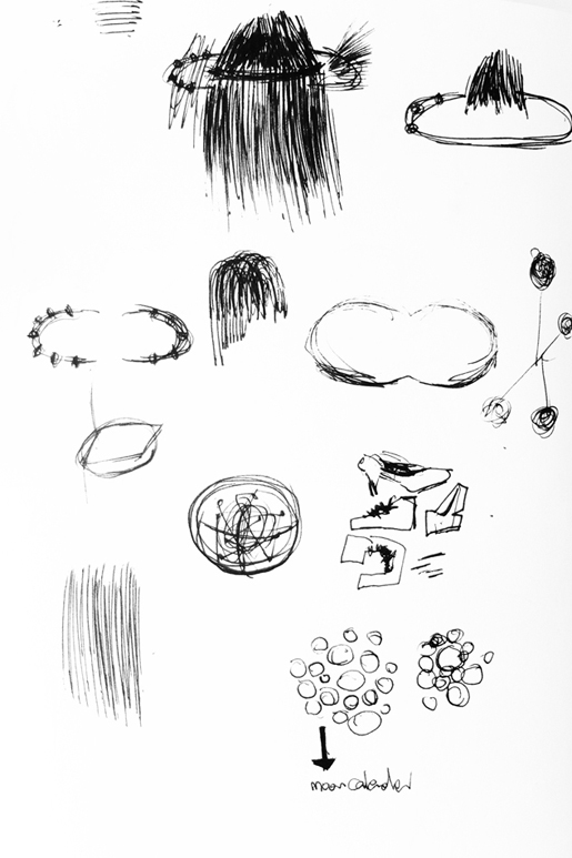
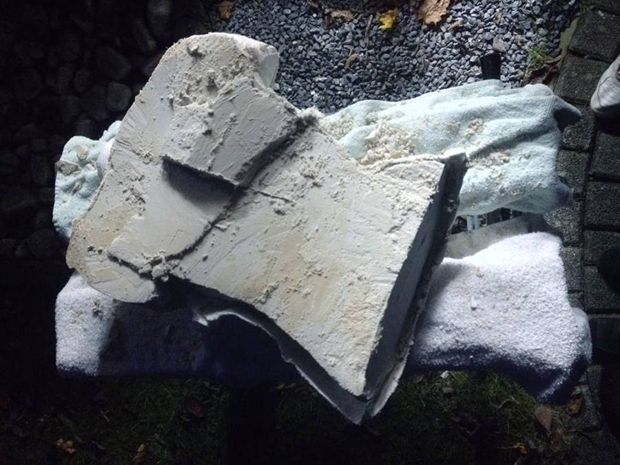
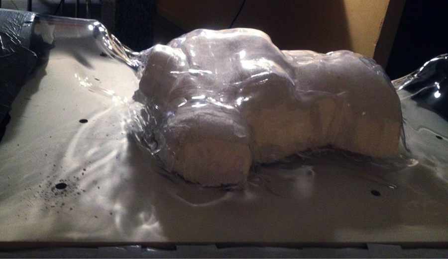
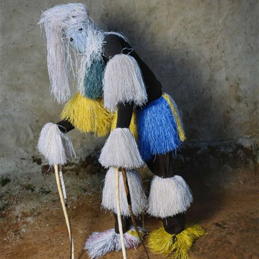
Meanwhile, inspired by those bright, colourful yarns and holy rocks, I planned to seek and experiment with similar and relevant materials so as to resemble the Cañari elements. Wood and bamboo were selected due to their primitiveness associated with the Cañari indians. Clay and small rocks were also applied, echoing those incredible rocks.


DSCF5505 small 950h DSCF5508 small 950h DSCF5539 small 950h


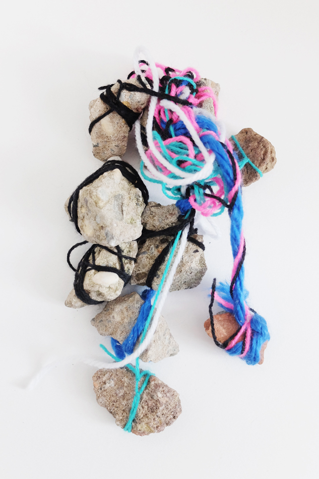
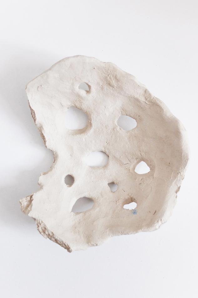
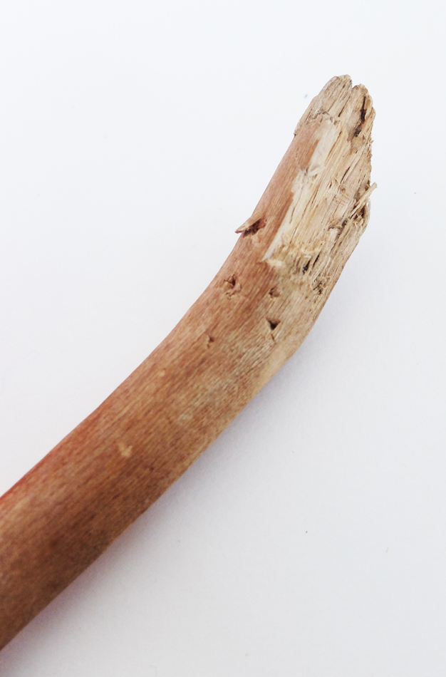
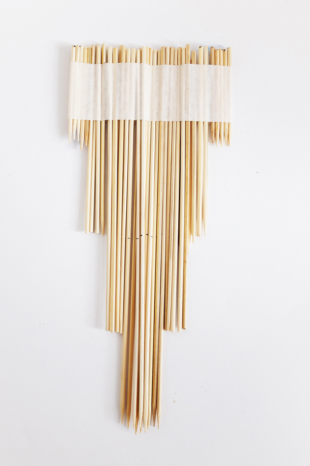
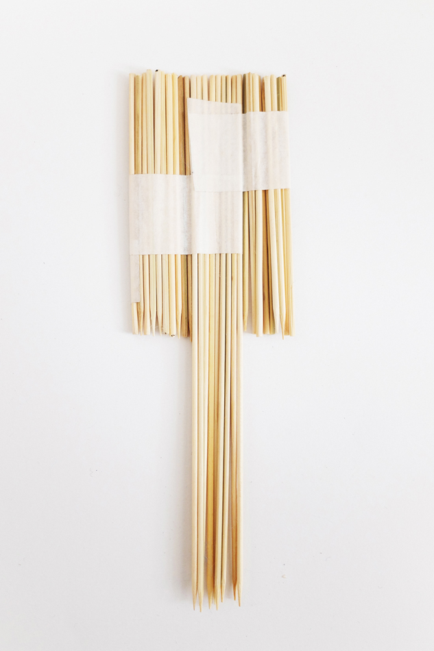
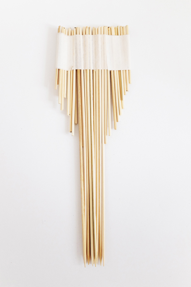
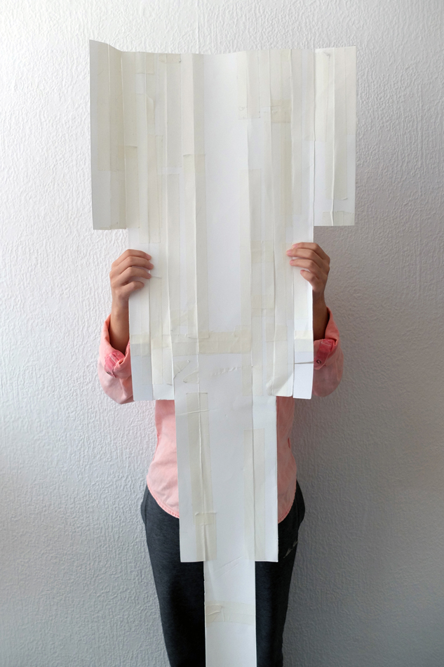
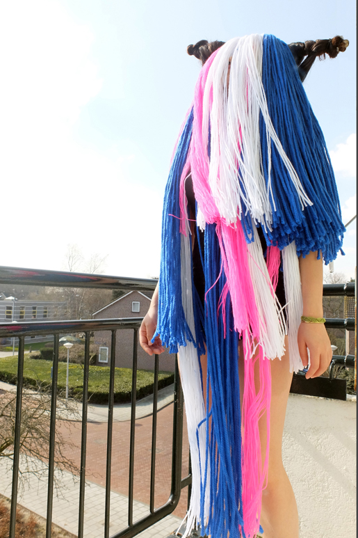
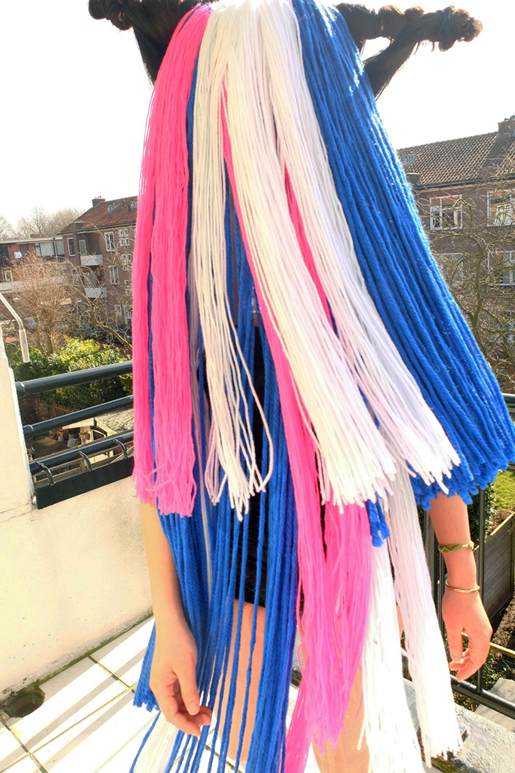
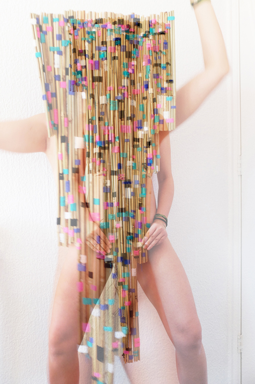
After the experimental trials with materials, a clearer image of the mask that I wanted to make gradually emerged. The try-outs with the clay mask as well as the small rocks didn’t turn out strong enough to mirror the Cañari moon worshipping system. However, the results of colourful yarns in combination with wood and bamboo were quite intriguing. Hence, I decided to further continue the mask concept mainly using yarn, bamboo and wood. As the techniques of applying yarns I developed during the experiments were different, I was suggested to make two masks using both techniques (yarn with wood and yarn with bamboo). In the first technique, long strands of yarn in selected colours were made and locked to an organic-shaped wooden stick that was found in the street, creating the idea of a mask that could cover most of the body. While in the other one, yarns were applied as components to bind the bamboo sticks.


small DSCF5163 small  

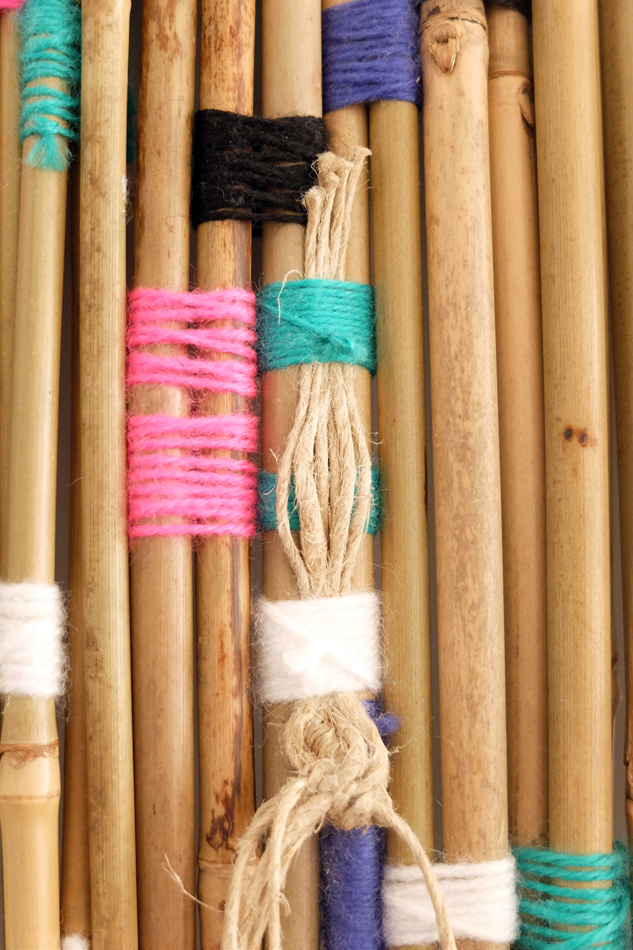
As I discovered that yarn strands in volume and layers would turn out more visually powerful in the form of masks, and bamboo sticks bound with brightly coloured yarns placing vertically would create a refreshing effect. Therefore, I decided to continue working on the mask of yarn strands by creating more volume in layers. On the other hand, I tried to come up with a few scale models to explore the overall shape of the bamboo mask. I found that a mask of bamboo sticks in different lengths and a more or less geometric shape could be primitive and fit well in the Cañari vibe. I eventually chose one shape that I thought would connect to the story the best and made a paper mock-up of it.


DSCF5511 small 950h DSCF5513 small 950h DSCF5514 small 950h

DSCF5532 small 950h

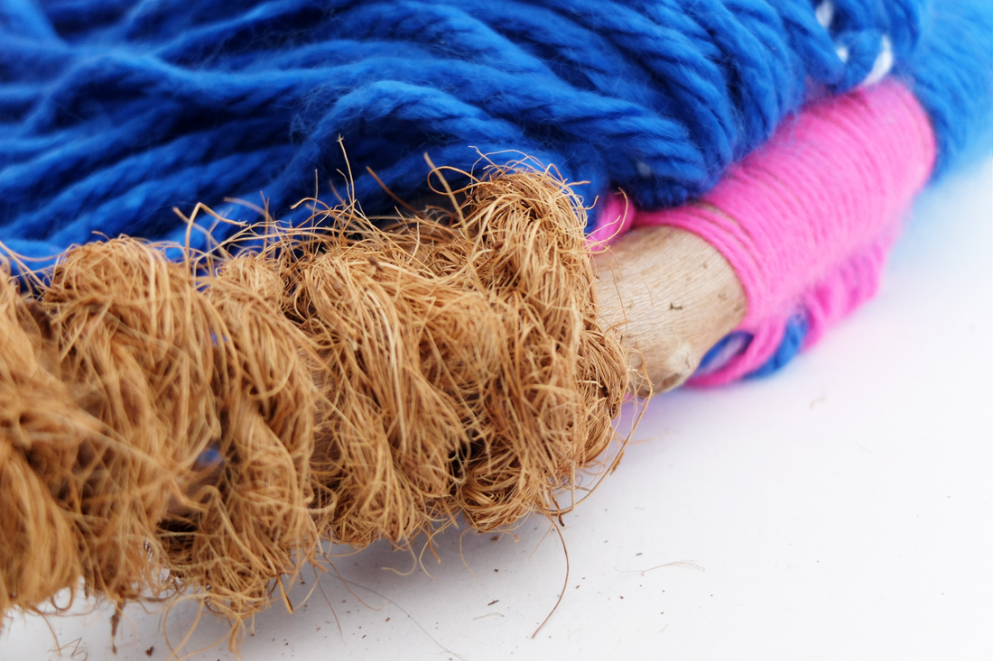
Simultaneously, I kept working on the mask with layers of the yarn strands. In the initial plan, hemp rope was used to coin around both the ends of the wooden stick, building a vast contrast between the fineness of the yarn and roughness of the rope, while small gaps were left between the yarn and the rope for hair fixation, creating a way for Sanmao/Hawa to put the mask on. However, I discovered it would be even stronger to leave out the hemp rope and cover the rest of the wooden stick using only hair.


DSCF5217 small 950h hemp rope ard the stick


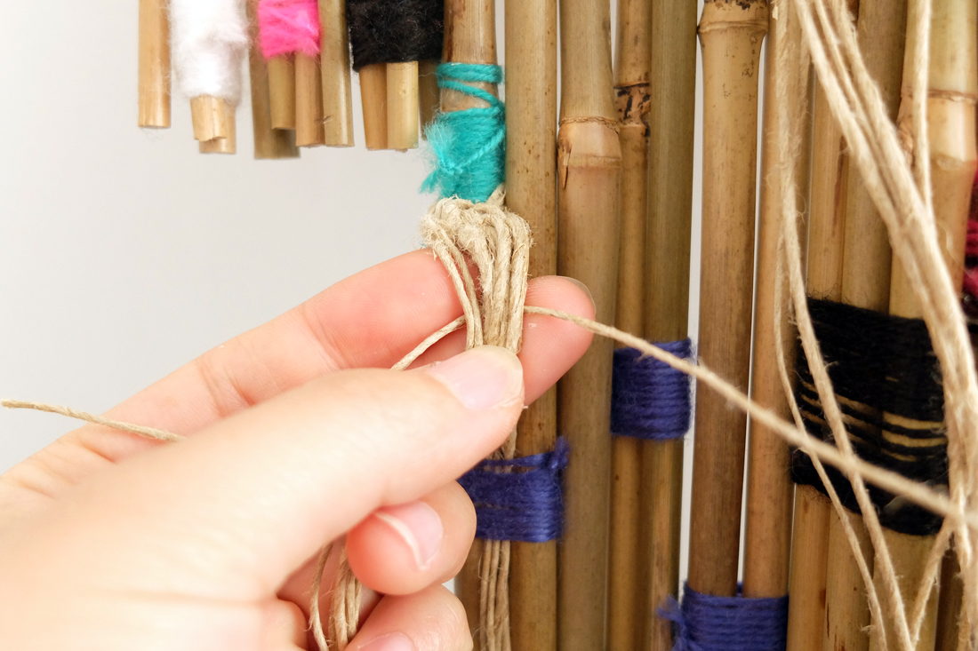
As for the bamboo mask, I continued building and finishing it according to the mock-up and came up with another means of fixation by attaching a few strands of straw rope to tie around Sanmao/Hawa’s body. The process of building was a bit struggling due to the difficulty of binding the slightly bended bamboo sticks.


DSCF5178 small 950h DSCF5189 small

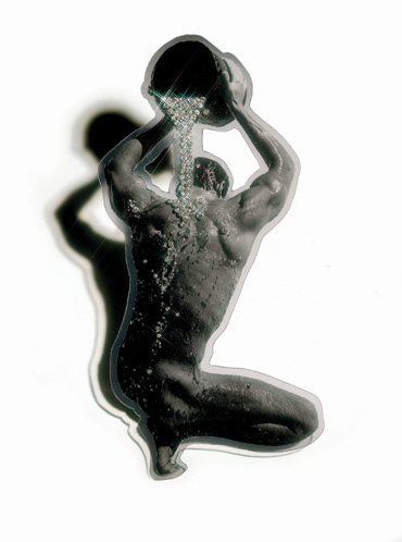
Nevertheless, after two months of efforts, the masks were eventually finished. Although there were struggles and doubts, I was quite happy with the process as well as the results. After finishing the works, I decided to try them on for photo documentation. As you can see, the photos were taken in different settings. Wearing the colourful headpiece with the long yarn strands, I thought that it was necessary to feel the wind and frame the yarn flying moment at my balcony. I felt spiritual and  being transformed into a shaman from an Andes tribe. It was incredible. When I firstly put on the bamboo mask, I felt the urge of being completely natural. I wore the bamboo mask naked and did some tribal dancing and humming in my room. I felt happy and free then. In the end, I decided to keep the pictures taken at the balcony original and fresh, while adding some effects to the photos of the bamboo mask, making it a bit strange and whimsical.


1 small w515 for design blog

3 small w515 for design blog 14 small w515 for design blog 11 small w515 for design blog


I’m certainly glad that my father introduced Sanmao’s books to me at my younger age, when talking about the relations between writing and experiences of life. Without her journeys, I believe that she couldn’t have told so many wonderful stories. And it definitely helped me to rediscover myself and to a certain extend shaped my view/values of life. To me life is a long journey after all. I  made these two masks for her/ her previous incarnation in remembrance of her free spirit. These two masks carry special meanings to me, as they were made for Sanmao – an incurable romantic, a lonely dreamer and a gifted drifter who I feel deeply in common with. 


Goodbye Sanmao.


 sanmao's photo with a white boarde w515


Physical letters


Monday, February 22, 2016


A


large_Curtain_2


This image is from a project of an hanging typeface that René Knip developed with Janno Hahn for the art academy in Istanbul, Turkey. I thought it was quite a beautiful image regarding typefaces and it got me curious with this idea of building curtains through the act of connecting letters.

In the first place I think it is interesting that we are speaking of objects now. Even though this typeface can and does work in an independent way when printed on a flat surface or on a digital platform, its design was developed based on the fact that it needed to work as a physical thing. The letters needed to be able to be hung and to connect between themselves.


BLOG1

A drawing is a different mechanism and makes use of a wider freedom while when you need to construct or build something it is dependent on a big set of criteria. Not everything is possible and it is ok. 🙂 The material, the craft and the limitations of earthly conditions give some direction on the process of making the design. Possibly they add a new layer or content and richness.


There are two artists about whom I can speak shortly in this sense.


BLOG6 BLOG2


Karl Nawrot (x) is a french graphic designer based in Lyon, France. We can say he has a very hands-on approach on the process of developing his designs. The  b&w image above shows two fases of the research for the typeface Lÿno that he designed in coöperation with Radim Pesko: first a sketch of cutout shapes made out of Albert Heijn packaging boxes that were later translated in a flat design. It is indeed a very experimental way of dealing with drawing, to try to find two-dimensional shapes through the making of three-dimensional sculptures.


Hiroaki Ohya is a Japanese fashion designer that has been working on the issue of clothing through a more artistic perspective. She transformed old t-shirts into letters (second picture above), keeping recognizable elements of the t-shirt, as neck and arm holes, and making letters that are readable.  They are intriguing pieces to look at, I feel, one doesn’t know if they are in fact still t-shirts or letters already.


~-~-~

B


96662_original


Going a bit further I wonder what does it mean for a letter to become an isolated object…?

Look at that little G lost on the sidewalk…

(Probably nothing very important but) I cannot help myself from feeling a certain fascination, seeing them out of their context and physically engaged in my world. One thing about symbols and language is how abstract and mysterious they seem to be when you don’t know how to read them. And when they are taken out of their function of communication they get some of these qualities back and open up a space for poetic understandings.

 
printing-press-letters


One of the first times it did happen was probably with the invention of movable types on the Gutenberg press. Even though as stamps they were not meant to be read themselves, letters started to take up space and had to be organized by shape and volume, not as a message.

Representative of the democratization of books, letters as objects are also very representative of the alphabetization. It only makes sense to shape so many things in the world as letters because so many know how to read. And actually primary schools are one of the places where you are going to see more letters-objects and to hear the actual speaking of the A, the B or the C as individual entities. This is done in certain schools for pedagogic reasons to get the students familiarized with the alphabet before starting to make words and sentences

A possible association of meaning that one can make of letters as things is with the playfulness of childhood and all the memories of the beginning of education for those who can read. There’s quite an abstract feeling in learning and schools if one thinks of it…


“Do you know what ‘A’ means, little Piglet? It means learning,
it means education, it means all the things that you and Pooh haven’t got”

Winnie The Pooh

I found this quote in the book  ‘One letter words, A dictionary’,  by Craig Conley, in which he tries to find the possible meanings that each letter can have when used by itself. It is quite interesting to find out a letter can be or mean so much. However I also like the possibility of a more poetic and abstract meaning.


~~


João Vieira (1934-2009) was a portuguese artist very much interested in the alphabet as a theme and on the idea of using letters as objects for their poetics possibilities. Like the situation of the second video above: “a runway of letters”. Which latent meanings are at stake? Or is it a formal exercise?


joao_vieira_uma_rosa
uma rosa é

Mainly known as a painter of letters,
he said in 2006 “I started to paint letters because I wanted to make poems with painting”.


Quite curious to see the way how this Portuguese artist dealt with the canvas since there is not so much tradition of painting in Portugal. There is a lot of literary tradition though. His first paintings were abstract and gestual and depicted simple shapes;  later he started to work also with quotations from famous writers and with the form of the alphabetical letter by themselves. His interest by letters grew into sculpture and into performances. In his first performance The spirit of the Letter (1970) he built several letters in wood that were later destroyed by himself and a group of kids. It was the next year he did the performance Expansions (first video above) where he made giant ones out of foam, plastic and leather and used them to interact and play with the public.


BLOG7_1100


~~

C


The Latin alphabet is based on sounds, the signs are phonographs, and I think it is where some of the interest of the topic lays. Each letter only refers to a sound that is a small fragment of a message. Without that it is a very vague and abstract form or thing and we are attributing to it the materialism of a physical thing. What does this object refers to anyway??

These letters are objects that can get old and used, they can be torn apart, they have a space in our bowls and stomachs. You can touch them, kiss them if you like, throw them in the thrash.

The same way that we animate objects in our imagination – as in filling them with life and identity – we do the same with this letters which is a kind of complex thing at this point. A mute symbol of a sound playing its life again.  Yes, complex situation but only an ordinary detail of daily life business.

..


 505944e557527f33c872008fa3254eca — 

BLOG4

zzZzee you aroud


Wednesday, June 3, 2015

SLOTHOUBER AND GRAATSMA

jan et willliam

Jan Slothouber is a Dutch architect and designer who often teamed up with his colleague William Graatsma who had the same background. We could also call them artists… Indeed, their status isn’t so clear. They both have been trained as architects working for the DSM (Dutch State Mines) in which they had the kind of privileged position to be very free in their buildings and creations. This way they could develop their interest : cubic constructions.
Considering the art movement of the time (i.e Cobra) as too elitist,they were much more interested to work with CUBE a simple, basic and humble shape, easy to reach for everybody. Also, working with such a basic and geometrical shape opens a lot of possibility and a much bigger diversity of work than an already complicated shape, usable only in a certain context.

According to this view on the Art Scene, they liked also to qualify themselves as « anonymous » and to work around social issues. But, they became famous when the Stedelijk Museum asked them to do an exhibition called Four Sides: Size, Shape, Colour, Letter (Vier Kanten: maat, vorm, kleur, letter). From this exhibition started a big enthusiasm around them, including lots of exhibitions and presentations, such as the Venice Biennial from 1970. [x]

Slothouber-Graatsma_vierkantenSlothouber-Graatsma_vierkanten2

Starting this period they built the Centre for Cubic Constructions (CCC) for which they are very famous. But a few years later, when they’ve been asked to design stamps in favor of children charity, and they used their now famous style to give those stamps value, a lot of people were very skeptic regarding this choice : Slothouber and Graatsma were indeed judged too « avant grade » not accessible enough for the average people. Which is exactly for what they were fighting against.


RICHARD ARTSCHWAGER

artschwager

Richard Artschwager is an American sculptor and painter. He Studied Science and Mathematics. After studying he worked as a cabinet-maker. He got to be pretty successful with his furniture untill his studio and all his contents was destroyed by a fire in 1958. After this he started to work more as an artist, this was in the time that abstract expressionism influenced the arts.[x]

After the 60’s his work is mostly pop- minimal- and conceptual art.
His work had a dichotomy between painting and sculpture, abstraction and representation, industrial manufacture and hand craftsmanship. The works are on one side sculptures and on the other hand pictures of objects. His craftsmanship for making furniture enabled him to make artworks with an identity and function that brings subject materiality, form and space into a balanced combination. Artschwager experimented with basic forms and materials, for example in his work Handle (1962), a handrail shaped in to a frame. The work is simultaneously pictorial and sculptural. Via an utilitarian and aesthetic approach he creates works that emphasize space.

In 1963 Artschwager starts to work with Formica, a new material, synthetic laminate, which was used a lot in furniture making because it was cheap and resilience. Artschwager: “It was Formica which touched it off. Formica, the great ugly material. the horror of the age, which i came to like suddenly because i was sick of looking at all this beautiful wood.” For Artschwager the Formica is a picture of a piece of wood. If you take that and make something out of it, than you have an object. But its a picture of something at the same time, its an object. By covering box-shaped plates with Formica in different colours and textures he creates a composition of domestic objects. In this way he pushes a painting in to three dimensions. mirror/mirror – table/table (1964) and later on triptych II (1967)

table 1964

mirror-mirror-table-table-1964_800 Table and Chair 1963-4 by Richard Artschwager 1923 - 2013


SCALE

This research is about the differences between art and design, we compare an artist and a design couple that both had their artworks in the exhibition ‘Setting the Scene’ at the Boijmans van Beuningen Museum. Both of our artists/designers shared the room themed by scale. To which extent is this the right theme to connect them to?

Scaling down is used in architecture to present large designs for building projects in a manageable format, as a floor plan or a scale model. Design and art also use scale models as way of crystallizing and communicating ideas and research. They can be used to experiment freely with form, scale, material, and details – after all a model does not always have to have a ratio of one to one in the real world.

Scaling up or down need not always be a practical solution; it may be and end in itself. A functional object can be made dysfunctional by enlarging it, reducing it or making it from unconventional material. Deviating from the human scale changes an object’s relationship with the human body. And if you enlarge a recognizable pattern far enough it transforms into an abstract structure of its own accord. The surrounding space is also a factor: you see things fundamentally differently when you see them from a distance or stand very close to the object. Scale changes one’s view of things.


CONNECTION WITH SCALE

We think that in Artschwagers work scale isn’t a central point. The alienating effect of modifying scale, is something that Arschwager achieves via material and playing with assumptions. The way he works is different but the result has similar aspects. The work in the exhibition, Counter III, is probably the only work that has a different proportion, but we think his works more relate to form and space. A form that is recognizable for his works is the cube, which is a central shape as well in the works of Slothouwer en Graatsma, our artists relate more in form than in scale. Indeed they’re using the cube for its simplicity and thus the diversity of composition it offers. Slothouber and Graatsma are then able to play endlessly with scale. The cube can be the piece in itself, as well as an essential element (like an atom) to build a bigger form not necessarily with a cube shape. The cube can be the final object or the substance of the object.
genicapart-inspirations-07

grid

SlothouberGraatsma

There is a clear difference shown between art and design that also matches the common view on this distinction, the works of the artist are not for use even though they look like in first sight, the works of the designer are based on shapes that are not immidiatly recognisble as domestic objects.


BREAD


Wednesday, May 13, 2015

I spent approximately 3 months doing intermittent research and experiments related to bread making. I looked a lot at the process of making bread, the associations and relationship that we have with bread and tried to think about bread making in a different way from what has become such a stable and set way of working with and interpreting bread. This all sounds a bit silly, and in a lot of ways it was – one of the conclusions I came to was that because bread has been such a common practice for such a long time that the way that it is done has been refined so much that it does not need a design student to come along and ‘re-invent’ it. When I came to this realization in many ways it opened me up to experiment more and in different ways without worrying about the experiments having any particular meaning or significance.

Punch

I started my project by getting up at 4 in the morning and spending a few hours watching a professional baker work and talking with him about bread and baking. I was amazed at how he seemed to always know exactly what needed doing next, he almost never paused to think about what the next thing to do was. A good moment was when I had just arrived, he was pouring out some walnuts from a large bag into a bowl and one dropped on the floor; thinking to be helpful I picked it up and after a pause of not knowing where to put it I set it down on the corner of the metal work surface. Issa instantly picked it up and put it in a small bowl lower down and gave me a bit of a smiley but ‘what an idiot’ look which was fair, I hadn’t considered the hygiene level in a professional food environment!

P1110728

One thing that I particularly liked about watching the baker work was the scoring of the bread before it goes into the oven. I originally thought it was just an aesthetic thing but it is an important element as it allows the bread to rise properly and cook more evenly, by scoring in a controlled way it also means the bread does not just split in random places. As a result of these thoughts I decided to do a small workshop with 4 of my class mates where I provided them with a piece of dough each and a razor blade and encouraged them to form their dough in whatever way they wanted and to try avoid the conventional way that bread looks. It was a fun experiment and brought a diverse range of results which I think pose an interesting question to how we all have a very set way of what we expect bread to look like and how it can be altered.

P1110754 P1110761 P1110784

As a continuation from that workshop I thought again about the lack of experience and in particular tactile experience that we have with bread even though most of us are so familiar with it as the finished product. For my next experiment I decided to teach a friend of mine who has very little interest in cooking/baking and virtually no experience in bread making but eats bread almost every day how to make bread.

Having watched a professional at work and been inspired to go and experiment with baking myself I wanted to pass on the experience that I had had onto someone who was unlikely to have experienced it before. I guided my friend through the simplest bread making and talked to him about his connection, or lack of it, with bread. As I am just learning myself it was enjoyable to guide him though it in an amateur way and work certain things out together at points and the discussion was entertaining. I was not looking to inspire him to become a regular baker but just to share the experience of making bread and hope that it would change his relationship with the thing he eats so often.

I also enjoyed the extreme amateur situation that we were doing it in, we did it in my tiny student accommodation kitchen and improvised a lot of parts where we didn’t have the space/equipment that a professional would use. This extension of the amateur level that we were baking at was something I enjoyed particularly because it shows just how simple bread making can be.

These are just a few examples of experiments that i tried out during my process, the project is ongoing and now I bake my own sourdough bread once a week and continue to experiment with the shape and ways that we look at and use bread.

Scan 23-cropNeckSandwich

Scan 25

Personal Mass


Tuesday, May 12, 2015

I decided to visit a glass factory, I met Just who controls the machines that generates 200.000 beer bottles per 8 hours. I wanted to see the mass production of daily glass objects, wine glass, beer bottles etc. The contrast between the two images that glass has: The cheap, functional mass product and the crafted, expensive, complicated, cultural acknowledged glass, was clearly visible in the factory visiting the production part and the craftsman department. Both in the same factory, two completely different stories.
I decided to learn to make my own hand crafted beer bottle to combine the cheap image of a beer bottle with the expensive one of crafted glass. This process was longer, intenser, more impossible and way more difficult then I ever thought. In the end this process, of searching for  methods getting to know the material (a little bit) and working together with all the elements that need to be just right in order for the glass to do what you want it to do, took over the functionality of the bottle.
You work in service of the glass, if not it will master you. I had to adept towards what the glass needed, the time, the pressure, temperature. I could wish for all that I wanted but there was only one way to go. The focused and calm research of the glass. It feels silly or a bit like a cliche, but the glass forced me to work in a way which I often try but where I also often fail, it made me really be in the process.


Measuring the bottle  Blow a bubble Take glass two times

Blow

Shape it Glass to thin at the bottom Broke when putting in cool down oven Blow a bubble

                                     Take glass two times

Blow

Bubble a bit small

IMG_1144

Shape it

When putting in the oven    Broke

Blow a bubble     Take glass two times   Really hot Blow   Bubble a bit small     Shape it     Put in oven  Heavy

Blow a bubble        Shape it         Really thin glass      Broke when putting in the oven


Get a piece of colored glass    Blow a bubble     Take glass two times


IMG_1149

Shape

                             Blow

                                                   Shape
Bottom to thin
Broke when putting in the oven

Get two pieces of colored glass  Mix them Blow a bubble   Take glass two times

Shape

Blow

Shape

IMG_1143

Open cold wind

Glass cools down

Falls off

Broke


Make shape in sand  Make sand wet Poor glass into shape  Sand to wet starts to boil  Making a glass volcano

IMG_1145

Making a mold from plaster  Get glass  Blow a bubble More glass                 Blow  More glass  Blow  More glass

                                                                                                 Blow

Turn a lot

Shape a bit Wait for perfect temperature Open mold Let the mass sink perfect timing closing the mold

Press mold as tight as possible

IMG_1330

Blow

Blow

Blow

Blow

Blow

Press

Open mold Take out the glass

Cool a bit

Make a cutting line Glass to cool for cutting line Broke

Fall down Transfer to cool down oven asap

IMG_1337

Blow Turn a lot  Shape a bit Wait for perfect temperature

Open mold Let the mass sink Perfect timing closing the mold

Press mold as tight as possible

Blow

Blow

Blow

Blow

Blow

PPPPPPPFFFFFFFFF

Press Open mold                 To little glass and to cool                     Take out the glass

Cool a bit and Transfer to cool down oven asap

Get colored glass Making a mold form plaster Blow a bubble

Get more glass Blow   More glass Blow   More glass  Blow    More glass

                                                                  Wait

IMG_0024

turn a lot Shape a bit Wait for perfect temperature Open mold Guide mass of glass bubble into mold Let the mass sink Way to hot and to much glass Drops quickly to the bottom Try to safe glass by pulling the pipe all the up                Pressing the mold

Blowing

Pressing

Blowing

pressing

Glass goes trough the sides of the mold Open mold Glass still soft

11231705_10152962643988931_110610957932174378_n

Rest glass on floor get gloves Pick up glass  Bring to cool oven


My associations with the Bird chair


Saturday, March 28, 2015


So many times I have seen chairs with an adjustable back; but I have never had any ideas where this design came from. To be honest, I was not so much interested in it, because I never liked it. However, when a previous tenant of my flat left a nice rush chair, which looks like a chair from the Van Gogh painting, I suddenly became more interested in it. I was wondering if I had this almost original Van Gogh chair, a chair of one of my favorite artists, or at least a copy of it.

a van gogh`s chair

Than I saw this rush chair at an chair exhibition and I was wondering again. I tried to get more information in the books and found out that this style was brought into fashion again by William Morris. I have never heard of his name before and became interested. I found amazing the way he looked at the world, how what he was making is directly connected to his perception of life.

Being under the strong influence of medievalism while studying Classics at Oxford University, William Morris became significant figure of revival of traditional British methods of production of the textile. He was also designing wallpaper, fabrics, the stained glass windows and so on. In 1861 William Morris and his friends from the the Pre-Raphalites have found  furnishings and decorative arts company Morris, Marshall, Faulkner & Co, which became later Morris & Co. Moreover, Morris was also known as a poet and novelist. In other words, he was a very versatile person and became a role model for me in some way.

Suddenly, reading some book about him, I found information that he was that person, who has created the first chair with an adjustable back, exactly such type of chairs which I did not like. I also found a picture of this chair ,which is called Bird, and was so amazed by it. How it is different from all the similar latest chairs I have seen!

a chair with an adjustable back william morris`s chair `bird` with an adjustable back

What I liked a lot is that feeling of coziness which this chair gives me. Of course it is very old fashioned and maybe too fancy and frilly, but to me it seems so comfortable and inviting. Usually, I prefer the use of minimalistic shapes and simple colours in art and design. But in case with this chair I feel like if I would have such chair somewhere in my old fashioned library, where I would have the same amount of books as Rijksmuseum does, for example, and where I could feel the specific smell of the books or somewhere on the attic, I would sit on it reading, thinking or just enjoying my sitting. It is making a special atmosphere for me because of the warm colors and a middle age pattern with a lot of small details. All its birds, fruit, flowers create a new world, when you look at it for a while. It reminds me myself at the age of 5-6, watching the illustrations by Russian artist Ivan Bilibin.

an illustration by Bilibin

They were also quite simple, but because of ornaments it was kind of imaginary traveling to the fantasy world for me. This chair gives me the feeling of infinite calmness. I think that only peaceful and calm person could create it.

While reading about William Morris, I realized that most of the times when I like some artist`s works a lot, I try not to read about this person and don’t see the pictures of his face, because sometimes his biography or facial expression ruins all my perception of his art and then I do not like it anymore. However, it did not happen in the case of Willam Morris and I still do not know why.

I found his art so organic and so suitable to his life, thoughts, home and even his face. I could not imagine another person doing such art. I also found him similar with one of my favorite Russian artist and writer of 19th century Konstantin Korovin, who was a good friend of Feodor Chaliapin.

a painting by Korovin

He is the second person of whom I was so happy to read, and who also, in my opinion, did not have any dissonance between his art and his point of view, which was quite similar to William Morris his ideas. Korovin liked the nature and he also was trying to make everything around him beautiful, thinking that natural beauty has a huge influence on people, their lives and behavior.

william morris konstantin-korovin

But continuing about Morris, I found his patterns for wall paper and  the book designs so elegant. Once he said: ‘I began printing books with the hope of producing some which would have a definite claim to beauty, while at the same time they should be easy to read and should not dazzle the eye……I found I had to consider chiefly the following things: the paper, the form of the type, the relative spacing of the letters, the words, and the lines; and lastly the position of the printed matter on the page‘.

a book design by William Morris

His book designs are so fairy and detailed, although not readable at all, at least to me. But it inspired me a lot and also reminded some of the old engravings depicting plants and animals. I felt like trying to do something similar, something really small and precise and I drew a silly painting depicting a beetle with a boy`s face. Of course it was not a serious work, but still after seeing William Morris`s works I had a lot of thoughts and ideas in my head, which I wanted to immediately realize.

a beetle with a boy`s face

I found out later (which was quite to be expected) that I am not the only person who was inspired by his book designs. So many people were trying to continue work in this style later. For example, such as the US artists Elbert Hubbard or W. A. Dwiggins, however some of them had not the best reputation. For instance, a daughter of William Morris called May believed that Hubbard was an obnoxious imitator of my dear father.

elbert hubbard`s book

It can be true, but I see Hubbard’s books more readable, although less decorative and precise. Anyway, I think it is not that bad, when one artist creates something inspiring for other artists, who start using or copying this style in their works. It just shows again the ingenuity of the inventor. Especially, talking about William Morris, who has definitely done a lot for arts and crafts in so many fields.

In this research it was very interesting for me not only to get to know more about some subject that was my starting point, but also to see how this subject brings you to something completely different. As I wrote, even if you have no desire of getting more information about something particular, this something can bring you to completely different field which can do affect you. It gives you this possibility to see the same not interesting from the beginning thing, but from the different angle, and then you are more into it.

I still do not know anything about the rush chair, but just because I started searching for information about it, it brought me to William Morris and now I know a lot about him and also about the adjustable chair, which did not had my interest before, but now.Now I know it’s story, I like it as a design product.

Waterman


Tuesday, March 3, 2015

Waterman

Sportsfigures_240_WatermanBrooch

I have chosen the Waterman Brooch from the series, combining a postcard of a Bruce Weber image with the diamond ring of the commissioner. Bakker bought the image as a postcard from a secondhand store in New Orleans, then embellished it with white gold and diamonds that resemble water droplets flowing from the bucket down the model’s muscular back. The movement and elegance in the original image was heightened by the placement of the gemstones. Bakker eventually created two additional brooches using the same image; one is in the collection of the Stedelijk Museum ’s-Hertogenbosch, the other in a private collection.

Gijs Bakker (1942) is a Dutch jewerly and industrial-designer, educated at the Gerrit Rietveld Academie and the Konstfack Skolan in Stockholm. Over the years, he has taught at various European art academies and worked on numerous commercial collaborations, creating everything from furniture through jewelry to public spaces. In 1985, Bakker began to use easily available and recognizable images of popular figures for his Sports figure series.

Passing by these items in the museum has made me doubtful about if it’s serious or some sort of joke ending up in the kitschy result. I’ve found this contradictional impression interesting enough to deal with it a bit further.

But what is jewellery’s role in our modern and future lives?

In the late 1960s, Gijs Bakker and Emmy Van Leersum, created a furor with their avant-garde jewelry and clothing that fused fashion, design, and art. They were the first to make minimal jewelry out of unorthodox materials, such as aluminum and plexiglas. The pair set of a real revolution in jewelry design. Bakker and Van Leersum’s breakthrough came in 1967 when they presented their vision of a total concept of fashion and jewelry with a spectacular show at the Stedelijk Museum Amsterdam. It was a provocation after which jewelery totally changed,especially on the subject of the concept of beauty and functionality.


MS04foto_matthijs schrofer_lowres


The most famous item of jewelry featured in the show is undoubtedly Bakker’s Stovepipe Necklace (with matching bracelet), now an icon of Dutch design. Bakker was the first designer to create a piece of jewelry of such audacity and on such a scale. It was a provocation.


The-Gijs-and-Emmy-Spectacle-exhibition-at-the-Stedelijk-Museum_dezeen_3


3.1999-K80249(A-C)A


https://vimeo.com/89612291

Afterwards his role in dutch jewelry design became really important in Holland, it changed the view on jewelry.


In 1993 he founded Droog Design, a Dutch collective of designers, products and information, together with design critic and historian Renny Ramakers. Together with Ramakers, Bakker was the selector and art director of all products within Droog. Droog works with independent designers to design and realize products, projects, exhibitions and events. During the Milan Furniture Fair in 1993, the duo presented a selection of sober designs made of industrial materials and found objects. The presentation was titled ‘Droog Design’, because of the simplicity and dry humor of the objects. The Droog collection is curated by Renny Ramakers and consists of around 200 products by more than a hundred designers. New designs are often developed and presented in relation with exhibitions “Saved by Droog” is an element of Droog design that buys up stock and transforms it into something completely new with a distinct voice and purpose. It’s more than sustainable design; it’s a “reflection of the designer’s creativity.

image.php

droog design [x]

In current design projects Bakker investigates the relation between craft and design. Since 2009, he is exploring this theme in his role as creative director for HAN Gallery, formerly known as Yii in Taiwan.His new series ‘Go for Gold’ emphasizes the importance of gold in the competitive world of sports, business and politics. By laser-welding gold on titanium or by laser-cutting gold under titanium, the brooches literally go for gold.


 „I am watching football in the same way as I am watching ballet”


The Sport figures series used copies of images from various newspapers of athletes in track along with contrasting, valuable materials like gold for example – to emphasize and highlight a particular moment. The practice of this clash of substances ends up in a playful tension that comes from having precious gems combined with an everyday object, bringing focus (or questioning) the borderline between „cheap” and „expensive” materials.

Does the use of valuable material makes something a jewelry (as the commissioner ask for it) or does it become a design piece driven by the vision of the maker himself?

Since he was fluently shifting through content, character, and medium it makes it hard to categorize the Sports figure series. Visual references from sports, automotive, and history are imbued with a trademark postmodern stance: sarcastic, ironic, and unsubtly nonconforming.

All of the works demonstrate his unconventional relationship with his discipline, as Bakker once admitted, „I dislike jewelry. I dislike the behavior of jewelry buying ladies. I dislike ladies jewelry. jewelry shops depress me. if jewelry is only decorative, I lose interest. I like jewelry because it is absolutely superfluous. I like jewelry because it is never a prior functional. I like jewelry because like clothes, it is closest to our body and says something about the wearer. a painting is hung on the wall and can be ignored. a piece of jewelry is worn and creates an impression.”


timthumb.php


For the first look the Waterman seemed for me like objects what you find in shops selling useless stuff for tourist, ranging the weirdest combinations of taste and culture.  Yet Bakker’s main approach was driven by the concept over the final product. So instead of the craftmanship’s usual categories, he tried to focus on the driving thought behind the piece, which in this case was the clash of materials, a surprising marriage between the every dayness of the paper cut picture and the stones. For me, this piece is still about the beauty itself (like all jewellery), just inviting a rather unusual form of it, at least within this field. But picking athletes somehow still tells about the beauty, so this piece becomes a celebration of the natural born beauty, combined and emphasized by the diamonds, which becomes a secondary tool for this purpose rather then the main „attraction” or message of the work. Like if it would pass it’s shine to the photo itself.

Yet I think that next to all the importance of conceptual approach, the visual and applied design principle shouldn’t be left behind too much, especially in an originally and historically applied discipline like jewellery. I feel that it’s just not the right tool or way to mediate such a message. Let’s be honest, a jewel is made for wearing, but who would walk around in a piece like Waterman?


MODEL SCULPTURE & DRAGONS


Sunday, January 11, 2015

A model is initially an object whose purpose is either to represent the real world or to be translated into the real world, in short the model can be a copy of reality or reality a copy of the model. The main difference is in terms of scale. Usually the model is a miniature of reality. But what more can it be? When we look at a toy car and a car, what do we see? Is the toy car just a replica of the car in a tiny scale? It is hard to analyze such a thing but I think that there is a huge difference triggered by (but not exclusively) the change of scale. When the toy car is made, it has no longer the same purpose as the car does. A child playing with it might as well imagine it just as real as the car and drive it around with his fingers, or see it in a whole new world, making it fly away, fist-fight and dance Rock n’ Roll. The new scale for things sometimes creates a new meaning for them above representation, a new reality even if they are seemingly the same object in different sizes.

model

sketch model of van Gogh Museum, Amsterdam by Gerrit Rietveld [object: SM]

In 1963-1964, the furniture designer and architect Gerrit Rietveld (1888-1964) designs the Amsterdam Van Gogh Museum. In 1964 the architect dies before the project is finished. The building is completed by his partners  J. Van Dillen and J. Van Tricht, and the construction was concluded in 1973. The model exposed in the design collection of the Stedelijk was produced by Gerrit Rietveld in those first two years. It is a sketchy model made of wood, paper, cardboard and glass. The final building is close but does not respect this concept, with a unified color of brick and very little white (from front).
I present this piece for multiple reasons. First, because in my personal taste, I prefer this version from the finished one. Rich in contrast between black and white rectangles overlapping each other, the building has the balanced complexity of the Rietveld style although the shapes which compose it stay simple and limited (only colors: white, black and blue) which gives sobriety to the building. When we look at the final museum’s front view, the unity in brick color makes the building lose its striking composition at first sight, for the overlapping rectangles melt into each other. The second reason why I chose this model is because of the way it was made, without any connection to the building itself. I see in between the other models of the museum [x], well built, detailed and clean; something of a stain. On a dirty piece of wood on which we can see quick pencil sketches for the display, an irregular, clumsy, and worn little building is erected. The colors are simply indicated by a rapid and un-precise use of color pencils ( blue and black). The materials used are cheap, and if we try we might not even find one horizontal or vertical line. And yet it is beautiful, marrying complexity and simplicity in form and color, with a rich diversity of cheap materials. Its cheapness gives it a poetic and rough authentic aspect, we see that it was handmade.

collage-model


James Castle

This may remind us of James Castle’s sown cardboard sculptures, which are made of scrap which gives them strength, or Bill Traylor’s choice (and no choice) of using cheap surfaces like cardboard for his paintings.

Bill Traylor blue man with suitcase                                                               James Castle


The model is in addition to this, very close to the final version. That sketchy but precise model shows the talent of Gerrit Rietveld as an architect, like the lines of a great draftsman. Its clumsiness along with the use of paper, lightly put together and slight curved, gives a feeling of fragility and tenderness which contrasts with the strongly built shapes of Rietveld’s buildings or the roughness of the materials.
I love this model because –to me– it is not a model anymore but a sculpture that contrasts with what we usually see, giving a new idea of his work and of what a model can be, even though it was not intended to become a piece of art. A model can be seen in ways that exceed its limits as a technical object.

A perfect embodiment of this idea is seen in the Tim Burton film Beetlejuice. The movie takes place in a small town and specifically in a house on top of a hill overlooking the town. In the opening scene (link here and here for the end with spider) a fake areal shot of the town is taken on a model of the town one of the main characters has built. We are tricked into believing that we are flying over a forest to finally overlook the whole town, then fly over and across it all the way to the house on top of the hill. Although it is possible to see that the scene is really shot on a model, the illusion is strong, and we are astonished to see a real spider (this time) which seems to be the size of a hippo, climb over the roof and be picked up by a real (gigantic) hand. What this illusion does is it gives life to the model, it gives it a new reality, and this is proved later on in the movie when we discover that the model has an “inhabitant”. When the protagonists are changed to the scale of the model, (in this scene) they come to its graveyard to dig up the main antagonist, Beetlejuice. In this case, the change of scale from real world to model is more than representation, the real world and the model are entangled, mingled into each other, whilst the two are different, the real world and the new world of the model. The model can open a whole new world for our imagination to create, a transcendental realm full of fire, wonder, and dragons.

Form follows fact


Monday, December 1, 2014

Cow chair was made in 1997 as a graduation project by the dutch designer Niels van Eijk. It is made from a single untreated cowhide which is stretched while soaking wet around a pre-consisting chair. It is left on the chair for a week until it has dried into a solid form. The idea was born when the designer looked down at his shoes and noticed how perfectly they were shaped around his feet. If this was possible, cowhide must have the quality to take on other forms, he thought, such as the shape of a chair. Van Eijk claims he is not a man of many words, he focuses on material and methods, which is clear in the case of the Cow chair. Despite that I think this chair is filled with relevant messages and comments on how we make and consume the objects surrounding us. It redefines the conventional use of familiar materials, It has strong relation to the discussion of using local recourses and it puts our attitude towards using animal products in context.

cow_chair_newmain

cow chair by Niels van Eijk 

The Cow chair does not try to conceal the single material used in its making. It almost looks like a newly skinned hide, having been laid on a chair at the tannery, waiting for further processing. Even the name of it has a very direct purpose, you are supposed to know that this chair was made of cowhide.
Normally, leather products have undergone such an intense working process that they do not remind us of they’re origin as much as the Cow chair does. As people of modern society, specially in the western world, have managed to distance ourselves from the source of the products we use that when we are exposed to the real thing a feeling of surprise or even repulsion arises. Sitting in a Chesterfield eating a fillet somehow feels more comfortable to most people than snacking on pigs ears and feeling the familiar texture of a cow behind your back.
Since 1997 several designers have experimented with the use of untreated leather or familiar animal body parts and taken the familiarity of they’re origin even further than Van Eijk. The artist Nandipha Mntambo uses the same method of stretching leather to form hides around her body as sculpture material. By leaving the hides unshaven she achieves feminine, yet animal like objects. She wants to address the things we demand of the female body, and how we want to change it, shape it, shave it bare.

1-Mirror-image cut-final-websize1
mirror image by Nandipha Mntambo • precious skin by Viktoria Ledig

Viktoria Ledig, a Swedish designer, used the tail, head and ears among other parts of the cow that otherwise would have been thrown away to make a line of products called precious skin. She tanned the body parts with a method that kept all the characteristics of the skin, so the final products had obvious wrinkles and blemishes along with a pale yellowish colour not so different from a humans skin. When describing the reason behind the project she asserts the following:
Leather is dead animal skin. This is perhaps the raw reason behind the human fascination with it. It is beautiful, precious and grotesque at the same time. We sometimes forget that touching leather is to handle a former living being’s hide.

The project and other similar ones for example Rachel Freire´s nipple dresses have caused a strong negative reaction, a louder outrage than is heard every time a designer puts out a more conventional product made from animal products.
When Jan van Eijk later formed a studio with his wife and co-designer Van der Lubbe, they designed a product with a more deliberate intention of discussing use of animal products. They used mole rats that had been killed on golf courses in order to make the experience of golf playing more comfortable. The product was a pair of loafers made from the whole body of the rat, hair, tail, nose and feet still attached. I think this work is a great example of putting our claim on nature into context. Although the making of these loafers used material that otherwise would have gone to waste, wearing them is an uncanny reminder of the animals fate. In the same way removal of an unwelcome animal only for increasing human leisure seems unnecessary or even cruel but it can easily be hushed or forgotten.


mole-4

moleshoesloka

leather football shoes by Adias • mole shoes by Van Eijk and van der Lubbe

The method Van Eijk used to mould the leather is very inspiring. The finished object is not soft and smooth but hard solid enough to stand on its own as well as supporting  a human being. I think it invites us to discover endless ways of using hide to construct objects. It isn´t too different from the way many nations made their first books, or the way old drums and other instruments are constructed.

By stretching the hide with water there is no need to use toxic chemicals to preserve the material and prevent it from rotting. This is on the other hand unavoidable when tanning leather, even if it is done in the most eco-friendly way. So in fact using the hide as done with the Cow chair and the other things mentioned above makes far much more sense than using it to make soft articles such as shoes and clothing.


Screen Shot 2015-04-17 at 13.42.11

Screen Shot 2015-04-17 at 13.42.36

Making of prototype 1 by Garðar Eyjólfsson

Garðar Eyjólfsson uses a similar method of shaping leather while making lamps by pouring hot water over it. Instead of selling the lamp around the world he shares the way of shaping the lamp shade with a video. By using such a simple method and sharing it on the web he makes it possible for people everywhere to make use of it. He transports an idea, not a material, and therefor makes it possible to produce the lamp in different places with local materials. I see that same quality in the Cow chair as well.

In the times where our consumption of material is unsustainable and our sources do not renew themselves fast enough it becomes a part of the designers job to go out of his way to source new solutions. Contemporary experiments with bioplastics, biomimicry and new ways of recycling are a important part of this process. But I think it is equally important to reinvestigate our old materials, our old methods, just as Jan van Eijk did while designing the Cow chair. How can we use them or parts of them to create things in a better way than we are doing now?

Stedelijk Design Show 2015 /Relevant Highlights


Monday, December 1, 2014


16 Rietveld Basic Year students visited the Amsterdam Stedelijk Museum to examine the items in the permanent survey of the design collection.

Does the Stedelijk exhibit all these design items simply because they are in their depot.

Do the collection criteria still have any significance today.

Do these design items have any relevance for us, our life or work,now? Is it possible to make a clear statement about that.

If you click on the image a caption will appear –just as a in a real museum– presenting information and a personal reflection on why that item is considered relevant. You can review the whole exhibition in pop-up mode.


click on images to visit the exhibit

Gijs_Bakker_Waterman_2_Cropped

modelWieke_stool_SM

PatrickJouinWelcome-To-The-StoreBeowatch_SM2

tafel-stoelunfolded

DSC_0321 Schuitema_300

superstudio_gherpe_flippedVaclavCigler_headband

cow-chair_flipped Paulina_glass


minding material


Monday, December 1, 2014

The exhibition The Future of Fashion Is Now [museum Boymans van Beuningen until January 2015] showed us an inspiring assortment of progressive designers with their newest techniques.

One of the many designers who participated in this exhibition was Iris van Herpen, who graduated at the Hogeschool voor de Kunsten Artez in Arnhem, the Netherlands. During her study she did an internship at Alexander McQueen in London and Claudy Jongstra in Amsterdam. Later, she began designing shoes for United Nude. An intriguing aspect is that she sees herself as a combination of a fashion designer and designer.
Iris van Herpen describes her own work as fashion where norms have no value and are being discarded. For her, fashion is a combination of craftsmanship and innovative techniques. It’s those techniques that really fascinate me in her work. Personally, I got really intrigued by the unique combination of materials and the technique with magnets she used to create the metal dress with, in collaboration with Jolan Van der Wiel.
On the other hand, the idea of using unusual materials such as wood and synthetics for 3D printing and laser cutting which eventually can be transformed into –wearable or non wearable– fashion, was a true eye opener for me.


Inspired by this project, I have pictured my own body in a plastic vacuum. Since this wasn’t possible with the vacuum machine that is available in school because of its size, I did thorough research on the internet in order to be able to build my own vacuum machine with the help of my father. Firstly, I made a mold out of plaster so that I could ‘pull’ vacuum from a see-through body. The heat got spread by a heater. In this way, only a small surface could be heated and I had no control of how the pvc plate would react to this. The consequence was that the pvc was about to burst or left air bubbles behind.

vacuum_1_900 vacuum_2_900

10912953_10203785246617845_1268682439_n

In the beginning I was quite disappointed because it didn’t go the way I expected it to. On the other hand, these little imperfections in the body actually do give some added value to the work. Having control over  your material can be handy, but as soon as you lose this, interesting and unique things can happen. This reminded me of the magnets that have a will of their own in the project of Iris van Herpen en Jolan van der Wiel.


Her growing metal dress from immediately had an impact on me when I saw it from a small distance. The dress presented in the museum was one of her latest experiments. The 3D printed dress lay in a bath and grows with the help of fluoride liquid and magnets. To develop this dress she asked Jolan van der Wiel, a product designer, for help. Because of her urge to constantly apply new techniques, she frequently works together with other artists who specialize in the handling of these certain techniques. Jolan tries to forget the mundane things in his studio and to trust and make use of his imagination. Just like Iris van Herpen, he is fascinated by the working of different instruments that offer him a platform to his fantasy.

Iris van Herpen_ferroJurk Iris van herpen_FerroJurk 2

One of the instruments he uses are magnets. He creates a mixture of synthetic and metal that transforms by the help of magnets in order to create his own, unique chairs. The magnet grabbed Iris van Herpen’s attention, what resulted in a collaboration. Together, they developed a way to transform metal by using magnets so shoes and garments could be made from this. They used the same technique as Johan van der Wiel (graduated from Rietveld Academy’s

Designlab in 2011) did to design his chairs [x]. JvW_black-gravity-stool They made a basis mold, the form of the dress or shoe, and ornamented this with the synthetic magnet mixture. Subsequently, when the mold is solid, the magnets continue to do their job. They determine how the form eventually will look like. The attracted force designs the shape and after that the plastic hardens whereby the form stays permanent. In this way, thousands of divergent forms can originate and every product has a truly unique aspect.

magnetenjurk_950

They practiced this technique in real life situation in the Boijmans museum. Underneath the 3D printed dress, different magnets are hidden. Above the dress, the fluoride liquid drops down, falling on the dress. Through the magnets, the liquid sticks which makes the dress grow layer by layer. Therefore the name ‘growing dress’.

SONY DSC images-5

Furthermore, without the fluoride liquid, the dress is made out of synthetic that is 3D printed. This is a technique that we continually see coming back in her designs. A 3D printer is a device that creates arbitrary three-dimensional objects based on digital drawings. The material that is used builds up layer per layer, such as the Ferro fluid process. With this technique, Iris van Herpen is able to accomplish sculptures that are impossible to make by hand.


Next to the 3D printer she also makes use of a lasercut machine. This machine makes it possible to cut or engrave different patterns out of different materials. These patterns are being outlined on a computer program like Illustrator and Autocat. I recently used this technique as well. The only thing is that you need to have good knowledge of material. Is the material elastic, is it going to melt because of the heat?

iris-van-herpen-ice-dress-2

The laser cut literally cuts the pattern or the figures with a cropped laser. On the basis of the material you coordinate the data for the machine. How deep does the radius have to go? How fast? Is it supposed to go slower somewhere, for example in turns? I personally experienced this when doing material research for the making of my bodysuits. Some materials work a lot better than expected, others are being destroyed completely by the heat. Now I know that table foil is a perfect material to cut and ribbed cardboard is completely useless, while I expected the opposite.


bodysuits2_1100


Iris van Herpen and Rem D. Koolhaas, the face behind United Nude, both agree that the border between fashion and design is tremendously vague. Together, they try to make the impossible possible as not everything has to be easy. One of the first shoes they developed together is the ‘Iris van Herpen x United Nude 2.0’, a limited edition made out of patent leather. The big secret of the weirdly formed shoe is the balance between the heel that is curved to the front and the gravity. This shoe was a big challenge for the both of them, but also for the wearer. United Nude was founded with the idea of breaking the conventional rules of designing shoes. The rules don’t have to be broken, they just tried to simply ignore the rules. The higher the heel, the bigger the challenge.
Speaking of challenges, Iris doesn’t only pushes boundaries in the shoe world but also in the fashion world. Here, we also see that she applies techniques that are being used in the design world. She wants to experiment with material and shapes.
This is something I also try to do myself, processing unusual materials while keeping the pure visible. In photography, I try to apply as few Photoshop techniques as possible. In my opinion, Photoshop is only there to corrugate, like for example the contrast, a disrupting line or adapting a color. Thus, I made a triptych in which material is central. In front of the camera, someone held table foil, which actually did all the work for the photo. I could have Photoshopped a nice little effect, but for me it’s all about experimenting with different materials.

table-foil_1100

Iris van Herpen doesn’t like following the rules blindly and decently too, that’s why she doesn’t think wearability is important for fashion. Because of this reason, she is able to use materials like synthetic, metal and wood, that can be transformed and cut through the help of her favorite techniques, namely 3D printing and laser cutting.

/


Just like Iris, I like working with unusual materials, and that’s why her work has a definite impact on me. She inspired me to dare to use different materials and techniques and made me step out of my comfort zone. So the main difference between all the other shown designer pieces is that the Ferrofluiddress is not at all a static object but it is a growing piece of art. Iris isn’t only a traditional designer who only works in fashion, but an artist who converts her experimentation into wearable sculptures.


“I find beauty in the continual shaping of chaos, which clearly embodies the primordial power of nature’s performance”
–Iris van Herpen–


There is no future, we create the past.


Monday, December 1, 2014

3 During the visit at the Boijmans Van Beuningen’s, between all the dresses who can melt and the one who construct themselves there where an UFO. Three little canvas on the wall of a red room , hidden by a giant costume referencing to the solar system. These three pictures were the work of Phyllis Galembo, the sample of an all life research about the ritual costumes and masks in Africa and the African Diaspora. This work was specially interesting not by the subject or the strong visual effect who drop out of these images but because it’s presented in the exhibition -The future of fashion is now- How can we related the future of fashion and a research about traditional costumes in Africa, who exist from centuries? We can relate this question with the work of Pablo Picasso who has been influenced with the first exhibition of african’s sculptures and masks in France and revolution the art history, but now is it still accurate? What is interesting about these traditional costumes is that they construct a bridge through the past and the future, pieces of art who travel between the ages, but the future of our own civilization is to look back in the past of other’s one or to build our own, now.

1 2

4

Phyllis Galembo is an American artist, fine art photographer. Her work is now related from more than twenty-five years at the African masquerade and ritual clothing. her first travel to africa was in Nigeria in 1985 since she travel through the west and central africa and regularly to Haiti. She document with simple and sober portraits these ritual clothing/art pieces without adding any meanings, keeping them in there own environment. This is a really important part of her work because these costumes are already meaningful in a lot of different themes (religious ceremonies, secret society, rituals, spiritual meanings…) An other big part of her work is to create a relation with the members of the different tribes and then be able to be in contact with these sacred objects. Here we find another interesting relation with the exhibition at the Boijmans Van Beuningen’s. The relation between the creation of a new area for the fashion designer’s and the work of Phyllis, who don’t create a new idea of fashion but put in the podium an ancestral art. The attention of the spectator is fixed on the clothing on the pictures relate to the meaning of the exhibition and not the pictures themselves who are the work of the artist. The projector should’t be pointed on the creator of these art pieces, or is it the collaboration with the photographer who make them important for this theme -The future of fashion is now-

7

These pictures were presented in the section “The (re)definition of the human figure”. It was the topic who interested me the most in the exhibition and also the one that disappointed me the most. The theme is so large and for me unxploited at all. Only the work of Pyuupiru (Tokio) “Mercurius” and the “Akata Masquerade” from the american photographer was relevant, even if my only wants was to see in real the costumes on the pictures.
The african traditional masquerade costumes are for me a door for a mystical world and also a question about the definition of the human being. These costumes are more than a redefinition of the human figure but a way to escape totally this human aspect, physically and spiritually. And maybe lead us to this question, why i was interested by this part of the exhibition, What is it to be human, Just a concept, are we just animals or is it something spiritual that we should be aware of, or search for?

6 5

Textile writer Tania Candiani


Tuesday, November 25, 2014


TaniaCandiani1


Tania Candiani, Woman, Mexican, 1974, Textile, Language, Artist …


Tania Candiani was part of the exhibition“ The future of fashion is now”, in Rotterdam. In this show, designers and artists try to show some different and new ways to see to the fashion world.

Tania Candiani exposes a big roll of fabric joined with some clothes and dresses. The finality of this work is an installation with fabrics, thread, metal hooks, sound and video. This work was showed almost at the end of the exhibition, a space that, according to me, didn’t support it as much as it could have. Therefore, all my attention wasn’t driven towards the installation as a whole, but only on this big role of fabric.

The title “ La Constancia Dormida “, which stands for Constancia Asleep, makes me think of the collections of stories, including Constancia, y otras novelas para vírgenes (1989; Constancia and Other Stories for Virgins) by the Mexican novelist and short story writer Carlos Fuentes. The theme of these stories, which is about the people and culture from Mexico City, is maybe a influence in Tania’s work.

The role of fabric, that I mentioned before, was exposed on a table and stitched with text. The language used was Spanish and it was about thoughts, feelings and stories of one certain group of people or community, that were influenced by their economic, political and social environment. This context situates her work in the last of the four themes which divided the exhibition: “Fashion Activism: Community and Politics”.

Being influenced by the reaction of these people, she used them as her subject for her story-telling. The textile is then used as a narrative tool as she explains it in one of her statement: “ My research processes take as starting point language, text, the political implications of the domestic, of what is public and private, and of “the others.”

“Translate strategies amongst systems –linguistic, visual, phonic– and practices, generates equivalences and associations (…) textiles have been present in my work as tailoring, as a narrative resource and as labor, socially embedded with meaning. Tailoring as design is a contact point with architecture, where the space distribution of the plans as sewing patterns re-signifying the idea of inhabited space or the utopia of an space that could be inhabited“.

nightmares_option_1

Tania Candiani – Artslant

4354648_1_l

Tania Candiani – Lot 88

I chose Tania’s work because I really like the simple and minimalist way she approaches two big ideas, in one hand the fashion world and in the other one, a more conceptual idea about community in a political and economical environment. Also, the way she uses textile and combines it with text gives me a big and strong feeling of nostalgia. The way she characterizes the political and human energy really fascinates me and awoke my curiosity. This feeling of nostalgia that is present in her work, makes me land back directly to my home country. This nostalgia and spirit of story telling is something that characterizes the Portuguese personality and community, bringing me even more closer to her work.

By listening to the people in different environments, Tania tries to save the stories and the atmosphere into the fabric by sewing it, and giving it an individual perspective. Through this act of sewing, I see Tania’s work as a memorial where she keeps all the moments and happenings, as a saving for the future, which for me is a really beautiful act. The act of sewing, reminds me of a scar or a tattoo that Tania is stitching in the fabric. By expressing these left marks, it connects us to our individual or common marks, which originates from situations and memories that we experienced. These marks which makes us the person or the people that we became. So it’s like creating and materializing all the spirit, thoughts and feelings from a specific and certain place, time and community.


This way of making art reminds me also of some works, for example, Louise Bourgeois, Tracey Emin and in the traditional bordering from Portugal.

tumblr_nd2py1rbml1rotipro1_1280

Louise Bourgeois

tracy-emin-blanket1

 Tracey Emin

mh-e603-02g

By having this in mind, I realize that textile can be really strong, powerful and expressive as a subject or a material. It was interesting to see how her work can become, in a way fashion but still textile with a sculptural character. It questioned the fashion world and trying to find or to create this small limit between fashion and textile, becoming in the end something else. Different than the world of fashion that we know now, but still an expressive future form of fashion. This makes her piece relevant, for me, in taking part of this exhibition “ The future of fashion is now “.


constancia6


1-2-3-:^)


Saturday, April 5, 2014

ppp1


Jumping around through these images in Designblog,

back to essay this title ‘1-2-3 Jewel’ caught my eyes.

An essay about jewelry? Cool, lets check out.

Not only its pretty graphic design and pinky pinky makes you happy, the content is really good.

For me hand made jewelry is unique, you can feel so much more than mass manufactured accessories.

And it’s always a great gift option for special occasions.

It’s so nice to read about the graduates, after spending so much time in Rietveld and staying in the Jewelry department.

What is their understandings or maybe personal relationships and reflection on jewelry.

To see how they find their own way through different approaches, experiments and observations,

finally to see where they are standing now.


ppp2


Are you an artist or a craftsman?

Are you making wearable jewelry or object for contemplation?

Does it matter? Does it not matter?

Sometimes I pass their department several times a day when I have to go to workshops,

then I start to guess how many people are working there on their table now:

Glue, hammer, burn, bang bang.

Pretty in color and form. Another jewelry is born.


ffff


Similarity


Wednesday, April 2, 2014

When i first went trough the pile of Wendingen magazines something struck me when I saw the cover of the “techniek en kunst” edition. At that point i didn’t really know what it was about that edition, but when thinking more thoroughly about it I had the feeling that I had seen it before. Going through my archive of pictures I found a poster designed by Karl Gerstner that had a lot of similarities. It left me thinking how amazing it was that something that was designed an odd thirty years later had a lot of the same qualities. The cover of the Wendingen magazine was designed by Wim Gispen, one of my favorite Dutch industrial designers. Before this discovery I only knew Gispen for his famous chairs, lamps and interior architecture in general. Unaware of the fact that graphic design at that time was not really labeled a profession, designers also did graphic design on the side. Though you can see that the cover designed by Gispen is an early design and not really modern any more it still has some modern qualities.

TechniekKunstWendingen karl-gerstner2

The use of shapes, circles, overprints and probably a grid in my opinion is quite modern. I think it fits in the same style of work as the early Swiss style of graphic desgin. That is why it reminded me of the work of Karl Gerstner a Swiss graphic designer that was part of the Swiss style. A movement that I am a big fan of because of their simple use of shape and subliminal use of color. Because Gispen is more linked to “de Stijl” movement I would have never expected that he designed the cover for the Wendingen Magazine but overall I am quite happy that I picked this copy because of the insight it gave me in early graphic design and the progression it went through over the years.

Wendingen 9-2 1928 Rijksacademie Amsterdam

The ideas & steps behind making ‘Haphazard’.


Sunday, December 8, 2013

Analyze a book which is interesting because of its design.
So the book needs to be interesting, apart from the content. I discovered that it is almost impossible just to take a book because of adesign however interesting it may be. The content and design are often so closely connected to each other.

With this book it was different.

The first reason why I took it: the cover.

I had really no idea what the book was all about and I also didn't understand the title. No, I just took this book because of the cover. Between all these 'regular' books, there was this one book with a cover made of cardboard. Cardboard? That seems interesting to me.

René Put [x], the graphic designer of Haphazard, told me that you can not ignore the cover.

‘When you see a book, it starts with the cover.’

‘As a graphic designer, you have to deal with a lot of choices by designing a book. The content and form are in my opinion connected with each other. The content always plays a role. Which material is used by the artist? Which ideas the artist wants to tell with the book?’

cover Haphazard

The manner of binding confused me when I opened the book. The way it is bound, on the right side, gives you the idea that half of the book doesn't need to be seen. That it is a secret, hidden.

‘As a designer I’m always looking for inspiration. Once I had seen an Indian account book, this is a long flat book. The idea of having this pile of papers, folding it into a new object, fitted well with the work of Ellert. Ellert is always looking for the border between 2D and 3D objects.’

‘Someone in Den Haag bounded the book. He made four dummy’s for us. We were really content with the last one, the one as it is now.’

‘They call this a Japanese way of binding. But actually a Japanese binding is different because there are more whole in the cover. There are just two holes in this book cover. Afterwards the book is bound by hand in a system which keeps the pages all together.’

‘This is maybe a funny fact to know. The whole research for the book cover, took the most time but cost also the most money because bookbinding is a handicraft.’

binding Haphazard

I have the idea that there's a link between the paper which is chosen and the work of the artist. The artist, Ellert Haitjema, is working with natural materials and material he has found in the streets. This paper looks like recycled paper. Not glossy, it has a more natural look.

‘It’s always a search to find the right paper. Here we’ve chosen for uncoated paper. In this case it was necessary because not all the pictures were in a good quality. To compensate this problem, it’s always a good idea to use this paper because the effect of the bad quality is less. The pictures become also more an unity when they are from different sizes/qualities, all printed on the same soft paper.’

Haphardize_0034

‘This quality of this picture was not really well. That’s why I doubted to publish this one. In the end, we changed it a lot to get it how it is now. There were to many good arguments to place the photo.’


Isn't it a pity that some pictures on the middle of the page, are folded?

‘The pages are turned and that’s also why they get folded. In this example you can see why, on purpose, we’ve placed some photos in the middle of the page. By folding there will be another image then by seeing the photo on the whole page.’

Band 2 Haphazard band 1 Haphazard

‘The cover and the papers inside the book are folded. What we wanted to create when the book is lying on the table, is that the cardboard will end on the first page inside the book. By folding the book, the paper will move, by moving the paper you get a nice cutting edge.’

snede achterkant Haphazard

‘At the last moment I thought of adding something to the cutting edge, it needed to become an experience in itself for the book. We decided to add five colors of grey, so called PMS colors or Pantone colors. These five different colors are printed on the back of the papers inside the book. Now you can see a nice variation of colors in different grey tones which are an experience for the book in itself.’

grijs verloop achterkant Haphazard

‘This book needed to be an object in itself. Just as the objects which are shown within the book.’

‘The good thing about the picture on the back of the book cover is that it shows how the function of this book changed by using it to carry a plate of glass.’

‘The idea for a photo like this (on the back of the book) occurred while we were designing the book: the book needs to be shown as an object itself. This photo for the cover was a bright idea, thereby the whole book design was completed.’

achterkant Haphazard

What I wondered about, when I took this book out of all the other 'normal' books, was; how is someone making a book like this?

For instance, when you're a graphic designer, what kind of steps do you make during the process of designing such a special book. At first, I thought there was no direct link between the design and content of the book because from the design you couldn't get an idea of the content.

In the end, I know better. When you take a closer look, you see that there's a link, off course, but a subtile one. Graphic Designer René Put let me see what is all necessary by making a book. Which choices need to be taken and which ideas are behind all these steps.

‘In my opinion, you can always go back to the book when it is a good book.’


Rietveld library catalog no: hai 4

I get excited by old stuff.


Wednesday, May 29, 2013


an old and very shiny little bowl to drink from.

wear a simular creation on top of your head.

a cup with a lid.

another hair accessory from horn, gold and diamonds. fancy stuff. this is a ring. with something like a lock inside. if you do not read dutch you can only emagine what it is for. it looks mechanical. porcelain parrot. no purpose.

a glass model of a big and powerful canon!

for making coffee. made from silver and bone. this is a shiny container for sugar. these are for storing liquid.

i do not know what this is. but i know i like it. someone was ment to drink from this. h 38,0cm × b 61,0cm seal ring. nice. very very old.

this is a porcelain monkey holding a snuff box.

this is for serving gravy. lots of it. this is a cup for something. another knife for food. even older than the first.

this is a tiny eg that can open. and close. finger ring. from back when diamonds where a little rougher. this is a jar with dead stuff from the ocean.


Old things are exiting because they are old. These things where made because it was possible, with the aim of perfection. carefully created with perfect skill. looking at beautiful things makes me smile. In the old days, rich people acquired these artifacts, because they could. To show off, and to create a visible distance from the people who couldn’t afford the decadent lifestyle they represented. A similar trend is still present today.  Nowadays they buy overpriced modern design or old and rare stuff, but the concept is the same. Being able to surround my self with beautiful things, of which the design has no practical function, is a privilege, that I enjoy very much. Even if it is just for the time I am hanging out in a museum, or in  a fancy place of someone else. I am fascinated by old things because they are old and rare. They come from another world. One that I can never become a part of.


violin. most likely with a crappy sound. watch. this is a glass. it is nice.

this is jewelry. for wearing. it is also a whistle this is a wooden dog. for no purpose.

9 bottles for expensive liquid. in a box that fit!

pocket watch. a whole lot of detail on 5cm. a mug. this, i think, is for storing cutlery.

old and thin container for liquid. pretty cabinet. very locked. this is where to put the salt for the table. there are 2 of them. some one had 2 of these.

birds cage. for tiny bird.

old, heavy and shiny. for tea and coffee. this container is either for soup or potatoes. it is 1 piece of a very much bigger set.

really old guns in a box that fit! put hands in these. to show you dont need to use them.

a little, old, sculpture of a grotesque monster. no purpose. fancy snuff box. made of solid gold. very old and very expensive table. could possibly contain all my belongings. one in each drawer.

items from the collection of the Rijksmuseum Amsterdam


Log in
subscribe