Frank Lloyd Wright had his breakthrough as an architect in 1893 with the Winslow house, then he was only 26 years old. 65 years later in 1958 he saw his last project finished, the Pilgrim Congregational Church in California, then he was 91. Durning his long career he became one of the most important and influential architects of the 20th century, and is credited to be on of the founders of modernism. Wright supplied some of the essential bridges between the architectural culture of the nineteenth century and that of the twentieth. He also was one of the first architects to break with electicism founding a new style based on a spatial conception of interpreting planes and abstract masses. This is considered to have evolved into the international movement, particularly through Dutch developments.
"architecture" Category
Jan Duikers, a digital tour through memory lane.
Thursday, November 24, 2011
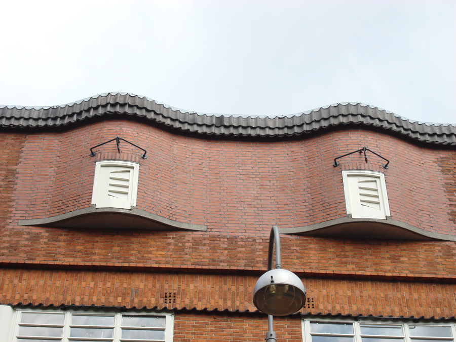
Some people may remember taking the fast turn around the corner into the Cliostraat for the very first time in their lives. I do. Others remember being safely tucked in a seat on dad’s bike, speeding through the grey streets of Amsterdam, early in the morning on a sunny day in September. Suddenly dad’s brakes and stops in front of a building quiet different from buildings you are used to know. The whole neighborhood seems like one grey mass of brick, but this building looks different. You get pulled of the bike, dad takes you by the hand and leads you through a gate onto a large playground. The glass building overlooking the square completely dominates the open space formed by the surrounding buildings, not by sheer size but by its open form, the glass used and the clean paintwork. Placed diagonally in the open space, it seems to form a glass palace, safely hidden by the housing blocks surrounding it, protecting, but also open and inviting.

eerste openluchtschool voor het gezonde kind
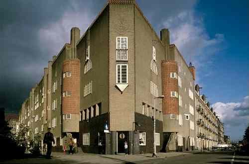
Sculpture in “The Amsterdam School”
Wednesday, November 23, 2011
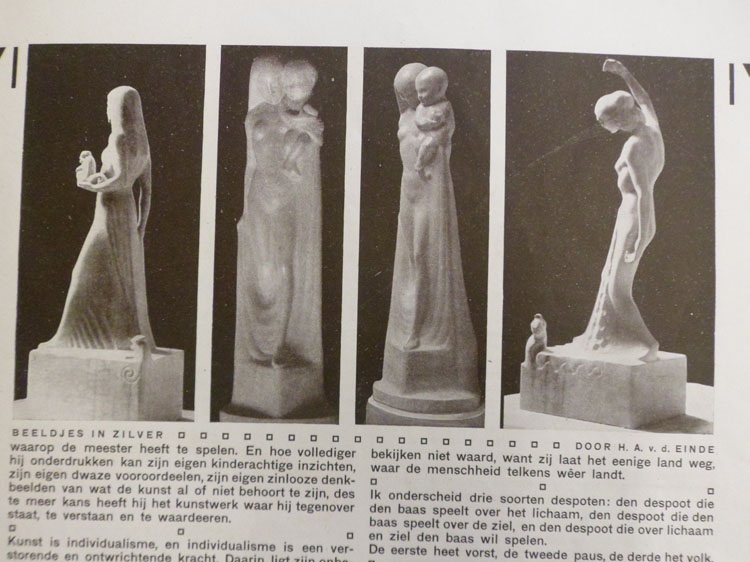
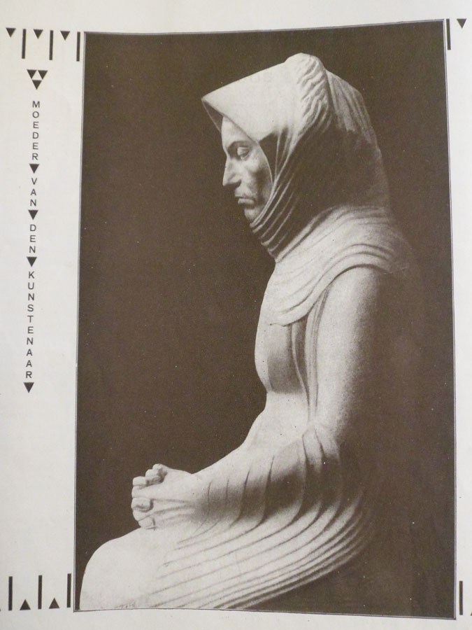
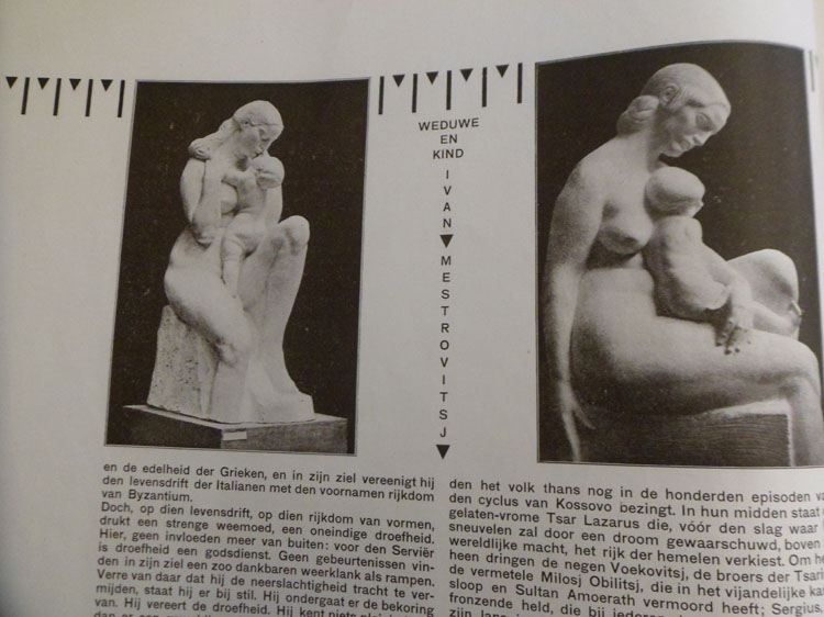
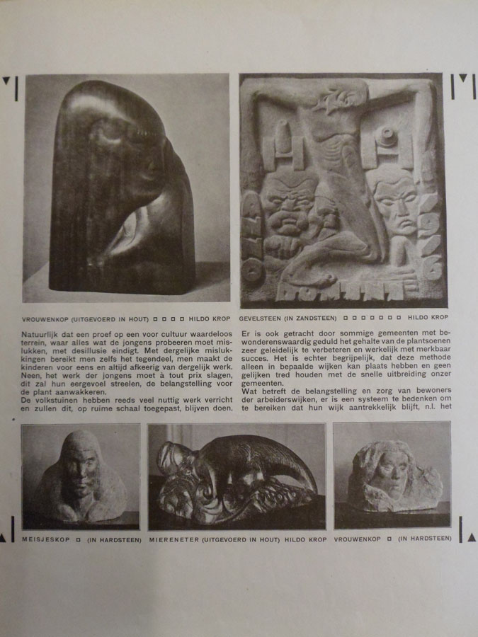
Reading Wendingen magazines I found an article in one of them about sculpture. Some of the names of the sculptors presented in the magazine were Hildo Krop, H.A. van den Eijnde and Jules Vermeire. The pictures in the article seemed very interesting so I decided to do my research on this topic.
These were the pictures in the Wendingen Magazine with sculptures
by Hildo Krop, H.A. van den Eijnde and Jules Vermeire
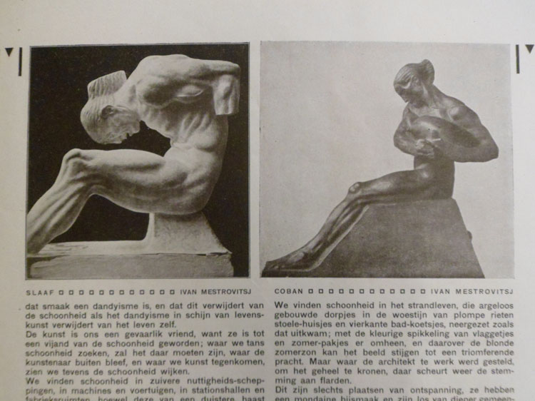
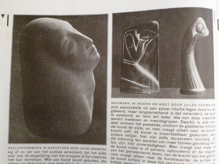

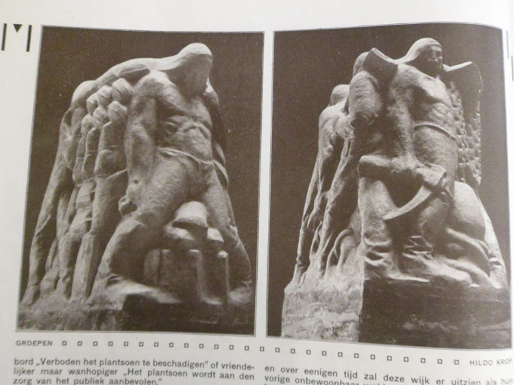
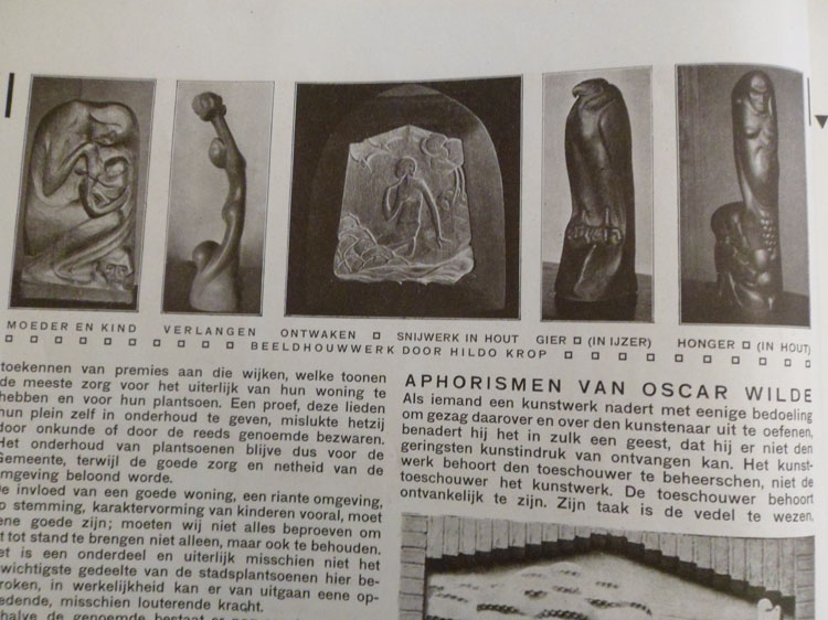
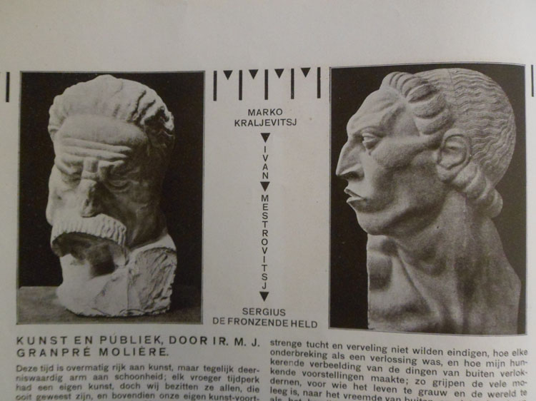


Amsterdam School sculpture is considered to be part of Symbolism, which is a collective noun for different art movements that arose as reactions to the Impressionism around 1885 – 1900. The major common denominator of Symbolism movements is the view that the task of an artist is not just to depict his impressions, but to express himself using symbols. The most commonly known of these art movements are Expressionism and Jugendstil. Some Symbolistic sculptors that you might know are Auguste Rodin, Willhelm Lehbruck and George Minne.
I liked my research to be based mainly on my own experience, so I started cycling around the city, photographing all sculptures, part of the “Amsterdam School” architecture, I ran into. Saying sculptures I also mean ornaments, facade reliefs, etc.. Due to my working method my research is not a very scientific one, but more of a personal impression of this Amsterdam School sculptures. What you will find below is a selection of the pictures I took while biking through the city and my comments to them. If you scroll over the picture with your cursor, you will see some further information on the topic. By clicking on a picture you open a new tab, in which you can see the enlarged version of this picture.
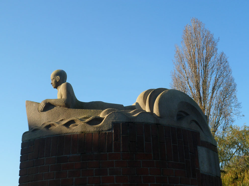
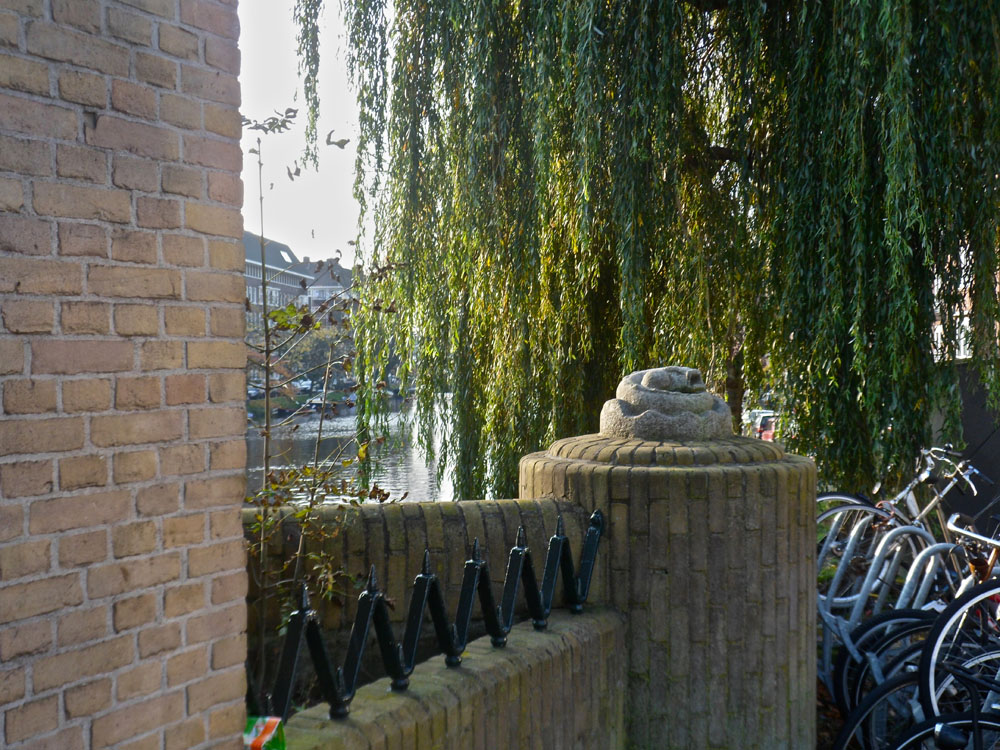
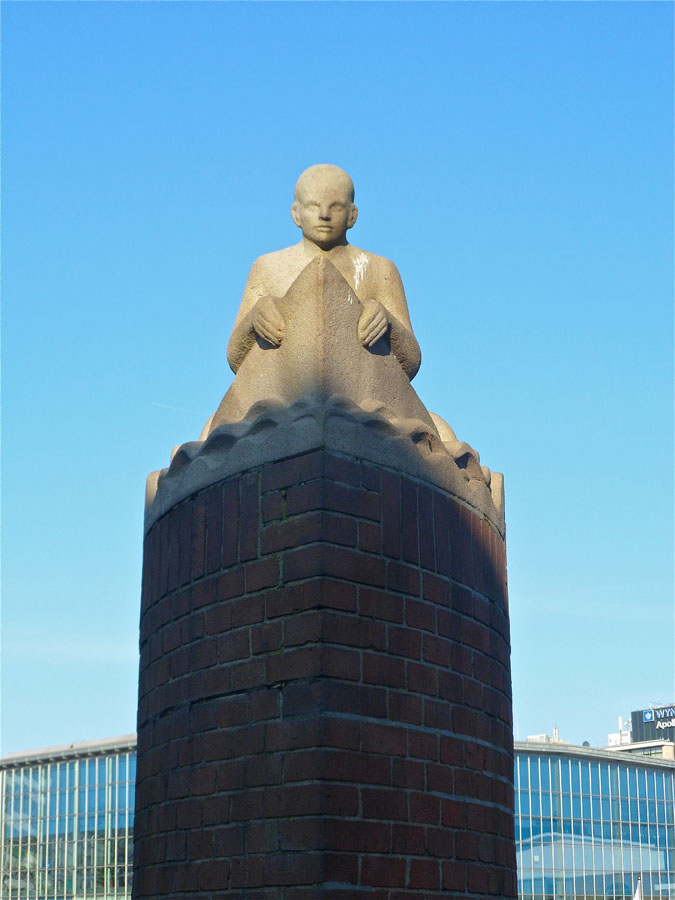
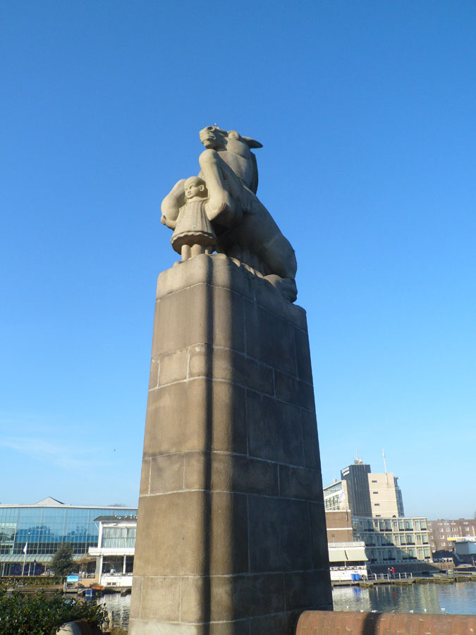
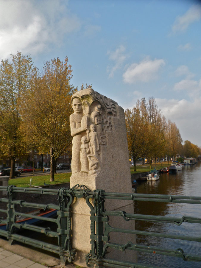
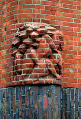
These nice sculptures stand upon the columns of bridges
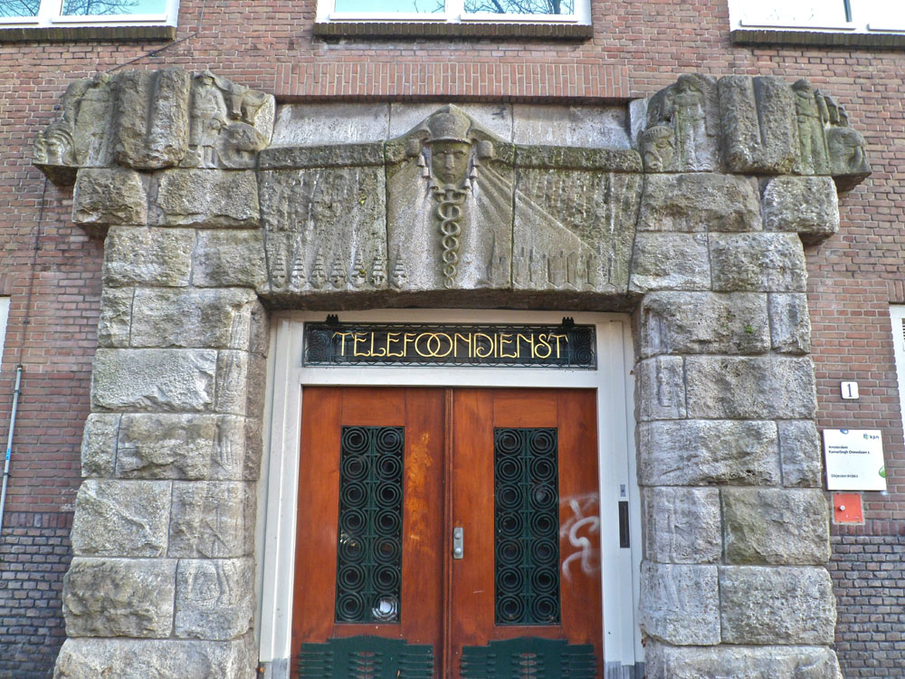
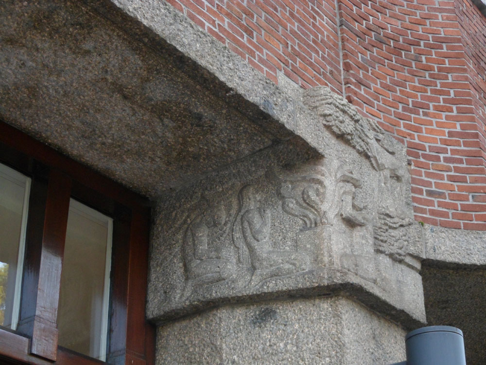
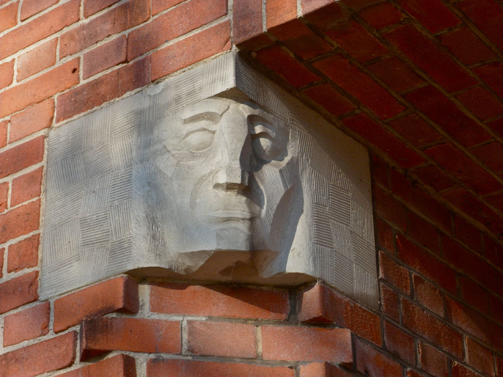
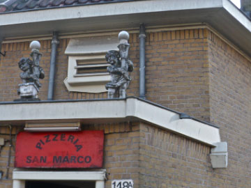
Door posts and cornerstones are often richly decorated
Facades of Amsterdam School buildings are sometimes very much like sculptures themselves

Some of the sculptures were added later on
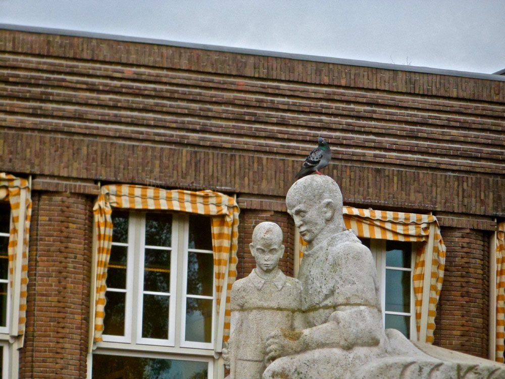
A type of sculptures that is closely related to autonomous sculpture in Amsterdam School are the those on the bridges. The sculptures are placed upon the columns of the bridges, that can often be found at both sides.
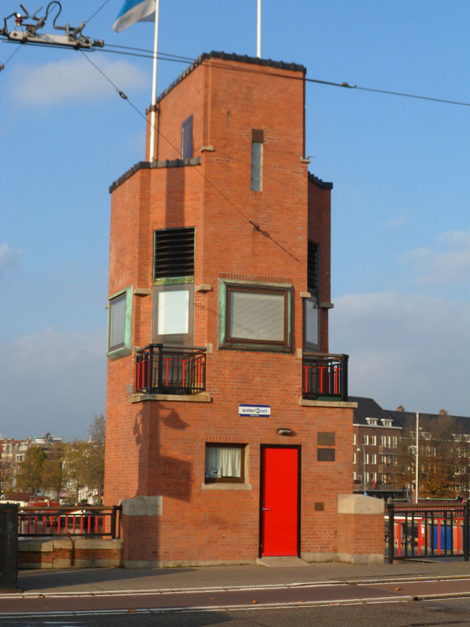
Although there are not too many sculptures in the Amsterdam School movement, (parts of) the buildings themselves often look like sculptures. Here I show just a few of the many examples.
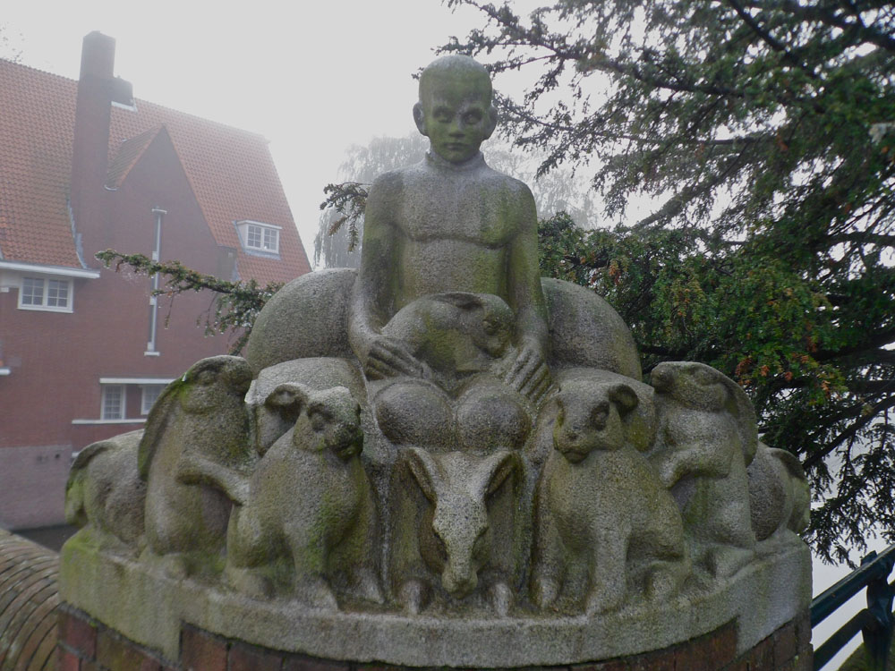
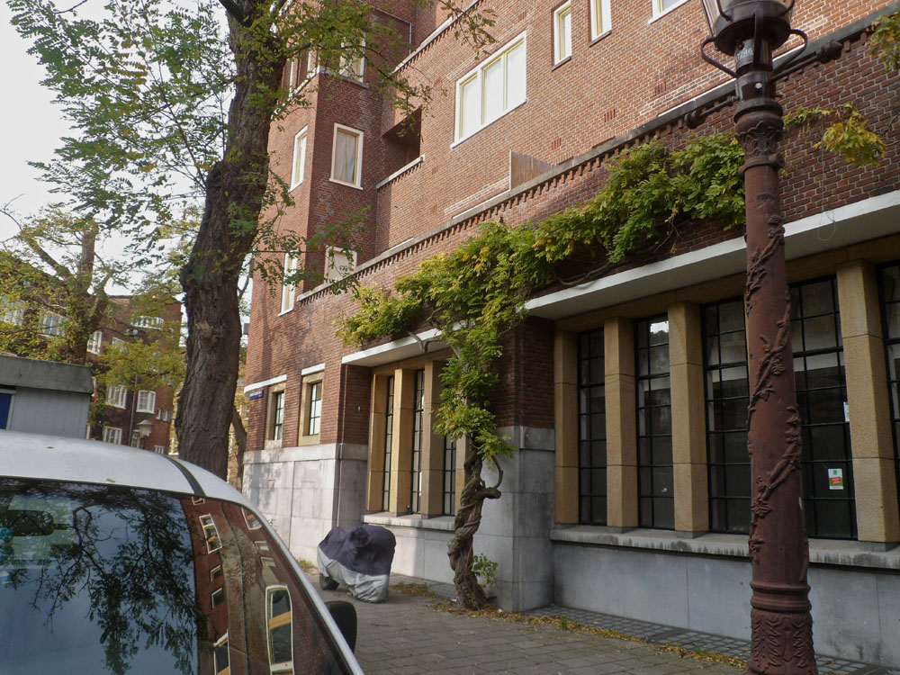
A kind of sculpture that is much beloved and used in Amsterdam School is ornamentation. There are various forms and themes of it.The most common form is regular ornamentation. Most of the ornaments have one of these few themes: human figures, human heads, flowers/plants or eagles. What stroke me when I watched the human figures, is that most of them wear ancient clothing. They also often practice traditional professions, like blacksmithing, cow herding and sailing. These images make clear that the Amsterdam School was not only a very renewing movement, but also a very traditional one.
Twisting: from “the Stijl” to “the Amsterdam School” by bicycle
Thursday, November 17, 2011
during a 3 hour bycicle tour two parallel architectural movements from the early twentieth [The Amsterdam School and De Stijl] were highlighted


stadionkade - stadionplein - stadionweg


cliostraat - olypiaplein - valeriusplein - koninginneweg


amstelveenseweg - surinameplein - hoofdweg - mercatorplein - jan evertsenstraat


frederik hendrikstraat - nassaukade - spaarndammerbuurt


hembrugstraat - zaanstraat - haarlemmerplein - haarlemmerdijk


haarlemmerstraat - prins hendrikkade - damrak - prins hendrikkade


geldersekade - oudezijds voorburgwal - rokin


muntplein - vijzelstraat


a week later we completed the tour –started at "The Rietveld Academie"– by visiting the ultimate architectural "de Stijl" statement "Rietveld Schröder House" Utrecht
IE
Tuesday, November 15, 2011
I thought for a long time about the Kho Liang Ie and his work, looking for all sorts of information, I even went to the industrial area where the Stedelijk Museum Library situated, and could not write a word. The only thing that is on the Internet is a biography, in the library all books and articles only in dutch language (sorry, but I do not know dutch).
And then I got lucky and found a booklet called ‘IE’. Read all three of the essay (which were in english!) on Kho, and than one of them caught me.
It is very rare material about Kho Liang Ie and his works, whitch did not exist in the Internet before. Now it does! It is my contribution to the online library of brilliant people.

The Crouwel Dynasty
Sunday, September 18, 2011
The Design Museum London celebrated the prolific career of the Dutch graphic designer Wim Crouwel in this, his first UK retrospective, “Crouwel a Graphic Odyssey”. Regarded as one of the leading designers of the twentieth century, Crouwel embraced a new modernity to produce typographic designs that captured the essence of the emerging computer and space age of the early 1960s.
This 1:27:00 long interview and presentation of Wim Crouwel (graphic Designer) and Mel Crouwel (architect) was moderated by Rick Poynor (design journalist/writer) to celebrate that occasion spring 2011. Subsequently the exhibit was held in the Stedelijk Museum in Amsterdam which could be considered a home coming for the eminence grise of Dutch graphic design aswell as the Museum itself.
interview registration by Alice Masters. Exhibition catalog design by Spin.
more? check out this very personal and summarizing presentation of Crouwel putting the exhibition in context. By Crane.tv at the Design Museum, 29 March 2011.
The Amsterdamse School Trip
Friday, May 20, 2011
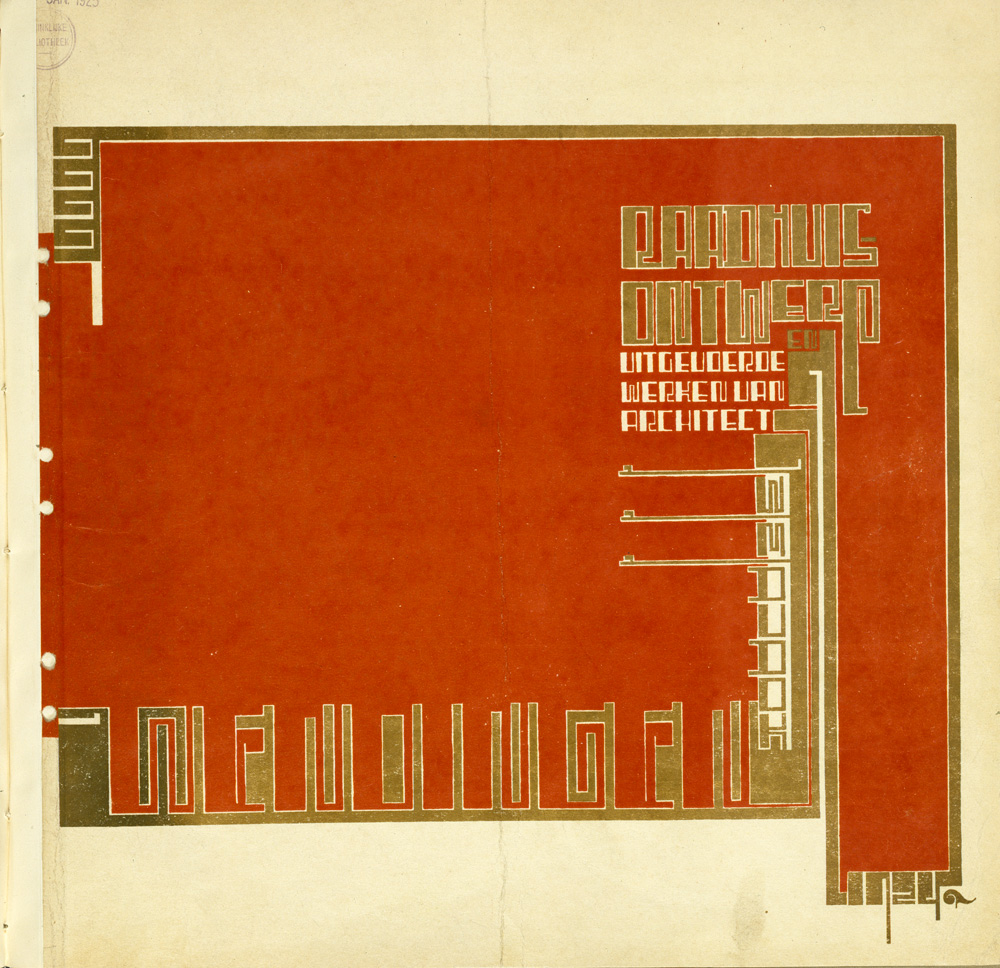
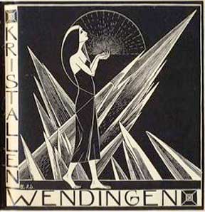
De Stijl versus Wendingen
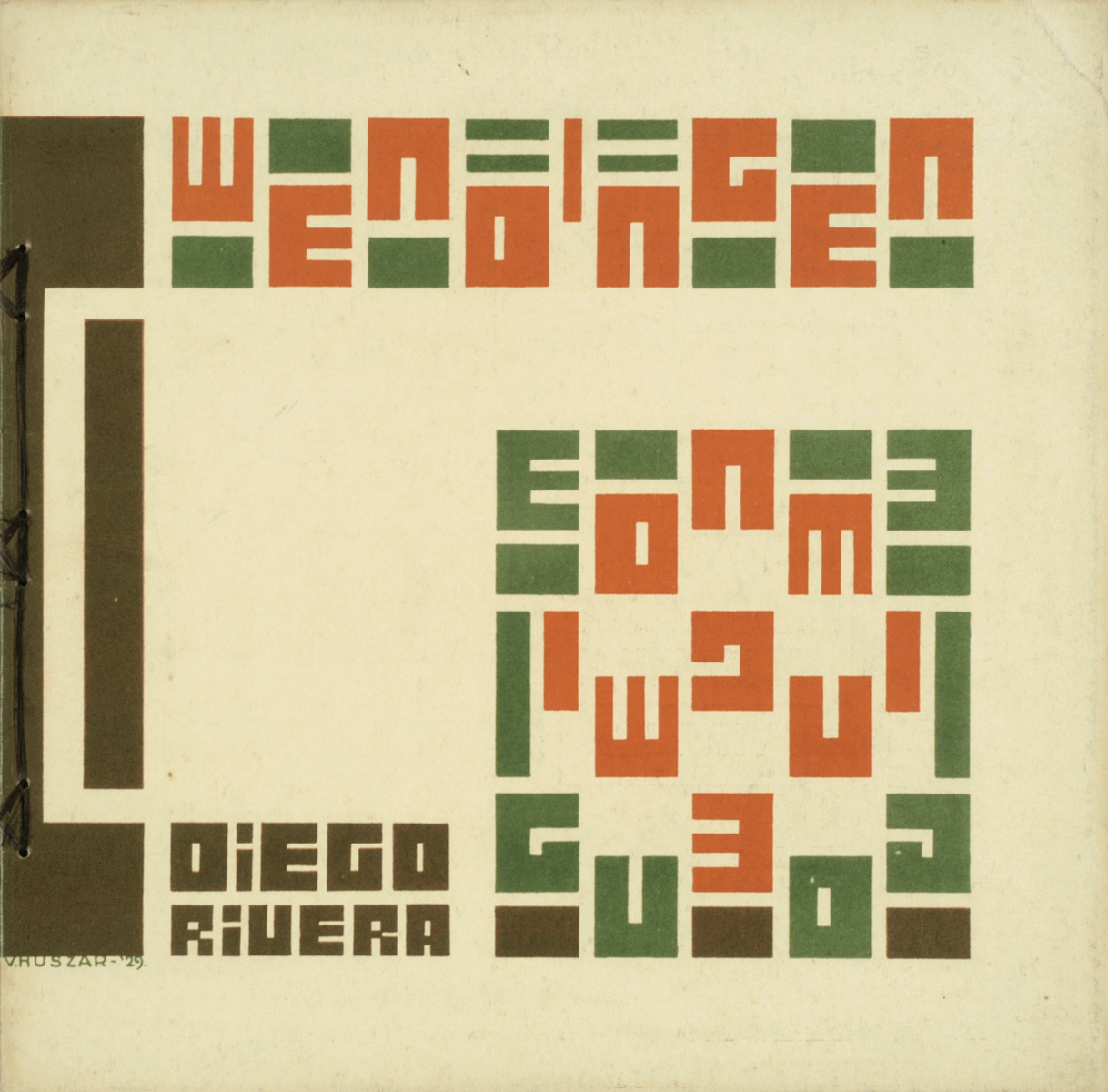
Wendingen magazine 1929 #3 on Diego Rivera. Cover by Victor Huszar
The magazines de Stijl and Wendingen were both founded around 1918. De Stijl was connected to the artistic movement of De Stijl and Wendingen was connected to the Amsterdamse school. These two movements are completely different, if not opposite to each other (De Stijl being functional and minimal, only using the primary colors and black white and grey, and the Amsterdamse School playing with different colored bricks and all these ornaments). Logically these two magazines felt like competitors when they started to publish.
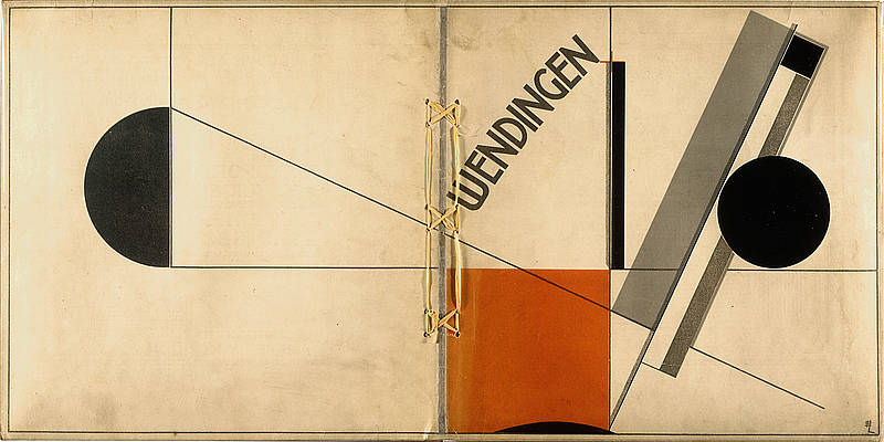
Wendingen magazine 1921 #4 on Frank Lloyd Wright and Berlage. Cover by El Lissitzky
That’s why I was completely confused when I saw a cover of Wendingen depicting a work of El Lissitzky, a constructivist artist and what I’ve always been told is that constructivism was kind of close to the Stijl. This issue was about: Frank Lloyd Wright’s architecture!!! I always thought that he was the one heavily influencing the Stijl. What turned out to be the case was that the Dutch back in those days weren’t really making ‘groups’. They stayed individuals and were inspired by different sources and that’s why, how different the movements may be, also individuals brought characteristics of the Stijl into the Amsterdamse school and the other way around.
Isn’t that just great: they were existing movements but there seems to be no rules or boundaries in taking aspects of other movement, you are free to be inspired by everything.
[by Liza Prins]
SMELL it, LICK it, SUCK it, BITE it, CHEW it, EAT it.

4 years ago I went on a study trip to a curtain great house, build by a curtain great architect, that I do not remember. And just before I went in, my previous teacher at Architecture and Design, Aalborg (Denmark), told me and the rest of my class, that we would get goosebumps, when we first got inside this building. He was in love. Than I went in – but no goosebumps. I apparently did not feel a thing.
Only now I understand, what he was taking about – but in another context.
Today I was placed in front of these amazing art magazines from the 1920s named “Wendingen”. I really felt it.
I tried to smell it.
I was just about to lick it.
I would love to suck it!
I wonder how it would be to chew it.
I really wanted to eat it.
[by Kristine Andersen]
Inside and Outside the Amsterdam Ring
>As the capitol of the Netherlands Amsterdam is a popular place for new businesses and companies. Still you see that a lot of these companies place there new architectural masterpieces outside of the ring. Is this because of the high ground prices inside the ring?
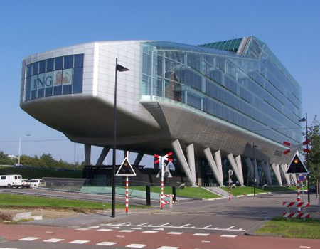
> On a trip trough Amsterdam we quickly discover that the historical buildings of the city are not only in the center-canal areas. Around these canals you see a band, almost like a protecting layer, made of architecture that is maybe even historical as its center. The buildings and blocks give you an unique look on the wide collection of the Amsterdam School architecture. This is something that a lot of tourists miss when they come to the city: icons like ‘het schip’ in the Spaardammerbuurt, mercatorplein, the Berlage Lyceum and the many blocks and bridges through the city. Maybe this is a good thing; in this way it stays as an unique treasure that functions as a decor for the the daily life of many. Lets hope this architecture will be protected in the future and won’t be replaced by transient cheap Almere buildings that will be replaced every twenty years.
[by Taro Lennaerts]
B-Group goes “Wendingen”
[click left for English / click right for Dutch]
[by Henk Groenendijk]
A call from the past
In some places the atmosphere doesn’t seem to change with time. Regardless of new interior pieces, integrated technological devices or relatively fresh layers of paint on the walls, you just come in there and dive into the setting of decades ago.
That happened to me when I stepped into the hallway of a former post office, which is now turned into the museum called ‘t Schip. Blue shiny tiles on the walls and floor, wooden benches, iron bars around and the coolness of the air immediately placed me into the first half of the previous century, when the work there was humming: post office workers were stamping, sorting or preparing for dispatch numerous letters and parcels, customers were writing addresses on envelopes, buying stamps and waiting for the telephonist to scream out loud their name and the number of the telephone booth where they could pick up the phone and hear the voices of their far away families or friends.
The booths are still there. With exactly the same heavy door, yellow tiles on the walls and little table. And even though the place of the telephone was taken by the modern computer you still get a feeling that if you come in you can hear those voices. The voices of the past.[x]
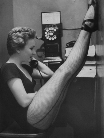
photo by Gordon Parks
[by Anastasia Starostenko]
A wrestling match
If de Amsterdamse School and de Stijl were to fight each other in a wrestling match de Stijl would totally kick de Amsterdamse School’s ass. De Amsterdamse School would be wasting time executing these beautifully choreographed moves while de Stijl would engage in some straight on pounding with it’s massive angular fists and totally destroy de Amsterdamse School’s ass. Then de Amsterdamse School would attempt to retaliate by trying to impress de Stijl through jumping around like a ballerina but like a true wrestler de Stijl would bellow out “None of this fairy Efteling crap!” And pound de Amsterdam School straight into the floor, leaving only some bricks in a beautiful brownish/red color and a perfectly square hole in the ground.

Doctors wouldn’t be able to restore de Amsterdamse School to his old self since the resources are no longer around. De Stijl however, would collapse some days after the match as it would turn out his sturdy build was way overestimated and so the next week’s competition would be between a Bijlmer “Honinggraad Flat” and a temporary complex of sea containers.
[by Sanne Hartland]
Typotecture
Wendingen Dudok-issue cover design by Wijdeveld • Hilversum Cityhall by Dudok
dive into the exiting world of Typotecture [x]
[by Casper Braat]
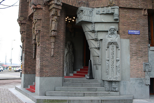
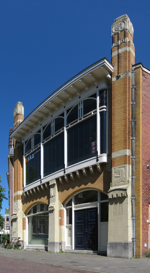
Architectura et Amicitia
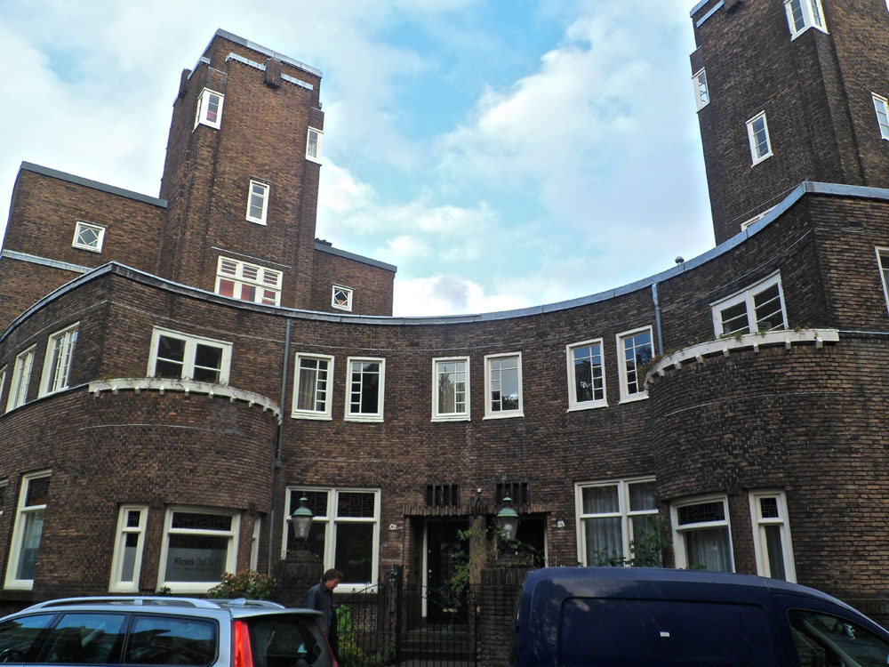
The ‘Amsterdamse School’ is a interesting architectural-style and is partly als known by it’s social-aware approach. The style belongs to a neo-style and contains architects such as: van der Mey, de Klerk [known by his work ‘the ship’], Kramer, and others.
I think it’s interesting that the ‘Amsterdamse School’ does not only stand for architectural knowable realizations, but that there’s also a whole movement for furniture [tables, chairs, clocks, lamps, textile etc], and even the idea of a ‘typical type font’, > Amsterdamse School is everywhere.
Wendingen was a interesting magazine [launched by the group, Architectura et Amicitia, of architects, artists etc] and was mainly focused on the ‘Amsterdamse School’.
I see this style as organic and yet non-organic, same as that it looks formal and family-aware. It is all and non, and that strikes me the most.
[by Petros Orfanos]
My Little Time Machine
 Being born and raised in Amsterdam and going around this city for 23 years I can still every now and then catch this utopian feeling by walking past the frozen canals in the winter or taking the ferry to the north part of the city by sunset, but I sometimes wonder what it must feel like being a tourist in my own city discovering new places and seeing things you have never seen before. The 5 minutes I spend inside the Scheepvaarthuis was the first time in a while that I felt this way. For this very short period, for just these 5 minutes I was a tourist, a tourist who stepped in a Time machine and was able to see inside a little part of her city from almost a hundred years ago.
[by Giulia Shah]
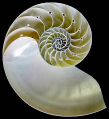
pelican + crystal + ship = Amsterdamse school
What made the Amsterdamse school style buildings so colourful was the rich use of symbols. Perhaps the easiest thing to notice was the inspiration from the nature in the structure of the buildings: flowing round forms (like a shell) or geometric forms (like a crystal). This gives the buildings a feeling of a living organism.
Then there are also sculptures full of symbolism. Sometimes they are telling the story about the building, like it’s function or it’s history. For example the Scheepvaarthuis is built in a triangular shape so that it looks a like a huge ship and there’s a lot of Indonesian style statues and sculptures to tell about the Dutch colony.
The funniest thing I saw were the pelicans in Spaandammerbuurt. One of the explanations that I found for a pelican as a symbol was that it is a sign for charity after a legend that the pelican pecks her own breast to feed her starving chicks with her own blood. Well, is this maybe something for social housing then?


– From nature to architecture and from architecture to printed matter –
[by Katje Hannula]
Een historische wandeling in een moderne stad
De excursie was een belevenis op zichzelf. De eerste keer dat ik zolang heb gefietst in Nederland en tegelijkertijd zoveel moest onthouden. Je leeft in het heden maar wordt omringd door het verleden. Gebouwen uit de negentiende eeuw of veel verder met hedendaagse bouwstijlen in hun glorie. Een vermoeiend uitstapje met interessante gebouwen zoals de Gerrit Rietveld academie die in de stijl van het modernisme is gebouwd met veel staal en glas. Het gebouw is een transparante doos terwijl je aan de achterzijde ervan massieve gebouwen ziet. De straatnamen die flitsen voorbij tijdens het rijden sommige heel duidelijke leesbaar o.a. Oost zaanstraat, Hembrug straat, Spaardammer plantsoen. Ik kan ook zien hoe de architecten mee gaan met de tijd: combinatie van oude bakstenen, glas, marmer, hout, enzovoort. Mijn hersenen proberen de tijd en de ruimte te bestuderen hoewel niet alles tot me doordringt. De hoeveelheid aan informatie is niet te verwerken. Ik wilde nog meer weten over het soort typografie, dat gebruikt werd voor de nummers van de gebouwen. De tijdschriften wendingen zijn heel uniek en hebben een heel diepe indruk achter gelaten. Ik zag ook hoe de verschillende architecten de stad tot eenheid wilde creëren ondanks de moderne gebouwen tussen de oude. Men wilde geen afbreuk doen aan de historie van de stad Het Olympische gedeelte dat alleen zichtbaar was voor me toen Henk erover vertelde. Door dit alles besef ik dat de exterieur van een stad ook aantrekkelijk wordt als je meer erover te weten komt.
[by Annemarie Daniël]
archi*-talent or archi-braveness
It really makes me wonder how is it possible that architecture differs so much every time you go somewhere . It happened to me in Amsterdam in even more intense way.
Amsterdam’s architecture for me personally is in a cartoonish style or like someone wanted to created imaginary world called “ let’s fit in here”.
I feel like there were not strict guidelines for building . People seemed to enjoy planning the city. No restrictions and open mind are definitely the keys of the
whole charm of the city.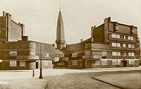
Compare to Poland ( it was a communistic country for some time), our architecture is packed with straight lines and forms and it visibly dominates in large cities. It has a bit of sadness and harshness in a way you approach it and how you feel about it. Amsterdam posses flow of energy that comes and goes . It is a great piece of art in itself and even it is already artistic and feminine it wants to be even more chic by putting f.ex. typography on buildings, graphical images on pathways or even decorating the edges of the houses. It is all to make people’s lives here better to let the energy be felt by people living in here.

Another aspect that attracted my attention a lot is the way buildings from different styles are put together, next to each other. Are they any aesthetic limitations? Is it the way people make art – experimenting in a way, showing the contrast, behaving mad or just enjoying the weirdness of those different styles? Does it has to be clear why something stands next to other object? In my opinion and the best explanation that works for me is simply to intrigue people’s imagination, to let them feel special. What is more this way of building may not fit established rules but by not feeling “ as it should be “ it gives the reason for existence the city needs to posses. To inspire people , to disturb and to let you discover it. This is the purpose an architecture should serve to really strike your mind, excite you and wake up when you, still sleepy, go out to face the world. Just like an art.
* archi – trouble of endless movement of investigation
[by Agnieszka Zimolag]
Glass Windows
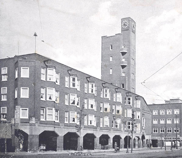 Mercatoplein is one of the Amsterdamse school constructions which developed through out and after the First World War as an architectural movement. Mercatoplein is influenced greatly influenced by Frank LLoyd Wright’s le Corbusier that was a project developing 5 years before the square was completed and is a good example of how a suburban space can be turned into a socio economical center where people gather and shop or eat.
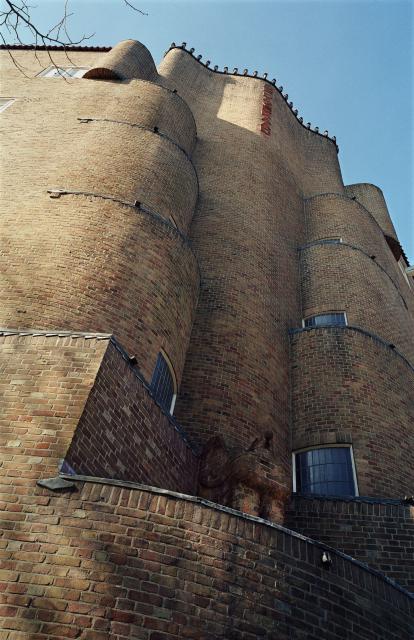
What intrigued me most in the square was the design the of windows, because contrary to their small shape,their frequency of their repetitive pattern reminded me of simplified church stained glass windows.
Patterns were indeed found in the window design of Het Schip by Michel Klerk as the top windows of the backside opened in a shape of semi spiral form could convey to the Fibonacci theory.
Sources: studiokoning, Amsterdamse_School [Wikipedia]
[by Claire Bamplekou]
DeBazel
Thursday, May 19, 2011
On Chaos, Fine Matter & The Immaterial.

From a Theosophical point of view, the whole body of the Stadsarchief Amsterdam represents the three basic evolutional stages; chaos, fine matter and the immaterial. The dark, syenite foundation of the building signifies the lowest level of cosmic evolution from which all forms emerge. From the solid base rises the concrete skeleton hidden by the façade of interlaced yellow bricks and purple granite. To the Theosophist yellow is equal to gold and represents the sun and male cosmic power, the purple symbolizes the moon and female cosmic power. In this sense the façade realizes one of the most important principles in H.P. Blavatsky’s (founder of Theosophy and the Theosophical Society) work The Secret Doctrine; the cosmic creation rising out of the chaos. This is called the fine matter or Svabhavat. Finally the massive glass roof that rest on top of the building, letting the light reach all the way down to the central court embodies the spirit or the immaterial. The immaterial is the highest level of cosmic evolution and brings everything to life through astral light (imagine all the employees working on the ground floor of the building still being able to get a glimpse of sunlight). This brick spekkoek is not just a fireproof vault; it is the manifestation of cosmic evolution.
[by Olga Nordwall]
Light in ‘De Bazel’
Bazel’s unique architectural form was greatly influenced by the American architect Frank Lloyd Wright as it conveys a feeling of harmony and balance, with hidden religious influences in its simple organic form de Basel achieved to combine modern architectural ideas with ancient archetypes.
The glass ceiling of the building creates a sense of transparency as it leaves space for an everlasting game between light and darkness to be played within its chambers. In de Bazel sky is the lightest element of the building nearly unreachable source of luminosity then you have the last floors escalating like Japanese rice fields, 3 floors down , allowing thin air occupy most of the space in between. As you go down its round stairs the light becomes dimmer due to the stained glass that covers the windows, leading to the basement of the building where light slightly becomes less and less as you go further down, until the only source of light is artificial, asphyxiatin (being smothered) between the close walls of the basement, the spaces become smaller and the air thicker.
From the outside de Bazel seems like a close fortress contrasting with the true inner nature of the building, containing hidden beauties and mysterious qualities, stands and talks for itself as the great architectural piece that it is.
[by .............]
Checkout that amazing table.
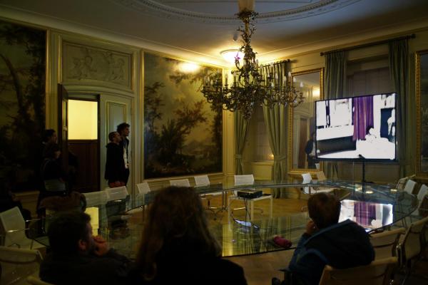
I wanted to write you something about the amazing table in the Italian room/italiaanse zaal in de Bazel but I could not find any information about it from the internet and I missed the name of the designer, help me out please!
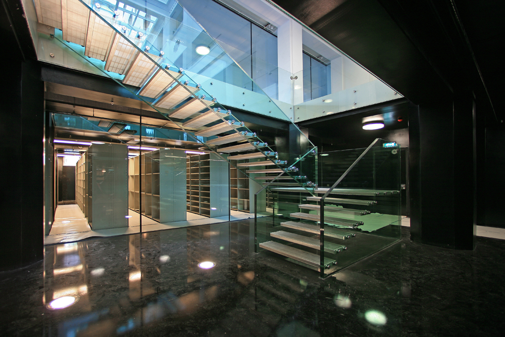
I think the contrast of something so modern with the rest of the room (18th century style Italian landscape murals) is a very cool effect. Since the weird Italian room quite stands out from the whole building and it’s style, placing such a minimal design table there was a brilliant move who ever then did it in the later years. I also had to think about a connection to the glass stairs (by Claus & Kaan) down to the archive that the guide was so enthusiastic about.
[by Katja Hannula]
Amsterdam City archives
Amsterdam City Archives was first built to be used as a bank, and it was not until 2007 that the purpose of the building changed to host the city’s archives.

The building was designed in 1919 by de Bazel and was finished at 1926, three years after de Bazel’s sudden death.

Its unique architectural form was greatly influenced by the American architect Frank Lloyd Wright as it conveys a feeling of harmony and balance, with hidden religious influences in its simple organic form de Basel achieved to combine modern architectural ideas with ancient archetypes.

The glass ceiling of the building creates a sense of transparency as it leaves space for an everlasting game between light and darkness to be played within its chambers, the glass ceiling also supports the contrast between the inside-outside impression since when you look at the building from the outside it gives the feeling of claustrophobic space but in contrary to its illusive form when you enter the space a feel like you re in the middle of an open space.

The building was officially declared as a national monument in 1991 for its distinctive formal values by the Dutch government.
[by Clair Bamplekou]
Balanced architecture
Amsterdam Archive building. A creation of Dutch architect Karel de Bazel in which each and every measurement and size are dedicated to the proportions of the human body. However the architectural tradition which seems quite unique for that period, takes its roots back in the ancient times…
The philosophical approach, formulated in 5th century BC by the Greek philosopher Pytagoras, stating that “Man is the measure of all things”, was further developed by the Roman architect and theorist Vitruvius, who created a famous code of human proportions, describing how a well-built man fits with extended arms and legs into the most perfect geometrical figures (circle and square), which was supposed to be the basis of temples and churches of those times to be able to give a person a feeling of balanced architecture.
This principle greatly inspired Leonardo da Vinci, who in the 15th century made a famous drawing of a vitruvian man as an attempt to relate human body to nature and architecture, as well as trying to define the ideal Renaissance church.
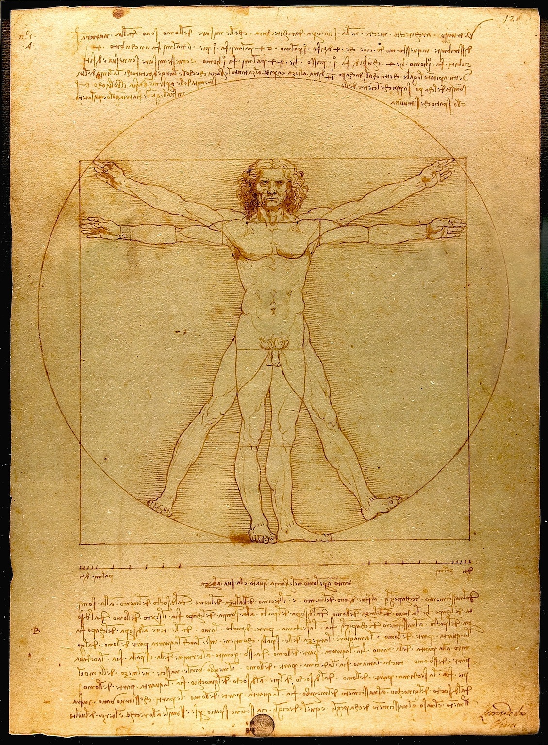

At the beginning of the 20th century, continuing the research of da Vinci, Le Corbusier created his modular, an anthropometric scale of proportions, based on the height of man with his arm raised as an attempt to discover mathematical proportions in the human body and then to use that knowledge to improve both the appearance and function of architecture.
In his own way, based on theosophical approach, de Bazel also set out in search of universal harmony and balance for his work on the Archive building. In the lay-out of the building he used a raster of rectangular’s of 3,2×3,6 meters, in other words 8/9×9/9, which reflect the proportions of the human body with and without head. A result of it – a building, which feels comfortable, inviting and truly made for a human-being!
[by Anastasia Starostenko]
personal architecture
What is fancy about building De Bazel designed by Karel De Bazel is the whole ideology he put into forms, patterns, outlays and finally the facade of the whole construction. He believed in harmony and balance in life so its projects, expressed his personal feelings and confessions. Noticeable is how every detail has been refined and his travels to Indonesia rebounded imprint on the inside of this building here. I liked the idea concerning the architecture as a bridge between cultures, beliefs. Coming into the building, despite not knowing the architect's plan was to feel the atmosphere of stability and peace. It seems to me that you have to have an amazing sense of form to achieve this effect. It is almost like being a good psychologist. Because of the openness of architect’s mind the building he constructed could be very easily called a place of a surprise and admiration but also curiosity. Indeed, when you keep moving between the rooms, halls, you almost get an impression that you are in a museum. The idea to place the archive there is the more accurate and suits his concept better than it did for the bank that was originally there, I guess.
[by Agnieszka Zimolag]
Bazel Civilization

The Bazel is not only a building, but also furniture! I had been visiting the Bazel before, but this time the guide was putting a particular accent for the furniture “designed by De Bazel”. Not only tables and chairs, but also coffee cups, inkwells, the colors of the walls. Everything inside the building was made on purpose to fit in the building and consequently I imagine the people looking like the building too! I personally find really contemporary the idea of making such big project and follow it from the beginning until every final detail (or almost, because Karel de Bazel was dead in 1923, just before finishing the project). A “total” architecture that keeps together the whole environment inside it. It makes me imagine at the creation of a new civilization where all the tools are thought in a way that consequences and growth are predictable. It sounds science fiction, but it’s what happen when design is perfectly designed. In the Bazel furniture, colors and objects have differences depending on the level of importance of the person they were made for. Most of the differences are details that say “we are almost the same, but my chair has a more comfortable seat” or “my table is bigger”. That’s why the hierarchic system of the bank, De Bazel designe, required respect and strict definition of roles. This is not difficult to understand for that time (early ’20s), but weird to realize in the proud voice of the giude talking about “the desk set for the president manager, a bit more black of the others desk sets, designed BY DE BAZEL”.
[by Sara Cattin]
De Bazel
Vijzelstraat number 32. the front of this huge building is covered completley with construction frames. Workers are shouting.
Karel de bazel is responsible for this.
Enter the 1920s. Look at this beautful wooden floor! Elegant white. Sunflooded. A sealing out of glass.
„karel did this all by himself!“ i love our guide, she fits the building.
Shocking from the outside and so sensible from the inside, like everything in this cityarchive; the cellar, massiv tresor doors.
Esotherik painted sealing.
„ de bazel designd everything in here, thats a gesamtkunstwerk!“ „ de bazel designd everything in here, thats a gesamtkunstwerk!“ i love our guide.
But she loves karel.
Black marmor. Dark green walls. Thats the chef etage. Now a days you can get married here.
This going back way back into time. 1920s and stylishe lightswitches. De bazel is a craftsman he knows his bussines. This is love for the detail.
He died before the building was finished. True romance. he would be proud.
I am.
[by Martin Kaehler]
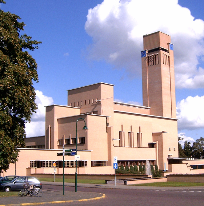
The gemeente museum The Hague/Berlage
Friday, April 29, 2011
“Walk into a new city; naked. Looking down; barefoot. standing outside a train. Looking for an exit; following the exit signs. Cold stone touching with every step, feeling the pattern on the tiles when eyes are closed. Being invisible. look around; the world loading itself behind every corner. To visit.”
A city is not one thing. It has all the little details people tend to forget or do not see when they walk into a city. A space is never empty; even the air carries the identity of the surroundings. A big problem if you ask me for the city designers. How can be decided if a building fits the city; the persons; the air it’s going to breath?
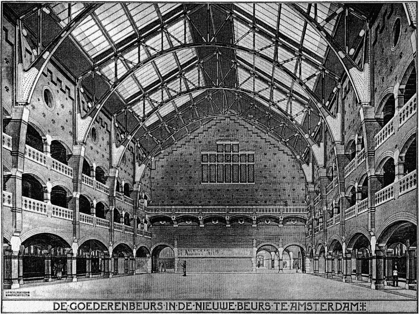
Let me tell you the story of an architect called Berlage.
Berlage didn’t start his architectural career in Holland, although he was born here. He first tried to build a career as an artist through applying at the Rijksacademie. This didn’t work out, so he took the next step and he went to study in Zürich at the Eidgenössische Polytechnische Hochschule, and after that he decided to make a tour through Europe. He returned to Holland again when big projects were planned and he was to be the assistant of Theo Sanders [x]. Together they made a plan for the competition to make the new Beurs in Amsterdam. Their design was quite historicizing and eclectic. Compared to the, after they stopped working together, design of Berlage itself; which was a much smoother design, and more focussed on modern architecture in one monumental-looking piece which still fitted the surroundings. In this period Berlage focussed more on the Romanesque, than on the older eclectic style. The design of Berlage was realised in 1883. This was the beginning of his career.
The old stock exchange of Amsterdam
One of the other most important buildings further in his career is the Gemeente Museum in The Hague. This was also his last mayor work within architecture. It actually opened its doors after he died in 1934. In the construction Berlage decided, instead of using the upperclass-floor material, to actually use plain bricks for the facade.
TYPOGRAPHIC MATCHMAKING [IN THE CITY]
Thursday, April 14, 2011
My first discoveries
One of the first impressions I got of the Typographic Matchmaking, was an image of a huge three-dimensional shape with letters that I did not manage to read. However, I could sense meanings and my curiosity grew to decrypt this ‘unknown language’. The shape proved to be a mixture of both Latin and Arabic words, translating each other and forming a common text. As a matter of fact, it was a construction of the type font StoryLine, and one of the outcomes of the Typographic Matchmaking 2.0:
khtt.net
Naturally, I had discovered The Khatt Foundation – Center for Arabic Typography. Founded by Huda Smijtshuizen AbiFarès in 2004, this online platform offers a space for projects which develop Arabic typography and design, and deal with its relation to the Western society.
The project
The first initiative to the Typographic Matchmaking took place in 2005-07, the second in 2008-10. There is a lot to say about the project. The Typographic Matchmaking 1.0 deals with the typographic needs of contemporary design in the Arab world, specifically for publications and new-media. The Typographic Matchmaking 2.0 / in the City stretches the research into the urban space. Here, the focus is to bring the marriage between Arabic and Latin writing cultures to the three-dimensional city.
Huda Smijtshuizen AbiFarès introduces 15 professionals from Europe and the Middle East to collaborate in 5 teams. Each team consists of one Arab and one Dutch type/graphic designer and one architect or industrial designer. Each team also deals with a different subject. It is inspiring to me that they immediately move away from the original classical type and experiment with both language types, starting from scratch. The participants then visit respectively each other’s countries, and the cities of Amsterdam, Beirut and Dubai.
Backgrounds
I find it interesting to mention, that one of the reasons argued for the Typographic Matchmaking is, that because of the poor matches between the Arabic and Latin fonts, most bilingual design projects in the Middle East start in English before getting translated. Too often, the street sign you meet in the Middle East are written in a way that forces the Arabic language to adjust to the Latin language. The basic idea is thus to create new fonts that work both in Latin and Arabic, and especially to find types that create harmony between the different language structures. The aim of the project in the City, is also to bring back the sense of belonging to fast growing multicultural cities in the Arabic environment. One of the big challenges here, is how to deal with a visually already overcharged space. New alternative spaces within the contemporary, shopping dependent, urban structure may engage inhabitants on many levels and create a more emotional relationship with the direct environment and the larger world.
Another important reason is the demand for Arabic identity in the West. I could very well imagine that even people who do not speak Arabic, can connect to their roots through the presence of Arabic script.
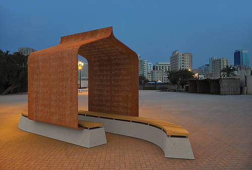
Nuqat-folly, with poetry on its walls in the type font Nuqat:
Yielding outcomes
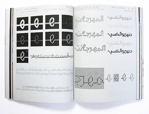
The Typographic Matchmaking is a merging of two cultures, where both adaptation and play are central. I was curious to see how two totally different kinds of languages can translate each other and at the same time meet each other’s ‘needs’.
The font named Nuqat is developed with a grid. The text is created out of dots in both language structures. The system of the grid has here the capacity of making a text where the letters are – or disconnected, or linked to each other. I find this font interesting for its apparent multiple possibilities. I also like to see how it could suit in different public spaces.
Here is a link to see some examples of the Nuqat used in several ways:
cube design
Wednesday, March 2, 2011
In the “beginning” all was dark… Paintings were hanging in dark rooms and the walls were so filled that one could barely see the landscape paintings for all the landscape paintings in the salon. Anyhow, most people were happy that they could consume the art, just like people since the ancient Vatican sculpture gardens. In 1812 the first “art-only” building was created by the English architect Sir John Soane. Finally! Here the art could be viewed for what it really was, perhaps even art selected with great taste, as Kant would have wanted it.
In the late 19 century the number of galleries and art museums were booming. Every “metropolis” had to have its own museum of art to be a metropolis. When we are approaching the mid 20 century old ways of building institutions of art, often retro romantic, were abandon for more “clean” and architectural deconstructed rooms, an early examples is the Guggenheim in New York. Exiting times.
At the Van Abbe-museum in Eindhoven you can walk around in beautiful, calm, strictly white and spiritual rooms filled with modernistic art. The worlds’ largest collection of Lissitsky paintings are finding its’ place like a perfect sized glove. Modern art for a modern room!
On the second floor an exhibition about art is presented. Or rather an exhibition of art. Or an exhibition of artworks about the modern art museum, but with new art. Or an exhibition on ehee.
When visiting this exhibition a feeling of unrest is present, an urge to maintain the “white cube” intact. The room can only be intact when art is made in respect of the cube. But what happens when people get tired of the white cube, when artist don´t agree that their works need the white cubes, when the curators finds them self unable to fill their holy rooms? Maybe the beautiful buildings of high modernism will slowly decay? Well to calm the museum directors I have taken my responsibility and re-used the modern room to create new room! Deconstructed the deconstructed. A post modern solution to keep modern. Now we all can sleep well.
Eatable fashion and so on..
Wednesday, March 2, 2011

BLESS DESIGN was founded in 1997 by Ines Kaag in Berlin, and Desiree Heiss in Paris.
In ’99 and ’04 they received the ANDAM fashion award.
They’re philosophy is creative freedom, they are busy with totally innovative fashion accessories through design to art.
The Bless creative expression takes the form through numbered editions, with a permanent research of timelessness. They’re way is to create without definite perimeter.
The two designers escape from any calibrated definition of fashion, “BLESS does not promote any style – BLESS fits every style!” they kept tight they’re initial concept and idea which was to combine creations between fashion, design, art and architecture.
The objects created by Bless result from the fascination of Desiree Heiss and Ines Kaag for recycling, the diversion of the uses and the traditional techniques.
They’re accessories turn what was supposed to be regular and unquestionable into surprising.
Like, for example the shoe-socks, that is a socks boot like, with a sole under, or from the collaboration with Le Pliage®, the bag that can be folded inside it’s own circular leather handles and can be worn as a bracelet.

Anti-design
Thursday, February 3, 2011
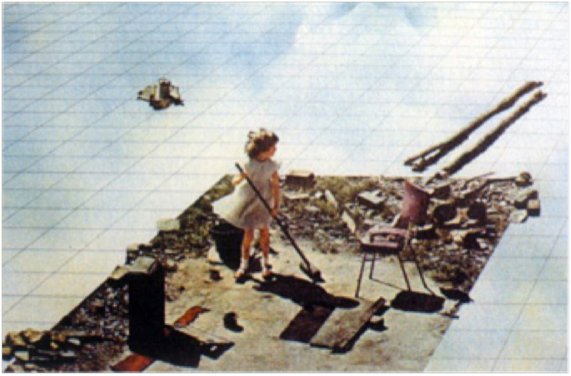
Superstudio was founded in 1966 in Italy. The group developed as a result of the expanding cities, which contributed to the growing amount of products and design. Later on they focused more on architecture and on collages and cut outs they did city plans of over expanding cities.
I like the fact that their plans never became reality but their concepts were sold and exhibited. They established radical surrealistic visions of a negative environment as critiques of contemporary movements. They lived in a time when it was hard to escape from the time pressure and the fast developments. Like now, designers have to go outside expectations and think further and in the end present authentic products, sometimes-overdeveloped products. What Superdstudio did (in some of their work) was that they stopped during the process of development and did not finish it. This was a revolutionary way of thinking during that time. It is a concept that allows the spectators to walk into an unfinished world.
Superstudio has influenced a lot of designers and architectures today with its radical and revolutionary ideology. Rem Koolhaas is one of them who have made a lot extravagant projects. There is a similarity of the buildings he does and the Superstudios sketches. He is also more interested in the city and urbanisation and in a contradictive way he builds dynamic, futuristic buildings.
“ If design is merely an inducement to consume, then we must reject design. If architecture is merely the codifying of bourgeois model of ownership and society, then we must reject architecture. If architecture and town planning is merely the formalization of present unjust social divisions, then we must reject town planning and its cities until all design activities are aimed towards meting primary needs. Until then, design must disappear. “
I like the fact that their plans never became reality but their concepts were sold and exhibited. That is one reason I think they are more like artists then designers. They used their designer skills and knowledge but pushed it further so their work became artworks. A designer solves problems and an artist asks questions. Superstudio asked questions. They gave one solution out of millions and force the spectator to use his imagination to expand this solution.
In 1970 they did a furniture collection out of their “Grid concept”. It is a 3d object out of their drawings, so from design they made art, and from art they designed. But how come they neglected design when they at the same time were involved in it and produced? Is it fair to their belief? What they designed here was a response on the political issues that existed during that time and the disillusionment, which gave origin to a new society, which off course affected the art world. In this collection the furniture reminded of cheap café furniture’s from the 50s. The functionality and easiness of it was the main goal.

Dutch Design Profiles
Tuesday, November 23, 2010

Designblog made a new link; to DUTCH DFA (Dutch Design Fashion and Architecture) “video profiles”. Presented at the latest 2010 DDW (Dutch Design Week) these profiles are part of DFA’s 4 years program that aims to strengthen the international position of these design sectors. Do enjoy the short video’s. Check out also Premsela Institute the much more interesting Dutch Platform for Design and Fashion. Have a look at their program of lectures and exhibits and their “pioneers of Industrial Culture Podcast series“.
To celebrate the exhibit Misfit of Hella Jongerius at the Rotterdam Boymans van Beuningen Museum –which we visited with E-group last week– and the kick-off of DesignTheory’s latest focus “The Designer as Artist.….”, based on an article in the 2010 5th issue of Metropolis M
we present . . .
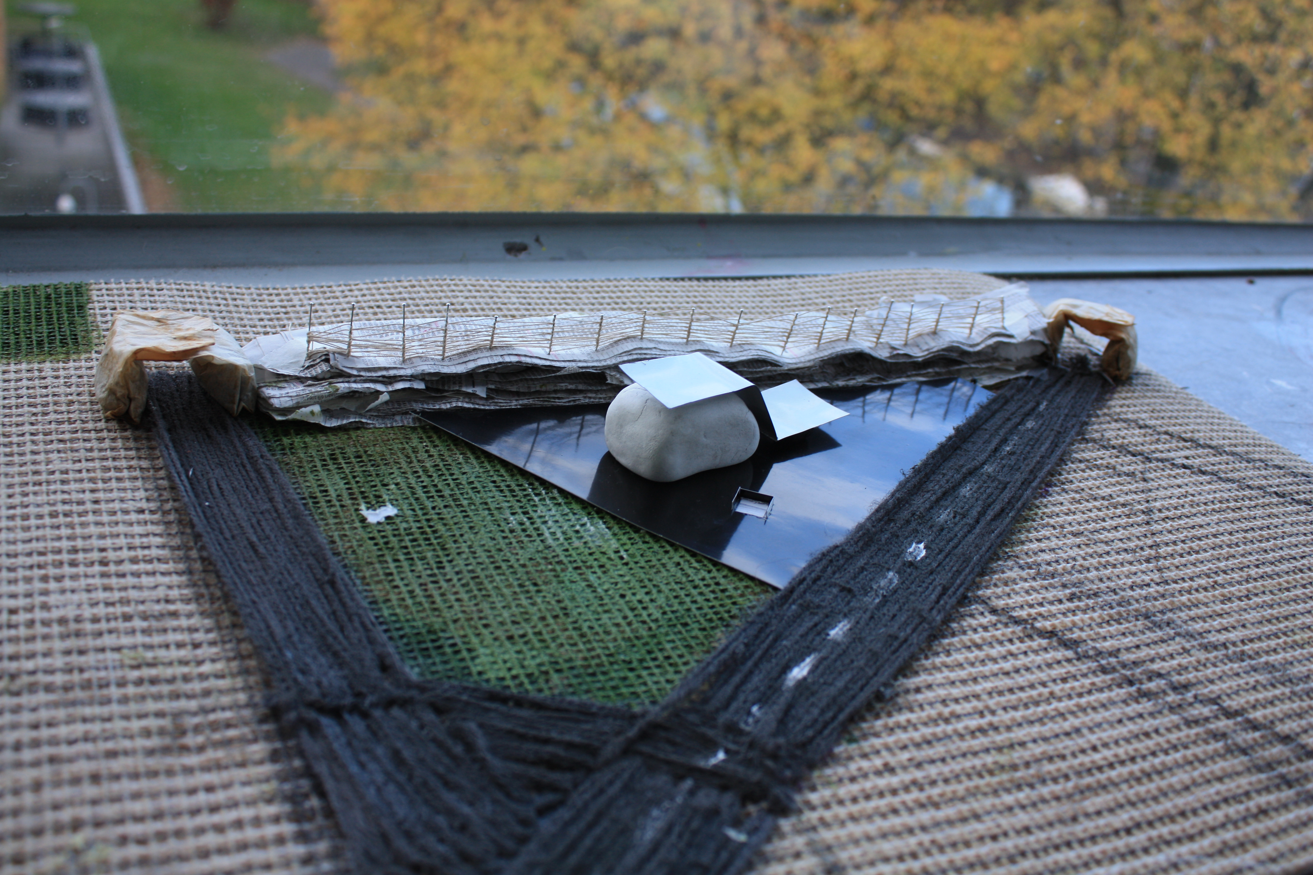
Hompje klei
Monday, November 22, 2010
Het startpunt van dit architectuur project was een zelf uitgekozen gebouw van Rietveld, dat interessant was op basis van de relatie tussen binnen en buiten. Mijn oog was gevallen op twee surrealistische gebouwen, die in hun omgeving lijken te zweven.


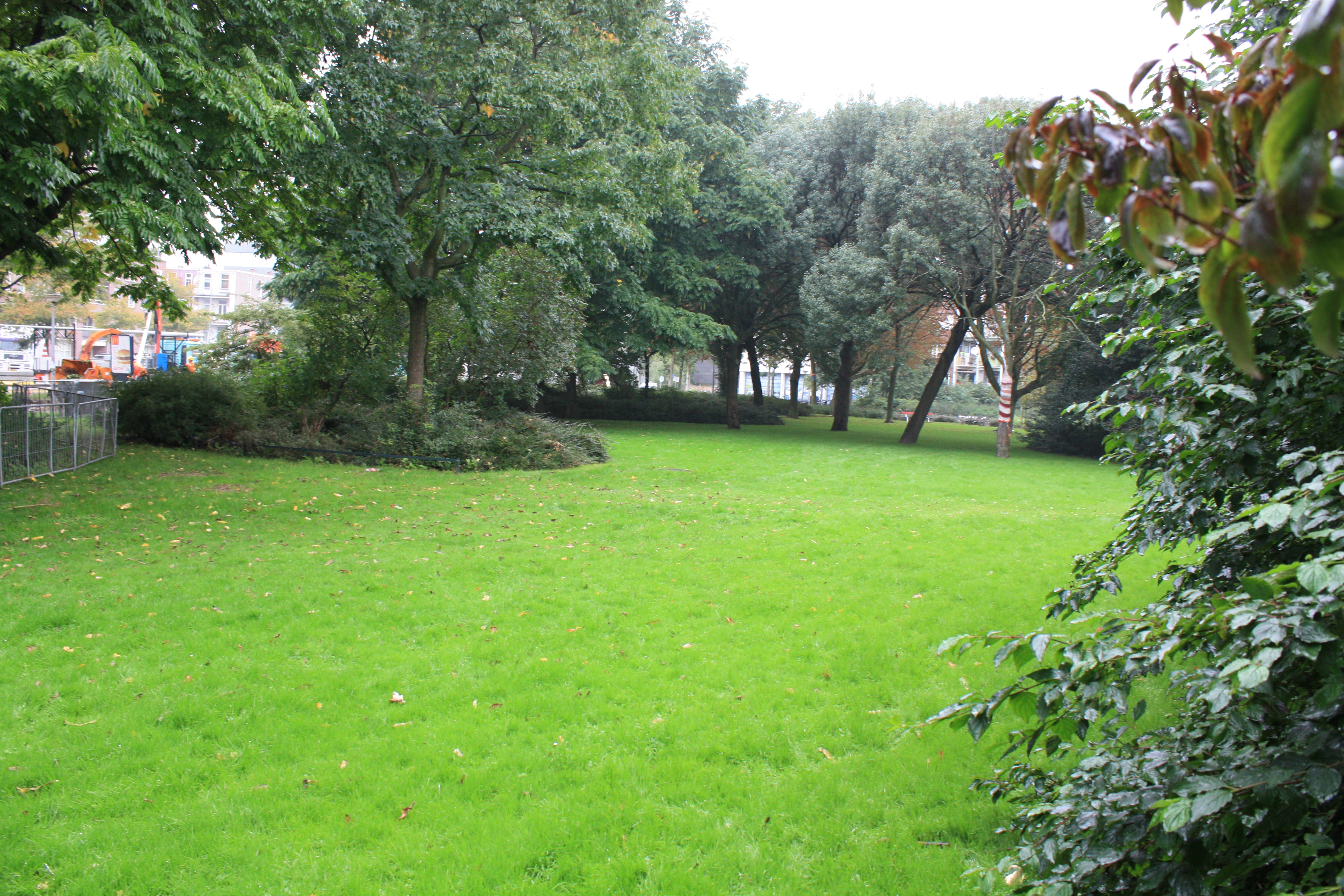
Naar aanleiding van deze gebouwen moesten we een publieke ruimte ontwerpen voor een groen stuk op de Wibautstraat.
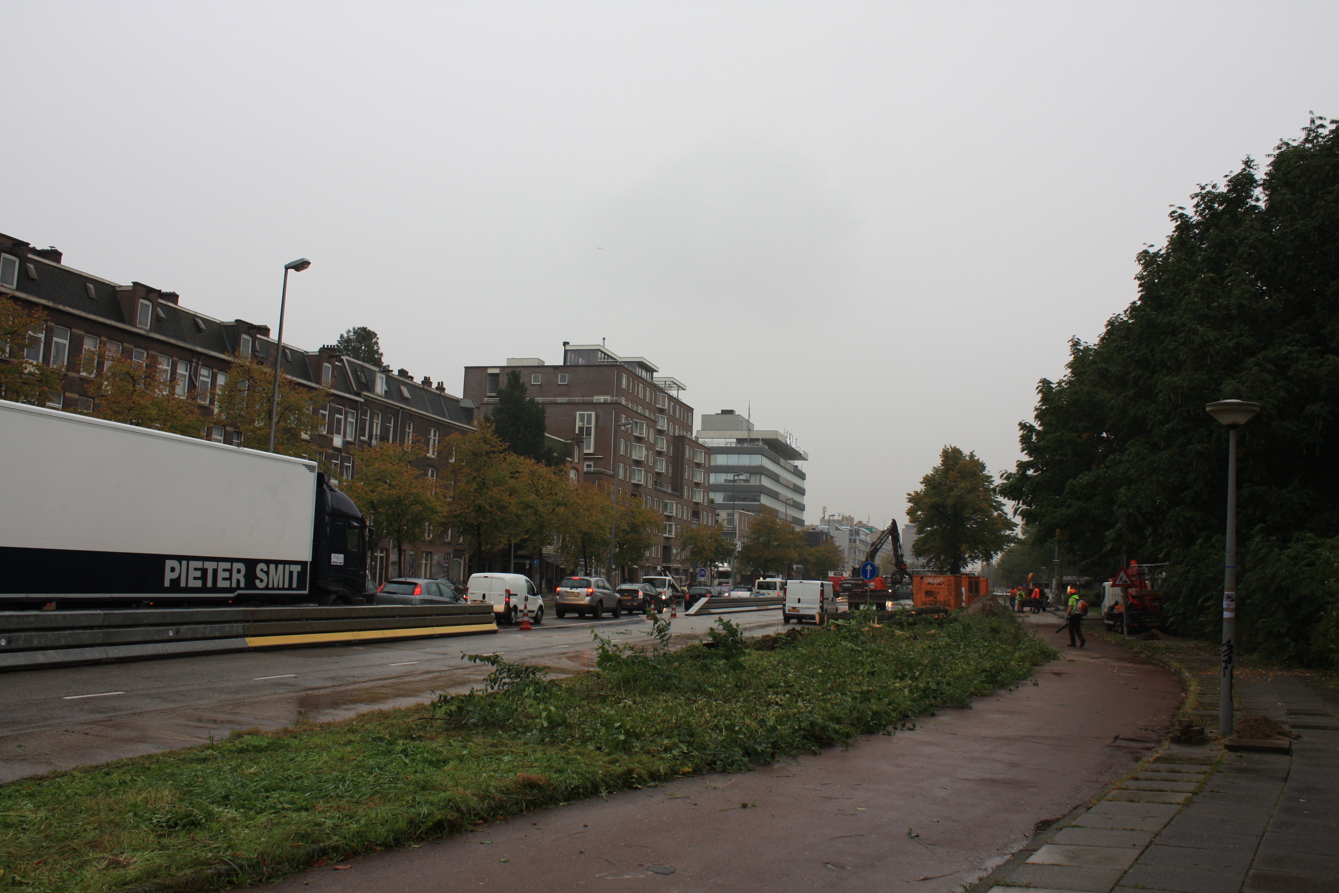
Tijdens het bekijken van de plek viel het me op dat de gebouwen op de Wibautstraat totaal niet in relatie staan met elkaar. Het is een onsamenhangend gesloten geheel en de gebouwen dragen niets uit.
Ik kreeg daardoor een beter beeld van welke aspecten ik in mijn gebouw zou willen hebben. Het gebouw moest iets gaan uitdragen, open zijn en surrealistische aspecten hebben. Met deze gedachtes ben ik begonnen aan een reeks kleine sculpturen, al zoekend naar interessante vormen. Uiteindelijk heb ik er daarvan twee gekozen.

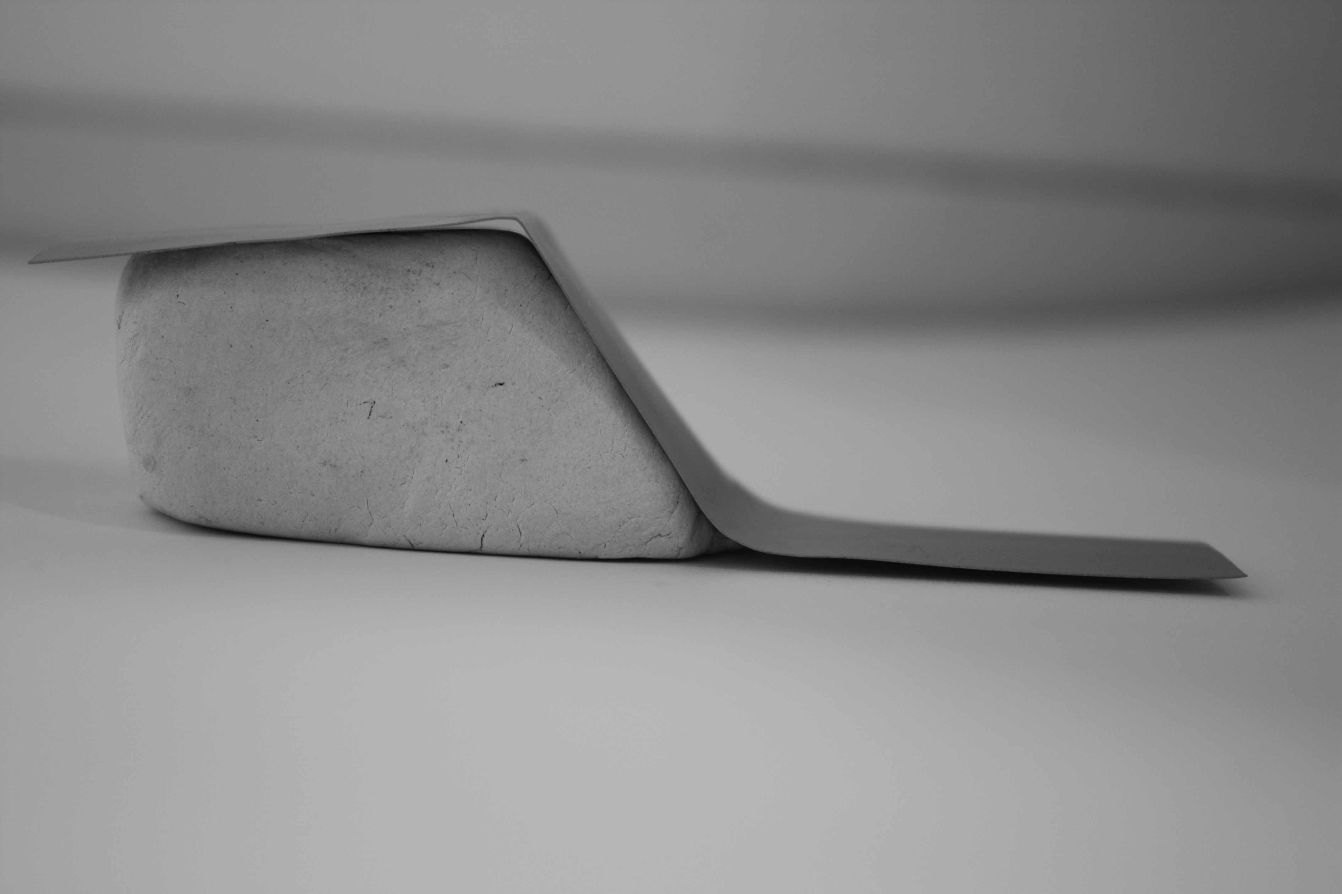
De een is speels, verticaal en open. De ander meer organisch, horizontaal en compact. Ik heb de tweede sculptuur verder meegenomen in mijn proces. Vooral omdat ik de openheid en de speelsheid van deze vorm erg goed vond passen bij mijn doelstellingen en bij hetgeen waar de wibautstraat aan te kort schiet. Maar zodra ik die keuze gemaakt had, liep ik vast en veranderde ik mijn plan in twee krampachtige kubussen op poten, die schuin voorovergebogen waren en die als twee kijkers op de wibautstraat keken. Beide kubussen gaven via de achterzijde een ander uitzicht op de stad. Ik vond de kubussen op zichzelf mooie ontwerpen geworden. Maar het was te statisch en kwam niet overeen met wat ik wilde.
Uiteindelijk heb ik mijn plan omgegooid en ben ik verder gegaan met de organische sculptuur die voor mij veel meer mogelijkheden bood. Misschien paste deze minder bij mijn doelstellingen, maar hij stond dichter bij mij. Ook kon ik met deze vorm naar mijn idee het surrealistische aspect beter verwezenlijken.
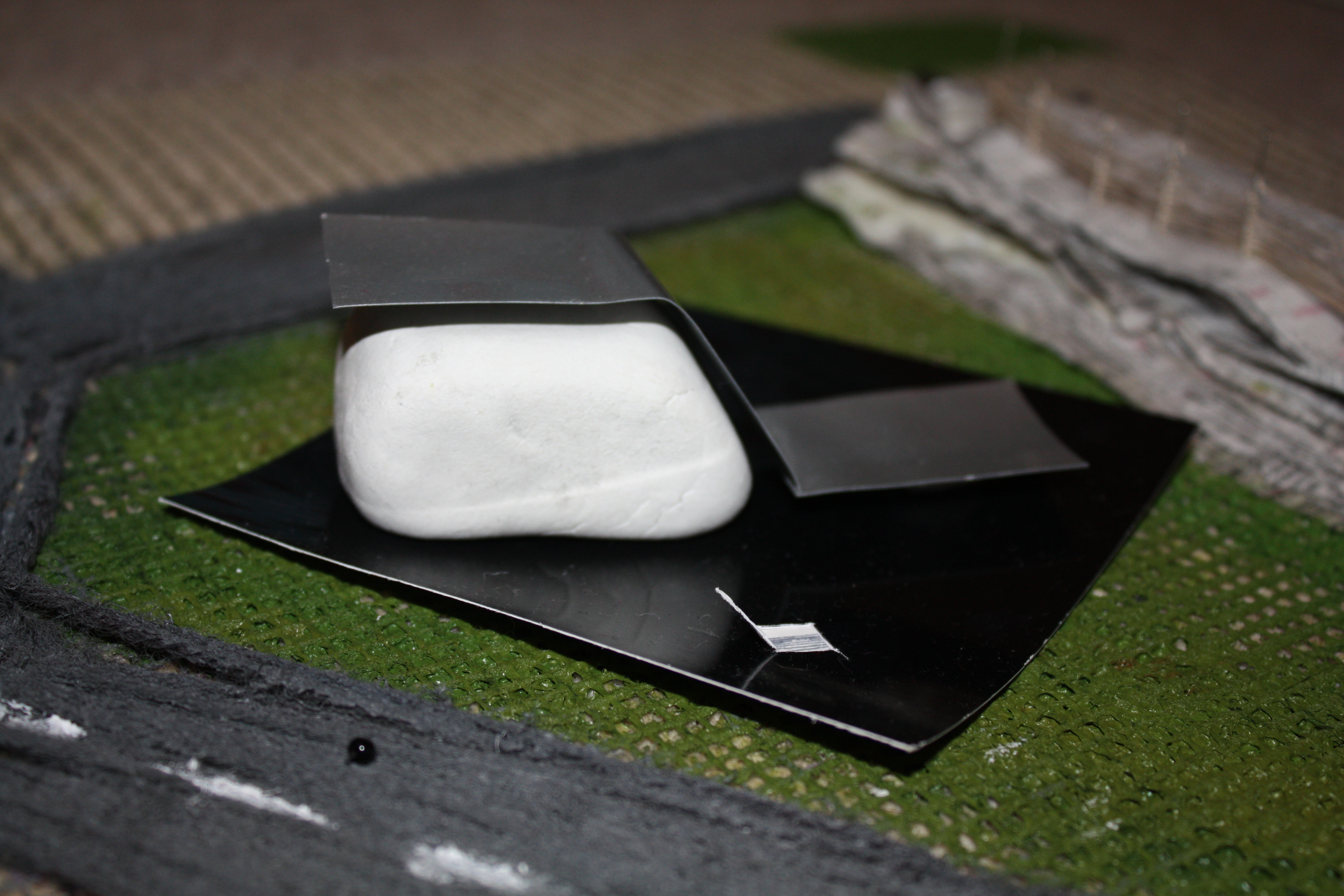
Voor mijn gevoel was ik nu op het moeilijkste punt van het project aangekomen. Het gedetailleerd bekijken en onderzoeken van de vorm. Moest er ruimte zijn tussen de twee materialen en de grond, waar zou de opening komen, moest de organische vorm ronder zijn of hoekiger enzovoort? Na veel uitproberen van verschillende mogelijkheden heb ik gekozen voor een iets rondere vorm en besloten om ruimte tussen de twee materialen te creëren en ook tussen de ijzeren plaat en de ondergrond. Hierdoor ontstonden schaduwvlakken om het gebouw heen die de vorm versterkten en de scherpte van het ijzeren vlak benadrukte.
Om dit aspect beter naar voren te laten komen heb ik een glimmende zwarte plaat onder het gebouw gemaakt waardoor het blok lijkt te zweven omdat er nu schijnbaar ook een schaduwvlak onder het gebouw is en het gebouw daarmee als het ware opgetild wordt.
De vorm van het gebouw wilde ik niet laten beïnvloeden door de opening. Daarom heb ik gekozen voor een ondergrondse ingang. De ingang is even groot als het blok dat als ondersteuning tussen de zwarte ondergrond en de ijzeren plaat zit.
Geniaal002
Monday, November 22, 2010
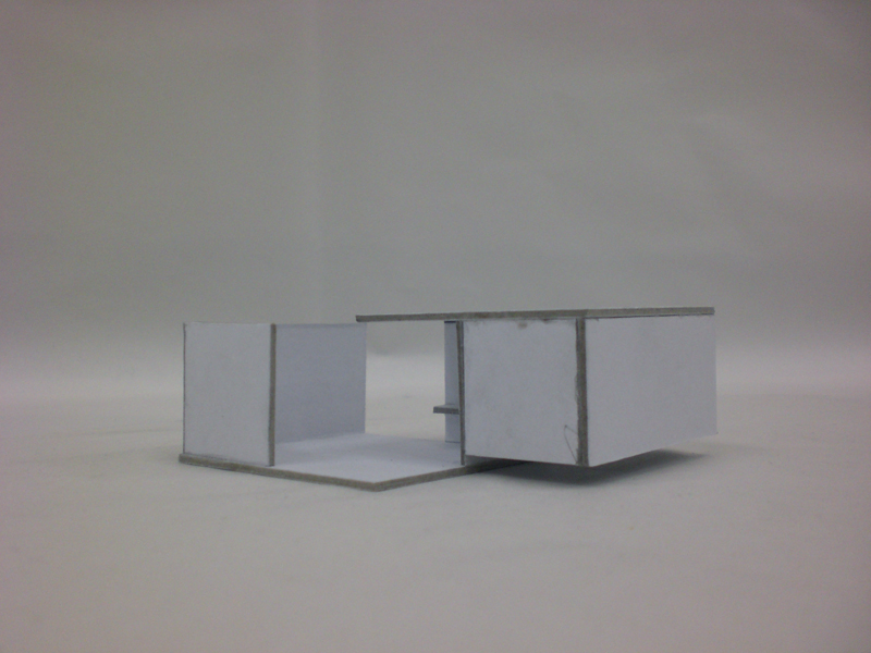
Open is not open. Closed is not closed. It can only exist next to each other.
Relativity was my starting point for this project. I wanted to create a space or building that existed out of an open and a closed area. By doing this it would be a building for everybody and every moment. It would be a contrast between introvert and extrovert. A place where you can be alone and with people. Where you can play and think.
A very nice thought but how to do this? I started with making 3D sketches out of cardboard. While doing that I tried not to plan to much. I had relativity in the back of my head and just started to make things that interested me or forms that I thought were strong. I did this till I had enough sketches and ideas. Then I put al the good ideas together and made a very complex building that was on one site a sort of bunker and on the other side an very open place. There where to much forms in it, so the starting point of relativity was far away. One of the sketches (witch I didn't used) was a very simple form of two squares who overlapped in the middle, by doing this I had created two rooms. Because the squares where turned, the one room had no roof and the other did. This was a very simple way of making use of an open and a closed area.

There where still some problems, The closed area was open on two sides so people can walk trough, this would create to much dynamics for a room witch suppose to be an closed room. The open area had still two walls so you didn't have a view witch is very important for an open area. There was a very simple solution for this, I just cut one of the walls of the open area in half and put it on one of the exits of the closed area. Because I started to work with squares this fitted precisely.In the open area you can look at the sky and in the closed area you can look at the grass. There was only one problem, because I closed one of the exits in the closed room there was no light in there and I couldn't make windows because the room would be to open. So I cut the lower part of the two outer walls away. Now there comes light from underneath. The focus lies now on the grass and there is light but not to much.
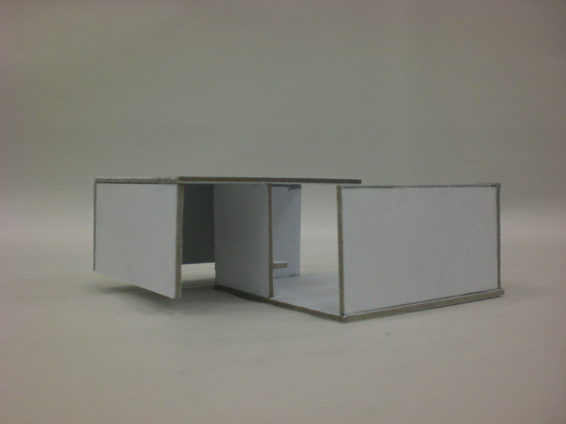
There still have to be a bench in every room. I decided to place the bench of the open area in front of the open space so you have a view from there. The bench of the closed area I decided to put on the wall witch I closed of the area with, so that it is in the corner where it is the most quit. By putting the benches this way it also supports the symmetric form of the building.
Now I created a building made out of two parts: an open and a closed one. In the open one you can can see the sky and people can walk trough so there is a lot of dynamic there. The closed one haves only one entrance and exit so you can't walk trough. Your walking on grass and there is not much light. I have made a contrast between an introvert an a extrovert area. The building shows the relativity between the two.
Boxes in the air
Sunday, November 21, 2010
I want to create something that is appealing to me both visually and intellectually. Something that will seem easy but yet complex without feeling pressured and stiff. Something that will breathe Rietveld but not be overtaken by it. Something that is made by me.
Our starting point is Rietveld, and our other starting point is a place in Amsterdam, at Wibautstraat.
Without exactly knowing what I wanted to do I started with taking pictures of the trees there, the motorway and the small bridge at the entrance to the triangle.
Scale is not my best friend and I decided to work mainly thinking about the surrounding and the visual view. My first idea was to create something inspired by the Rietveld zomerhuis. A house which would be standing free in the air. Of course lifted with the help of panels. I wanted to create a place where on one side, the one looking to the road, it would seem that there was just a wall and once you go behind it you would find an oasis looking to the tree. I was inspired by the uplifting feeling of the zomerhuis like it was floating in the air. Something spacious and airy.
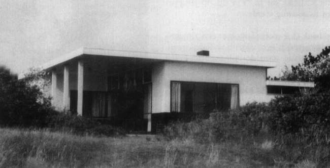
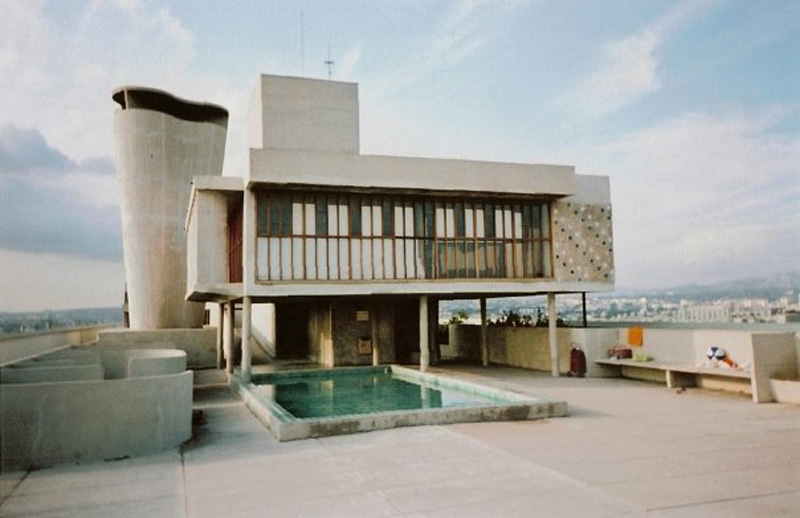
Gerrit Rietveld "Zomerhuis" en La Corbusier "La Cité Radieuse"
Once I started building it I found another picture that pushed me to the direction where I ended up. A house in Marseilles, built by Le Corbusier.
Transparency and greys would be the vital parts in this ”building”
I want to create a view for the person sitting in the box, I want to choose where the person should look, a little bit like Rietveld did at the Schröderhouse, before the bridge, motorway and new building was made. The boxes are placed in different levels, connected to each other by staircases.


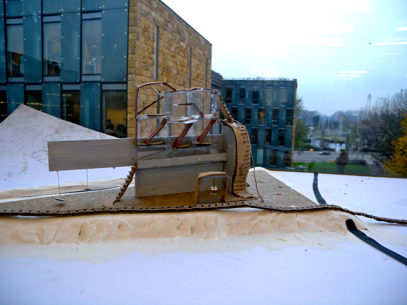
 It is a sort of labyrinth that can be seen as difficult to get around in. But it is an open obstacle that I think makes one more intrigued to visit. When you stand on the side were the grey wall is you still can see the transparent boxes, which is made with the intention to be seen. Just a little bit, so that you feel forced to go around and see what is hiding there. They are all connected with stairs and bridges. Like a playground and a relax area.