"type design" Category
Research David Keshavjee & Julien Tavelli
Sunday, March 6, 2011
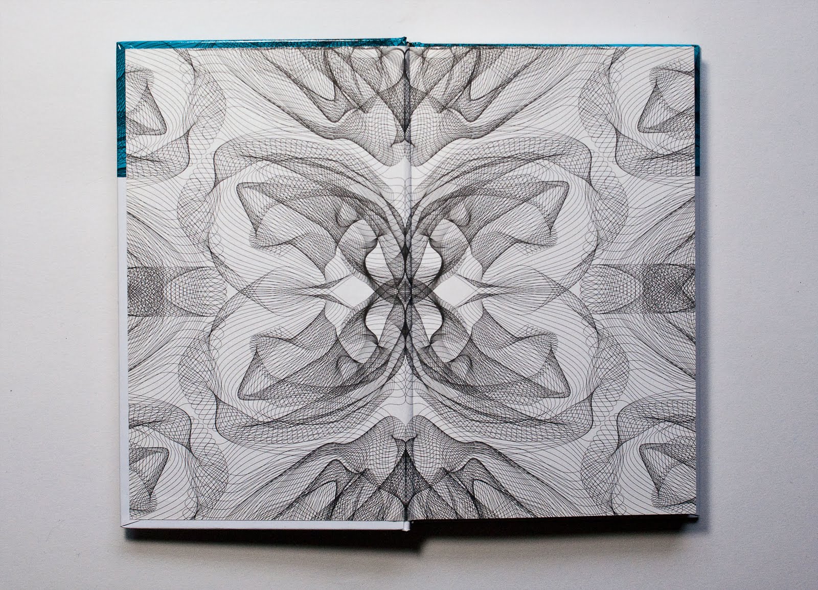
David Keshavjee (born 1985) and Julien Tavelli (born 1984) are two Swiss graphic designers/typographers, they both studied at Ecole Cantonale d’Art de Lausanne (ECAL) They where one of the winners of the Swiss Federal Design Award with their graduating project, ‘Using Tool,’ in 2009. They just made a pedagogic booklet at the Federal Office of Culture in New York, Acid Test. In collaboration with Körner Union and Tatiana Rihs they made offset cmyk experiments. Later they printed a reproduction of that handmade booklet, “Les impressions magiques“. They are part of Maximage Société Suisse, an exploration in the field of emotion and technology.
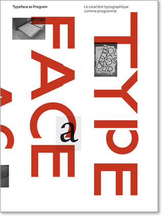
Their Using Tool project is, I think, the most interesting thing to discover about them, it explains a lot about how they work and how their poster series for music concerts where build up. The posters where published in Wallpaper and in the book ‘Typeface as Program,’ witch was published by Ecole Cantonale d’Art de Lausanne (ECAL) Especially the last one is very related to their process and what they are designing. They also explain in this book how Keshavjee and Tavelli approached their works by using half digital half manual tools during the process.

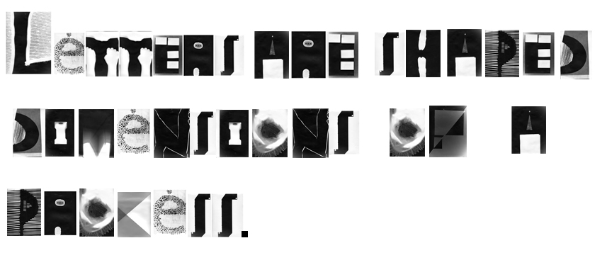
They started in their design process of the posters by first programming a script, inspired by a workshop of Frederik Berlaen on ECAL, that could automatically create a system of characters by using the already by Keshavjee and Tavelli designed ‘o’ and ‘n.’ Those two are the essence of the typeface, so with this characters the script is able to create the other characters of the alphabet. Keshavjee and Tavelli like to keep the random and uncertain factor in this system and in their font by giving the computer the control of the typeface. I think the script also helps them to design the first layer of the poster, the digital printed part, the black thin lines. When their computer created the characters they use a machine next to the computer that cut the letters out of a 2mm thin wooden plate what is still very raw then, but they do the final touch by hand. After they manufactured the wooden characters they cut pieces wood all the same size to glue the 2mm thin wooden characters on it. After they did this crucial step, they can think and work with the spacing of the letters, and build up the composition. The last step for them is to combine the background layer and the composition of the typography, the wooden characters into the final poster.


I think with the combination of manual and digital processes that are repeated at each step, from the production and application of the typography until in the composition and final print, Keshavjee and Tavelli create a refreshing and inspiring result of the raw woodcut with the smooth digital print. They work according to the principle that the means influence the form and that new forms of expression in graphic design can be created by combining different tools. These ideas are applied to the poster series as well, it’s the essence of their project. The posters are also published together with the thoughts about this series and an interview where they explain more in the book, ‘Typeface as Program.‘ There is also an interesting article on boston.com about the swiss designer thoughts of typography by Cate McQuaid.
For me they work a bit like typographic engineers I would say. They really are working with developing scripts and systems to help them approach typography in another way, not very usual and practical way, but an interesting one. You could think if you read about how controlled they work in a way, that they are probably to much controlling their work. But their prints are very open for unexpected accidents within its system, there is a lot that can go wrong, all trough this process the accidents are creating new opportunities in the creative process of their typographic experiments, that’s a good value of their work I think. They also always start projects by experiments. It could be interesting to learn and see more of the projects of David Keshavjee and Julian Tavelli, and see how they treat their project during the process of designing typography.

Hansje van Halem
Sunday, March 6, 2011
De computer heeft gezorgd voor drastische wijzigingen in de manier waarop lettertypes worden ontworpen en gebruikt. Het lag voor de hand dat grafische ontwerpers zouden reageren op de ontwikkelingen die hun traditionele manier van werken bedreigden. Ze ontwikkelden andere, soms ook traditionele, oplossingen voor de nieuwe weg naar de toekomst. Dit deden ze omdat ze bang waren dat mechanisatie tot een verdwijning van standaarden en gevestigde typografische regels zou leidden.
Tegenwoordig integreren veel belangrijke grafisch ontwerpers typografie, belettering en beeldproductie, waardoor ze meer opschuiven in de richting van de beeldende kunst dan in die van de vormgeving. Microsoft kwam in 1996 met het “Core fonts for the Web-project”. Microsoft wilde hiermee een standard set lettertypes gratis verspreiden. Deze lettertypes moesten goed leesbaar zijn op het sherm, verschillende stijlen bieden en ook geschikt zijn voor internationaal gebruik. Uiteindelijk zijn de volgende lettertypen hiervoor gekozen: Andale Mono, Arial, Comic Sans MS, Courier New, Georgia, Impact, Times New Roman, Trebuchet MS, Verdana en Webdings.
Dit zijn nog steeds de meest gebruikte fonts op het web. Bovengenoemde lettertypes zijn natuurlijk ontworpen om een tekst makkelijk leesbaar te maken, zodat je als lezer snel informatie kunt opnemen. Maar niet alleen handige fonts worden ontworpen. Er is namelijk ook behoefte aan sierletters, of aan letters die interesse wekken en waarnaar je aandacht getrokken wordt. Deze letters kunnen goed gebruikt worden op bijvoorbeeld posters.
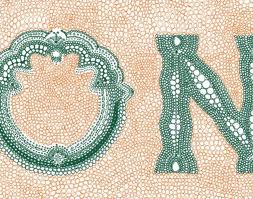
Een voorbeeld van een ontwerper van sierlijke letters is Hansje van Halem. Zij is afgestudeerd aan de Rietveld Academie afdeling grafisch ontwerpen met een vorm van typografie in het jaar 2003. Ondertussen heeft ze nog een aantal letters ontworpen, maar ze richt zich tegenwoordig vooral op het vormgeven van boeken en ontwerpen van patronen.

Sommige van haar ontworpen letters zijn ontstaan in opdrachtverband, of tijdens het tekenen van hun plek binnen een andere opdracht. Het afstudeerproject is een alfabet, opgebouwd uit een x-aantal lagen geschetste letters. Ze nam het frame van de letters van een al bestaand lettertype en tekende vervolgens deze letter daarin op de computer. Door een aantal lagen te kiezen is het mogelijk om heel precies te zijn met de dikte van de letter. Dit maakt het erg interessant, want zo kan het er telkens weer uniek uitzien door te spelen met de aantal lagen. Dit font is de enige die ze als totaal alfabet heeft ontworpen.

Verder heeft ze eigen ontworpen letters gebruikt voor posters of boeken, maar hiervoor alleen de letters getekend die ze nodig had. In deze voorbeelden komt ook meer haar algemene stijl naar voren dan bij haar afstudeerproject. Bij het zien van haar werk, is het duidelijk dat ze onder andere inspiratie bij ouderwetse technieken vind, zoals breien en kantklossen. In haar ontwerpen werkt ze niet zo zeer aan de vorm van de letter, maar meer met de invulling. Ze gebruikt bestaande letters en “tast” die vervolgens aan door middel van een systeem of regels die ze zelf bedenkt. Hansje van Halem gebruikt voornamelijk lijnen in haar werk. Dit doet ze, omdat ze op deze manier makkelijk met zwart en wit grijswaarden kan bepalen. Er is een constante spanning tussen dikte, schaal, structuur en handschrift. Door de computer is het mogelijk om met haar systemen ervoor te zorgen dat er geen onregelmatigheden ontstaan, maar juist dat vind ze erg interessant. Hierom gebruikt ze vaak kleine tekens van oneffenheden, verloop, zichtbare vermoeidheid en ontwikkeling en zorgt ervoor dat het nog een extra laag krijgt, wat de aandacht van de lezer langer vasthoudt.


Naast haar interessante afstudeerproject heeft ze onder andere ook het ontwerp gemaakt voor de Nederlandse postzegels van 44 cent en 88 cent. Bij de zegel van 88 cent heeft ze de cijfers zelf ontworpen en de tekst in het lettertype “Spectrum” erbij gezet. De ronde vormen van de achten komen terug in de kleine tekst eronder. Bij de postzegel van vierenveertig cent is het lettertype “Johnston” gebruikt. Het patroon op de achtergrond van beide zegels heeft ze ook zelf ontworpen. Deze zorgen ervoor dat de speelse, schijnbaar met de hand getekende cijfers toch een zakelijk/serieus uiterlijk hebben. Later heeft ze ook de aanpassingen gemaakt naar de nieuwe 1 en 2 zegel. Vooral de toegevoegde kleuren vallen daar in op

De letters van Hansje van Halem zijn sierlijk en interessant. Kleine krabbeltjes maken een letter gedetailleerd, maar storen de eesbaarheid niet. Soms is het zaak een moment te focussen om te ontdekken hoe de letter werkt, hoe het is opgebouwd, anderen laten duidelijk een systeem zien. In ieder geval is de concentratie en een passie voor ontwerpen in elk ontwerp terug te vinden.

Meer voorbeelden van het werk van Hansje van Halem en ook de periodieke tentoonstellingen die ze organiseerd met mede kunstenaars en
ontwerpers in haar huiskamer SCHRANK8  kun je bekijken op haar site
monospaced
Saturday, March 5, 2011
Monospaced Fonts.
The horizontal space that a letter occupies in a monospaced font is the same for every letter.
Meaning that wider letters are cramped into a smaller space, and thinner letters have more white space around them, so they will all fit in the same box.
Monospacing first occurred when the typewriter was invented, because the typewriter had to use the same space for every letter, a good example can be found in WordPad on Windows the standard font is still monospaced.
When looking at the shapes of letters it’s not hard to see that some letters need more horizontal space because they are more complicated in their shape, compare for instance the letter ‘m’ to the ‘i’ it seems obvious that the letter ‘m’ needs more space because it has 3 vertical lines opposed to one in the ‘i’, when these two letters need to be fitted into the same width then the ’m’ has to be cramped and the ‘I’ stretched, or the white space around it needs to be wider.
Is monospacing more easy and clear then variable-width fonts?
When seeing a monospaced font it immediately reminds me of old fashioned computers or typewriters, and it does not have any ‘flow’.
Most people will assume that the subject of the text corresponds with the typeface, making a text that is written monospaced unattractive for many people. Writing monospaced does give a certain structure to a text , although I doubt if it would become more clear, because it does more justice to the personality of a letter to give it the space that it needs and deserves, then to force it into a pre-defined space.
Using a monospaced font can serve some particular purposes, for instance when a text on a sign needs to be changed it is easier to work with when it’s possible to predict if a sentence fits when all letters have the same width, the same goes for some type of documents and other formal writings.
Concerning monospaced fonts it seems that technological reasons are more important than readability, although in bringing across a quick message they could work well.
Monospaced fonts can be strong when communicating short messages, but because it doesn’t ‘flow’ as nice as variable spaced fonts it can be more tiring to read long tekst written in monospace, because the words don’t become words but remain more separate letters.
What is important for readability of text is how letters form words when they are combined and here the white space in between is as crucial as the individual letter, monospaced fonts eliminate these characteristics and therefore it can take more effort to read a long text in a monospaced font.
In a monospaced font the letters have equal space, but why would an I or J or L need the same space as letters like W and M ?
If letters get the amount of space that they need instead of the amount that a technology allows them to have they can function more strong because they keep their own
characteristics, this way words can function as words instead of a combination of letters.
Why use monospaced fonts? I found out is mainly because of technological limitations, and in some cases to make it easier to know whether a text fits into a frame, although it seems there are more reasons to not use monospaced fonts but instead variable width fonts, because the main reason of text is communication and readability and they are stronger in variable width fonts.
Bob Vos
references:
list of monospaced fonts and a description.
http://www.fontsquirrel.com/fonts/list/style/Monospaced
this website contains many examples of monospaced fonts.
http://www.quora.com/Why-is-it-important-to-have-a-monospace-font-in-a-text-editor
text explanation about why monospaced fonts are used.
We love geometry
Wednesday, March 2, 2011

Geometry appeals to us. When I was very young, I remember playing with wooden squares, circles and triangles, trying to find the right hole for them. Apparently, we learn to recognize geometry’s basic shapes from an early age. Not only is it one of the oldest mathematical sciences, it provides practical knowledge to interpret size, volume and relative position of figures in all kinds of situations. Through the axioms of geometry, measurements can be reduced to a simple set of lines, making our world a very synoptic place and providing us with a feeling of – why not – security and intelligent understanding.
TYPE CRUISER
Wednesday, July 28, 2010
The Type Cruiser / Ebay Auction is spearheaded by Simone Vollenweider & Anna Sartorius.
Within the last month they designed a new typeface which is available on Ebay till July 29th. Ebay (Typeface Cruiser HGB)
Part of the concept is that the font is meant to undergo changes throughout the auction: With each new tenderer a new special character will be introduced into the existing font such as a comma, question mark etc. Designers – that are not part of project yet – are encouraged to contribute to the exciting pool of characters by designing such a special character. The design of each new character is not subject to the existing typeface and is free of any rules or limitations.

The designers who are participating: Angelo Benedetto, Anna Lena von Helldorf, Anthony Burrill, Carolin Kurz, Daniel Gaffner, Daniel Peter, Dino dos Santos, Fanette Mellier, Jennie Winhall and Kathe Burn, Kerstin Finger, Hudson-Powell , Markus Dreßen, Martin Aleith (Pfandfinderei Berlin), Martin Sperling, Mathis Pfäffli, Node Berlin Oslo , Oliver Klimpel, Radim Pesko, René Siegfried, Silke Klinnert, Stephan Fiedler, Stephan Müller (Lineto), Thomas Ulrik Madsen, Yoann Betrandy, Mind Design & students of the Academy of Visual Arts in Leipzig.
More Informations Both, Simone and Anna, are enrolled at the Academy of Visual Arts in Leipzig/Germany and study "Systemdesign" with professor Oliver Klimpel.
Duct-tape
Tuesday, June 1, 2010

In April we had a lecture from Ayumi Higuchi. The lecture was about her essay in which she investigates the impact rules have or can have on the process of cause and effect in the creative process.
To give us a visual example how the rules work, Ayumi let us make trees out of duct-tape.
Although it was not the goal of the workshop, it was really nice to see how quickly you could make a beautifull installation with tape. This inspired me to search more about tape and the artist who work with it.
Quick history
Duct-tape was developed during World War II in 1942. It’s a water resistant sealing tape with a standard width of 48 mm. It was used to repair military equipment quickly, including jeeps, firearms and aircrafts, because of it’s strength and it’s water resistand quality.
The original name is duct-tape but the soldiers in World War II changed it into duck-tape because the word duct-tape was to simular to the name for the cotton fabric they used for tents and rain clothing.
After the war soldiers returned home and took the duct-tape with them, to use it around the house. Since then it serves all kinds of perpuses. In the 1970’s duct-tape even made it’s introduction into spaceflights. When the square carbon dioxide filters from Apollo 13 failed, they used duct-tape to fix it.
This saved the lives of the three astrounauts on board.
Over the years duct-tape became a very popular product. People are making items out of duct-tape or decorate objects with it. You even have a lot of websites with information about how to make stuff out of duct-tape, and movies on youtube with instructions how to make it. Like this movie, that shows how to make youre one wallet out of duct-tape.
Increased interest in creating these novelty and fashion pieces has given rise to designer duct-tape handbags, wallets, belts etc.
Not only designers are interested in duct-tape. Also a lot of artist use it.

Click here for more of these installations.
Aaksh Nihilani
Also a lot of graphic designers use duct-tape. Within typography it even got a new name: Tapography. (also used for typography made out ofcasette tapes )
Artist Aaksh Nihilani is one of the artist who works a lot with tape. For the Arario Gallery in New-York he made three installations with duct-tape.
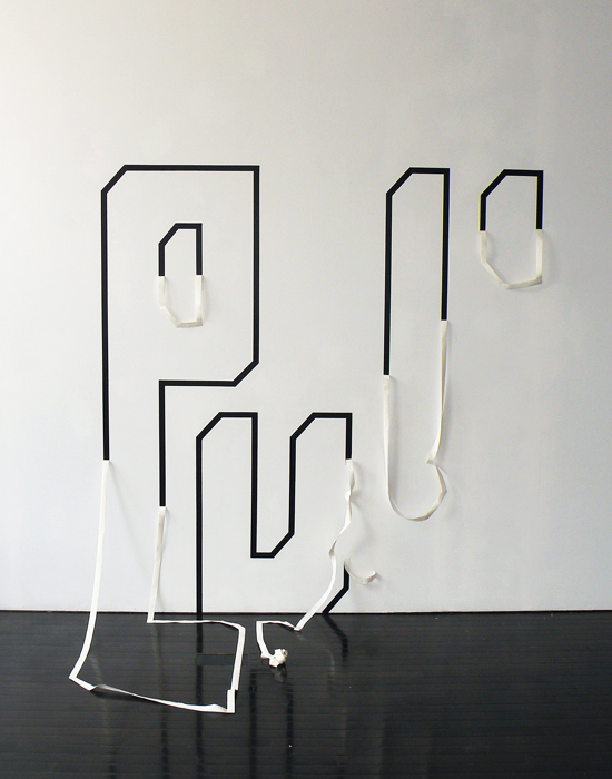
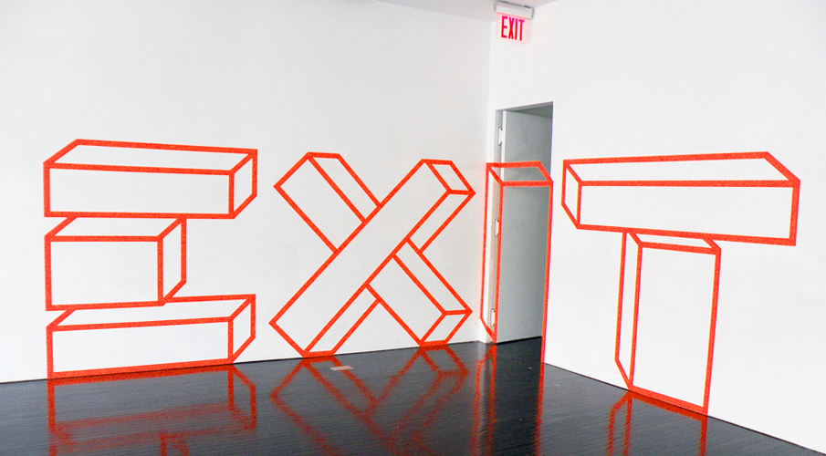
His explanation about the works:
“Since the show was titled Paraphrase, I took the opportunity to get into some tekst, tapography. I did ubiquitous words that we all encounter in our daily travels, especially as a New Yorker, but I wanted my paraphrase of the words to be aesthetically ‘better ‘than their original. So the words pull, push, and exit are all written out in tape, as well as simultaneously being shown acted out, or about to be (as in the exit piece). They were all a little bigger then human scale so as to more objectify their viewer rather than the usual other way around. I think these installations were particularly succesful because they stayed true to the site specific nature of the wordk that got me the show in the first place (i.e. Using the gallery’s door hinge to complete some of my lines), but also took on new levels of content in the figuration of the letters, and new concepts/processes of using the tape to express qualities like peeling and falling”
Autobahn
An other example of a tapografic experiment is tapewriter bu Autobahn. It is developed during a seminar by Richard van der Laken and Eric Wie, and later developed until a type specimin.

Tapewriter is a typeface that gets it’s form from the fence of a soccer-cage. The width of a role duct-tape is exactly the same as the room between two bars of the fences from thes cages. The thought behind this font is that any one who ones a role of ducttape can share their thoughts with the rest of the world.
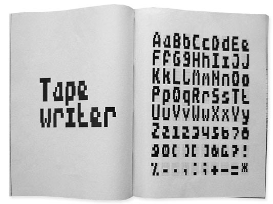
Tapewriter showes that you can write with anything and that any surface can become your paper.
More information and the total typefase you can find on the website of autobahn.
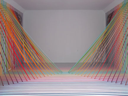
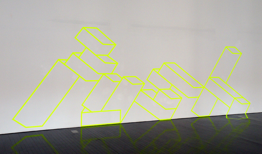
Experiments with Duct-tape
Inspired by this all I started to experiment with duct-tape myself. My first experiment was just to write something on the wall with tape.

After that I wanted to create a 3-d effect into space, wich I achieved to tape tekst to my window an fotograph it with the outside landscape:

In my last experiment I really wanted to go 3-d. So I made lines with yellow tape in the air and made letters with black tape in it. It creates
a very interesting effect because it looks different from each side. As you can see on the picture below and the title picture.

In our house we had a cat…
Thursday, November 12, 2009
Subjectively searching for a very unsubjective assignment, but still with the subjective thought in mind that it is not possible to be subjective in command, I saw a large white book. The title is not really that interesting, but the bigness of the book attracts me. It might be worth taking a look on the inside. So that is what I do. The whole book (798 pages) is filled with the same text in different sizes and fonts. If the book was on sale, I would buy it. But it is on lend, so that is what I do. It is fascinating to read the same text (‘In our house we had a cat with the grandiose name of Gonnosuke …’) over and over again. If not knowing the purpose of this book (a sort of shopping guide for fonts), you could think it was written by someone who was or high or compulsively neurotic or both.
FunctionalVsEngagé
Thursday, May 28, 2009
In my first post about two of the most important and influential dutch graphic designers, Wim Crouwel and Anthon Beeke (pdf), i tried to compare them by their different approach. Especially the way Beeke designed, really intrigued me.
It was provocating and controversial which made him one of the leading conceptual engaged designers.
On the other side, Wim Crouwel is known as a more functional designer, which means less conceptual.
But is it really that easy to divide and are all this categorizations correctly made?


Especially in the case of Wim Crouwel i doubt it. His design of the new alphabet was based on the begin of computer technology, in a time were blogs, facebook and internet in general didn’t exist. Coming up with a font type based on this new technology combines in a perfect way a clear, functional and computer like approach. Computer like is also the keyword for, in my opinion, a highly conceptual design.
With the awareness that this technology will change they way we communicate, document, the way we are. His style is timeless (even if it also relates to the early 70s) and applicable still nowadays.


Beeke’s Human alphabet, using the aesthetics (look at the swedish film makers Ingmar Bergman and Vilgot Sjöman) and social and political topics like sexuality, seems more related to that specific time.
So Aesthetics is next to conceptualism and functionalism a really important aspect, what makes Crouwel’s design less depend on a certain time period.
Never the less, Anthon Beeke’s radical and shocking way, even if it is not so applicable in our times anymore, was responsible for breaking through the conservatism of (Graphic design) and is so a mirror of other important political and social openings in this time period, and even if his aesthetics are not so up to date, his conceptual engagement is.
link: The Human Alphabet as a visual brand
link: Anton Beeke exhibit at Centre for Visual Arts Zeeland
unconditional brand communication
Wednesday, April 1, 2009

you should not pick up “guerilla advertising” if you don’t have at least an hour to flip through this book.
it is reporting about advertising campagnes of various kinds.
numerous firms and organisations (e.g. nike, addidas. mcdonalds, the protestant church, the united nations, amnesty international, unicef or oxfam) with different approaches such as provokation, investigation, simply advertising or social criticism are represented in this book.
the methods are new; investigation of space and the use of human habits in western society are part of the adverting strategies.
there is several opinions about the capitalistic aim of advertising itself, but in my point of view is this book dealing with a lot more than only the selling aspect of it. definately worth a glaze… or two.
cat.no. 754.5-lue-
keyword: overview
EXCAVATION (part 2)
Thursday, March 26, 2009

Excavating the library, looking for pyramids, lead me to a late 60´s representation of posters by the graphic design artist Milton Glaser. The choice for this book is solely based on the cover graphics and has no other connection to the first book selected, though it seems that the fascination for pyramids and their monumental quality are shared by many designers regardless of the time or design field.
The size of this book (A3) is in my opinion very well adapted for displaying these incredible hand drawn posters. Every page is a poster and the more you look into them the more you see.

Bob Dylan poster by Milton Glaser 1966.
cat. nr: 754.1
keyword: pyramid
NATIONAL IDENTITY IN FILM POSTERS
Wednesday, March 25, 2009
This letter I want to attach to my last message about national identity present in a street signs in different cultures. For the second time I’m using this book, which you can also take in a library. This time I’ve made a selection of posters made in different countries, but for the same movies. My thought was about the possibility of existance of different schools of postering. This posters, that you can find below, were made in the time when there were no internet for sending files with information and a designer or an artist had to improvise making a new masterpiece for the public. But this problem had made movie presentation even more interesting in different countries. Each country had added something special, non cliche. So, enjoy!
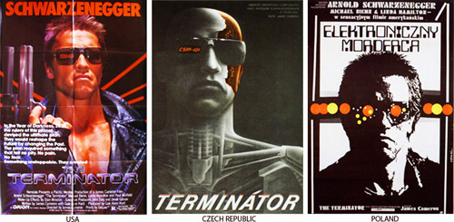
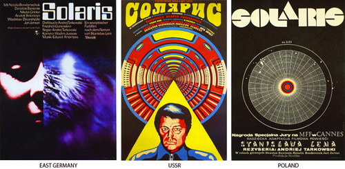
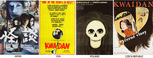
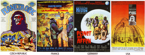
cat. nr: 754.1-keh-1
keyword: identity
standing still
Wednesday, February 11, 2009
I will start with a beautifull sentence that has inspired me often. ”standing still for a moment, is actually a big step forward. So I stand still the whole day”. This sentence is a complete overview of what slowness is for me. But is this in connexion to any kind of design or art? For me in some cases this standing still adds a big layer in looking at things. By looking at objects and art for more than an hour and from the same perspective, it gives a new strength. But is there a way to make other people expierence this power of standing still. What could design/art add to this?