Skip to Content Skip to Search Go to Top Navigation Go to Side Menu


Poul Henningsen The Artichoke 1958


Sunday, March 10, 2013

Poul Henningsens lamps were produced because he thought that the electric light bulbs cast a disturbing light. They where either too bright or the lampshades swallowed all the light because of their design in that time. He wanted a lampshade that sent light into the room with its full strength without blinding you. One of the examples is the The Artichoke which also hangs in the Stedelijk Permanent Design Show. As you can see on the picture he has composed layers of copper plates in the shape of a pine cone (I choose to say a pine cone and not artichoke but I will explain why later) so the light is reflected from the greatest ability and does not dazzle you as there is no direct light from the bulb.

One of the reasons that I chose PH’s lamp is because I know that design from Denmark. It reminds me of my parents living room where a PH5 lamp is hanging over their dining table which is typically seen in many places of Scandinavian homes and institutions.

But what also catched me was the English translation of “Koglen” which from danish should be translated to “The Pine Cone” and not an artichoke. I found it disturbing to break the original concept because I do not associate it with being something Danish or Nordic. I can understand that the artichoke as a vegetable visually have something in common with the lamp as the leaves of the artichoke could compare to its division into the different copper plates.

But as a fact he build his design out from a pine cone and that is what makes me wonder why it is suddenly being an artichoke. Also because the copper is an obvious association to the brown color of a pine cone.
It is not because I am a bitter nationalist that finally get the chance to publish a letter to the editor about how danish design is being misunderstood but I am really surprised about the translation and I’m thinking it is the same as if the chair “The Swan” by Arne Jacobsen was translated into “The flamingo” to get people from outside Scandinavia able to identify them self with the design.
 

An infinite loop


Sunday, March 10, 2013

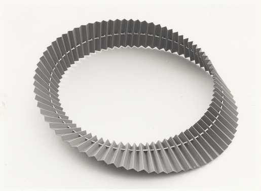
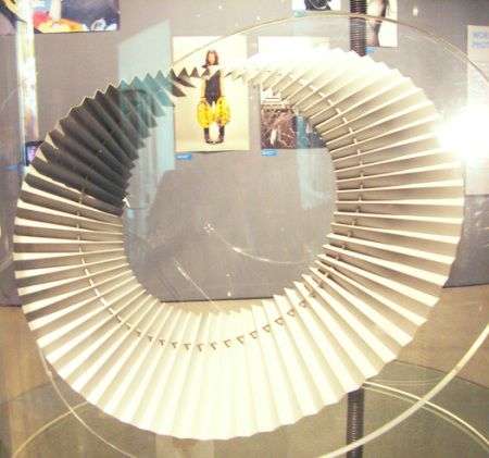
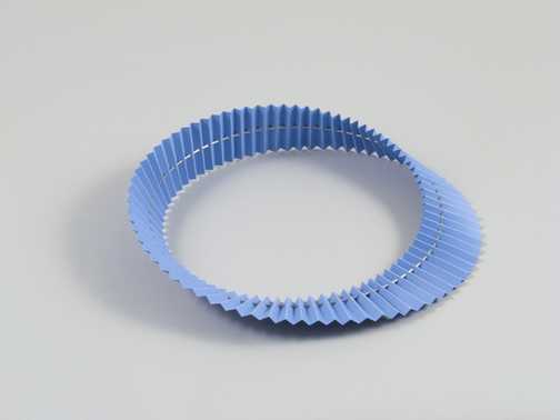
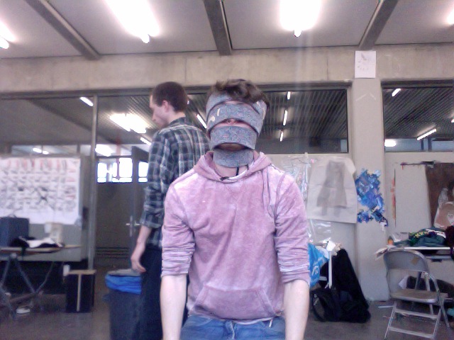
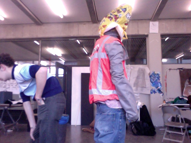
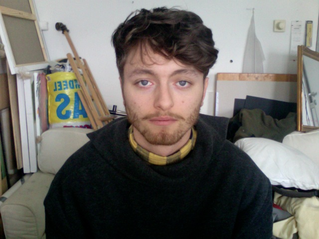
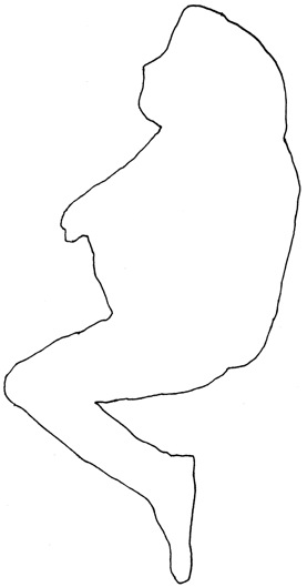
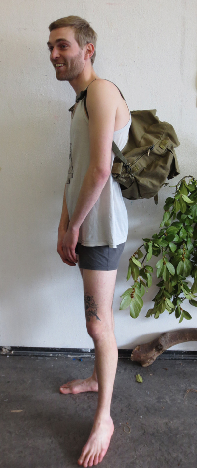
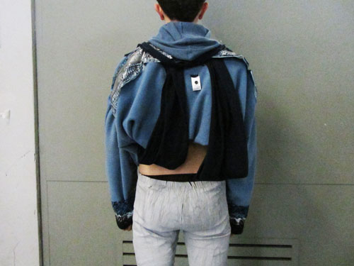
 halssieraad, Paul Derrez. 1982

Jewellery is mainly recognised by its symbolic and stereotypical image. This category is limited by the size, flexibility and wearability to mass market towards wider audiences. For long time jewelleries were symbolizing affluence, importance and preciousness, in the value carried by this word. Then the decade of the sixties, seventies set a new stage, without limits for jewellery design. The category of “art jewellery” appeared and new directions were taken. The traditional structure is then broken done, permitting freedom regarding the form, material, technique and production. Still the relation between the body and jewellery is getting the most out of boundaries. In this context I want to present Paul Derrez’s creation, halssieraad.

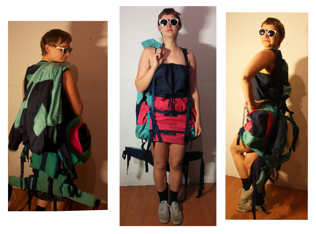
The piece is created in 1982, as part of collection of necklaces with pleated material, there are versions in different colors, red, grey, white, blue, black, so there were more, but grey was ‘one of the best’ as mentioned by the author. He made in total around ten, in different colors, maybe three grey, as the one exhibited at the Steddelijk museum.

When I interviewed Derrez, about the creation of halssieraad, he said that this work was

the end results of a period I was involved with pleating material. First I made a silver pleat from which I made earrings, brochures, smaller items, but by using that pleated, thin, plastic sheet, which is cheaper and easier to get, I could have bigger objects.”   

The weight was also important so the necklace is the product of experimenting with these materials and producing the so called Mobiusm necklaces. The Mobius shape represents a never ending plane . Over time, it became the accepted symbol for infinity. 

Paul Derrez’s interest in design is mainly connected to jewellery, not only in his work but also in his collection and research. He is a productive author and the founder of the gallery Ra opened in 1976 which for him is his main priority. In 2005, he wrote one of the essay in “new direction in jewellery”

Derrez prefers to work with pure and robust forms which are likely to give monumental effect even if his work is relatively small. He sees his pieces as a wearable sculpture and give an important place to the relation between object and body and also to the relation with the space.

It’s via research and mostly experimentation that he is developing his work and it’s a reaction toward a wide range of conclusions and results. It permits for him to look for new meaning, language form and new aesthetic. This symbolic importance appears a lot with his work “pills”, 1986, associated to drug abuse. . In the collections shown in Ra there is this passion for transient material. In his work as well the material experimentation show how it emphasis ideas. It has a Mobius space when you have a strip and you glue it and then you turn it together then it becomes a continuing line and this is halsieraad. Also in fact the plastic strip and also has a twist which is the Mobius principle, because it is also a necklace, it makes it even more infinite. I needed the pleating to make it work. There is a stainless steel wire in it, to fix it; the wire is just a circle.

In the other hand, even if his jewellery tends to stand as a sculpture by itself, he is defining and limiting a jewellery only if «it can be worn by a human being and is a thing » but « this aspect of ‘wearing’ can either be done easily or with difficulty ».

Then I asked about the relationship between the body and the object?

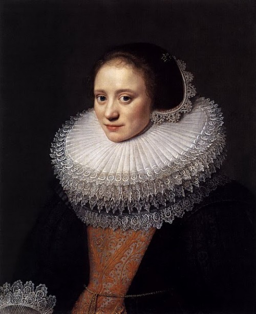
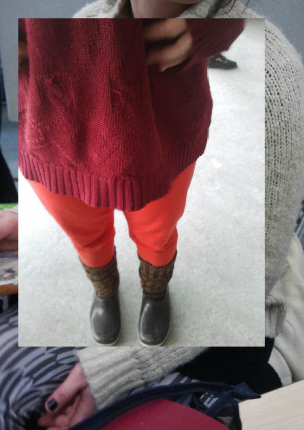
Due to the size, ‘it is almost more of a collar than a necklace’. The historical example is seen in old Dutch paintings of collars (those are made of textile) they are the same large size, making the person who wears them feel important. This is a similar piece, as described by its maker halssieraad ‘is quite theatrical, it is as if for a theatrical performance.’ In the 70’s it was all about size and material experimenting, when it came to jewelry, but also how it relates to the body. 

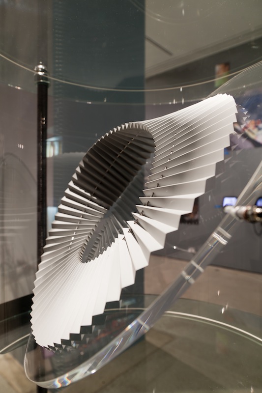
From my point of view, standing first as a sculpture and then as a necklace, I used two opposite ways to analyze halssieraad. This contrast made it interesting to understand the piece itself but also how Paul Derrez is approaching his work.

The first visual sensation I got from the work had both an architectural and sculptural impact. Therefore, it was the main reason for my selection of halssieraad. I have not perceived it only as a designed or useful object.

This work of Derrez gave me a sense of a complete control and true understanding of form and material. The shape is minimalist, recurrent and with the use of uniform plastic the collar appears as a light structure. When gathering my own perception of the work and forced by my understanding of an infinite loop and continuous movement in the object, the necklace gave me a meditative and hypnotic feeling.

The sensation and impression that the collar triggered in me is most often created by work that is impressive in size. I could feel the monumental effect that Derrez seeks to activate with a smaller size restricted by the jewellery.

The relation between halssieraad to the body and then to the space is also an important part of my interest in the object.


Thinking about it as a necklace to be worn is not appealing for me. The way it has to be positioned on the body by surrounding not only the neck but also the top part of the body and the contact of the material to the skin seem to me disturbing, irritating and disruptive. The piece gave me also a feeling similar to a fence which is creating a distance between the body and external interaction or even the space, yet after the interview I managed to support my views of the object’s use to create a sense of superiority and importance.


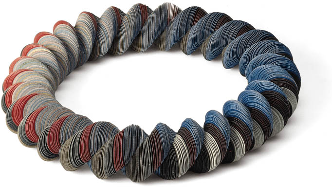
 Via Paul Derrez’s writing about Niel Linssen, I discovered her work. What I really found interesting is how I could connect my feeling from the necklace to the way that Derrez is speaking about her work. I associate the two artists because there is also with Linssen this experimentation for material, form and structure. And like Paul Derrez said: there is in her work this “determines form and direction” that I felt with Halssieraad.

Therefore I asked if there is any relationship between your work and Neil Linssen?

I have a different veto. I am a gallery owner and maker and by promoting, writing about and sponsoring, so I represent her artwork here, but there is no connection. She has a continuing line of research on a material and technique. While I work in themes, in groups of work and then I move on to something else, so I do not have this lifelong study of material, and her work is not connected to mine.’

“Ultima Thule” Tapio Wirkkala


Friday, March 8, 2013

A dinner service “Ultima Thule” made by Finnish designer Tapio Wirkkala in 1968 was the most attractive object in design part of the Stedelijk museum. Tapio was a post-modern designer/sculptor. He was designing jewelery, ceramics, furniture for mass production, individual sculptures. One of his most famous design is for example a Finlandic vodka bottle.The dinner service was designed for the IIttala, a popular shop which collects Scadinavian designs of products for living, dining, decorating and giving. Tapio designed more than 400 different art glass objects and glassware series for iittala. The old term “Ultima Thule” meant the most northern, most demanding and at the same time most venerated place in the world. Tapio Wirkkala was directly inspired but the Arctic mystique, Finland’s wintry landscape and glassclear ice. The glasses was intended to represent the dripping and refreezing ice drops from the glacial landscapes of Finland. The technique for making these beautiful objects is called the ice glass technique, and Wirkkala himself was involved in developing and perfecting it over a period of many years. This techniqueis is achieved by blowing the glass into a wooden mold. The trick is to know when to stop blowing as the colours and patterns change as the hot glass burns the wooden surface of the mold as it begins to cool. For me personally the service looks like it was left for the whole summer night in the garden and  covered it the morning with a dew underneath. It gives me immediately the impression of having a water on my hands and the smell of a beautiful summer morning, feels like holidays.  The piece reminds me also of the work by Hans Haacke “condensation cube”. “Ultima  Thule” I can also relate to my grand mother’s desert plates. They were not exact same copies of the Wirkkala’s piece. They had more linear structure but the surface of the glass feelt the same when you touch both the objects. In my opinion it is definitely one of the best glass designs made in 19th century.

Culture mixing and the living-room memories I’ve never had


Friday, March 8, 2013

In my quest to choose an object to research out of the current display of design at the Stedelijk Musem I initially thought I would go against my instincts. I thought small, delicate, rational. I even went as far as to write a full research on “small, delicate, rational” but after I was done I couldn’t go to sleep. Needless to say, my roots got the best of me and I ended up being hunted down by the work of Philip Eglin. To give a little background Eglin is an alumni of the Royal College of Art in London and he is specialized in ceramics.

The work in question is entitled “Virgin and dead Christ” and it was made in 1998. The decade it was made in is so well embedded in it in fact that it has on one side Hugh Grant’s ’95 mugshot. Instinctually I wanted to know a bit more about the motivation for such a detail, and Mr. Eglin obliged me with a reply (in the age of rapid fire communication, artists apparently are kind enough to answer the curious):


Something as dated as this reference could now sound obsolete (in fact, it is assumed as dated), but in my view it’s delightfully reminiscent of the time when I was a kid and also of Romanian style of ceramics that I grew up with – not in the traditional sense, but in the purely kitsch one.

Easy to say that ceramics was never considered art in the country I come from. It’s purpose was either utilitarian (dishes, cups, etc), traditional (folkloric patterns) or of display on a smaller scale (think grandma’s living room, on a shelf).

My most prominent memory of ceramics is in fact the last one of the above since throughout communist times (until 1989) in Eastern Europe and even well after (old habits die hard) it was a custom to gift and later to show off in your vitrine figurines which made no connection to the surroundings of your living room and which were hidden behind glass for purely functional reasons (it saves on a lot of dusting hours). I suspect this was done because of the need to be sorrounded by beauty, but given the lack of education on the subject, never a true understanding of how to handle and consume said beauty.

The most common subjects which found their way into Romanian living-rooms were porcelains (named “bibelouri”, from the French “bibelot” or English “trinket” – which stands for ornament) of: random French couples dressed a la 17th century, random curved ladies in provocative poses, ballerinas large and small, peasants male and female, mythological figures, horses, peeing little boys, Christ and Madonna figures, dogs, chicken, weasels, bunnies and other furries.

The list was peculiar but standard. The objects, always poorly made, did not have any other redeeming qualities either than a striving for beauty and having been made of materials more delicate than plastic.

These tiny sculptures were never displayed as individual pieces, but crammed together. So, you would always see a bizarre Noah’s ark of larger than life dogs next to ballerinas and in a 17th century French setting in a 20th century Eastern European living room.


Seeing Philip Eglin’s work in the Stedelijk museum only later brought on the realization that I was, in front of “Virgin and Dead Christ”, catapulted back into a Romanian living room. The work screams contemporary through it’s eclectic mix of features on the two characters and patterns on their surface, but it also comes to me as a commentary against cleanliness and the rationality of Dutch design.

There is no reason, everything seems to have been pushed together against it’s will. The theme speaks of centuries of reinterpretation, during which the Madonna has been turned on all of it’s sides, so much so that now it’s impossible to have just one view of what the scene should look like. The subject has been done and done to death. Maybe that is why if it is to be done again it can only be done with a sly humour and a stamp of Hugh Grant’s face on it’s side. No longer can we look at it in reverence. The relation that we have with the image goes beyond “no judgement”, it’s also somehow pop culture in itself.

There are inspirations in Eglin’s work which are easily traceable” Northern Gothic religious woodcarvings, Chinese porcelain, English ceramics, contemporary packaging, popular culture. There is also a lot of humor as his later work (porcelains of the Pope, footbal teams etc) would go on to suggest.

Choosing Eglin has been for me an exercise in respecting my roots and disregarding the fact that they are not clean, solid, elegant ones, but messy and irreverent. After all, there is in design enough proof of cleanliness. A little chaos is therefore needed as well.

In retrospect the choice was also motivated personally by the stubbornness of both my parents to have a house lacking in ornaments. While I was familiar with the norm for Romanian living-room displays, I never did have any small ornaments, only one large library filled with books and records. In those small figurines as in Eglin’s work, I contaminated myself with a nostalgia for a time which I never truly lived, but only observed from a distance.
 

Is it a bird? Is it a lamp?


Friday, March 8, 2013

‘Bibibibi’, one of the later works by Ingo Maurer, was a cheeky reaction on the modernist movement of the early eighties. Surrounded by the slick minimalism of artists like Donald Judd, Dan Flavin and Frank Stella, Maurer wanted to create a lamp that was exactly the opposite. Bibibibi is not only absurd in its image, but also in the material it is build of. The plate consists of porcelain, the legs are plastic, the bird’s body is metal and the top is fully made out of soft feathers. Especially the porcelain is a unconventional material to use with lamp-making and it makes the lamp almost afunctional, even though the light of the lamp, the bulb itself, is one of the most standard. The anti-functionality – the case that it can hardly be moved – makes the strongest comment on the minimalistic design of the beginning of the eighties, which was very much focused on the ability to use the object in every way desirable. Of course also the suggestion of some kind of narrative makes this lamp stand out compared to its contemporaries. It makes us wonder: what kind of bird does it represent? Is ‘bibibibi’ the sound it would make? What has the bird been through? Was there a certain background for Maurer to make it? Is there even a story behind it?

In my case it particularly reminds me of a character from one of the most famous Dutch children books, called ‘Pluk van de Petteflet’ by Annie M.G. Schmidt. This character is also a bird, but a rare species, which the people call ‘the Krullevaar’. Because this bird is so exceptional, the director of the city’s museum wants to make sure it will be in his collection, but then stuffed. The protagonist, Pluk, naturally saves the Krullevaar from this sad ending. However, this is exactly what happened to ‘Bibibibi’, he or she eventually ended up in a museum. Maurer initially succeeded in creating a lamp that was absurd enough to differ from the rest, but exactly because of this it landed in the Stedelijk, which only increases the lamp’s anti-functionality. This finishes Maurer’s wish to create something unique: the bird is caged and so is the design.


GRA DRESS-INDEX SHOW


Thursday, March 7, 2013

Get the Flash Player to see this content.

Group D of the Basic Year worked on the GRA DRESS-INDEX* project during the months of February and March 2013. Each student took ‘dress’ at the GRA as a starting point for new clothing designs. Each individual research resulted in one new outfit. These outfits were presented in the form of a fashion show at the staircase of the old GRA building (between 2nd and 3rd floor) on March 21st. It was an energetic – exciting – show, here a video synopsis of the show:

>> As one student said: People dress quite boring at the Rietveld, this is way more fun…. Why don’t we dress up like the GRA DRESS-INDEX outfits every day?

*GRA = Gerrit Rietveld Academy, Amsterdam
DRESS = Clothing in a broad sense; the way people wear, move around and behave in clothing
INDEX = List arranged usually in alphabetical order of
some specified data (as subject, or keyword)
<

DRESS-INDEX #18


Thursday, March 7, 2013

My observation started with peoples back. Everybody is being encouraged now a days to look at himself in everything that reflects, also at the Rietveld building where the glass plays a big role. In the reflection is most of the times only the front visible. The back of the body is, during the day, not so visible, but it is for others. People can’t look 360º, so they have to choose what’s worthy enough to look at and to show their front part of their body to. Thereby they will always show their back towards someone/ something else.


The torso and the neck is where i decided to put my focus on. With the face as the most detailed part of our body, thats presented ‘naked’ in the public, it has enough detail to show on the front and does not need to be supported by more details on the clothing. By all the buttons and extra decoration that are situated on the front of most people their clothing, we concentrate ours selves on those details on the front. Thereby the back of our cloth has almost no detail at all. So in a way our front is over-detailed/ decorated compared to the back.

covering body parts


I tried to make the back over-detailed while putting the focus on the front. The object on the back became a transparent bag / hoodie. The inside will be visible now which makes it more detailed. The material is plastic.


Creating more openness on the back by turning the clothes, makes the front of the clothing much more in harmony with the face. By hiding the details for yourself, therefore you have to move them to other places (like the back) or cover them, the front and the back will be much more in harmony.


Dress-index #17


Wednesday, March 6, 2013

My research.


The picture below i made it blurry.


Then i translated the overall colors in the pictures and put it in beams.

Recently i did a research which has shown that there are underlying tunes in colors that can be observed when i make the figures in the first picture blurry, followed by the CMYK beams. The CMYK beams have a combination with numbers to get a certain color. With this research i have a rich foundation which exists out of color, weight, patterns and even sounds, to make a dress. the dress design so far, are not interfere with normal daily functioning clothes. – There are several dresses out of the research. As soon as i started draping something else was happening. The act in clarity after the research faded, unfortunately. Afterwards, i decided to focus more on the color according to my research to comprehend the color beams/tunes.


In the picture below, you can see the shadows that are exposed on a particular time of the day.


Since there are dark colors on the photos at the beginning of my research, i linked that with shadows. To narrow down my research and to focus on something that would give my designs more padding, something that is still coming back in my research photos,  but was first very downplayed. I noticed an area where direct light from a light source cannot reach due to an obstruction by a ledge, which i created by folding the fabric, repetitive. Normally the sun causes shadows, also on certain times of the day and at certain heights, the length of the shadow change. But since i decided to treat my dress more as an sculpture and thereby also used ”Gesso” (which is a medium that you use on fabric before your going to paint a painting) to make my dress stiff. My dress became very static and the shadows that i painted on my dress are not changing at all, which i sort of created an illusion with shadow on the dress. From a certain angle you can see the ”shadow” and otherwise the dress looks white.


Here i took the picture aiming from top on the dress.

^ In this picture i was aiming from down on the dress.


My final dress.

On my second dress which was my final one, i focused a lot on, how i treat my dress, that i was  already questioning myself in the first try out dress. Should i treat it more as a sculpture or as a design that is wearable. There are elements that i used in my approach for the dress like : canvas,  wood to clamp the tube (skirt), gesso and paint. those are the characteristics for the upset of an painting. The difference in my first dress, and my second becomes more clear. I decided to present the dress not on a mannequin, but on a metal pedestal, and even put the dress in front of a painting, that the dress is connected with the painting and it becomes one with the painting. The gap between the first dress that was more design, and the second one started to get more clear. The idea during the show, of painting on my sculptural dress was to make clear that it finally became my sculptural painting.


DRESS-INDEX #15


Wednesday, February 27, 2013

When I look at the first research I did, I find some detail pictures of what people are wearing, pictures of hands, but most notable are the pictures of people sitting on the ground. In our classroom the ground is so full with our stuff and our bodies. We leave everything on the ground, our bags, clothes, camera’s and projects. When I look at the pictures everybody looks comfortable sitting on the ground and in a way vulnerable. The vulnerability is what interests me.

When I showed the research to Elisa she noted that because of the way of seeing and capturing, the bodies are in a weird perspective. Elisa showed the book “all events are even” from the photographer Mark Borthwick, I like the forms he creates in his images, the feeling it gives me connects with my research. I tried to compare the pictures of clothes on the ground with the pictures of people sitting on the ground. By removing all the skin and hair, I thought I would make them more similar to the clothes and bags on the ground. The comparison doesn’t really work, only a little because of the colors. But for me the pictures of the people sitting are much more interesting because they bring the clothes to life. I found it nice to discover that without the hair and skin, you don’t take away the vulnerability in the image.

The space that is left when I cut the person, becomes grey in photoshop. It was suddenly a very grey photograph because the floor, walls, window frames, doors, almost everything in the building is grey. We color the school with ourselves. One of my try-out outfits is based on the idea of making a “Rietveld building dress”. Because Rietveld makes me think of “de Stijl” I thought of using the shape of the Yves Saint Laurent “Mondriaan dress”. I used a grey fabric.

The other try out was the same model but with a pattern of the silhouettes. The result was quite boring so I cut the silhouettes out of the dress. The dress looked a little bit nicer, but I liked the forms that where left over the most. The shape of the YSL dress, that I used in both try outs, was to dominant so it had to go.

I tried to make a new dress where the YSL model is replaced with two body silhouettes. I am not satisfied with the dress, it gives to much of a “tarzan and jane” feeling. Under the dress the model had the left over forms from the previous dress pressed to her body with panties. The forms are used as underwear.

In the fashion show there needed to be an action with every outfit. I am thought of that action to be “cutting”, because that was what I was doing in my research and try outs. The dress that my model is wearing and that I am going to cut out, is one big silhouette, made from a firm fabric. When you cut out someones clothes, what is under is revealed, something vulnerable.

Inspiration Yoko Ono “Cut Piece”

DRESS-INDEX #14


Saturday, February 16, 2013

Knot (shot video collage)


Hair, an extremely personal thing. Every person wears there hair differently expresses themselves through there hair and struggles with what will suit them.

One style that has suited me very well is the bun, a style that is universally used by all long haired girls. In the Rietveld the bun is used often. It differs from high in the sky to a low and tightly rolled bun. While observing the buns of the rietvelders it occurred to me that our buns can be compared to some sort of landscape. An always alternating landscape in which we can feel at home, personalized and detailed to fit our character.

I personally wear my hair as a wild mountain like a high peak that just allows the mountains to peak out from the masses of the mountain filled horizons. Others wear there bun as a field meticulously organized by the farmer.

In the English definition of a “knot” (the way of saying bun in dutch) it stated that a know maybe a complex problem, but also a unifying bond and a feeling of tightness. I think that this contradiction shows exactly how people use the bun, and depicts exactly what i believe to be some kind of conclusion to the short video collage made above.

When transforming my research in to a 3d product I focused on two aspects. Using hair as the medium of choice and exploring on how I can translate my idea on how hair is a landscape. Using a wig, i tried to place the wig in such a way that it became a part of the body by overtaking other parts of the body.

This photo is an example of my process, I chose to let the hair take over the face as a mask having a longer suspense to come to final bun.
I transformed the hair in such away that the hair became a sort of man constructed field.


Using the mask idea as a basis, I hoped to develop the aesthetics of the mask. Markus Leitsch uses the same starting point covering a person with hair, the person becomes somewhat of an animal. This is a very direct relation to landscapes, by dehumanizing the person the concentration lays more on the piece.
This piece by Markus Leitsch is shown on the left. Its a very direct relation to the fur of an animal I really like how there is a certain movement in the hair. The movement that he has created also leads to the head, where the hair then comes together.


My final product became somewhat of a costume. I focused treating the hair as if it was a man made landscape, a corn field. I racked the hair, cut the hair for harvesting and collected some hair as if it was a hay stack to save for the winter months. This resulted to a somewhat fairy tale like piece. An absurd mask taking over the face with the main focus on the top of the hair where a bundel of hair lays lively.

For the presentation of the piece as part of the fashion show I chose to present it on a male. As mainly woman wear there hair long it would create a distance from my initial research and allow the piece to speak for its self.

I add a loose piece of hair on his pants unifying the outfit he was wearing and showing the build up from the bottom to the top of his body.


DRESS-INDEX #13


Thursday, February 14, 2013

The stalkers approach: A place and time is picked, and whoever, unknowingly, positions themselves in the spot of direct eye-catch, will be the victim. This person is objectively observed and described down to detail. The documentation grows more comprehensive and precise, following what details every movement reveals, until the object leaving the spot of observation marks the end of the session.

This particular observation was made during one and a half hours, from behind and in the dark. Gender remains unknown.

The text is given it’s visual form by what was observed during the session; colours, shape and direction of the words is dictated by these exact notes that were taken:


->Brown curls, shoulder length, wildly arranged

Jacket hung halfways over the chair in a sloppy way

Black leather, black synthetic fur collar, Left flap touches the ground

Scratching back, touching hair; thin blue sleeve comes visible: crochet in patterns, loose flaps at elbow, probably loose layers around the underarm

A slice of greyish jeans are seen between seat and backsupport of the silvergrey foldable steelchair

On the ground to the right lies a knitted black, blue, yellow + green bag with red top and zipper, handbag, approximately ten liters, decorated with pompoms hanging from each corner; braided with loose ends, made from all the yarn variations that occur in the knitted volume. Pattern: schematic spine fractions, line, line, one-time pierced rhombus, surface with fringe; shoulder hanger is attached with steel chain through rings

Right ancle is shown quickly, no skin, but torn, thready jean line

Left-tilting: Head (slightly, but this seems to be the preferred default-side), Jacket is thrown over left side of the chair, Bag tilts to the left (towards chair). The door is also on the left side.

Hair pulling makes a golden watch visible; 1 1/2 cm thick classic watch link armband

Rearranging: fur vest is pulled forward from under the jacket; put on, taken off, put over the chair, light grey knitted sweater with pattern that is traditional somewhere is chosen to be worn as first layer, then fur vest, then over-but leather coat.

5 cm heels (wedge)

Two bags: one red, one knitted.

Leaves early.

The now empty space has two knitted white sweaters in front of it, stripey fur coat to the right and burgundy hoodie to the left.


For the fashion show that finished the project off, I wanted to make an Observers Outfit. Does the observer want to be seen? I made golden glasses from two large key rings, two coat hangers and some see-through gold/silver foil,. With their both square and round shape and folds it gives the carrier a crazy, starry gaze. To go with them, I made a see-through plastic coat, with the window pattern of the academy building, viewed from the outside, on the back and a little collar on the front.


DRESS-INDEX #12


Thursday, February 14, 2013


Color combination is one of the strongest parameter of the way people dress.
But at the Rietveld, people also combine colors in their hair.
I’ve been around the school and found all different kind of combination, from black&white, green, pink, blue, etc.
And I was wondering to what extent does it change the perception you have of a person. There are some people that I’ve always seen with bi-coloured hair, then to me it is a normal thing to see them like this.

Therefore, when we had to make an outfit for a model, I went a bit further to transform the color combination into positive/negative, to create a non-existing part on the outfit, rather than adding an extra layer to the existing material.
I’ve chosen a regular black hoodie, where I’ve removed part of it, to create a clothe/non clothe combination.
I’ve used one of the girl I’ve photographed for my research, so it would combine the hair and the outfit.
I’ve also played with the hood, so you can cover your head completely or partially.
This is the result :


DRESS-INDEX #11


Wednesday, February 13, 2013

CLOTHING WITH REFERENCES

Looking around at the Academy I saw student and teachers dressing with clothing which has strong references to activities that are not preformed here. What does their choice of clothing refer to? how strong is the reference?

Sporty sneaks, originally made for different kinds of sport activities, running, indoor football. Military boots and other army/camouflage clothing. Clothing where we almost don’t even think of the original purpose anymore. But looking further around the academie i discovered some new tendencies of making functional clothing fashionable in the sense that army-clothing and sporty sneaks already have become.

On the picture above you see a man wearing functional outdoor pants and shoes for hiking, an outfit that would be necessary for at scout, but the surroundings tells us that he is teaching at an arts school.


On the pictures above you see some more examples. Leather boots for horseback riding, here combined with a black skirt and stockings.
A big green backpack of the well known outdoor brand haglöfs, very functional for hiking/camping because it can fit a lot of equipment, like sleeping bags, sleeping pad, but here you see it casually thrown on a chair in the computer-workshop. Or hanging almost empty on the back of a guy hanging out at the Academies entry.

I wanted to base my outfit literally on these new tendencies, so i choose a bag, a pair of pants for horseback-riding and a pair of boots for hiking as my materials. I tried out the possibilities for a backpack as my main part of the outfit.

Because of the backpacks functionality it has a zipper in the button, that makes its possible to turn the backpack in to a kind of tube and wear it  and then use the straps with buckles as shoulder straps .
Combined with the sporty cardigan in similar colors, a very fashionable outfit where the reference is paramount. That was only using one material and making one reference. I tried out another bag, a smaller version to give the outfit more possibilities.

This bag is more an old-school army version of the Haglöf backpack from my research. Compared to the pink/turquoise back-pack the green one has a lack of comfortable design, like soft straps and buckles, which makes the backside look more  stylish and less like a insect.

For the shoes i started cutting out all the soft fabric parts so there would only be leather left. I replaced it with golden chains and a golden strap from an old watch so they completely lost the good grip on the ankle. By doing that I took away all the functionality of the hiking boots, turned them into a fancy sandal, but without taking the strong references to outdoor clothing away.

I took the pants apart and putted them together again so the suede lost its protective purpose. I made them into hot pants which are not at all functional for sitting on a horse.

So from these three pieces of functional clothing with a specific purpose i made a very nonfunctional outfit, with strong references to outdoor living, horseback -riding and hiking. Only one very functional feature is left, the top can still function as a bag and can fit the whole outfit.


DRESS-INDEX #10


Wednesday, February 13, 2013


Desert storm, blizzard, hurricane, rain, overcast, mist, snow, and sun. All different weather conditions. From the extreme to the daily they all affect the way we dress, and the garments have just the same spectrum off difference as the weather effects themselves. Some strive to challenge the weather by dressing fashionable or delicate. I was more teased by their counterpart; the ones that never complain, instead wear comfy clothes and who’s clothes’s form follows function. Their occupation may vary but their way of dressing makes no weather bad.

I started sketching in my mind, on paper and with materials. Building a tent for my thoughts to gather in. The materials I used was of a similar kind from what tents are constructed of. Plastic and synthethic fabric sewn together by hand to form some sort of shell and shelter from weather abuse. In the process I was inspired by certain type of insects who truly change their biological structure and appearance through the various life stages that they go through. I could see a similarity in the way people dress and undress from practical to unpractical that corresponded to the way insects evolve. Although the similarities was quite apparent I didn’t want it to be in the visual presentation of my outfit. Instead in my early version of the garment it’s wearer rolled in to it while lying on the floor. It was as though the caterpillar spun its body with silk for a transformation.


Just as the silk hardens and loses its transparency, so did mine. The first try-outs were all built of see-through plastic but the final result was all made out of a red sheet of tarpaulin. Cut in pieces and sewn together with a machine. The handy-craft garment changed over to sturdy mass-produced work-wear. And it is just as tough as it looks. All thanks to the material properties of the tarpaulin; being at one hand flexible, easy to work and move in, it is still sturdy enough to not break and it isolate its wearer from pouring rain. Worn with little in-under and the design lets air move easily in and out of the outfit which make you arrive free from any odor. At the same time all pieces are big enough for you to pack yourself with many layers of clothing underneath their resistant plastic layering. With this outfit you are set for anything, no matter the weather.


DRESS-INDEX #9


Wednesday, February 13, 2013

It strikes me that people are not afraid to combine many patterns and colors. I heard that someone got restive when he thinks of the combination of squares with stripes. On the academy, I see many combinations. The boundaries are shifting here and certain “rules” like the squares with stripes or certain color combinations are wiped which sometimes new patterns emerge and some unexpected colors still come out better than you expected. I’m going to delve into the lines that might not be consciously created and a certain kind of natural transition into an outfit.

So, I started collecting different kinds of fabrics and made different combinations with them. Various types of woven wool, cotton, polyester and synthetic fabrics are the materials which I have chosen.


A jumpsuit is always a garment that I would like to make so, this was the perfect opportunity. Also because it is a complete outfit consisting of a entirety. Because my choice is about combinations of different colors, fabrics and patterns it seemed to me the ideal of a proper clothing, no boundaries but a continuous whole. To stay close to my research I chose red, gray, white and blue mainly for the colors. I’ve made from various old garments. The tubes are a sweater, the hull consists of a dress and I putted a leather cross in it. The hood I made from a dress. With this design I have primarily focused on large surfaces and materials that can be combined.

Because the main focus on my first jumpsuit is directed to large surfaces substance, I decided to make another jumpsuit but then with more details. Here again, I made use of many wool combined with a synthetic substance.
Again in the suit I sewed a pattern, again of wool, consistent with my research. These details you will come back in several places on the suit. By letting different parts open, the outfit gives you the opportunity to create many more patterns and colors so you always can make your own special outfit and never have to wear the same.

shaun-samson-5 IMG-20130307-WA0003

this outfit above inspired both material as color boundaries

FINAL RESULT

Previously I thought that many Rietveld students wore brown. This I think no more, thanks to this study.


DRESS-INDEX #7


Monday, February 11, 2013

Gerrit Rietveld Academy. The building were I spend the most of my one hundred sixty eight hours the week has to offer. The building were I drink the most of my coffee , which I pick up in the canteen on the ground floor.

The canteen. There is my starting point.

When I look around I see a diagram of the clothes worn in Gerrit Rietveld. The canteen is a meeting point, were people from all departments as well as teachers and visitors take their coffee and have their meals. I find it interesting to sit there and look around. Nobody can know what I am thinking about and nobody cares.

I find it nice to look at the textiles, and since my background is in tailoring maybe it is almost an old habit. I try to realize if there is any trend going on. Is there particularly much of some certain kind of fabric? Printed? Colorful? Patch worked? Second hand? Do we have more woven fabric visible or is it knitted, felted or even leather fabric we see? And what content do the fibers have. Are they made out of processed animal hair or plants so we can call them natural? Or are they more on the synthetic spectrum? Sometimes it is hard to see and then it comes to guessing…

After writing randomly down what is to see in the canteen on a regular day I decided to make myself a system; to take snapshots and analyze them. I took one before lunch and one in the lunch brake. By analyzing the photographs, which should give me a quite good overview on the average dress code in the academy, I calculated the ratio between the textile fibers and the processes they have been put in.

As you can see the ratio between the natural fibers and the once that are either synthetic or mixed with synthetics is 40 % versus 60 %. That means that out of 5 cloths 2 will be made out of natural fibers and 3 of synthetic related material.

On the other histogram you can see that woven and knitted material is what we have most of in our surrounding, but since shoes are often made of leather, the leather bar has some value as well.


When it came to making an outfit related to the research I decided to choose weaving as a method, since weaving and knitting are the main processes of the fibers in Rietveld surrounding according to my results. I wanted to work with raw material, and since wool and cotton are the most common natural fibers in (Rietveld) clothing I choose to work with sheep wool among with fish skin, which I count as leather. The weaving I did in a very primitive  way to match the rest of the working process. I wanted to keep the process of the fiber out of my work, and that worked better in combination with very course weaving. The headpiece I made to make more harmony in the outfit, since the woolen outfit is quite overwhelming on its own and in that way I could also represent a suitable ratio of leather in the outfit according to my research.

At last I wanted to show layers, since we most of the times have many layers on ourselves in everyday life. I decided to stick with the raw material and the weaving method worked well for this. I took several kinds of plastic, which can be recycled and processed into textile fibers, as well as fish skin and bast, and wove them into the structure.


DRESS-INDEX #6


Monday, February 11, 2013


C82% M79% Y46% K45%

 A mysterious dark blue was the starting point of my observation,

 I could see this color on everybody, combined with lighter tints of blue and black,

wearing simple jeans and very little accessories.

 And most of the time a comfortable sweater in the same color.

The connection between the school as a building and the students in it became clearly visual for me;

people walking down the blue stairs transforming into a different scene

like a landscape with elements that make sense between each other.

Students sitting on the floor working on their projects are getting camouflaged with the surrounding,

and become just a dark spot on the ground.

I based my research on these two observations;

the dark blue sweater and the camouflaged people.


I started experimenting with the conventional clothes that I constantly see at school.

I tried out different ways of wearing them, getting new forms and textures.

I also experimented with daily tools like scissor,

school materials and basic materials like tape and plastic bags to finish off the clothes.


The shapes I got were really interesting.

Especially the one that came out from a simple sweater,

which I turned into a strange hoody giving it an urban-hip-hop feeling which I also perceived at school.

The tension of the fabric created on the shoulders by the way of wearing the sweater,

makes you bend a bit to the front like the people working on the floor.

I created a skeleton out of the sweater, a basic structure,

and then I worked on the details based on some objects I used in my research,

scissors, tape and a plastic bags on which I drew some black patterns with marker

I painted the leggings with the same gray scale from the building

They turn into live pillars supporting the heavy structure, cracking with the movement of each step.


Log in
subscribe