Skip to Content Skip to Search Go to Top Navigation Go to Side Menu


Collaborations with the Multidisciplinary


Monday, April 9, 2012

Emmeline de Mooij’s • Mixed Media

Emmeline de Mooij (Delft, 1978), currently lives and works in New York and Amsterdam and has a very detailed collection of works. She works a lot with settings in photography and from what we see she often centers herself like an actor in her own works. From 1997 to 2002 she studied Fashion Design at the Gerrit Rietveld Academy. If you see her work, you can see that she’s not your ordinary fashion alumni because her works are a combination of a lot of disciplines containing, but not limited to: sculptures, installations, photography, graphic design, video and performance art. I guess it’s safe to say her work is Mixed Media galore.

Where some alumni remain somewhat more linked to fashion, or at least to fashion within the ‘logical’ borders of fashion, I notice that there is an interesting thing that happens a lot during and after studying at the Rietveld. Something that I see less at other art schools seems to be more apparent there. The tendency to not-choose just one direction, but have a strong drive towards multi-disciplinary ways of creating their form of art. This is something that I not only see in the work of Emmeline de Mooij, but also in the work of other alumni like Felix & Mumford (Fashion, Installation, Graphic Design and more -),  Soepboer & Stooker (Fashion, Graphic Design and more -) and for example the way Thera Hillenaar doesn’t just make clothes for wearing, but also adds a focus on it’s interactive function.

The following images are taken from the solo exhibition ‘Strip it down baby, give me those bare necessities’ at the Steinsland/Berliner gallery in Stockholm.
What I have mentioned in the above, becomes clearly visible in these photographic images.

‘Strip it down baby, give me those bare necessities’
image © Emmeline de Mooij

image © Emmeline de Mooij

image © Emmeline de Mooij
image copyright - Emmeline de Mooij

In the above work she spent weeks in European forests with her colleague Melanie Bonajo and together they researched and visualized how the modern man compares itself to the outdoors nature.

“By wearing masks, I attempted to free myself from my ego and access a collective unconsciousness. It is a reaction to the Western urban human being, wallowing in a nostalgic concept of nature, convinced of being able to reach a certain pure natural state within the safe context of taking a course in “primal dancing” or “collaborating” with dead ancestors.”

[welikeart.nl/]

I feel that from what I am learning now at the Rietveld, it is very important to try and focus on this collective unconsciousness, or somewhat try to approach and question the way you are thinking, and the way you approach a problem that you come across on your way to making a piece of art. This and the multidisciplinary approach to her works give me the feeling of a strong connection to the Rietveld.

Read the rest of this entry »

Not A Complete Story…..


Monday, April 9, 2012

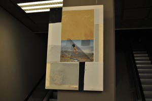
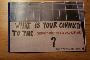
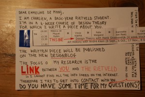
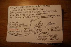
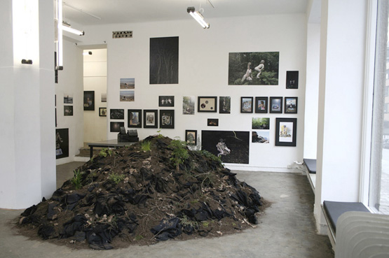
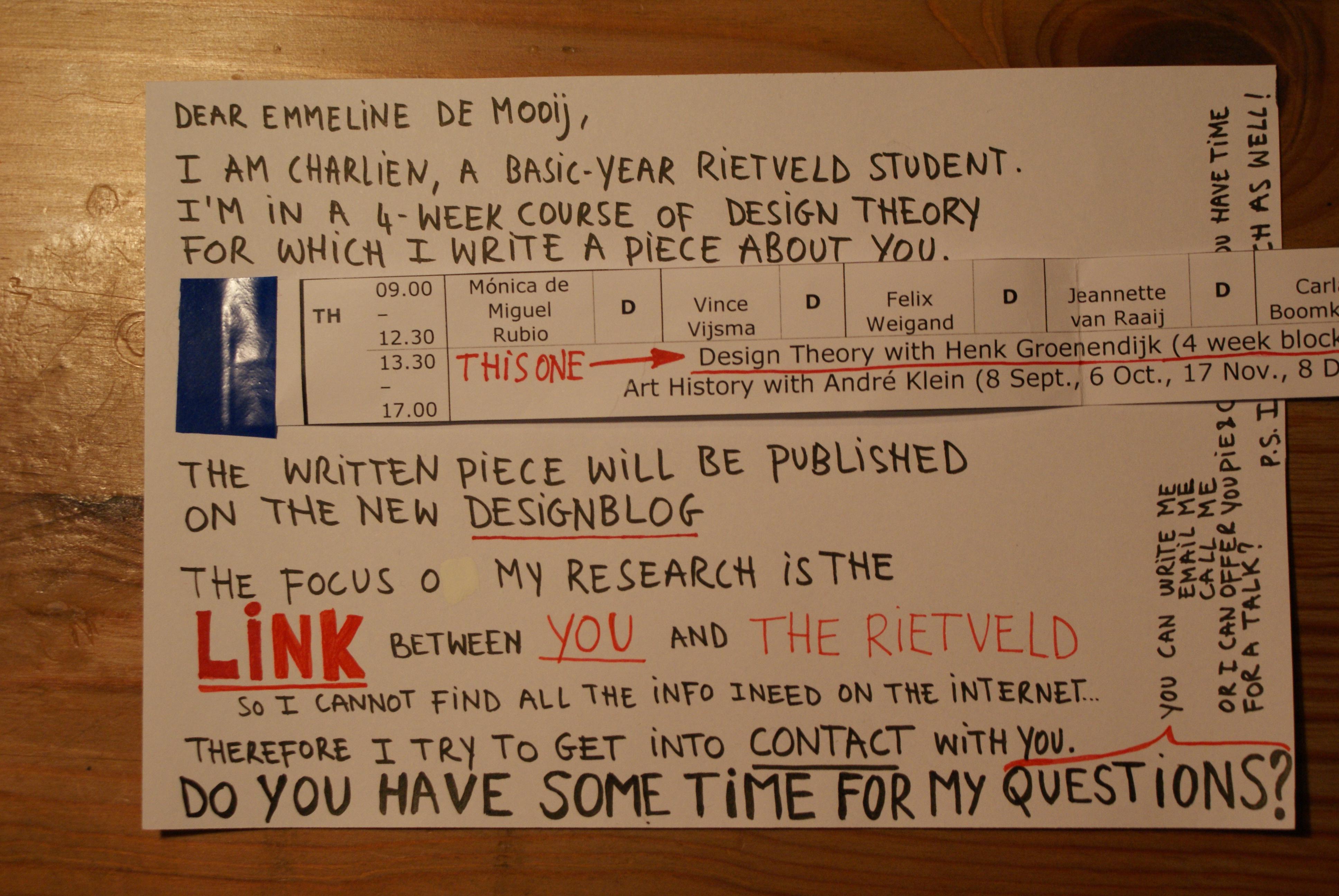
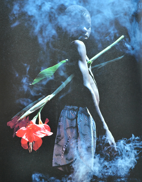
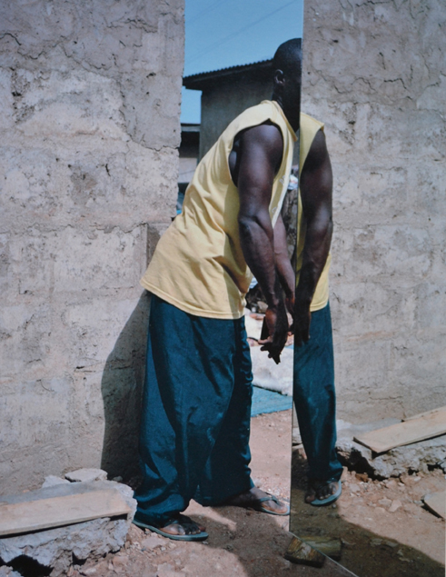
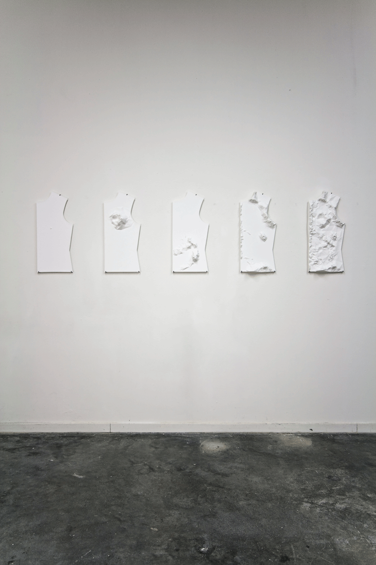
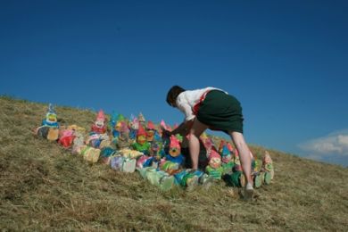
At the Fashion&FOAM exhibition in the Vijzelstraat, the work of Emmeline de Mooij was a real eye catcher. Not because of its colors, not because of its size, not because of its position, but because it was ‘different’. In an exhibition on fashion design, she chose not to show clothing or fashion photography, but to present a canvas with a picture of a jumping naked woman and collected sand, called ‘Gravity and Domestic Dust’. A very (strange?) personal approach to what fashion design is? How does she describe herself, and what –as an ex-Rietveld student- is her connection to the Rietveld after 10 years of graduation? As a reaction on her visual work, I chose a personal formal approach by sending her a letter full of loose questions, written on pictures of the Rietveld building and on photographs of her own work. What I got back was not a complete story, not a letter either, but a bunch of answers giving a slight insight in the relation between this versatile artist and ‘our’ Rietveld.

How do you describe what you do?
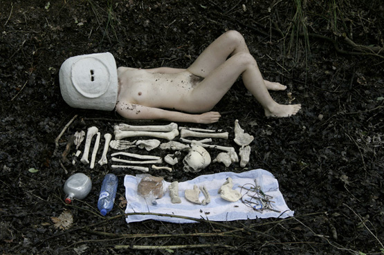
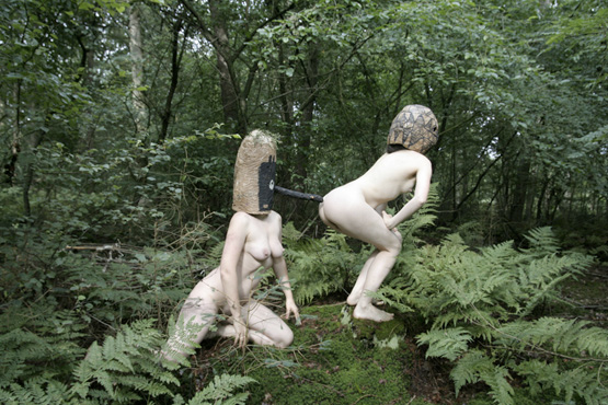
Emmeline de Mooij (born in Delft, The Netherlands, 1978) investigates in her installations, photo’s and performances, the human being looking for something to hold on, confronted with the sight of a dizzying big universe. Comfort and a therapeutic effect is often found in surrounding oneself with as much objects as possible.
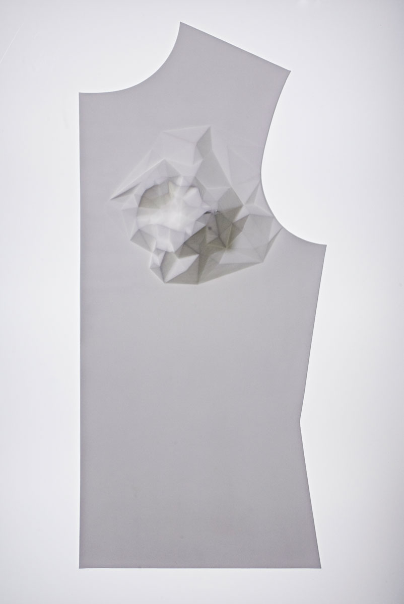
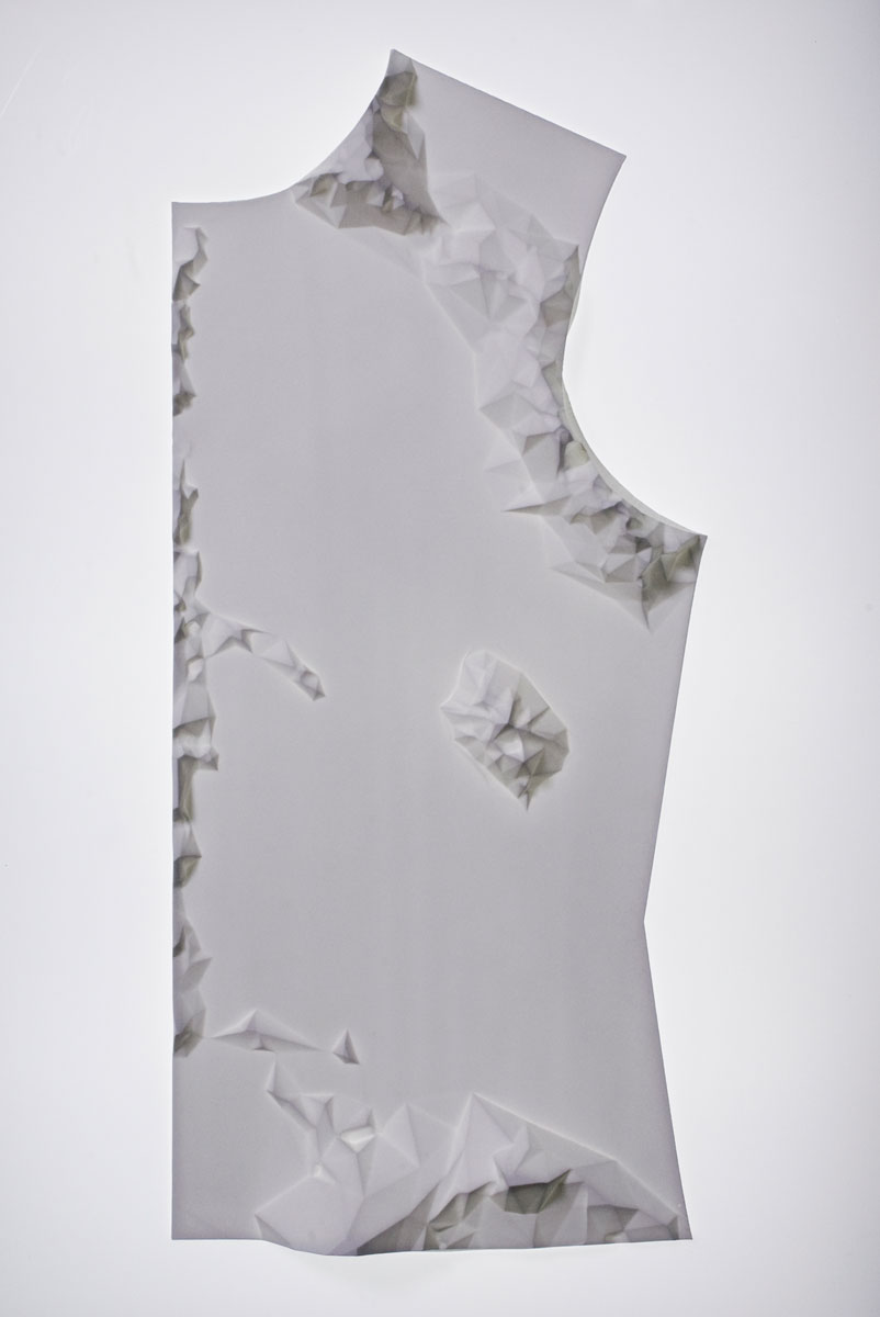
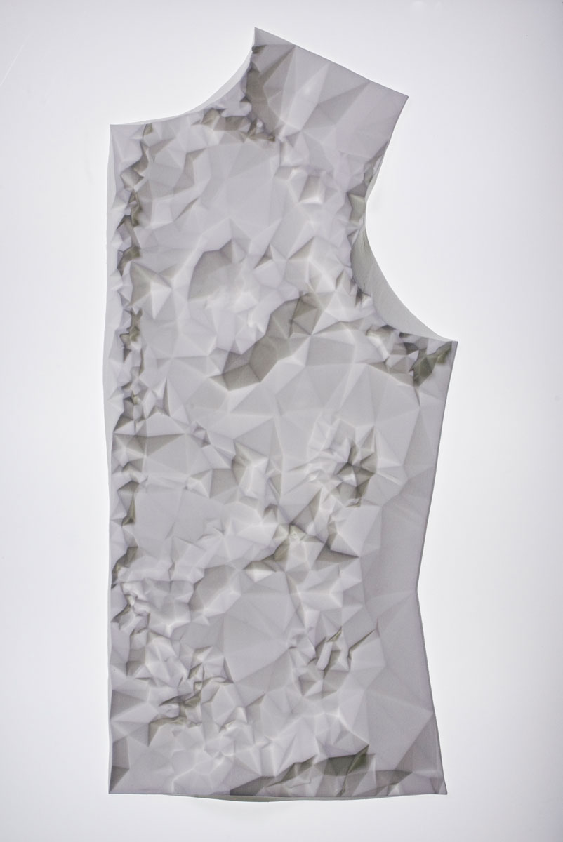
In her work she creates artifacts and remnants of fictional societies and scenes from apocalyptic scenario’s, removing the contradictions between the everyday and the improbable. Materials such as clothing, utensils, plastic, clay and Styrofoam, she molds together into images referring to science-fiction, archeological finds and pseudo-scientific theories.
The complex, with objects surrounded modern life and the nostalgic desire for simplicity, she captures in an ironic way. Where concepts of freedom and panic are inextricably linked to each other.

You+Rietveld: Happy marriage?
Yeah, quite a happy marriage! Although I wouldn’t describe the Rietveld at that time as a top level institute. I thrived well in the general focus at the Rietveld at giving the students a lot of freedom and responsibility, but I also think that there were a lot of not really good teachers. Teaching on a bad level, not up to date with developments within the international art world, or just not dedicated enough (absent all the time, sick, burn-out etc). I had the feeling some of those teachers where teaching there since ages, having this contract, so they were save for the next 10 years, they were friendly to the director and that seemed enough to keep their job.

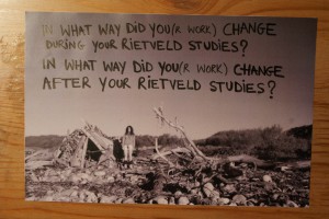
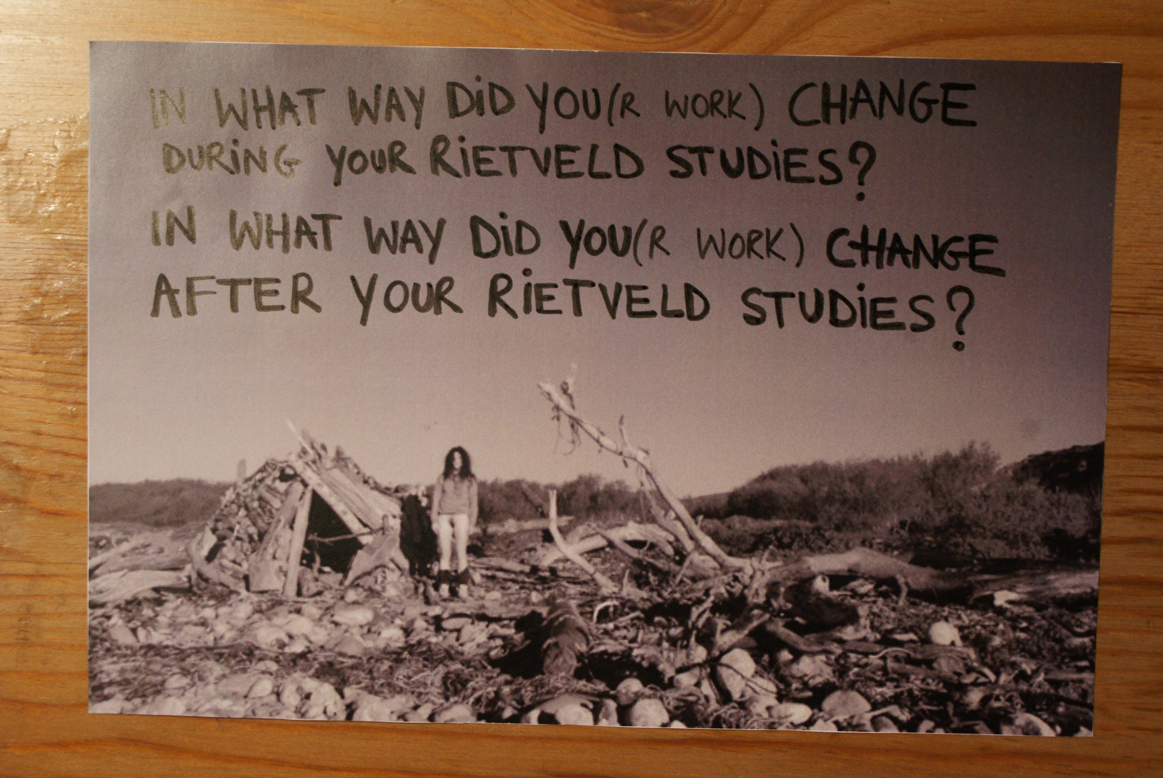
In what way did you(r work) change during your Rietveld studies?
I guess, due to the fact the Rietveld being quite an international community, the same counts for Amsterdam where I moved to for my studies, my horizon was broadened. And I felt I could finally fully express myself, surrounded by like minded people, quite different from the provincial town I grew up.

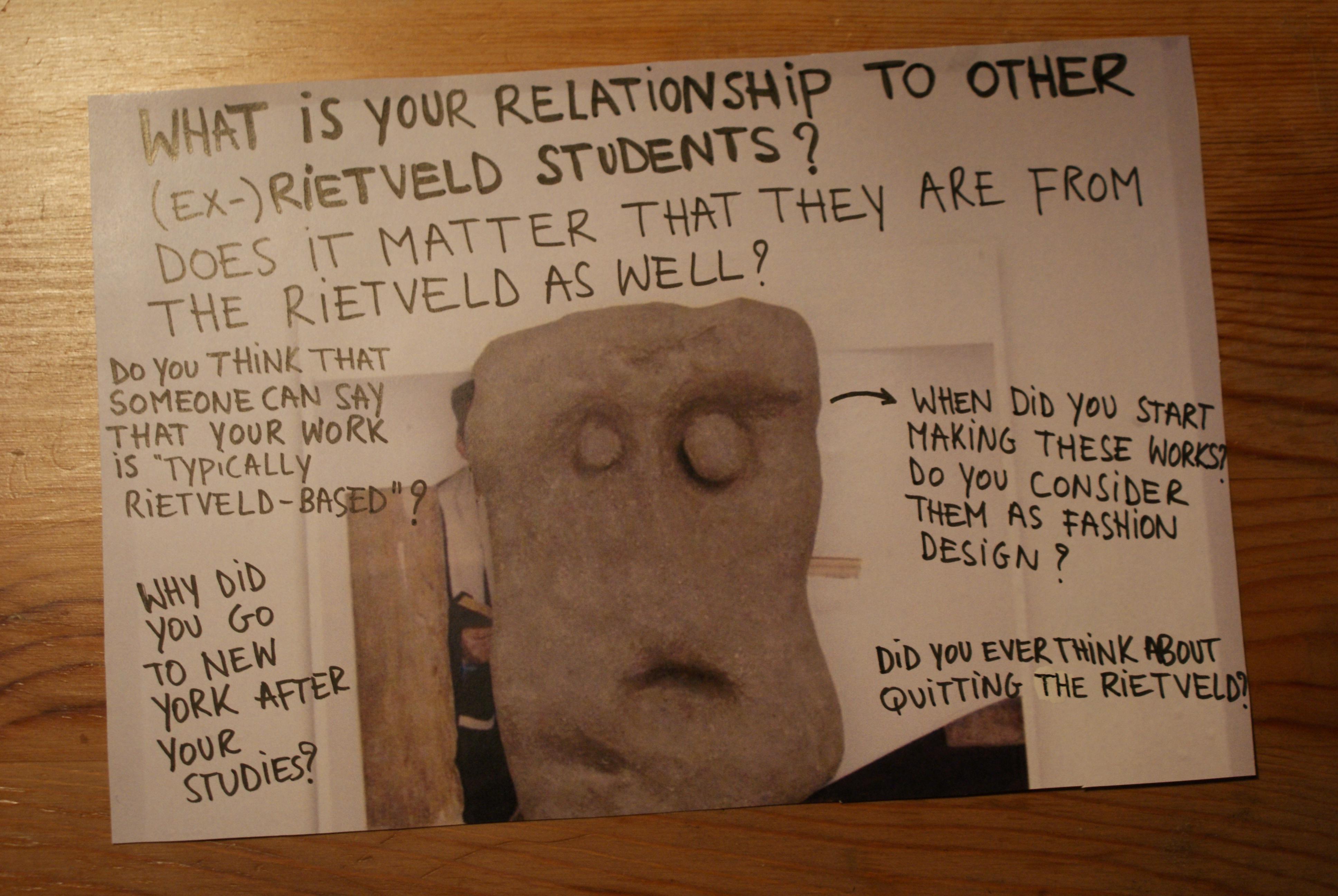
What is your relationship to other (ex-)Rietveld students?
I have some friends that went to the Rietveld as well, maybe 30% of my friends? But I’m not one of those that keep hanging out with only Rietveld people, there’s quite a big community in Amsterdam that is like that.

Does it matter that they are from the Rietveld as well?
See answer above.

Do you think that someone can say that your work is “typically Rietveld -based”?
To be honest, I hope not. I hope my work is not too strongly part of just one particular tradition.
Although sometimes I have the feeling, especially compared to artists with a background in American art education, people who studied at the Rietveld have quite an elaborate/intuitive way of working, which feels to me more natural. So I wouldn’t mind if people would connect me to the Rietveld in that sense.
I can’t ignore though that my work can be typical Dutch sometimes.
Especially in photography I think there is a certain approach that a lot of Dutch artists unites, “improvised” looking still lives for example, or snap shot like photo’s with strong flash light, the use of humor in the work. And many times I think Dutch art isn’t very political, again especially compared to artists with a background in American art education (for me this is a strong reference just because I recently lived/studied in the States for 1,5 years), artists here are not extremely engaged or making political statements.

Why did you go to NYC after your studies?
Because I got offered a scholarship for the Photo Global Residency Program

When did you start making these (canvas)works? Do you consider them as fashion design?
I started making them in New York in 2010. I wouldn’t consider them as fashion design.


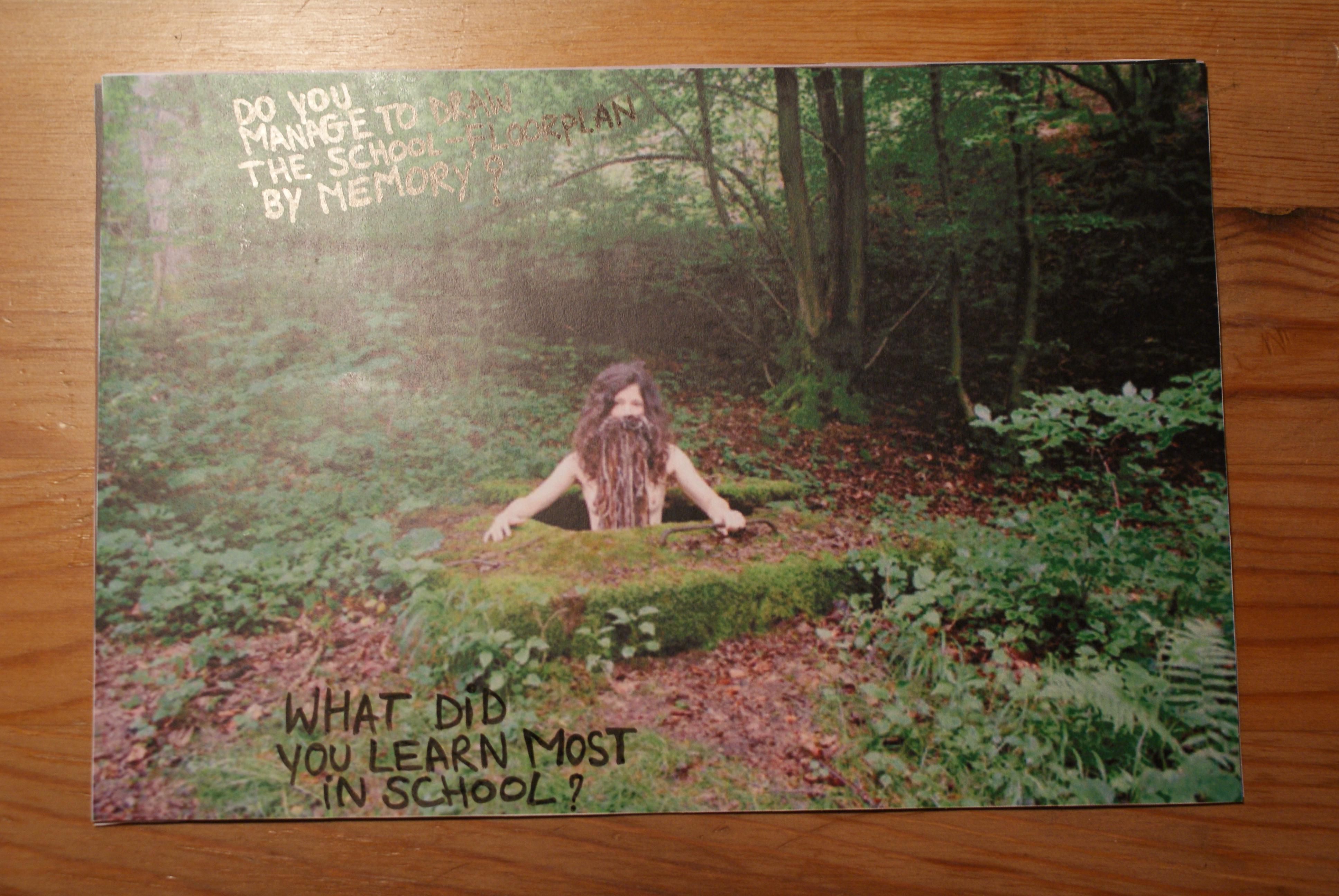
Do you manage to draw the school-floorplan by memory?
No.

What did you learn most in school?
Working from my intuition.

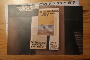
Did the school change in your eyes?
Don’t know.

Would you change something?
If there are still these teachers that aren’t dedicated and not good at teaching, I would throw them out and really try to upscale the general level. There are enough great artists and theorists living in or close to Amsterdam who could teach at the Rietveld.

Did you ever think about quitting the Rietveld?
No.

When where you there for the last time?
I think 2008, for the graduation show.

Do you feel linked to the school today?
Not so much, although coincidentally two weeks ago or so I ended up at a lecture from the Italian thinker Bifo and I heard he was going to speak at the Rietveld Studium Generale the next day. So I checked the Rietveld website and some lectures looked interesting, but I had to finish some works for a show so I couldn’t go. But maybe definitely next time.

SUNSET


Monday, April 9, 2012


‘‘Today, you can expect it to be windy throughout the day, a few showers between 2 a.m. and 4 a.m. After that, it’s expected to be mostly cloudy. It’ll get a little warmer in the afternoon, around 10 degrees Celsius. The overall chance of rain is 45 percent. Tomorrow, showers in the morning and high temperatures around the 9 in the south up to 12 degrees in the north-east. The rest of….’

Read the rest of this entry »

KevinPower


Monday, April 9, 2012

Kevin Power welcomed me in his studio, in a building that used to be a school. We sat down with a cup of coffee and I was soon to realize it was his birthday by a numerous of very nice birthday calls.

We talked about his career after he in 1999 graduated the fashion department at Rietveld, for example how difficult it can be to works as diverse as he does (paintings, collages, sculptures, illustrations, installations, costumes etc.) in a commercial context where they need a more clear style. That’s why he got two websites commercial oriented and one more diverse.

Kevin Power has worked as freelancer, made costumes and set designs for Klank Kleur Festival and from 2004-2010 he was hired by Tommy Hilfiger:” to inspire, everything from creating various interactive art projects to making props for stores and showrooms”.

The Atelier

The work space is a storage for previous works that partly will become future works. After being cannibalized to bits and pieces they are recreated and reused containing both the history of its previous function and new dimensions for the present context.

Works are gathered and hidden in corners, paintings put in an untouchable distance and space is cleared to give a fresh start and room to begin a new project, new thoughts and challenges.

Read the rest of this entry »

Chain of Connections


Monday, April 9, 2012


Sometimes it happens when you think that you do not have any relation with something, suddenly you find a chain of connections with yourself.


Richard Niessen – graphic designer working and living in Amsterdam, the Netherlands. Since 2006  he works together with his wife Esther de Vries. The main focus was – search for a relations between Richard Niessen and Gerrit Rietveld Academie. Richard Niessen graduated from the Gerrit Rietveld Academy in 1996. Esther de Vries graduated from this Academy as well in 1998. I selected some fragments from interviews where they mention the Rietveld Academie:

“The class in which I graduated, in 1996, we all started on our own. I think there was a need for a new generation. We were the first generation of creatives that were used to using computers. I think there was also an economic boom; a lot of clients wanted to work with young designers. Linda van Deursen had been teaching us and she was very influential. Ajax won the Champions League in 95 so she called us her Champions League.” 

“It’s one of the best schools,” says Niessen, “because it takes students seriously. Also, great designers teach there. A lot of art schools in Holland are more like schools, but the Rietveld is different…”

“It’s also because there are lots of interesting students,” adds Esther de Vries. “Everybody wants to go there, so they get a great selection of people to choose from. It generates a lot of talent.” 

“Students at the Rietveld are taught that they shouldn’t ever expect to earn any money,” laughs Niessen. “Most people prefer to stay poor and do exciting work. Sometimes we’re asked to work with commercial clients but it never works out because they see a piece of work and say ‘we want that’.” 

“Rietveld is a quite particular school. Rather than being taught in a certain style, you are trained to have an attitude. Students aren’t given straightforward assignments like ‘make a letterhead’ or ‘design a business card’. You are encouraged to be autonomous, to adopt a more art-like approach, to work more conceptually. Of course at the time I wanted to make letterheads, but after I left I was thankful for the training. It’s attitude that prepares you for anything, and you have plenty of time to find your own style after you graduate. Now I always start by thinking about what is the most interesting aspect of an assignment for me.”

Read the rest of this entry »

Viviane Sassen: “I just love the black skin of people”.


Sunday, April 8, 2012

Viviane Sassen photographs people. But she doesn’t consider her photographs as portraits. Her models are more composition than persons. They are never photographed in close-up: it is always a total or semi total scene in which they figure. She almost uses her models as sculptures. Bodies always have a very sculptural aspect. She underlines that with very contrasted pictures. The faces of Sassen’s character’s are often no more than suggestions. They are surfaces and contours, black holes that contrast sharply with the bright, colorful surroundings. She uses a technique that could be called “the revered Clair-obscur”. While Rembrandt and Caravaggio used the light of a candle or their characters to emerge from dark decors, Sassen drapes a veil across the face. A tree, the edge of a roof, bystanders of whom only the legs are visible – they suggest eyes, mouth and nose with the echo of their presence.

Sassen makes 3 kinds of photographs: recumbent figures, lying with their head turned away from the viewer; intertwined bodies; and “Mystified portrait”: individuals who cannot be identified as such, who avert the camera’s gaze, who have a plant or a shadow of a plant where you expect a smile or a frown.

Between the age of 2 and 5 Sassen lived in a village in Kenya. It was a world of skinned goats’ head on market stalls, morning dew on the red earth, and sweet soft drinks in glass bottles and the smell of burnt charcoal. Her father worked in a hospital, and she herself played with the young patients from the polio clinic next door to their house. For a child of that age, who has not yet made the distinction between I and the other, the identification is complete.

She left Africa quite young and only came back there with a camera in 2001. During this in-between period, she flirted with the profession of fashion designer and became acquainted with photography. She sucked up the work of Araki, Nan Goldin, Thomas Ruff, Andres Serrano and Wolfgang Tillmans. Besides her autonomous work, she worked on assignment for progressive fashion labels like Miu Miu, Viktor & Rolf, Diesel, So, Adidas and Stella McCartney.

It is tempting to give an autobiographical interpretation to the images of her African’s work. But that would be too easy, opening the doors to accusations of navel-gazing and narcissism. “I’m attempting to recreate the images of my youth”, she says. But because of a lack of precisely determined locations these images have a universal charge, transcending personal ups and downs. And there’s a particular, political meaning behind them.


Read the rest of this entry »

all4114all (to niels klavers)


Thursday, March 22, 2012


“They seemed to fill with air, ALMOST like they were made out of paper.” Morta Griskeviciute


all4114all


121-58

Supplies the spark that

ignites the air/fuel mi

xture so that com

bustion can

occur.

The

spark

must

happen

at

just

the

right

moment

for the w

hole to work properly.


A hand tool consisting of a handle with a head of metal or other heavy rigid material that is attached at a right angle, used for striking or pounding.


40-62


Regulates, directs and

controls the flow of a

fluid by opening, closi

ng, or partially obstru

cting various passage

ways. The intake and

exhaust open at the pr

oper time to let in air

and fuel and to let out

exhaust. Both are clo

sed during compress

ion and combustion

so it is sealed.


A small open container, usually with a flat bottom and a handle, used for drinking.


33-93


Pushed by the

pressure of the

expanding

combustion

gases,

its

motion

converts

into

round

motion

within

4390

for the

purposes

of the

whole.


A thin toothed strip, as of plastic, used to smooth, arrange, or fasten the hair.


43-90


The space in which 33

-93 travels. Arranged

accordingly in a bank

typically cast from alu

minum or cast iron be

fore receiving precision

work. It may be sleeved

or sleeveless.


A printed or written literary work.


Conversation with niels –

“1-2-3 Jewel”


Monday, March 5, 2012

As part of the final exams and graduation show 2011, the Jewelry department of the Gerrit Rietveld Academie “Het Sieraad” published a wonderful triptych.
A successful effort to put the work of the 8 graduating students in broader perspective.

This triptych consists out of 3 layers in which the students present
1] their visual inspiration material, 2] parts of their theses in relation to the works, 3] the works itself.

The whole publication is beautifully designed by Anna Hennerdal a graduation student of Graphic Design herself. She managed in a very effective way to visualize these layers and their interrelationships. Most intriguing in this publication is the transformation of all the material through the miraculous technique of cyclo-style printing causing an unique visual interpretation.


“1-2-3 Jewel”
a feel of the field / research & inspiration / final pieces

page 2 - 3 : chapter 1 / a feel of the field / index - Boris de Beijer

page 8 - 9 : chapter 2 / research & inspiration / Benedikt Fischer - Catherine Doyle

page 12 - 13 : chapter 3 / final pieces / Nhat-Vu Dang - Marina Elenskaya

The 40 page publiation “1-2-3 Jewel” of which 200 copies were printed can be bought for € 25 at the Jewelry department or can be downloaded as pdf below.

  download thesis: 1-2-3 Jewel” [english language]


E/MERGING PATTERNS – Khurtova / Bourlanges


Thursday, March 1, 2012

As part of the Foundation Years design-research project “New Energy in Design” based on the 2012 Boymans van Beuningen exhibit, Marie Ilse Bourlanges and Elena Khurtova were invited to present their work and research. As a sequel to an earlier presentation in the program 3 year ago [x], the development in their work over the years and the ambivalent state of design versus art presented the clear and inspiring ‘new energy’ in their work

E/merging patterns, challenges the Normativity of systems: a care for order, from which one can’t withhold (social, cellular or temporal system), and provides an access to an aesthetic of cancer, ‘beyond well and ill’.

The artists study the grouping of cells that emerge as a new system within a normal ‘baseline’ system. By applying the behavior of cancer cells (uncontrolled growth and invasion) as design parameters, Khurtova and Bourlanges offer an experience of the body that begins where the usefulness of healthy bodies ends.

The work consists of a series of 5 bone china cast objects, and depicts a flat garment pattern, in order to give a dry representation of the body. The flat surfaces are distorted with extruded patterns, relating to different organs or inner body systems. Those patterns are generated from detailed 3D mapping of tumor growth, by the use of algorithmic software implementing uncontrolled growth parameters. The obtained structures are manufactured by CNC milling machine, in order to produce mother-molds for plaster molding and precise slip-casting.

Realized at the EKWC, this project merges the material sensitivity of ceramics and the precision of CAD/CAM technology.

5 pieces – 28 x 62 cm – Bone China (ceramics)

2011


>Studio Makkink & Bey<


Tuesday, February 28, 2012


Jurgen bey one of the founder of Makkink and Bey Design studio,graduated from Design Academy Eindhoven and now the director of Sandberg Institute, starts designing from how a person thinks, feels and works. From there he goes and scales up things.

He starts from humans and thats where i feel connected with him and his designs. He works very intuitional. It is not about organizing things and creating solutions. Every disorganization has a specific organization, and the specifics are what interests him.He thinks we should be more specific on what we organize.

It is not about mapping everything and understanding everything and then designing it, for him its about following an intuition and questioning why things are the way they are and let that lead to somewhere where he has not been before.

According to him wanting to think or create something new is bizarre for everything or solution we can possibly dream of does already exist in the world around us. The language is already familiar, When we see things we already recognize. So it is about knowing that language and translating it our way.

Jurgen Bey is aware of the different areas he can dive in to as a designer. He is interested in the context of his designs where usually most designers avoid.

Designing a space so to say instead of the building itself is what Jurgen Bey is interested in. As soon as he touches a space with his things, he owns the space, as he says.

For him its always about being in a specific situation. He designs for specific situations instead of abstract.

Jurgen Bey emphasizes on model world because you have the liberty to do things you want in a model world without being distracted by the questions of reality. It is important to live isolated for a while. You could reach places you haven’t reached before and you become special when you get back to reality. You face the questions of reality when you reach the level you know why you do these things.

He thinks of dutch design as a historical driven design where the craftsmanship matters and is valued. He is fascinated by the future driven design like in the 50s, or now in China where he feels the progress. Its interesting to be completely free from the history and that you are allowed to think completely ahead.

Now designers are interested in making their own machines which can result in factories becoming smaller. You can get products made on demand. For Jurgen Bey its very interesting to watch how the industry will change and the effects it will have on the people and the city.

The whole discipline is growing so fast. The change is fast.  He sees the whole discipline as a sort of olympics where you can choose your own discipline and focus. You cannot do everything well, He does not believe in multidisciplinary  designers.

Industrial design is not about the product but more about how things are made. How the factory would look like how would you go to the factory, how would you work there.

Jurgen Bey creates designs that provokes thinking and discussion.

Jurgen Bey considers himself to be a product designer but i really see him on the line between art and design. This is also where i would like to be, somewhere on the line. Playing with the context and the reality.For me it is not about creating beautiful products that people would like to buy for their houses. It is also not about making money but more about the social context my designs will have in the society. How will they change or adapt to people? It is not something to be planned, but more like a progress that is waiting to be unfolded.

Considering Jurgen Beys description of dutch design, ironically i see myself as a dutch designer even though i am not dutch. I value the history and the craftsmanship. I value the individuality of pieces and am not much into mass production. I don’t think that design is for everybody. I am sure not everybody would like my designs and that is ok. It should be only for the ones who would cherish them.

Quality over Quantity?


Monday, February 27, 2012

In the fashion industry the topic of sustainability and eco-friendliness has not been on the top of the priority list one might say. Trends change every season, and to stay in style you are expected to renew your wardrobe at least twice per year. High-end designers are now launching even more than two collections a year, you have the so-called pre-fall and resort collections as well as the biannual summer and winter. Chain stores are introducing new collections as often as every six weeks. At the same time as this is happening, fashion is getting cheaper and cheaper.  The high-street brands keep pushing prices lower by producing their clothes in countries that are known for using child labor and having extremely poor working conditions. The materials used are usually of very bad quality, which is probably also produced in an unethical way. So with facts like these you don’t have to be the sharpest tool in the shed to see that this is not a very sustainable approach

Read the rest of this entry »

Bugged out


Sunday, February 12, 2012

“Good design should be innovative

Good design should be useful

Good design is aesthetic

Good design is understandable

Good design is honest

Good design is unobtrusive

Good design is long lived

Good design is consistent in every detail

Good design is environmentally friendly and as little design a possible.”

Dieter Rams


I used these premises to give structure to my research about “New Energy in Design” because I think it defines what the attempts are behind designing and what more or less designers are trying to achieve in actuality. It is becoming harder to pinpoint what is design and what is not. When I say “ contemporary design” I mean all which design is surprisingly turning out to be : from sketches to little tryouts, researches that can surprisingly redefine your idea about design.

When you design you are not only making an object that could function in a situational context. It’s about giving meaning and making an identity for the object and the situation it will serve. Nevertheless, functionality plays a big role because initially as a designer you are trying to come up with a solution. A solution for a problem should always be on top of the head of a designer. But besides solving a problem there’s also a big amount of values being transmitted from the designers character to the end result. You project all the perks and peculiarities that was found in the making. You add important characteristics that will come to identify you, and the connections you made through the research.
Being a designer is really about having a set of creative paradigms and externalizing a generated map of routes that will lead you to a product, or to a stable outcome (for the time being).

At least that is what I gathered after visiting the Boijmans Museum.


I  bumped into works that are surprisingly “Design” because they still whirl in between design and something less concrete: ”design-ish” if I shall put it that way. A very perfect example of what I mean is Debug, a work by a design firm in Eindhoven called EdHv.
Edhv retrieved the idea of mapping a route when they first started on a design project for a restaurant menu. Remco who is the founder of EdHv decided to create the restaurants identity based on the routes they take while they operate in the kitchen. Which is a clever solution if you ask me. Because what are we but pattern seeking creatures. The remarkable work I bumped in is just a small model of a chair and could be categorized as an architectural piece, product or even an identity for the project which is still ongoing.


Debug gives us a new way of approaching space, a new angle, a new perspective but on a whole different dimension, insect proportions. It kicked off when The EdHv crew started monitoring/tracking the movement of different insects on a model cast for a poster. A poster model generating 300 posters and counting. Every one of them is unique. Some posters are made by woodlice, some of them by house crickets. Tracking software and scripting, maps the walking patterns of these little creatures. The complexity of movement leads to stunning results.

click on image to see "Debug : Art by insects" a video made by edhv.nl

Read the rest of this entry »

SlowLab, thinking and creative activism


Sunday, January 29, 2012

To summarize the context I first must mention- with the freedom of a resident of here and today – the presence of pressure and calling out resent for (this interpretation of) passive living. With that, a near apocalyptic sort of set creation takes place. It receives emphatic caricatures, tragic responsibilities, gets greatly busy scenery’s to play on, and personally – I have a dislike for tricks in most cases. Not that I don’t care for the drama, it is the very reciprocal end, of paying respect to voices in letting them be exactly what they are.

In theory, slow design agrees with my thought. Carolyn F Strauss saw faults in the growing movements of green design, and overproduction of recycled/recyclable designs with wonky purposes – “We should be calling into question the need for the product in the first place.”. The economical success of key wording pollution, organic and related terminology grew and hasn’t reclined much since, the very idea of reducing production overproduced, and did so quickly.

What the slow movement suggested is a reduction with increased effort. The time needed for the process of manufacturing most things shortens exponentially to the cost – spiraling in recent event, time is money they say, slow designs agree differently. A pair of trousers whose material has circled the Earth several times even before being sewn together, has then been sent on a series of to a majority unknown routes before finally reaching y/our unimpressed hands – is replaced by a dazzling piece of phantom experience and craft, culture and tradition are now personal choices and flavors. As long as our story is near geographically, associatively or else, and beaded with time, it is what slow tells about in it’s forms.

In this sense, daily designs gain back their emotional and such weight in style and charm of a hand-made product, we make slow but noteworthy changes in ways of everyday consumption,  directing the trend rightfully. So I see visions of Strauss, who founded SlowLab in 2003, as a vent for ideas of applied activism, designs and debates on this slow framework within a worldwide web of selected individuals, based in New York, US. Through series of lectures and projects we get an insight to a philosophy with few examples of artists making (todays) drastic choices in technicalities of work methods and building new or bringing back old manufacturing principles, such as Judith van den Boom who’s taken the knowledgeable Chinese porcelain worker out of the factory into a small and personal area for working, learning and collaborative design. Focus frequently falls on ideas, and magnify a personalization – in form a sustainability factor – of objects, an illusion of a caring presence is cast to put the viewer into romanticized relationships with his toys. We wait for your mail accordingly through a programmed lens of another rational design, listen to amplified cooking sounds while reaping scents of it’s making, in a sort of disposable but pleasant and seedful event. Reflective research fruits a wearable face of inevitable and looked-over slow processes, not the first of SlowLab’s collaboration with former or present Rietveld students . It peeks a little outside the umbrella of the boldly tagged holistic promise, and resorts often to mid-flight concepts in elaborate captions, with it’s patterning accents on context and sacrificial imagery of more or less extreme discomfort as a crime against nature.

I have a hard time agreeing on sets of carved rules, and think one should be as careful and discrete with evoking guilt in other beings as can be. Moral justification does not make (good) artistic experience good,  neither does over politeness. But we can make a lot of solid exceptions for this in design, and the power of suggestion in a possible event differs from an artists dense sensation to be experienced attentively, also not to be overlooked is the responsibility of a designer of largely produced goods, and creator of appliances to be sent randomly into living and often outlive it’s maker. What I miss is a striking moment, like the gasp for air after having or witnessing a brilliant idea, otherwise I feel I might be convinced, perhaps this is the way of having framework. A sharp, clear thought, strong visual motor, an undirected balance that leads to somewhere like this. Maybe it is too ideological to expect of pieces a mapped idea with limited or no description, this sort of modulation seems crucial though, and a set of produces that need not much or any sugarcoating. I think the slow designers, and all artists concerned with environmental damage a cruelly run contemporary life allows, should take the green trend as a mean to challenge their own work, and distinct themselves in opportunist waters by finding strong subtleties for use in triggering thoughts rather than speaking them into a bore. We see the blueprint in our every day life already, respond to it most strongly when the message comes on it’s own, and we all have many factors afloat – a suggestive shooter like this is surrounded by comfy amounts of room for exploring abstraction and rock and roll, yet it stays easy. What I try to say is – we should be raising awareness by raising awareness levels, and sway to an old fashioned need to please and show (off) our very best, even if it means falling outside the fixed frame of your politically correct ideology – at least, we will be left with a loud work to discuss, debate, come back to and so forth.

Carolyn F Strauss with SlowLab sends out promising goals and messages, and should have space enough to branch and develop a captivating and elegant design, which sends us to a slow but sweet relationship with the inanimate, and gradually teaches importance of lively touch.

Just give us some variety and we’ll be happy


Sunday, January 29, 2012

The Idea of a Tree

I have a medium-large grocery list in one hand, and a shopping bag in the other. Moving through the kitchen accessories department of the Ikea store located in Utrecht, I am looking for a new, preferably cheap pizza cutter. My old one was lost in the crypt that is my room, and scissors can only do so much when it comes down to cutting my Albert Heijn pizzas.

Having found the shelf containing cheap plastic pizza cutters (they’re called Stäm), a question arises. What colour to choose? The olive green one, the scarlet version, the bright yellow edition or the rather unpleasing cyan variant? Remembering that I already happen to own a green spatula, I decide on the similarly coloured pizza cutter. While paying for my newly acquired Stäm pizza cutter, I am certain: the olive green colour will most definitely improve my quality of life to a larger degree than the cyan edition.
A seeming elementary choice. We make these rather dull choices all the time. Nonetheless, the other day I was investigating a friends kitchen supplies during a house party. In one of the drawers, I found the same green coloured Stäm pizza cutter. Soon, we were high fiving and felt closer related. After all, we have a mutual preference for a certain commodity. This anecdote can be generalised. In a nutshell: our social relations are based on the products (or, commodities) that we own. According to Karl Marx, that is. He calls this phenomenon commodity fetishism.
More relevant to this writing are the slight variations of a specific object. People like having a choice, as they have their own identity to maintain. All Ikea has to do to meet this need is presenting their Stäm pizza cutter in a variety of colours. This phenomenon has been conceptualised by the German philosopher Theodor W. Adorno. He coined the term pseudo-individualisation.
During the last two decennia, a new notion in consumption and production has emerged. Manufacturers increasingly think about sustainability when producing new designs. Artists are responding to this way of thinking as well: exhibitions about sustainability and slow design seem to have become common.
On the twenty-fourth of November I visited the “New Energy in Design and Art” exhibition at the Boymans van Beuningen in my city of birth, Rotterdam. A work that caught my eye was “The Idea of a Tree,” an award-winning project by Katherina Mischer and Tomas Traxler. Basically, it is about an autonomous machine (called “recorder one”) that produces objects using just thread, glue, paint and solar energy. Finished objects are not only functional, as they also reflect the weather conditions of the place and time where the machine has been working. Elaborates more extensively on the project.

The good thing about “The Idea of a Tree” is the fact that it actually works. Too often, sustainable projects by artists somehow feel stuck in the conceptual zone. As a person that classifies most of his own projects as “stuff that works”, I like seeing a relatively simple machine that tries to give a concise answer to the relatively complex question of sustainability.

Moreover, the project doesn’t just work in a mechanical sense. It also effectively combines concepts of consumer culture with ideas coming from the Slow Movement. Using the distinctiveness of local environment factors, objects are produced that are each unique and yet share a common theme. Examples of the objects produced can be found here.

The objects produced by “recorder one” are, as can be seen, aesthetically rather pleasing. They also come in a variety of forms, functions and colours. The seal, colours and even construction breathe the words “ecological design”. People buying these objects will probably identify themselves with some ecological responsible subculture. This is a typical trait of commodity fetishism, though this aspect doesn’t distinguish the “Idea of a Tree” project from most other slow design projects.

The unique appearance of every single object, however, does. Just like the Stäm pizza cutter mentioned in the introduction of this essay, there are concepts of pseudo-individualism to be found in the lovely stools and lamp shades produced in the “Idea of a Tree” project. The variety in thickness, length and intensity of colours found between these objects can be interpreted as the ecological responsible answer to the diverseness colours presented by the Stäm pizza cutter.
People like having to make these kind of choices. Thus, presenting the consumer with an assortment of small differences in the same product makes a great marketing tool. Take Apple, for example: ever since the dawn of the iMac, Apple has presented their products as a smorgasbord of colours and sizes. With the iPod, Apple took pseudo-individualisation to the next step: there are about five different iPods (iPod Nano, iPod Classic, and so on), each presented in a variety of colours. It made Apple one of the most successful companies in the world. The same counts for Ikea, offering rather superficial customisations to the customer. Over and over again, pseudo-individualisation has proven itself as a winning marketing tool.

Green marketing, however, has not. Despite the trend of sustainability becoming “hip”, telling people to buy a sustainably product because it’s sustainable doesn’t work. Just take a look at these links. In the end, people do not want ecological products for the greater good. People want good products that are marketed well. The “Idea of a Tree” project by Katherina Mischer and Tomas Traxler has this potential, especially if it were taken to a larger scale. The products show a clever balance between sustainability and the fulfillment of the rather superficial needs of the consumer. These superficial needs are met using local, environmental factors. It uses these factors to simulate the idea of the growth of a tree, which is – well – cool. Let it be an example for the many inspiring slow designs that are yet to come.

Reflecting Design Practise


Sunday, January 29, 2012

One of the first things I noticed when I saw the work of Sophie Krier for the first time is that there was definitely a lot more going on than just a simple design. She directly got my intention by a deep video about her grandfather @ Face value [x]. It was really based on reality, honesty, and with so many deep hidden emotions. I thought it was really interesting to see how she doesn’t directly throws it in your face. She is experiencing her work and daily life not only as a designer but also as a human, and a young women with a vision ‘designing is researching’.

Sophie Krier, video still from “Kabouter Revolutie”, 2009

Read the rest of this entry »

knitting machine


Saturday, January 28, 2012

 
[

http://www.youtube.com/watch?v=P4chUCehdbY&feature=related

]
 

Get the Flash Player to see this content.

 
[

http://www.youtube.com/watch?v=mQMtBBnMi_g

]

He flew too high, the wax melted, and Icarus fell down into the sea and drowned.


Saturday, January 28, 2012

Come to the edge, he said
They said: We are afraid
Come to the edge, he said
They came
He pushed them…and they flew.

by Guillaume Apollinaire

Design; while going in a more and more functional direction, slowly losing its identity or personality, we can see globalisation in comparison with every object, especially from minimalistic or functionalist movements, there are no more locations, no more things which are related to places . In this case designers; who’ve been born with brick in his stomach. In other words one who lives all their life in the same place and were inspired by local traditions are starting to feeling more tension nowadays.
In the conception of slow design in the way how research has become a scientific experiment or philosophical theory the line between art and design become finer. On the exhibition which was dedicated to the theme New Energy / sustainability /Slow design one object was more related to the art then to the design , but the way of construction it is in the experience of the thing by itself that reflective ideal of positing thought has it’s basis. This statement is an almost perfect description of Panamarenkos notion of indention as creative method because for him inventive thinking must be invested in something, it must be realised in some way.
Thus when Panamarenko speaks of his machines as working, he is not simply talking about function -although this is enormous importance to him – but about the way in which a whole trajectory of new thought, aimed at an empty location of a certain kind? The journey into the unknown, the adventure, becomes embedded in or embodied by a thing. Even if this trajectory is never completed and flying machine, despite repeated attempts at improving the technology, fails to get off the ground, the concept together with the material engagement with the thing itself, will lend it an undeniable sense of purpose. It will make it intelligible, both as an object of technology and as an object of knowledge. Most important of all, it achieves an independent existence as what might best be described as a ‘radically styled’ work of art. It becomes inappropriate to categorize Panamarenko s works according to their appearance within some overarching notion of his development as an artist; we must look at them instead as a types and categories of things, aeroplanes or birds, insects or cars.
The impetus underlying Panamarenko s approach to work is a somewhat sceptical one, and his scepticism is directed at the institutions of both science and art. In this respect, it is part of an important and still current strand of scepticism in the complex weave which forms the history of ideas in the post-war period .
The most basic assumptions of science- it is institutionalised forms and routine methodologies- were being questioned by a generation intent upon pursuing their dreams rather than acquiescing in the face of a technology driven, steadily-intensifying cold war. In the field of art , this same spirit was manifested as a robot and to branch an attack upon the modernist conception of relationship based upon the idea that some profound sense art should demonstrate belief in a world, even a universe , that was potentially analysable, describable and measurable in its entirety.
His sceptical outlook extended to the nature of human existence .Rapid advances In the social sciences were leading individuals to question the biologically singular and rationalist construction of the human subject. For a brief historical moment it looked as though there were no certainties any more and seemed that everything was up for grabs .

As an example is an excerpt from an interview with an artist which reflects the position of Panamarenko about art and design:

If somebody asks me about my profession, I’m ashamed to have to reply: “I’m an artist.” For I consider most artists to be retarded. They always work in relation to the galleries and museums. This goes for all art, of course, art can only exist in relation to museums and galleries, but why should it depend completely on it? 50% should have a reason of its own as well. It should also have been made if the art world with all is crap wouldn’t exist. Most of the time one sees art which is 100% dependent. I absolutely dismiss all of it. My position is very neutral with regards to the general ideas about art. It’s easy. It relieves me of the question how to be anarchistic. It comes without saying, because otherwise I couldn’t make any good work. Without this dismissal my work wouldn’t be free and it wouldn’t contain any attempt of adventure. What a burden, all those stupid galleries and museums! One should analyse these people who have organized art shows for half of all the artists. One really wonders what artists are looking for in the neighbourhood of such jerks.


Log in
subscribe