Skip to Content Skip to Search Go to Top Navigation Go to Side Menu


"Projects" Category


These black hairs in my ass will soon be in Yours.


Tuesday, April 23, 2013

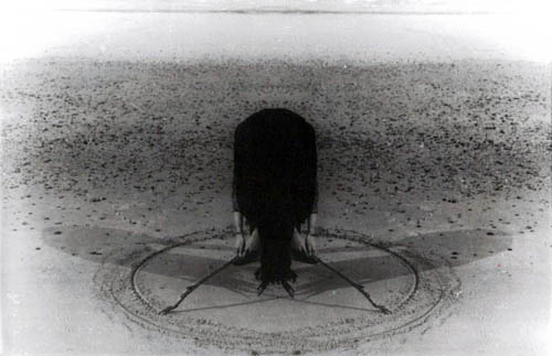
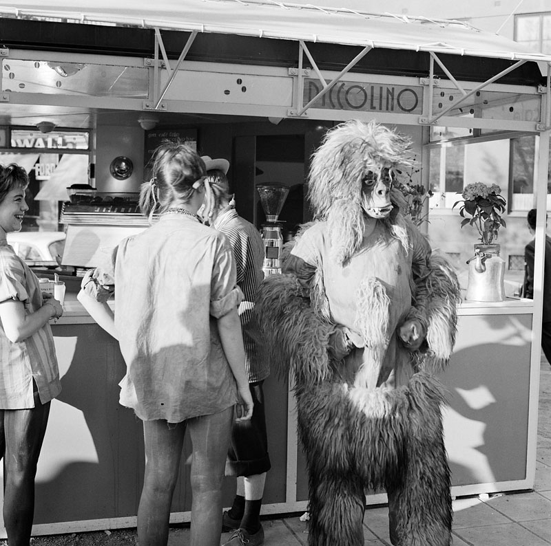
It’s a screaming gorilla. And it could be me.
Many times when the subject is discussed I really do feel like I’m another type of animal than the others around me. We speak different languages although it all sounds like English. I’m made fun of, I’m put in a gorilla suit.
The gorilla girl.
When I first came to Rietveld and discovered the lack of knowledge and interest I was stunned. The situation baffled me for a second before I realized how freaking much work there is to be done here.
The sleeves of my gorilla suit are rolled up and I’m ready to go to work. I’m a hardheaded one. Because I do it for You. I do it for Your grandma, Your sister, Your dad and the entire payroll of society.
And of course, for myself. The fucking gorilla suit is making me sweat. And sometimes I must admit that it brings out sides in me that are not the most flattering. Chest pounding is very powerful and expressive, but not always convincing. And to make people scared of the gorilla won’t help my cause.
Feminism. It’s a field of Science. Not my personal gorilla opinions. First lesson taught, right there.

Rietveld Library cat.nr: 708.4

The Spatial Brain


Tuesday, April 23, 2013

Entering my three tags in the search engine of the library didn’t lead to any results. At least, I hoped of course to find a book that was at the intersection of all three keywords leading to a publication that delt with designers of Asian witchcraft and mapping their whereabouts.

Fortunately I did find books with every specific tag; one on contemporary Asian architects; one on the map as art; and one on devils, demons, death and damnation. The latter of course sounded very inviting and it is indeed filled with the most fascinating gothic graphics of infernal punishment, public witch executions, demons riding to the Sabbath and Lucifer reigning over the souls of sinners.

On a lighter note, Asian architecture with the Zen-like attitude on dealing with space and the use of water -for tranquility and balance instead of drowning alleged witches- has a certain appeal as well.

But my eye can’t stop getting pulled to the last book of my pile, called “The Map As Art”. Cheating a little bit? Yes. This book is not from the Design department. But it sounds like it’s interestingly bordering on the edge of science, art and design. Cartography assembles scientific data in a technical way and models our reality as to effectively communicate spatial information. But then maps take on a life of their own. They may be worn out, damaged, have decades-old coffee or wine stains on them reminding of holidays or trips effectively pushed to the corners of the memory to make room for new ones. They may be folded so many times that crucial information is deleted, or have scribbles and writings on them that may be even more cryptic than the maps themselves can appear to be on first sight. These alterations seem to be lifted to a higher level in this book, making maps almost into fantastical designers of political landscapes, neighbourhoods and private spaces.

Rietveld Library cat.nr: 708.5 har 1

Inside the egg


Tuesday, April 23, 2013

I was searching for gold.

1988, the year before I was born.

I was searching for something that I could take a look at, pick up and say

“Yes, here is it. I’ve found it.”

Something to put on a shelf, inside of glass, something to be fragile and beautiful.
Or maybe heavy and beautiful at the same time. Like rococo is heavy. Or baroque.
Heavy beauty, when something is meant to be admired.
Money and gold. This thing with power.

When I was 8 years old my mother and my grandmother took me to see the exhibition of the famous Russian Fabergé eggs.
This exhibition got stuck in my memory somehow.

I remember the big rooms.
I remember the whiteness of the walls.
I remember the small glass cages where the most delicate, fragile things were put.
I remember my grandmother, my mother and me getting lost in the whiteness and all the beauty.
Like small animals in a bigger picture, circling around.

Then there were the eggs.
They were made of gold, silver, glass and something that almost seemed like air.
They were magical and impossible to touch.

Maybe it is also about this fascination with the exotic.
Beautiful creations, very far away from my reality.
This idea of something up there in the sky, out of reach.

Lately I have developed this fascination with Japan.
I don’t know what started it, maybe it was my friend who is obsessed with Japan.
Maybe it was just to have a fantasy about something.
I think about their delicate manners. I think about their delicate objects.
I see their patterns in design and art and I don’t understand them but I like it.
I look at Hentai porn, anime and all these crazy comic live shows and I am fascinated.

It is this idea of something, of a country, a people.
I construct it in my head.

I feel somehow that it is the same distance from me to Japan as from the jewelry eggs of Fabergé to me through those glass boxes where they were kept.

Rietveld Library cat.nr:

The Dark Side Of The Chair


Tuesday, April 23, 2013

It is funny and scary in the same time to which result I was leaded this time of researching by using the tags chair, history and portrait. The book is dark on the back and the front and shows an image of a chair, the unclear shape of a phantom which covering the shine of its own ghost, heavy and stiff but the best thing is the book is German. Another German book about the history of chairs and again the title of the book is making me to laugh again. “z.B. Stühle: Ein Streifzug durch die Kulturgeschichte des Sitzens” is for me as well absurd and funny as my first choice in the library “A Chair makes history”. This time the book introduces itself as a guide through the cultural history of SITTING, which I think is the most funniest and beautiful way to find a title to describe the history of a design object, which function is mostly to relax the human bag and ass.
As well as last time the image shows no longer a simple picture of a chair, it is almost again a portrait of a chair which you can find on the front cover of the book, but this time tis image becomes for me to something strange. While the last book I took had a really bright and sort of funny, colorful, cover, which was perfectly hanging together with the title, the book “z.B. Stühle” has a really dark and heavy appearance. Without the title and the text it could be misunderstood as a book about satanic rituals with chairs or dark spiritual experiences with chairs but not as a leader through the history of sitting. The title in relation to the book cover design is for me a big paradox. The title “z.B. stühle” which means “for example chairs” sounds really easy, like “let’s talk about something, for example chairs or trees” which is really well supported by the text below. It sounds cool and relaxed, while the book cover is dark and heavy and doesn’t represents coolness at all to me, rather an image of violent and brutal history, which might be also presented in the book, for example chairs as torturing instruments. All in all the most interesting point is that the tags which I used for the research are leading back to a book which is almost as well absurd in its appearance as the first book I’d choose about the history of chairs. It seems to be not easy to write or create a good or well-chosen title for a book about chairs without letting it sounding absurd.

Rietveld Library cat.nr:774.9

Ruler book


Monday, April 22, 2013

Distinction

Stand-out

Taste

Those were my tree tags from the previous book I choose when we had to write about subjectivity.As you may have read in my previous blog post subjectivity is all about your own individual personal interests and characteristics. When I had to choose a book at random and not by its content the thing that mattered for me and that made me chose that book was that the book was different and therefore it stood-out from the rest and of course your own personal taste is always an important factor.

This time we had to do the same thing, pick a book out of the design section at the library but with a different approach. We didn’t have to choose a book based on subjective criteria but we had to choose a book using the tags that we made for the previous book, so basically the things that defined our subjective criteria now became our objective criteria. So now when I entered the library and went to the design section my goal was to find a book that was distinct as in different from the others, it had to stand out and of course my own personal taste had to be involved, cause basically I have to like the book in order for it to stand out or then I would like it because it stood-out (so it is still a little subjective).


So there I was standing in front of the book shelves looking for book covers that were different then the rest, looking for a book with some kind of new fond that is not used often or for colored stuff that would grab my eye (cause allot of the books have common fond and colors). And then I saw a popping yellow plastic side cover with stencil printed letters, so I picked it up and then I saw something that I have never seen before. The cover was a ruler, it also had this cut-out letters and shapes like the ones old rulers used to have for you to “write’’ or more like fill in the letters. At that point I knew that that was the book I was going to choose this time, the popping yellow made it stand-out and the cover was certainly different. It’s a really nice book.

Rietveld Library cat.nr: 772.9

Book of Spells


Monday, April 22, 2013

The book I chose is of a faded sort of blue, and has the title “Bamboo” on its hardcover back. This back is graphically shaped as a piece of actual bamboo using shading and divisions. Like how you would see real-live bamboo in real-live nature.
The contrast with the blue, which of course in actuality it isn’t, drew my eyes to the book’s back I guess. Also probably since I was feeling very restless that specific afternoon and was more with my head in the sky than in the neatly organized library smelling of old paper and glue. On top of that it appeared old, and somewhat mysterious. And reminded me of when I was a kid and would always hope to find a forgotten book in the corner of the library that would have a map of a hidden treasure tucked away in it. I remember drawing those maps myself and hiding them in old books in my parents’ bookcase. Then I’d make myself forget, so I could stumble upon a forgotten map and could go on a treasure hunt. In my parents’ backgarden mostly. Or sometimes in the attic, where more secret passages could be created.

The typography of the letters “Bamboo” and in fact the word itself also reminded me of a book featured in a film I once watched when I was young. Probably around the same age as I was when trying to forget my hidden maps. It was about an apprentice-witch who lived in a big house in the English countryside and had to take in three children from London at the onset of WOII. The children found out about her secret practices and blackmailed her into giving them a magic gift. This gift was a traveling spell, to be used by turning a bewitched bed knob back on the bed in a specific way and speaking out loud the destination you would want it to take you. Eventually the witch and the kids used it to get to an island not to be found on any known maps; the isle of Naboombu. There, they would get the remaining words needed for the ultimate spell of the witch’s correspondent course in witchcraft, that of “Substitutiary Locomotion”.

Rietveld Library cat.nr: 772.5 aus 1

A boring future?


Thursday, April 11, 2013

This book came to my mind, first of all because it was small, and i already had a really heavy bag with me.
Further more, it kind of looked like an old schoolbook, all yellow and nothing fancy about it. The title is “basic typography”. It was probably trying its best to be very fancy at its time, who knows.
the text on it reminded me of the schoolbooks where you would have to follow the lines with your pencil in order to learn how to write the letters. a b c d e f g, and so on and so forth.
There was something quite calming about this childish first impression, and the faded yellow cover. Besides that, it also has strips of tape, preventing it from falling apart, which doesn’t help me thinking it could once have been very dear to someone, and made me feel kind of sorry for it. I don’t like the font much or the general design of the book but still it is appealing to me some how because its just seems so uselessly boring. the content of the book is served on a plate for the ready to eat, nothing hidden in there, and I am saying this without even opening it. Type fonts. its just the feeling I have. The subject is very geeky in my opinion, and indeed also the title “basic typography” But that is deliberately why i choose it. I would like to study graphic design myself which is also why i picked it. Will I ever find a subject like this interesting? Well maybe in a year or two, but now, it seems like a very distant and flat subject to me. Perhaps not typography in general, but definitely in this case. It just happened to appeal to the doubtful side of me that is about to choose a direction were covers can be so planned out and yet so horribly boring and non exiting.

Rietveld Library cat.nr:7.57.3

Touchable sound


Thursday, April 11, 2013

Are you dying to get your hands on a book? How you can choose the only one from thousands titles on the bookshop shelves? To search books by authors you’ve enjoyed in the past? Isn’t it boring? Look for a “Keyword”. Does it really work like that? Imagine that you are in the restaurant ordering a dish you’ve never tasted. What’s then? You can explore the ingredients, take a look at the picture. But still you can’t smell it or  touch it. With the book – it’s not the same, actually. Real book has it’s own aroma, touching feeling and the sound. That makes it almost a dish you can try before you order and pay.

Narrow down your stack. If you would rather have book 1 over book 2, put book 2 back. Keep doing this. If you would rather have book 3 then book 1, put book 1 back, etc. Try to feel the quality of paper, the smell of typography, touch it as you choosing a fruit or music instrument. Fall in love with it’s cover, play on it, feel it’s life. Deep sound from book’s cover will make you want to take this book to your hands again and again and again. And it will not be quietly collecting dust in your house.

Touchable Sound [audio:https://designblog.rietveldacademie.nl/wp-content/uploads/2013/04/MZ000006.mp3|titles=MZ000006]

Rietveld Library cat.nr: 775.2 vri 1

A Book Makes History?


Thursday, April 11, 2013

When I search for a book in a library or in a book store the design as well as the title of the book has to be eye catching, recognizable for me and outstanding in its own appearance between hundreds or even thousands of books, especially if I’m not searching for something specific and have to walk through an overwhelming sea of letters and information’s.
Therefore the title, the subject or the design of the book doesn’t have to be beautiful or about something I’m interested in, it could be anything from an absurd, paradox, nonsense title/subject to an extremely kitschy, not aesthetically attracted cover design. The most important thing for me is to not only recognize it in ways of attraction rather as well in ways of questioning the whole appearance, the first impression of it.
The first book that got my attention was the German book “Ein Stuhl macht Geschichte” from Werner Möller and Otkar Mácel, a book about different design chairs of an exhibition in the Bauhaus Dessau in 1992. It was not the subject which interested me; it was the title which first made me laugh. Normally I would connect the sentence “A chair makes history” not with a chair, something that makes history for me are people or certain happenings in the past history which are responsible for certain effects on our society or changing points in our systems of thinking or culture as well as political behaviors.  Of course I can see that the design of some of the chairs could have had a certain influence on a new way of living, a new lifestyle but I still see the title connected to a persona or a personification, a group of people or a movement which changed something more life essential than a chair (which mostly just changed something in the “history” for a smaller group of people). To be honest I think it was just absurd and funny for me to use such a personifying sentence for some object like a chair, which you basically use to relax your ass.
The Cover in that context to this thought was even more interesting, you can see on the front as well as on the back page black and white images of different Bauhaus chairs which have for me the appearance of old portraits of important figures of the human history, covered by a big black and white image of a Mies van der Rohe chair. For me that was definitely an interesting way of the personifications of chairs in context to the title as something historically important, almost holy, like the birth of Jesus Christ. I’m looking right now at the book and I’m still impressed by just the visual effect of it. I think it is the first time that I’m actually more interested in the cover as in the subject of the literature.

Rietveld Library cat.nr: 774.4-cat-20

Moral panic? No worries, there is a whole encyclopedia to help a filthy girl out!


Thursday, April 11, 2013

I had to swallow a bit of vomit in my mouth when I saw the cover with the title “Girl culture”. Raw quiche for breakfast was a good choice. And then the stupid pictures of: girls hogging a mirror to smack make-up in their faces. A little (girl)child in a fluffy room with bubbles and pink fluff and beauty queens.
How fucking stupid is that? Puke factor is high.
Girls do other shit than that, I thought. And then I felt a little bit better when I discovered a tiny picture of three girls in a locker room dressed in football gear.
Better, but not well enough. Because I flip the cover to get to the List of Entries. Scrolling down for my favorite two topics. As the girl I am surely they should be listed here, yes?
Baby phat
Backstreet Boys

Breast enhancement
Covering over
Dirty Dancing
Easy-Bake Oven
Fairy Tales
Fat Girl
Felicity
Filmmaking
Feminism? Nope.
And then I puke all over it. Damn it. All that raw quiche, took me a lot of time and love to make, wasted.

I scroll down.
Gilmore Girls
Hello Kitty
Innocence
JAP (Jewish American Princess)
Ken
Little women
Lopez, Jennifer
Madonna
Magazines
Moral panic
My little pony
Masturbation? Nada. “We rather put Moral panic in there”. Truly saddening. The way we’re obstructed, sub consciously, by images and mould by the power of words. Girl culture. With no equality nor sexuality. Ignorant and poor point of view.
Beware of shit like this coming your way. Because this was, as the title said, only VOLUME 2, there’s probably a VOLUME 1 out there too.

Rietveld Library cat.nr: 905.2

Amulet


Thursday, April 11, 2013

When I saw this book first time some one was checking it and considering to take it, which immediately attracted my attention. It happens to me some times. I asked that person If I could see it as well. When I opened first page I saw a fungus. It’s a glue got rotten. The book is broken, so you can see the glue between first page and the cover. The cover of the book looks quite boring and dirty. I made my mind. I fall in love with rotten glue. It is a palette from dark brown to yellow and beige with little crumbles and cracks. The same on the back side. I don’t know what happened there but I don’t see that often a pure life inside of books.

Pictures in the book are quite kitsch. Many of them I would say are very bad and cheesy. You are not really able to see a tittle of the book when you hold it first time. The tittle is Amulet. It is about jewelries. Jewelries are presented on the different parts of a human body inside  of geometric shapes. All the picture are taken on a way to make you think about vaginas and penises. The book has been taken from the library 7 times from 1993 to 2002. I guess it has not been opened that often. Probably it is a reason why the new life got born. It made me think about books in the third row on the top shelf at my parents house. Some of them will be never opened again. I am wondering what could happen there.

Rietveld Library cat.nr:777.6 cat 179


CHINESE BOOK


Thursday, April 11, 2013

The title got me immediately.
40 years of Chinese rock’n’roll is the title of the book. The typical stereotype of Asian people is that they are quiet, down to earth and hard workers.
What I experienced with Asian people is that they aren’t indeed that outgoing as for example people from the United States.
So I expected some Rock’n’Roll pictures that will change my thoughts about the stereotype of Asian people.
The print on the cover shows Chinese men sitting behind baskets with something I guess like potatoes.
Is there a price card in the basket?
Because there are a lot of cards coming out of the baskets.
But they are all red.
There is also a light yellow in the cover that reminds me of Tuscany.
I’m always searching for those pastel colors because it reminds me of the Mediterranean happiness.
The happiness of being always welcome to have dinner with the whole family. Also getting a lot of food because there is plenty enough. Eating good food instead of designed restaurant food with always a piece of parsley.
Being surrounded by a lot of people and sunlight that will lighten up your whole world.
The inside of the book shows a lot of different pictures.
Paintings made of the same fragments but showing 1 image.
Like a picture, all the pixels will become 1 image.
The structured chaos is something that surprises me in the book.
I know that you shouldn’t talk bullshit so this is everything I wanted to say about the book.
But I will give you a Chinese poem to read:

Thoughts afar in moonlight
by Zhang Jiu Ling

A bright moon rising over the sea,
Shores apart, watching the same
Is someone dear to me.
I loath this endless night;
And could not sleep but think of thee.
In this full moon light,
Who cares for candlelight?
Stepping out I don my gown,
And feel dew on the ground.
I wish to offer you moonlight in a handful,
But, to my real shame, ’tis impossible.
Retiring to my bed, it seems, I might find happier days in dreams

Rietveld Library cat.nr: 16845

Visual differences


Thursday, April 11, 2013


When we start talking about choosing a book on subjective grounds, we must first really understand what the term subjective actually means. So what exactly does it mean? Subjectivity is something existing in the mind. A subjective evaluation is different for every individual, everybody differs from each other, each of us have our very own personal taste and characteristics. Subjectivity places emphasis on one’s own moods, attitudes, opinions, perspectives, it relates to properties or specific conditions of the minds as distinguished from general or universal experience. One chooses an object mostly based on his or hers own subjective criteria. If you were to be presented with the opportunity of getting one free book out of a library without actually knowing the content inside the book, that would be the moment when you start choosing based on your own subjective criteria, you would start judging the book by the cover, its layout, the colors, letter type, fond, the texture and of course based on your own personal taste and what you find interesting or not, what grabs your attention or not. When I was placed in this situation I started looking at the bookshelves after which I realized that most of the books look basically the same from the sides. Most of them seemed boring and didn’t grab my attention, the few that I actually took out of the shelf were the once that stood out, the once that had a different aspect out of all the other, like uncommon letter types, or a visually nice combination of colors.

The book I ended up with is a book called Nest. and it’s about interior design. I choose this book because it is really different than the others.  When I saw it on the shelf I thought that the book was placed on its wrong side, when took it out I noticed that this book actually didn’t have a side cover. I immediately liked the book, the front and the back cover are the same, dark grey (which is one of my favorite colors) hard cardboard , with big white letters for the title and a small white square with a few words about the content of the book. The cover itself is quite simple and plain, I’m a person that likes simplicity so this grabbed my attention. What I liked most about the book and the reason why I chose this one over all the other once is that this book doesn’t have pages it is actually a long flyer folded zigzagged into a book. So I guess what made me choose the book is the design of the book self and its layout.

Rietveld Library cat.nr: 774.5

you remind me of gold


Thursday, April 11, 2013


Gold. I was thinking of all these gold bars, piled up in heaps somewhere.
 
It is a material like any other.


You can pile it up, stack it, cut it, bend it, shape it.
 
When I think of gold I see
 
minerals
 
stone collections
 
science
 
jewelry
 
the earth
 
and something romantic.
 
I see things that glitter in the dark, I see mysterious sparkling sources.
 
Like Anselm Kiefer’s gigantic paintings with small outstanding elements that speak to you.
 
Like the canopy of heaven and the sublime creatures drawn in patterns over a night sky with tiny flickering lights.
 
It is all very dramatic.


Like the phrase “You remind me of gold”. I would like to use that phrase of someone. I heard it in a poem somewhere and I like it. I would say that out loud and I would mean it.


“You remind me of gold, you remind me of gold, you remind me of gold”


It is sleezy and dramatic, it is far too romantic, but that’s how I want it to be.
And I guess it’s true that the people I felt love for would in a sense be golden.
After all, gold is just a material like any other and it’s all natural.


It is like this phrase “Eternally Yours”.
I don’t know if I believe in those kinds of words, but in a way I guess I do.
I think I am eternally yours to everyone I ever loved, in a way, and I will never leave them, nor will they leave me, regardless of physical distance or time. That’s how it is with love, I think.


I like small things. Things that don’t speak out too loud, that don’t shout or take place, but keep their integrity. These things intrigue me. They make me want to step up and look closer.
 
When I think about it I realize now that I have the same preferences for objects as for humans.


I also like black and white photographs, and the slightly worn-out look.
 
Like there is something forgotten in time, something that is slightly bashed and overlooked. It could be an old suitcase, a forgotten text, a worn-out shirt.
 
I have a lot of love for these kinds of objects.
Somehow when I look at them it is like they are all speaking to me at the same time,
saying something like
 
“Hey, look at me! I’m ragged but I’m alright”.

Rietveld Library cat.nr: 770.6-hin-1

What if the content DIDN’T matter


Thursday, April 11, 2013

Already as a young girl I had this specific love for libraries, though I’m scared they don’t love me back that much because I always seem to forget to get the books back on time… But anyway, being in a library felt like an adventurous gateway to all this different worlds and lives.

As a kid you make a decision on whether you like the cover or not, or on the amount of nice pictures in a book. When you grow older, the content starts to matter more and more, until it is the only thing that counts.

So last week I went to a library as if I was six years old again. Not thinking about a topic, just looking around and seeing which book catches my eye. And after some sniffing around, I found it: the book I didn’t know I wanted. On the uttermost left corner of a bottom shelf of the graphic design section, it was hiding. It had a small cover made out of a black fabric, like a luxurious pocket size notebook. But when I grabbed it, it didn’t seem to stop! Thinking it was a small notebook; it appeared twice as long as I thought it would be. Completely black, even the letters on the cover were black. It said: ‘Vladimir Navokov’. Given the fact that I found this booklet in the graphic design section, I would say, it is a rather odd place for a book of this old Russian writer.

The explanation would soon follow, because when I opened the book, it appeared to be filled with beautiful descriptions of fantasy’s Nabokov had when he thought of a specific letter. Each description came along with an illustration of the described letter. It seemed to be a new dimension of learning how to read.

This whole booklet breathes a sense of care and love for detail, a feature I can relay to a lot when I think of my own work. Even the smell is part of it. Exploring a publication on every detail you can find in the cover and layout, but without really knowing the content. And when I was studying this book, on the ground of the graphic design section of the library, I felt like I was six years old again.

Rietveld Library cat.nr: 757.3

The personal problem of contemporary architecture


Thursday, April 11, 2013

This building is one out of a million examples of problematic contemporary architecture. A grey building in a grey country, no exciting materials used, no decoration, not any different from the next building, no ambiance created, no emotion left behind, no warmth expressed, no nothing.

When I took a glance at the design books, my choice was clear rather soon; ‘Contemporary Architecture’. Admittedly, the contemporary architecture shown in in this particular book, which has an incredibly creative title for a book about contemporary architecture, is much better than the regular architecture you can see around you. Yet it will never change my opinion that Bauhaus has stopped any evolution in the artistic field of architecture.

How is it possible that in all fields of art, the artistic styles change so rapidly, while architecture looks almost the same for several decades?
You can’t compare films from the sixties with contemporary movies.
You can’t compare early photography with contemporary photography.
You can easily compare architecture of the 1920s with contemporary architecture.

Why oh why with our modern tools do we still worship the rules of Bauhaus?
Why do we fear decoration? Why do we need to make our homes so practical that we forget its real use: to feel home. Let’s face it; we are not living in a country where it’s a luxury to have a home at all, the use of homes in ‘our world’ is to feel at home. But no, we have to keep it gray, un personal, zero decoration.

Do I have such an untrained eye or do all products of architects look the same indeed?
Is it just what I see or are architects really so conservative? I’d just love to see architecture that acknowledges that a home is more than a frame. Let’s just make our homes our homes again, let’s stop those grey ‘machines for living’, those brick houses with their built-in BBQs, those average-man gardens with one tree surrounded by high anti-neighbour fences.

Ah well, I could probably have approached this subject in a more sensible way, with better arguments and all that, but hey, I am here to write a subjective article about the book that caught my eye – I can’t make it any more subjective than this.

It’s time for a revolution though. Dear architects, grow some balls and be creative, not practical.

Rietveld Library cat.nr: 13053

Hands up here comes the paperback traveller


Wednesday, April 10, 2013


There is at least fifty books on each shelves. Fifty title, and probably as much authors’ name. Maybe less actually if on have more than one book in this section. Go for a stroll among them is quiet random. Your eyes get caught and release instantly. The purpose is not to look for something. The quest without no goal has something relaxing. Maybe the atmosphere of the library is issue from that. A group of lonely loafer in between an ocean of lonely writers. If choosing imply the end of the journey, I might go on a bit longer.

Eyes flying over the cover. Plans among dead trees, I keep traveling. Suddenly I try a different contact, I touch. As the first encounter to this unknown world, my risk is huge. Infinity of lines, cliff to climb up and down. My first handlers is a soft old cover. The time is entering the journey now. Should I old to that?

I must take a precaution. Let’s stay simple and small. The comfort is not something to underestimate in trip. Over the practicality of the diary the relation toward the pocket map is always different.

Bending over, to put it back down. Rock and roll over the wooden shelves. Hold on sailor the storm shall end soon. A riff of page, this might be the end. It cant be that. Not now, the exploration started the dream catcher. The fingers are getting more grip as the training goes on. A ballerina step to the right, and the right hand got catch at the bottom left. Two flip, and a perfect landing on a monograph. But the local topics miss eccentricity. Layers of clouds over paper skin and the way thats getting more fogy. There not wet season forecast, but the time run on my watch. Straight turn to the left and larboard all sailor. Here it is, pocket size and soft paper. You must move rocks to find some precious grass. But the harvest isn’t always a success. But a web start to catch the essential. Title, destination, impossible choices. The hands go down the mine. No pity, scratch, move, rip it off to catch it. The lonely traveler is now isolated.

Unsatisfactory  feeling of beautiful emptiness. No more drift. Camping isn’t aloud on this land. The eyes get back on the track. Catch a pattern, them two. Hundreds of maps in my small hands. The plastic shield doesn’t matter anymore. The balance in the right arm sounds okay. The secret isn’t reveal and the quest over. There is always a next season to picking books. Run, run, booty in the hand and new journey to begin.

Rietveld Library cat.nr: 6247


Log in
subscribe