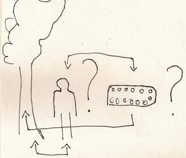
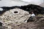
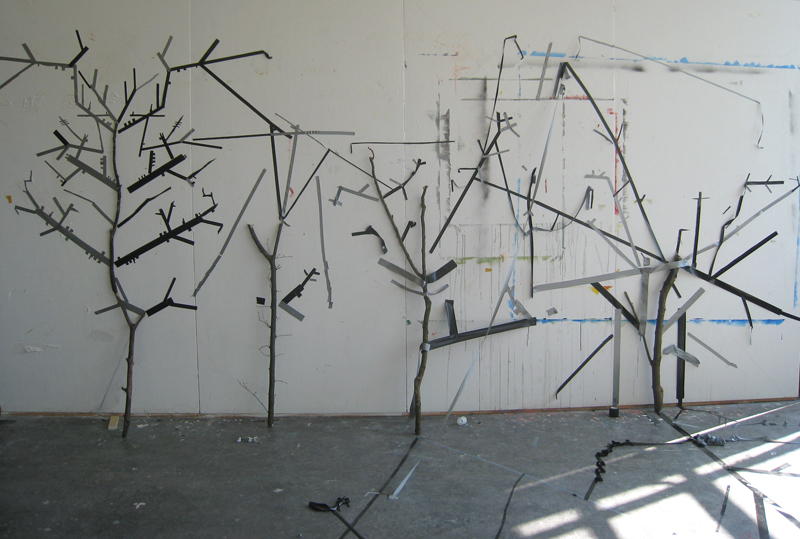
In my case rules always bring a lot of variations. I observe it a long time because my way of working usually include one or more rules. Sometimes because I pick the rule but most of the time they are visible when work is finished. They reflect my present situation and feeling but for that certain amount of time they become rules and then variation of creating is visible.
It is not random that I found how this rules are already involved in me and I have no problem with it because rule is just a strong word- meaning most of the time something destructive but there is theory in biology which can very easily prove how rules are from the beginning a part of life and that they provide never ending variations of everything we are surrounded by.
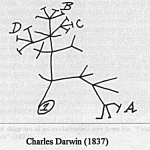
Charles Darwin introduced us to his theory of evolution in 1859 with his book On the Origin of Species.
This theory is based on several rules which explain that it is working :
1, In nature of biological species exists variability and is partly hereditary
2, In this variation there must exist some species which are more and some which are less adapted to the condition of environment where they live
3, Species which are more adapted have bigger possibility to create descendants. And when this process is repeated for a longer time then certain type in certain environment will spread and this is called = blind power
4, Everything alive has last universal common ancestor
Example for a blind power is very simple:
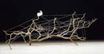
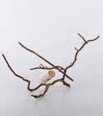
Imagine that you are walking some field and you come across a stone, what do you think of is that ok is a stone and it was here or somewhere around from the begun, but now imagine you found a watch.Probably you take it and observe it, you check if it works, you find out that is a machine which measures a time, you see from which kind of parts it is made so it is sure for you that there had to be someone who designed it someone we call watch-maker. Existence of watch prove an existence of watch-maker. But this is the thing which Darwin challenged.He is tried to say that watch can exist without watch-maker.
The choice of nature can be called something like a blind watch-maker – he get some parts of watches separately and one by one he makes a watch from it.The thing is that he doesn’t know that he is making a watch.
Darwin was a very big observant and had a big possibility to travel around the world what makes him very rich of the materials he could used for his theory.
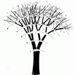
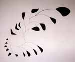
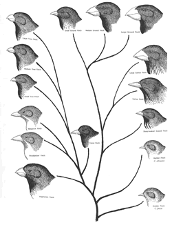
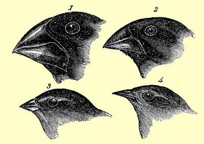
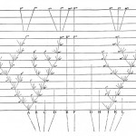
Another example of his theory which nicely explain also how rules of environment included food,weather… influence variability in this planet is his observing of birds- finches in the islands where he found out that they differ depending on what surround them and especially what differ is their beak – tool for eating. The reason is that finches split all over the different islands and by evolution they adapted themselves to the world around them and its rules.
Evolution begins with the first life in this planet and thats for me also where the creation begins and where the rules are always present and there is nothing wrong with it. The word freedom would never exist and would never have such a powerful meaning without the word restriction = laws.
To finish I choose the last part of Darwin’s book On the Origin of Species:
“It is interesting to contemplate a tangled bank, clothed with many plants
of many kinds, with birds singing on the bushes, with various insects
flitting about, and with worms crawling through the damp earth, and to
reflect that these elaborately constructed forms, so different from each
other, and dependent upon each other in so complex a manner, have all been
produced by laws acting around us. These laws, taken in the largest sense,
being Growth with reproduction; Inheritance which is almost implied by
reproduction; Variability from the indirect and direct action of the
conditions of life, and from use and disuse; a Ratio of Increase so high as
to lead to a Struggle for Life, and as a consequence to Natural Selection,
entailing Divergence of Character and the Extinction of less improved
forms. Thus, from the war of nature, from famine and death, the most
exalted object which we are capable of conceiving, namely, the production
of the higher animals, directly follows. There is grandeur in this view of
life, with its several powers, having been originally breathed by the
Creator into a few forms or into one; and that, whilst this planet has gone
circling on according to the fixed law of gravity, from so simple a
beginning endless forms most beautiful and most wonderful have been, and
are being evolved.”
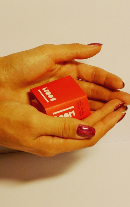 These fragile memories from the past childhood help grown ups to keep a child in their souls.
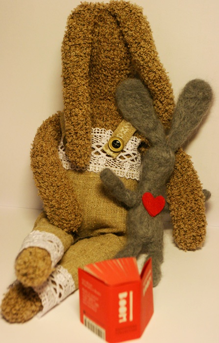 Take care of your childhood.


