Skip to Content Skip to Search Go to Top Navigation Go to Side Menu


"photography" Category


Rodchenko in het Foam


Wednesday, February 3, 2010

Rodchenko is een constructivist, behoort tot de Russische avant garde. Zij hebben ontzag voor machines en architectuur.
Rodchenko begon zijn carrière als kunstenaar met abstracte schilderijen, daarna ontwikkelde zich dit tot grafische vormgeving en vervolgens fotografie. Door dat hij dit allemaal gedaan heb zie je zijn kennis en talent. Deze bijzondere veranderingen in zijn vakgebied zijn te verklaren aan de hand van zijn werk. Zo is er in zijn constructivistische schilderijen als in zijn grafische collages en fotografie een duidelijk oog voor ruimte en communicatie tussen vlak en lijn zichtbaar.

Door dat hij dit allemaal gedaan heeft zie je zijn kennis en talent. Dankzij zijn veelzijdigheid en het feit dat hij zowel autonoom en vrij toegepast kan werken. En bovendien gebruikt hij zijn talent.
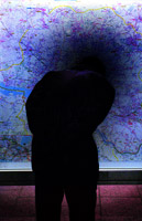
Rodchenko heeft fantasie en een persoonlijk fotografisch oog. In de tentoonstelling in het foam komt dat vooral naar buiten bij de atletiek serie. Door de hoeken die hij kiest word het een beetje surrealistisch en tegelijkertijd is het een prachtig momentopname. Je begrijpt misschien wat ik bedoel als je de foto hier boven ziet. Kale Russische mannen op gymschoenen met heel korte broekjes, en een geweer.
Als hij dit recht van voor had gefotografeerd, werd dit veel serieuzer genomen.
Hij is in dienst van de Sovjet Unie, maar toch heeft hij nog steeds oog voor de absurde taferelen. Hij verpakt deze absurditeit in een voor de Sovjet Unie acceptabele vorm.
Rodchenko heeft fantasie en gevoel voor compositie.

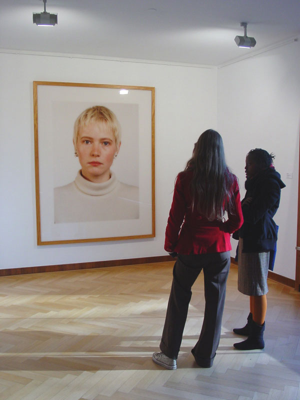
Wat ik echt heel fijn vind aan de voorstelling is, is dat je het plezier in zijn werk kan terug zien. Iets wat ik trouwens miste bij van Doesburg in Leiden en Lissitsky in Eindhoven.

Omdat ik vorig jaar fotografie heb gestudeerd weet ik dat er een soort regels in de fotografie zijn, waar je rekening mee moet houden. Rodchenko heeft dat niet gedaan. Ik vind dat erg fijn, want dat zorgt voor meer vrijheid en meer mogelijkheden.
Mensen hun voeten zijn van de foto afgesneden en sommige gebouwen worden uit hoeken gefotografeerd als of iemand de foto heeft gemaakt die net een beetje bezig is met de fotografie en is wat anders wil doen, zogenaamd iets orgineels wilt proberen.
Ik heb opgezocht dat hij de gebouwen zo fotografeert, omdat hij ze wilt laten zien van alle kanten, op een meer ruimtelijke manier.
Toch hoop ik dat hij de voeten er onderbewust er af heeft gelaten. Want dat betekend dat er minder denken aan te pas is gekomen, het is dan natuurlijker het komt uit het gevoel en het gaat dan meer op de actie zelf.
Dan moet ik gelijk aan zijn collages denken, ze zijn soms heel simpel, maar ze werken heel goed op de een of andere manier.

Ik merkte aan zijn foto’s ook maar weer hoe belangrijk het wel niet is om je eigen foto’s af te drukken. Het contrast of de lichtheid, maakt soms echt zijn foto. Zonder dat waren ze misschien wel te normaal geweest.

“The Nude…”


Tuesday, December 8, 2009

In the first books I choose, everything was planned. Every stroke and detail. Design is a view of something. From something which is mostly they same in somebody’s mind as in reality.

My other book is about photography, photography from naked people. It is called: “The Nude in Czech Photography”

I was inspired by tags from the second book, originally, realization and process. Human body, every body is original. Every body is unique, there is no body the same. The product in my other books are all things were you can make more of the same.

I have choose nudes photography because it is always about process and realization. If you ask a person to pose, you have to read their body language. You have to understand the light and try to photograph the energy from the person. A photo shoot is a ritual where your ideas become really with your improvisation.

Process from the photo is just as important as by design. In photography are photoshop and the dark-room two of the most important items. In the end I think that this book “The Nude” totally is related to my other books but also totally different.

(from the personal library)

New way of looking at architecture


Tuesday, December 8, 2009

Using my last tags, I found a really interesting book from an artist I already knew before. Because I found something with the words architecture and library, which were the most important tags of my last post, I was surprised, to find a book which is so nice even when I had to search quite specific.

Andreas Gursky makes pictures that are famous over the whole world. In my first post I told something about a book which is totally focussed on libraries. But this book shows not only libraries, but it shows a whole content of buildings photographed on a way only Andreas Gursky is able to. He makes pictures that show a new view on a building. Most of them are enormously big, or extremely complicated. They show an index of these buildings.

It is related to my second book because Andreas Gursky also photographed some interesting libraries and museums. And that is also the reason it is related to my first book. The difference between the books, is that this book is all about photography of the buildings. That’s why the images in the book are so interesting. In this book, the main subjects are the photographs of Andreas Gursky, in my other books it was about the building itself.

I think it is really interesting I found this book. Andreas Gurksy is one of my favorite photographers, and combined with the subject of this book and my earlier books, it is a nice collection if you want to know more about the architecture of the library, and specially when you want to see some brilliant pictures. It all fits together, but I think it also fits really well in the project we worked on.

Public Library Amsterdam: 761.2

the family of man


Wednesday, November 25, 2009

This second book the family of man attracted me in a different way. printed in 1955 it was at the time  – ”the most ambitious and challenging project with photography that had ever been attempted” (three million photographs were originally collected from amateur and professional photographers (not to mention more than a handful of gems by Henri Cartier Bresson). 10,000 of which were included in the MoMA exhibit while a further 506 photos from 68 countries were chosen for this publication (now that’s a die-hard archiving project!!)

“The Family Of Man” was originally produced for the museum of modern art in new york- not with the intention presenting the photograph as art but to show – ”photography as a dynamic process of giving form to ideas and of explaining man to man.” -to teach man about himself in all his various creeds and shades (this book was much before its time and although it did not have the intention of formenting multicultural acceptance it probably had a great influence and later gave way to books such as the 1968 random house publication The Colour of Man.) in the foreword Edward Steichen explains that his family of man was created in the passionate spirit of devoted love and faith in mankind.”.  and this i feel is what drew me to this book. pictures of birth, love, life and death shown with tangible empathy and passion. pictures of every possible ethnicity.  tribesmen from papua new guinea, native americans, french peasants, maori. this book although outdated is not without some degree of power still as can be seen by the frequency it has been rented out in recent years by people with a similar curiousity and interest to mine.

rietveld library number – 760.3 / stei / 1

the cleaning of the Rietveld pavilion


Monday, November 16, 2009

At March 16th 1992, Cornelia, Jane, Greetje, en Weimpje Koelewijn Vermeer cleaned the pavilion of the Gerrit Rietveld Academie.

the soberness and functionality of Rietveld

the neatness and the costume of the women from Spakenburg

respect

space – light – color.

a women that cleans will not lose her morality.

Job Koelewijn, Winner of the Dr A.H. Heineken Prize for Art (2006) talks.
photo’s by Erik van de Boom, reprinted from Rietveld Publication no 76

All about people


Monday, November 9, 2009
  • The first reason I chose the book New York nomadic design, was its title. Recently I visited New York and I thought that the book could complement the information about US design and art that I had gained from the recent trip. The book is the size of an average magazine, and is not too thick either. The cover has a metallic grey cover with a map of New York printed all over the cover. In addition there are four small images that are very different from each other. After a couple of introductory pages, I found that every single page contains three or four pictures with very little text. Those pages as well as on the cover show extremely different things, from a tent made on the street by homeless people to glossy slick furniture. I can appreciate the approach taken by the writer which is giving a real feel for the city.

Rietveld Academie Library No:9788425216213

Anita +124 freaky looking EyEs


Thursday, November 5, 2009

It is extremely difficult to ignore a weird Lord of the Rings, elf looking girl called Anita. Specially when it stands as a single, motion and emotionless portrait in the cover of a book. Difficult to avoid once again, as it stands next to what it seems like unreadable books full of text and content. A three second glance into Anita’s freaky, albino brawless eyes and four seconds into the side cover title to highlight it as the most interesting cover in the design book shelf.

Rietveld Academie Library No: 15046

Portraits without faces


Monday, October 26, 2009

Beautiful or ugly? Smiling or crying? Or maybe thoughtful? Or just silly?…

Lying on the table or looking for something behind it? Or maybe resting in this absurd way? Or perhaps the person is even dead…

You can guess but you don’t know for sure, because the indication of these emotions, feelings, moods and characteristic features, which can immediately tell you the whole story at once, is missing. The face is missing.

Annaleen Louwes, the Dutch photographer, turns people’s faces away from us. She is taking a photograph of a dancer stiffened in one of the passes, a patient from the mental hospital, a duo of theatre makers, or this photo of a young woman in a traditional Dutch costume leaning across the table. A photo made for an exhibition related to the subject of Dutch Folklore.

She raises all these questions and leaves us with no answer.

Annaleen_Louwes

The Last Days of Shismaref


Friday, October 16, 2009


> Fred Goodhope < photograph by Dana Lixenberg

Shismaref is a community settled on an isle close to the Alaskan west coast. The people who live there will be the first victims of the global climate change. Slowly but surely there homeland will disappear in the sea. I do wonder what will happen when these people, with their traditions and folklore, end up in the middle of the mainland American society. There are no concrete plans yet for a re-settlement. In the meantime these inhabitants of Shismaref are forced to survive in refugee centers, which brings about interesting contrasts.
Should there be a search for an isolated site making it possible for their traditions to survive, or should these people lurn how to live in a society as we know it? Questions which I find hard to answere.

Get the Flash Player to see this content.

Experimental interview


Thursday, October 15, 2009

What is the connection between Experimental Jetset, Johannes Schwartz and Herman Verkerk?
Besides the fact that they are all based in Amsterdam, that they can speak Dutch, they all like to create beautiful and witty designs or images, they like to question their practice, they like to experiment and they actually teamed up together several times, another crucial connection appeared recently: the three of them are going to participate to a collective interview project…

After discovering more about their work, it became obvious that there was something interesting to investigate about their collaboration. What make several people or entities meet and work together? Are they alike or on the contrary, are they so different that they complement each other…?

For that reason, we interviewed them using the same process:

>> AN INTERVIEW IN A SUITCASE
We visited Johannes Schwartz, Experimental Jetset and Herman Verkerk, carrying with us this suitcase. Inside the suitcase, many different objects. Each interviewee was invited to open the suitcase, to browse through it and to freely react to the objects they found in it.

The results were surprising, exciting and very interesting. But when it comes to decide what brought the three of them together and where they meet… you are left free to listen to the interviews and to make up your own mind!

Experimental Jetset, Johannes Schwartz or Herman Verkerk

slowLinking: tagging slow design part 3


Monday, May 4, 2009

Welcome to part 3 of : tagging slow design. This is a worksheet on which all the link-topics and post-it tags collected on the “slowWall” are listed in relation to the research subjects as components of the ‘slow design project’. (researches can be downloaded as .pdf’s).

link topics.

Performance links the Morgan O’Hara research to the one on Julia Mandle. The Julia Mandle research links to the one on Richard Long on the topic street /nature & art, by slow movement to the Kunsthalle Bern exhibit and by sensibility & violence to the Psychogeography research. Psychogeography has the link topic urban life with the Karmen Franinovic research, consumption /destruction /life style with Futurisme, against and pro community with Wim Wenders, evolution of everyday life to Downshifting, and a anonimous link to Maria Blaisse. This anonimous link is not the only one linking Marie Blaisse. Link topics like art and left over, connect this research to Uta Barth. Karmen Franinovic links to Christian Nold by means of the topic mapping, and to Psychogeography by urban life, to Futurisme by life is getting faster & people are getting a social, to Julia Mandle by just stop & think and to Richard Long by the link a way to see. Richard Long links to many other researches: to Sophie Calle by self related art, to Christian Nold through a line made by walking, to Karmen Franinovic linked by the topic a way to see, to Downshifting by choosing slowness. Downshifting links back to Julia Mendle by the link topic us and them, to Psychogeography by revolution of everyday life, to Futurisme tagging the link with designed lifestyle, to Marie Blaisse by us and them, and to the Kunsthalle Bern exhibit by reflect /a closer look. The research on Futurism has some remaining links to Julia Mandle through the topic exploring / explosive / sculptural. Following links from Wim Wenders to Uta Barth is made possible by the topic notice the small things in life, to Christian Nold by moving /memories. Mapping links Christian Nold to the Ambient/Brain Eno research while that last one makes a link back to the Kunsthalle “The Half and the Whole” exhibit creating a take time to cook link.

Reading all the researches the links will surely start to make sense, as will their variety shed light on the specific nature of many of them. Some research subject however did not create any link at all, like in the case of Maison Martin Margiela. And it was 0nly after some discusion that the performance link was created between Sophie Calle and Karmen Franinovic. Uta Barth was anonimously linked to Richard Long which might have been an intuitively act

Post-it tags.

No links did not mean no tags. Time, Maison Martin Margiela for example was closely read and tagged with post-it. This created tags like memories, replica, time(less), can’t relate to it, time, physical picture of memory and the photographical tag to a picture by Mark Manders. Wim Wenders (present in our research list because of his beautifull documentary “Notebook on Cities & Clothes” about fashion designer Yohji Yamamoto) generated also many tags like sublime, I finally found time, hillbilly, surreal, the truth, place, moving. Sophie Calle tagged by the moderator with authorship, generated: life=art, stories, documenting life. Uta Barth looking was tagged: rainy day with half closed eyes, in between places, no left over, sunday. Ambient the research connected to Brian Eno tagged as big here long now was retagged as live the moment, loosing yourself, don’t think, sound. Christian Nold place-ness got tagged with keywords like biomapping, google earth, links, remapping memories. Linked to many, tagged by few. Julian Mandle pause, was tagged with pause from urban flow only. Morgan O’Hara gestures was tagged with trans, transforming, concert-art, transmission, energy of moments, reaction. Maria Blaisse architecture by border between self and not self. Futurism with fast life, life style, save time? Downshifting was tagged with life style too and change assumption. Richard Long tagged as a subject with landscape was enriched with the two tags: exploring fast and slow and perception of space, time and personal potency. Psychogeography with destruction of community, philosophy, socialism, anarchisme and urban live. Finally Karmen Franinovic subtraction, served as a hub for the tags: observe, spontaneous landscape, discover a realy nice place that never be online, easy fast, MTV generation, reflect, and observe. Some researches like Conditional Design re-mapping did not make “the slowWall” and were concequently not linked

added tags from the slow design lecture.

scale, gestures, measurements, relations, sustainability, evolving, creative activism, reveal, expanding awareness, reflect, engage, participal, deceleration, fresh connections, rhythm, probing, (im)materiality, metabolism, reflective consumption, live span, memories, community, record, tracing, (human) body, break (take a break), nothingness, inclusive, transparent, re-mapping, connection to scale

read also: >tagging slowdesign part 1

things as they are and things as they were


Wednesday, April 1, 2009

“things as they are” is a book reflecting photojournalism of the last 50 years.
it is a documentary about the development and change in this specific genre, but also very useful as an overview of of social, political and enviromental topics, concerning the media in this timeperiod.
Its definition as an artbook functions, because it is dealing with the medium photography itself, aesthetics, how they change, but also with the investigation of reality and how it is and has been shown to us.
It’s great flipping through it for the matter of inspiration, information, investigation, interest and the aestetical experience.

cat.no. 761.6-pan-

keyword: overview

Time identity in photography


Wednesday, April 1, 2009

While I was looking for the book, which could give me some materials about identity, I found, that there are not that many books about photography in our library. So, I decided to stop on this History book, which includes photos from 19th-20th century. I have chosen a portrait genre. But I found that it’s difficult to talk about this topic objectively, showing just a few examples. The idea was to show changes in society, that led to the changes in photography also. Not only technical innovations had influence on it. I can say that now we have a good material, good inheritance, that we can use in our work. And, of course, our present time has it’s own identity, interesting, what kind of changes it will leave after.

book no: 761-WAR-1

keyword: identity

Metal Balls


Tuesday, March 31, 2009

For this book, I need to cheat. I will add a tag to my previous entries. Maybe like every book, this one is also a time related book.
The images in this book are trying to give you a certain feeling of action and adventure in the 1970’s. You, standing in a bar, always playing with your metal balls. Sometimes you are a cowboy, killing Indians. Other times an astronaut looking for new worlds in outer space.
I didn’t read any text, but I think to people have really interesting stories to tell you about how it is in the pinball business.
You should read them.

Sharpe PINBALL! Hamilton
cat.no. hami 1

keyword: time

only b/w


Thursday, May 22, 2008

black and white 10 years purple magazine

Since almost two years I have a copy of the ‘Purple ten years’ supplement that came with their fourteenth issue. I like it because of it’s rawness, sensibility and inconspicuous complexity.It doesn’t contain texts, only b/w photographs of ripped out pages of former issues of Purple. Issues that were published between my fourth and twelfth age. I’ve never seen the magazine to that time. But since then every page of ‘Purple ten years’ was flipped countless times. But still everytime I discover stomething new. Sometimes visual gags, connections between pages, people and their work or others. The page that attracted my attention while the research showed two pages three dimensional laying in space and seem to be from a photo series about Susan Cianciolo. An so far unknown name to be but her work looks highly interesting!

“Functionality can take a form of beauty”


Thursday, May 22, 2008

nikon camera Photo_Malthe Stigaard I have several cameras in my collection. I guess the Nikon F3 is the camera I use when I know what I want to shoot. I never use it just for snapshots. It is too heavy to carry around with me and it is too much work processing the images if I don’t specifically want to use the benefits of shooting on film. I mostly use it for shooting people and for street photography.

I never push the button except if I get that feeling in my stomach, which tells me that this will be a good picture. I guess it’s the preciseness and the functionality of the camera that makes it my favorite. And I like the fact that the basic design of this camera, like most cameras, comes from functionality and not from making something which has good looks. Still I keep it proudly presented on my shelf as a decorative object when I don’t use it. So I guess “Functionality can take a form of beauty” as is a motto of it’s designer Giorgetto Giugiaro…

interview with Giugiaro / http://www.media.italdesign.it/

Design Trip to Insel Hombroich


Sunday, December 2, 2007

0708_Hombroich4

Thomas Ruff at Haus Esters Haus lange

The Design Trip to Germany took us to Insel Hombroich in Neuss Germany. On the way we stopped at the Museums Haus Esters and Haus Lange, Mies van der Rohe’s first building experiments (1929) with -non supportive- brick housing. The buildings were clearly designed to look from inside out as we experienced while exploring the art and photography filled interiors. Especially the bathroom on the second floor gave us a sweet glimps in the past.

0708_haus_esters"Rietveld at Insel Hombroich"
"Venician Glass: crafts at insel Hombroich""Haus Esters Haus Lange Mies van der Rohe"

Top left > 1 Haus Esters • 2 Rietveld at Insel Hombroich • 3 Mies van de Rohe, Haus Esters Haus Lange • 4 Venician glass craft >< art in insel Hombroich

During a beautifull autumn day, we entered the magical Erwin Heerich‘s Pavilions followed by red and yellow leaves . Nowhere can daylight be experienced like this, looking at the art and craft as it realy is and was meant to be. The unique melting of architecture, art and craft can be enjoyed only at a few other places like..

Calder, Yves Klein, Buddha, China or Schwitters and Bart vd Leck, the sheer power of it made us enjoy this humbling moment.


Log in
subscribe