Skip to Content Skip to Search Go to Top Navigation Go to Side Menu


"graphic design" Category


Approaching the Archive


Sunday, December 11, 2016

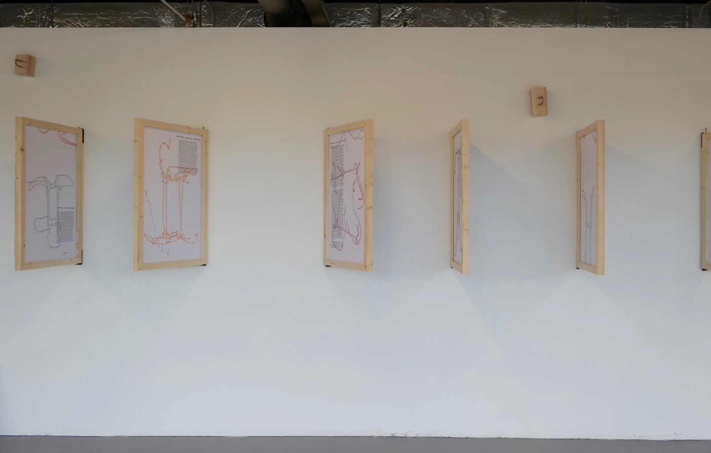
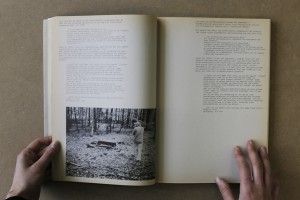
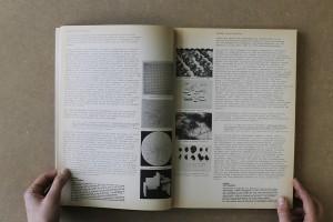
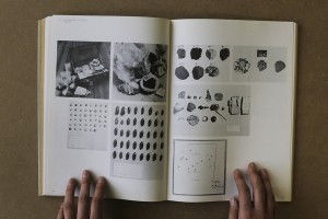
‘Approaching the Archive’ begins from a coincidence that becomes an unexpected point of access to the archive and book collection of artist, writer, editor and graphic designer Will Holder, in the context of his exhibition ‘Sorry! NO we don’t do REQUESTS’ at Kunstverein in Amsterdam.

The essay deals with the successful as well as the unsuccessful attempts at trying to grasp a lot of material in a little space, and the systems that one makes up in order to organize and process content through. Moreover, it is an essay about books and the stories and associations they convey, as well as it is about the finding of an unexpected relationship between ‘typography’ and ‘topography’.

Will Holder click on the image to download the pdf

Un Use You All


Thursday, September 15, 2016


How much can a few oddly functioning objects tell us, about the written and unwritten rules and conventions revolving around the world of artifact? The on-the-verge-, in-between-, half-, unhandy-, surprisingly-, weirdly- or not-at-all-functioning objects – or is that even possible?

Through a series of 10 short-stories, the term Shift Spectrum is introduced. An objects journey from fully functioning (as its initial intention) to the broad field of “what else” during which the object behaves as a sort of “social agent”. Where the object speaks back to us and we listen creating a two way dialog which reflects, sometimes in confronting ways, the useful and personal values we imbue objects with. Whether in a dry product description or the object becoming a protagonist, an object narrative power is prominent in the text.
The examples given are both historical and contemporary, ranging from a tent peg, a kitchen chair, a warming pan and a Neapolitan coffee pot to a name a few.

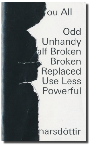
Handing the thesis over to William Jacobson to design it was a way of taking a distance to the text and another dialog, this time between my text and his design was created. His choice of making the cover sealed, puts the reader immediately in a position of questioning the object, even before starting to read.


SAMSUNG CSC SAMSUNG CSC


This thesis became a theoretical foundation for my graduation work, Sauðfjarveikivarnagirðing. A story of a broken down fence in the highland of Iceland. It wasn’t until after writing the thesis that I was able to go back to the material I had gathered a year earlier about the fence and contextualize it.


Cover_shadow download this thesis by Halla Einarsdottír
all rights to this thesis are property of the author © 2016


BE VISUAL


Sunday, February 21, 2016


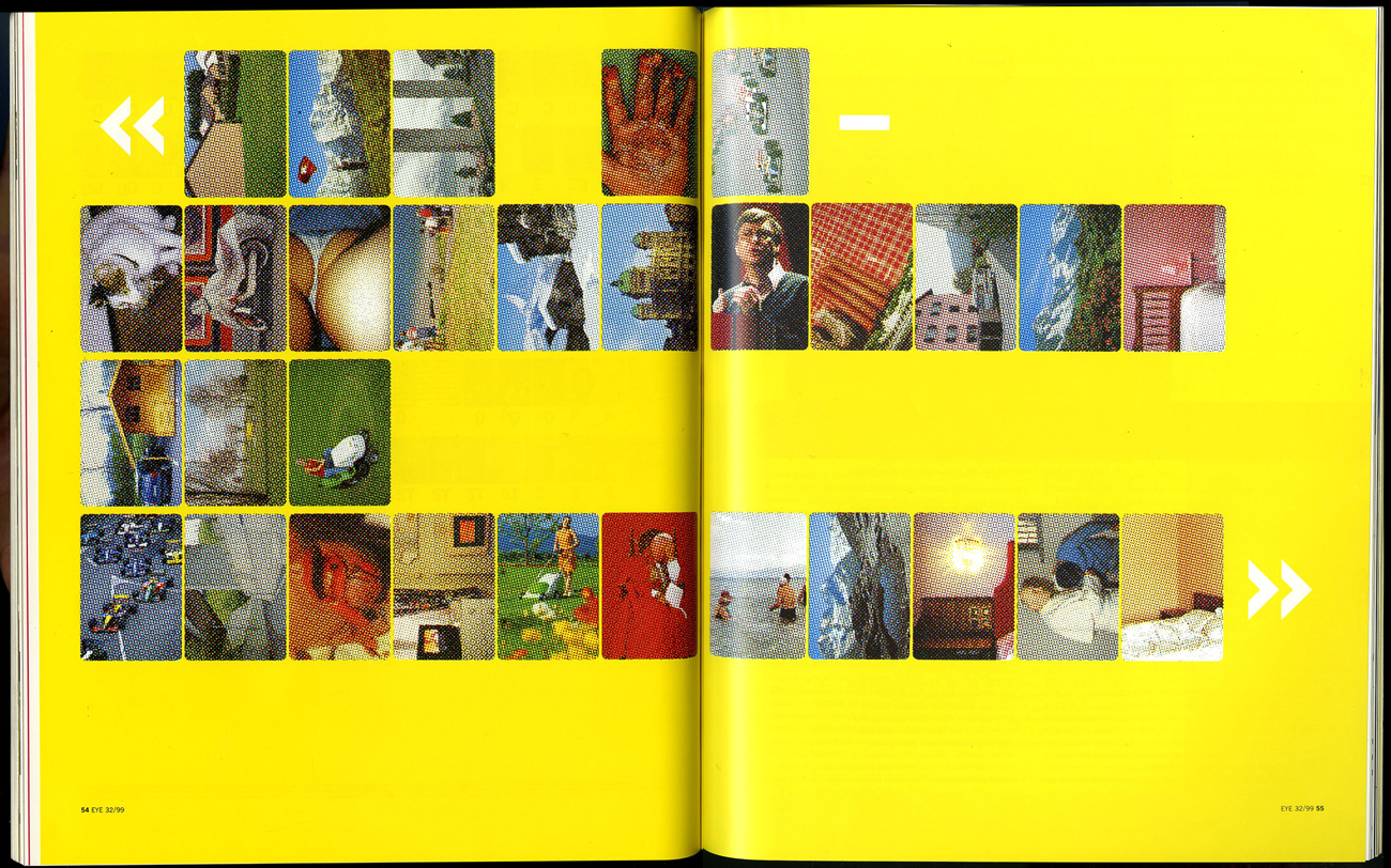
To share and receive, to express an idea or a feeling; that is what communication is to me. It can be transferred in various ways; through verbal and nonverbal communication. In the Arts, communication can be interpreted in a different way.  On this essay the main focus is image and communication. How images are understood as means of communication? As a starting point, the ‘visual essay’ of Beat Müller and Wendelin Hess called ‘The Impossibility of Neutrality” gives a view on the perception of communication. The impact globalization has in culture and economy, questioning how “neutral” a design could be? This ‘visual essay’ consists of images from various sources; from the Swiss Alps, from sports, the pope on tour to hooligans in Basel. From the founder of the Microsoft software Bill Gates to luxurious chalets, contrasting with pornography, war and violence. A visual combination arranged in a certain way, each image elaborating harmonious with one another forming a pictorial alphabet and text.


Impossibility-Neutrality_2_1300

Müller & Hess, The Impossibility of Neutrality, Eye #32, 1999


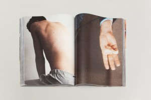
A similar approach as Müller and Hess has the London based artist and designer Paul Elliman with the “Untitled” (September magazine) 2013. The publication consists of an enormous private collection by the artists himself, of found images, reaching around 500 pages, a compilation of different sources from the world of fashion and photography to pornography. Paul Elliman modified every image by adjusting and cropping; by “zooming” into details. as a focus on the human body, emphasizing in such a way, physical gestures, such as the human hands for instance. A publication of powerful figures creating a variety of shapes and patterns. Without any further explanation of a written text; only the act of hands; a distinctively particular way of communication, in contrast of vivid colours. A synthesis of dynamic images capturing semi-nude and nude areas of the ergogenic parts, such as the chest and limbs of the human body. Gestures can be powerful, they are a form of information; a message that has been made by the sender towards the receiver.


elliman

Paul Elliman – “Untitled” 2013


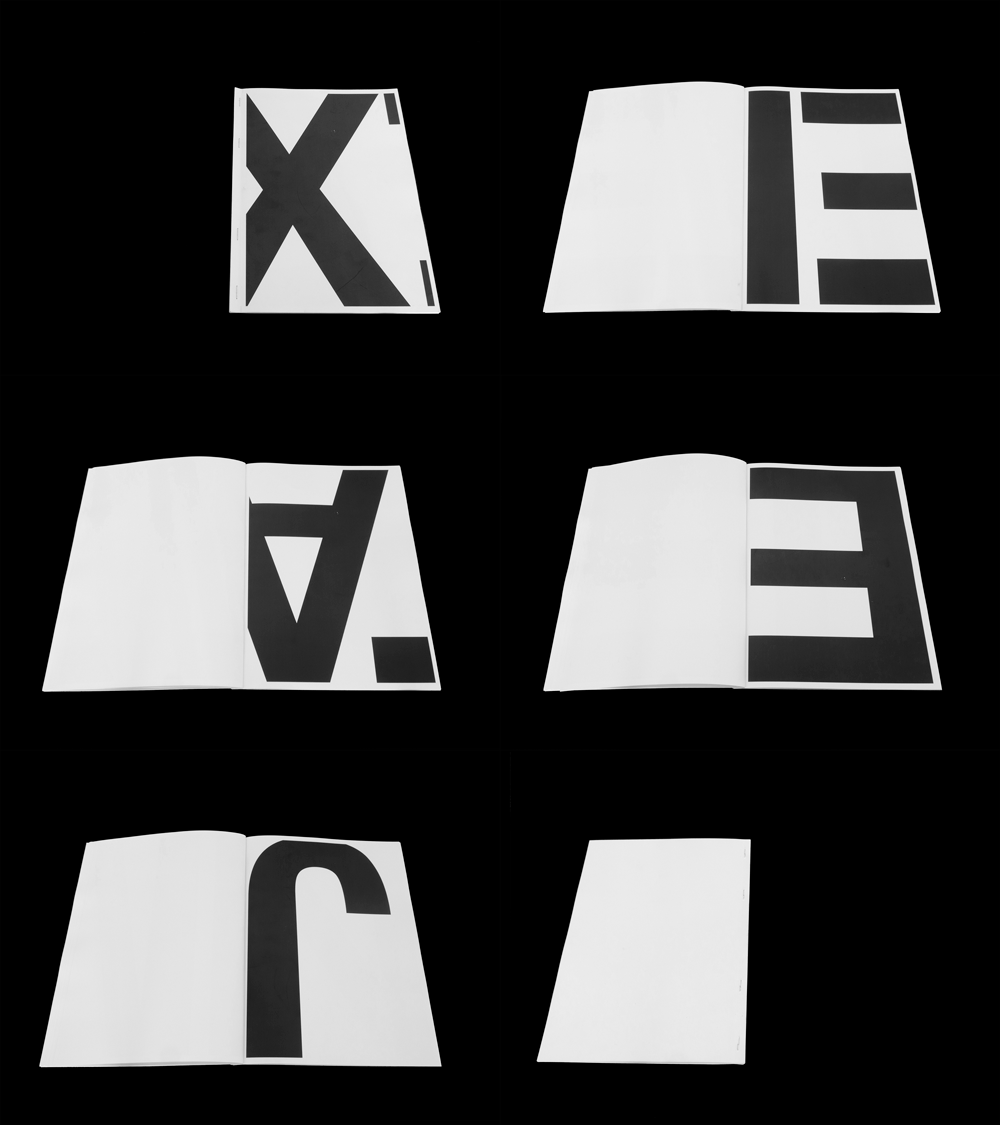
Another project called by Elliman is called “The Alphabet” ’92 [x] in collaboration with 26 students of the London University. New ways and possibilities of opening up a communication were created. The result was an interactive piece or work that denies any stereotypes of the spoken language by making a new kind of alphabet by using objects and the human body to create letters. Image is the main element of it, structured by the human body. A unity of photographs decoding the language by giving it literal form and/or subjective expression. Shot inside a photo booth, students were deliberated to be themselves and interpret each letter of the alphabet by using only themselves.  By using only a few “ingredients” for instance; movement and the human body. The result is exciting and highly creative; could be a proposal which suggests to be open and think different regarding the process of ; reading and understanding.
 

“Language moves between us and the world on patterns of repetition and variation, and a mimetic example of this might be something like an alphabet” – Paul Elliman


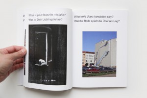
As mentioned above the artist Paul Elliman and his projects “Untitled” 2013 and the “Alphabet” 1992, suggested a new way of communication which I would like to follow up to with an interesting example that can be found in the book of Hans Ulrich Obrist and Hans-Peter Feldmann  called “Interview” 2009.  They use a cryptic way of communicating, consisting of questions that have been posed by Obrist, to which Feldmann gives an image as the answer. A game between words and visual language, projecting social issues in combination with humor. The reader is allowed to make his own “translation” on every image as the possibilities of an answer are endless.


VT2A3857

Hans Ulrich Obrist and Hans-Peter Feldmann – “Interview” 2009


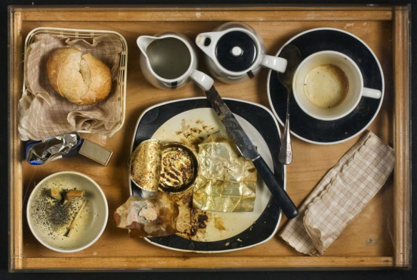
Moving on to one of the founders of the New Realism movement [x], Daniel Spoerri and his book “Coincidence as a Master” 2003. The Romanian-born, Swiss artist and writer have been collecting actual items such as; plates and cutlery for years. Creating himself the term “Tableau Piège” (snare-pictures) around 1960, which stands for; “objects, which are found in randomly orderly or disorderly situations, are mounted on whatever they are found on (table, box, drawer, etc.) in the exact constellation they are found in(…). By declaring the result to be a tableau, the horizontal becomes vertical”. What can be seen in this publication is a synthesis of found objects which each one has a story to tell. Taken from a “bird’s eye” point of view, of tables, frozen in time, captured in a certain moment. Remains of meals fixed on the table, an attempt of reviving a particular event. His own approach of expressing a story through fixed scenery of objects; a momentary need.


variant-spoerri

Daniel Spoerri  – “Coincidence as a Master” 2003


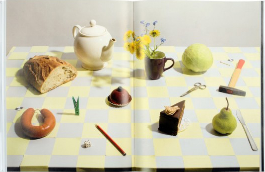
A similar approach as Daniel Spoerri has Uta Eisenreich as seen in her “A Not B” 2010 book designed by Julia Born. A mixture of colourful and playful photos, consisting still life images of objects like matches, balls, fruits and scissors. Rearranged in such an order which creates an optical illusion and language, where you might also come across with “spot-the-difference” mind game; experimenting between the thin line of common and uncommon sense. Eisenreich was inspired by scientific experiments, nursery rhyme poems and the “non-verbal IQ tests” for children,. The work contains of a variety of domestic objects directly connected with our everyday lifestyle. Questioning the possibility of placing in order items that has no function together although create a serene atmosphere. An exploration of structures between objects and space; “A Not B” takes us along into a playground of constructions of forms, the power of symbolism and youthful tendencies.


uta_346

Uta Eisenreich – “A Not B” 2010


Objects surrounds us, usually designed to fulfill every human need. Although, from another perspective objects can be used for another purpose. Through them we can create a whole new reality, new experiences which opens up possibilities. It is all about perception, how we see the world around us, how do you see it?  Eventually, everything is changing and new things are born. For instance, the collaboration between the “creative agency Forsman & Bodenfors, stylist Evelina Bratell and photographer Carl Kleiner” publishing the “Homemade is Best” 2010 cookbook for Ikea.  It consists of one hundred and forty pages of ingredients placed in such order of creating geometrical patterns.  A wide range of baking recipes motivating the reader to take action. Suggesting an alternative approach of reading a recipe; by looking the images of the ingredients, guides you to the recipe instead of reading a text of each step that has to be made. As a result focusing only on the ingredients that are needed. While you turn the page you can as well see the result of each recipe.


Language is not dependent on writing” – Ferdinand de Saussure


In conclusion as the examples of the artists mentioned above, communication can be understood without the use of words; the power of the image can be stronger. In depth, photographs can express an emotion and interact with its audience. Words can be unnecessary; the use of the body or an object can create another medium of communication.
 

Hardly readable – A graphic translation, the sound as a last abstraction


Sunday, February 21, 2016


A translation of roman letters into graphics and a translation of these graphics into sound. What happens if a language is changed into a system that we all have to learn new? A system that defines roman letters in new ways. Therefore a first abstraction into graphics and a last abstraction from the graphics into sound. Both, the individual graphics as well as the sounds can be connected and therefore they can create words in the level of language. To what extent is that still readable? Is our visual dialect able to understand that? And if we are able to read the graphics as new letters, can we associate them with new sound that is creating a virtual language that is not spoken?


AZART


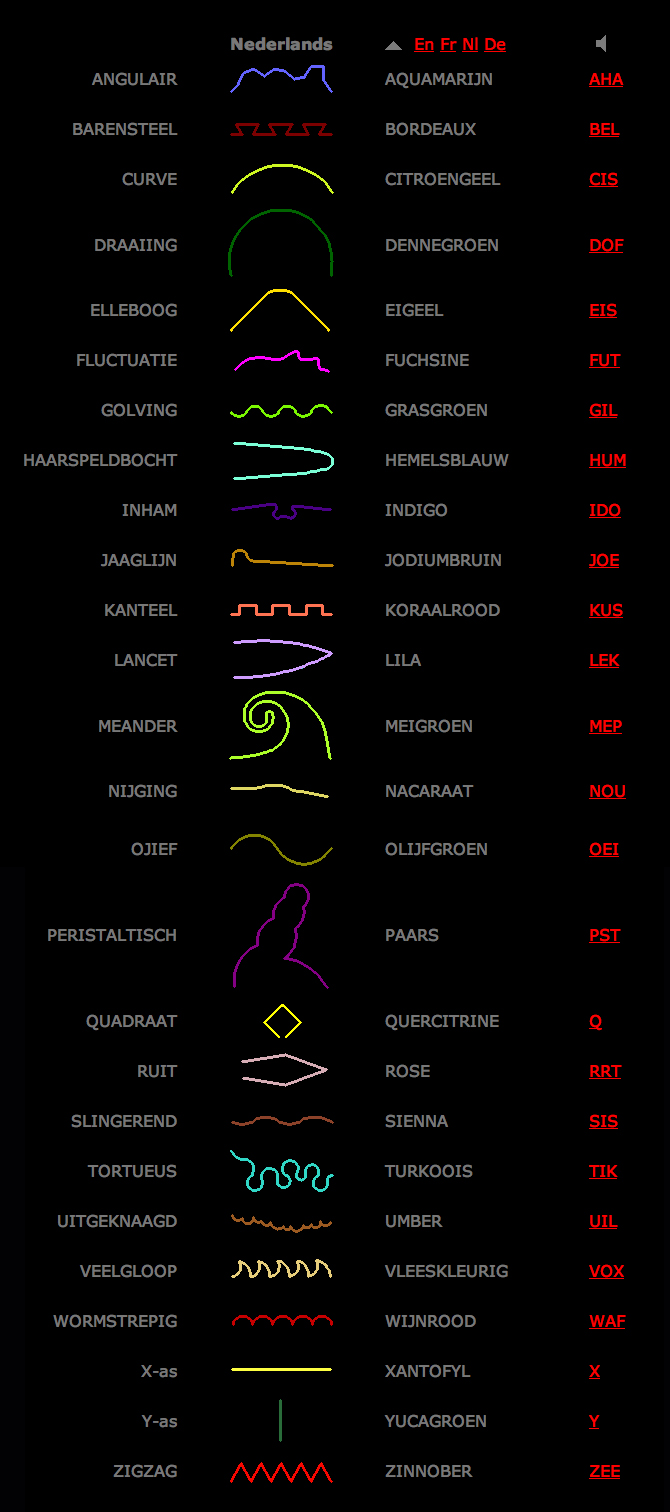
AZ-art is about the art from A to Z by belgian Guy Rombouts. It is an alphabet translated into graphics. Each letter gets a fixed graphic. If the letters create one word the graphics create one cloud. That means that there are certain combinations between the graphics that are approximately working in the same way as certain combinations between letters in a font (space, connection etc.). Instead of one-dimensional strings the alphabet combines words as two-dimensional objects. With the use of different colours for each graphic the combination appears much stronger than a written text. If there appears a space that separates two words in the graphic translation it appears a second layer and therefore it becomes a third dimension when words create a sentence. The words are translated into new associations.


Writing Down And Reading Aloud


Questioning the system of a new graphic language means to make a connection to our understanding. How do we perceive things? How do we actually start learning to understand what we perceive? Being alive with the knowledge of speaking and listening, we learn our visual dialect as a second language. This second language is learnt by translation: writing down what is spoken and reading aloud what is written. Our roman letters are carrying petrified leftovers of a long historical development – connected to pre-alphabetic times. Therefore many people are questioning them for an efficient design. Also Chinese politicians and teachers were trying to simplify the logographic of the Chinese alphabet. What is a graphic translation about? In “Phonographic Translation” by W Haas it is explained that a worker in Tientsin needed half a year for learning the Chinese characters and he still could not remember them. These three characters represented just three works that he had to use every day. Chinese pupils have to learn the first One-Thousand Characters in primary school. Basically a contemporary graphic translation of a language is about the simplification of a language.


The AZ-art is about the transformation in two directions: X axis and Y axis


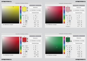
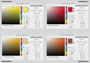
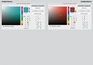
Every graphic is defined by an individual shape and colour. My description of the colours of the graphic alphabet is based on Goethe’s colour theory. I used the definition of red, blue, green and yellow and brought them in connection with the RGB-Values of each graphic.


blog blog2


blog3 blog4


blog5 blog6


blog7


Goethe’s colour theory


|||||||||| Because of its high dignity is is sometimes called crimson (even if this is actually drawn into the blue). By increasing the two poles (yellow and blue) to red an association, tranquilizers or gratification takes place. It gives an impression of seriousness and dignity and also of kindness and grace. Through a crimson glass one sees a well-lit landscape in a terrible light.

|||||||||| It is the color of the dark. It is a color energy and the highest purity a lovely Nothing. It seems to recede (the distant mountains can be seen in blue). It is pleasant to look at, there is a feeling of cold and reminiscent of a shadow. Although Blue rooms seem far, but cold and empty. Blue light is changing your mood into sadness. If blue is touched on its plus side it is pleasant.

|||||||||| It is the colour that is nearest to light. It has a serene, cheerful, gentle property. As gold it has a splendid and noble effect. It makes a warm and comfortable impression and in Painting it is used to illuminate. Howerver yellow is very sensitive and gets an unpleasant effect when it is dirtied or pulled into minus. Then it becomes the colour of shame, disgust and displeasure.


The sound as a last abstraction


As an outgoing sound I decided for the Wobble Bass with a 25% Filter Reso. Each graphic is based on this sound and is transformed in its visual appearance. That means that e.g. letter X is not transformed because it is a linear graphic. In its tone middle e.g. the filter frequency of letter N is transformed (30-90 Hz). The filter frequency of letter C is transformed (30-155 Hz) from the beginning to the end of the tone. Letter B is showing the strongest hearable difference. Because of its graphic the transformation of the outgoing bass has 4 high distances and 4 low distances. That means that the Filter Reso is 4 times transformed to 70% and 4 times to 0%. The filter frequency is 30.

Next to these 4 letters I also translated the 3 AZART- Options of a black, grey and white environment into sound. My research is ending with a playlist that I uploaded on SoundCloud. There you can find the sound of 4 single letters, the 3 environments and the combination of the 4 letter with each environment. These sounds are produced in a collaboration with Alexander Köppel (Exchange Student GRA – Inter-Architecture).


Een blik op Anthon Beeke


Saturday, February 20, 2016

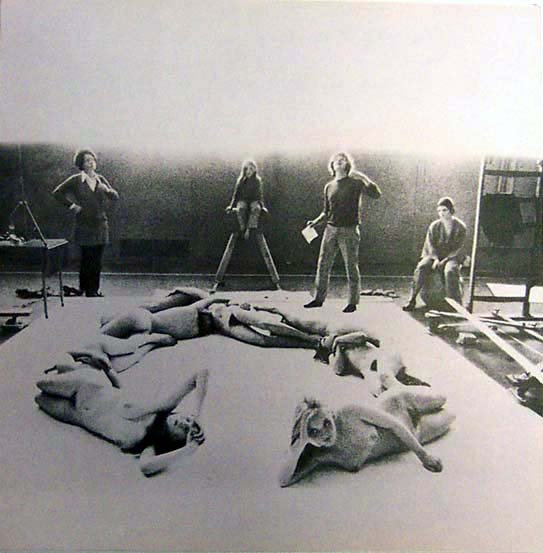
Ik ben geboeid door communicatie en woorden, en specifiek in de manier waarop mensen met elkaar communiceren. Het eerste werk dat ik leerde kennen van Anthon Beeke was het ‘Blote meisjes alfabet’. De subtiliteit waarmee hij die schoonheid vertaalde in die naakte lichamen trok mij heel erg aan. Op basis daarvan heb ik besloten om Anthon Beeke te kiezen als onderwerp. Toevallig kwam ik hem tegen en besloot toen om over Anthon te praten via een persoon die dicht bij hem stond en zo kwam ik bij Aaf van Essen terecht.

 We waren op uitstap in het Lloyd Hotel, waar we een rondleiding kregen van artistiek directeur Suzanne Oxenaar, toen Anthon Beeke en Aaf van Essen net langs liepen. De tweede ontmoeting vond plaats tijdens de open dag van de Gerrit Rietveld Academie, Hierna vroeg ik Aaf voor een interview over Anthon Beeke, met als vertrekpunt zijn werk ‘Blote meisjes alfabet’.

interview Aaf van Essen

 “. . . Ik heb Anthon leren kennen doordat hij een vriend was van mijn echtgenoot en we beide Amsterdammers zijn van dezelfde leeftijd.” Begon Aaf. “Anthon is altijd een kleurrijk figuur geweest in de wereld van ontwerpers en kunstenaars. En dat heeft ook wel te maken met het feit dat hij een hele aparte manier heeft van denken en functioneren. Voor ik besloten had naar de Gerrit Rietveld Academie te gaan, was ik verpleegster. In 1986, toen ik 46 was, begon ik aan de Rietveld Academie. Anthon hoorde dit en zei tegen me: “Aaf, doe die Rietveld niet, kom maar gewoon bij mij, ik leer je het vak.

 Het is ook een lastige man, dus ik dacht ja, als je een nieuw vak wilt gaan leren, dan moet je ook dom kunnen zijn. Als je niet dom mag zijn omdat een ander verwacht dat je het allemaal weet en kent en doet, dan gaat het helemaal niet goed. Dus toen heb ik gezegd; Ik kom wel op je studio werken, maar ik ga wel gewoon naar school.

“. . . Waarschijnlijk kan dat wel als hij al te beschrijven is, ik denk door zijn fotografische kwaliteiten dat je hem zelf ook als een soort foto zou kunnen beschrijven. Als ik hem voor de geest haal, dan zie ik een man met een grote bos wit haar. Een zwarte goede regenjas van Japanse snit. Eigenlijk staat dat voor een soort rotsblok, een eigenwijs rotsblok. Ik denk dat zijn gevoel voor humor hem uit heel veel ingewikkelde situaties heeft gezet. En het is een plastische man, een muzikale danser. Hij ziet in heel veel dingen muziek. En dan zijn dat eigenlijk de ingrediënten waarmee je zo een goede ontwerper wordt. Daar moet je het mee doen”.

 “. . . Anthon Beeke heeft de schoonheid van de naakten heel delicaat behandeld bij de productie van het ‘Blote meisjes alfabet’ van 1969. Er ligt meer nadruk op de vorm, die van de letters. Het naakt valt minder snel op” Zijn liefde voor vrouwen en het veilige gevoel dat hij ze geeft, is duidelijk zichtbaar in het resultaat van het ‘Blote meisjes alfabet’.

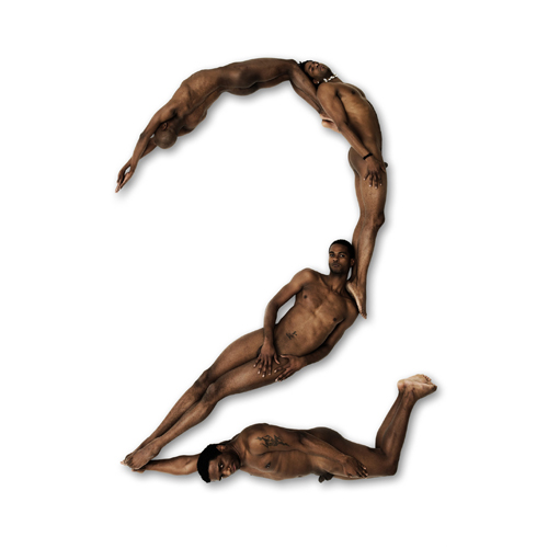
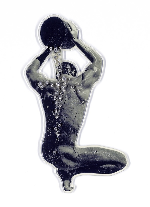
De letter T van Anthon Beeke's blote meisjes alfabet gefotografeerd in 1969 en het cijfer 2 gevormd door naakte zwarte mannen van Naked Numbers 2005-2011.

De herwerking van 2011 is in samenwerking met Wim Crouwel geweest. Dit is te herkennen door het gebruik van het typeface ‘The New Alphabet’ in het boek. Dit alfabet is gebaseerd op de opkomende computertechnologie in 1969. Het werd door Wim Crouwel ontwikkeld en gepresenteerd in het kwadraat bladen formaat. Dit komt ook terug bij ‘The Body Type’ waar ze de nummers 1 tot en met 9 in de vorm van naakte zwarte mannen hebben toegevoegd

 “. . . Waar zo een zwarte man voor staat kan je heel makkelijk zo uitvergroten, dat doet hij dus niet [x]. Nu is hij van plan hetzelfde met volumineuze vrouwen te doen, dit is niet heel evident, bij een ‘l’ bijvoorbeeld wordt de vorm ontzettend geaccentueerd. Maar misschien komt hij daar goed uit.

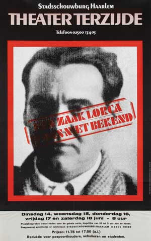
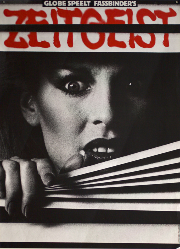
 “. . . Gedurende dezelfde tijd als “the Body Alphabet” was er een culturele revolutie in Amsterdam, ook op het gebied van theater. Deze revolutie heette ‘Aktie Tomaat'[x], zij waren heel erg tegen het traditionele van toneel maken. Toen deze revolutie zijn effect had op toneel, begon je dat ook te zien in het straatbeeld in de vorm van de affiches. Toen deze belemmering was verdwenen en het theater vrij spel had, kon dit ook worden doorgewerkt in de affiches.

Theater-Terzijde-Haarlem AntonBeeke_Zeitgeist

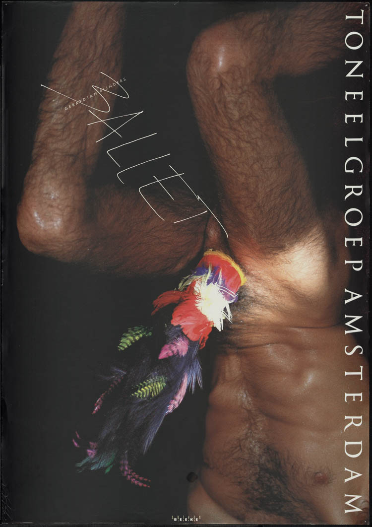
Anthon’s eerste affiche voor een theater was in 1966 voor Theater Terzijde. Sindsdien van 1966 tot 1985 heeft hij de affiches en programma’s voor Zuidelijk Toneel Globe ontworpen [x]. Vanaf 1987 tot ongeveer 2001 bepaalde Anthon het gezicht van Toneelgroep Amsterdam. In overleg met de directeur van Toneelgroep Amsterdam vertaalden ze het toneelbeeld in affiches.
Veel affiches van Toneelgroep Amsterdam bevatten naakt. Dit resulteerde in nog een controverse, aangezien deze affiches overal op straat hingen en dit was destijds erg provocatief.[x]

resolve

“. . . Ik vond het altijd heel erg opvallend dat dit beeld op straat niet beklad is geweest. Aangezien dat best vaak is gedaan ook met ander werk. Hij vond het zelf niet storend, en ergens wel goed dat het een bepaalde reactie opleverde. Maar dus wel opvallend dat dat niet is gebeurd met dat werk, hij vond het wel geestig, het is ook heel discreet ontworpen.”

 “. . . Ik denk dat Anthon toch op de een of andere manier miraculeus raak heeft geschoten.”

interview Aaf van Essen

Ceramics with Émilie / Ceramics with François


Tuesday, January 26, 2016

650-Emilie_Ferrat_and_Francois_Girard-Meunier_RV_lowres_1 Rietveld Graduation Show

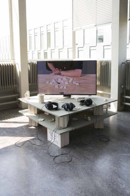
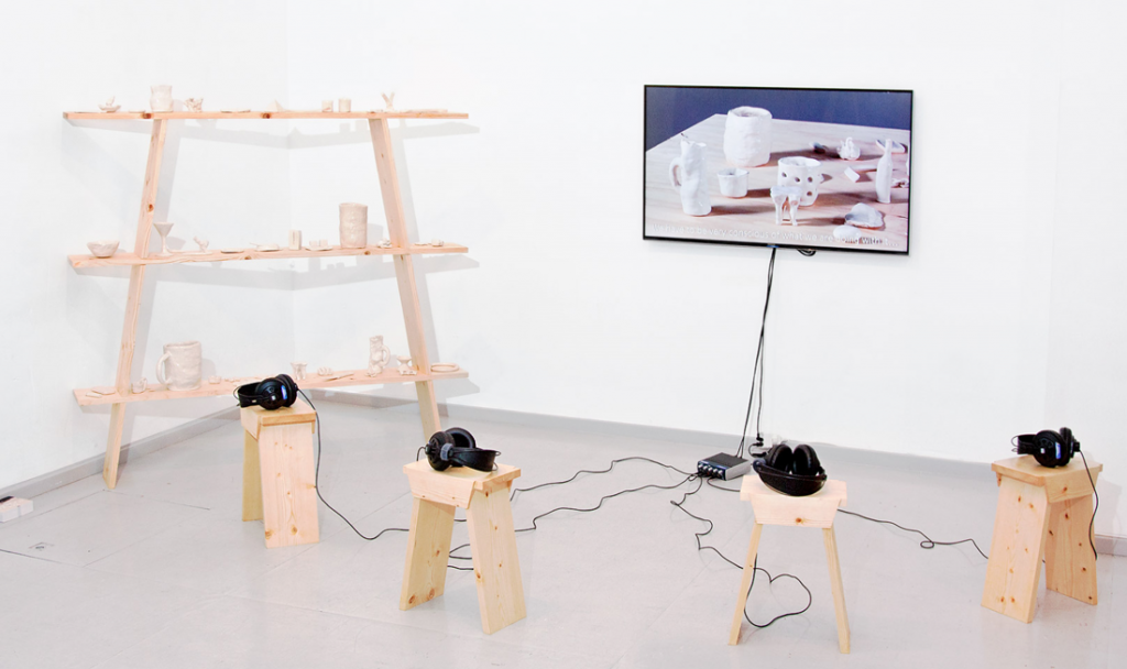
Émilie Ferrat [x] and François Girard-Meunier [x] graduated from the Department of Graphic Design. As part of their graduation show they presented a collaborated project ‘Ceramics with Émilie / Ceramics with François.’ This project was chosen by an independent jury to be nominated for the Design Award and was for that reason part of the exhibition ‘Selected Gerrit Rietveld Academyie Awards 2015’ organized in Castrum Peregrini [x].

Screen shot Peregrini-show

Castrum Peregrini Presentation


Ceramics with Émilie / Ceramics with François

‘The medium is the message.’ These words of Canadian philosopher Marshall McLuhan still offer room for artistic exploration. Because how exactly the message changes when the medium, or the material, is changed remains shrouded in mystery. In their collaborative project, graphic designers Émilie Ferrat and François Girard-Meunier use a classic yet surprising approach: dialogue.
 
Screenshot_Selected-images1
 
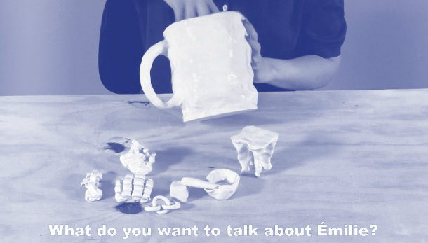
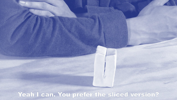
    The installation consists of a video of the two designers conversing and a number of glazed clay models –a mobile telephone, for example, and shot glasses, jigsaw pieces and some undefinable models– with which Ferrat and Girard-Meunier stretch the boundaries between form, material and meaning. A new plain field is established. The video shows their fresh and resolute debate on their progress in working with ceramics – a new material for both of them. The dialogue is explicitly overacted, which stresses the artificiality of the form (a recorded conversation about models they made earlier). The overacting harmonizes nicely with the glaze on the clay models: a shiny layer upon robust content. The spoken and material form are one.
 
Screenshot_Selected-images2
 
    ‘Do you think it’s the ceramics that is giving meaning to our talks,’ one of them asks, ‘or rather that our talks are giving meaning to the ceramics?’ The relationship between words and things is a complex one. It is a relationship that has puzzled many philosophers, artists and linguists. By deliberately speaking as amateurs, ferret and Girard-Meunier open up a new perspective on this relationship.
    The material prompts conversations that lead beyond just ceramics: design in a broader sense, a philosophical ‘brain in a vat’ argument, personal insecurities and the history of art, these are all subjects that lay hidden in the material. The ceramics function as a conversation starter: the medium turns out to contain many messages.

text by Thomas van Huut [x]


for full length video [19 minutes 54 seconds] contact François Girard-Meunier


Process: how to choose an apple?


Wednesday, December 2, 2015


apple


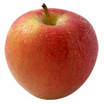
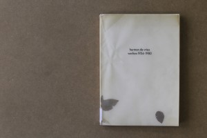
choosing a book without paying attention to the content is like picking an apple based on its skin and form. you never know if the consistence and the taste is reflected by its surface but still you choose it, thinking that the appearance echoes what you want to find inside. this intuitive and impulsive choosing process based on your assimilation faculty, knowledge and cultural education, needs to be done without concession. avoiding everything that incorporates elements which make you doubt is a way to find the precise object that fits your taste. this process can be long but it makes you swim fast through objects and, at the end, allows you to find the right fruit, in which the design and the content are reflecting each other, the materialisation of your desire. this search technique lead me to an old fashioned catalogue issued for an exhibition of herman de vries at the groninger museum in groningen, the netherlands. the book was published in 1980 by the museum itself and is entitled, like the exhibition, “herman de vries, werken 1954-1980”. the design of the book is made by “std suurling treffers designers”. they also came from gronigen and they were, at this time,  the graphic designers of the museum. alongside of working for the museum and being independent designers they were also working at the minerva art academy. nowadays the studio doesn’t exist anymore.


1 3


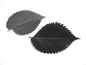
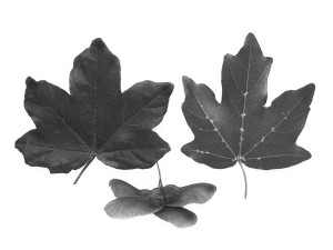
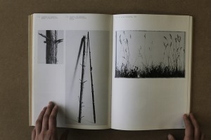
speaking about the design of the catalogue, the cover appears fragile and at the same time raw, ruff and powerful. the delicate aspect of the book comes from two different components. firstly, the paper used as a protection for the book itself is created by two layers of recycled transparent paper. the weight of times altered the colour of the paper into different shades of beige and adds an antique aesthetic to the object. secondly, in-between this two layers of tracing papers, two real leaves drift with the rhythm of the reader turning the pages. on the website of herman de vries it is said that they came from a western tree called acer campester. strangely the copy from the gerrit rietveld library contains different ones, looking like the leaves of an elm tree, which is really common in the netherlands. we will probably never know, if the artist himself puts different types or if someone lost the original ones and exchanged them. these natural elements encapsulated into the cover protection remind on the origin of paper, namely trees and leaves, and point out that these objects, made for human use, were, first off all, living matter.


Ulmus americana - American ElmAcer campestre - Hedge or Field Maple 5 4


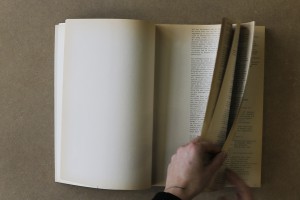
the cover reveals another radical choice: the absence of capital letters. this vacancy occurs in the whole book. most of the time, attributed to the bauhaus ideology of typography, this non-use of capitals could represent the honest approach of the artist herman de vries in his work and his aim to represent nature in it’s purest and simplest form. the first part of the the book, introduced by the director of the groninger museum, frank haks, is mostly composed of texts, essays and poetry by and about herman de vries. the designers chose to create the layout using the aesthetics of a type machine, therefore making use of the typography “courier”. looking at the work of herman de vries, this decision resonates his visual language. the paper being used is another example. it is brown, natural and rough. the second part of the book focuses on showing images of his art works. alongside to this change the paper changes as well. becoming more neutral, it gives the the work all the space needed for expressing itself.


8 10


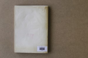
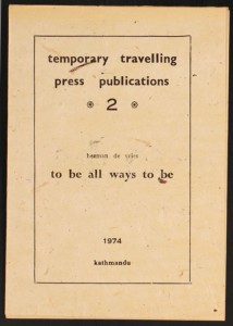
on the back cover, a curious detail pops up: a red stamp saying “all”. it is hard to understand its visual appearance for different reasons, mainly because it is the first time that we see colour. in addition, the size and the disposition are not fitting with the layout either, they are more strictly constructed. during the research about the artist i came across a video which fulfilled my curiositiy. presenting his exhibition for the biennial of venice, where he was representing the netherlands, herman de vries showed an old mantra printed on a booklet in 1974 in katmandu. the sentence “to be all ways to be” is written in big letters inside of it, the typography and the size are exactly the same as in the book.


11 1998.1.0006(1-36)02_v3


considering the design of this book, it makes a good example for a successful reflection and interaction between the graphic designers and the artist. in this case, herman de vries took part in the making process, adding some characteristics of his own work to the cover. the catalogue therefore got a handcrafted look and gives the impression to handle something rare and authentic. the aesthetic choice demonstrate the graphics designer’s respect for the artist and merge the book with the world of de vries. a bridge is created, giving the book the aura of an artwork.

Rietveld library catalog no : vri 7


Shapes, Space and Harmony


Monday, November 30, 2015

I tried to let my mind be open for new impressions during my selective process. My main goal was to find something that inspires me. Something that I can relate to but still find exciting in a new, different way. I also wanted to find a book with well thought out typography. So I can learn from it. Analyze it and break it down. Pick it apart like an engine.

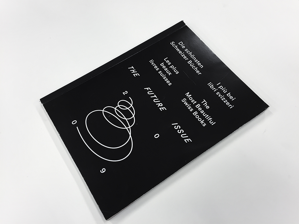
At first, all the showcased works by students caught my attention and I started going though them. Although many of the works were inspiring—I felt like I had more to see before making a final choice. I started to drift towards industrial design. The aesthetics were nice, with a lot of grids and furniture covering the front pages. But the typography that I was looking for was missing. At last I found a book called “The Future Issue” next to the industrial design section. At first glance, the typography of the cover really struck me. It was well designed, set in black and white, in a balanced layout. I opened the book and saw that it was designed by Laurenz Brunner. He’s known to me from before and an interesting designer, the choice was easy.


Foto 2015-11-24 18 38 12_2

The Future Issue—Vol. III


FUNCTION AND FORM

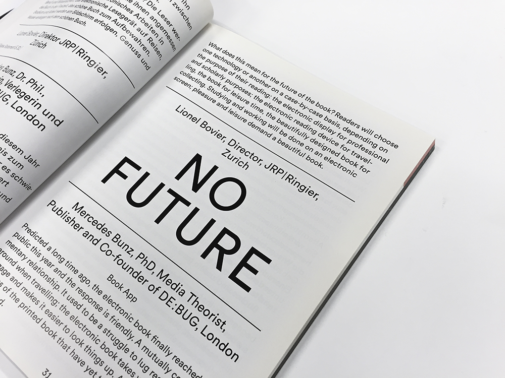
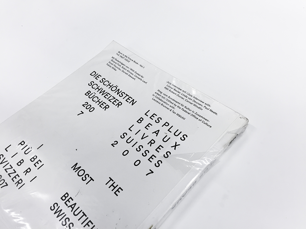
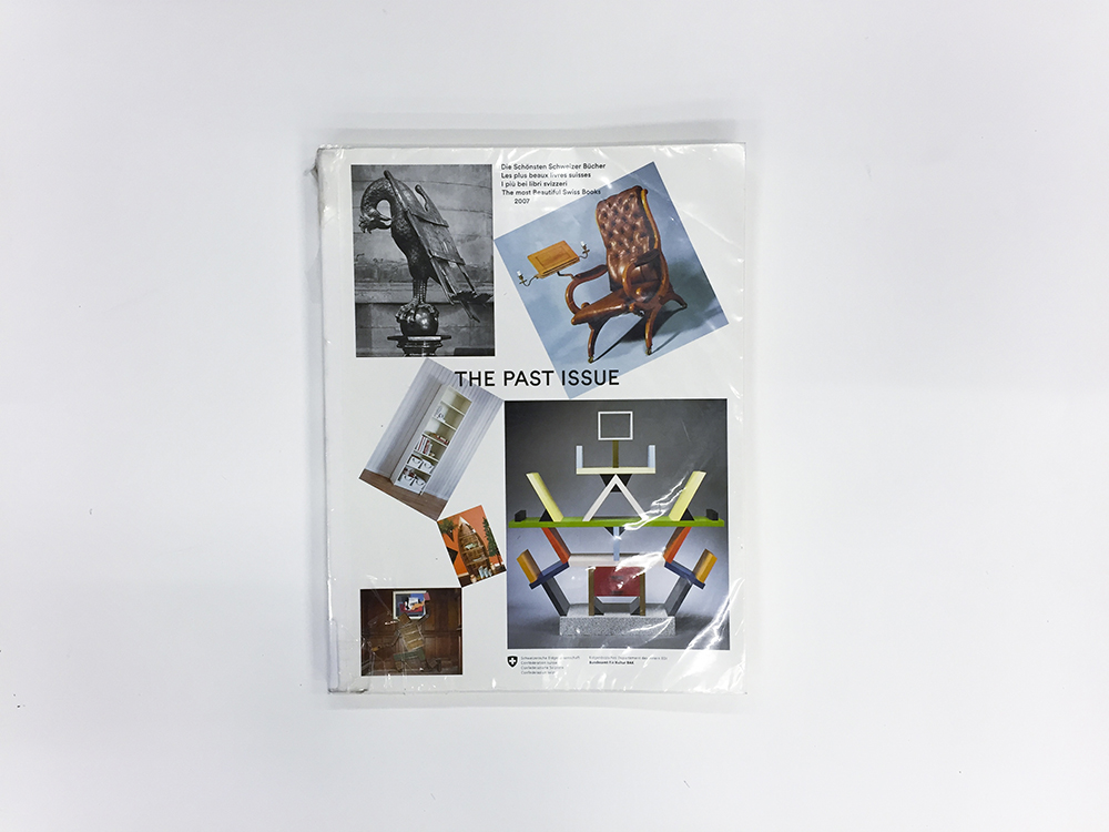
In 2007 the first volume of “The Most Beautiful Swiss Books” was released. This catalog is the first part of the Back to the Future Trilogy. “The Future Issue” which I found, is the third volume. In order to learn about the design I decided to go back and start with taking a look at the first catalog to see how the design has developed. All three volumes are designed by Laurenz Brunner. A composition of several colorful images are covering the front page. The title “The Past Issue” is written across the center of the cover. The images are positioned in a way so their corners touch each other. Connecting them together, almost creating a spiral effect. I like the fact that it also creates a clear hierarchy among the images. The cover feels well balanced yet without losing tension. Some of the images are rotated. It helps breaking up the square layout and also makes it more difficult for the eye to see the pictures individually. Instead we focus on the whole picture and get the impression of a playful yet organized layout.


Foto 2015-11-24 18 59 00_1

The Past Issue—Vol. I


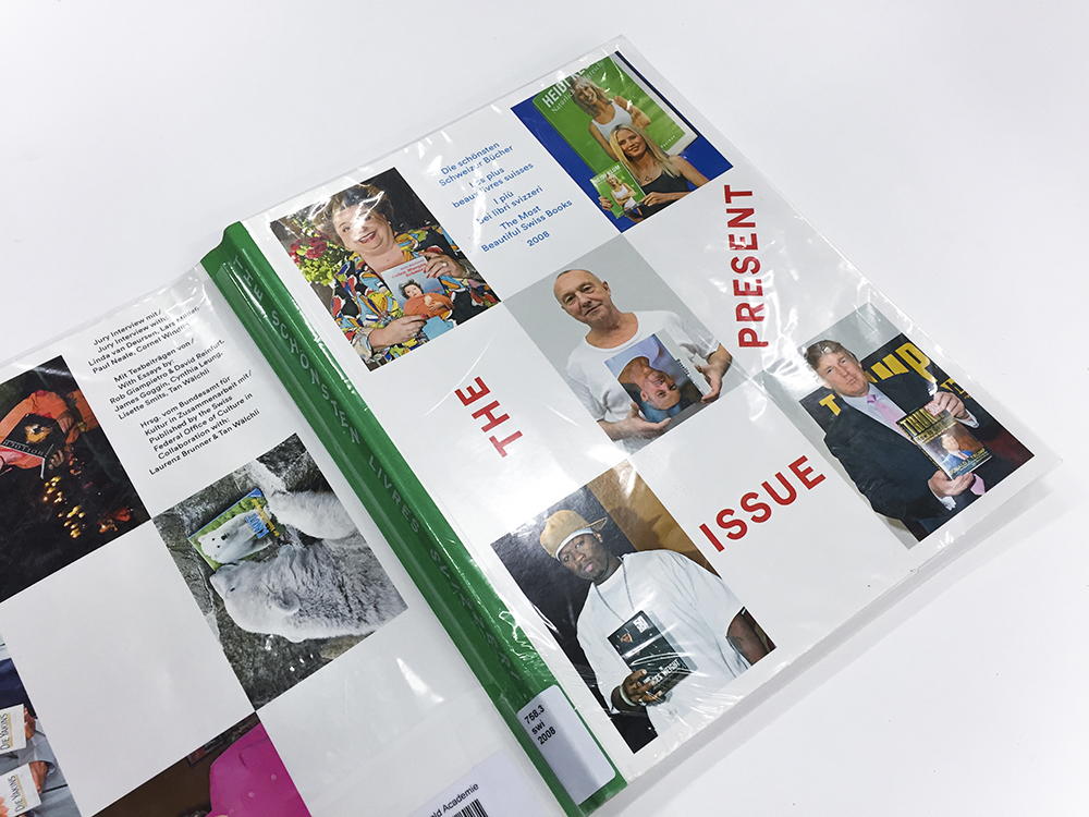
The second volume in the series, “The Present Issue”, has a similar cover. Yet again we see a composition consisting of colorful images. Although this time, the layout is much more organized. Every image contain the same size, and no one is rotated. They are positioned in a grid, spanning from every corner to the center, also connected by the corners. The titled is allowed much more focus—being set in a larger weight, in a bright red color. On the contrary, the title lose readability as the words are rotated. By comparing the two covers you easily spot the similarities and the differences. It is almost like they are reversed. On “The Past Issue” the images are allowed freedom and the typography is kept minimal. Creating a playful layout. While on “The Present Issue”, the images are static and the typography is allowed freedom. Filling the same function as the images on the previous cover.


Foto 2015-11-24 18 51 09_1

  The Present Issue–Vol. II


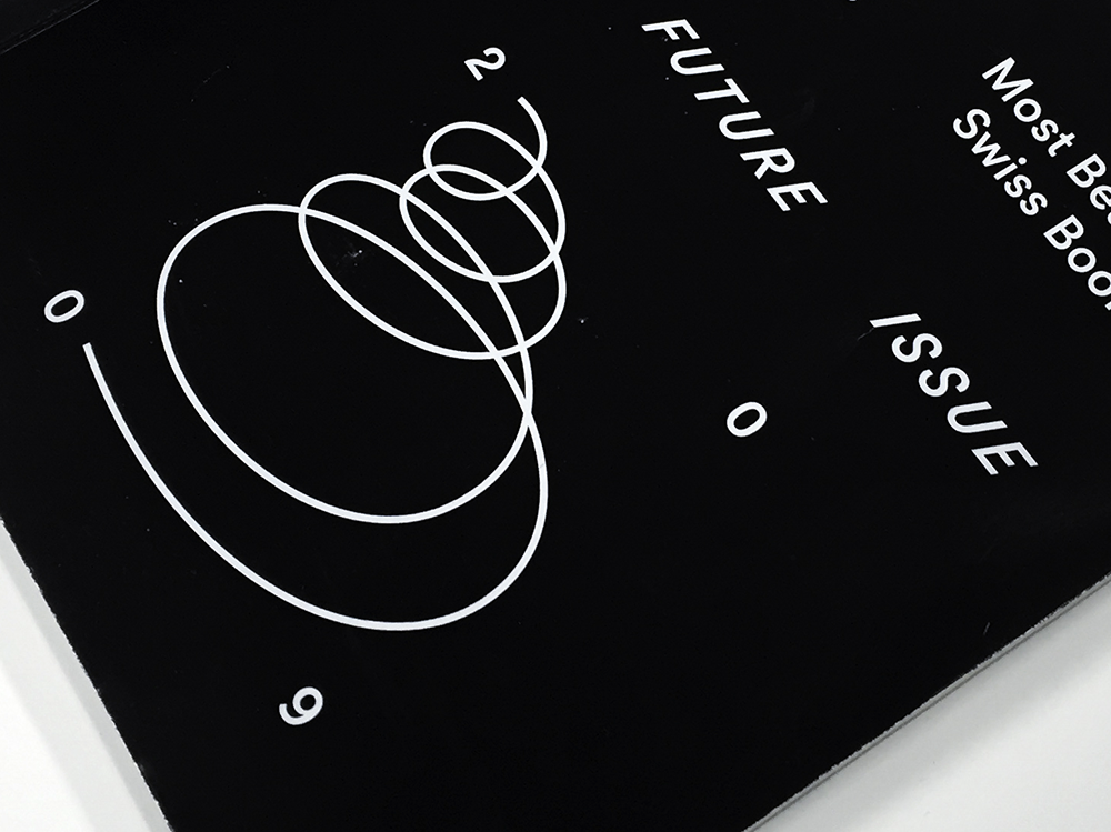
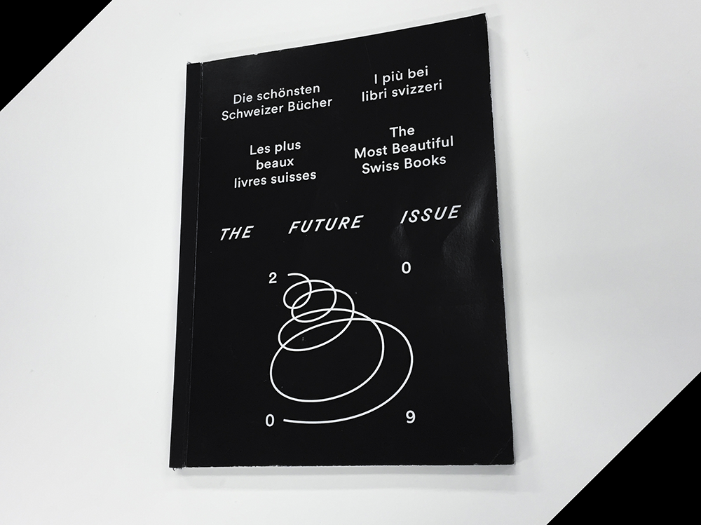
Lets jump forward in time and look at the cover of “The Future Issue” (Vol. III). The first you notice is that it does not look anything like the previous volumes. First of all the front page is completely covered in black. Second, there is no images. Only text. Despite this time, an illustration is also covering the page. The numbers in 2009 are spread out in a square with a loose spiral connecting them together. For me the cover feels much more mysterious and cryptic than the two previous ones. It’s atmosphere also works better with the title. The future is something that is unknown to us. Something that lies completely concealed in darkness. The spiral also emphasizes the mysterious vibe and makes me think of space. Which is also something that is very unexplored for us.


Foto 2015-11-24 18 38 12_3Foto 2015-11-24 18 38 40_2


VECTORS AND HARMONY

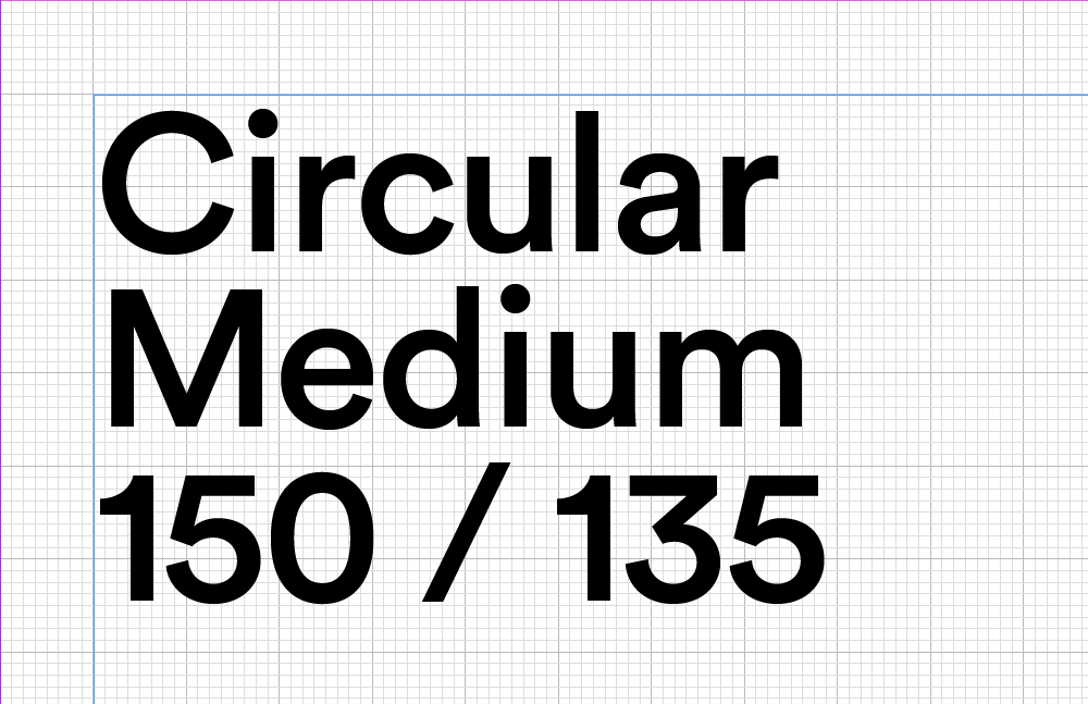
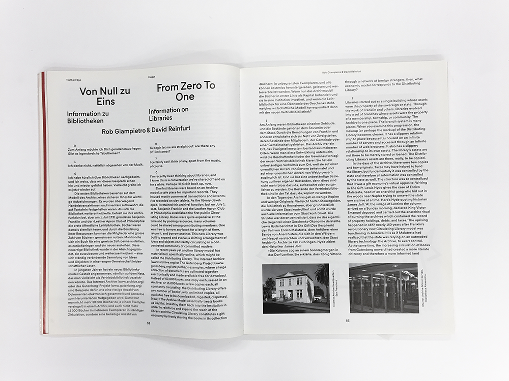
All three catalogues are set in Circular. Which is a geometric sanserif created by Laurenz Brunner himself. In 2004 he released his first typeface LL Akkurat which shortly became very popular. After it’s success he created Circular which is inspired by Paul Renner’s classical typeface Futura. Both typefaces has a purely geometric approach and a balance between functionality and idiosyncrasy. Circular also possess a recognizable character yet a universal appeal. The geometrical shapes became the representative elements of the Bauhaus design style and you can clearly see the influences in Circular and “The Most Beautiful Swiss books” series. The simple use of color also draws inspiration from the past, working only with red, green and blue. The layout and the typography of the series are simple. Designed in a minimalist way with high readability. Titles set in a clear hierarchy and text set in either two or four columns.


Screen Shot 2015-12-11 at 01.11.25Screen Shot 2015-12-11 at 01.10.27


The way Laurenz Brunner is working with the typography connects the individual catalogs in a clear energetic way. All based on the previous one but with another layer added to it. The design varies but always with the same principles in focus. Laurenz Brunner’s fine harmony between tradition and modernism creates a design that I find engaging and timeless, in a very intriguing way. Function always in mind but set in a contemporary way.

Below you can find some pictures showcasing the typography from all three issues.


Foto 2015-11-24 18 42 49_1


Foto 2015-11-24 18 51 51_1


Foto 2015-11-24 18 51 51_1Foto 2015-11-24 18 56 13_1

Rietveld library catalog no : 758.3 swi 2009

RiCB-D/TRftBL


Monday, November 30, 2015

– https://www.youtube.com/watch?v=KmwZNivC4r0 

1

Rammstein in Contemporary Book-Design


Daniel van der Velden, the man, the genius, the mystery… in terms of designing a series of publications collecting highly
eloquent essays on uprising tendencies and phenomena in contemporary culture, what can you expect from a man giving you this look:


Daniel_van_der_Velden_1000


as he plays the song “Du Hast” by the German band Rammstein on his iPhone 6 to introduce himself prior to a lecture on his work – A whole lot in my opinion.


My research is dealing with a book that was designed by this very man – the mastermind behind Metahaven, an Amsterdam based design and research studio whose work in a way couldn’t be more contemporary. A typical Metahaven design usually even exceeds the expectations of contemporary in its extroverted way of layering and heavy usage of political and economical iconography. The result often is a somewhat futuristic, hardly readable, almost autonomous graphic. A work of art in which a mysterious overflow of visual content makes the purpose of providing information seem of secondary interest. There is a feeling of playfulness to a lot of Daniel’s graphic designs that on first sight does not leave the impression of being the product of a structured research and design process.


You will agree when looking at a few examples…


tumblr_n3khhuX4xS1qeg0aeo1_1000

032c_doppelseiten_032c_26.indd tumblr_myc2z1trxy1qeg0aeo1_900

tumblr_nc0fy1QUF81qeg0aeo1_1000


1.1

My personal analysis: the literal overflow of visual information is to be understood as a representation or comment on the way we perceive information through new mediums in the digital age. In our globalized day and age one is confronted with an overwhelming amount of text and images simultaneously, overwhelming to such an extent that the core of the singular information often gets lost before being processed and saved by its recipient. In that way it makes sense to think of Metahaven’s design as a ‘political instrument’, a term used by the studio itself, emphasizing the important role spreading information digitally has played in recent political uprisings and hinting at the potential the field of design has as a means of communication.


2

A Reason for the Black Label


backcover-1cover


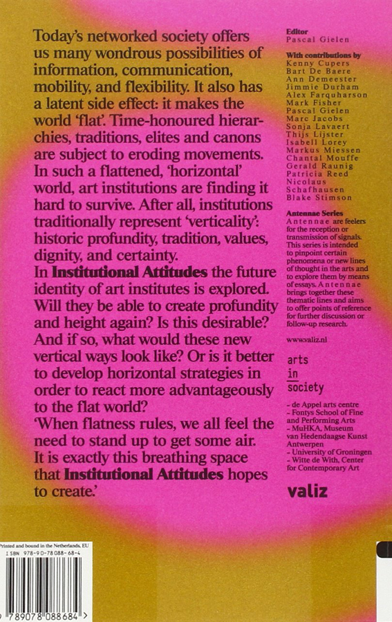
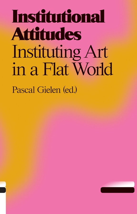
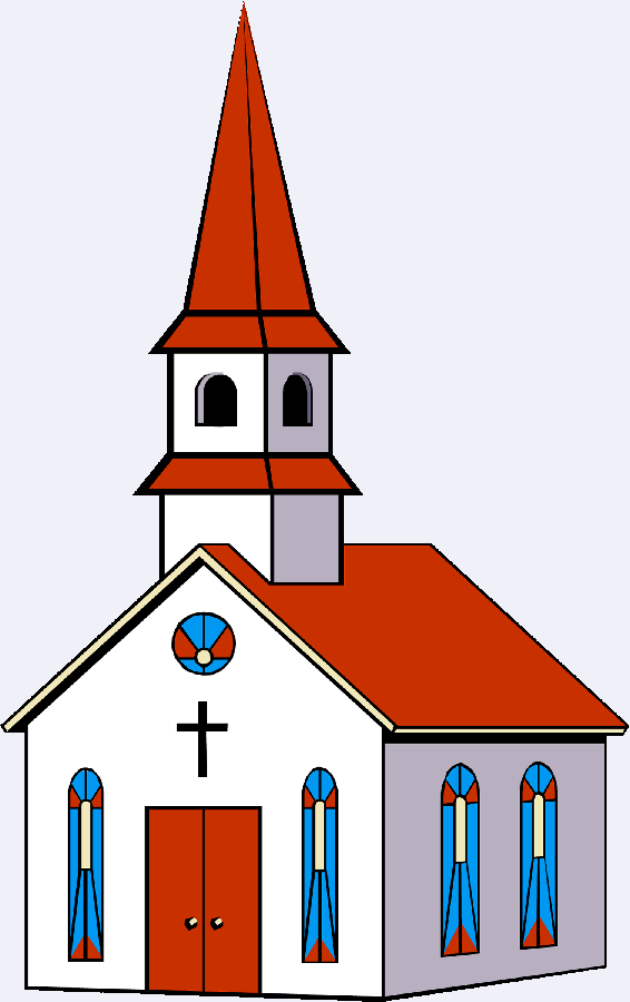
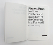
The design of the publication I chose to do my research on doesn’t make use of this ‘visual overflow’-technique at all and is therefore hardly recognizable to be designed by Metahaven – this makes the preceding introduction more or less unnecessary. Instead of multi-layering of various typefaces there is “only” one layer of text in a font that at first sight seems to be Times New Roman – just one layer of black text in a traditional lay out giving only the basic information of the title of the book and its author on a relatively neutral background. One would normally not call this blurry smudge of pink and orange ‘relatively neutral’ but we are talking about Metahaven here and in this context, metaphorically speaking, the design feels a bit like going to church

church-building-clipart-FaithChurch

.

In search of the chaotic element, the signature of Metahaven on the cover page of the book, I stumbled upon this obscurity…
Screen Shot 2015-12-05 at 15.58.27


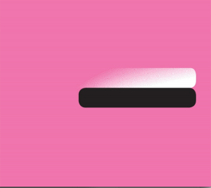
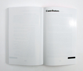
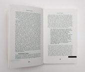
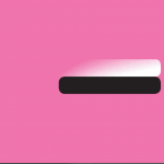
There it was – the definitive reason for my choice. At last a sign, a seemingly random element – The black label. A bar-like shape on the bottom right corner framing the front page of the publication adding a sense of mystery to the picture. When finally opening the book I felt confirmed of my selfishly made up theory that every Metahaven design was constructed, following an illogical master plan based on a very personal philosophy that is escaping a conventional approach of communicating by introducing the ungraspable – communication through exclusion. As a matter of fact the black label can be found on every single page of the book except for the back cover.
28738-Web_IMG_0588 25472-Web_IMG_0586 28573-Web_IMG_0582


2.1

Imagine going to a concert of one of your musical icons. After having lost a bit of distance and respect due to the mediocrity of the concert experience you feel brave enough to approach the artist himself and ask him about the essence of his work. In the following case this mediocrity was actually more a product of bad preparation and incredibly flat interviewing rather than a bad performance of the man himself – but you should always make best use of your more self-confident moments.

When approaching Daniel after a lecture on Metahaven’s new publication ‘Black Transparency’ I wasn’t too sure about what kind of answers I could expect from this larger than life character and if he was even in the mood of explaining the artistic decisions he made in the process of designing ‘institutional Attitudes’. (By the way the book is part of a series of publications, which is why I consciously decided not to speak about the content in this essay.) After a while of awkwardly standing next to him while he was signing all the publications people had bought I found the moment to ask him my three definite questions:

1.

Times New Roman? Really?

2.

Why the psychedelic smudge of color?

3.

What is the reason for this?

Screen Shot 2015-12-05 at 15.58.27


2.1.1

There is something relieving but tragic about the moment you find out your romanticized idols are actually rational people who have solid reasons for what they do and how they do it.

1.

The font used for the Antennae Series is a rare variation of the Times used to set a fitting stage for the serious approach the series has to the subject of recognizing contemporary tendencies in art, culture and politics.

2.

The Aesthetics of the background images are the result of researching images from thermo-graphic cameras, which are directly related to the subject of the Antennae. In this case Antennas are understood as objects that search and recognize information in their environment.

3.

The Black Label is nothing but a library label, a combining element of the series to make the single publications more recognizable.  🙁
http://survincity.com/wp-content/uploads/images/546500-e1338395736644.jpg

Rietveld library catalog no : 700.4 gie 2


Illegal emotions


Monday, November 30, 2015

shape_cover

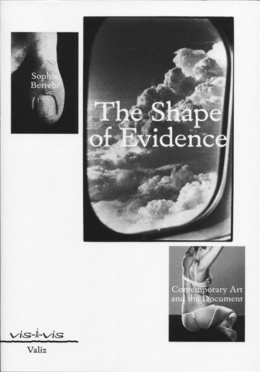
    Always when i have to choose a book, i will try to find one that feels nice when i touch it. I prefer softer over the heavy ones. When i held ”The Shape Of Evidence” in my hands, i thought the cover was the most interesting part of it. It has a soft cover, it is comfortable to hold and it resembles the skin of sphinx cat.
    I chose ”The Shape Of Evidence” by Sophie Berrebi because this september one of my friends invited me to the book presentation in the Rijksakademie voor Beeldende Kunsten, but i did not go. However, I am still interested in the role of the document, the archive and the museum in today’s culture.

0004841428_10

    It surprised me later to find out that the designer of the book is Sam de Groot, i had heard his name before, but i had not heard about his graphic design work. Last year, i went to his concert in ”Butchers Tears” and became a big fan of his music he’s been making lately and today, even yesterday. He is part of a Londom/Amsterdam hip-hop duo and he makes the instrumentals for the group. Sam de Groot and Paul Haworth make music and lecture-performance pieces. You can also hear their music on the Red Light Radio (do not miss next concert with the new album ‘Illegal emotions’ in Berlin in the early of next year. I hope they can make it!).
     I thought that a person who makes such a cool music must be cool with everything he does. It is true, i swear. De Groot has also published books under his True True True imprint, which evolved out of his experience of translating and producing the English edition of Nescio’s Little Titans. For a relatively short period of operation, True True True has produced a small yet substantial body of work, ranging from translations to original novels and audio work, developing a unique genre of comedy—typographic or otherwise. This combination as a writer and a publisher has resulted in three short novels produced through True True True (Silk Handkerchiefs, Alone Desperate And Going Nowhere and Andy De Fiets: letters to Robin Kinross). Sam de Groot graduated from the graphic design department of the Gerrit Rietveld Academie, Amsterdam, in 2008. Since then, he has been working as a freelance designer for cultural clients. As I realized later, Sam De Groot is a proud member of the Rietveld Preservation Society. Every Monday he teaches typography students of the graphic design department. 
     I asked him what helps to be so productive. The answer was: ’’I am productive because I like to work and I say yes to many things, which then forces me to deliver’’. He has several interesting design commissions coming up and he holds and directs many workshops. “That keeps me busy enough. I would like to free up more time for music”
In addition, Sam de Groot was a member of the Typojanchi 2013, Seoul International Typography Biennale. In his works Sam tried making something archetypical, anonymous, without mimicking anything specific. He dislikes posh, bibliophile ‘literary’ aesthetics.

shape3_670

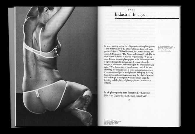
     The Shape of Evidence, was the first book in a series, so design for it was made for the whole series, not just for this book in particular. Originally the series was going to be set entirely in the typeface Windsor and the publisher liked it. Despite that the author of the first book of the series, however, really objected to use the typeface with the reason that it did not seem serious. Therefore, Sam had to find something new that would please everyone. What he love about Windsor [x] is that it is so rich in curves and contrast – much richer than the average typeface. In the end he went for a more conventional typeface that still has a lot of idiosyncratic shapes (Eldorado [x]).
He aimed to reinforce this visually unique feature with the exaggerated bottom/outer margins and the non-straight lines that are used for chapter titles, etc. The strategy was to find unusual aesthetics that could still work in a respectable academic context. To explain about typefaces of ‘The Shape of Evidence’ I would like to mention Tariq Heijboer who also graduated Gerrit Rietveld Academie. He created the SKI DATA typeface [x], working with the words, ‘ski’ and ‘data’ what gave him the idea of representing counter-balance. There are two different weights, horizontal and vertically stretched.
The typeface was used by Sam de Groot when he was designing The Shape of Evidence. It was the first title in Vis-à-vis, a new series of books published by Valiz [x]. Valiz is a young company which was established to respond developments in contemporary art, photography, architecture and design in a broad-based and imaginative way. The main focus is on the composition, editing and quality of the text and images.

   I was really happy to work on this assignment because i have a joy of good music in my heart and beauty of good graphic design in my eyes. And this is one more example of how small our world is.

Element, Fifteen


Saturday, November 28, 2015

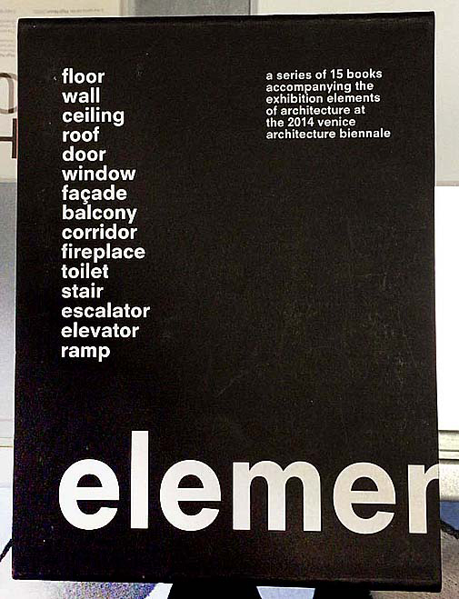
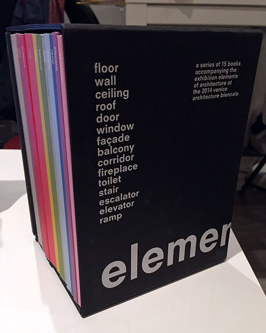
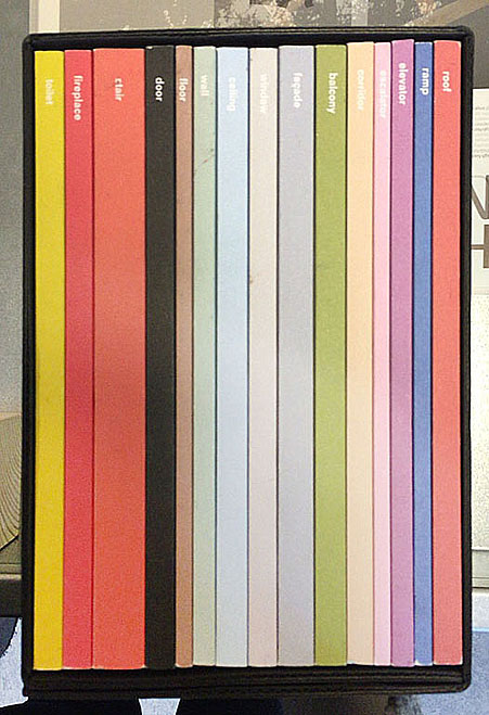
15-elements_cover2 15-elements_side 15-elements

front of box • side • 15 elements

When I first saw this book..
I thought that books always have similar size and shape before I see this book. For example, a book is made of one piece and has only one cover. When I saw this book at first, I do not know the series are a book that has one package. Also, I liked different colours in a black package and these books have diverse design and layouts. And I discovered that she used only small letters on the package and covers. I guessed small letters mean elements than capital letters. Moreover, when you open the book, you can see two pagination on the top and  under the page. I am not sure that I guessed a number on the top of a page is a pagination of one element(a book of series) and another under the page means a pagination of all elements(15 series). This is because second number start to 100 and finish to1500.  Actually, this book’s contents are very difficult and boring to reader since it deal with the history of architectural elements, the technical and social developments where they come from but this book design helps to vent. In addition, I could see really different layouts each book because these books have very diverse compositions to almost pages. So, it seems like I read a book but it is not a book.

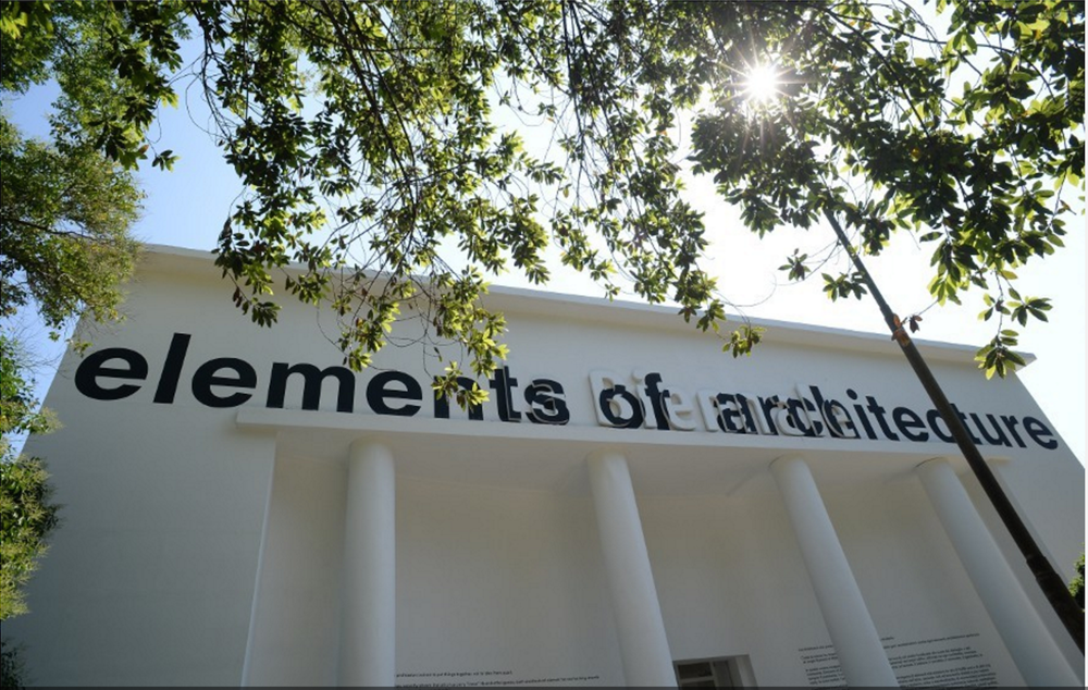
elements-of-architecture

Venice Architecture Biennial

Design of this book..
Title of the book is ‘ elements’ designed by Irma Boom. This book is a series about architecture and the series is consisted of 15 books about 15 elements of architecture. It means this book is not one but it becomes the one as a black package. You can know what is the elements as seeing the 15 book’s titles. Also, you can find how did she show the ‘elements’ in design because it has 15 different titles, colours, books and contents. It is really interesting to me since she gave how to use the book’s title and concept as design. I realised that dividing a book is really effective for showing a small title. The book has 16 titles that is one big title and 15 small titles and you can see 15 elements before open the book ; floor, wall, ceiling,roof, door, window, facade, balcony, corridor, fireplace, toilet, stair, escalator, elevator, ramp. This book was made for the Venice Architecture Biennale by Rem Koolhaas.

Who is Irma Boom..
Irma boom is a Dutch graphic designer and she makes a book more special. This is her website. She has made over 300 books and her books are exhibited in New York City(MoMA). She is very famous designer internationally and she has lectured at Yale University in the USA. Also, she has been awarded a lot and worked as a critic. This is her website.

How does she make a book..
I was wondering when she make a book, how to approach, get a concept and develop. This means process of making a book. I was looking for some interviews(1, 2) for knowing her and her books. She said “Everything revolves around the development of a good idea; everything else – buying paper, production – are skills that one might or might not have, but the concept is what makes a project succeed or fail.” And she does not approach books like a product designer does. She said “I really approach books for what they are, as books, turning the pages. The object. Sometimes I see books, and I think it could have been a PDF. The regular book is not alive anymore. You can put it on a PDF on the internet, or on a Kindle or iPad, and it’s the same. But my books are something else. They have to be this three-dimensional object. Somebody once said that I’m building books. I really like that expression very much. ”

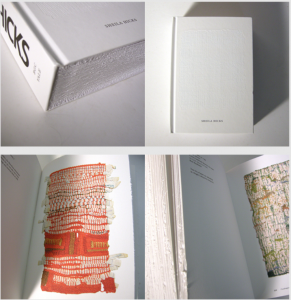
To sum up, I could realise that a book can evoke a lot of interests by design because I have saw books that made to similar size, techniques and feelings. I agree her opinion that her books are remained as three-dimensional objects because her books are truly special. For example, ‘Biography in Books’ is immensely small and thick. When you see the book in the internet or iPad, you can not feel this shape. Although this book is tiny, it gave very strong feeling to me when I saw. In addition, this is another example. Sheila Hicks: Weaving as Metaphor. This book on the work of textile designer Sheila Hicks. You can see different feelings when you touch the book even surface of the book. This means she just did not use the photos in the book and she made to feel real. So, she won the Gold Medal for the “Most Beautiful Book in the World” Prize given at the Leipzig Book Fair through this book. She does not apply the same style in everything when she makes a book. Moreover, searching about Irma Boom was really interesting since her books had very diverse design. I thought books will be able to disappear at one time except some specific books and be produced a small quantity. There were some intriguing points to me in her interview because Irma Boom and interviewers talked about digital books in her some interviews.

Sheila Hicks

Book number(Rietveld library) _ 710.4 bien 14 lll

Elvis lives forever


Thursday, November 12, 2015

part 1.1 bm

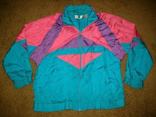
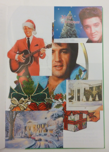
Very intuitively I picked up this book. The bright, contrasting colours were screaming for my attention. The colours reminded me of those beautiful 80’s ski jackets.


ski-jacket_3

nice

Next came the tactility. The moment you take it in your hands it feels like a good, quality book. The cover is a tough silkscreened fabric sheet which looks and feels substantial. The silkscreening is neat and professional. However when opening the book you see that the cover isn’t even attached to the rest of the book properly. It’s just folded around the pages. The book also slides around quite a lot within the cover, making it very susceptible for damage around the corners.

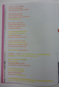
On further examination I found that the design of this book is actually full of contradictions. The paper on which text is printed is not the same as the paper on which the images are printed. Very high quality images are placed right next to very low quality images. There are two different fonts used. The text is printed in seven different colours. And Part I and Part II are in the same book, except you have to flip the book around if you want to read them both. All of these little disagreements within the design of this book are what made this publication so exciting for me.

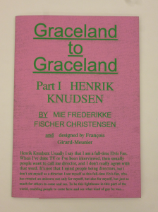
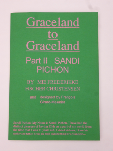
François Girard-Meunier is the designer of the book; Graceland to Graceland. Graduated from the Rietveld Academie just last summer 2015, so he is a fairly new player in the Amsterdam design world. Nonetheless, his design for Mie Frederikke Fischer Christensen’s (a fellow graduate student) book “Graceland to Graceland” is more than noteworthy.

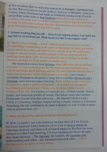
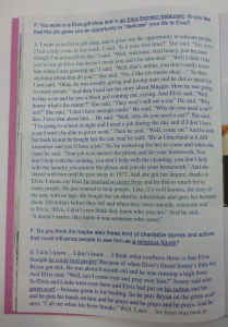
There’s just something childishly interesting about bright colors, which draws one’s eye to this book. The use of these bright and very contrasting colours reminded me of those amateur-built websites from around 2000. Which would tie in very well with the content of the book, elvis being quite a cult-figure with a fairly large amount of fans. The colours emit a certain immaturity, as if someone very unaware of conventional graphic design really wanted to make this book look as ‘beautiful’ as possible. And by doing so, that individual crammed in as much visual stimuli as possible. However, when reading the appendix (written by the designer himself) it became clear that all of these elements are actually a ‘leftover’ of the text editing proces.  “As multiple annotations came and disappeared within the editing proces, we [François Girard-Meunier and Mie Frederikke Fischer Christensen] somehow found [it] meaningful to keep a form that suggested this process.”


text         text         text


Moreover, not only the colours are striking about the text, the fact that François also used two different fonts to distinguish the interviewer from the interviewee is also very interesting. A certain distance is created between the two characters by letting the interviewer ‘speak’ in Arial and the interviewee in Times LT. When taking into account that the Arial typeface has mostly taken the position that the Times typeface had before, one could argue that this symbolizes the younger interviewer versus the older interviewees. In a sense that the interviewer is now more relevant than the Elvis fans. In this publication the focus lies more on  the reasons for these fans to be fans than on Elvis himself.

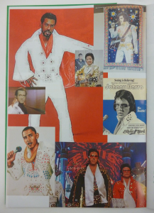
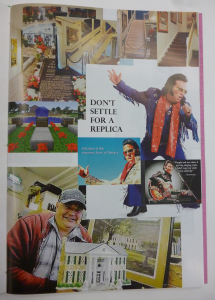
Furthermore, a plethora of images is showcased. Seemingly randomly stacked on top of each other and in different levels of quality. the pictures seem to be taken from all over the internet. Not only good resolution pictures are used but also quite bad quality stuff, watermarks included. The one thing they have in common though is their relation to, or, representation of; Elvis. This aesthetic is reminiscent of the ones found on fan-made websites, created to lift their idol to a higher level by posting as much images of him as possible. No matter the quality or the context, the only thing that matters is Elvis.
This is also what drew me to this book. These details supposedly try to reenact the feeling of a very DIY website. It takes a good eye to spot these kind of fan-made characteristics and even better eyes to imitate them. Then again, when reading, and hearing François talk about these things, these kind of decisions seem to have a more layered argumentation: “the massive amount of material that, even though not ‘clean’ are great forms of representation that show how diverse and polysemic a character such as Elvis Presley can become after being transformed into a mythology.” 
He turns the tables. Instead of all these image just being an illustration of the interviews, they are actually a representation of what the ‘myth’, Elvis, can mean.


plethora         plethora         plethora


The inside of the book also features two types of paper. One a bit more glossy that the other. The images being printed on the glossier one. This division also suggests a certain budget, as if there wasn’t enough money to make the entire book out of glossy paper. Which again, ties in with the aesthetics of these amateur fan-pages. When listening to François however, this was exactly the point. All individual materials used in order to make the book are of quite high quality, there is just a lack  of coherence (literally and by figure of speech) between the materials.

All of these clashes in the design and in my way of thinking about the book and the original intentions of the designer make me realize that this book is actually so much more than what I had anticipated it to be.


Rietveld library catalog no : graduation publication 2015


A Book where images are Still


Thursday, November 12, 2015


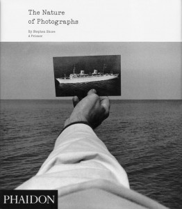
The Nature of Photographs_back The Nature of Photographs_cover
I choose this book because I like how the front cover looks. In the upper left corner, there are small letters saying ‘The Nature of Photographs’, but the main part is the picture: one of the pictures described in the book.

It shows a man’s hand, firmly holding one photo against the horizon. It’s a photo of a white ferry, slowly proceeding on black waves. The man’s sleeve is also white, and you can see rough wrinkles on it.

The sea is covered with wavelets, and light from them is diffused into the sky. The sky is of a lighter tone than the ocean itself, and there is a belt of white on top of everything …as if responding to the dark colors below. It creates a comfortable rhythm of black, gray and white.

One characteristic of this book is that the cover does not just place the picture of a hand among other elements composing it (to have a glimpse of what is inside the book, as most of pages are mainly occupied by photographs). Instead, the designer uses the photo as a base of his design: a black square of “PHAIDON” comes in lower- left corner, in response to the ferry-picture. Title, same as all of the text inside, is written in a ‘typewriter’ font. In this way the text becomes very subtle, like a transparent brook running through all the pages, sometimes long but sometimes as short as 3 lines.
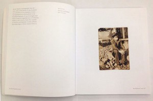
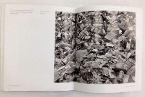
Old Man with apples    Garbage


"Old man with apples", a small, anonymously taken picture is accompanied by a text concentrated in upper-left corner, while huge pictures with a lot of details often have very little text

All of this indicates that the designer tries to show the pictures in balanced way with the text.

1. Importance of font-design

The names of designers of the book are Henrik Kubel and Scott Williams. The two established a London-based design studio A2/SW/HK in the year 2000, two years after meeting each others as post-graduate students at the Royal College of Art, London. A2/SW/HK is now a member of ‘Alliance Graphique Internationale’, AGI, which consists of 440 influential graphic designers.
In 2010, they launched A2-Type, a new type foundry with a selection of 15 fonts specially created for print, screen and environment. It releases and distributes over a decade’s worth of specially crafted typefaces, ranging from serifs and sans serifs to handwritten types, angular types and ornaments.
The two designers have a rule to create a new typeface for each of their new works, whether it is a book-cover, a brand identity or a signage for an exhibition. For example, a thin font that reminds you of cutting-lines of stamps,  because its lines are hardly attached to each other, is called “Danmark”: it was used for a set of stamps designed by the duo.
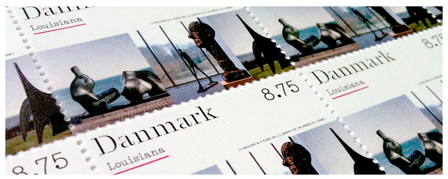
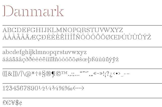
postmarksDanmark


Another example is “Beckett”, which was made for series of books by Samuel Beckett, an Irish avant-garde novelist, poet, and theatre-director.
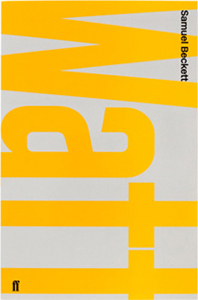
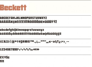
Beckett-ref-1   beckett-top_bold


2. How do they work?

A2/SW/HK have a conceptual approach. Their design ranges across various media including print, screen and interiors. (here, on their website, you can see a huge portfolio consisting of almost 50 works.)

From an interview with ‘Eye‘, an international magazine on graphic design, we can get an idea of their way of working on projects.

As eye magazine declares,  their attention for the materials, process and artifacts becomes clear as soon as you enter A2’s studio, located on the third floor of an old textile warehouse in Hoxton, London,. In case of stamp series for the first of James Bond books Casino Royale, it took the designers 2 months to research and retrieve every single edition that was published over last 50 years.
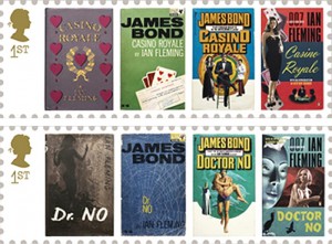
Casino royale


It is interesting to see how the style of illustration changes in accordance to the visual cultiure of the time.


3. Metro

The process of creating a font includes testing various typefaces and weights with one another, applying them across point sizes, and making sure it “looks right”, as Scott Williams mentioned in an interview with Aperture.

A project that shows up on top of their current website is “Moscow Sans” – a font designed exclusively for Moscow Department of Transport, DOT. The duo art-directed and designed the font in collaboration with Margaret Calvert, type and pictogram consultant, and Ilya Ruderman concerning design of Cyrillic script. The system of a custom typeface in 4 different weights, along with unique pictograms, is being applied to all the stations of Moscow Metro within this year. Compared to the gorgeous interiors of Moscow Metro, the signs look very bright and have a lot of difference in style from the station building. However, there is nothing wrong in the most important piece of information standing out from its context, and thinking of a rush in metro, I think A2 solved the complicated metro-system in a clear way. A straightforward, bold font, but at the same time round and warm, is easy to read; the station’s sign is written both in Russian and English, with one number and one color that has been assigned to all the 12 stations of Moscow Metro.
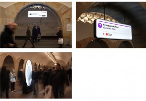
 

Moscow

Moscow is a capital city, and they say Moscow Metro is world’s 6th longest and the most crowded metro outside Asia. When there are more people and the lines are more complicated, it is essential to see what you really need in a short time: what station is it, which line. Therefore, I think design by Henrik & Scott is very user-friendly, displaying information in a plane, sensible way.


4. New Rail Alphabet

Another typeface which was designed by Henrik Kubel is New Rail Alphabet, which is a revision of the British Rail alphabet, used in UK’s National Health Hospitals, rail stations of Denmark and Britain, and BAA airports. Margaret Calvert, designer of the original alphabet, used to teach Hendrik in his younger days, and therefore, when adjusting it for digitalization, Kubel was able to link the font to handwriting of Margaret Calvert. Two points were altered in the original: one is its height, which used to be taller before, as slim tall fonts were considered to be fashionable when it became first in use in the 60s.

British Rail

5. A thought-through book

The more I read about the two designers, the more I understood that the large part of the body of their work is font-design. Sometimes they only have a name of a certain brand, so they find the best way to communicate with those letters that they have.

Returning to the book, (about which I haven’t talked so much .. its font is indeed designed also specially for this book, but as photographs are playing main role in it, text becomes more airy – different from letters in logos, that have a lot of visual layers.)

I think each photograph is shown, or “exhibited”, in a very thought-through way. Reading through it, I feel like it is a photographic gallery, where not only a picture itself, but the white space around it and size are taken into consideration. It is hard to find pages where pictures are placed in the same way.

Rietveld library catalog no : shor 2
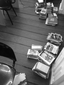
Words used as objects


Wednesday, November 11, 2015

 
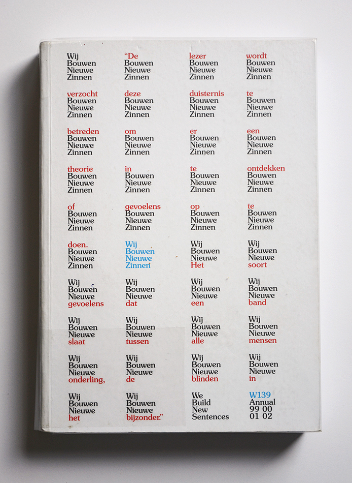
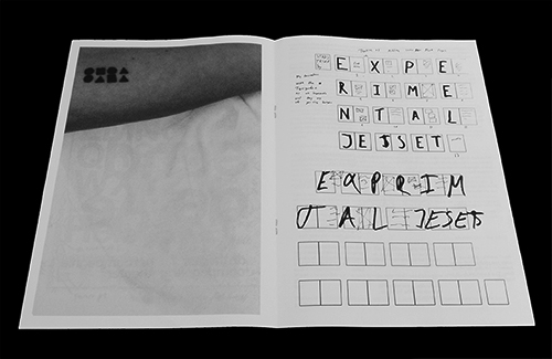
The front page of the book is plain white, with nothing but text – that’s not so special, you would think. But the designer of this book, Experimental Jetset, describes their methodology as ‘turning language into objects.’ And so it is possible that a plane white cover with nothing but the title and a few words could catch my eye.

DSC_0145_cover

Experimental Jetset is a small Amsterdam based design studio, founded by and still consisting of 3 designers: Marieke Stolk, Erwin Brinkers and Danny van den Dungen. They all studied at Rietveld academy and formed Experimental Jetset together in 1997, after their graduation.


DSC_0148_1 DSC_0146_2
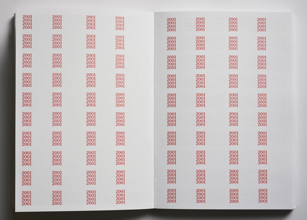
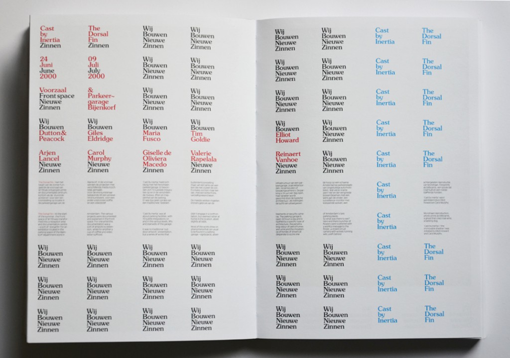
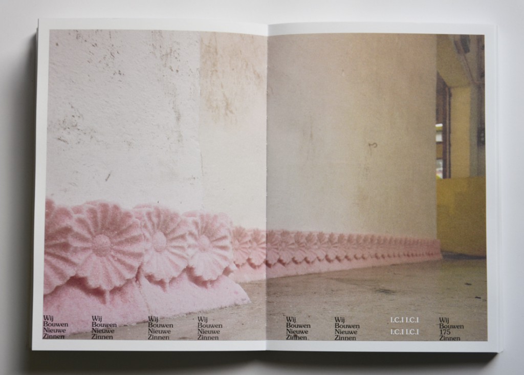
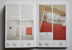
Not only on the cover of “Wij Bouwen Nieuwe Zinnen” (building new sentences) are words turned into objects – through the whole book, this theme comes back. “Wij Bouwen Nieuwe Zinnen” is an art catalog, presenting an overview of the exhibitions, and their contributing artist, that took place in W139 gallery between 1999 and 2002. Every exhibition that is described (in words and in pictures) starts with a blank page, like the cover of the book, with in the same block wise shaped sentences describing which exhibition it was, when it took place and which artist contributed to the exhibition. The space that doesn’t have to be used for this information, is filled with word-objects saying constantly one thing: We Build New Sentences. In the pages that follow, pictures and texts are showed, a bit like you would expect it to be in a catalog, except the fact that the bottom of the pages is always reserved for the word-objects. Always you can find in the bottom of the page the name of the exhibition that is further described on the page, but the rest of the space in the bottom of every page contains more word-objects, which continue saying through the whole book: We Build New Sentences

DSC_0147

DSC_0149

At designboom.com Experimental Jetset gives a very clear explanation of how they work with words as if it were drawings or ‘objects’. ‘Originally, the word ‘graphic’ is derived from the proto-indo-european base-word ‘grebh’, which simply means ‘to carve’ or ‘to scratch’; but in greek times, the word ‘graphikos’ referred both to the act of drawing and writing. In a sense, we do believe that the current practice of graphic design still refers to this classic notion – the idea that writing is a form of drawing, and drawing is a form of writing.’

The way Experimental Jetset uses words in a certain shape and the repetition of this shape, I had never seen before. Because I am no designer, I am unable to see direct influences in the work of Experimental Jetset, but according to themselves they are influenced by all kinds of things, from punk to what they call ‘the late-modernist landscape’ in which they grew up. This is one of the reasons for their frequent use of the typeface Helvetica. ‘It’s only logical that this late-modernist dialect can be detected all throughout our work. we’re simply not the kind of people who feel it’s necessary to suppress one’s own dialect.’

‘We feel strongly connected to the Dutch graphic design tradition, much more than we feel connected to contemporary Dutch Design. Contemporary Dutch Design is often perceived as very ironic, and overly personal; something we have absolutely no affinity with. At the same time we do realise that our humourless and rather dogmatic way of designing is sometimes interpreted as ironic or even deadpan. We have learned to embrace this awkward friction.’

So though they invented a very original style, they did this in the ‘language’ they grew up with, and they often use nothing more than words and letters itself. I would call their work honest, and I think that is one of the things that I find so interesting and pleasant about their work.

Experimantal Jetset claims to have no affinity with ‘overly personal’ contemporary Dutch Design, but when I started my research on Experimental Jetset, it stroke me how many interesting comments the designers of Experimental Jetset make about themselves – in interviews, but also in the book the designers made about their own work: Statement and Counter-Statement. Notes on Experimental Jetset. These comments show a different image of the group: a very open group, eager to talk about how they work, how they come to certain designs, and even make personal notes on their own work. This is, according to themselves, to reflect on their work. In an interview they mention their way of using these texts: ‘Around 2005, we decided to make our first proper website, we thought it would be interesting to include texts like these. Mainly because we don’t necessarily see our website as a portfolio, attracting possible clients – we see it more as a diary, or a personal archive.’ So in this sense, and maybe that is different from the ‘contemporary Dutch Designers’ they are talking about, they are very open about their way of working and about their work-proces, rather than putting personal issues in the works.

The good thing about the many comments Experimental Jetset makes about their work and their way of working, is that it is easyer to put the work in a perspective. The fact that the designers point out their influences themselves, that they describe their own method, is a parallel to their work itselve – works that are always very open. The designers of Experimental jetset are not these artistic magicians who do magic tricks – they use means that are recognisable for everyone, they explain what they do and why they do it and this brings the honesty and clarity in the design and the concepts of the designers.


Rietveld library catalog no : 705.9

Designing A Country


Monday, October 5, 2015


Why is it interesting to examine the differences between Dutch and Belgian design? The exhibition that was supposed to make me understand what was interesting about comparing the two countries design-wise, made me even more confused. As I strolled down the beautifully curated paths of the Design Derby, I saw Dutch and Belgian design objects cleverly placed next to each other to make the viewer see the clear differences between these two very closely related countries. The problem was that every time I had concluded something drastic about one of the two being more art nouveau, constructivistic or a clear example of de Stijl movement than the other, I would see two new objects and be surprised that my conclusions were far fetched.

What I should have done instead of just casually taking a glimpse at the beautiful objects, was reading what was written on the walls next to them. This I found out by googling the relationship between Belgium and Holland, and figuring out that they have a closely related history, but developing different socio-economic statuses during the 20th century.

Hereby I found the answer to why this exhibition is interesting and relevant, not only to people familiar with the history of the two countries, but in general for people who want to understand how a design object can express a whole time period or the mindset of a country just in the way it’s shaped.

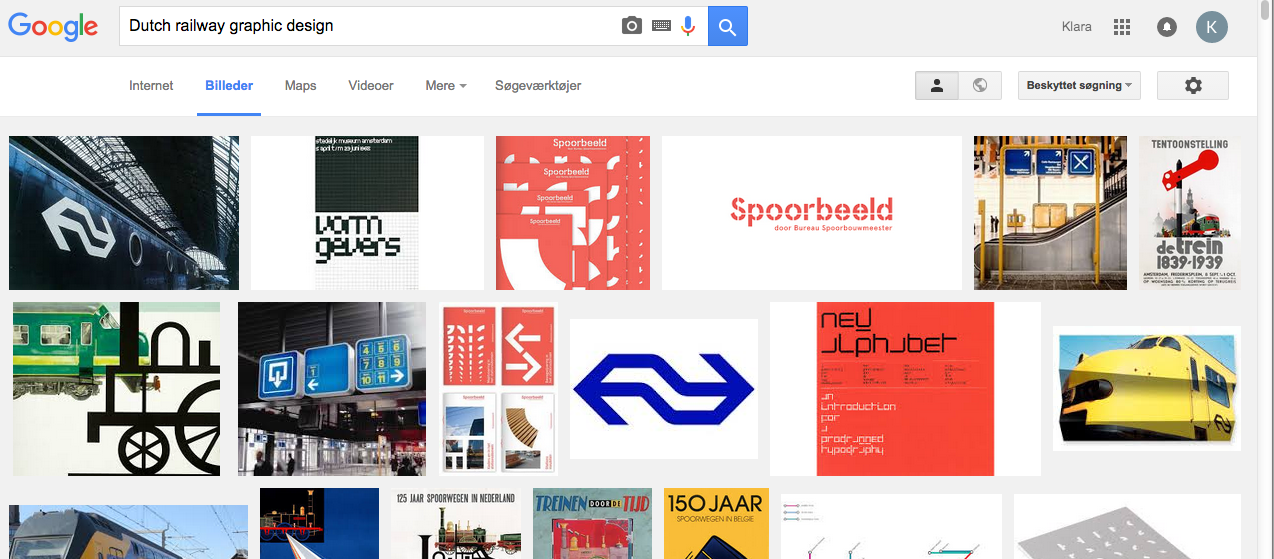
Here, for example, the two logo’s of respectively the Dutch railway system, and The Belgian Metro. Similar in their form, you think by first eye sight, but if you look closer you see significant differences.

NS-Logo_200logo-metro-brussels_200

Dutch >•< Belgium

The Dutch logo was made in the 1960's, a golden age for corporate design in Europe, with Holland and Switzerland as two of the main providers. This logo was made by the still existing Graphic Design company, Studio Dumbar, who created a whole Identity for the Dutch railways; way finding signs, tickets, the look of the outside of the trains etc. The logo is a symbol, no letters are needed, because this symbol is supposed to be strong enough to remind every Dutch person that 'here you can take the train', and maybe it even contains more than just that simple fact. The railway system of Holland is a public institution, it's a representative of the Dutch culture, signaling to both the people of the country itself and the outside. Maybe this is why the same company was chosen to design the identity of various other public institutions: to give the whole country a graphic identity. This shows a very visually conscious country, knowing the importance of a graphic identity.

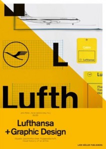
Here an example from neighboring country, Germany  and Swiss, with  their big company's representing the country, the airline Lufthansa and Swiss-Rail. Other examples showing the strong, straight lined, European corporate design of the 1960's.

lufthansa-book-cover Swiss-Railways

Logo design by Otl Aicher 1963 and Joseph Müller-Brockmann 1982
The Belgian logo is a bit different in it's look. Less sharp, less serious with a lighter blue colour and a rounded and assymetrical shape. What is the most significant difference when you look up the history of this logo, is that it was made, not by a big company that knows about Graphic Design, but by a small and vagely well known Sculpturer, who never, before nor after, had anything to do with Graphic Design in a traditional sense.

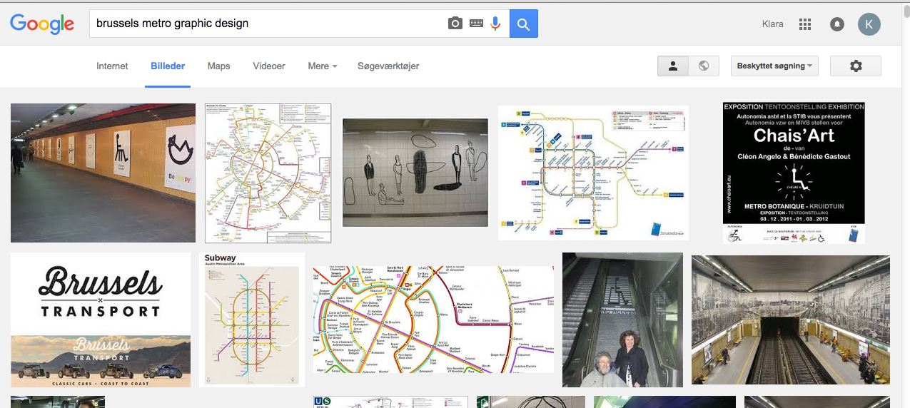
Also interesting is, that if you google Brussels Metro Graphic Design, the images that turn up are far less clear than what turns up when you do the same to the Dutch Railways. This being said, it is also important to have in mind that the Belgian logo was designed in the 1980's, a slightly different style period in the history op graphic design. Less clear, more post modern, pointing in different directions. This shows in the logo being both sharp and soft, geometrical and asymmetrical, as if  it was shaped in the hands of a, yes, sculptor.
 
Skærmbillede 2015-10-05 kl. 23.06.18 Skærmbillede 2015-10-05 kl. 23.06.34

Google Search images for Dutch Railways and Brussels Metro


STARSTRUCK


Wednesday, May 13, 2015

01_animation_EX_book

Hello Experimental jetset

My name is Claes and I’m a student at the rietveld academic, and my design teacher has given us an unusual assignment to contact people that influence our work and see if we can spend a short period of time with them. I had the chance to talk with one of you at the San Serriffe bookstore a while back and it was a really nice conversation. Your group is a huge inspiration to me and contacting you was the first thought i had! I hope that we could work something out at your convenience.

I look forward to hearing from you!

Best regards,

Claes

This is the first mail I sent to EJ and the starting point for a really nice project which resulted in a book that you can see as the gif above.

The research publication can be found in the attached PDF at the bottom. The research publication is about the work before and after the meeting with EJ. This meeting lead me to the conclusion that “less is more”. Enjoy.


IMG_0730_2_500px

“The tattoo I got is the worst and best…. But I would never show it to them, they would think I’m a freak”

research publication


Stedelijk Design Show 2015 /Relevant Highlights


Monday, December 1, 2014


16 Rietveld Basic Year students visited the Amsterdam Stedelijk Museum to examine the items in the permanent survey of the design collection.

Does the Stedelijk exhibit all these design items simply because they are in their depot.

Do the collection criteria still have any significance today.

Do these design items have any relevance for us, our life or work,now? Is it possible to make a clear statement about that.

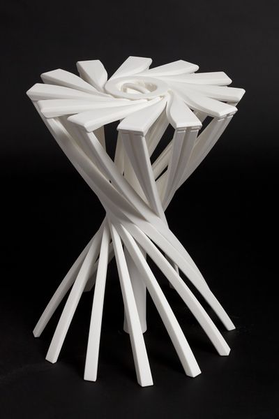
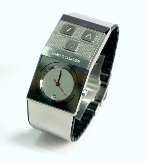
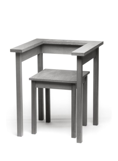
If you click on the image a caption will appear –just as a in a real museum– presenting information and a personal reflection on why that item is considered relevant. You can review the whole exhibition in pop-up mode.


click on images to visit the exhibit

Gijs_Bakker_Waterman_2_Cropped

modelWieke_stool_SM

PatrickJouinWelcome-To-The-StoreBeowatch_SM2

tafel-stoelunfolded

DSC_0321 Schuitema_300

superstudio_gherpe_flippedVaclavCigler_headband

cow-chair_flipped Paulina_glass


Log in
subscribe