Skip to Content Skip to Search Go to Top Navigation Go to Side Menu


"graphic design" Category


Forever a starfucker


Thursday, May 19, 2011

Yesterday I went to this book presentation of the book “TD 63-73”[x].
To be honest I did not know anything about this presentation of the book, before Henk told me about it. And just today I went online to get information about the book. But beside this book presentation I found myself setting in a room, with people from the movie “Helvetica”, which is about the typeface Helvetica. Suddenly my idols from this film were sitting just a few meters from me. Just one meter from me was the great Dutch graphic designer and typographer Wim Crouwel. And next to me the people from Experimental Jetset were sitting. Even though I did not understand most of the presentation, because it was in Dutch, I was busy looking at these people and thinking about my future in the graphic world.
They represent my dream of becoming a good graphic designer.

[by Kristine Andersen]

I will forever be a starfucker of these people!

de-mystification of Total Design

In the middle with yellow book 'my hero' Anton Beeke, to the right of him the godfather Wim Crouwel. sitting at the tabel writer of the book Ben Bos and to the right of him speaker Paul Mijksenaar and all the others of TD

[by Henk Groenendijk]

LINETO


Monday, March 7, 2011

Since the start of our Design Theory/Research course about typedesign, graphic design, foundries, fonts, typefaces etc. we have had a look into a, for me unknown but, very interesting world.

This research will be about Lineto which is a foundry that these days sells there Lineto fonts, like replica, via their website and they have type-designers who publish their own fonts through Lineto. We will further explore the similarities between type design, graphic design and art.

My research question will start us out with some history to get a grip on all the different terms that are used to find out what Lineto actually does. For me starting out as a rookie I’m trying to grasp the meaning of this all. This is an interesting step that can also help you in understanding this world on its own. After that we will dive further into the question what the similarities are between type design, graphic design and art.

A type-foundry is a company that designs typefaces. Typefoundries used to sell their typefaces made out of wood or metal and matrices that were used for line-casting machines like Linotype and Monotype. This is such a time consuming and expensive process that when the computer started to be used it was replaced by digital type which is mostly used today.

Now to first get some terms straightened out. The term typeface is often mistaken or used for font. The two terms had more clear meanings before the start of desktop publishing but faded. What the difference between font and typeface is is that a font points out a specific member of a type family like roman or boldface, while typeface shows a consistent visual style which can be a family.

Back to Lineto, Lineto sprung up into existence in 1993 right at the time when the computer started to get used extensively in people’s daily lives. The foundries in this computer age where called digital type foundries which accumulate and distribute typefaces as digitized fonts created by type-designers.

Typefoundries always had used catalogues that were updated every year but since the digital type came in to the scene it was almost impossible for a foundry to make a catalogue looking at the amount of types that were created and distributed.

This way of working was embraced by Lineto and five years after starting their business Cornel Windlin and Stephan Müller the founders of Lineto jointly set up Lineto.com to distribute their own typefaces through the internet. They also invited a number of other designers to publish their fonts alongside theirs.

If you look at the fonts on Lineto.com you start to wonder what the difference is between type design, graphic design and art. There are differences between the three but there is also a very strong cohering similarity which you can’t deny and this I find an interesting discovery.

Starting out with describing graphic design you see that it is a creative process which involves a client who provides the work and then there is a producer, printer, programmer or signmaker of some sort. At the end of the process the result is used to bring across a specific message to the viewer.

In art you see that it is also very much a creative process which brings across a specific message but usually addressing different issues but the principle is most definitely the same.

For a type designer it is the art of designing typefaces. Where the typeface is one or more fonts designed with a certain unity. The function that their end product is used for is also about getting a message across to an audience, a better description of it is that it is a tool for bringing across a message to the viewer.
So everyone of the professions that are described above is about visualizing an idea concept or bringing across an idea or thought or a tool for doing so. Type is so rooted in our system and culture that we cannot escape from its grip, there are always fundamental links rooted at the core of it all. Looking at it in this way I think can open up your mind to look at type in a new and different way as an artist.

NORM formulating new dimensions in design


Monday, March 7, 2011

Dimity Bruni and Manuel Krebs,two graphic designers from Switzerland. Both born in 1970 and met in art school, in Biel. They founded NORM in 1999 and created their own typographic language by ignoring existing conventions. NORM is now based in Zurich. They’re well known for their typeface «Simple» which first got used in their book The Things. Later, Ruedi Baur of Integral, Paris, asked them to redesign the typeface for use in the new corporate design of the Cologne-Bonn Airport – this version is named Simple-Airport.

Bruni and Krebs developed their own typographical brand. They invented their own way of putting the world into categories and they formulated two rules: — the world is divided into two groups:  3d things and 2d things. — anything invisible is not of our concern.

3d things:  3d things consists of physical things that are of material existence. These items should be solid and visible, though not necessarily visible with the eye.

2d things:  the 2d category can be put into four different groups based on dimensions. group 1, those which represent something pertaining to a three-dimensional space group 2, those which represent something not pertaining to a three-dimensional space group 3, those which represent nothing group 4, those which are as yet unknown to us

group 1 represents the physical spacial things. It is bound to its own being because we recognize 3d things through its build, size  and materiality. When speaking in 2d matter, things lose their necessity of being a certain size, light, color. This is quite a wide range of objects, so NORM has categorized group 1 in sizes, — smaller than human beings, but large enough to be seen with the eye — roughly as large as human beings — bigger than human beings, but also small enough to be seen

group 2 represents the non-spacious, nonphysical things. Things that come down to numbers and letters and abstract ideas like sounds. Letters are the most easy to understand. Letters can also be read as signs. They have a double function, we write them and read them. Letters define their own meaning in a very clear way; while sounds are more difficult to represent, read, and understand. Letters have principles, we have a certain way of making letters and this is why they are so recognizable. Letters are principles. Still, there is much room for playing and sculpting in this field. — when designing a new system of writing, signs should be simple. they should be simple, because it makes them easier to remember, to recognize, and reproduce. — also the signs should be in a small quantity, because it makes them easier to learn — no sign should resemble another, because it will create confusion. so each sign should appear no more than once — it should be possible to align the signs in straight rows. always on a horizontal/vertical grid. this is so we can recognize a text, even when the script is unknown to us. — the characters should be simple graphic forms, recognized, and written easily as possible.

group 3 These things represent nothing. the things indescribable and invisible, so no concern

group 4

(more…)

sans Comic Sans


Monday, March 7, 2011

Annual design awards is an event which is announced almost by every design magazine/ company/ institution, whether it is the influential “Wallpaper” or just a blog of a random fashion lover. The best is picked out of everything, “from beds to breakfasts through jeans to genes”. However, when all the winners are praised, the time comes to remember those who weren’t lucky enough to fit on the pedestal. Being nominated as the worst is rather a dishonor for every designer or design company no matter if it’s a car or a pair of shoes.

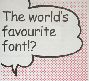
Nevertheless, sometimes ‘bad’ is not enough to describe public opinion about a design piece. ‘The worst of the worst’ may sound dramatic, but this is a title used talking about… typography.

It is difficult to find a font or, frankly speaking, any piece of design which would be accepted more controversially than Comic Sans MS. Its naive, innocent and childlike appearance makes it so attractive for primary teachers and prayer groups of local churches. Yet it is also immature, juvenile and silly as if written by a 6-year-old, yelling ‘bad taste’ at everything where it pops out.

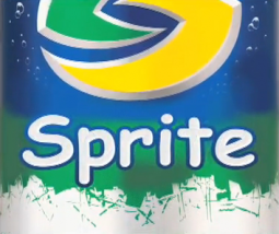
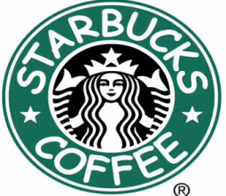
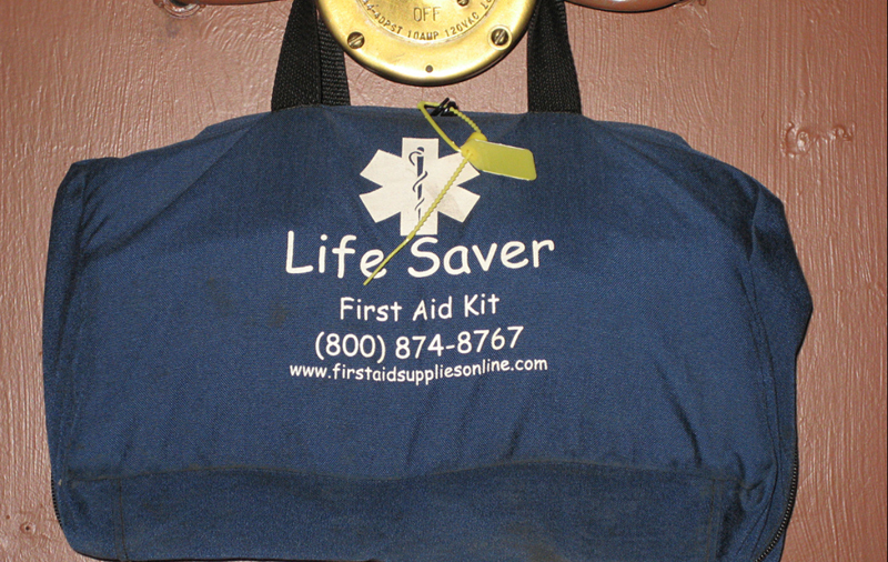
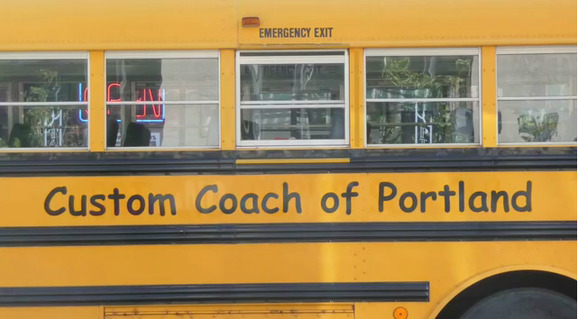
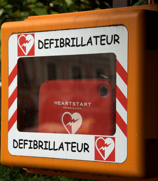
If some well-known logos were replaced with Comic Sans, it would look rather homely, warm, inoffensive and simply unsuitable. But when it comes to real examples, a restaurant menu presented in this font looks more like a kindergarden canteen while a warning sign loses its all respect immediately and seems to be rather an April Fool’s joke…

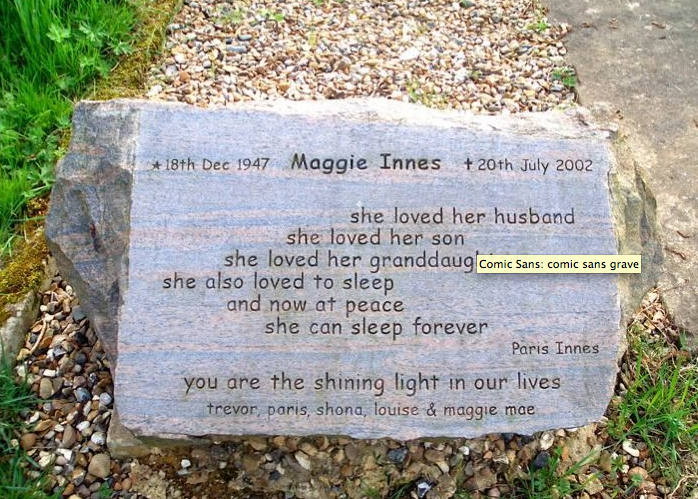
As if it was not enough, this font proves to be contagious. Ever since it’s first appearance in 1995, Comic Sans is now everywhere, even on the sides of ambulances or gravestones.

No wonder that such a vast misuse of a font has caused a big anti-Comic Sans campaign: various websites offers hilarious photostreams of Comic Sans spotted everywhere in the world; one can also email a comical educational pamphlet for a friend who is suspected to be a comic sans criminal. As if it was not enough, the hate campaign has it’s own website where special Ban Comic Sans T-shirts or coffee mugs can be purchased. Even more, visitors can donate for creating a documentary called Comic Sans Or The Most Hated Font In The World. The greatest haters can also download a special Safari extension which changes Comic Sans websites into Helvetica!

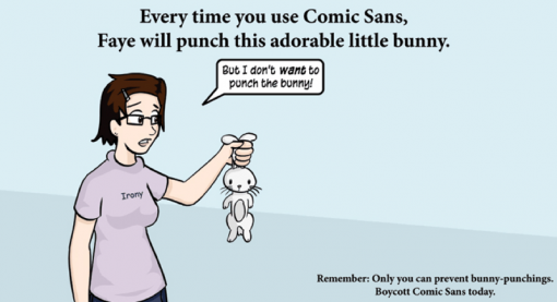
‘Every time you use Comic Sans, Faye will punch this adorable little bunny’, is written on a picture with a worried girl, holding a small white rabbit, crying ‘but I don’t want to punch the bunny’. The scale of hate sometimes seems to be taken to extreme or even absurd: “Misuse of the font is analogous to showing up for a black tie event in a clown costume”, claims the creators of the hate campaign.

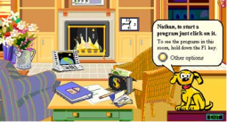
It is interesting to know that originally Comic Sans wasn’t designed for wide use. It was actually created for Microsoft Bob, a software program included in Windows 95. A little dog which was used as a help character ‘talked’ in Times New Roman, a font which was a bit boring, not warm and helpful-looking at all. That’s when Vincent Connare, a typographer who worked for Microsoft, was asked to create a special font for the program.

Apparently Connare was a big fan of comics. Inspired by “Watchmen”, a popular graphic novel, trying mimic its handwritten letters in speech bubbles, he ended up with now inglorious Comic Sans.

What was the secret of it’s enormous popularity? When Microsoft included the font in Word of Windows 95, Comic Sans suddenly bursted like a virus. It was something new, unseen and fun-looking. Connare explains it simply: “because it is sometimes better than Times New Roman”.
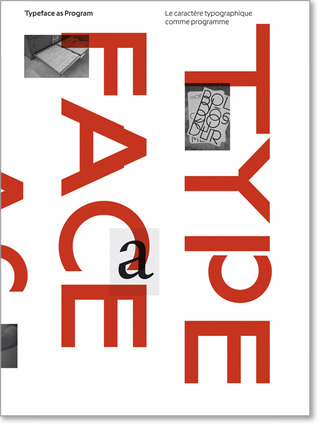
GRANDMASTER FLASH OF DUTCH DESIGN


Monday, March 7, 2011

This description appeared in my research on the Amsterdam residential graphic designer/teacher Karel Martens.

His name was stored in my memory, but I didn’t know anything about him, probably because I’m Danish and just moved here. I guess every Dutch person would or should know him or at least his works, in fact even touched them. He designed coins, stamps, phone cards and signs.

€ 5 (Queen) Beatrix and Vincent (van Gogh) coins

His style is very clean I would say; clear colours overlapping each other and forming a new colour. But what I really found interesting about his works is his way of translating a language or information into form or grid; his own new language.

proposal for a festive sheet of good-will stamps. The design was never executed

A good example of that is the façade he did of the philharmonic in Haarlem. It is situated in front of the big old church St. Bavo. I found some pictures on the Internet, but they didn’t give me the right impression, so I went to Haarlem to see it in real life.

The philharmonic building itself is very old, but as part of its recent restauration he designed this modern glass façade around the entrance and on a piece of wall high in the air.

Philharmonie in Haarlem

l: the view of the glass facade from the church / r: glass facade entrance

(more…)

Karl Nawrot, fascination for the In-Between


Monday, March 7, 2011

Typefaces always seem to be facing the wind, two feet on the sheet of paper, unmovable. Like a silent army, arranged according to there ranking, there are ready to take a new formation. This traditional and almost absolute arrangement tends to make us forget how those typefaces got there, what is there personal journey, what and even who shaped them like that.

Karl Nawrot seems to be privileging this particular journey i am talking about. So to say, his typefaces carriers are far from being all traced beforehand. Moreover, he seems to be having even more fun in creating devices and means to form those letters than in the final presentation.

By using tools he creates himself, he lets the door ajar to imagination, not exhibiting the letter as a final assertion but as a possibility. Stamps, enigmatic stencil disks, collages celebrate as much the process as the result.

Thereby the designer does not hesitate to present those tools, such as the stencils disks, also through a series of posters, respecting somehow the presentation of typefaces. By creating a parallel in the presentation, he builds up a clear bridge between the making and the result, putting them on the same level of importance.
Through this interstice he offers us, one can let his imagination grow about what could be the final arrangement.

But is it not the definition of children games ?Making use of the possibility of the material and playing around it more than gathering all the forces to the final result. Indeed he does not only create his own tool, he also documents the process by making use of stop-motion movies.
Once again the use of this device to present his work makes it really fun. The videos or clip-arts that can be found on his website, www.voidwreck.com , are, according to me, by no means instructions for the proper use of those tools but once again a celebration of its inner-possibilities.
Thereby, in a interview he gave to the blog Manystuff.com in January 2011, he gives his definition of what a good design is. He declares : ’’A good design gives you the feeling of a piece stuck between past & future.’’

Playfulness is definitely the word I would use to describe the work of Karl Nawrot. However focusing on this aspect would maybe undermine the importance of geometry in his creations. Indeed if there is space for game and ‘’abruptness’’ in the realization, there is a clear rigor in the fabrication of the tool. On the one hand the Stamps Box conceived in 2005 and 2006 has a clear connection to childhood but on the other hand the rubber stamps consist of drawn geometrical patterns of the same size. Even if Nawrot limits himself to four simple geometrical shapes (rectangle, line, triangle and circle), he succeeds in generating 150 different stamps : the result of an intense research in exhausting the possibilities and combinations of shapes.

Still Karl Nawrot is not only experiencing with typography, he is also an illustrator but those two interests tend to meet again through the approach he uses.

Indeed the letters he draws seem to peel themselves off, falling into pieces. But the movement could also be interpreted in a reverse manner : the letter getting slowly their final shape under our eyes. Once again Karl Nawrot creates the ambiguity, describing physically this in-between he invokes below, ‘’between past and future’’.

Background :

Karl Nawrot attended the graphic design school Emil Cohl in Lyon, France. He was accepted at the Werkplaats Typographie in 2006. He is now established as a graphic designer and typographer in Amsterdam where he lives.

Turned to the grid


Monday, March 7, 2011

#####Turned to the grid#####

(Wim Crouwel)

When walking through the main entrance of the Stedelijk Museum Amsterdam towards the coatroom one quickly notices the array of poster prints papered to the subwalls of the main stairs to the second level. These prints are from past exhibitions and many are made by the functionalist designer Wim Crouwel. When Willem Sandberg (director of the SM and did most graphic work) retired in 1962 Crouwel took the job and designed many from ’64 until 1984.


Stedelijk Museum Amsterdam, Wim Crouwel Shapes of Colour exhibition
c Jean Pierre Jans Photography poster 1966, Contemporary Art museum poster 1971

Mondriaan or Miro 1958 (Letterpress), Vormgevers in SM, Hiroshima 1957

Wim Crouwel (Groningen, 1928) studied Visual Arts at the Academie Minerva in Groningen from 1946 until 1949. There he became acquainted with ‘The Ploeg’ artist collective that was established in 1918. His father was a block maker and perhaps this made the transition towards typeface design very logical. He Continued as an abstract painter with the ‘Creatie’ (Creation group) he joined the Amsterdam School of Art and Design evening courses and the Liga Nieuw Beelden (1954, co-created the Manifesto in 1955). The Liga was a group of urban designers making demonstrative exhibitions.

(more…)

Research David Keshavjee & Julien Tavelli


Sunday, March 6, 2011

David Keshavjee (born 1985) and Julien Tavelli (born 1984) are two Swiss graphic designers/typographers, they both studied at Ecole Cantonale d’Art de Lausanne (ECAL) They where one of the winners of the Swiss Federal Design Award with their graduating project, ‘Using Tool,’ in 2009. They just made a pedagogic booklet at the Federal Office of Culture in New York, Acid Test. In collaboration with Körner Union and Tatiana Rihs they made offset cmyk experiments. Later they printed a reproduction of that handmade booklet, “Les impressions magiques“. They are part of Maximage Société Suisse, an exploration in the field of emotion and technology.

Their Using Tool project is, I think, the most interesting thing to discover about them, it explains a lot about how they work and how their poster series for music concerts where build up. The posters where published in Wallpaper and in the book ‘Typeface as Program,’ witch was published by Ecole Cantonale d’Art de Lausanne (ECAL) Especially the last one is very related to their process and what they are designing. They also explain in this book how Keshavjee and Tavelli approached their works by using half digital half manual tools during the process.

They started in their design process of the posters by first programming a script, inspired by a workshop of Frederik Berlaen on ECAL, that could automatically create a system of characters by using the already by Keshavjee and Tavelli designed ‘o’ and ‘n.’ Those two are the essence of the typeface, so with this characters the script is able to create the other characters of the alphabet. Keshavjee and Tavelli like to keep the random and uncertain factor in this system and in their font by giving the computer the control of the typeface. I think the script also helps them to design the first layer of the poster, the digital printed part, the black thin lines. When their computer created the characters they use a machine next to the computer that cut the letters out of a 2mm thin wooden plate what is still very raw then, but they do the final touch by hand. After they manufactured the wooden characters they cut pieces wood all the same size to glue the 2mm thin wooden characters on it. After they did this crucial step, they can think and work with the spacing of the letters, and build up the composition. The last step for them is to combine the background layer and the composition of the typography, the wooden characters into the final poster.

I think with the combination of manual and digital processes that are repeated at each step, from the production and application of the typography until in the composition and final print, Keshavjee and Tavelli create a refreshing and inspiring result of the raw woodcut with the smooth digital print. They work according to the principle that the means influence the form and that new forms of expression in graphic design can be created by combining different tools. These ideas are applied to the poster series as well, it’s the essence of their project. The posters are also published together with the thoughts about this series and an interview where they explain more in the book, ‘Typeface as Program.‘ There is also an interesting article on boston.com about the swiss designer thoughts of typography by Cate McQuaid.

For me they work a bit like typographic engineers I would say. They really are working with developing scripts and systems to help them approach typography in another way, not very usual and practical way, but an interesting one. You could think if you read about how controlled they work in a way, that they are probably to much controlling their work. But their prints are very open for unexpected accidents within its system, there is a lot that can go wrong, all trough this process the accidents are creating new opportunities in the creative process of their typographic experiments, that’s a good value of their work I think. They also always start projects by experiments. It could be interesting to learn and see more of the projects of David Keshavjee and Julian Tavelli, and see how they treat their project during the process of designing typography.

Hansje van Halem


Sunday, March 6, 2011

De computer heeft gezorgd voor drastische wijzigingen in de manier waarop lettertypes worden ontworpen en gebruikt. Het lag voor de hand dat grafische ontwerpers zouden reageren op de ontwikkelingen die hun traditionele manier van werken bedreigden. Ze ontwikkelden andere, soms ook traditionele, oplossingen voor de nieuwe weg naar de toekomst. Dit deden ze omdat ze bang waren dat mechanisatie tot een verdwijning van standaarden en gevestigde typografische regels zou leidden.

Tegenwoordig integreren veel belangrijke grafisch ontwerpers typografie, belettering en beeldproductie, waardoor ze meer opschuiven in de richting van de beeldende kunst dan in die van de vormgeving. Microsoft kwam in 1996 met het “Core fonts for the Web-project”. Microsoft wilde hiermee een standard set lettertypes gratis verspreiden. Deze lettertypes moesten goed leesbaar zijn op het sherm, verschillende stijlen bieden en ook geschikt zijn voor internationaal gebruik. Uiteindelijk zijn de volgende lettertypen hiervoor gekozen: Andale Mono, Arial, Comic Sans MS, Courier New, Georgia, Impact, Times New Roman, Trebuchet MS, Verdana en Webdings.

Dit zijn nog steeds de meest gebruikte fonts op het web. Bovengenoemde lettertypes zijn natuurlijk ontworpen om een tekst makkelijk leesbaar te maken, zodat je als lezer snel informatie kunt opnemen. Maar niet alleen handige fonts worden ontworpen. Er is namelijk ook behoefte aan sierletters, of aan letters die interesse wekken en waarnaar je aandacht getrokken wordt. Deze letters kunnen goed gebruikt worden op bijvoorbeeld posters.

Een voorbeeld van een ontwerper van sierlijke letters is Hansje van Halem. Zij is afgestudeerd aan de Rietveld Academie afdeling grafisch ontwerpen met een vorm van typografie in het jaar 2003.  Ondertussen heeft ze nog een aantal letters ontworpen, maar ze richt zich tegenwoordig vooral op het vormgeven van boeken en ontwerpen van patronen.

Sommige van haar ontworpen letters zijn ontstaan in opdrachtverband, of tijdens het tekenen van hun plek binnen een andere opdracht. Het afstudeerproject is een alfabet, opgebouwd uit een x-aantal lagen geschetste letters. Ze nam het frame van de letters van een al bestaand lettertype en tekende vervolgens deze letter daarin op de computer. Door een aantal lagen te kiezen is het mogelijk om heel precies te zijn met de dikte van de letter. Dit maakt het erg interessant, want zo kan het er telkens weer uniek uitzien door te spelen met de aantal lagen. Dit font is de enige die ze als totaal alfabet heeft ontworpen.

Verder heeft ze eigen ontworpen letters gebruikt voor posters of boeken, maar hiervoor alleen de letters getekend die ze nodig had. In deze voorbeelden komt ook meer haar algemene stijl naar voren dan bij haar afstudeerproject. Bij het zien van haar werk, is het duidelijk dat ze onder andere inspiratie bij ouderwetse technieken vind, zoals breien en kantklossen. In haar ontwerpen werkt ze niet zo zeer aan de vorm van de letter, maar meer met de invulling. Ze gebruikt bestaande letters en “tast” die vervolgens aan door middel van een systeem of regels die ze zelf bedenkt. Hansje van Halem gebruikt voornamelijk lijnen in haar werk. Dit doet ze, omdat ze op deze manier makkelijk met zwart en wit grijswaarden kan bepalen. Er is een constante spanning tussen dikte, schaal, structuur en handschrift. Door de computer is het mogelijk om met haar systemen ervoor te zorgen dat er geen onregelmatigheden ontstaan, maar juist dat vind ze erg interessant. Hierom gebruikt ze vaak kleine tekens van oneffenheden, verloop, zichtbare vermoeidheid en ontwikkeling en zorgt ervoor dat het nog een extra laag krijgt, wat de aandacht van de lezer langer vasthoudt.

Naast haar interessante afstudeerproject heeft ze onder andere ook het ontwerp gemaakt voor de Nederlandse postzegels van 44 cent en 88 cent. Bij de zegel van 88 cent heeft ze de cijfers zelf ontworpen en de tekst in het lettertype “Spectrum” erbij gezet. De ronde vormen van de achten komen terug in de kleine tekst eronder. Bij de postzegel van vierenveertig cent is het lettertype “Johnston” gebruikt. Het patroon op de achtergrond van beide zegels heeft ze ook zelf ontworpen. Deze zorgen ervoor dat de speelse, schijnbaar met de hand getekende cijfers toch een zakelijk/serieus uiterlijk hebben. Later heeft ze ook de aanpassingen gemaakt naar de nieuwe 1 en 2 zegel. Vooral de toegevoegde kleuren vallen daar in op

De letters van Hansje van Halem zijn sierlijk en interessant. Kleine krabbeltjes maken een letter gedetailleerd, maar storen de eesbaarheid niet. Soms is het zaak een moment te focussen om te ontdekken hoe de letter werkt, hoe het is opgebouwd, anderen laten duidelijk een systeem zien. In ieder geval is de concentratie en een passie voor ontwerpen in elk ontwerp terug te vinden.

Meer voorbeelden van het werk van Hansje van Halem en ook de periodieke tentoonstellingen die ze organiseerd met mede kunstenaars en

ontwerpers in haar huiskamer SCHRANK8 kun je bekijken op haar site

Filosofie op z’n hoogtepunt


Friday, January 21, 2011

Kunst en design. Vullen zij elkaar aan? Is het familie? Hebben zij überhaupt wel een relatie? Als ik mensen om mij heen vraag naar verschillen tussen kunst en design kom ik bedrogen uit. Lang nadenken wordt vervolgd door: ‘Ik heb geen idee’. Maar ook over overeenkomsten lijkt ‘men’ nog niet nagedacht te hebben. Een interessante kwestie dus. Om te beginnen zoek ik op wat kunst, en wat design, in de volksmond als betekenis krijgen opgespeld:

–      Kunst: Kunst is alles wat door een mens is gemaakt en tot doel heeft menselijke zintuigen of geest te prikkelen door originaliteit of schoonheid.

–      Design: Design is daarentegen de creatie van objecten, omgevingen, grafisch werken (en enzovoorts) beoogt, zowel op functioneel als op esthetisch gebied en afgestemd volgens de eisen van de industriële productie.

Kunnen wij zo stellen dat kunst met een functioneel doel design wordt genoemd?

1] Temple of Truth. Three 7m high “Roman” columns consisting of paper strips with gossip articles, press statements, and chats regarding WikiLeaks. Part of the Metahaven installation at Graphic Design Worlds at the Triennale Design Museum in Milan, and also part of the WikiLeaks Identity research project. January 2011. 2] Happy Crisis. This poster is part of the Metahaven installation at Graphic Design Worlds at the Triennale Design Museum in Milan, and also part of the WikiLeaks Identity  research project. January 2011. 3] Radical Transparency. Transparent plastic banner. Part of the Metahaven installation at Graphic Design Worlds at the Triennale Design Museum in Milan, and the WikiLeaks Identity research project. Length: about 7m. January 2011.

(more…)

Dutch Design Profiles


Tuesday, November 23, 2010

Designblog made a new link; to DUTCH DFA (Dutch Design Fashion and Architecture) “video profiles”. Presented at the latest 2010 DDW (Dutch Design Week) these profiles are part of DFA’s 4 years program that aims to strengthen the international position of these design sectors. Do enjoy the short video’s. Check out also Premsela Institute the much more interesting Dutch Platform for Design and Fashion. Have a look at their program of lectures and exhibits and their “pioneers of Industrial Culture Podcast series“.

To celebrate the exhibit Misfit of Hella Jongerius at the Rotterdam Boymans van Beuningen Museum –which we visited with E-group last week– and the kick-off of DesignTheory’s latest focus “The Designer as Artist.….”, based on an article in the 2010 5th issue of Metropolis M

we present . . .

Look for the unusual (2)


Sunday, October 10, 2010

book  (bOOk)

n.

1. A set of written, printed, or blank pages fastened along one side and encased between protective covers.

there were some books in the library that didn’t fit this description of a ‘usual’ book.I chose a rather mysterious one.

(more…)

the mystery of constructivism


Thursday, September 16, 2010

When we were at the Irma Boom: Biography in Books exhibit, my eyes caught this inconspicuous book. First I walked passed it, I did see the book but didn’t really noticed it. After a while I came back to see it and I found it really interesting. The book is really thin and also not big but not to small too. The book was opened so I couldn’t see the cover of it. I only saw it was an orange cover. It was opened at a page with a constructivistic drawing of a boat, on the other page you saw three lines of text and another drawing that is hard to describe. It looked really graphical, something I really liked!  It was so minimalistic and that was what got my attention. I didn’t really wanted to know what it was about. But I found out it is a poem book. Maybe that broke the mystery of the book a little bit. I’m still thinking about putting the poems in a translatormachine.

The book also has a really interesting index on the right side of the pages. Every page has it’s own little logo with some Russian word above it, it’s probably about the subject of the poem, but still I don’t get the little logo’s. All these little mysteries made the book so interesting to me

Look for the unusual (1)


Wednesday, September 8, 2010

The SHV Thinkbook was the book that catched my eye, because of the passionate story Henk told us and also because of the vitrine that showed some try out versions of the book, experimented with paper, way of binding, the cover size. It made me look up to the wall and back to the vitrine all the time, to try to find out the story of the book and to try to see the problems she met and the way she solved them.
I think it was important to me get get to know the book in some way before liking it. I see books as object were you don’t only look at, you want to feel the weight, you want to feel the structure of the paper went you turn the page, you want to have a close up to see how the ink is printed on the paper, you want to smell the book you might even want to make a little loving fold in the corner of a page you want to remember.

The only think that i had in the back of my head all the time when i looked at the SHV Thinkbook, was this sentence that i read or heard which was the instruction Irma Boom got for making this book and that was; ‘Look for the unusual’
Maybe in settled book, and publishers land this is a very unusual book, but in my perspective books can be way more unusual.

Some thoughts about books being an object that store information, in a handy, clear, protected and unusual way…

unusual books

unusual books 2

Thinking over the Thinkbook


Tuesday, September 7, 2010

When going inside the exhibition of Irma Boom I decided to look for the one book that made me want to grab it, huddle in a big fluffy chair and disappear behind it.

The SHV Thinkbook attracted me because it is plain black on the outside, like in the past many books were. Some of these ancient books also being on display (part of the private collection), I can see where she might have got her inspiration from.

Books to me are objects I love being around. They often bring back sentimental memories of a snug warm house and evenings spent divulging my favourite books again and again. And so does this book designed by Irma Boom.

I always thought there is something fascinating about books that are plain on the outside. They hardly reveal any of its mysteries at first glance and thus makes me curious about its contents. When you open it a whole world opens up before you. I wasn’t disappointed now. When you open the SHV Thinkbook you find colourful page after beautiful colourful cotton page, 2.136 pages of them! Within the letters of the title are hidden. Also, on the edge of the pages you can read a poem by Gerrit Achterberg.

Irma Boom wanted the book to be a voyage. For me the voyage already starts with goggling at its cover. Alas, that is as far as I am going to get, since it wasn’t allowed to touch any of the books.

All I can say is: it is a mighty shame I wasn’t allowed to take it home with me and discover its many secrets.

Ghost Science?


Thursday, May 27, 2010

During a workshop of Ayumi Higuchi about ‘rules’ I saw one of the books she brought with her to class. One of them was “Design as Art” by Bruno Munari. While reading, I noticed he was clearly writing in and for another era, but his ideas about visual, graphic and industrial design are still working. It’s a modern classic about how we see the world around us.  I have an obsession with modernism of an earlier era. I don’t know why exactly. But I know that something is haunting me. I constantly seek references of music, book, clothing and product design from the past. I wanted to write about examples of where I see these references, and what is it exactly that is haunting us and what enhances this power of haunting.

Lets start with Apple, almost everybody I know owns a macbook or an I pod. Most people don’t know that every single product at Apple, from hardware to user-interface design, is based on old designs for Braun during the 50s and 60s made by Dieter Rams. Jonathan Ive from Apple design is clearly inspired by him. Dieter Rams gives the clues for the products of the past present and the future of Apple, he is a furniture maker, architect and product designer.

Maybe a few of you are familiar with my next example, the magazine Monocle. Its an international magazine with its headquarters in London. Its more a book than a magazine, about international affairs, business, culture and design. Tyler Brûlé is Monocle’s editor-in-chief and chairman. He is the guy who brought neo-classic post-European modernism to lifestile publishing. Writers and photographers from over 50 countries deliver stories on forgotten states, political figures, emerging brands and inspiring design solutions. Monocle also works with impressive illustrators who contribute to the magazine periodically. Here are a few examples of illustrations made for the magazine.

Andrew Holder

Lab-Partners

Adrian Johnson

Notice the vintage inspired style and color composition. Few of the readers know that this is not the first Monocle. There was another Monocle , a virtually forgotten, but important magazine that was published from the late 1950s to the mid-1960s. the new Monocle however actually looks nothing like the old Monocle.

Maybe all this nostalgia is not for the recent past, but more for the future that it promised, but never came. I present you Hauntology. Hauntology is derived from haunt and ology.

Hauntology is the opposite of nostalgia. The term goes back to 1848. Marx and Engels stated ‘A sprectre is haunting Europe, the spectre of Communism’. It was introduced for the first time in 1993 by Jacques Derrida in his work “Spectres de Marx”. The future can only exists in relation to the past. We are living in a time when past is present, and the present is saturated with ghosts of the past. In hauntology, the present is not only haunted by ghosts of the past but also by  ghosts of the future. Jacques Derrida talks in the documentary “Ghost Dance” about ghosts being part of the future. In the documentary a student asks Jacques whether he believes in ghosts. He answers “Le phantom c’est moi”. In this case, yes it could be himself, since he is asked to play himself and without knowing it, he lets a ghost speak for him, he lets the ghost play his role.

Cinema is the art of ghosts, a battle of phantoms, its the art of allowing ghosts to come back, and let them speak for you. Watch the interesting documentary “Ghost Dance” (1983), starring Jacques Derrida.

My last example, hauntology can be found also in music. Recording label Ghost Box is an English recording label by graphic designer Julian House and musician Jim Jupp. They describe themselves as a label for artists that find inspiration in library music, folklore vintage electronics and haunted television soundtracks. The name Ghost Box itself is a reference to television and the way previous experiences with this medium can haunt your real-world experience.

I agree with Jacques Derrida that cinematography and telecommunication enhances the power of ghosts and their capability to haunt us. Music also contributes to this power of haunting. To prove it, listen to some of these examples of haunted music and let the ghosts of the past and future speak for you.

Memoryhouse

Broadcast and The Focus Group

Mordant Music

Proun. Street Celebration Design, 1921, Lissitzky


Wednesday, February 3, 2010

In this work you see influences of Design, Fine arts, Architecture and Graphic design.
A nice thing of this work is that the upper drawing can stand on his own, and therefore can be divided in Fine arts. What Lissitzky is doing in the painted photo below, can be compared with design. Almost all his work contains influences of Design, Fine arts, Architecture and Graphic design. For myself I see it back the most in this one.
I really like the composition and colour distribution and how Lissitzky combines the 2D/3D perspective, which makes the drawing much more architectural.
I think the later work of Kandinsky is in some way comparable. I’m talking about elements of composition, colour distribution wise and form contrasts.
What’s fascinating actually is that for example in these paintings ( K1, L1, K2, L2 ) the triangles, (half) circles, stripes and composition have so much in common. While the ideas of their work are so different. Kandinsky combines painting with music, which Lissitzky does with architecture.

What I appreciate is the modern way of exposing his work. I like the way he puts his drawing and his street-exhibition in one frame on the cardboard. And the fact that he paints on the photo. The street celebration design reminds me a bit of graffiti in legal manners. In Graffiti you have multiple meanings of doing it. Some do it for the adrenaline-kick, some for the group or competition feeling, some to show their design skills and others for  political statements or propaganda. This last example is what I see in a part of Lissitzky’s work.

I think it’s interesting to see how he uses his propaganda work in other work but then he integrates his in his autonomous work (proun. street celebration design).

All in all I think it’s a great work and a unique style. I really admire that Lissitzky makes so many different things, and still keeps it in one theme


Log in
subscribe